‘Herengracht 567, Associatie voor Total Design N.V.’ is what the nameplate reads. It’s eight-thirty on Monday morning, 21 July, 1969. This is where I am going to be for a two month internship. My heart skips a beat as I ring the bell. I wait, but nothing happens. I try again – a little longer this time. Still no one answers. Downright impertinent ringing doesn’t help either. Maybe they start at nine? After time out over coffee on nearby Rembrandtplein, I resume my attempts. Around ten-thirty someone comes up the steps to the front door. ‘What a memorable night of television that was,’ he mumbles as he turns the key. I haven’t a clue what he’s talking about, for I went to bed early the night before, missing out on what later turns out to be one of those rare ‘Where were you then?’ moments in time. But with that one small step over Total Design’s threshold, I’m already over the moon.
Total Design 1969
I had met Anne Marie in Liverpool a year earlier and after my first year at the Royal College of Art (RCA) in London, I wanted to spend my summer vacation in Amsterdam.
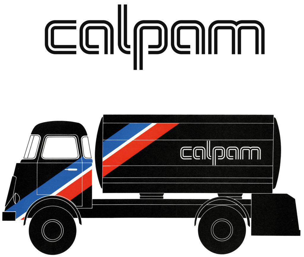
I started with Ben Bos, before transferring to Hartmut Kowalke’s team. Total Design had an open, relaxed atmosphere and in no time I felt completely at home there. John Stegmeijer and Dirk Fortuin were helpful, both within and beyond the agency. One day I was asked: can you design a logo for the Calpam oil company? Hartmut and Benno Wissing had already designed the basic house style, but the logo, in Helvetica Bold, wasn’t distinctive enough. I was inspired partly by the notion that oil runs through pipelines, but also by Lance Wyman’s graphics for the 1968 Mexico Olympic Games. On our way to the presentation Hartmut said to me: ‘You designed the logo and the meeting will be in English anyway, so why don’t you present it?’ At only 22 years old, my first client presentation was rewarded with a round of applause. The Calpam logo curves were difficult to finish to perfection, and were used by TD for years to come as an artwork test piece for studio applicants. If I had known about continuous curves – as now used by Apple – I would have opted for them instead of tangential ones.
When my internship was over, it was clear I was welcome to stay on and finish the Calpam job. But TD didn’t want to give the impression they were pirating me away from the RCA, so it had to be my own initiative. The thought of having to wait another year and a half in London was daunting: I wanted both to be with Anne Marie and to work at TD. Professor Richard Guyatt and my other tutors had already seen that my Dutch experience had been life-changing and understood my decision to leave.
TD 1970-73
My first day at TD was the start of a dark chapter for Benno Wissing: ‘Calpam is fine for you, lad, but it’s the kiss of death for my PAM house style’. I never forgot this, especially when starting on new commissions or when my designs were on the receiving end. Gasunie and Transavia have already received new identities, Cito is two rounds further and after 25 years, Nuon is now on its way out. And Calpam? After half a century, it is still in use.
It amused Benno to reflect that Napoleon hadn’t succeeded in turning all European measurements metric. Dutch typography was a prime example, for it was still based on an antiquated, yet highly intuitive and efficient, twelve-point system. Back in England, we had to be somewhat bilingual in dealing with kilos, centimetres and litres alongside pounds, inches and pints, so working in ciceros instead of picas was easy enough for me to pick up.
Benno and Hartmut worked closely together, so I had the advantage of being part of an extended team, all of us spending many hours together, sometimes sketching out new ideas on beer mats in Café Monico.
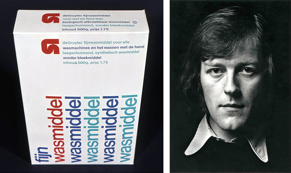
Ben Bos always started early and went home on time. He was a hard worker, probably TD’s cash cow, especially in tough times. John Stegmeijer and I designed a set of detergents for his De Gruyter house style. Ben may not have been easy to get on with but he was extremely loyal and had a heart of gold. At the time it always seemed to be fire and water between him and Benno, but later on in their lives they became close friends. Ben got me to take over one of his teaching jobs and I succeeded him as president of NAGO (Netherlands Graphic Design Archive).
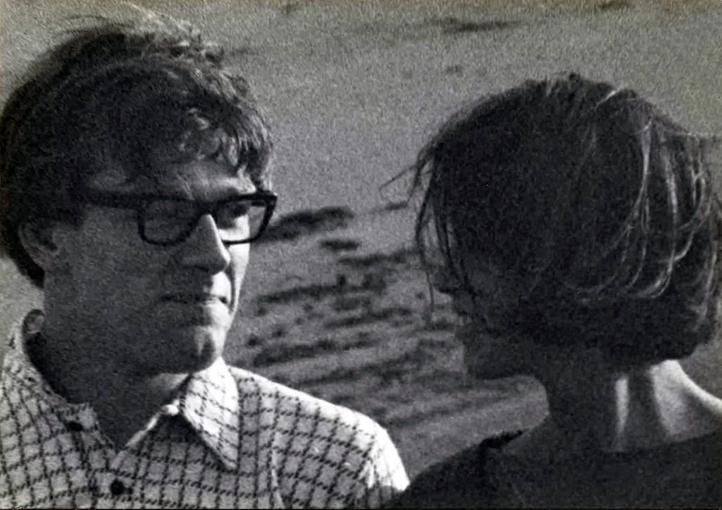
Andrew Fallon, portrait by C. Barton van Flymen, 1974
Even though Wim Crouwel was more distant, he was more of a binding factor. When serious management problems arose at TD, Wim demonstrated what a powerful leader he really was, though he could do nothing to prevent Dick Schwarz, Paul Schwarz, Hartmut Kowalke and Benno Wissing from leaving the company in rapid succession. Partly due to the internal problems at TD, I got to know Wim better. First of all in his role as lead for the PTT (national postal and telephone company) in collegial competition with Tel Design, and later when I worked with him on the Rabobank logo. At one stage he asked me to join his team, but Crouwelian cloister life didn’t appeal to me. He was a father figure for whom I had huge respect, but I felt the need to break out.
This might seem a strange moment to bring up the HBG house style that had just been designed by our rivals at Tel Design, but it’s important to recall how we at TD viewed this at the time. With its voluptuous shapes and green-orange colour scheme, the new HBG identity was something of a shock to TD. It wasn’t seen as the outcome of the sparkling energy between the ambitious Frank Luyendijk (head of HBG public relations) and the creative Gert Dumbar and his team at Tel Design. Oh, how I wished I had been part of that process! Little did I know that only a few years later HBG would be on my client list at Tel Design. Or that following the takeover by BAM, HBG was destined to end up at Total – with Dumbar’s green and orange still intact today.
The ambitions of young designers can make them greedy when it comes to new work. I was no exception and after four years at TD, I had become restless. Having done some freelance work, I felt the urge to go it alone. Anne Marie had a steady job and so we decided to take the plunge. In retrospect, it was a lunatic move into the unknown. I sent out letters to potential clients, but nothing came of it all: I didn’t have a proper network.
Dots Design 1973-76
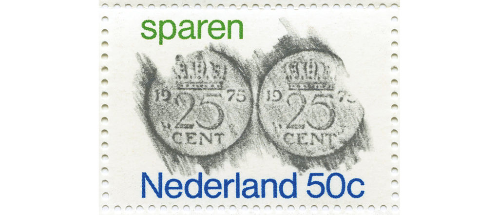
Around this time I got to know Hans Versteeg, a designer who had worked with Otto Treumann and who was now into making powerful posters. I had been freelancing for Hans for several weeks when he asked me to join forces with him on a fifty-fifty basis. There was plenty of work and things went well between the two of us. We made a strong team and I learned a lot from him, with his forceful, illustrative way of designing. Our clients included the Netherlands Opera Society, Levi’s, Allert de Lange publishers, Van der Bunt consultants and Arsycom computer services. Ootje Oxenaar, head of design at PTT, gave us the task of designing a postage stamp for the Netherlands Savings Week.
One evening in November 1975, Gert Dumbar of Tel Design phoned me: ‘I’m looking for a new staff designer and your stamp caught my eye. Can we talk about this?’ That’s how it started, even though I didn’t really want to go along with him, for Dots Design was flourishing with a growing client base. I must admit that I did miss the unequivocal professionalism that I had experienced at Total Design and which I saw to be present at Tel Design.
At the time I was unaware of the insurgency that had taken place at Tel, something that had caused several of Dumbar’s best designers to leave the agency. And quite honestly, I didn’t give a hoot. Gert’s enormous charisma was infectious and apart from there seeming to be no good reason I could turn down his job offer, I grew to wanting to take on the challenge. That curvy Tel Design work – in contrast to Total Design’s restrained style – had become irresistible. It wasn’t easy to break the news to Hans Versteeg, but he took it really well and even threw a huge goodbye party for me. We have remained good friends ever since.
Tel Design 1976-2000
In his book ‘Hey, there goes one of mine!’ A chronicle of graphic design in The Hague, 1945-2000, Jan Middendorp writes about Tel Design: ‘A merger had been announced with Frans de la Haye (industrial design) and Ton Haak (public relations). The new agency was to be named Tel Graphic Design, Industrial Design, Public Relations. Gertjan Leuvelink, who had earlier been nominated as a partner at the original Tel Design, left to set up 2D3D. The gap had to be filled by someone like Leuvelink who had experience in system typography. That person was Andrew Fallon, an Englishman who had attended the RCA before gaining several years experience at Total Design.’
I had hardly started at Tel Design before a conflict between Gert Dumbar and Jan Lucassen resulted in each of them resigning, one after the other. As newly appointed director of graphic design, I concentrated with the help of Will de l’Ecluse and others at Tel on major house style projects for new clients such as Cito, Delta Lloyd, Aga Gas and ECI.
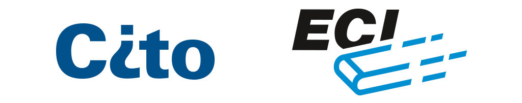
ECI logo, Andrew Fallon, Will de l’Ecluse, Tel Design, 1980
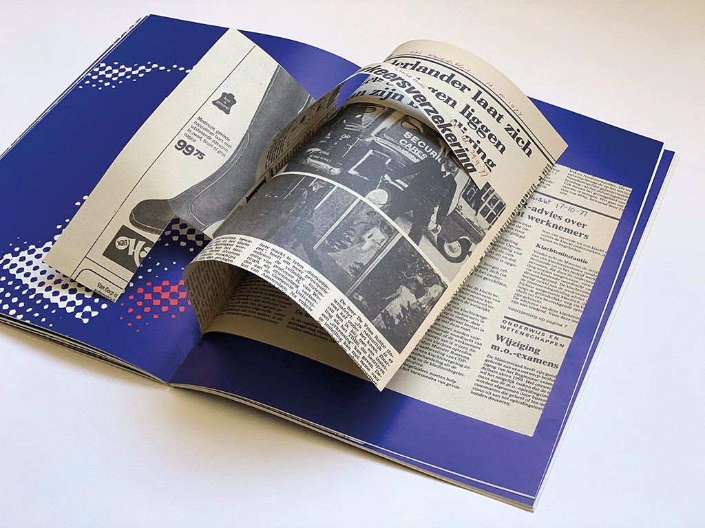
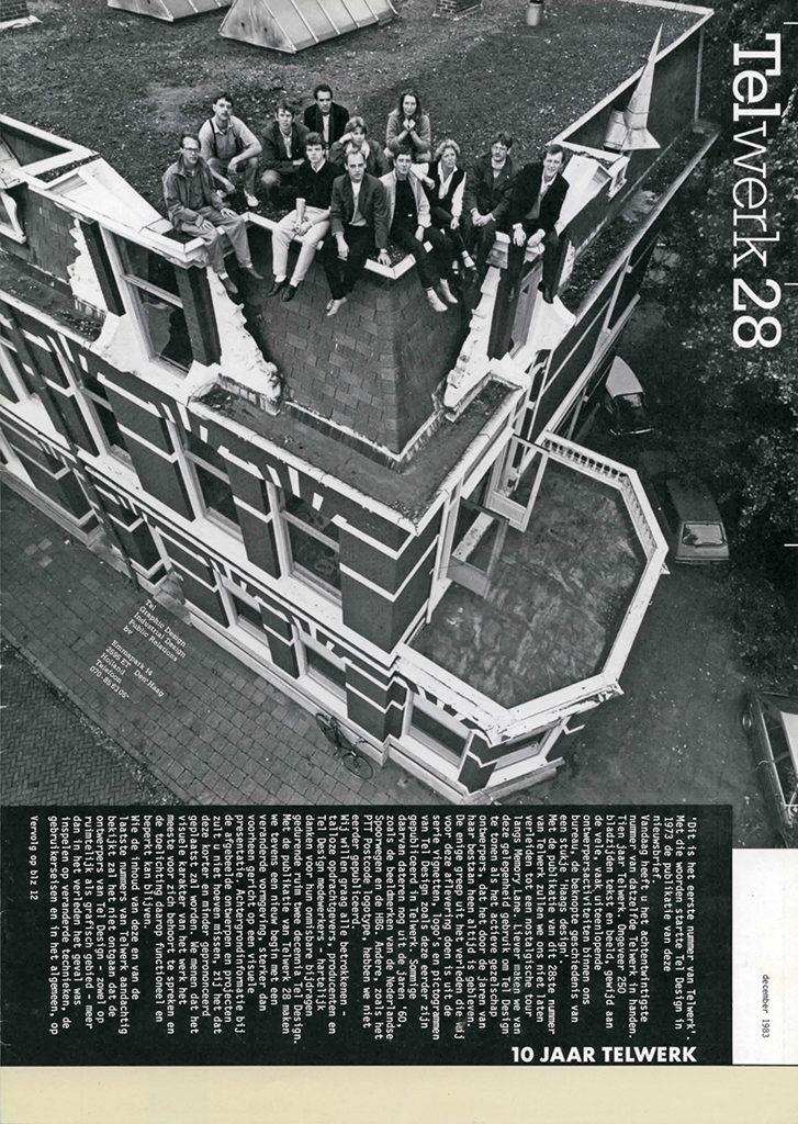
Between 1973 and 1980, Ton Haak took care of the public relations at Tel Design. His most brilliant achievement was undoubtedly Telwerk, our company magazine. With its clear editorial content and attractive images, Telwerk was a showcase for Tel Design’s work, bringing it fame as well as recognition amongst clients and colleagues alike. With 37 editions altogether, Telwerk was an important marker in the history of the company.
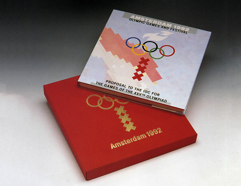
Soon after Paul Vermijs started in the early eighties, Ton Haak left, followed in turn by Frans de la Haye. We pressed on and successfully carried out several large projects for clients such as the Amsterdam 1992 Olympic Games Foundation (Bid Book), NMi (Netherlands Metrology institute) and Medical Spectrum Twente. Meanwhile, with Ronald van Lit now on board, and later Gert Kootstra, we were ready for the hectic nineties.
How did you manage to get all that work?
In the past I never thought twice about where the work came from. We often tend to attribute this solely to the success of our own doings. But now I know better, for much of it came from some highly benevolent individuals in my network. Looking through my old diaries, I come across the names Dick Schwarz and Paul Schwarz, not in their original capacities as employers at Total Design, but as new clients at Dots. And PR-agency Hill & Knowlton, who unselfishly introduced Tel Design to their clients, such as the Amsterdam 1992 Olympic Games Foundation and construction company Strukton. In turn, the Olympic Bid Book led to an explosion of new contacts and clients, including architect Jelle de Boer. When Strukton’s director switched to competitor Dura Vermeer, he took us along with him. I met HBG’s Ben Warner for the first time at Tel Design and later, when he was head of communications at Gasunie, he came to me for his house style renewal. And after I had left Tel Design, there he was again, this time to brief me for his GasTerra visual identity. Another notable long term contact is architect, builder and furniture designer Frans Elion, with whom I have worked for over forty years.
Some of my work came from family and friends, and in other cases if I had the idea that something needed to be designed, I myself had to take the first step. Whenever I do something pro bono – usually for a good cause – my motto is always that although it may be free of charge, it’s never free from accountability.
Transavia 1984
Jan Middendorp continues: ‘Transavia is an example of a very successful visual identity project. The airline, with its fifty percent share of the European market, had a reliable reputation, but was rather dull and middle of the road. Transavia knew precisely what its new house style should express: vitality, enthusiasm, self-confidence and a personal touch, without relinquishing its solid, professional image. Andrew Fallon and Ronald van Lit found themselves facing a large house style committee, with an overload of recommendations, suggestions and sketches. Tel Design quickly took the initiative and developed the necessary visual elements. They added blue to the existing green, a flying capital T and a friendly typeface with it’s characteristic lower case ‘a’ for corporate typography.’ Part of the exercise was to involve Transavia employees closely in this process of change. To that end Ronald and I devised a crash course to help them recognise and evaluate all possible visual ingredients, such as colour and lettering. We got the employees themselves to learn to see the difference between three capital A’s versus three lower case a’s in the Transavia company name. Then we went a step further and introduced the rounded, winged a’s of the Advert typeface (designed by Just van Rossum). It was a fascinating journey for the Transavia employees.
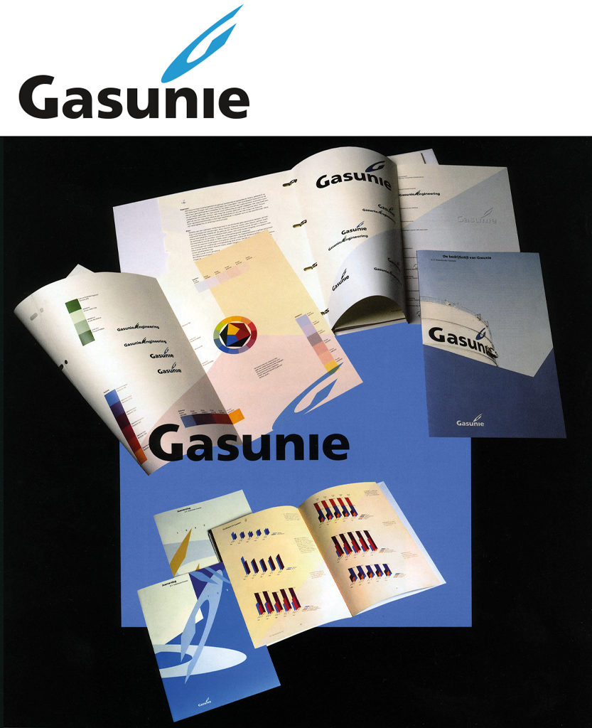
Digitalisation and Gasunie 1989
In the mid-eighties the Apple Macintosh made its appearance. For several years though, it couldn’t compete with the quality of existing photo-typesetting output. Total Design already had a few Aesthedes computers in use. We could afford neither such an investment nor the operational risk involved and so we were content to have our artwork done by graphic service bureaus that owned Aesthedes machines. However, in a short space of time, the Mac developed to become a serious contender and we took on dtp-operator Niels Poppe to run our first Mac.
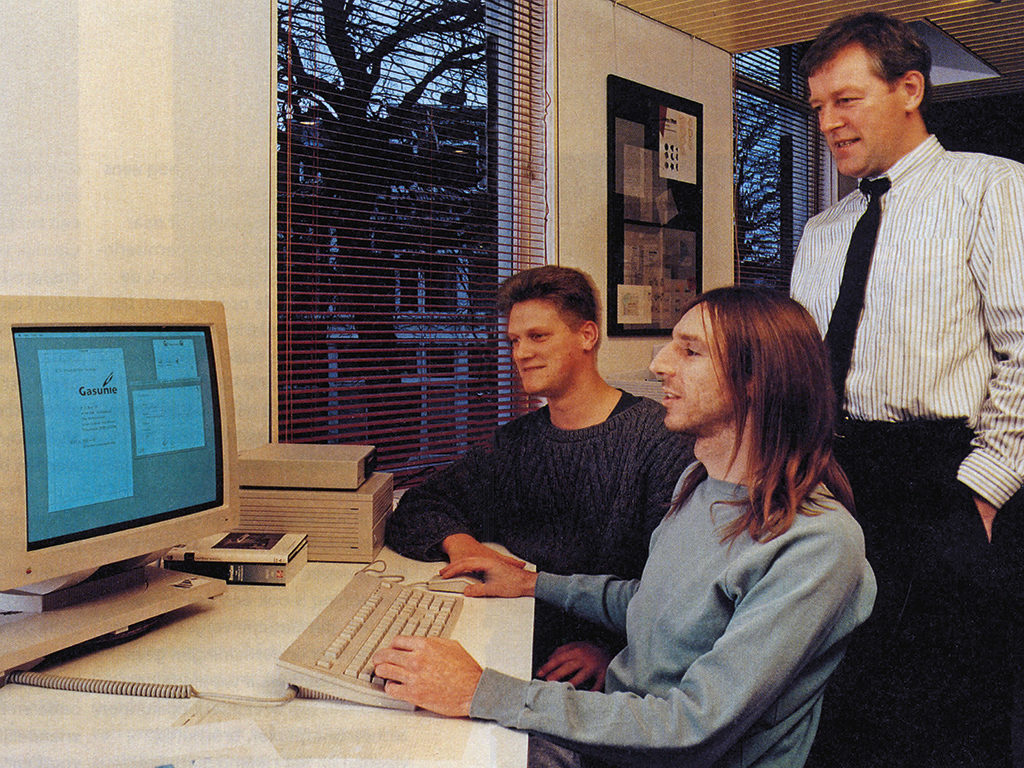
Around that time, Ben Warner reappeared, this time from Gasunie in Groningen. His message was clear: ‘Andrew, with the natural gas world about to change drastically, I need our ambitions for the future to be reflected in the way we present ourselves. But there is one snag: the board doesn’t want the existing logo (by Otto Treumann) to go. Please look into this, remembering to share with me any ‘Eureka’ moments you experience.’ In due course I sent Ben some sketches and before we knew it Gasunie’s board members were all for change – a typical example of Warner communication. My Gasunie logo design with its G-flame marks an extraordinary point in time because it had one foot in the analogue era and the other in an exciting new digital one. Within a year we had three Apple-operators and it wasn’t long before the designers themselves were becoming interested. We bought five portable Macs for them to experiment with at home. Within weeks Stephan van Rijt had reconstructed a digital typometer so accurately that was far better than the analogue original. This was the turning point: from then on we had Macs everywhere. The dtp-operators rose to the challenges of changing technology and Tel Design was soon enjoying an enviable reputation at the crossroads of design and dtp.
Following the digitisation of graphic design it was the turn of interactive media. Peter Post, who had come to Tel Design to help us complete the Transavia house style project, was cut out to develop our new media activities to perfection.
Nuon 1993
Nuon is the result of a merger between two major energy suppliers in the Netherlands: PEB and PGEM. This was familiar terrain for me, having recently completed the house style for EPON, a subsidiary of PGEM. It’s a little known fact that the letters O and N in Nuon were actually derived from the name EPON. These letters represent the eastern and northern provinces of the Netherlands, for at the time of the merger Nuon only had regional ambitions. The two contrasting halves of the logo represent energy in terms of: light/dark, warm/cold, on/off, etc.
I designed the Nuon logo with its distinctive yellow and purple colours, using Gerard Unger’s Swift typeface. Together with Nuon’s house style coordinator Sjoerd de Vries, and Ronald van Lit, Gert Kootstra and others at Tel Design, I worked on every detail of this extensive visual identity project.
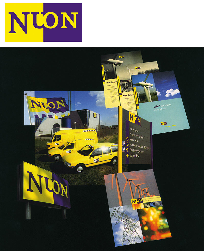
Nuon was so successful that at one point it nearly lost its right to operate under its own name. Peter Knoers, head of communications at Nuon, explained to me that new legal requirements were going to make it necessary to split energy companies in three: production, transport and supply. This meant that Nuon needed an additional name as a temporary workaround. I came up with Continuon. From the outset, Nuon had worked hard at increasing its brand awareness, something that paid off well during merger negotiations between Nuon, Gamog and ENW. Usually in such situations, board members tend to freeze in their tracks, each hanging on tightly to their own corporate identities. But here there was one significant difference: Nuon had proof of its dominant brand reputation, sweeping the others aside. However fame is not set in stone and after more then a quarter of a century of market leadership the yellow and purple Nuon logo is being phased out.
NAGO 1998-2005
As NAGO president I worked with committee members Hans Bockting, Johan van Oostveen and Ida van Zijl, supported by Karin van der Heiden. In spite of government subsidies now being systematically quashed, we broadened our horizons. Instead of going only for individual designer’s archives, we focussed more and more on those of the main design agencies. This started with Hard Werken’s heritage, though right from the beginning I had my sights set on Total Design, the flagship of Dutch design agencies. Others followed, including Tel Design and Studio Dumbar. My eight-year presidency overlapped the end of my Tel period and the start of my new existence as an independent designer. The NAGO archives have since become part of the Wim Crouwel Institute.
The millennium
I worked at Tel Design for 24 years. It was a highly creative phase in my life, during which time excellent staff and enviable clients contributed to a constant stream of good design. Sometimes though, I was alone when faced with several inevitable dilemma’s, especially in the early years when I took on the daunting task of getting Tel Design back on top. I was determined in the fulfilment of this long term ambition, so much so that I sometimes acted contrary to my own best interests. Luckily though, my sense of humour seemed to help keep our spirits high. I have always had the more human side of the business close at heart, constantly endeavouring to keep this paramount whatever the odds. Just before the turn of the century the three of us running Tel Design encountered incompatible differences of opinion as to our future course. Gert Kootstra was strongly attracted by a stern, dogmatic strategy, whereas I was convinced that the creative spirit at Tel was the very reason for its existence. I decided to risk putting my own position at stake. Exit Gert. I wanted Ronald van Lit to fill the gap but I couldn’t get him to take the step. Around this time I had asked Alan Fletcher: what’s the best time to quit as director of one’s own agency? ‘Once you have reached the age of fifty, stop managing and get back to being creative’ was his liberating answer. So there and then my decision had been made. I passed on my half of Tel Design to Paul Vermijs and went my own way.
The differences between going it alone back in the seventies and at the start of the new millennium were immense. Now I had experience, a proud portfolio, a thriving network … and nothing to lose. I could even afford to turn down work that didn’t appeal to me. My contacts with colleagues, increasingly through NAGO, the BNO and the Premsela Foundation, were more open by this time and I was no longer seen to be the eternal competitor. In my role as design consultant I have been called in to advise several large organisations, arranged various agency selection procedures and helped young talent further on their way. Old contacts led to new work and if I felt strongly about a particular job, I simply went for it. I recorded many of my colleagues’ stories about their design careers on video. And I took on small jobs that I would never have had time for previously. My golden rule had become never to accept work if I wasn’t convinced I could deliver the goods.
ASML 2001-2019
Marjolein te Kolsté, interim communications manager at ASML, who I had known from my Tel Design days, asked me to provide graphics support for her corporate design manager. This was the start of a truly crazy period in my career. In close cooperation with Jeannot Driedonkx, we laid the foundations for a new ASML corporate identity, carrying applications out step by step. Initially, the company was strangely introvert: ‘Outsiders wouldn’t understand what we do anyway’ was how their own employees saw themselves. But when communications director Lucas van Grinsven arrived, ASML started presenting itself withmore confidence to the outside world: it had to, in order to attract new talent as the company expanded. Over the years I have sourced a large number of creatives for ASML from my network. These include Fabrique, Reinier Gerritsen, Studio Kluif, Bureau Mijksenaar, Monkeytree, Tinker Imagineers, Total Identity, Titus Yocarini and Carel Zaal.
Jeannot says that in the course of time I have had a vital influence on him, but on the contrary it was this highly motivated, very determined and strong-willed individual who changed so much for me. Jeannot is an exacting client who can’t stand mediocracy, never fearing confrontation. He’s a simply tough nut who understands precisely what tech giant ASML really stands for and what its needs are. If Leonardo da Vinci’s biographer Walter Isaacson hadn’t got there before him, Jeannot Driedonkx himself might well have thought up the motto ‘Vision without execution is hallucination’. Could it be that the design of our ASML logo suggests that hallucination, thanks to vision and execution, really does exist?
Wasn’t this supposed to be about roots?
In 1987, Design Factory from Dublin came to visit Tel Design in The Hague. Things just clicked between Conor Clarke and me and since then each of us has travelled back and forth countless times for lectures, design juries and shared projects. As it happens, flights between Amsterdam and Dublin pass directly over Liverpool, where I was born and raised. My parents originate from Ireland and whenever the plane touched down in Dublin I felt a strange sense of belonging. It was when Conor asked me to write a chapter in his book Oranje & Green, about the Dutch-Irish design connection, that everything about my three-pronged roots fell into place: my Irish heritage, my English upbringing and my career in the Netherlands.
(cover illustration, Bernard Fallon, Liz Butler, 1976)
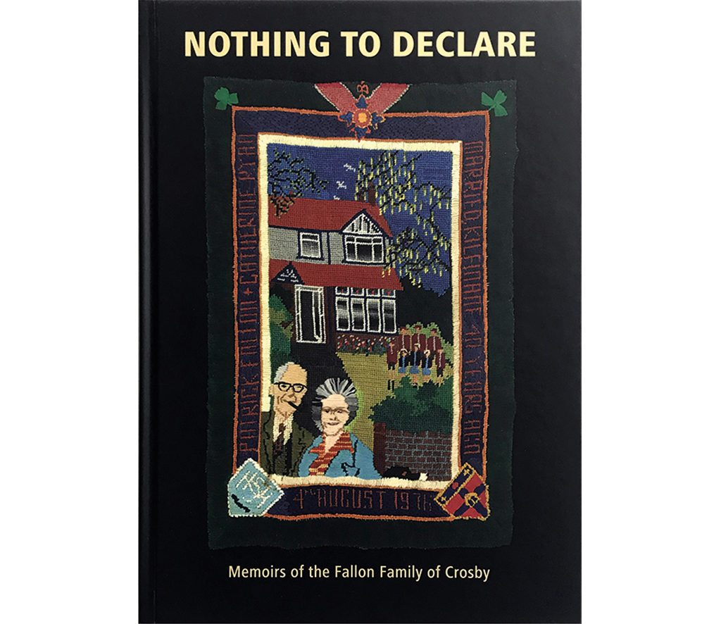
This publication is too brief to include a full account of my roots, but if you wish to know more, read the Fallon family memoir Nothing to declare. Here are the key facts: I was born and educated in Crosby, a suburb of Liverpool, the fifth of eight children in an Irish immigrant family. We were raised to strict Catholic standards, with freedom and responsibility high on the agenda. Our parents offered their children every opportunity to study without restriction, never asking for or expecting anything in return. As I could draw and paint well, I attended Liverpool College of Art and Design, where I studied graphics. Tutor Ray Fields taught us about Swiss design, took us to Crosby Fletcher Forbes (later Pentagram), to the BBC and to the Hochschule für Gestaltung Ulm. My tutors at the master study in graphic design at the Royal College of Art in London included Margaret Calvert, Alan Fletcher, Bob Gill and Jock Kinneir. I wanted to spend my first summer vacation gaining agency experience in the Netherlands when one of them suggested: ‘Try Total’.
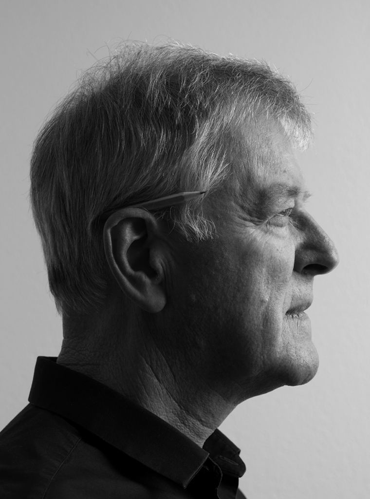
Andrew Fallon
born on 7 June 1946, Crosby, Liverpool (Great Brittain)
Author of the original text: Andrew Fallon, June 2019
English translation and editing: Andrew Fallon
Final editing: Sybrand Zijlstra
Portrait photo: Aatjan Renders