Baer Cornet, from Limburg province in the south-east of the Netherlands. He is a typographer first – who loves the sanserifs and especially the Monotype Grotesque. Which may be surprising, because a more classic serif type is what you’d expect from a designer born and nestled deep in the old historic and friendly rolling hill country of Limburg. Sanserifs – clear, straightforward, businesslike – are more at place in the industrial western part of the Netherlands, are they not?
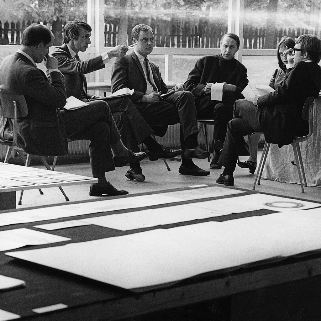
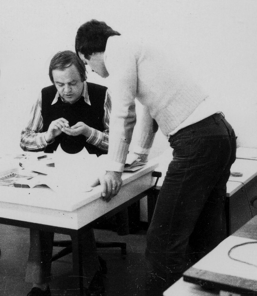
From left: Wim Strijbosch, Wim Crouwel, Baer Cornet, Jan van Toorn, Josje Pollman, Will van Sambeek
It’s the difference between Charles Nypels and Piet Zwart. Too much of a generalization, perhaps, but surely related to Baer Cornet’s work because he has somehow succeeded in bringing these two worlds together. His typographic purism is defined by refinement, by a poetic and melodious composition of letters and pages. His work has a French rather than a Dutch flavor. Cornet remains loyal to his philosophy even when he decides to apply a serif for type because it suits the project’s subject better.In all his work the use of white space, of silence, is a dominant factor – a silence to listen to.
After graduating from high school in 1958, Cornet found a job at Océ-van der Grinten’s publicity department; he would continue to work for the company for most of his life. He got acquainted with Joost van der Grinten, an architect who built violins, to whom he faint-heartedly showed his first layouts. Van der Grinten advised him well and at some point showed Cornet the strictly purist designs Teun Teunissen van Manen had created for companies such as textile producer De Ploeg and furniture factory ’t Spectrum. As Cornet said: “Such subtle, controlled, functional, straight-laced yet magnificent print I’d never seen before.” He was all set to be taught design by this master.
Tough Schooling
Jacques Peeters, a designer who worked for Lecturis, the printing company that worked for De Ploeg, brought Teunissen van Manen and Cornet together. He provided his own home in Eindhoven as a meeting place for Cornet to follow the master’s private lessons. And so Cornet received a tough schooling in functional typography, page layouts, and other aspects of graphic design. “Teun’s simple grid for De Ploeg (note1) impressed me – the half of a half, as he described it. Or, as he said: just divide a paper format (not necessarily a Din A format) in four, eight, sixteen et cetera parts. Teun’s teaching was what really made me aware of the specifics of the profession. I subscribed to magazines such as Graphis, Gebrauchsgrafik, Typografische Montasblätter. In search of everything professional designers had put their mark on I hunted for each and every catalogue Harry Sierman had designed for Pastoe; for all museum catalogues published by the Stedelijk Museum and the Van Abbe Museum; all Kwadraatbladen publications from Steendrukkerij De Jong; all issues of the German magazine Twen designed by Willy Fleckhaus.”
Cornet remembers how proud he was to own a deck of cards as published for the ‘Proost Prikkels’ series in which each designer associated with graphic designers association GKf could show some work on one card. “My deepest wish was to be invited by GKf to become a member. I think it was on one of those cards I first saw designs by Wim Crouwel. (note2) I was so impressed by its soberness and its difference from what I was familiar with at Océ’s publicity department. Harry Sierman’s work was also on a card, as was a small part of Teun’s grid for De Ploeg. Of course I was interested in everything that the Swiss School produced. I found their work mentioned in the magazines I devoured and in the books by Müller Brockmann, Karl Gerstner, Emil Ruder, Hans Neuburg, and others. I knew Piet Zwart and other pre-war designers from reading professional publications, but it was only later that I was able to understand and admire the scope and quality of their work. How endearing were not the promotions of companies such as Bruynzeel that made use of blotters. So different from the glossy trash tons of money are wasted on today.” (note3)
Echos of Idealism
Teun Teunissen van Manen had been educated at Amsterdam’s IvKNO (later to become the Gerrit Rietveld Academy of Art). He started working for De Ploeg in Bergeyk in 1957. As ‘head of general design affairs’ he was responsible for the corporate identity program (with red, blue and yellow as its main colors); he improved the factory’s interiors and designed its presentations at the Jaarbeurs trade fair. Cornet proudly preserved his cherished copy of De Ploeg’s corporate identity manual, illegibly dedicated and hand-signed by Teunissen van Manen, on his bookshelves.
Teunissen van Manen also worked for furniture factory ’t Spectrum to which, from 1954 to 1974, the furniture designer and art collector Martin Visser was connected. Visser’s art collection started with Cobra and the Nouveaux Réalistes (Christo, Arman, Panamarenko) and after 1965 was focused on minimalists such as Sol Lewit, Bob Morris, Dan Flavin, Donald Judd, Carl Andre and Peter Struycken. Their approach showed a preference for primary colors and distinct geometric shapes excluding subjectivity as much as possible: red is red and not the color of sunset or love. This philosophy saw its beginning during World War I in Russia, the Netherlands and Germany, and became revitalized in the 1960s. Its art was a confrontation “with a model that provided the viewers with insight and comprehension of their thoughts and their mechanical approaches of labor.” (note4) In its background played the echo of far-left idealism as conceived in the 1920s and aimed at the realization of a better world. (note5)
In this climate of modernism Cornet laid down his own ideas and method. He carried these with him after he had left Océ in 1963 to become employed by Lecturis printers in Eindhoven, where he hoped “to gain more knowledge of the print production process.” Jacques Peters had told him all about this printer with great enthusiasm. Cornet became their in-house designer responsible for all graphics. “A whole range of interesting projects came to my desk, but as soon as I’d sat down it also turned out to include the layouts of leaflets and magazines explaining the blessed activities of monks and nuns. Luckily, the majority of the work was for regional companies, and I could do designs of posters and catalogues for Van Abbemuseum, bridging the short period between the Will van Sambeek and Jan van Toorn regimes. I also designed the catalogue for the Jeroen Bosch exhibition and a magazine for a collective of photographers.”
Functionality and beauty
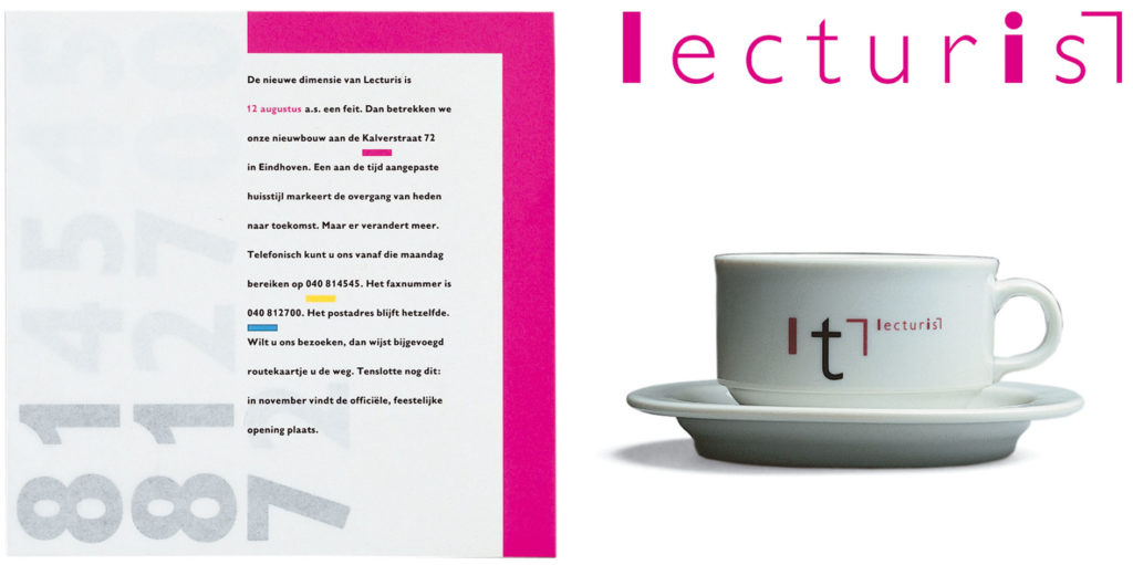
Cornet created the Lecturis type catalogue and the printer’s letterhead, which he would much later extend to a formal corporate identity program in 1991; and he was the intermediary between Lecturis and independent graphic designers who chose to work with this printer. He grew familiar with a large number of leading designers and their work: Wim Crouwel, Jan van Toorn, Will van Sambeek, Benno Wissing, Otto Treumann, Ben Bos, Jan Bons and Pieter Brattinga, to name a few. “Not Harry Sierman, alas. I was an admirer. Harry preferred to work with classic type in his very modest and subdued way. I fell in love with its functionality and beauty.” Thus, at Lecturis, ‘Southerner’ Cornet connected with ‘Westerners’. He became a member of GKf and the organization of advertisement designers and illustrators, VRI (later to merge into GVN and still later to be merged with other design associations to form BNO). (note6)
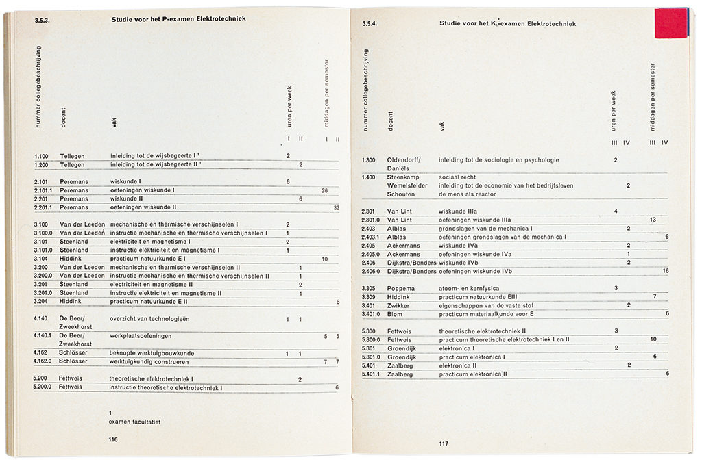
At Lecturis, Cornet directed the lithography, watched print go to press, and was responsible for quality control in general. Clients who did not have their own designers had Cornet assigned to their projects. He designed the logo and annual study guide for TH Eindhoven (later TUe), the city’s technical university. “I had arranged for the full layout of all pages to be produced by the Linotype machine. At that time this was a whole new approach. Today, that’s what is ‘easily’ done on a Mac.” Cornet received Amsterdam’s Frans Duwaer Award; he taught part-time at the art school in Den Bosch, where Wim Crouwel was one of the founders of the graphic design department. It became a meeting place of colleagues such as, again, Jan van Toorn, Will van Sambeek, Jacques Peters (who would eventually become director of the art academy in Breda), and others: Anthon Beeke, Ton Limburg, Wim Strijbos, Josje Pollmann, Karel Beunis and Chris Brand. William Graatsma, too, taught in Den Bosch; Cornet had met him already in 1964 and from 1970 onward would create designs for Graatsma.
New horizons
1970 was also the year Cornet, richly experienced, returned to Océ in Venlo. He found Océ’s board of directors fully convinced of his qualities and was granted a free hand to operate; he was even allowed to take commissions from outside the company. His love of modernism hadn’t diminished; his goal was still to create objective and subservient designs. At the time, the economic climate of the southern part of the Netherlands was unhealthy: the coal mines had closed, the number of unemployed had grown dramatically. Improvements were only slowly reached in the following years when new industries were established (car factory DAF for example) and national government departments came to settle in the region (CBS national statistics, ABP government pension fund); the Open University was to be established in Heerlen and Maastricht got Limburg University. Also, the former national coal mines found a new future as DSM chemicals. With these new economic impulses came an improvement of the region’s cultural climate. New modern architecture followed: Bonnefanten Museum (Maastricht), a history and anthropology museum (Venlo), and many buildings designed by Jo Coenen and Wiel Arets. Limburg’s cultural life was slowly discovered and recognized outside of the province.
At the end of the 1960s, new horizons were opened by those Limburgers whose interest in art under influence of what was happening in the western part of the country switched to a more formal and constructivist approach. Baer Cornet was one of them; as was printer Cor Rosbeek, his brother Jean, paint producer and art collector Jo Eyck, the artists and architects Slothouber and Graatsma, as well as interior architect and graphic designer Herman Zeekaf.
Cor and Jean Rosbeek took over their suddenly and sadly demised father’s print shop in Hoensbroek. As William Graatsma wrote in 1995: “Notwithstanding all kinds of complications, businesswise, technical, and with staff, they managed to set into motion an artistic adventure that lasted for more than twenty-five years.” The adventure included the production of a series of extraordinary goodwill publications that received national fame. DSM was an important client, but the Rosbeek brothers looked for projects far beyond the borders of Limburg; and they searched for collaboration with leading graphic designers.
Cubists
William Graatsma and Jan Slothouber were DSM’s designers of exhibitions and all visual communication since 1955. They also established their own Center of Cubist Constructions (CCC) through which they continued to study their philosophy of a rational approach of design problems. The cube was the basic element of their studies, a shape coming with restrictions, yet with unlimited possibilities.
Jo Eyck, the owner of paint producer Jac Eyck in Heerlen and also (independently) running the Sikkens Service Center for Limburg, was an enthusiast collector of contemporary art; in the early 1970s his eye was focusing on artists who worked in the Dutch constructivist tradition, such as Peter Struycken, Ad Dekkers, Ben Akkerman, and Carel Visser. The artists whose work Jo Eyck collected were also favored by Baer Cornet, who ads Jan Schoonhoven and Rob van Koningsbruggen to the list.
Herman Zeekaf was educated at the Industrial Design Academy in Eindhoven. He was a promotor of modern design (Danese, Eames chairs, Le Corbusier’s architecture) but also an admirer of Shaker furniture designs. These ‘Limburgers’ met and formed a circle that acquired quite some fame with their initiatives. Graatsma was a consultant to Rosbeek. Rosbeek printed for Eyck. Zeekaf built and renovated for Eyck and for Rosbeek, and also contributed to Slothouber and Graatsma’s product development for CCC. Cornet advised Rosbeek and designed their promotional material; and he designed catalogues for Eyck’s exhibitions. Wim Crouwel, Jan van Toorn, Gerard Wernars, Mart Kempers and other designers “from way out West” came to Rosbeek for print.
Restrained flamboyance
Jean Rosbeek wrote an article for the book Galeislaven en rekentuig published by [Z]OO producties in 1997. Its headline said, roughly translated: “Sharing the designer’s mentality” and it pointed out that the best results could only be reached if the client, the designer and the printer all share the same philosophy and mentality. The mentality cherished by this circle of friends was more than a kind of idealism; they desired to create clarity, to not shy away from experiments, to promote all that is direct and pure. Their viewpoints were, of course, also influenced by their own cultural background and their restrained flamboyance.
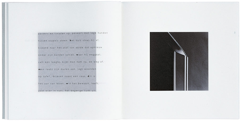
This mentality became manifest in Baer Cornet’s work. His admiration of the great modernists directed him to the creation of his own distinctive morphology. He once said his purism “originated from a rather neurotic obsession to give a functional and preferably esthetic arrangement to all elements; and the conviction that a viewer has to be able to discover and to understand them as quickly as possible. I am happy to see the younger generation of designers is convinced of the same beliefs. Hopefully we are forever done with free-painting of text and images (with type 6 letters placed in the images).” Cornet’s work had to be in service of the viewer, which does not mean that his own opinion about esthetic clarity had to take a step back. His objective designs, obedient to rules and grids, are influenced by his sensitivity and his good eye for the connections between black and white, height and width, format and size, subject and type of paper, lead and spacing. He also adopted symmetric modernisms by applying either wide margins, or almost no margins at all, thus creating a binder’s nightmare.
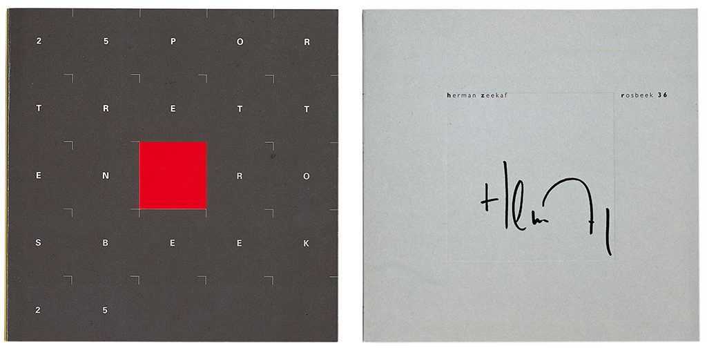
The Rosbeek publications may be the most consistent examples of his beliefs, although these are just as prominently present in the calendars he produced for Jo Eyck, the early product documentations for Océ, the type catalogue for Lecturis, the guidebook for TH Eindhoven, the Jeroen Bosch catalogue and the designs for Slothouber and Graatsma. His work for the foundation for the preservation of Limburg’s landscape, though following strict and consequent lines, was allowed to breathe a different atmosphere. His designs show a preference of the use of square formats. First examples are Rosbeek’s goodwill publications, with the first one appearing in 1969. The format referred to the well-known promotional issues of Kwadraatblad, published by Steendrukkerij De Jong & Co in Hilversum, but Rosbeek’s publications were smaller. The square became the standard format of designs for Eyck and for Slothouber and Graatsma. He couldn’t use it for specific publications such as annual reports, for which A4 is the accepted standard.
“Too slick”
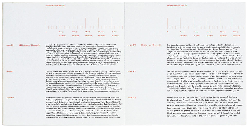
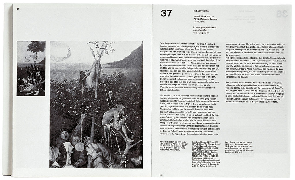
Cornet had his favorite type, too. He loved the Monotype Grotesque but didn’t shy away from types like the Frutiger. Or the sanserif Baskerville which “isn’t all too stable but shows some spirit just as the Bodoni does.” The Futura and the Gill also show up in his work. Cornet based the selection of fonts on emotions and associations more than on principles; the Univers was “too slick” for him, the Futura was “too German” and the Garamond “belonged in a boudoir.” Depending on the subject, he used either a serif or a sanserif, or both together, for example for the Limburgs Landschap magazine (sanserif for headings and captions; serif for plain text). A little book about Wijlre’s castle received a serif, as did the catalogue he designed for the commission Peter Struycken received from Jo Eyck for his company’s building in Roermond (Color, space and change). Nevertheless, for the Struycken publication Plons (1972) he combined the sanserif and a typewriter letter; while in the Jeroen Bosch catalogue (1967) the sanserif is used as a part of a very contemporary design for this historic subject (Monotype Grotesque 215 as well as Akzidenz Grotesk).
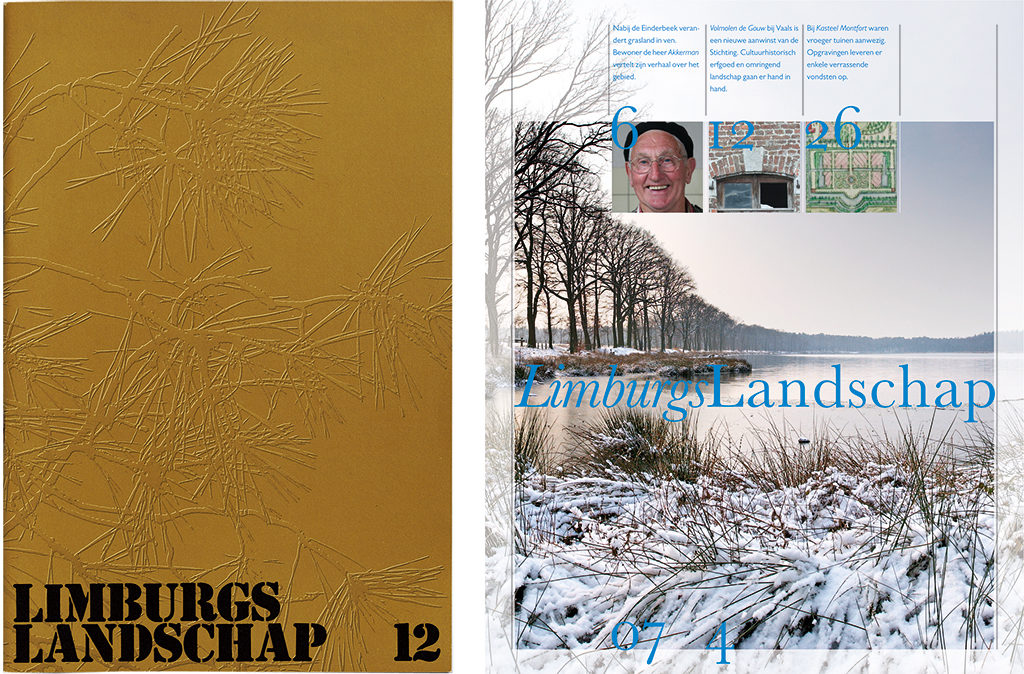
Cornet wrote: “I had no problem with adapting to clients and their opinions. For Océ, Rosbeek, Eyck, CCC, Lecturis, Tesink Vorm and for People on the Move I could keep wearing my ‘safe and sound Teun hat’. For Limburgs Landschap I combined a classic type with a modern layout; and a project for the city library saw a similar approach. What I regret is the disappearance of the good old custom of mentioning the font and type used in a publication” (yet this information is absent from quite a few publications Cornet himself designed).
The use of a grid always needs serious consideration, although Cornet said: “It’s a very important element, but if it suits me better I just as easily drop using it. It is too often seen as something unchangeable and rigid, to depend all other decisions on, instead of a tool that helps to create a certain rhythm.” In the end, each page needs to be individually viewed and checked for its own shortcomings. “For an esthetic placement of text and images a page always needs a basic set of instructions, while variations are allowed,” and Cornet did not shy away from the use of 13 columns on a page divided by a minimum of white. His designs showed flexibility instead of dogmatism. Using the Mac, says Cornet, improves the flexibility notwithstanding restricting freedom at the same time. Therefore he kept doing much of the prep work for his designs by hand.
Leaving monographs
His free approach of design is visible in a publication about Herman Zeekaf from 1995, published by Rosbeek. Its square format is repeated on each page by smaller squares – each page is folded twice, Japanese style, and the insides of these squares are printed in light grey to form the foundation of also square black-and-white images and (parts of) the text. The square defines the left margin, the top and the bottom, but Cornet took the liberty of letting words continue from the square into the white margin at right. A fresh breath, away from rigidity, which resulted in a different composition of each page of a book of which all pages were essentially ruled by the same layout principles. His use of paper and the way of binding contributed to the design as well, as did his play with white or with starkly contrasting black-and-white illustrations that bled from the page; and at other times he used small images in clear reference to the grid. Cornet sometimes used Geert Setola’s illustrations and placed them harmoniously in white although each time differently, according to their subject. He also chose to use text (of headings or less interesting paragraphs) vertically to add or reduce emphasis. Groupings of his work often showed relationships. The same elements kept returning although sometimes he ‘broke up the family’ on purpose.
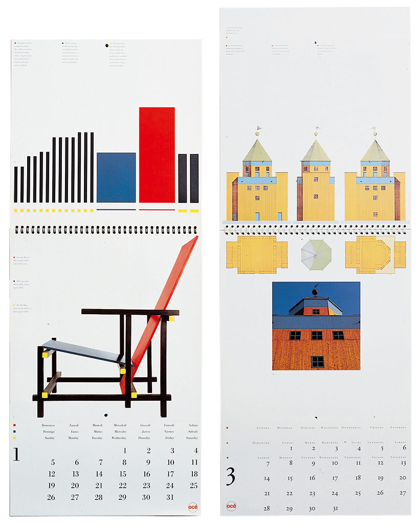
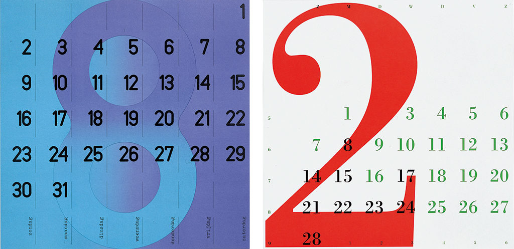
For the first series of calendars he designed for Océ (1979 to 1981) Baer Cornet strongly influenced the choice of subject. These first series are devoted to contemporary artists such as William Graatsma, Jan Dibbets and Hamish Fulton. The following series were edited by Marijke Küper and presented architects: Gerrit Rietveld, Bork Sipek, Gaudi, Aldo Rossi, Le Corbusier, Frank Lloyd Wright, Santiago Calatrava and Alvar Aalto. The calendar part could be removed to leave a monograph. Cornet also chose the subjects for the first Rosbeek publications: Helvetica Catalogue, Papers and The Hidden in Print.
His calendars for Eyck became experiments in typography. He created a variety of applications of numbers and approached a different font each year. Cornet knew of no limits for his research and experiments. The jury members for the 1995 Graficus Calender Award felt he had gone too far: they opined that the rasters overwhelmed the numbers. Most of his calendar designs for commercial clients differ from the designs concentrating on cultural or professional subjects; nevertheless they show a familiarity through the presence of what is clearly Cornet’s handwriting. Jo Eyck once recalled how for Océ’s brochures Cornet had photos shot in interiors at his paint company, Jac Eyck, in which Océ machines were shown prominently, while in the background there was an abundance of contemporary art.
Advocate
Baer Cornet established his prominence in Dutch design history by being the Limburg contributor to the heritage established by the ideas Zwart, Schuitema and Kiljan formulated in the years between the two world wars. A businesslike, objective approach of design based on an optimistic view of the world. After World War II, Sandberg and Treumann continued in this tradition and so did Teun Teunissen van Manen at the ideology-based textile company De Ploeg. Cornet was educated along these lines, felt much at home with these design traditions, and was their most important advocate especially within the Limburg design coterie. (note7)
With the commercial sector’s rapid and dramatic changes of recent years, and the dominance of marketing, sales and profit, the visual image of companies has lost some of its importance. In previous days the image was used to establish a certain trust in the company. Today, the financial numbers are counting first and last. Knowing this, it is a joy to see that in his later days Baer Cornet was concentrating on the creation of the restrained sound of white more than ever before.
Baer Cornet
born on 28 April 1937, Venlo
died on 20 March 2014, Venlo
Author of the original text: Paul Hefting, February 2008
English translation and editing: Ton Haak
Final editing: Sybrand Zijlstra
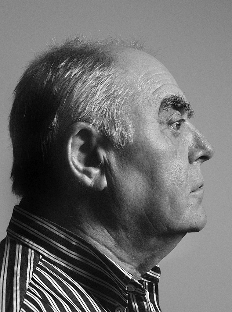
Portrait photo: Aatjan Renders
Notes
- Weverij De Ploeg in Bergeyk was founded in 1923 as a cooperative of textile producers and consumers. The coop was based on religious anarcho-communist principles and there were “no bosses, no servants.” Like the company name its logo, the plow (ploeg) pulled by a horse in front of a rising sun on the horizon, stood for the preparation of the new world in which militarism, alcoholism, corruption, prison systems would be banished to allow the reign of freedom. The rising sun stood for socialism. Gerrit Rietveld designed the company’s new headquarters in the 1950s.
- Cornet explained how he, with his colleagues Capello and Kesseler, worked under Wim Crouwel’s supervision intensively on Océ’s corporate identity program. The manuals and other parts of the design were delegated to Total Design. The logo was Crouwel’s design form 1968: the o and the c were Folio capitals and also the é was constructed from the Folio; all three letters were placed in a circle, fire-engine red. A color code appointed additional colors to Océ’s groups of products. Later, the logo was redesigned by Cornet in such a way it could be better trademarked; he used the Univers 65 and 75.
- No work was kept from the first period Cornet worked for Océ. “Those were the days when the company closed a few weeks for the yearly carnival and I could take a long time to prepare my designs. The brochures I designed were cloned from a Swiss-looking brochure published for Monotype,” recalled Baer Cornet.
- Hans Jaffé in ‘Panorama of constructive art’, in Nieuwe Rotterdamsche Courant,July 12, 1969.
- Baer Cornet wrote: “Purist companies such as De Ploeg en ’t Spectrum strongly influenced purist thinking. Their building by Rietveld. The best of professionals who they engaged to work with: Jan Versnel, Ulf Moritz. They used Arabia porcelain. ’t Spectrum presented unique furniture.”
- Baer Cornet was a member of a GKf restructuring group together with Jan Bons, Ootje Oxenaar, Benno Wissing, Jurriaan Schrofer, Maarten Houtman and Gerrit Noordzij. “I also was a jury member for the best-designed books, and for the Werkman Award (twice). And I was appointed by the government to supervise the exams at the academies in Eindhoven and Maastricht.”
- Other colleagues important to Baer Cornet especially in later years were: Huub van Gerven, Bert Canjels, Frans van Nieuwenborg, Piet Gerards and Maud van Rossum; and collaborators such as Ton Tesink, Geert Setola, Hans Kentie, Louis Lucker, Angela de Vrede, Egon Notermans and Henk Lamers.