Ad Werner was taught ‘Bauhaus Rules’ at the academy of art in The Hague. One of his teachers, Paul Schuitema, was shocked to see Werner design movie posters at the start of his professional career. Werner worked for HEMA department stores and for popular magazines such as Margriet, Elegance and Nieuwe Revu, and he drew cartoons. “Werner was able to catch the signs of the times and create attractive designs that touched the hearts of a large audience.”
In the Dutch design world, Ad Werner is seen as an outsider, someone who does not want to have anything to do with intellectualism and conceptualism. Nevertheless, his influence on the face of graphic from the Netherlands in the 1970s and 1980s cannot be denied. His designs for aircraft manufacturer Fokker, electronics company Philips and car producer Citroën; his identity program for the City of Amsterdam; his famous ‘little Mexican’ logo for Caballero cigarettes; and many other logos and type designs carried his name across the country and beyond.
Werner, who studied at the art academy during WW II, at age 84 remembers: “I wanted to become a painter and dreamed of strolling to the countryside wearing a corn-blue shirt and carrying my easel. And that’s what I did. By getting out of bed at 6 a.m. I was able to paint for a few hours somewhere in a polder or a wood before attending class at the academy. My father, a printer in Wassenaar, had other ideas and sent me to the academy not to become a painter but a commercial artist. My teachers were Gerrit Kiljan, Paul Schuitema and Piet Zwart.”
In 1944, the academy had to close its doors – the building could not be heated in the harsh wartime winter. It was Werner’s fourth year at the academy; with nothing serious to keep him occupied, he started to play with colored pencils to make an illustrated children’s book. About a mouse that finds a nut shell and takes a caterpillar with him on a sailing trip. The book was never published, but Werner kept the drawings safely tucked away. Werner was always creating paintings or designs, as Ger Kraaij wrote in De Telegraaf newspaper in 1992: “… always making lay-outs, drawing lines, arranging new combinations.”
Movie posters
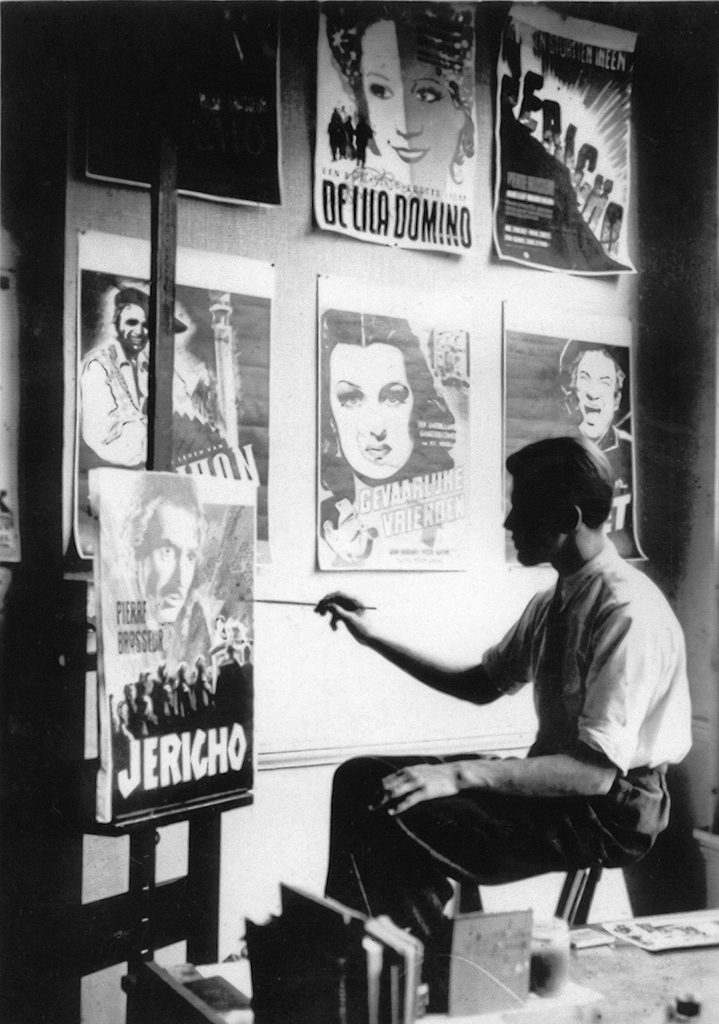
After the war, Werner found work quickly. His first commission as a designer came from a grocer in Wassenaar: he was paid 80 guilders for a letterhead design, including printing. Other local shopkeepers followed, but soon “someone told me I’d better move to Amsterdam if I wanted to become a real professional.” On the day he arrived in Amsterdam, Werner found a room to stay and a job, too, at Keman & Co’s advertising agency: “Each week I had to produce a poster for Nederland Film, the distributing branch of the Tuschinski group of theaters. I had to show up in their screening room at Hobbemastraat, they told me to sit and have a glass of cognac, smoke a cigar, and watch a movie. I was just 20 years old. At the end of each preview session I was handed a short stack of film stills before they sent me off to design the promotion poster.”
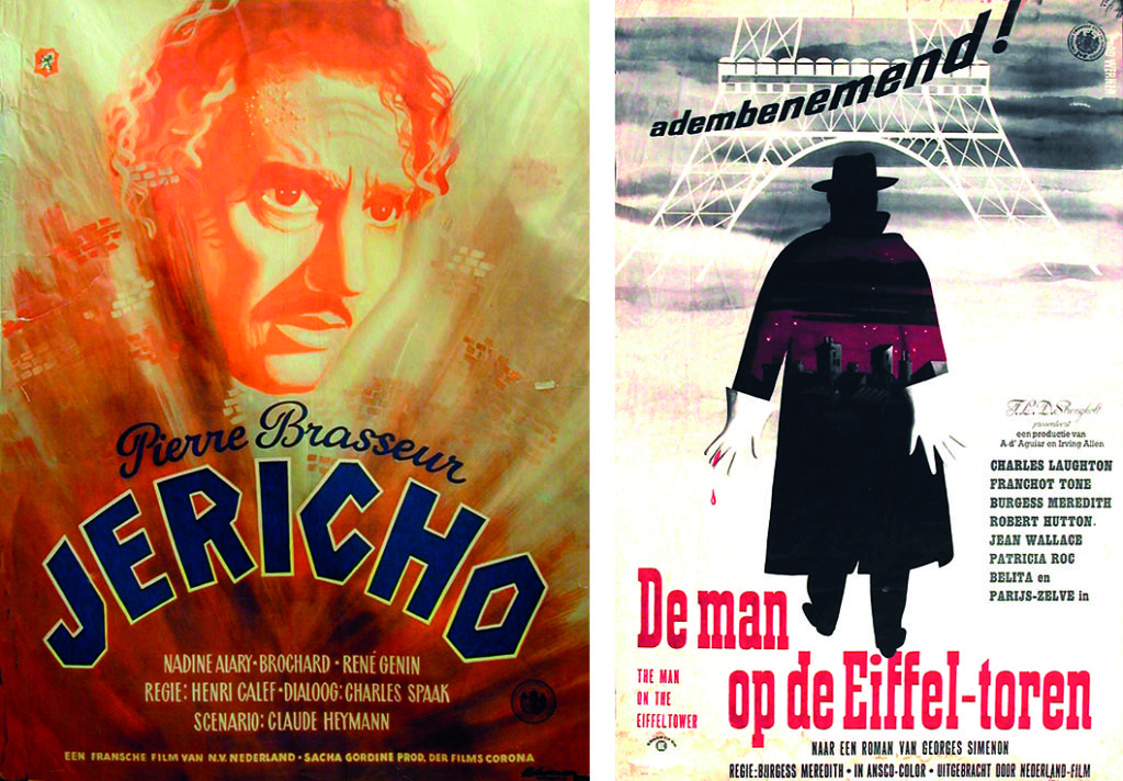
His first poster design was for director Henri Calef’s 1946 film Jericho with Pierre Brasseur in the leading role. He created a 70 cm x 50 cm oil painting and hand-painted all type as well. “I took my painting to Frits Strengholt, Tuschinski’s ‘king’, who looked at it and said, make me another one. I made three more proposals before Strengholt was ready to make a decision; he chose the first one. I had passed the test. From then on, I couldn’t go wrong.”
Werner admired the French designers René Gruau and Raymond Savignac. “They, and Saul Bass too, were artists whose style I emphatically did not want to copy. But I had to learn that there was no escape. The film business cannot avoid clichés. You have to work with the expectations of the general public because your design has to pull them to the theater.”
Werner found a pleasant work climate at Tuschinski. “Mister Van Leeuwen was head of the publicity department. One day he called me into his office to discuss a design I’d done for a Jane Russell movie, because Strengholt was too busy. I had painted Jane wearing a, for those days rather minimal, bikini. Van Leeuwen shied from taking responsibility and went over to Strengholt. He came back with a big smile and told me that mister Strengholt was ‘very excited’ and had given his fiat. I enjoyed working for Tuschinski, although I knew I was somewhat unfaithful to my high-minded art education.”
Paul Schuitema did not appreciate Werner’s work for the movie industry. “He’d seen my first posters, for Jericho and for La Belle et le Bête (1946, Jean Cocteau), and decided I’d gone crazy. He took the trouble of traveling to Amsterdam and go to Tuschinski to complain. Later, Strengholt reported to me that Schuitema had told him in harsh words that it wasn’t done, to commission someone who had graduated from a Bauhaus education to design such ‘rubbish’. Movie posters, bah! The academy has taught me a lot, but those Bauhaus apostles were wearing blinkers. It was their way or the doorway. Cartoons and comic strips were forbidden – movie posters were damned.”
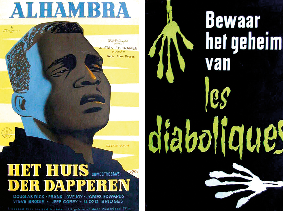
Away from the academy Werner’s work was recognized and well appreciated. In 1948, art critic A. Glavimans wrote in Elsevier: “Wonderful posters, inspired by French fashion designs, yet clear and animated. What else could you want?” Between 1946 and 1955, Werner created more than a hundred movie posters in two or more colors and a variety of styles; scores of these are kept in the Film Museum’s collection. During a lecture at Amsterdam’s Vrije Universiteit, Werner talked about his poster design and he recalled that Maurits Aronson, the founder of Prad advertising agency into which also Keman & Co had merged, had once told him: “To be effective, a design has to put out some bait that cannot be ignored. It is not your style that should be decisive. It is about who you are communicating with.” Werner would never forget the advice; it was to be his lifelong motto.
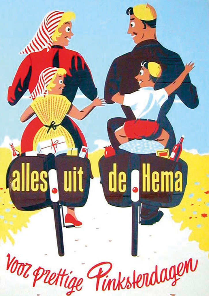
HEMA
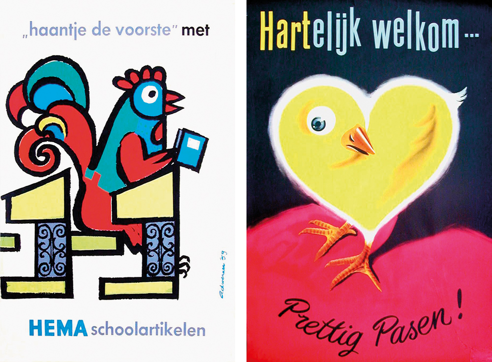
When at Keman & Co, Werner also designed posters for De Bijenkorf department store. A few years later, after starting his own studio together with colleagues Cor Sinkeldam and Han Groot, HEMA knocked on his door. Werner: “HEMA and I, we were a good match. My philosophy was: does Aunt Jo get what I’m doing? Aunt Jo was my wife’s aunt and she helped my wife with housekeeping. She became my test audience. If she didn’t understand what I presented, I threw it out. I designed for a mass audience, not for museums.” Yet Werner was very proud that Willem Sandberg, the Stedelijk Museum’s director, once decided to show his HEMA posters on banners outside the museum – these sweet-looking promotions of back-to-school products, or just wishing everyone Happy Holidays. Based on his work for HEMA, other retail companies came to Werner for poster design: Végé for instance, and Priba (Belgium).
From 1955 on, HEMA was Werner’s most important client. He designed their packaging; he redesigned HEMA’s logo (in 1960). Werner: “It was HEMA, HEMA, HEMA, day in day out. One day, I decided it was enough. Then, ten years later, they came knocking on my door again. Could I redesign their logo one more time? It set me thinking. In the end I decided to advise HEMA they should keep the logo as it was and to adjust only a few minor details. They agreed. Years later the type was adapted, simplified.”
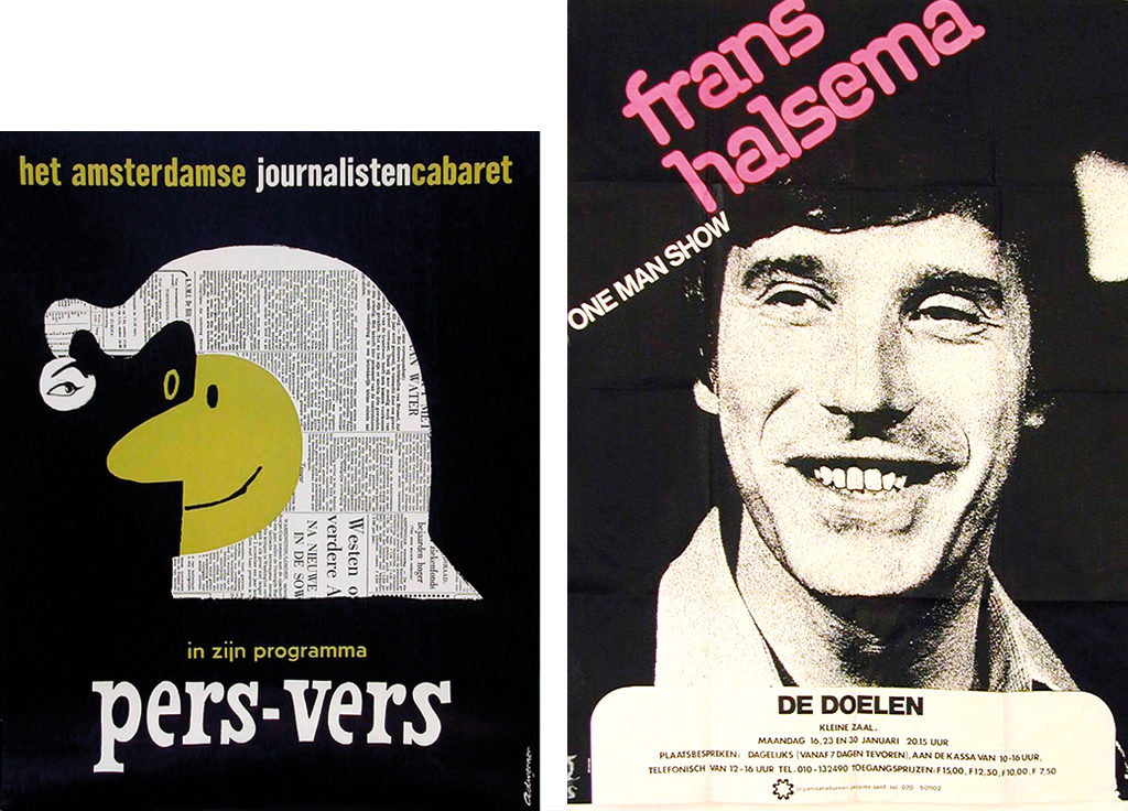
A free-lance designer from the late 1950s on, Werner found himself surrounded in Amsterdam by left-leaning journalists and politicians; he became a member of the Amsterdam Journalists’ Cabaret, and he designed their decors and posters, including (in 1960) the well-recognized ‘Pers-Vers’ poster (a wordplay on ‘fresh from the press’ and ‘perverse’). Hedy d’Ancona, the future Dutch government minister for culture at WVC, was also a member of the cabaret; they would remain friends forever. Werner would design posters for other cabaret groups as well: for Eric Herfst, Jasperina de Jong, Frans Halsema, and for Peter Faber.
Type
A co-director at Keman & Co was a handwriting specialist. He inspired Werner to create type; in the end he had added twenty-four different fonts to his oeuvre, including one especially for the Succes diary that was to be used by many other clients, too. “Type design creates strong ties between a client and his designer. If the client likes it, he can’t go to another designer. This happened with Succes and also with the Geïllustreerde Pers (GP – magazine publishers).”
His ‘Hadassah’ type was originally designed for a birth announcement. He re-used it for the Opzij feminist magazine. “It was also used by quite a few dental technicians. I never understood why,” smiles Werner. From 1970 to 1978, his ‘Dubbeldik’ type was successfully used for the Rijam diary. Its publisher wanted to expand their youth market and Werner took the diary away from its old, conservative approach; he introduced photos of pop stars, and cartoons and comic strips. “I didn’t have to research what young people liked. I had them at home. I knew how to hit the right chord.”
More than eighty book covers were designed, for a range of publishers. Werner created covers for the Sigmund Freud series published by Boom publishers, but became better known for his ‘popular’ designs for GP magazines such as Margriet, Pep, Viva and Nieuwe Revu. His design of a serial version of the bible was much talked about, too; for these weekly ‘episodes’ he used his ‘Dubbeldik’ font. In the end there were seven volumes and on each volume’s spine one letter was printed in gold; together, the seven spines would form the words ‘de bijbel’. “A marketing trick,” said Werner, “to push the public to buy the whole series.”
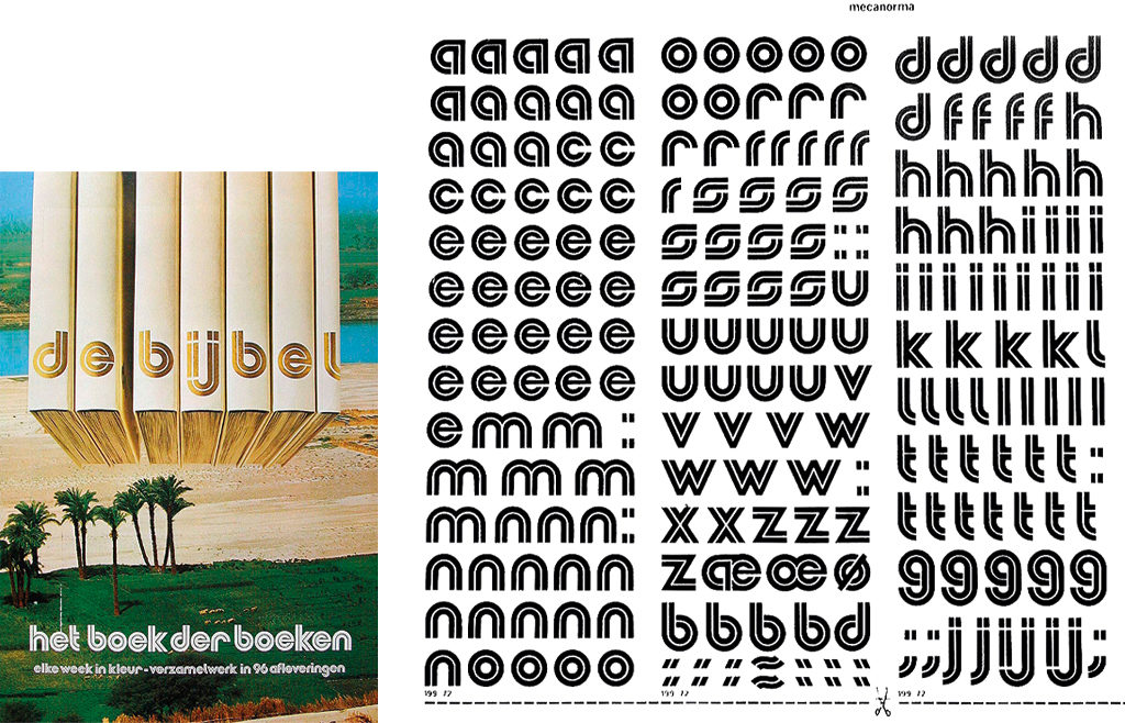
In 1972, the ‘Dubbeldik’ was published by Mecanorma and became an international hit. The font had a futuristic businesslike character that proved to be an ideal instrument for logo design. ‘Domenica Sportiva’, the Italian TV sport show, made use of it, as did Charles de Gaulle airport on its hangars in Paris. “The font didn’t get me huge amounts of regular income but lots of recognition including an international award that came with 10,000 guilders and a huge party at Schiphol airport in Amsterdam.” Werner didn’t sell the copyrights to his clients; he leased them out for a yearly payment. His type for Margriet magazine, the ‘Rochetta’, named after the Italian mountain village of his summer home, was used for more than ten years and eventually got Werner more income than the sale through a type library would have brought.
Magazines
“I spent so much time at GP… One day, I met Joop Swart, who was called ‘the magazine doctor’, somewhere in a corridor. He was carrying a whole stack of design proposals for GP’s Knip magazine, a publication on do-it-yourself fashion (knip= cut). Show me, I said. I didn’t see anything that made sense and told him so. Give me an hour, I said. And within that hour, before the meeting started, I had produced a logo in which the ‘K’ of Knip was used in such a way that it formed a pair of scissors. The original designers, GP staff, were fuming. We’ll use it one year, they said, but fifteen years later the logo was still in use.”
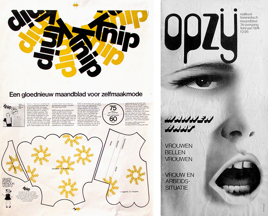
Werner came up with names for products or publications as well. For the daily newspaper NRC Handelsblad he found a fitting name for its youth section. When in 1972 the movement ‘Man-Vrouw-Maatschappij’ (man, woman, society) wanted to establish a feminist magazine, they asked him to help out. “Why me? Because they didn’t have suitable female expertise in their group,” Werner says with a smile. At the first meeting he suggested the name Opzij (stand aside). “In its first years of publication, I did everything. Illustrations, cover designs, typography, everything. I didn’t get paid – idealism drove me. It was time for women to have a voice.” After a recent redesign, the magazine has lost some of its uniqueness, alas.
The little Mexican
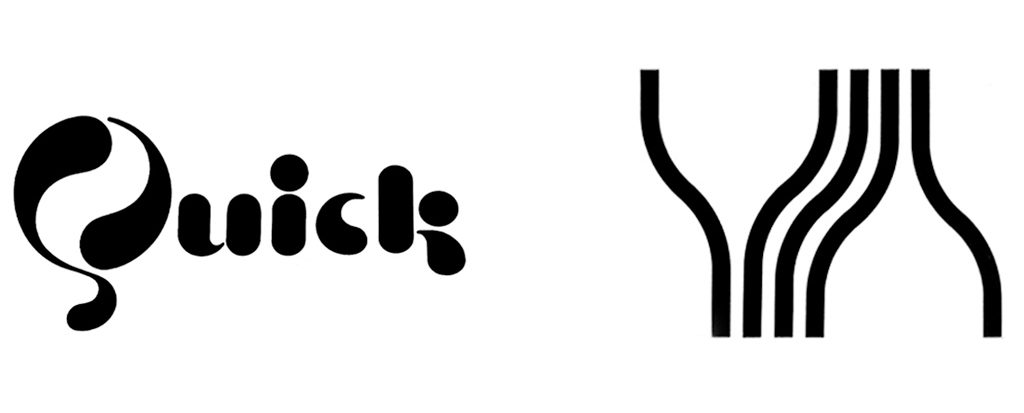
Many companies and organizations carried a Werner logo. HEMA, of course, and also Quick (a sports brand), Royal Leerdam (glass) and many hospitals. But most famous became ‘the little Mexican’, the mascot he designed for Caballero cigarettes. He also showed up in all Caballero promotions and advertisements, not riding a horse, but zoomed-in on the upper body, the moustachioed face and the sombrero hat. “No one could forget what the little Mexican stood for.”
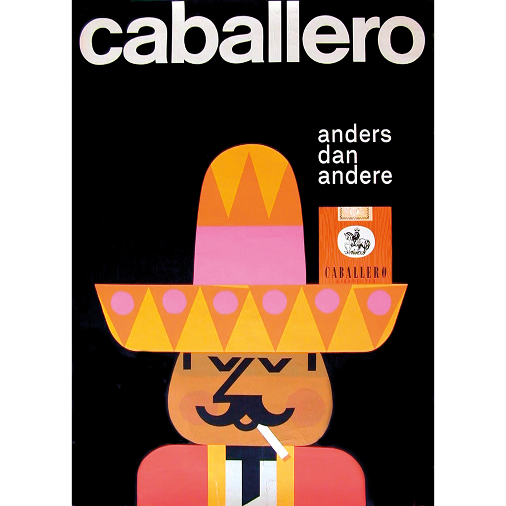
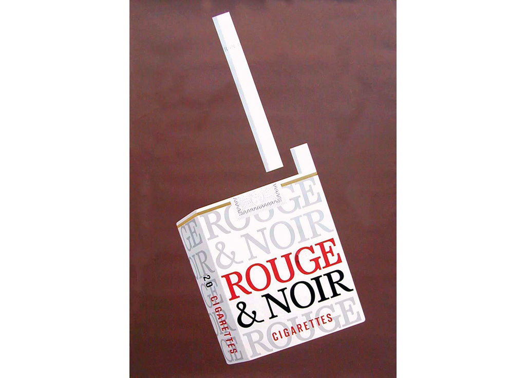
For a promotion film directed by Ronald Bijlsma (in 1964) Werner sketched fifteen scenes. The little Mexican approached on horseback, his sombrero happens to hit the moon and he literally falls to pieces. Five times he rises from the dust in a new shape but finally the little Mexican returns. The film, made for theater screening, received an important advertising award. After the award show, Werner could never get his hands on the award statue again because the director had claimed it to take it home. The cigarette producer, Laurens, asked Werner to design the logo and packaging for a new cigarette brand, Rouge & Noir, but it never reached the market. Werner’s contact person at Laurens, Nick Holwerda, would later introduce him to Brocades Stheeman & Pharmacia (later named Brocacef).
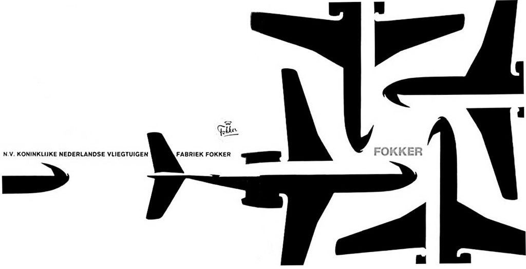
Fokker
Vaz Dias advertising agency put Werner in touch with Fokker aircraft. Werner designed sober-looking advertisements for the F27-500 and F28 passenger planes, to be published in professional magazines. They had an almost abstract design that is described in Dutch Type (2004, edited by Jan Middendorp) as expressing a similar esthetic vision as Wim Crouwel’s and Jurriaan Schrofer’s, “with joyful use of grids and simple geometric forms.”
City of Amsterdam
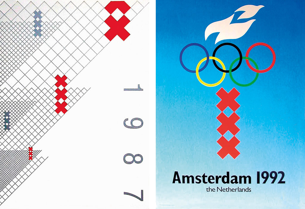
In 1985, the City of Amsterdam wrote their list of demands with regard to a new identity program in which the three Andreas crosses of the old city arms had to have a prominent position. Five design studios were invited to submit proposals, including Total Design. Ad Werner also participated; his design was chosen – it was based on squares that could be applied as a grid in all presentations of the city. Werner used the Helvetica for type and made heavy use of the colors black and red; the red Andreas crosses joined the 45-degree grid nicely. The design proved to be enormously versatile.
Later, the city’s mayor approached Werner and asked him to design the campaign supporting the bid of Amsterdam for the 1992 Olympic Games. Of course, the three Andreas crosses dominated Werner’s designs for Olympic posters and print; with flames and Olympic rings added, they happened to form the Olympic torch. Unfortunately, the International Olympic Committee did not favor Amsterdam. Werner missed out on a dream commission.
Citroën
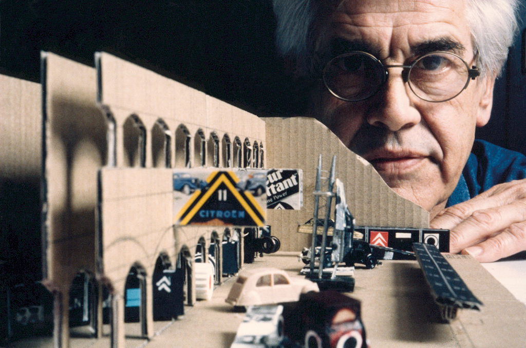
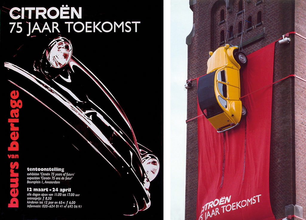
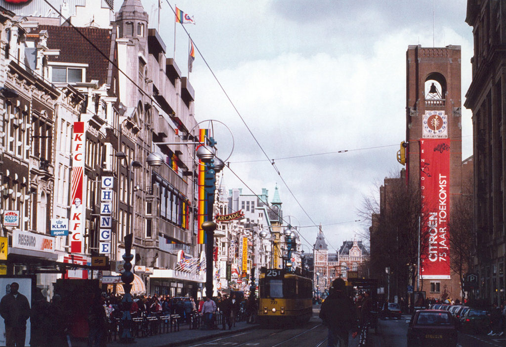
1994. Werner was involved with the huge jubilee exhibition ‘Citroën. 75 years of future’ in the Beurs van Berlage, in Amsterdam. “I came up with the slogan and this text was used in all kinds of publications and presentations. The exhibition design was an enormous project, but great fun.” For two posters, Werner used shadowy photos of the Citroën DS and the newly introduced ZX. He tried out his exhibition design with mock-ups. Photos and drawings from Citroën’s archives were hanging high above the vehicle models on show. A real, canary-yellow 2CV was hanging high up outside, on the building’s tower. The exhibition was hugely successful and resulted in commissions of two other exhibitions, designed together with Ton van der Spruit: ‘Reclamehelden’ (heroes of advertising, 2000) and ‘Harley Freedom Forever’ (2001), both also in the Beurs van Berlage.
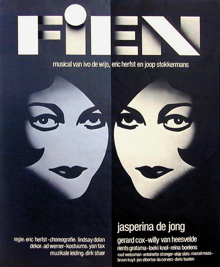
Later in life, Werner retired from daily studio involvement; his sons Yorick and Leander continued the creative business. They designed a logo and identity program for the Concertgebouw (2007); and together with Ad assembled a book of his designs, paintings and sculptures. His cartoons and comic strips for the daily newspapers NRC Handelsblad and Het Parool were published in one volume; and his drawings for ABN Bank, to attract a younger crowd of clients, were published with his type design, the ‘Tuxedo’, on the cover. This type was also used on the poster for the musical Fien (1982) in which Jasperina de Jong starred. “Such a classy lady,” smiled Werner. “She deserved the classy ‘Tuxedo’ type.”
‘Rochetta’
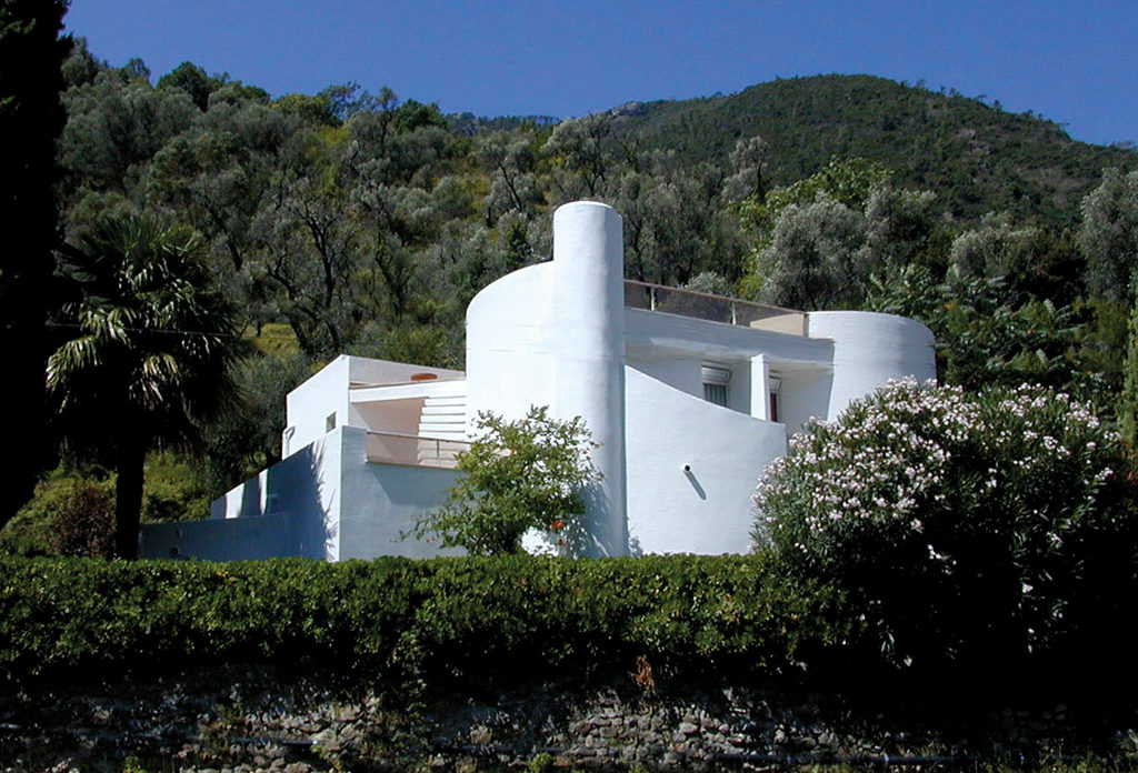
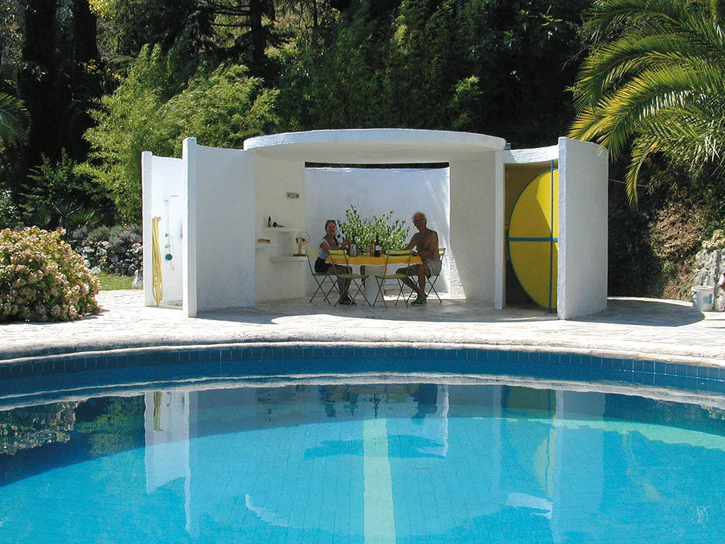
In 1967, Ad and his wife Willy Werner bought land in the Italian mountain village Rochetta to build a summer home. He designed the house as a sculpture. The problem was, the village builder didn’t have much experience with building unconventional homes; in the end, Werner had to contribute many days especially on the execution of more complicated tasks. In 1978 he built his own studio and used barn wood, drift wood and rocks that had previously functioned as pavement of village roads. Over time, pathways, a pond and a swimming pool were added to the property. He designed tables and chairs as well. The house has rounded corners and is beautifully situated between olive trees on a mountain slope. Of course, Werner designed a book about his summer home; he created a new type for the book, the ‘Zero’ (1974). Essays were contributed by the poet-philosopher Eldert Willems, the architect Tijmen Ploeg and the graphic designer Karin Daan.
Jan Middendorp insists in his book about Dutch type that Ad Werner’s influence on the Dutch graphic world of the 1970s and 1980s matched that of the larger studios, Total Design and Tel Design. Yet Werner’s name is less well known. Middendorp even called him an outsider. Well, maybe not: Werner taught graphic design for twenty-two years at the Royal Academy of Art in The Hague (evening school). He was one of the guests in the national ‘Young at Heart’ event, where students and starting designers were given the opportunity to ask questions to senior designers. His pragmatism and no-nonsense approach of projects were highly appreciated, maybe more so than they were in previous times. Werner kept underscoring that “it is all about communication, not about the artist. Whatever I design, a house, a poster, a font, comic strips – I have to come up with a solution of a problem. Thinking about the problem and the solution is just as joyful a part of the design process as the eventual production. All these things together make me happy.”
Ad Werner
born on 23 September 1925, Leiden
died on 17 June 2017, Amsterdam
Author of the original text: Paul van Yperen, October 2009
English translation and editing: Ton Haak
Final editing: Sybrand Zijlstra
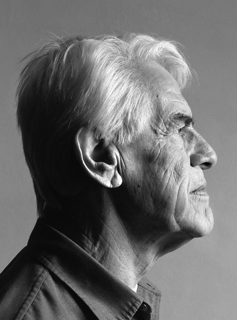
Portrait photo: Aatjan Renders