Henk van Stokkom is one of the grand old men of the Dutch graphic industry. For thirty-seven years he worked for the Eindhoven printing house Lecturis, at first as a management assistant, later as a deputy director, and his last four years as their commercial director. It was under his wings that Lecturis became the leading printer of high-quality art publications. His strength was his capability to unite people and to promote graphic professionalism. He never tired of driving all over the Netherlands to discuss projects with clients, many of whom were graphic designers or museum directors and curators. He also took Lecturis to England and Scotland. In later years, Van Stokkom played an active role in the improvement of Eindhoven’s cultural climate. His importance was recognized; he deserved the honors he was awarded; he can look back on a successful life.
In 1993, Van Stokkom received the ‘Grafische Cultuurprijs’. The jury described “the task” he was set to carry out in his life: “Aiming for the highest possible quality, he saw it as his duty to unite the industry, designers and artists. He himself remained in the background: he organized and he inspired. To create new connections, to convince people, to stimulate a mutual respect: of the craftsmanship of designers and artists on the one hand, and of the clients on the other.”
The young Van Stokkom was not much interested in art and design. He attended a military school in England and from 1947 to 1949, as a first lieutenant, served in Dutch army intelligence in Indonesia. Back in Holland, he started looking for a civilian job. A letter from Prince Bernhard sent to all ex-servicemen promised his support with finding a workplace. That was the last he heard from the prince. A future career at Philips came to a dead end after the first interview, during which he had felt treated without respect. In December 1949 at last, through his fiancée and later spouse Hetty, he found a job at Lecturis in Eindhoven. “The director, Van de Westelaken, was looking for a sparring partner, someone who could listen and who could come up with ideas.” Van Stokkom was hired as a management assistant and sent out into the field. He loved being in touch with all kinds of people. It was the time that Van Stokkom drove to Amsterdam often, to visit museums and to talk to designers. He was one of the first in the graphic industry who took the initiative; it helped to put Lecturis in an advantageous position.
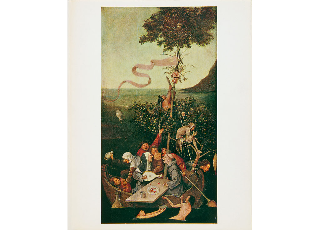
In 1952, Van Stokkom was appointed deputy director; he was empowered to make price commitments and sign contracts. “I had to deal with board members and managers, also at museums. I had to be able to make on-the-spot decisions.” The vison of Van de Westelaken paired with the never-ending dedication of Van Stokkom pushed Lecturis to a leading position in the field, with clients such as DAF, PNEM, Grasso, Boerenleenbank, and Van Abbemuseum. More clients, a larger staff, the highest standards: Lecturis began to receive commissions from international art museums. One of the first giant projects was the catalog of the Jheronimus Bosch exhibition in the Noord-Brabants Museum in Den Bosch (1967). Lecturis was asked to deliver 5,000 copies before the official opening of the exhibition, but they sold out so quickly that a day later already they had to start a 5,000 copy reprint. Later, a third run (of 10,000 copies) had to be printed.
Brothers and competitors
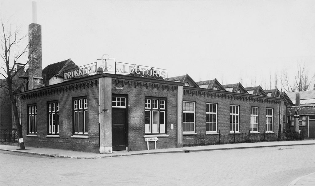
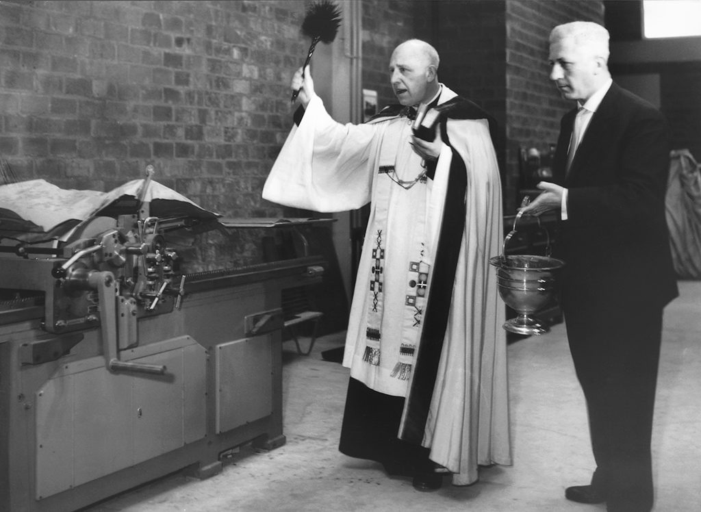
The company first started growing after, in 1960, Lecturis moved to a new building and Monotype typesetting came available. Lecturis had been founded in March of 1922 as an international bookstore and publishing company by B. Kessels, who also owned the famed Eindhoven bookstore Van Piere. On November 16, 1940, the company added a printing shop and became: Drukkerij & Uitgeversbedrijf Lecturis nv. The company started at the corner of Zwembadweg and Paradijslaan in Eindhoven, a location that soon proved to be too small. Adding space could not be realized: the city council did not approve the Lecturis plans, on the contrary, they wanted to tear the building down eventually to create a green zone. In the end, Lecturis could acquire a piece of land near Montgomerylaan. The new building came available on January 15, 1961. Within two days all typesetting machines, printing presses and bindery machines were moved in and installed. On February 11, 1961 the official opening followed – the building was blessed by the local parish priest, Bergmans.
Years earlier, after long research Lecturis had set up their own machine-setting department. After researching Ludlow, Intertype and Monotype, they had chosen for Monotype’s versatility. Its quality was recognized by many designers. “On a certain day,” remembers Van Stokkom, “a tall designer came to visit us. A bearded man dressed in a thick wool vest who told us: ‘I am here because you have Monotype, a system so much better than Linotype.’ The bearded man was Teun Teunissen van Manen, who was head of Weverij De Ploeg’s design team, in Bergeijk. It was the beginning of a long and fruitful collaboration. Teun introduced me to De Ploeg’s director, Piet Blijenburg, who at the end of a pleasant conversation told me: ‘We are brothers in the fight for quality. Do you want to do our printing jobs? I don’t need estimates or a tender, I merely want to see your costing figures if I ask for them.’ He never did. Of course we did not want to destroy his trust by charging even one guilder too many.”
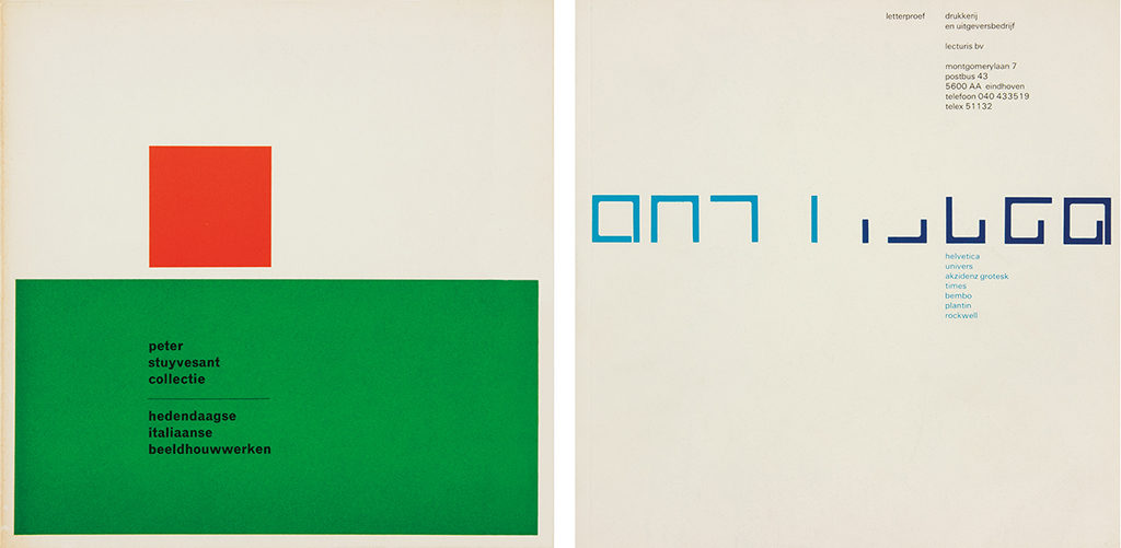
The Monotype Grotesque 215 (Akzidenz Grotesk) especially was a great success. Designers such as Crouwel, Sandberg, Unger, Van Toorn and Cornet had Lecturis typeset thousands of columns with this type. Lecturis used the Grotesk long before the derivatives Helvetica and Univers came available. Teunissen van Manen had asked Lecturis to make adjustments to two letters of the original 215 font; together they found an English company to do it.
Paradise Brabant
Van Stokkom has the best of memories of his collaboration with the photographer Martien Coppens in the 1960s and 1970s. Coppens, although hardly understood in the northern part of the country, was an icon in Brabant. He documented churches and cathedrals, farm families, “the people of the region.” He hoped to see his extensive archives published. Lecturis and Coppens found each other; in 1962 Lecturis published their font catalog which many pages of images shot by Coppens on the theme of craftsmanship. In the same year, the book Eindhoven was printed (photogravures of the illustrations were printed in Leiden). The text was written by Lambert Tegenbosch and the Lecturis in-house designers Baer Cornet and Jacques Peeters under the watchful eyes of Coppens himself took care of the book’s lay-out.
In Paradisum, photography Martien Coppens, design Baer Cornet and Martien Coppens, 1965
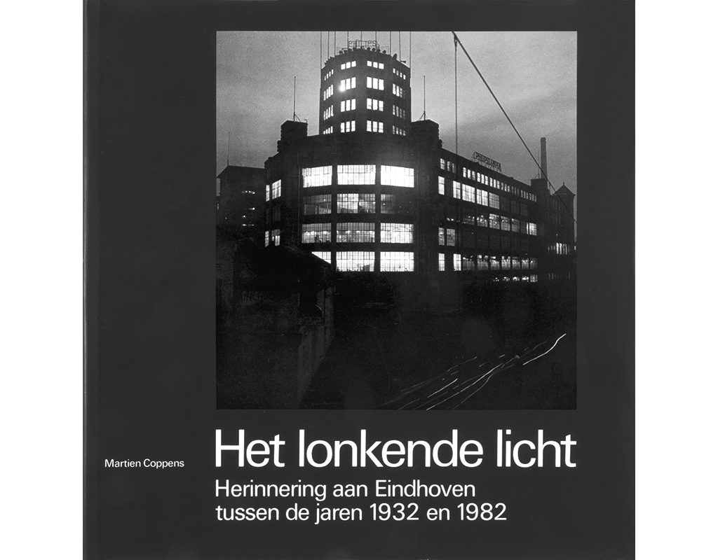
In later years, a committee was formed by Coppens and Van Stokkom as board members, with the Volkskrant-journalist Cor van Heugten in the chair, to promote the publication of Coppens’ work. Lecturis became its printer and publisher. Many books about the city of Eindhoven and Brabant Province would follow: Het Stadhuis van Eindhoven (1970), Het Landschap van De Dommel (1977), Rondom De Peel (1979), Leven in Geloof (1980), Het lonkende licht (1982). Baer Cornet and Piet van Meijl would design them.
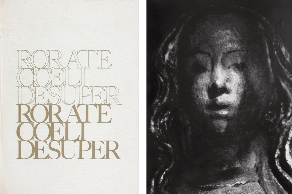
Coppens documented the importance of the Roman-Catholic Church and religious life in Brabant with such power that his photography was selected by Lecturis for use in special publications. On the occasion of their move to the Montgomerylaan, they published Rorate Coeli Desuper (1961), a small run of 500 copies. The images, by Coppens, illustrate the intense love with which in the Middle Ages pictures of the birth of Jesus were needle-worked into chasubles. Anton van Duinkerken wrote an essay to accompany the photos. Van Stokkom: “Martien had discovered the magnificent needlework of a chasuble in the church in Heeze. Enormously expensive, hardly known. The church used it only at Easter. Martien had taken wonderful close-ups. The details looked as if sculpted.” In 1965, a memorial publication on the occasion of 25 years of Lecturis publishers and printers was also centered round photography by Coppens of an aspect of religious life: the altar of St. Anthonis Church. The book was titled In Paradisum. Baer Cornet did its design and lay-out.
Confidentiality
Lecturis printed confidential publications for many clients. Philips had all their commercial print done by the Eindhovense Drukkerij, but on purpose chose to work with Lecturis when confidentiality was of importance. Rabobank (previously named Boerenleenbank) also chose Lecturis, for instance for the production of their interest tariffs. Van Stokkom: “I could have profited from the advance notice, but never did, of course. It was all about trust.” Trust was the word also with regard to the Rabobank’s annual reports (most of which were designed by Mart Kempers). “We’d be done by July 1 and until the publication date, no printed page, not even a fragment, left the building; even the proofs and other waste from first runs were collected for secure storage. From February on we even cancelled tours, to keep nosy people away from confidential print.”
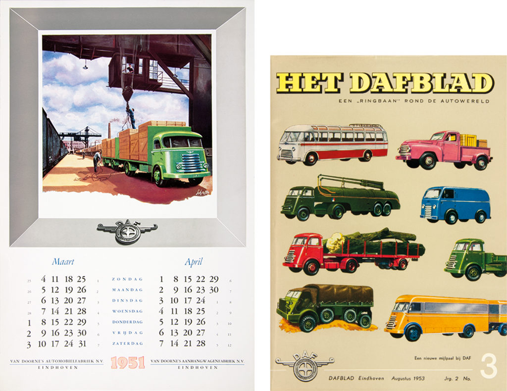
Another important client was Eindhoven truck and car maker DAF. Van Stokkom remembers that, at the time DAF was to introduce their first passenger vehicle, the ‘Daffodil’, he had to escape from media attention. “DAF was test driving camouflaged Daffodils. We were producing all their introduction publications. No one was allowed to enter our building.”
The same language
Van Stokkom’s career paralleled the blossoming of the graphic design profession. “Previously, the client and the printer hadn’t needed an intermediary. In later years, the printer had to deal with the designer. A positive development, also because the designers introduced their clients to the printers of their preference. We at Lecturis saw many new clients; my job was to convince them that we were indeed the ones to collaborate with. My position wasn’t the easiest: I had to sell a product that wasn’t there yet. What I sold was trust and goodwill.”
Meeting graphic designer Gerard Schouten resulted in printing the DAF quarterly magazine year after year. Schouten became DAFs in-house designer and Lecturis printed their calendars and memorial publications (they even bought new machines especially for DAF productions). Teun Teunissen van Manen introduced Lecturis to Weverij De Ploeg and furniture maker ‘t Spectrum. Benno Wissing (Total Design) connected them with Ogem, for which they printed annual reports. Turmac came from Wim Crouwel (“We printed all those splendid catalogs for the Peter Stuyvesant Collection”). Jan van Toorn introduced Lecturis to BBKB, the Dutch government’s department that promoted Dutch culture internationally, and to the foundation that organized the Museumjaarkaart, the “passport” to all Dutch museums. What also contributed to their success was that Lecturis started creating their own in-house graphic design staff at an early time. “We learned to speak the same language as the freelance designers. Our in-house designers also worked for clients who had no knowledge of graphic design.”
Jacques Peeters was the first one to join Lecturis; he had previously worked for a typesetter/printer in Venlo. Peeters excelled in keeping the discussion going between external designers and internal printing staff. He was followed as in-house designer by Baer Cornet and Piet van Meijl. All three were on the receiving end of many awards for their typography. In the 1950s, before design studios came up, designers like Crouwel liked to work with Lecturis because they could delegate tasks to the in-house designers.
Of the many clients Lecturis kept a long-lasting working relationship with Van Abbemuseum, Museumjournaal, and the technical college in Eindhoven (later Technical University Eindhoven, TU/e) stood out.Herman Rademaker, a design teacher at the Eindhoven academy of industrial design AIVE, was the one who connected Lecturis with these clients. “We had printed for Herman, who had the foundation that conserved Brabant’s fine crafts as a client. Most often we would meet at his former tollhouse home in Vught. I knew I had to arrive exactly on the set time. But I never knew when I would be allowed to leave, it could be four in the afternoon or two o’clock in the early morning. Herman worked for Van Abbemuseum where Ely de Wilde was the director. We printed catalogs including small catalogs of French art, Van Gogh, Dufy and others. De Wilde was an eccentric client. At one time, he wanted something printed in ultramarine blue. I strolled to the museum, which was within walking distance, and showed him the proof. De Wilde screamed: ‘You don’t understand anything, this is all wrong, clean the stone, I want to mix the color myself.’ He started to set up a color, and another one. No easy task. Soon a smudge appeared on his neat costume. Then a printer told De Wilde: ‘Sir, you have to add a little orange.’ De Wilde reacted angrily, grabbed his stuff and legged back to the museum. I followed him with the proof we had mixed, presented it for his approval, and he said: ‘See, I had to do it myself.’ That was the moment our friendship started. I could never do wrong.” After De Wilde had left for Stedelijk Museum in Amsterdam, Van Stokkom continued to work for Van Abbemuseum; with its subsequent directors Jean leering, Rudi Fuchs and Jan Debbaut he produced some of the most memorable publications.
Lecturis was Van Abbemuseum’s printer for more than sixty years. “Extraordinary, isn’t it? Such long-lasting professional relationships do not exist anymore. We were able to build a friendship with our clients. And, we were really interested in contemporary art and the specific demands of our museum clients.”
The relationship between Lecturis and the university in Eindhoven dated back to the 1950s. Again, a matter of trust. It all began when Herman Rademaker designed the university’s curriculum catalog, which had to be printed in the letterpress of the day; it was a fat toke of a vademecum full of names and descriptions. They were always late with delivering the texts. “We had to keep on a small staff during the summer months specifically for this job and we’d have the binders on stand-by in the last week of August.”
Herman Rademaker and later Jacques Peeters designed the cover and the typography. “Our Monotype typesetting stood out. More than once we were honored for our work by the CCPNB, the collective promotional organization of books in the Netherlands; we received Best Book awards and favorable critique such as, in 1961: ‘This publication tells us what can be accomplished if one is satisfied with applying a minimum of carefully selected typographic tools, in this case a small corps with italics only when a certain differentiation is needed.’ The catalog was printed until late in the 1990s when the printed version had to make place for the web version.” In 2006, Lecturis printed a small TU/e encyclopedia, again a rather fat toke, which gives account of the university’s history.
Sailing the seas
Printing catalogs for Van Abbemuseum and Stedelijk Museum made Lecturis get international recognition. It was Rudi Fuchs who advised Van Stokkom to pay a visit to Whitechapel Art Gallery, where Nicholas Serota (later of the Tate Gallery) was the director. Esther van Royen, who was an advisor at Waddington Galleries, introduced Van Stokkom to several important artists. “I had first met her at an opening of an exhibition at Stedelijk Museum. She had heard about the high quality Lecturis produced. She was working on a new catalog for the Waddington and wanted to see me the next day to discuss the project. We got the job and many more after we’d delivered this first one.”
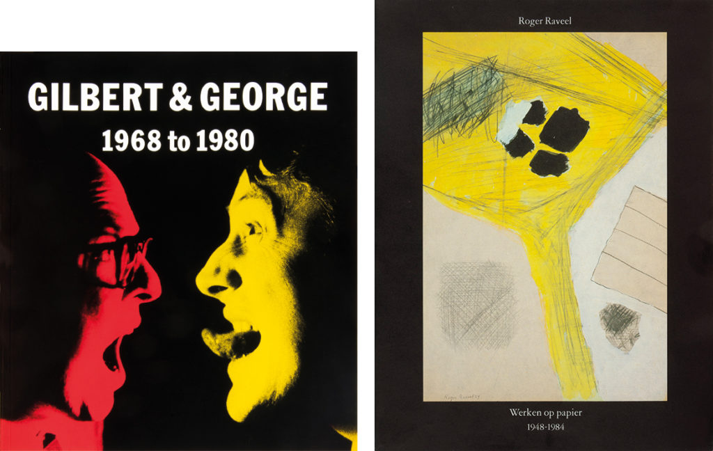
Van Stokkom was entering a new impressive world. Through Serota and Jaap Bremer, a curator at Van Abbemuseum, he met the artist duo Gilbert & George. “They lived in a magnificent Huguenot house with wood wainscoting. In the center of a room stood a table with a zinc bowl filled to the brim with ice cubes and champagne bottles. We had quite a few drinks, in the middle of the day. We often had a curry lunch when we visited them; it appeared they had a private room in the restaurant permanently reserved for them.” With more and more business to deal with in London, Serota offered Van Stokkom a space in his Whitechapel Art Gallery; he was able to invite his London clients in his own pied-à-terre. Richard Long came from Bristol to discuss a project. And Serota introduced Van Stokkom at Saatchi’s, in Cambridge and Oxford, and at the Serpentine Gallery.
One thing led to another. Serota’s curator, Marc Francis, was appointed to director of Fruitmarket Gallery in Edinburgh. So, Van Stokkom went to Scotland, where he also met with Graeme Murray, another gallery manager. Via Murray, Van Stokkom met the American landscape photographer Thomas Joshua Cooper, for whom Lecturis would print a uniquely magnificent catalog. “Cooper’s photos were of such intense blackness that we couldn’t use a screen 80 but had to go to screen 110 to get all details. The book was called Between Dark and Dark. Cooper complimented us on the perfect collaboration and the chance he was offered to make corrections in the proofs. American printers were less easy and considerate to work with.”
Lecturis Documentaires
In the 1970s, Lecturis started the publication of their own Documentaires, a series of publications about graphic design and technique. “About themes people, especially professionals, were interested in. No brochures with promotional photos of our building and machinery, but little jewels of print which discussed issues that were meaningful to professionals and their clients. We paid a lot of attention to the building up of our mailing list and if we discovered we’d missed someone, we took care that they received previous issues as well.”
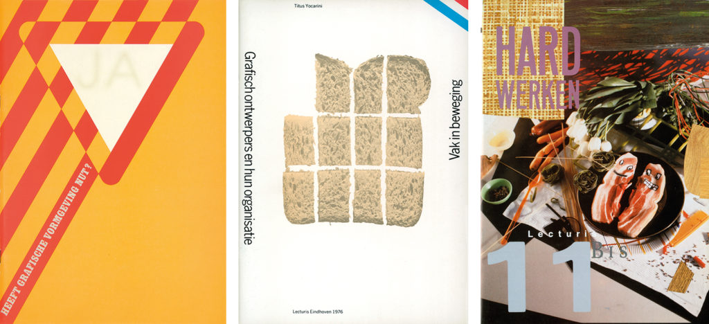
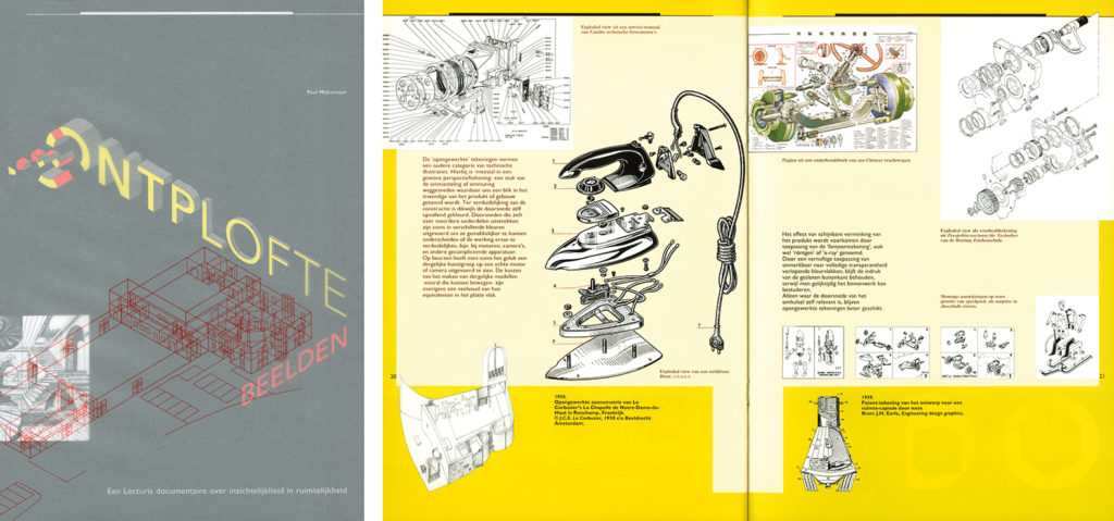
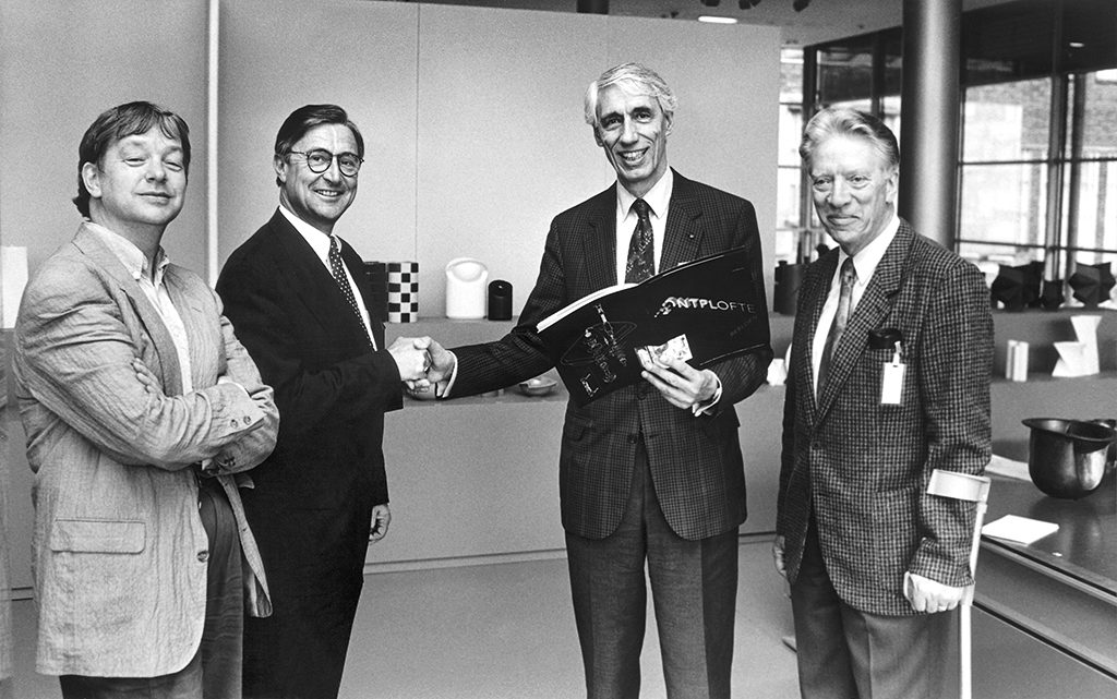
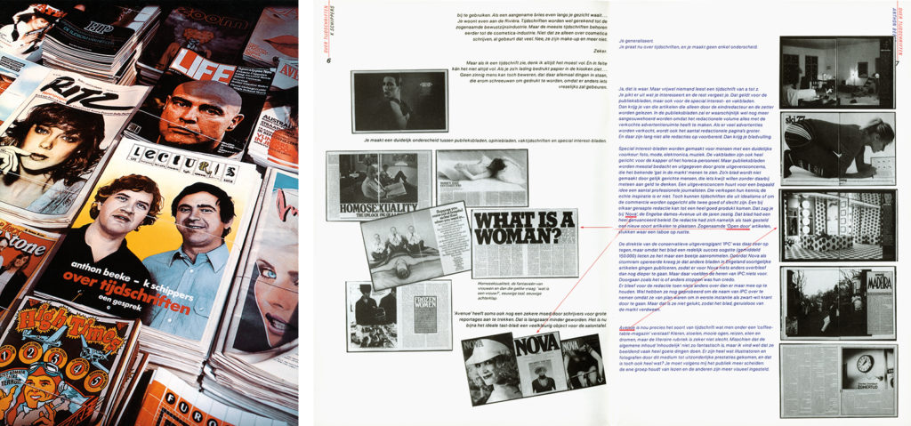
An editorial board was assembled to select the themes, the authors and the designers. The only given was the publication’s format: 32 pages of A4. Editor-in-chief was Wim Crouwel; later, he was succeeded by Paul Mijksenaar. Issue number 21, of 1991, was titled Ontplofte Beelden (exploded images); it marked the changing from the Crouwel to the Mijksenaar regime. It dealt with exploded views of buildings, engines, the human body, with all parts shown in sequence. Crouwel cherished exploded views, and Mijksenaar knew all about the technique. Exploded Views became a favorite of Van Stokkom even though the publication came about after he had left the company. He himself had collaborated with Crouwel and done “the final checking” of all issues that appeared until 1986. Van Stokkom recalls which issues were his all-time favorites: #5 – Vak in beweging (1976, authors: Titus Yocarini and Walter Nikkels); #9 – Over tijdschriften (1979, Karel Schippers and Anton Beeke); #11 – Hard Werken/Wild Plakken (1982, Paul Hefting). But most of all he cherishes #1 from 1974: Heeft grafische vormgeving nut? written and designed by Paul Mijksenaar. In the orange-fluorescent cover the answer to the question “Does graphic design makes sense?” simmers through: “Yes!” Van Stokkom keeps one copy safely conserved in a protective envelope.
There were 800 copies printed at the start. In 1993, Lecturis printed and distributed 4,000 copies of their Documentaires. The publications brought Lecturis much recognition of their quality standards. And they found good use in design education. “All leading academies made their 4th and 5th year students absorb their contents.”
Social involvement
After leaving Lecturis, Van Stokkom put all his energy into the improvement of the cultural climate of Eindhoven. He stood up for needy artists and got involved with the interweaving of creative premises in the city. He was one of the godfathers of the graphic studio ‘Daglicht’ and the artists’ workshop ‘Beeldenstorm’, two initiatives with names that found recognition far across the Dutch border.
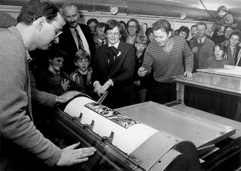
It all started with a group of forty artists/squatters that had taken over a former industrial building at Baarsstraat (previously bookbinder De Wit’s location). The city had taken propriety of the building, but they had not torn it down. The artists settled there to protest against the absence of studio space elsewhere in town; seven graphic designers used the basement for studios and printed a newspaper, Daglicht, now a collectors’ item; other artists claimed space elsewhere in the building. They had no structure, no plans, no organization – soon they needed a foundation to organize, communicate with the world outside their commune, and to keep track of their finances. 1982 was the year the foundation Grafisch Atelier Daglicht (daylight) was founded. Teun Abbenhuis (dean of the Saint-Joris College) held the chair, board members were Piet de Jonge (a curator at Van Abbemuseum) and Henk van Stokkom.
Van Stokkom became secretary of the board and, during his board period from 1983 to 2005, developed all sorts of new initiatives. Most important was the construction on TU/e territory of a new home for the workshop; it became a part of the Meulensteen Art Center (MAC). Museum director Rudi Fuchs officially opened the new buildingin 2001.There were lots of spaces,workshops, offices, archives, showersand sanitary conveniences; there was space for visiting artists too, and a cafeteria for common use. The professionals taught the newcomers how to use the technical (printing) facilities. Maecenas Gerard Meulensteen, the founder of the electronics conglomerate Neways, was most supportive. Van Stokkom: “Meulensteen had noticed the dire straits at Baarsstraat and arranged that Daglicht would find a home at TU/e for forty years without paying any rents. Because he was away from town often, I represented him at construction meetings. You could say he gave me the use of his wallet.”
In the meantime, Van Stokkom also got involved with the founding of a bronze foundry which would become one of the largest and best-known in Holland. In 1992, Ab Hofstee, a former director of the cultural department of the City of Eindhoven, called Van Stokkom: “I am looking at the sculptor Harry Storm, he’s from Sterksel. He has stopped creating things and he has enough bronze foundry equipment to start a studio, and he offers it to us, no pay demanded.” Hofstee and Van Stokkom sat together with Joke Valentijn, Leo van Vegchel, Jan Wils and Joop Kalb (the interim-director of Weverij De Ploeg) and brainstormed about starting a sculpture workshop. Their foundation was called ‘Beeldenstorm’ (image destruction); they started in a painters’ workshop on TU/e property and the first artists they got involved with were Jos Biersch, Hans van Eerd, Jan Wils and Leo van Vegchel. Beeldenstorm grew and attracted many international artists; their seminars, workshops and courses were well-attended. When the Aruba Hall on TU/e land came available, Beeldenstorm moved – the space was too small to also accommodate Daglicht. Eventually, Gerard Meulensteen was the initiator of a new home for MAC and Daglicht next to the Aruba Hall.
The neighbors started working together. They collaborated on the project Gastateliers, which offered visiting artists the opportunity to experiment with graphic techniques or foundry processes. The neighbors Beeldenstorm and Daglicht were connected through Van Stokkom, who had co-responsibility of the whole project. “I was close to the people in the city’s cultural department and managed to get them to co-finance the project. We managed to publish interesting books and brochures and organized exhibitions. I spent long hours with promoting these activities, but in the end, I had to get out, it was becoming too heavy a workload.”
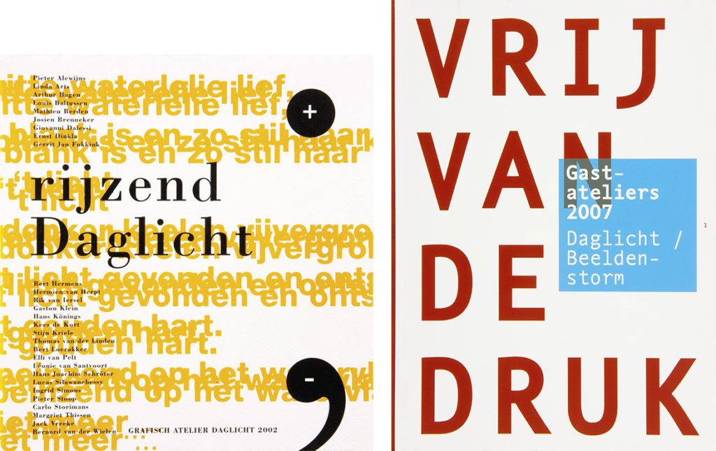
Vrij van druk, visiting designers and artists, design Jan Willem den Hartog, Gastateliers, 2007
In 2007, in recognition of all his input, the Henk van Stokkom Foundation was created, secured by a donation from the Meulensteen Foundation. Gerard Meulensteen donated €2,000 a year for five years to provide a budget for artists and designers to improve their expertise by using the graphic machines Daglicht had installed. Meulensteen always stated how grateful he was for Van Stokkom’s motivation. “Without pushing to the foreground, Van Stokkom was one of the driving forces advancing art in the Eindhoven region. He is trustworthy, and a pleasant man to work with; his engagement stimulated many others. And he stimulated me to get involved and to continue to be involved.”
More fields held Van Stokkom’s attention. In the late 1980s and the early 1990s, he was the chairman of the editorial board of the yearly Kerstnummer van Grafisch Nederland, the traditional publication by the Koninklijk Verbond van Grafische Ondernemingen (KVGO), which connected the Dutch graphic industries and published the yearly ‘Kerstnummer’ as their show piece. In 1993, Van Stokkom himself was honored by the KVGO. Until 1994, Van Stokkom remained involved with the Renée Smeets Fund, the foundation that aimed to facilitate the transfer to employment of industrial design graduates; awards and yearbooks were provided to give them a face. And lately, Van Stokkom was a member of the TU/e’s art purchasing committee.It couldn’t not happen: in 2003, Van Stokkom became a ‘Ridder in de Orde van Oranje Nassau’ – he was knighted, after having received a Gold Medal of the same royal order already in 1986. He is proud of the recognition he received, but he remains unassuming as ever. If you hear him talk, the tone is light; his sense of humor never left him – it was what made so many to trust him.
Henk van Stokkom
born on 3 March 1925, Oss
died on 30 October 2019, Eindhoven
Author of the original text: Edwin van Onna, January 2012
English translation and editing: Ton Haak
Final editing: Sybrand Zijlstra
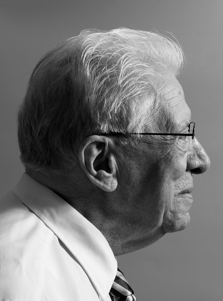
Portrait photo: Aatjan Renders