Although not a designer, Hein van Haaren deserves his portrait to be published in the series Dutch Design Roots. As a leading principal and patron, and as an executive or a director of many organizations and events, he put his mark on Dutch art and design. He is best known for his ten years as the director of DEV, the Dutch PTT’s department of esthetic design (from 1966 to 1976). This was followed by his directorship of Sdu, the Dutch state-owned printing and publishing house, another national bulwark in The Hague, from which he continued to push for the highest quality of design for the Dutch public sector.
It was thanks to Van Haaren’s unwavering yet gracious efforts that Dutch graphic design became a shining model recognized all over the world. In the 1970s, two different traveling exhibitions titled Dutch Design for the Public Sector went to several countries; they attracted an international audience that came to admire the high quality of contemporary design stimulated by the Dutch government. Van Haaren came up with the idea of the first of these traveling exhibitions and was one of its curators; he succeeded to assemble a group of enthusiast backers and to obtain the (financial) support of the Ministry of Cultural Affairs. Van Haaren like few others knew how to effectively work the corridors of bureaucratic power. And, he personally knew every decision maker of importance through his countless board memberships and other side activities in the arts.
Hein van Haaren was never one to boast about his own role, but his contribution to Dutch culture in the second half of the 20thcentury was considerable. He was client, patron, principal, coach, promotor and intermediary at the same time; no one could ignore his influential presence in anything related to art and design. Yet, unassuming as he was, he never dwelled at great length on the complexities he had to deal with when working his way through policy making and bureaucracy.
Born in Herpen, in 1930, he grew up in Hees near Nijmegen in a family not very interested in art. His parents were teachers. An older brother took him along on trips to museums, during which he became deeply moved by religious art. He studied art history at Nijmegen University with religious art as his main subject. One of the professors that influenced him most was F.G.L. van der Meer. Co-students were Wim Beeren, Joop Joosten, Theo van Velzen and others who would, eventually, establish their names in the Dutch art world. In those days, the 1950s, contemporary art was a terra incognita to which neither universities nor museums paid much attention. Students like Van Haaren, though, traveled to Eindhoven’s Van Abbemuseum, where Edy de Wilde had become an inspiring director, or to the Stedelijk Museum in Amsterdam, where the Cobra artist group was presented. They had their eyes wide open, read everything they could lay their hands on, participated in feverish discussions, and enthusiastically welcomed change.
As the secretary of the editorial board of the Nijmegen student paper Vox Carolina and a co-editor of the Student Almanac, Van Haaren participated actively in student life. He coordinated the renovation of a space in a fraternity house that was to be open to male as well as female students. He managed to get Wim den Boon involved, an architect connected to the ‘Goed Wonen’ (better living) movement but controversial because seen as too strict and impertinent: everything had to be white and no rugs or tablecloths were allowed.Van Haaren also asked the young artist Charles Hammes to create a crucifix for the space; his design was rather unusual: Christ’s arms were hanging down. It was the first time that Van Haaren’s diplomacyand persuasive powers were put to the test. His gracious determination would save many an extraordinary work of art in years to come.
In 1956, Van Haaren was appointed secretary of the editorial board of the magazine published by the St. Bernulphus Guild for the promotion of religious art and architecture. He modernized the magazine’s title to Kunst en Religie (art and religion) and changed its direction by inviting his friends and co-students to write articles pledging a more contemporary approach of religious art. After graduating, Van Haaren had already been given the position of assistant-curator at the Aartsbisschoppelijk Museum in Utrecht, the archiepiscopal museum. Other appointments followed: a curatorship in Haarlem, at the Bisschoppelijk Museum; and in Amsterdam, of the Museum Amstelkring (running the ‘Ons’ Lieve Heer op Solder’ monument). There, too, he saw it as his task to create a stir, to shake up the conventions, and to create connections to modern times. And, there he learned how to arrange exhibitions, how to raise funds, and how to promote shows and art collections.
A few years later, Van Haaren was appointed to lead the educational department created by L.J.F. Wijsenbeek at the Haags Gemeentemuseum (Municipal Museum The Hague). Wijsenbeek steered the museum toward modern art and contemporary art. Van Haaren conducted guided tours of exhibitions, introduced information panels throughout the museum, and organized shows especially for children. He was given the opportunity to work with secular art and he took to informing about and promoting new directions in art, such as pop art and minimal art. His department published a newspaper at the occasion of the Nieuwe Realisten exhibition (new realists), curated by Wim Beeren. With his colleague Cor Blok Van Haaren curated the exhibition Taal en Teken (1965) about signs and symbols. Together with Josine de Bruyn Kops he created the widely discussed exhibition New Babylon, in which the artist Constant displayed his utopic vision of urban environments and human creativity. Constant would remain one of Van Haaren’s favorite artists.
Wijsenbeek as a leader was unpredictable and invited many conflicts within his museum staff. Karel Schuurman, the curator for modern art, left (for PTT/DEV). Wim Beeren, too, resigned. Van Haaren was offered the position of deputy museum director but decided not to accept because Wijsenbeek refused to write a contract defining the interrelationship of the director and the deputy director. He left the museum and was invited to become Schuurman’s assistant at DEV.
Mr Stampman
DEV was responsible for all of Dutch state-owned PTT’s manifestations and representations, from postage stamps to annual reports, and for all art in and around its many buildings. Under Schuurman, DEV was reorganized and already heading in a more contemporary direction, with a good eye for experiments. Changing its policies, the department moved from an executive task to a coordinating role, selecting and supervising outside creative talents. After Schuurman died, in 1966, Van Haaren took over DEV and would be its director until 1976.
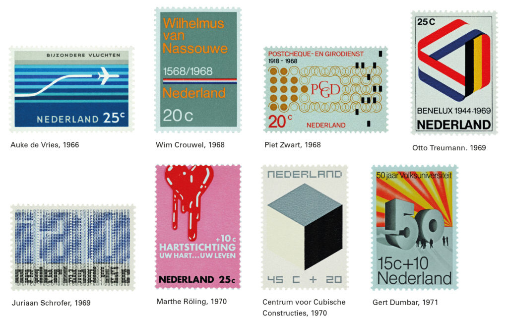
In these ten years, PTT showed turbulent growth; the company was not only responsible for the Dutch postal services and the nation’s telecommunication, but also for its giro bank. PTT employed 70,000 people. Van Haaren had to report directly to the director-general, but to work for and communicate with the directors of all sectors: post, telecommunication, giro, infrastructure, buildings, acquisitions, and materiel; as well as with PTT’s advertising and PR department, PPD. After Schuurman had paved the way, Van Haaren, too, gained respect but still had “to navigate carefully, to deliberate with judgment, and to convince” his adversaries of the importance of an esthetic approach. He described the task he was facing as follows: “The graphic design needed systematic attention to ensure that the postage stamp was seen as representing the quality of all PTT’s services; the interior design was to be delegated to creative external experts; with the development of automation, new attention should be given to industrial design; and new directions should be found for the art projects, including new procedures.”
Van Haaren fought for respect for the artist and the designer. Their role, as he and his staff saw it, was not to continue traditions, but to invite experiments, to surprise, and by doing so to broaden views. DEV stood for the task of bridging the gaps between the creative daring of artists and designers and the often conventional expectancy from within PTT’s different service units. The DEV staff had to fight, indeed: to explain, educate, persuade, and win over; to remove prejudices and other obstacles; with one goal: to create space for art and design.
The times were with Van Haaren: the 1960s were changing Dutch society, they modernized Holland, opened up the dialogue about authority; terms such as ‘welfare’ and ‘creativity’ and ‘social relevance’ became common good also in the public discourse about art. The art sector itself was moving in new, and divergent, directions: pop art, minimal art, conceptual art, land art, body art, and video art. Wim Beeren brought all developments and directions together in Sonsbeek Buiten De Perken, the hot-topic exhibition in Sonsbeek Park, Arnhem, which in 1971 literally stepped away from the park’s borders to sites in all corners of the country. PTT was involved in the exhibition by providing all communication tools and networks.
As was stipulated in the design magazine De Vorm (the form) at the time when he left DEV for a directorship at Sdu, Van Haaren succeeded in expanding the DEV tradition “to a deep involvement with the work ethics, the internal atmosphere and the external services of PTT, seen in a social context; and the recognition of art and design as factors that cannot agree with any routine.”
Controversies and resistances
Van Haaren knew from the start that he had to build up a position of strength if he wanted DEV to operate successfully within the complex PTT organization; without respect for its intermediary position, no terrain could be won for art and design. The rule for government-owned companies and organizations at that time was that 1% of new construction budgets was to be allocated to art, and that the spending had to be coordinated with the government’s ‘Rijksbouwmeester’ (national architect). Both the national architect G. Friedhoff and the head of the PTT department responsible for constructions, wanted a say in the selection of artists and art. Their taste in art was rather conventional. Van Haaren had to take a stand for DEV’s opinions and policies, and personally gain the respect of these two powerful adversaries. He knew that the director-general would back him up if necessary, but he preferred to not hide behind the highest authority; he used his talent for diplomacy.
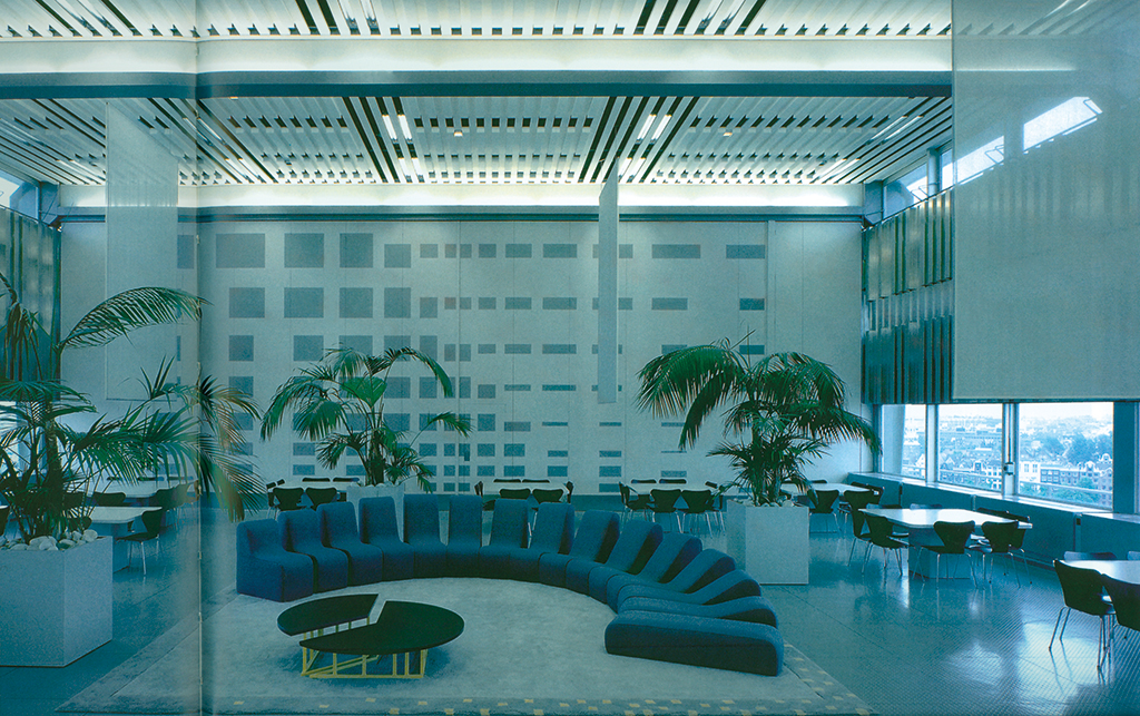
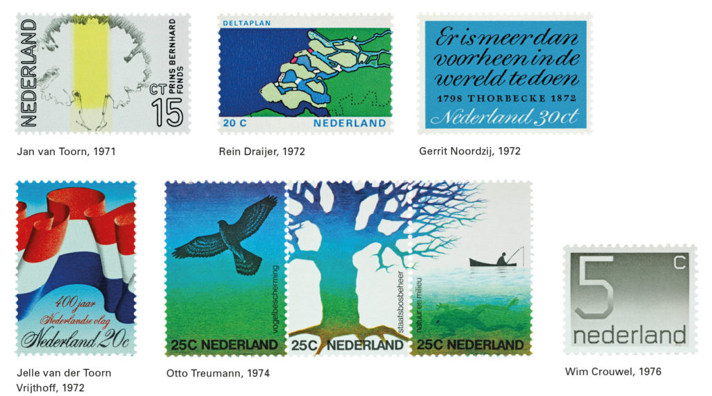
He succeeded to get the young artist Peter Struycken together with the sculptor André Volten involved with the design of the Amsterdam Central Station’s mail distribution center, where they created an environment dominated by huge reliefs and paintings in the staff lunchroom. But Van Haaren had to let go when his proposal of a street sculpture by Constant, for the giro bank’s central office in Arnhem, was rejected. It would have resulted in a colorful feast in which the three-dimensional use of aluminum ‘bricks’ created a reduced version of New Babylon along the busy Velperweg. “My first task was to convince the architects, Van den Broek en Bakema, of the importance of the proposal. Van den Broek was not happy; he was afraid that the quite large art project would hide the building’s façade. But Bakema came to my side; and we got the architects’ green light. The next step was to gain support at the construction department’s side; we had a short film produced that convinced the director responsible for PTT’s giro bank of the feasibility of the proposal, but raised the condemnation of the head of the construction department in such a way, that his opposition became insuperable. He won.”
In 1969, Van Haaren managed to execute a coup. He formulated a proposal that was accepted without much discussion by PTT’s board of directors and, before any opposition forces could become aware of its consequences, resulted in the appropriation of all 1% funds to DEV to spend flexibly according to their discretion; also, Van Haaren’s clever wording allotted him more money to spend on art for more general purposes. The generous funds allowed DEV to build up an important art collection. As always, Van Haaren didn’t boast about his accomplishments. In a catalogue accompanying the exhibition Holland in Vorm he wrote that as a principal and a patron he preferred to remain in the background: “The client stays out of sight. He doesn’t exist. At best, he is kept alive in the stories of the (artists and) designers he employed, to become a legend in the end. Yet, most times his backstage performance doesn’t leave enough traces to base an acceptable portrait on.”
Van Haaren saw himself foremost as a member of a team. Judith Cahen, Ootje Oxenaar and Ewoud Bezemer were his esteemed colleagues, responsible for art, graphic design and industrial design respectively. He gave them the space to move around, but he also challenged them; he knew how to motivate them. He did not want to create any dispute of competence, because he had already enough fights to fight and conflicts to solve within the PTT organization. In the different sectors, one could always hear it said that while they were doing the work and making money DEV was just spending the money. “Now and then they tried to work around us; if so, I had to become angry, or pretend to be angry. But others came to us for advice; we didn’t have to push them.” Van Haaren was not happy with the little ‘vulgar’ lion that was added to the giro bank’s logo. The responsible sector director’s response was: “It’s only temporary.” Van Haaren stepped back.
Van Haaren was able to see the controversy rather as a game he wanted to end victorious. His sense of humor and understatement seldom left him as he had to confront bureaucrats who rather spent their day solving crossword puzzles, or who thought they had to fight for a specific color red on a stamp. The production of postage stamps never ceased to be an exciting and exhilarating experience. DEV had to battle with leading philatelists and collectors, with the director of the section postal services, with the printers (Enschedé) who believed they and only they were the guardians of quality, and with the director responsible for stamp duties, ‘the keeper of the seal’. In the case of special stamp editions, collaborations had to be started, and successfully finished, with all sorts of organizations, foundations or special interest groups and their board members, who all wanted to have a say in the design. Tempers would flare, discussions would never end, and not only opinions about quality would differ, but tastes too might be found miles apart. Van Haaren had to sway opinions, to win over a range of people who were involved – some of them herding almost ‘hostile’ opinions. Postage stamps were smack in the nation’s eye, always formed a highly sensitive issue, and their design and production demanded great and tender care. “My deep belief and conviction helped me to convince others,” said Van Haaren. Many a new, unconventional proposal was received with sighs and frowns, but Van Haaren managed to engage designers who established a name of their own for spearheading a culture of quality and excellence. He did not forget to arrange for adequate payment of their services either.
Van Haaren worked under three different director-generals: G. Bast, H. Reinoud and P. Leenman, all three well-educated men with an interest in the arts. He was allowed to introduce art to the workspace and to publicize PTT’s role as a promotor of art. Not just stamps, but annual reports and other publications were commissioned to a variety of designers. On some of these projects, such as the yearly calendar, DEV had to collaborate with PPD, the company’s advertising and PR department. “Cold, ice cold,” is how the relations were described between DEV and PPD. Opinions about quality and esthetics of advertisements and campaigns differed much; in fact, they were so far apart that the distances could never be bridged.
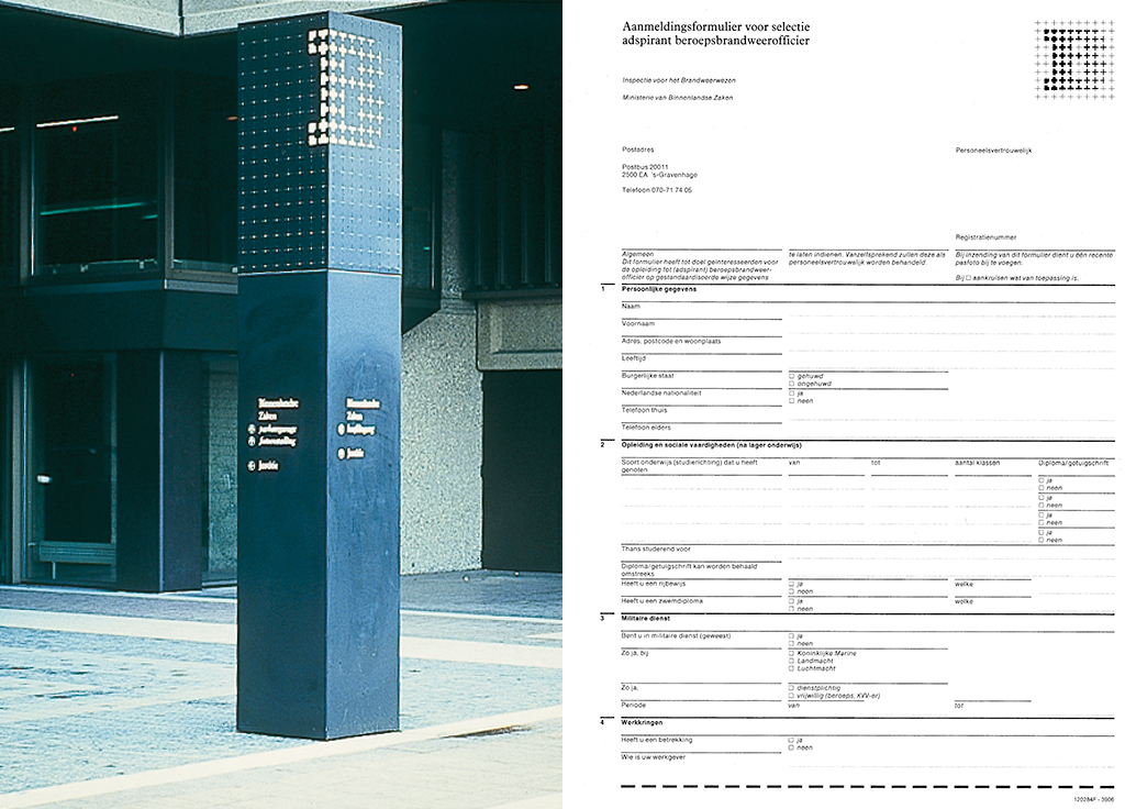
Nevertheless, PPD supported DEV’s plans to develop a consistent corporate identity program. It took PTT twelve years before this program could be introduced, in 1981, but by that time all sorts of circumstances had changed and the program already needed renovations. A large workgroup was involved; countless meetings were needed; and the project became even more complicated because Van Haaren had commissioned two different design studios to work in concerted action. Total Design (Amsterdam) especially for the (re)construction, modernizing and organization of all PTT’s stationary, forms and other print; and Tel Design, later Studio Dumbar (The Hague), for a more adventurous design input. The collaboration proved not to be a great success. Another complication showed up: the different sectors within PTT were marching toward independence.
Sdu – government printing and publishing
Before PTT could introduce its corporate identity program, Van Haaren had moved to a directorship at Sdu, de Nederlandse Staatsdrukkerij en -uitgeverij (government publishing and printing house), where all print for Dutch central government was designed and produced. From 1976 to 1982, Van Haaren was the publishing branch and design department’s director under general director Th.H. Oltheten, who had realized many quality improvements of government print already. One of Van Haaren’s tasks was to find more involvement for Sdu with literature and cultural publications. Sdu did not lack any expertise, but their designers and printers walked different paths; two philosophies ran wild under one and the same roof. Van Haaren attracted Jelle van der Toorn Vrijthof to lead the designers and he arranged that the design department participated in the discussions at board level.
Sdu proved to be an even more bureaucratic and hierarchic organization than PTT. Van Haaren discovered soon there were many obstacles to remove: a general adversity to progress was one of the largest; but he was handicapped also by the payment conditions as set by the ministry of home affairs, the government’s salary administrator, which prohibited Sdu from hiring talented or leading designers. Not much has been written about Sdu’s design history in the 1980s. Many of its archives were destroyed. These were the times that Sdu had to cope with contrasting factors; still a bureaucratic government department working under the home secretary, it had to and wanted to act more and more as a competitor in the commercial sector and create a market of its own. Meanwhile Sdu was still depending on its involvement with the production of all parliamentary print, all phone books, most national securities and bonds, although Van Haaren pushed the company toward deep involvement in the development and production of identity programs for all departments of government.
In 1970, the Dutch government had published their vision of how they should communicate with their citizens. At Sdu, the Staatscourant (government gazette) was redesigned to a better accessible format. At the different ministries of state, the information departments grew substantially and all improved their services to the public. Government offices became aware of the importance of building and maintaining a favorable image, preferably breathing great efficiency. Contemporary identity programs could help.
Van Haaren’s role was moving the different ministries to engage experienced designers to create efficient identity programs. Jelle van der Toorn Vrijthoff built a design group within Sdu that specialized in the organization of forms. The ministries of finance and economic affairs had already introduced new logos, and after the ministry of home affairs introduced a comprehensive identity program as a structural element of policy, all others followed suit. The logos may have attracted most of the public attention, yet the reorganization of all print was to be the most important element of the identity program. Again, Van Haaren opted for the involvement of two different, collaborating design groups: the Sdu’s own graphic design department and the young but growing Amsterdam-based studio BSRS (founded by Jan Brinkman, Niko Spelbrink, Guus Ros and Edo Smitshuijzen). Together, these studios screened the forms and publications of all departments and services falling under the ministry of home affairs, including the national police and fire-fighting departments.
Van Haaren’s course was in line with Oltheeten’s policies and a continuation of his own accomplishments at PTT: to modernize and to create space for a substantial input by artists and designers. A gracious but unwavering diplomat, he was the creative sector’s ambassador. His appearance gained the respect and support even from bureaucrats who would not share his views. His battles were never about him, but always about what he stood for and he battled in a convincing and fair-minded way.
After his years at Sdu, Van Haaren became the director of the art academy in Rotterdam and, later, the temporary director of the Dutch architecture institute, also in Rotterdam. And then there were the countless boards he was a member of and the also countless times he was involved in art and design in an advisory capacity: adviser for art to the province of Zuid-Holland; member of the national commission for art projects (Kunstopdrachten); member of the ministry of culture’s commission allotting art grants (Stipendia); co-founder of the Octopus art group; board member of Sonsbeek Buiten De Perken national art manifestation (1971); member of the council for industrial design; board member of the council for the arts (Raad voor de Kunst); member of the board of directors of BRS Premsela Vonk, Amsterdam (multidisciplinary design studio); and chairman of the Mondrian Foundation. And more.
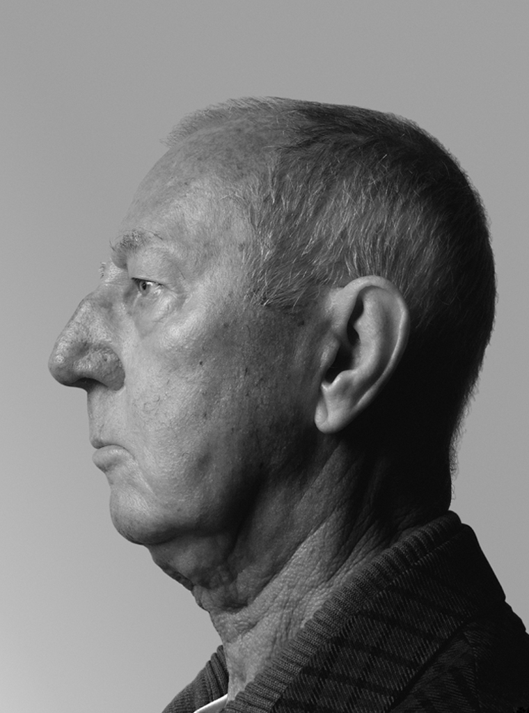
Hein van Haaren
born on 13 June 1930, Ravenstein
died on 3 August 2014, Rotterdam
Author of the original text: Frederike Huygen, December 2009
Translation and editing in English: Ton Haak
Final editing: Sybrand Zijlstra
Portrait photo: Aatjan Renders