And now for once a different story about Ootje Oxenaar. My story. For how to write about a designer’s work everyone is already so familiar with? Although there is more than the nine Dutch banknotes we all used to pay our bills with. How to write about a graphic designer around whom so many tales are spun that they could form a spectacular oral history of their own? A mythology, built up and maintained by Oxenaar himself. And how to write about that famous department, DEV, the esthetic conscience of the Dutch postal services, where he worked for almost 25 years and about which so many tales have been told already? I will take an alternative route, I will not write from a historian’s or a reader’s perspective. I want to experiment a little with trying to keep the middle road between an idealist-centered and a materialistic approach of his history and not focusing too much on the anger in the Dutch cultural world about DEV’s demise in 2002. Too much was published explaining that it was Oxenaar’s and his designers’ own fault that the department was nixed. Which just wasn’t true.
I have known Ootje since I was ten years old. I was a veteran of Annie M.G. Schmidt’s children’s books, which had been read to me before I went to sleep. I knew how royal the princess Tierlantijn looked, dressed in a gown with a train, as drawn in black and white by Wim Bijmoer – this fiery, confident princess who dreamed about different things than others, who wanted to find a chimney sweep instead of a prince, and who succeeded.
I found the same recalcitrant, rebellious potential in Gargantua, the book I could read myself a few years later after my brothers had passed it on. The famous Rabelais story, edited for children between the ages of ten and fourteen. I gobbled up its one-hundred pages; I screamed when reading about the precision of the astronomic numbers and weights, or noticing the absurdity of the wordplay about something as simple as blowing your nose, or stumbling on absurd nonsense words that still seemed to have a meaning.
But similar or maybe even more joy was experienced by looking at Ootje Oxenaar’s full-page black and white illustrations and the attractive, colorful cover he had designed, showing the giant king Gargantua in full regalia: the white-velvet beret on his fat head and the hard-pink vest tight around his fat stomach. Regardless of the silly situations, I felt that I, as a young reader, was taken seriously. I didn’t have to be a child any longer. I was ready to leave Wim Bijmoer and Fiep Westendorp way behind me, for they were treating me like a child.
This Gargantua, the only one ever printed in Holland, was published by Van Goor in their second Gulden Sporen series in 1961. Its price was a most reasonable 2.20 guilders, while our edition, bound in linen, cost 2.95 guilders. Van Goor published titles for a mass public based on the classics of which the copyrights had expired; they published both the Gulden Sporen and the Oud Goud series with young readers in mind. Saving copyright costs, they were able to invest in serious book designs and well-executed illustrations while keeping the book price low.
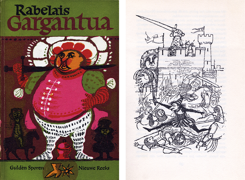
Commissioning Oxenaar to illustrate Gargantua was a great choice (although it may have been so that Oxenaar himself selected this title to illustrate, as happened often. De Bruijn, responsible for Van Goor’s children’s books, had a similar arrangement with Willem Rozendaal, who also selected his own titles to illustrate). Oxenaar had designed and illustrated books before – and he would continue to do so all through his life. His drawings presented a form of realism that reduced the figures to their essential characteristics. He had been educated at the art academy in The Hague, where realism dominated, and he was coached by Willem Rozendaal, a charismatic all-round artist, whose approach remained of great influence.
Rozendaal’s realism was not based on mimesis – true-to-life reproduction of the world – but rather on a creative interpretation of reality. Thus Oxenaar came to develop a storytelling way of illustrating, in which the graphics (fat lines, black and white contrasts) added an expressive force without becoming ‘atmospheric’, ‘vitalistic’ or ‘expressionistic’. In Gargantua, his enlarged realism added anecdotes and caricatures to Rabelais’ own grotesque realism, in which hyperboles and fatrasies (from the Medieval poetry style in which seemingly nonsensical sentences are put to rhyme following a strict scheme) are combined with realistic descriptions and fantasized elements, often leading to humor and parody.
Forty years later. As I remove this beloved book and another version of Rabelais’ work from my book shelves, I now notice for the first time how rigorously their editor, Wolfson-Eyssell, has cut out parts of the text. Scabrous and scatological references have been removed and other parts have been changed or stylistically flattened; not much was left from the lively, exuberant language with its villainous hackling and uncommon humor. And I am shocked to see how she dealt with the whole glorious ‘The End’ – which it was all about: the founding of a new utopia – by condensing it to one sentence only: “He wanted to found his own abbey based on principles he liked better than the existing ones.”
Just one sentence. Unforgivable. “He”, friar Jan van Plettum, the earthy, cursing, fighting bad guy, the opposite number of the so “heavenly” king, together with his beautiful abbey Thélème was a source of inspiration for so long, not just to me but to others in the world of arts and culture, from Denis Diderot to Louis Paul Boon. And now we miss from this little book the one and only line important in Jan’s new world: “Do whatever you want” – which is what every free human being deserves who wants only the best. The critique of the long existing monastic order with their mile-long directives and scholastic laws had been made to disappear from the text.
Yet Oxenaar must have known the true plot and the motto. He made sure he’d read all books he had to design or illustrate, just as he had learned from Rozendaal. “Do not start a cover design of a Franz Kafka book before you’ve read his most important works.” Oxenaar did lots of research before starting any project. For Gargantua he studied the extensive, richly illustrated, 19th-century edition published by Gustave Doré. This edition was republished by Arbeiderspers in Amsterdam in 1957 to enter the collective memory once again.
Look at Oxenaar’s drawings. You can see how well he had researched the story from the way his friar Jan attacks the evil in the world when, in the last drawing, wearing a jester’s cap and a sardonic grin, he fearlessly and joyfully destroys Picrochole’s hostile army. It leaves us with the suggestion that friar Jan’s ideal world is within reach after all, just as Oxenaar’s is. The undivided world as described by Rabelais, approaching modernity and combining the way of all flesh with spirituality, was very much the young artist/illustrator Oxenaar’s world. It was not his parent’s world, the respectable world of The Hague, but the one he was introduced to at the art academy, then a sanctuary of free-thinkers and rebels.
In this alternative world, Rozendaal was his role model rather than his teacher. ‘The Rozendaal School’ it was called, an epithet that represents more than the results of a stylistic adaptation: it was the expression of a mentality on which a vision of art was based, including an opinion of the role of the artist in society. For Rozendaal, creativity resulting in action was of all ages and defined humanity: the artist leads the way. Rozendaal did not accept any distinction between old and new art, arts and crafts, high and low culture. His vision repudiated the continuing fragmentation of the present-day world. It was on this vision that Oxenaar’s own mentality was built; later, he recognized it in the contemporary approach of materialism by Raymond Williams: “Art is nothing but an extraordinary element in the general human process of creative discovery and communication.” As friar Jan would say: “Art is a passion for the real.”
However superannuated Wolfson-Eyssell’s Gargantua adaption may appear in my eyes, I must be aware of an anachronistic bias. For it were these kinds of illustrated books that in the 1950s and 1960s dominated the literature for children and can be seen as stimulating starting points of their subsequent emancipation (mine included). Other publishers than Van Goor in The Hague played a role. In Amsterdam it was Leopold, for instance. Other than Oxenaar and Rozendaal, many illustrators came from The Hague: Herman Berserik, Jenny Dalenoord, Reinald van Lamsweerde, Babs van Wely and Bertram Weihs. It was Weihs, a student of Rozendaal’s but also schooled by the classic typographer Henri Friedlaender, who would teach many future artists from The Hague in calligraphy and typography, thus helping to create the ‘The Hague handwriting’ style based on humanistic italics that was so recognizable in Oxenaar’s work. It was the beginning of a letter-writing tradition that still influences the graphic design education in The Hague.
I learned to better comprehend this tradition after I had started teaching design history and design theory at the academy in The Hague. When first entering its doors and smelling the inks and linseed oils it took only a fraction of a second before I, like Proust’s Madeleine, arrived back in time, on the Saturdays that I, aged ten, was allowed to draw under the ceiling windows in the huge open studio at the same Prinsessegracht. I had a real painter’s easel and I used charcoal; and there was a live model and there were real artists, too. The magic of a whole new world – like what happened in Gargantua. I was entering the world of art again and I could have encountered Oxenaar, too, who taught at the academy in the late 1960s.
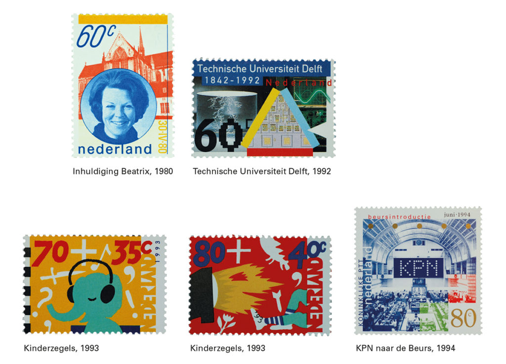
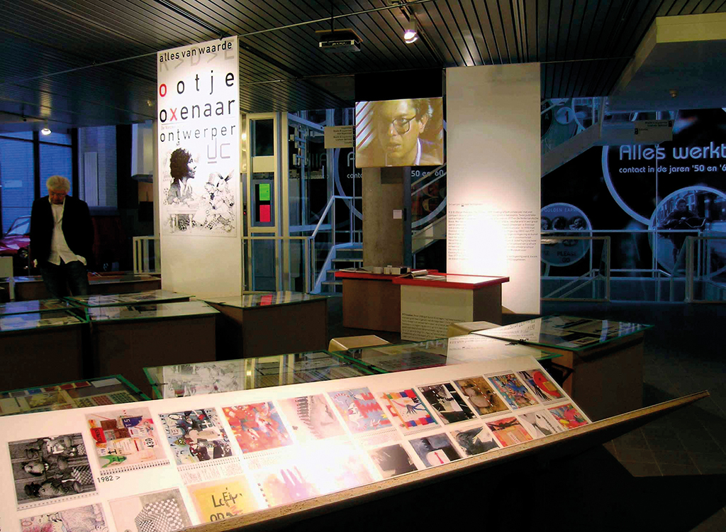
But the second time I met Oxenaar must have been in 1984. I had known him intimately for many years, through the nine bank notes and the thirty-three postage stamps he had designed, but we met because I, a student at the art academy in Arnhem, was doing my internship at DEV, the department responsible for the esthetical design of the Dutch postal services (PTT, later KPN). Oxenaar was the man in charge. I felt very small when coming face to face with Oxenaar; maybe I remembered how in days long past my father, who worked in the PTT head office at Zeestraat, walked to Bazarstraat where DEV had their domicile and humbly begged them for the newest PTT calendar, an immediate collector’s item, for his daughter. I knew I had entered ‘my’ world.
I remember DEV as a contemporary combination of design studio and architecture studio, a pleasant, dynamic environment where thought and action mixed well; where people were motivated to (help) create things; where modernist furniture found a place next to classic designs by Willem Penaat or Le Corbusier and in easy contrast with the excellent contemporary prints hanging on the walls and the Sipek glass and Appenzeller’s vase on the window sill, next to a scale model of the mailbox designed by Wolfram Peters and Peter Krouwel. A wonderful place to work. And, luckily, no one cared about styling or office ergonomics yet.
We always had lunch together at the big table. Pleasant and effective gatherings these lunches were. The people who worked at DEV were professionals committed to art and design; they came with their enormous expertise and a huge amount of technical knowledge. Together, they created a highly productive environment in which graphic design, ‘Dutch Design’, was taken to great heights. They helped to promote Dutch graphic design and Dutch industrial design all over the world; and they introduced contemporary art to many if not all PTT buildings in the Netherlands. Everyone of importance in art and design passed through DEV and many a young and talented artist’s career was pushed forward by DEV. Their consultants’ contribution to the strong cultural infrastructure in the Netherlands is immeasurable. I personally will never forget how one of these consultants, Judith Cahen, pushed me to apply for a beginning artist’s stipendium from the government, which I successfully did.
DEV became a leading cultural institute – client, consultant, promotor and school all in one – and their staff had a ball. DEV has been called “my family” (by Paul Hefting) and few of their devoted professionals ever considered leaving this paradise: Liesbeth in ’t Hout remembers DEV as “out of this world” and Ewout Bezemer talked about DEV is words like, “a moveable feast”. Julius Vermeulen underscored their uniqueness and Ada Lopes Cardozo found there, “the best possible job ever.” It was made possible under “the spiritual leadership” of Ootje Oxenaar (said Abe van der Werff).
From 1976 to 1994, Oxenaar was, indeed, highly responsible for DEV’s work climate and success. He hated authority and bureaucracy. The staff worked in a horizontally organized department where a formal hierarchy was traded in for distinguishing responsibilities. DEV’s ‘boss’ did not want to play boss by keeping everyone from doing their job. Oxenaar gave his staff a free hand to do what they thought they had to do and to do it their own way. Flexibility was what characterized DEV – a flexibility without the competitive elements that would become such a destructive force in the many organizations where short-term vision was allowed to reign. Oxenaar kept his supporting administrative staff small; he did not allow bureaucracy to grow and cause extra work instead of providing relief.
Technocrats were not Oxenaar’s cup of tea either. In his style of leading he kept modern management ideologies at an arm’s length even as they gained more and more influence within the PTT organization. In the years between 1982 and 1992, Oxenaar had to fight hard for DEV’s independence. Annual reports over this period indicate how defensive he had to act against the attacks of the ‘pragmatic’ bureaucrats. A master of strategy, knowledgeable without comparison and, nationally, in high regard because of his creative excellence, he kept receiving the support of an admiring crowd from outside as well as from inside the PTT organization. He even managed to subtly use his strong ties with Queen Beatrix to strengthen DEV’s position (although this, a sign of accepting the status quo, may have robbed him of the mythical status Willem Sandberg reached, of being recognized as a great innovator). Yet, he would not be able to resist ‘progress’ eternally. In 1994, he had to leave DEV. The department itself would not survive much longer.
I believe Oxenaar over time designed his own ideal order, an exemplary cooperative that showed us how to understand the role of labor in a human life and to what extent creative labor contributes to society. At least he tried – and by doing so, Oxenaar made DEV (his own Thélème) work to the word as well as in the spirit of Rabelais, but spiced up with his own cultural ingredients, which I’d like to translate as: “Love a life wrapped in fantasy!”
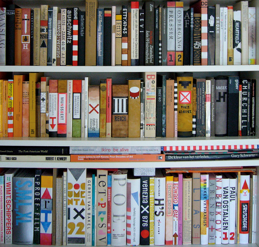
This sagacity, the mentality of an artist, can also be discovered in Oxenaar’s library. In November 2008, I met Oxenaar for a third time, this time in his home in New England, in the USA. While exploring his bookshelves I met the rebellious ghosts of friar Jan and his Théléme in their full, Oxenaar-inspired, detached ambiguity. His collection of children’s books was extensive. Bruintje Beer, the Dutch version of Rupert by Mary Tourtel, could not be missed. It was the first illustrated book Ootje could lay a finger on and it made such a deep impression on him that its main character would be his alter ego forever. Another English icon was Edward Lear with his Book of Nonsense, a unequaled collection of nonsensical limericks. Then I noticed Lewis Carroll, the grand master of humbug, the one who made his Cheshire Cat exclaim: “We’re all mad!” His Alice in Wonderland is the most fantastic book ever written for children and, like Lear’s, not exclusively for children – with its word games, the jokes, the double entendre attacking language codes and social conventions. Oxenaar owned several editions, with contributions from different illustrators, including one bound in magic combination with Through the Looking-Glass and What Alice Found There. Its Dutch version is called: Alice in Spiegelland, a very fitting title (spiegel= mirror); this book turns the world upside down like no other and tells us the world of children is much more interesting than, if not superior to, the world of us grown-ups. I can see Oxenaar before me nodding his consent.
Not far from Alice I found Kafka, of course. Gregor Samas’s identity crisis is just as confusing as Alice’s role reversals. Carroll’s Alice is just as Kafkaesque as Die Verwandlung or Das Prozess. They did not differ much either from books on other shelves in Oxenaar’s library about the historic avant-garde. Dada, with Schwitters, Van Ostaijen and Werkman, also deals with unruly, recalcitrant, often playful acts trying to realize the impossible and to reconcile art and life. The nihilistic, absurd Jarry and Ionesco also fit in, just as well as Marx’ Das Kapital and the culture-critical work of a successor like Raymond Williams. I found Oxenaar’s library to be a hybrid parade of recalcitrant artists and thinkers who were searching, in times of great social and economical change, for an alternative route away from the ‘creative destruction’ of modernity. Rebellion, as taught Rozendaal already, is of all times. Look at Cervantes, look at Rabelais; these brothers were neighbors on Oxenaar’s bookshelves.
Which brings me back to the soul of which this library was the mirror: the soul of an artist, a contemporary artist, who rather enjoys than mourns about his split personality – for it is the price of his independence. This happy but wise clown, this medieval fool, this Renaissance Arlecchino yet contemporary tragic comedian who shrouds in all kinds of masterly disguises to cover his true identity and who invites you to learn his lessons, that was Oxenaar. His family and friends can tell you how he enjoyed to dress up and to change identity, to pretend to be someone else and to fool everyone. For his children, he dressed up in St. Nicolas tabard. For his students he pretended to be the professor and for his friends he played the grandiose fool at Halloween parties. And in front of his colleagues at DEV he appeared in a bureaucrat’s standard apparel. He dressed his whole life in fantasy.
Again, this mentality was reflected in Oxenaar’s library. It’s not just what is written that mirrors Ootje Oxenaar. For hundreds and hundreds of books in his library he designed new covers. His library became a beautiful display of his literary and artistic preferences and heroes, with the lucid watercolors beating the quiet gouaches, and where the light palette – lighter, ever lighter – mainly red, yellow and blue – combined his own cryptic visual grammar with the romantic, stylized ‘The Hague handwriting’. Yes, “Enjoy life. Do whatever you want!”This was my very personal Ootje Oxenaar story, written especially for [Z]OO Productions and Roots. It is just one of the many possible perspectives, but essential, at least in my opinion. The pointe of the story is: the dream, this alternative, is not a luxury; we need it so much. It’s not just there – we have to fight for it, at all times, in all ages. Because: “Culture may be arriving on soft-cladded feet, but is hung like a horse.”
A short biography
Robert Deodaat Emile (Ootje) Oxenaar (The Hague, 1929) followed the drawing and painting class at The Hague’s academy of art. In 1953, he graduated cum laude. His career started with creating monumental art projects for schools and government buildings in several cities (The Hague, Zeist, Heerlen) and he also contributed to the 1955 event E 55 in Rotterdam. He was awarded for his design of Alkestis (1954) for Boucher publishing in The Hague. Many publishers hired him to design their books. He worked for Van Goor as well as Haags Gemeentemuseum and for Expo ’58in Brussels, to promote Dutch art.
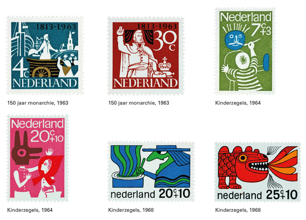
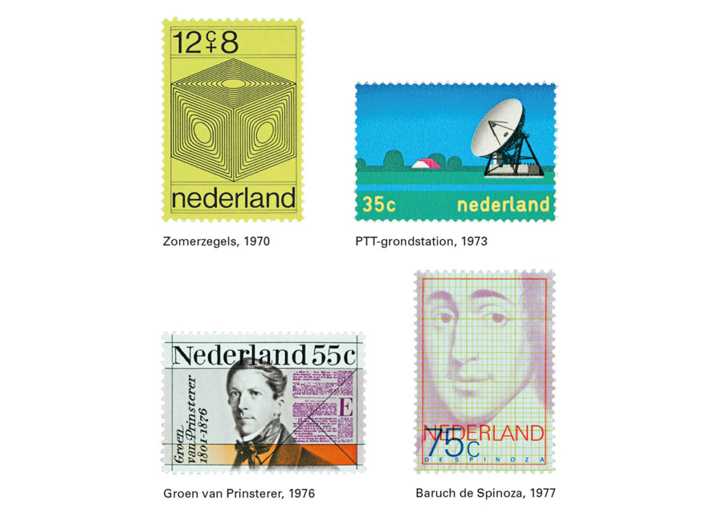
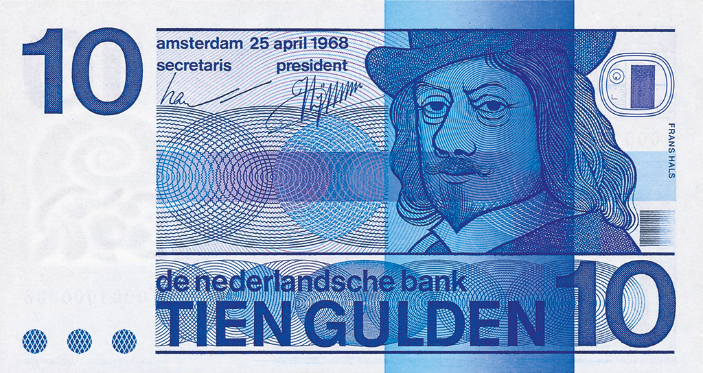
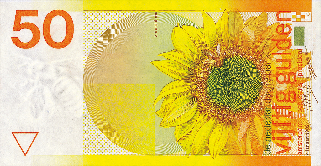
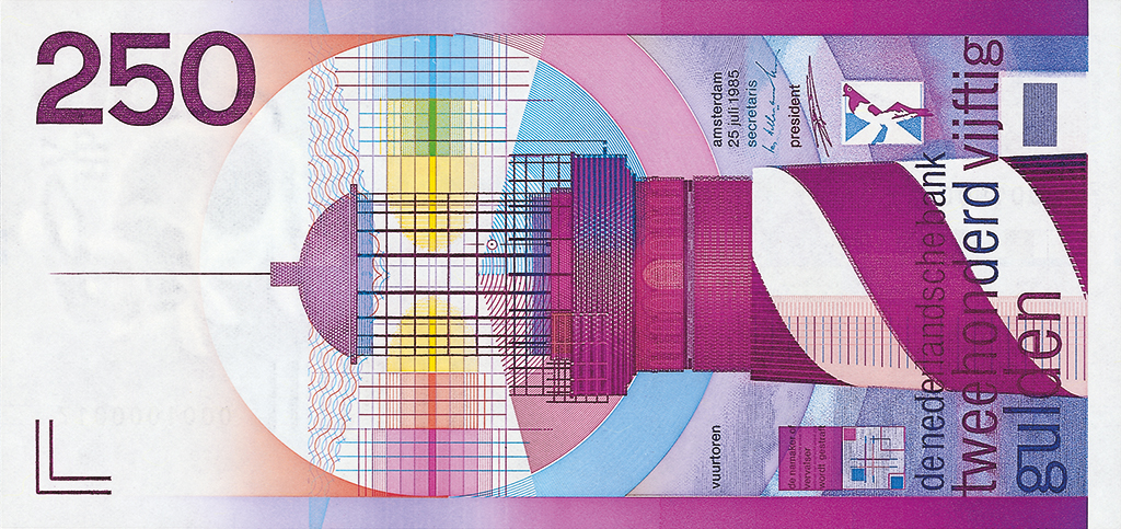
Two important clients pushed him to start his own design studio: the national postal service PTT and the Nederlandsche Bank (Dutch national bank). In 1963, he designed his first series of stamps for PTT. After entering DEV/PTT in 1970, he became deputy head of the department and, in 1976, their chief. He designed thirty-three stamps. In 1964, he designed the 5 guilder banknote. In the following years bank notes of 10, 25, 100 and 1000 guilders were added. Between 1977 and 1987, he designed a second series of banknotes, including the Snip (100), the Sunflower (50) and the Lighthouse (250), designs that became iconic.
Between 1984 and 1970 he taught at the art academy in The Hague. Between 1978 and 1992 he was an associate professor for visual communication at Delft Technical University’s industrial design department. He was a visiting professor at many universities in Holland and abroad.
At the time of writing, he was living in the US and teaching at Rhode Island School of Design.
Ootje Oxenaar received many awards for his design, such as the Werkman Prize in 1987. His work can be found in many museum collections in The Hague, Amsterdam, Paris and New York. He was an AGI member since 1964.
Ootje Oxenaar
born on 7 October 1929, Den Haag
died on 13 June 2017, Rhode Island (USA)
Author of the original text: Els Kuijpers, February 2010
Translation and editing in English: Ton Haak
Final editing: Sybrand Zijlstra
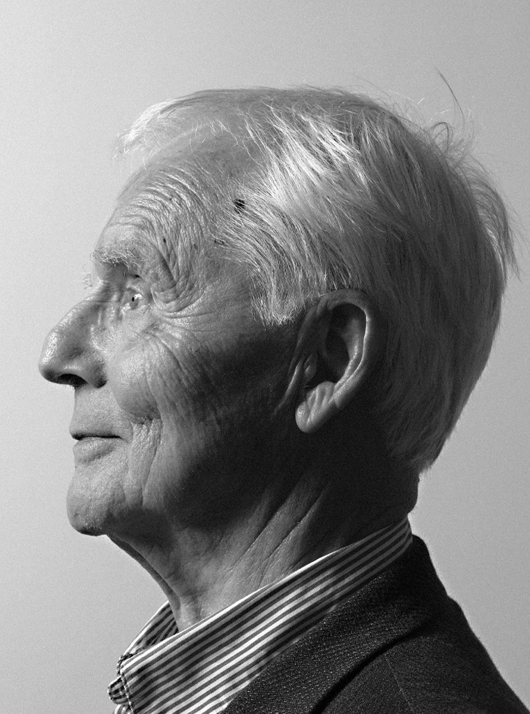
Portrait photo: Aatjan Renders