Born in the last year of the war but one, Paul comes as a surprise to his parents, who already have three daughters. He grows up in a house on Watteaustraat, while his father works as head of press and information for Amsterdam’s municipal government, his expertise and skills so valued that a meeting room at the city hall is named in his honour. Meanwhile Paul saws open his toy cars, removes or combines various parts and paints ‘Mijks 1’ or ‘Mijks 2’ on them. On the upper ledge of his folding bed, he builds an aircraft carrier out of paper and plastic with planes he equips with lights using slide contacts. Engineering fascinates him.
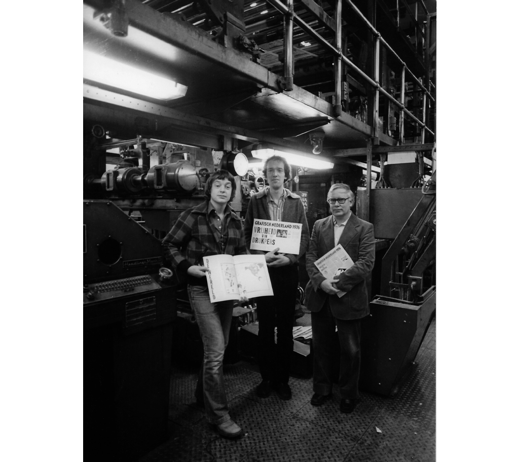
l. to r.: Paul Mijksenaar, Piet Schreuders and Nico Scheepmaker.
In 1956 he enrols at the Montessori Lyceum in Amsterdam and spends most of his time drawing planes, cars and tow trucks for ‘Garage Mijks’. He has to repeat a year and continues his secondary schooling in 1959 at a three-year secondary school with a commercial training programme on the Roelof Hartplein. He is just as bored with this school.
On Sundays his mother goes to church and his father takes him out in his official car, a blue Ford Zephyr with a ‘permit for exemption from visible official vehicle identification’, driving through the new garden suburbs, over bridges and along the expanding docklands. In these docklands, deserted on Sundays, his father teaches him to drive. At 16 he is chauffeuring his parents all over the Netherlands.
IvKNO
His school helps him choose a profession by having various training and academic programmes give presentations. The moment he sees the one by the product design programme at the Institute for Applied Arts Education (IvKNO, now the Rietveld Academy) he knows one thing for certain: this is it. Back home, his mother’s reaction is ‘I’d just as soon throw you down the well’. His father makes inquiries on this programme at city hall and, with his approval, Paul draws an Amsterdam cityscape and a launching platform for rockets and composes a letter explaining why he wants to go into product design. Whereupon, in 1960, still 16, he is accepted by the school’s director, Mr Vis, backed by instructor Wim Jaarsveld, who teaches product design. His other instructors include art historian Fred Zimmerman, sculptor Jos Wong and painter and graphic designer Theo Kurpershoek, who teaches him calligraphy. The lessons given by draughtsman Piet Klaasse go well as long as machines, rather than people or animals, need to be drawn. Graphic and industrial designer Charles Jongejans teaches graphic design and Jaap Kruijff teaches technical drawing as a meticulous preparation for the production process. This fascinates Paul, as does the annual two-week field trip organized by Jaarsveld to various Dutch and Belgian industrial firms. He drives one of the two hired vans.
While the curriculum fits in better with his interests, it still doesn’t really excite him. To pass his subjects, he knuckles down just a couple of weeks a year and becomes a master at presentation. The rest of the time he wanders around the city, along the displays in hardware shops, strolls about the stalls on the Waterlooplein flea market, looking everywhere, even in scrap heaps and junkyards, for anything that seems useful to him.
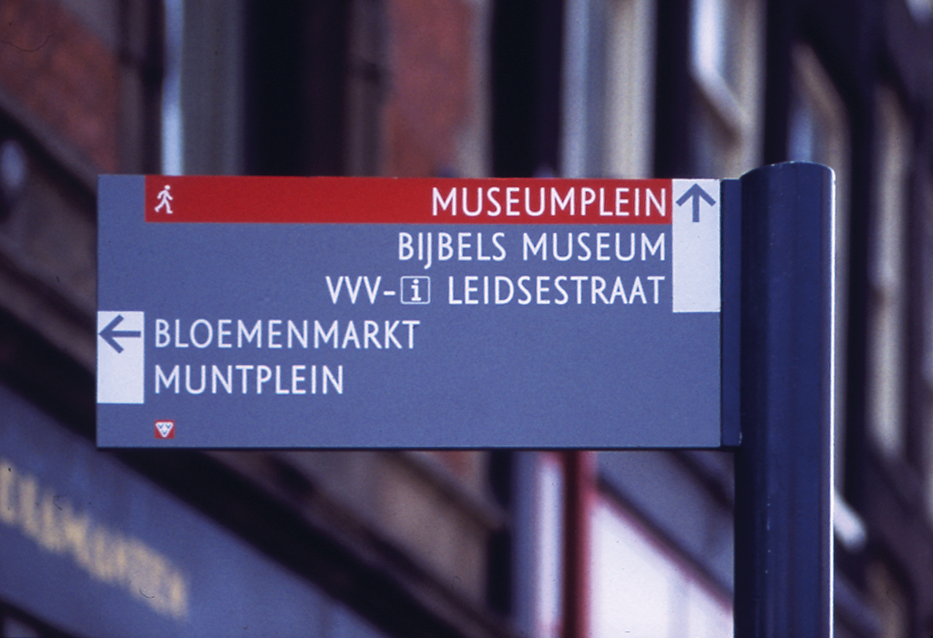
In an Amsterdam becoming ever more boisterous as a changing political awareness emerges in a restless society, Paul pursues his own interests. His approach to the world is not so much emotional as rational. Collecting and combining bits of knowledge to turn them into ingenious engineering. He loves to read about that aspect of the world. Like the 1963 article on the work Jock Kinneir did on traffic signs on British roadways. This combines many of his interests: crystal-clear communications through painstakingly constructed graphic figures, such as lines and arrows in a variety of colours, functioning in combination with letters and numbers within a strict typographic system.
Golden Form
At the end of five years at the applied arts school, he sits in his student room with his diploma. Getting swallowed up in a company doesn’t appeal to him. What to do now? His father secures him several commissions for his municipal information work. His former teacher Charles Jongejans provides him with an introduction to the Hoornsche Metaalwarenfabriek, a metalworking factory that wants to expand its line with household products. Mijksenaar comes up with these and cuts and folds them out of coloured paper or plastic. Sometimes they are actually put into production, like the ashtray with an anti-smoke flap and his tea light. He receives the ‘Gouden Vorm’ (‘Golden Form’) award for both, but his designs are too minimalist, too lightweight and too inexpensive to serve as desirable gift items. In the end the factory goes bankrupt.
His friendship with Joost Elffers brings him into the home of the latter’s father. In 1967 Dick Elffers asks for his assistance putting together the ‘Colour and Motif’ Christmas issue of the weekly printing industry periodical Drukkersweekblad en Autolijn. This publication gets him in touch with the Royal Netherlands Federation of Graphic Enterprises, which subsequently gives him all kinds of commissions. Paul Mijksenaar goes into graphic design.
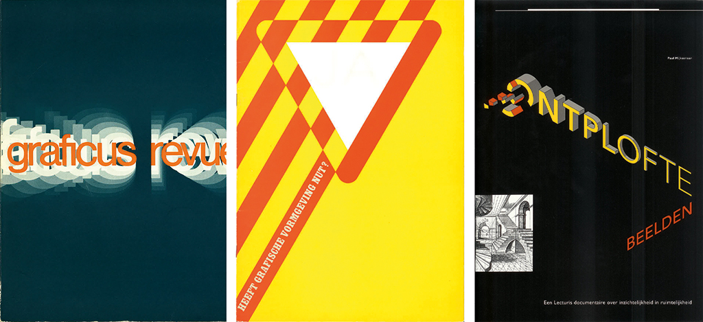
For the first periodical he designs, the Monroepost, the house organ of an American manufacturer of – then still entirely mechanical – calculators, he draws detailed vignettes. Together these form a series; individually their meaning is revealed in combination with the text under them. He co-founds his second periodical in 1971. Its cover says simply Graficus Revue – ‘Graphic Arts’. Its contents deal with such subjects as graphic design, typography and wayfinding signage. Frits de Winter is its editor-in-chief, Aart Clerx draws the comic strip and Mijksenaar does the layout, produces some of the illustrations and writes articles. Like the long, exhaustive article ‘Typography in Wayfinding Signage, or the Battle Between Aesthetics and the Slide Rule’, in which he discusses the legibility of typefaces and research into reading, compares the wayfinding systems of Britain, the United States and the Netherlands, and challenges the ANWB, the Royal Dutch Touring Club, about the poor quality of their road signs at the time. After six issues the Graficus Revue folds, because there are not enough subscribers to support the magazine.
Metro
Mijksenaar continues to write alongside his graphics work and remains interested in wayfinding signage. On his page in the illustrated members’ list of the GVN (Netherlands Graphic Designers) he states: ‘The “wayfinding signage” of the Netherlands still leaves a lot to be desired in cities, neighbourhoods, commercial estates and buildings. This is what led Paul Mijksenaar and Gerard Unger to work together. We provide consulting advice on visual and non-visual route information systems, in interior as well as exterior environments.’ A year later they jointly publish two lengthy inventory articles in an issue of Plan, a monthly periodical for design and spatial planning.
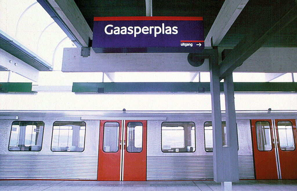
Their thorough analysis does not lead to any commissions, whereupon they close their ‘Sign design’ agency. Pieter Brattinga, however, is impressed. In 1974 he invites the two men to join the specialist team with which he is advising Amsterdam’s municipality on the visual aspects of the city’s first metro line. The other members are Paul Laarhoven, Anthon Beeke and Siep Wijsenbeek. Mijksenaar focuses on the systematics of the planned metro network. He recommends numbering the metro lines (this advice will be followed 30 years later), designs a map that shows a schematic representation of the metro lines and places a line map above the doors in the metro trains that also shows connections to other public transport.
That same year the Lecturis printing house in Eindhoven begins publishing its ‘documentaries’, with Wim Crouwel as editor-in-chief. He invites Mijksenaar to produce the first instalment, incidentally entitled Is There a Point to Graphic Design. In it he analyses the range of graphic media and the encoding and decoding of messages. He discusses various communication processes and theories, such as semiotics, in relation to the functioning of our brain. This makes it clear to the reader that graphic design can be more than just form. In 1990 he will take over the editing of the series, publishing the documentary Exploded Images, an ode to the technical drawing, a year later.
In 1976, with Piet Schreuders, Mijksenaar edits and designs the Grafisch Nederland Christmas issue, entitled ‘Freedom of the Press’. Meanwhile he advertises ‘Garage Mijks’, a fictional business inspired by the garage built out of painted triplex where he used to take his toy cars for repairs, in Schreuders’s periodicals Furore and De Poezenkrant.
Routext
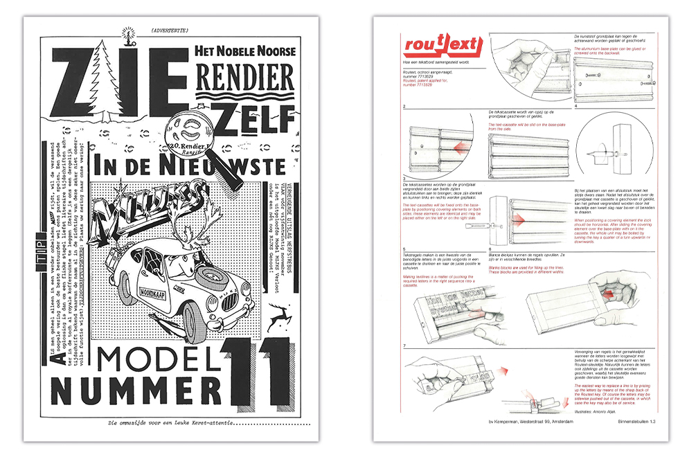
As a student of Charles Jongejans at the Institute for Applied Arts Education, Mijksenaar made models of signs on which you could compose all kinds of text using individual letters. He starts working on a plastic variant in 1976, in collaboration with the Kemperman company. It takes many years to make the injection moulding of the plastic blocks seamless and to silkscreen the smallest characters in a single saturated pass. Gerard Unger is recruited to do the typography. He simplifies the typeface horizontally into eight widths. Vertically he gives each line sufficient spacing to guarantee legibility and positions the x height away from the midpoint, so that reversible letters immediately stand out. The final product, which fuses industrial design and typography, is christened ‘Routext’.
In 1977, Wim Crouwel, in his role as professor by special appointment at the Delft Institute of Technology, offers him a full-time job in his Visual Information and Technology Presentation department. Mijksenaar begins to give lectures, lead workshops and conduct research in collaboration with Hans Kruit, Frans van Mourik and Piet Westendorp. Over the years he gradually reduces the number of days his appointment requires, in order to be able to design. Postage stamps, for instance, and annual reports, for which he produces charts and diagrams and sometimes has illustrated by former classmates Mariet Numan or Franka van der Loo.
In 1981, Loek van der Sande, director of Total Design, invites him to start his own design team within this agency. Analytical and systematic has become necessary because the agency is securing increasingly complex commissions more and more often. He works with Esther Verdonk, Rijk Boerma and Theo Peters on such projects as the handbook for the Amsterdam metro system and the CITO exam administered to Dutch pupils at the end of their primary school education.
Spruijt Calendars
He had secured a more visible commission two years before from Frans Spruijt, whose printing firm keeps in touch with its business contacts by sending them a weekly calendar every year. The series began in the 1950s with typographic designs by Harry Sierman; later Jan van Toorn expanded the experiment by weaving in substantive themes and photography. Mijksenaar is asked to design three calendars. The actual calendar function is given less of an emphasis, which is transferred to the selected themes. These are well-documented introductions to previously unpublished subjects, to which he invites fellow designers and other experts to contribute with images and text.
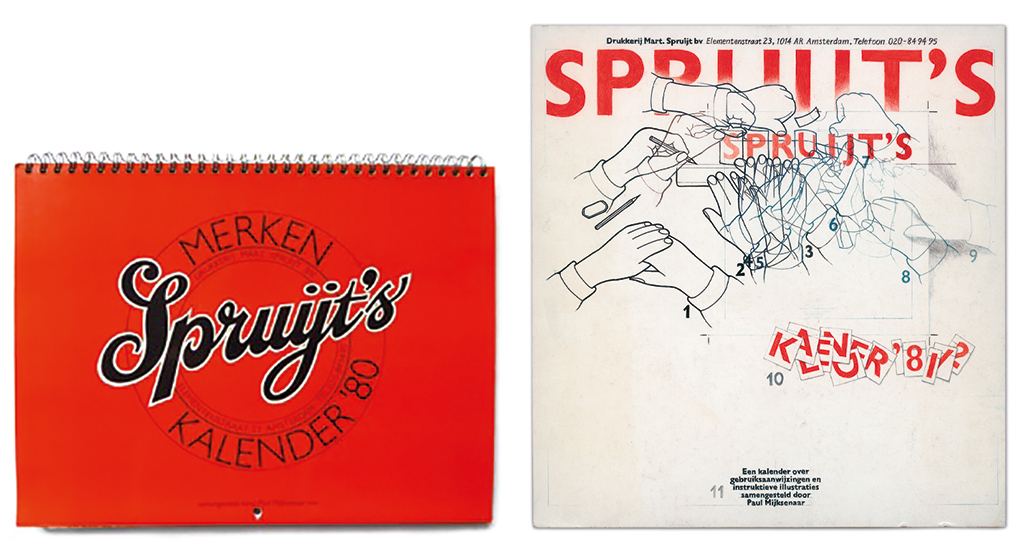
The first calendar (1980-1981) is ‘Spruijt’s Brands Calendar’ and presents the written and pictorial brands of businesses and products. The subject is literally handed to him by his mother-in-law who, working at the Amsterdam Chamber of Commerce, has salvaged superfluous annual reports with registered trademarks out of the trash. The selection is complemented by items from his own archive and those of others.
The second calendar (1981-1982) features user manuals and illustrated instructions. Graphic messages whose beauty he elevates even more by magnifying them, while increasing understanding of them by supplying explanations. He closes his calendar with this request: ‘Partly with research to be conducted at the Delft Institute of Technology into the visual aspect of user manuals, displays, control panels, etc., in mind, anyone who is in or comes into possession of examples that are not included in this calendar and that they are willing to turn over or lend for use in this research are asked to send these to Paul Mijksenaar.’
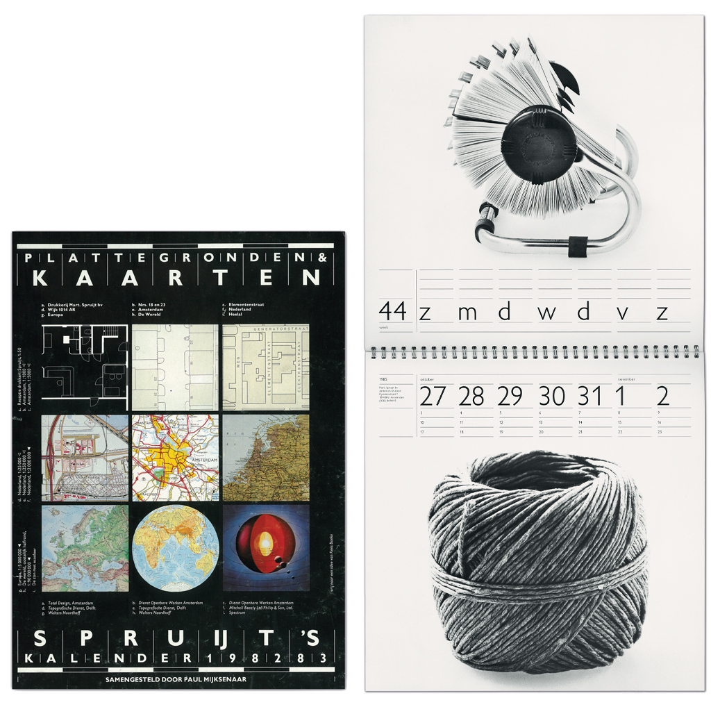
The subject of the third calendar (1982-1983) is maps. This is risky for the printer, because the images have already been lithographed and printed, and the calendar also has to serve as proof of their graphic competence. It is also risky for him because, unlike his previous calendars, a very great deal has already been published on this subject. He fulfils his objective thanks to the wide variety of the material presented.
As an encore, a fourth calendar (1985-1986) follows, entitled ‘Never Thought About It . . .’. This is Mijksenaar’s commentary on the rise of extravagant design in which form and function are disconnected. Alongside the sober typography, he uses black-and-white photographs to show more than 100 objects, tools and small appliances that fulfil their function to the maximum with a minimum of form.
Collections
The inspiration for these came in the course of his scavenging around hardware shops, flea markets and junkyards. These collections also led to the themes for his three previous calendars. At first it all fits in one box, later on a shelf and later he can fill a whole cabinet. Then several cabinets that – first in his garage and later as an archive – become an inextricable part of his agency: as inspiration for his associates and himself and as support material for the projects they work on. His wife, Ellen de Ringh de Vries, takes charge of the archive in 1989 and also makes it accessible to others. At the same time, a second archive is forming in Delft, thanks to the enthusiastic responses to Mijksenaar’s request, varying from a single user manual to several boxes at once. These fill storage racks that take up 50 m2; it will eventually take two staffers from the Netherlands Graphic Design Archives three months to catalogue them. In 2011 Mijksenaar donates portions of his archive, including more than a thousand maps, to the Special Collections of the University of Amsterdam.
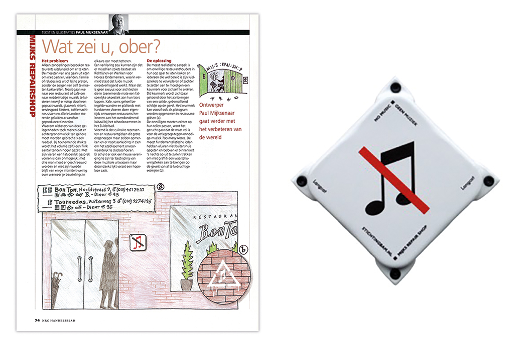
Mijksenaar continues to write. A monthly column in the ‘Design’ section of the NRC Handelsblad newspaper starting in 1985. He discusses a broad range of subjects for a wide audience, varying from objects like banknotes and pootjesglas, the collective moniker for signs produced by the Hilversum firm Pootjes, to intangible aspects like the design of public space and visual conventions that allow society to function. He starts to write the monthly column ‘Mijks Repair Shop’ for the same newspaper in 2006, directly solving problems brought to his attention with a design illustration.
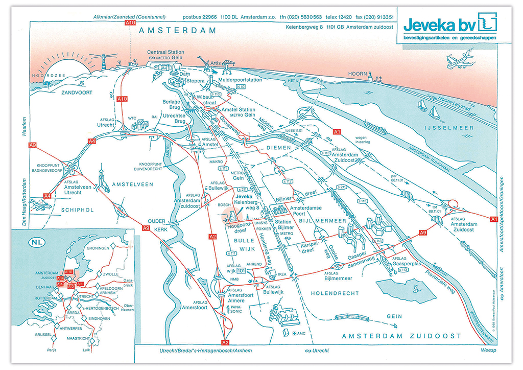
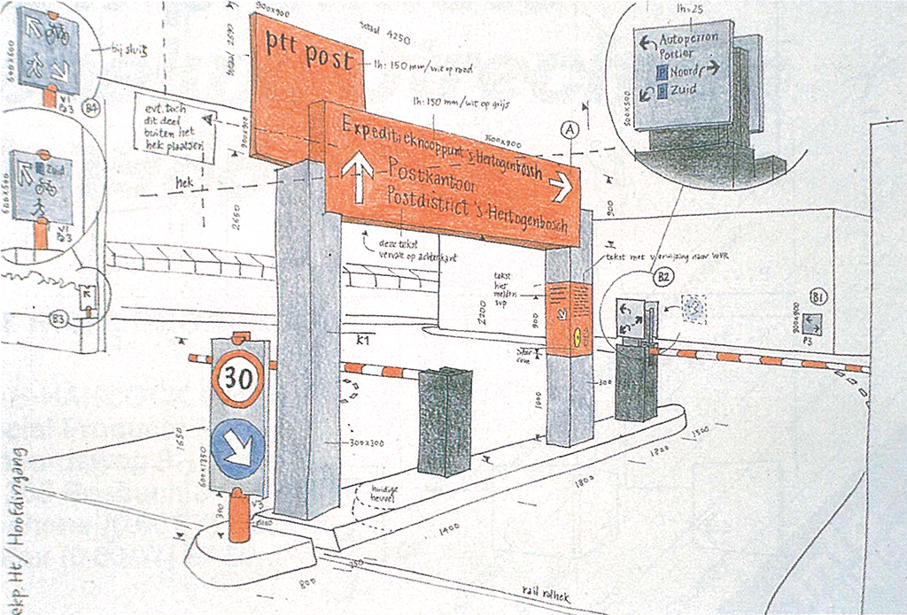
In 1986 he leaves Total Design and what is now Delft University of Technology to set up his own agency. As Paul and Ellen want each of their sons Daniël and Meijer to have his own room, he initially works out of his bedroom. He soon has to rent office premises because of the work, such as the wayfinding signage for the postal delivery junctions, that is partly carried out using the Routext system. More associates join him, including Rijk Boerma, because the commissions keep getting bigger.
Schiphol
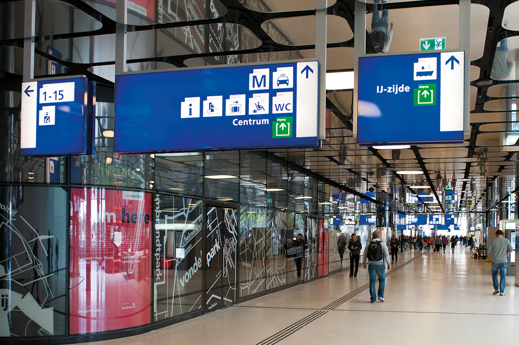
In 1989, Hans Beukelman, head of the design department at Amsterdam’s Schiphol Airport, asks Mijksenaar to conduct a small, brief investigation. Beukelman has had it with the proliferation of signs at the airport. After Mijksenaar’s tour along the access ways, through the terminal and around the piers, the concluding presentation turns out to take place in a conference room for 100 people. He analyses the problems that have been uncovered without holding back, whereupon several people leave in irritation. Those who stay listen with approval, because the airport is on the eve of a major expansion, with an elevated road system, new departure and arrival halls, new piers and a new train station to be built underground.
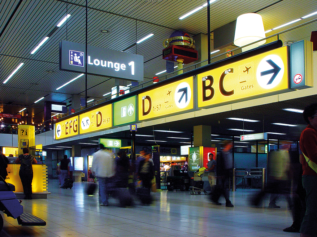
Bureau Mijksenaar wins the competition for the commission for wayfinding signage at Schiphol. Two orientation research reports are written: one on the principles and one on the concept proposals. Both deal with ergonomic aspects in order to evaluate how the traveller relates to the wayfinding signage. Aspects such as field of vision, sightlines, visibility, colour contrasts, routing, decision points, signs, maps, and everything else involved in getting the traveller through an airport without problems. Once all this has been clarified, the needed decisions are based on better evidence and made more quickly.
These decisions also take into account the history of Schiphol Airport. Before its completion in 1967, its interior architect, Kho Liang Ie, asked graphic designer Benno Wissing to produce the wayfinding signage. It was agreed that all signs leading to and from the airplanes would be yellow. The signs for all other information would be green. If needed, Wissing put a black arrow in a white circle; other symbols or pictograms would not be understood by international passengers at that time. Thereafter the in-house operational service produced the signage for two decades, and irregularities slowly crept in.
For the new wayfinding signage system, Bureau Mijksenaar keeps what is good and gradually changes what is not. He replaces the Akzidenz Grotesk font with the more legible Frutiger, simplifies the layout and tightens the vocabulary. In the wake of a fire that claims numerous lives at Düsseldorf Airport in 1996, green is now used exclusively for safety information. Other topics each get their own colour; he takes the Dutch out of the bilingual signs for the most part, reintroduces the initial capital letters and expands his character repertoire with a slew of pictograms. The international traveller can now interpret these language barrier-transcending characters without hesitation or error.
The work at Schiphol inspires his analytical mind to further research and publications. The explosive growth of travellers has made wayfinding a specialist area, and he now calls himself a ‘wayfinding expert’.
Visual Information
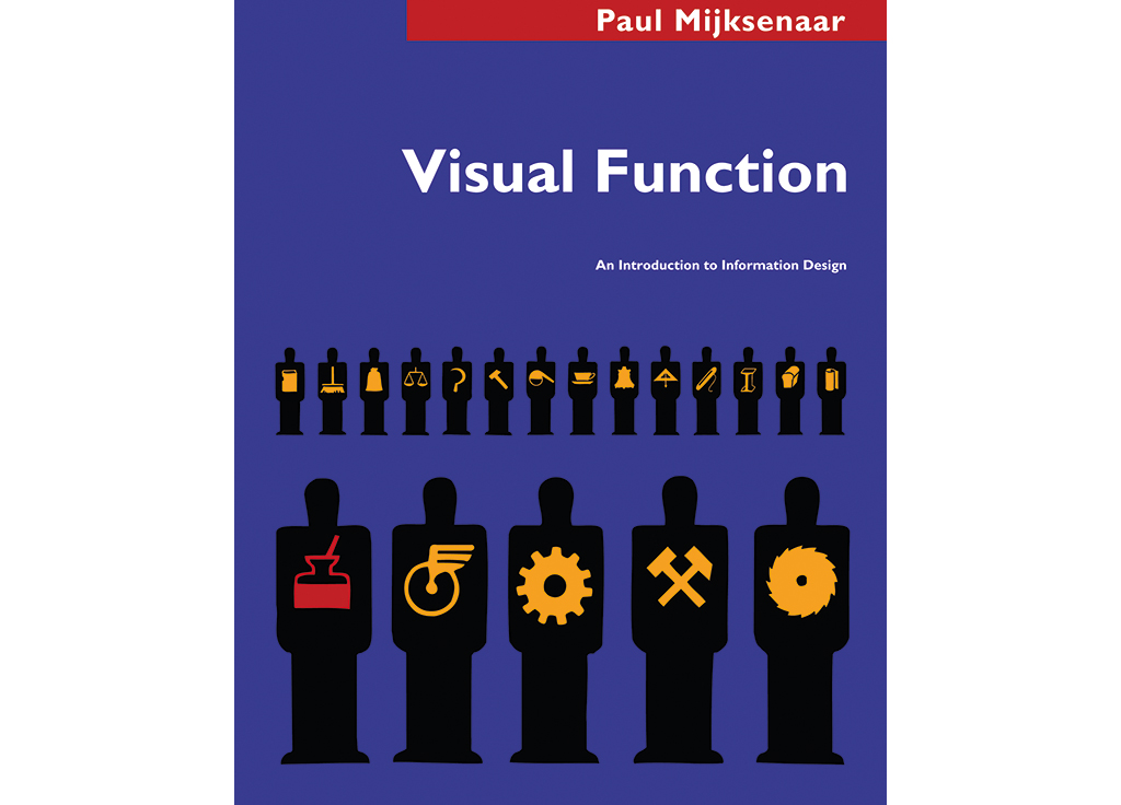
In 1996, Delft University of Technology invites Mijksenaar to become a professor, succeeding Ootje Oxenaar. One day a week he leads the Visual Information department. Besides putting together the curriculum, he mentors others in conducting research, writes about research with co-authors in professional journals, gives lectures at the university and elsewhere, shares his knowledge and know-how with students and assesses their projects with his sharp analyses.
The inaugural speech Mijksenaar gives upon taking up the position is published in full later the same year, with a dedication reading ‘For my father/ who made the preparations for the substance/but never got a chance/ to see the form’. The title of the publication is a quotation by Multatuli: ‘Seek – through very diligent labour, O adepts of art! – to master substance. Form will come to you.’ The English edition is followed by a Spanish and a Korean translation.
Over 56 pages, the function of visual information in our immediate environment is addressed, such as that of products, on screen and in buildings. After this overview, he discusses the intellectual contributions of his predecessors in the field, such as Jacques Bertin, Gert Arntz and Otto Neurath, Florence Nightingale, Charles Joseph Minard and William Playfair. After this he comes to the three principles of Marcus Vitruvius. According to this Roman master architect, every structure should incorporate firmitas, utilitas and venustas, the trinity of strength, utility and beauty. Mijksenaar translates these as sustainability, reliability and satisfaction. Using a diagram with three axes, he shows that many designers concentrate their attention on form, experiment with it or strive for beauty. This produces poorly thought-out and excessive design that interferes with the transmission of information. Mijksenaar argues that ‘form will come to you’ through a correct analysis of function and that form is perceived as beauty when it functions properly. Finally, he reminds art historians that they pay too little heed to the ordinary, such as what can be found in shops, on the street and in flea markets, while this can inspire many.
Universal Language
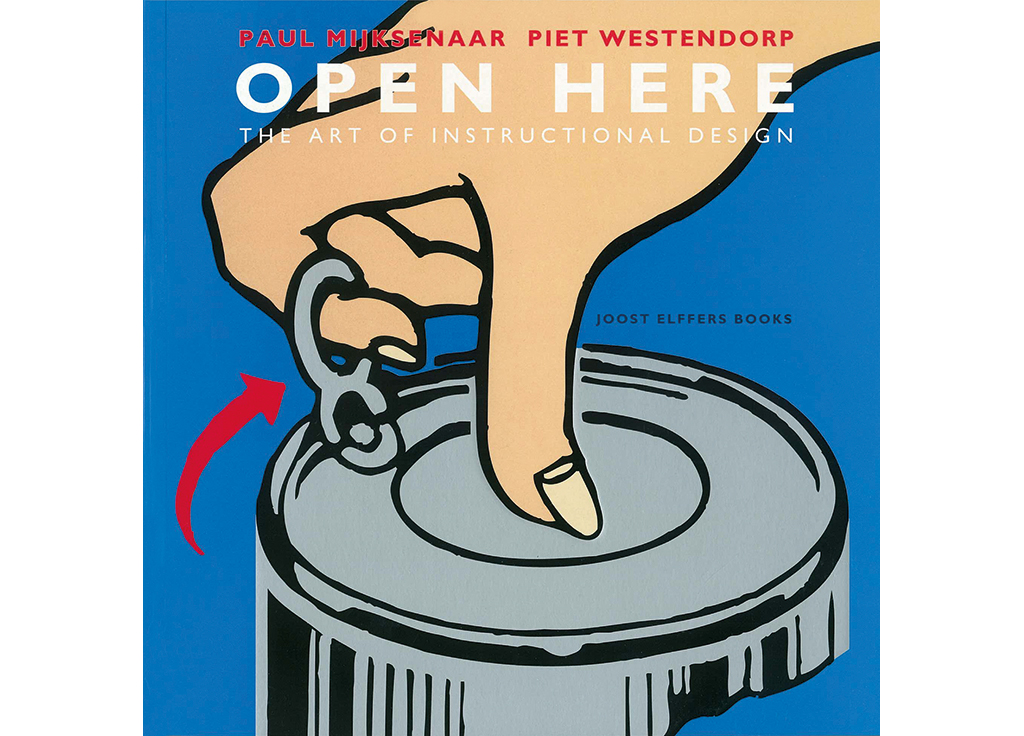
Something ordinary inspires him to publish Open Here: The Art of Visual Instructions in 1999. As further research following his second Spruijt calendar, he and his Delft University of Technology colleague Piet Westendorp select hundreds of visual instructions for all kinds of products from their archives in Amsterdam and Delft. They clearly establish that industrial revolution and technological progress have made visual explanations for all kinds of progress a necessity, in part because the physical distance between manufacturer and consumer has increased and at the same time their product has become more ingenious, so that it is no longer self-explanatory. Illustrated instructions provide assistance here thanks to their resemblance to reality, their compactness and their universality. For this last reason, the text of Open Here is the only thing that still needs translation. Other advantages of visual instructions are that they can be used in all kinds of media and that they make space and time visible – two aspects for which people lack any bodily sense. They form a language that is easy to learn, a lingua franca, bringing together many people as a bridging idiom. Because this language still lacks standardization, however, visual instructions do not yet function as a worldwide visual Esperanto. And so misunderstandings can still happen.
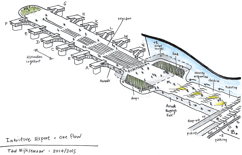
Travellers, however, want to navigate without misunderstanding. For this reason, the wayfinding specialist constructs his messages from various character systems, such as language, numbers, icons, symbols and colours. These messages, in dialogue with the architecture, tell travellers how to reach their destination. During this route, or ‘flow’, a narrative unfolds, whereby the wayfinding specialist, like a director, has to make sure the tension does not get too high, that there are understandable dénouements and finally that it all ends well for every traveller. Mijksenaar, conscious of such a scenario, would in fact like to invert this design process: first the narrative that generates the flow, around which an airport is constructed. For after this analysis, form will come to you.
Wayfinding
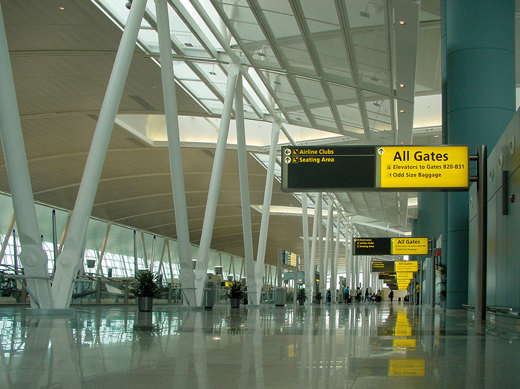
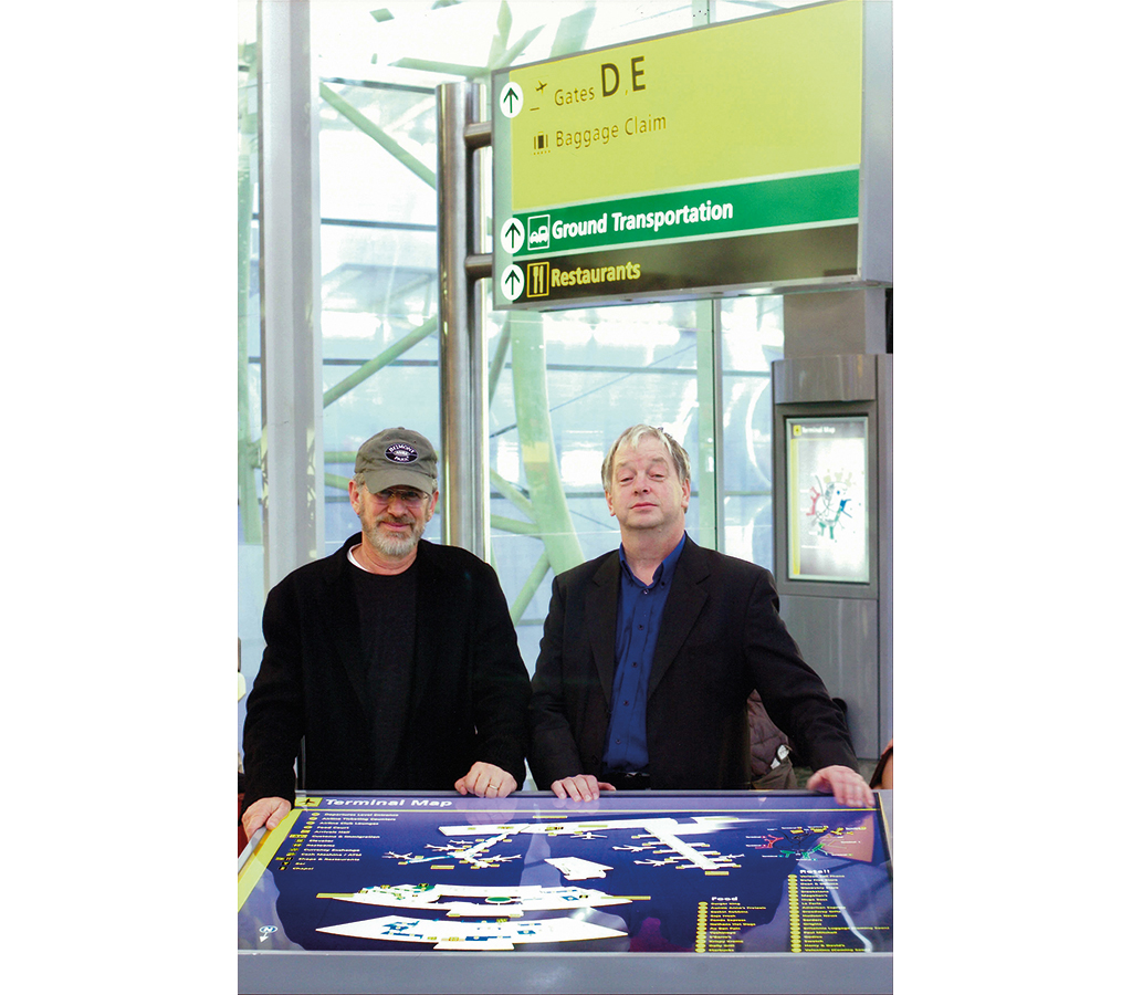
The consistent popularity of Schiphol and its subsidiary Terminal 4 at John F. Kennedy Airport in New York among international travellers leads the New York Port Authority to recruit Dutch expertise for the JFK, LaGuardia and Newark airports. Eventually Schiphol USA asks Mijksenaar to conduct a ‘peer review’ of the JFK wayfinding signage designed by Geismar & Germayeff. He excoriates it as poorly thought-out, secures the commission for his agency to redesign it and receives an award for the final result upon completion. Thereafter, in collaboration with the American engineering firm Arup, he obtains a similar commission for Dulles International Airport in Washington. For the destroyed metro stations under the collapsed World Trade Centre towers, his agency works with Arup on plans that are ultimately not implemented. They also design the wayfinding signage for an arrivals hall in an airport where no plane will ever land or take off, but where Steven Spielberg shoots his film The Terminal.
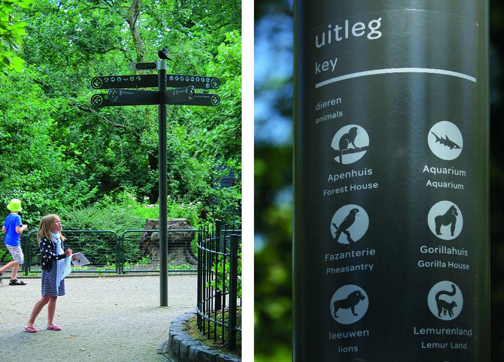
Besides that of airports, Bureau Mijksenaar also designs the wayfinding signage of car parks, shopping centres, hospitals, universities, museums, metro and train stations and zoos. In every case, the project is first thoroughly researched before the signs are designed, ordered and put in position. For example the poles in Amsterdam’s Artis zoo, which communicate with the public in four different ways. The topmost sign as the ‘Artis Walk’ connecting the 15 best-known animals. Under this a larger sign that indicates the animals in the immediate vicinity. Below that a sign for topics other than animals. And at the bottom of the pole, images depict the things that interest children.
Commissions other than wayfinding receive the same thorough analysis and detailed implementation. Mijksenaar and his associates are able to think from the small to the large, from the concrete to the abstract, and vice versa. Reduce a complex problem to a question, answer it with workable solutions and implement these flawlessly down to the smallest detail. The research report Design in the Creative Economy, for instance, published by the Premsela Foundation, in which the clear data visualizations of Bureau Mijksenaar tell the story. Or the bookend for the bookshop of New York’s Museum of Modern Art. Or the trophy for the Piet Zwart Prize, which is a three-dimensional representation of that designer’s typographic signature and is awarded ‘to an excellent designer of major significance to the profession and serves as a role model to the next generation of designers’. In 2015, the jury awards this prize to Mijksenaar, who as a result is presented with his own trophy.
Retirement
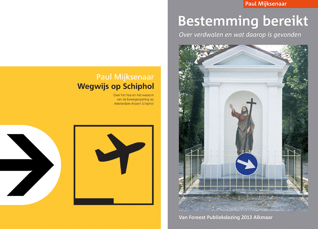
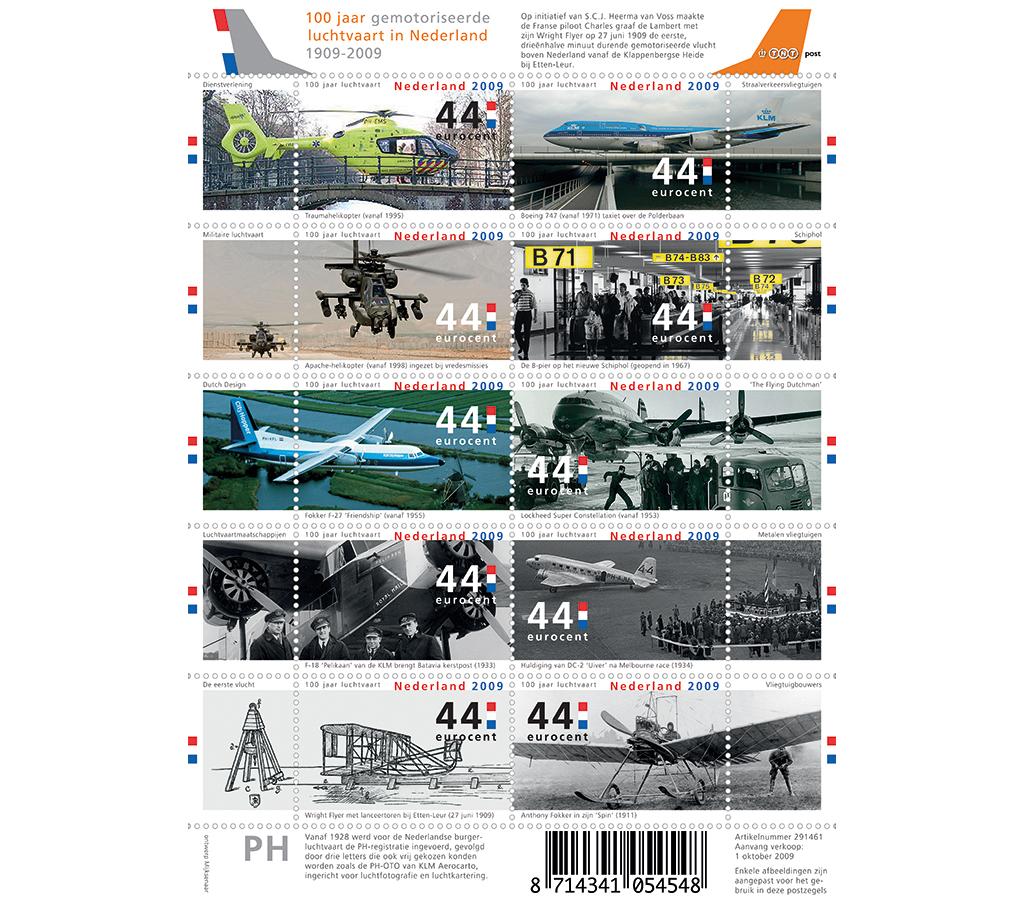
By now, regulation from The Hague has circumscribed his teaching curriculum significantly, and his role as a ‘manager’ at Delft University of Technology has become a burden. In 2007 Mijksenaar becomes a professor emeritus, later publishing the books Wayfinding at Schiphol: Destination Reached and the app 99 Do’s & Don’ts of Wayfinding. His son Meijer joins Bureau Mijksenaar in 2009. With him Mijksenaar designs ten postage stamps that year to mark the centenary of motorized air travel in the Netherlands, which the public hails as the most beautiful of the year. An additional honour is the Paul Mijksenaar Design for Function Award, initiated by Joost Elffers in 2011 to draw greater attention to functionality in design. Mijksenaar designs the trophy, which rests on three legs representing the three principles of Vitruvius: firmitas, utilitas and venustas. Edward Hines is given the award posthumously for his invention of the roadway median line exactly 100 years before. Two years later, in 2013, Belgian mining engineer Hugo Bollen receives it for his network of cycling junctions.
In 2014 Mijksenaar turns his agency over to his partners Rijk Boerma and Herbert Seevinck, who relocate it from the Bijlmer housing estate to Amsterdam’s city centre. He is now free to spend more time with Ellen in their house in Tuscany . . . and to wander.
Paul Mijksenaar
born on 1 January 1944, Amsterdam
Author of the original text: Chris Vermaas, September 2015
Translation and editing in English: In Other Words
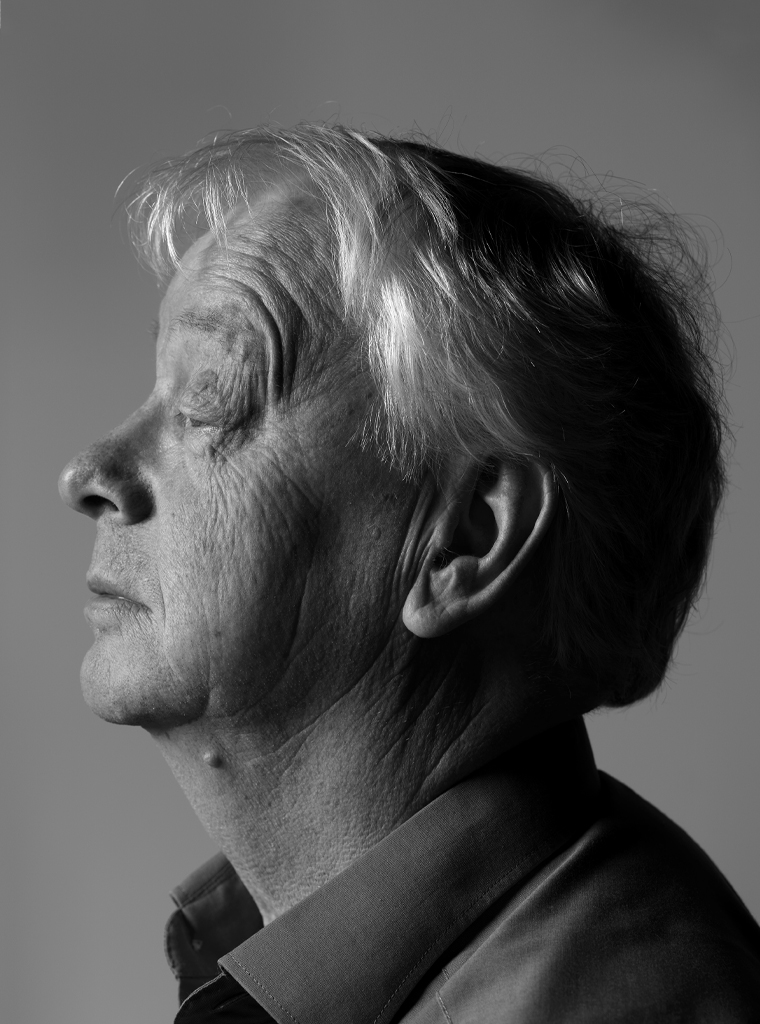
Portrait photo: Aatjan Renders