Swip Stolk’s career started at age fifteen when he entered employment of an advertising agency. He dropped out of graphic school and Gerrit Rietveld Academy’s evening class, for he didn’t want to have anything to do with conventions and couldn’t stand the academic character of the studies. Others might be ashamed of not having finished any formal education, but it filled Swip Stolk rather with pride. A self-made man, he looked back with satisfaction on his early years: becoming a professional was all his own doing. This says something about his approach to his work: for a self-taught designer the learning process never ends.
In an astonishingly short time Swip Stolk worked himself up from a nobody to a leading and innovative designer. He created a unique position for his talents. His designs are recognizable from a distance; there is no handwriting comparable to his. He didn’t follow trends – never has. He always looked for his own personal responses to developments in society. No one could deny his irreplaceable contribution to the profession. He received countless awards. His work went straight into museum collections. The education system he had rejected would later beg him for his expertise, experience and insight. The lost student became an inspiring mentor, teaching many years at AKI in Enschede and the Gerrit Rietveld Academy in Amsterdam.
His extraordinary talent set Swip Stolk apart. He never gave up, he kept throwing in his passion to convince others. He kept striving to avoid attachment to any proven model, if only to be able to meet new challenges and cross new borders. No ‘style’ became his, he was not attached to any standard or school. A free man, he based his strength on freedom. In his own words, he “never joined anything and never fit in.”
Many professionals confirmed his uniqueness, for instance in the catalog that accompanied ‘Master Forever’, his first retrospective exhibition, in the Groninger Museum (2000): the first time Swip Stolk gave account of his life as an artist and a designer.
Han Steenbruggen, the museum’s curator, wrote: “Swip Stolk is an expert at penetrating subjects. Intuitively understanding how far he can go, he knows how to create the right tension between a personal view and an – often impassioned – relationship with the subject. He is able to see subjects in their wider context and to allocate new meanings. He offers us the chance to see the world through new eyes and he belongs, with Piet Zwart, Willem Sandberg, Wim Crouwel and Anthon Beeke, to the small group of graphic designers that established the 20th-century visual culture of the Netherlands.”
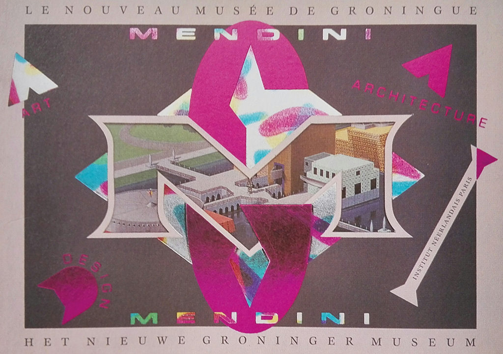
Alessandro Mendini, the architect who designed the Groninger Museum’s new extension, wrote: “Immediately, I noticed the extraordinary quality of his graphic designs and his unique locked-in, solitary personality. He established a fundamental interpretation of the museum. His way of promoting the museum’s multidisciplinary formula, the research Frans Haks was doing, and the subtle architectural characteristics of the building, was ‘aristocratic’. Amidst all these different theories and approaches, his designs remained autonomous and original, which is why I consider him to be a singular genius with an unparalleled method.”
Wim Crouwel, the Godfather of Dutch design, wrote: “Just because Swip Stolk’s work so diametrically opposes my own opinions, I can’t not keep following its development. Even if it arouses the sceptic in me, my admiration for his work is stronger. It is unique and instantly recognizable. Swip Stolk’s rich oeuvre had its roots in pop art and from there developed to baroque, but squared. In 1968, it helped to set the tone for a revolutionary period that empowered imagination. My, were we different!”
Paul Hefting, the art critic specialized in graphic design, said: “In the 1960s, an explosion of new ideas and approaches came about in reaction to the existing norms. Of the graphic designers, Swip Stolk was the most active forerunner, a ‘provocateur’ who created something that had not existed before.”
Emotions At Play
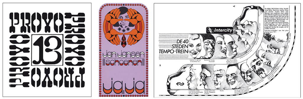
Swip Stolk was involved with Provo and with Fluxus, the radical art approach also influenced by Willem de Ridder and Wim T. Schippers. His roots are undeniably in the 1960s. In the street demonstrations, in the social and cultural revolution that took place, in the birth of youth culture with its own fashion, music, language and mores, and its own publications, such as ‘Provo’ and ‘Hitweek’.
He was there from the beginning. In the streets he learned that graphic design is not only about esthetics but also about “the effects of visual confrontation.” As he said: “A design has to create fascination, it has to hook in the retina. It has to make people turn around and look one more time to see what exactly is going on. Who needs just beauty? Intrigue, provocation, irritation, that’s what we need. Which doesn’t mean there cannot be beauty at the same time.”
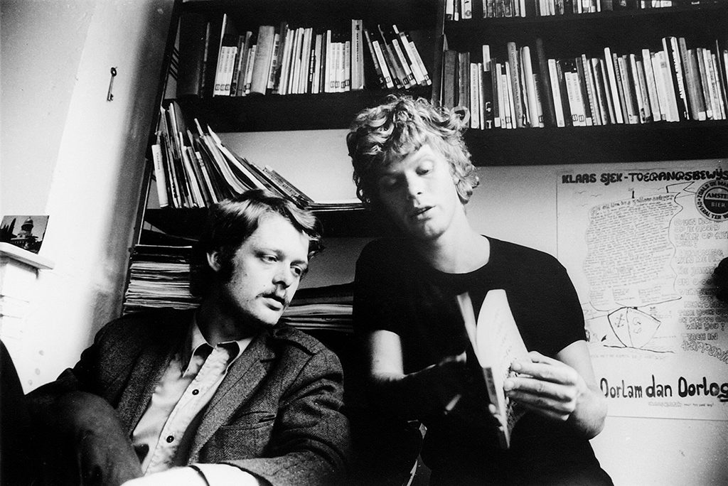
In the 1960s, clients who wanted to relate to young people were automatically drawn to Swip Stolk or to the similarly rebellious Anthon Beeke. Beeke became more than a fellow sufferer: a companion, a comrade in arms, a sparring partner. These young lions worked together for several years without any consideration for anyone else’s opinion. They created campaigns that were talked about and that reflected the spirit of the times splendidly. They played with emotions and it horrified them to find emotions absent in Wim Crouwel’s clear and clean and efficient designs.
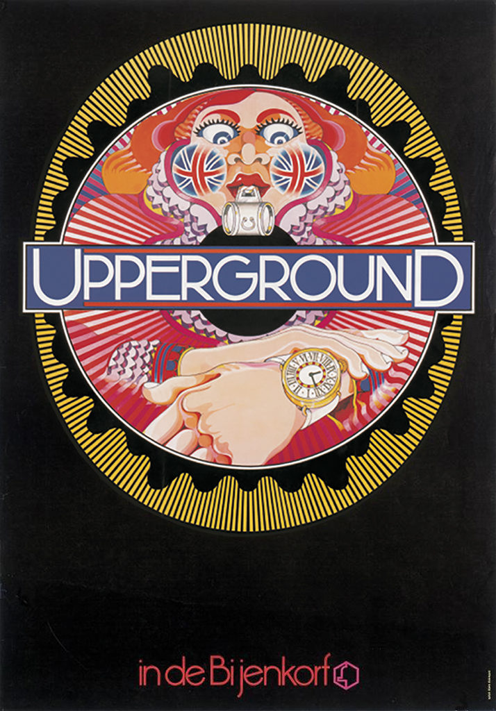
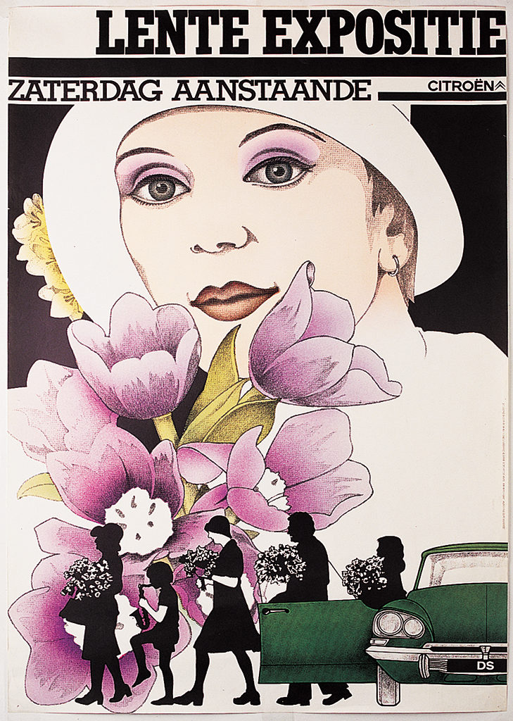
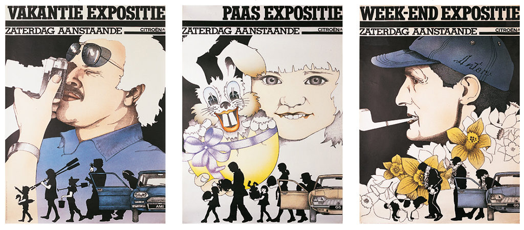
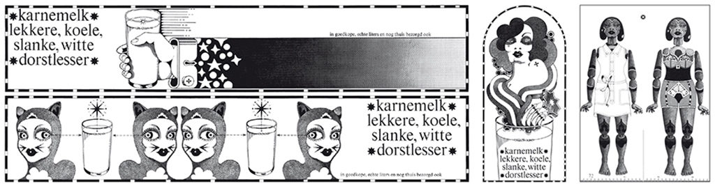
Swip Stolk created the department store campaign ‘Upperground in De Bijenkorf’ and for the Nederlands Zuivelbureau (National Dairy Board), a newspaper campaign for buttermilk. He loved working with fluorescent colors. In 2017, he looked back at that period with the exhibition ‘Neo Neon’ in Leeuwarden. Together with Beeke he designed a campaign for the new ‘Intercity’ railroad connection to which NS hoped to attract a young crowd. They also designed a campaign for ‘hip’ Citroën cars, for which the carmaker hoped to find a young clientele. Animated movies were a part of the campaign: filmed scenes were recreated in countless drawings, with the astonishing result of the silhouettes’ movements being totally natural. After a few years of intensive collaboration, Beeke and Stolk each went his own way.
A Journey of Highlights
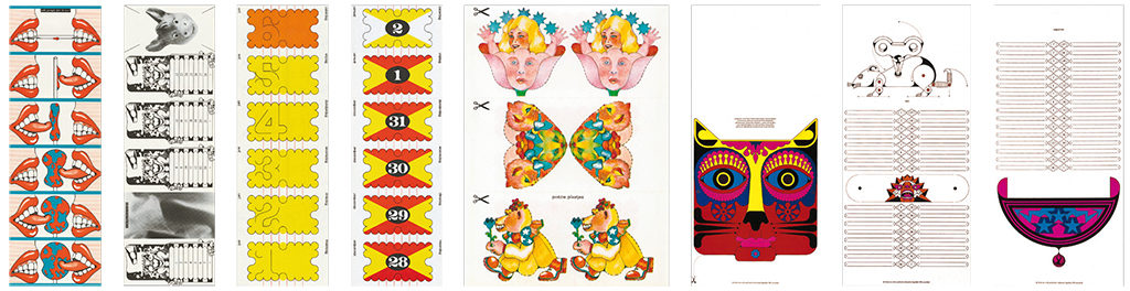
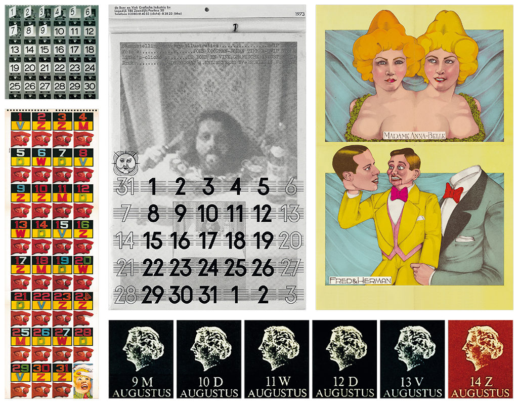
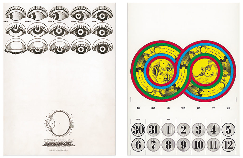
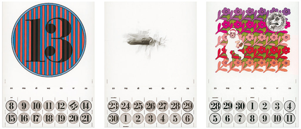
Let’s have a look at some of the highlights of Swip Stolk’s oeuvre. In his first years as a graphic designer he created a yearly calendar for De Boer & Vink graphic industries in Zaandijk. They gave him the freedom to experiment and use all available techniques. His designs did away with conventions. They were more than just calendars: they became symbols of a new approach of graphic design and print technique. What he developed could be seen as ‘visual irritation’ and would become characteristic of all of Swip Stolk’s later designs.
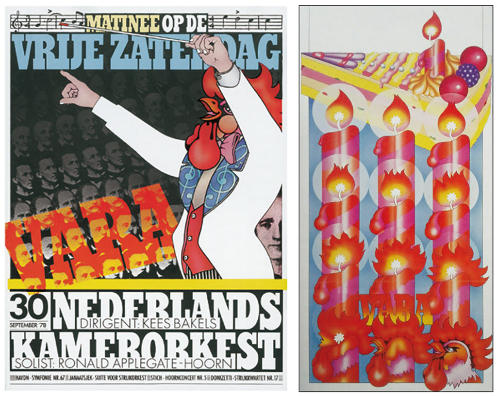
On recommendation by TV director René Coelho, the leftist broadcaster VARA invited him to become their leading graphic designer. The ‘red rooster’with “earlobes like testicles” became their logo, and again all scenes in which the rooster performed were first filmed before being recreated as drawings. The rooster came accompanied by all the elements of a corporate identity program, including an especially designed type, the ‘VARA bold’. For certain programs, such as ‘Koning Klant’ (The customer is king) and ‘Achter het Nieuws’ (Behind the news), Swip Stolk designed a studio in which the cameras could move around unobstructed. He gave VARA a recognizable face, but eventually his designs were met with reluctance and even staff revolt. In the end, Swip Stolk had to resign.
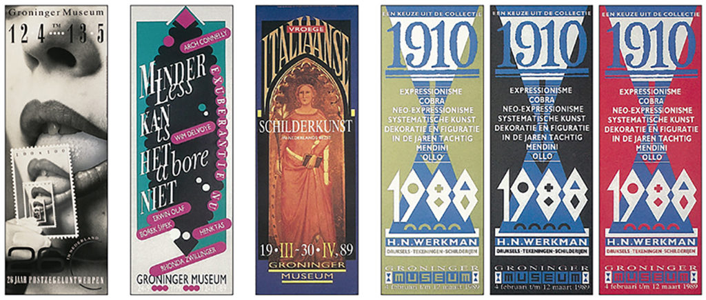
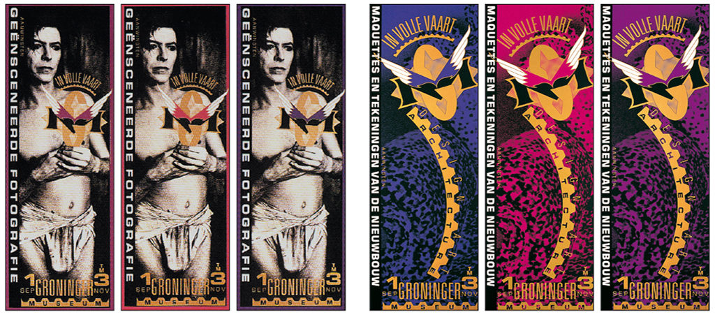
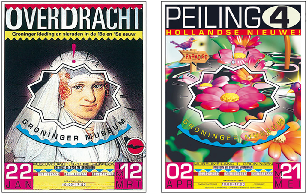
He worked for Rijksdienst Beeldende Kunst (Netherlands Office for Fine Arts) and became the leading designer of the Groninger Museum and Rembrandthuis in Amsterdam, two museums with a very different culture and style. In Groninger Museum, director Frans Haks intended to closely follow the developments in art, photography, fashion, architecture, and everything in between. In Amsterdam, Rembrandthuis was the protector of the Dutch Golden Age’s grand master. Swip Stolk had no problem dealing with these two extremes: as no other, he was capable of adjusting to the different circumstances coming with various projects. Frans Haks once said: “He just jumps on the back of the bike of his client.”
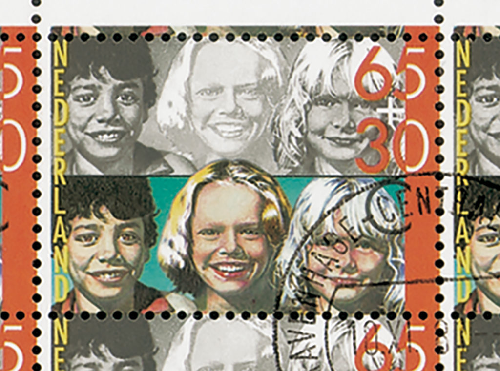
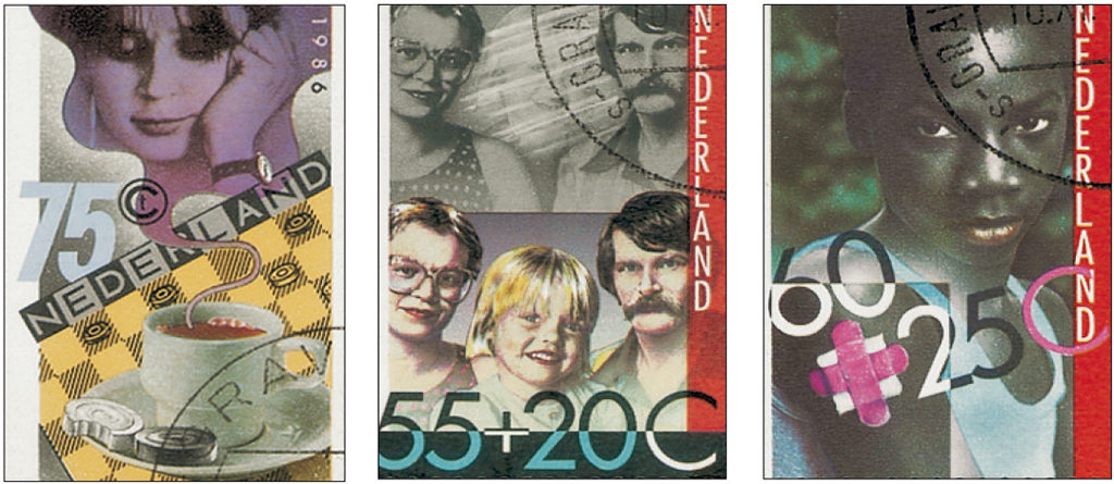
His oeuvre is rich and varied. For footwear designer Jan Jansen he created the interiors of stores as well as a book: ‘Jan Jansen. Master of Shoe Design’ (2002). He designed a logo for the magazine ‘Dutch’ and its successor, ‘Zoo’, and he worked as a consultant for ID Lite/ID Laser. He designed several postage stamps for PTT, posters, exhibitions for museums and traveling exhibitions. He created jewelry and art objects of glass and stainless steel, and he also made fabric designs.
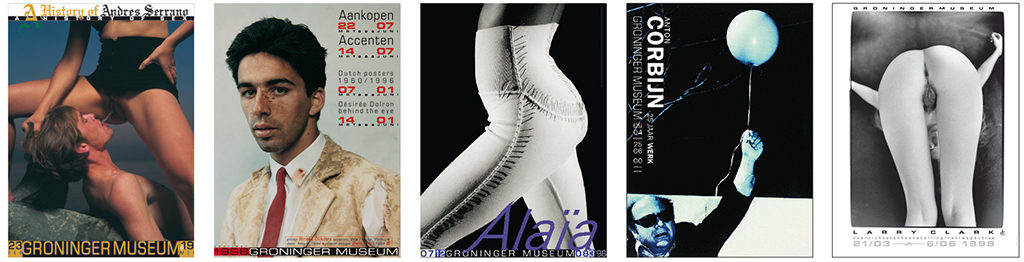
The Groninger Museum was one of his most important clients. His identity program design was as exuberant as Mendini’s architecture of its new extension. In Groningen, he became acquainted with many of the forerunners in art, architecture, fashion and photography of his time. He worked with artists such as Francois Morellet, Marina Abramovic, Anton Corbijn, Micha Klein, Andres Serrano, Joost van den Toorn, Viktor and Rolf, and with the American cinematographer Larry Clark. It was in Groningen that he developed his motto “first line, second use” about the re-application of elements from his previous designs in new designs. This way of recycling became one of his favored approaches. It only annoys him if others do the same thing with his designs without asking for his permission.
A late design project was the creation of several fabric designs for one of the most famous chairs of all ages: Theo Ruth’s ‘Pinguin’ for Artifort, in 1953. This was Swip Stolk’s contribution to a project of Job Smeets developed for the New York art gallery, Chamber. Smeets had also asked Wim Crouwel and Julius Vermeulen to present a design in black and white. Swip Stolk called his contribution, constructed from icons in his own oeuvre, ‘Hotstuff’.
the most famous chairs of all ages: Theo Ruth’s ‘Pinguin’ for Artifort, in 1953. This was Swip Stolk’s contribution to a project of Job Smeets developed for the New York art gallery, Chamber. Smeets had also asked Wim Crouwel and Julius Vermeulen to present a design in black and white. Swip Stolk called his contribution, constructed from icons in his own oeuvre, ‘Hotstuff’.
Inspiring Friendships
A different way to look at Swip Stolk’s work is by following the lines of his many friendships. Many of these inspiring connections lasted for decades. He even created a series of ‘tandem exhibitions’ (a name Frans Haks had come up with) to be held in his own home and studio in Zaandam. The location was called Galerie De Atlas van Zwerus Adrianus (his official given names) and presented designs based on these friendships.
In the first exhibit, he presented his younger brother, Rob Stolk (1946–2001), co-founder of the Provo Movement, who went on to become a printer. “He was my brother, my friend and my printer.” In the book ‘Master Forever’, Rob said about Swip: “Swip is an autonomous artist who works in service of applied art. This enables him to add some magic to his designs.” Rob and Swip collaborated for ‘Barst’, the magazine that came before ‘Provo’. Swip Stolk designed some of its covers.
Anthon Beeke. Their friendship lasted longer than their partnership in the 1960s and 1970s. Together, they designed the 2006 yearbook ‘Grafisch Nederland’, titled ‘Geluk/Happiness’. Their collaboration at architectural magazine ‘Forum’ was one of their pinnacles, in Swip Stolk’s own opinion. They totally changed the magazine’s look and, even more importantly, the editorial board invited them to become full members. They continued as co-editors from 1971 to 1975 and succeeded in widening the magazine’s scope from architecture to street and street life, cultural happenings and the latest developments in art.
The relationship between printer De Boer & Vink and Swip Stolk started in 1961 and lasted for decades, as did his friendship with Klaas Vink, the company’s director. It was a rare thing that a young and as yet unknown graphic designer was given the opportunity to do whatever came to his mind. The calendars he designed for De Boer & Vink are examples of technical prowess and design guts. “Maybe all my ideas about design already emerged in these calendars,” Swip Stolk said later. “They laid the foundations for my future work.” At De Boer & Vink, he found a dream laboratory and a podium for his designer mind and soul. There it was that he met Anthon Beeke and Jan van Toorn and discovered his wasn’t the only voice crying in the wilderness.
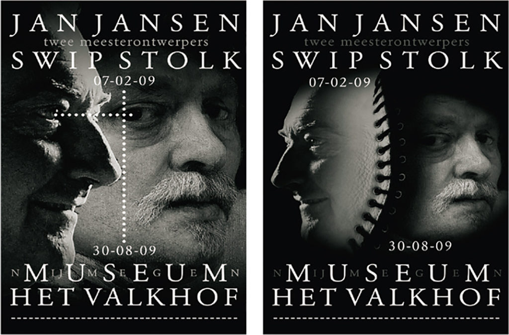
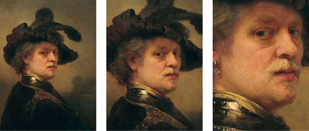
Jan Jansen was another ‘blood brother’ and comparable to Beeke. They’d first met in 1968. Wim Crouwel had designed a logo for Jansen, who wasn’t really happy with it. Pieter Brattinga connected Jansen with Swip Stolk and they hit it off immediately. They understood that they, each in their own field, were working along similar lines. They recognized each other’s attitude. In 2009, their friendship found its apotheosis in the duo exhibition, ‘Jan Jansen/ Swip Stolk. Two Master Designers’, in Museum het Valkhof, in Nijmegen. Swip Stolk designed the poster (based on portraits of Jansen and himself, he as the Rembrandt from his exhibition ‘Master Forever’, and both portraits connected by elements of a men’s shoe designed by Jansen); he also designed the exhibition space.
Paul Mertz, Dutch ad man beyond compare and a communication consultant for the Dutch arts and culture, was one of the first who commissioned Swip Stolk. It resulted in the ‘Upperground’ design for De Bijenkorf and the buttermilk campaign for the dairy board. Paul Mertz remained a lifelong friend and an important and invaluable inspiration.
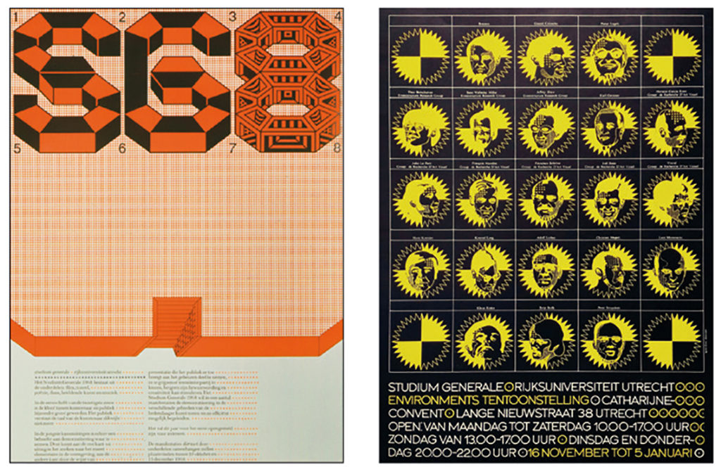
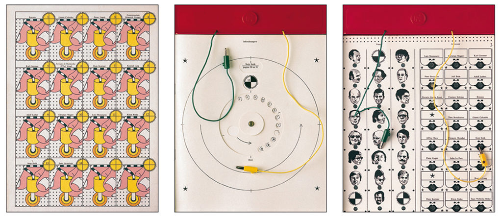
1968 was a magical year also because Swip Stolk met art historian Frans Haks (1938–2006). Haks worked for the university in Utrecht on an exhibition in the Catharijneconvent, ‘Environments’, about democracy and innovative directions in contemporary art. Haks wanted the public to participate, not just be passive. He had thought to work with Jan van Toorn, but Van Toorn had other things to do and advised Haks to engage Swip Stolk. The two understood each other well. Swip Stolk came with the idea of an electronic catalog working on batteries, based on the ‘Electro’ table game published by Jumbo. He also designed the exhibition and it became an equally provocative environment, to be entered through a dark tunnel; portholes offered a view of parts of the exhibition but only after the public had punched the right buttons to switch on spotlights. He contributed to the exhibition in more ways than as a designer: he became its co-editor and co-curator and a fellow artist of the participating artists. Haks and Stolk created a new podium for art; it was the beginning of a life-long friendship and collaboration.
Ten years later, Haks had become the director of the Groninger Museum. One of the first exhibitions during his regime was devoted to Swip Stolk and his memorable involvement with VARA. Haks and Stolk collaborated on some forty projects for the museum. After Haks had left, in 1996, Swip Stolk continued to be their graphic designer. His poster designs were recognizable because of their unique narrow format: four A4 sheets above each other. He exploded when he found out that, to mail the posters, the museum staff folded them four times, to make them fit in the envelopes. He insisted them to mail the posters in tubes instead.
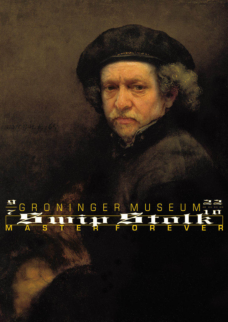
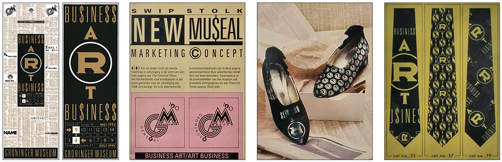
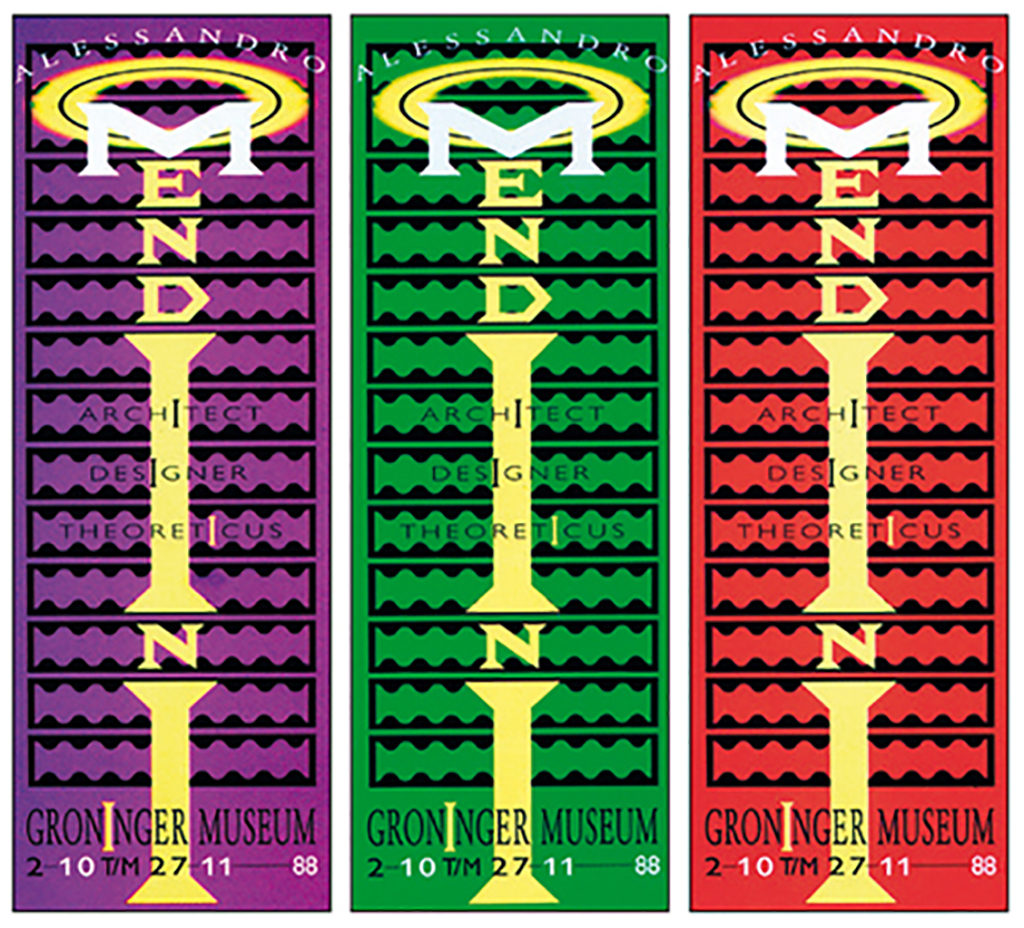
Highlights at the Groninger Museum were the exhibitions about Alessandro Mendini was, in 1988, Memphis in 1989/1990, and ‘Business Art/Art Business’, and of course ‘Swip Stolk. Master Forever’ in 2000. Six years after Frans Haks had died, Swip Stolk designed a gem of a little book, ‘Frans Haks. A portrait’ (2008). A tribute to Haks with contributions by friends and colleagues in which Haks and Stolk were called “the twin brothers of museum land.” About Stolk, Haks had once said that “all forty years, he kept amazing me.” No greater compliment was possible, responded Swip Stolk. “Imagine, coming from someone like Haks, who always chases the new…”
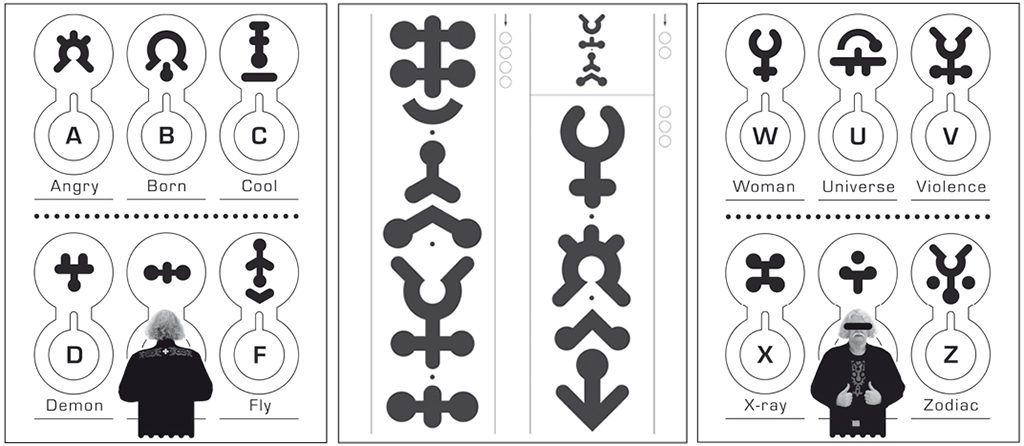
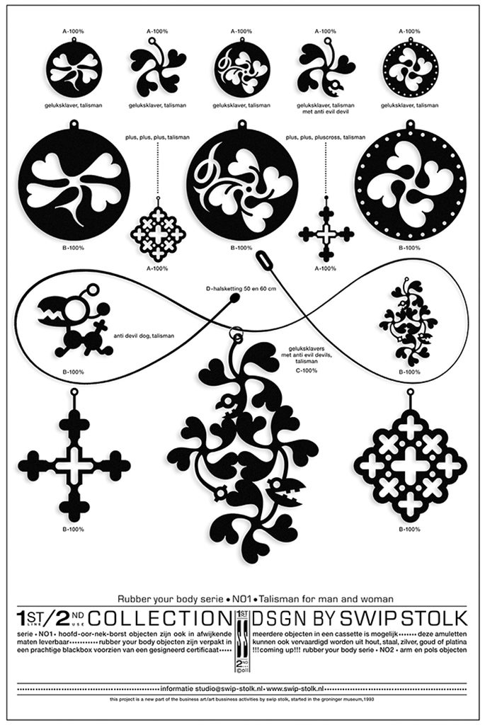
Victor Spits of ID Light/ID Laser was also a close friend and compatriot. ID in Westzaan was specialized in laser techniques for the graphic sector and Swip Stolk designed their corporate identity program (in 1993) and a website (much later). He was allowed to use the new techniques for any experiment he wanted to do. In 2003, he presented the ‘secret’ alphabet ‘Secret Signs’, an amazing alphabet designed to let codes communicate with each other. As always, there was a double entendre. Each letter had a double meaning, the second one more symbolic. A is for Angry, B is for Born, C for Cool, et cetera. By using decoding cards one was able to find out about someone’s true character.
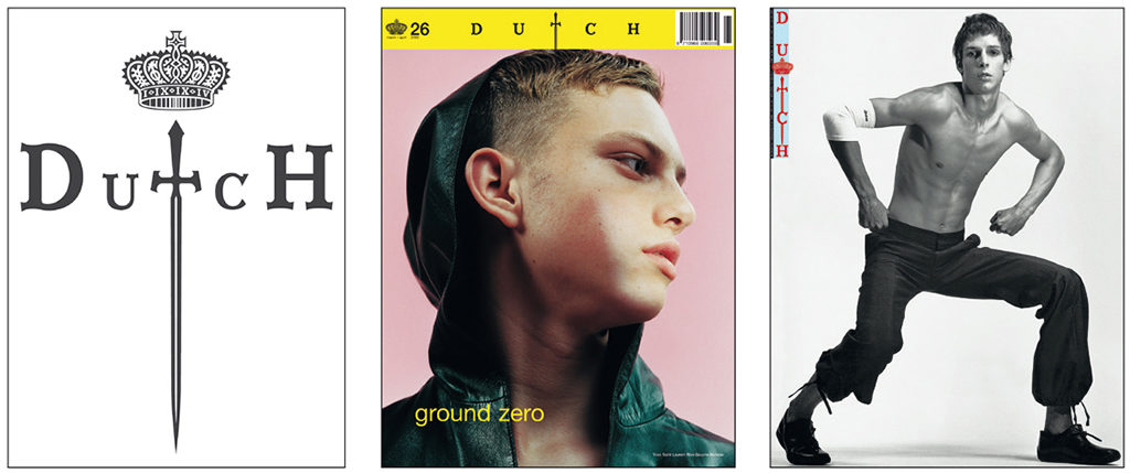
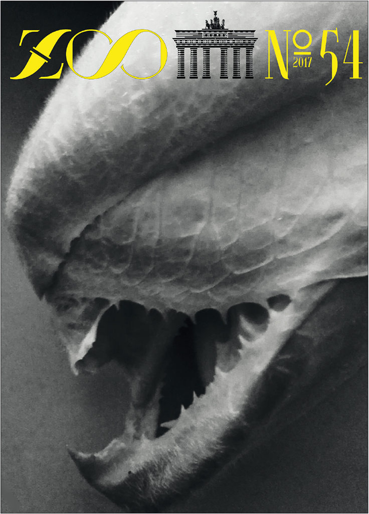
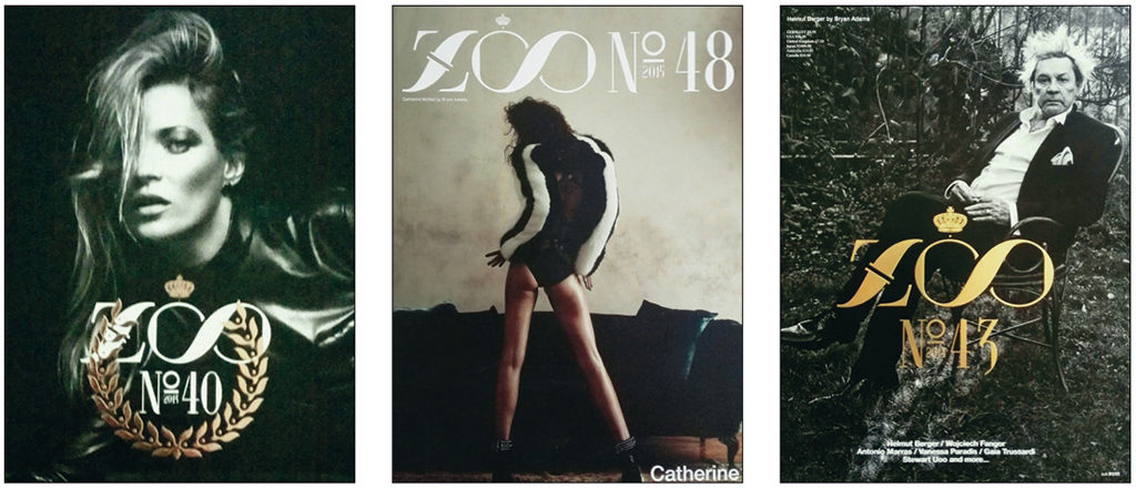
Sandor Lubbe was the man behind the avant-garde magazines ‘Dutch’ and ‘Zoo’. Stolk and he cherished strong ties for more than twenty years. Swip Stolk designed their instantly recognizable titles. His involvement with ‘Zoo’ reconnected him with the avant-garde in the art world and in fashion. ‘Zoo’ became a showcase for his newest work.
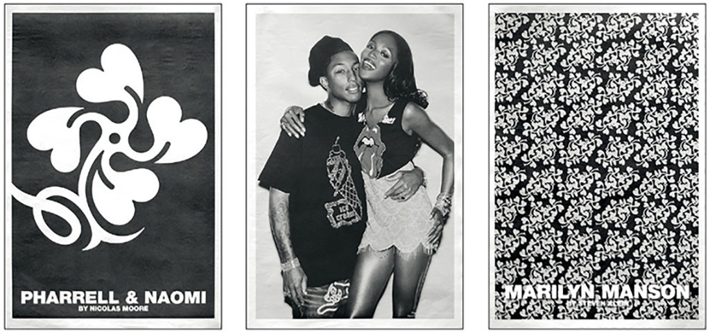
In 2004, the Palais de Tokyo in Paris presented the exhibition ‘Curious Wishes’. Commissioned by BMW, six avant-garde magazines selected an artist to redesign a top class BMW. ‘Zoo’ chose Swip Stolk for the job. He covered the vehicle with a second skin of black rubber and added symbols and signs from his own ‘secret’ alphabet. The rubber skin was vacuum-drawn across the car’s body and the symbols and signs bubbled up and formed reliefs. The car was eventually entered in BMW’s collection in their Munich museum. In 2005, Swip Stolk, in a special edition of ‘Zoo’ showed his jewelry designs in a unique setting, because his designs were worn by pop icons such as Pharrell, Naomi and Tommy Lee.
Iconographic Symbolist
Early 2017, the magazine showed Swip Stolk’s latest work. It was called: ‘Groceries. The Other Face of Food’, a surrealist world he discovered after going shopping and attacking his groceries with a kitchen knife. He discovered a visually bizarre universe and instantly grabbed his smartphone to preserve it for eternity. “It is what your eyes discover,” he said, “like faces in the wallpaper.” This is how he observed the world, all through his career, and the proof is in his designs. In this ever recurring role, Swip Stolk called himself “an iconographic symbolist”.
Swip Stolk
born on 3 Januari 1944, Zaandam
died on 10 March 2019, Zaandam
Author of the original text: Willem Ellenbroek, March 2017
English translation and editing: Ton Haak
Final editing: Sybrand Zijlstra
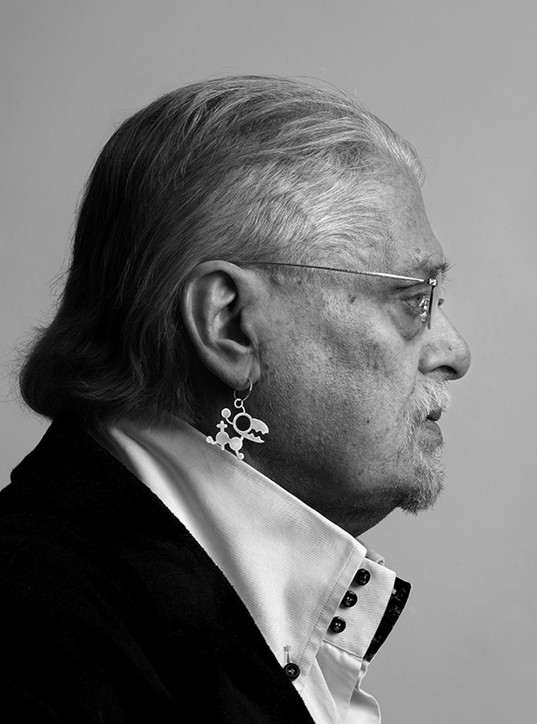
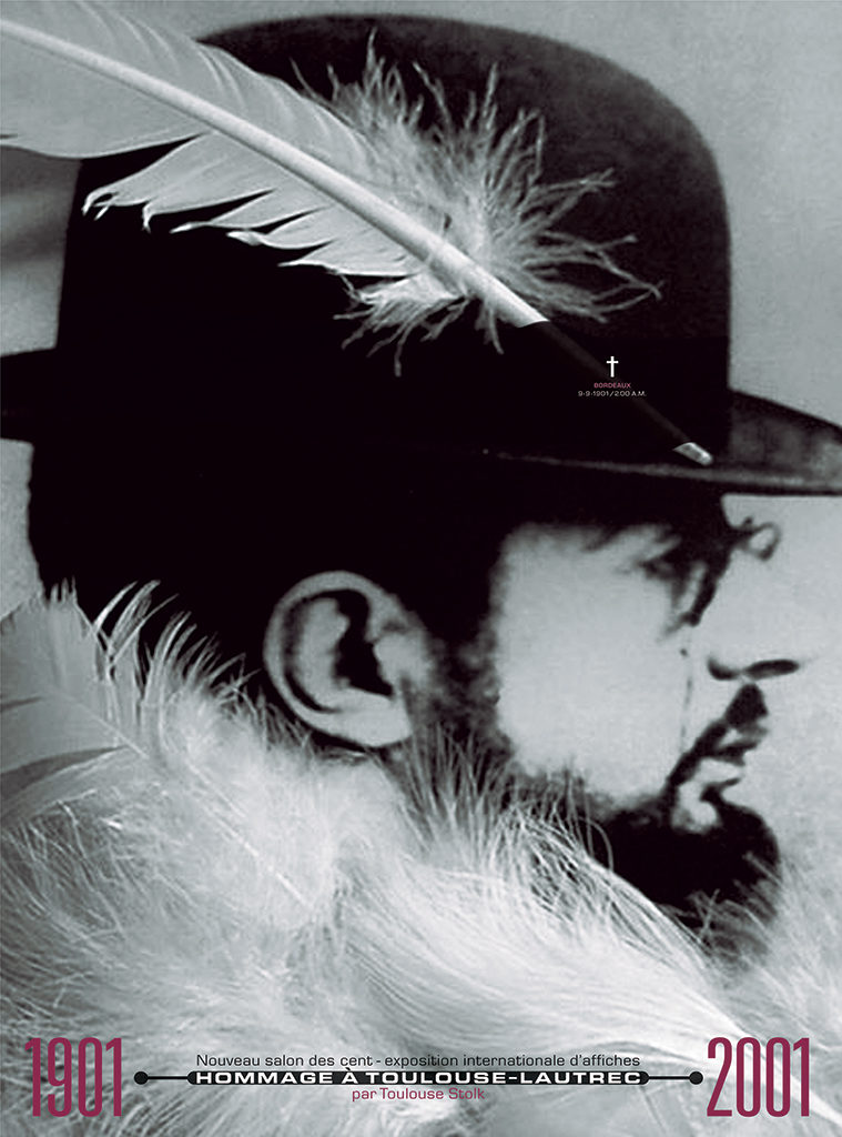
Portrait photo: Aatjan Renders