Since Karel Treebus understood possibly better than anyone that typography is a means and not an objective, he was well aware of the essential distinction between hype and evolution. His whole professional life was based on grasping the reality that form is content too. He was a driven man who did not pretend anything, just delivered a service, and never hesitated to share his knowledge with others. He was a unique example of ‘homo typographicus’, a species not yet extinct but under threat. We have to thank Karel Treebus for his contribution to keeping typography alive and kicking.
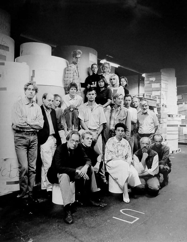
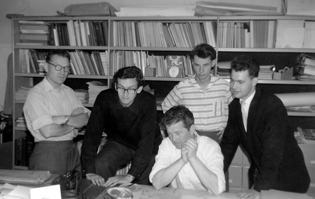
Sdu’s design group in 1987. From left, top row: Gert Kootstra, Esther Noyons, Paula Molewijk, Vincent Peters, Moniek Voorhout, Irma Boom. Middle row: Eric Nuyten, Joost van Roon, Debora Goedewagen, Marjon de Haan, Herman Govers, Cook Kouwenhove, Date Nieboer, Steven Tuinstra, Karel Treebus. Bottom row: Gertjan Leuvelink, Gert de Graaf, Maia Scherf-Sapuletty, Gerard Bouwman, Bart Versteeg (photo: Bart Versteeg)
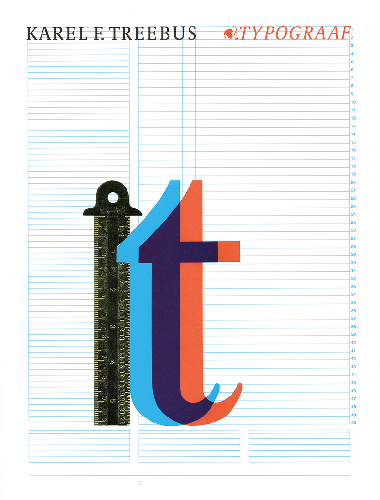
Typography is a must
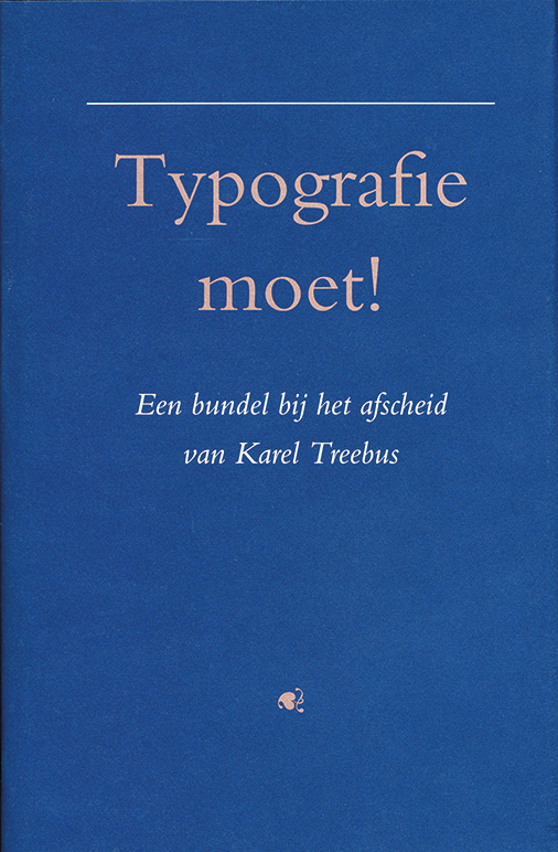
His farewell party at Sdu (the Dutch government printing and publishing house) took place on September 10, 1993. But he had stopped working already on August 1, almost forty years to the day that he had entered its employment: July 27, 1953. Karel retired early, at age 55, but could look back on a remarkable career; he had been kept hostage by this ‘many-faced monster’ called typography. The story of his captivity can be read in the collection of twenty-four essays, Typography moet! (Typography is a must!), written by friends, former colleagues and others. Some of their contributions don’t even mention typography but deal with the characteristics and concepts that define the many-faced monster: intuition, freedom, restraint, arrangement, love of books, literature, invisibility, precision, imaging, selection, technique, evolution, history, communication, tradition, innovation. The book is a covert, short biography. It hides the mentality that reflected Karel’s life and infected all around him. Even in the hospital he had to visit for an allergy test he was welcomed with the words: “Hi there, Mr. Treebus, are you here for the past-up?”
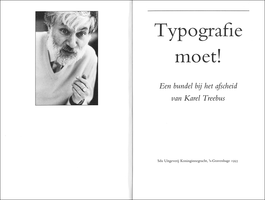
Cover and title page of Typograpy moet! received by Henk Treebus at his farewell from Sdu, September 10, 1993 (design: Wim Zaat)
How Karel Treebus made it from an apprentice-typesetter to “the complete bookman” (as Huib van Krimpen called him) is a long story. His talents and personality made him the unique man he was; but of just as much influence was Sdu’s company culture, as he gracefully admitted. Its pro-design culture was stimulated by Sdu’s deputy-director (later their director and from 1958 director-general) Th.H. Oltheten and cultivated by their first designer, A.J. Blom. In 1937, Blom had entered the service of what was then called ‘de Landsdrukkerij’ (The nation’s printer); he was then promoted to a management position and in 1955 assigned to create a separate department for graphic design, which would later be called Sdu Design Group. In 1958, Karel became a member of the team and soon occupied a leading position. Paradoxically, and surprisingly, the continuing growth and alteration of the organization strengthened his position. His reputation reached beyond Sdu to professional circles and clients alike.
The design department’s start was based on a coincidence. Ton van Riel, who worked as a bookbinder, was an enthusiast illustrator. Oltheten recognized his creativity, sent Van Riel to evening class at The Hague’s Royal Art Academy and appointed him as graphic designer. A free spirit, Van Riel contributed much to the department’s culture of experimentation and was an inspiration to the young Treebus. In his spare time, Treebus started making studies for EP record covers for example.
Karel Frederik Treebus was born to the public transport conductor Karel Frederik Treebus, Sr. and Jannetje Vooijs. At age fifteen, after three years of MULO secondary education, and because his uncle Piet Gaal and his cousin Wiggert worked there, Karel joined what would eventually become Sdu. He was schooled in the theory and practice of typography at the company’s part-time in-house school, where graphic design got just a little attention. Oltheten couldn’t ignore Karel’s talents; after finishing his in-house schooling (by H.C.A. Lommelaars) he was invited to join the design team, where he was welcomed by A.J. Blom. Other team members were Henk Alkema, Fons van der Linden, Ronald Lindgreen and Ton van Riel, and later Aad van den Bosch joined as well.
The design department was allowed to become more independent and was housed in the ‘housekeeping’ space of what previously had been the director’s home. It was the beginning of what would become a historic development. Similar interesting and important in-house design departments were becoming of great influence on graphic design in the Netherlands: at Lettergieterij Amsterdam (typesetting), Ahrend (office furniture), Océ-Van der Grinten (photocopiers), and the city printing house in Amsterdam. Between 1945 and 1955, these became breeding grounds for design; they modernized typography and graphic design. Progressive printers also became influential; they understood that efficiency and esthetics paired up well and even strengthened each other. Design would no longer be left to the typesetters and designers were learning that their technical know-how should be up to date. After the Dutch economy had overcome the after-effects of WWII, by the mid-1960s graphic design was on its way to become a desirable profession. Freelancing was still the best option in most cases. In 1948 GKf had only 49 members, by the early 1960s the number had doubled (although not all were independent).
At the beginning of Sdu’s design department. From left: Henk Alkema, Fons van der Linden, Ton van Riel, Karel Treebus, Aad van den Bosch, 1959
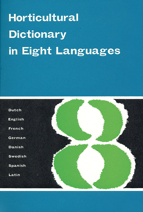
Cover of Horticultural Dictionary in Eight Languages, 1961
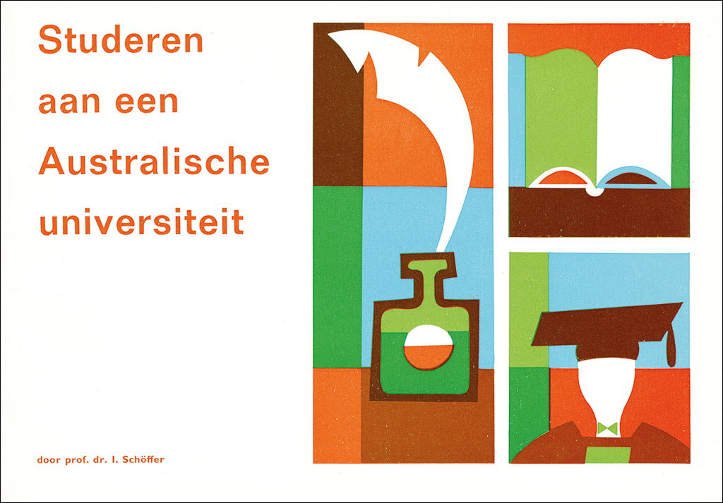
Cover of brochure To Study at an Australian University, 1962
The housekeeping room at Sdu was the site of much improvisation and pioneer work. In the beginning, they had to cope with what often were inferior paper types (which they called ‘underpants paper’) and other handicaps. Later, this ‘dynamic austerity’, which created strong forms with a long shelf life, when it was no longer a necessity, it became a choice. In spite of the limiting circumstances, Karel Treebus got ample opportunity to grow professionally thanks to the support given by Oltheten and Blom, who had a good eye for design and for quality. They managed to find the balance between what the partners in the process expected: the (progressive) designers, the (conservative) company and the clients (also conservative). And then there were the (instable) dynamics within the design team to reckon with. Designers could not yet sign their creations – it would take time before they would be presented as ‘authors’ – but after four year at Sdu, Karel Treebus received his first award: one of his reports for a state commission was recognized as one of the 50 Best Designed Books.
Treebus would be able to create many more outstanding designs – books, posters, magazines and more. His covers for the extended series that started in 1969, Het Koninkrijk der Nederlanden in de Tweede Wereldoorlog (The Kingdom of the Netherlands during the Second World War), attracted much attention. His Monsterboekje (Seaman’s book) of 1968 excelled and became a curiosum. His sensibility to language and orderliness grew, as did his talent for management of complicated projects; at the same time he was able to be the focal point at Sdu’s design department, their stabilizing force, and their conceptualizer – playing defense as well as quarterback. With too much work to handle, the design department had to engage many external specialists; and Sdu’s printers, too, needed support from outside. Karel got to know most graphic experts in the country and to work with many of the graphic industries (most of which are now defunct).
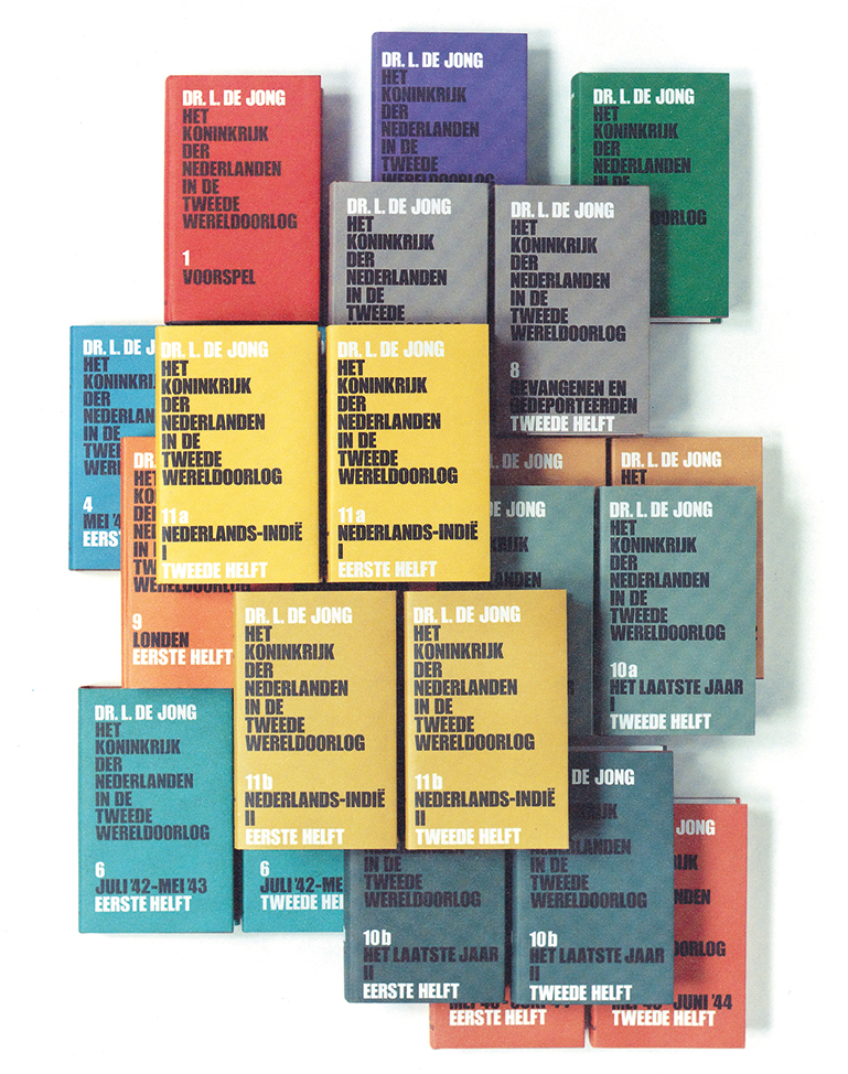
Covers for eleven books of Dr. L. De Jong’s standard work about the Netherlands during WWII, 1969-1985
In his spare time, he began to write. First for the company’s staff magazine, ’s Lands drukker (The nation’s printer) in 1956. In 1970, he edited the brochure Het zetten van vreemde talen (Typesetting of different languages); it would be reprinted three times. Then came Tekstwijzer. Een gids voor het grafisch verwerken van tekst (A guide to graphical text processing). By that time, it was 1982, Hein van Haaren had joined Sdu’s publishing branch as their director; he was as strong a promotor of good design as Oltheten himself was and Blom had been, and he had immediately recognized the commercial opportunities of Tekstwijzer. The book, an instant success, found a broad market.
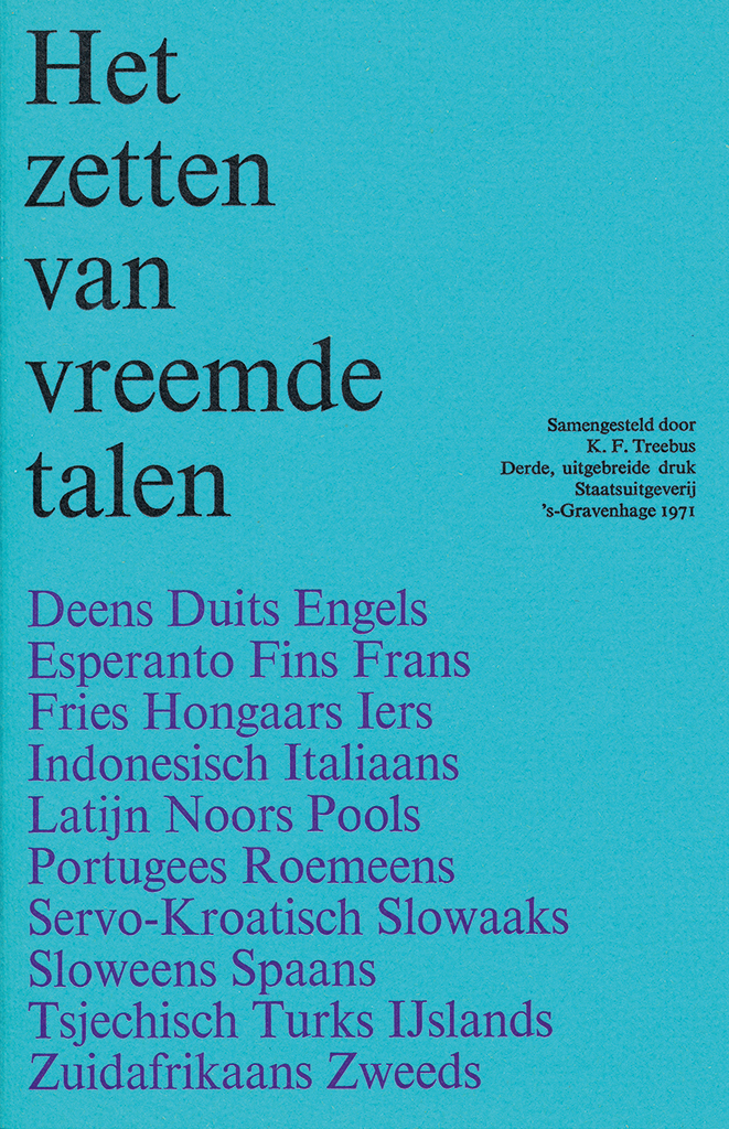
Cover of Typesetting in foreign languages, 1971
Cover of Typographic manual, 1989 (design: Harry Sierman)
Treebus had close ties with Museum Meermanno-Westreenianum (Museum of the Book) in The Hague, where R.E.O. Ekkart was the director. In 1986, they organized an exhibition about Karel Treebus, designer; he had worked more than twenty years for the museum. In 1985, they had started publishing a series of monographs. The one about Treebus was more than a catalog and showed the public what the Sdu was all about. It came at the right time, because Sdu’s privatization (in 1988) was foreshadowed. Karel wasn’t too eager to ‘promote’ his company (“There are more important things to do”), but he nevertheless took the opportunity to present the educative aspects of the production processes of the graphic industries and the importance of graphic design.
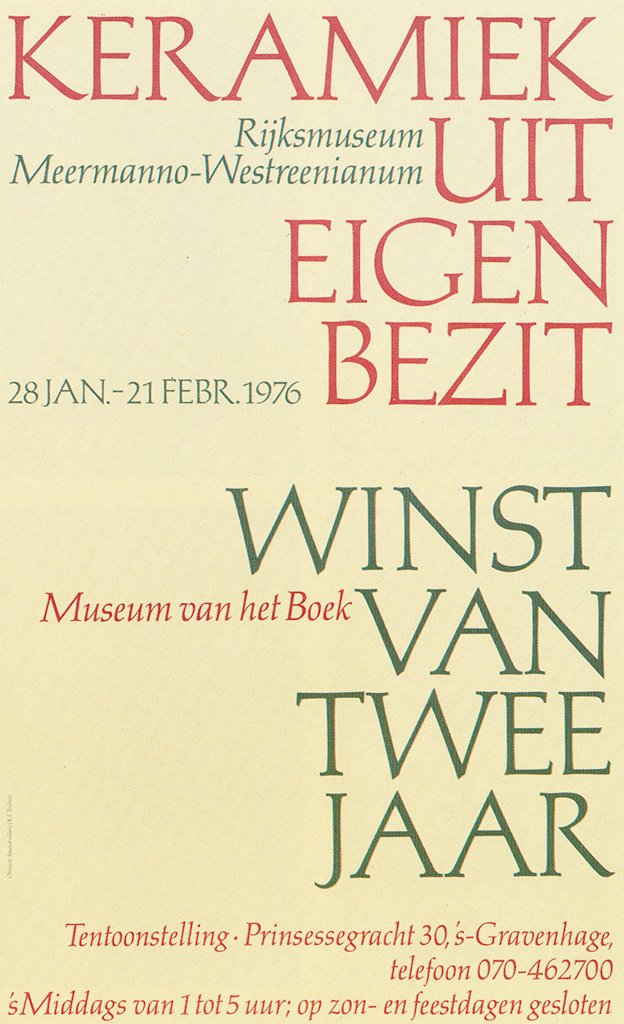
Poster for Museum van het Boek, 1976
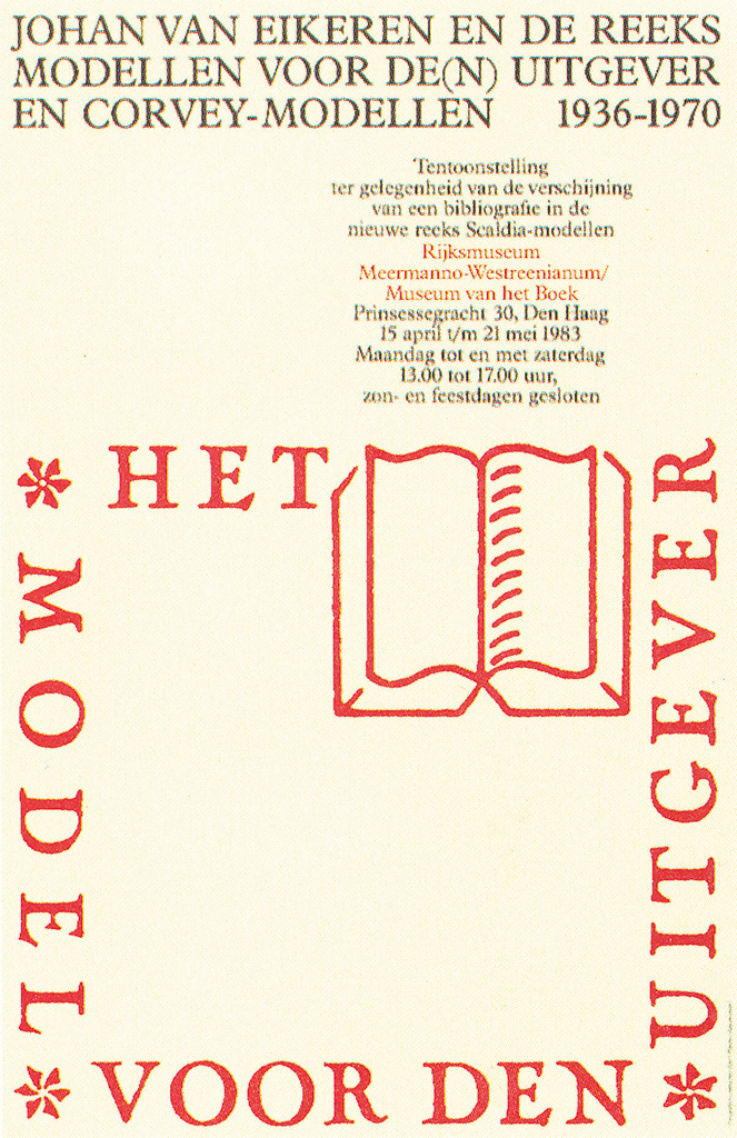
Poster for Museum van het Boek, 1983
Sdu was in transition at that time: electronics marched in and changed the company culture and their typesetting traditions. The Karel F. Treebus, typographer exhibition offered a great opportunity to explain the ongoing confusing processes, how to discern hypes from evolution, and how the new techniques and innovations would fit in with the existing ideas about form and yet create a new visual language. Was ‘communication’ more than a magic spell and would it serve society well – was it just a faddish word or a screen for the capitalists world to hide behind? May 13, 1986: Ekkart opened the exhibition after Van Haaren had asked the audience: “Typographer, erudite professional, author, who else but Treebus is able to be all?”
Karel Treebus was known for his exclamation: “Any type is fine as long as it is the Times New Roman.” Nevertheless, in 1982 he began to use a new Dutch font, Trinité, designed by Bram de Does, in the book and poster he had designed on the occasion of the reopening of the library of the Dutch ministry of culture, CRM. For Het Groene Boekje (official spelling guide, 1985) he would later use De Does’ Lexicon font. Gerard Unger’s Demos and Hollander fonts would be applied in Tekstwijzer, in Vormwijzer and in Karel Treebus, typographer. But he loved Eric Gill’s Gill Sans and Joanna just the same.
Cover of Karel F. Treebus, Typographer, 1986
Written for the future
The eminent typographer Karel Treebus knew how to organize technical simplicity. He did the profession a great favor by writing down his expert views in three deep-delving books: Tekstwijzer (1982), Vormwijzer (1991) and Symbolenwijzer (2007). These books are great teaching and reference tools, but they are more: they are still such unique compilations of practical knowledge and experience, and technical and theoretical backgrounds, that they keep transcending all other publications about the subjects. Karel wrote down in very precise language his reflections on the developments and the highlights of the graphic production industry and the evolution of language and form. His observation post was unique: Sdu put him in a position that allowed him to keep an eye on the diversity of the rapid changes the industry had to pass through; his books explained the ongoing evolution and its effects on the industry’s efficiency, organization and manageable work conditions. Just like Typographisch ABC by Henri Friedlaender (for Mouton publishers, The Hague) and Zet het zo! (Typeset it like this!) by Bern C. van Berkum (for Debussy, Ellerman and Harms, Amsterdam) his books were written for internal use, only to become historic source books. They were essential tools benefiting production efficiency and quality improvement, and they paved the way for good graphic design.
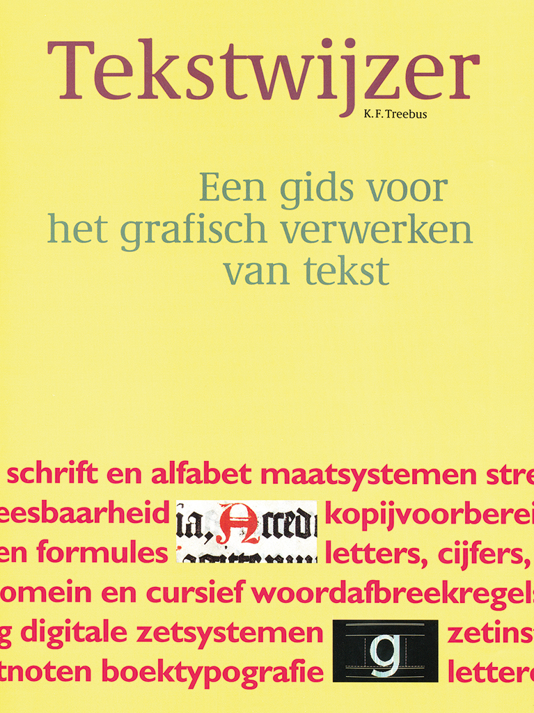
Cover of Tekstwijzer, 1990
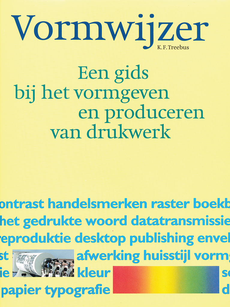
Cover of Vormwijzer, 1991
They were books that, though offering very practical advice and instruction, already had an industrial-archeological value at the time they were published. Because they were conceived at Sdu, a company that was often the first one touched by all the industry’s evolutions, they became assets not only within the profession but also provided tools to a more general public. Tekstwijzer, written before the pc was introduced, became an immediate bestselling book because it clarified many of the confusing if not controversial developments of the past decennia and their many, often idiotically complicated, typesetting techniques. Six reprints and atotal of 28,000 copies sold. No wonder that Oltheten was “extraordinarily proud” of this publication – it put his whole organization in the spotlight and explained the technical prowess of Sdu’s machine park. It also pointed out that it’s all about the quality of the people involved in the process and the smooth connection of the different disciplines. Vormwijzer (three print runs and 14,000 copies sold) sold out just as Tekstwijzer has. Reissues are out of the question. It is not hard to predict that digital (print) technology will keep developing, which will only increase the importance of these publications for understanding the post-industrial period.
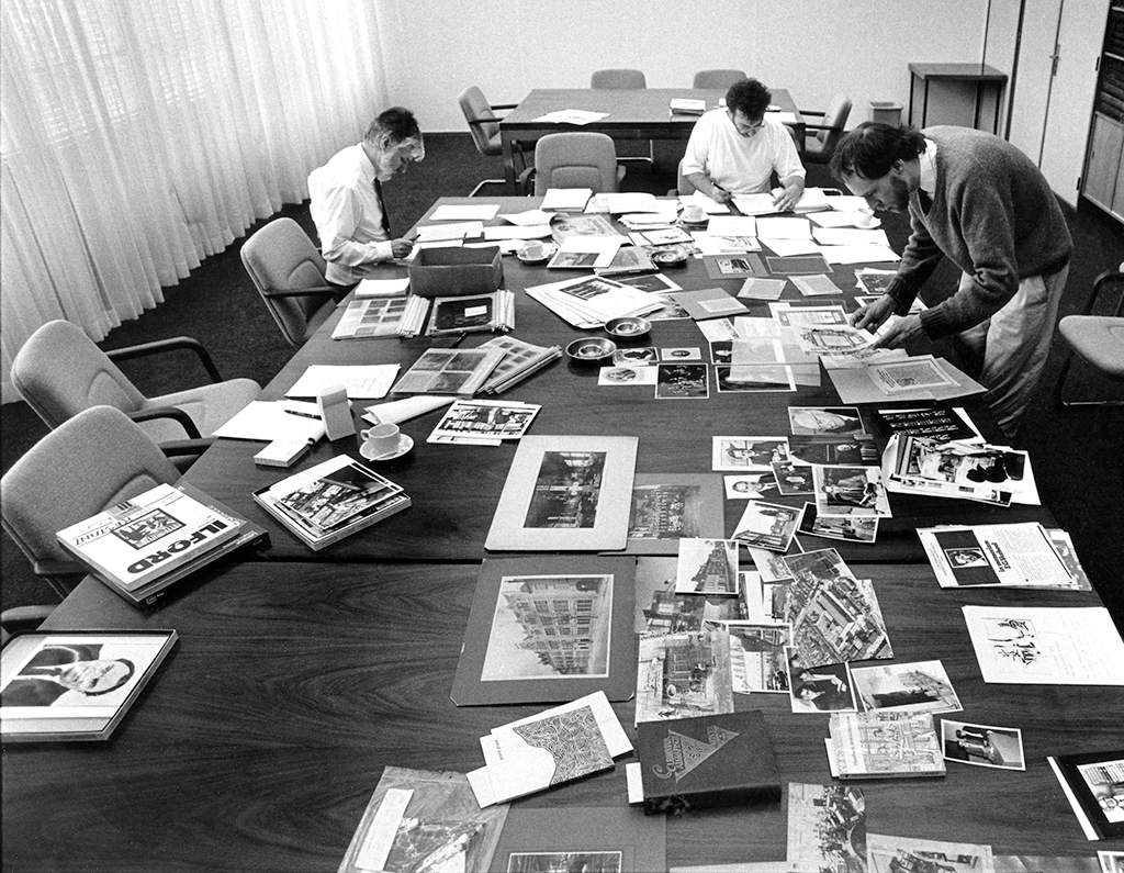
Photo selection for memorial book: Sdu. 1988). From left: Karel Treebus (designer), Theo van der Linden (editor Sdu uitgeverij) and Leo van Heijningen (author). Photo Bart Versteeg, 1988
Cover of 400 years of Sdu, commemorative publication, 1988
The commemorate publication, Sdu. The first four centuries, was written by Leo van Heijningen but unmistakably edited by Karel Treebus. Between 1850 and 1950, many jubilee publications have seen the light in the graphic world, but none surpassed what Sdu was able to accomplish; none went this deep and this broad. Karel also had his fingers in the revitalization of Sdu’s font catalog, highly urgent because the last one had been published in 1935 with an annotation dating from 1964 (called ‘the Little Red Book’ at Sdu). So many new typesetting techniques had to be described: Monotype, Linotype/Intertype, Linotronic, Linotron, Digiset (with Gerard Unger’s Demos font) and Compugraphic. The first renewed font catalog was published in 1977; supplements were added until the mid-1980s. Then, suddenly, they were useless as tools. But they will keep a unique value because they document graphic history.
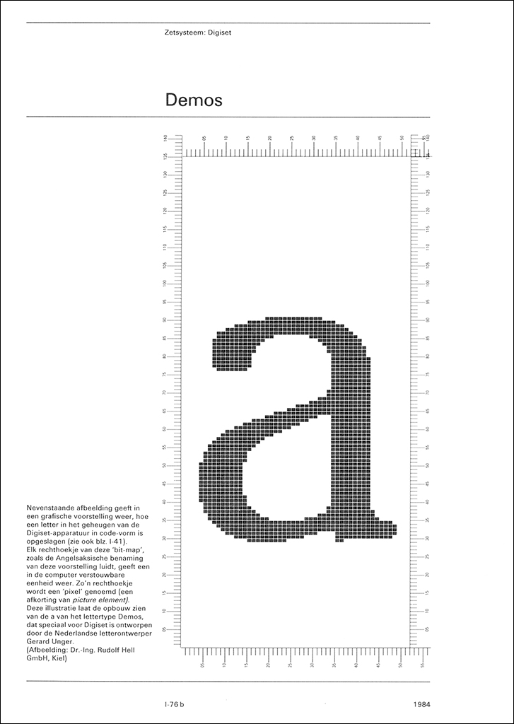
Pages from font catalog supplement Sdu, Demos, 1984
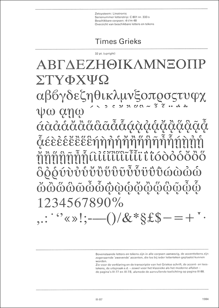
Pages from font catalog supplement Sdu, Times Greek, 1984
The circle is squared
October 1982: at the presentation of Tekstwijzer, Karel Treebus received a gilded cicero ruler from Marie-José Eikelboom and Ronald Kruijff of the Sdu design department. It may have appeared to be a trivial act, but it signaled the big step that Sdu was taking of moving away from lead type to photo-typesetting and from letterpress to offset. Lots of type and outdated typesetting materials became superfluous. Karel Treebus reacted immediately and adequately; he removed “this leaden burden” from Sdu’s shoulders and set up his own press at home (De vergulde meetlat/Treemapress). He joined the foundation Drukwerk in de Marge (Marginal Print Foundation) and the old craftsmanship that had fascinated him so much thirty years earlier received his renewed attention. Still, he also kept up to date with the advancing graphic techniques, even after he had retired from Sdu.
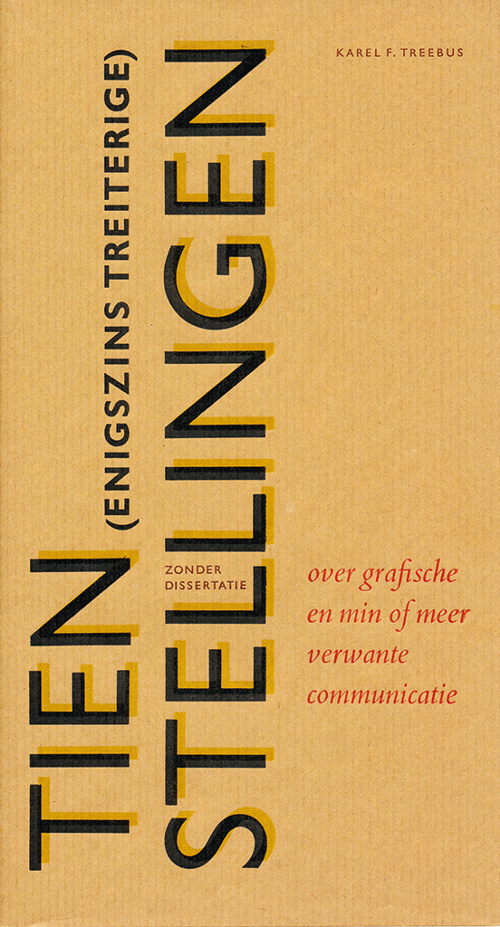
Cover and pages of Tien treiterige stellingen, 1985
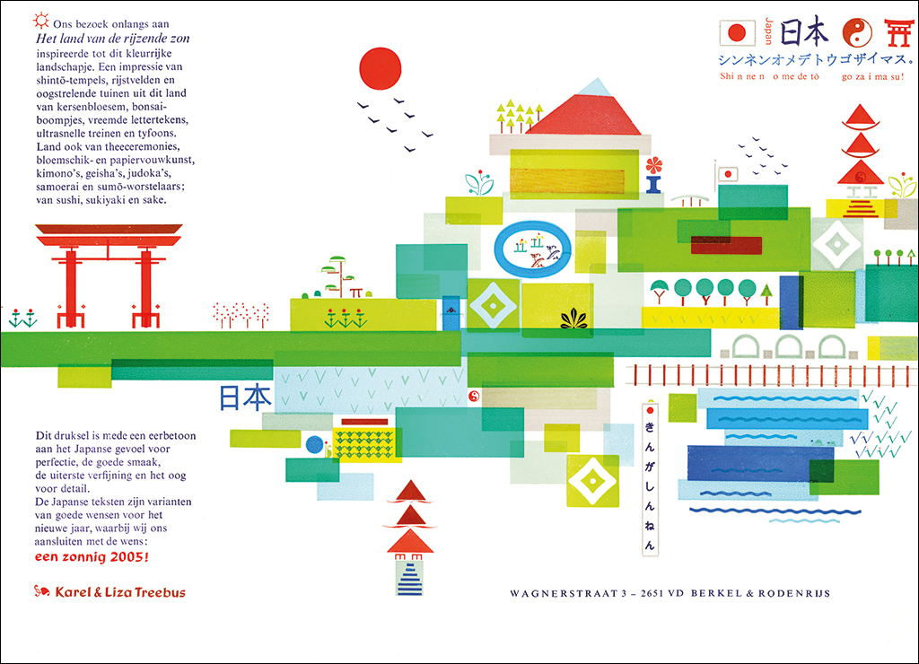
New Year’s Wish 2004-2005 (Japan)
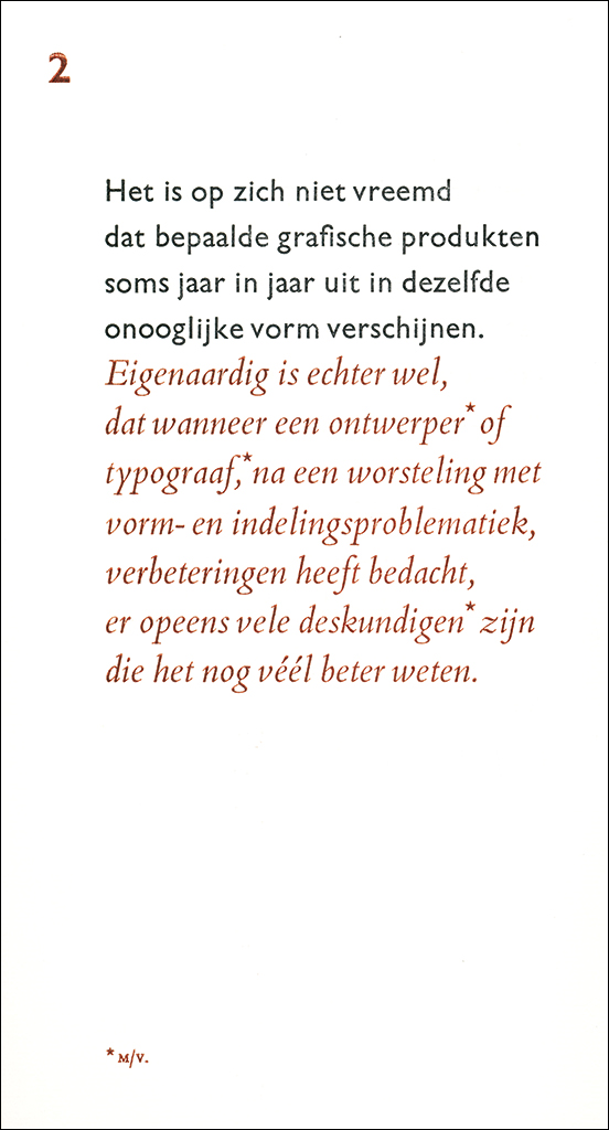
His press produced all sorts of special print, including a yearly New Year’s wish, a jolly, colorful collectors’ item that made a clear statement of his strong ties with the craft and the essence of typography. Treebus was honored with several ‘Mooi Marginaal’ (Beautifully marginal) awards from the foundation Laurens Janszoon Coster. In 1985, he published Tien (enigszins treiterige) stellingen over grafische en min of meer verwante communicatie (Ten rather annoying statements about graphic and somewhat related communication). Statement number 7: “Looking at the many graphic products made in the past ten years one might think that everything is allowed and possible as long as the designer (m/f) has added the epitheton omans ‘innovative’ and wherever possible the readability has been compromised.”
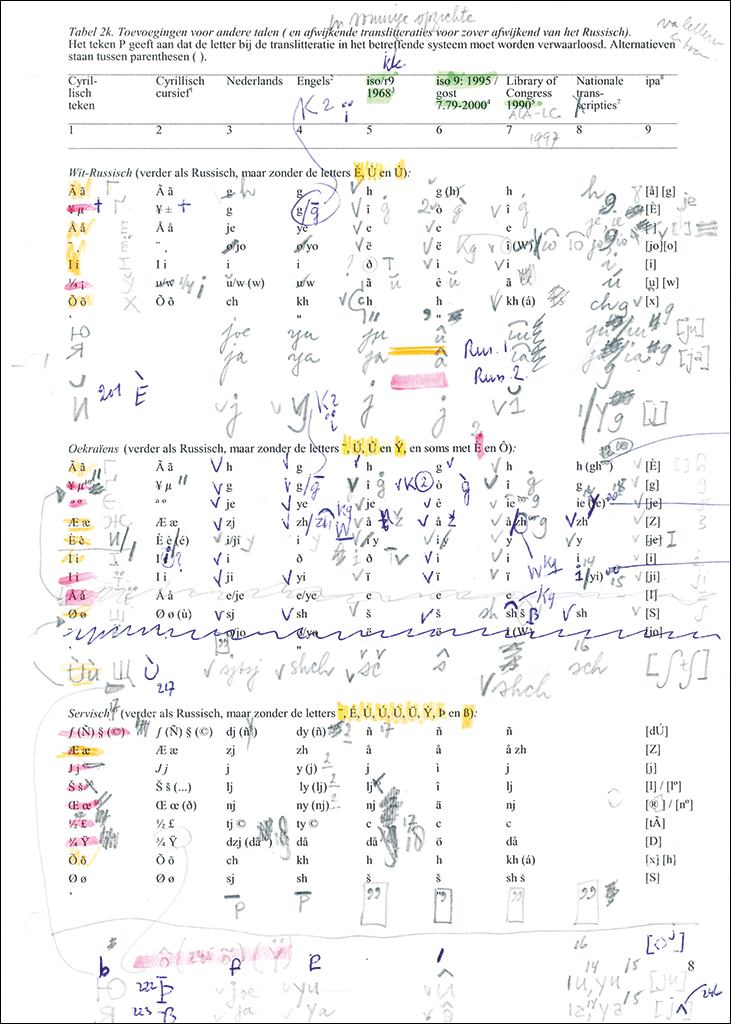
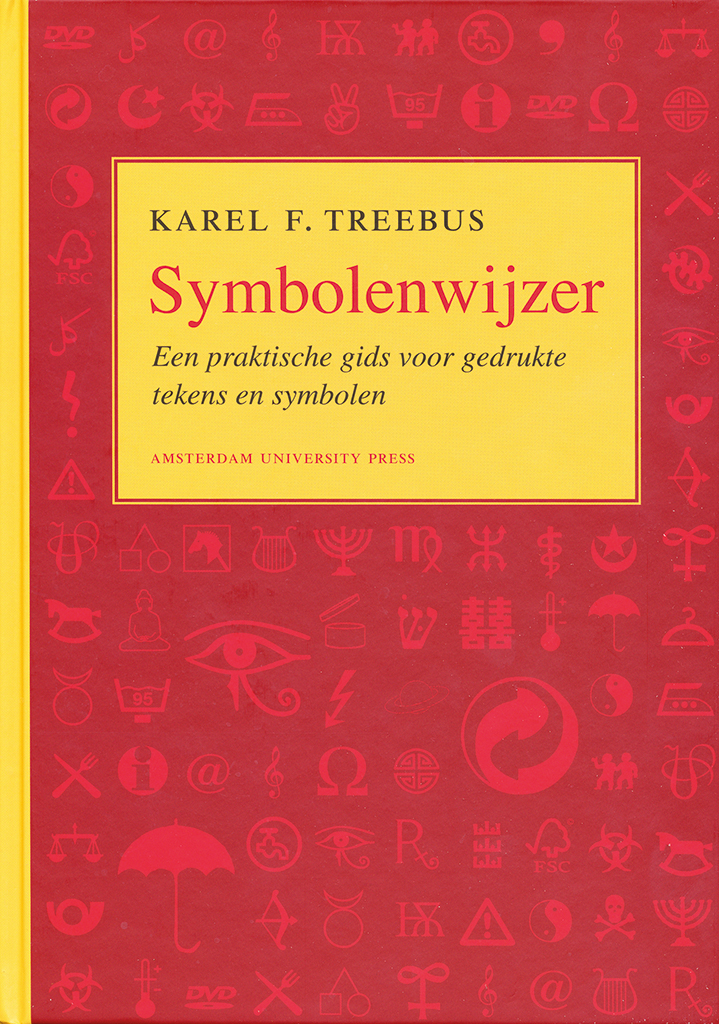
Page of Symbolenwijzer with color codes for typesetting, Cover of Symbolenwijzer, 2007 (design: Jan de Boer)
His importance was widely recognized. He worked for highly-regarded Dutch institutes such as Rijksmuseum, Museum van Oudheden, Koninklijke Bibliotheek, Rijksinstituut voor Oorlogsdocumentatie NIOD, Teleac, and Museum Meermanno-Westreenianum/Museum van het Boek. Twelve of his book designs received awards from 50 Best Designed Books. His annual reports were honored by the national federation of book printers. Karel Treebus held many jury positions; his work was on display at scores of national and international design exhibitions. The author in him never disappeared: he kept writing contributions for different publications: for Sdu’s staff magazine, of course, but also for Onze Taal magazine about the Dutch language, and Quaraendo. A quarterly journal from the Low Countries devoted to manuscripts and books. Then, in 2007, his magnum opus was published: Symbolenwijzer. Een praktische gids voor gedrukte tekens en symbolen (A practical guide to printed signs and symbols). This book gave expression to his life-long fascination with anything that created language. It is a unique image dictionary and itself a marvel of typography, designed by Ben van Popering. Afruitful symbiosis of advanced technique and solid contents.
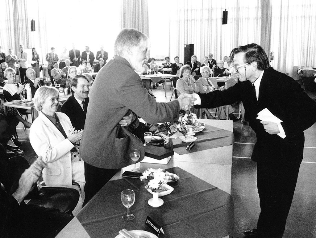
Farewell to Sdu, September 10, 1993. At right: R.E.O. Ekkart
Karel Treebus
born on 22 May 1938, Den Haag
Author of the original text: Jaap Lieverse, June 2011
Translation and editing in English: Ton Haak (unauthorised)
Final editing: Sybrand Zijlstra
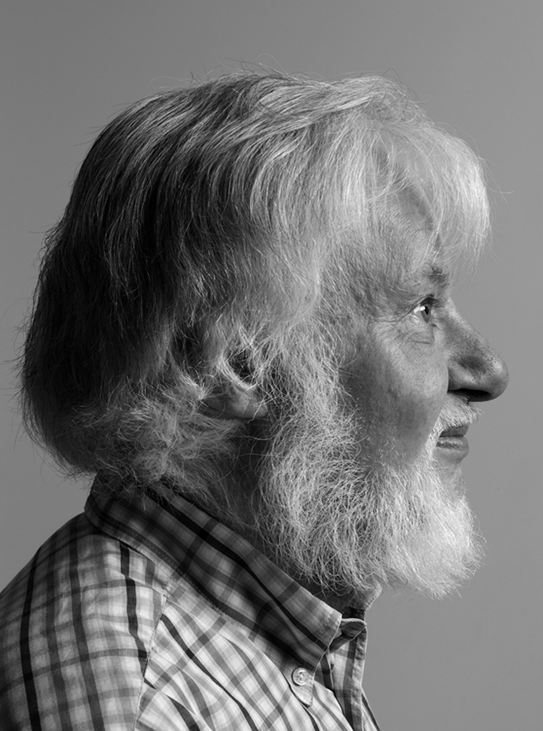
Portrait photo: Aatjan Renders