Amsterdam, Victorieplein, Berlage’s statue, the streetcars, the ‘Wolkenkrabber’ (skyscraper). The place where Paul Mertz was born, to which he returned and where he now lives and works for quite some time already. A Sunday’s child. A consultant, says the sign on his office’s window. A stimulator of young artists and designers, and still active.

The story of his life: growing up in a working class family with four siblings and hardworking parents – ever so often a background pushing one to discover what else is going on in the world. He remembers two art pieces decorating the wall in his family’s home, a color etching of the circular Lutheran church building in Amsterdam and a painted landscape of the woods near Oosterbeek, where his parents had cuddled on a bench at the time of their engagement.
In 1950, Mertz entered HBS (high school). He was lucky to have a passionate art teacher who took his students to the Stedelijk Museum on Saturdays, where museum director Willem Sandberg was showing work by painters of the Cobra Group. This motivated him to continue exploring on his own. Once every two weeks he bicycled first to the Bijenkorf (department store) to see the extraordinary display windows; then to the Stedelijk; and next to Gosewehr, an interior design store following the maxims of Stichting Goed Wonen (foundation for good interior design). Another source was his favorite uncle, who worked at the Bijenkorf’s furniture department in the days of Martin Visser, the man who brought the public in contact with ‘the better interior’ in exhibitions called Ons Huis Ons Thuis (our home, our castle), which he organized together with the architects Aldo van Eyck and Gerrit Rietveld and the designer Benno Premsela. The times were uncomplicated and unpretentious – everything new was exceptional; it took just one afternoon to visit all important art galleries in town including, for instance, Ina Broerse’s ceramics gallery in the Spiegelstraat, which also showed small sculpture and graphic art. Ina taught him how to look; in her gallery his love for ceramics was awakened; it was there that he bought his first art pieces, in the days when art was still affordable.
Social geography, then a fashionable university major, was what Mertz wanted to study after his graduation from high school, but his age – he was only sixteen – blocked his way. His school’s headmaster advised his parents to have their son follow the Economic Course for one year, the precursor of the Higher Economic School of later date. It was a do-much-yourself education; the students were expected to invite leading figures in commerce to come and speak to them about ‘what made the world run’. One of them was Hendrik Eduard Janssen, a well-known advertising agent who had worked for the Bijenkorf. He owned a small ad agency on Rokin called Interad and he had important clients. His ads were the best, well designed and well written, by talent such as Gregor and Dimitri Frenkel Frank. After hearing Janssen’s lecture Mertz knew what he wanted: enter the advertising business. After applying at different agencies, Mertz got the job of assisting the production manager at a small agency, NPP. The agency’s owners, a man-and-wife team, ran a studio with excellent designers and copywriters; they were seriously interested in design. Mertz found himself diving repeatedly into the stack of design magazines always within reach at the studio, including Graphis from Switzerland. He stayed at NPP for most of two years.
His career was interrupted: he was drafted into the Dutch Air Force. But this soldier had the good luck to serve in public relations for the Second Allied Tactical Air Force in Münchengladbach, where he got his own office and, even better, the opportunity to organize exhibitions of posters and more from the Amsterdam Stedelijk Museum in the hallways. Meanwhile he kept in touch with Janssen, borrowed his books and magazines, and was eventually hired by Interad. When the big day came he was told to present himself at Prad in Sarphatistraat instead; the two agencies had merged. Prad (short for Progressive Advertising) was a giant with a staff of 155, many of whom were administrators in those days before the computer made its entry. Mertz did not like the size of the agency much but understood he could personally grow there. He worked amidst experienced people for important clients such as ABN, Bijenkorf, Citroën, IBM, Philips, Unilever, and Nederlands Zuivelbureau (Dutch Dairy Board); he would stay with Prad for the next twenty-four years.
Prad was founded by Maurits Aronson, an art and design aficionado. He had collected work by many young artists and became the next person to stimulate Mertz, who also met Benno Premsela, an encounter that eventually led to invitations to join Premsela on the boards of several art institutes; his strong ties with the cultural world prohibited him forever from becoming a ‘vulgar’ ad man. It shows even today: enter his home/studio on the ground-floor of the stunted ‘skyscraper’ at Victorieplein and instead of ads you will see art on the walls and extraordinary objects and appliances designed by young talent. He began organizing Wolkenkrabber Weekends to open up his collection to the eyes of others. Graduates from Design Academy Eindhoven competed to become recipient of Mertz’s Wolkenkrabber Award.
Mertz took countless initiatives, he was active on boards; he taught and inspired art students. He was a prolific writer, an exhibition designer, a graphic designer – but foremost he was leading the way to the future. He was closely involved with all the nation’s organizations dedicated to advertising: Genootschap voor Reclame (association of advertisers and advertising professionals), SIRE (foundation for non-commercial advertising), Art Directors Club Nederland, Steering Group Advertising, Advertising Code Commission, as well as the Dutch Advertising Museum. He was an active board member for even more institutes dedicated to culture, visual arts, music, theater, dance, design, architecture, the national trust, film, photography, literature and even the environment. To name a few: Concertgebouw, Residentie Orkest, Het Toneel Speelt, Museum Mauritshuis, Groninger Museum, Stedelijk Museum, Rijksmuseum, Joods Historisch Museum, De Nieuwe Kerk, Stichting Kunst & Bedrijf, Netherlands Design Institute, Design Academy.
He became one of the most important intermediaries between the worlds of advertising and graphic design – which is why this first Roots publication is dedicated to him.
In the Netherlands there has always been a deep gulf separating advertising and graphic design. In 1917 the Vereniging voor Ambachts- en Nijverheidskunst (arts and crafts) organized an exhibition in Amsterdam’s Stedelijk Museum debating if an artist ‘lowered’ himself if he engaged with advertising and if his conscience would be shaken by its ‘questionable truths’. Art in Advertising was the exhibition’s title; the discussion ran on: was it ethical to create commercial art? Could artists work in good conscience for commercial purposes? Shouldn’t artists and designers work toward ‘the good of all people’ and propagate a high-standing vision of life instead of promoting mere products and services? Realists had an opinion too; a group of artists who believed they could add to the quality of human life by designing better products in 1921 founded the Instituut voor Sier- en Nijverheidskunst (Institute for Decorative Arts and Crafts). As an intermediary between the arts and industry this institute seriously tried to bridge the gap. W.F. Gouwe, its director (who later became the head of PTT’s Aesthetics Department), wrote in 1929:
‘… this and similar activity[the discussions about this theme – PH] came from the understanding that, to the disadvantage of the arts as well as industry and trade, a large distance, a deep spasm, had grown between the arts and daily industrial and commercial life (…). In this atmosphere the Dutch Association for Art and Industry was established, whose industrial members cherish the viewpoint that the modern mass product deserves aesthetic care; is not just a means for the company to make a profit but also an significant element in society that as carrier of established qualities has an important civilizing role …’
The best interbellum examples of the connection between art and industry can be found at Van Nelle in Rotterdam, where the architecture of the industrial buildings (by Brinkman and Van der Vlugt) as well as the design of advertising and packaging (by Jac. Jongert) expressed a distinct clarity and thus effectively gained trust for its products. From 1920, PTT (the national postal service, which was then still a state enterprise) also contributed to a greater sense of the importance of aesthetics of the mass product and produced well-designed forms and stamps. The ads Piet Zwart designed for Kabelfabriek in Delft show an enormous variation of possibilities for an efficient yet attractive communication with the market. The glass factory in Leerdam, but also companies such as Gispen, De Ploeg, Regout, Sphinx, and Metz & Co, commissioned great designers to create their products. As still happens today – think of Hema. A good read about the wish for better design in the 19thand 20thcentury can be found in the comprehensive catalogue Industrie & Vormgeving 1850–1950 published by the Stedelijk Museum, Amsterdam in 1985/1986.
Mertz and Gouwe were two of a kind. Mertz has worked for advertising agencies where ethics and aesthetics (‘beauty’) counted. These are still Mertz’s criteria. His paragon was Maurits Aronson, Prad’s founder and owner, who ‘paired a sharp eye with an enviable sense of art’ (Mertz, 1987). Now and then Prad on purpose engaged designers who had nothing to do with advertising: Anthon Beeke, Gielijn Escher, Swip Stolk and even Jan van Toorn, not a lover of capitalism. In the Communication Yearbook of 1987 Mertz wrote:
‘In the past everything was so simple. Lines were short, structures uncomplicated, markets neatly arranged. Commercial policies were equivalent to sales efforts. Advertising was the director’s responsibility. The advertising manager, if available, was a representative, an expert, closely connected to the board.’
A new situation came about after in the 1950s ‘marketing’ blew in from the United States. Companies changed into complicated organisms where the marketing department gained power. Advertising agencies, too, developed; they became communication conglomerates consisting of specialized groups and disciplines. Strategy directors, trend watchers, creative teams, public relations and public communications directors – all these new players with their own opinions about the profession entered the game, initially accompanied by extremely bad coordination. Collaboration of the different staffs was hard to accomplish; everyone protected their own field of ‘expertise’. Too many people were involved in the advertising process; the communication lines extended immensely. Scaling-up, growing prosperity, the blossoming western economies, and fierce competition – these factors were all debit to the development of confusion. And the ethical and aesthetic qualities suffered.
The directors of companies were no longer the clients the ad agencies were dealing with: the marketing managers took over. The directors withdrew to their ivory towers and let their marketing people decide how to campaign. These marketeers tend to operate with great care, often without vision, without allowing critique, and only within the narrow framework of demanding larger sales and higher profits. Many times there is no real relationship, no strong identification with the company they work for – not just among staffs but also among directors. Too many reorganizations, amalgamations, and cost-cutting rounds especially after new conglomerates are formed create this complexity in which also the consumer finds himself lost. PTT used to be something, a living idea, a transparent company. Now there are KPN (no longer the name of the whole organization but just of the telecommunication branch) as well as TNT and TPG. These acronyms are not understood by the larger public, which has no idea who owns these privatized companies. Traditions apparently have to be wiped out, so why notchange the color of the mailboxes from red to orange? Is it arbitrariness or caprice that leads the decision makers? Or is it the trendsetter who decides, or the public, or the youth? Or is it a hype? No, it is merely a matter of might, of power: TNT happens own the former postal service and decides that orange is its color and let no one ever have any doubt about it. No tradition, no familiarity, just a waste of money, if you ask Mertz.
The ‘fast and furious’ marketing approach never had Mertz’s unconditional support; he always questioned it and tried to make clear that other philosophies work better, just look at his aforementioned activities as well as his own ad campaigns. Why bad and fast without any regard for aesthetics if everything can be done plain good just as well? Why present the public with bad stuff while there is so much good stuff available? Meanwhile the design world has changed as well: advertising is no longer tainted. The wide crevasse has narrowed, possibly because designers do not want to continue finding themselves in an isolated position – they cannot be blamed for their urge to survive. Independently working designers now have more understanding of the changing times and the strong economizing of society. They have their own ways of following trends. Mertz is not optimistic about this conciliation, but he cannot ignore what is going on. In the advertising world he recognizes just a few small agencies that are really into design: Kessels/Kramer and Wieden & Kennedy. They are the only ones left that know how to competently handle different disciplines.
Our times are dominated by visuals like nothing before. Mertz regrets that words no longer play a role in advertising. He reads just abominable soulless ballyhoo such as ‘De bus is goed op weg’ (the bus is well on its way) or ‘Brood daar zit wat in’ (bread, there’s something in it). ‘Check out the ads and try to find great copy. In well-designed and well-edited magazines the ad copy and visuals are left far behind.’ Mertz acknowledges his pleas have not worked to expectation and his fear is that the situation will not improve notwithstanding his statement from 1988 that: ‘The understanding grows that culture and commerce, that graphic design and advertising are not irreconcilable, that the fight for the consumer’s attention is not just one discipline’s fiefdom.’ Which clearly indicates that the designer must not only be concerned with his or her own position, freedom and originality only; and that the advertising man or woman must acknowledge and keep close to the aesthetics of design.
The world of advertising and the world of design. Mertz has positioned himself smack in the middle of these two worlds. He knows these worlds well and he understands both the cravings of the ad man and the desires of the designer. Mertz sees himself as a designer rather than an art director, but gives precedence to the consumer. His many speeches and his own ad campaigns give testimony of the differences between the two worlds and also of his conviction that each media demands its own translation of the message. Years ago, Mertz made a seven-second TV commercial for the Groninger Museum exhibition Fatale Vrouwen (fatal females). A voice-over says: ‘She looks at him. He is lost.’ A complicated issue reduced to its essence in seconds.
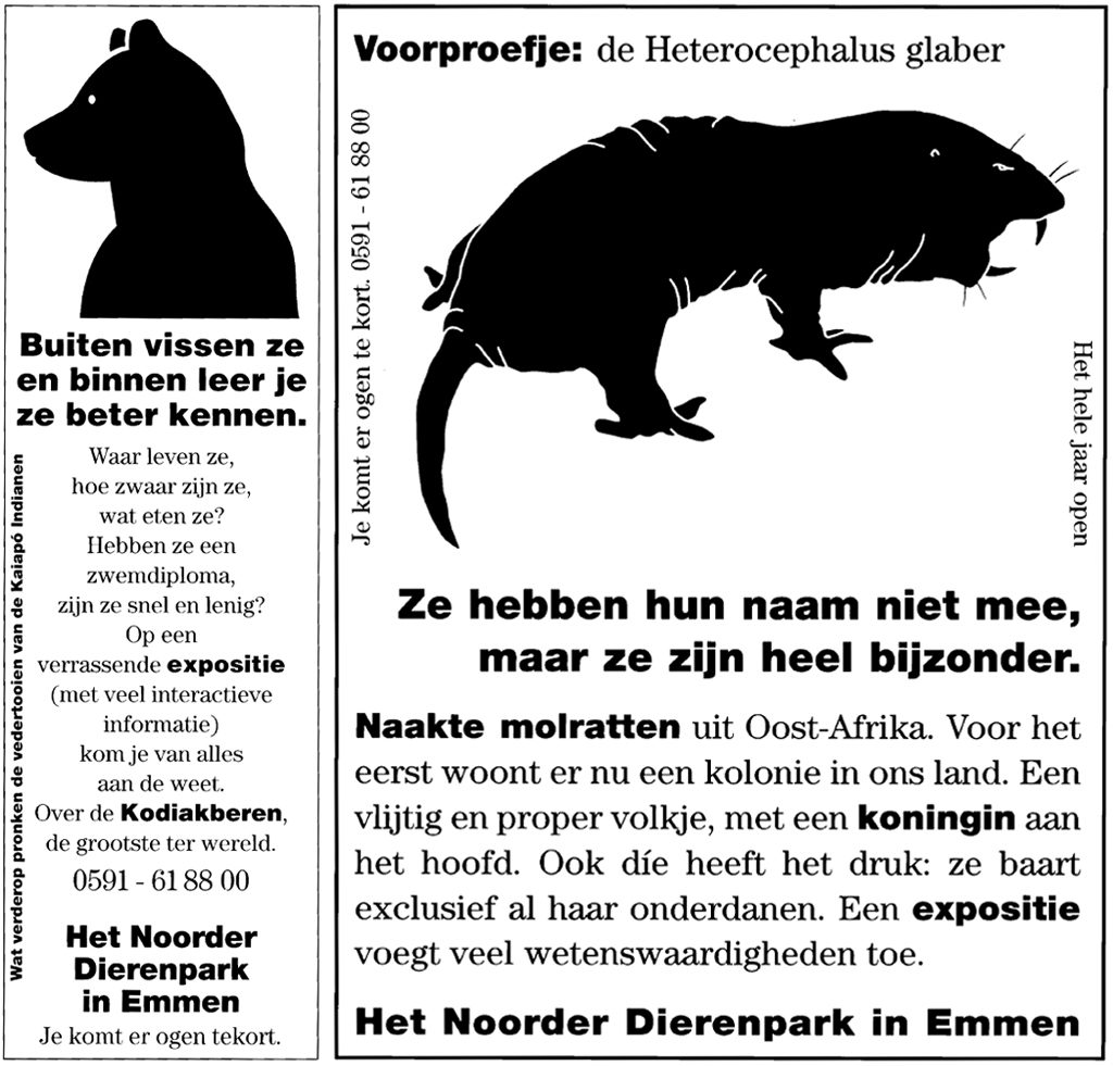
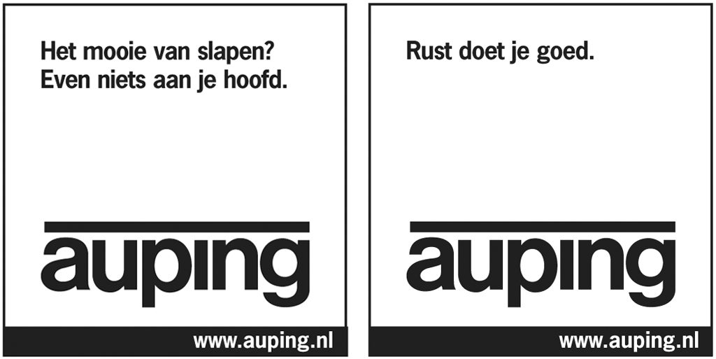
At one time, Mertz started to do his own designs. Through his ads for Mauritshuis Museum, Noorder Dierenpark (zoo) in Emmen, and Auping he showed how to make a difference with subtle combinations of copy and image. He was asked for advice but instead came up with extensive concepts to be worked out by different studios. Copy and image found each other again. Nine years of ads for the zoo followed and even if he designed these ads according to his own ideas, he fully honored the identity program designed by Koos Staal and Geja Duiker. His ads for publication in children’s magazines stood out for their detailed information about the zoo even if his copy was surprisingly short. Unknown yet educative facts and figures were presented and proved to deliver effective invitations to families for visiting the zoo.
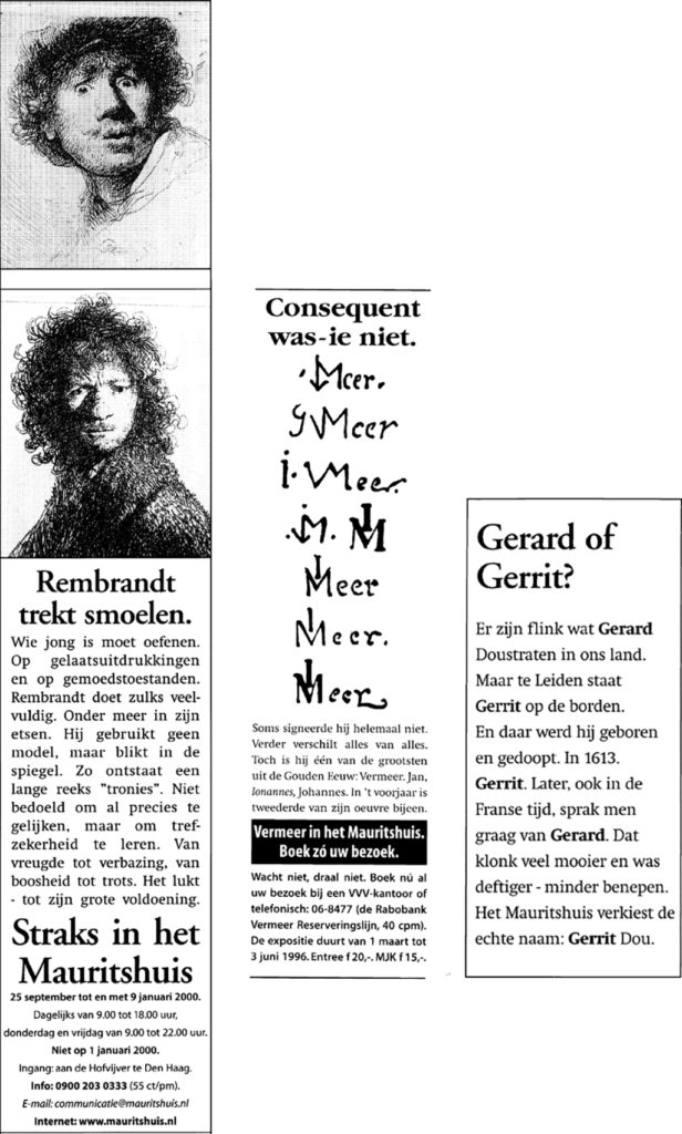
Mauritshuis, ‘The Royal Cabinet of Paintings’. It was 1990 when Mertz was commissioned to bring together museum and advertising. At that time, this was a big deal. Now it is different – everyone is convinced the public has to know, has the right to know, what is going on and not just from a few posters – the traditional medium used by cultural manifestations – but also through print ads, TV commercials, flyers and the Internet. Copy and images play an important role in attracting the public to set a foot inside the museum. The copy Mertz wrote for the different media concentrated on unknown backgrounds of the artworks on display. He discovered (and told) stories that may appear not to be essential but proved to be very effective. Hidden facts about the artists and their lives, faits divers about the artworks, these elements form short and inspiring information which Mertz integrated in a sublime way, and sublimely worded, in the design.
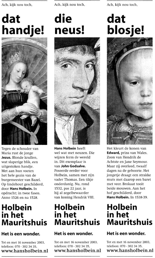
For an exhibition of Rembrandt self-portraits Mertz was not satisfied with just art history’s facts, he allowed himself to be inspired by the supermarket novel Ik de hoer van Rembrandt (I, Rembrandt’s whore) to learn that the painter always consumed jenever with his breakfast, because the water most often wasn’t potable in those days and drinking it was a sure way to get sick. Beer and jenever were clear and clean and delicious to boot. This anecdote explains a lot about the time in which Rembrandt created his paintings. In another ad Mertz observed that Rembrandt introduced the beret, which went on to become the universal headwear for artists. Mertz also used the story behind Vermeer’s letter-writing girl: the painting was owned by a Bahaman judge who was murdered by its thief; the painting was recovered years later. Another example. Who were the commissioners of trompe-l’oeil painter Cornelius Gijsbrechts? One of them was King Frederik III of Denmark, whose portrait can be found on a wax seal in one of his paintings. Gijsbrechts lived in Denmark for four years and also worked for the King’s son and successor, Christiaan V.
In general ads for the museum such as Thuis in het Mauritshuis (at home in Maurits’s home), Mertz entered short texts which, for instance, he had discovered in a letter written by Johan Maurits van Nassau-Siegen in Brazil to Constantijn Huijgens in the Netherlands. One question was: ‘What do you think, is Pieter Post [the architect who built Mauritshuis – PH] making good progress?’ The same Johan Maurits invited many scientists as well as the painter Albert Eckhout to follow him to Brazil, where Eckhout painted species of plants, fruit, trees, and human beings that were unknown in Holland. Presented in short copy, these facts and stories added a much appreciated level to the museum ads. Mertz knows how to search for and find small anecdotes that others ignore or do not want to recognize because ‘they would only distract the public from the real thing’; art should speak for itself, is what this implies, and the public has to discover all attractive associations all by themselves.
In the end, what became of all his efforts to clarify and narrow the gap existing between the worlds of design and advertising? True, there are improvements, but still, they remain separate, each with their own peculiarities, their own language, their own way of thinking, different goals and probably different ideals. No one knows what is going to happen to these worlds. No one knows if they will become better places or worse ones; no one can predict if the public interest will prevail or if capitalism will reign forever. Speed, profit, competitiveness, being the first in the market – these are the ideals of contemporary companies and ad agencies. A designer hoping to maintain independence and freedom will look for commissions from the cultural sector, where the communication lines are still short and where directors are still eager to be involved. The public at large, the consumers stand aside and just watch; they grow more and more immune to the noise that is made to draw their attention.
I do not believe this can go on indefinitely. In this respect there is a desire for quietude, insight and reflection to evaluate what we are actually doing. Paul Mertz has at least tried to show that alternatives are within reach and that history has something worthwhile to offer. Closing the gap? It will remain a utopian dream.
Paul Mertz
born on 20 July 1938, Amsterdam
died on 30 April 2026, Amsterdam
Author of the original text: Paul Hefting, May 2005
English translation and editing: Ton Haak
Final editing: Sybrand Zijlstra
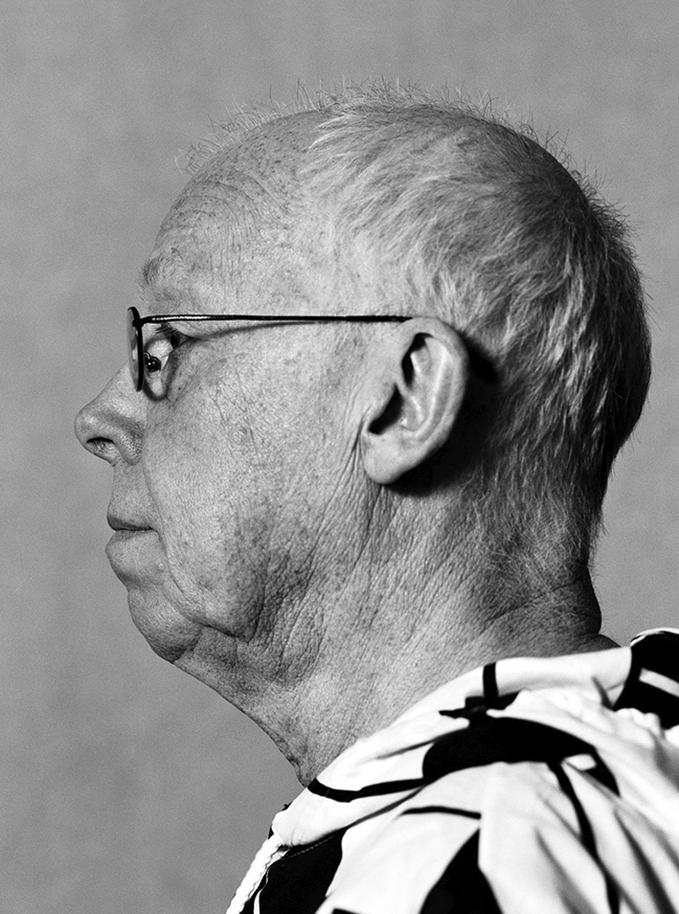
Portrait photo: Aatjan Renders
Postface
I am so proud I was the first one to be honored with a publication in the series Dutch Design Roots after many probing conversations with Paul Hefting. And I am not even a 100% pure designer!
Obviously lots of circumstances have changed since 2005. Much has happened. Paul Hefting passed away in 2018 and, now 80, I am long, long retired. I closed my office in 2014 and discontinued all business sometime later. Yet, I continue to think, create and write, which gives me much joy. For as long as I’ll last.
Paul Mertz, February 2019