The first time I have an appointment to meet Lies Ros and discuss her Roots cahier she carries a laptop on which she immediately and at a high pace starts to show a range of posters, exhibitions and multiples. I tell her I’d prefer to discuss a structure first, to bring some order in the tale about her life and career. Lies suggests to connect her story to just a few of the projects she was involved with. An approach that suits her level-headed view of things. After I had asked her to write a list of design projects that definitely have to be included and to add a few catchwords that indicate why these are exceptional, she warns me: “Don’t expect any philosophical fireworks from me. I’m not smart enough.” I rather believe she is too unpretentious, but I keep her statement in mind; she doesn’t have to caution me again.
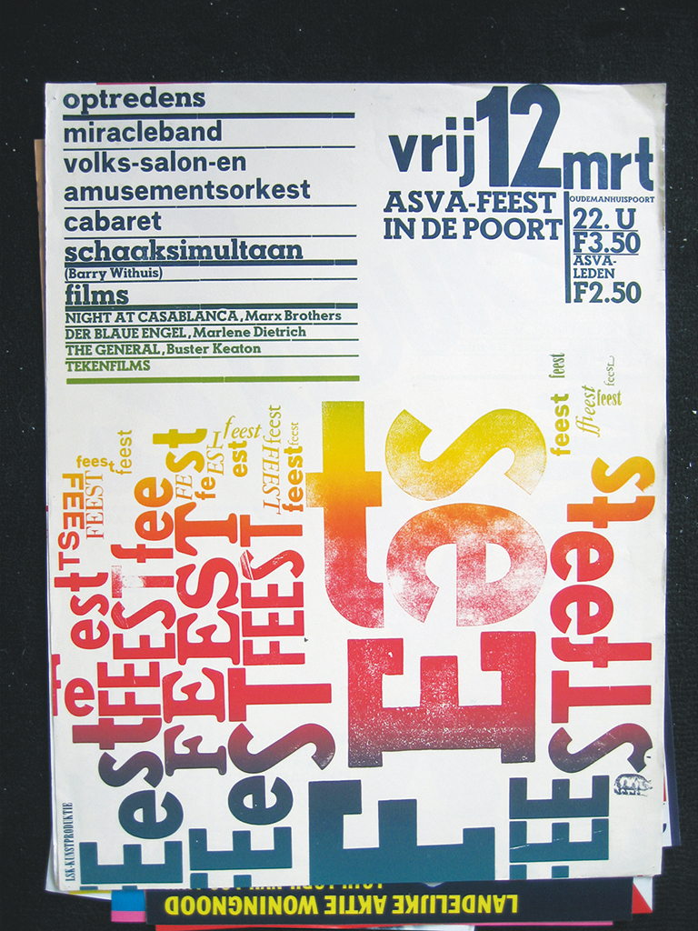
Poster, 1975
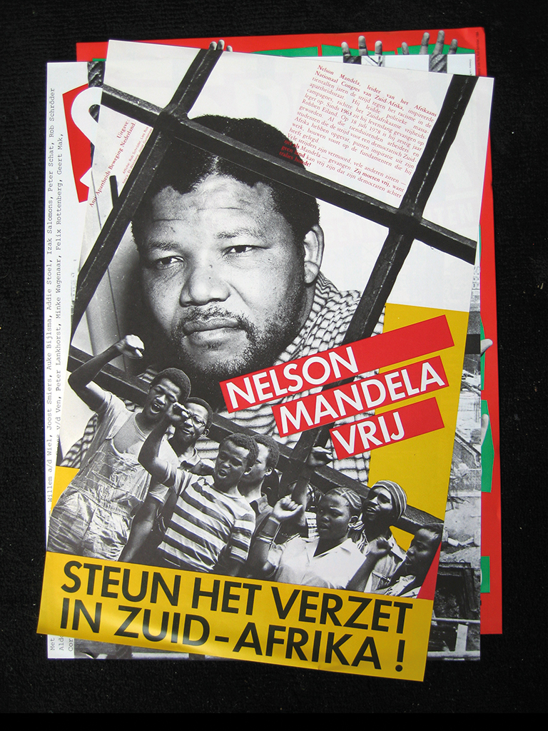
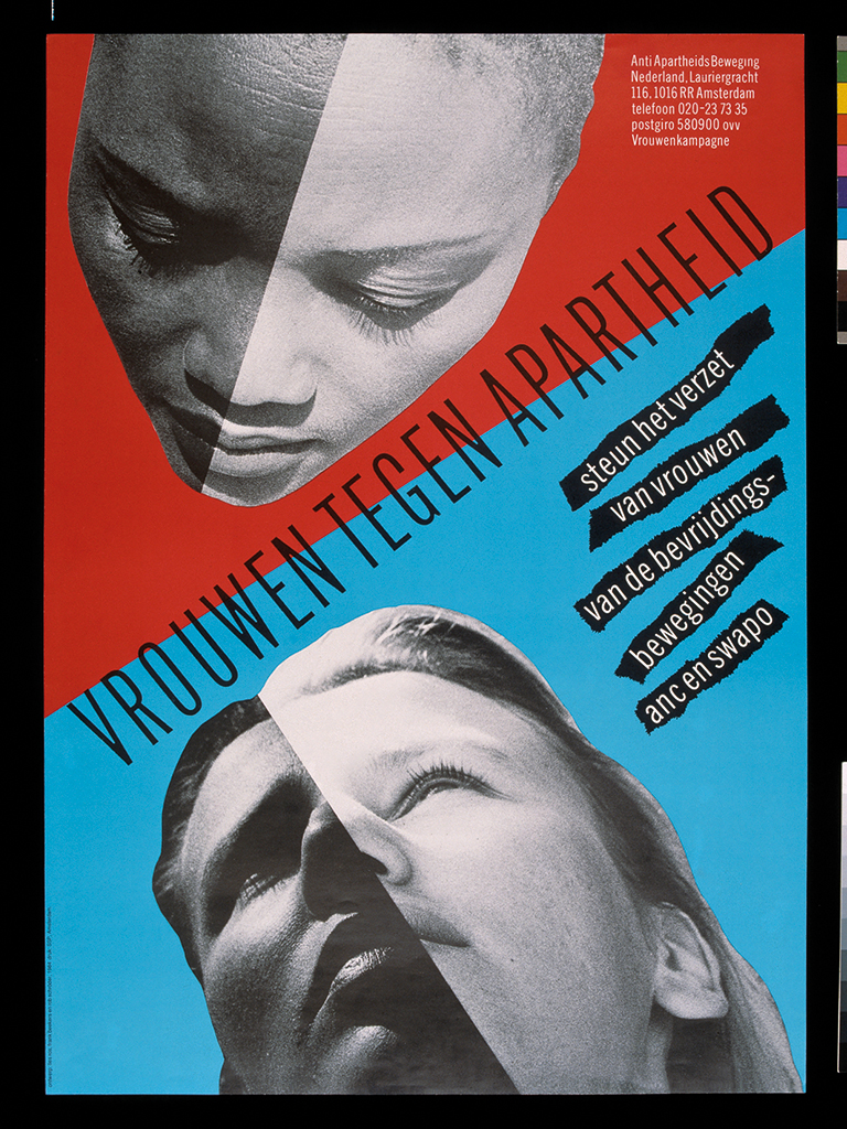
Poster, 1979
The next time, we meet at her upper floor home in the Plantagebuurt of Amsterdam. The low sun warms and lights up the house enough to highlight the collection of collections that is her living space and to create sharp contrasts. Display cabinets have no spaces left; on bookshelves all printed matter is arranged to size to allow for maximum storage; more items are stored in all sorts of flat-file cabinets and chests of drawers. We will talk about her extended collections.
Lies sounds concerned when she asks me I would prefer to have the blinds lowered. No, thank you for asking, but I love the view and the sunglow matches the warmth of the reception I am receiving. She has prepared well for my visit and presents a list of projects, a back-up list and another one, just in case. “Of course I selected the things that are my designs, although they were credited to Wild Plakken. Many of our Wild Plakken projects can in fact be credited to just one of us.” On the top of her list are posters. No surprise, posters were the prime media of the 1970s, especially if one had to relay political viewpoints or activist messages.
Posters
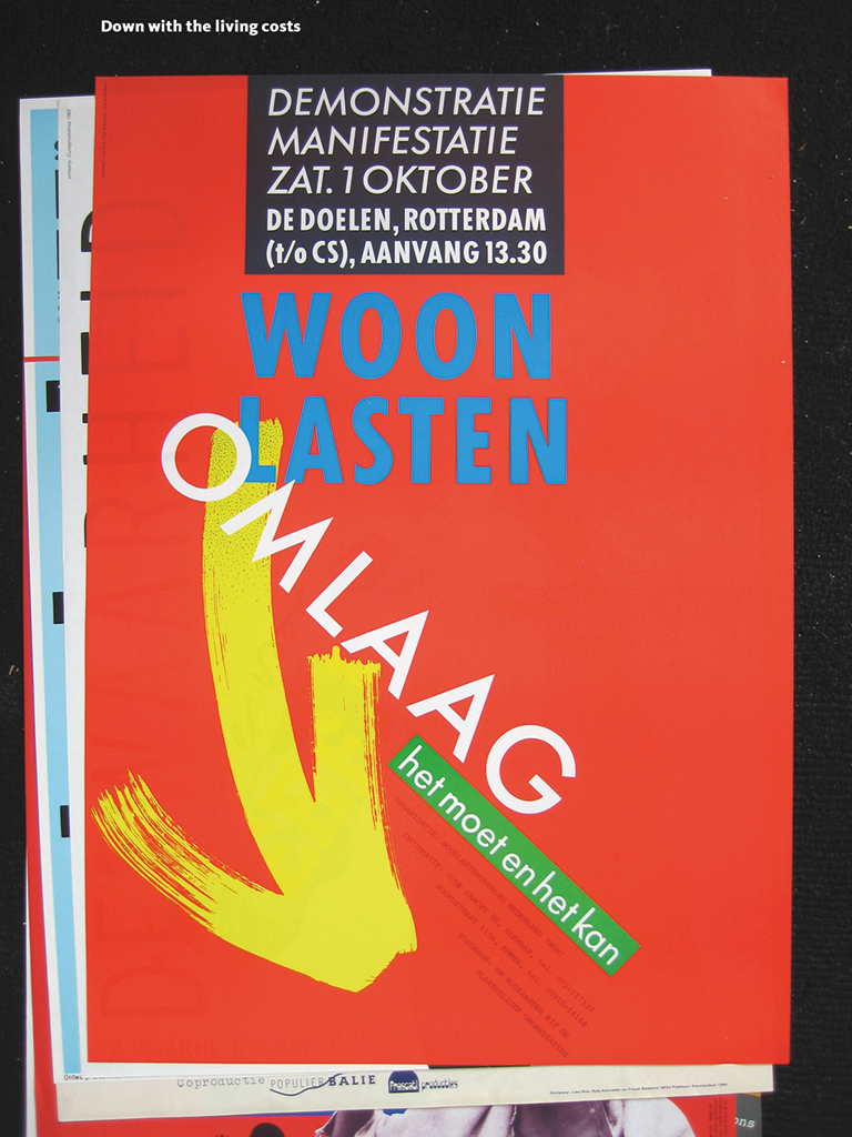
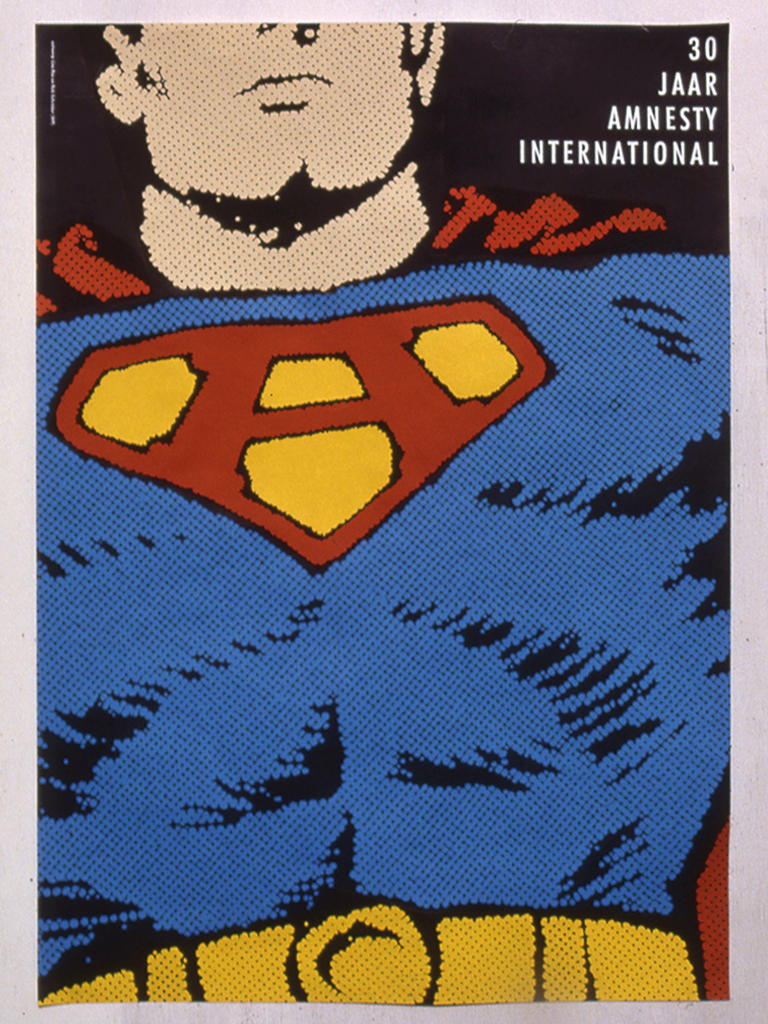
“Posters usually need no explanation. Action posters are effective only if they originate from a recognizable movement. We worked only for movements we agreed with: anti-Apartheid, Amnesty International, the fight for affordable rents. Max Bruinsma had interesting things to say about my Amnesty poster in his book Beeld tegen Beeld [published on the occasion of the Wild Plakken exhibition of 1993 in Centraal Museum, Utrecht – CK], he saw things in the design I had never even thought of. I just created a witty image.”
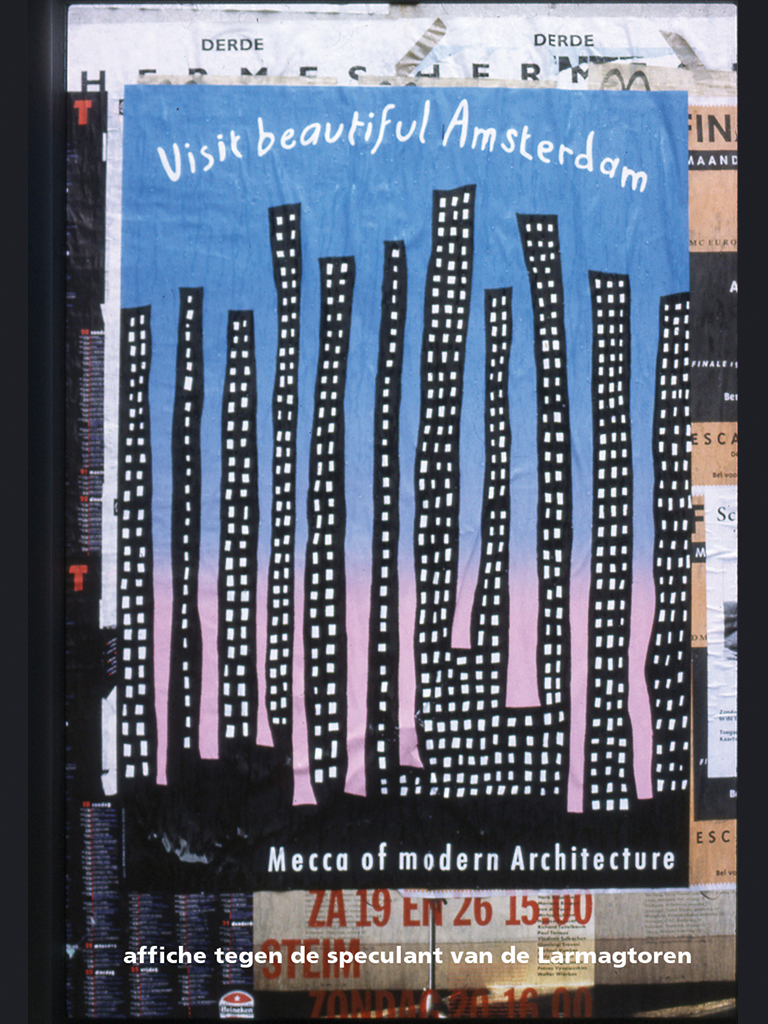
“The final poster was my own initiative, a protest against the construction of a high-rise tower near Sloterdijk in Amsterdam. I was inspired by what I had seen in New York. I visited the famous nightclub, the Blue Note, and noticed a simple neon silhouette of the Manhattan skyline on one of their walls. I thought: this is how Amsterdam is going to be.”
Poster, 1983
Poster, 1984
Poster, 1984
Poster, 1991
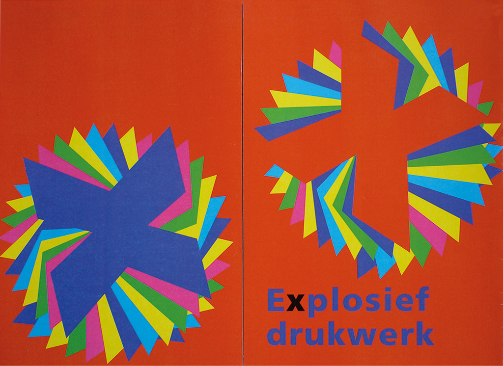
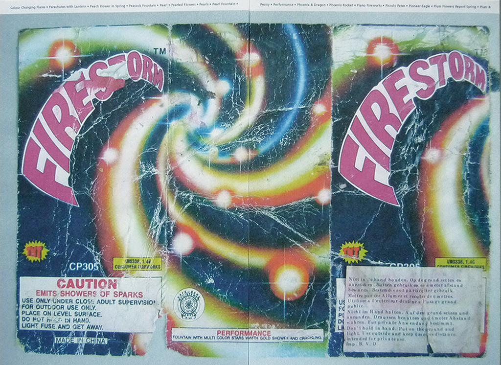
Explosive print 2006
“Year after year I went out on New Year’s Day to collect remnants of rocket wrappings and packaging of other fireworks that were left in the streets after the nightly celebrations. Print that we, in the West, are not able to reproduce any more, such as iris print on a super-small surface. And then the outrageous subjects, ideology on the smallest possible scale, explosions, lots of happiness, heavy weapons. With titles such as Happiness, Joy, Happy Flowers, Happy Heaven.”
“Ewald Spieker organized an exhibition in his Typo Gallery and I, together with Ewald, self-published a small book about these fireworks. He came up with the concept: from the magical beginning of the world to its destruction by human beings – and the rebirth of the earth. All as told by fireworks.”
Lies collected more than the rocket packaging. Lies owns scores of collections: she appears to collect everything that fascinates her. Sometimes a collection exists of just two items, which appear to have no connection whatsoever until you look closely. For instance, there is a wooden monkey sitting on a cabinet side by side with a portrait of a figure with a corseted waist.
Spread in Explosief drukwerk (Explosive print): The world in flames
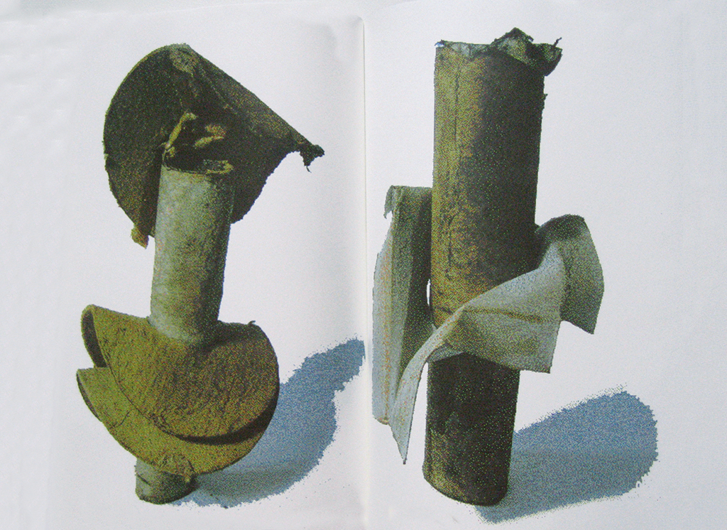
Spread in Explosief drukwerk (Explosive print): Victims of the burning world
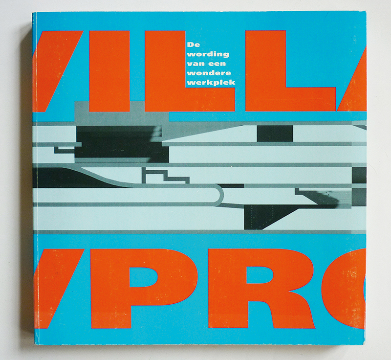
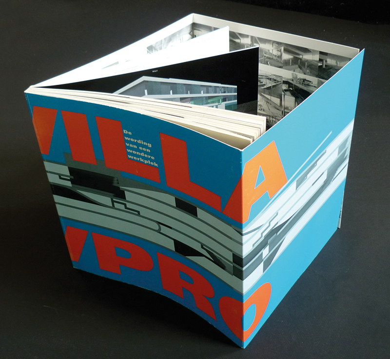
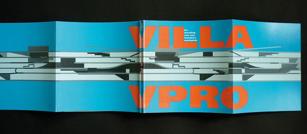
Villa VPRO 1997
“A book about the new VPRO studios designed by the rather obstinate architects MVRDV. They had clear thoughts about transparency, about how everything was interconnected. Anyway, that’s how I remember their concept. You can discover this approach in the drawing they submitted, which ultimately turns into a box.”
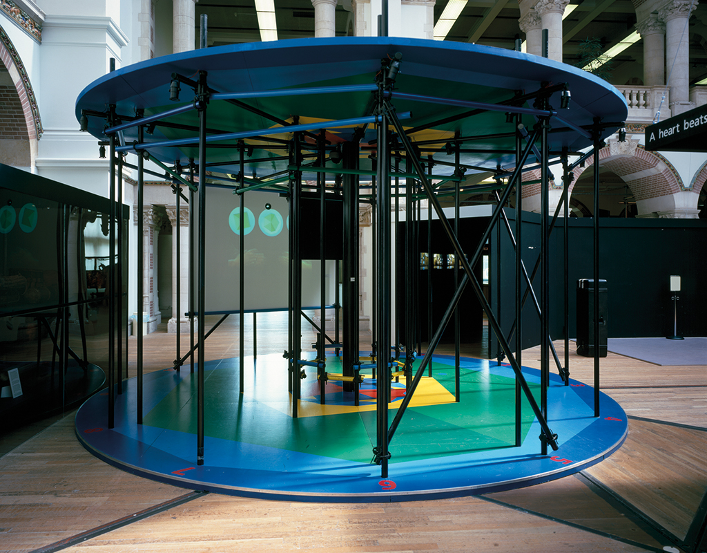
Ritme. Dans van de tijd (Rhythm. Dance of time) 2000
“The enormous atrium of the Tropenmuseum in Amsterdam was made available for an exhibition about creation, destruction and re-creation. All their curators were involved. Now that was a challenge! Each of them had his or her own opinion. All sorts of ideas about experimental forms – including an exhibition without text panels – were discussed. In the end, they agreed to accept my design of a tall tower created from ‘cake wedges’ in the center of which all subjects were brought together. All themes would be presented through projections. A friend of mine said, ironically: ‘You have designed a small village.’”
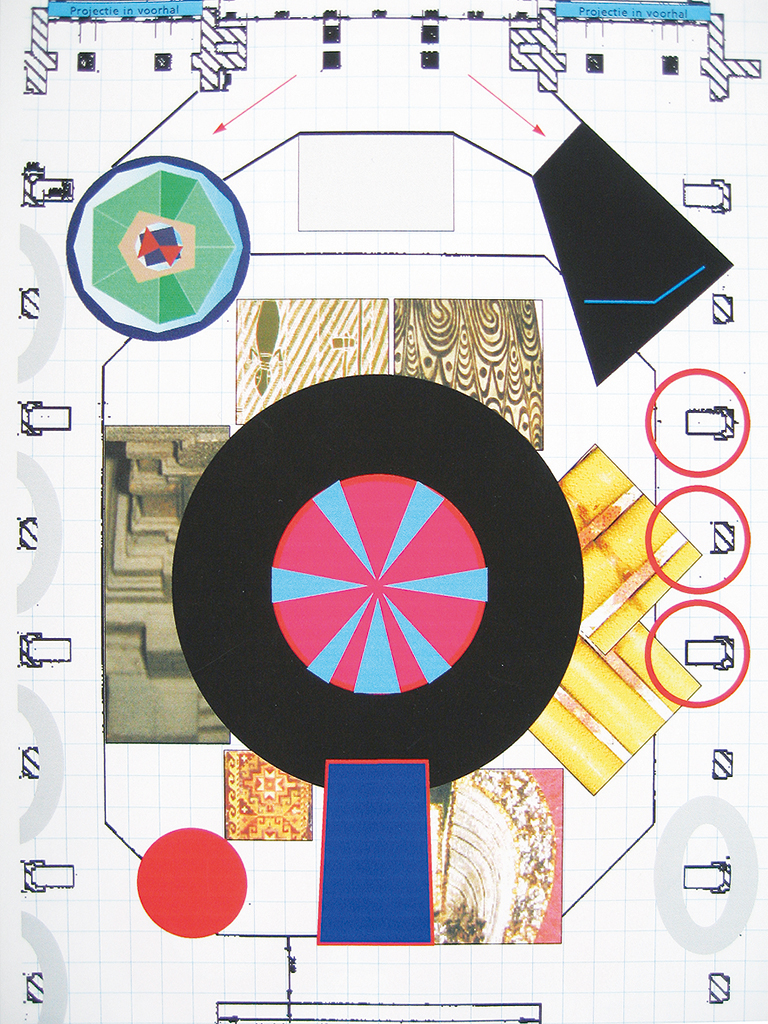
One of the more than sixty exhibition lay-outs
Above: Sketch for a display
Belowe: Hans Hoeksema’s ‘rhythm carousel’ (an alternative musical notation), photo: Ernst Moritz
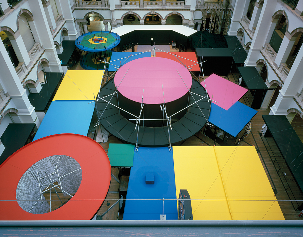
Top view, photo: Ernst Moritz
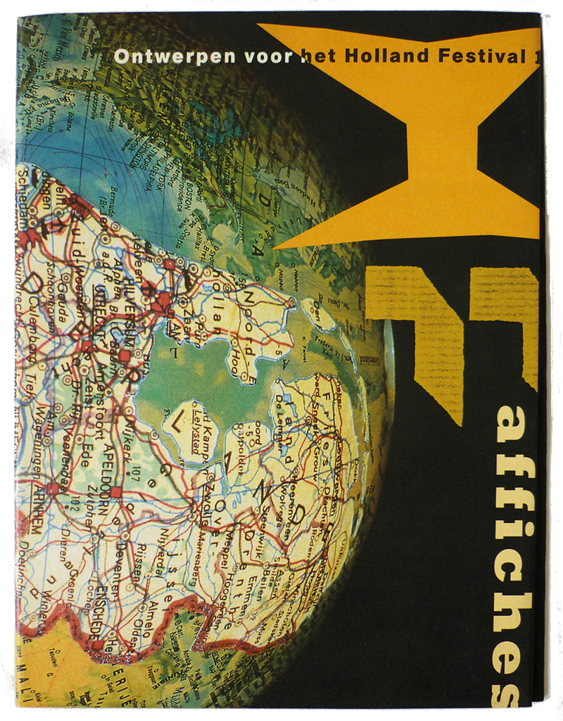
Holland Festival posters 1990
A look at the several posters Lies designed over the years for Holland Festival. Megalomaniacal, one could say, for Dutch Design is so outstanding in this field that it overshadows (if not swamps) all other countries. “The second image shows it was created before the digital era.”
The cover is larger than the book and can be unfolded to become a poster.
Merci beaucoup M. Nièpce 1996
For this exhibition, for the PTT Museum in The Hague, Lies had to deal with many of her favorite media. She had to combine photography and graphic design, and give all of her analytical power a free run. She recalls with great enthusiasm: “You begin with just looking, observing. All stamps selected for the exhibition on the floor of the workspace and you try to detect which story they tell, visually, and what connects them. Do they have something to say about the theme that may influence the eventual shape of the exhibition? Then wild ideas emerge: huge, old photo cameras on tripods from which zigzag lines of folded images jump out and enter – for me with a logical consequence – drawers, cabinets, playgrounds for designers who manage to bring together all these small pieces of photographs and create a whole new image. It has to become a wonderful fairgrounds, is what you think at first.”
“When you see all the materials that were left over from the stamp design processes: a revelation! All these elements were condensed into one thin, miniscule piece of paper! That’s how it has to be done. Suddenly the shape of the exhibition is clear, in your head, you don’t have to design anything. There is no story to tell, the only thing that is there is the continuing deep concentration until this one little thing is left. As a designer you discard things all the time. What you want to accomplish slowly comes into focus, like an image projected through a lens. This describes how the three-dimensional construction came about. With each stamp, the relevant photography was shown, from top to bottom, and ending at a separate sheet on which the stamp itself was presented. That the exhibition ultimately appeared to be an arena full of competing designers was an unexpected bonus.”
Mock-up of lay-out with (random) images, scale 1:10.
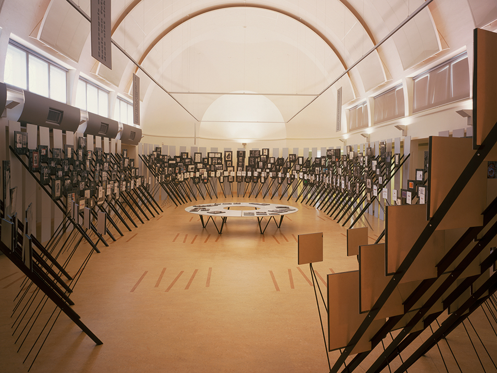
Photo:Ernst Moritz
Beeld tegen Beeld (Image counter Image) 1993
“Still the most important exhibition about Wild Plakken, Beeld tegen Beeld came about precisely at the moment that the analog past met the digital future. I tried to express this development by introducing a reading room and a digital space (by using old-fashioned slide projections no less). For some of the exhibition’s units I had to spend a week, just playing with the mock-up, putting in everything I could lay my hands on, hoping for the most extensive possible display while knowing full well that some items would not make it. Yet, this way I was able to remain close to the original concept.”
“The book cover was one of those hits that suddenly manage to connect everything. Applying secondary print was already fun; it resulted in nice blends. Then there are the two B’s battling with each other: Beeld tegen Beeld. One could see it as a lemniscate, a sign of infinity, or an owl symbolizing wisdom. I rather see two B’s mating, but I’ll keep that to myself, like the possibility of seeing the owl as a symbol for our rather recalcitrant, wild and not so wise collective or as a lemniscate symbolizing a contemporary and topical way of working.”
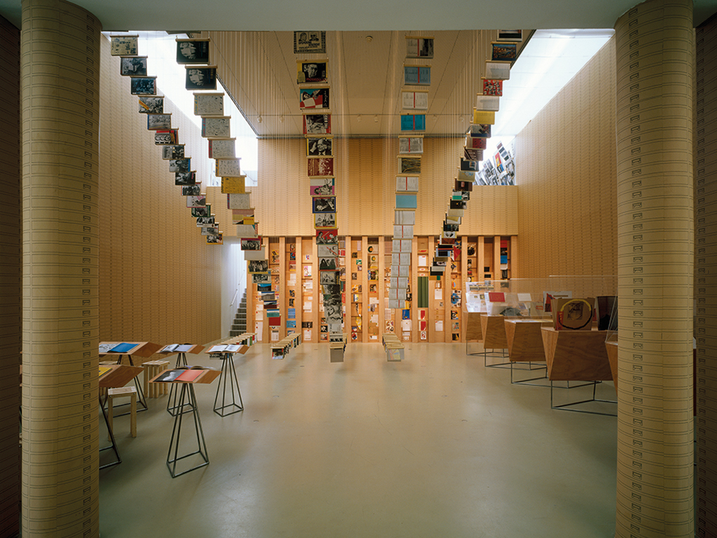
Photo: Ernst Moritz
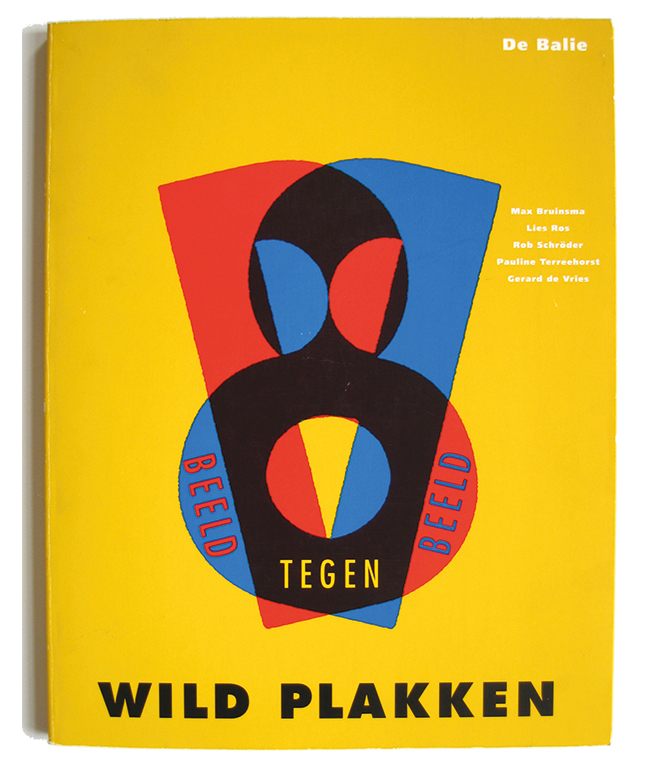
Cover of the book published at the exhibition

Alsof je een emmer leeggooit (Like pouring out a bucket) 1981
“I designed a back panel for a pro-abortion event. A group of women and a supportive carpenter and I painted it in a large hall on a day we had to fight the biting cold by drinking hot tea and rum. During the event beautiful protest photographs were on display in an improvised and badly executed exhibition. I thought: what a shame, I can do better. This was the start of a two-year research period with Lia Gorter and Lida Kerssies; the collaboration ultimately resulted in an easy to handle exhibition to which Rob and Frank contributed as well. The whole exhibit could fit into the trunk of a car; it took no more than twenty minutes to install it at any event, in a neighborhood building or wherever the renter needed it (at a weekly rent of 25 guilders). The exhibition portrayed the life of average women in three themes: at home, at work, in street life. Thirty panels in aluminum frames.”
“The exhibition became a huge success. Its frequent use demanded many renewals. Its success was noticed by the department of WVC, or CRM, or whatever the name of the culture ministry was at the time: we had to design another, somewhat similar exhibition. It had to be more ‘polished’ of course. It missed some of the spontaneous fun of the first exhibition. But the minister of culture, Hedy d’Ancona, opened the exhibition and that was great, because she is such a fantastic person. Alas, we had to fight the bureaucracy for six months to get our invoice paid. It is hard to forget the exasperation this caused.”
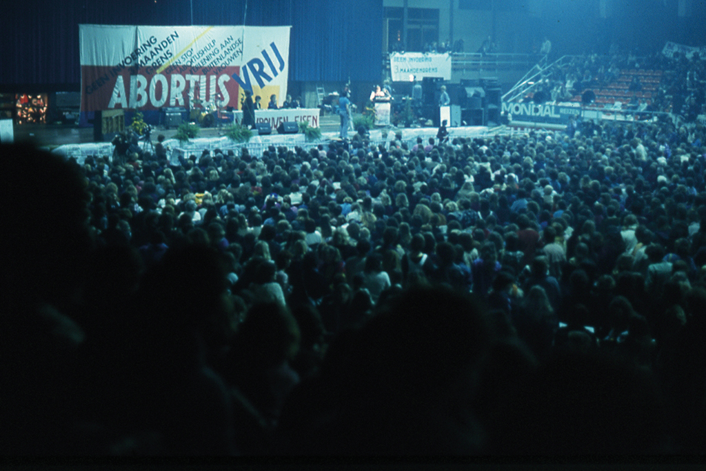
The pro-abortion event in Jaap Eden hall, 1978
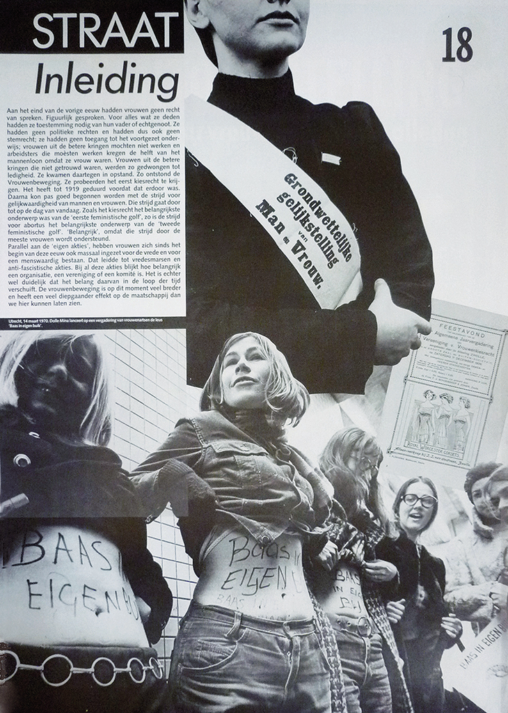
Two panels with among others photos by Cas Oorthuys, magazine clippings, the famous ‘boss of your own belly’-picture and arranged photos about female suffrage.
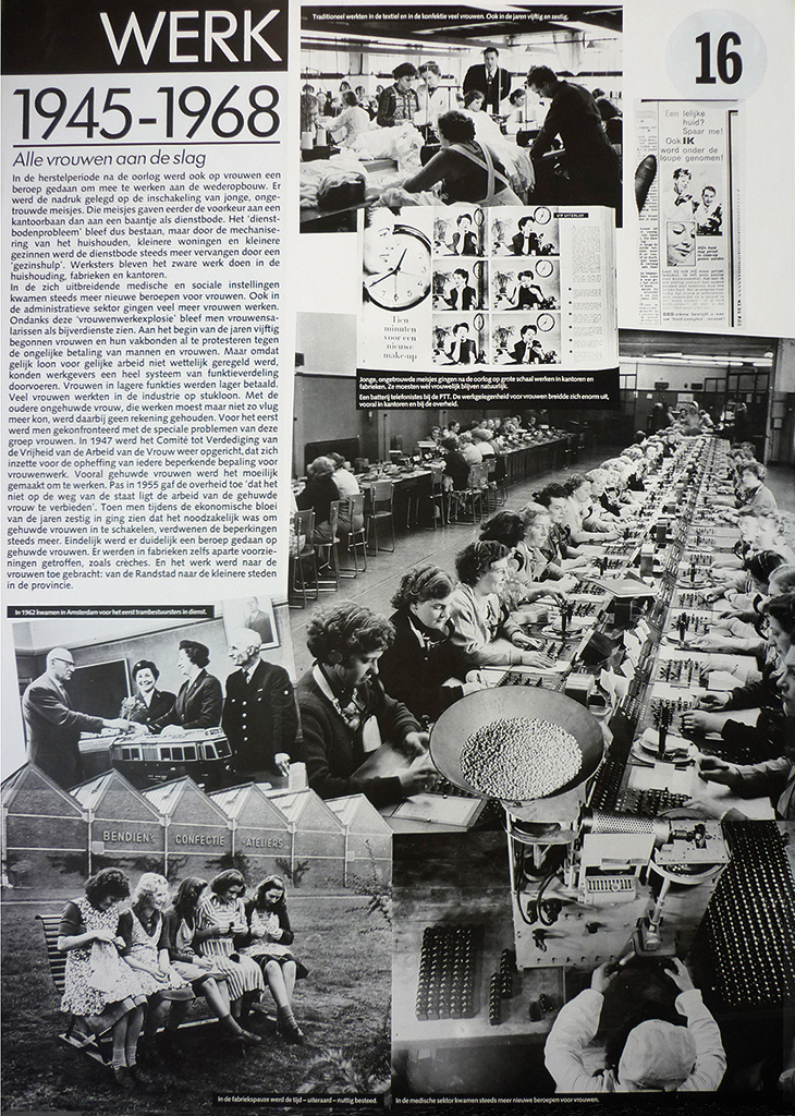
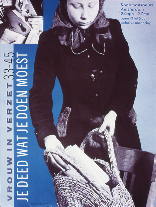
Je deed wat je doen moest (You did what you had to do) 1985
“An exhibition for the National Committee ‘May 4 and 5’, remembering the Netherlands coming out from under the Nazi yoke in 1945. A minimal budget, but we could use the wonderful Beurs van Berlage in Amsterdam. An important exhibition, about the role of women in the resistance during the German occupation – until then a role paid little attention to. Only volunteers were involved with the realization of this exhibition, which presented just photos. All the available money was spent on photo enlargements.”
Liefde te koop (Love for sale) 2002
An exhibition about four-hundred years of prostitution, in Amsterdam’s Historic Museum, Love for sale is one of Lies’ major projects. She explains which the different segments were, all dealing with different themes that were presented in little rooms, ‘cribs’; a long wall was fully covered by a blown-up photograph of the Nes, the heart of the Amsterdam red light district. The exhibition expressed how Lies used to approach her projects: “I can remember the discussions with my client. Her view of prostitution was more liberal than mine. Colliding viewpoints – I like that. In this case it contributed to a fascinating design process.”
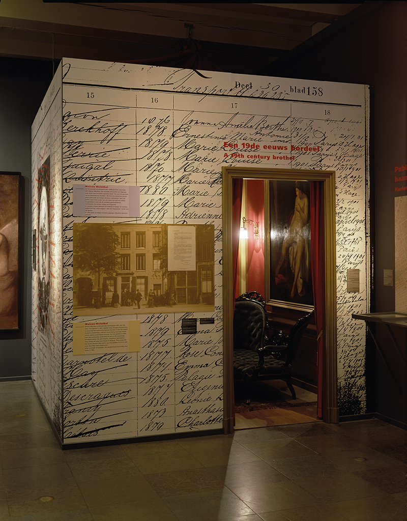
A reconstruction of the interior of a high-class brothel (from 1895). The exterior of this rather chic crib showed the miserable work climate of prostitutes, their background, their wages, their dates of birth – and the strict control that was exercised by pimps and madams.
Hannes Wallrafen – Verhalen vertellen (Telling stories) 2006
“When Hannes Wallrafen’s archives were handed over to the Fotomuseum, Hannes and Flip Bool (the archives’ director) and I created a retrospective exhibition of Wallrafen’s work. We plowed through all of his archives; the resulting exhibition was truly a joint project. One of its elements was a cabin (rather a cinema) where the documentaries that he had filmed were shown.”
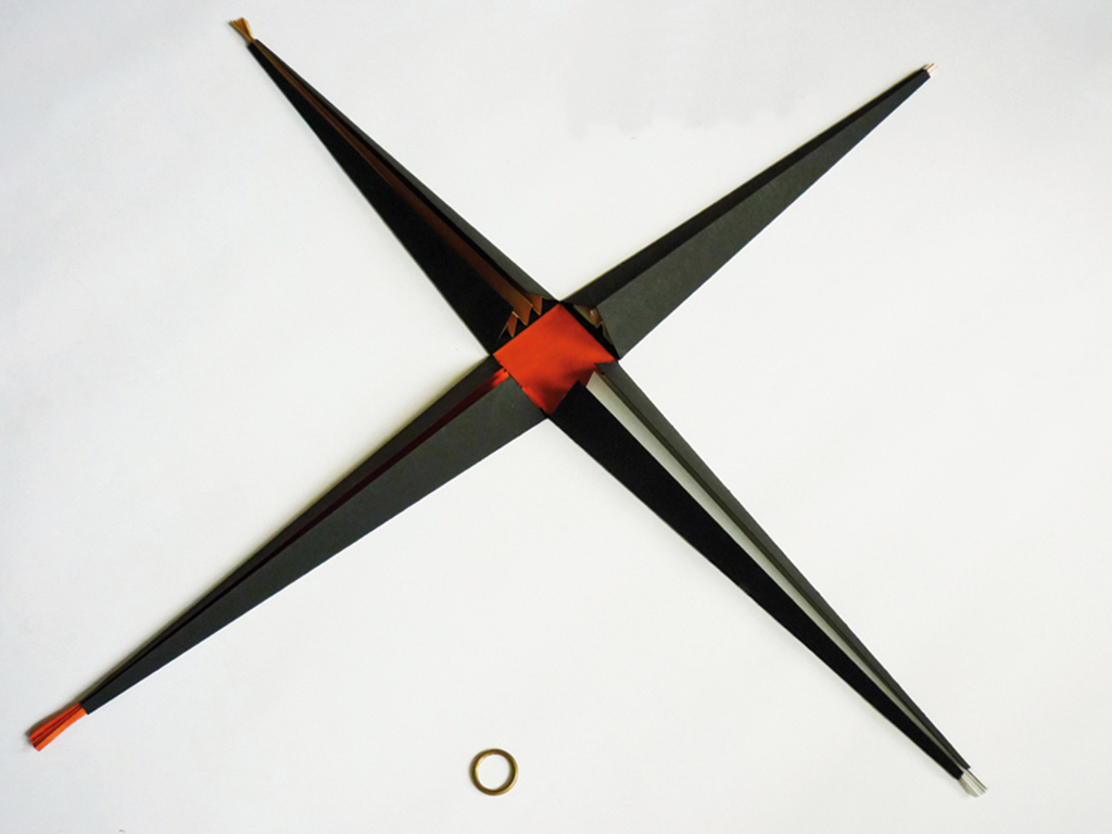
Pyramide 1995
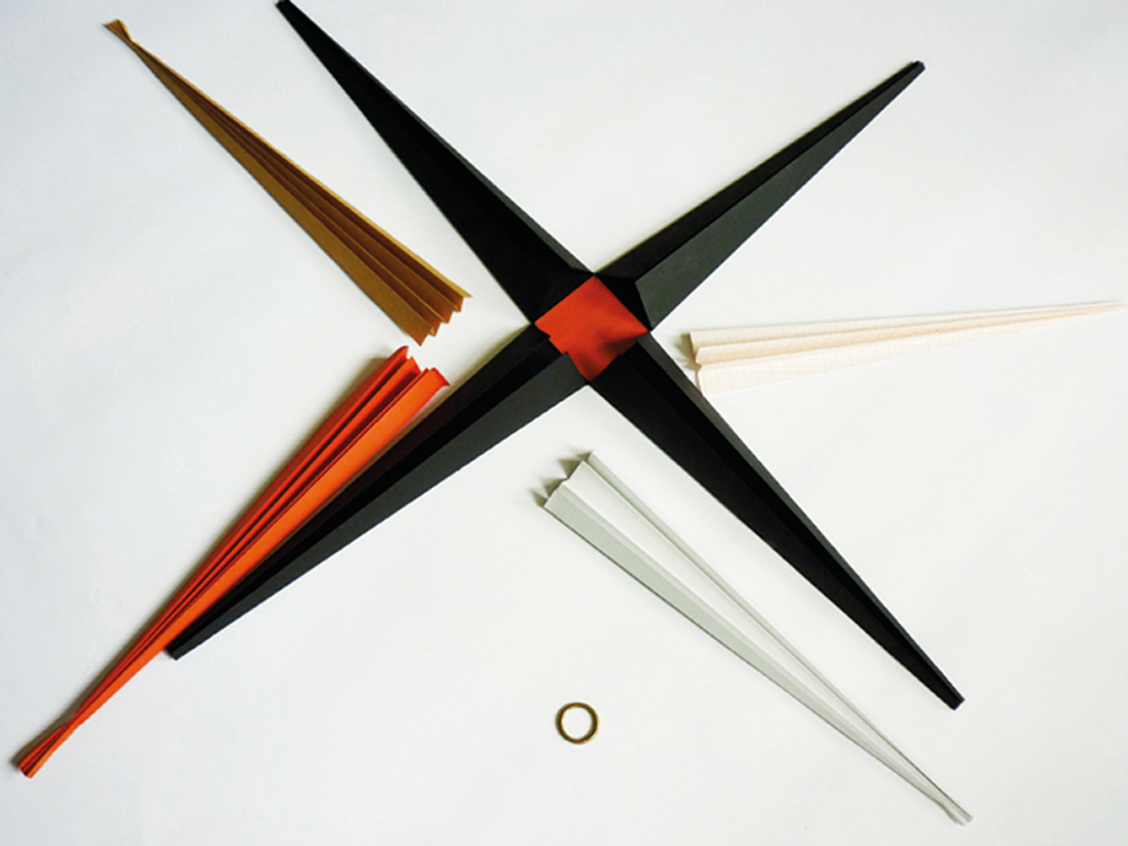
The client was Annemieke Roobeek (of ‘Strategic management from below’). “A surprise invitation aimed at managers, to get them to attend an important conference: ‘Come on, move!’ Only thirty or forty copies were needed, so I created a handmade multiple.”
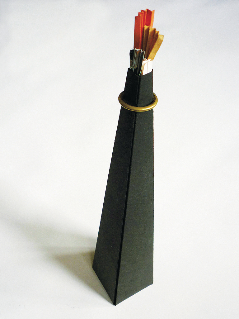
“They received a pyramid wrapped like a present (booze!). They had to remove the shiny ring and, wham! The four segments of the pyramid poured out over the empty desk top. Inside, the message is hidden in four fans.”
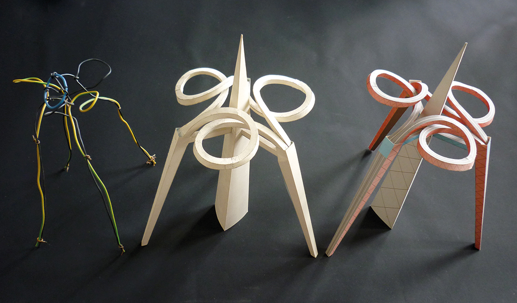
(Anti-auto) cut-out 1996
“A friend who worked for a small event organizer asked me to design a promotional present for engineers who attended a congress. The anti-automobile issue was my contribution. You can take the car lift up, but once up there are dangerous curves to cope with and eventually only an unavoidable downfall along vertical posts. I had three weeks to come up with the idea, to design and test it, and to get it printed. Construction of the cut-out takes sixteen hours. Such a fun thing to do!”
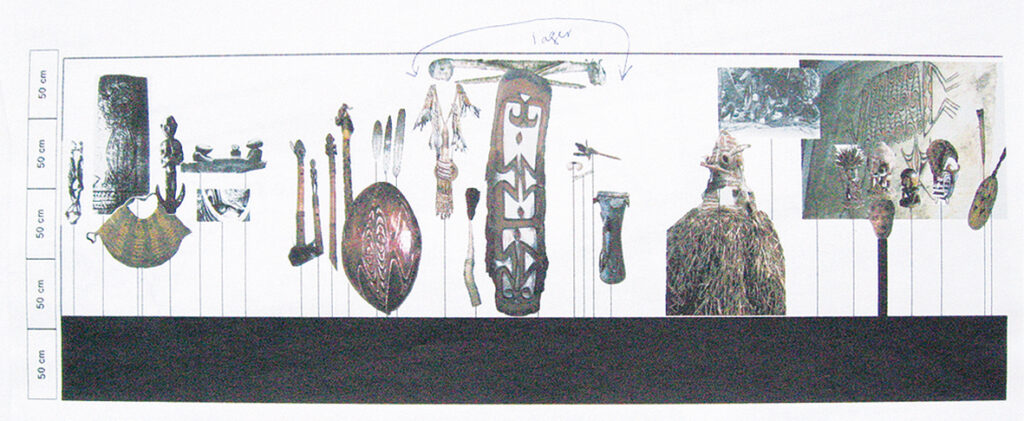
In mijn verzamelingen kan ik wonen (I can live inside my collections) 2015
Lies tells about the exhibition in Museum Boijmans Van Beuningen, Rotterdam: “As always, I designed the furniture of the exhibition myself. I also tried to include a social dimension and deal with a hot issue: should you throw things away or keep them. I am for keeping things, obviously – you never know! On the exhibition walls I displayed a blown-up inventory of all my purchases at the Waterlooplein flea market and photos of items thrown away by the sellers. In display cabinets I showed objects that represented controversial issues. On tables and panels other objects that I had collected over the years could be found, so many that a thematic approach was possible, with objects, typography and images.”
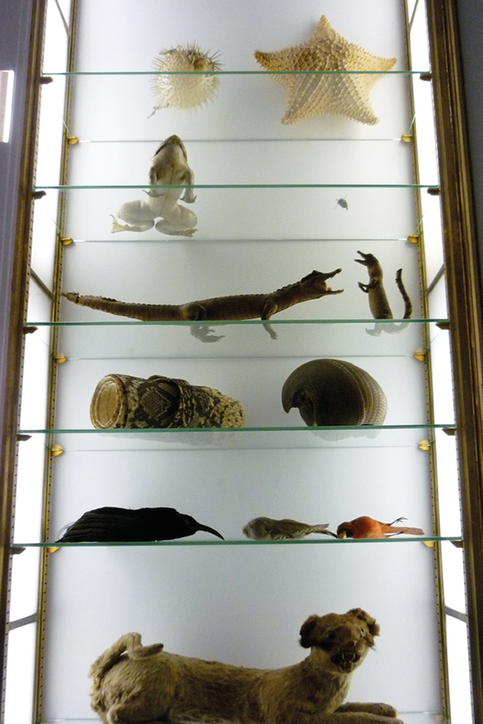
In four showcases: the trade of exotic animals; alcoholism and destructive mania; the deathly accident in the textile factory in Bangla Desh (2011) caused by the factory owner’s (all factory owners’) unstoppable urge to make profits; the danger of more powerful fireworks.
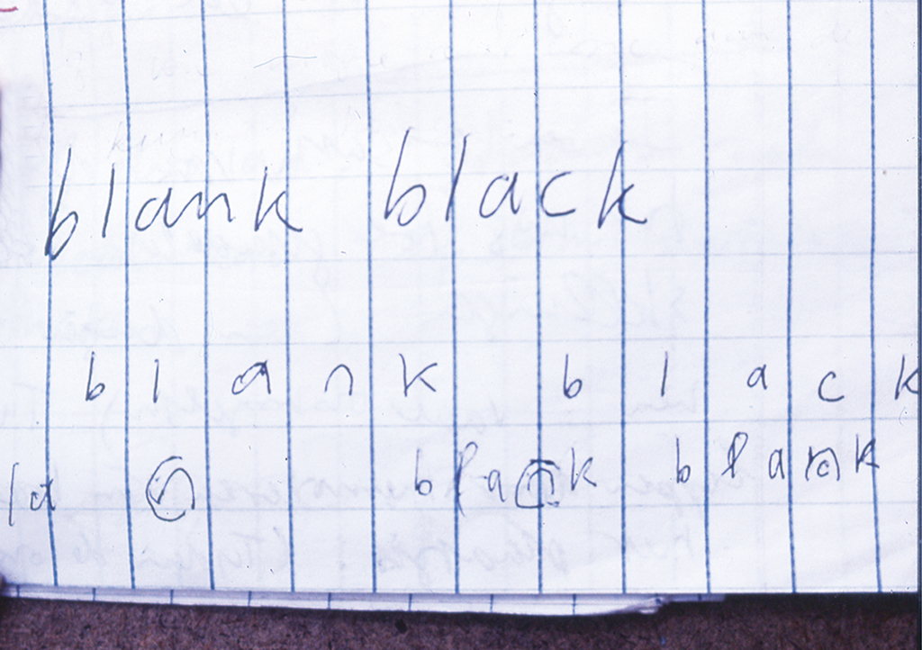
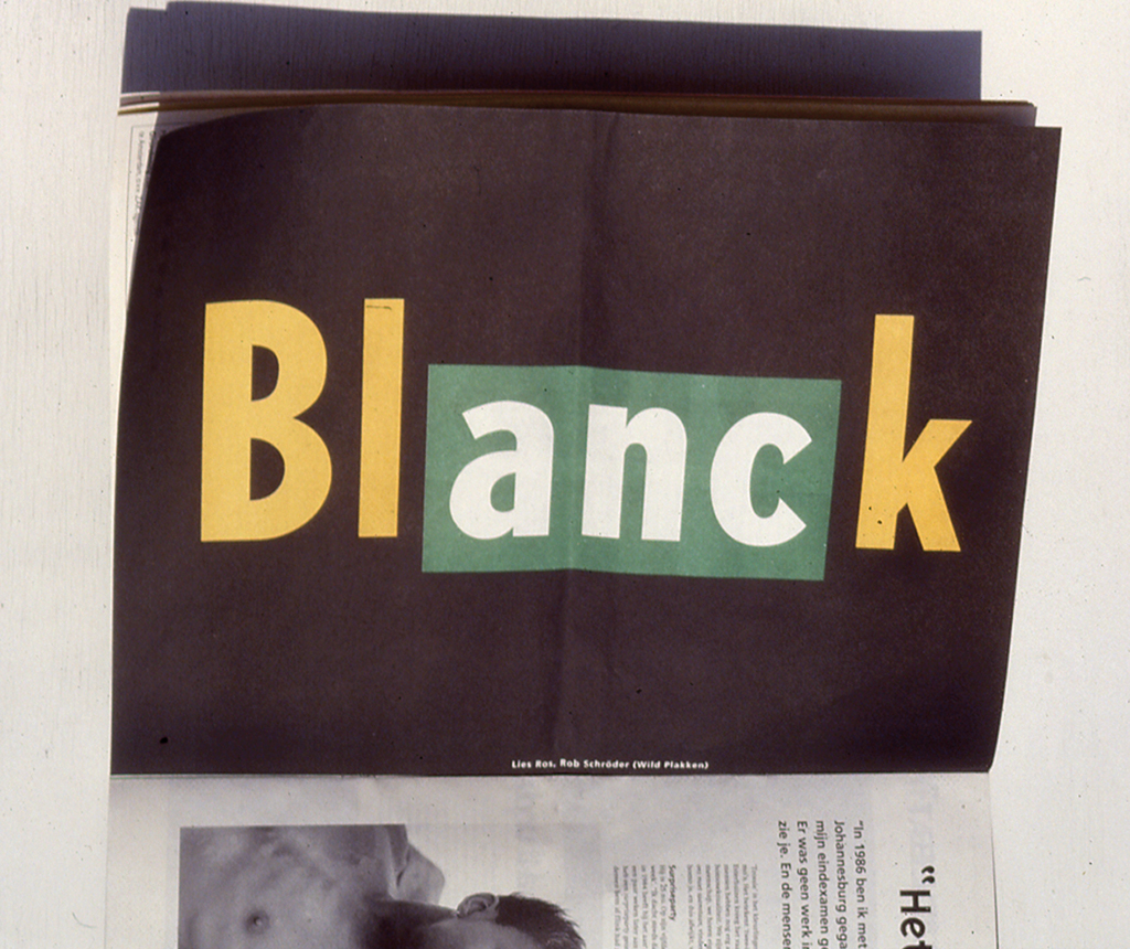
Blanck 1993 / 1994
“I noticed that ‘blank’ (fair-skinned in Dutch) and ‘black’ are words with only one letter that differs. And I noticed the letters ANC in the word ‘blanck’. Mix the letters n and c and one symbolizes the blacks being oppressed by the whites. Or the reverse: black power over white people. Politically correct? The last poster announced the final party, celebrating the end of the anti-Apartheid movement in the Netherlands.”
Schoonheid in de wetenschap (Beauty in science) 2011
“Museum Boijmans Van Beuningen asked me to design an exhibition of images found in science and especially use enlarged microscope photos, about ten subjects from the exact sciences, in as many spaces throughout the museum. I had to work with images that resembled each other, which put me onto the track to a solution in which I distinguished each space – otherwise, the visitor would get confused, if not lost. I decided only to project, onto small and big screens, onto entire walls and even onto ceilings. I could easily imagine this – long live the imagination! – but had no clue how to do it. If I may say so: the exhibition became a breathtaking fairytale. There was no criticism, even though they were very critical – I had to redesign the accompanying small book three times.”
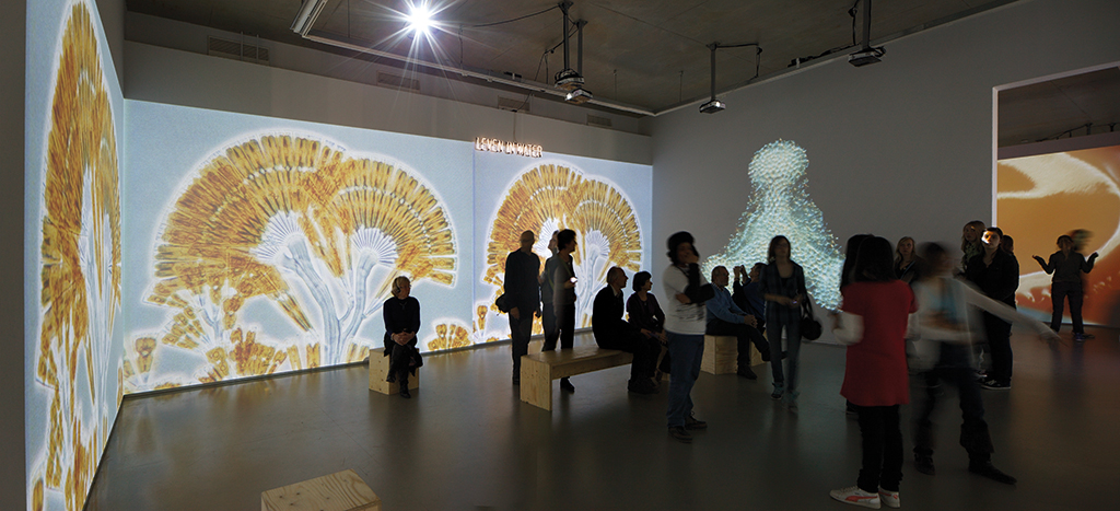
The space named ‘Life in water’. The typography used neon letters, photo: Ernst Moritz
Lies Ros
1952 Born in Hengelo
1969 – 1971 Schoonhoven vocational school (precious metals)
1971 – 1976 Gerrit Rietveld Academy of Art, Amsterdam
1976 – 1977 Partnership with Corina van Manen
1977 Beginning of the partnership with Frank Beekers and Rob Schröder, the collective later to be named ‘Wild Plakken’
1988 Frank Beekers leaves Wild Plakken
1988 – 1993 Hanne Lijesen is part of the team
1993 – 1996 Max Kisman is a part-time team member
1998 Lies Ros departs from Elandstraat to continue working from home
Lies Ros
born on 8 april 1952, Hengelo
Author of the original text: Carel Kuitenbrouwer
Translation and editing in English: Ton Haak
Final editing: Sybrand Zijlstra
Portrait photo: Aatjan Renders