Designers knew Paul Hefting as “postzegelpaultje” (Mr Stamp) of the Dienst Esthetische Vormgeving DEV (Department of Esthetic Design) at PTT, later KPN, from whom they might receive the much desired commission to create a new postage stamp and who would guide them through the process. Other people knew him as the diligent author of scores of publications on art and graphic design. The leading publication is his great review Grafische vormgeving in Nederland, een eeuw(a century of graphic design in the Netherlands) co-written with Kees Broos. Many monographs and essays about stamp design and other graphic subjects followed. Hefting delivered an important contribution to the historiography of Dutch design. ‘I am a lover of language and I desire to formulate well. But most important to me is to convey a message and explain it well.’
Hefting’s father was a minister and his mother came from a minister’s family. They were Dutch Reformed Church but associated with its liberal-thinking wing. Father Hefting’s benefice was in Nijmegen. He was a man respecting ecumenicalism—even with the Roman Catholic Church. He was a social democrat too, which explains why Paul and his brother did not attend a protestant-Christian school but received secular public schooling. ‘My family did not point me in the direction of art, music or literature. I wasn’t much of a reader and according to my school teacher most of my writings were below par. After graduating from gymnasium I decided to study art history in Utrecht.’ The decision was reached on recommendation of his aunt Victorine Hefting, the director of the Haags Gemeentemuseum and publisher Bert Bakker’s spouse. A good sketch artist and a fair piano player, he felt attracted to the arts.
In the 1950s, art history was still a discipline preferred by “young ladies.” Hefting started his education together with eight other students. Contemporary art did not get much of their attention. ‘A co-student and I now and then went to visit Kees Groenendijk, a dentist who collected modern art and who bartered his services with artists such as Lucebert. This world attracted me although it did not yet fascinate me. I was mainly interested in symbolism, the meaning of images, rather because while in Utrecht I became leading iconologist William Heckscher’s assistant. I received a grant from the Italian government and, in 1960, I went to study emblemetic paintings which were attributed to Giotto, in Castelfranco in the Veneto.’ By that time Hefting had discovered his interest in graphic design. He was one of the contributors to the students’ almanac and printed big wood-cut letters found in a market place as well as his own illustrations with his writings.
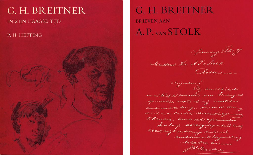
Professor J.G van Gelder stimulated him to write his dissertation and advised him to choose Breitner for his topic. The painter’s The Hague period was not well known. Hefting described Breitner’s life and work of that specific time and his interest in French art and especially the literature by Zola, Hugo and Flaubert. ‘What intrigued me was why people became artists. Later, Breitner went to Amsterdam and joined an avant-garde group, the “Tachtigers” (of the 1880s). I studied the connections between visual art and literature, and was moved by symbolism, artists such as Jan Toorop, and the whole culture of the 1900s. This is still one of my favorite epochs.’
Hefting worked as A.M. (Bram) Hammacher’s assistant between 1962 and 1966. Hammacher was professor of art history in Delft after having concluded his directorship of Kröller-Müller Museum, the museum where Hefting would eventually become a curator; he was a renaissance man and deeply interested in creative processes and the relationships between art and architecture. In his lectures he moved from churches to Arts & Crafts and from the public-spirited art in the Beurs van Berlage (Amsterdam’s exchange building) to contemporary art such as Wessel Couzijn’s sculpture for Unilever in Rotterdam. In the 1920s, Hammacher had collaborated with J.F. van Royen, a lawyer who worked for PTT and would become the initiator of its future DEV. Van Royen was an esteemed art critic and wrote many books including Romanian Sculpture published in 1936. While in Delft, Hefting assembled a documentation for Hammacher dealing with the connections between art and architecture.
Otterlo and Museumjournaal
Hefting worked for fifteen years at Kröller-Müller under the directorship of Rudi Oxenaar. ‘At the time the museum was a traditional hierarchy and we did not discuss much. Oxenaar and Ellen Joosten were the ones who made the decisions, and I was tasked with the production of exhibitions and the collection’s catalogue. That is how I met designer Otto Treumann who often worked for the museum, and later also Pieter Brattinga and Ton Raateland. It was Otto Treumann who really generated my interest in graphic design; in 1970, he assisted me with the design of my own dissertation and I enjoyed this unique experience. The book was printed by Trio in The Hague and I learned they had printed for important designers such as Piet Zwart in the 1930s. Catalogue productions for Kröller-Müller took me to many different printers where letterpress and lead typesetting were still in use. Treumann was a meticulous designer with a great eye for the page lay-out and typography, while Brattinga worked with grids and always with images. The museum had no identity program; yet Brattinga’s posters for the museum were recognizable from his preferred use of squares.’
A real outstanding production was the catalogue of old drawings edited by Herman Colenbrander and Jan van der Waals. They used the computer for everything they designed in the late 1970s and for the catalogue specifically to arrange easy entry to indexes: by art sales, by auctioneer and year, price, collector’s name, catalogue number, inventory number and theme. All photographed drawings were added to the book on microfiche, which created an extraordinary catalogue, more complete and cheaper than was common; its cover was a Petr van Blokland design.
Meanwhile, Hefting got involved with Museumjournaal, the magazine of modern art published by a group of Dutch museums and edited by their staff members. He was one of its editors from 1967 to 1978 and its editor-in-chief from 1970 to 1974. These were tumultuous times for art: conceptual art, body art, land art, minimal art, public art, everything was in motion. It was the time of artist protest movements, of engagement and “social relevance.” Museums started educational departments and experimented with shows away from the museum in city districts and with art-sociological approaches. Jean Leering at Van Abbemuseum in Eindhoven partnered with designer Jan van Toorn and created exhibitions about subjects such as De Straat (the street) to bridge the distance between art/the museum and the public at large; catching graphic designs were seen as important communication tools.
Hefting contributed to Museumjournaal too. The newest developments were granted many pages even if the magazine continued to pay much attention to all aspects of modern art. Avant-garde, the experiments, art sociology, and art and museum policies were all subjects of articles and discourse. ‘I was interested in engagement and discussion and appreciated the thoughtful left-leaning writings by art critic Cor Blok just as much as the more cerebral contributions by Wim Beeren. In my days with the magazine it became more open, better readable, with a calendar and information about exhibitions in other countries, and a column by gallery owner Geert van Beijeren (Art & Project) to discuss topics. I commissioned Van Toorn to design the English-language edition of Museumjournaal.’ Design too became subject of writings. DEV/PTT was portrayed; the identity program for Dutch railways NS caught broad attention.
DEV, “postzegelpaultje” (Mr. Stamp)
Hefting was becoming an all-round art and design connoisseur not attached to any specific artist or designer or art movement. He remained foremost the art historian with a wide view and receptive to all developments. He did not see his role as a writer and journalist to pass judgement; he just wanted to go to the bottom of art. His articles for Vrij Nederland and other mass publications were aimed at the transfer of information and understanding rather than his opinion; as an author, he was an intermediary, not a critic. ‘Art has to be understood and this asks for introduction to backgrounds, for explanations. Nevertheless, much with regard to art remains forever in the dark; my task is merely to put into the clearest possible words what it is all about, to clarify its context.’ Hefting loved many different artists, from Matisse to De Kooning, Schiele to Giacometti, and Ingres just as much as Douwe Jan Bakker. Drawings always had his favor possibly because he himself was a draughtsman, and maybe because a drawing is closer to the person of an artist that an accomplished painting; a sketch is a first concept of a work to come.
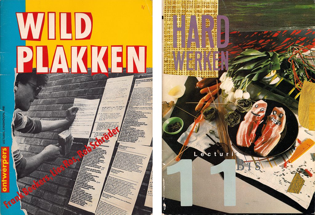
Wild Plakken, Hard Werken (Lecturis documentaire 11a and 11b) – The first essays about these two designer collectives which stood out for their loud claims of independence and freedom. Hefting underscored their emphatic distancing from standard norms, their experiments, and their undeniable romanticism. Wild Plakken he saw as connected to the idealism of past times, the historic avant-garde and Dada. In 2006, Hefting returned to the designers for a follow-up interview to add to the WP archives then being catalogued for NAGO.
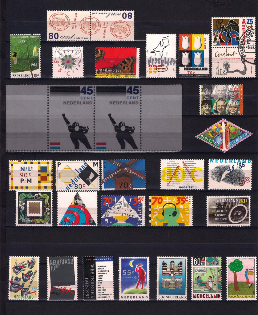
Hefting joined the team at DEV, then led by Ootje Oxenaar, in 1981. He liked the new phase in his career although he had to admit he would rather have remained a museum man. ‘But after fourteen years at Kröller-MüIler I wanted out of Otterlo. I had divorced and was ready for something new. DEV was something special often called “Het zootje van Ootje” (Ootje’s mess), and was associated with art and design education and “1% art” (1% of building expenditure reserved for art), of which I was not really fond. Oxenaar had told me part of the job was to speak in front of groups of wives of PTT staff.’ No fun, thought Hefting, who stammered a little. But public speaking wasn’t his job, writing was, and he was assigned only a few 1% projects. The design and production of stamps became his field; in fact his was the job of the middleman and as started under Hammacher the relationships between art and environment remained the red thread in his professional life. He admired the idealism of artists and their curators and clients and he sought to connect art and society; he was inspired much by J.F. van Royen, the great helmsman who directed PTT’s art and design policies from the beginning of the 20th century, and he enjoyed writing about Van Royen’s ideas and accomplishments.
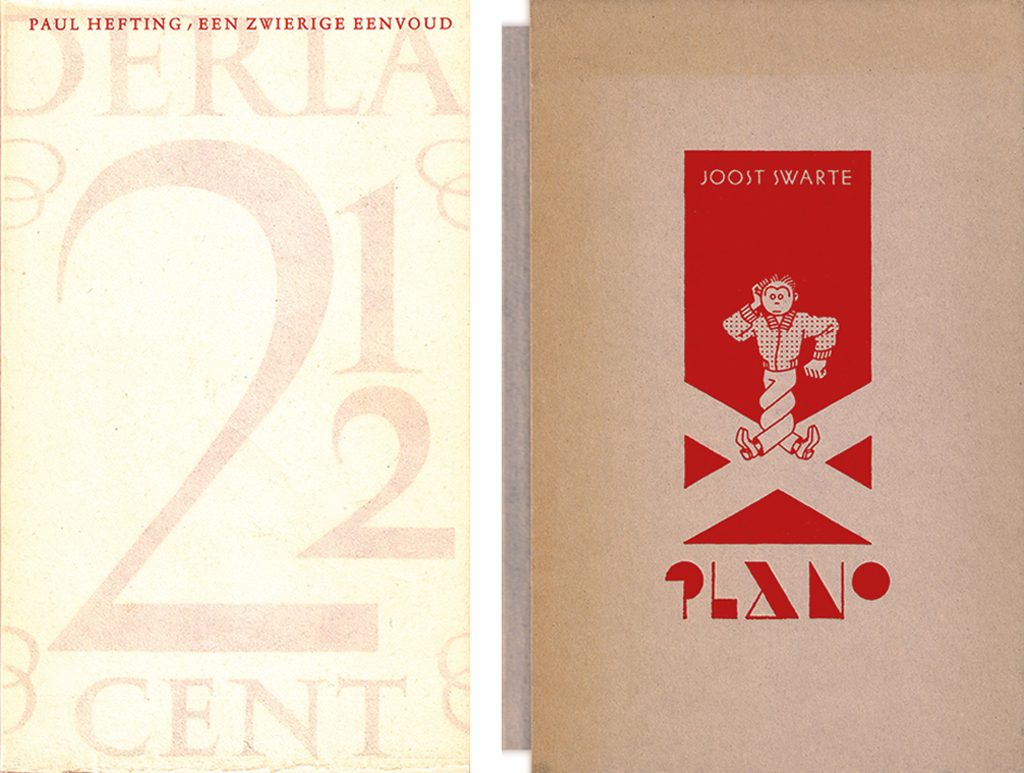
Een zwierige eenvoud (A dashing simplicity) – about the number stamps designed by Jan van Krimpen – A beautiful little book in which Hefting wrote about the origins of Jan van Krimpen’s number stamps (1946) and the designer’s life. Hefting’s writing is as elegant as Van Krimpen’s work. The book’s print run was just 175. It was designed and printed by Bram den Does and Niek Smaal in 1987. Designgeschiedenis Nederland republished it in a digital version.
Oxenaar was less idealistic. The integration of art and society was already disappearing as a moving concept. Quality was asked for, amongst others by the then Dutch culture secretary, Brinkman. Quality was what DEV too preached, quality and multiformity. Oxenaar was a leader who gave his staff lots of space, which resulted in a divers rather than a strict corporate approach. Commissions were given to a broad scala of architects, artists and designers. ‘Quality and diversity cannot be defined easily. We, staff members of Art and Design as DEV was called after the privatization of PTT in 1989, were aware of most if not all developments and talents in the arts. We discussed our discoveries and opinions, let ourselves be pointed to new directions, and once in a while had “the luck of the draw.” And sometimes Oxenaar showed his preferences, such as when a new stamp with the portrait of the Queen had to be commissioned. Peter Struycken, Marte Röling, Jaap Drupsteen en Walter Nikkels were invited. Struycken’s design was the winning one; he used dots to create the portrait and his design was not appreciated widely within PTT (Post) because the color values tended to be so close that confusion was the result. Yet the Queen herself had selected this design; the abstraction that was created fitted exactly with her opinion of her function as the crowned head of state, because she was not presented as a person.’
With some ten new stamp designs added each year the variety became enormous. Designers who were seen as avant-gardist contributed, such as the Hard Werken and Wild Plakken collectives, but also Guus Ros, Kees Nieuwenhuijzen, Max Kisman and Victor Levie. Hefting kept his eye open for designers who could understand the complex essence of a stamp and create something unique. He was fascinated by the design process and the whole complicated procedure of winning acceptance within the PTT (Post) organization and his spear-heading of the production process. ‘Ootje was a great support, he defended designs if needed, but also gave designers the opportunity to defend their designs themselves. Ootje and I supplemented each other quite well.’
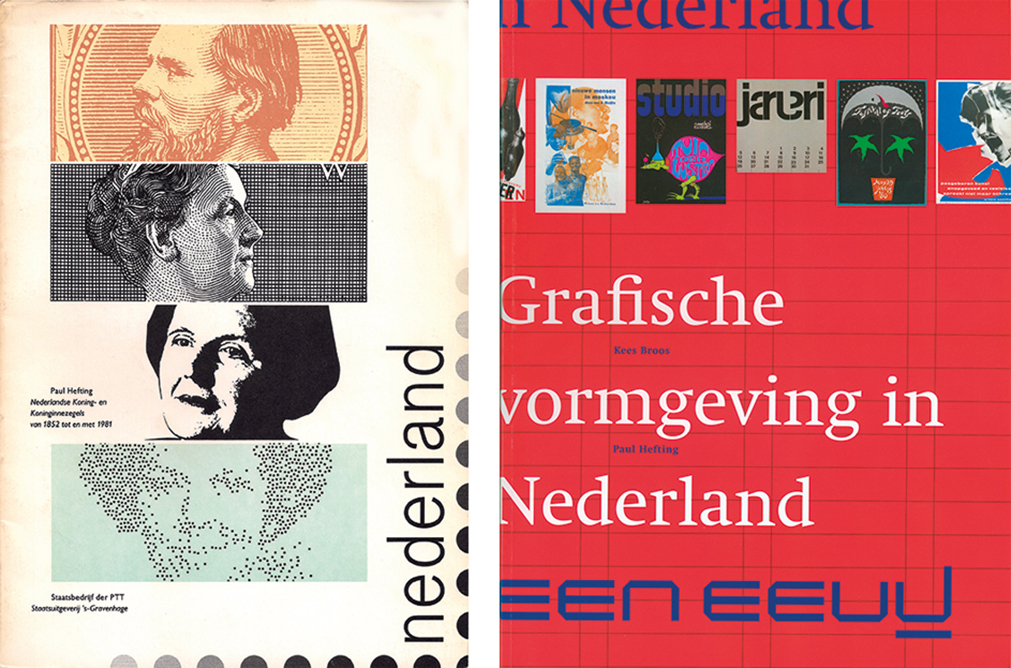
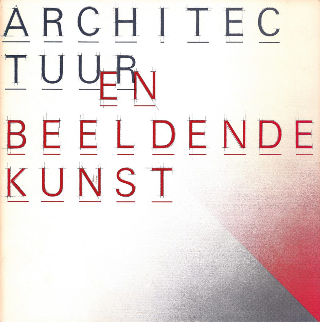
A Century of Graphic Design in the Netherlands, Paul Hefting and Kees Broos, authors – One of the few general surveys of graphic design, from letters to books, posters and corporate identity programs after 1890. Short texts about designers, themes, and printers. Creativity and imaging are put opposite functionalism and abstraction, yet it is not merely esthetics that move the authors.
There was freedom. There were limits as well. Balancing on lawlessness was an adventure for DEV staff and commissioned designers and artists alike. Punk and modernism roared their heads in the 1980s. The collectives scored high, but so did Jaap Drupsteen who had made his name with extravagant designs for VPRO television, and so did Walter Nikkels with his more typographical designs. Nevertheless, there are publications in which Hefting made mention of his hesitance with the “anything goes” approach of the multiformity of those years. ‘For, the stamp is not a free expression. PTT (Post), then a state-owned company, had to make sure nothing appeared on stamps that could lead to critical questions in parliament. Showing a factory’s smoking chimney on a stamp about the conservation of the Wadden Sea wouldn’t do. With the privatized organization KPN, after 1991, things changed. Two stamps dedicated to space exploration did not show rockets being launched but a man saluting space by taking his hat off, and two stepstools, to indicate space as something materially and immaterially approachable.’
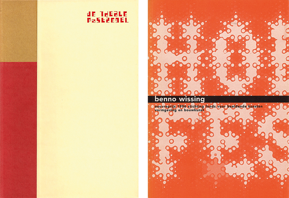
Benno Wissing, Oeuvre Award 1996 – A small but carefully edited monograph about Benno Wissing, one of the founders of Total Design and the first designer of Schiphol Airport’s sign system. Small as it is, it tells all about Wissing’s background, ideas and work. Hefting collected information from Wissing himself and his contemporary colleagues.
In those days, the marketing divisions at KPN gained power. Was in previous days PTT’s director-general or his deputy at Post the ones who gave the green light for production, now the marketing people had the say and they were exclusively fueled by profit’s fires. Surprising content lost to popularization. Hefting left the organization in 1994. He continued to write about art and design, though. A selected list of his writings is already a page long.
Paul Hefting
born on 4 March 1933, Eelde
died on 17 May 2018, Haarlem
Author of the original text: Frederike Huygen, September 2012
English translation and editing: Ton Haak
Final editing: Sybrand Zijlstra
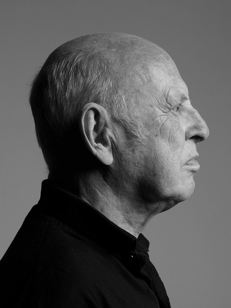
Portrait photo: Aatjan Renders