9 November 1972. That evening the grand hall in Museum Fodor on the Keizersgracht in Amsterdam was packed. To mark the occasion of an exhibition about Jan van Toorn’s work, the museum had organised a debate between him and his colleague Wim Crouwel. The audience’s attention quickly turned to the alleged contradiction between their different views on graphic design. While Crouwel expressed his conviction for a functional, neutral or objective way of designing, Van Toorn spoke about his opinionated, subjective views. Meanwhile, emotions ran high among the audience; thinking in simple contradictions and wrongly placing the work diametrically opposite each other. For Van Toorn, that November evening was a moment in his quest that had not yet come to an end.
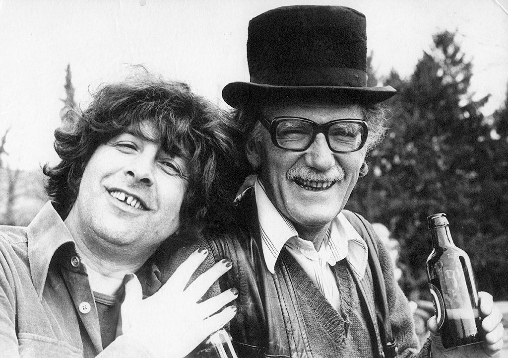
Jan van Toorn and colleague teacher Tom de Heus in Remouchamps during a workshop of the graphic design department of the Gerrit Rietveld Academy, early 1970s.
The beginning
In 1935, three years after the birth of Jan, the Van Toorn family left the city of Tiel in search of work in Amsterdam. It is the years of economic depression and Jan’s father, a tailor, starts a vegetable shop on the Postjesweg in Amsterdam. By helping out in the store, Jan grew up in the world of small business with his two brothers and his sister. The war years ended with a winter of famine, which at the same time brought an end to the store. His father picks up the tailoring trade again and continue to do so until his retirement. After the summer of 1945, when Jan is 13 years old, he goes to a four-year secondary school, which he does not finish.
Craftsmanship is highly regarded at the Van Toorn family. His father accompanied his son to the job interview at offset printing company Mulder & Zn. on Wibautstraat. Because of Jan’s talent and interest, they give him the job as a draftsman in the drawing department, where he will stay for seven years. He drew many illustrations for children’s books published by the printer and designed ceramic transfers, a sticker technique developed by the printer for decorating tableware.
In a time when the Netherlands still lacks everything, Jan is learning to master his own trade. During his first year at the printing house he received a weekly wage of five guilders. While the young Van Toorn draws all kinds of things during the day, he comes into contact with Marxism and other socialist ideas through the head of the drawing office and other colleagues; political and social thoughts that are far from the center. Printing houses were strongholds of the union at that time.
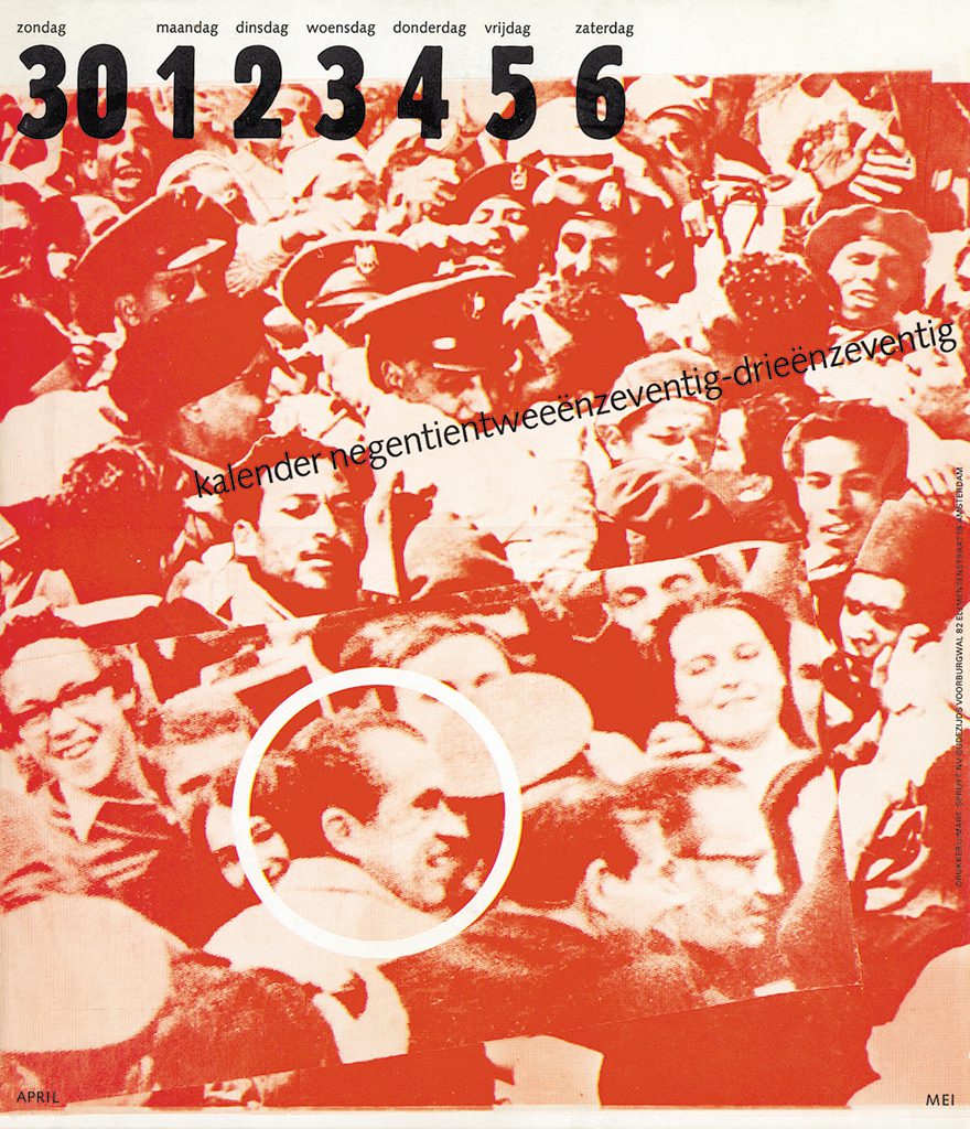
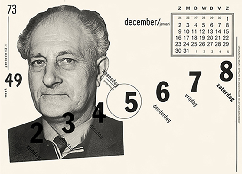
Calendar 1972 – 1973 Mart.Spruijt, Amsterdam
Education
As a sixteen-year-old, the head of the drawing department advises him to take a winter course at the evening school of the Amsterdamse Grafische School (Amsterdam Graphic School) in the Dintelstraat. Thereafter he enrols in the evening course at the IVKNO, the institute for applied art education (later the Gerrit Rietveld Academy), in the Gabriel Metzusstraat. There he comes in contact with a visual world that is more artistic, idealistic and critical than the one he is familiar with during the day. On those evenings he learns from Ab Sok how to make engravings, woodcuts and etchings and he meets teachers such as Lex Metz and Charles Jongejans with their ideals of an independent and free socialism. In the lessons they talk about their utopian expectations and about how art and design should contribute to better living conditions.
This evening course, which in addition to vocational training is also described as ‘a form of social emancipation’, makes it clear to Van Toorn that what matters to him is: craftsmanship that is driven by both form and content, the pleasure of experimenting and the desire to inform the viewer instead of manipulating them. Aspects that will remain visible for the rest of his career and that continued to reinforce each other. The call for military service in 1953 made it impossible for Jan to complete his education.
The games
During this period, he meets his future wife and after two years of military service Jan returns to printing house Mulder as a draftsman. He finds his next job at the Van Dam company, where he designs all kinds of prints for plastic, such as tablecloths, aprons, pillows, diaper pants, etc. This lasts until the company goes bankrupt at the end of 1956, after which Van Toorn receives unemployment benefits for a couple of months.
A ‘search for work campaign’ sent by mail is answered by Jumbo, the games company of Hausemann & Hötte NV. Their reaction enabled him to establish himself as an independent illustrator, he designed games for years, such as Board Script, the Dutch version of Scrabble. In the late 1950s, Hausemann & Hötte asked him to set up a ‘laboratory’ to develop new games and design them carefully. The first game to emerge from this laboratory in 1960 immediately wins the Gouden Noot (Golden Nut) packaging prize.
While illustration assignments come and go, including for decors for the window displays of airline companies, Van Toorn designed his first small exhibition in 1959, commissioned by the nutritional institute of the Institute for Applied Natural Sciences (TNO). This assignment also included his first typographic layout: a brochure that he had printed at the printing house Mart.Spruijt.
Graphic design
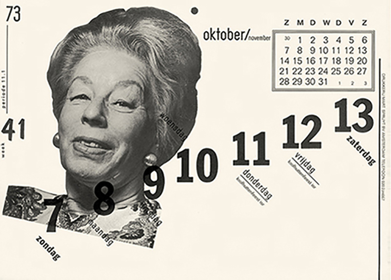
The director of this company, Frans Spruijt, immediately remarks that Van Toorn’s typography is “damn well put together” and that he “had to keep doing it”, after which Spruijt instructs him to design the calendar for his printing company that serves as a promotional gift. After Spruijt shows him how to space small capitals in lead, Van Toorn continues to specialize in typography under the motto ‘learning is copying’. Spruijt’s calendars become a recurring assignment – ultimately over a period of seventeen years – and their presentations becomes an event that the printer’s relations look forward to receiving their copy; each edition was so well printed and typographically so experimental.
Calendar 1973-1974 Mart. Spruijt Amsterdam
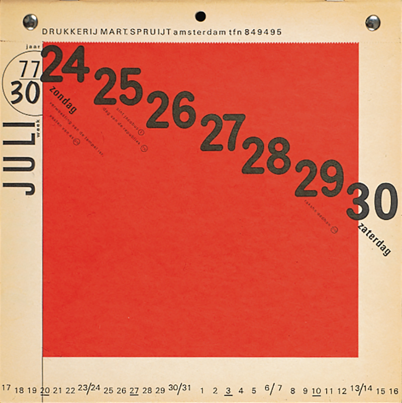
Calendar 1976-1977 Mart. Spruijt, Amsterdam
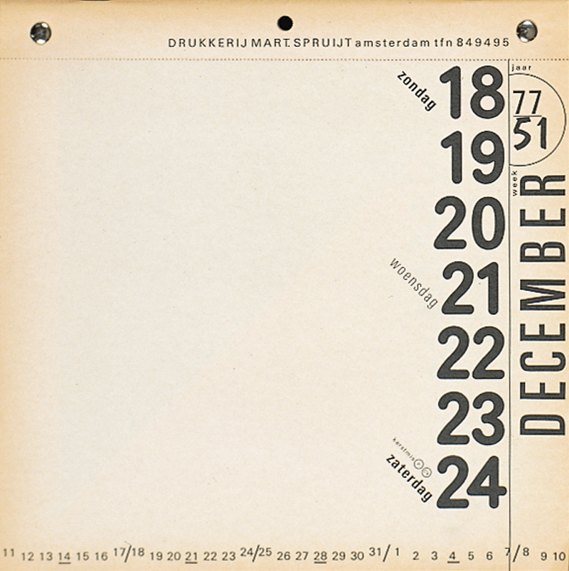
Calendar 1977-1978 Mart. Spruijt, Amsterdam
The calendars also bring him other assignments, as a result of which he gradually says goodbye to his commercial illustration assignments at around the age of thirty, he also receives the honourable offer to become a member of the Gebonden Kunsten federatie, the GKf (Federation of Applied Arts).
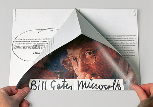
Van Toorn became responsible for the layout and image editing of publications for the paint manufacturer Sikkens and for the magazine Range of Philips Telecommunication Industry (PTI). These are assignments from industrial companies that consciously use cultural added value of design for their publicity. These assignments were educational for Van Toorn because the budgets to be spent gives him access to the graphic resources of the best printers. Through his collaboration with editor-in-chief Niels Douwes Dekker, Range gave him experience in visualizing the often-invisible functions of electronic communication devices.
In answer to the question who he thinks should design Van Abbe Museum’s publicity material, Willem Sandberg, at that time director of the Amsterdam Stedelijk Museum, advises his younger colleague Jean Leering in Eindhoven to give Jan van Toorn a try. Leering commented later: ‘Rather than adopting a single graphic style with possible When asked who he thinks should design the publicity material of the Van Abbe Museum, Willem Sandberg, then director of the Stedelijk Museum Amsterdam, advises his younger colleague Jean Leering in Eindhoven to give Jan van Toorn a try. As a result, Leerling and Van Toorn have worked together for nine years from 1965 on a remarkable series of printed matter for many exhibitions. Leerling: “Not by using the graphic resources in the same way, with variations, but by using those resources as a technique and saying: the exhibition subject provides the associative elements with which the technique is used. Then, despite the large differences in form in posters and catalogues, you get something that expresses one mentality.” In this museum, Van Toorn seizes the opportunity to further develop his skills in making exhibitions. Besides being a designer, he also works as one of the editors of the exhibition De Straat. Vorm van samenleving (The Street. Form of Society).
At a time when the Dutch economy is starting to flourish and many companies are beginning to recognise the At a time when the Dutch economy is picking up and many companies are beginning to see the importance of good design, Van Toorn mainly receives assignments from the cultural sector. This is where he can best apply his ideas and where he can experiment the most. In a period of 25 years from 1971, he designs numerous stamps and several annual reports for the Dutch Postal Service (later KPN).
In 1974 Jean Leering leaves the Van Abbe Museum for the Tropenmuseum (Museum for the Tropics) in Amsterdam, for which Van Toorn had already worked for a year, with the intention of converting the former colonial museum into a place for intercultural exchange. However, due to the unwillingness of the staff, Leering and Van Toorn do not succeed in realizing their joint plans; in 1978 they both left this institute.
In 1976, Van Toorn designed the Dutch contribution to the Venice Biennale, Beyond Shelter, in which he questions the quality of public space. In the same year, the collaboration with Drukkerij Mart.Spruijt came to an end. There is no arguing, but the president of the printing house could no longer follow the designer “in his anarchist and Marxist way of thinking”.
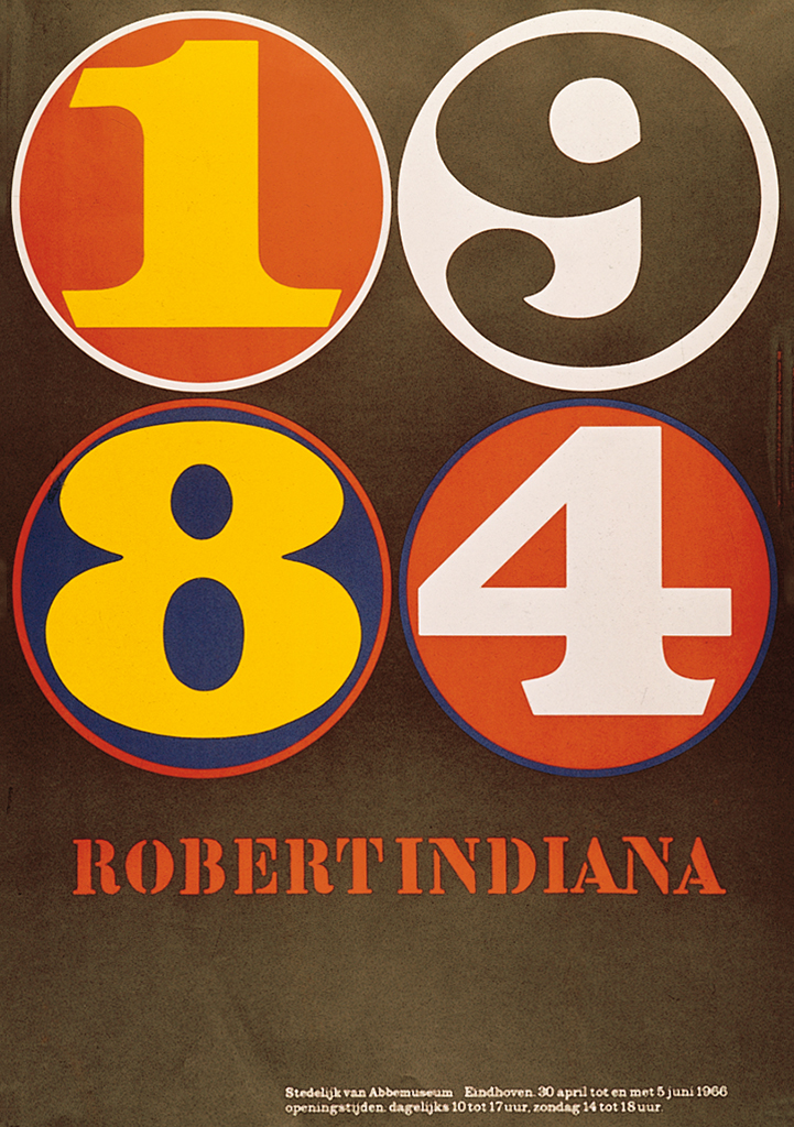
Robert Indiana Van Abbe Museum, Eindhoven 1968, poster
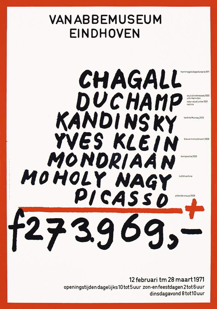
Chagall etc. Van Abbe Museum, Eindhoven 1971, poster
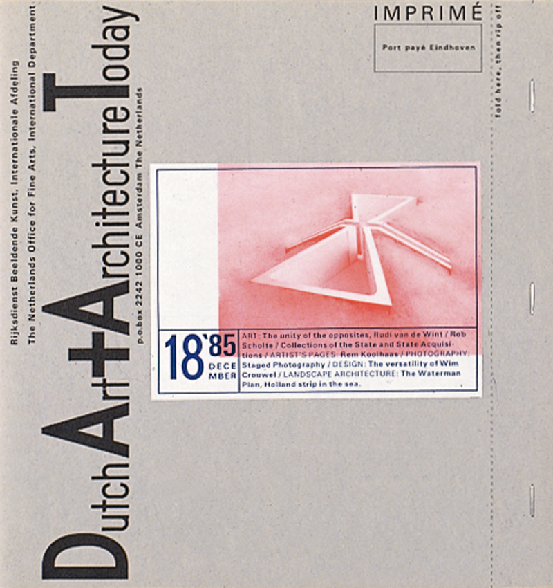
For Van Toorn, however, the assignments keep coming and around this time he designs the magazine Dutch Art + Architecture (DA+AT). It is a small and smartly designed magazine published by Gijs van Tuyl of Bureau Beeldende Kunsten Buitenland of the Ministry of Welfare, Public Health and Culture, is published and distributed via embassies to all kinds of relations in our kingdom, and also available in the Netherlands itself. In 1978 Van Toorn designed a document, as a sign of his time, that included a dialogue between him and Jean Leering: Vormgeving in functie van museale overdracht (Design to support museum communication). This publication is part of the series of documentaries by the Eindhoven printing company Lecturis.
From 1978 to 1980, Van Toorn designed 24 covers for the bimonthly magazine Museumjournaal. From 1980 he designs the printed matter for Cultural Center De Beyerd in Breda. This collaboration also produces a striking series of posters and catalogues for exhibitions. In 1987 this collaboration was concluded with an exhibition about the work of Van Toorns himself, designed by Karel Kruijsen.
In 1981 Van Toorn leads the team that compiles and designs the permanent exhibition about the Delta Works on the artificial island of Neeltje Jans, part of the construction of the reinforcement of the Dutch coastline, which opened in 1986.
In the same year he is invited to participate in a closed competition to design the new Dutch banknotes. He fulfils this honorable mission by highlighting a different aspect of the role that money plays in our society, depicted on the different denominations of the banknotes. In 1989 Van Toorn designed one of the posters in an international exhibition to commemorate the announcement of the ‘Declaration of Human and Citizens’ Rights’, 200 years earlier.
So far a selection from the extensive oeuvre that Van Toorn has created to this day, often with the help of his talented assistants.
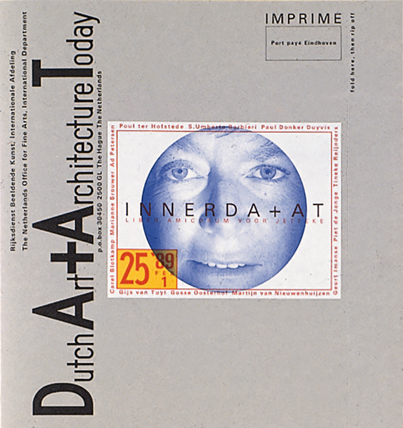
Dutch Art + Architecture Today Bureau for the Visual Arts Abroad, WVC, The Hague 1977-1989, magazine
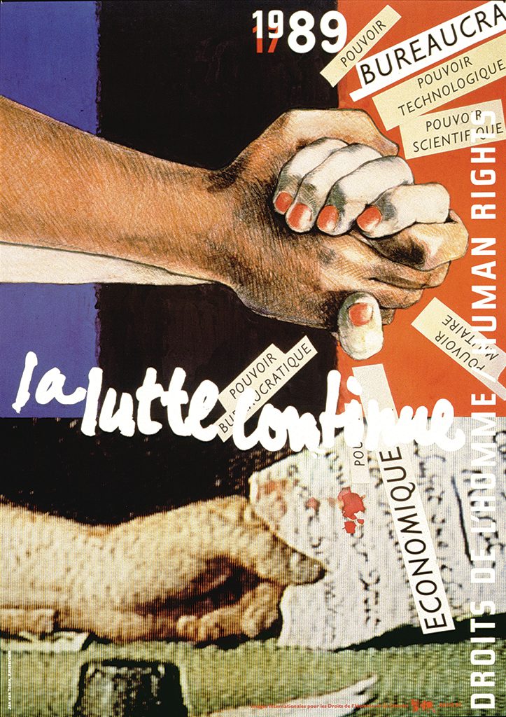
La lutte continue Commemorative poster ‘Declaration of the Rights of Man and of the Citizen, 1789’ Paris, 1989
Je ne cherche pas, je trouve From the series Man and Environment De Beyerd Cultural Centre, Breda 1984, poster
Teaching
Towards the end of the eighties, teaching takes over for Van Toorn. First in Amsterdam, then in Providence on the east coast of the United States and later in Maastricht. Van Toorn had previously been a teacher at various institutions. It starts in 1963 at the graphics department in Den Bosch, until 1968, when he is invited to teach evening classes at the Gerrit Rietveld Academy, Amsterdam. Together with Jurriaan Schrofer, he is developing an academic program based on an editorial approach to graphic design. It consists of providing professional and theoretical knowledge, such as the different aspects of image and typography, as well as the technique and organization of work. Unfortunately, the program is never put into practice. Two years later, he switched from night school to day school, with his ‘Regie en Planning’ (Direction and Planning) course. In the later years, it becomes an increasing burden to be able to educate a growing number of students in a thorough understanding of all aspects of graphic design, especially at a time when budget cuts lead to fewer teaching hours and fewer resources. In 1985 he left the Gerrit Rietveld Academy after seventeen years. Two years later, Jan Willem Schrofer, director of the Rijksacademie in Amsterdam, asks Van Toorn to set up an ‘Artmedia Studies’ department. He forms a team of teachers and teaches there three days a week. In 1989 he resigned his position because of the unmanageable nature of the academy president.
Around this time, he receives an invitation to become ‘visiting professor’ at the graphic design master course of the Rhode Island School of Design (Providence, USA), a position that he still holds to this day. It is here that Van Toorn learn to know an academic program, much more to his liking than the Dutch equivalent. Experience and knowledge are presented in conjunction with one another, so that in exchanges and collaboration between students and professors the transfer of knowledge and experience is more effective, while reflection on the work is deeper.
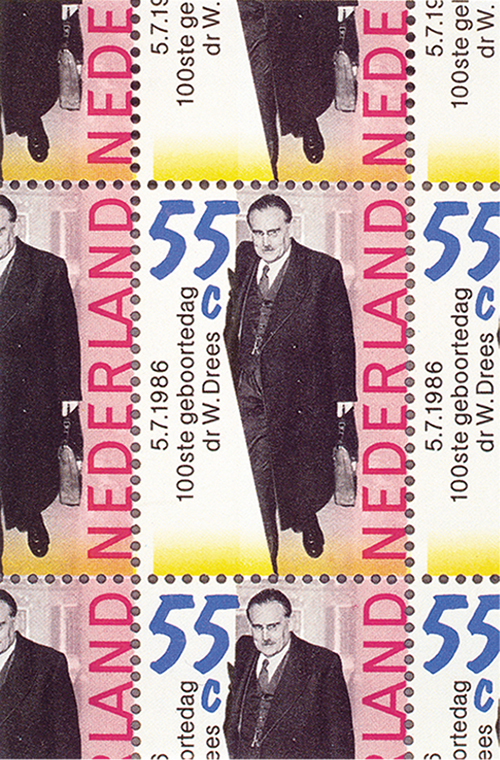
Postage stamp 100th anniversary Dr Willem Drees, 1986
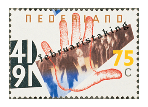
Postage stamp February General Strike 1941, 1991
The American experiences proved to be of great value when in 1991 Van Toorn was offered the position of director at the Jan van Eyck Academy, the postgraduate artists work spaces in Maastricht. He is asked to transform this academy into a research institute for reflection and practical work in two domains of visual culture: ‘autonomous visual art’ and ‘design as commissioned visual production’. Thinking about visual culture must be based on a third and equal discipline: ‘the theory of visual culture’. This assignment is the end of a long journey through education and brings together a number of themes that are close to his heart. After his appointment, the Van Toorns settled in Maastricht. Partly because of his intention to consistently confront the three departments – art, design and theory – with themselves and with each other, the institute became a success as an international institute for practical and theoretical exchange. As director, he designs the printed matter of the academy himself, in the tradition by the renowned former director Willem Sandberg of the Stedelijk Museum Amsterdam. Seven years later, in 1998, the Van Toorns returns to Amsterdam. Although formally retired in the Netherlands, he continues to teach at the Rhode Island School of Design, “because you learn so much from students and colleagues”. He gets more time to write and to join several editorial boards, including Visual Language and Design Issues. There is also time to take on commissions, such as in 2004 designing the monograph Sandberg. Vormgever van het Stedelijk (Sandberg. Designer of the Stedelijk Museum).
Observatoire internationale des prisons Lyon 1993, poster
His layout
This carefully crafted book, on one of his esteemed graphic predecessors, shows Van Toorn’s visual interventions that he has applied for decades. First of all, the care he devotes to his work and declares with: “I keep tinkering with it, and at some point, it has to go to the printer”. Another constant is that he usually chooses a common sans serif font for the reading text, with which he creates legible and even gray typography. The different editorial levels each have their own font and typography. As a result, they acquire their specific typographic structures and give reading their own rhythm. He often chooses less conventional fonts for the headlines. Sometimes also tasteless ones, but Van Toorn has the gift of making them bloom. Just like with a successful bouquet, the different fonts give each other the role they should play in the whole.
He does not allow the placement of the images to be determined by the dimensions or the rhythm of the typography. It is their meaning and form that determine how the images should be treated. Visually, Van Toorn has given himself more and more freedom in his layouts over the years. The different graphic elements with their different functions meet on the pages, and another characteristic of Van Toorn’s method is to let the different graphic elements ‘disturb’ each other and to break down the built-up graphic structures to an acceptable level. Done differently on every page, giving each spread its recognizable individuality. By precisely controlling the layout, he creates a careful ‘messiness’ in his visual arrangements, which evokes a certain informativeness through this ‘inaccuracy’. This informal layout feels organic and natural, creating a graphic environment of a comfortable ‘perfect imperfection’ for the viewer.
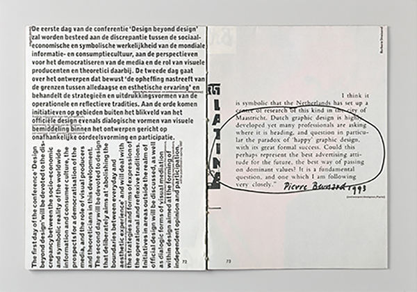
Symposium: Design beyond design Jan van Eyck Akademie, Maastricht 1995, brochure
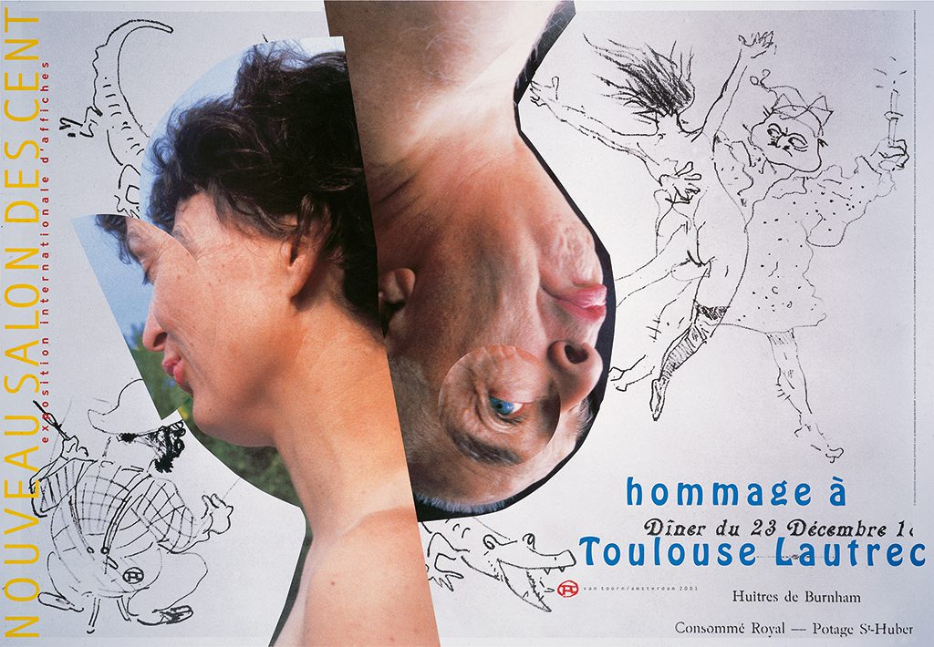
Le nouveaux salon des cents 100th anniversary of Henri Toulouse Lautrec’s birthday 2001, poster
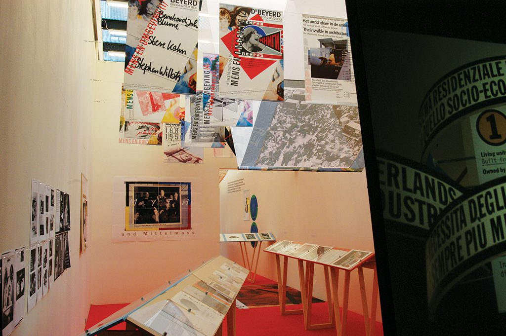
Exhibition design
For Van Toorn, it is always about the stories that need to be told, and exhibition design is an excellent medium for this. It also allows him to present a topic in a way that gives viewers an impression they help create, as they are free to decide for themselves what information to select, in what order they want, and all at their own pace. Van Toorn stated in 1986: “Our perception of reality is impoverished when everything is neatly ordered and verifiable. Chaos is an essential fact that constantly reminds us of an irrational, emotional and difficult to describe experience of reality through verbal means. I see it as my task to provide insight into this field of tension using visual means.”
He is also convinced that a meaningful transfer of communication only takes place if the client and designer take a position and make it visible, which makes them vulnerable. Once the latter has been decided, it is important to find the right visual means and then combine them – described by Van Toorn as ‘meaning production’ – so that the intended associations arise in the mind of the visitor, who can then use them to express their own point of view. Whatever that position may be.
The Sixties
On that evening of 9 November 1972 in Museum Fodor, Van Toorn spoke about the attitude of the graphic designer to his audience, about an independent position in relation to the client and the consequences this has for dealing with the message: how to deal with the subject. and what the effects are for image editing and design. Classic rules and conventions within the design world had to be broken down. It was a decade in which people liked to think in contrasts, were looking for them – and so on this evening too, Van Toorn’s work was wrongly contrasted with that of Crouwel: the artist versus the engineer. The latter, as an aesthete, applied his modernist ‘Swiss’ design method and described the result as functional and neutral, which, according to him, resulted in objective communication. Crouwel’s work aroused admiration, but his explanation of it caused confusion.
Besides the fact that both designers were active during the same period, it was also a time when Western society was changing rapidly, when many cast off their chains and for some the imagination had to become reality. According to Van Toorn, there was no objectivity in communication, and he did not believe in the authoritarian attitude that often accompanied it. He preferred to give the individual viewer the freedom to form his or her opinion. This is where the ideas of the historian and theoretician Jan Romein (1893-1962) came in handy. Romein argued for an ‘integral historiography’, a description of historical facts and their context, which shows the inescapable choices that every historian has to make. This combination presents the ‘objective’ historical facts in a subjective and narrative way. A fusion of fact and fiction that easily invites the readers to form their own judgment. This pursuit of integral historiography became (and is) a workable guideline in Van Toorn’s in dealing with his subjects. It presented him with the dilemma of how the integral or composite story of subjective ‘reality’ should be given a graphic form.
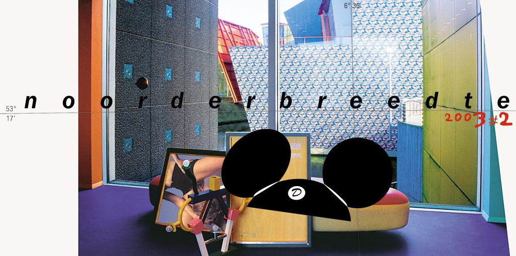
Noorderbreedte Magazine cover nr 2/2003
Re. Jan van Toorn Exhibition, Kunsthal Rotterdam, Curator Els Kuijpers, 2004
His research
In the 1960s, graphic design elements and their application were too formal and neat to tell stories in an integral or composite, subjective way. Van Toorn has looked broadly across national borders and searched history in depth in search of visual means of expression.
British and American newspapers provided part of the solution. In their tradition and in the experience of their editors with editing photos and other visual material, Van Toorn discovered greater effectiveness. Those same newspapers also offered a looseness in their typography, showed more flexibility. Another source of influence was the graphic ‘bad manners’ of the informal cultures of the situationists, Fluxus and the student movement of the time.
He found other typographic solutions and all kinds of fonts at the beginning of the 20th century in the typography of the Futurists, the Dada movement, and the Constructivists. Driven by his enduring curiosity, his inquisitive attitude gives Van Toorn more and more opportunities to present his subjects in an informal, subjective and integrated way. And against the prevailing graphic standards and rules arose Van Toorn’s graphic ‘handwriting’.
His position
Van Toorn has never been insensitive to the moods of his time and society. Consider the influence that printing trade unions, the Sixties, the museum world and art school thinking had upon him. Although as an individual he remained an outsider, it was the craftsman who, through his work, interviews and articles he wrote, would Van Toorn has never been insensitive to the moods of his time and of his environment. Think of the influence that the printing unions, the sixties, the museum world and art academy thinking had on him. Although as a person he remained an outsider, while as a craftsman with his work, his interviews and articles he constantly reminds his colleagues that it is not about the outside; that it is different on the inside or may be different. He still fulfils that role, because designers often want to forget the social and symbolic meaning of their work. Even today, designers seem too little aware of the possibilities the media has to offer to show their commitment. Increasingly powerful media conglomerates are addressing ever-larger groups of people with superficial messages merely to sell their services and goods. It is an uncomfortable observation for Van Toorn who, as a little boy, once went to the big city with his parents in search of work, in the hope of a better world.
Jan van Toorn
born on 9 May 1932, Tiel
died on 13 November 2020, Amsterdam
Author of the original text: Chris Vermaas, January 2006
English translation and editing: Andrew Fallon, Chris Vermaas
Final editing: Sybrand Zijlstra
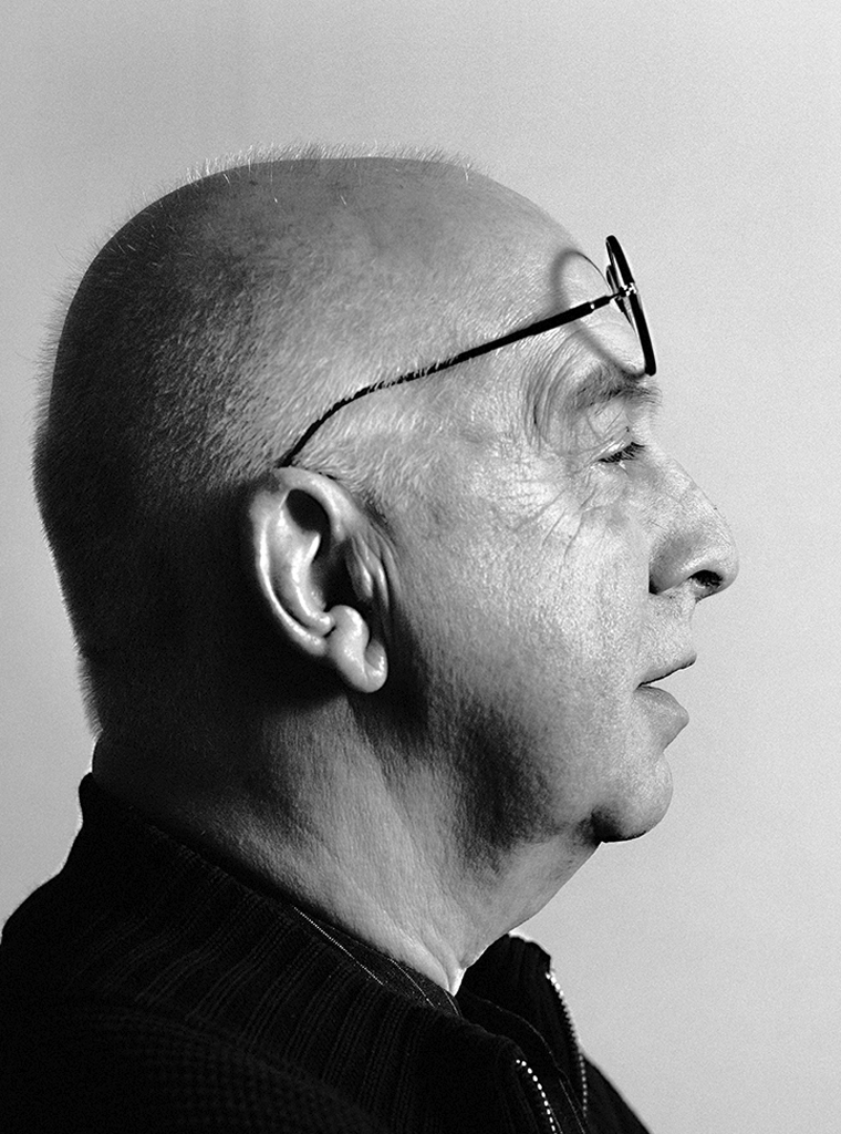
Portrait photo: Aatjan Renders