There are many sides of Gerrit Noordzij – all of them filled with love and devotion. His most inspired and inspirational side, though, is that of the teacher. He cannot stop talking about his love of teaching and his admiration for the human being as a student. He says: “Their innocence is so touching; they do something they can’t do and they know it. Students are officially permitted to not be able to do something. What greater challenge can there be for the teacher?”
Gerrit Noordzij, born in Rotterdam in 1931, could be the passionate teacher because he never stopped being the eager student. His whole life he has explored the things he was occupied with and gained insights and ideas that were sometimes quite unconventional.
He quit high school in the third year: “Not that I didn’t enjoy school, but I wanted to make something by myself, create something with my hands.” During an apprenticeship at Van Rijmenam, a company that produced books, notebooks and calendars, he marveled at some of the curious attitudes and habits the experienced workers there had. “I had to learn how to apply gilt edges by using thinned egg white. Having applied the gold foil, you had to polish it as fast as possible without damaging the underlying wet surface. Nobody told me you had to take advantage of the balance between wet and dry. They were convinced that an apprentice all by himself would never be able to discover anything. When I did, they ran to inspect my tools to discover my ‘secret’ as soon as I’d left the room. But they ever asked. Imagine them having to confess they didn’t know…”
Unforgettable
Noordzij followed evening classes at the lyceum in addition to learning to become a bookbinder. “I wanted to teach drawing but had to graduate first. The school’s director pointed out ways to receive exemptions. I got them. That was a relief, though I still had to study math and languages. It took me three years to graduate.”
“A visit to the publisher A.A.M. Stols led to book cover commissions. “An unforgettable moment. I’m sure Stols would have preferred to work with Helmut Salden rather than a clueless beginner like me, but he thought that was too expensive. Thanks to his penny-pinching, a number of young designers got a tiny opportunity to start their career. From the beginning he accepted my clumsy designs but in passing he pointed out the weaknesses. I learned while doing.”
“In 1956 Stols was commissioned by the United Nations to advise a university publishing house in Mexico. Before leaving for Mexico he told me I had to start doing the typography of his publications too. The second book I designed turned out well. It inspired the gifted calligrapher Piet van Trigt to invite me to come and study at the art academy in The Hague, where he taught typography.”
His love of type is as old as Noordzij himself: “As a toddler I looked at newspaper type and reproduced it by hand. I had to ask my mother what the letters said. She might have expected I would grow out of it, but no, I was able to read at age three. Not satisfied with knowing the meaning of letters, I wanted to know more about their form. I have kept a number of the drawings I made on small pieces of paper in kindergarten and in elementary school; you won’t find a single one without letters.”
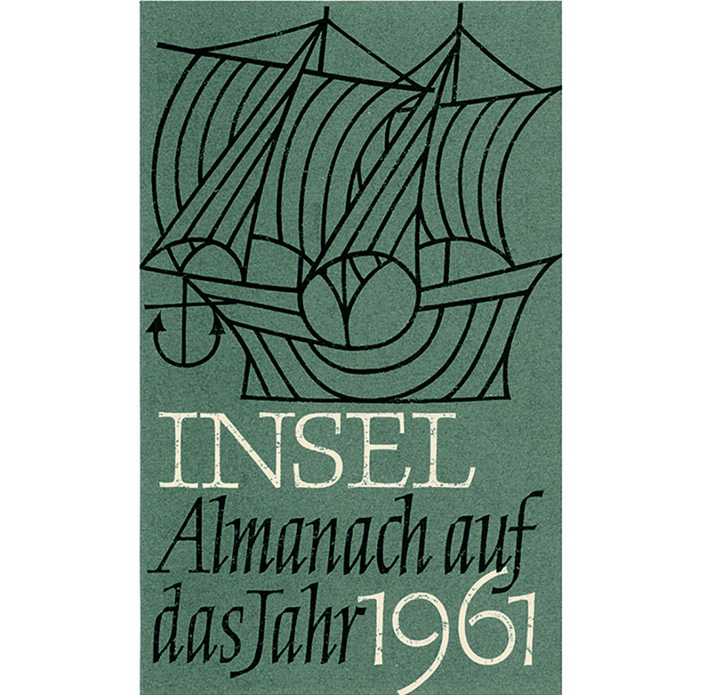
In the 1950s his work took him to a German paper factory, where he would meet his future wife Wilme. The young couple settled in Amsterdam in a house on Herengracht that was, in Noordzij’s words: “Respectable but distressing.” They did not want to stay there and left for where Wilme was born as soon as their own first child arrived. “My love of type brought me in touch with people such as Kurt Weidemann, who edited the professional magazine Der Druckspiegel. At Deutsche Verlags Anstalt I met Hans Joachim Störig, the philosopher known for his Kleine Weltgeschichte der Philosophie (1950). Störig worked for Cotta, Goethe’s original publisher. He asked me to design the covers of the collected works of Wilhelm von Humboldt, who was among much else one of the founders of the University of Berlin.”
Radical thinkers
“And then the telegrams started coming from J.J. Beljon, who had been appointed director of the Koninklijke Academie voor Beeldende Kunsten (royal academy of arts) in The Hague in 1957. He wanted me to teach letter drawing and typography.”
The academy’s advertising department had gained legendary fame in the 1930s under Gerrit Kiljan and Paul Schuitema. It was the place where students were taught in the line of Piet Zwart, New Typography and Russian Constructivism, and where revolutionary designs were created by using sanserif type, realistic photography and primary colors. Because of their radical social ideas, Kiljan and Schuitema were called ‘the Maniacs’.
“Schuitema was an amiable fundamentalist, much nicer than Piet Zwart. They both indoctrinated their students with narrow-sighted dogmas. They didn’t accept any deviating opinion. I have always found it worthwhile to thoroughly wipe out all traces of their ideas on education. One day I asked Paul Schuitema what he and his companions thought of Jan Tschichold (the pioneer of modern typography who had become a devoted classicist after WW II). Schuitema responded without hesitation: ‘Piet Zwart and I of course knew immediately that Tschichold was useless’. In 1929, the same Schuitema had written in i10 magazine about Tschichold’s Die Neue Typography that, ‘One would wish that anyone working with type would own this book’.”
Beljon finished the Maniacs’ regime. Kiljan had already left the academy’s advertising department in 1950 to start the first industrial design course in the Netherlands. Schuitema was commissioned to teach painting nudes, which surely must be seen as a way to get rid of him. The advertising department was restructured and became reborn as a department for graphic design. Berserik and Oxenaar became professors, Jan van Keulen was head of the department, and Piet van Trigt was ‘the letter man’. Noordzij was invited to teach typography and gradually took over from Van Trigt.
“We started to turn it into a profession. The interests of the students were always our priority. As teachers we knew from each other that we wanted what was best for the students, or at least what we thought was best for them. We even managed to show some tolerance. I felt that in the painting department they too often taught trends or schools instead of a profession.”
“There was another difference. Painters often had to find their raison d’être in their teaching position at the academy, whereas for us it was something we did alongside our freelance practices. I took my affairs from the academy home and my experiences from work to the academy. My students could check my design work to find out if I myself applied the things I was teaching them. I showed them my sketches and print proofs.”
Books written by Gerrit Noordzij
A fitting freedom
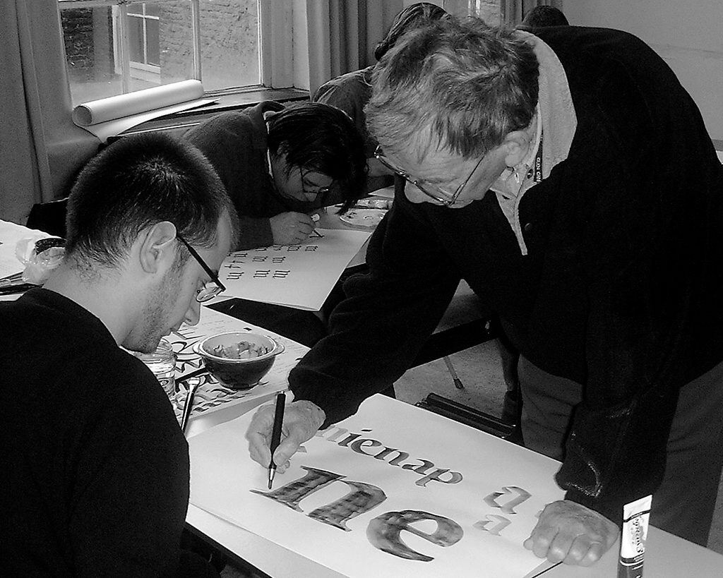
“There’s a strange dilemma in teaching: while you are consciously manipulating your students, you are working at a freedom that agrees with them. Educators told me this is the wrong approach: students should have to find their own way. Instead, I set clear boundaries. To me it was an absolutely certainty that they could not cross these boundaries and if anyone thought they could, they were on their own. For many students this warning proved to be an irresistible challenge to try anyway. When they finally gave up, they had studied the area around these boundaries so intensely that there was little left for me to add. The most wonderful of course was to see students triumphantly stick their head through a hole in the border anyway. I judged them mostly for what they had discovered in the process. I wasn’t too interested in a flawless presentation of a neatly executed design. In the end, the students came to me with their sketchbooks. I loved it. Such moments made an hour of class an unforgettable event. And some students did indeed manage to find themselves completely, but I have also had sleepless nights over the dreadful thought that students might become my duplicates.”
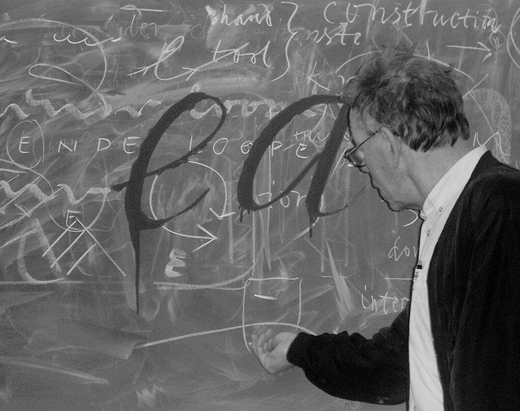
Noordzij’s teaching methods were quite unusual and new at the time. He kept resisting the traditional docile approach and pushed his students in the direction of fundamental research and design by analysis. “My predecessor, Piet van Trigt, asked his students to recreate classic fonts such as Bembo, Times and Baskerville. He taught what happened to a letter if you took it from a book page and blew it up two thousand times for use on the roof of a building. This confrontation with the problem of scale was excellent, but I thought the copying was a bad idea. Not only because the examples weren’t good, but also because it is a way of corrupting young people: copying makes them look away from their own work to a dubious example. I wanted them to look at what their hands were doing without grasping onto solutions by ancient predecessors. I had to be able to cheerfully welcome my first-year students by saying: ‘You already know the most important thing, which is how to create a smudge. From now on we’ll work on setting this smudge to your own hand’.”
A self-critical approach was the first thing they had to acquire and Noordzij applied drastic measures to achieve this. Scaring the daylights out of his students, he would throw a knife on the table, asking if it was okay for him to cut up their work. “If they refused, I told them to make a copy that could be sacrificed instead. Then, I asked: what do you think of your proposal? In letter designs the problem is often a lack of harmony, but pointing out the bottlenecks is very difficult. Cutting loose the elements a student was struggling with provided the opportunity to discover new configurations. Together we watched harmony grow. What had first looked wrong turned out only to be an ambivalence in the design, which could be resolved by splitting it up and making it into two separate designs.”
“Often you would hear the students lament that they were going backward instead of forward. That wasn’t true; it’s just that at a certain moment your criteria grow faster than your skills. It’s like driving a car: first you think you’re doing quite well, but after a few lessons you think you have gotten worse, only because you are learning that there is much more to learn than you’d expected.”
Handwriting
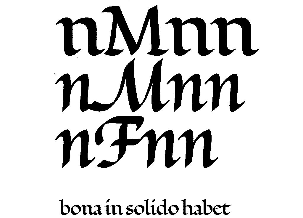
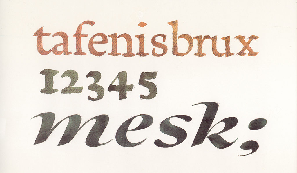
Noordzij explains all characteristics of type from the development of handwriting, even type design that seems to have come straight from the computer. “The stroke of the pen stands for the elementary artifact: every object human beings can make starts with the single mark of an artifact. Because that pen can be an inked finger just as well. All relevant developments of type have occurred in handwriting. And with handwriting I mean letters that are single strokes. Those single strokes can be described precisely. I make a distinction between strokes used for contrast and strokes used for construction. As soon as you start ‘reviewing’ a letter, improving it, refining it, you get what I call a drawn letter. The elements of drawn letters are built up from overlapping strokes, where it can no longer be seen whether they were made using a brush or a ballpoint pen. In this sense, type designs are also drawn letters – however different they may seem from handwriting – and can only be explained as interpretations of handwriting. Any attempt to describe drawn letters, such as type design, as an autonomous category of letters have failed and will never succeed.”
“Each form goes back to the fundamental artifact of the single pen stroke. In education, this simple principle has the powerful advantage of making it possible to trace the whole of cultural history with a few pen strokes. Even if some nuances are missing, I still have a systematic page of contents on one sheet of paper. The history lesson begins with a clear overview, which I always thought would be a great relief for my students. I didn’t intend to hand them any other presents.” After a meaningful silence, Noordzij smiles. “Neat, huh?”
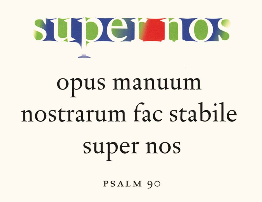
He points at a magnificent small stone in which large letters are carved out, filled with gold foil and framed by smaller capitals. “With this stone I prove there does not need to be a difference between the shapes of written and carved letters. The shapes do not indicate how they were produced. The technique may be different, but the result and effect are not. This destroys the whole modernist story of mechanical construction being the opposite of manual work. You can immediately recognize the stone as a piece of work accomplished by a carver, but not from the form. The letter form is that of a handwritten letter, or type design if you prefer, for type is nothing but developed handwriting.”
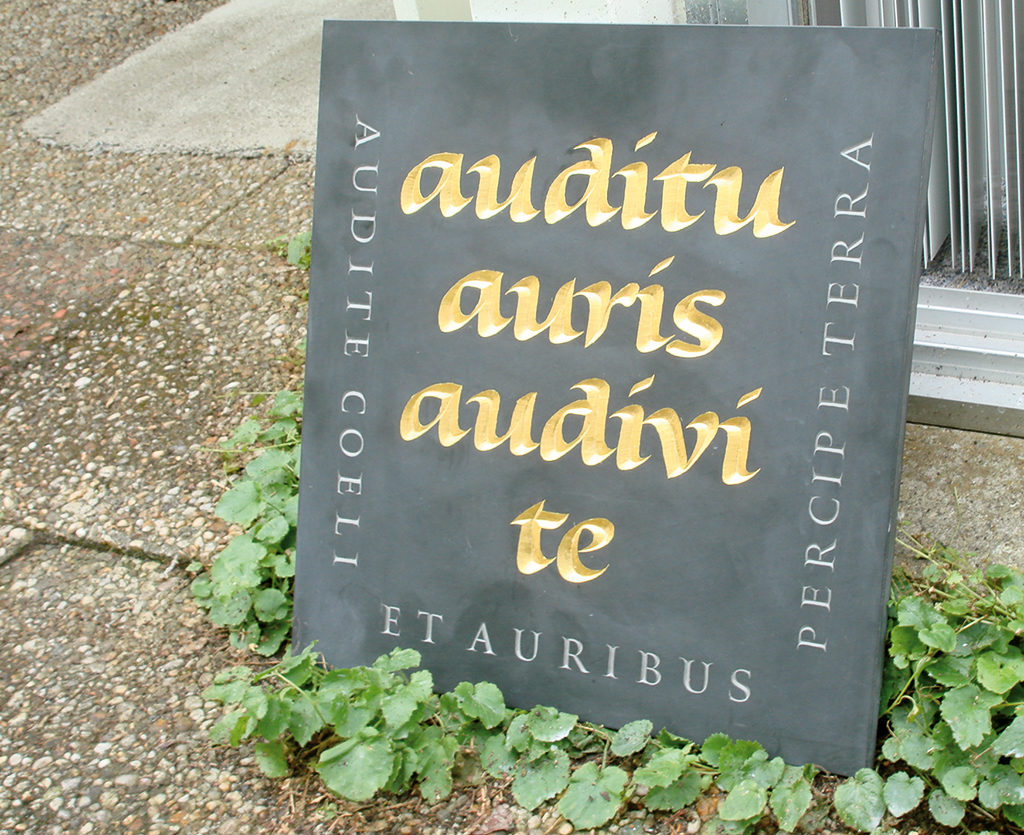
“I wanted the carved letters to be as fat as possible without becoming coarse. The surrounding grey letters and the gold leaf are only there to add a certain class. And to make it less massive – or massive but still friendly. If you make letters this big and crude, you create a new subtlety, of the negative spaces, which become smaller as the letters become larger.”
“I selected the text for its visual rhyme. I found it in the book ‘Job’ of the Vulgata, the Latin translation by Hiëronymus: auditu auris audivi te. Which is translated as,‘With the hearing of the ear, I have heard thee.’ A loose translation could be: ‘I had only heard about you’.”
Delivering talent
Noordzij loves to speak in hyperboles that indicate the opposite of what he is trying to say. “At the academy I always conducted a reign of terror,” he states provocatively. Followed by: “Everyone’s opinions should be completely safe from interference there. Those natural inclinations and ideas, that is where it all has to come from, after all.”
This certainly does not mean that students got the freedom to do whatever they please. His colleague Max Caflisch wondered how The Hague managed to deliver so many talented type designers. Noordzij answered: “Max, we do not attract talent, we create talent. We do not let them do what they want, we train them in the practice of a profession. If I allowed myself to be immodest and counted the number type designs in Jan Middendorp’s Dutch Type that originated from my pedagogic activities, I could spread laurels on my chair and rest on them.”
As could be expected, Noordzij is critical when asked about present-day design education: “What it comes down to is that I think everything used to be better, but I’m afraid that would only disqualify me as being an old man.”
It goes without saying that when drawing and designing – and certainly when learning them – seeing is central for Noordzij. Seeing is more than merely registering things visually. Noordzij thinks that you can only see what you know: “Things turn out to be different from what you first saw, or thought you were seeing. The question that has occupied me for a long time – What do I see when I look – now has a provisional answer: I only see what I know.”
From his days as a bookbinder he remembers: “My older colleagues covered up their work when I passed by, because they didn’t want an apprentice to learn anything. I, in contrast, let them see everything I was doing and still they were not able to copy me.”
He had a similar experience when teaching typography: “If you demonstrate to someone how to do something, it often turns out they haven’t seen what you did. They try to copy what they think they have seen, but they can’t. They do much better when you point out what they should pay attention to. You have to tell them. Man only knows through revelation.”
This statement takes Noordzij on one of his unexpected yet seamless jumps of thought, to the religious concept of revelation. “Seen from the outside (what else can you do?), revelation is a symbol of the secret of our existence, contained in stories we call myths. Righteousness and fundamentalism are trying to rob these stories from their symbolism: everything must have happened for real. This is deadly for revelation: if a real snake had talked to Eve, we wouldn’t be able to recognize how the seducer tries to persuade us today. But the myth is indestructible: even the most zealous fundamentalist still sees the snake as a symbol of Satan.”
Irrational base
The revelation is more than a religious experience for Gerrit Noordzij. Notwithstanding the importance he gives to informed observation, he understands that seeing and therefore creativity has an irrational foundation. “The precise moment of revelation, the birth of a dream, a brainwave or a strange thought always escapes us. We depend on an instant of lucid inattention. Some smoldering impressions suddenly connect. Something like, ‘Hey, I always passed by without noticing and now I suddenly see.”
Gerrit Noordzij: “We’re not done yet with studying ‘seeing’. All physiological and psychological literature on seeing limits itself to well-defined images. However, most of what is in our field of vision stays out of sight. While you’re reading, 99 percent of the page is a blur. That blur may push forward characteristics of the script that would have remained hidden if the image were clear. This visual process is a model for thinking. Thought prospers at the rough edges of our consciousness. It is hurtful, like in Bach’s Quod Libet: ‘O Ihr Gedanken, warum quält Ihr meinen Gheist’. Yet, this pain… it feels good.”
Gerrit Noordzij
born on 2 April 1931, Rotterdam
Author of the original text: Carel Kuitenbrouwer, November 2007
English translation and editing: Ton Haak
Final editing: Sybrand Zijlstra
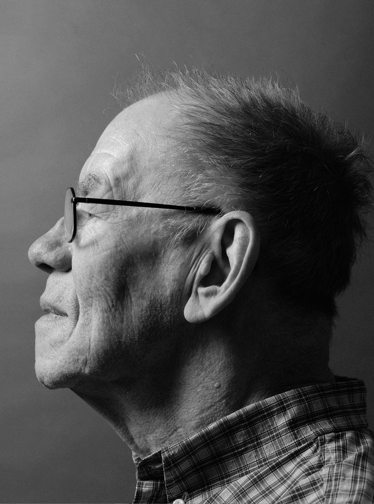
Portrait photo: Aatjan Renders
Some highlights from the life and work of Gerrit Noordzij, typographer, calligrapher, teacher and publicist:
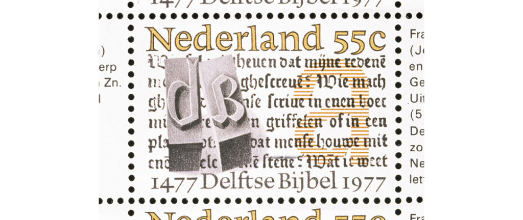
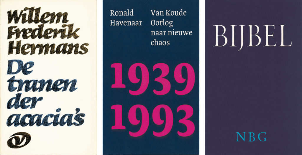
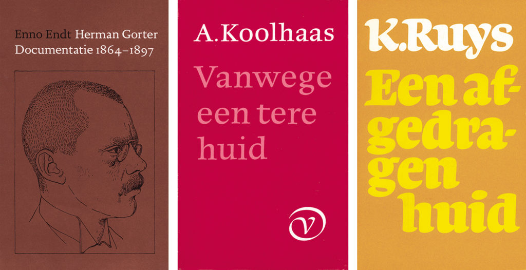
Gerrit Noordzij was born in Rotterdam in 1931. He left high school halfway through and went to work at Boekenfabriek Van Rijmenam in The Hague. In his spare time he designed letters. After two years he got his bookbinding certificate and went into military service (1952-1954). In 1955, encouraged by Piet van Trigt, he studied at the art academy in The Hague for six months. At Uitgeverij A.A.M. Stols he designed covers for books and did the typography. He also worked for publishing houses Querido, De Bezige Bij and Elsevier, among others. He got married and moved to the village of his in-laws in Germany due to the arrival of his first son. He designed book covers for the Deutsche Verlagsanstalt, Insel Verlag, Cotta and Kohlhammer. Later, back in the Netherlands, he designed books for various publishers, after 1978 mainly for Van Oorschot. He calligraphed Queen Juliana’s abdication act and Princess Beatrix’s marriage license. He designed scores of posters, coins and postage stamps, made engravings in wood and copper, and inscriptions in stone and glass. He wrote computer programs for Canon and five books about typography and from 1984 to 1996 edited the English-language magazine Letterletter of the Association Typographique Internationale. From 1960 to 1990 he was a teacher at the Royal Academy of Art in The Hague.
Gerrit Noordzij’s books:
Zeis en sikkel: de kunst van het maaien, Bert Bakker, Amsterdam, 1979
Deliciae, over de schrijfkunst van Jan vanden Velde, with Ton Croiset van Uchelen, Enschedé, Haarlem, 1984
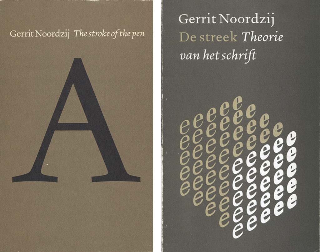
De streek: theorie van het geschrift, Van de Garde, Zaltbommel, 1985 (republished in English as The stroke: theory of writing, Hyphen Press, London, 2005)
De staart van de kat: de vorm van het boek in opstellen, GHM, Leersum, 1988
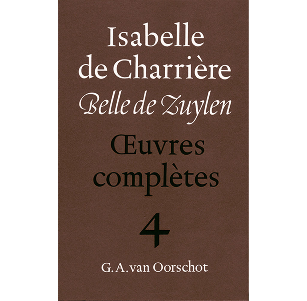
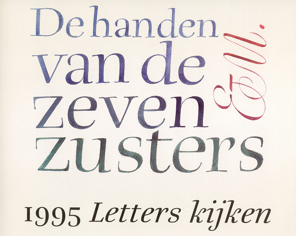
De handen van de zeven zusters, Van Oorschot, Amsterdam, 2001