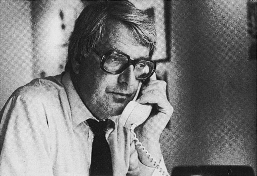
When he was still a printer, Frans Spruijt was devoted to always deliver the highest quality and willing to be engaged with exceptional projects. The remarkable Spruijt calendars, the exhibitions he organized in his printing house and many, many of the publications he produced gave testimony of this devotion, his love of type setting to perfection and new developments in graphic design. Frans Spruijt was a highly esteemed advisor and a member of many an institution’s board.
During my second conversation with Frans Spruijt I notice photographer Pieter Boersma’s book lying at his side, which was sponsored by the Charemafonds voor Geschiedenis en Kunst [Charema Fund for History and Art]. Wim Vroom, the former head of the Rijksmuseum’s history department, and like Spruijt a member of the foundation’s board, came over to deliver it in person. ‘It’s the only club I am still a member of. The foundation sponsors documentary photography. Looks good, huh? Printed by Drukkerij Mart. Spruijt.’ Frans Spruijt shows pride as if it was he himself who had printed it. ‘I am good with numbers. For the Charemafonds I am the one who checks the numbers and does the calculations to see if a grant application is realistic.’
Letterpress to offset printing
Spruijt was born in 1931 on Amsterdam’s Oudezijds Voorburgwal, where his grandfather had founded a printing office in 1906. The house looked out on the Lange Niezel alley, often the scene of drunks being kicked out of a bar or Chinese women who still had their feet bound. Spruijt’s first memories of his father’s business date from 1944. Three employees of the famous literary publisher De Bezige Bij were standing at the presses. One of them was its founder, Geert Lubberhuizen. Spruijt’s father’s shop was small and letterpress was still the production technique. A little later, it moved to 82 Oudekerksplein.
Frans Spruijt was twenty when he entered the family business, after finishing secondary school and graphic school. Type was bought from a type setting company operating a Monotype machine, which also took care of replenishing the case of single type stock. At Drukkerij Mart. Spruijt quality typesetting was considered essential in delivering high-quality print. Spruijt was one of the first printers that switched to offset, using a Heidelberger cylinder automatic press, a KORD (not considered a ‘real’ offset machine yet). After taking over Schreuder offset printing in the Amsterdam West’s Elementenstraat in 1965, a company whose switch from letterpress to offset came too late for survival, Spruijt was ready to extend his client list. With Schreuder came KLM Royal Dutch Airlines as a client; ad agencies such as Walter Thompson were already among his clientele.

KLM had forms printed on Spruijt’s Heidelberger (using paper offset plates); an IBM Composer, the one with the ‘golf balls’, was used for typesetting. They produced good quality fast, which attracted paint producer Sikkens for their manuals. Where traditional letterpress was slow and offered just one standard quality, the new technology could deliver a choice of quality levels at a higher speed and a lower price to boot. Not that many clients in those postwar years were demanding high-quality products; the large demand for print did not stimulate a lot of attention to quality improvement. Most colleague-printers did not own their own Monotype typesetter and small-press offset wasn’t taken seriously yet.
Spruijt was able to benefit from the gung-ho atmosphere and economic development in the Netherlands after the war. These were golden years for enterprising printers such as Spruijt, who had ambition and invested in new technologies that could guarantee a technical and esthetical top quality. ‘I witnessed how colleagues missed the boat. Trio in The Hague for instance,’ says Spruijt. ‘Such a great printing shop. A pity they fell victim to the dialectics of progress.’ Asked about the future of the profession from the perspective of 2007, Frans Spruijt predicts that the improving quality of the photocopier will have a decisive impact on the printing industry.
Spruijt calendars
Frans Spruijt always had a good nose for technological developments and craftsmanship. At a young age he already realised that a printer has a broader task than just taking care of print production: he is also an adviser, especially with regard to typesetting and graphic design. He first met the graphic designer Harry Sierman through his brother Paul, who was a member of the same rowing club as Frans. Harry Sierman said: ‘If you have such beautiful fonts available as Futura and Romulus, how can you make such lousy printed matter?’ Spruijt responded plainly: ‘Okay, if you know better, just do it.’
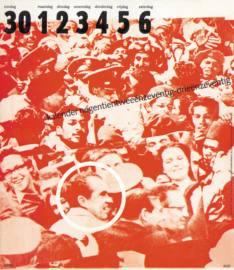
That’s how Sierman would start what was to become a long tradition of Spruijt calendars. Here, Frans Spruijt actually followed in his father’s footsteps: before WWII his father had commissioned Jacques Nuiver, who worked as a graphic designer for Philips electronics in Eindhoven, to design promotional calendars. The new generation of Spruijt calendars became the talk of the town for their originality, high quality and absolute beauty. ‘Great PR,’ says Spruijt. ‘A good calendar with an outstanding use of typography is kept hanging on the wall for a whole year. You know, in the beginning I wasn’t interested in those things. But then Harry Sierman took it up and he did a really good job and suddenly we received an award. All vanity and self-gratification, sure, but you also start paying attention to what others are doing. You start noticing things you haven’t noticed before. And after the Spruijt calendars had won three awards I was asked to join the board of the prominent Gerrit Jan Thieme foundation.’
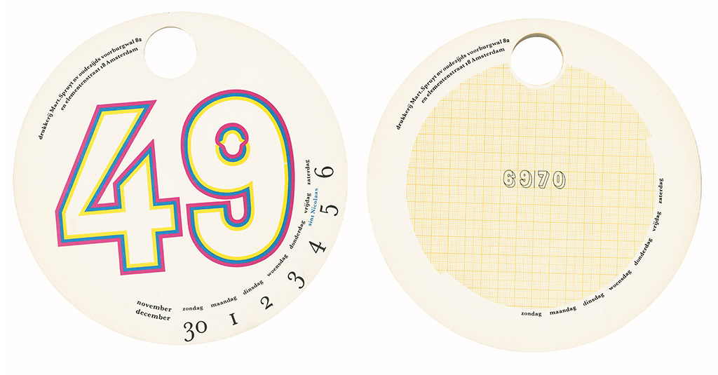
Sierman designed Spruijt calendars from 1956 to 1960. Then Spruijt learned about Jan van Toorn, who then worked for board game producer Haussemann & Hötte (now Jumbo). Their meeting was the beginning of a strong friendship and working relationship – and of a series of calendars that became collectors’ items almost too precious to hang on the wall. First Van Toorn simply made beautiful designs, assuming that this was what was expected of him, but soon Spruijt decided that Van Toorn should be given a free rein and design entirely to his own liking. The results were remarkable. Spruijt remembers a calendar ‘with a hole in it and a circular calendar, which a homeworker had to glue on using his fingers. With each calendar came a crazy production process. It wasn’t often that we managed to mail them on time. But no one cared anyway as long as they received them. Actually, being later than everybody else gave us lots of extra attention.’
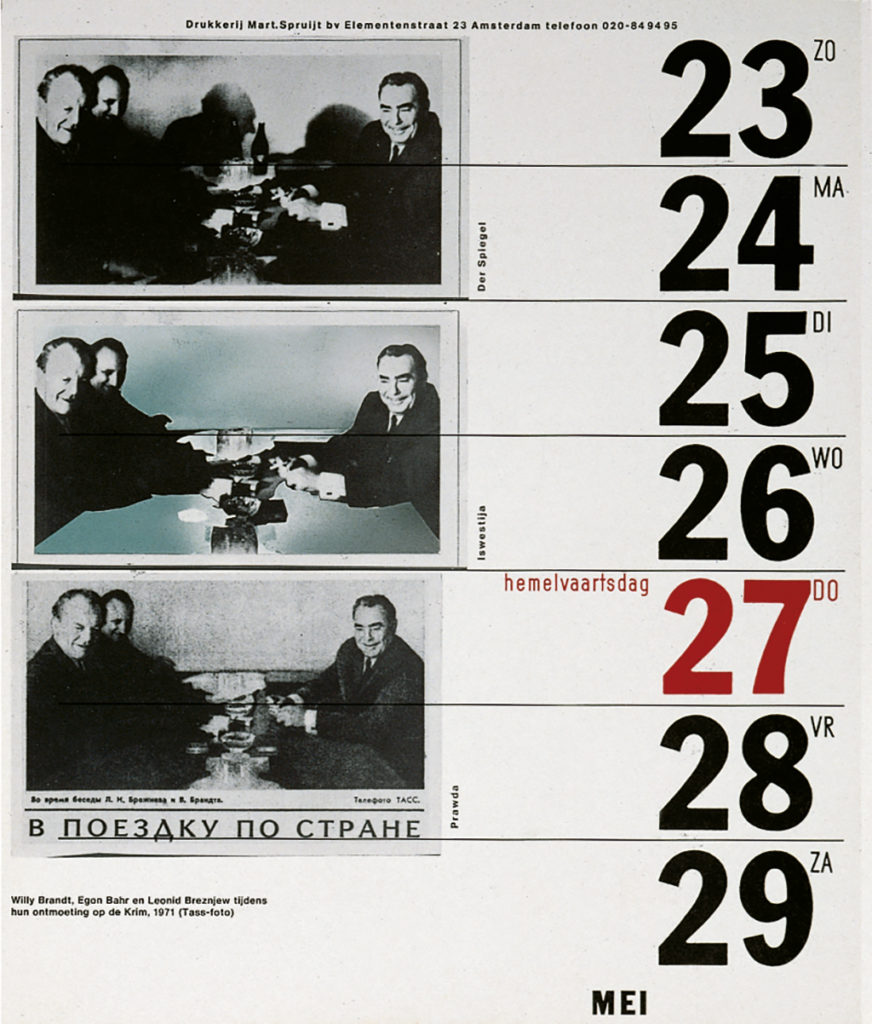
When Jean Leering, the director of Eindhoven’s Van Abbemuseum, started commissioning Van Toorn, his calendar designs got fresh impulses from his confrontations with different artists. Spruijt remembers the photography by Bernd and Hilde Becher, which influenced the photos of Belgian homes Van Toorn had commissioned to Geertjan Dusseljee. ‘We printed them as shitty as we could to convey the houses’ wretched and pathetic atmosphere. Producing beauty is no big deal, but producing in such a way that it reflects shabbiness and desperation is very difficult.’
One calendar, in 1974, invoked heavy criticism from Dolf Stork, then the director of the Stadsdrukkerij Amsterdam. Van Toorn had added a hawk to Moshe Dayan’s face. Dayan was Israel’s foreign secretary. ‘Stork interpreted the image as a statement condemning Israel. Designer Otto Treumann, who was Jewish, refused to set one more step across our threshold. I myself had problems with accepting a calendar page design depicting the faces of princes Beatrix and prince Claus on the bodies of queen Juliana and prince Bernhard. In the end we opted for a blank page.’ Frans Spruijt’s expertise of typography and typesetting expanded Van Toorn’s professional knowledge: ‘I taught him how to space small caps.’ Their collaboration stopped after nineteen calendars because Van Toorn’s choice of subjects became more and more radical.
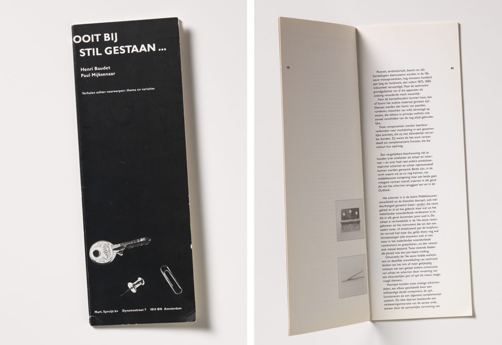
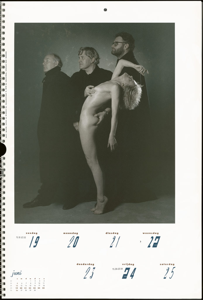
Paul Mijksenaar was commissioned to design a new series and Spruijt greatly enjoyed his conversations with Mijksenaar. After the first three calendars, with logos, manuals and mapsas subjects, the fourth Mijksenaar calendar in the serieswas Nooit Bij Stilgestaan [Taken for granted] in 1985/1986. It presented appliances of which the original designer, if any, was unknown. Later a book followed titled Ooit Bij Stilgestaan [Not taken for granted], in which Henri Baudet, professor of human-product interface at Delft University, explained the history of these products. Spruijt: ‘Baudet knew everything about, for instance, the corkscrew. But when after a meeting I advised him to follow me to the easiest way out of Amsterdam, he followed the wrong Volvo.’ Later came calendars designed by Toon Michiels and Hard Werken/Studio Dumbar/Anthon Beeke. The last one produced under Frans Spruijt’s directorship was designed by André Toet and Marianne Vos (Samenwerkende Ontwerpers).
design by Hard Werken, Studio Dumbar and Anthon Beeke & Associates
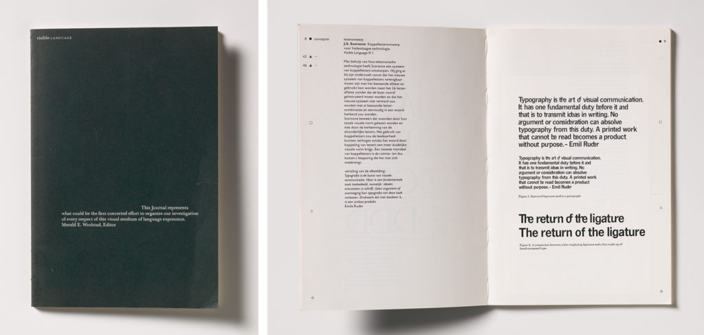
Drukkerij Mart. Spruijt was also well-known for the exhibitions they organized at their printing office. A small task group, consisting of Spruijt himself, Tijmen van Grootheest, Jan Kohlman and Jan van Toorn, curated some ten exhibitions, of which Selma Klein Essink was the organizer. The theme of the first exhibition was the design of Jan van Toorn. It was followed by a show of posters painted by the artists collective V2 and by a show about Visible Language magazine. Spruijt specifically remembers the exhibitions about design and music, Belgian designers, and Narcisse Tordoir’s oeuvre. The publications accompanying these shows were veritable sources of inspiration.
In a publication by Gerrit Jan Thieme foundation in 1986, Het Ontwerpproces. Grafisch ontwerpers en hun opdrachtgevers [The design process. Graphic designers and their clients], Spruijt expressed as his view the importance of giving the designer of the Spruijt calendar free rein to step away even from his or her own signature design and experiment with new forms of imaging and typography. Drukkerij Mart. Spruijt wanted to provide a stage for these try-outs. ‘It is the graphic designer’s duty to raise questions, ask for problems, evoke anger, incite to resistance, make people laugh, and summon emotions by the manipulative use of images. Still, a calendar is also a tool. It may be written on, it may be hung anywhere, including the toilet.’
Pioneering
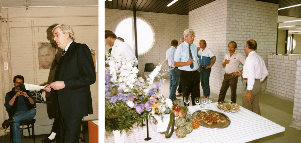
Drukkerij Mart. Spruijt found a new home in Dynamostraat in 1983. It was a state-of-the-art printing office full of advanced electronic equipment for prepress. Most clients came from industry and commerce. Spruijt was known in the art world as a quality printer, in particular because of their calendars and exhibitions, but in a 1987 brochure, Zetten en Drukken [Typesetting and printing], Frans noted that that didn’t mean they looked down on clients from the corporate world. He is phlegmatic about the issue: ‘I didn’t focus on doing business. To me that was a minor part of the job. At Sikkens they said that someone had to be the most expensive in their sector. I made a mental note of that of course.’
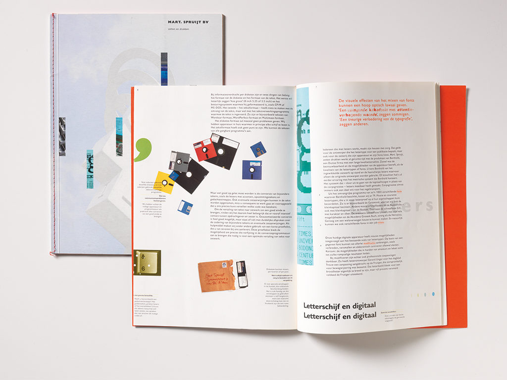
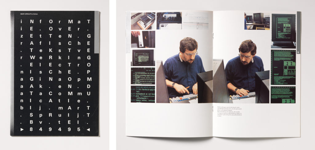
Either way, clients could count on Spruijt being a front runner when in it came to typesetting. Eight Berthold phototypesetting machines delivered perfect work. Typesetting was his great love; he may have discovered this as an intern at Duwaer printing office in 1948, but his love grew by collaborating with different designers. After working with letterpress, which required thousands of square meters of work space, the Berthold phototypesetting machines delivered perfection fast and needed only a fraction of the space. ‘We were good typesetters. I joined Dolf Stork of Stadsdrukkerij Amsterdam on journeys to Berlin to learn the intracacies of phototypesetting. Our printing offices were the first to apply Berthold’s Diatype. I thought we had prepared everything to perfection, but it turned out that we had to learn how to develop the films by ourselves. Even GTI couldn’t help us. We discovered that the use of steel basins resulted in a better product; steel is a much better heat conductor.’
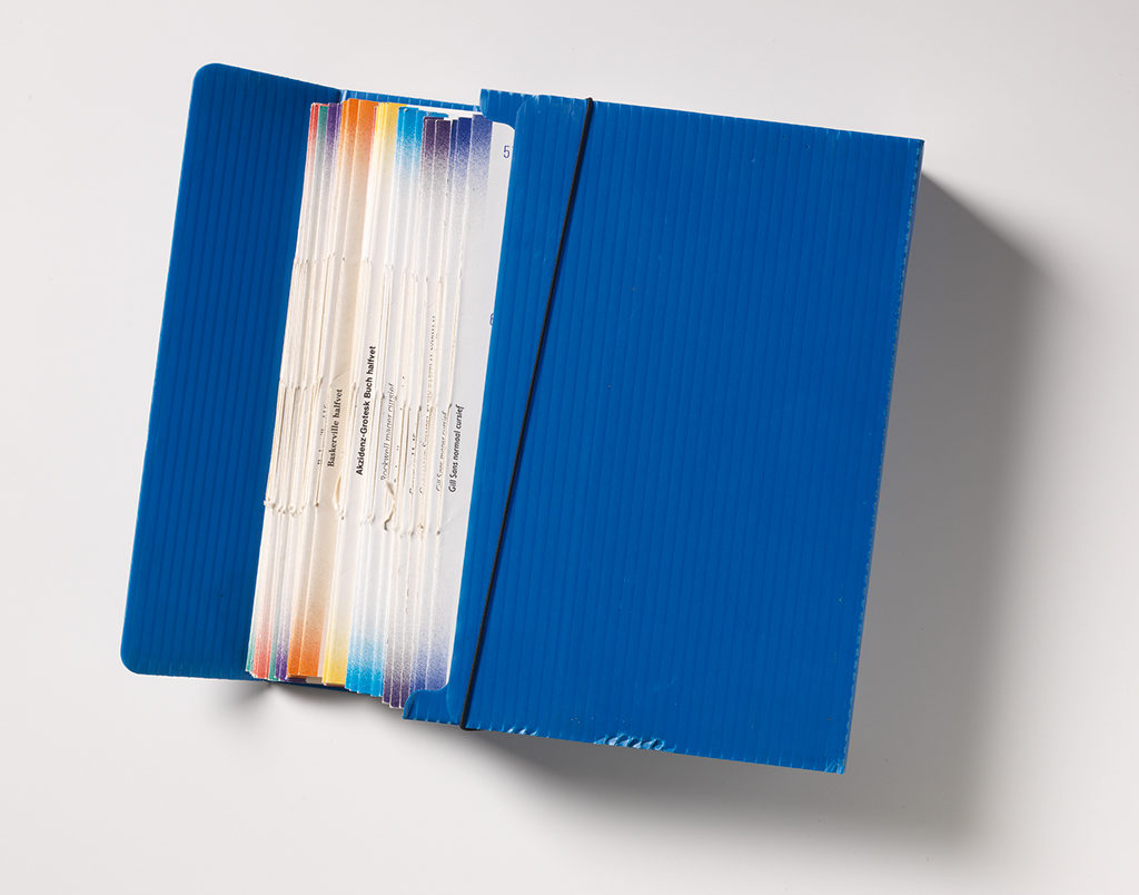
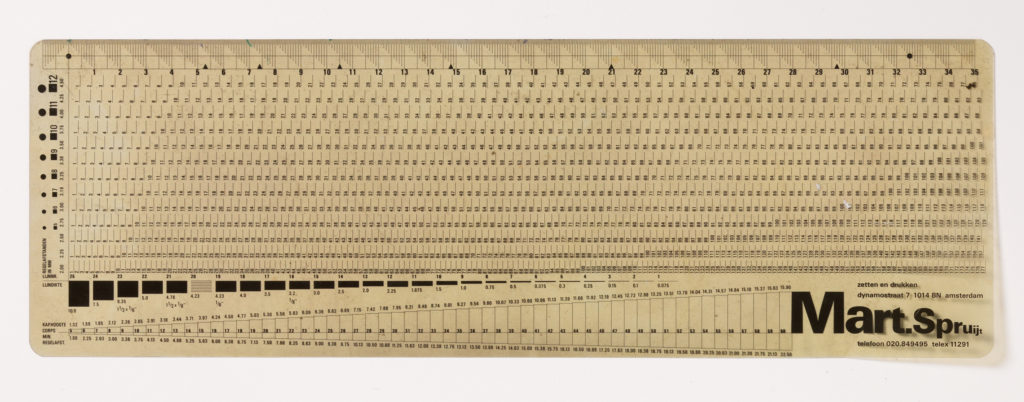
Spruijt produced a brochure about typesetting and layout when using Bertholds; graphic designer Ton Limburg wrote and designed it. They carefully selected fifteen fonts from Berthold’s offering of 1200, and showed how the use of the millimeter scale was to be preferred over the cicero scale with its twelve steps. Later, they also made an accurate typographic ruler and sketch book using millimeters.
Spruijt was most proud of the book they produced for Bankgirocentrale [bank-giro money transfer center] in which all automatic payments were correctly typeset. Maybe it wasn’t the state-of-the-art in design, but surely it was the highest possible craftsmanship. ‘I got a real kick out that. Alas, today Berthold and the whole prepress process have disappeared from the printer’s office.’
Spruijt’s font and type catalogue was a concept developed by font designer Gerard Unger. The whole rich collection was presented by Chris Vermaas in a blue plastic box with eight nicely bound pages for each font. The text throughout the catalogue is a sequel novel written by Jan Willem Holsbergen. ‘A splendid man, full of practical jokes, who could really take us for a ride. I knew him from Gerrit Rietveld Academy; he was actually married to a niece of Gerrit Rietveld. I can recommend his little book Zakenmensen, Eerlijk Als Goud [Businessmen, straight as a die].’

Knowledge and contacts
Spruijt had no problems making friends in the cultural sector. ‘You got to see beautiful things, you got to meet great and interesting people, and eventually you would be awarded with wonderful projects.’ That’s how he met architect Thijs Asselbergs, who had founded the design magazine Items with some friends in 1982. ‘They had absolutely no money to spend, so we adopted the magazine. Then I always got to see these great designs. When I needed a walking stick, I bought the one designed by Ruud Jan Kokke that I’d seen published in Items.
And we found out that the magnificent designers agenda, a project of [Z]OO Producties, was in danger. I managed to get the collective support of twelve printers to support its publication. It is still going strong.’ Spruijt did more than typeset and print. Designers as well as clients sought his advice. For the social annual report of GAK (municipal administrative office), Spruijt proposed the theme of ‘vacation’ and to use images of vacation greetings sent to GAK staff by colleagues to illustrate the report. ‘They liked the idea but GAK’s directors demanded that only their own vacation homes be shown. Unbelievable!’
Spruijt was deeply involved with Koninklijke Verbond van Grafische Ondernemingen (KVGO), the graphic industry’s branch organization. Taking an active role in their education and exam committees, he met scores of colleagues and was kept up to date on all developments in the industry. Later, he also was a member of the editorial council of Drukkersweekblad [Printers’ Weekly] and the Kerstnummer Grafisch Nederland [the special Christmas edition of the magazine, which always attracted much attention].
His board membership of Gerrit Jan Thieme foundation made it possible to find ways for exceptional publications. Piet Schreuders created a craze with his book Lay-in, lay-out (1977). ‘A brilliant event was its presentation at Gerrit Rietveld Academy. Piet got it in his head to tear up a poster designed by Wim Crouwel on stage. In his book he protested against Swiss typography, a design approach he described as a pseudo-religion that would destroy the world. Piet recognized in Wim Crouwel the embodiment of the functionalism he wanted to wage war against. He called Crouwel’s designs “personal, original, dated and ugly”.’
Spruijt was also involved with the book Dick Elffers & de kunsten. Een leest heeft drie voeten (1989). ‘This book about designer Dick Elffers and his oeuvre just had to be published, but to get it produced we had to invest quite a sum.’ It was not the first time Spruijt jumped in to save an important publication. The pictograms designed by Gerd Arntz in lino cuts for Otto Neurath were collected in a magnificent book published by Drukkerij Mart. Spruijt: Symbols for Education and Statistics: 1928-1965 (1979). ‘It was not cheap,’ says Spruijt. ‘But it was sublime. It’s such a great thing to be able to make something that people can enjoy and appreciate.’
The goal of the Gerrit Jan Thieme foundation was to promote knowledge and esthetics in the graphic profession. For example, it had a yearly award for the best calendars and books. In the 1970s, these awards always went to the same small group of clients, designers, lithographers and printers. In the 1980s, the idea of giving out awards became the subject of hot debate. Spruijt had his own views: ‘Not only bibliophile publications, special calendars or unique annual reports should be selected for the awards. More day-to-day productions or clever innovations deserve them too. Why not award travel brochures, for example, or the ‘bulk book’ (cheap re-editions of literary works in tabloid format) or the weekend section of newspaper NRC Handelsblad.’
Of course Spruijt has a similar opinion about the yearly awards for the Bestverzorgde Boeken (Best-designed books). ‘Fine with me. Important, yes. But why not award prizes to, say, dictionaries or cook books; such books are not easy to produce.’ Frans Spruijt himself was awarded the first Grafische Cultuurprijs (Graphic culture prize) for people who have made an important contribution to the graphic sector in the Netherlands. In 1991 Spruijt, as the first chairperson of the Grafische Cultuurstichting [Graphic culture foundation], organized national and international tours to printers who had built new production premises. ‘It is not only the architecture itself that deserves attention, it is important that the work space is excellent. Drukkerij Lecturis, owned by my colleague Henk van Stokkom, is a shining example. The building and its usage tell the same story. Too much design can be destructive: it creates a visual noise that distracts and distorts. You don’t need that.
I am convinced we did well at Drukkerij Mart. Spruijt. It is a huge challenge to create a new building for your own business. Especially in the graphic sector, where surprising developments are plentiful. If I had to do it today, I would just rent a space.’
In 1988 Frans Spruijt said farewell to his printing office. He sold the business to Jan Kohlman who had to retire for health reasons only two years later. Ton Hennis became his successor, but he died at a much too young age. ‘I haven’t been in touch with the company for years. They contacted me about celebrating the 100thanniversary. We had a good meeting and I came with a few proposals. I also told them that it was no big deal if the celebration was postponed for a year or so. Our calendars always came late, didn’t they? They got the attention they deserved anyway.’
Frans Spruijt
born on 23 February 1931, Amsterdam
died on 30 April 2009, Amsterdam
Author of the original text: Titus Yocarini, March 2007
English translation and editing: Ton Haak
Final editing: Sybrand Zijlstra
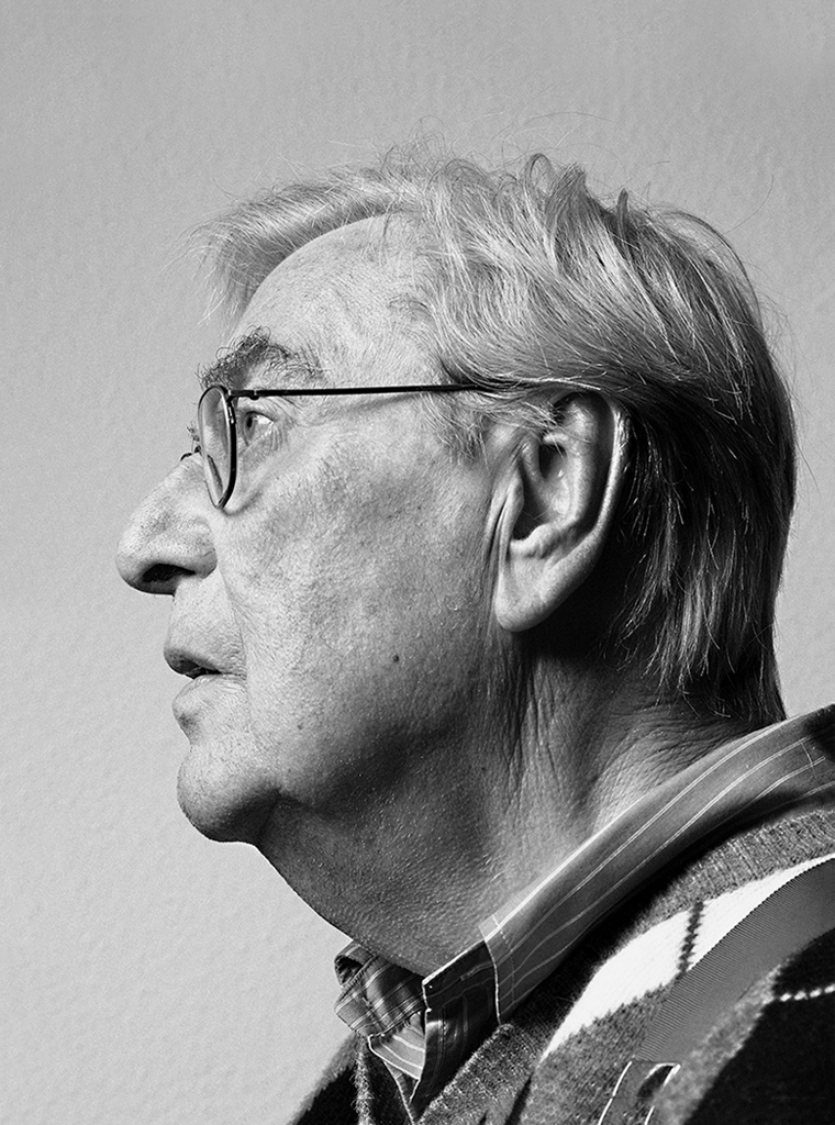
Portrait photo: Aatjan Renders