Born in Amsterdam in 1927, Bob Noorda attended what was then called ‘commercial art class’ at the Instituut voor Kunstnijverheidsonderwijs (IvKnO), also in Amsterdam, in 1950 and 1951. Although Bauhaus was much admired at the IvKnO, the education program was geared to practical implementation. Noorda was fine with this approach. Having lost three valuable years as a conscript soldier in the Dutch Army, at that time fighting in Indonesia, he also lost his initial ambition of becoming an architect. He was eager to enter ‘the real world’ fast and what he needed were some qualifications. ‘In the end, my curiosity and intuition were decisive,’ says Noorda when looking back at his early years.
In 1954, at age 27, Bob Noorda left Amsterdam for Milan, never to return as would become clear later. Italy, where ‘desegno’ was recognized as a discipline of its own already in the sixteenth century, became his new homeland. His common sense was to have an impact on Italian graphic design. Noorda was hired by Pirelli, the Milan Metro, the Milan Triannual, important publishers such as Vallecchi, Feltrinelli and Mondadori, AGIP gas stations and COOP supermarkets; he created magazines for Ottagone, L’Arca, Architettura and Domus. Altogether a portfolio as magnificent as it was interesting that in the Netherlands received due attention only recently.
Studio Bella Vista
After graduating from IvKnO Bob Noorda worked half-time for an Amsterdam-based ad agency. Their clients did not present many interesting projects, which made Noorda decide to follow in the footsteps of two former colleague-students all the way to Milan. His professional career got a start at Studio Bella Vista, as small an agency as the one he had given notice to in Amsterdam. But already shortly after his arrival Noorda was engaged in a free-lance capacity by Pirelli, the prominent Milanese producer of tires, cables and toys. ‘They were developing a public relations program that could compete with Olivetti’s advertising efforts,’ says Noorda. Pirelli was actively involved with the postwar modernization of the city—it was in the days industry and commerce had such a favorable image that folks recognized them as benefactors to society, for would not technology contribute to the improvement of the living circumstances and the wellbeing of many? This optimistic view of the future deserved to be supported by the new, clear visuals of modernism.
Pirelli (1960-1961)
Arrigo Castellani was Pirelli’s head of print and publicity for twenty years; his status at the company was equal to Giovanni Pintori’s at Olivetti. Under Castellani’s direction the tire producer developed an interesting and active PR policy; the company at the time Noorda started to design for its PR department was Italy’s biggest tire producer, serving 75% of the market and not under pressure to work hard on its brand recognition. Until their first calendar (for distribution to automobile tech workshops) was published in 1964, Pirelli’s corporate identity was promoted through support of cultural activities, sports and technique and the periodically published magazine Rivista d’informazione e di tecnica was their main communication channel. All over the public space Pirelli’s posters underscored the company’s sportive and innovative character at the time when the poster was the medium and car races, motorcycle races and motorized rally sports were the big public attractions. Pirelli was omnipresent. It became Noorda’s task to connect Pirelli’s tires with recognized qualities such as speed, manoeuvrability and roadability; by then he was their full-time art director.
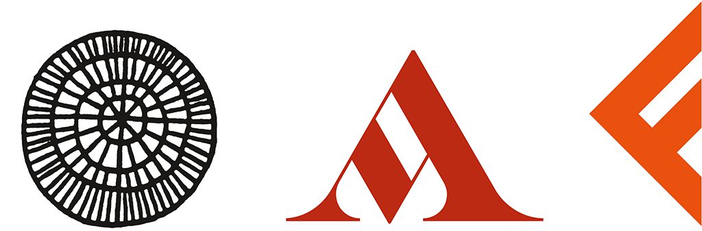
‘Cinturato’ (1961) got its name from the iron thread that strengthened the tire. Noorda abstracted the radial profile to a pattern of lines; by placing this pattern in rhyme with the also leaning product name and company brand he created the image of dynamics and movement. ‘Pirelli. Più Veloce’ (1960) had a similar expression though with a rather minimalistic view of esthetics when Noorda bent the Pirelli logo with the so recognizable stretched P to a circle and thus created a sense of speed. Simple yet no less esthetic was his approach of ‘Pirelli’ (1961), also a poster in which Noorda played with the logo but now added subtle color contrasts. Within a gouache indicating a car tire the Pirelli logo is repeated in different pastel shades to create what was broadly recognized as a sport car’s wire wheel. Noorda had the freedom and opportunity to apply different techniques such as illustrations, photography, photo collage, and photograms. He created simple visual puzzles that were playfully used to attract attention and keep people hooked. Narrative interpretations like these of a company’s identity were still common in the 1960s; not much later the influences of the Swiss School moved graphic design toward a more systematic approach in which the rational-objective and arranged system of a grid predominated.
Signposting Milan Metro (1962)
Bob Noorda adopted rationalizing design trends quite early. This became visible in his signposting designs for the Milan underground, a complex commission he received in 1962 and which allowed him to leave Pirelli and start his own studios. Building the Milan Metro was commissioned to two of the most important architects and industrial designers of Italy’s postwar years, Franco Albini and Franca Helg. Albini was a minimalistic architect and created with a sense of refinement he probably recognized in Noorda’s work. Initially the Milan Metro had only three lines, a ‘green’, a ‘yellow’ and a ‘red’ one. Of course these colors played an important role in the systematic graphic presentation. Noorda improved color recognition by applying wide and long color bands on the stations’ platform floors in which the station name was put in negative, while a (narrower) white band was saved immediately above the station name for additional information in positive (directions to exits, names of other stations on the line, and interchanges). Enamel signs were fluorescently lighted from above. For clarity, and for its contemporary character, Noorda’s choice of font was the Helvetica, then only one year old and created by the Swiss type designers Edouard Hoffman and Max Miedinger. Noorda used a combination of regular and bold type to optimize readability in different circumstances.
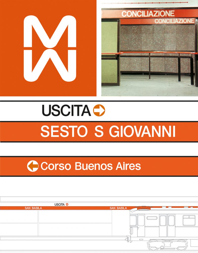
For the underground’s logo Noorda created a rounded capital M which was connected to its upside-down version and to be placed white in a red field; its design received the Milanese’s wide acclaim, and Noorda received the same award for his graphic design as Albini and Heig for their metro architecture, a Compasso d’Oro, awarded for the first time in 1954 by the Associazione Italiana per il Design. His successful design for the Milan Metro had proved he could handle complicated projects and helped to build up Noorda’s reputation. A little later Noorda went into a partnership with Massimo Vignelli.
New York City Transit Authority (1966-1970)
Vignelli advised Noorda to attach himself to Unimark International Corporation, the design agency that counted 402 employees in 48 offices in its heyday, with studios in the United States, the United Kingdom, Australia, South-Africa and Italy. Unimark was founded in 1965 in Chicago by Massimo Vignelli and the Americans Ralph Eckerstrom and James Fogleman, who sincerely believed that ‘good design will change the world’. Unimark combined American marketing techniques with European design of a uncompromising modernistic character. The grid was their elementary tool to streamline all graphic communications and banish any designer’s personal signature. Clarity and readability were made easy by use of the Helvetica, Unimark’s ‘house’ typeface. Their approach was extremely successful; in no time Unimark had strong ties with clients such as Alcoa, Ford Motor Company, Memorex, Xerox, and Panasonic. Vignelli moved to the U.S. in 1966 to lead the New York studio. Noorda, married to an Italian woman who was expecting their second child, decided to stay in Milan and lead the Italian branch as well as work for Unimark clients elsewhere in Europe, such as Thompson Brewery in London.
For Unimark, and in collaboration with Vignelli, Noorda designed the signposting system of the New York metropolitan. The project came from the amalgamation of the initially private transportation systems Interboro Rapid Transit (IRT), Brooklyn Manhattan Transit (BMT) and Independent Subway System (IND) that had the New York Transit Authority as a result. The individual companies had failed or were to fail eventually; the City of New York took over and leased out the contracts to the new Transit Authority. Nelson Rockefeller was governor; he was the one who appointed the new Subway’s manager, who had as task to turn the tide away from decline. A new identity program was to accompany the revival. With his Metro experience in Milan Noorda was the right man to design all signs for stations, platforms and street entrances.
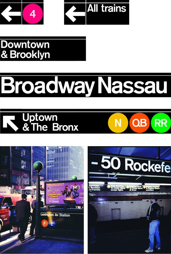
Twenty-six lines already used different colors but Noorda needed to reorganize and supplement them to make things work. He created a ‘total system’ based on signs modularly growing in size: 1-2-4-8. The smallest sign, for an arrow or a short Subway line indication, was one square. The next one, for instance indicating ‘All trains’, was four of these squares large; the largest sign, of eight squares, informed about directions such as ‘Uptown’ and ‘Downtown’ and included arrows and detailed information about lines. Just as in Milan, enamel signs were used and lighted from above by fluorescent tubes. The signposting was intended to be timeless, and it is. Its strength did not come from the use of the Helvetica; this time the powerful, but strongly to Helvetica related, American font ‘Standard’ was applied, the one known as ‘AG Old Face’. The characters are white in a black field although Noorda had proposed the reverse. The management decided this would not work: with graffiti a plague, virginal white would be inviting mishap. Noorda had no problem with switching his approach; white letters in a black background have been in use in the Subway ever since.
AGIP
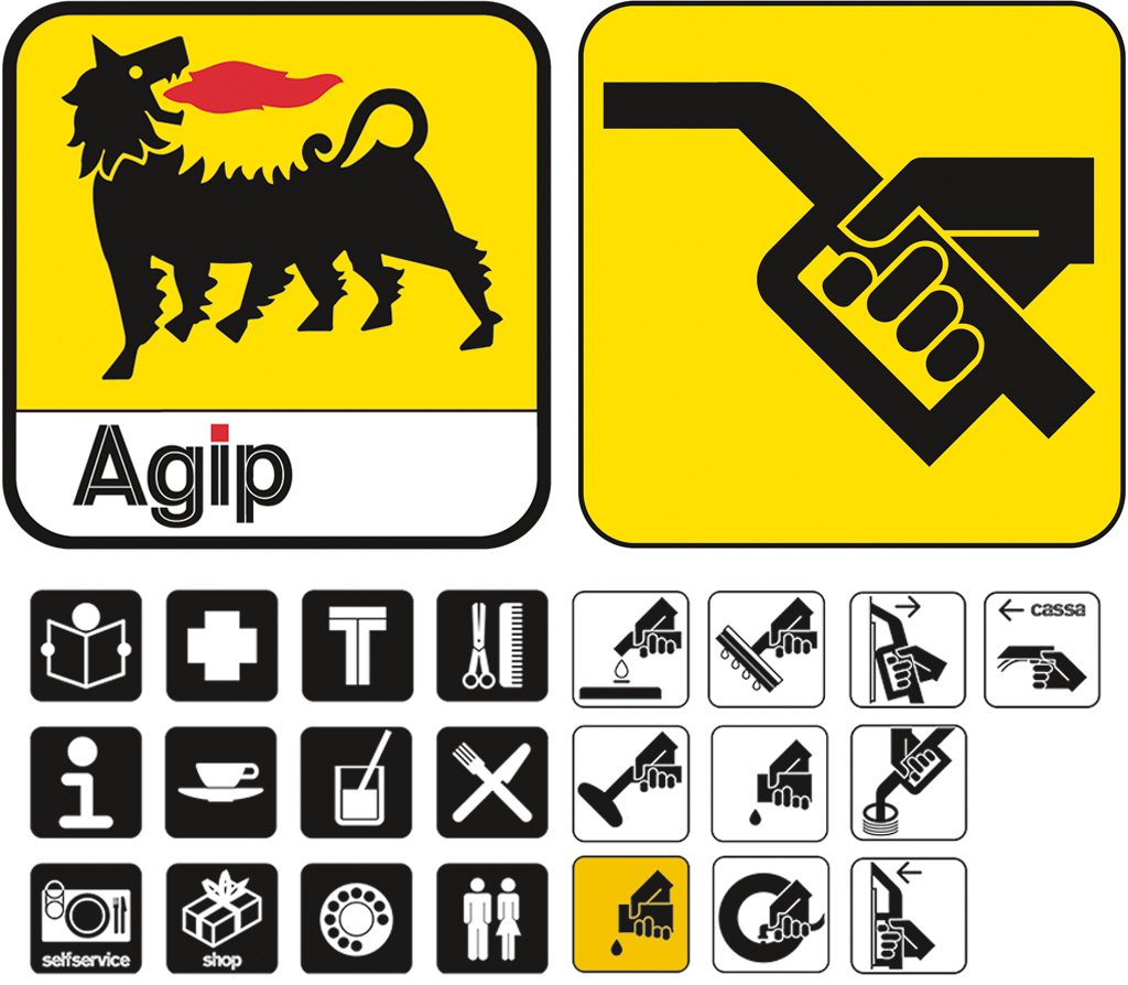
This strange dog with six paws is recognized by anyone who ever traveled Italy’s highways. Luigi Broggini invented the fabled animal; the famous Italian sculptor sent in his design for a new identity of the gasoline distributor in 1952 under a different name; the competition was organized by ENI, the Italian state-owned energy giant. The jury report said the design with its six paws was recognized as a combination of the wheels of a car and the legs of its driver—a modern centaur that ‘thanks to gasoline has extraordinary and supernatural powers’. Twenty years later there were new ideas about corporate identity and Noorda was commissioned to redesign the logo. He restyled the dog (made it shorter) and gave the animal a clear-yellow background. Its square with rounded corners returned in Noorda’s series of pictograms designed for all signposting at AGIP’s gas stations. AGIP proved to be the client of Noorda’s dreams: he was allowed to push through the ironclad logic of the corporate identity program to the tiniest detail. He was responsible for the color schemes, pump designs, the lay-outs of interior and exterior spaces, even the turn-ins and turn-outs at the gas stations. He also designed a special AGIP font (Helvetica with a white line in the body) to add below the beloved dog with six paws.
Mondadori, Vallechi Editore, Feltrinelli Editore
Noorda worked for many Italian publishers during his career. One of them was the largest publishing house, Mondadori, the mother of more than fifty Italian and international companies. There were professional connections also with literary publishers such as Giangiacomo Feltrinelli Editore and Vallecchi Editore of Florence. Noorda developed identity programs for Mondadori and Fetrinelli based on classic design principles that were tightly controlled by detailed manuals. Vallecchi Editore came with one of the most interesting projects at the time it was managed by the leading Italian literature critic, Geno Pampaloni, with whom Noorda establish a close relationship. Noorda came with a proposal for a new logo, a pine cone as seen from above in combination with the publisher’s name in a fine Boldoni sanserif. The design radiated a warmth and respectability that was seen as very fitting to Vallecchi’s literary-philosophical identity and image.
Logos for publishers Vallechi Editore, Mondadori and Feltrinelli EditoreThe covers Noorda designed for Vallecchi are recognizable for their consistency; although photography and illustrations were used intermittently, the typography followed strict lines. Noorda applied the modern Helvetica to form free lines for one series of book publications and the classic Boldoni in a different symmetric way for another series. The covers have been called ‘monuments defining Bob Noorda’s greatness as a graphic designer’. Like few others he understood how to create an efficient coherence of image and typography. His consistent approach created recognizable unity as well as beauty of book covers.
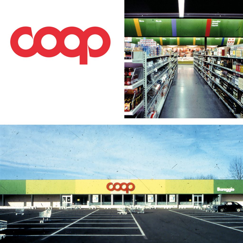
COOP (1994)
Noorda’s design for COOP (Cooperative di Consumatori) is a late example of corporate identity inspired by modernistic principles. The design project comprised not just logo and typography but ‘everything’: the exteriors of the stores and supermarkets; their interiors including lighting, check-outs and signposting; and graphics for packaging, posters, and more. COOP was Italy’s largest retail group with a huge number of outlets, all exuding one and the same atmosphere of ‘modern management and contemporary service’. COOP’s mission statement shows their pride of more than 150 years of joint purchasing power and their history of solidarity and oneness. Noorda helped to create a younger face for the group that was commonly seen as somewhat dated if not old-fashioned. He modernized the logo designed originally by the Florentine designer Albe Steiner; respect for the environment was expressed by the symbolic use of façade panels in changing shades of green (symbolizing healthy vegetables) and ocher (earth), and in bright yellow (sun) near store entrances. The design’s essence is: ‘We breath quality’.
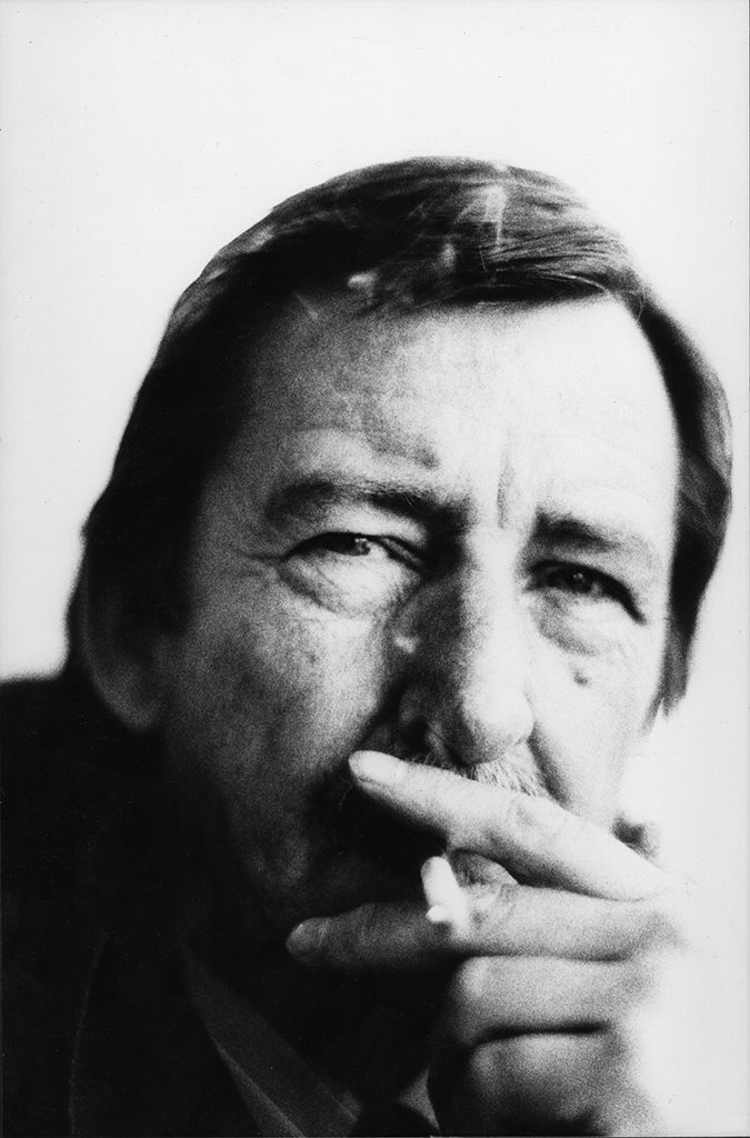
At the time of writing, Bob Noorda still works in his studio off the elegant Via Leopardi in Milan. His daughter, an architect, has taken over the company and its name Noorda Design. Never during his career has Noorda looked for interaction with the Dutch design world. He visited Dick Elfers once at his studio when he was still in art school but he has trouble remembering what exactly Elfers designed. And alas, until recently Dutch designers hardly if ever recognized what magnificent portfolio their talented colleague accomplished to create in Italy and other far-away locales.
Bob Noorda
born on 15 July 1927, Amsterdam
died on 11 January 2010, Milan (Italy)
Author of the original text: Toon Lauwen, May 2007
English translation and editing: Ton Haak
Final editing: Sybrand Zijlstra
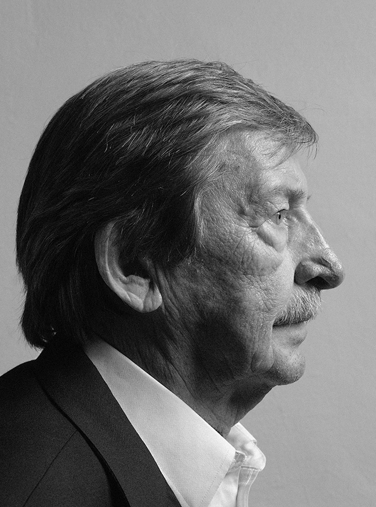
Portrait photo: Aatjan Renders