Er hangen vijfhonderd omslagen van Dick (Five hundred covers by Dick) was the title of the exhibition that opened on 26 May 1962 in the cafeteria of lithographic printing house De Jong at the ’s-Gravenlandseweg 19 in Hilversum. Those covers were put up at the request of Pieter Brattinga, son of the printing house’s director.

Opening exhibition There are five hundred covers by Dick. 26 May 1962, cafeteria of lithographic printing house De Jong. The organiser, Pieter Brattinga, served as professor and chair of the visual communication faculty at the Pratt Institute in Brooklyn, New York between 1960 and 1964.
© Mercis bv
From left to right: (sports) journalist Albert Milhado, the author Francis Durbridge, to the right Dick Bruna’s wife Irene de Jongh, his uncle and the publisher Henk Bruna, and his mother Johanna Bruna-Erdbrink, behind them Pieter Brattinga’s sister, Hannemarie Brattinga. The exhibition is designed by Gerard Wernars.
In addition to these ‘Canteen exhibitions’ Brattinga also initiated and organised the respected Kwadraatbladen newspapers. Both activities paid for themselves because they generated goodwill for the printing house with their clients, and the printing house could also get in touch with designers and companies. For example, via furniture company Pastoe in Utrecht, Dick Bruna also ended up at the printing house, who saw the work of renowned designers such as Jan Bons, Dick Elffers, Cor van Velsen and Eppo Doeve being printed there. “You saw everyone there. Otto Treumann was also busy there. And he was very precise, if he wanted that blue or that red a little different, the entire machine had to be cleaned, so he was there all day.”
Dick Bruna decided to have his posters printed there and Pieter Brattinga supervised these assignments together with his colleague Simon den Hartog. “They were also precise at printing house De Jong. At one point they had printed a poster for the Zwarte Beren (Black Bears), which were put up in the station, with a black background that they were not satisfied with. I was only allowed to look in the evening when it was ready. Yes, that was a great time.”
The exhibition in Hilversum was Dick Bruna’s first, and at the same time it was a confirmation of the appreciation by his colleagues. That was welcome, because he had entered his father’s publishing house ten years earlier without any education to reassure his father-in-law with a regular income.
Publisher Bruna
Bruna, the publisher, started in 1868 in a shop in Haarlem that sold and also published books. The publishing house moved to Utrecht and bought its first railway kiosks in 1891. Bruna published more and more books and, in order to sell them, owned more and more bookstores, bookstalls and newsstands. They did not only sell books there but also newspapers, magazines and light sensual literature. The railway station was the perfect place to purchase this ‘sensual literature’, because the anonymous traveler did not have the social control of his home environment here. However, morals at that time relatively strict, so the Dutch Railways considered closing these outlets, which never happened. In 1962 Bruna owned about 40 bookstores and 200 railway kiosks, most of them at stations across the country. In those kiosks they did not have the knowledge of a bookstore and travellers were in a hurry, so the books had to sell themselves to the public. As such, the covers gradually became increasingly visible, more comprehensible, more attractive and more seductive.
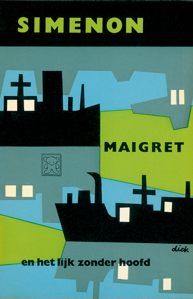
Maigret en het lijk zonder hoofd
George Simeon, 1959
© Mercis bv
Another simultaneous development was the book as a disposable item. From 1841 onwards, the German Bernard Tauchnitz marketed successful titles from Anglo-Saxon literature for students and travellers. At a low price, because it did not have a linen-covered cardboard binding around the book block, but a paper cover with the title printed on it – hence the name paperback. The price was low in part because Tauchnitz did not pay any duties. The disadvantaged publishers left the pirate Tauchnitz alone because his books were often thrown away after the trip or after they were read, after which the official bound version was purchased. This way both parties benefited.
It took nearly a century for paperbacks to be reduced to pocket size and to spread widely as ‘pocket books’. It was in 1934 that Querido in Amsterdam started publishing the Salamander series. One year later, the Englishman Allen Lane started his Penguin Books. In the United States, pocket books started to flourish around the Second World War. In 1951, publisher Het Spectrum in Utrecht launched the Prisma pocket books. From 1954 onwards, the publisher Hachette gave the French their livre de poche, or roman de gare, as it was popularly called. Sales skyrocketed for all publishers.
The Bruna publishing house also had many writers whose titles would sell better if they were issued in pocket-size with a paper back for the price of 1,50 guilders. Publishers Jaap Romijn and Abs Bruna made the decision in the winter of 1954/55. “At the same time that they started with the Zwarte Beertjes, Jaap Romijn and my father said: ‘If you really have to draw, try making a book cover.’ But also posters and those kind of things.” As such, Dick Bruna became a designer. He was the only designer of the Zwarte Beertjes series until science fiction was added. He did not really know what to do with that.
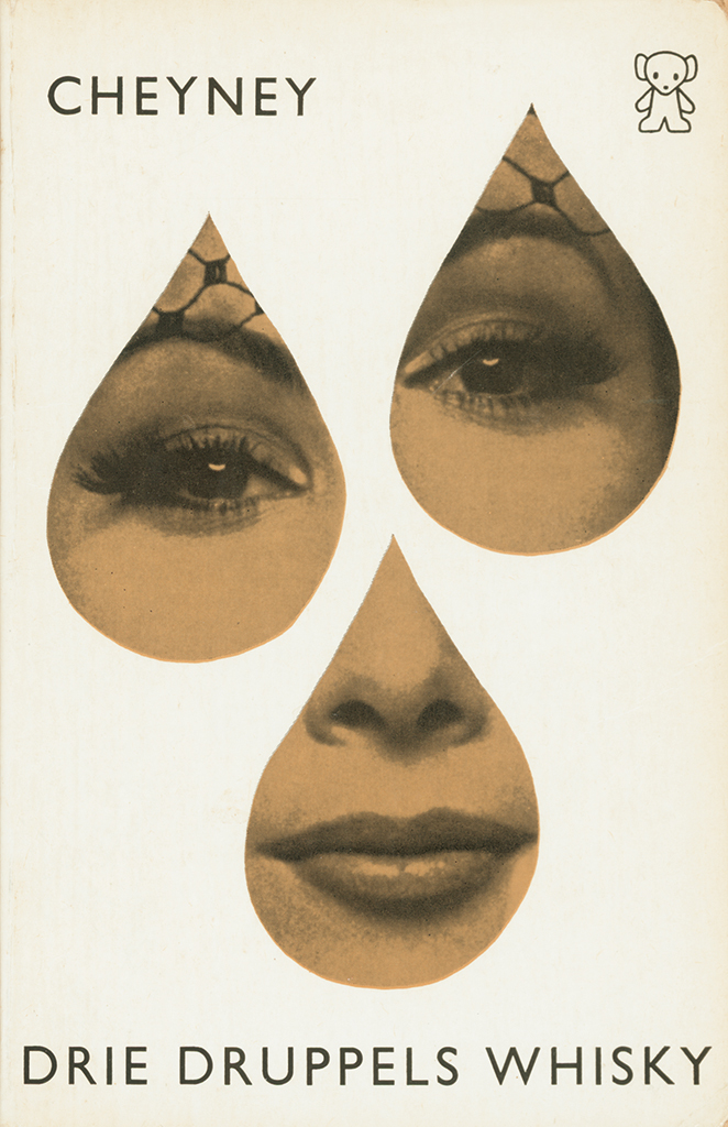
Drie druppels whiskey
Peter Cheney, 1962
© Mercis bv
The Zwarte Beertjes series had the Book of the Month series as its predecessor, which they started publishing in 1945 with a beautiful binding with red linen for the price of 3,90 guilders per book. This series also included fiction and non-fiction and was divided into different genres, with an emphasis on suspenseful crime novels. For example, that of the Dutch writer Havank with protagonist Charles C.M. Carlier, pseudonym The Shadow; that of British writer Ian Fleming with secret agent James Bond; that of British-American writer Leslie Charteris with high-society crook Simon Templar, better known as The Saint; that of the British writer Peter Cheney who wrote about Lemmy Caution, immortalised on screen by Eddie Constatine in Jean-Luc Godard’s film noir Alphaville; or that of the Walloon Georges Simenon with his Parisian police commissioner Maigret. Especially the latter achieved unprecedented high circulation for a small country such as the Netherlands. For example, in 1969 the first edition of Maigret was set at 100,000 copies. In the same year, the 25 millionth Zwarte Beertje was sold, in part because of Dick Bruna’s visible, understandable, attractive and seductive covers. “The Zwarte Beertjes went so fast that I had piles of work in my room at the publishing house. I had to make the covers and finish them within fourteen days.” In the peak years of the pocket book, there were also special spring and autumn offers every year with about fifty titles at a time. He then had six weeks to two months for that.
The cover policy for pocket books was of great economic importance to publishers and that is why they used the best designers for this. At publishing house Bruna, they could use the graphic talent of the director’s son, which meant that the lines of communication to the management were short and full of mutual trust. For each title series, Bruna designed a figure that distinguished the series by its recognisable silhouette. As such, these figures forged the separate parts from the title series of Havank, De Saint and Maigret into a visual whole, while at the same time these figures gave him the graphic space to represent the contents of each book. “I worked hard not to make them look alike, so that a figure for Simenon didn’t look like the one for Havank. At a certain point I had a pipe for Maigret and a character for Havank, that was very nice. You can do all kinds of things with that, of course.”
Distinction and similarity at the same time. While the series slowly filled with titles, yet another distinction and similarity emerged on a different level. Where the figures distinguished the various title series from each other, Dick Bruna forged all the Zwarte Beertjes together into a series with his distinctive style. At the same time, this similarity distinguished the series from those of other publishers. His style arose from the personal twist he gave to the graphic elements, their interplay and their application.
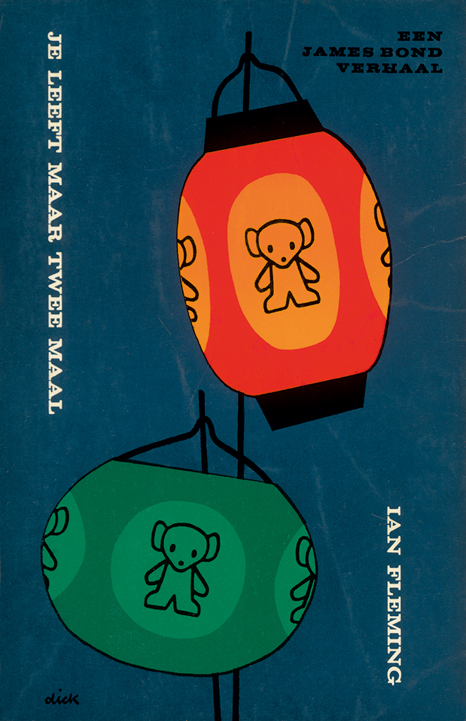
Je leeft maar tweemaal
Ian Flemming, 1964
© Mercis bv
Method
In short, Bruna’s method consisted of the following steps: after studying the manuscript, he translated its mood into the colours that he wanted to use for the cover. He then cut out shapes with scissors that depicted the book’s theme, after which he chose the title font, and then he coordinated these three aspects – colour, shape and typography – for the desired narrative effect.
Following his method, let us first take the aspect of colour. According to Dick Bruna, the tone of a story could be presented most effectively with a combination of colours. In his earlier covers these were mainly primary and fresh, in later years they became dirtier and darker. The latter in part due to the tone of the many crime novels that were put on his drawing table. “Of course, a lot of dark things happen in those thrillers. And if there is only shooting and murder, then you keep it dark.” This darkness reduced the colour contrast and in order to maintain the high visibility of a cover, it was important to place the shapes larger and simpler on the surface. The condition for a successful cover is that it delivers its story to the hurried traveler in a matter of seconds, who must be able to choose from the many covers that are looking at him without the help of a bookseller.
The aspect of form was the next step. In the 1950s he painted, tore or cut them. At first loosely, later he provided them with more geometry, but he never constructed them. This is in contrast to his design colleagues, who at the time – impressed by modernism – turned their drawing pen around on a compass or used a ruler. Bruna did not care about that perfect and lifeless design language. “No, I didn’t have any rulers.”
In the 1960s, Bruna combined his cut-out shapes with photographs, which he also cut out with scissors. The photos, often with a high contrast, were – fashionable at the time – printed in combination with a solid colour as a duotone. Photography had become a possibility not only due to the increased print quality but also because it was required by the market. “Well, not a requirement per se, but more in the sense that I thought it was necessary. And I know I was against photography in the beginning, and actually I still am. On all those covers that were made in America, you saw a beautiful lady, who had nothing, absolutely nothing to do with the story. I hated that. I also always had the feeling: don’t picture it precisely. Design those covers in such a way that you leave something to your own imagination.”
The title of a book on a cover is a linguistic element within a visual narrative, which is defined by the writer. For the designer, choices start with the typography, such as the font, size and colour of the letters. Even more choice arises with the visual elements with which the visual narrative is constructed. Dick Bruna searched for his graphic elements or made them himself. He did not allow these elements to contradict each other, evoke misunderstandings, or delay each other when combined. The final result had to be a narration that the audience could fully retrieve from the printed cover. There are more graphic designers who have this gift, but Bruna’s arrangements achieve this with a minimum of elements. “I have to admit that omitting things was one of the most difficult aspects for me.”
His efforts had effect because the combination of elements that he chose created a synergy that made them suggest more together than individually. In addition, this synergy was fast and powerful. It was necessary to be fast and concise because Dick Bruna was convinced – and still is – that a book cover is only successful when it can speak with the same force as a successful poster, clearly visible from a distance, which tells its story in the shortest possible time. “When they told me that it had to have ten lines of text, I always replied: ‘You don’t have time for that when you are cycling past’.”
But when there was time, his posters also caught the eye. “I remember a letter from a gentleman who wrote that he had missed his train, but he did not mind because there was a Zwarte Beertjes poster by me.” In addition to this man, many others such as Dick Bruna’s design colleagues were impressed with the way his posters delivered a visually compact and concise message, so that their narrative effect could be retold later.
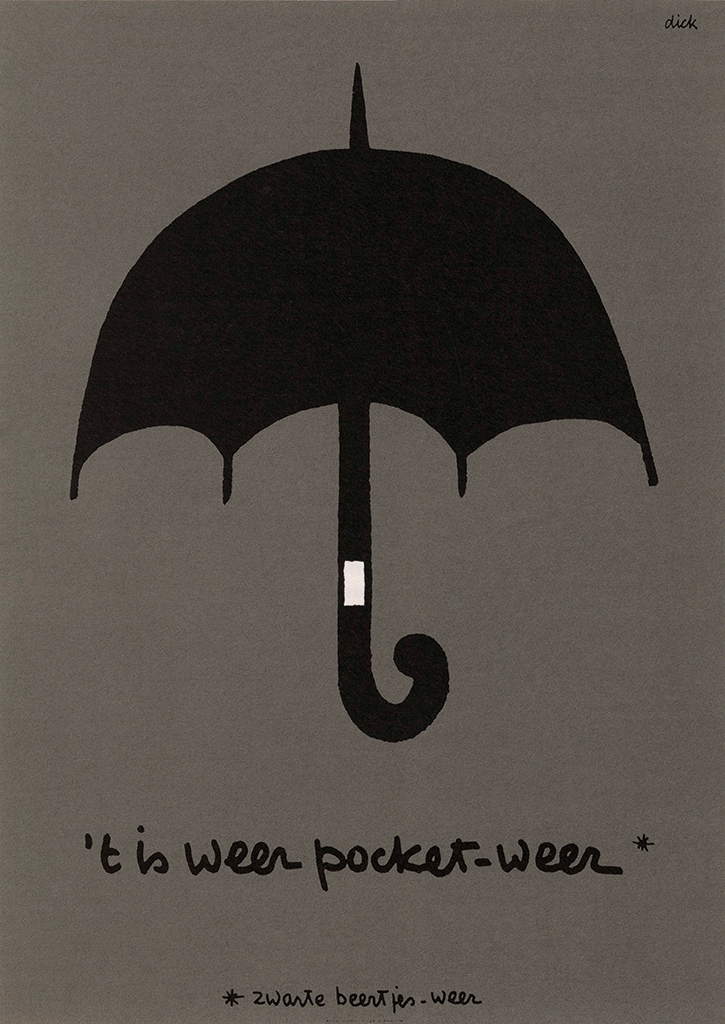
‘Zwarte Beertjes’ poster, 1967
© Mercis bv
Once a book cover had taken shape, the proposal left his drawing table. “I have always had the feeling that I was not working for the publisher, but for the writers. During that time I have always been in contact with the writers, for example Georges Simenon. If I had made a cover for one of his books, I sometimes received a note from him. Once or twice he wrote that he thought it wasn’t very good.” Bruna his final actions were placing the Zwarte Beertjes logo and his signature. “Yes, ‘dick’ has always been my signature.”
His graphic efforts were limited to the book’s cover, and further graphic care was in the hands of Bernard van Berkum, the house typographer of the Bosch printing house, later Van Boekhoven-Bosch, in Utrecht. Dick Bruna appreciated it when Van Berkum could establish a typographic relationship between the cover and the interior pages. In the mid-1960s, Paul Groenendaal Jr. took over these tasks. Around that time, Dick Bruna celebrated his 40th birthday, had designed more than a thousand covers and “… my grandfather asked me when I was finally going to get a proper job.”
In the 1970s, he no longer designed all the covers himself and was managing a team of younger designers. In 1980 Elsevier took over publishing house Bruna and two years later Dick Bruna said goodbye to the company after designing approximately two thousand covers, catalogues and many posters. He continued his career by paying more attention to his rabbit miffy* and her friends. Back to childhood.
Childhood
Dick Bruna was born in 1927 as the first son of Abs Bruna and Johanna Erdbrink. He grows up in a family where his father takes the Bruna authors home. In addition to literature, there is also an interest in visual art and music at home. Dick hears early jazz and French chansons, of which Charles Trenet’s work particularly stood out. “Later I saw him perform a couple of times and I was completely overwhelmed. I also played the accordion myself.”
At the age of twelve, Dick witnesses the outbreak of the Second World War and more than three years later their villa in Bilthoven is confiscated by the Germans. The then 16-year-old Dick and his 39-year-old father both fear the Arbeitseinsatz and go into hiding with the rest of the family in their house in Breukelveen by the Loosdrechtse Plassen. There, boredom is added to the tension. Dick practices both his writing and drawing pens by drawing nature in the style of the then popular Jo Spier and Anthon Pieck. At night he sailed across the lakes to gather wood from the docks of those who sympathised with the German occupier in order to heat the house.
After the war Dick dropped out of secondary school in exchange for the promise to continue in in the publishing firm. His internal training starts with an internship at the bookstore Broese in Utrecht, followed by an internship at the English publisher and bookseller W.H. Smith, and is completed in 1949 at publishing house Plon in Paris.
This city made a deep impression on the 22-year-old Dick. “Yes, Paris in the late 1940s, cabaret, performances, we had skipped all that in the Netherlands. We had not heard or seen anything like that here. Not even sitting on terraces, watching people.” And in addition to the colourful and powerful cutting work of Henri Matisse, there he also saw the work of Fernand Léger with its visual layering, achieved by placing black lines over and around the coloured areas. This would continue to inspire him, and he returned from Paris with the ambition of becoming an artist. After this his father arranged weekly lessons from Jos Rovers, an advertising artist and painting teacher at the Rijksacademie van Beeldende Kunsten (State Academy of Fine Arts). But Dick did not want to build up his shapes using oil paint. He preferred solid surfaces, which he preferably cut out, such as done by Léger and Matisse, with their colours, their liveliness, their temperament. “Well, if I got the chance I got out of there and I walked through the streets of Amsterdam, that was of more use to me.” At the same time, it became clear to him that he was expected to succeed his father for the business side of publishing. “Then I said to him: ‘I’m not going to do that. I will continue drawing’.”
Meanwhile, Dick had bought himself a dog to get in touch with a girl across the street, and he put his easel on his balcony, hoping to impress her. Dick was in love, and when he received a ‘no’ to his proposal, he left to France with the intention of becoming a painter for good. Charles Trenet sang: “Boum, quand notre coeur fait boum”. “Yes, that was one of his big songs.”
After a while he returned with the same proposal. Now she said yes, supplemented by her father’s requirement to support his daughter. In short, no artist’s existence. Dick stayed in the Netherlands and returned to the publishing house. In 1953 he married Irene de Jongh and they had three children, their two sons Sierk and Marc in 1954 and 1958, and their daughter Madelon in 1961. His commitment to the publishing house kept him away from home. On vacation, at the beach of Egmond in 1955, he drew a rabbit for the stories he made up for his son Sierk. It would especially entertain Dick himself for a long time.
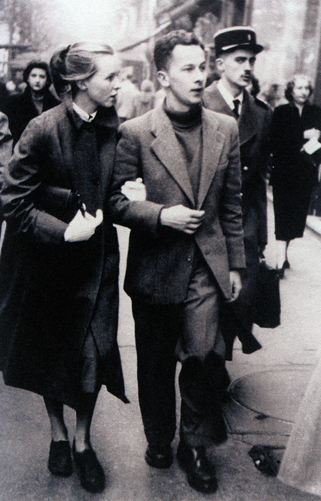
Dick Bruna with his wife Irene in Paris, 1953
© Mercis bv
miffy
After his positive experiences with the posters for the Zwarte Beertjes at printing house De Jong, Dick Bruna asked them to print the children’s books he conceived, written, drawn and designed. While the first children’s books were upright, Pieter Brattinga folded the printing sheet for miffy in 1959 in such a way that 24 square pages, each measuring 15,5 by 15,5 centimetres, emerged. “Yes, Brattinga, he was very good.” This has remained the format, it suited the small arms and hands of its young readers better and “a square, that is the simplest shape there is.” It also gave Bruna the idea to place his texts on the left page and the image on the right page from then on.
Printed in an edition of no more than 2500 copies, his children’s books sold slowly. The public clearly had to get used to the large, flat cut-out shapes, as in his first children’s book, De Appel (The Apple), from 1953. Five years later, in a reprint, he paints a contour around it. The figures in his miffy books were also all contoured. “I always use the same brush until it’s worn out.” But first, Dick Bruna draws his shapes with pencil on transparent paper to transfer them to watercolour paper, after which he paints over the impressed lines with black gouache. “But this is done piece by piece, very carefully. And if I slip somewhere, that’s the end of that drawing. Then I’ll start over again.” Dick Bruna does not correct his drawings, never. “No, absolutely not, because I keep seeing that.” Up close, his lines show a human trembling that reveals the handwork of the master. With these lines he carefully builds up his shapes, after which they are precisely put in place. The line generates the shape and the mutual relationship between the shapes tells the story.
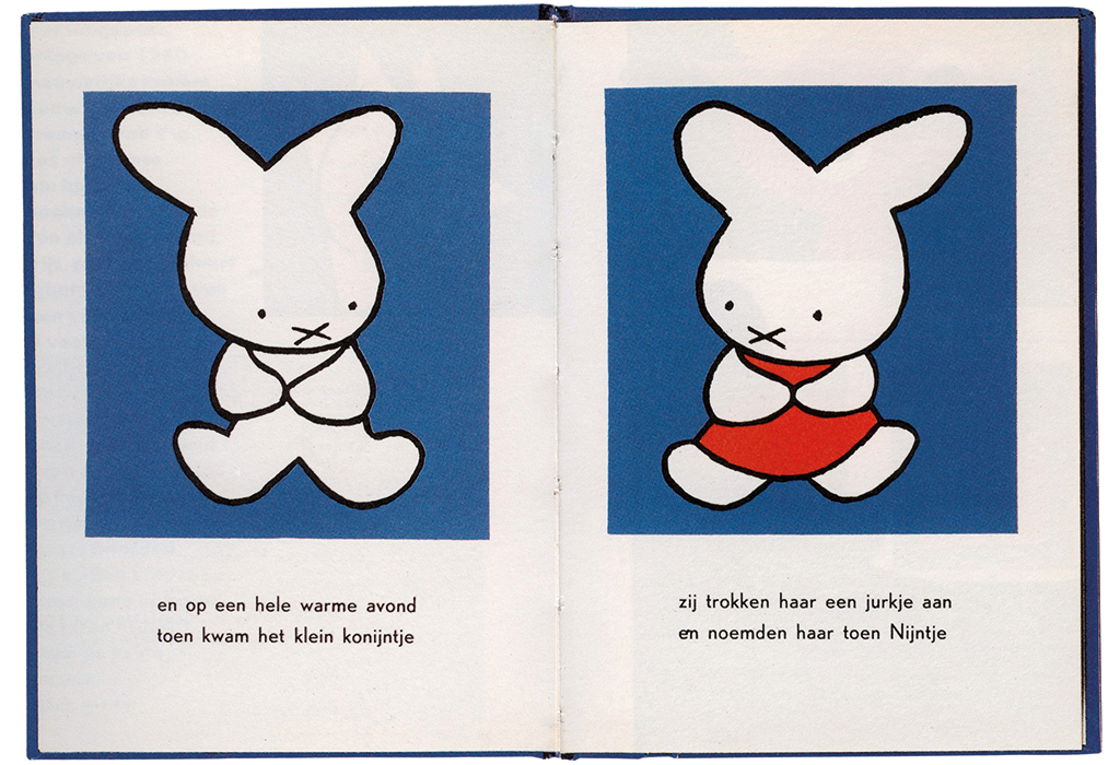
The first ‘nijntje’ book, 1955 © Mercis bv
In the real world, youthfulness manifests itself through a disproportionately large head and larger eyes compared to adults. Remarkably, miffy’s head is even bigger than her body. Even more remarkable is that her eyes are comparatively smaller and are also rather far apart. Most notably, the eyes are tilted ovals and the head is wider than it is high, in contrast to the usual human proportions. “Yes, it’s the other way around for me.” miffy’s ears in particular make her meet the condition for a successful figure, which is that the silhouette must always be recognisable so that it can not be confused with another figure. Because of this visual condition, it loses narrative flexibility. Also for miffy, because with whichever emotion she has, the ears remain symmetrical and upright. “Yes, although I move them a tiny bit when she’s angry.”
In the early years, when Dick Bruna’s drawing style was too artistic, too ‘cold’, or both, the audience eventually became used to it, in ever-increasing numbers. It was looked at by millions, even many, many millions of children’s eyes as their parents read Bruna’s texts. The temptation was mainly the drawing style. First of all, miffy and her friends have a human figure, except for their ears. Another temptation comes from the minimalist style with which the faces are drawn. This minimalism makes the figure visually unexpressive and allows the viewer to identify with it. Without any blocking elements, viewers can then fill this visual vacuum, loading the unexpressive face with their own personality. For example, when the visual characteristics of the viewer are clearly different from those of the figure, such as a different skin colour, this could be a blocking element. Africans are less likely to identify with miffy and are more likely to remain spectators than Europeans. At the same time, the light skin tone and small eyes were no blocking element to the Asian audience. Millions identified with the bunny in Japan alone.
Mercis
miffy’s great welcome was probably the reason why a similar figure was released in 1974 in the same country. It had similarities in terms of line width, shape and proportions, but the main difference was that the rabbit’s ears had been exchanged for those of a cat. Hello Kitty became very successful worldwide. “I think that’s a copy of miffy. I don’t like that at all. I always think, ‘No, please don’t do that. Try to draw something that you came up with yourself’, Dick Bruna remarked in 2008 in the Daily Telegraph.
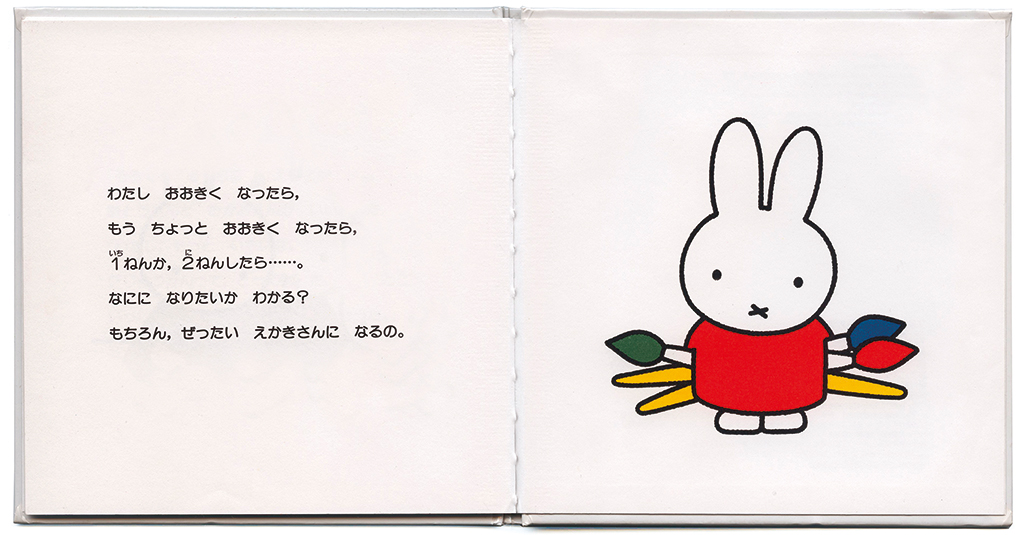
‘nijntje’ translated in Japanese, 1998 © Mercis bv
Intellectual property must be protected to fight plagiarism, because successful characters can make money. A lot of money, even when well-meaning companies are provided with clear guidelines on how to print their products with the right figures, in the right colours and of the right quality. The same was true worldwide for miffy and it was a torment for the – self-proclaimed – ‘un-businesslike’ Dick Bruna. Pieter Brattinga, his longtime business friend, helped him by setting up Mercis Publishing in 1971. He recorded miffy’s shapes, determined the qualitative lower limit and drew up usage guidelines.
While miffy retained its shape in this way, which in turn benefited the business, Brattinga determined the rights to be transferred to all kinds of miffy merchandise worldwide and fought plagiarism with lawsuits. This turned the un-businesslike Bruna into a wealthy man. In 1995 Brattinga stopped working for Mercis and died nine years later at the age of 73. “Yes, Pieter, he has always remained a friend of mine, for the rest of his life.”
Will miffy stop after his death? “Yes. I have three children who all enjoy drawing, who can make things. But we agreed that no one will take over miffy.”
Dick Bruna has used his various talents to tell stories to his audience. He combined the book titles that were given to him or the words he wrote for miffy with his images, compiled of his shapes, filled with his colours, in his arrangement for the right narrative effect. He does not consider himself a writer or illustrator, but a graphic designer. Where he started with the Zwarte Beertjes for adults in the Netherlands, he now goes around the world with little white rabbits for children.
Dick Bruna
born on 23 August 1927, Utrecht
died on 16 February 2017, Utrecht
Author of the original text: Chris Vermaas, March 2012
English translation and editing: Peter Hofstee
Final editing: Sybrand Zijlstra
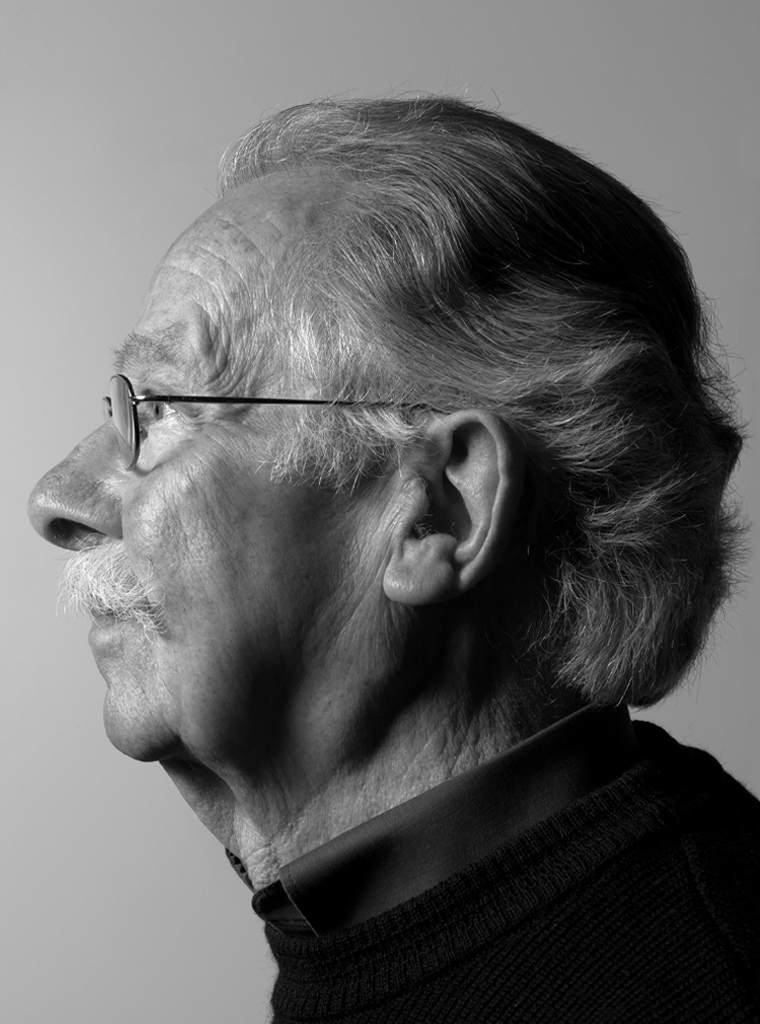
Portrait photo: Aatjan Renders