“Right boy, when you’d rather sit here in class drawing than paying attention to me and the blackboard, make that same drawing one hundred and fifty times for me. Hand it in next week!” That was the disproportionate punishment imposed by my German teacher, F.J. Kamminga, for drawing a boat during his lesson in 1964.
As a thirteen-year-old I was more interested in drawing* than in German grammar. It also illustrates my difficult relationship with authority at secondary school in Veendam. The best part of that school period, I thought, was meeting Margriet there. After the final exams in 1968 I knew for sure: School is not for me.
School Dropout. As I didn’t want to go to school I had to find work but what kind of work? My older brother Klaas had a friend Jan van Kooten, a graphic designer who staffed the studio at Europrint Printing in Wildervank. He asked: “Printing, does that appeal to you?” Shortly afterwards I was hired as an apprentice printer. After two days, I already knew it wasn’t for me. I had more of an eye for what was being made in the studio than for technical production. I presented my dilemma to Van Kooten. His reaction: “Then you should go to art school.”
No one from my village had ever gone to art school, so there was certainly some distance there. It was my mother who boarded the bus to Groningen in early 1969 with a folder full of my drawings for an appointment with Wim Zwiers, director of Academie Minerva. Zwiers looked at my drawings and said that her son certainly had talent and should take the entrance exam.
So surprisingly enough, in a roundabout way I ended up as a student at Academie Minerva in Groningen in 1970. Margriet and I found a place to live in the city and our life began.
At Minerva’s Graphic Design Department, subject teachers Karst L. Zwart, but above all Ralph Prins opened my eyes and heart to the fascinating world of (graphic) design.
Ralph was an erudite and cheerful mentor, a designer of the grand gesture, a passionate and enthusiastic teacher who was firmly rooted in the field. He was a typographer, painter, draftsman, photographer and spatial artist. He took his students with him in this and showed how design could be a broad field of work and a source of pleasure. He was the man who taught me that it was a duty to always aim high, that you can always take the initiative yourself and that the life of a designer is a privileged life.
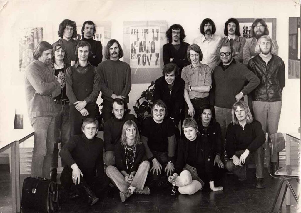
The entire Graphic Design Department of Academie Minerva 1971: FLTR. Rob van den Elst, Henk Suurling, Klaas Geertsma, Ebe Treffers, Frans Leroux, Wout Müller, Karst L. Zwart, André ?, Gerard Meuleveld, Bert Dost, Joost?, Koos Staal, Ralph Prins, Klaas Brons, Sybe Sybesma, Jan Wessels, Albert Verboon, Kees de Vries, Jarko Aikens, Tineke Wieringa, Ymkje Cussél. Design is a men’s affair for the time being.
With an active leading group of senior students from the department, I worked daily in our regular classroom/workshop. This created a fruitful exchange between the different year groups. We worked together, I learned a lot from them and our fascination with the design profession firmly connected us.
Study trips within the Netherlands and to London, and internships at the PR department of Enka in Arnhem and Total Design in Amsterdam in 1973 were also inspiring. They formed an educational introduction to the big world of design and marked the beginning of contacts with colleagues and friends.
In 1975, after my final exams, I screwed a sign next to my front door in Groningen:
Koos Staal, graphic designer gvn
Done! I was my own boss.
I had an office, a telephone, a bicycle,
and one client already.
A client indeed…
Two years earlier:
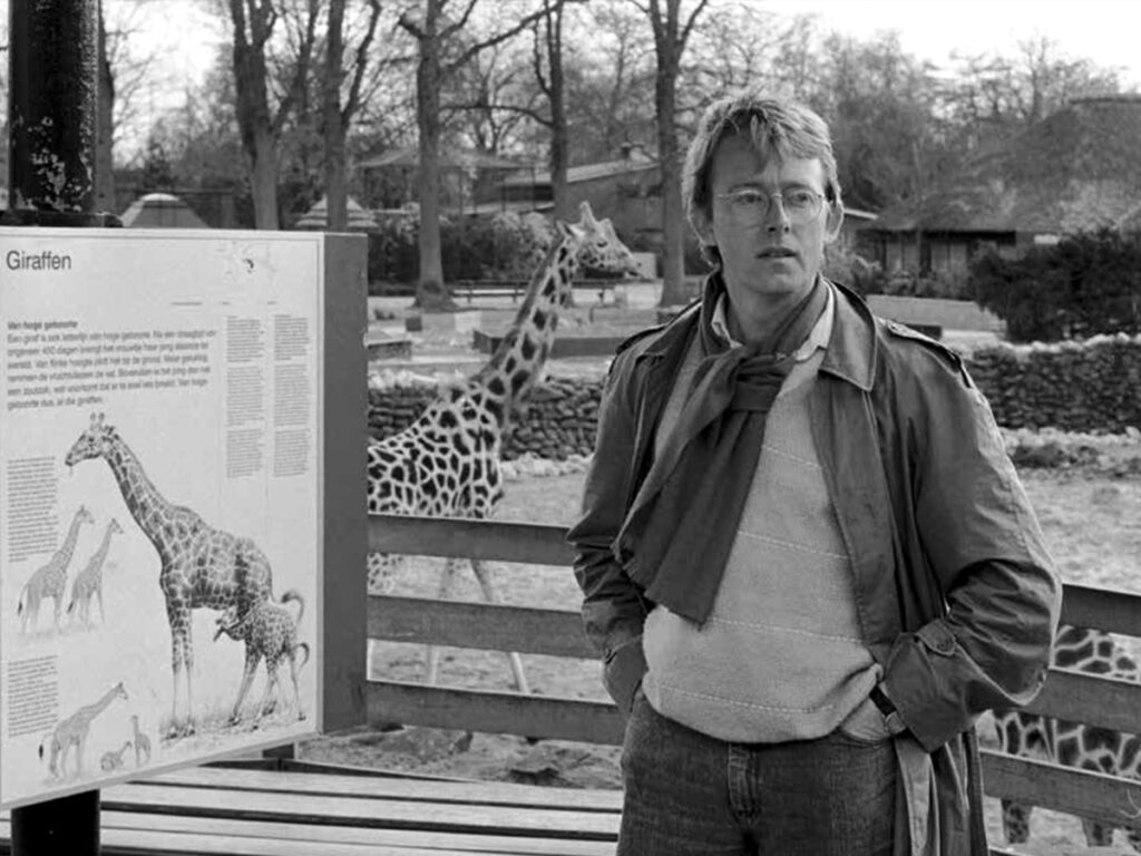
A bleak November morning in 1973. I had taken a day off from my internship at Total Design and got off the bus from Groningen to Emmen at the Noorder Dierenpark / Zoo for an appointment with the recently appointed directors Jaap and Aleid Rensen to present the design for their new seasonal brochure.
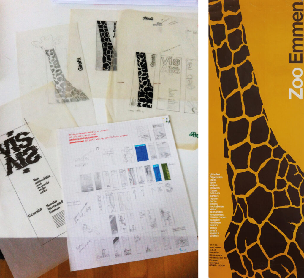
Sketches and first printed design, 1974.
How had I ended up there?
Two senior students, Henk Suurling and Ebe Treffers, had designed a corporate identity for the Noorder Dierenpark Emmen as their final project – a design with a somewhat nostalgic tone. As the new management above all wanted to distance themselves from the old-fashioned zoo, from cages and monkey-watching, that corporate identity was never implemented.
Henk moved to Amsterdam and I rented a room in his house during my TD internship. During that period Aleid Rensen had asked him to design a different brochure for the Noorder Dierenpark. “But this time not that nostalgic style please!” We decided to work on it together but unexpectedly Henk was offered a job in Paris. We agreed that I would proceed on my own.
And some weeks later there I was in Emmen with my ‘academy folder’ under my arm. I had not only created a seasonal brochure but also all kinds of designs for whatever seemed useful or fun to me for a modern zoo: poster series, informational booklets, carrier bags, games, souvenirs, designs they had not asked for. Aleid Rensen recalls that first meeting in the book ‘De Verdwenen Dierentuin’ (2014): “Sketches by Koos, too many for the table in our small office. Everything looked cheerful, contemporary, and playful. His work aligned perfectly with our vision and thoughts about the park. We were completely on the same wavelength. We also liked Koos as a person. Modest and at the same time self-assured, with a great sense of humor. Jaap and I exchanged a brief glance. Consultation was not necessary: this was a more than excellent designer for our park…”
Could I have wished for a better start? The collaboration with the Noorder Dierenpark would last thirty-seven years, twenty-two of which were with the Rensens and fifteen years with their successor Henk Hiddingh.
Submission for the Start ’75 exhibition at the Stedelijk Museum Amsterdam.
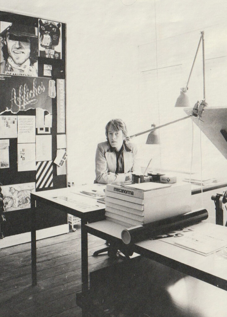
In my study, 1976
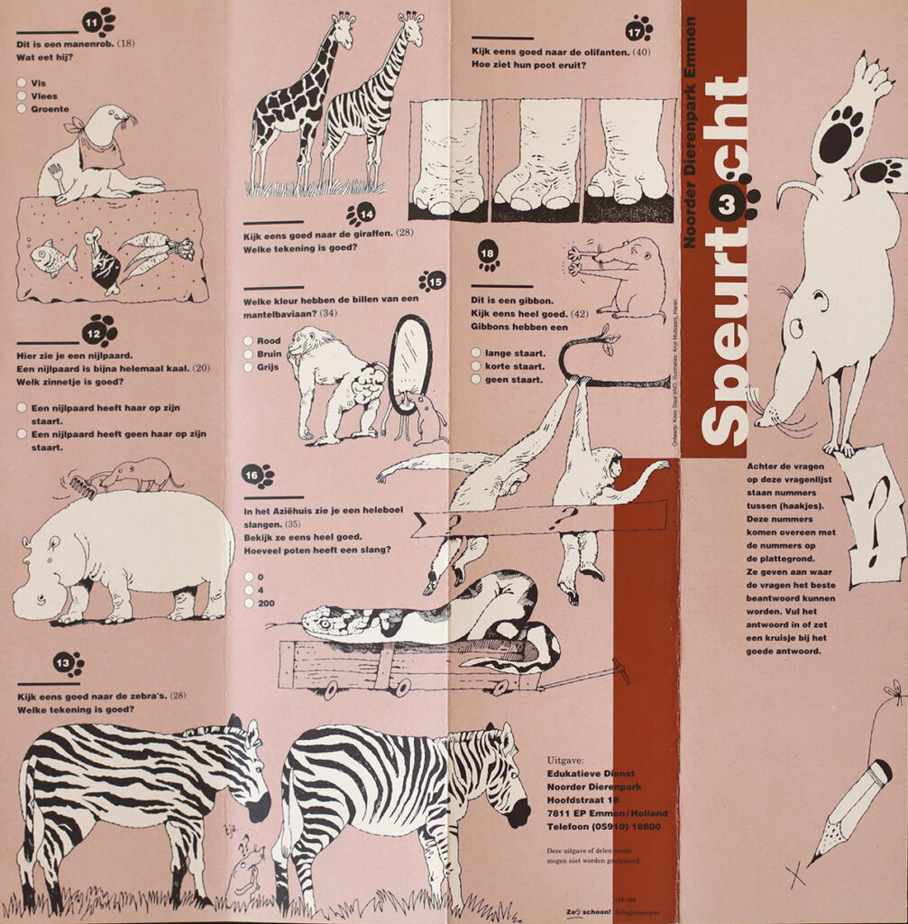
One of the dozens of ‘scavenger hunts’, illustrated by Anjo Mutsaars
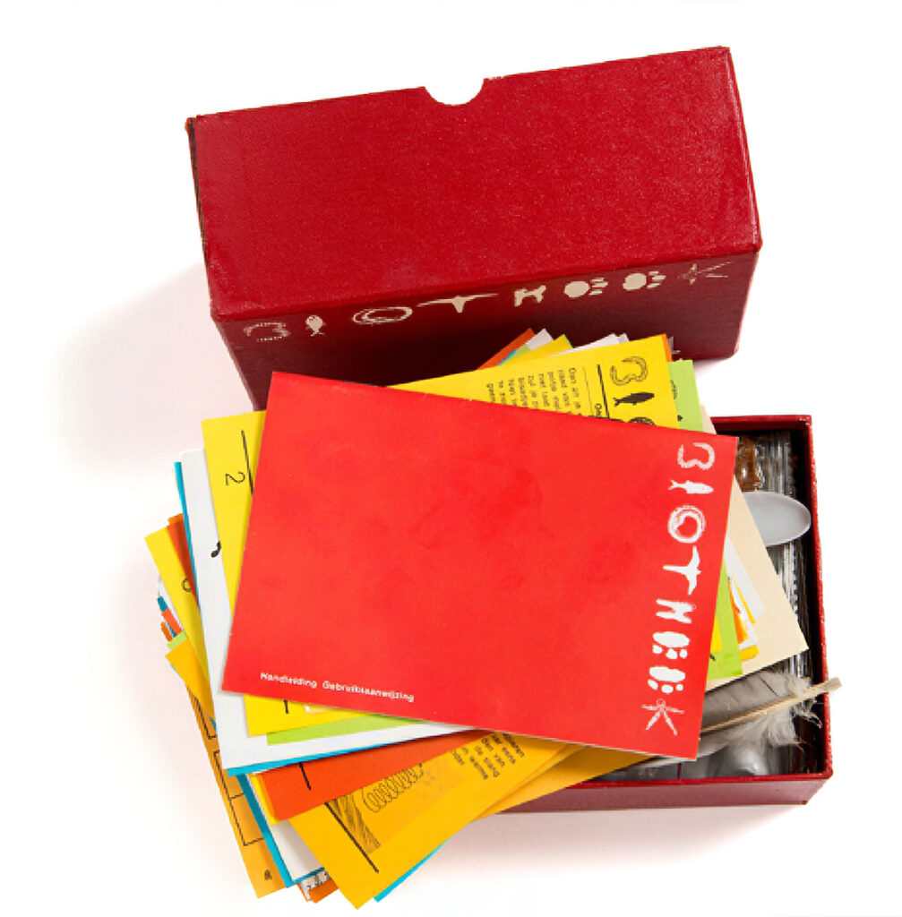
Biotheek: An educational surprise package for primary schools, in preparation for the upcoming school trip to Emmen. Information about a biological theme such as food, locomotion, sight, skin and hair, and materials to visualize that theme in the classroom: construction kits, games, materials for experiments.
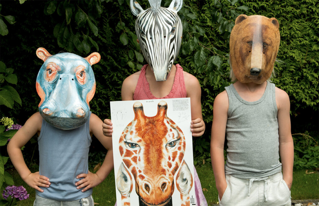
The bus full of children is returning from a school trip in Emmen. Parents are waiting for them, but the bus seems empty… Until all the children appear behind the windows wearing animal masks… The mask folding kits were a popular souvenir, presented with an educational booklet containing details about the animal in question.
The Rensens´ ambition was to transform that dying, severely outdated zoo into a new, modern animal park, featuring ‘open’ animal enclosures and – a novelty in 1973 – with the emphasis on nature education in everything. Graphic design would play a major role in that transition. After all, that educational function would require numerous publications, teaching materials and exhibitions.
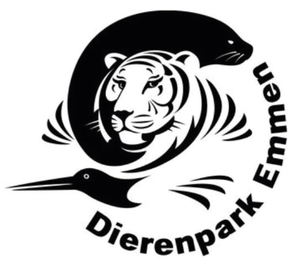
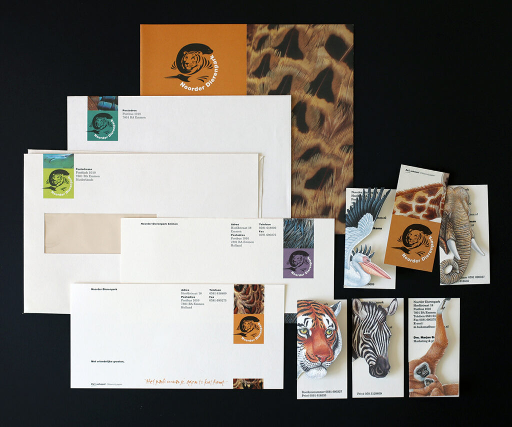
From 1973, the corporate identity was represented by the wordmark Noorder Dierenpark. In 1998, Henk Hiddingh asked us to develop a logo. We were looking for a land and water animal in combination with a bird. Bart Kootstra designed this compact form.
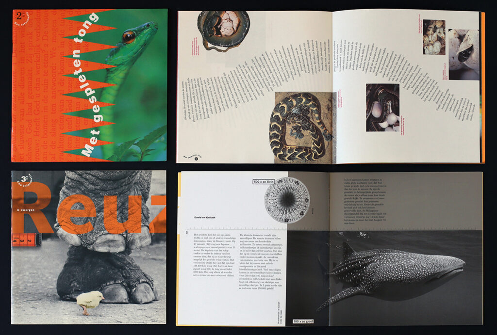
Zoo Informatie: Of the many educational publications, the quarterly magazine Zoo Informatie was the flagship. Thematic issues in which only the format (21 x 21 cm), the size (32 pages), and a number of minimal house style rules were fixed. Each issue was given its own form. Zoo Informatie appeared in a print run of 65,000. It was always surprising and committed subscribers and the media. Although a magazine, Zoo Informatie was included in the selection of the 33 Best Designed Books of 1996.
On that platform my work became prominently visible, which led to many subsequent clients finding me. The motto ‘one thing leads to another’ became a common thread throughout my career.
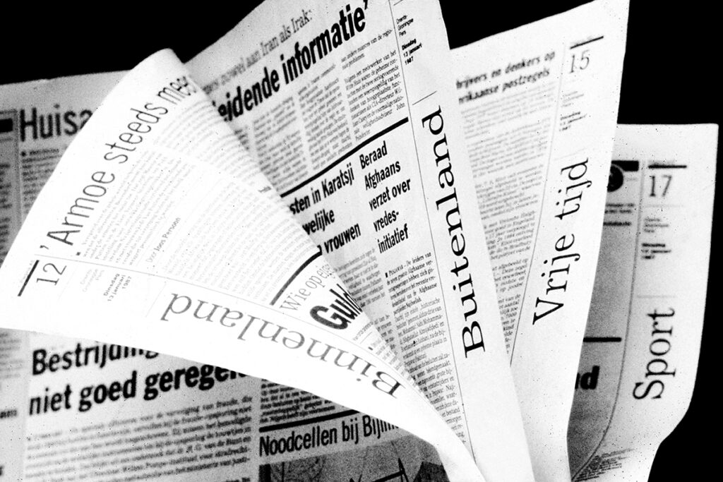
Newspapers
In the summer of 1985 I visited George Vogelaar, the new editor-in-chief of the Groningen daily newspapers Winschoter Courant and De Noord-Ooster. A native of Amsterdam who had recently moved to the north and had visited the Noorder Dierenpark with his family. My work had caught his eye there and he asked if I could make a concept for a new design for his newspapers. Before long the assignment was expanded: publisher Wegener had decided that the Groningen newspapers had to merge with three Drenthe daily newspapers: the Drentsche en Asser Courant, the Emmer Courant, and the Hoogeveens Dagblad. The new editorial board, consisting of George Vogelaar, Piebe Prins and Jan van Kooten, subsequently requested me to design a down-to-earth, somewhat bold merger newspaper for the Drents-Groningse Pers/DGP and to guide the (layout) editorial team in its implementation.
I viewed this as an honorable and responsible assignment. If anywhere, typography is important in newspapers. It is not about beautifying but about guiding tens of thousands of readers through the layered content of the newspaper every day via clear typographic codes and structure and also about practical applicability for the newspaper’s creators.
Page structure of DGP daily papers: basic layout of sixteen half-columns, three of which were for a column in which all short news items and sections were grouped, a half-column on the outside for navigation, vertical page titles, and the middle section of twelve for larger articles.
Minimization of typographical means: two headings type, three column widths, two line thicknesses. The complex structure of the start of a news item (square, place name in spaced small capitals, half-embedded line, beginning of text) was made possible thanks to the technical ingenuity of IT specialist Geeuwke de Wit, who managed to modify the software that was still rudimentary then in such a way that this format became achievable with a single keystroke by the editor.
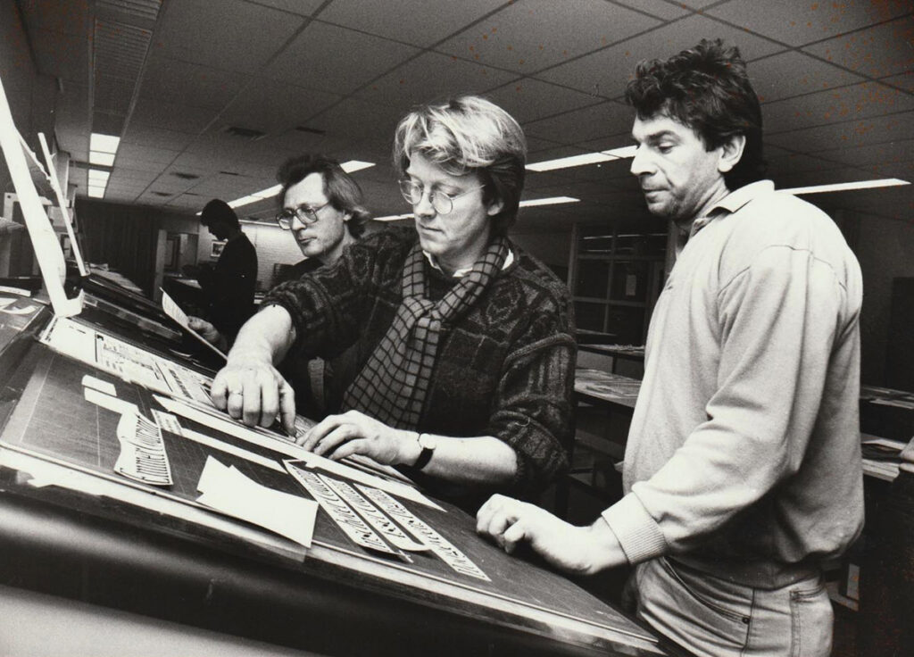
Giving instructions at the Winschoter Courant: To my left is Jan van Kooten, the designer who advised me to go to the Academy in 1969. He had ended up in journalism and was Deputy Editor-in-Chief with DPG by then. Due to his roots in graphic design, he was a stimulating support for me within the publishing house hierarchy.
The new newspaper was widely appreciated by readers and editors and attracted international attention from the Society of Newspaper Design and WAN-IFRA (World Association of Newspapers and News Publishers). They repeatedly presented the design at their conferences and it won awards, which subsequently gave my reputation wings as well.
Newspaper Mergers
The DGP basic design served until spring 2002 when a new newspaper emerged following the merger of DGP with the Nieuwsblad van het Noorden: Dagblad van het Noorden.
Initially newspaper mergers intended to halt declining circulation and reduce costs which was often the reason for engaging me. When two or more newspapers merge, each with its own style and character, a new form and style must be created for the merged newspaper. This was traditionally done by in-house designers. But an external designer who looks at it with a fresh, impartial eye had many advantages and seemed to me the best choice as well.
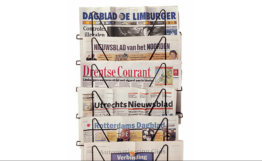
A newspaper rack as a portfolio. At the top is Dagblad de Limburger (editor-in-chief George Vogelaar), voted Europe’s best-designed regional daily newspaper in 1999.
Foreign Affairs
The echo of the DGP project took me not only to editorial headquarters in Rotterdam, The Hague, Utrecht, Zwolle, Apeldoorn, Arnhem, Nijmegen, Breda, Amsterdam, Hilversum, Haarlem, Venlo and Maastricht but also across the border. In 1995 I presented the design for the Northern newspapers to a group of Scandinavian journalists at a conference in Paris.The Danish cartoonist Lars Refn was in the room and inspired by my DGP project, he said that he would try to convince the editor-in-chief of his newspaper in Copenhagen to hire me for their planned redesign. Six months later a fax arrived from Copenhagen from that editor-in-chief, Per Westergård. He wanted to meet up and I did not mind at all.
That is how my first international assignment began. A redesign for Ingeniøren, a weekly newspaper for everyone involved in technology in Denmark.
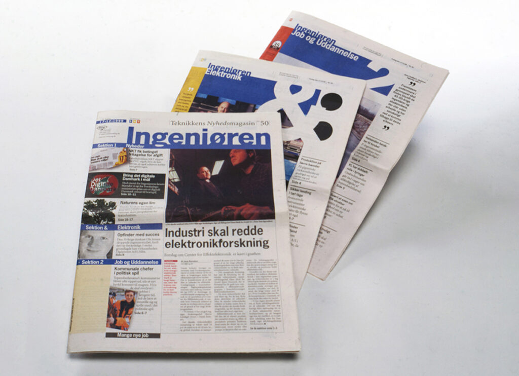
The renewed Ingeniøren 1998.
Anyone wanting to serve the entire Netherlands and abroad and who is based in Groningen is helped by solid and smooth equipment. Boys will be boys …
The Danes turned out to be pleasant. They were almost like Dutch people, which meant the collaboration proceeded smoothly without difficult cultural differences. The circulation of the revamped newspaper increased and on top of that Ingeniøren received the Anders Bording Award in 1998 for the best media launch of the year, presented by the Danish Prime Minister, Anders Fogh Rasmussen.
With the family to Copenhagen for the presentation of the Anders Bording Award in 1998.
Eight years later I returned to advise on a design update for Ingeniøren at the request of a new editor-in-chief, Arne Steinmark, in close collaboration with Danish colleagues Ann-Britt Böström and Lars Pryds. Meanwhile Per Westergård had become editor-in-chief of the daily newspaper Åarhus Stiftidende. This led me to find my way to Aarhus as well, where I introduced a revamped newspaper in 2006.
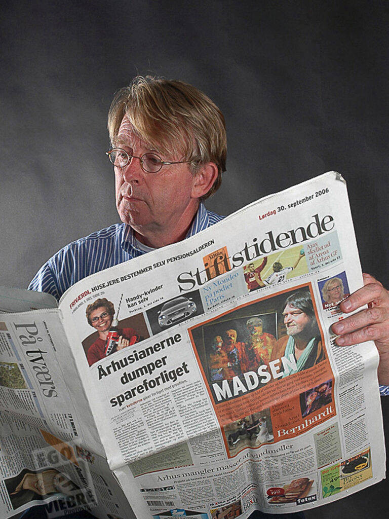
he revamped Aarhus Stiftstidende.
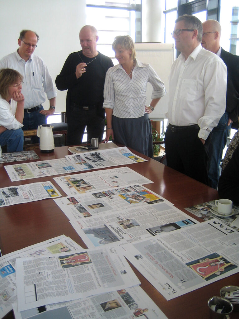
Per Westergard (on the right) explains my sketches to some of his editors in Aarhus.
“Koos understands the business. He has a strong sense for the needs and style of different target groups. He understands journalism. He is extraordinarily brave and creative – but in exactly the way we need in magazines and newspapers. He does not push design before content. He makes design an integral part of the content. He makes the content pop up from the pages into the mind of the reader.” – (Per Westergård, editor-in-chief Fyens Stiftstidende)
Meanwhile in Singapore…
“Can you please recommend a suitable designer for a revamp of our newspaper?”
In 2001 a delegation from The Star, Malaysia’s largest (by circulation) English-language daily newspaper asked this question at the WAN-IFRA office in Singapore. Coincidentally Jürgen Müller-Stephan, a WAN-IFRA manager from Germany and a fan of my DGP project, was on a working visit to Singapore. He overheard the question, joined the conversation and subsequently recommended me. Less than a week later a concise email arrived from Kuala Lumpur: “Hi Koos, can you be in KL next week? Teh Eng Huat.”
Going up in the world.
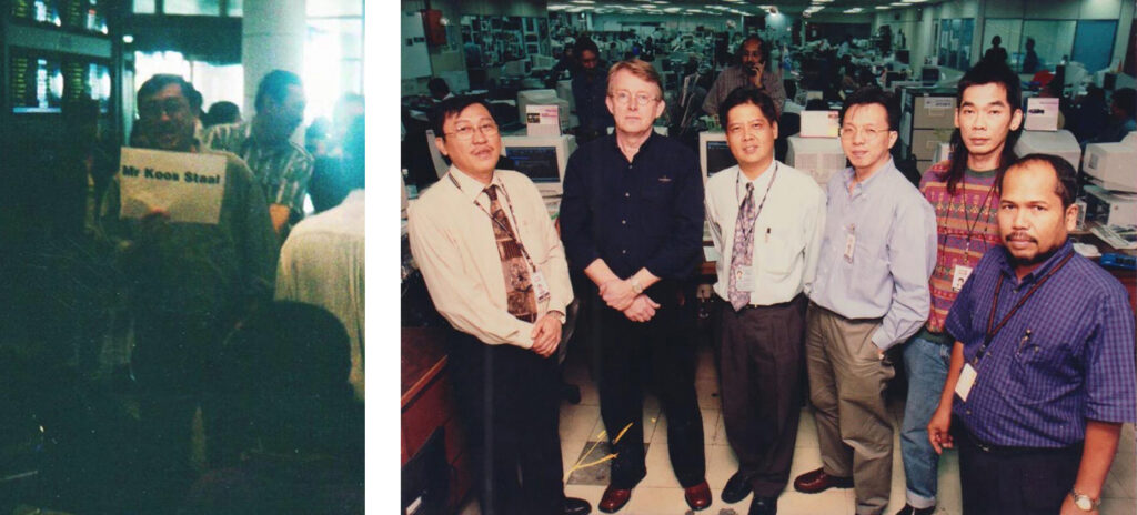
Left: Teh Eng Huat is waiting for me at Kuala Lumpur International Airport. Right: With the redesign project team at the editorial office of The Star. Next to me project managers David Yeoh and Teh Eng Huat.
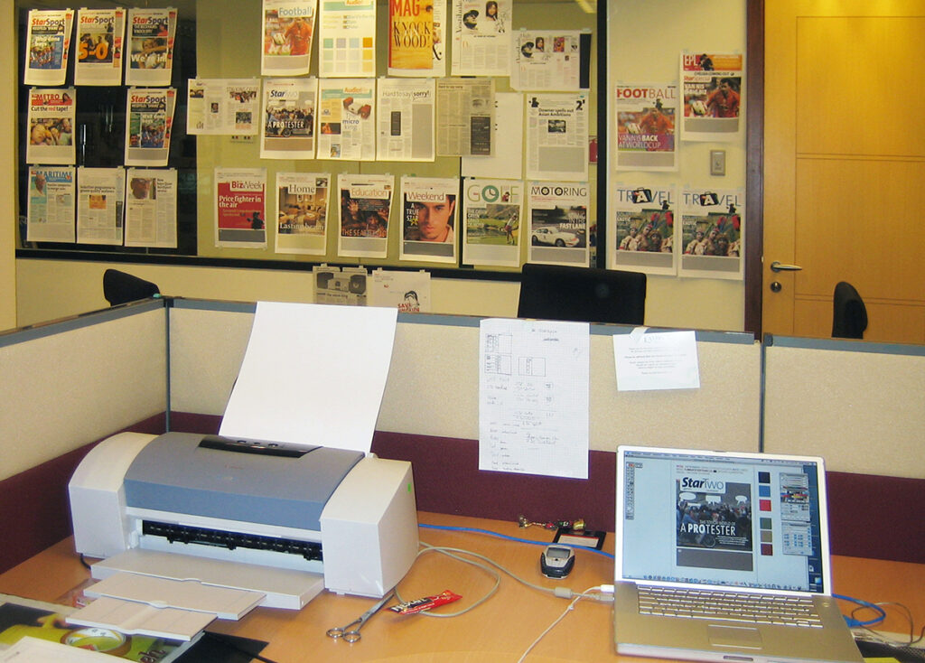
My temporary workspace, sixteen floors up in Star Tower.
And then suddenly tabloids are much sought after.
In 2004 all daily newspapers wanted to transform from the standard broadsheet format (41 x 59) into the smaller tabloid (29.5 x 41) as a powerful incentive. This was because a tabloid is more manageable and would boost single-copy sales. Het Parool, Cobouw, and Dagblad vh Noorden/Leeuwarder Courant put me to work. Existing titles that were already appearing in a small format also wanted to innovate: Spits, Kidsweek/7days, Delta, and Cursor. And initiatives emerged for new free newspapers in public transport, on the street and at the gas station: ANWB Auto, Re: Den Haag, Amsterdam Times, Z24, NL-NWS*. All in need of a designer. Busy, busy, busy.
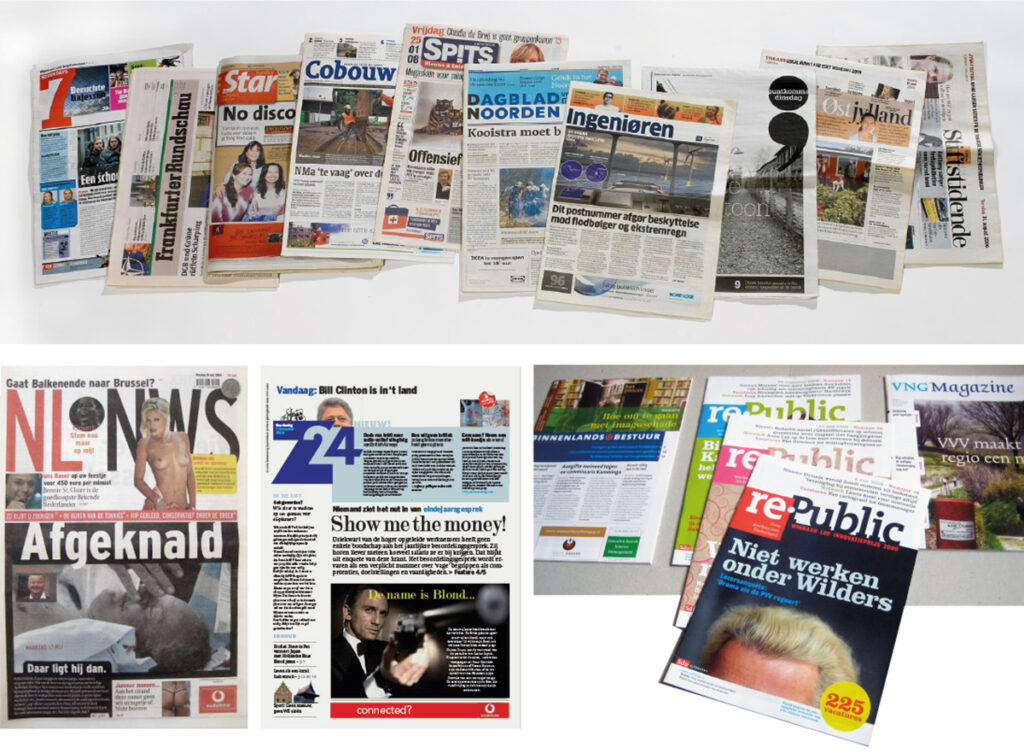
A selection of my tabloids and weekly magazines. This includes never-published pilot issues of the popular Dutch tabloid NL.NWS (NDC) and Z24, a free daily newspaper for young professionals. (Financieel Dagblad)
All of this brought me back to school of all places but in front of the class this time. In 2013 Jan Middendorp asked me to succeed him at the Plantin Institute for Typography in Antwerp. For nearly three years I taught media design courses there. Then Jan Paul van der Wijk (NRC) took over. In addition I gave guest lectures and presentations on newspaper design here and there.
In 2014 specific aspects of the newspapers I had designed were compiled in the book PaperworksNL.
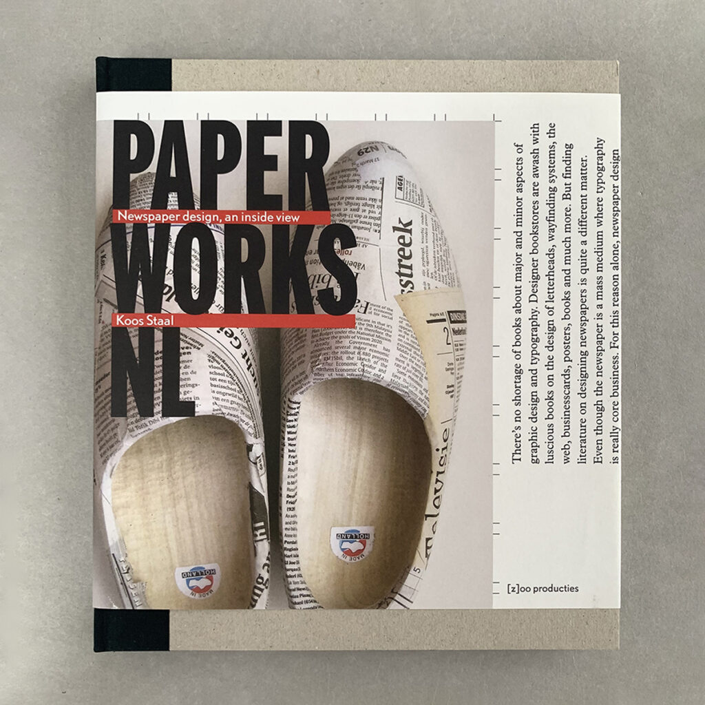
PaperworksNL: Many books are published on aspects of designing books, stamps, calendars, or typefaces, but hardly any on an everyday graphic product like a newspaper. Hence PaperworksNL.
By then there were few Dutch newspaper newsrooms I hadn’t visited. Within the newspaper world, after (re)designing more than a hundred newspaper titles and magazines, I seemed to have become a specialist but I have always actively strived to continue creating other work besides newspapers and magazines.
Calendars, diaries and books
The birth of our children and an ever-increasing workload led me to hire assistants on a permanent basis starting in 1989. However, the role of employer did not suit me at all.
In June 1992 I served as an external examiner for the final exams at Academie Minerva and met exam candidate Geja Duiker there. Her work and attitude made an impression. And as I was working alone again and missed having help, I asked Geja if she would be willing to assist me with a calendar assignment as a freelancer.
With a calendar designed by Swip Stolk, the Groningen lithographer/printer Pijper Reprofessionals received an honorable mention in the calendar competition of the weekly magazine Graficus in 1992. That wetted the appetite for more and Pijper asked me to design his calendar for 1993.
During my TD internship I had worked intensively on a calendar annually designed by Wim Crouwel for Drukkerij v/d Geer and in doing so I discovered that the principles of a calendar present a fascinating typographic challenge. I was looking forward to it.
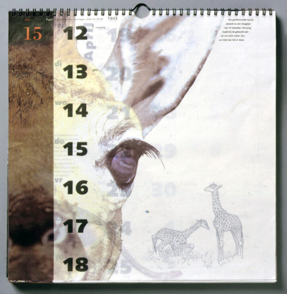
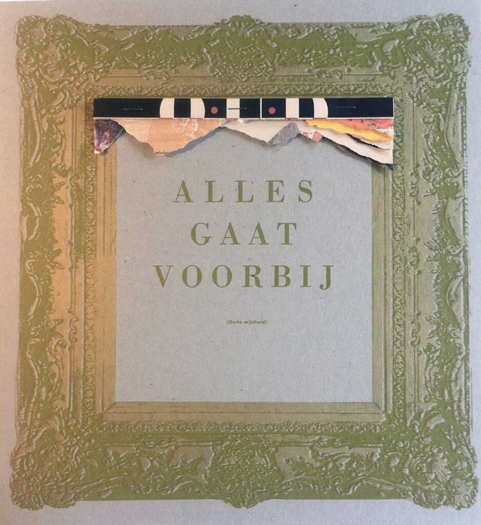
We chose biological clocks as the calendar theme. Text and images were provided by Aleid Rensen and biologist Wijbren Landman of the Noorder Dierenpark. We had the calendar printed on 32-gram semi-transparent paper known as ‘butcher paper’. This way you could already see the next week’s calendar emerging from the mist of the translucent paper through the page in front. The calendar *Alles op z’n tijd* was submitted to the Graficus calendar competition in 1993 and won first prize.
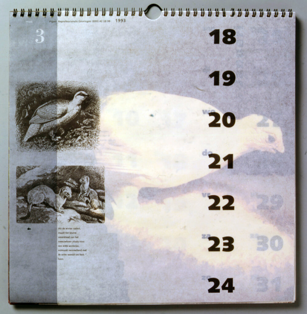
Calendar pages Everything in due time.
Following this positive experience, it seemed like a good idea to me to continue the collaboration with Geja. Not as employer-employee but as agency partners. Thus, in 1993 the partnership Staal & Duiker graphic designers was formed based in my home studio on the Rijksstraatweg in Haren. A harmonious collaboration that would last 21 years.
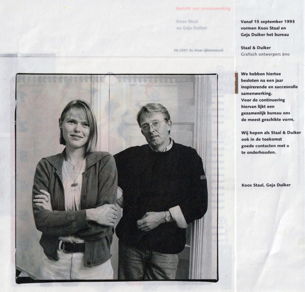
Announcement of the collaboration Staal & Duiker.
The strength of that collaboration lay in the mutual interaction and our ‘Monday meeting’. We would go through the list of tasks in a structured manner and together we decided on ideas, solutions and who would take on, develop or arrange which projects. In the past when I worked alone, I tended to beat around the bush for a long time: it could be done this way but also that way or perhaps differently after all. As a duo we proved to be better organized and much more decisive.
As our first joint project was a success, we designed our own calendar or diary every year starting in 1994. An end-of-year gift for our business contacts. Friends and authors Elke Beekman, Eric Nederkoorn and photographers Reyer Boxem, Ton Broekhuis, John Stoel and Harry Cock contributed. For the execution/production we asked our regular lithographers, DTP specialists, printer André van Liere and binders to participate. Everyone generously contributed their work for free and as a thank you received a hundred copies or more to distribute around Christmas. For seventeen years Geja and I would start thinking about the theme and the design in September. We worked it out in October, had it printed in November and binding, finishing, packaging and shipping would be in December. It was always stressful because the printer and binder had to do this pro bono work during a time of year when they were very busy with regular paid work. “Just bring it up in the summer months, then we’ll have time for something like this,” was a common sigh. It never worked out. We needed that time pressure to be able to perform.
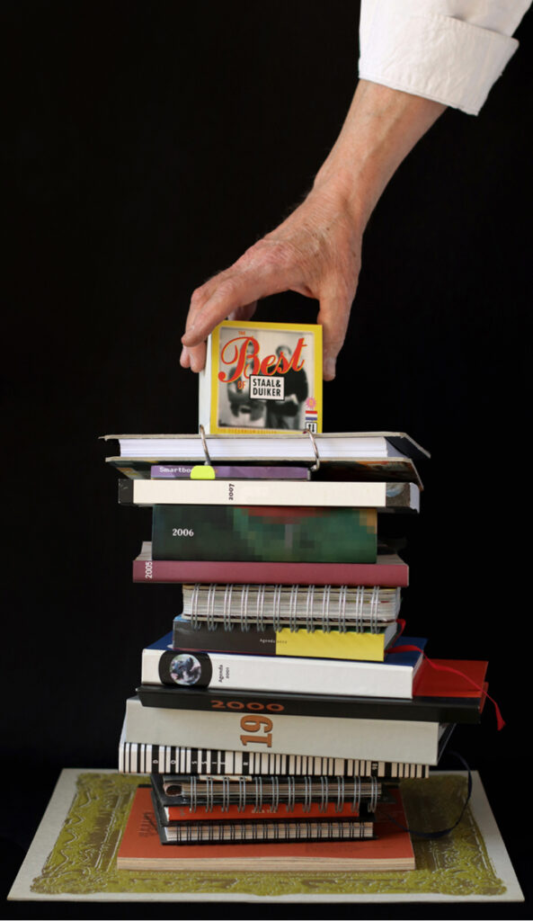
Half a meter of calendars and diaries, the themes: 1994 Old, 1995 Secret, 1996 Time and cosmic causes, 1997 Counting days, 1998 Dossier ’98/Registration, 1999 The end, 2000 Appointments, 2001 Wanted? / Found!, 2002 Duos, 2003 Thrifty, 2004 Best of Staal&Duiker, 2005 No. 13 / Superstition, 2006 Starting Over, 2007 Inspiration, 2008 Smartbook 8.0, 2009 DIY, 2010 Reuse
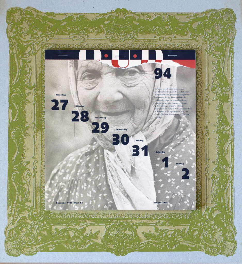
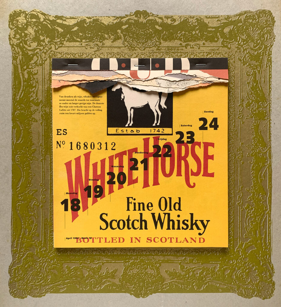
Calendar 1994 – Old: Weekly tear-off calendar in the European Year of the Elderly, about old age in humans, animals, and things. A calendar as a ladder to the life cycle. Printed on rapidly yellowing paper and deliberately poorly perforated resulting in torn remnants of previous pages remaining at the top and literally illustrating aging. 41
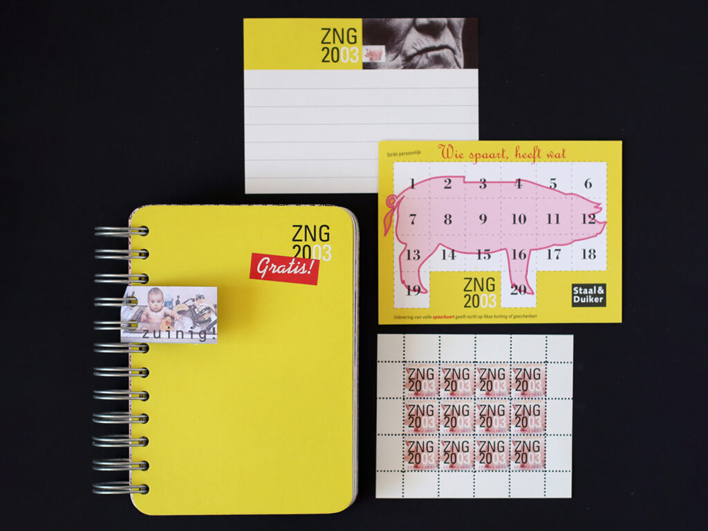
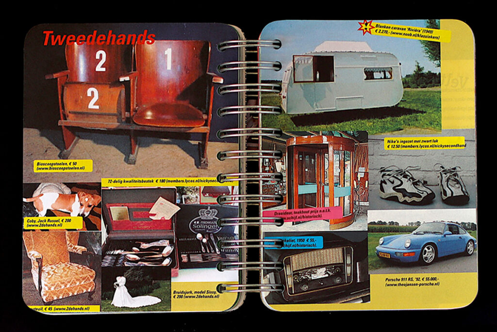
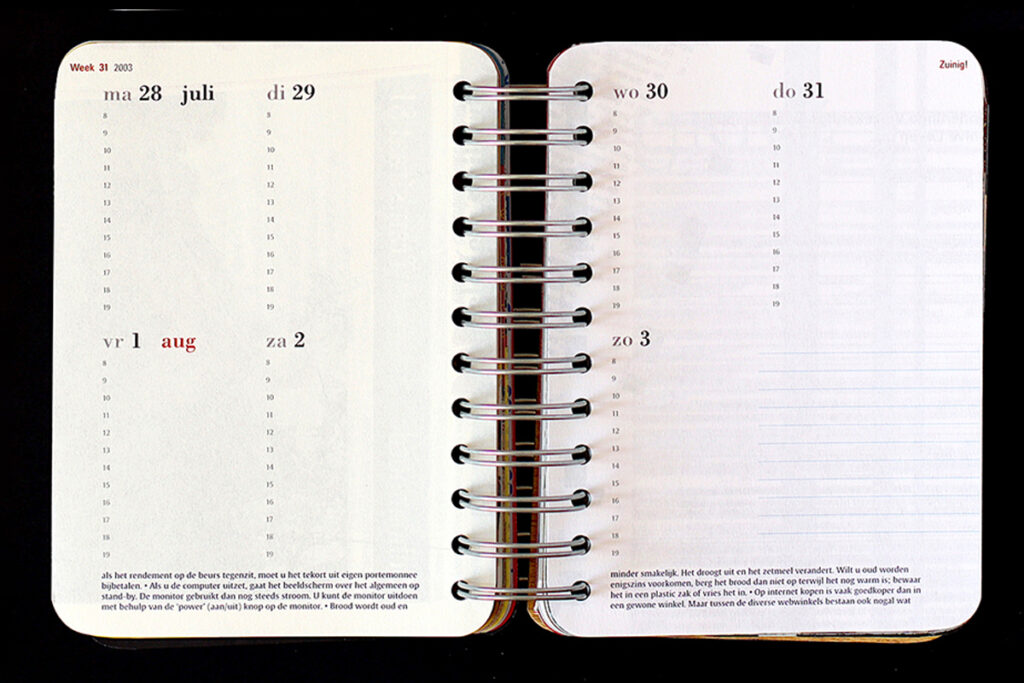
Agenda 2003 – Frugal: Frugal format (11 x 16 cm), printed on blank backs of ‘proof sheets/precursors’ that are used on one side from the printing house, Japanese-bound pages with image spreads on frugality and tips below the calendar section. Includes a rewards card and loyalty stamps.
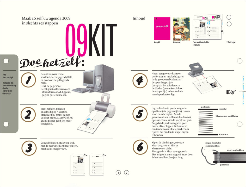
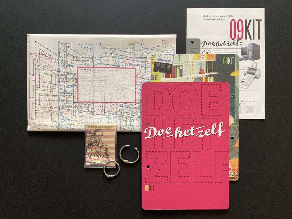
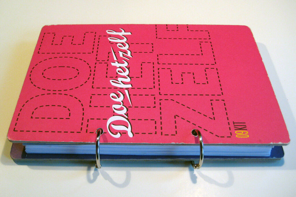
Agenda 2009 – DIY: We sent around a front and back cover, two metal binding rings, and a link to a PDF of the interior. To print at home on fifty-three A4 sheets; punch two holes after folding, and you had made your own agenda. DIY tips inside.
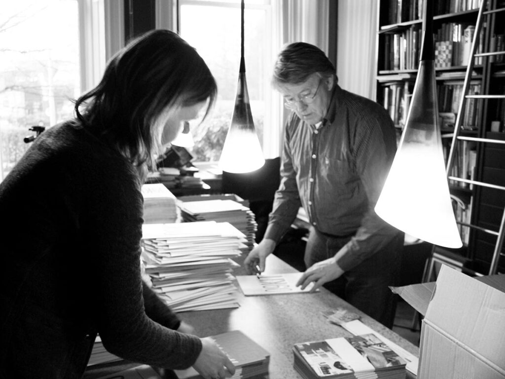
Annual ritual: under great time pressure, just before Christmas, packing the agendas and getting them ready for shipping.
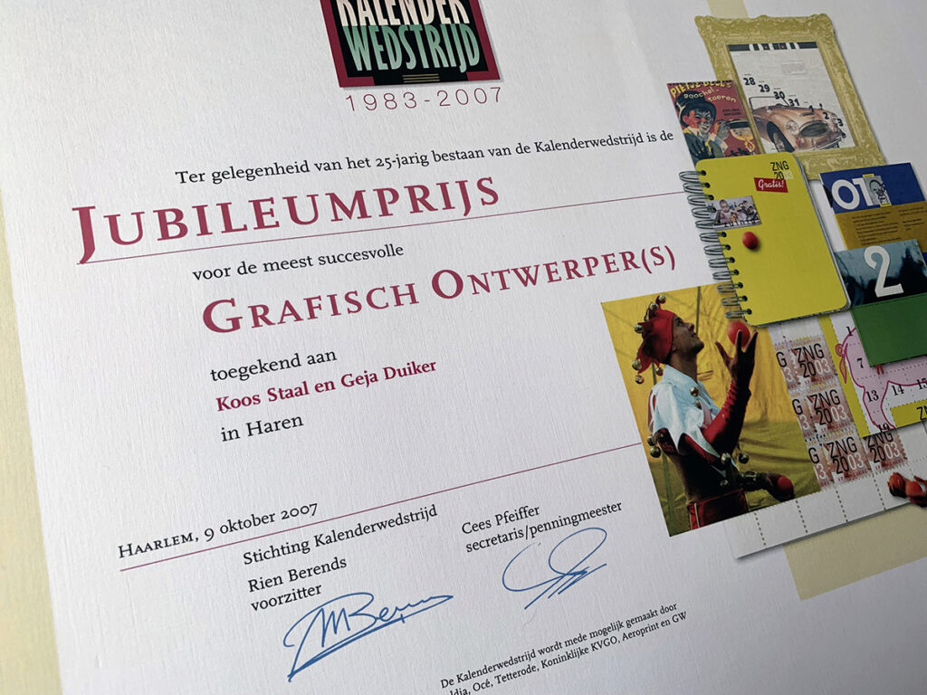
During the anniversary of the Calendar Competition, we were proclaimed anniversary winners. In those twenty-five years we were among the winners the most of all the participants.
Bookwork
Those diaries were a playground, a reflection of the joy of designing something that is useful and enjoyable as well. But I could also experiment a little more with material, construction and form between the front and back covers. That experience and our motto ‘can we do a little bit more’, also rubbed off on other book projects.
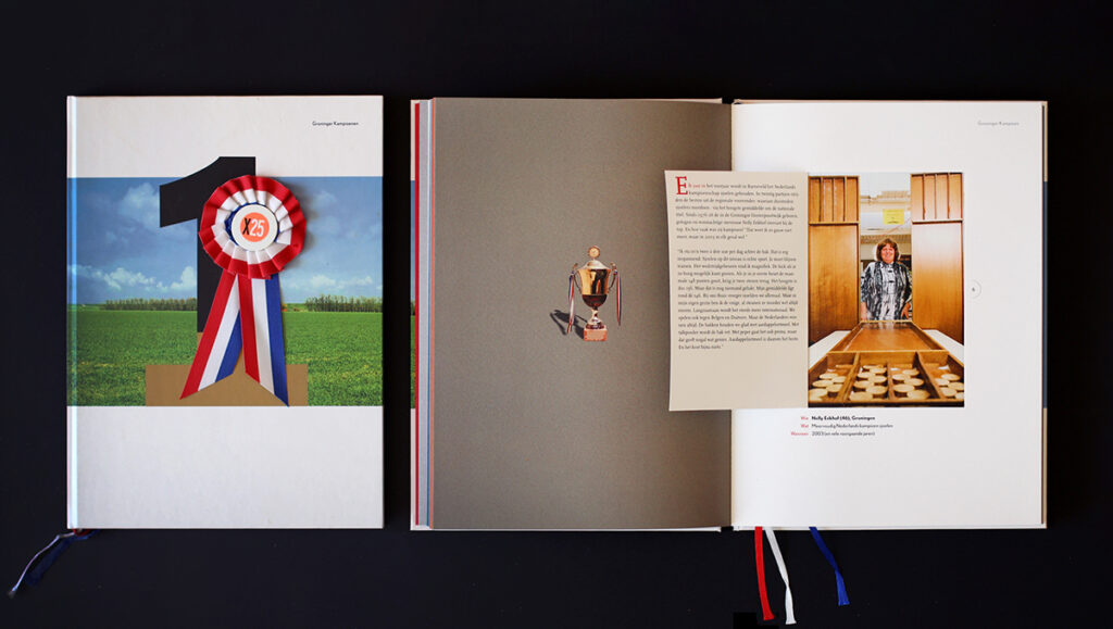
Groningen Champions: Printer Guus Sligter was named Graphic Manager of the Year 2005 and asked us for something to be devised to mark that occasion. Including Guus, this resulted in a collection of twenty-five Groningen Champions. Due to the modesty attributed to Groningers (‘just ignore me’), they have been placed behind a small flap. One of the Best Designed Books of 2005. “A masterpiece of design, printing, paper usage, finishing, and binding technique.” (Hub. Hubben in de Volkskrant)
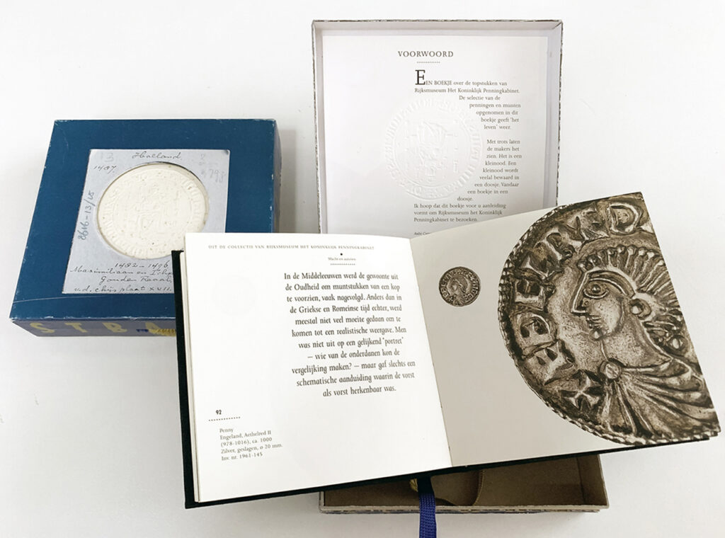
A Precious Possession: The Royal Coin Cabinet in Leiden wanted a substantial coffee table book about their masterpieces. However, those masterpieces turned out to be rather minuscule. Therefore the booklet was small (10 x 10 cm). Packaged as a small treasure in a box with the title, A precious Posession, as edge lettering. The masterpieces were shown 1:1 next to a greatly enlarged detail.
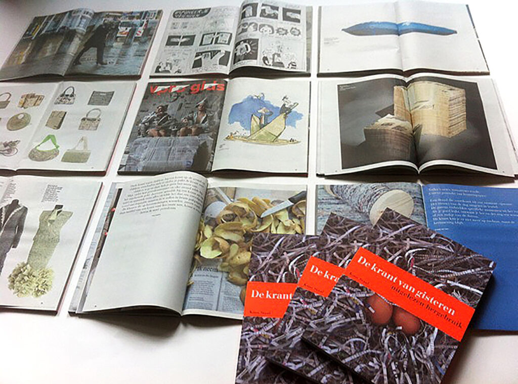
Yesterday’s Newspaper: All the other things you can do with a paper newspaper, besides reading it. Printed on 52-gram newsprint on the BDU rotary newspaper press in Barneveld. One of the Best Designed Books of 2013.
Daily work
Loyalty
Specific to my practice was that the client approached me, not the other way around. I used to contact organizations with the suggestion that I could be of service to them but nothing ever came of it. Apparently I was a terrible salesperson. I did not participate in pitches or tenders either. I found being chosen simply because you are the cheapest downright insulting.
But my clients usually proved to be ambitious and loyal as well. That had nothing to do with favouritism but was always about mutual trust in the process and the result. Aleid Rensen, Leon de Wolff, George Vogelaar, Per Westergård, Gert Selles, Lize Alink, Frits Campagne, Ans van Genderen, Kees Frenay, and Evert van Dijk proved to be loyal clients who, with ‘their’ ambition, also helped me move forward.
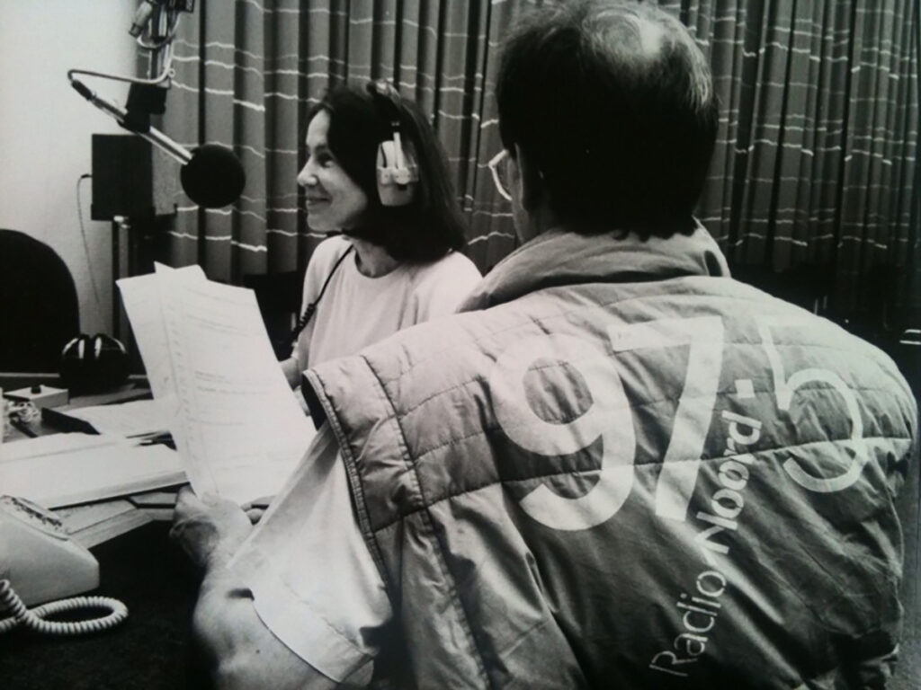
Take Wim Ramaker. An NCRV radio producer who became director of the regional broadcaster Radio Noord in 1985. Once in Groningen he tracked me down through my work for the Noorder Dierenpark and asked me to design the corporate identity for Radio Noord.
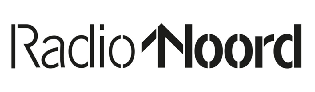
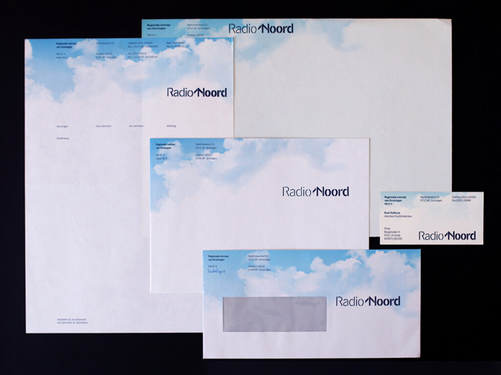
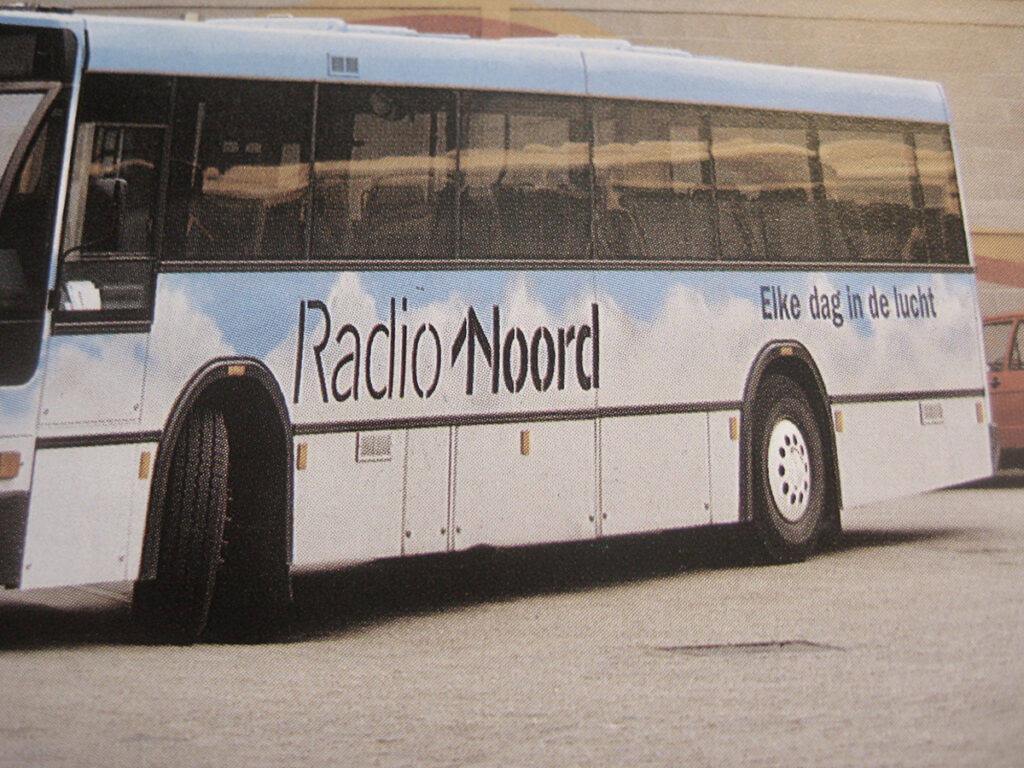
Radio Noord Corporate Identity: On the air every day.
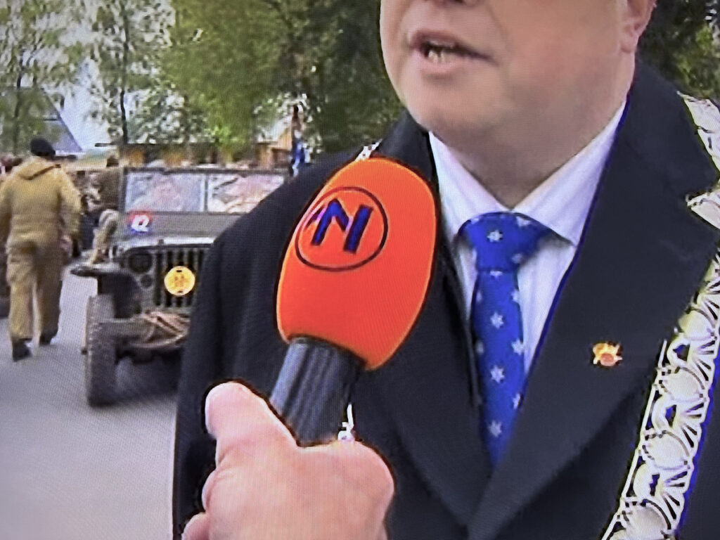
Evolution of the Logo in 2005, with the arrival of regional TV. The ‘North Arrow’ in a circle is now also used as a separate element.
Four years later Ramaker became director of De Rode Hoed in Amsterdam and I frequently worked with him on the Keizersgracht in Amsterdam.
In 1991 he was promoted to director of the National Committee 4 and 5 May.
“It’s Wim; we need a kind of corporate identity.”
“I’m on my way.”
A few weeks after I had presented my sketches Wim Ramaker passed away unexpectedly. However, his successor Nine Nooter had seen the designs and was eager to continue. And so for nine years we designed among other things the printed materials for the annual National Remembrance Day on Dam Square on May 4.
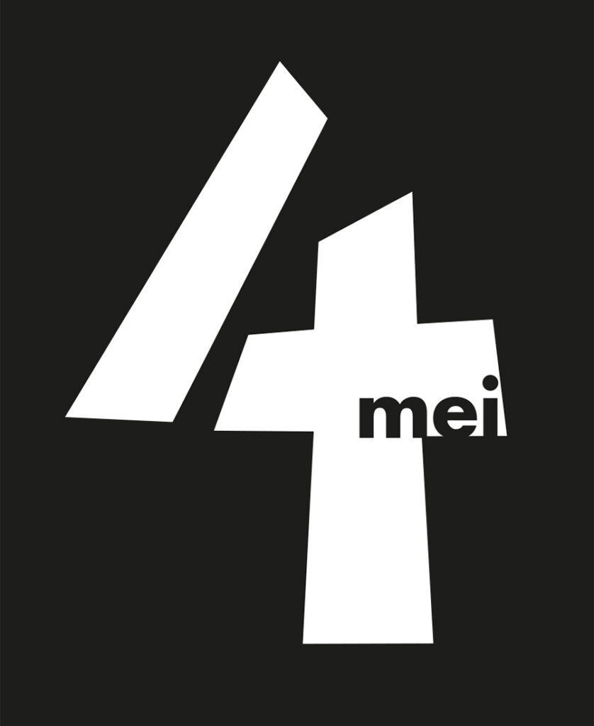
Logo of the National May 4th Commemoration.
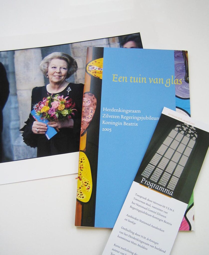
Queen Beatrix celebrating her jubilee with the booklet ‘Een tuin van glas’.
A direct consequence of this was a commission from the National Committee for Queen Beatrix’s Silver Jubilee in 2005: to design the booklet for the National Gift for the jubilant Queen, a stained-glass window designed by artist Marc Mulders in the Nieuwe Kerk in Amsterdam. That is how you suddenly find yourself in high society.
Loyalty in two directions
Lithographers, DTP specialists, printers and bookbinders were important daily partners and pillars of support. I valued stable and long-term working relationships with them as well. That loyalty always paid off in proactive thinking regarding technical challenges and flexibility when delivery times were too tight. Thanks to mutual appreciation, trust and the occasional treat I could do nothing wrong. Most of the time that is….
An architect does not lay bricks
“Dear friend, if you want to stay in the game you will have to accept the computer as a tool.” It was that phone call from Ben Bos in 1989 that gave me the final push into my modest digital future. An Apple Macintosh landed on my desk. A fascinating device. But designing remained a matter of a black fineliner and graph paper.
The execution of the idea grown on paper did change however. From creating a presentable model using Letraset and rubber cement to Adobe Illustrator. Illustrator was and remained, above all, my favorite and only program. I even typed letters and invoices in it.
I kept software like Quark XPress, InDesign and Photoshop at bay. I gradually noticed that print-ready work on the Mac was becoming part of my colleagues’ design process, even a revenue model. But under the motto ‘an architect doesn’t lay bricks either’, I always kept my distance. Layout and lithography were the expertise of prepress companies and printers. That did mean however, that I spent half my days or more sitting next to DTP operators, watching over their screens, giving instructions and making changes. I think they got fed up with me occasionally but they never let on.
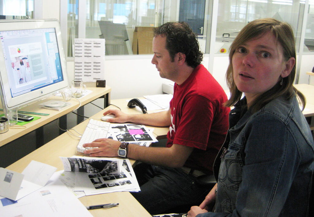
Behind the scenes: Watching and guiding the imperturbable DTP specialists Sebastiaan Lenting and Alex Huizinga at MarneVeenstra.
My Graphic Groningen was a manageable world. A legendary printing house that certainly must be mentioned is Drukkerij Kemper in the Groningen city center, the company of the always optimistic Joop Kemper. At Joop’s, more was possible and allowed than elsewhere. A lot went wrong, but it always turned out right, often at the last minute. Many recently graduated colleagues in Groningen and I were able to discover the possibilities and limits of graphic production here through trial and error.
Drukkerij Van Liere in Emmen, the regular printer for the Noorder Dierenpark, was a reliable daily partner for forty years as well as a generous sponsor and printer of our diaries. Grafische Industrie de Marne, owned by Guus Sligter, was a solid, no-nonsense Groningen company located beneath the Wadden Sea dike. Driving to Leens in a convertible, taking the back roads through the Groningen Hogeland, was always an added pleasure.
And then there was Fotozetterij Baptist, Albert Pijper Repro, Repro de Poel & Co, Reproform, Letter & Lijn, Arfo, bookbinding company Witlox owned and run by Jan Perdok, B&L and CE Couriers. Thanks to their dedication and flexibility I was able to do my work.
And last but not least as to commissioning: schoolbook publisher Wolters-Noordhoff. With Head of Design Alje Olthof and subsequently Ans van Genderen. A professional client who employed many freelancers in Groningen.
Bart Kootstra visiting Groningen. In Geja’s classroom at Minerva in 2024.
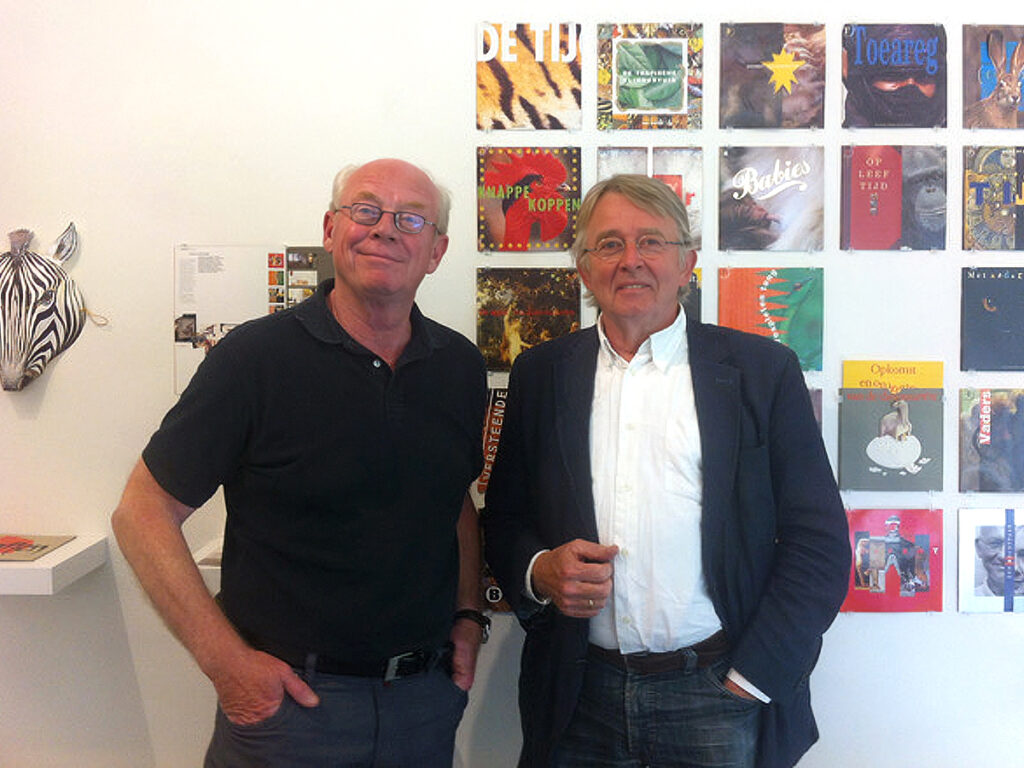
With André van Liere, printer.
Local hero
Although I live and work in Haren/Groningen in the north of The Netherlands I have never considered myself a regional designer. I also found my sources of inspiration, design heroes and clientele outside the region and the Netherlands. But looking back, there are quite a few regional projects and organizations that I gave a face to. When I left home I regularly came across my own work. On facades, bus shelters, signs, vehicles, in bookstores or on newsstands.
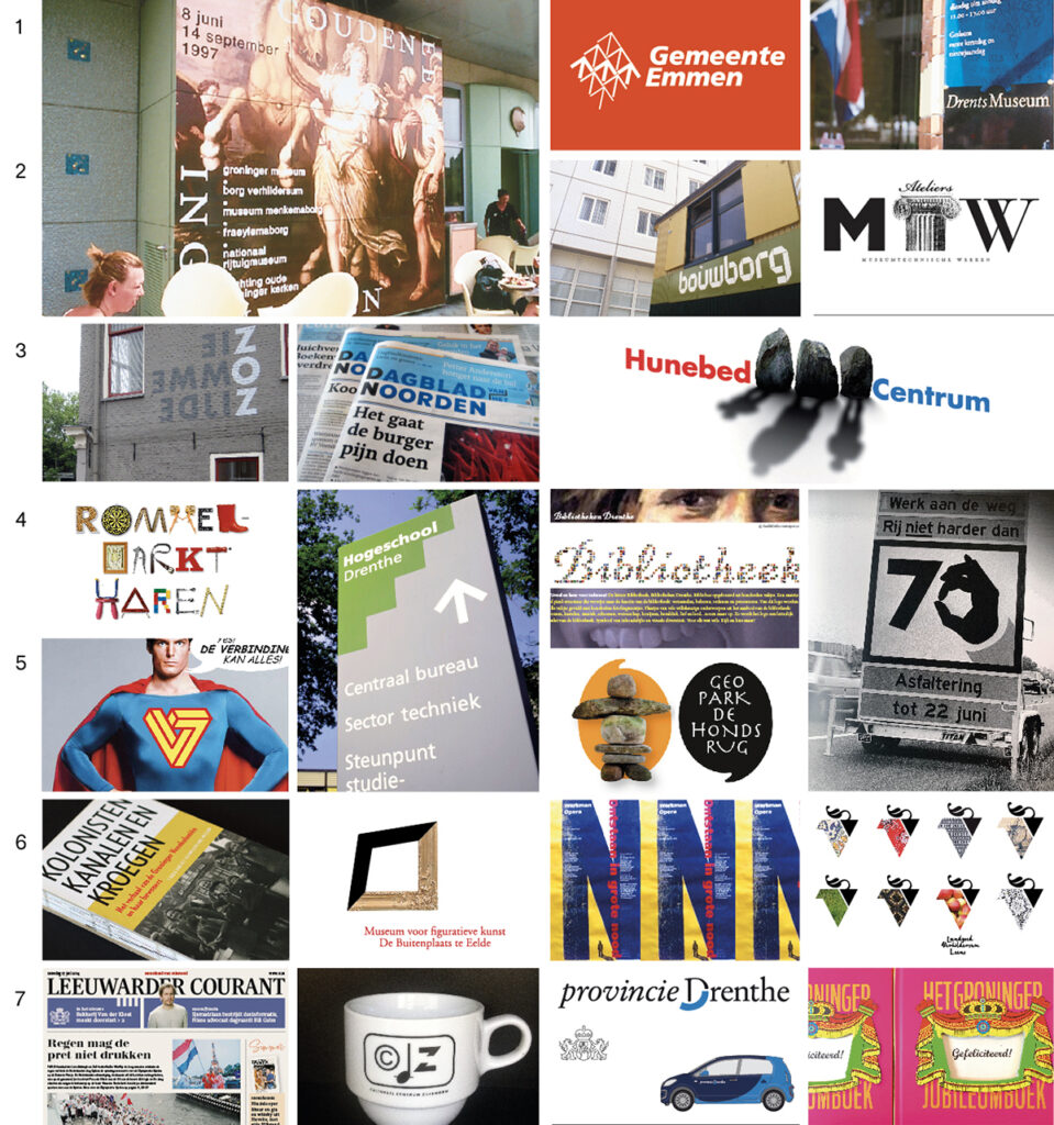
Selection of corporate identities and publications of northern organizations: 1 Golden Age in Groningen, Groninger Museum / Municipality of Emmen Corporate Identity / Drents Museum Assen Corporate Identity – 2 Corporate Identity Construction Company Bouwborg, formerly Poppema, Groningen / MTW Studios Corporate Identity, Groningen – 3 Corporate Identity Event Organization ZOZ, Groningen / Basic Design Dagblad van het Noorden / Corporate Identity and Interior Design Hunebed Centrum, Borger – 4 Logo Thrift Store Haren / Corporate Identity Drenthe University of Applied Sciences / Corporate Identity Libraries in Drenthe / Mobile Warning Signs National Motorways Groningen – 5 Corporate Identity De Verbinding Carpentry Factory, Groningen / Geopark de Hondsrug Logo – 6 Publication Veenkoloniaal Museum, Veendam / Corporate Identity Museum de Buitenplaats, Eelde / Poster Opera N.H. Werkman / Corporate Identity Verhildersum Estate, Leens – 7 Basic Design Leeuwarder Courant / Corporate Identity Cultural Center Zuidhorn / Corporate Identity Province of Drenthe / Groningen Jubilee Book.
“Staal and Duiker have left their mark on the North, making the North a little more beautiful. After all, the designs are beautiful, but just as characteristic is the fact that beauty never gets in the way of practicality. And that is what we like here.” – (From the jury report for the awarding of the Dagblad van het Noorden Prize 2005)
Decoupling
In 2014 we discontinued the Staal & Duiker partnership. Geja became increasingly absorbed by her teaching position at Academie Minerva, which had started as a side job. Margriet and I made plans to partly live in Potsdam (Germany) to get used to a calmer life in between assignments.
However, my need to distance myself from the practice was also prompted by a changing work climate. What made my work in Emmen and the newspaper world successful and pleasant was that I always sat down with the decision-makers there. I worked in close consultation with editors-in-chief and management who were very much committed to their newspaper and company. That way you would quickly agree on the main lines and build the new product together. Design was ‘Chefsache’.
That changed when I increasingly had to deal with a Communications Department, mostly staffed by young people working part-time who, lower in the pecking order, were not allowed to make any decisions themselves and at the end of a meeting they would cheerfully say: “We will include your proposal in our decision-making and let you know what we think of it afterwards.” Design was delegated and decision-making was democratized.
For me that degradation of my profession was deadly and usually a reason to quit.
My final assignment was the redesign of the regional daily Friesch Dagblad, carried out in phases during the period 2021-2023. A project that I managed from Potsdam during the implementation phase and partly thanks to my colleague Corné van der Horst, whom I brought in as my boots-on-the-ground at the editorial office in Leeuwarden, it proceeded smoothly and quickly. A pleasant project, not least by the involvement and infectious enthusiasm of editor-in-chief Ria Kraa.
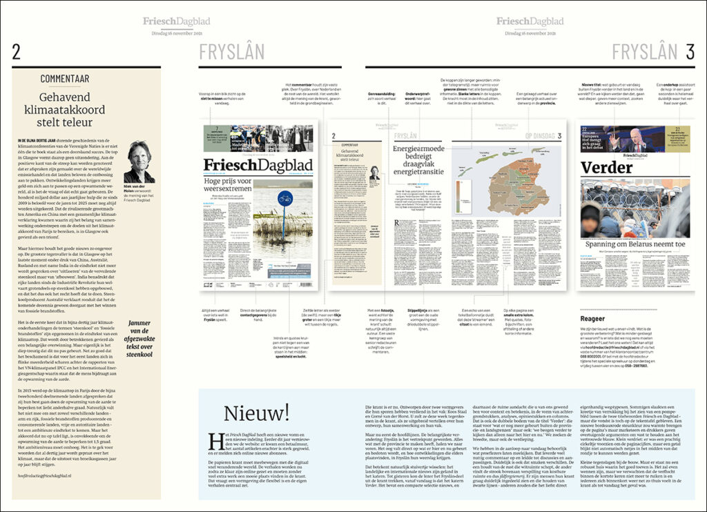
resentation of the renewed Friesch Dagblad to the readers.
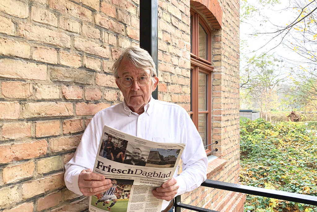
Probably the only reader of the Friesch Dagblad in Potsdam.
The completion of this, fifty years after I got off the bus in Emmen with my portfolio, seemed like a good moment to declare myself retired.
To announce my farewell to active design practice to my contacts I wanted, surprise, surprise, to create a book: not a retrospective of masterpieces from my career but a general illustration of what graphic design is and what it can achieve.
Years ago I had put out a call among colleagues and friends to send me photos of – whether striking or not – male/female pictograms on toilet doors. Thus, a curious collection steadily grew. Initially I had no idea what to do with them but now it seemed like a good opportunity to showcase those pictograms as a metaphor for graphic design.
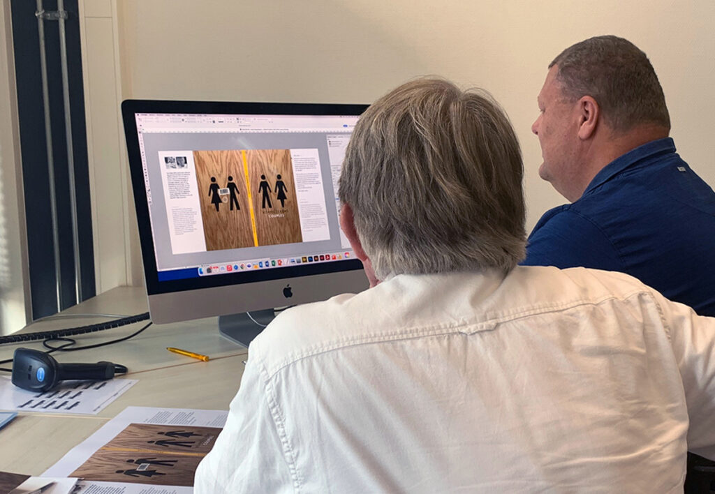
So I designed the book ‘Couples’. Twelve chapters of male/female images show how you can answer the same question visually in many ways. That is where the richness and pleasure of graphic design lie.
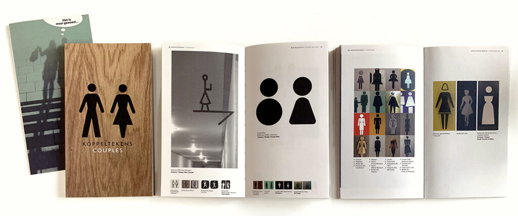
Late 2023, farewell to active design practice with Koppeltekens/Couples.
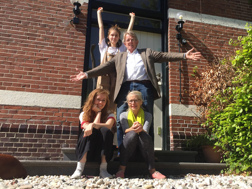
I am now a retired graphic designer. I only work on self-initiated book projects and I am Chief Logistics Officer for the Stalinskis, our two daughters who both work as independent illustrators. In them I recognize important elements from ‘my’ life as a designer: the combination of talent, hard work, ambition and a bit of luck.
I lacked none of the four, but certainly not the last one.
Note*
I was born in the East Groningen village of Meeden in 1951. My father ran our bakery, my mother the shop and in between we lived as a family. It was a happy childhood for a child who loved to draw, was fascinated by illustrated books and later, as a teenager, by the bold design of Hitweek. The fact that I signed up for a correspondence course in lettering at the age of fifteen can now be seen as a premonition…
Koos Staal
born on 25 June 1951, Meeden
Author: Koos Staal, juni 2026
Final editing: Sybrand Zijlstra
Portrait photo: Aatjan Renders