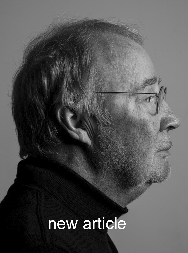
‘In fact, I’m still painting – only now with images and typography’
Ton Homburg (1952) has been working as a graphic designer for almost fifty years, yet still feels, at heart, something of a painter.
How does that work?
Since studying at the St Joost Academy in Breda, Ton has worked on a wide range of graphic design commissions. For him, every assignment begins with an interest in the people who approach him, who ask him something: what drives them, and what can he learn from them? Creating something is a shared process of discovering. Ton is stimulating, critical and slightly mischievous, never merely servient. He seeks sustainable, meaningful collaborations that go beyond a final product: loyalty between designers, clients and the graphic industry. For him, it is all about creating added value.
He rarely looks back. Ton works in the present, for tomorrow, always moving on to the next project. He has no need for the spotlight, nor for lectures or speeches. He prefers to let his designs speak for themselves. With clients, friends and colleagues he enjoys sharing thoughts about his work and that of others, preferably over a good meal and a fine glass of wine. Atmosphere and quality matter to him. Joie de vivre in full measure – work and life are one.
Over almost fifty years he has built up an extensive and highly diverse body of work. Time, then, for a ROOTS publication. But let us return to where it all began, in 1971.
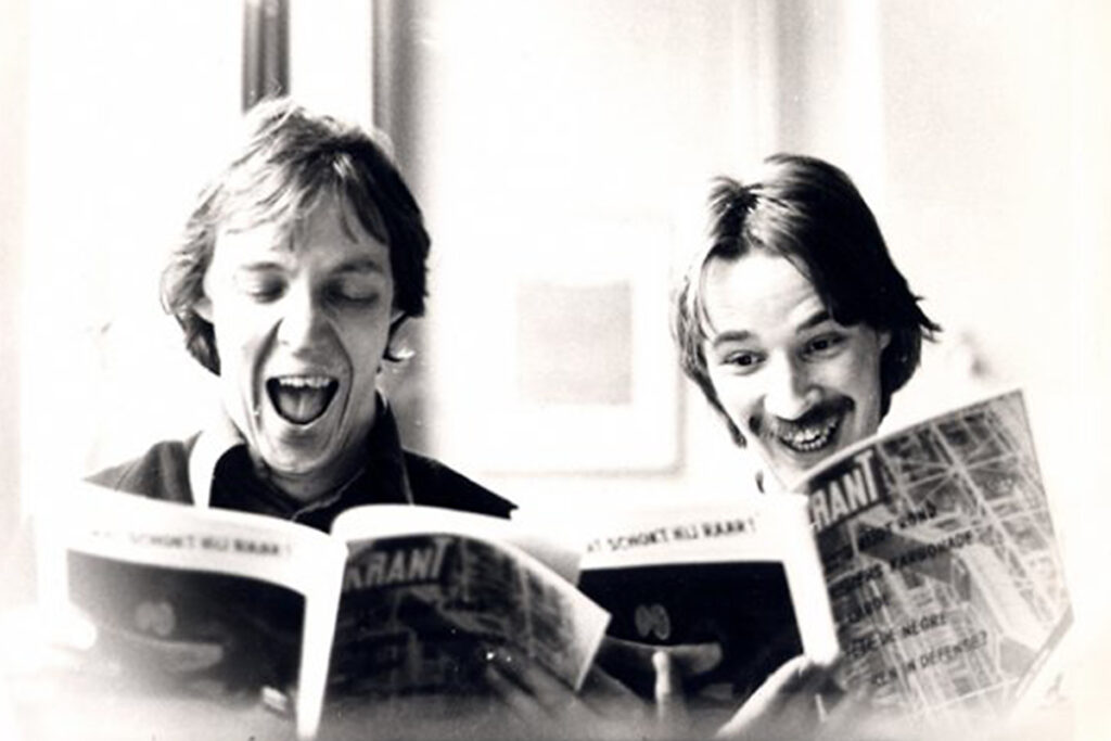
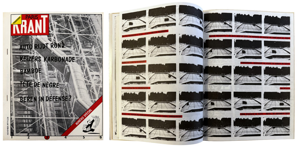
Verkeerde Krant, 1978
Verkeerde Krant is Ton’s graduation project, initiated together with Ko Sliggers.
St Joost
After secondary school and the Protestant Christian boarding school in Culemborg, Ton enrolled in 1971 at the St Joost Academy in Breda. His talent for drawing and painting immediately caught the director’s eye. Despite enrolling far too late, he was admitted to a first-year fashion group — the only place still available.
“I didn’t find that an unattractive condition at all for my first year,” Ton recalls with a smile. “Because at the end of that year I could simply transfer to Painting.” His love of drawing and painting had been nurtured by his father, who, after returning from the Dutch East Indies, discovered drawing and painting during a stay in a sanatorium.
St Joost is also where Ton and I, René Pijnenburg, first met – around 1976. We studied in different departments, but music, design, architecture and the student club brought us together. For Verkeerde Krant, Ton’s rebellious graduation project, I wrote as Correspondant à Paris. After countless collaborations, conversations and a long friendship, a request to write for ROOTS feels entirely natural.
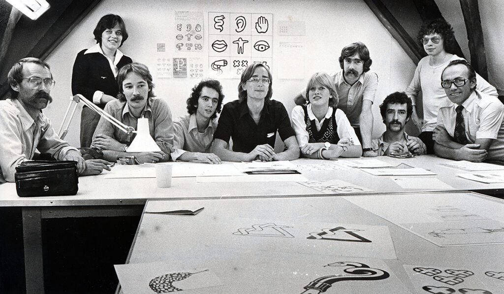
Medical Congress, 1976
Projects outside the academy play an important role in the curriculum at Sint Joost. In 1976, Ton’s entire year group worked on the identity and communication for an international medical congress in Breda. The project demonstrates how design education and professional practice can intersect productively. From left to right: tutor Henk Cornelissen, Marie Claire van der Steen, Ton Homburg, Pleun Vos, Cook Kouwenhoven, Leontien Hooij, Jan Vervest, Jan Carlier, Jos Brombeek and GP Dr Enneking.
From painter towards designer
From the outset, Ton knows he wants to become a painter. Picasso, Man Ray and Kurt Schwitters are key inspirations, not only because of their work but also because they never confined themselves to a single medium.
Ton’s studies at St. Joost would last seven years, and for good reason. In his fourth year in Painting he wants to experiment with typography in a series of silkscreen prints. His painting tutors are less than enthusiastic, but type designer and typographer Chris Brand, a lecturer in Graphic Design, in contrary very much is. Brand embraced Ton’s ideas and introduces him to the work of Jan Tschichold, Piet Zwart and Paul van Ostaijen. Die Neue Typographie and Pioneers of modern typography are a revelations to Ton: this is another way of doing things, taking freedom, breaking rules, painting with typography.
Encouraged by Brand’s teaching and by lively discussions with fellow student Gerard Schilder, Ton switches in 1975 from Painting to the third year of Graphic Design. He believes that, even within commissioned work, he will find greater freedom and autonomy there. Brand, along with design tutors Jan Begeer, Wim Smits and Henk Cornelissen, quickly teach him the necessary technical skills, but above all how to ask the right questions: what do you want to express, and why? For whom? In what context? And which forms and media are appropriate? Designing is less about style than about fully inhabiting an assignment. What do content, constraints and context evoke in a designer? How can you co-create meaning? And which outcomes logically follow from that?
When a planned internship unexpectedly falls through, Ton is offered the opportunity to gain experience at established studio of his tutor Henk Cornelissen and Karel Kruijsen. For his graduation project (1978) he produces three complete issues of Verkeerde Krant. Ko Sliggers, who would graduate a year later, is his close ally.
‘Those were wonderful years. I may well have been studying during one of the finest periods in the history of the Academy St. Joost. Teachers and students collaborated, even across departments. We worked incredibly and had a great deal of fun doing so.’
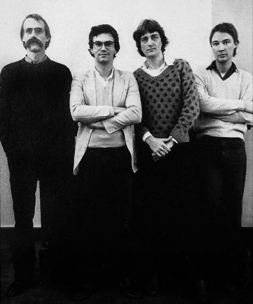
Cornelissen & Kruijsen, 1977
Group photograph from 1977 featuring Henk Cornelissen, Karel Kruijsen, Frans Bevers and Ton Homburg. The studio plays a crucial role in Ton’s development as a designer.
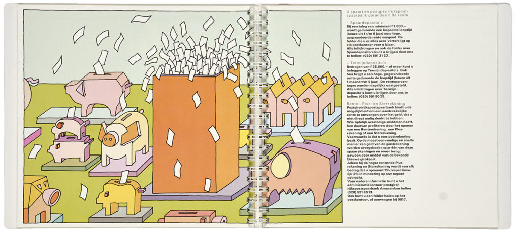
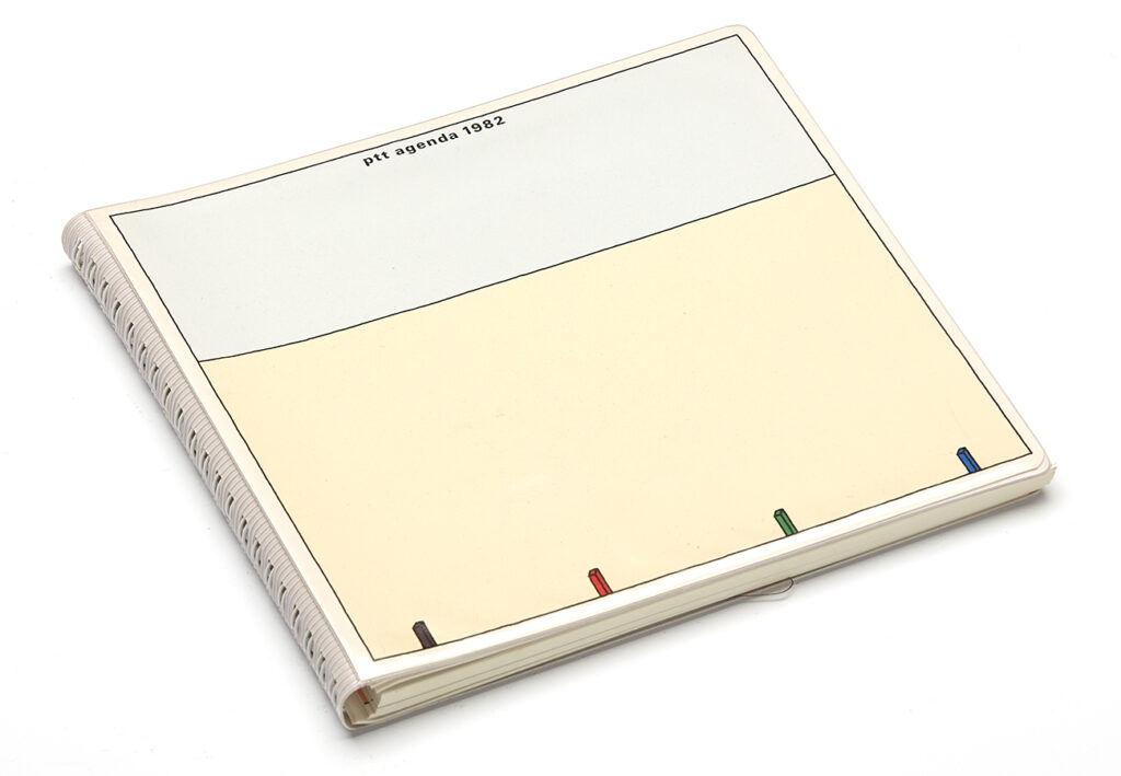
PTT commissions, 1980–1982
In the 1980s, the PTT’s Department of Aesthetic Design is a major client for designers. Cornelissen & Kruijsen receive the commission for the prestigious PTT office diary for two consecutive years. For the 1982 edition, Ton designs all image pages, adopting a lightly ironic, illustrative approach.
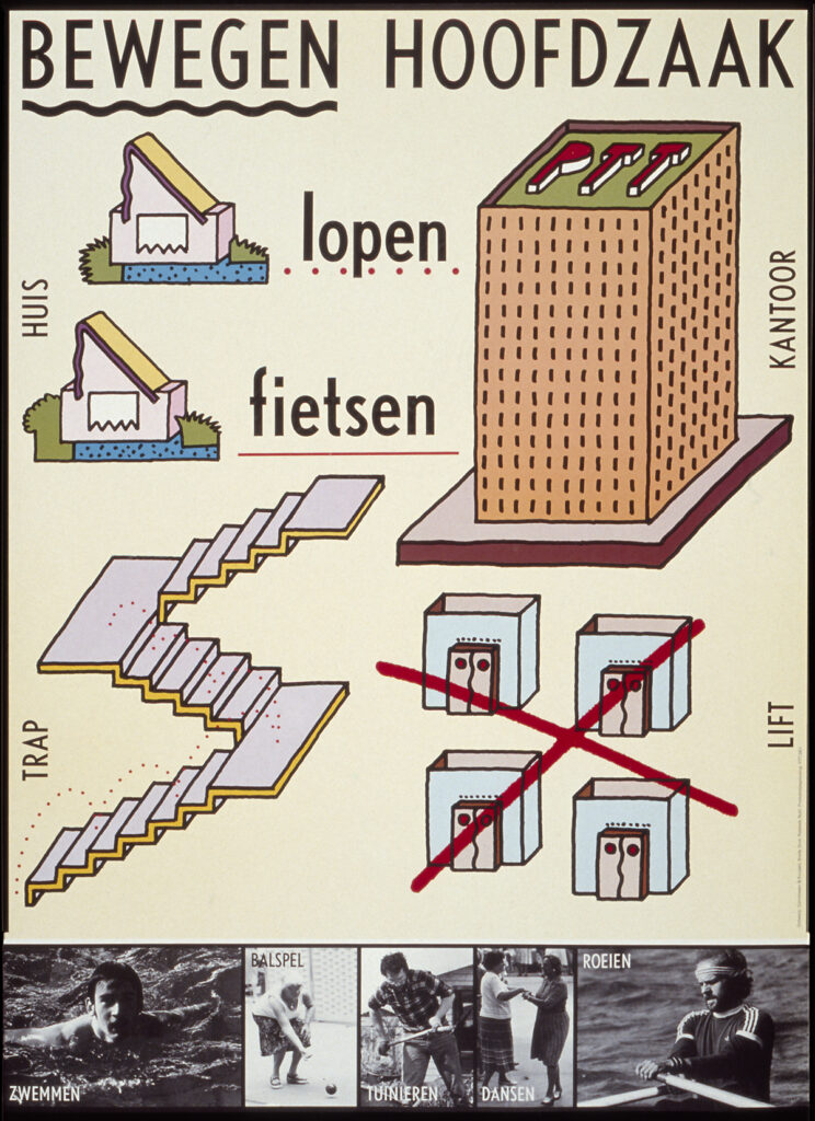
Bloomfield & Travis, 1978
Through his passion for music, Ton is introduced by Karel Kruijsen to the London design studio Bloomfield & Travis, renowned for their work for Island Records. He designs, among other projects, the Fruit Tree box set for Nick Drake and record sleeves for various artists. A sleeve for Cat Stevens is enriched with a gold border which, despite objections due to longer drying time, is produced exactly as Ton envisioned.
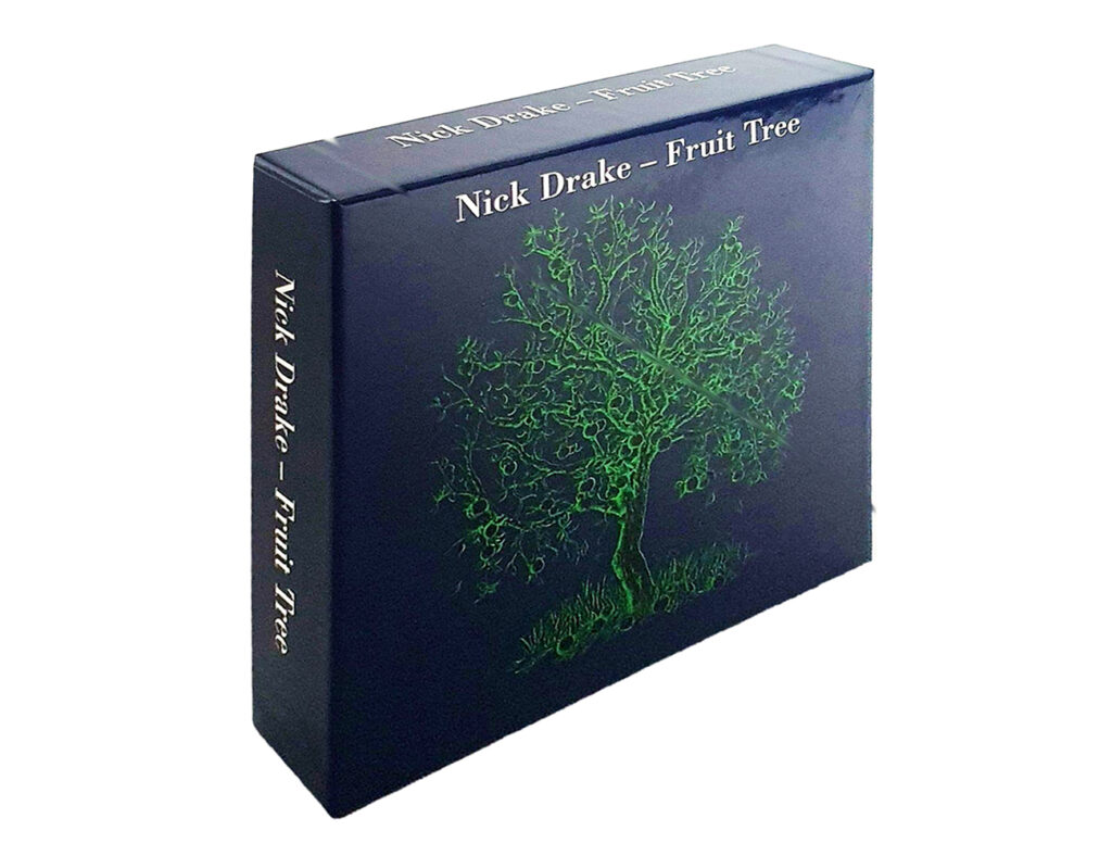
After graduating, Ton leaves for London to work at the studio Bloomfield & Travis. He designs for Island Records, including the Fruit Tree box set by Nick Drake (1979) and album covers for Bob Marley and Cat Stevens. He is then invited by Studio Dumbar in The Hague to join as a designer, working alongside Michel de Boer and fellow student Ko Sliggers. These are passionate years, the early days of the studio, with international clients and groundbreaking projects. Ton contributes to the PTT corporate identity and handbook and he designs, together with Gert Dumbar, the poster Dutch Design for the Public Sector. In 1979 he returns to Cornelissen & Kruijsen, where he spends another four years working on commissions for PTT, posters, printed matter, books and various corporate identities.
Time for his own studio
Over the years Ton’s love for cultural commissions grows: working with artists, theatre makers and musicians. Small budgets, great opportunities. He designs posters for performances by Moniek Toebosch and Michel Waisvisz, and the identity and catalogues for gallery The Living Room in Amsterdam. Wanting to determine his own course, he starts working as an independent designer.
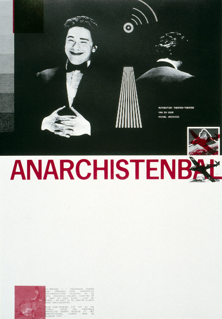
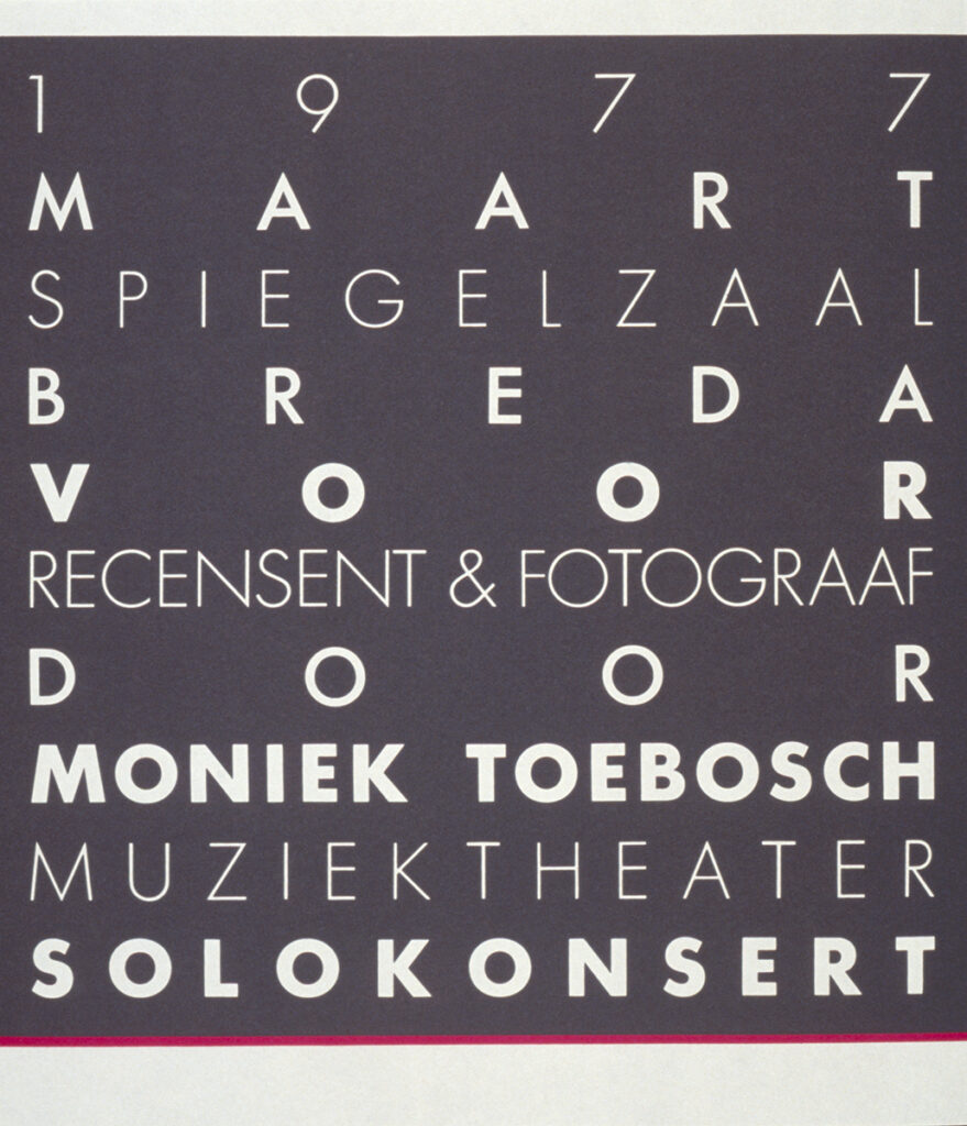
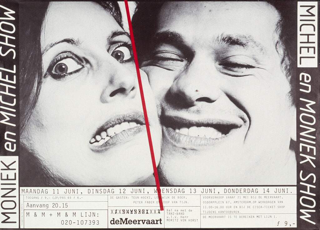
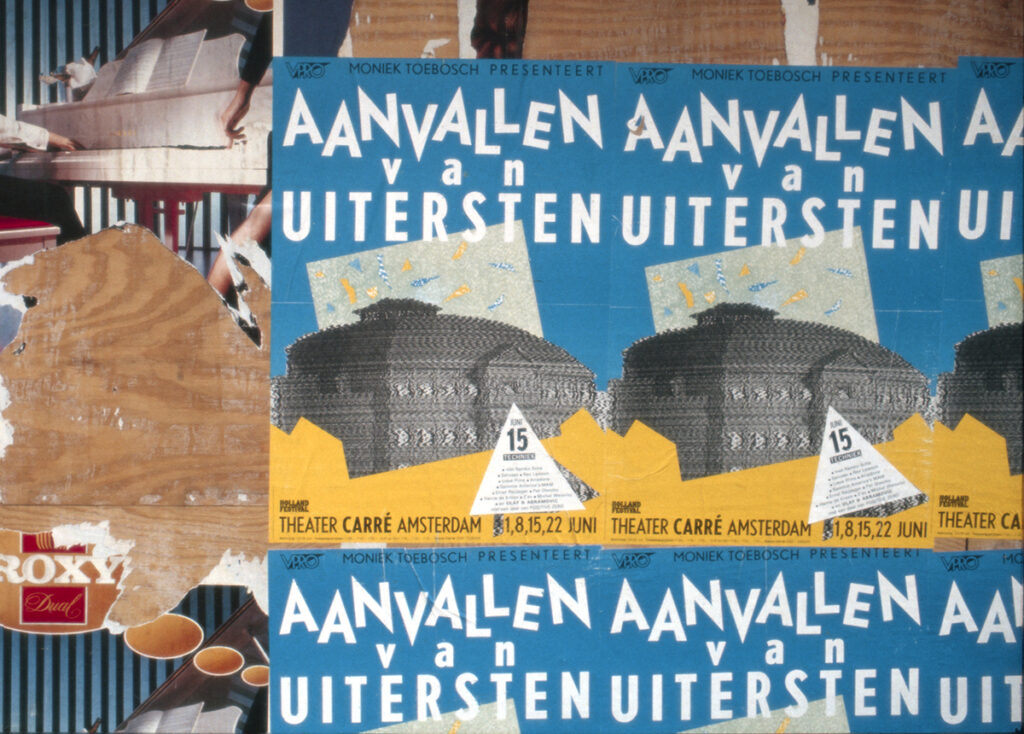
Posters for Moniek Toebosch & Michel Waisvisz, 1977–1982
Ton meets Moniek Toebosch at Sint Joost, where she studies fashion illustration and is already developing as a performer. During his internship at Cornelissen & Kruijsen, he designs her first poster in 1977 for a performance with only two attendees: the critic and the photographer. Many posters follow for Toebosch and her performance partner, musician Michel Waisvisz. The poster for Aanvallen van Uitersten (Holland Festival, 1983) visualises the destabilising nature of a series of four live television broadcasts from Theatre Carré.
OPERA
In 1981, while still at Cornelissen & Kruijsen, Ton co-founds OPERA together with the author of this ROOTS publication and Frans Bevers. Initially, OPERA serves as a vehicle to present competition entries and self-initiated design projects. When Studio Alchimia in Milan picks up their work, recognition grows so quickly that it is decided to use the name OPERA for two collaborating design studios: OPERA Spatial Designers and OPERA Graphic Designers, housed under one roof on the Baronielaan in Breda. After a few years, Marty Schoutsen joins Ton’s studio in 1989, following an internship at OPERA and the completion of her Graphic Design studies at the academy in Den Bosch. They soon become partners in both work and life.
For both studios, the 1980s are formative years in which they develop their identities as designers. They position themselves as specialists in their own domains, but also as designers unafraid to cross disciplinary boundaries. The studios work independently, yet collaborate when projects require it. Graphic eyes engage with space, and vice versa; working across disciplines is part of their DNA.
This results in notable projects such as the architecture exhibition De Collectie in the former departure hall of the Holland America Line, and the reconstruction of Café De Unie in Rotterdam (1986). The original café, designed in 1925 by architect J.J.P. Oud, had been completely destroyed in 1940. The spatial designers are commissioned to design the interiors of the new restaurant, theatre and offices behind the façade. Ton and his team design all graphic applications and reconstruct the iconic façade typography. In 1998, OPERA spatial designers moved to Amsterdam. OPERA graphic designers remains in Breda, from 1999 onwards in the same inspiring studio space in the Leistraat, slightly removed from the bustle. The two OPERA studios continue to collaborate for many years, producing exhibitions and publications for institutions such as the Victoria & Albert Museum in London and contributing to the complete renewal of the National Museum of Ethnology in Leiden, including signage, logo and identity, website and numerous catalogues.
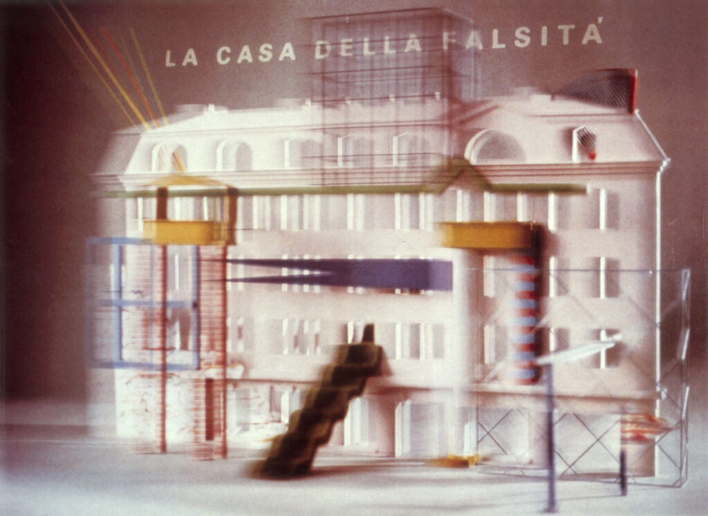
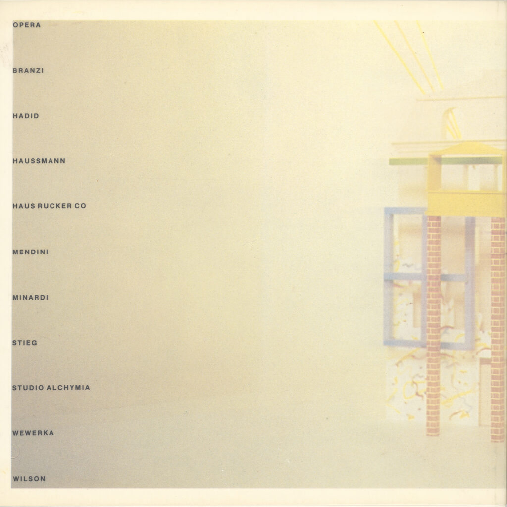
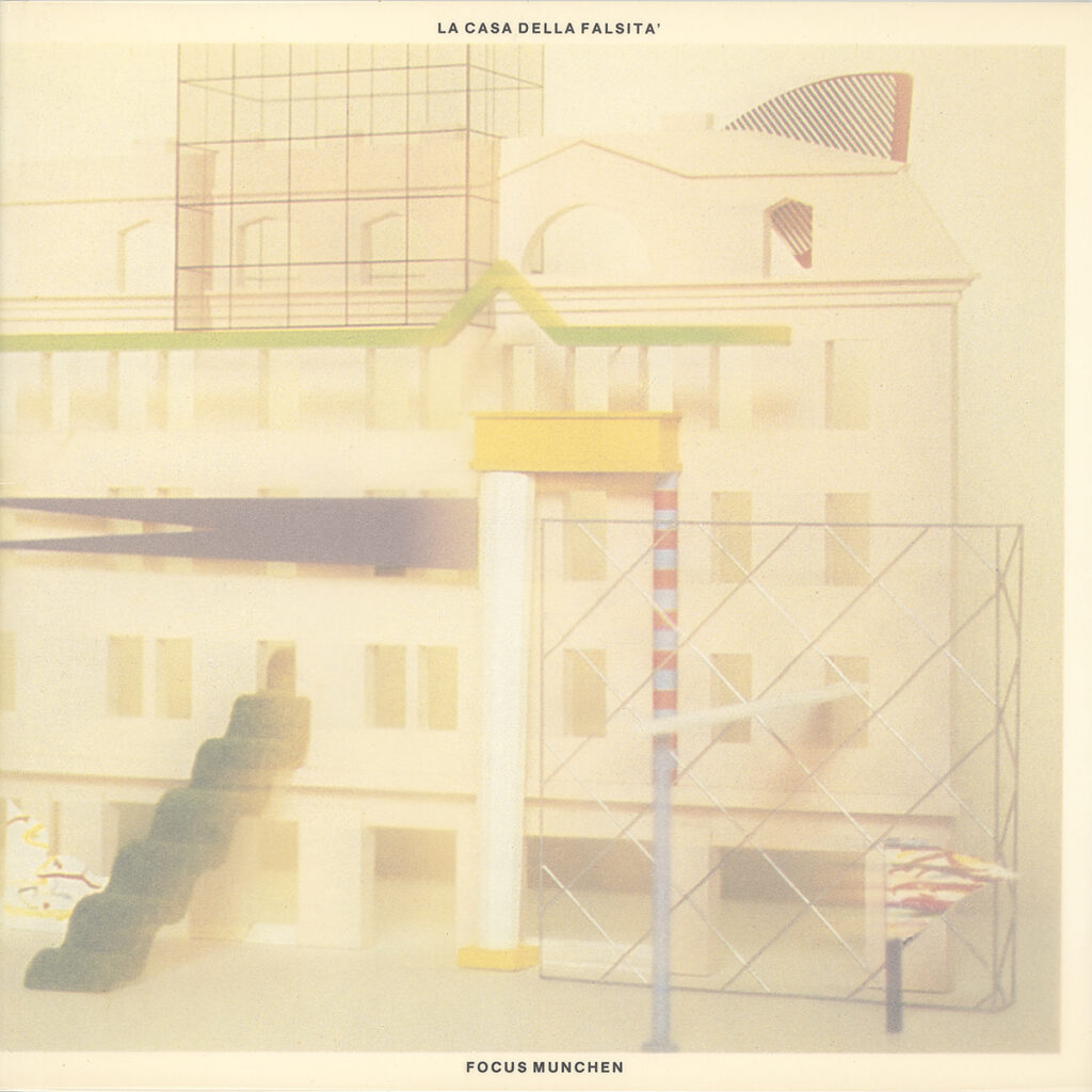
La Casa della Falsità, 1982
The exhibition La Casa della Falsità originates from a conflict surrounding the renovation of Focus Gallery in Munich. Young international architects, including Andrea Branzi, Haus-Rucker-Co, Zaha Hadid, Peter Wilson, Stefan Wewerka, Bruno Minardi and Alessandro Mendini, are invited by Alchimia Milan to design proposals for the gallery around the theme of deception or falsehood. Following a meeting with Alchimia in Breda, Ton Homburg, Frans Bevers and René Pijnenburg are asked to design the poster. They designed a spatial-graphic image in which the gallery façade is ‘falsified’ by incorporating stylistic features from all the participants and being rendered out of focus. This idea was carried through into the object with which they also contributed to the exhibition and into the design of the catalogue. The travelling exhibition and Opera’s work attracted considerable international attention.
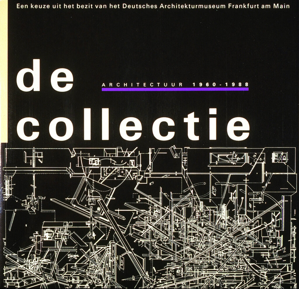
De Collectie, Rotterdam ’88
This exhibition presents the complete collection (1960–1988) of the Deutsches Architekturmuseum Frankfurt. For some time, parts of the collection had been travelling internationally before being brought together in Rotterdam for the first time. Models, drawings and archival materials outline the development of post-war architectural thinking. OPERA spatial designers are designing the exhibition; Ton and his studio are responsible for all graphic elements, accompanying printed matter and the catalogue. A long corridor visualises the concept of the museum, while the open cage-like structures in which the works are displayed emphasise the travelling nature of the collection.
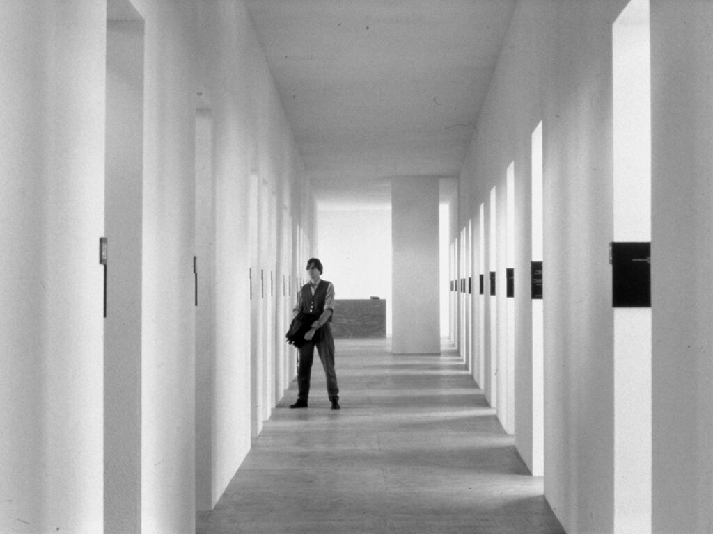
Ton and his studio remain closely connected to the cultural sector, while recognising that commissions from the business world and the public sector are essential to sustain that work. OPERA designs corporate identities, books and catalogues for, among others, Lensvelt, the Municipality of Rotterdam, Museum Van Bommel Van Dam, Museum of Contemporary Art Den Bosch, the Rijksakademie Amsterdam and Witte de With in Rotterdam, and develops the full branding for the new furniture label HIDDEN.
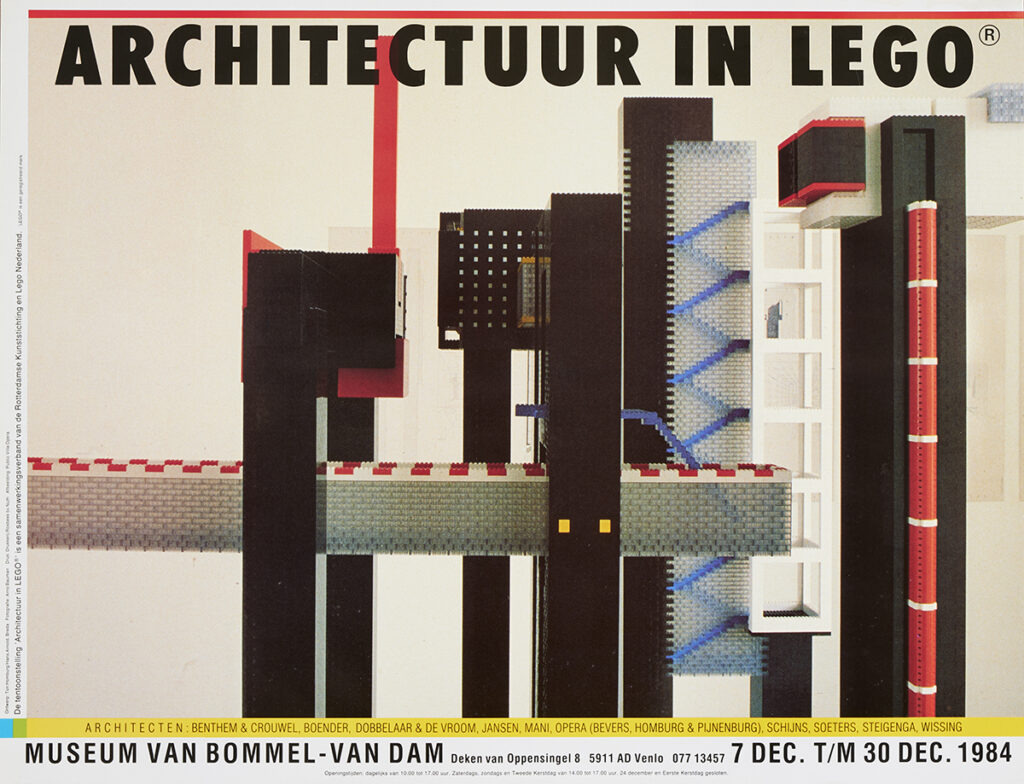
Architecture in Lego / Public Villa, 1984
At the invitation of the Rotterdam Arts Foundation, Bevers, Pijnenburg and Homburg design a Public Villa. The Lego object functions both as an architectural scale model and as a play object for children. The concept enables people to temporarily enjoy the amenities of a private villa, such as a swimming pool or library, high above the city. Alongside the model, a series of architectural drawings is presented and the poster for the exhibition is designed. A portfolio of screen prints by all participating architects and a catalogue are published. The exhibition tours Europe and receives extensive media coverage. In 1993, the Public Villa is again shown in High, Low and Inbetween – 10 Years of OPERA.
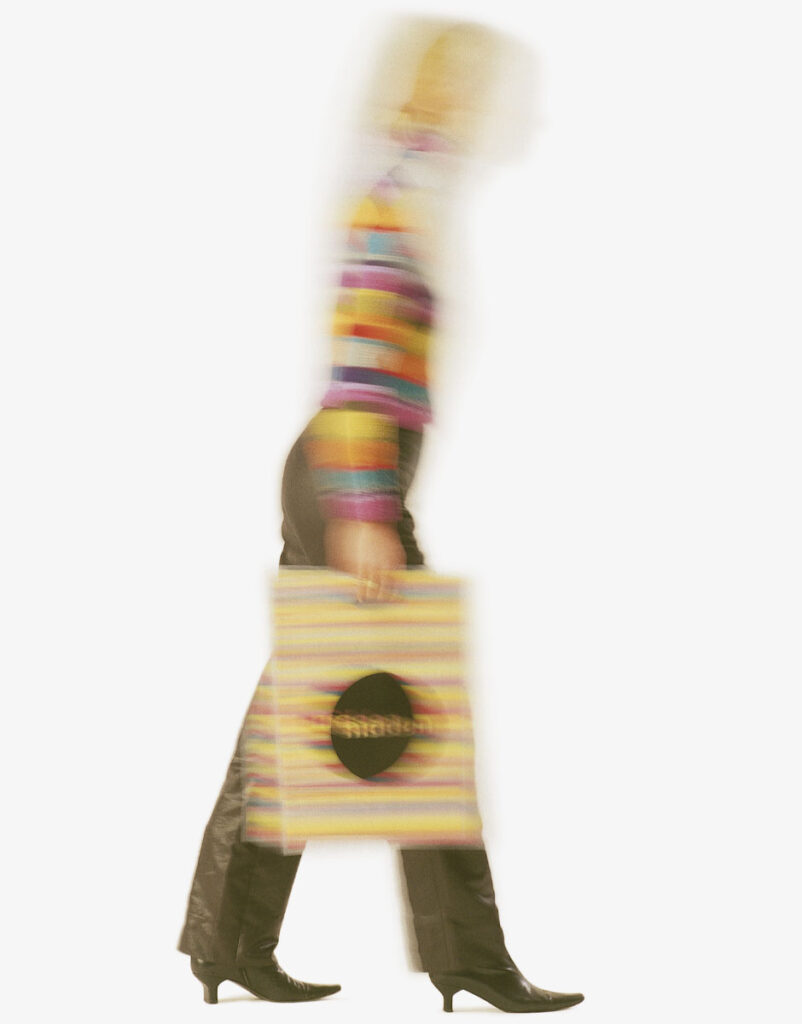
Hidden Unveiled, 2005
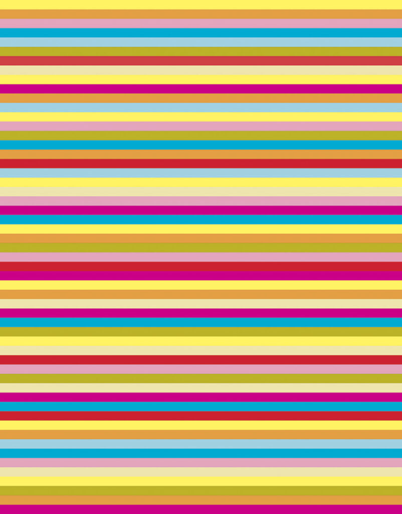
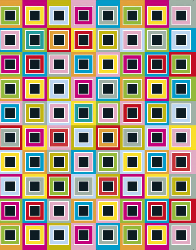
For the Dutch furniture brand HIDDEN, the studio has developed a striking visual identity, which the brand uses to present itself at major international furniture fairs. A black circle featuring the logo contrasts with colourful patterns in the catalogue, stand design and printed materials. Clever details, such as handles in catalogues and transparent bags, ensure that the eye-catching imagery is widely disseminated on the exhibition floor. Visitors thus become unwitting ambassadors for the brand.
At the same time, posters are created for Het Zuidelijk Toneel (with Erwin Olaf), publications for the Rotterdam Arts Foundation, and the visual identity for Muziekgebouw aan ’t IJ. The constantly evolving designs for Het Apollohuis intelligently establish a highly recognisable identity. Magazine concepts for ITEMS, FRAME and De Architect are designed to be instantly recognisable without overpowering the content. For museums in the Netherlands and abroad, OPERA designs logos, posters, catalogues, signage, exhibitions and presentations.
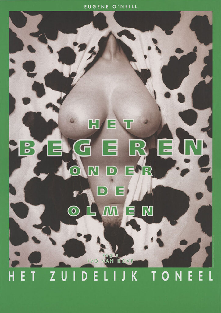
Het Zuidelijk Toneel & Erwin Olaf, 1991–1995
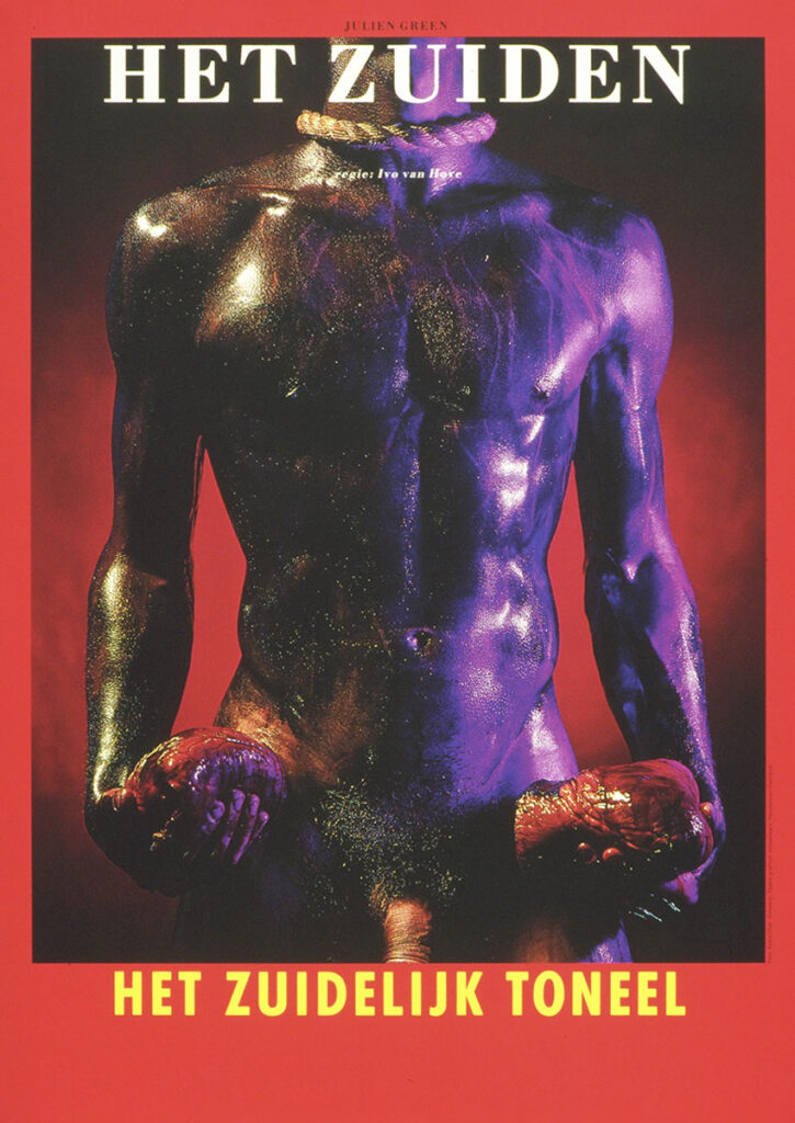
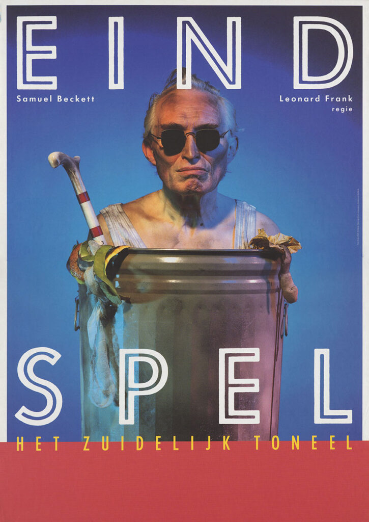
In the early 1990s, Ton collaborates with photographer Erwin Olaf on the communication for Het Zuidelijk Toneel. A series of posters brings the theatre far beyond the auditorium, generating both controversy and visibility. Olaf’s theatrical tableaux are positioned by Ton within a strict typographic grid, resulting in a performative form of theatre communication.
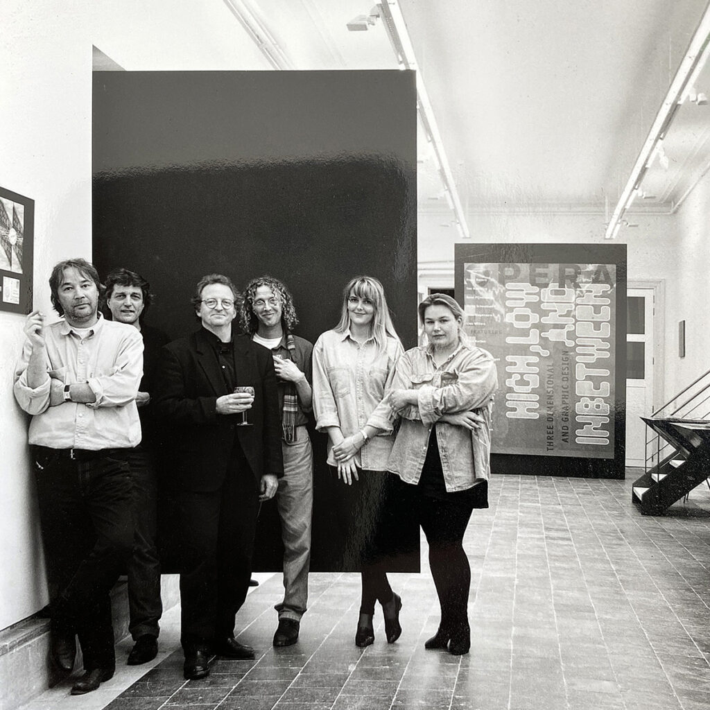
High, Low and Inbetween – 10 Years of OPERA, 1993
De Witte Zaal–Sint Lucas, Ghent / Parsons Gallery, New York, 1993–1994
At the invitation of De Witte Zaal, this exhibition presents ten years of work by OPERA. Alongside an innovative interactive presentation for its time, the work is also shown in analogue form and through numerous slide viewers. Equally prominent are inspiring contributions by artists and designers with whom OPERA collaborated over the years. Part of the exhibition later travels to Parsons Gallery in New York. The title is an homage to Townes Van Zandt. From left to right: Ton Homburg, Frans Bevers, René Pijnenburg, Kees Wagenaars, Marty Schoutsen and Lies Willers.
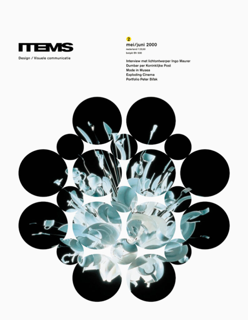
ITEMS, 1997–2003
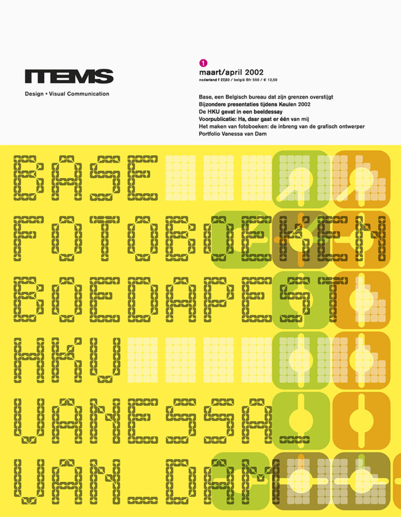
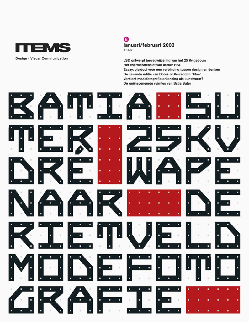
Founded in 1982, ITEMS magazine initially focuses on industrial design and architecture. Over time, its scope broadens to encompass design in the widest sense, serving a growing professional readership. The magazine undergoes frequent redesigns in its early years. From 1997 onwards, Ton becomes responsible for the design. He introduces a playful identity featuring colour, bold typography and a wide diversity of imagery. Around 2000, he radically shifts the visual language to a more restrained editorial design, affecting every aspect of the magazine’s identity — from logo to typefaces and format. Typographic experiments and structures, already evident in the Apollohuis posters, become the cornerstone of the covers. Many covers feature newly designed typefaces and typographic structures. In 2003, Ton hands over to a new generation of designers. ITEMS continues to be published until 2012.
FRAME, 1997–2001
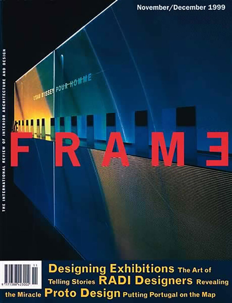
From the outset, Ton is involved in the creation of FRAME, the Dutch international magazine on interior and architectural design, first published in 1997. His contribution to developing the editorial formula naturally leads to the design of the magazine and its visual identity. Covers are characterised by powerful detail imagery and a strongly structured typographic approach. Ton remains associated with the magazine as designer until 2001; it continues to be published worldwide.
National Museum of Ethnology, Leiden (1997–2001)
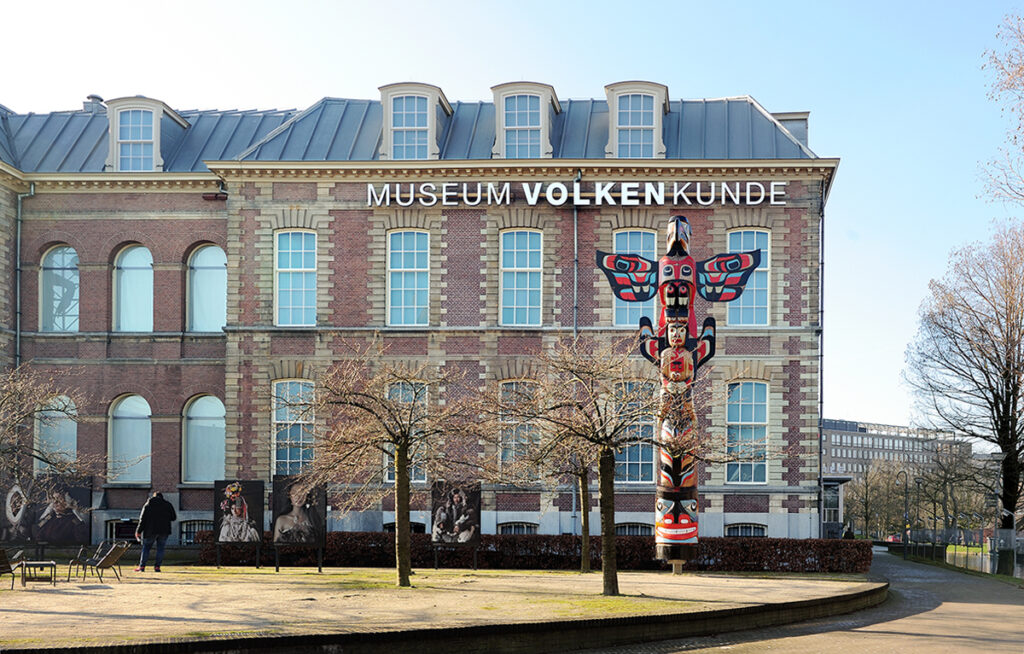
The renewal of the National Museum of Ethnology is a large-scale museum project in which both studios collaborate intensively with museum staff and architects over a three-year period. Through a distinctive design methodology, a coherent museological concept emerges, centred on interwoven cultures and translated into an integrated spatial and typographic design. Ton and his team are responsible for the exhibition typography, interactive applications, the new identity, all printed matter and a completely new website providing access to a collection of over 193,000 objects. The award-winning project is widely published and becomes a springboard for international museum and exhibition commissions.
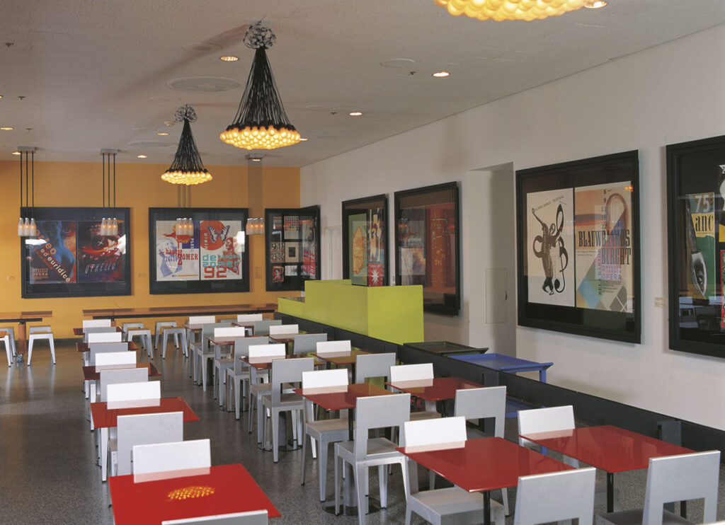

Dutch Design Café, MoMA, 1995
MoMA’s Garden Café is redesigned every three to four years to coincide with major temporary exhibitions. For the Piet Mondrian exhibition (September 1995 – January 1996), the museum commissions a Dutch café. OPERA is asked to design the interior and entrance and invites other Dutch designers to contribute. The Dutch Design Café emerges as a Gesamtkunstwerk of contemporary Dutch interior, industrial and graphic design, making design an integral part of the museum experience.
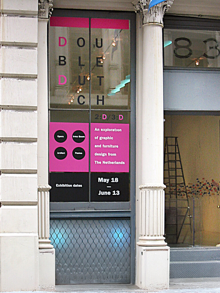
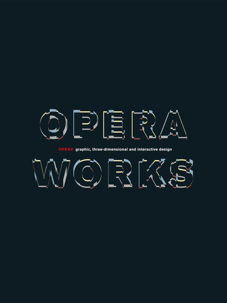
Dutch Design, New York, 2002
Initiated by the Dutch Consulate, a series of events and presentations dedicated to Dutch Design take place across New York between May and September 2002. At Totem Soho Gallery, the exhibition Double Dutch 2:D/3:D features, among others, work by OPERA. On this occasion, the publication OPERA WORKS is released.
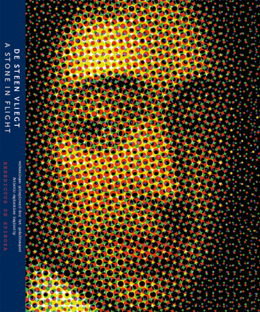
De Steen Vliegt, 1997
For a Spinoza exhibition at Arti et Amicitiae, Ton contributes a portrait of the Dutch philosopher Baruch Spinoza (1632–1677). Constructed as a graphic pattern, the image refers to Spinoza’s lesser-known profession as a renowned lens-grinder. The portrait is used both as the exhibition publicity and as the cover of the accompanying book.
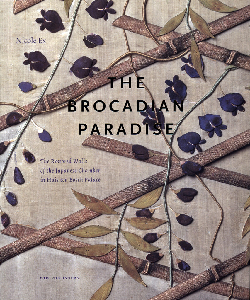
Het Brokaten Paradijs, 1997
This book is published on the occasion of the restoration of the Japanese Room at Huis ten Bosch Palace. It explores the history and significance of the eighteenth-century brocade wall coverings. Years later, the book proves to be a source of inspiration for fashion designer Jan Taminiau for Queen Máxima’s couture gowns — one of which she wears on Prinsjesdag 2015. In this way, the narrative moves from interior and book design to fashion, and from history to the present day.
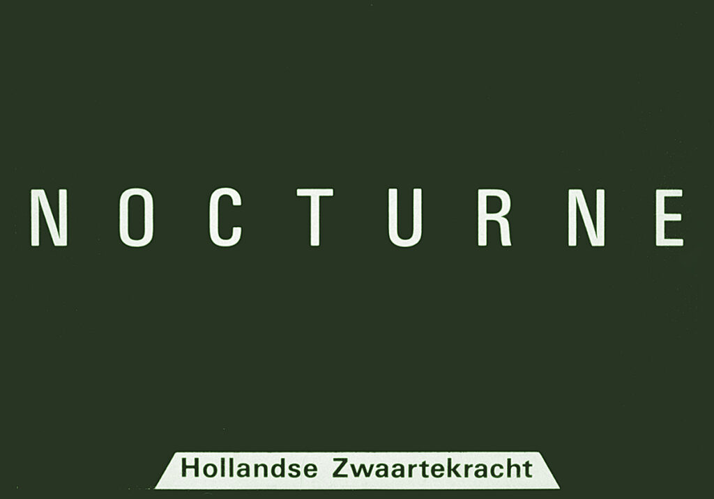
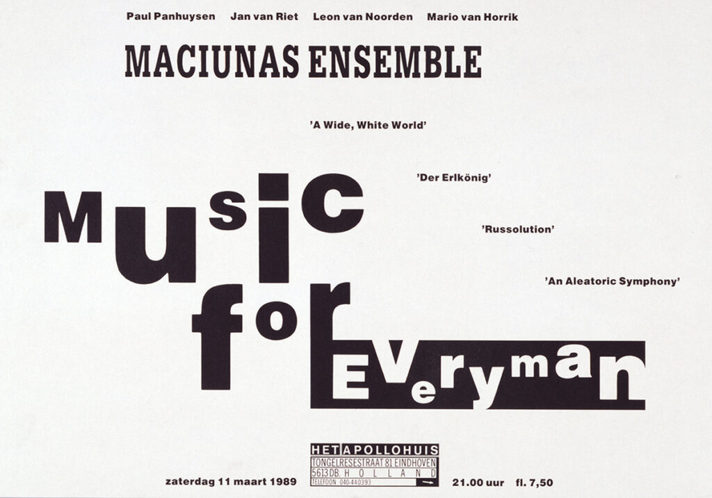
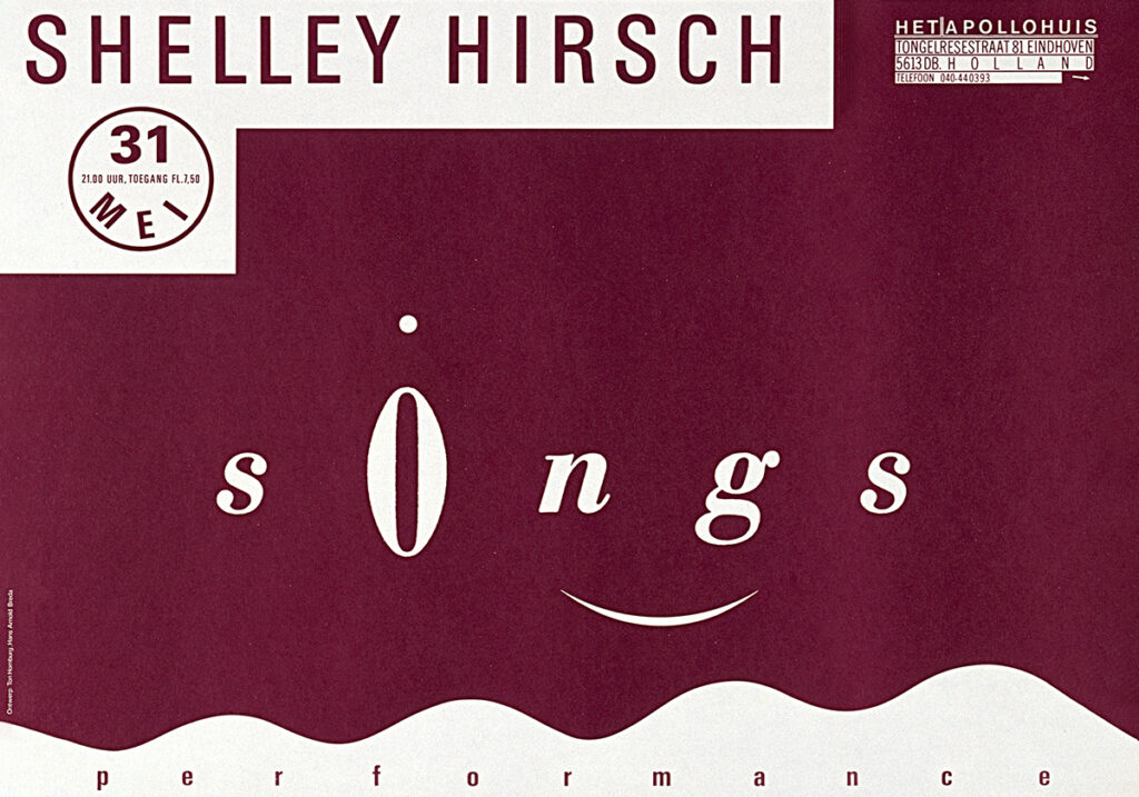
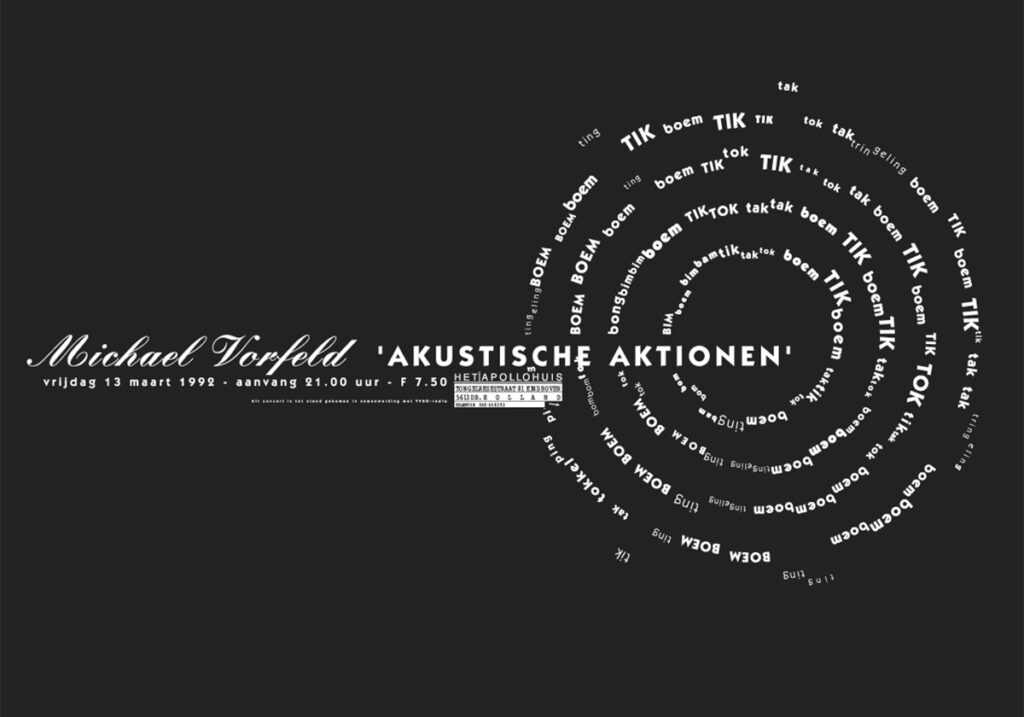
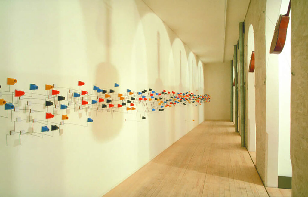
Het Apollohuis, 1980–2002
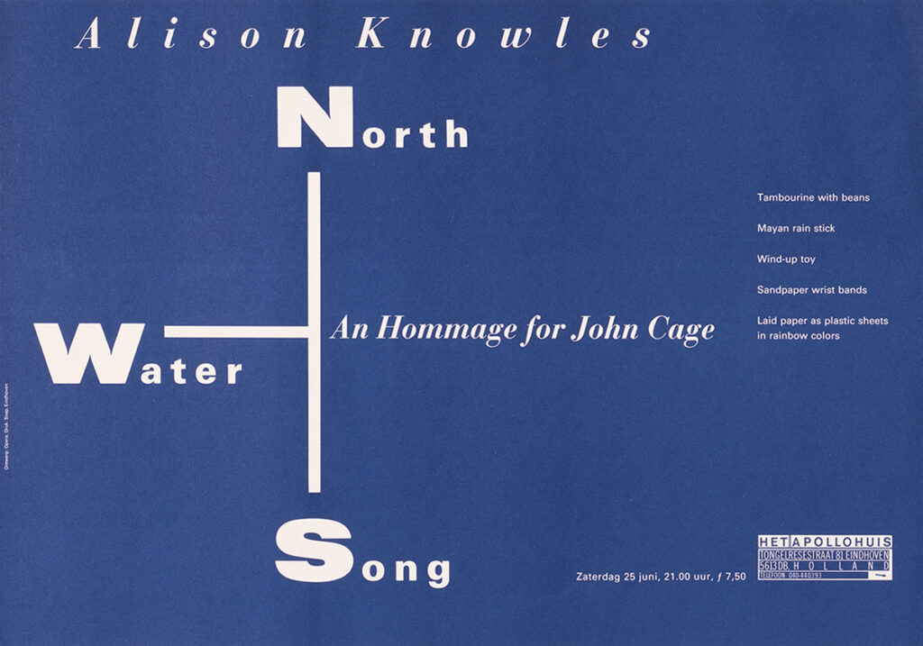
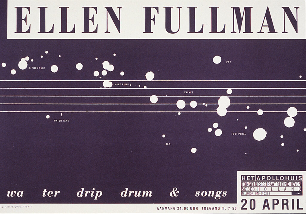
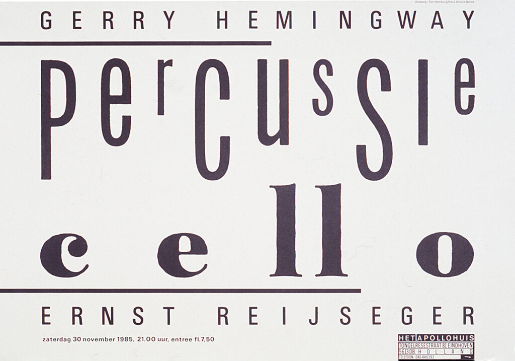
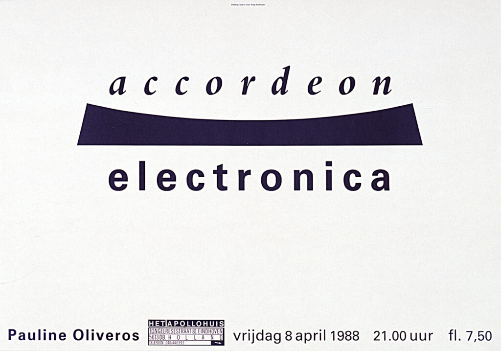
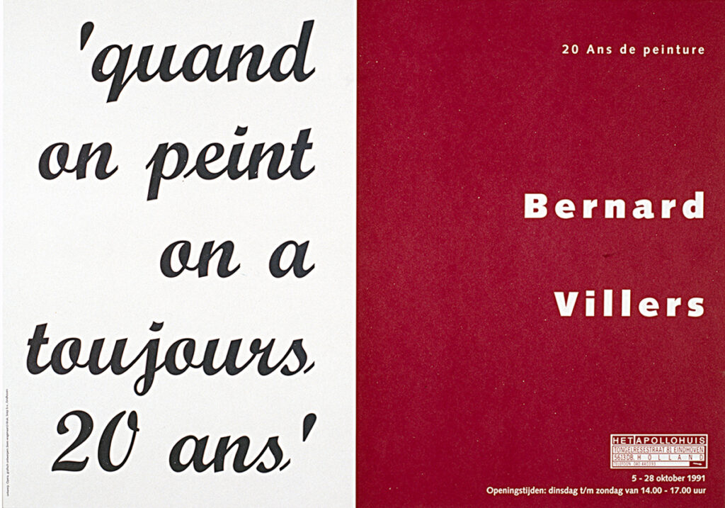
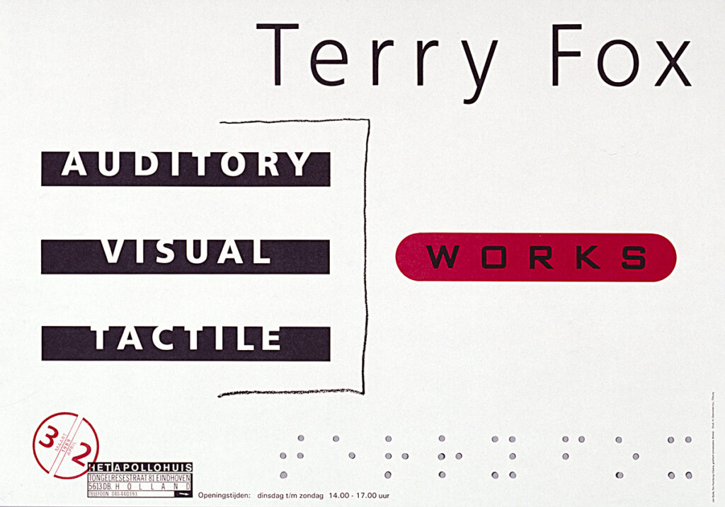
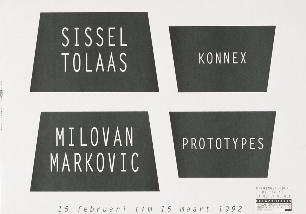
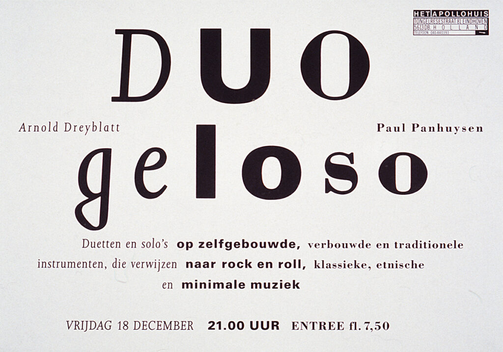
In 1980, artists Paul Panhuysen and Remko Scha establish a centre in Eindhoven where international avant-garde artists present their work. The emphasis lies on the fusion of visual art and sound. Until its closure in 2002, Het Apollohuis maintains a very active programme of exhibitions, performances, concerts and installations. Through extensive international publications over its 22-year existence, it gains widespread recognition as a platform. From the outset until the very end, Ton is responsible for all graphic design. In close collaboration with Hélène Panhuysen, books, brochures, catalogues and CD productions are realised. In particular, the mesmerising series of purely typographic posters , Ton’s intuitive and conceptual visual translations of the work of sound artists, strongly contribute to the identity and reputation of Het Apollohuis. To emphasise the ephemeral nature of the performances, the posters are printed on paper yellowing over time. His work for Het Apollohuis attracts attention both nationally and internationally. MoMA in New York acquires a large series of Apollohuis posters for its collection.

NowHere, 1995
NowHere is an exchange project between Het Apollohuis and ICAEE/Gallery Surge in Tokyo. Ton designs the catalogue, printed matter and visual identity. Paul Panhuysen encounters a road sign in a French cemetery: dogs prohibited. Reworked by Ton into a logo, the image acquires a new meaning in a different context. To this day, it remains his favourite logo.
Books: content that speaks
Gradually, book design becomes Ton’s great love. His bookcases at home and in the studio are bursting at the seams. He wants books around him, to see them, smell them, feel them, discover and understand them. Books are a source of inspiration, and naturally he wants to design them himself, with increasing expertise. Large productions follow, such as Living Apart Together (1997), in collaboration with photographer Reinout van den Bergh and Bas Vereecken, Het Brokaten Paradijs, and numerous publications for publishers including De Hef, NAi 010 and Toth. He designs cherished art books for collector Joop van Caldenborgh (The Caldic Collection), for museums and for artists such as Paul Panhuysen, Eelco Brand and Studio Job.
Following the publication Jan de Bie – Verf en inkt, doen en laten (2003), Ton realises the remarkable book De Papieren en Notulen van De Asgrauwe (2006) together with Jan de Bie and author Harry van Boxtel.“These are intensive collaboraties,” Ton says, “about understanding one another, searching for special perspectives and paying attention to detail. What can I add as a designer, and when should I hold back? Those are questions I weigh ever more carefully.”
“In a book cover I often tryt to capture the content in a single image. That image almost emerges naturally as the result of the journey I make together with the authors. For the interior, I try to organise text and image so that the content gradually unfolds for the reader. Rhythm and hierarchy play a crucial role.”
Letting the content speak for itself, that’s what it’s all about for Ton. But above all, it’s about having fun together, lots and lots of fun. That’s essential.
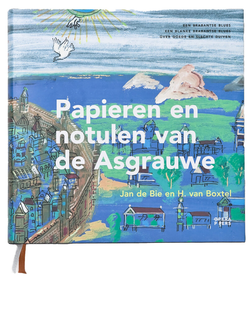
Papieren en Notulen van De Asgrauwe, 2006
This book is the result of a collaboration between Harry van Boxtel and Jan de Bie. It portrays life within a Brabant pigeon racing club as a metaphor for the art world. A tragicomic portrait of people and community. Ton designs a book in which language and image are carefully balanced, Alongside the complete works of De Bie, Ton incorporates the full tekst of vVan Boxtel and a distinctive typographic notation of a stage play.
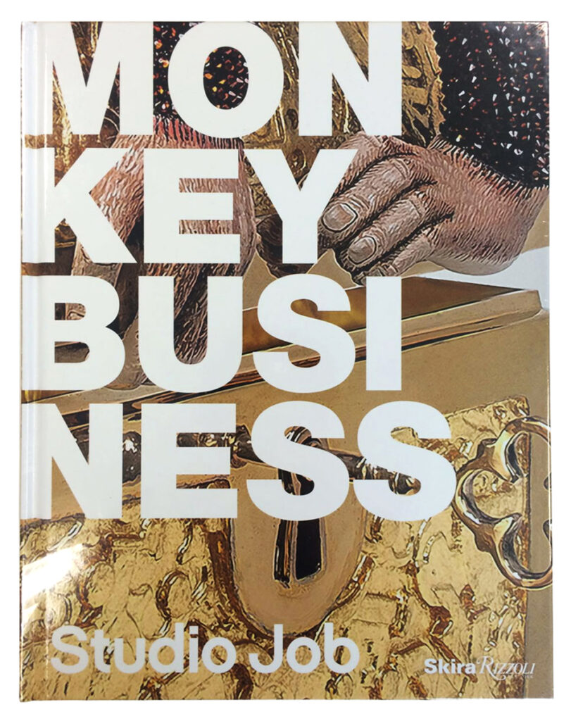
MONKEY BUSINESS – Studio Job, 2016
Monkey Business, published by Rizzoli New York, presents the highly expressive oeuvre of Studio Job, including furniture, sculptures, exhibitions and interiors, as well as the designers’ own home. Opera designs the publication in close collaboration with Studio Job. Their opulent, ironic and craft-driven signature forms the basis for the graphic concept.
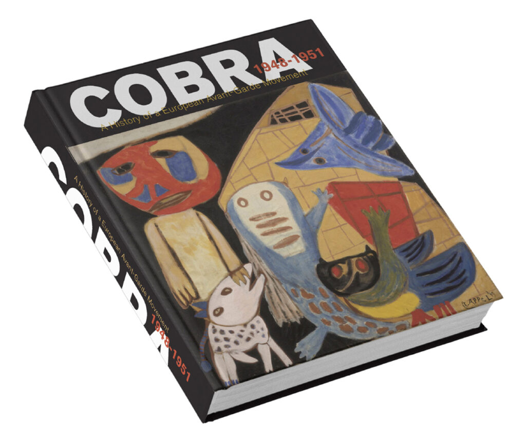
COBRA 1948–1951, 2017
This updated edition of the standard reference on COBRA is designed in close collaboration between Ton, author Willemijn Stokvis and Barbara van Kooij of NAi010 Publishers. In the design process, Ton explores rhythm and hierarchy in various ways to make the extensive body of images and text accessible to the reader. The cover emerges only at the very end of this intensive process.
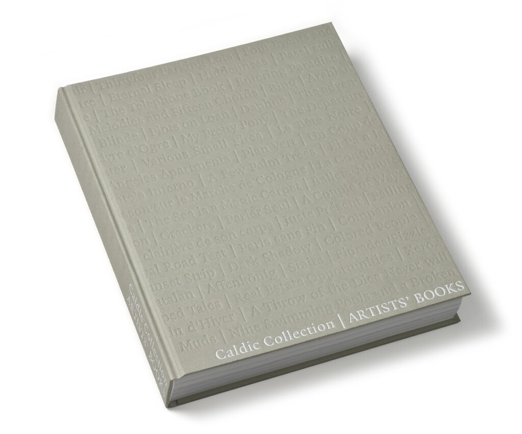
Artists’ Books – The Caldic Collection, 2007
This book presents artists’ books from the collection of Joop van Caldenborgh, The Caldic Collection. In the design, Ton seeks a balance between restraint and structure, creating cohesion without overshadowing the individuality of the works. Published in an edition of 1,500 copies, the book reflects the intimacy inherent to the artist’s book.

Muziekgebouw aan ’t IJ, 2004
For the newly built Muziekgebouw aan ’t IJ, Ton and his studio design the complete visual identity, including the logo, façade lettering, signage and promotional print. The studio had previously worked for its predecessor, De IJsbreker. The identity reflects both the diversity of the programming and the waterfront location; the logo, for example, alludes to sound ripples in water.
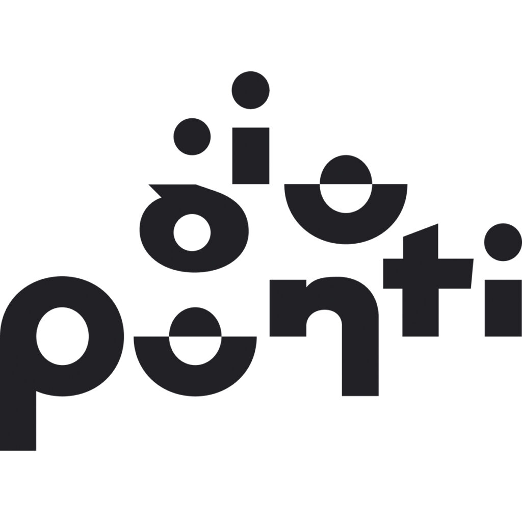
Gio Ponti, 2002
For the retrospective exhibition on Gio Ponti at the NAi in Rotterdam, Ton designs the logo, all graphic expressions and the exhibition typography. The logo is constructed as a typographic structure, reflecting the versatility and defining characteristics of Ponti’s oeuvre.
OPERA Concept & Design
The cultural funding cuts introduced under State Secretary Halbe Zijlstra around 2010 radically change the playing field. Fewer cultural commissions, smaller budgets. They force Ton and Marty to reinvent OPERA. Brand strategist and friend Hans Arnold plays a key role in the repositioning towards OPERA Concept & Design, with a stronger focus on business and public sectors. Their empathetic, research-driven approach proves to be surprisingly effective there as well.
Long-term collaborations follow with Tempo-Team, Lensvelt and the Danish group ISS. For the latter, OPERA designs corporate interiors and complete hospitality concepts. For Grafisch Papier, OPERA has been developing and producing event concepts here for four years. In 2016 Monkey Business (Studio Job) is published by Rizzoli; in 2021 Raining Stories, the book about the Dutch contribution to the World Expo in Dubai, appears.
For Masterly – The Dutch in Milan, an initiative by Nicole Uniquole, OPERA develops a new visual identity. Since 2022, the studio has been responsible for all presentations and publications at the Palazzo dei Giureconsulti during the Salone del Mobile. Various anniversary books for the corporate sector are designed, including 125 Years of Siemens Netherlands (2004) and, more recently, 100 Years of Van Leeuwen Buizen (2024).
Alongside this, there is always room for art. In 2010 Ton designs the CD sleeve Hold On Tight by Solomon Burke & De Dijk. In 2015 he creates the photo book Amsterdam by their keyboard player, photographer and friend Pim Kops. The image editing process Ton and Pim undertake for this book is a remarkable journey, starting with thousands of photographs.
Also in this year, a major retrospective exhibition on the work of artist Jan de Bie Is presented at the Breda Museum, together with an accompanying catalogue. In 2017 Ton designs the standard work COBRA 1948–1951 together with Willemijn Stokvis and Barbara van Kooij for NAi010 Publishers. This is just a small selection from a vast number of projects; there is so much more.
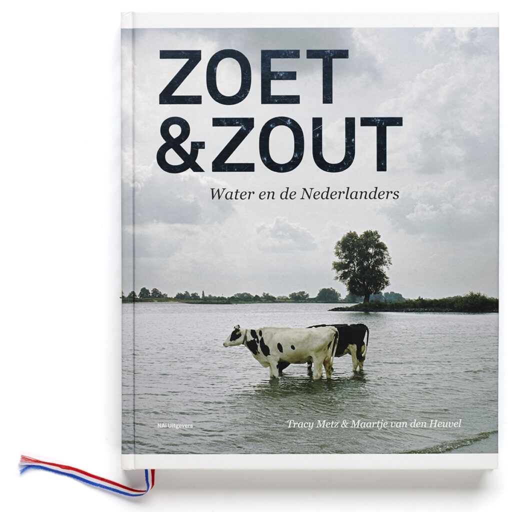
Zoet & Zout, 2012
The book Zoet & Zout (Sweet & Salt) by authors Tracy Metz and Maartje van de Heuvel accompanies the exhibition of the same name at Kunsthal Rotterdam. Through text and imagery, it explores the changing relationship with water in the Netherlands, addressing the major challenges ahead and the landscape’s ongoing transformation. Published by NAi010 Publishers, the book also appears in English and is awarded Best Informational Book of the Year in 2013.
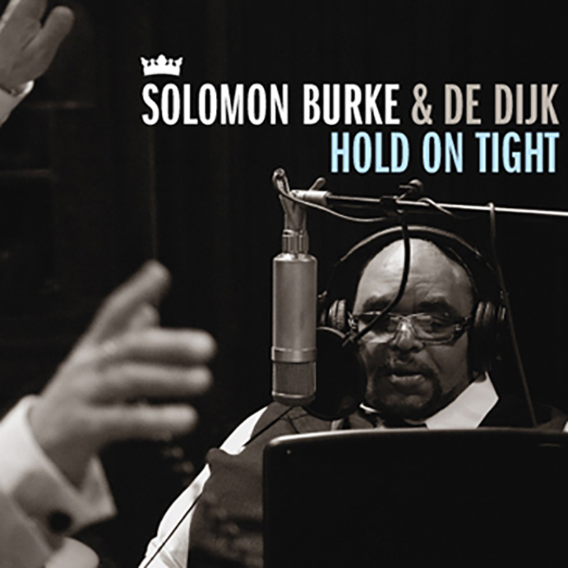
Hold on Tight – De Dijk & Solomon Burke, 2010
The album Hold on Tight is the result of a remarkable collaboration between Dutch band De Dijk and American soul legend Solomon Burke. Tragically, Burke passes away upon arrival at Schiphol, still on board the aircraft, shortly before the planned presentation at Paradiso. As a tribute, the concert goes ahead. Ton designs the CD cover together with Pim Kops, keyboard player of De Dijk and photographer.
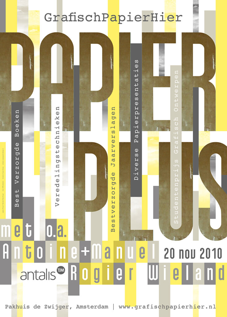
GrafischPapierHier, 2007–2010
For the annual event Papier Hier, Opera develops a new concept and the name GrafischPapierHier. Over four years, Opera acts as both curator and designer, with a different theme each year. The event transforms from an informative format into a sensory experience centred on paper as a carrier of ideas. In 2010, under the theme Papier Plus, the accompanying giveaway publication is awarded a Silver European Design Award.
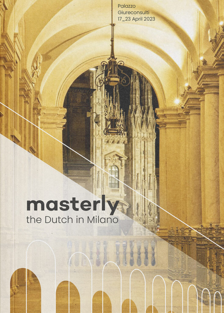
Masterly – The Dutch in Milano, 2022–present
Over more then ten years, Masterly , an initiative by Nicole Uniquole, has presented Dutch designers and companies during the Salone del Mobile in Milan. Palazzo dei Giureconsulti provides the setting for a broad and innovative design field with around one hundred participating designers, artists and companies. Since 2022, Opera has developed the complete visual identity of the event. Graphic patterns, signage and publications create a strong and recognisable overall image.
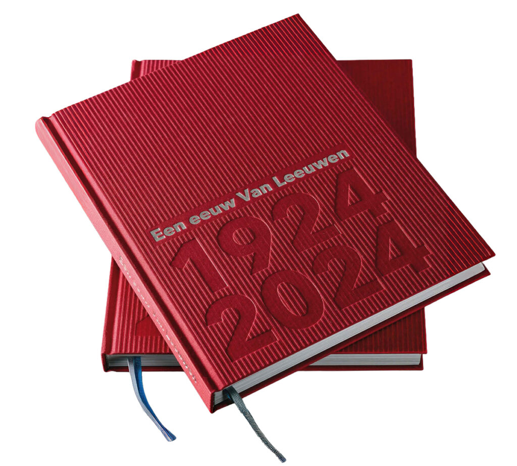
Een eeuw Van Leeuwen – A Century Van Leeuwen, 2024
Designer, painter or cook
Client, subject and context always form the starting point of Ton’s interest in a commission. Not-knowing is no obstacle for him; it is where his curiosity begins. Designing means taking time: inhaling, listening, absorbing, questioning, experimenting, rearranging, stepping back, looking again. Designing is a process of creating the conditions in which insight and form converge, allowing solutions to present themselves. Sometimes this happens quickly, often slowly. Doubt is as important a companion as the decision itself.
Composition, colour, white space, balance, feeling, scent, sheen, grid, typefaces and and line spacing make a product tangible make a product tangible, but Ton keeps asking himself: what effect does it have on me? How does the sequence of images and texts work? What is the rhythm, the repetition, the feeling? Where is the counterpoint, the silence, the emptiness? Editorial design in its purest form. Over an initial structural layer, new layers of nuance subtle additions or a wink are added. After all, there must always be something left for the viewer to discover, even after a first glance. The painter is never far away, nor is a touch of blues. “Designing is actually like cooking,” I hear him say. “You have to take your time.”
(Typo)graphic structures
Over the years Ton develops graphic and typographic structures, often prompted by a specific assignment. For example, in 1997 he creates a portrait of Spinoza for the cover of the book De Steen Vliegt, constructed entirely as a graphic pattern. Many of these structures originate within projects but are then further developed over time to explore new possibilities. This leads to Graphic Patterns as an independent studio activity. These patterns are applied to walls and floors in utilitarian environments such as schools, offices, healthcare facilities and restaurants, or appear as designs in textile applications. The Graphic Patterns now form an extensive and inspiring collection. A dedicated publication on this subject is currently being prepared.
Inspirator and mentor
Ton enjoys sharing his knowledge and experience. He has taught oon a few occasions and has acted as an external expert at various academies. Within the studio, plenty of opportunities are offered to interns and young designers. This actually always starts with ensuring that they can, above all, be themselves in the studio: getting to know one another first, then giving them room to pursue what suits them.
“I once went so far as to make a ‘focus box’ for an intern who was struggling to concentrate. Not long after, he created brilliant book illustrations, which we went back and forth over endlessly to make them ever sharper and wittier. We reached a point we’d never been to before, and had a lot of fun doing it.”
Ton inspires young designers by working with them. He encourages them to ask questions, to seek experimentation, to step beyond uncertainty and to believe in themselves. Much as he himself experienced during his own years as a student.
Retirement?
“I do what I enjoy. Not because I have to, but because I can’t do otherwise. I’ve never had the feeling that I was going to work. So in fact I’ve never worked. How, then, could I retire?”
With the award-winning Koppermaandag print, Ton designs and publishes in 2023 a first work on the autonomous oeuvre of his mentor Henk Cornelissen. Together with two co-authors and Henk, he has already been working for over a year on an extensive monograph: Henk Cornelissen – Gestructureerd Toeval ( Structured Chance). Two years later, in May 2025, this hefty book is presented at the Chassé Theatre in Breda.
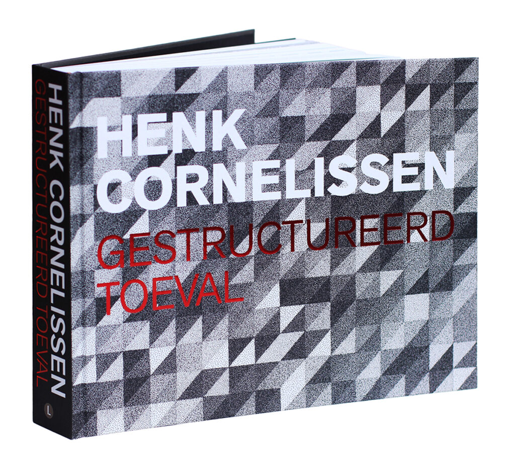
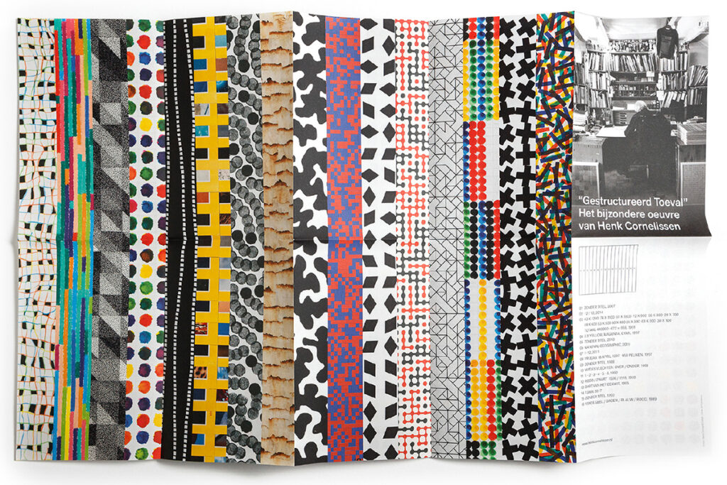
Henk Cornelissen – Gestructureerd Toeval, 2018–2025
Since 2018, Ton and fellow initiators René Pijnenburg and Pieter Vlamings have been working to make Henk Cornelissen’s body of work accessible. This has resulted in a website, films, presentations and two publications: The Koppermaandagprent (2023) presents three works by Henk at full scale; on the reverse sides, Ton places his own image compositions assembled from Cornelissen’s oeuvre. The publication was awarded the Indigo Design Award 2023.
The comprehensive monograph Henk Cornelissen – Gestructureerd Toeval – Henk Cornelissen – Structured Chance (2025) encompasses Cornelissen’s entire body of work. Concept, text and image editing, and design evolve through close dialogue between the makers and the artist. Thanks to the book’s structure, to which several authors have contributed, you are not only introduced to the artist’s previously little-known and highly extensive body of work, but are also taken on a deeply personal journey through the artist’s thought and creative processes. The substantial monograph is published in May 2025 as the culmination of a long and meticulous journey.
The studio is operating at full capacity. The exhibition De Smaak van Soestdijk opens on 19 November 2025. Preparations for a new edition of Masterly have alreay begun. But whenever work allows, Ton and Marty travel a bit more often to visit cities and exhibitions, to recharge their batteries and find new inspiration. Their respective roles in the studio have gradually shifted. Marty handles the commissions, ddesigns concepts and organises things; she is the driving force of the studio. This enables Ton to continue working on new projects. And for the others in the studio his presence is indispensable every day: almost invisibly visible, right down to the last detail.
In 1994, Gert Staal wrote about the work: “…The message is never overshadowed by the form. Clarity is the point of departure, layering the unspoken condition, relativisation the innate mindset. Always with a dash of self-mockery and preferably a hidden gift for the discerning viewer. More a reflection of a mentality than of a style. More a person than a form.”
That, after all these years, remains the enduring strength of Ton’s work.
Ton Homburg
born in1952, Breda
Author: René Pijnenburg, januari 2026
Eindredactie: Ad van den Kieboom
Portrait photo: Aatjan Renders