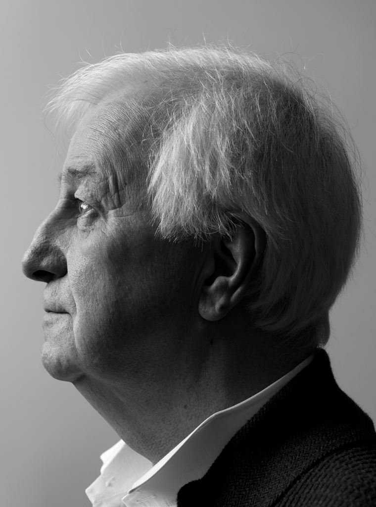
Storytelling, the way of the south of the Netherlands. Approaching the village of Oirsbeek, the curving roads begin to blend into the slowly slanting landscape, the foothills of South-Limburg’s hilly country. A hollow road leads me to the center of the village where Geert Setola and his wife Monique reside since 1972. This is where he has his studio; this is where he continues to work as a graphic designer and an illustrator, as an artist, a photographer, a poet and an essayist.
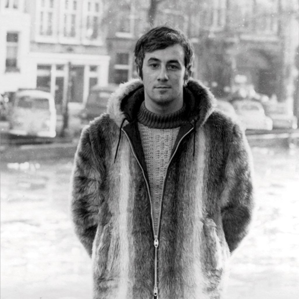
Geert Setola, Amsterdam, December 1969
He was born in Bruges, Belgium, in 1945, in a family of immigrants – the Flemish called them ‘inwijkelingen’ – something like ‘intruders’ but with a friendlier undertone: they were on their way to initiation. His grandfather came from Napels, his grandmother was from Düsseldorf. His father, Albert Setola, by recommendation of a German uncle, a painter and celebrated copyist, studied at Düsseldorf’s respectable art academy. Back in Bruges, Albert opened his own studio and made his money by designing decors and creating paintings, and as a sculptor, an illustrator (of novels and children’s books), a graphic designer, and a photographer. He also taught at the art academy in Bruges. Graphic design was not yet a serious profession and the academy did not do much more than to introduce the students to generalities. This suited Albert, the generalist.
Albert’s son, Geert, attended gymnasium (the Greek-Latin humaniora) and had thought about continuing to study for translator and interpreter. But the study involved lots of bookkeeping, administrative work and such; it did not connect at all to the broad-viewed artistic perspective he had grown up with and which he would keep all his life. For some time he foresaw a future in music or literature. The book printing press in his father’s studio and the lead type (most of them the sanserif fonts his father loved: Helvetica, Folio, Annonce) attracted him enough to reach the decision to study liberal arts and applied graphic art at St. Lucas in Brussels. Still a student, he would work with his father’s press to print the invitations and programs he had designed, many for the Beursschouwburg theater in Brussels. St. Lucas taught primarily classical illustration and dedicated little time to typography.
In the meantime, Geert noticed interesting developments in the Netherlands, Germany and England, where graphic design and typography prospered. He educated himself after buying books at the English Bookstore in Brussels from the Studio Vista series, such as Ken Garland’s Graphics Handbook and Typography: Basic Principles by John Lewis. Of course he also bought the German magazine Twen, designed by the legendary Willy Fleckhaus, and the English Nova, designed by art director Harry Peccinotti. These magazines were not just designed in a revolutionary way, they would stoke up the fires under the student and youth movements of the 1960s, with Paris 1968 as their apotheosis. They published articles about homosexuality, sexual freedom, contraception, fashion, music, and literature, and they used photography in a different way than mainstream glamour magazines. The Twen logo used the wide and bold Annonce font – déjà vu for Geert: it was a type he had experimented with in his father’s studio.
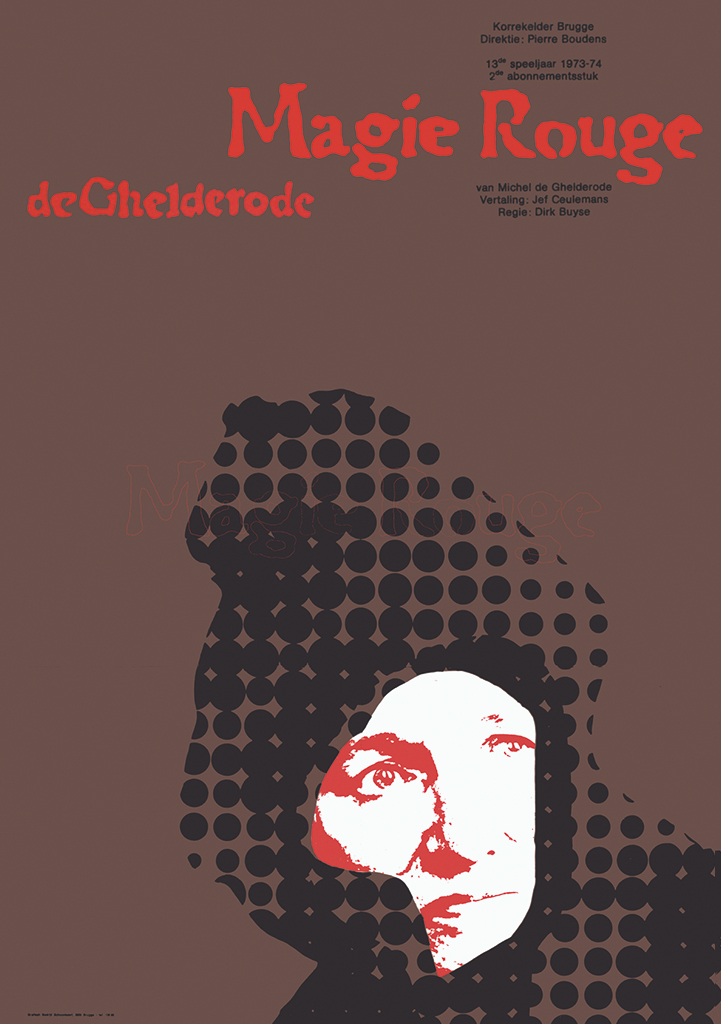
Theater poster: Magie Rouge, for Korrekelder, Bruges, 1973
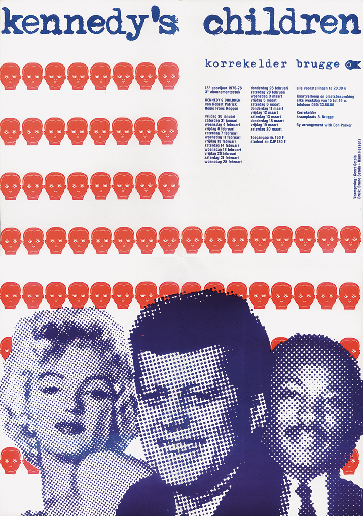
Theater poster Kennedy’s Children, for Korrekelder, Bruges, 1975
It is from this period that the ingredients dated for his short novel, Par(ad)is revisité; it would be included in the typographic handbook Letterfontein, which Geert and the author of this text wrote, designed and published later. The tantalizing Paris of those late 1960 days was remembered in sentences such as: “Just one thought away I am sixteen, and the trees blossom under wildly blowing rain screens. I am joining my father and mother in a waving line of people, step by step approaching Grand Palais to see the Picasso exhibition […]. The show confirms my father’s greatness, because above the sofa in our living room two pastiches signed by Picasso are hanging […]. Now and then I go to town to see things that others have seen before me. A joy spiced by envy, and that’s what it always was. Because much that I am seeing breathes the grisaille of nostalgia: I was too young to experience Saint-Germain-des-Prés and while studying in Brussels I happened to miss 1968.” The young designer, while following in his father’s footsteps, is experiencing the irony of his past battling with his hunger for innovation.
In the many publications he hungrily consumed, Geert Setola discovered a number of designers who stood out and whose work confirmed or strengthened his own ideas. From France, it was Robert Massin, who experimented with photography and typography in books such as Eugene Ionesco’s La Cantatrice Chauve and his own book, La Lettre et l’Image (1970). Massin’s design influenced designers and students from all over Europe and in the US as well. Geert also followed Saul Steinberg, who was most famous for his cartoons for The New Yorker, not just for the quality of his commissioned work but also because his illustrations were recognized to be art. Other well-known artists and designers of the day – Milton Glaser, Tadanori Yokoo, David Hockney, Henryk Tomaszewski – gave the spirit of the age a socio-philosophical image-language and were favorites of his, too. In the US, Andy Warhol published Interview, a magazine in which he presented absurdist and minimalistic interviews in a serious and surprising way. In the UK, similar expressions could be found in the theater and in comedy shows such as Monty Python’s Flying Circus. In the Studio Vista series he discovered Graphic design: visual comparisons written by Fletcher, Forbes & Gill, later Pentagram. Alan Fletcher, the illustrating graphic designer, created beautiful work from paper and cardboard cut-outs.
After graduating from the academy, Geert had to do military service. In this period he did not develop much as an artist, but he made good progress in life by falling in love with Monique, a girl he had befriended while still in school in Bruges and had kept in touch with. Monique was from Hoensbroek in Dutch Limburg; and that’s where they got married and decided to settle, because Geert preferred the Dutch over the Belgian design culture. He needed an income and taught drawing class at two schools, but not for long: this wasn’t his world. His father-in-law mentioned that a small printing house and stationary shop might offer him a job. They were called Rosbeek. In their shop window they displayed what Geert recognized as very refined work. Geert met Cor Rosbeek as well as Baer Cornet, who worked as a graphic designer at copier machine producer Océ in Venlo. Rosbeek asked Geert to design an announcement and later also a New Year’s wish; and Cornet had him make illustrations for Océ – the start of his freelance design career. Later, he would collaborate with Cornet and create the concept and the images of cards while Cornet took care of the typography.
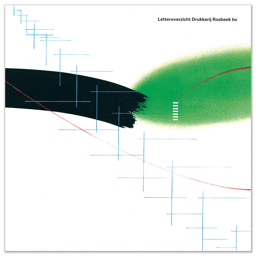
Cover of type catalog, for Rosbeek, Hoensbroek (with Guus Ros)
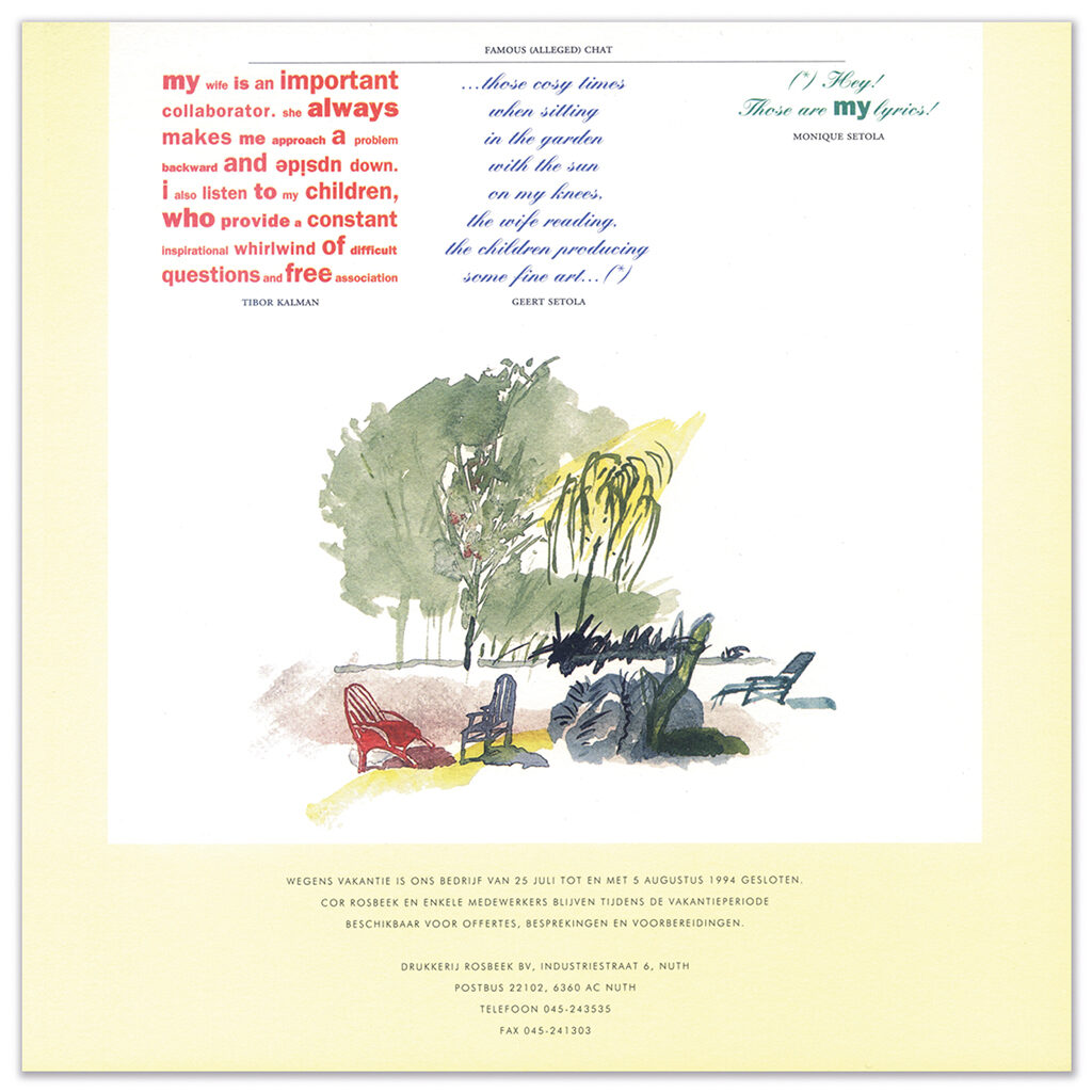
Vacation announcement, for Rosbeek, Nuth, 1994
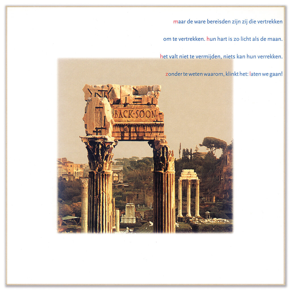
New Year’s wish ‘Back Soon’, for Rosbeek, Nuth
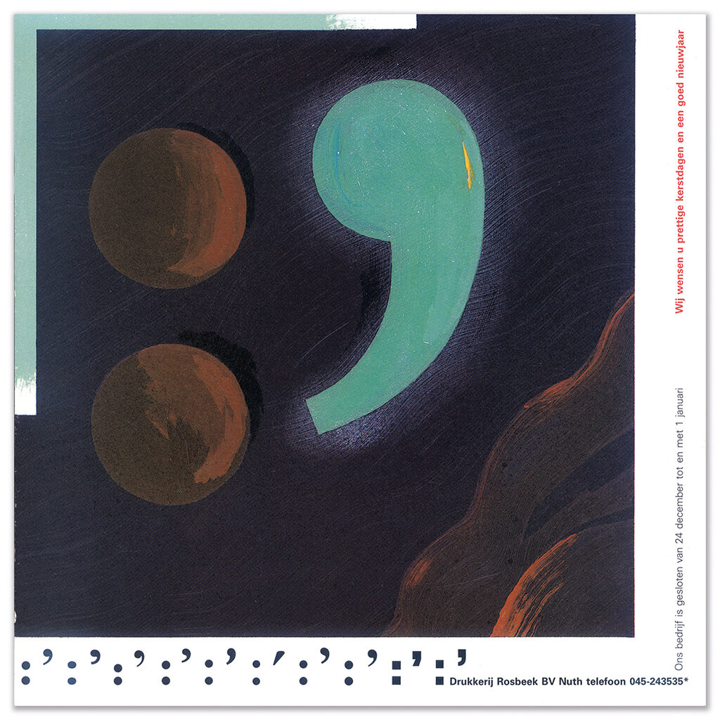
New Year’s wish, for Rosbeek, Nuth, 1989
It was Cor Rosbeek who told Geert to contact GVN (now BNO) and try to become a member of this organization of professional graphic designers. Membership was stil ballotted so Geert went to Amsterdam with his portfolio; he was accepted by his established colleagues. He had planned to stay a week and knock on doors of potential clients in Amsterdam; the journey back and forth would cost almost all day, so he asked GVN for advice and was surprised to receive a donation of 600 guilders, to spend on a room in a simple hotel. GVN added a couple of interesting addresses for Geert to visit. One of them was Avenue’s address at GP publishers. Avenue was the leading progressive magazine of the day; their art director Dick de Moei’s eye found a comic from Geert’s time in Brussels. “I want this one,” said Dick, and Geert’s Schrompel was granted a full page in Avenue. Not a bad start. Later, the whole Schrompel series was published by Rosbeek in their goodwill issues. Baer Cornet did the typography. No other clients came from Geert’s week in Amsterdam. Through his father, though, he received commissions for the design of posters and programs for De Korrekelder theater in Bruges. Not much later he was asked to design all promotion material for a Maastricht theater group. His portfolio grew; most clients came from the cultural, public and social sectors.
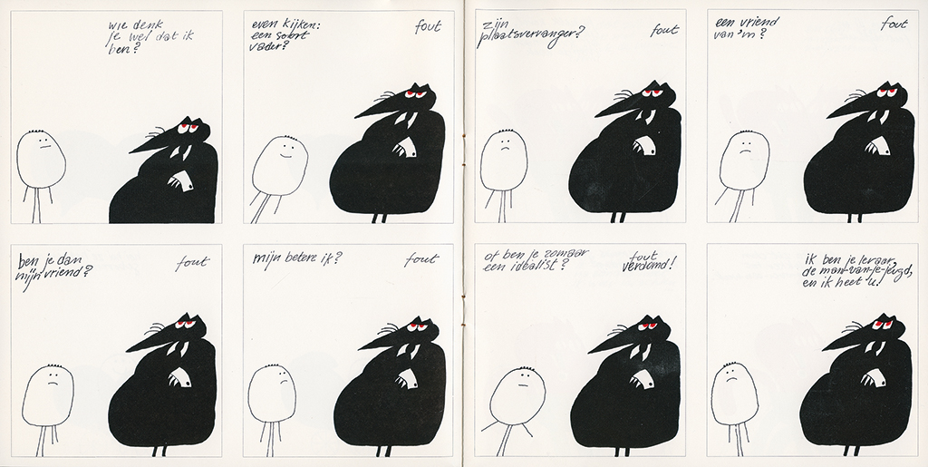
Spread from goodwill book Schrompel, for Rosbeek, Hoensbroek, 1970
Cor Rosbeek also introduced Geert to the much admired Jan van Toorn. Anthon Beeke had just left his studio. Much later, Geert Setola would write an article about Van Toorn’s designs for the Italian magazine Progretto Grafico (#26, autumn 2014). He described Van Toorn’s background, viewpoints and work; and in between the lines one could read that Setola’s own motivations were similar. The line “To free viewers and readers from their passive consumerism and take them along on an interactive journey circling form and contents” appears to reflect Geert’s own design philosophy.
In the beginning of the 1970s, Geert was introduced to Ons Erfdeel (Our heritage), a publication of the like-named foundation that published books and magazines to promote Flamish-Dutch culture in these two countries and abroad. They proved to be a perfect fit for Geert. He could give them all he had: his illustrations and writings about design. Since many publications had to be translated in different languages, Geert’s early aspirations of becoming a translator/interpreter came in handy. Language, writing was still his passion.
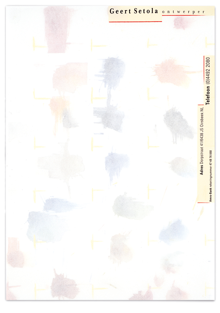

Left: Setola letterhead, 1980
Right: New Year’s wish (about privacy), 2014
In 1975, Geert Setola was invited to teach illustration at St. Joost art academy in Breda, for one day a week, later to become two days. From 1980 to 1983 he also taught in Den Bosch. In Breda he met typography designer and calligrapher Chris Brand; they became good friends. Geert admired Brand’s didactic skills, his knowledge and his mastery as a typographer. These were the days that St. Joost’s graphic design education was unsurpassed in the Netherlands. Their design students were invited to internships at all leading studios; they were lucky to have been under the wings of the original ‘dream team’: Jan Begeer, Chris Brand, Wim Smits, Henk Cornelissen. These teachers introduced professional conceptualism to design education and caused an international furor: even in other counties they talked of The Breda School.
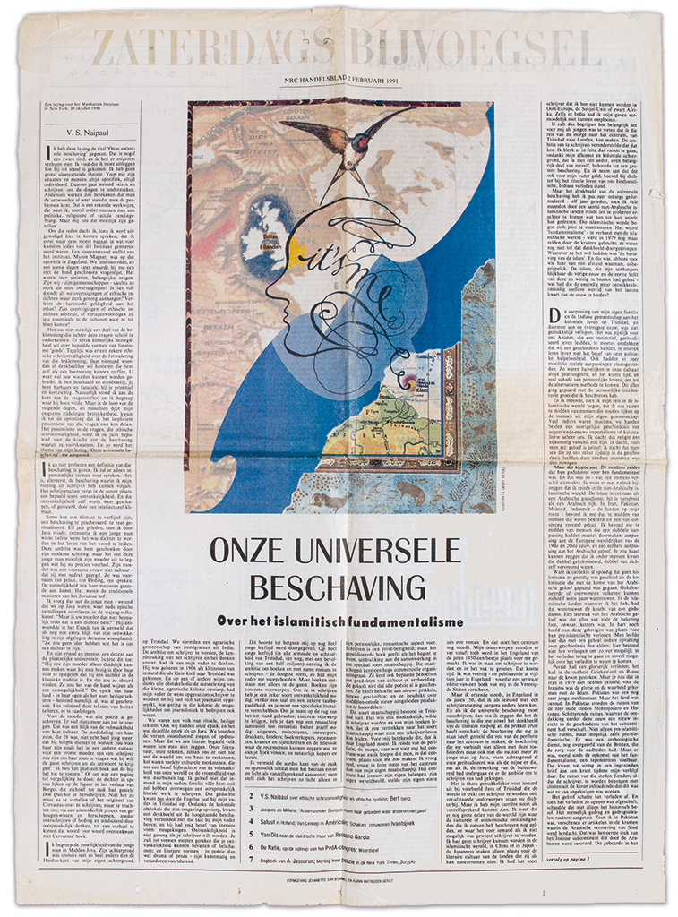
Newspaper illustration Our universal civilization, for NRC Handelsblad, Saturday section, 1991

Newspaper illustration Japanese corporate ethics (with a respectful wink to Shigeo Fukuda), for NRC Handelsblad, Economy section, 1991
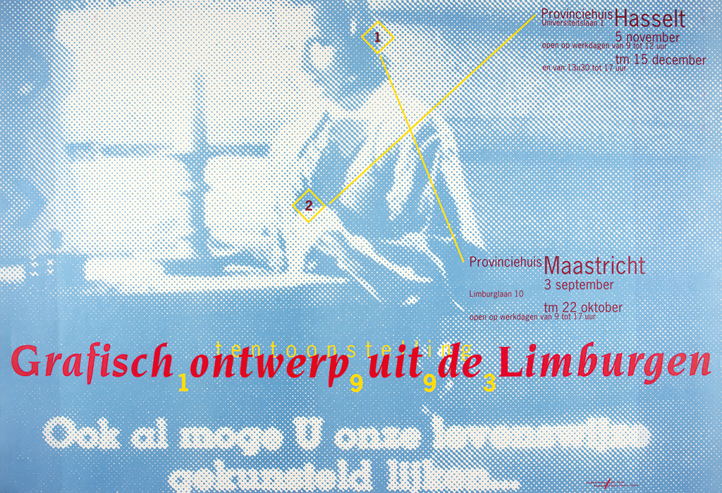

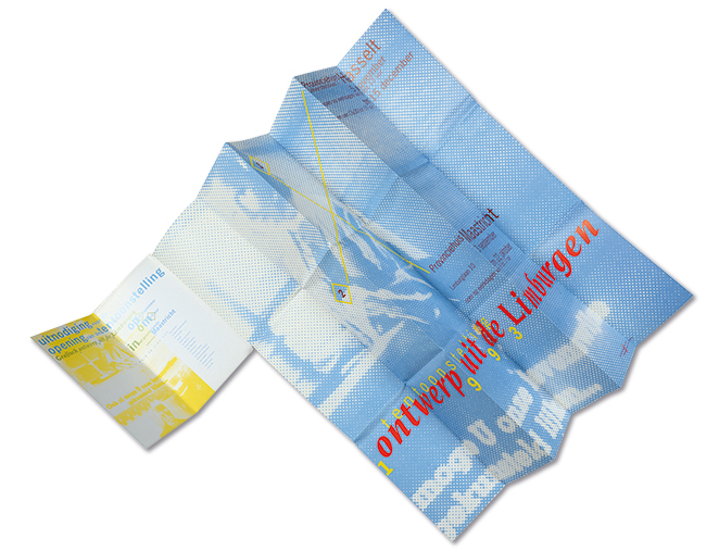
Poster and invitation, exhibition Grafisch ontwerp uit de Limburgen, 1993
In 1994, new post-academic education laws provided students with the opportunity to specialize after graduation or after a few years of working in practice. Geert Setola was a co-initiator, co-founder and name giver of the master program Post-St. Joost together with Edith Gruson, Gerard Hadders and Hugues C. Boekraad. In 2001, he wrote the curriculum and a proposal for the renewed illustration class of the Breda academy. As a professor, Geert met with many famous Dutch and foreign designers. Pierre Bernard, from Paris-based Grapus, was one of the first visiting professors. They had first met in 1985 when De Beyerd in Breda presented the Grapus exhibition with the provocative title The Best Designers in the World. In 1990, Geert was invited by Pierre Bernard and Marsha Emanuel, who worked for the French department of culture, to join a committee that was commissioned to formulate a vision of design education in France in the future. No typography studies had been published in French since 1957. Bernard himself participated, as did the designer Jean Widmer and the art historian Jean-Pierre Greff. The commission interviewed a large number of teachers, designers and clients. The fall of the François Mitterand government threatened their report to disappear deep into a ministerial drawer, but intensive lobbying had as result that many of their recommendations found their way to improve the education system after all.
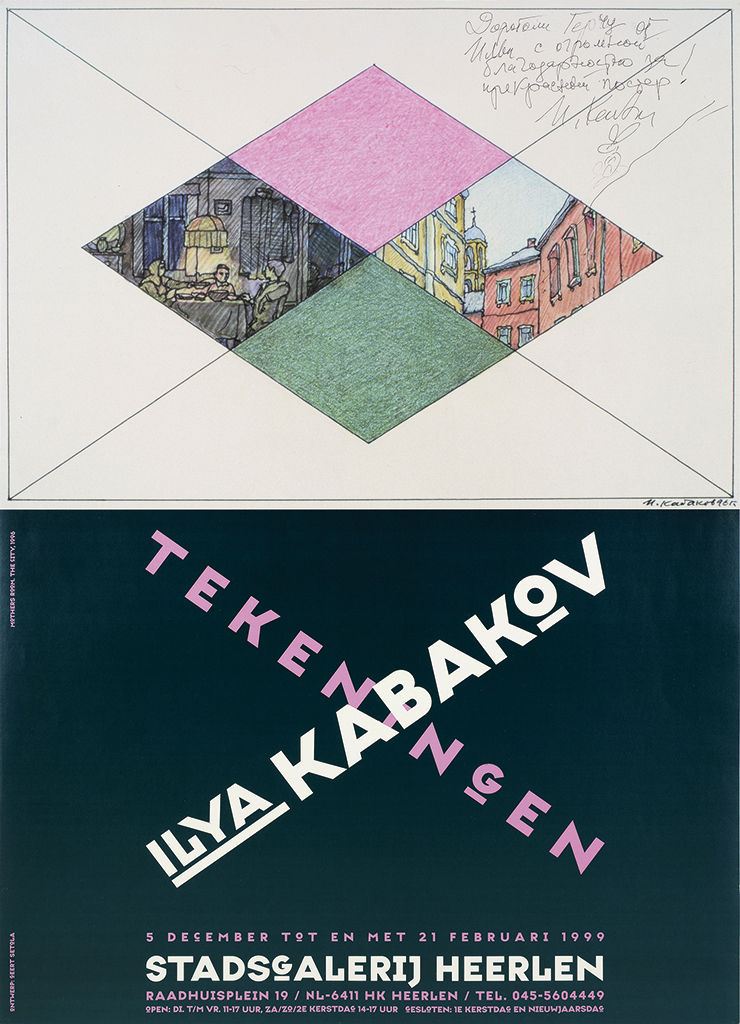
Poster for exhibition Ilya Kabakov, drawings, city gallery, Heerlen, 1999
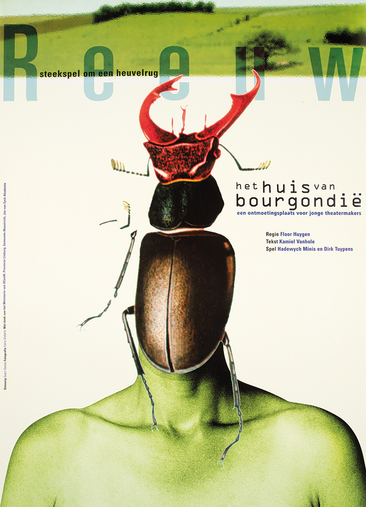
Theater poster Reeuw, Maastricht, 2000
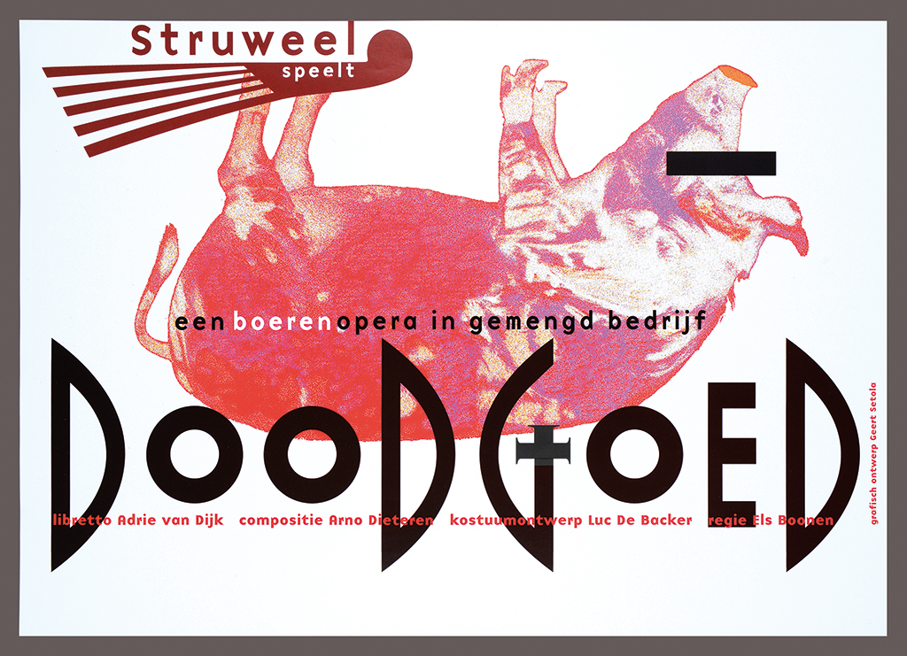
Theater poster Doodgoed, Heythuysen, 2001
I had just graduated from the academy in Maastricht when I first met Geert, after having made the rounds of potential clients just as he had done, years earlier. We hit it off and worked together at book designs such as for the 750th anniversary of the city of Sittard; policy papers for Limburg province; and brochures for furniture manufacturer Arco. We became good friends and went into many discussions about design and typography. It wasn’t just France that lacked typography studies that could benefit students; Belgium and the Netherlands faced the same problems. We decided we ourselves had to write the book, and we should publish it ourselves too. Geert came up with a name for the imprint: Fontana. In 1994, we were ready to introduce the first print of Letterfontein and La Fontaine aux Lettres at the Month of Graphics in Ėchirolles, near Grenoble. At a dinner table we discussed our profession with several French designers, including the excellent ‘typomaniac’ Muriel Paris and Geert’s favorite German designer, Heinz Edelmann.
Letterfontein was received well; soon, we were invited to decorate a show window at the famous bookstore Librairie La Hune on Boulevard Saint-Germain in Paris to promote the French edition; and we had to deliver copies of the books to the Centre Pompidou. By then Geert was well known in French design and education circles; on our way to La Hune we stopped at the design and applied arts college in Reims, where we were received with open arms by professor Bodenschatz. The students were assembled and Geert had to give an improvised lecture about typography. He was invited to speak often in France and to join, or chair, many juries. In the Netherlands, Letterfontein was elected one of the Best Designed Books of 1994; in Germany it received a Red Dot Award. The critic Huib van Krimpen wrote in Graficus about the book’s minimal design and beautiful printing, but he also put forward the question: “What is its purpose, and who will read it?” Well, in the beginning of 2000, after three Dutch reprints and editions in French and German, and a combined run of more than 15,000 copies, Van Krimpen knew the answer.
Were we reaching the saturation point? If so, it didn’t prevent me from starting preparations for a fourth edition of Letterfontein. It was 2002, and the typographer Evert Bloemsma, who also taught at the art academy in Arnhem, pressured me to do so. The book was an essential education tool and since new copies couldn’t be found, his students had to hunt for second hand copies; these were becoming three times as expensive as the price of new ones had been. Geert did not get involved in the production, but he did contribute a great article about the development of script. A summary of his novel Par(ad)is revisité was included, and parts of the original edition went unchanged. It was 2009 before the fourth edition was published; by then the text had multiplied tenfold. Alas, Evert Bloemsma wasn’t there to enjoy it; he had suddenly passed away in 2005. The book sold out within seven weeks; but the cherry on the pie was that Taschen Publishers had stepped in and editions in four other languages than Dutch were reaching the market: translations in German, English, French and Spanish. The reckless initiative of two designers had blossomed into a casebook about typography that was sold worldwide and used by many hundreds of design teachers.

New Year’s wish, (wish: arrest Karadzic and Mladic; text: Setola’s haiku; in remembrance of Roman Cieslewicz), 2003
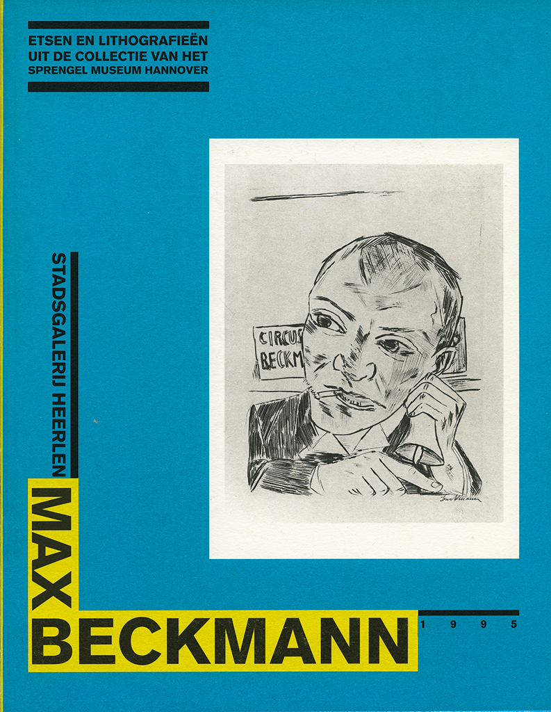
Catalog Max Beckmann, city gallery, Heerlen, 1995
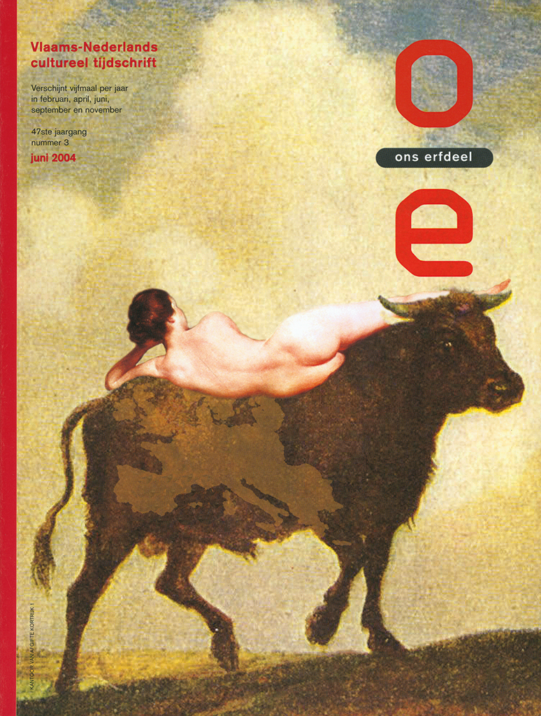
Cover for Ons Erfdeel, Rekkem, Belgium, 2004
As said, Océ in Venlo was one of Geert’s first clients. His creative friendship with Baer Cornet gave him the opportunity to experiment freely; this lasted until Océ was taken over by Canon, in 2006. Other clients had become important. In 1996, Geert designed a series of unique pages for the annual report of Bouwfonds Limburgse Gemeenten in which he used his own illustrations, photos and poems.
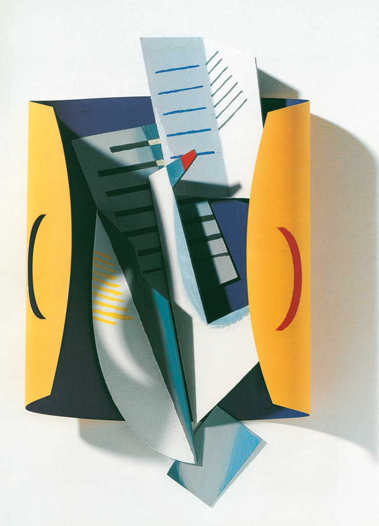
Illustration for annual report, for Océ, Venlo, 1992
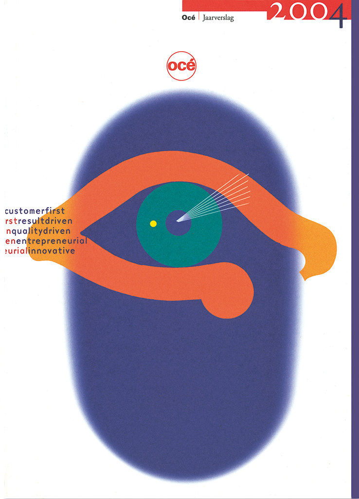
Cover for annual report, for Océ, Venlo, 2004 (typography: Baer Cornet)
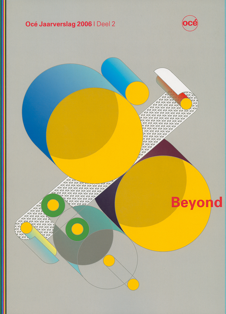
Cover for annual report, for Océ, Venlo, 2006
In 1993, an exhibition showed work of designers from both Belgian Limburg and Dutch Limburg and could be visited in both provincial capitals; its curators were Jan van Toorn and Urbain Mulkers. Who better than Geert Setola to design the exhibition’s invitation and poster? The invitation was a folded poster in a rough cardboard cover, the type of cardboard the Limburgers used to package their famous ‘vlaai’ (the traditional fruitcake of the region). An important client was Algemeen Burgerlijk Pensioenfonds ABP (pension administrators) in Heerlen, for whom he first started to work in 1996. Geert designed books for them as well as for the related group APG about investment policies; and for sixteen years he was the art director, designer and illustrator of their magazines ABP Wereld and ABP World.
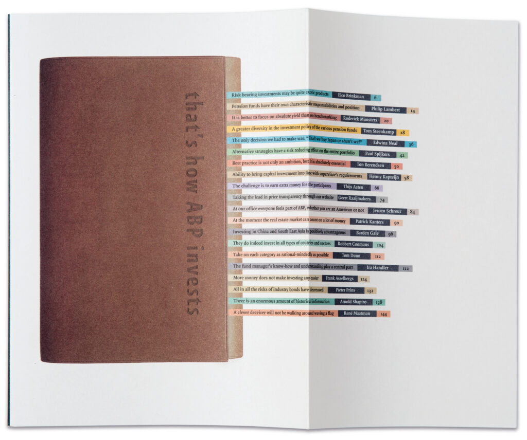
Cover That’s How ABP Invests, Heerlen, 2006
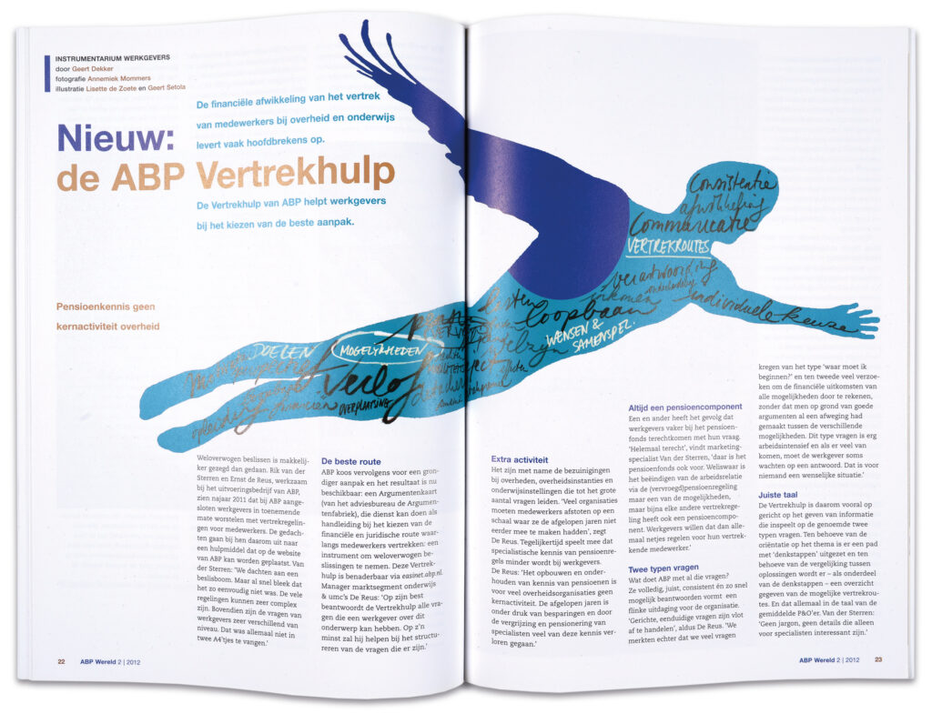
Spread and illustration, ABP World, Heerlen, 2012 (calligraphy: Lisette de Zoete)
NRC Handelsblad provided the highest circulation ever of Geert’s work; his illustrations, work that had deadlines to reckon with, were often sent to the news desk in Rotterdam by fax. There were scores of other clients: Maastricht UMC (reports); Herik publishers (Zwarte Reeks poetry books); several museums (catalogs); and individual artists (artist books). Together with Ad Himmelreich, a curator at Bonnefantenmuseum, Maastricht, he created a series of artists’ cahiers, Le Rose du Bleu, with work of Wiel Kusters, Susana Solano, Richard Deacon and Marien Schouten (1988/89). Also, in 1995, a book for Magdalena Pelzer and, in 2014/15, the books for which Marianne Aardsen asked poets to enter contributions based on her own work. For Herik publishers, in 2000 Geert designed Bij duizenden written by Leo Vroman on the occasion of the first national poetry day organized by Poetry International. For the city gallery in Heerlen he designed catalogs and monographs for exhibitions of Max Beckmann, Aad de Haas, Kurt Schwitters, Henk Visch, Rob Birza & Rob Scholte, Han Schuil & Philip Akkerman, and many others. Other printers than Rosbeek asked him to come up with concepts and designs for promotional publications: the Hondjes series for Huntjens in Stein, and calendars for Andidruk printers in Beek.
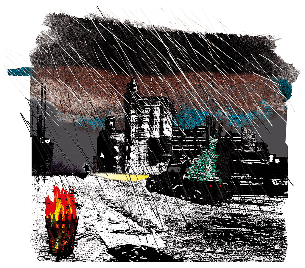
Newspaper illustration about literature, for NRC Handelsblad, 2005
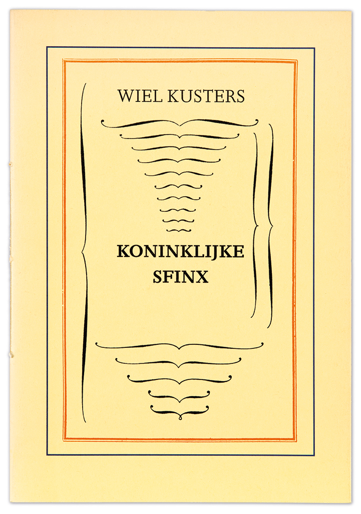
Poetry collection Nonsense by Wiel Kusters, for Koninklijke Sfinx / Bonnefantenmuseum / Herik publishers, 1989
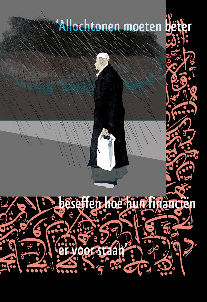
Page from ABP World magazine, for ABP, Heerlen, 2012
His attachment to and contacts with the theater world brought Geert Setola in 2003 to work with music; he, as the librettist and designer collaborated with composers of contemporary music theater. The stage plays were performed in different languages and sometimes simultaneously. Geert was able to play out his appreciation of language and design; he created many a piece in the past years. In the meantime, he continues to write articles about graphic design and to create photography projects, and he publishes pdf-format digital versions of Cahiers Setola on request, free of charge, through the internet. Sometimes these form collages of more than eighty pages, filled with his texts (many haikus, thoughts, poems, essays, stories and observations), illustrations, photos, typography and collages. The text is often composed to form images. It’s his way of sharing his world with others.
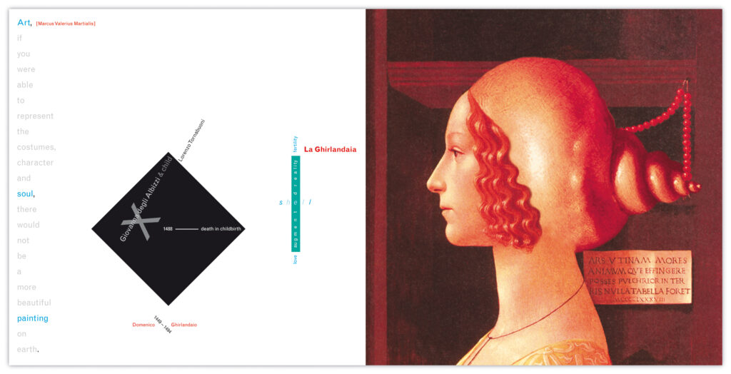
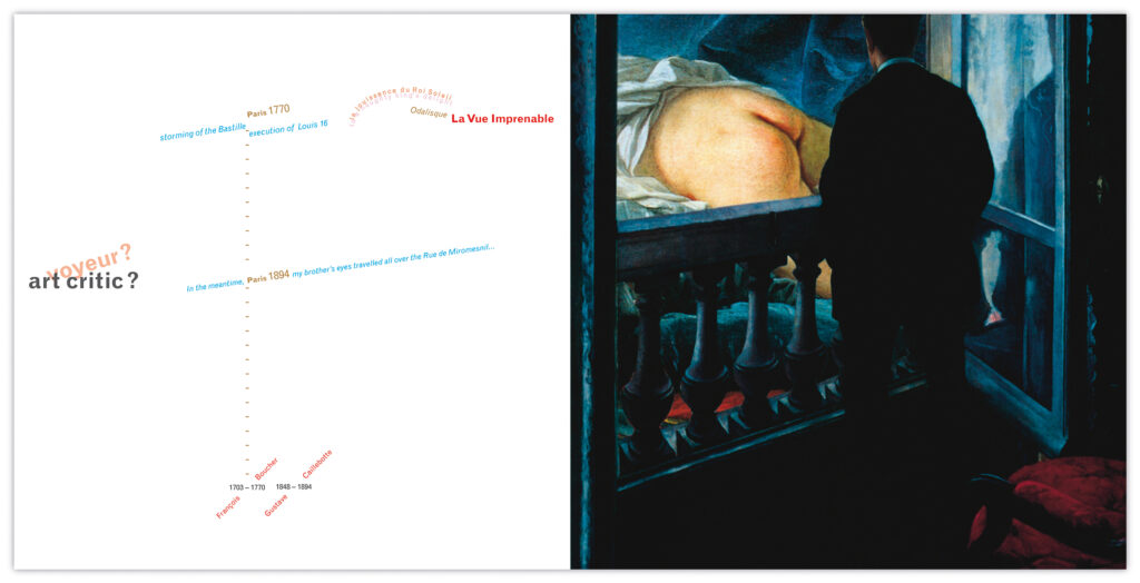
La Ghirlandaia, page from Grimages & La Vue impregnable, page from Grimages – Panic and Loving Images, Cahiers Setola CS-002, 2015
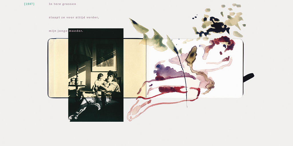
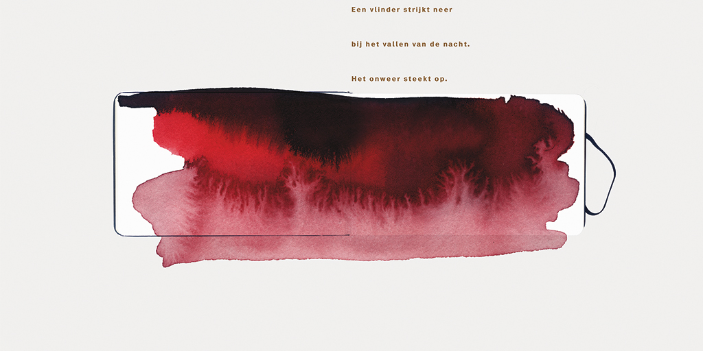
Pages from OgenbliksErvaringen, Cahiers Setola CS-003, 2015
My own favorite is and remains Par(ad)is revisité, possibly because it is so tightly connected to our book Letterfontein. The most beautiful observation is of a scene in a Parisian bar: “Three young Parisiennes my age are together. They are smiling as they meet. Each one exchanges four spouted yet modest kisses and doing so, they express they are in heaven. Remembrance of an ice-cold blueberry sorbet. A chanteur sings: ‘J’aime les filles…’ They are petite, the French girls of Paris, blowing on the cigarettes at their finger tips. I am trying to imagine I am falling in love with one of them, or all three together. On the door behind which a public phone can be found a small enamel sign says ‘Water closet. Une personne à la fois’. The singer continues: ‘Je suis un homme responsable…’”
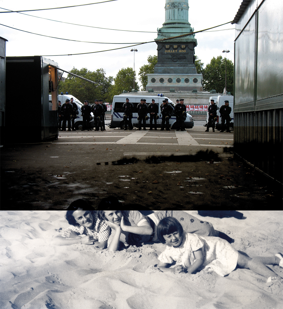
Sois le pavé la plage, page from Par(ad)is reviseté, Cahiers Setola CS-001, 2015
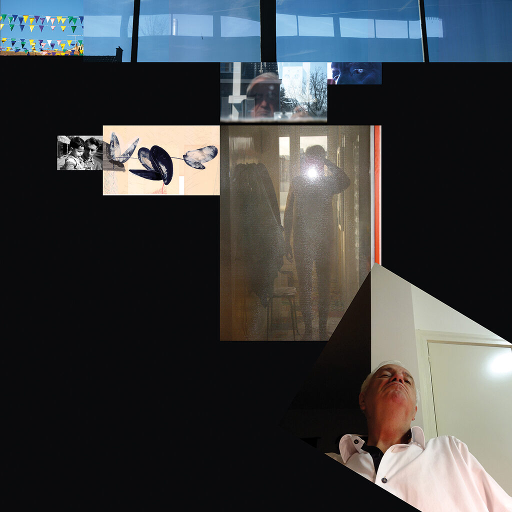
Geert Setola, image biography, Knokke/Oirsbeek, 2014
Geert Setola
born on 22 February 1945, Brugge (Belgium)
Author of the original text: Joep Pohlen, March 2016
Translation and editing in English: Ton Haak
Final editing: Sybrand Zijlstra
Portrait photo: Aatjan Renders
