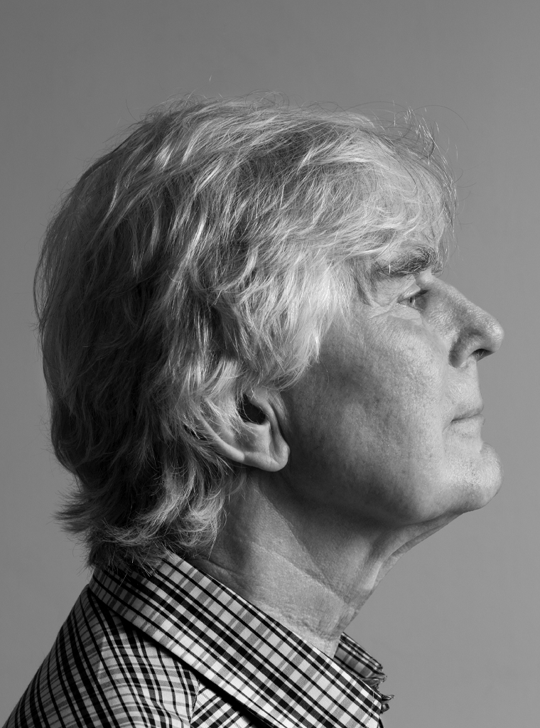
Born in Amsterdam, on February 6, 1940, Guus Ros lived with his family on Hoofdweg, in the western part of the city. His father was employed by Hollandia Kattenburg, producers of rain vestments, where he was promoted to chief of shipping. Theo Ros was a true family man who polished all the family’s shoes each Sunday. Grandfather Ros, a retired cabinet maker, still had a workshop in his attic where Guus and his brother, Hans, were welcome to play. His mother came from a large family in the old Amsterdam neighborhood, the Jordaan; her father repaired shoes. The Ros family didn’t go to church. In his early years, Guus was a devoted reader and, in secondary school, MULO, he excelled in languages. His father had hoped he’d continue to study, but Guus wanted to work, make money, buy blue jeans, and be independent.
The Red Citadel
I had no idea what to do, but a test result decided for me: it predicted I would do well in a job in the graphic sector. At age sixteen, I was hiredto become an apprentice at the publishing house and printer De Arbeiderspers (The Workers’ Press). Mister Ceelie taught me what to do and one day a week I was allowed to attend class at the graphic school. De Arbeiderspers was a giant, occupying a huge building at Amsterdam’s Hekelveld. It was the home of a commercial print shop (letterpress and offset printing), a huge typesetting department (Monotype and Linotype), their own stereotype plant, and a big publishing house. It was said that the whole operation was paid for by the socialist party. They had a staff of 1,000 or 1,200 and it was the noisiest place you could imagine. It was one huge loud machine, as it were. It was nicknamed the Red Citadel. I was much at home there, even if most guys of my age rather played the fool whereas I preferred to read.
We typesetters also did layouts of books and magazines. Proofreaders had a separate room; we took care of their corrections, sometimes two or three times in a row. The building was a place to find solidarity; there was a social conscience no one could escape from. Once every six weeks, each typesetter had to do the night shift and work for the national socialist newspaper, Het Vrije Volk. Young as I was, they didn’t allow me to leave the building by myself during breaks because the streets around Hekelveld were teeming with streetwalkers; they assigned me someone to keep an eye on me. We took turns at apprentice chores: like loudly yelling “herrrrring” and taking note of what everyone ordered for lunch. In 1962, after doing my military service (21 months), I entered evening school at IvKNO, the future Gerrit Rietveld academy of art. Jacques Teljeur, an apprentice typographer I had befriended, was the one who advised me to study again.
Wider horizons
IvKNO introduced me to a whole new world. My classmates were Jan Brinkman and Niko Spelbrink. Jan and I worked on a project for Amsterdam’s Stedelijk Museum. Even while studying at IvKNO, Niko was already the one to detail things to the breaking point. Our teacher, Wim Strijbosch, a classic painter, knew from my sketches that I was interested in Russian literature. A great man, he had his studio overlooking Amstelveld. Another of our teachers was mr Schellevis (painting under the name of Perdok) and art history was taught by professor Knipping, who discussed all the ‘isms’ before modernism. I was eager to learn about the world of art. We had to do a painting in the impressionist style, or a cubist one, which taught you to look carefully. I painted a lot in those days.
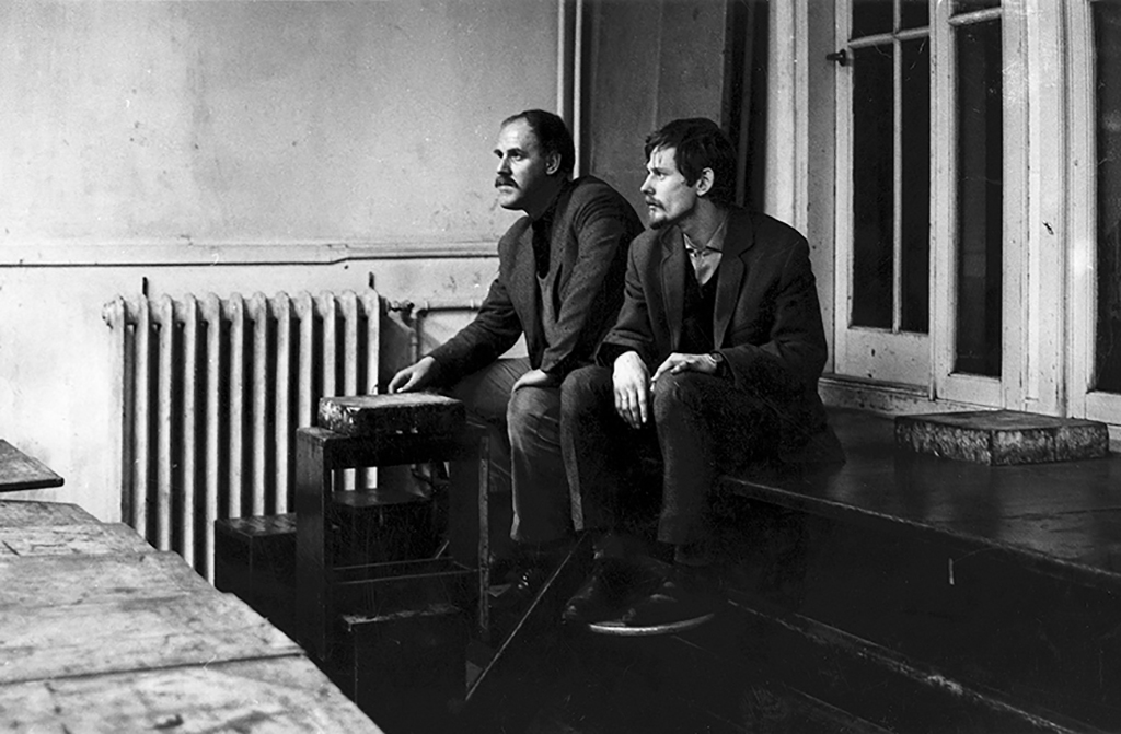
I had married and we had three kids. I cannot remember how I did it, how I managed to combine my day-time job including working on Saturdays, and attending class in the evenings, six years in a row. I needed a break after graduating from IvKNO. My family and I were living in 3rd Weteringdwarsstraat, near the Weteringcircuit, in two rooms with a narrow alcove and a small ice cold kitchen. At IvKNO, I had also studied with Jurriaan Schrofer, who was promoting the profession and an active member of the association of professional designers, GKf. Both Strijbosch and Schrofer were sometimes slightly intoxicated in front of class and sometimes we would protest. We became more assertive and expected our teachers to give us proper attention. I would work for weeks on a poster design and then Schrofer would simply say: “I have no comment, it’s good.” I hated that.
I proposed to make a connection between us young graphic designers and students at the graphic school, who were learning about typesetting and printing. To create a bridge between future professionals. Later, as a professor, I tried to stimulate exchanges of teachers from different art academies, but no one wanted to leave their little safe spot.
More books
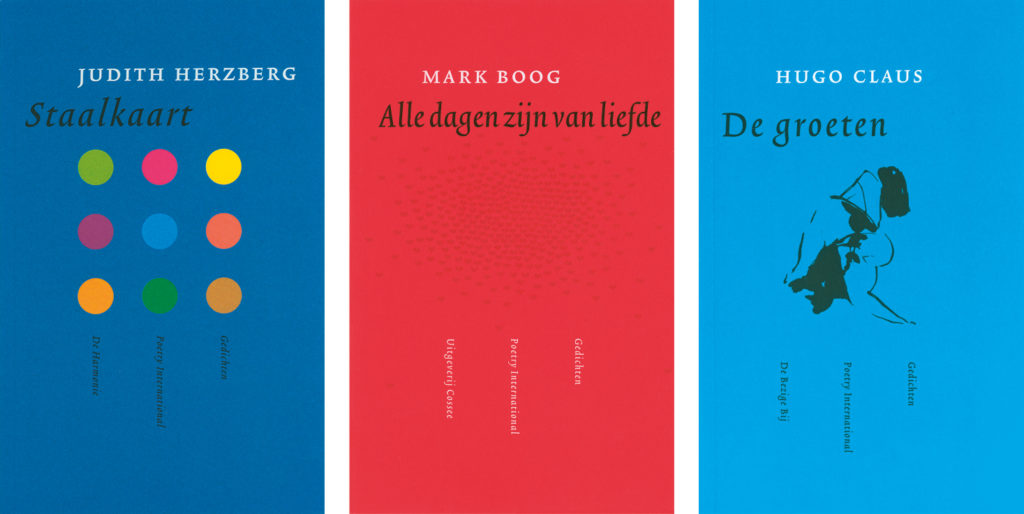
In 1965, I switched to the publishing branch of De Arbeiderspers. My colleagues were Jacques Teljeur and Wim Bisschot; our supervisor was Wim Mol. We were the typesetters’ advance guard: we wrote their instructions, calculated the costs to produce manuscripts, checked proofs for details and footnotes, and so on. Cover designs were commissioned to designers, illustrators and photographers, but we were responsible for all layouts and typography. We also came up with concepts for book series such as ‘Privé-domein’ and we created a basic layout and covers before Kees Kelfkens took over the job.
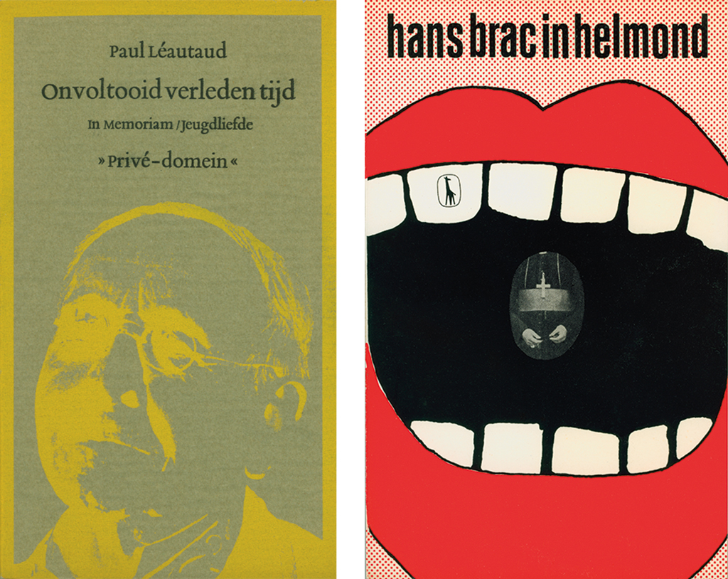
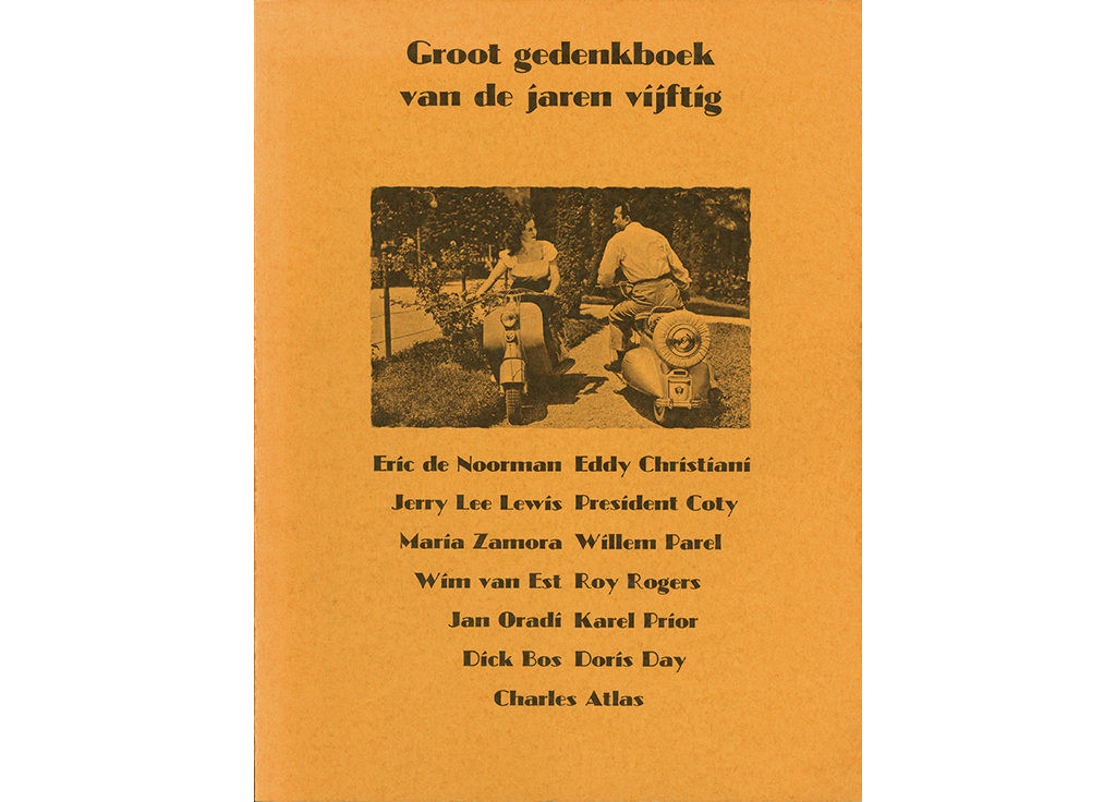
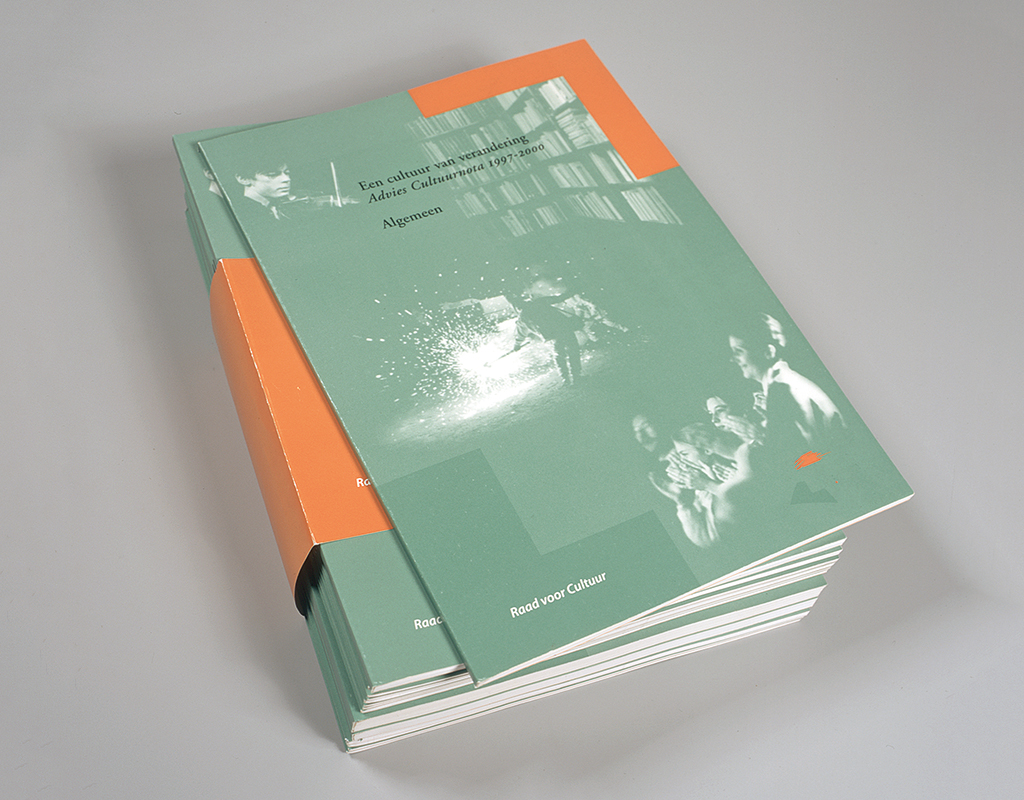
Aside from my work at De Arbeiderspers, I began to design books for Thomas Rap’s publishing company. Rap had a boyish chique about him and was great to work with; we made up new book projects one after the other. In 1968, we came with the Groot Gedenkboek van de Jaren Vijftig (Great Memorial of the 1950s), with contributions by authors like Jan Donkers, Wim Noordhoek, Guus Luijters and Arend-Jan Heerma van Voss. They dropped tons of stuff on my desk: their soccer player cards, vacation snapshots, 78 and 45 rpm records, reviews about everything and anything, portrait photos of movie stars, and their favorite comic book strips. Each Saturday afternoon we’d design a chapter: ‘Captain Rob’s Secret’, ‘Interiors’, ‘Sitting at the Radio’, ‘Teenagers In Love’. Altogether, it was a romantic, adventurous and nostalgic period – something out of a boys’ book.
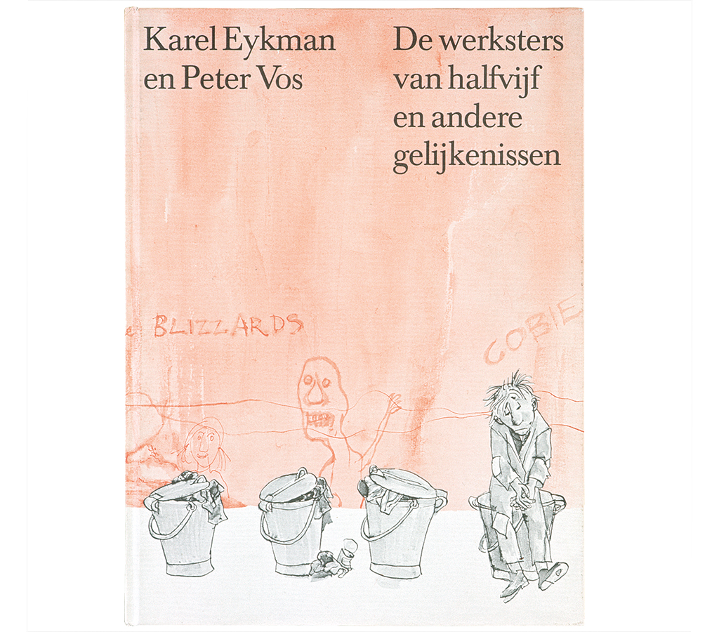
Thomas Rap sent me to artists such as Pyke Koch, Carel Willink, Co Westerik, Jeroen Henneman, and Herman Berserik to work with on an artist project. He was a freebooter never short of wild ideas. He did a reprint of Amsterdam’s first phone book, a photo-biography about W.F. Hermans, the author, and together with Peter Vos the ‘Animal Quartet’ table game, which I designed. He paid me around 25 guilders for a book cover. Together with Leendert Stofbergen I did all Rap’s publications. But I also worked for other publishers: Bruna, Ambo, Atheneum, and Polak & Van Gennep.
BRS
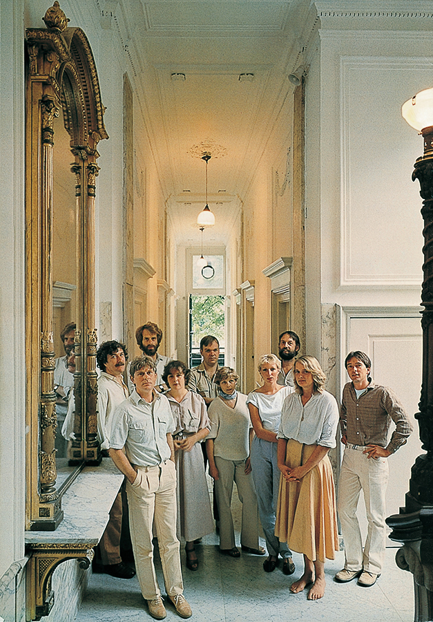
1971. I was invited to join Jan Brinkman and Niko Spelbrink and start a partnership: BRS. Meanwhile, De Arbeiderspers had fallen apart, the Red Citadel was crumbling. The building was already half empty; parts of the company had been sold; many of the staff lost their job. The publishing department became independent and continued as a literary publisher in the same location as Querido: Singel 262. I was asked to join them, but I decided to partner up with Jan and Niko. De Arbeiderspers gave me a little money to facilitate my departure with which I could buy my share in BRS. We were realists and signed a contract that also mentioned what to do if the partnership failed to work. Part of the deal was: all money we’d make would be divided in three – we were equal partners.
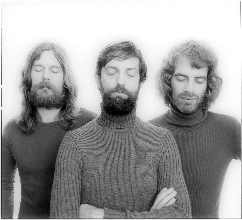
Within BRS, I had my own team with whom I continued to design for many publishers. My strength was typography. Jan was the man to come with concepts. Niko was the perfectionist. If Jan and I were content with a solution, Niko would continue his search for an even better standard or quality. That wasn’t always easy to accept, but luckily Jan had authority and knew how to manoeuver with Niko, all in a friendly way, and Niko would listen to Jan. If we had to bid for a commission and we, as owners of BRS, had to decide about fees and expenses, Jan would be sure 3,000 was the right figure, while Niko came with 2,000 and my contribution was to come up up with something in between. Jan, the strategist of the three of us, did not get deeply involved with the design work. He was an excellent manager; he cared for our staff and built a strong studio where people loved to work. And all the time we were promoting the design profession by getting actively involved with the association of designers, GVN, later BNO.
Now and then we decided not to accept a project. For instance, at the time of the Vietnam War, one of our clients had converted a dredger into a naval vessel, with gun ports and all. We didn’t want to be involved with anything related to war.
Our philosophy didn’t stop at creating highly perfect typography; we also strived to build and maintain good relationships with our clients. We had learned that Dick Houwaart, the top communications man at the Ministry of Home Affairs, had converted to Judaism. During a work-related meeting in our studio, we had a kosher lunch served, including the right stoneware and cutlery. Years later, he told us he had appreciated our gesture very much. We tried to be respectful to others, not to show any arrogance. We understood that, as designers, we were just a link in the production chain – though we had to keep oversight. If I received author’s copies from a publisher, I would drop off one at the printer to thank him and tell him he’d helped make a beautiful book. Professional skill and craftsmanship deserve to be honored.
Vrij Nederland
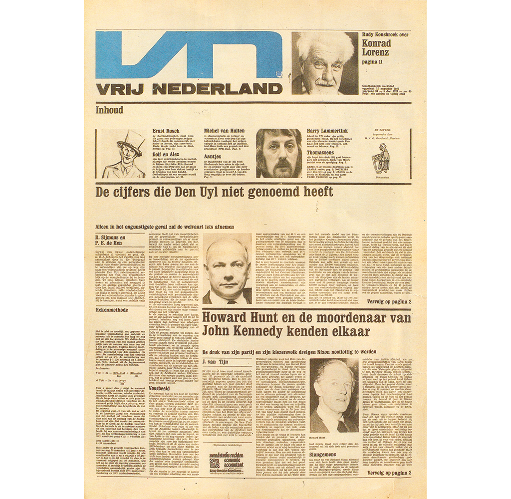
1972. Rinus Ferdinandusse and Joop van Tijn asked me to restyle Vrij Nederland, the leftwing weekly. Their editors were among the latest who were still working in the Red Citadel of De Arbeiderspers. The building was to be pulled down to become a hotel. Vrij Nederland (Free Netherlands – the paper had started as an illegal, underground news bulletin in the time of the German occupation) was planning to switch to a format similar to what Time Magazine used. Their competitor Elsevier’s Weekblad (more rightwing) was able to head them off, after which they decided to keep the old newspaper format, only a little bit narrower than before. The old logo, designed by Karel Zwart, remained but the layout of the pages was totally renewed. I introduced wide, horizontal white spaces to emphasize the hierarchy of headings. I kept the old heading type while we slowly introduced the new face of the weekly, meanwhile expecting fierce protests from the readers, as is always the case any time a paper changes its trusted appearance. Well, the protests came the moment we began using the Clarendon Elongated for the headings. Nevertheless, the new Vrij Nederland became an even more trusted news and background media than before the restyling.
‘Ministry of Design’
1975. A new partner joined BRS: Edo Smitshuijzen. Niko left to work in London, for a year, like I had worked in Dublin, for the experience. I was recalled from Ireland by Jan and Niko because Total Design had contacted them and wanted to talk, they thought about extending their board of directors. But we soon learned that an assistantship with Ben Bos or Wim Crouwel was all they had in mind. I went back to Dublin quite relieved (see the book Orange & Green. Holland-Ireland Design Connections. 1951-2002).
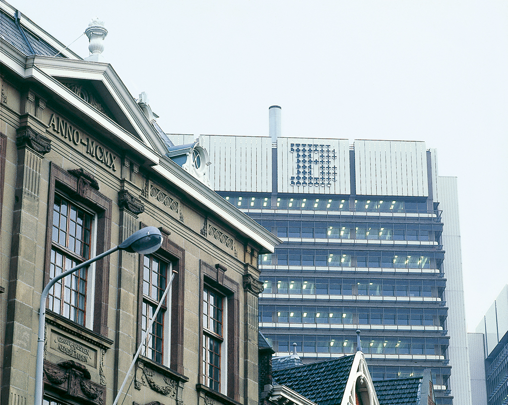
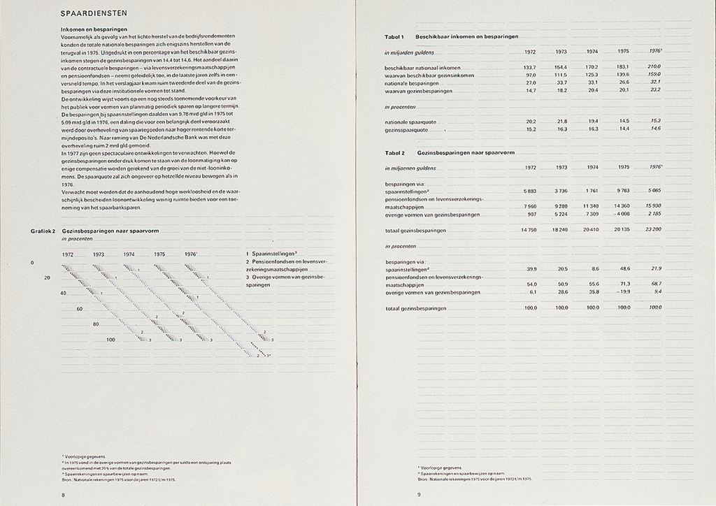
In 1976, all of us were back at home. One year later, we got hired to design our first big corporate identity program, for the Ministry of Home Affairs. A huge job, in collaboration with Sdu, the government publishing and printing office. Hein van Haaren was the initiator. Jelle van der Toorn Vrijthoff, Sdu’s head of graphic design, was to be our sparring partner. Van Haaren first offered us to do just the sign posting system, but we didn’t accept the offer. “We do fifty-fifty, or nothing,” we said. The contract was written in lead: Sdu and BRS would divide all design work.
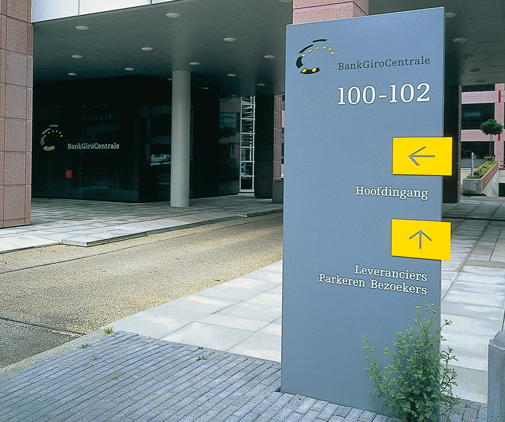
We hired Margriet Blom. She became the one who would design all the hundreds of forms used by the Ministry and the departments under their wing. Later, in 1982, we founded BRS Linea especially for all form design, such an essential part of identity programs. And also later, we were commissioned by other government ministries and departments: Economic Affairs, Roads and Waterways, Raxes and Revenues. Colleagues called BRS ‘the Ministry of Design’ at some point. Luckily, others, either in national or regional government or in commerce or in the cultural sector, also knocked on our door. We had the wind in our sail and grew and grew.
The clients
Tel Design had prepared a splendid proposal for the Ministry of Roads and Waterways’ new identity program. But, the Ministry’s staff had neglected to follow standard procedures and their minister, who was caught unawares, reacted by refusing to accept the proposal. We, at BRS, were invited to design a new concept. And we took care to learn how to deal with clients from government bureaucracies. It proved to be important to discuss the project with the highest in command and keep him or her well informed during all creative phases.
Today, it is much more difficult than before to build up a relationship with a client. In the past, staff of communication departments would be stable and remain so for years. Nowadays, they move easily to new jobs, which disturbs the continuity of agreements and policies. Also, there are now more layers between the person who has final responsibility within the organization and the designer. We always made certain that we won over the employees in the organization so they would feel involved and would cooperate. Often it is more effective to inform a group of secretaries about how to deal with the identity program than have lunch with the board of directors.
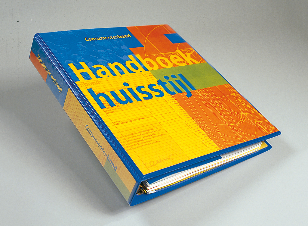

A new identity program is always met with confusion and resistance: a director complains that his name is too small on his business card, silly things like that. I’ve seen it happen that two board members of a newly amalgamated company got into a word battle during my presentation of the new identity program. I told them: “Call me when you’ve resolved your problems.” A designer shouldn’t let himself being walked all over. At a presentation of the proposal for their annual report, the board of Bouwfonds Nederlandse Gemeenten (a national real estate bank) kept me waiting. Someone offered me lunch to make up for the delay. When, at long last, I was invited to sit down with the board, everybody had steam coming out of their ears. No one was in the right mood to look at my proposals. I told them: “I see you are still discussing a different subject,” packed up and left. Just as I did when a director of another company, his mind still fixated on other problems, took out his bad mood on me. I left. I wasn’t a haberdashery salesman, was I?

TNO
1979. TNO (scientific research) wanted a new identity program, but didn’t want us to touch their existing logo, designed as it was by one of their top engineers, who was still alive. A giant of an organization, with many different, independent, specialized institutes, TNO was divided in scores of kingdoms. We looked in from the outside; they looked out from the inside. How to create an efficient unity at least with regard to printed matter and communication? Their storage rooms were overflowing with print that hadn’t been used or distributed. What a waste of money and energy. We asked for 10,000 guilders just to make an inventory of what was wrong. If you think an organization and their communication aren’t functioning, you have to deliver the proof. We presented them a slide show including parts of recorded phone conversations that incoming calls were treated inconsistently. Management is often not at all aware of how their organization actually functions. Such confrontational information can be upsetting. We didn’t hear from TNO for a while. But call they did.
We, at BRS, just wanted to help them make up their minds. What we did, could be defined as a management consultant’s job. We interviewed people, discovered bottlenecks, and we mapped the organization. We had to educate the staff before we could do our primary job, and before we could educate them we had to listen to them and to learn about their points of view, their experiences and thoughts. We had to take their views seriously. Our proposals were discussed and tested; we received feedback that helped us to refine our designs.
Open University
1983. Following the United Kingdom’s example, Holland founded its own Open University, OU. My work for them became a success story – I discovered my qualities as a designer and learned a lot. It all started when Niko saw a badly designed advertisement in the newspaper and said: “These people need us!” We contacted them at the right moment and were invited to their first, mostly still temporary offices in Heerlen.
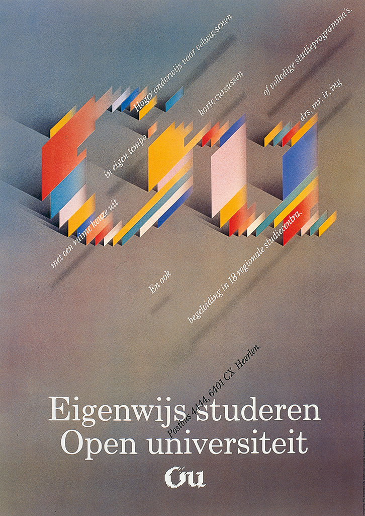
They were pioneers, who were eager to build an organization that distanced itself from the traditional tertiary education and would deliver distant schooling. Education minister Deetman was the OU’s godfather and he had appointed Gottfried Leibrandt to chair their board. The OU offered a second chance to students who had failed elsewhere, to mothers with children at home, and to retired people. Graduation was coming within anyone’s reach. We, at BRS, also investigated how the English had approached their open university; they had engaged the help of BBC television to broadcast courses during afternoons and late in the evening – a much better use of this media than daytime soaps or late night shows. We missed that opportunity in Holland, alas. How to make the OU popular? In the beginning, they aimed at 3,000 to 4,000 students. BRS designed the identity program (under Edo Smitshuijzen). Imagine the OU’s and our surprise when 60,000 students enrolled. We all had to work hard to create all sorts of course materials; the OU was on its way to become a midsize publisher. At BRS, they said: Guus Ros knows best about books, he should do it. In the end I had to move to Heerlen, where I lived for almost two years, designing course materials for OU day in, day out. A positive note: it was in Heerlen, at OU’s project bureau, that I first met Susan, who would later join me in Amsterdam as my wife.
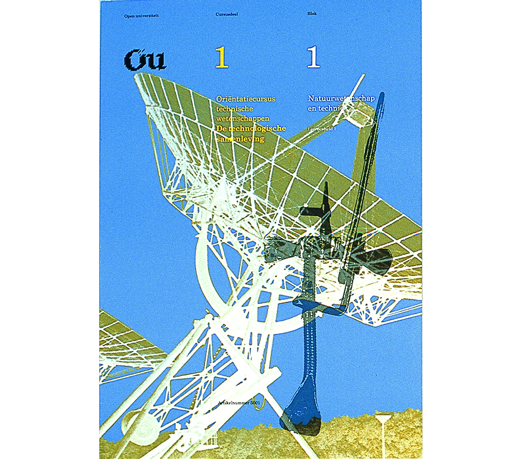
No one at BRS had any experience with designing course materials and at the OU they had to create a brand new department to develop didactics for all their different faculties: social and cultural sciences, state law, film history, physics, etc. It was all about printed text and images, no computers were engaged yet – no internet. The task ahead was so enormous that we advised the OU to establish their own, in-house, graphic design department. I would be its temporary head. We designers knew nothing about education and didactics, and the education department knew nothing about graphic design and typography. How to teach people how to learn? This question fascinated me. Earlier, I had designed school books for Malmberg, but this was different. Correspondence courses were a field of their own and we needed to engage someone with specific communication skills. We hired Ritzo Bloem, a man with a broad general knowledge, to become our image specialist. We tried to design the course materials with an eye to the demands of the students; we showed them respect by giving great consideration to all aspects of communication. To be co-responsible for providing the course materials for thousands and thousands of students was very satisfying professionally.
Because the board trusted our way of doing things and we used one concept, the results were clear and unified. It was neither the professor nor the designer who played a central role: the student was central. Traditional universities and colleges envied the OU for their course materials.

PTT
Although quite prominent as the graphic designer of several government ministries, BRS didn’t have close ties with DEV/PTT. DEV’s head Ootje Oxenaar (‘King Ootje’ we called him) called me once and asked me to design a postage stamp, with as subject William of Orange, and he told me in private he expected me to design the stamp “from a socialist viewpoint”. I was intrigued, to say the least. But I decided to just follow the official task description and delivered a design fitting ‘the commemoration of the 400th year of the house of Orange’.
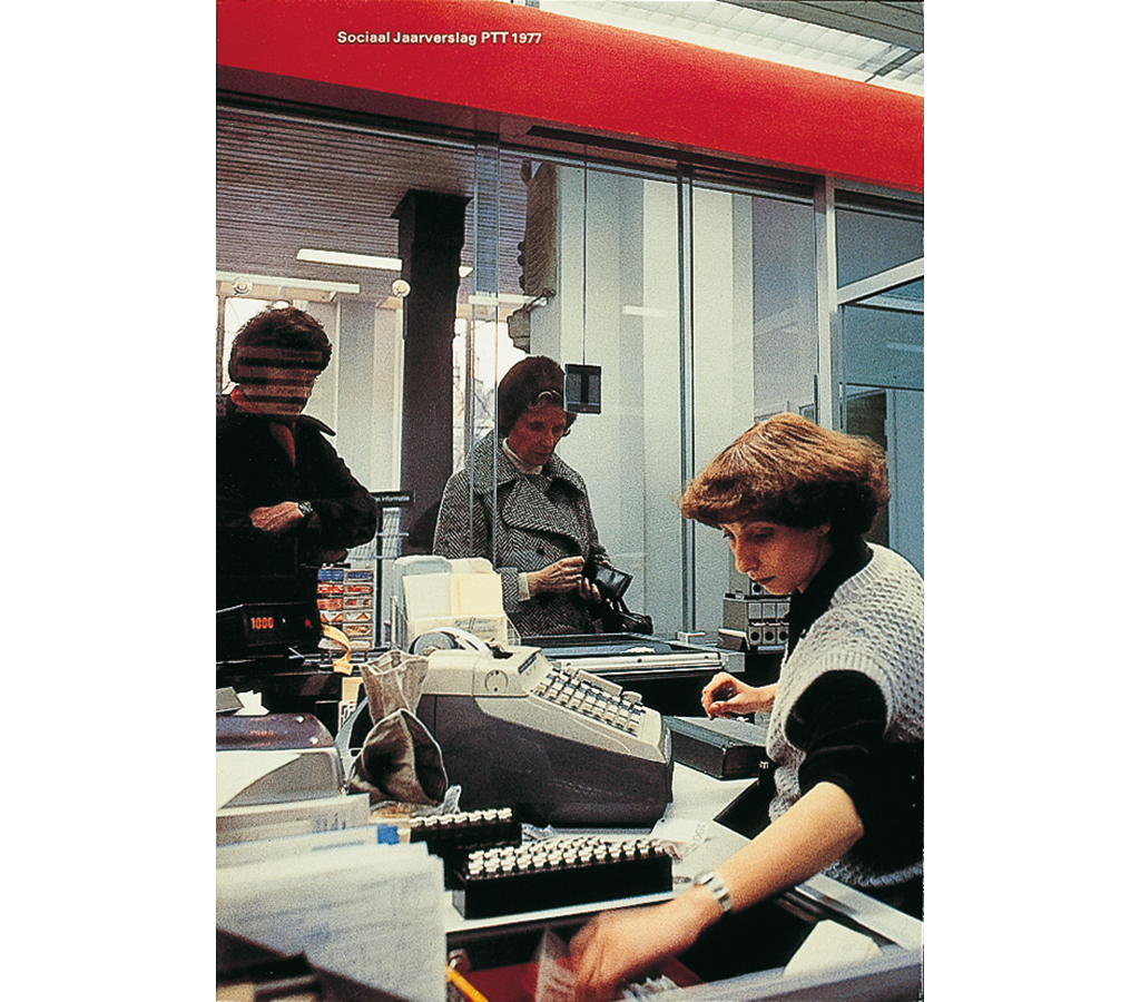
BRS designed two annual reports for PTT, collaborating with Piet Cossée as editor and Eddy Posthuma de Boer as photographer. In 1983, the year BRS and Premsela Vonk amalgamated, Oxenaar came and visited us. During lunch, he said: “In my opinion, in the Netherlands, having one Total Design is enough.” No one responded. We showed him the door, jump-started his car and wished him a safe trip back to The Hague.

The studio
BRS grew fast and explosively. Our first studio, at Prinseneiland, where we had a staff of sixteen, was followed by the acquisition of our huge building at Keizersgracht. We as partners might have lost sleep over this investment, but the bank didn’t see any problem. A lot of work came our way, notably from government ministries and services. Jan and Edo were just great at attracting and managing clients. Yet, looking back, I am a little disappointed how little of our efforts had lasting results. If I see the new umbrella logo for the national government, I am disappointed with its weak distinction.
There is more attention for presentation than ever before, but content suffers. What we did in the 1970s and the 1980s – to work with organizations in order to efficiently reorganize their way of working as well as their communication, but without screaming out loud what we were accomplishing – may not have been spectacular, but it travelled throughout the bureaucratic world as an oil spill. BRS was good at organizing, excellent at typography. We created teams that were tight and motivated, not averse to change and development, with team members who were willing to grant each other all the space they needed to excel. We created an organization in which mutual respect and respect for the client were manifest. And if we met problems, we sat together and solved them.
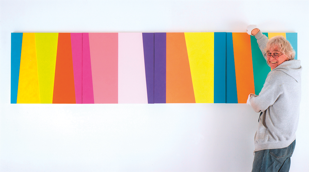
Guus Ros left BRS (later BRS Premsela Vonk, later Eden, then Eden Spiekermann) in 2000. The text of this cahier was compiled from interviews held in 2008 at Academy of Art and Design St. Joost in Breda, to which Reynoud Homan, Mark Schalken and Wim Westerveld contributed. After leaving BRS, Guus Ros became a painter.
Guus Ros
born on 6 February 1940, Amsterdam
Author of the original text: Frederike Huygen, June 2010
Translation and editing in English: Ton Haak
Final editing: Sybrand Zijlstra
Portrait photo: Aatjan Renders
