I first heard about Susanne Heynemann from Abe Kuipers, one of my teachers at the art academy. It was 1966 and Abe showed me her work and said: “The first female in our profession.” Fifteen years later, I came face to face with her when I joined Wolters-Noordhoff publishers in Groningen.
I was lucky to have her as my mentor for one day a week during the following year. My previous job was as a designer for Sdu in The Hague, the state publishers and printers. I joined Wolters-Noordhoff in the belief book design held no more secrets for me. But schoolbooks are different, Susanne explained. Schoolbook design starts even before there is a manuscript on the table; you have to deal with product development of the different elements and preparing the marketing plan.
Susanne had mapped out the whole process in detail. Nevertheless, as a consultant she was given a hard time from all sides of the publishing company. She told me I should fight for the acceptance of the procedures she had developed. “And don’t stay here, in Groningen, at your desk”, she said. “You have to go to the book fairs in Frankfurt and Bologna. Look at what other educational publishers are doing. Look at the product elements, at the design and the images and see what works for which students and which teachers and what doesn’t. Learn, then do it.” It took at least eight years before I could see that her lessons, through me, had reached the heart of the company.
We became friends. From a distance she followed what I was doing and guided me. In 1992, when the colorful new teaching materials were dispatched to the elementary schools, I had the feeling we had done it together. She was 79 at the time but still working for several clients, even from her early years in Amsterdam. Now and then she invited me to meetings of a small group of women in design and publishing she had assembled over the years. Always attentive, always involved.
Susanne is 95 at the time I am writing this. Soon, her printing press will become part of the collection of the Graphic Museum in Groningen. Her type cabinets will go to the Grafische Werkplaats (graphic workshop). One of their teachers is a former professional who as a young apprentice had taken type for proofing to her home and studio. “She could be very strict. She naturally expected us to do spacing by placing pieces of paper with a different gram weight between upper case type. We had them ready to use in the right size for all fonts. At the year’s end she would always bring chocolate letters as a thank you.”
During one of my last visits, Susanne said: “I had a dream. I was working on a layout of a thick and complicated book. Each page had to be designed separately. It was late but I kept working, until I realized I wouldn’t be able to finish on time. I was crushed. It was so unlike me, I always managed to deliver on time.”
Ans van Genderen, January 2009
Susanne Heynemann – Autobiographic notes
The first years
I fell in love with literature, letters, type, typesetting, printing and publishing at a young age. I never fell out of love. “There is no end to the making of many books” (Ecclesiastes 12:12). We had no printers or publishers in our family, although one uncle was madly in love with a well-known publisher’s wife. But I grew up with books all around me.
What makes one desire to get ideas to make books, to design them? The complexity of the whole process has always fascinated me. It started at my school in Berlin, where we were stimulated to experience bookbinding and decorate paper after class. Enjoying myself, I artfully ‘re-designed’ the covers of lots of books I found in my parents’ library – and in my enthusiasm practically destroyed them. My parents reacted rather cheerfully.
Still very young and totally unfamiliar with the magic world of creating books, at the home of a friend I came to meet a publisher in whom I saw a magician. Adalbert was his name. Alas, he didn’t return my adoration, but he did allow me to visit his company and showed me his font library. Fonts, they make me weak in the knees. Letter proofs, all starting with the same arrangement of words, all starting small and slowly enlarging, building up a crescendo. They fascinated me. I wanted to know more.
I was lucky: I was allowed to work as an apprentice under the experienced guidance of an older typesetter, who thought it was a bit odd but not unpleasant. And still today, put me behind a type case, this age-old wonder with all these small metal strips, and I feel at home. I learned about printing techniques, too, and I became aware of the fact that to print, one needed something to be printed: an image, a text; and you needed a machine to do the actual printing, plus ink and paper. This has not changed, it is still how it is done today, all technological developments notwithstanding.
The first projects
I was always attracted to the Netherlands, visited often in the years before WW II, and came to settle in 1939, flying KLM from Berlin to Amsterdam non-stop. Printers are friendly, helpful people; it was easy to get an introduction to a printshop where I could improve my typesetting technique. Lead type and mysterious names, such as nonparèl, galjard, cicero, augustin, grote kanon, that sound very poetic to me even today.
Handwritten letters also spoke to me. I had some experience with calligraphy, but now began to take it seriously. As the typographer/book designer Henri Friedlaender once said: “Calligraphy is not just an art form in itself, it is the foundation for drawing letters and typographic design.”
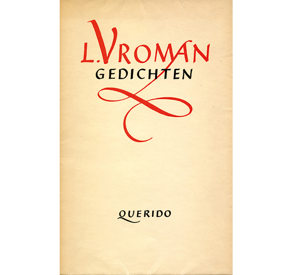
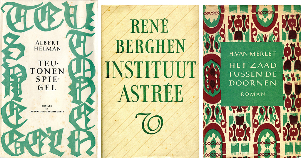
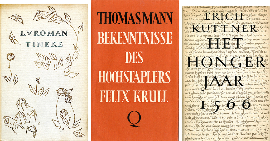
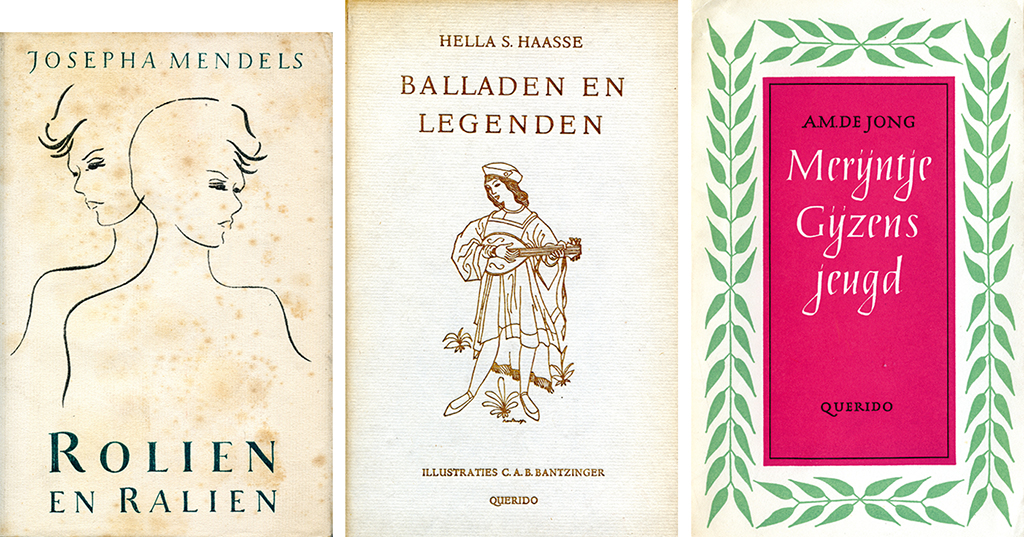
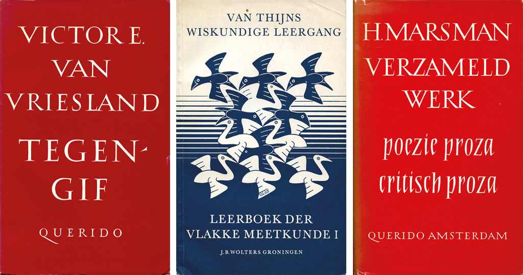
My first commissions: calligraphysheets with long texts quoted from old books and ex libris designs for Chris Leeflang, C.J. Asselbergs, G.M. van Wees and others. I drew individual letters that were sometimes connected by little loops and arcs and I never hesitated to use exuberant twists and garlands; these extravagancies followed me in my career. For the cover of Leo Vroman’s Gedichten, poems published by Querido, I came up with an elegant swing attached to the letter ‘A’. The poet didn’t like the design at all: it wasn’t him, he said. He was right. Later, I worked with him very pleasantly on several occasions, but it took him until his 70thyear to forgive me – he told me so while in Groningen to receive his honorary doctorate. My balance was finally restored.
Larger commissions followed. My first ‘book’: the calligraphy of ten Emily Dickinson poems on 24 large pages (19.8 cm x 25.8 cm); its cover was printed in weak green and weak pink, broken up by a label with the title, Ten Poems by Emily Dickinson. A.A. Balkema published it illegally under his Vijf Ponden Pers (five pounds press) imprint. It was 1944. In 1941, the German occupying power had ordered that no book should be printed or reprinted unless they had given permission if more than 5 kg of paper was used, a quantity that was reduced to 2.5 kg, or 5 pounds, in 1942. Thus: ‘Vijf Ponden Pers’.
So that’s how my first book came about. It was an adventure. I still wonder where I found the courage. When I look at it now I’m slightly embarrassed and at the same time moved, as is usually the case with youthful errors.
Querido
In the summer of 1945 I met Querido’s Alice von Eugen van Nahuys. She had worked for many years with Emanuel Querido, who died during WW II in the Sobibor concentration camp. Alice got the publishing house going again and showed the same love of well-designed and well-produced books the founder himself had been known for. In 1947, Querido’s renewed search for quality was rewarded with the D.A. Thieme Prize. I visited Alice at Singel 262 in Amsterdam and was asked to design a few books for her. I hesitated, because my experience was limited to calligraphy and typesetting, and book design was something else. I asked my teacher Charles Nypels for advice; he said: “Do it!!!” with three exclamation points and promised to help me if needed. That’s how it all started.
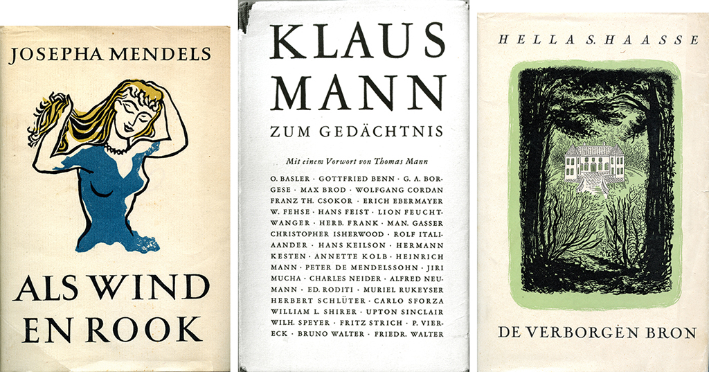
I also met Fred von Eugen, the director of the Amsterdamsche Boek- en Courantenmaatschappij, ABC, publishers of books and newspapers. He asked me to design the cover of Vrij Volk (free nation), a commemorate publication on the occasion of the liberation. I was living my dream. In 1945, designs for Orpheus and Ahasverus by J. van Wageningen (J. Presser’s pseudonym) followed, as well as Stroomversnellingen by Hella Haasse published by Querido. I had a marvelous time and was pushed to be inventive, for paper was still rationed (and not of the best quality either) and few books could be printed. Quality type was scarce, too. Dancing lines were common because old and often neglected linotype had to be used and definitely not because the designer had decided to be frivolous or to show off his refinement as a typographer.
In 1951, the poet Gerrit Achterberg published his Oude Cryptogamen. I covered the whole cover page with his name and the book’s title; hand-drawn letters allow you to do whatever you want. Computers could do it, too, as I learned, but handwriting adds a decorative atmosphere that’s hard to beat.
Nypels
I knew Charles Nypels from before 1945. We had met in Utrecht, we befriended, and he took me along as his apprentice. His teachings and advice, and the way he expressed his love of typography, opened up whole new worlds to me. He was a raconteur with thousands of stories to tell about the ‘anatomy’ of the book; about the value, beauty and different uses of paper; about old and new pictograms; about his quite exciting personal life and his two daughters; and about the French comedy he loved, stories he illustrated with many quotes in French. He talked about his wife as ‘my widow’, had strong opinions about everything, and could rant and rave as the best. I will never forget that he told me: “Creating a book is ninety percent brain work.” He also advised me to shake hands with the typesetters – “that’s more effective than a thousand words.” I loved my typesetters, so, no, I had no problem with shaking their hands.
In 1945, in Utrecht, Charles Nypels, Chris Leeflang and G.M. van Wees were the founders of Foundation De Roos, a non-commercial publisher of bibliophile books. “Making books and printed matter only for the pure and therefore also unselfish love and art, in all conceivable forms in which these can go together.” Their foundation was named after the versatile book artist S.H. de Roos. I observed how they worked hard and with great devotion; it is amazing that even today Stichting De Roos continues to create splendid publications that often make it to the list of 50 Best Book Designs of the year. Elckerlijc was the first of their publications I was asked to design, in 1951. I was to be involved with ten of their books, my last contribution being, in 1983, to Hella Haasse’s Twee Verhalen. Each of these books used a different font, all were bound in silk. Chris Leeflang was a tireless editor, who invested an enormous amount of time to get the manuscripts right and obtain the drawings and etchings, gravures and lithographs. Precious paper was selected, the print quality had to be without comparison, the binding did not escape their attention either.
Indonesia
My husband Max Gruber and I moved to Indonesia in 1952, the year he was appointed professor of biochemistry at the University of Bandung. I had such a wonderful time in the tropics. I was witness to the rise of the new Indonesia, with new universities, with the unforgettable Bosscha observatory in Lembang. Not that the old Dutch East-Indies were no longer visible; the old society was still all around us and also present in the literature by P.A. Daum and Louis Couperus, and by Maria Dermoût, for whom I had designed her book Nog Pas Gisteren just before boarding ship to Indonesia. I was to experience her story in its real and colorful setting.
While in Indonesia, I continued to design books and worked with printers (one of which had the beautiful name of Kilat Madu, meaning ‘honey lightning’). Most interesting, though, was teaching calligraphy and book design at the academy of art at the university.
Images of Bali are vivid in my mind that had to do with being able to read and write, and not being able to (it was 1954). Children on their way to school, carrying their writing books, walking with self-confidence and their backs straight – the way people do who have a purpose – clearly aware that it was a privilege to learn. I can still see before me, in the mysterious darkness of night, a boy sitting at a wobbly table, lighted only by a tiny light bulb, writing carefully and thoughtfully. He was surrounded by some younger and older children who followed his moves as if mesmerized. For children in school letters are no longer incomprehensible signs. With letters you can make words and with these words you can make sentences and those sentences you can read – and reading opens up whole new worlds. Years later, involved with the design of books for dyslexic people, I was somehow reminded of these images – the intense joy and pride of children who have read a book.
Groningen
We spent three years in Indonesia and one year in the United States before returning to the Netherlands, in 1956. My husband was invited to teach biochemistry in Groningen. We arrived by train on a cold March day. It was a cold and clear day and the sky seemed to have been washed clean; a promising start. In the tropics you can intensely long for the seasons. While in Bandung, I read an illustrated article about Groningen; a photograph of the Grote Markt square showed the tower of the Martini church and pedestrians disappearing in a fog. And at that moment I wanted to be there in that cold, damp, grey and misty square in Groningen – a rather peculiar desire.
At some point, it must have been in 1948, I had heard John Meulenhoff of the eponymous publishing house in Amsterdam say that he wanted to pay more attention to the design of schoolbooks. They were too unexciting, too dry, even though they might have been effective as educational material. Now, some eight years later, the Groningen-based publishing house J.B. Wolters also wanted to pay more attention to the presentation of schoolbooks. A.M.H. Schepman, a truly outstanding publisher, discussed the topic with Chris Leeflang, the Utrecht bookseller. I have heard it said that Schepman expressed that he “didn’t want having a man around,” to which Leeflang responded: “No problem, Susanne Heynemann is coming to Groningen.” In the summer of 1956 I had a conversation with Schepman and his co-director, J.A. Schreuder. Before the end of the year I was submerged in schoolbooks that needed a new design approach. It stayed for the next 25 years.
I remember the J.B. Wolters typesetting department and their print shop very well. Typesetters have a special place in my heart.They were a closely knit, sympathetic group who worked quietly and with dedidaction – I remember them with a tinge of melancholy. They were able to decipher all handwriting, even if the authors couldn’t make head nor tail of their own handwriting. They were able to typeset correctly in languages they didn’t understand. In this workshop full of typesetters I held to my own opinions about what constitutes good typesetting – I don’t know where I found the courage. At first they were probably ready to kick me out, but in the end they became friends. As I said before, I love typesetters.
And then there was the print shop. The staccato sounds of the small presses, the andante of the larger ones and the deep basses of the largest ones. Unforgettable music, combined with the delicious smell of printing ink, I can still dream of it.
Education books
J.B. Wolters published a broad range of books for elementary school students as well as for the University of Groningen. I couldn’t have found a better place to be. The essence of a schoolbook is that you are able to learn from it very well, otherwise it is not a good schoolbook. Schoolbooks are paper teachers, that’s the gist of it. Whatever the education’s level, the book has to hit the right tone for its readership.
All texts had to be easily readable of course. You want pages that can be read without effort. This is achieved by unobtrusiveness, the invisible work of the typographer, because you should never put form before content. A spectacular typography that draws all attention to itself is something different altogether; certainly interesting and fascinating but not very suitable for a schoolbook.
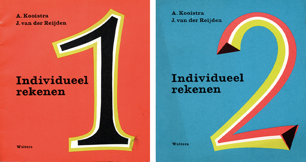
From 1956 on, I designed scores of publications for J.B. Wolters, later Wolters-Noordhoff. Some of them became bestsellers and several fields of education were ‘conquered’, so to speak. We worked with flair and mutual encouragement, they were golden years. In the end, I started to feeI a kind of occupational disability: I heard people talk in bold or italic, in small type or capitals.
In the beginning, the books of Wolters were solid publications, often in a grey cover, not beautiful but very strong and durable. Titles were printed in black or dark blue; if, once in a while, we used red we were dangerously approaching exuberance. We would later call them ‘our grey books’, recognizable schoolbooks that had a long lifetime: a twentieth or twenty-ninth print run was no exception. They had a rather dull appearance, but dull doesn’t necessarily mean bad.
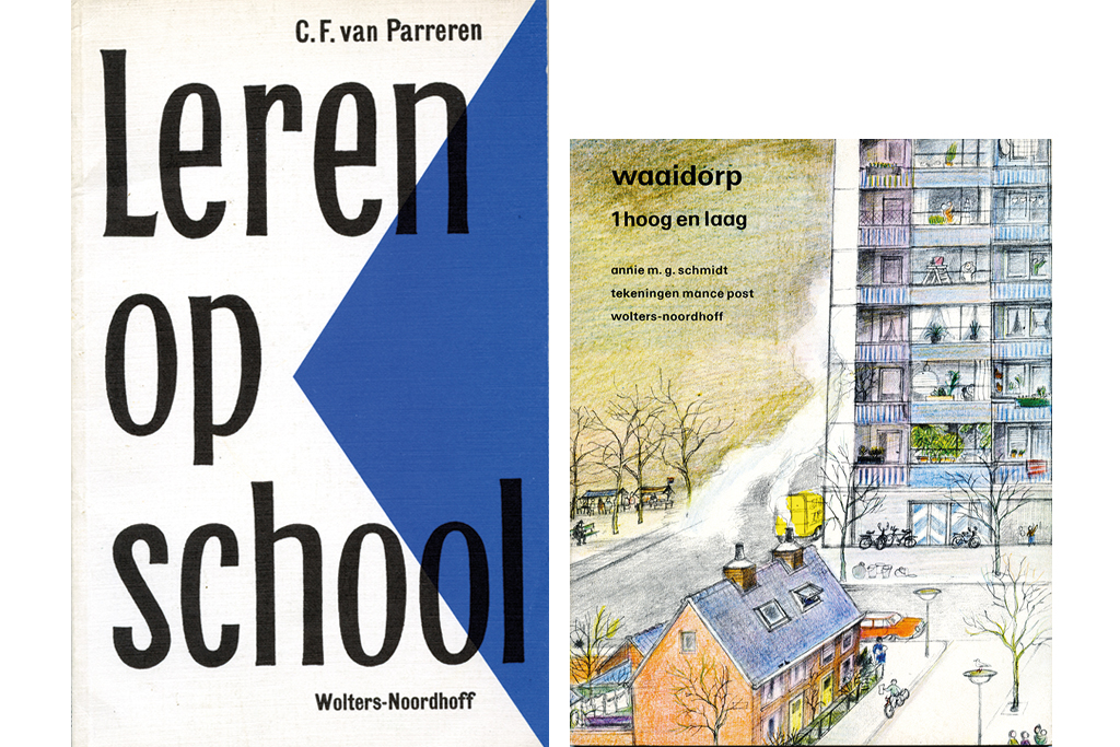
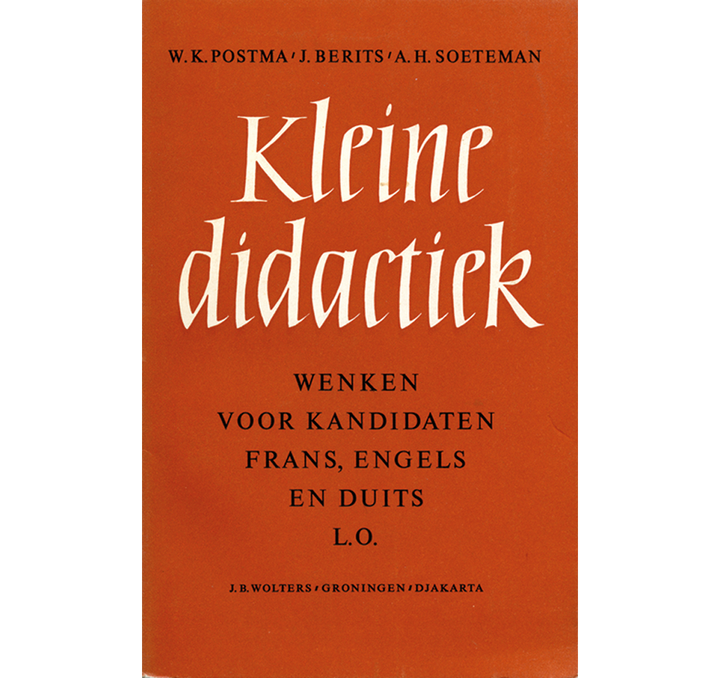
But the times were changing and in Groningen, too, we went searching for different approaches. At Wolters our motto became: economical, meaningful, dynamic. There were two kinds of projects: modestly adjusting the appearance of existing publications according to the latest insights and working on new books. When improving existing publications we were restricted by thrift. Giving one merely a new cover is what we called a ‘facelift’. But the new publications were truly ground-breaking, also in the presentation of the contents. Already in 1958 three of our books were selected for the 50 Best Book Designs of that year: Juris Honoris Causa, Kleine Didactiek and Engelse Spraakkunst. [Between 1948 and 1986, thirty-nine books designed by Susanne Heynemann made it to this list. Ed.]
One of our facelifts was of Vlakke Meetkunde I in the series Van Thijns Wiskundige Leergang (first printed in 1907!). I decided that the 1960 reprint, its 24th, would do well with a cover design by M.C. Escher. Escher liked the idea (he wasn’t world famous yet) and moreover, as he said himself, he felt more affinity with mathematicians than with artists. I visited him in his spacious Baarn studio; it was fascinating to see him work, using a magnifying glass while carving wood to the finest detail. “The hand reaches so much farther than the eye,” he said. He made a beautiful design: flying birds changing from dark to light over a background changing from light to dark.
Over the years, I was involved with the production of hundreds of publications, for all levels of education. Readability and the ‘nuance’ of each publication were the starting points for my designs. It was obvious that I should also pay attention to the delivery of the subject matter, which can be done in a thousand and one ways. Words can convey strong images but not as well as images themselves, that is to say models of books, book-like objects or even non-books. Models not meant in the first place to follow literally but to open up new perspectives, to break ground. Wolters had developed a set of such models and aptly called them ‘bibliodynamica’.
It used to be sufficient to add a simple manual to a schoolbook or method, but gradually the guidebook for teachers became an essential part of the method itself. All sorts of didactic guidebooks were made available to support the teachers and many of these were wonders of applied psychology. Other publications were added: exercise books and logbooks as well as audio books and slide series. We also published mini-books with only eight pages and titles such as I, You, Yes, No. Not to teach children to read but to make them familiar with books. Back then the book made its appearance quite late in most childrens’ lives, so we had to prepare them for its arrival. Today it is different. Children are born with computers and learn while playing. The arrival of the computer changed everything. That’s why I stopped being a schoolbook designer in 1983. I continued in design, but concentrated on other types of books.
Other books
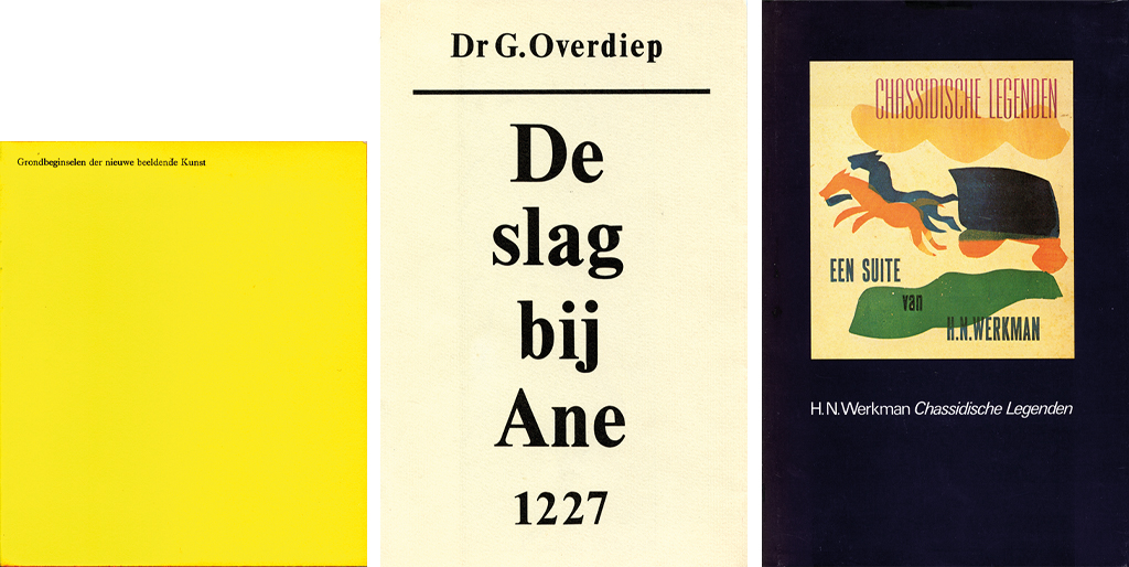
Books have a long past but are not ‘history’, nor will they ever be. As long as there are poets and writers, there will be books. Who doesn’t have a favorite book? The relationship between reader and book is a special phenomenon, with no other person involved. And, more practically, the book is ‘pleasant to read, light to carry and therefore easy to consult wherever one may be’. The electronic age is full of miracles. Information is immediately available, worldwide. But it does not affect the essence of the book. For one thing it is tangible, whereas an image on a screen is evanescent. Its beauty can be, and often is, extraordinary. Go visit Museum Plantin in Antwerp, Belgium and see the excellent and handsome manuscripts and tomes from all ages they have on display. Eternal beauty. I think it was type designer S.H. de Roos who once said that books are born grown up. And at H.N. Werkman’s print shop, one day I discovered a piece of paper glued to the side of a type cabinet saying: “Books are the solace of the lonely.”
Susanne Heynemann
born on 19 June 1913, Berlin (Germany)
died on 15 February 2009, Groningen
Text re-edited from the publication ‘Susanne Heynemann. Typographer’ (Museum van het Boek, Museum Meermanno-Westreenianum, Universiteitsbibliotheek Groningen, 1998)
Translation and editing in English: Ton Haak
Final editing: Sybrand Zijlstra
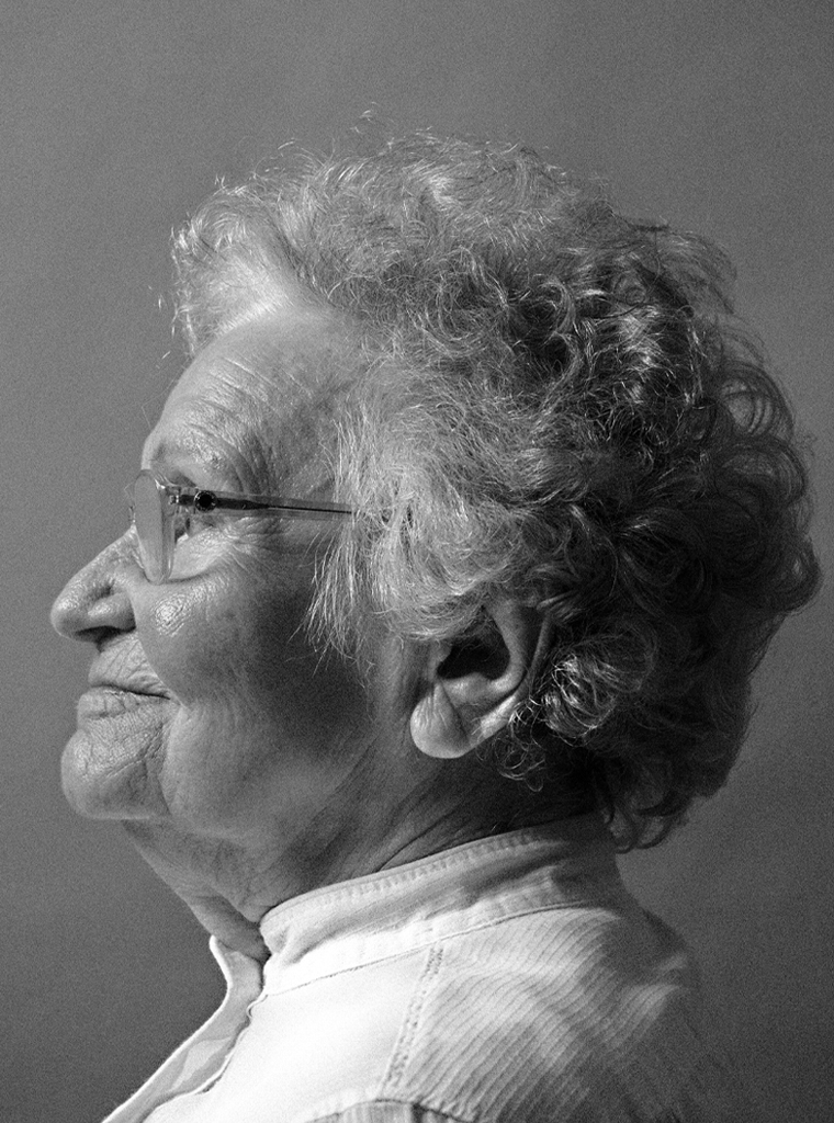
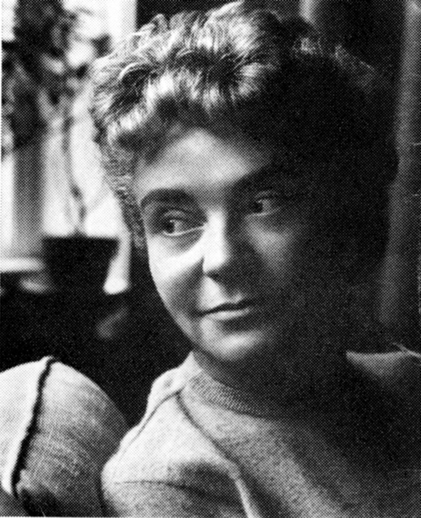
Portrait photo: Aatjan Renders
Susanne Heynemann, a short chronology
Born: June 19, 1913
1930s: apprentice with Berlin printer Büxenstein
1940s: working at typesetters in Amsterdam, establishing contacts with Utrecht based bibliophiles
1944: first book design (Emily Dickinson’s Poems)
From 1945: designing for Querido, ABC and Querido Verlag
1948: recipient of the Herman Duwaer Award of the City of Amsterdam
Early 1950s: Teaching design in Bandung, Indonesia and, during a stay in the U.S., becoming a member of AIGA American Institute of Graphic Art
1956: starting at Wolters, later Wolters-Noordhoff publishers
From late 1950s: designing schoolbooks for Wolters-Noordhoff and doing free-lance projects for Stichting De Roos, University of Groningen, and other clients
1968: teaching book design in Groningen
1983: leaving Wolters-Noordhoff, continuing to design bibliophile and scientific publications, and more