Hans Bockting was born in Bladel, on May 8, 1945 – at the time of a watershed in European history, the end of WW II and the beginning of the Cold War. Maybe this is why he has always cherished his independence. “Freedom,” he says, “is and remains the supreme good.”
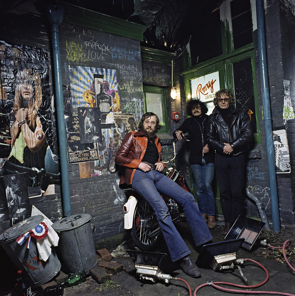
From left: Hans Bockting, photographer Hes van Schoonhoven, Dieter Ludwig (1972). Photo session for Puch brochure. Location: the rear of the Bockting home and studio in The Hague, transformed into an obscure club. In the trash bin: the ADCN Award received for an earlier poster design.
In 1964, Hans Bockting enrolled in Enschede’s Akademie voor Kunst en Industrie, AKI (Academy for art and industry). He studied graphic design as well as graphics art and photography. “The graphic design classes were following the Swiss design tradition. Clear shapes, uncomplicated color panes, all nicely staying within the lines. There was no important role for illustration and photography – these were subjects taught in book design class, a separate department. Abe Kuipers was the one who introduced me to the history of letterpress and layout.”
He spent many hours on experiments with etching and lithography and was always to be found at the typesetting machines and printing presses. “Working with lead provided me with the criteria to judge the visual image of text: measurements and ratios. Even though photography would become a most important medium for me, I wasn’t much interested in handling a camera myself. In the evenings and during many a night, I created large collages using imagery cut from newspapers and magazines, which I covered with template letters, handwriting, and painted or printed color panes.”
New teachers came to the academy who were less hung up on doctrines: Wim van Stek, who worked for the Gemeentemuseum in The Hague, and Geert Voskamp. In Bockting’s first posters, for the theater, he used fragments of images that showed he was under the influence of Polish poster designers. Bockting recalls that at the time he was trying to get as broad a view as possible and to be open to all new developments in other art fields than graphic design: music, dance, theater, film, literature and the visual arts. Also, he found inspiration in daily life, in street scenes or while traveling.
Advertising in The Hague
Wim van Stek was the one who advised Bockting to find a job in The Hague and who provided him with a list of contacts. “I knew I had to get out of Enschede. My classmate and girlfriend Ans van Genderen moved with me.” His first application was successful: in 1967, Kees van Roemburg at HVR advertising agency hired him; he would remain at HVR until 1970. It was to be his one and only salaried job.
During his relatively short period at HVR, the advertising industry experienced quite a change. Until the 1960s, print ads had been strongly influenced by Swiss design, with clear lines, frequent use of black-and-white images, dispassionate typography and solid layouts. Five years later, the face of advertising had changed. Less text was used, colorful photography would dominate whole pages, and typography went wild.
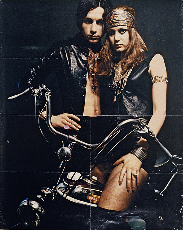
The Puch poster design awarded with an ADCN award in 1968. Bockting continued to work with Piet Wapperom and Hes van Schoonhoven on promotions for the Puch moped brand after he had left HVR.
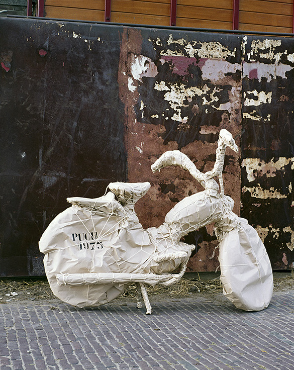
Image of an ad introducing a new type of Puch (“with thanks to Cristo”).
One of HVR’s clients happened to be R.S. Stokvis, a Rotterdam-based trading company that imported Puch mopeds. The target group for this product were youngsters (age 15 to 18). Bockting was commissioned to design a poster campaign to promote Puch, “for didn’t I belong to the same crazy sex, drugs and rock-n-roll crowd?” He did in fact understand the youth culture better than the older creatives at HVR. The Puch campaign’s account executive, Piet Wapperom, put Bockting to work, together with Hes van Schoonhoven for photography. “We were already part of the circle around the fashion designers ‘Puck & Hans’ who provided us with what we needed to dress our models in. The models we found in the street or through friends.”
Meanwhile, Bockting was exploring new career possibilities. “At HVR I hardly had the time for things I was really interested in: good typography, book design, corporate identity design. I almost had the opportunity to explain my designs to the client; that was the account executive’s job. I like doing it when I got the chance: I learned to argue in advertising.”
Logotype for Archi Interieur, Rotterdam (1968)
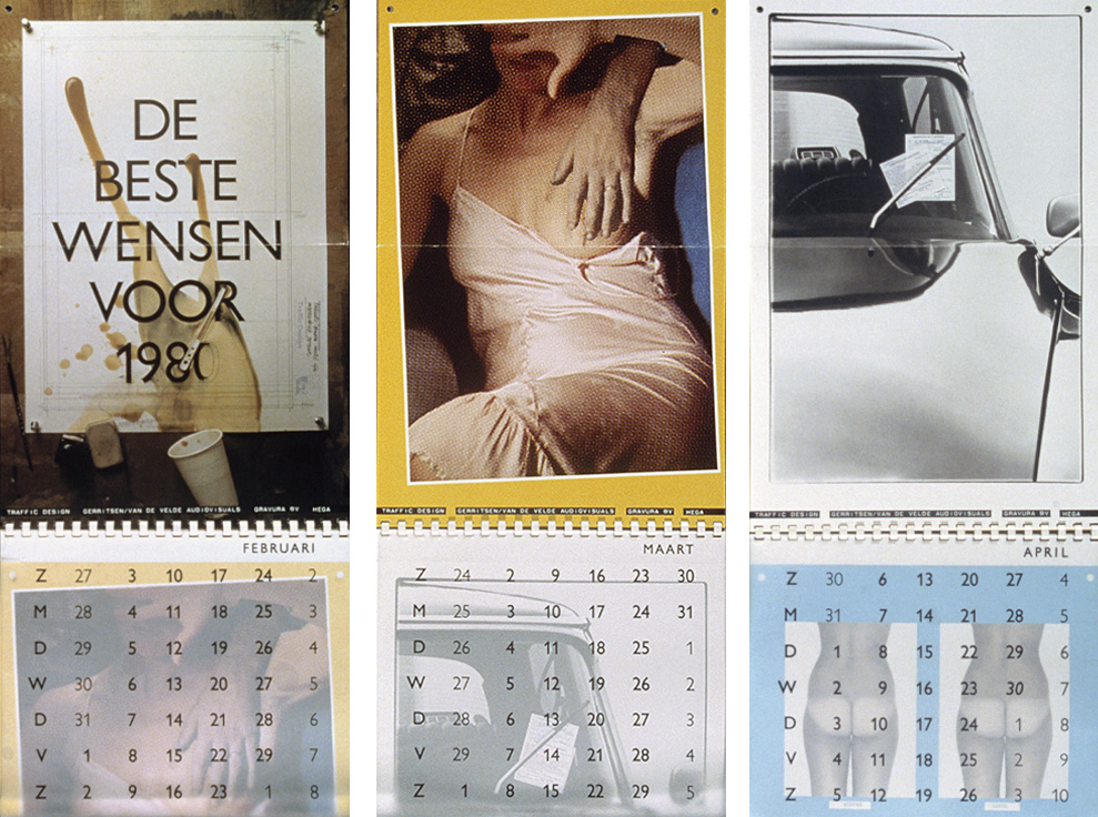
Calendar, produced and published in collaboration with Reinier Gerritsen and Maarten van de Velde (photography), Gravura lithography and Hega printers (1980). In subsequent calendar projects Bockting’s friends Rick Comello and Lex van Pieterson were involved, as well as his partners Henk Hoebé and Will de l’Ecluse.
Traffic and later
Bockting explored possible jobs at Tel Design in The Hague and with Delpire in Paris. Yet he decided to collaborate with Dieter Ludwig with whom he started his own agency, Traffic Design, in 1970. His first clients were Sandoz Nederland, Falkplan, the City of The Hague and Dutch PTT. “Dieter really knew about production techniques; if he said it couldn’t be done, that was it. At the time, I first met Fokko Tamminga, director of Ando printers, and their shop became my second home.”
Bockting’s design could be quite controversial or provocative. The simple brochure about wastewater treatment the Haagse Duinwaterleiding (municipal water company) had expected became a surprising series of leaflets in which infographics and a cartoon story illustrated the whole process.
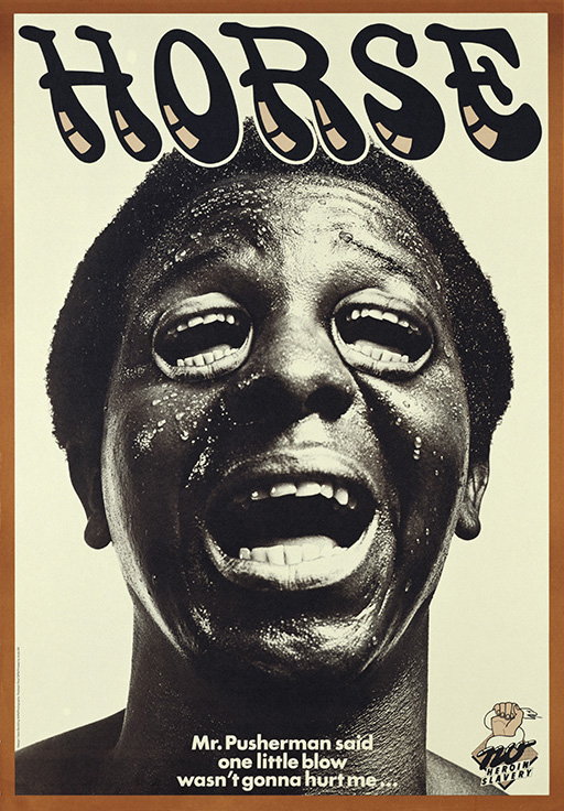
Poster against heroin addiction, aimed at Surinam youth (1976). Campaign photos by Rudolph Pauli.
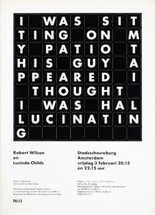
Poster for a Robert Wilson theater production (1977) for Nederlands Theater Instituut (Bockting had previously designed the institute’s logo).
After five years, Dieter Ludwig left the studio to sail the oceans. Bockting decided to continue by himself, working for government departments, publishers and cultural organizations. It was the time of consolidation and professionalization. He designed his first book, a catalog for the Mauritshuis museum that brought him his first Best Book Award. Many of the government officials who he had to face to discuss big projects with were restricted in their freedom. So he decided to take his own liberty. “I learned to read between the lines of project briefings and not to do precisely what was expected from me.”
He was asked to include the logo of Van Lanschot Bankiers, a sponsor, in a poster design for the Mauritshuis. The bankers were impressed by Bockting’s presentation, during which he minced no words while critiquing the bank’s upperclass, conservative image. It was the beginning of a relationship that would last for 25 years (and three studios).
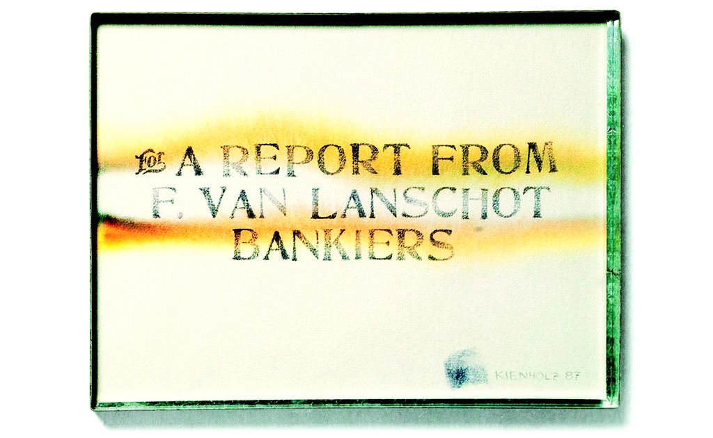
Van Lanschot Bankiers was Bockting’s client from 1982 to 2009. “The first commission was to design their annual report. I tried to deliver an effective and elegant presentation of the financial data. But I also tried to present the lesser known activities of the bank by introducing illustrated themes. This resulted in, especially for a bank, rather striking designs. In 1986, we showed how artists looked critically at money and money managers. We had Edward Kienholz produce a watercolor for the report’s cover (for a little money and a copy of the report), one of the many works he delivered in exchange for services or products, thus proving that to barter, one doesn’t need a bank.”
In 1988 and 1989, the theme was: how did people look at financial data through the different ages. The baroque images were realized in collaboration with Lex van Pieterson. We built crazy installations in his photography studio. Later, I added all sorts of graphic elements to his photography.”
Concepts, Amsterdam
In 1982, Bockting closed his one-man studio to enter a partnership in Amsterdam, Concepts. On five floors of an old trader’s warehouse in the Nieuwmarkt area, seven designers came together from different disciplines and backgrounds. “I learned about the new studio from Will de l’Ecluse at a time I was ready to enter a new phase in my career; new clients had approached me with very demanding projects and I either had to expand my own studio or to find partners to help me handle them.”
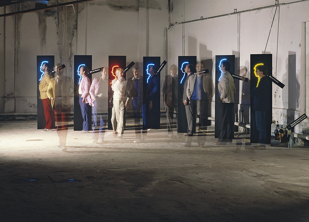
The seven Concepts partners. From left: Hans Bockting, Will de l’Ecluse, Ton Haak, Floor Kamphorst, Hartmut Kowalke, Anne Stienstra, Marcel Vroom. Concepts was associated with the industrial designers Hans Ebbinge and Ton Haas. Photo by Maarten van de Velde (1982), at the introduction of the new partnership
Concepts started as a multidisciplinary agency: graphic design, industrial design and 3D design, but it became evident that the expected synergy did not occur. After two years, Ton Haak and the industrial designers Marcel Vroom and Theo Groothuijzen as well as associate partner Ton Haas decided to move to Rotterdam and to found a new industrial design studio.
Concepts was continued by the graphic designers Hartmut Kowalke, Floor Kamphorst, Anne Stienstra, Will de l’Ecluse and Hans Bockting. The studio attracted many young designers and interns (including Robert van Rixtel, the future publisher of the Dutch Graphic Roots series). “Interns weren’t ordered to make coffee,” said Bockting. “We already involved them in the first phases of a project; they did research and helped find directions. This approach led to surprising results.”
Yet, even in the second phase of Concepts, only a few real collaborations between partners came about. Only Bockting and De l’Ecluse worked together often and successfully; they occupied the same floor of the Concepts building. “We really complemented each other. I approached a subject from its contents, Will more from a design viewpoint.” After five years at Concepts, Bockting and De l’Ecluse left to start a new studio; they were joined by Henk Hoebé, a graphic designer Bockting had worked with on projects before.
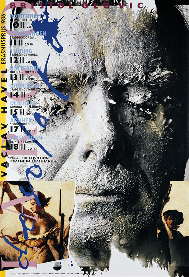
In 1986, Victor Havel received the Erasmus Prize. “On the occasion, the Bristol Old Vic performed Havel’s play ‘Largo Desolato’. The plastered head I used in the poster is Hartmut Kowalke’s, one of my Concepts partners. Reinier Gerritsen was the photographer.”
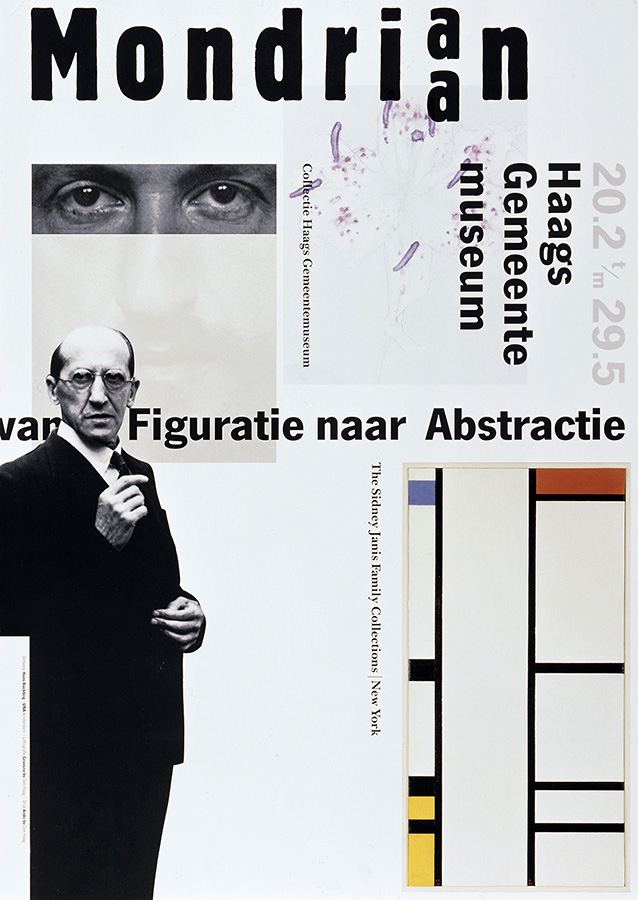
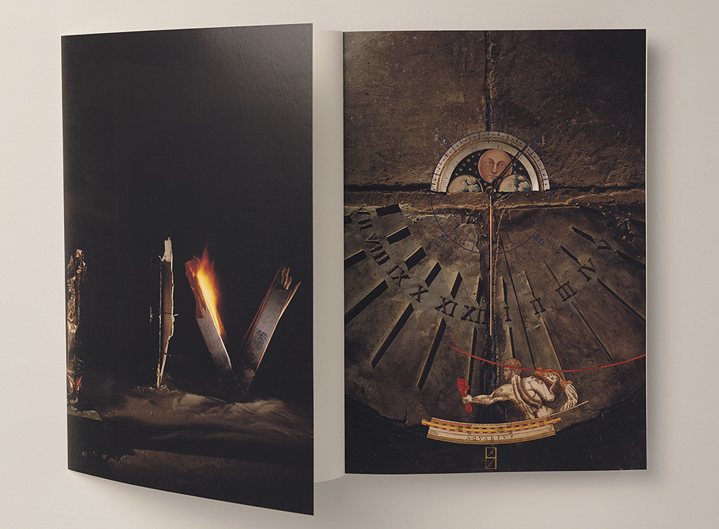
Exhibition poster (1988). “I also designed two catalogs for the same exhibition. I had visited New York together with art historian Herbert Henkels and journalist Coos Versteegh and dropped by art gallery owner Sidney Janis. He had hundreds of Mondrians propped up against his walls. Henkels selected the works he wanted to include in the Mondrian exhibition in The Hague and I decided which details I wanted to have photographed. We also wanted to show the handwriting of the young and the older Mondrian. Back in The Hague, we discovered it was someone else’s handwriting and we had to ‘restore’ the poster.”
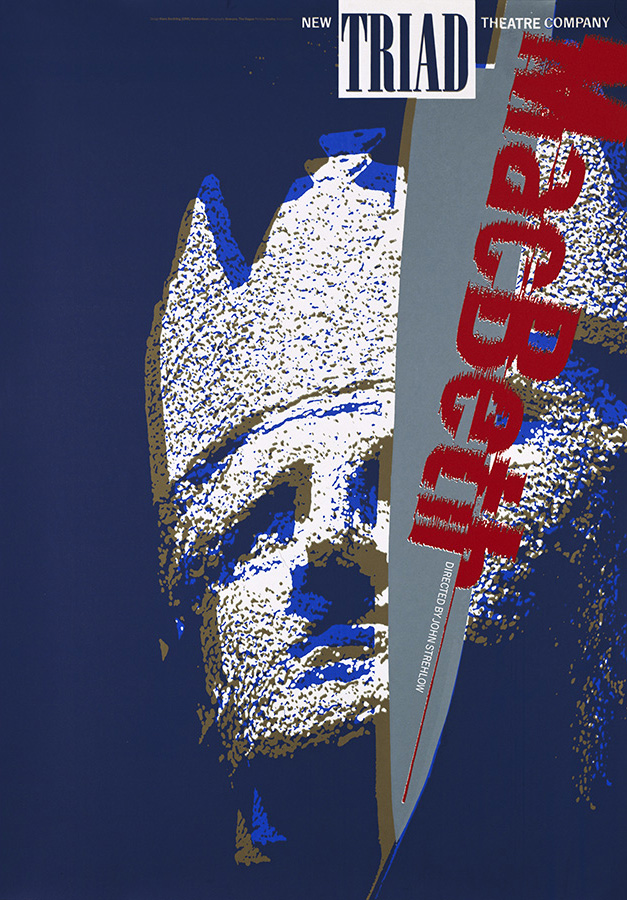
Posters and programs for Triad, an English-Australian theater company directed by John Strehlow (1989). Screen print in gold, blue silver and red.
UNA
UNA was founded in 1987. After nine months in a temporary location, the partners settled in an industrial building with tall windows and big skylights at Amsterdam’s Mauritskade, where they would remain for fifteen years. Krien van Stapele and Marie-Anne Defesche designed the studio’s open and bright space; it reflected UNA’s spirit and energy and was dominated by a large library with an oval wall.
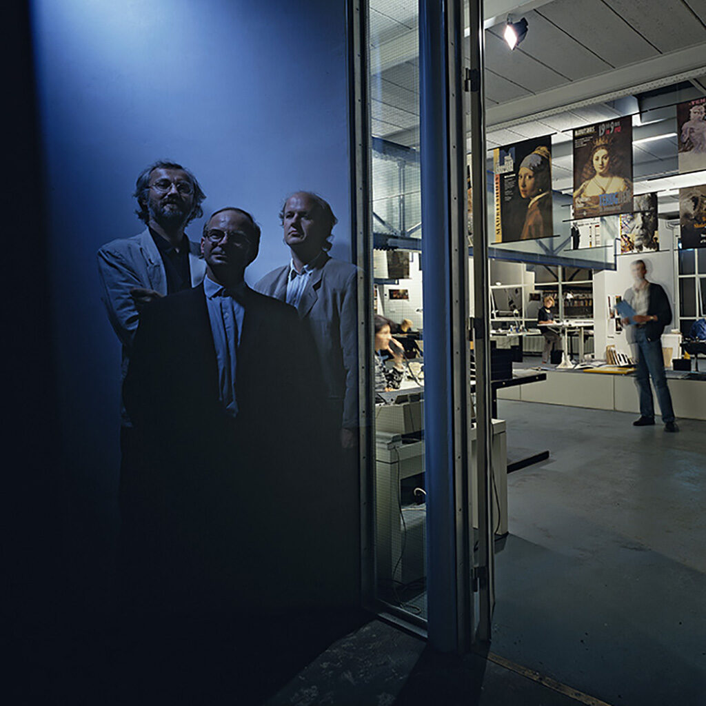
The UNA partners at the door of their Mauritskade studio (1987). Photo: Maarten van de Velde
UNA grew fast. The designers excelled and distinguished themselves by presenting a strong visual language, without loosing track of elegance of style and perfection of execution. UNA did not join the ranks of the cool problem solvers, such as Total Design, BRS Premsela Vonk (later Eden) and other specialized corporate identity studios. Nor did they embrace popular culture the way studios such as Hard Werken and Wild Plakken did, or other forms of ‘viusal friction’ (some would call it ugliness) as preferred by young studios in the 1990s.
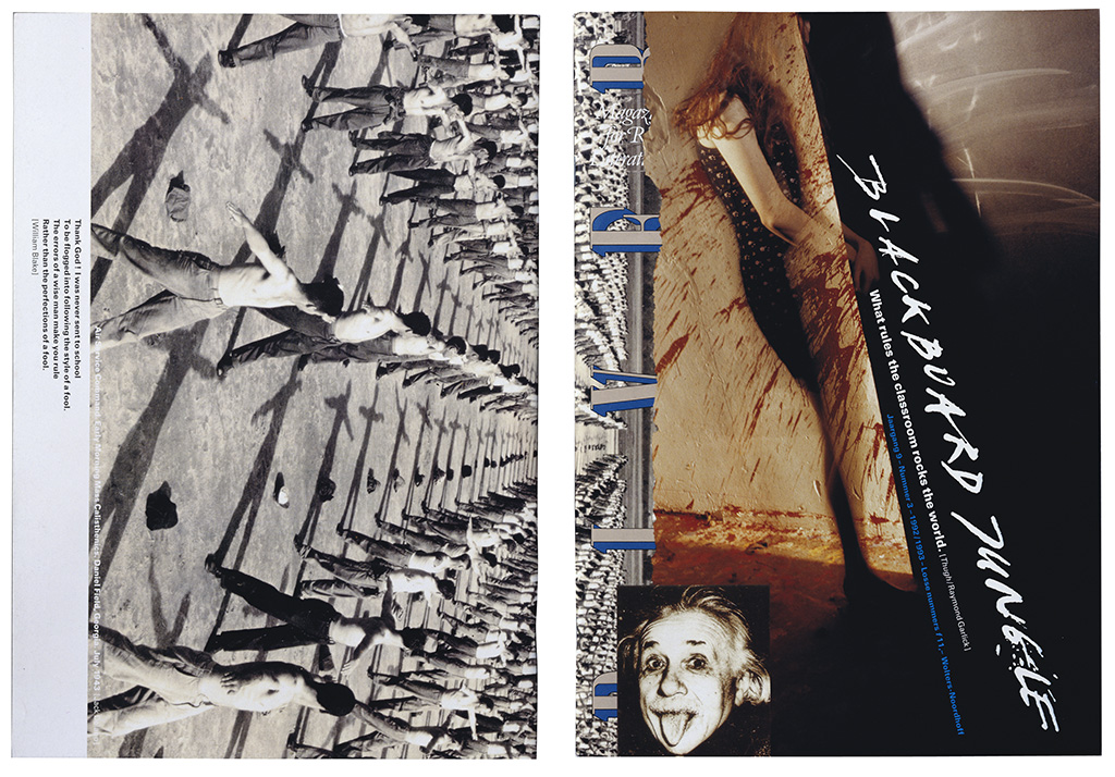
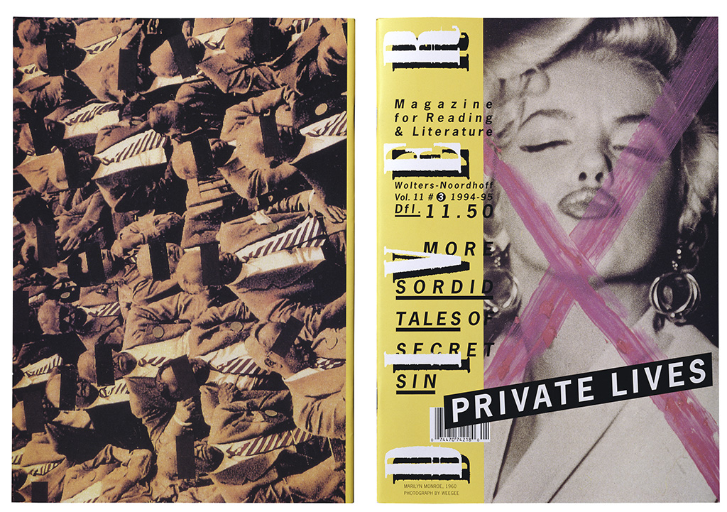
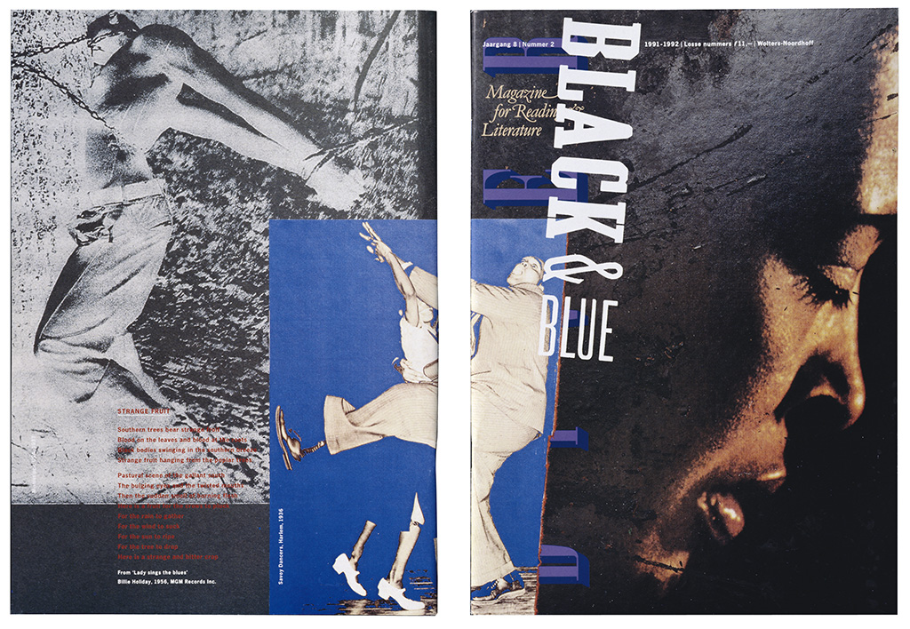
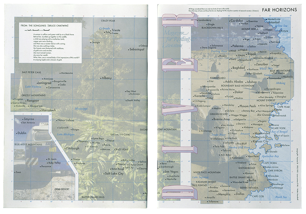
‘Diver’, an English-language magazine published by Wolters-Noordhoff, was aimed at the education sector. “The covers delivered a visual commentary on each issue’s theme. So did the illustrations used with the articles. I invited many friends and colleagues to contribute.”
The contents of a publication directed UNA to the design of books and other projects. They were strong conceptual thinkers, not just doing right to their clients’ culture or viewpoint by arranging for the clearest possible communication: they strived to always create a surprising interplay of form and contents, and did not shy away from taking risks or hard sells.
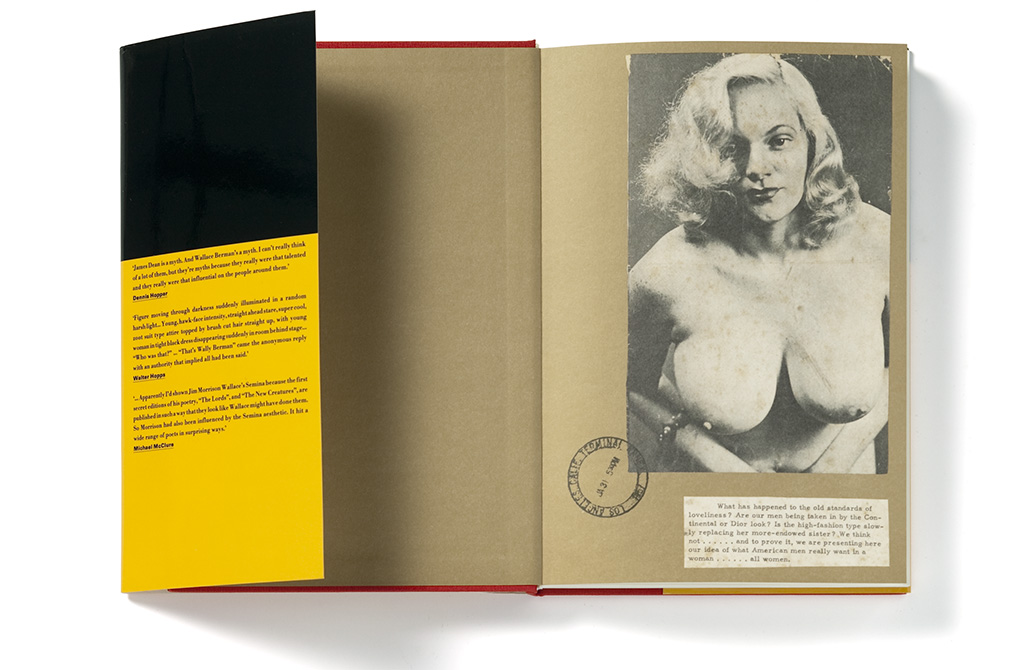
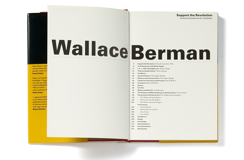
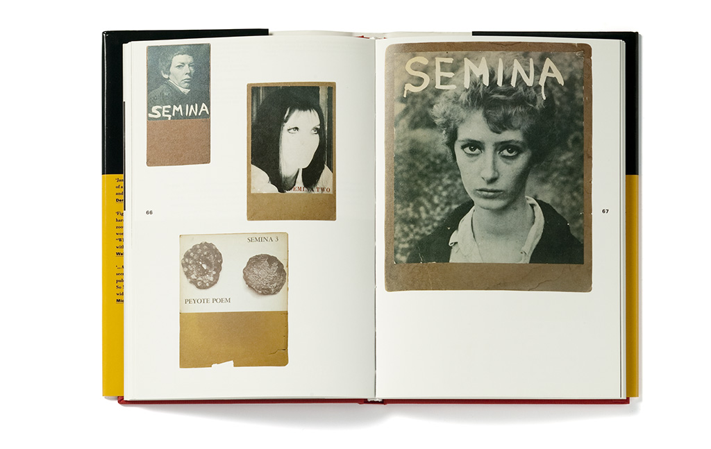
For ICA Amsterdam, Bockting designed several art books (early 1990s). The artists, like Richard Tuttle and Kiki Smith, were personally involved with the production. This book is an exhibition catalog about Wallace Berman, a Beat Generation exponent.
“Now and then we had to convince a client to join the adventure. We always talked directly with the decision makers, we never worked through intermediaries. It is in their nature to avoid risks.” Strong concepts were supported by utilizing unique production techniques and the use of special papers. Their own (promotional) desk calendars became internationally known as collectable items.
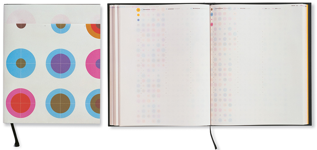
UNA, in collaboration with a changing group of partners, published a desk calendar to promote their creativeness and professionalism. The first desk calendar was produced in 1991 and created a lot of publicity. In 2001, UNA designed a calendar that showed the passage of the days by only using graphic means. The thin paper (a Japanese fold) is printed on both sides with a pattern of concentric circles that proceeds twice a week. Sabine Reinhardt was the typographer and prepared the complicated print instructions. The Art Directors Club of New York gave the design a Gold award.
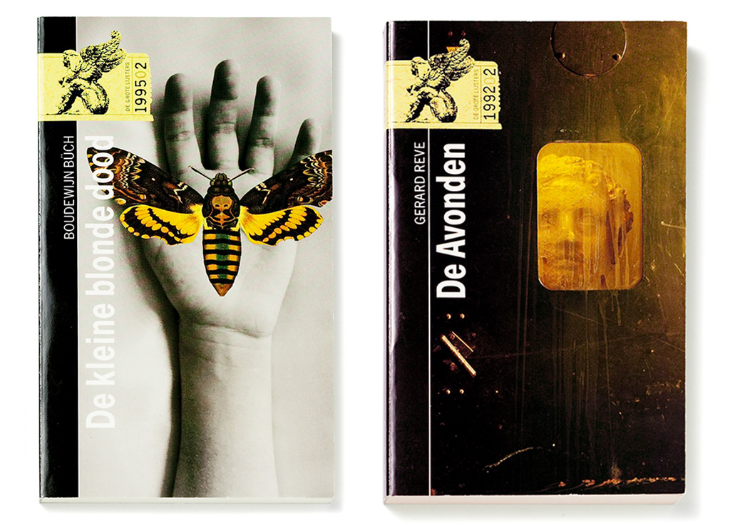
Two covers for a book series (Grote Lijsters) published by Wolters-Noordhoff. The project was initiated by Ronald Dietz, who left Wolters for De Arbeiderspers publishers in Amsterdam but continued to work with Bockting.
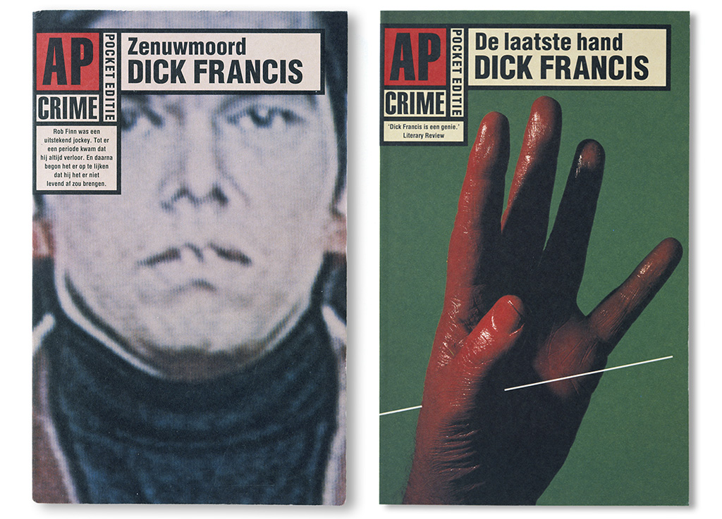
Book covers of a crime series published by De Arbeiderspers. The design used light, flexible and non-laminated covers and had a distinguished and informal character. “The series wasn’t granted a long life – the cover designs didn’t present the usual clichés.”
Recognition
Already from the start of the studio, UNA had their eyes on other countries. Young designers approached UNA for an internship; presentations at international fairs awakened an international interest in their designs. Awards were won. The Maastricht fair introduced them to Design Zentrum NRW in Essen, Germany, the founders of the Red Dot Awards. Awards from the ISTD (International Society of Typographic Designers) in London followed.
The award ceremony in Essen changed Bockting’s life. There he met Sabine Reinhardt, who applied for an internship with UNA in Amsterdam. She stayed around to become an assistant and the collaboration of the two got wings. In 2004, Sabine and Hans got married; eventually they became business partners, too.
Asked about what set UNA apart, Bockting mentions semantic relationships of definitions that can be traced back to the Latin word praesens and have to do with ‘the now’, giving, thinking and communication. Grammatically, it means ‘present tense’ – from which came present (gift), presence (being there as well as clear-minded). Bockting cleverly combined these concepts and concluded: “A logical consequence of this approach is, that in order to be of topical interest a presentation should be a present, a gift. That’s what still guides me: a presentation prepared with great care and love, and attention to every detail – a true boon to the receiver.”
Because of his passionate stand against unpaid-for pitches, he was invited to join bNO’s board in 1992. After three years he was elected to be the organization’s chairman, which he remained for two years.
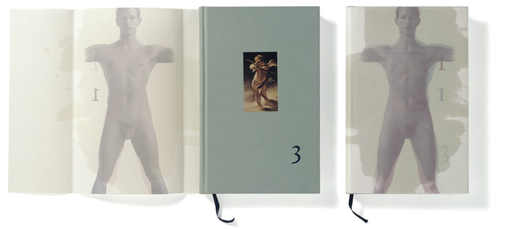
1993. “Holland was the ‘Schwerpunkt’ at the Frankfurt Buchmesse and highlighted Dutch literature. [Z]OO production’s Robert van Rixtel asked me to design a book in which not just authors, but illustrators and graphic designers as well as graphic production companies could present their profile. No money changed hands, of course. I designed the book’s cover. By using linseed oil parts of the cover became transparent and the figures of a man and a woman blended. This referred to the title of the publication: ‘1 + 1 = 3’.” Photos: Diana Blok. Typography: Will de l’Ecluse
Changes at UNA
Bockting remembers UNA’s first years (the late 1980s, early 1990s) as the most interesting period. After its first free and explorative years, the studio found itself adapting to a more formalized approach of projects. “The continuous discussion of where projects were going, which enabled us to respond alertly to situations, was replaced by formal Monday morning meetings. I could never really accustom, I like to improvise.”
After 2000, technical and organizational developments in the graphic sector created an uncomfortable feeling, at the same time that marketing and communication managers became almost almighty in the business as well as in the government sector. “Ladies and gentlemen decided about design as if they were buying a skirt or a jacket. Then, later, it would become clear that they didn’t have the real authority to make decisions after all.”
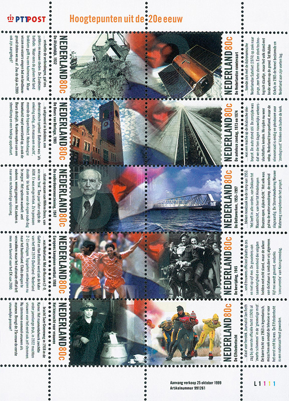
“In 2000, PTT introduced a series of postage stamps with as theme: highlights from the 20th century. I worked on the design together with Will de l’Ecluse and David Smith. For PostNL Bockting Ontwerpers designed the pop-up stamps for the Childrenbookweek 2012 and the December stamps 2013.
Logo for CAOS Congress and Administration Services (late 1980s). “I met CAOS director Robi Valkhof in 1986, when we prepared our contribution to Design ’87. Will de l’Ecluse and I were responsible for the then controversial congress design. I still work for Robi and her team.”
Proposal for the identity of the Kieler Woche 2001. Every year a number of designers is invited for this competition. ‘My proposal was not selected: the jury had a problem with de figure combination 00, in Germany a familiar reference to the toilets. In my opinion, considering the liberal consumption of beer and sausages during the Kieler sailing event, applicable…’
Economic pressure and fiercer competition caused business to shrink and reduced the size of the studio. Having two captains on one ship made the organization top-heavy so Bockting decided to end the partnership with De l’Ecluse and to leave UNA. In the same period, between 1998 and 2005, Bockting became an enthusiast ambassador for Dutch graphic culture. He joined the board of NAGO (Dutch archives of graphic design, later taken over by the Wim Crouwel Institute). He also took it upon himself to organize the UNA archives, which were eventually handed over to the University of Amsterdam (Special Collections).
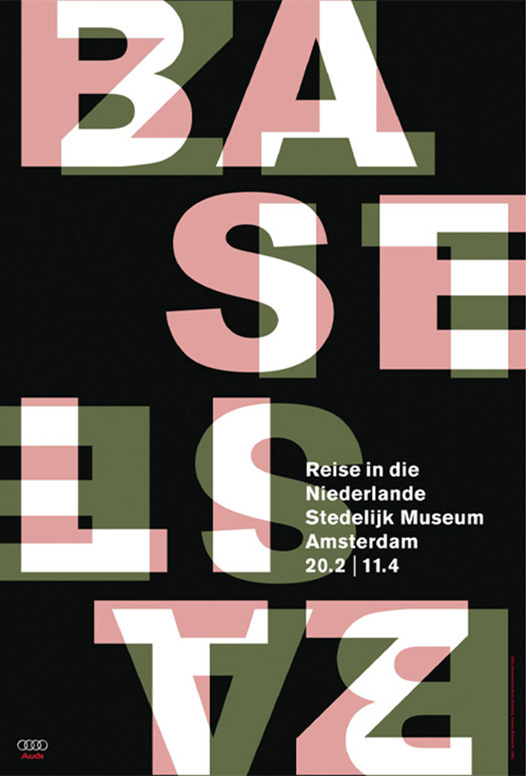
Poster design for Stedelijk Museum. “By request of the museum, Georg Baselitz had delivered a strange sculpture. There was no way I could use its image for the poster. Sabine Reinhardt managed to design a great alternative: a typographic interpretation of a characteristic element in Baselitz’ work: upside down figures. Two different color versions were printed.”
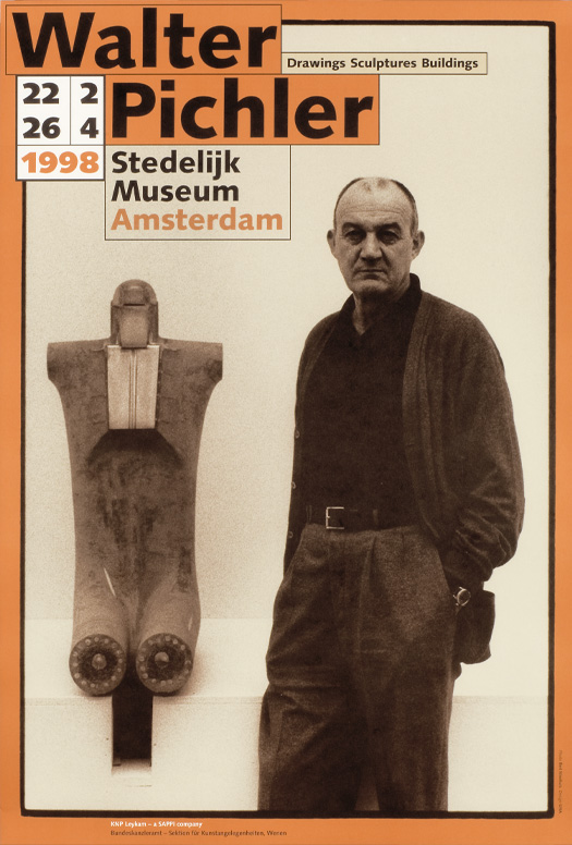
Bert Nienhuis photographed the Austrian sculptor Walter Pichler for this poster.
Bockting Ontwerpers
Hans Bockting continued to design in a partnership with his wife, Sabine Reinhardt. Book production became their favorite field. They collaborated with a range of publishers, authors, illustrators and photographers to create extraordinary publications. Children’s books became one of their specialties.
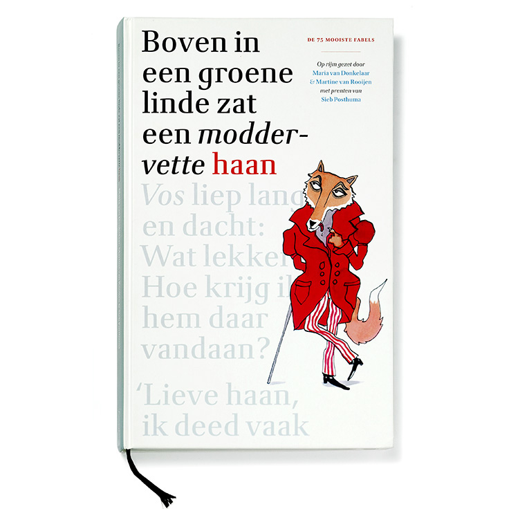
Sabine Reinhardt contacted Gottmer publishers in 2004. From 2007 on, Bockting and Reinhardt worked together as Bockting Ontwerpers and they created scores of outstanding children’s books. Many of these were awarded. The book of fables was illustrated by Sieb Posthuma.
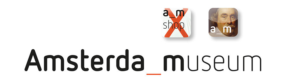
‘In 2010 we presented proposals for the identity of the Amsterdam Museum. Crucial was the use of only one typeface: FF Netto, a neutral sans serif with shapes reduced to an absolute minimum. We considered this typeface, used in all communication items, the essential element of the museum’s identity, creating a high rate of recognition. It did not work out that way: the judging committee decided differently.’
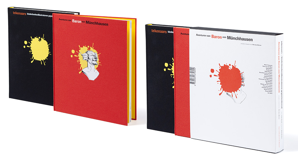
‘The adventures of Baron Von Münchhausen’ (2016). Eighteen different illustrators collaborated to the book. An additional book presented interviews with, and other work of these illustrators. Hoogland & Van Klaveren published the two books. They came together in a box designed by Piet Gerards.
Bockting: “As a jury member of de Gouden Penseel (award for illustrated children’s books), I noticed that many books for children are magnificently illustrated but lack a real design. Designers enter the creation process only at the end. I wondered: what if the designer enters into a discussion with the author and the illustrator at the start.” By following this approach, Bockting and Reinhardt were able to create beautiful and surprising children’s books. They loved the collaboration with photographers and illustrators, passionate professionals like they themselves are. “If we weren’t passionate, we wouldn’t do this work. Making books doesn’t make one rich.”
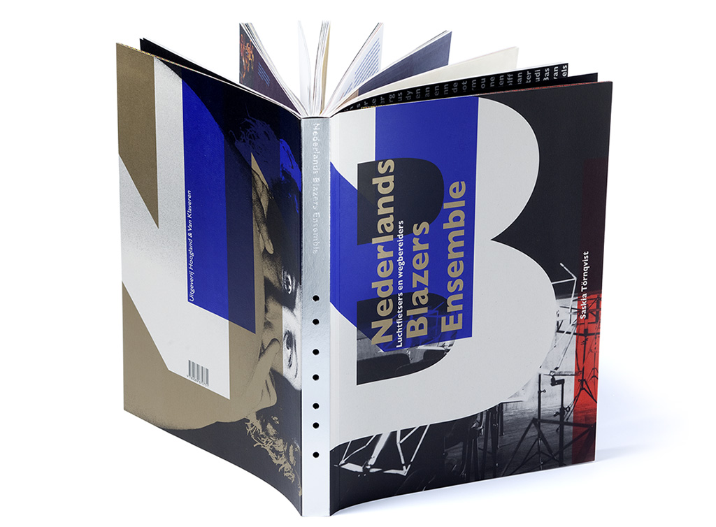
A pigheaded book for an obstinate (wind) music company: ‘50 years of NBE’ (2012). “A complicated mixture of information, interviews, photos of performances, posters, portraits, music scores, critiques and correspondence. Just as the NBE concerts, the book received loud acclaim as well as angry condemnation.”
At age seventy, Bockting does think about what the future will bring, but a word like ‘retirement’ doesn’t enter his vocabulary. “I will play some kind of role in the profession as long as I can. Whatever that role will be.”
Hans Bockting
born on 8 May 1945, Bladel
died on 18 September 2021, Amerang, Germany
Author of the original text: Jan Middendorp, September 2014
Translation and editing in English: Ton Haak
Final editing: Sybrand Zijlstra
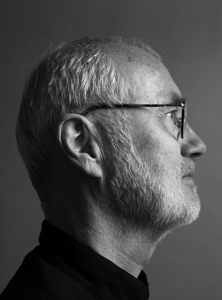
Portrait photo: Aatjan Renders