Coming from a family of tradespeople one learns to think and act pragmatically. There is little time for philosophical discourse. It is all about keeping the business afloat. It is a busy life all day, every day. My family members on both my father’s and my mother’s side are middle class tradespeople in Amsterdam and have been for generations. At a certain age, each child would be drawn into the business; we, the four boys in our family, certainly were. What I learned was that I couldn’t care less about trade. I decided to become a designer because I thought this was the only way to distinguish myself. And also, because my energetic and zestful mother pushed me in this direction.
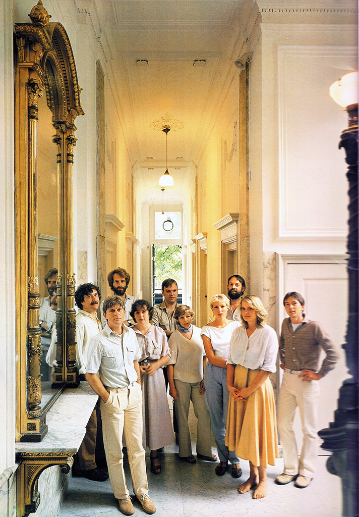
BRS, 1980, in the hall of Keizersgracht 610, from top to bottom and left to right: Edo Smitshuijzen, Guus Ros, Jan Brinkman, Margriet Blom, Sietse Wolters, Petra Minnesma, Tineke Stevens, Niko Spelbrink, Marise Knegtmans, John Stegmeijer. Photo: Robbert Fels
I did quite well in elementary school, but high school was a disaster. I hated it even though I learned a lot and met my best friend there. Luckily, I learned to experience education to be one big party from the moment I entered the IvKNO training for a profession in the graphic industry, the vocational school that eventually became the Gerrit Rietveld Academy of Art. I had found my niche and I especially enjoyed the first year, during which I was introduced to all design disciplines – and I loved them all. As the first year came to an end, my teacher Jan Elburg advised me to continue in industrial design. Piet Klaasse, though, told me he’d advise to continue in fine art. In the end I chose for applied graphic art. Maybe it was Elburg who really understood what suited my capacities best, but that’s hindsight.
Special society
The most important lesson the art education taught me was to change focus all the time. We couldn’t think of becoming a great artist or designer if we had not discovered our own path through these extraordinary fields, or if we stopped being curious about everything that came within our sight. My teachers at IvKNO were strict in this matter: it was alright to visit a museum exhibition as long as we didn’t dive too deep into the work of established artists, for this could hamper the development of our own handwriting. Because that’s what it was all about. They also made it clear that as students we were entering a very special society, a society distanced from ‘normal’ bourgeois life and its doings. If we wanted to be a part of this exclusive society, we had to go through a long incubation period and we shouldn’t expect recognition as a member until after, say, ten years. And they were right. I graduated with honors from IvKNO. It was 1965, I was 21 years old, and no one took notice of what I had accomplished. No one ever asked me to show my certificate. When trying to find employment, what I had to show was my portfolio. And even showing my portfolio didn’t open any doors and I knocked on all of them. I remember Wim Crouwel told me he saw a career as an illustrator for me.

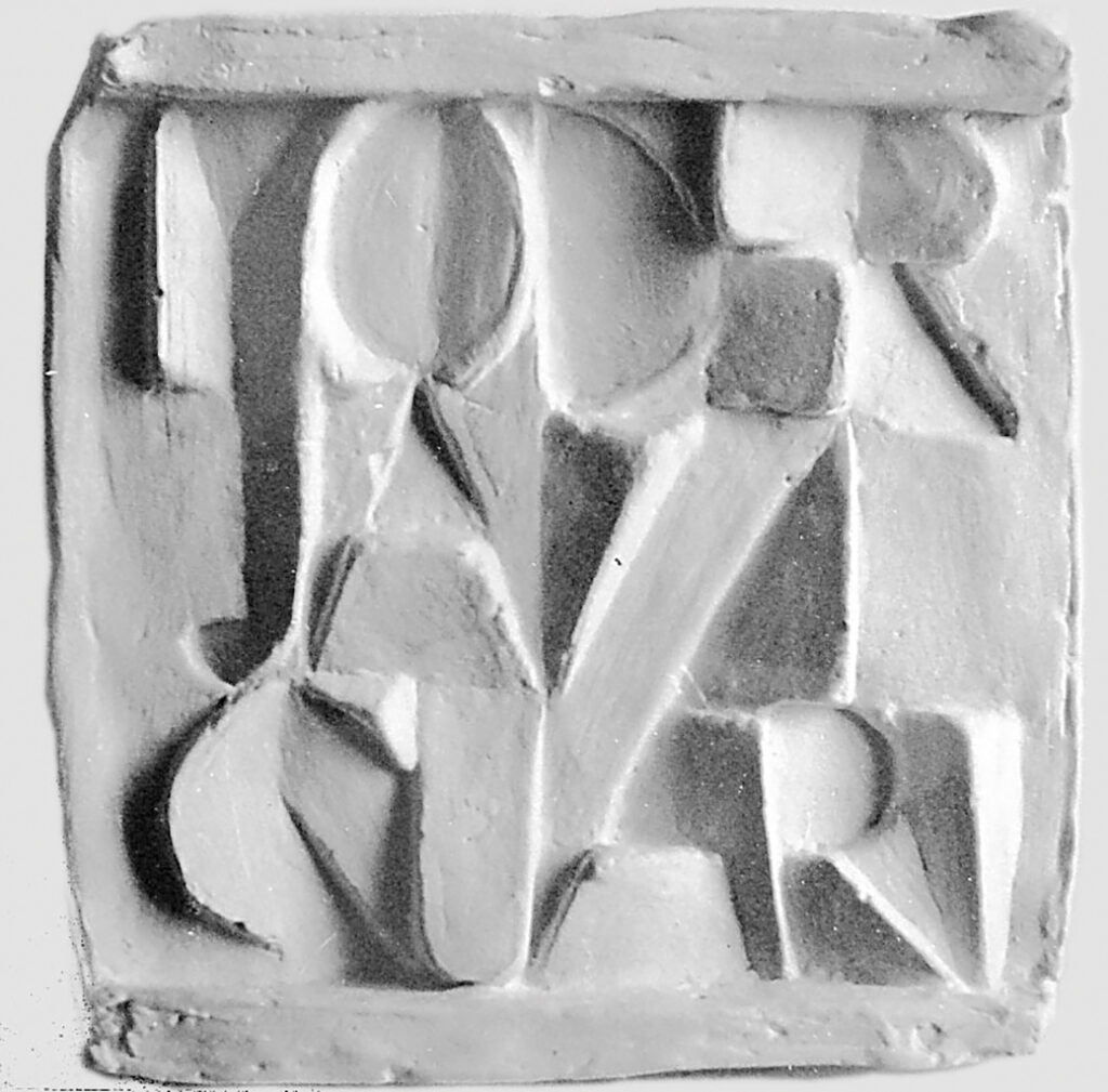
IvKNO graduation project, stamps with numbers (teacher: Charles Jongejans), 1965
Font study in plaster (teacher: Jos Wong), 1962
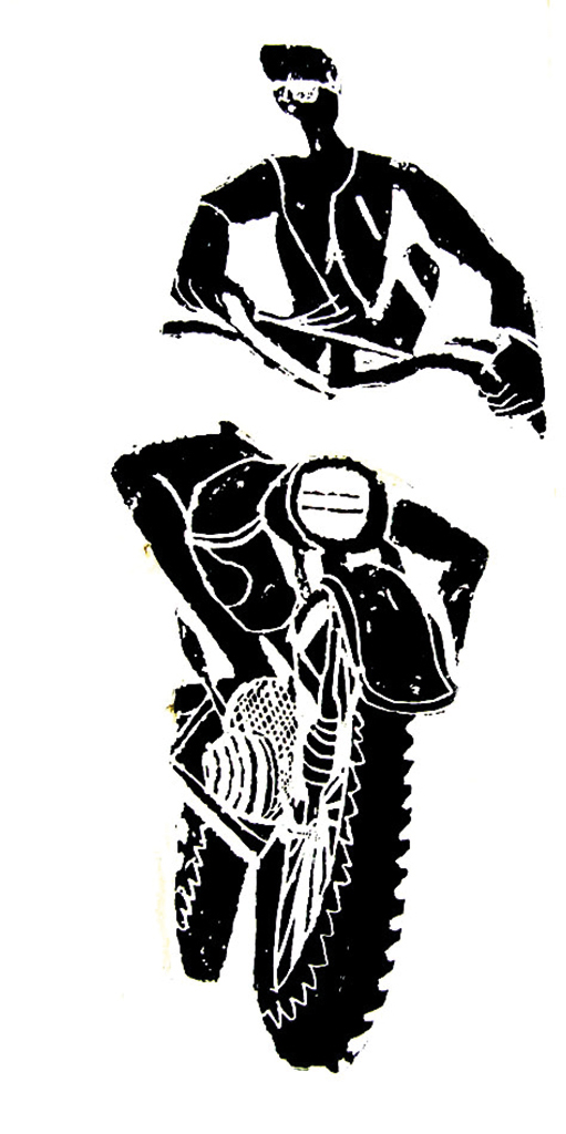
Illustration for IvKNO (teacher: Piet Klaasse), 1965
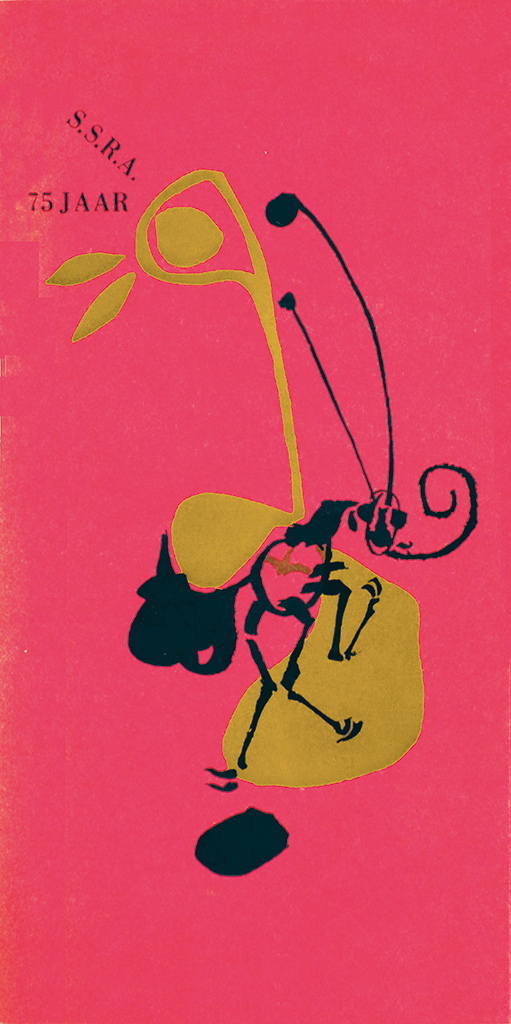
IvKNO, illustration for the cover of students’ yearbook (75th anniversary), 1964 (design: Jan Boterman)
I needed an income, so I started painting a sign for my father’s company and designing labels for wine bottles for a printer who was a friend of the family. One design was accepted and I had to draw the typography and the illustration by hand on separate papers, as full-scale lay-outs. Using adhesive letters or photo-reproduction was out of the question: too expensive. I came closest to a job when I did a two-week try-out without pay at Studio Hiemstra, in the evenings. To be able to discover what I had to offer they had me redesign projects they had already finished. Apparently I didn’t have anything to offer. It took me two years before I finally got a job, as a lay-out man for Geïllustreerde Pers (GP publishers, in Amsterdam). Together with two colleagues I was tasked with lay-outing Revue weekly men’s magazine. Our team leader smoked pipe, which was the only indication he had anything artistic in his blood. My team members were joyful graphic professionals without any serious interest in visual arts. I couldn’t stand working there for much longer than six, seven months, but I must have made a good impression anyway because I was asked to continue working for GP, but as a freelance designer. In collaboration with sports journalist Ed van Opzeeland I designed special publications about soccer and speed skating. And: GP paid me hard cash. Enough to buy a car even.
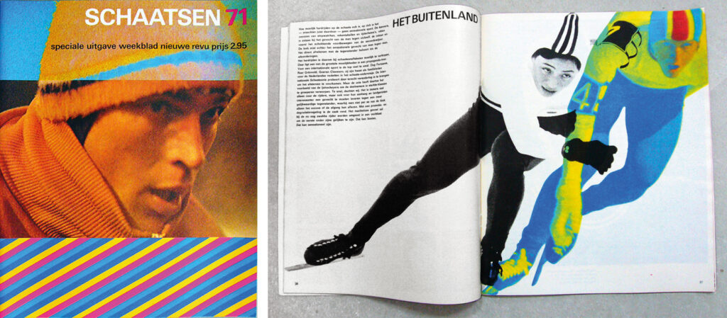
Sports magazines for GP (editor: Ed van Opzeeland), 1971
B&S graphic designers
At IvKNO, I had met Jan Boterman. We kept in touch after we had graduated. He tested his ideas on me and he asked me to assist him when he was commissioned to do complicated projects. Jan taught me about typography, a subject that had not been given the attention it deserved during the four years I had studied at IvKNO. Eventually we decided to start a design studio together, B&S, and to become members of GVN, the professional organization of Dutch graphic designers. It brought us recognition in what was essentially a marginal existence.
As B&S we managed to attract an important client, Slotervaartziekenhuis (a hospital) in Amsterdam; they needed a signage system. We started to produce wonderfully outrageous designs, scores of proposals, like we were expected to do at the IvKNO. After a while it became clear to me that we also had to produce and install hundreds of different door signs and Jan, too, woke up to reality. We decided to split the tasks. Jan was to design the logo and most essential letterheads, and I would concentrate on the routing questions and prepare the signage system. Jan never again took on this kind of project; for me it was the first one of a long series.
Signage Slotervaartziekenhuis, Amsterdam, 1974
I had reached the magic number of ten years in the profession and connected with the studio of Brinkman, Ros and Spelbrink. First through a competition and later Jan Brinkman invited me to contribute to the design of a publication about an urbanization plan for the city of Zoetermeer. I had to work day and night to create scores of separated drawings. I had to use cutting films, today an inconceivable way of working. But Niko Spelbrink went to London for a year, Guus Ros moved to Ireland, and Jan Brinkman was left behind in Amsterdam and felt lonesome. There was plenty of work to do. Jan asked me to join the partnership; he was the one who had started the studio and he remained its kingpin until his resignation much later.
Department of design
There were significant differences between the original BRS trio and me. They had taken evening class at IvKNO together and had known each other well for a long time. They were experienced craftsmen in the traditional way. And they were very successful professionals. I wasn’t. They were the three Bee Gees of graphic design with their long hair and wild beards and were designers to reckon with. I wasn’t. Jan Brinkman was a natural leader; no one doubted his authority. He was the one who took the group’s initiatives and dealt with all important clients. Guus Ros was the born typographer, the book designer, and a stand-up comedian to boot who always made us laugh. Niko Spelbrink was a typographer, too, and he loved infographics; he had an eye for detail no one else could equal. And he was a born teacher, the author of quite a few interesting essays about the profession.
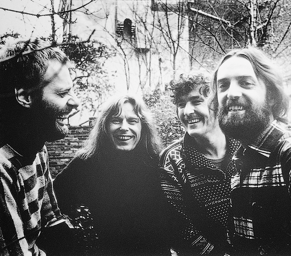
From left: Jan Brinkman, Guus Ros, Edo Smitshuijzen, Niko Spelbrink (in the garden behind the Prinsengracht studio), 1975
What the four of us had in common was a sense of realism. Projects needed to be experienced by all involved as being efficiently executed; we had no other pretentions and goals than to deliver outstanding quality, far beyond what could be seen as normal. We delivered a service. Our new combination was to prove exceptionally productive. Soon, our colleagues called us ‘the Department of Design’ because many of the larger national government ministries and departments, beginning to understand the importance of a coherent identity program, were finding us. I have to mention the former journalist P. van Dijke; he was the one who, as secretary-general of the ‘Home Office’ (BiZa) pushed through an integrated corporate identity program, which paved the way for similar programs at other government departments. What helped us to be involved was that we had the right age. Graphic design is a profession for young people and their clients expect to receive a visual impulse that transforms their organization as if by magic to become young and dynamic. Experience is important, but youthful élan is what really counts.
Proud
Casper Broeksma, my best friend since high school, had become a partner of a leading international accountants group. Talking with Casper I had gained some understanding of the formal organizational and financial structures of companies. This helped me to create a structure and establish procedures, as well as a strong financial foundation for our own partnership. My partners gladly delegated these tasks to me.
Our staff were essential to our success. We carefully selected them and we trained and mentored them conscientiously. Everyone was allowed the space he or she needed to develop professionally and everyone’s participation in the affairs of the studio was seen as important. We had lunch together and our yearly studio outings became legendary. We were building a strong and stable organization. Many staff members never left us. Two of the first of our assistants, Margriet Blom and Sietse Wolters, ultimately became associate partners. The atmosphere at our studio made us feel proud.
Jan Brinkman once again came with an important decision. After handling BiZa he understood that we needed one partner to exclusively concentrate on the organizational, strategic and marketing tasks. He was willing to take a step away from practicing design himself, which was not easy; it proved to be the right decision at the right time.
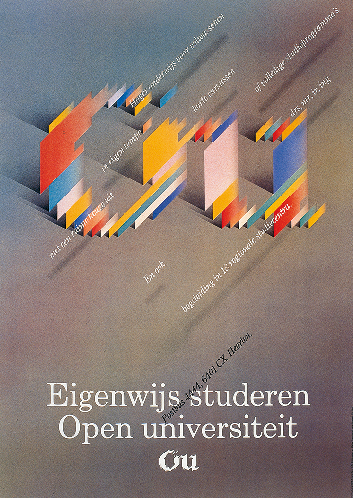
Open University announcement (airbrush: Marise Knegtmans), 1982
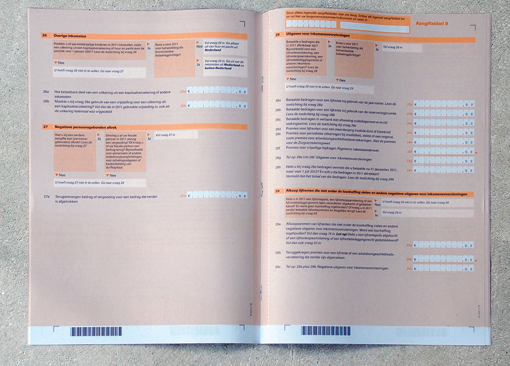
Forms for Dutch taxes and revenue department. Their identity program was one of the most complicated; the forms were highly professionally designed by Margriet Blom and Francien Malecki
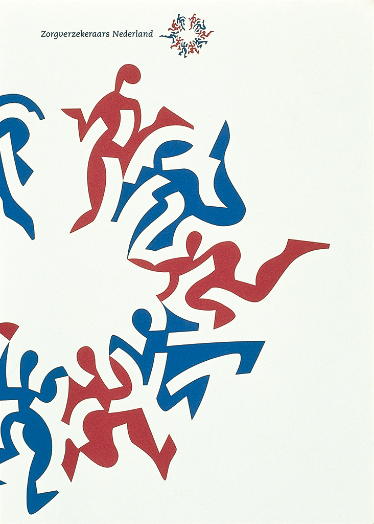
Logo for health insurance company, 1994
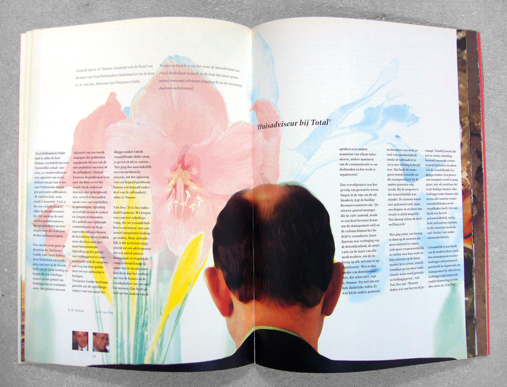
Annual report for Twijnstra Gudde, 1993
The studio kept growing exponentially. We hired a neighboring building at Prinsengracht and connected it with our existing space. Later came a larger studio space at Prinseneiland and still later a huge building at Keizersgracht that had to be renovated completely. Our location could match those of private bankers and it had taken us less than four years to get there. Our clients were BiZa (in collaboration with the state printing house), the Koninklijke Bibliotheek (royal library), the Dutch national bank, Open University, TNO scientific research organization, and the City of Rotterdam. My own involvement with the signage of Slotervaartziekenhuis came in handy when I had to do a presentation for the government’s national architect, Wim Quist, who first decided we had to design the signage of the justice department and later that we had to do the same for the royal library, the national archives, and also for the building of the Dutch ministry of foreign affairs. This last one fell through: someone high up in the hierarchy decided his daughter could do a better job.
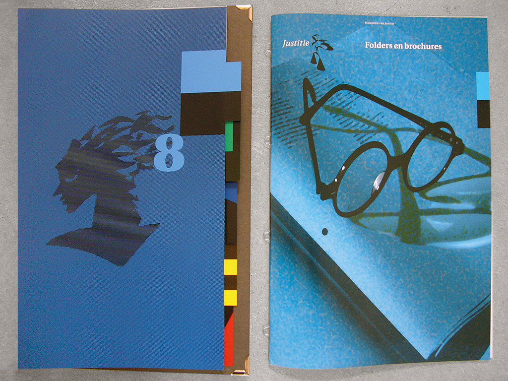
Corporate identity manual for department of justice, 1994
BRS Premsela Vonk
After ten years we had arrived: we were an established, successful design group. Funny: others had come to this conclusion long before we did. They called us the new Total Design. When we were still working at Prinsengracht, Daphne van Peski had already told me: “The TD directors only acknowledge one threat and that’s you guys.” I was surprised, for our size was so much smaller than TD’s. And who would think in such strategic perspectives? We were just in love with what we were doing and wanted to concentrate on doing things well.
In the meantime, we had been joined by a new partner, John Stegmeijer. BRS had become our name and we joined force with Shigeru Watano and Yata Matsuzaki to form a Japanese/Dutch agency, BRS Watano. We had started another company, Linea, to especially design forms in the context of corporate identity programs.
We were recognized, indeed, and solid as a rock, financially. But Jan Brinkman was already looking for something new. He proposed we should team up with Benno Premsela and Jan Vonk (of Premsela Vonk architects), the studio he had joined in his early days as a professional. This merger would create a real multidisciplinary design studio and be sure to attract many large clients. I thought this was a bad idea, especially since Premsela Vonk had reached the dangerous stage of having to consider who should succeed their founders, while we youngsters were still reaching for the sky. I was the only one who voted against the merger.
Now named BRS Premsela Vonk, we moved to a magnificent former school building at Nieuwe Prinsengracht. There were ten partners and we had a staff of fifty. It was a joy to stroll through the building where, in separate former classrooms, different design disciplines could be seen at work: product designers, graphic designers, architects. Even though I had voted against the merger, I had to admit that the new organization appeared to have been molded into a shape that fitted me exceptionally well. I had arrived in paradise.
Transgressing disciplines
Initially, the merger was a success; important clients wanted to work with a studio that offered them the expertise of different disciplines. But, what we needed and could not offer our clients was the project leadership of partners who could transgress their own discipline. At Premsela Vonk, it had been Benno Premsela who, as a most inspiring creative director, had been a true leader; he watched over all projects. My partners asked me to take over Benno’s role. Indeed, I was able to cross from one discipline to the other. But I was no Benno Premsela and, moreover, I was a practical man who was best at implementation and not a creator of design styles. Also, I had no talent at all for public relations. Deep in my heart I felt most at home in the company of designers of milk bottles and paperclips. I was rather unhappy with the status of solver of all problems that no few colleague-designers at the time thought they were destined for. On the contrary, I believed it was the level of involvement of the client himself that was highly responsible for the quality and effectiveness of the final product.

Logos for corporate identity programs designed under my supervision, 1976-1994
Yet, BRS Premsela Vonk continued to grow. Clients were government departments (such as transportation and waterways, justice, and economic affairs); the government accounting office; taxes and revenues; and the Dutch supreme court. We worked for the cities of The Hague, Leiden and Amsterdam; for ABN Amro; Mees Pierson (bankers); Shell; and for Randstad, after Wim Crouwel had advised Randstad’s owner Frits Goldschmeding, who was looking for a new studio to work with, to contact me.
Our most important contribution as a team to the development of graphic design in the Netherlands was making clear how important it is for government departments to develop and maintain a strong, well-organized identity. Every citizen has to deal with more than a few government departments – the government has to deal with the largest possible public. Most often we were the first designers on whose door government representatives knocked after they had decided their department needed to have an identity program; this gave us the opportunity to set the tone and the pace. We aimed at giving our identity projects a wide scope; we observed contents just as critically as style and form and there were few items or details that escaped our attention. And we showed how relevant a structured approach of all design elements was for, ultimately, a successful communication between government entities and their public.
No charges
After the sunny start, dark clouds appeared above the horizon. Relationships with clients began to change. Designers changed how they looked at their own profession. Initially, a whole generation of designers had worked closely with clients who became friends; and most times they dealt directly with the ones at the top of the client-organization. Applied art was not yet an integral element of business management, it was still the feather on the cap rather than the cap. But the change was unavoidable: design became a serious tool for serious managers. The generation that followed, my generation, was already facing a more pragmatic approach of design. The best results were only within reach if all design and every detail was integrated in the organization’s daily operation.
The generation of designers that followed us, including me, wasn’t much interested in the detailed organizational approach of complicated projects. What counted was the shortest way to being on the receiving end of attractive international professional awards. Complicated design projects that demanded intensive study and an eye for detail were less ‘productive’ in that sense than series of posters. Emotional approaches became favored; even the traditionally high wall separating design and advertising appeared to become leveled.
At the same time, design became to be seen as an integral part of management, the more so after new communication channels exploded after the arrival of social media. Whole regiments of media consultants showed up and became intermediaries between clients and designers. Lawyers had a boon as controllers of copyrights. Company buyers, devoid of any knowledge of design, looked for the lowest-priced bids for the company’s design projects. A crazy ‘pitch culture’ came about: free-of-charge, and fees only for the ‘winners’. And, anyone who had a laptop or desktop computer could become a designer, for design was being ‘democratized’. Studios disappeared almost overnight. The security of the profession had offered many for so long disappeared; designers moved from project to project and from one collaboration to the next.
An agency such as BRS Premsela Vonk could not function under these new circumstances. I was lucky – I left the partnership in the early days of this ‘revolution’. And I also realized I had been very lucky to have made my professional career in the previous era, in the twenty-five years that the heyday of Dutch graphic design lasted. I had known my clients well, there had been no intermediaries interfering with our communication. I and my colleagues knew what we were doing because we fully understood the prevailing media. The fascinating first edition of the new-media conference Doors of Perception in 1993 had opened my eyes: I suddenly understood the times were changing dramatically. Communication would change. How? No one knew. Not yet.
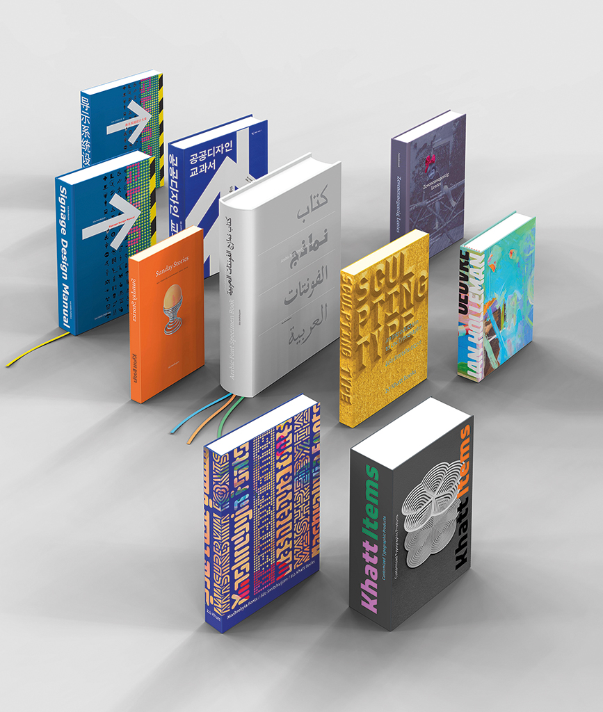
After BRS Premsela Vonk came books (editing and design): Signage Design Manual, 2007 (translated in Korean in 2010, in Chinese 2015) / Arabic Font Specimen, 2008 / Sunday Stories, 2010 / Sculpting Type, 2013 / Zevenennegentig Lentes, 2015 / Oeuvre Jan Holleman, 2017 / Khatt Items, 2017 / Mashrebyia Fonts, 2018
Profitable patents
After having reached age 50, I left BRS Premsela Vonk. It wasn’t an easy ‘divorce’ but I immediately felt immensely relieved. I did not want to remain in Amsterdam, close to the old bunch. I moved to France. Not that I’d received a golden parachute from the partnership (it was me who had reduced all goodwill payments to zero). Luckily, I had a source of income. The director of the Koninklijke Bibliotheek (royal library) in The Hague had offered me a unique opportunity by ordering me to design a totally new signage system; none of the products on the market met the requirements. I designed the system and applied for a patent. I was incredibly lucky: the system became a classic. I connected to a production company in the Netherlands and found a market in the UK, where a friend of Jan Brinkman’s, the interior designer Marcus Hartland, fell in love with the product and introduced it left and right. Marcus created the market; he was the best PR man I could wish for and he sold my design to the Victoria & Albert Museum and the Imperial War Museum. Marcus established a sales network in Europe and found me a producer/franchise holder in Canada who also operated in the US. And, together we invented new products.
mss 0.5 modular stem for signage system, Dutch patent 1981
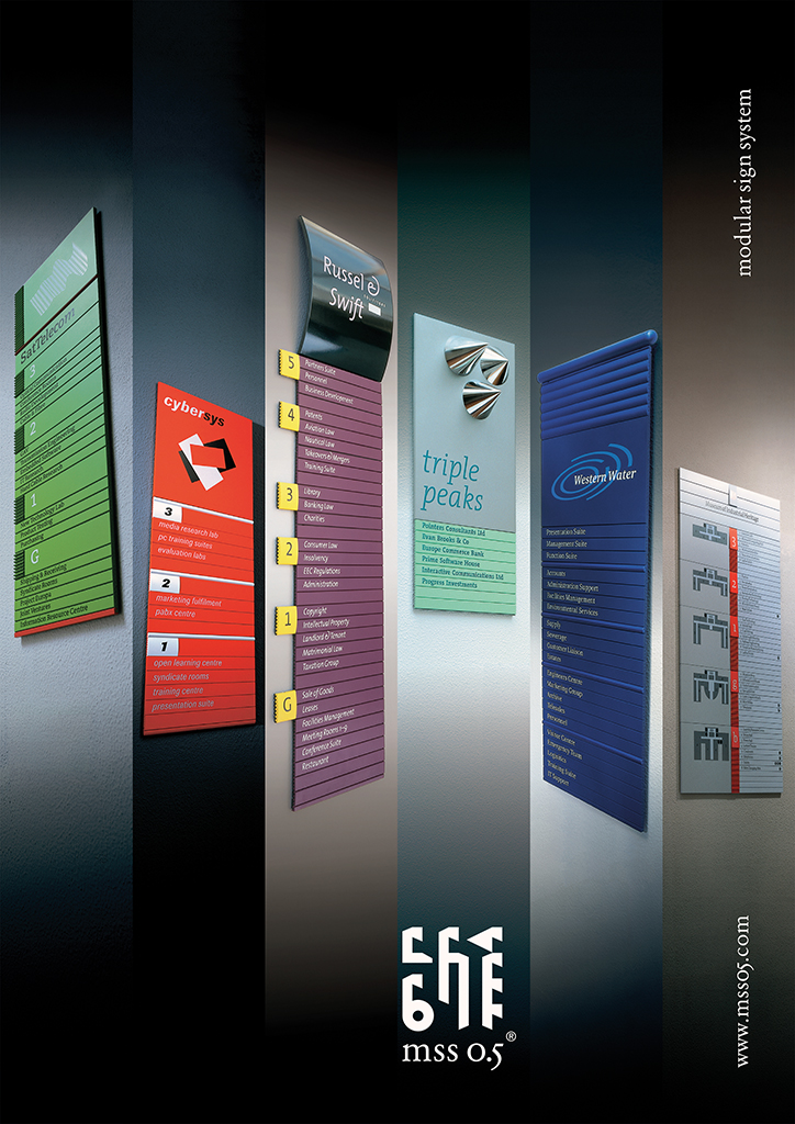
Brochure mss 0.5
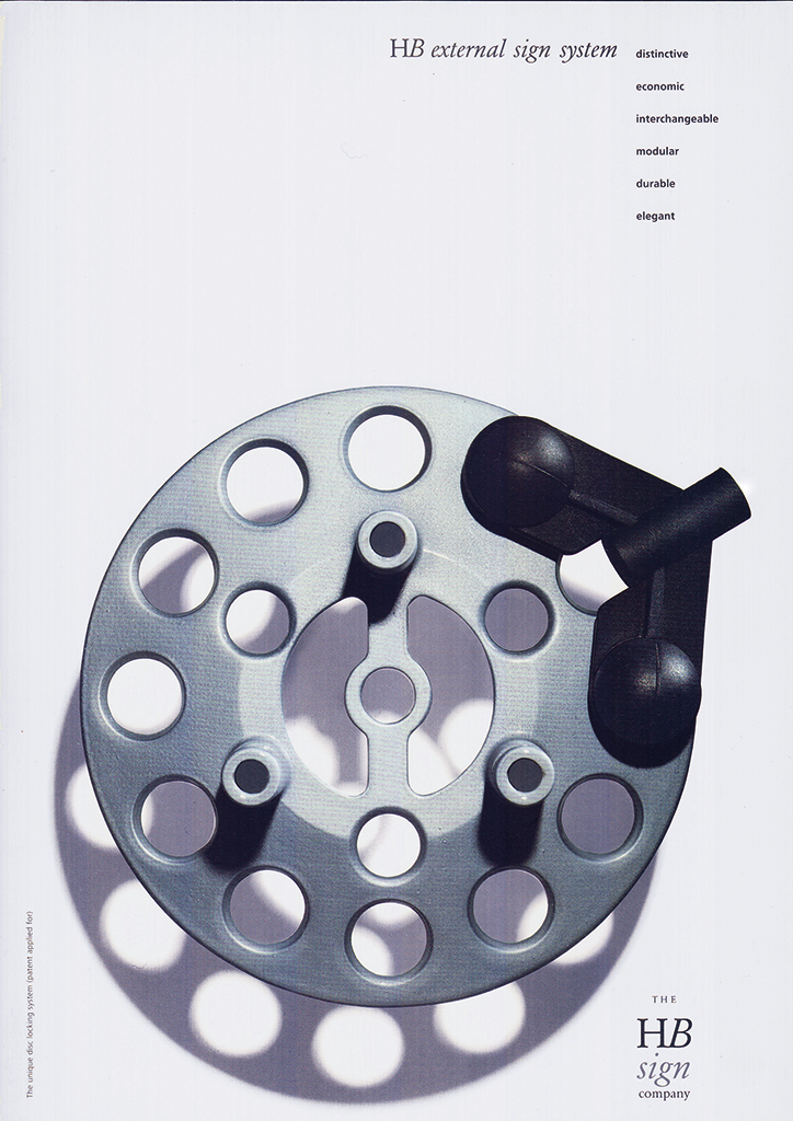
Brochure ess, external sign system (together with Marcus Hartland), UK patent app. 1992
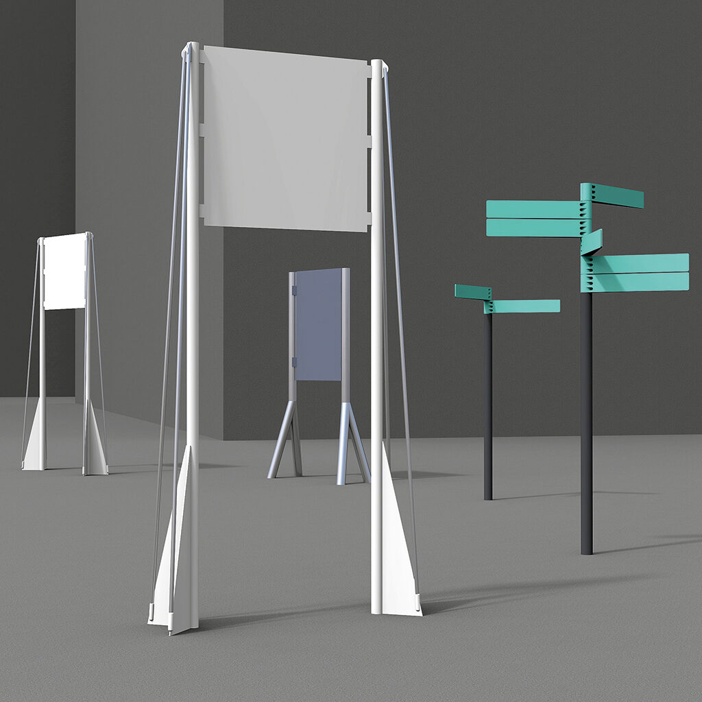
Free-standing signs for Royal Library and TNO
Pixelitti, educational game display, Dutch patent 2006
Marcus asked me to become a director of his company, HB, but I declined, I’d rather remain in my small French town. The time I had available I used to write a book about signage systems, a ‘bible’ of 455 pages published by Lars Müller. I created the 800 illustrations myself, by hand. The book was translated in Korean and Chinese. I also took the initiative of founding a Dutch signposting association, following the American (SEGD) model to not just have designers as members but producers as well.
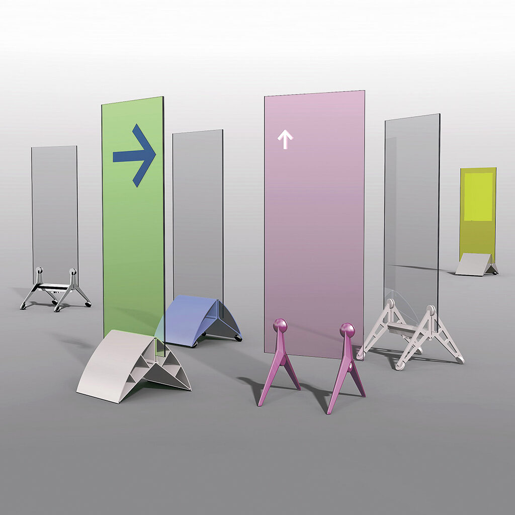
Free-standing displays, USA patent 2005, Dutch patent 2010
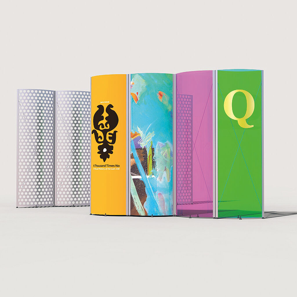
Spring Panels, display system, 1986
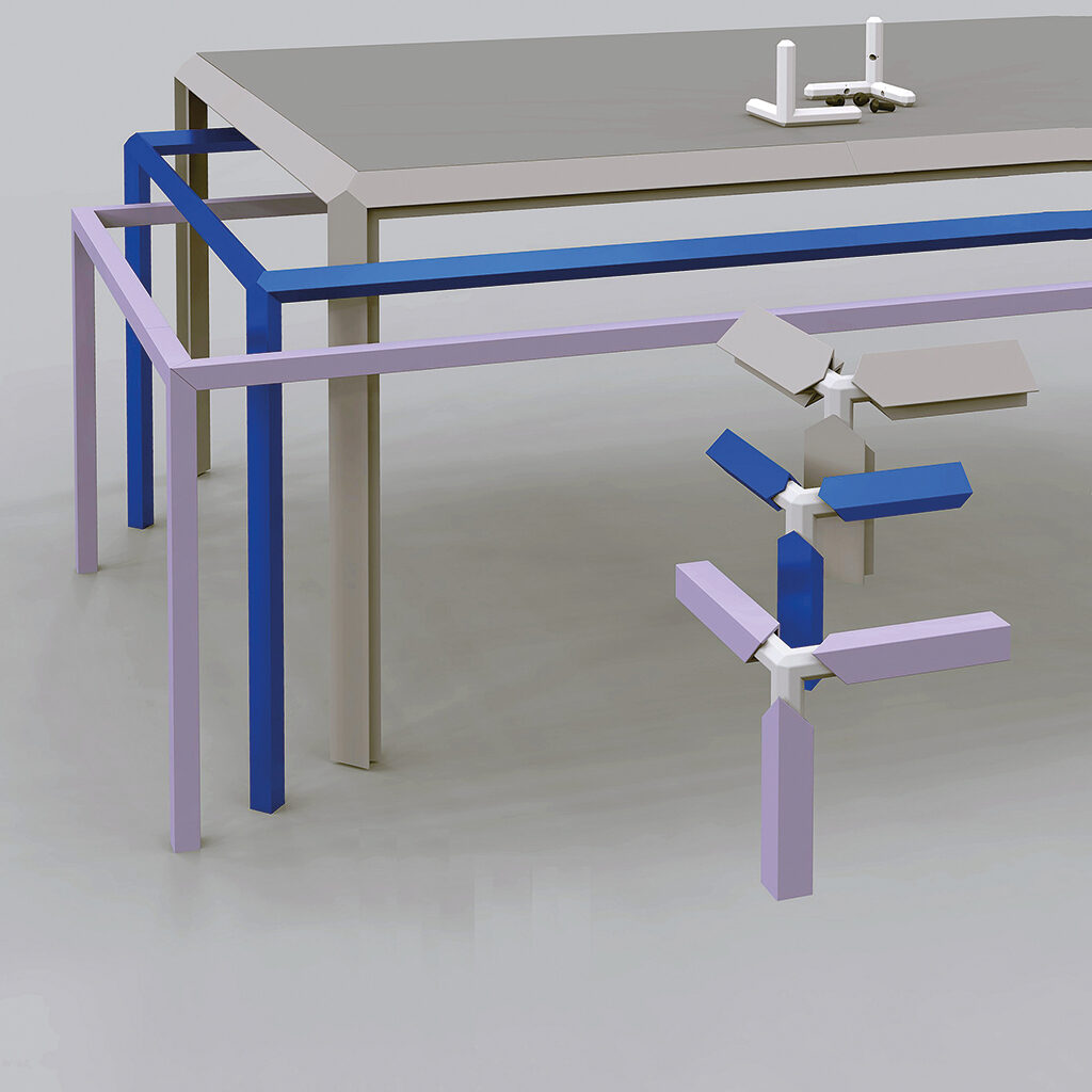
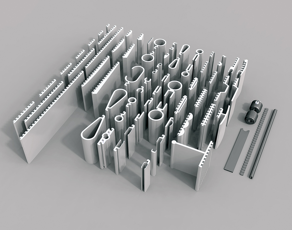
Aluminum cross section for extrusion, 1985
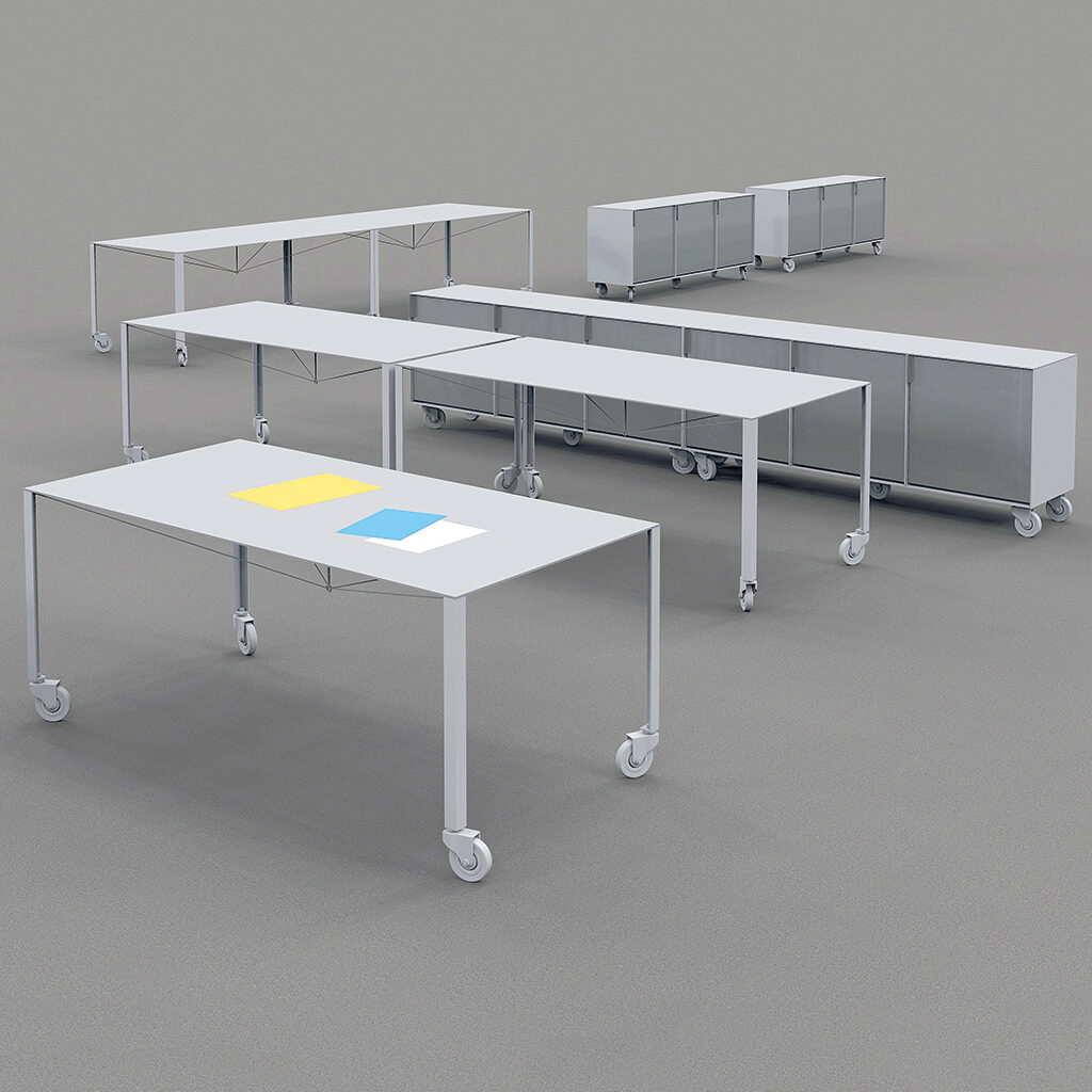
Ultralight office furniture, 1996
Arabic fonts
My marriage to my Lebanese colleague, Huda Abi Fares, opened up a whole new world. I dove full-heartedly into this fascinating world. The professional in me discovered the magnificent traditions of Arab calligraphy and the creation of ingenious ornaments. Yet, these creative techniques had not adapted to what contemporary graphic design and typography had come to, internationally. I discovered I had development work to do. Huda started her Typographic Matchmaking projects: she was bringing Dutch and Arab type designers together in teams with the aim of having them collaborate on the design of Latin-Arabic fonts. She was hugely successful. Mediamatic (Willem Velthoven and Jans Possel) were asked to offer a helping hand and introduce the results of the first project. They organized a brilliant presentation of the El Hema project, which won them a Dutch Design Award.
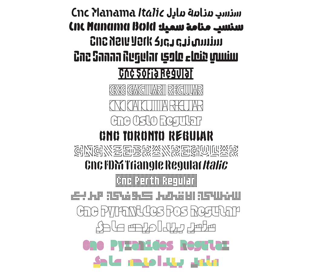
CNC type designed specifically for computer-controlled production
Identity program and signage for National Theater Bahrain, 2012
Huda decided she should teach in the Middle-East and write textbooks. I became her assistant. The Arab world, I soon discovered, does not have textbooks that describe the history of their graphic design and typography or that can come in handy if one wants to professionalize. I had hoped that Huda and I together with her students would be able to compile a first type catalog of Arabic fonts. We didn’t manage to reach our goal. Therefore I decided to give it a try on my own; I spent a full year at gathering all content information and writing the text of the 656-pages Arabic Font Specimen Book. De Buitenkant published it. Huda and I capitalized on the success of the second Typographic Matchmaking project by establishing our own publishing company, Khatt Books. So far we have published thirteen titles. Huda, together with Mediamatic, also started the first network-website aimed at designers of Arabic scripture. I contributed to the site by writing articles and developing projects to improve specific Arab design concepts.
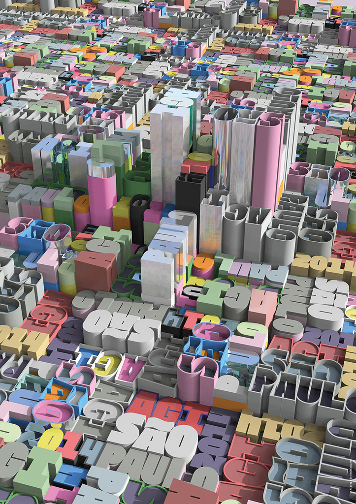
Poster for AGI Sao Paulo, 2014
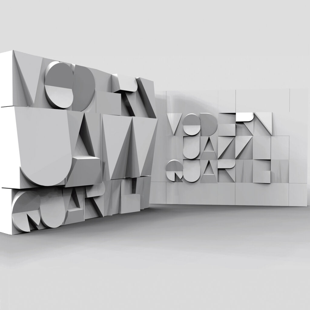
Illustration for Sculpting Type, 2011
3D typography
Later, Huda asked me to help her make prototypes for her project Typographic Matchmaking in the City. This project gathered Arab and Dutch type designers with the purpose of creating multiscript fonts especially for use in public spaces. Product designers and architects joined the teams. The 3D element directed the design, as did the demands of the available 3D machinery. Since almost 100% of all type is designed for reproduction in print or for the screen, most typographers do not find it easy to disregard their old customs and open their minds to the specific problems of 3D applications. I saw a market ripe for exploration. I learned how to work with modeling software and wrote another book, Sculpting Type. An introduction to CNC typography, which presents hundreds of examples of possible applications of machine-produced 3D typography; most were of my own invention. This book didn’t signal the end of my involvement with prototypes. I may not have studied for typographer, but this didn’t keep me from designing many fonts, including multiscript fonts, for CNC production machines and for scores of products using these fonts. I founded Khatt Items, where you can get made-to-measure graphic products on demand, or have them made to your specifications.
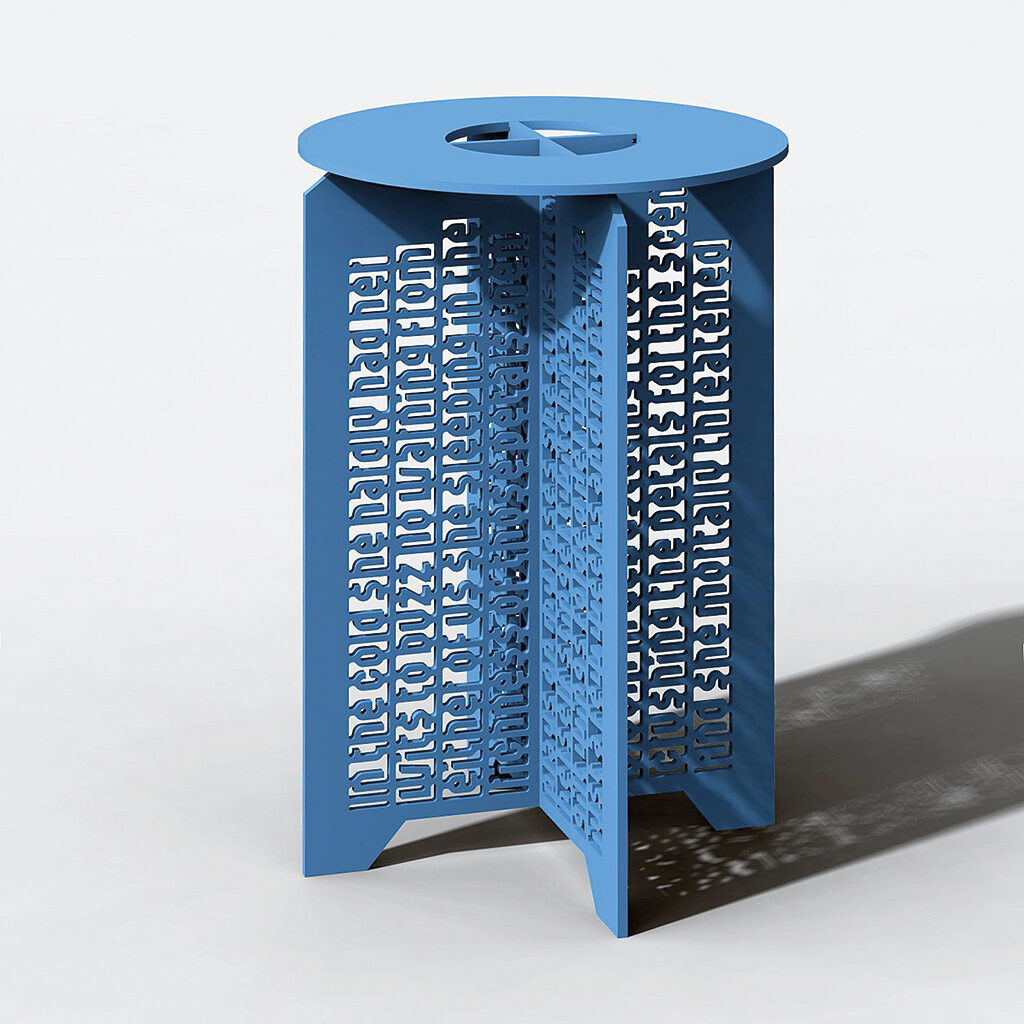
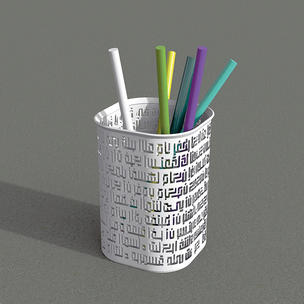
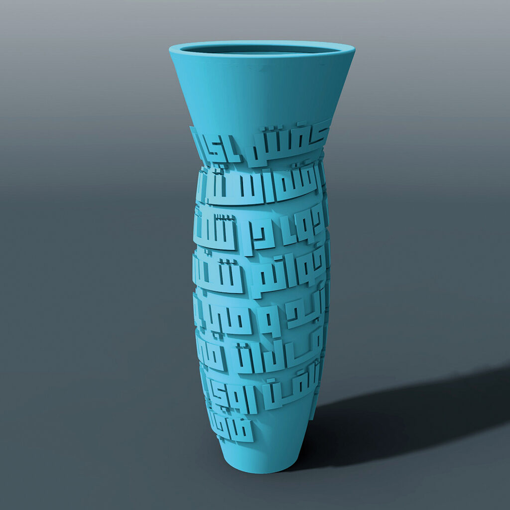
Prototypes for Khatt Items collection
In my view, graphic design is a profession for young people. But, I have myself as evidence of the fact that one has to do what one has to do. I hope I can stimulate young people to go their own way and invest in the exploration of new and as yet undeveloped fields. I am sure they will do a better job than I, closing in on the end of my career, can do.
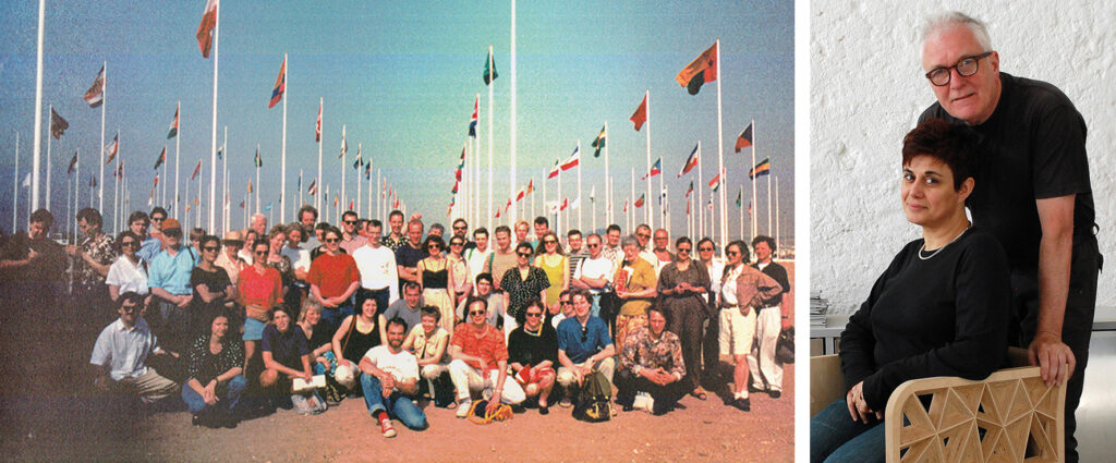
Left: BRS Premsela Vonk at Sevilla World Fair, 1992 / Right: With colleague/partner Huda Abi Fares, 2018
Edo Smitshuijzen
born on 19 May 1944, Nieuwer-Amstel
Author of the original text: Edo Smitshuijzen, June (2018)
Translation and editing in English: Ton Haak
Final editing: Sybrand Zijlstra
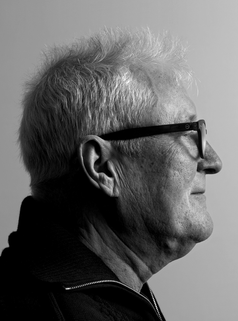
Portrait photo: Aatjan Renders