At the beginning of the 1960s, a double bass sounded in the Molenstraat in Enschede, sometimes together with a guitar, alternated with the sound of pencil on paper. Jaap Drupsteen and Hans Bernard were living there, working on their assignments for the art academy and the conservatory. Jaap and Hans performed together and listened to jazz, such as Miles Davis, John Coltrane, Sonny Rollins and Bill Evans. Jaap mainly listened to their bass players. What attracted him to that music was the driving rhythm or swing: the cumulative effect that occurs when musicians play in a tight collective cadence.
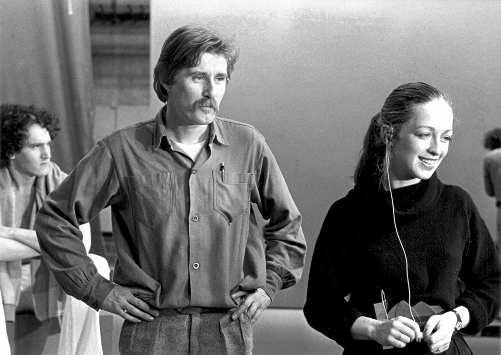
Jaap Drupsteen and Milka Henriques de Castro during studio recordings, 1978
Drupsteen (1942) had signed up at the Enschede Academy of Art and Industry (Academie voor Kunst en Industrie Enschede, AKI) for the interior architecture programme. The academy was in the same province as Hasselt, where he grew up. The study programme was obvious because his father had a furniture shop, and the academy because the results of a career choice test after a stagnating education as a teacher showed that Jaap was artistic. This talent may have been cultivated by his organ and guitar lessons, or by the campaigns that his father came up with for the store, stencilled on a Gestetner and coloured in by his children. During his childhood, without television or internet, visual culture was less prominent than we are used to today, certainly in the Christian city Hasselt, situated between Kampen and Staphorst by the Zwartewater. In this strict offshoot of the Bible Belt, Drupsteen grew up without much entertainment. Classical music was played at home, the brass band played in the streets, the Knoll organ in church, and every now and then there was jazz or other exciting music on the radio.
Admitted to the AKI, located in a villa on the Hengeloseweg, Jaap could not believe that an education could consist of drawing all day long. In his first year he attended the painting course by Johan Haanstra, among other courses, who shaped his professional attitude.
During the first year, Drupsteen saw how the students of the Publicity department had drawn the word ‘storing’ (no signal). At that time, this word was displayed on the screens of Dutch television viewers when there were technical problems. This new medium was still in its infancy, but it became accessible to an ever-increasing audience, so that everyone could witness the same event at the same time. TV developed into a mass medium and although it was not welcomed into some living rooms at first, the magic of the medium would eventually win and change our society. At the AKI villa Drupsteen realised: “Well, apparently that’s also possible at Publicity!” He immediately switched studies. In addition to various other subjects, he now also took courses in typography by Abe Kuipers and learned how to space letters.
Another revelation were the films rented by the academy, such as the Begone Dull Care animation by Canadian Norman McLaren. Together with Evelyn Lambart, McLaren had drawn, painted or scratched shapes, lines and points directly on the celluloid, which moved at great speed and high precision to the jazz rhythms of the Oscar Peterson Trio. Due to its abstraction, the short film was open to everyone’s own interpretation and those eight minutes, only seen once, made a deep and lasting impression on Drupsteen.
Jaap and Hans had not yet realised that the media of their two studies could be combined. As close friends, they brought out the best in each other in long exploratory conversations and so they prepared themselves for the time that lay ahead after the academy and the conservatory. That time did not come for Hans. At the age of 22, he was killed in an accident involving a scooter. As the gifted illustrator that he was, he was honoured posthumously with an exhibition of his work.
Jaap stayed in touch with Hans’s family. He finished his studies at the AKI and it was Hans’s uncle who asked him if he already had a job. This Jan Palma worked at the Nederlandse Televisie Stichting (Dutch Television Foundation, NTS), and with his introduction and thanks to the neatly spaced letters Drupsteen was hired in the ‘graphics department’ as ‘upcoming designer, class C’ in 1964. Dutch public broadcasting, back then as well as today, had a structure consisting of competing member associations that fought for the favour of viewers and listeners with their programmes. Technical support came from the NTS (named NOS since 1969), which owned the studios and broadcast vehicles and also reported on sports and news as a neutral organisation.
In the early years of Dutch television, decor painters from the artists’ village of Laren drew the opening titles, credits and announcements such as ‘please stand by’ or ‘no signal’ in a smooth or calligraphic style with a brush. A new medium simply borrows from a previous, similar medium. Meanwhile, more designers who were trained at art academies, such as Will Bakker and Johan Volkerijk, came to work in the graphics department of the NOS and as such the design of Dutch TV gradually modernised. The text for titles, subtitles and title roles were put on a Masseely Hotpress. This was a manual die-cutting press with which the texts are cut with copper letter stamps out of white foil and the letters are pressed onto black cardboard with a hot plate. Grey tones were used instead of colours, because Dutch television was still only broadcast in black and white. As a lover of jazz, Drupsteen was often allowed to make the titles for the related music programmes and to see his musical heroes he knew from the radio or his records that he listened to in Hasselt or Enschede perform in the studio.
When pop music culture emerged in the second half of the 1960s, it had a major influence on the work that was made by the graphics department of the NTS for music programmes such as Moef Ga Ga, Fanclub and Twien. Bob Rooyens’ experimental shows also called for a more contemporary design, and designers such as Frans Schupp, Hans de Cocq and Rob van den Berg deviated from the norm, which was safe. This was also the case with Jaap Drupsteen. The modernism of Swiss typography was hardly applied because it did not come into its own on a black and white, almost oval-rounded rectangular picture tube. Drupsteen admired the more fitting, more ‘popular’ graphic work of American designers such as Herb Lubalin, Louis Dorfsman and Saul Bass. Especially Bass’s film titles showed Drupsteen the great communicative power of animated graphic ingredients, such as photos, drawings, and typography combined with sound.
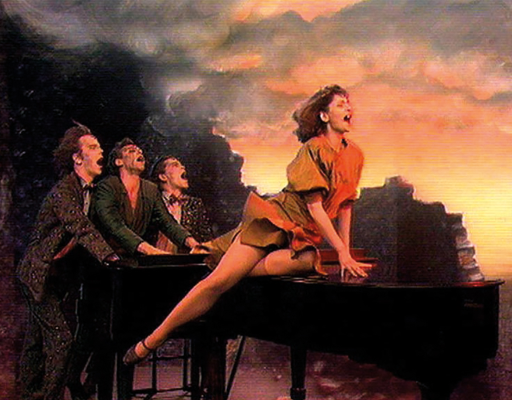
For the VARA programme Hadimassa, director Dimitri Frenkel Frank had also conceived the plan to combine media by announcing or commenting on the various parts with texts. From 1967 Drupsteen provided the black and white typography for this, which contributed to the success of the programme and at the same time accelerated his career. He was asked to make a television adaptation of Bertold Brecht’s The Seven Deadly Sins, for which VPRO director Annemarie Prins formed a team of designers. Drupsteen had already studied the graphic possibilities that colour television offered by occasionally assisting in the studio where the introduction of colour television in the Netherlands was being prepared. He was introduced to techniques such as chroma key, merging different image layers, which is still used in video editing software and in Adobe’s Photoshop.
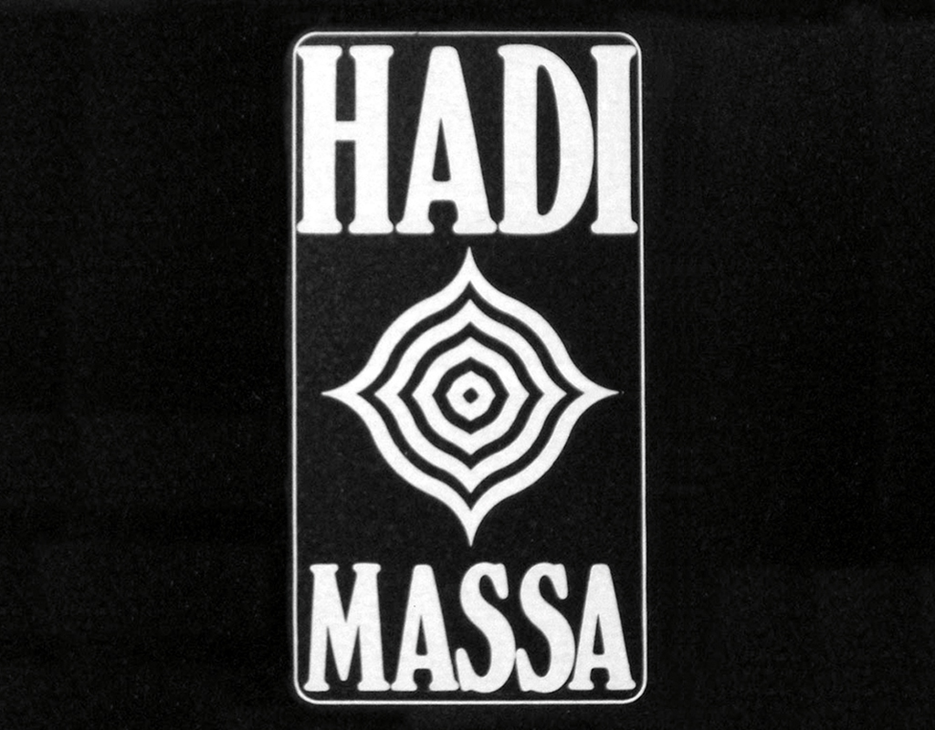
Hadimassa, 1967-1969
With The Seven Deadly Sins, Drupsteen was given the opportunity to demonstrate the power of these videographic capabilities, after which he wanted to further develop his skills in this area into a specialism. However, according to his superiors at the NOS, this was impossible for a ‘designer, class B’.
In the summer of 1969, Gert Jan Leuvelink left Tel Design in The Hague to set up a design studio at the Staatsdrukkerij (State Printing House). Tel Design wanted Drupsteen to succeed him as studio chef, but he was camping on Terschelling and could not be reached by phone. Gert Dumbar drove from The Hague to the island with his offer, after which Drupsteen again made his videographic wishes known to the NOS. Insensitive to these, they let him go.
At Tel Design René van Raalte familiarised him with the airbrush technique. Meanwhile he continued to work on a VPRO production, so he was back in a NOS studio several months later. A feeling of homesickness overtook him: “This is where I belong.” And once again it was Jan Palma, now working as head of production at VPRO, who got Drupsteen to work for television.
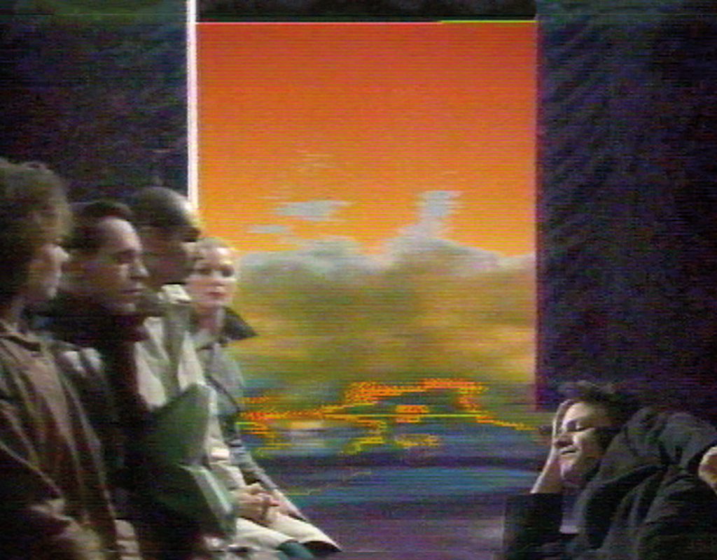
Under the directorship of Arie Kleijwegt, the V.P.R.O., the Vrijzinnig Protestant Radio Omroep (Liberal Protestant Radio Broadcaster), had changed in the mid-1960s from a civilised broadcaster that televised church services, into an institute that made all kinds of innovative, experimental, taboo-breaking, offensive and absurd programmes. This shift was a reflection of changing Dutch society, especially in left-wing, liberal circles. The liberal pastors gave way to a generation of young programme makers who were averse to authority, questioned power and its institutions in their search for the truth, and that wanted to explain both themselves as well as others. The VPRO – now without the dots between the letters – had become a broadcaster for journalists by the end of that decade, and moulded the view of reality of many viewers. Kleijwegt had to clarify the commotion that was often caused by the programmes to the rest of the Netherlands.
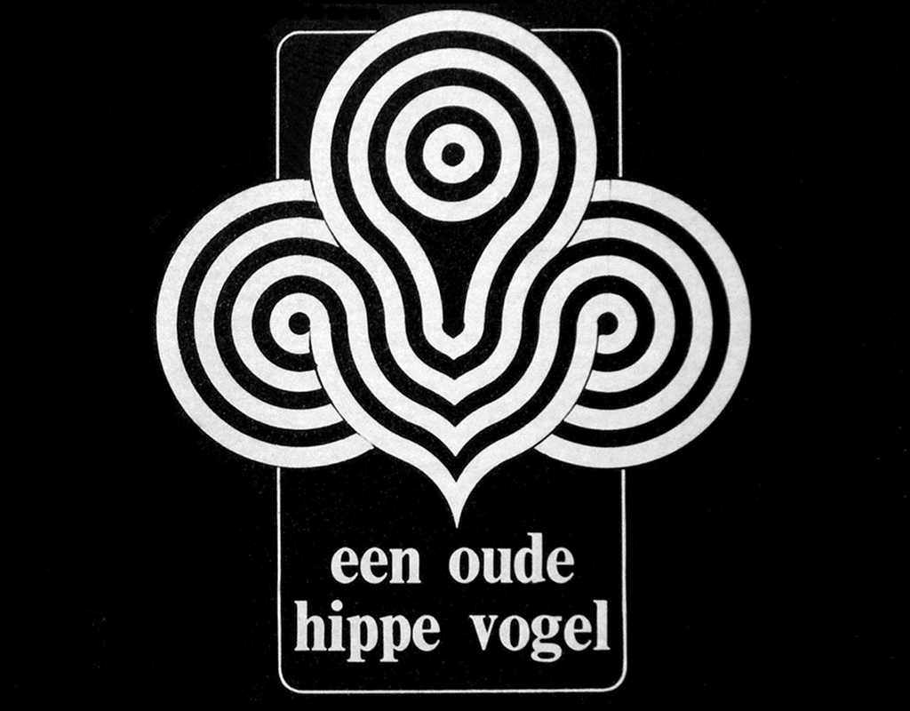
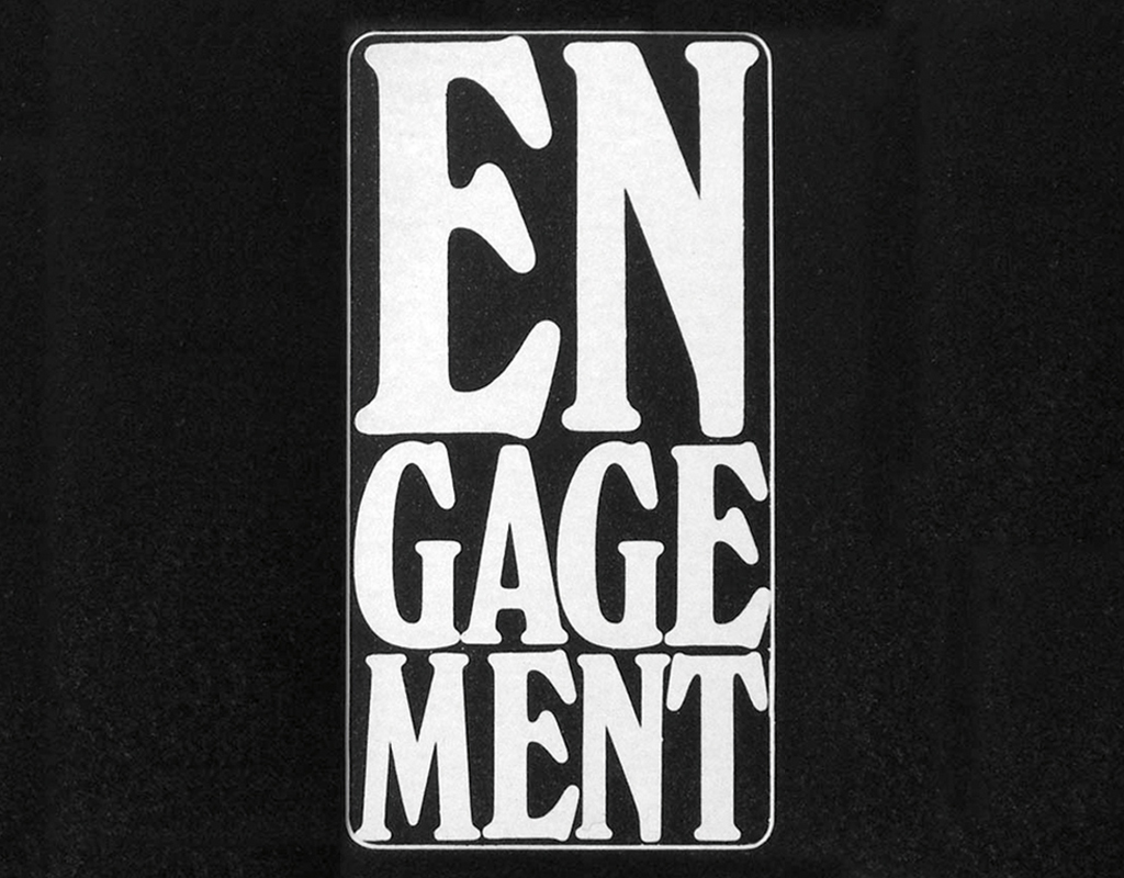
Journalist Jan Blokker, who worked as editor-in-chief at the VPRO, saw the power of Drupsteen’s videographic ideas. Blokker had conceived the plan to abolish the announcer in the television season of 1970-71. According to him, one could see the fear in her eyes that she would have forgotten her lines, and he also felt that an announcer did not match the true face of the VPRO. After the first failed attempt, Blokker asked Drupsteen to come up with a proposal. This was a dreamed-of and welcomed assignment because he had already developed ideas for a station identity. In a very short time the TV graphics were produced that gave the VPRO, as the first broadcaster in the world, an identity that was created with videographic techniques. Drupsteen would continue to work on it for ten seasons.
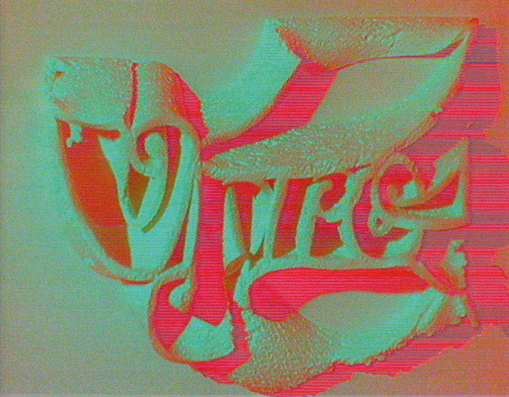
VPRO logo, 1970-1979
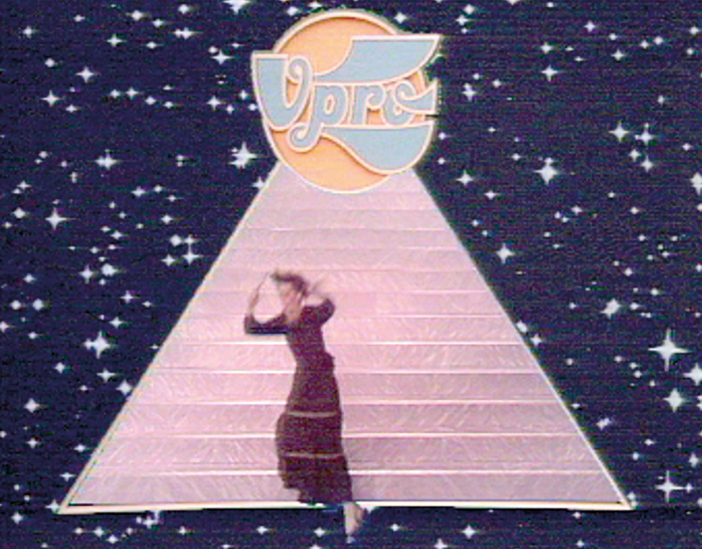
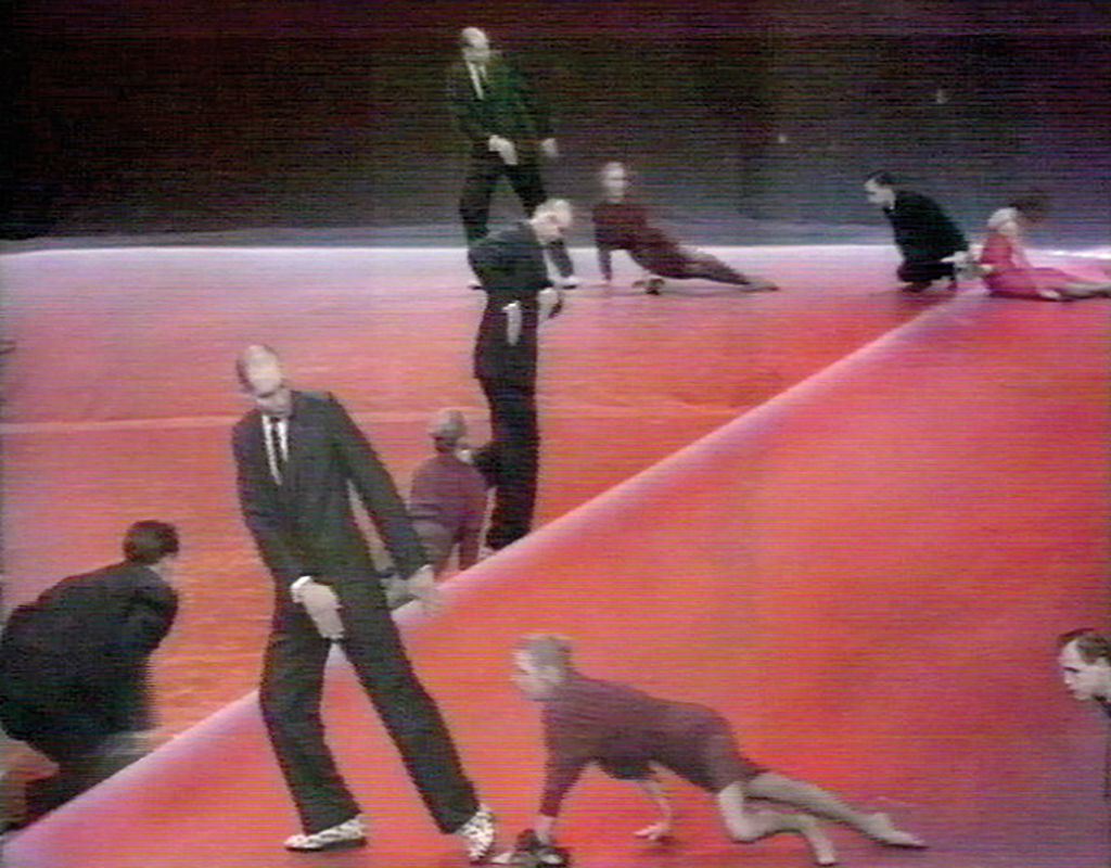
Film and television directors limit themselves to a camera and a microphone, to add music and a voice-over at the cutting table. Those who work with videographic techniques have the freedom to combine filmed material with photos, illustrations, typography and all kinds of graphic forms. The ‘leader’ informs the audience that they have tuned in to the right channel, announces a programme in a recognisable and informative way and arouses curiosity. Drupsteen airbrushed the graphic elements for these ‘leaders’. With airbrush, light and space can be suggested in a way that connects well with the studio lighting and the spatiality of the image. Airbrushing the elements himself was important for Jaap to maintain control over his own graphic signature. The actors were then filmed against a blue background, after which this blue colour was electronically eliminated and filled in with airbrushed drawings or with pre-recorded backgrounds. This is how the visual compositions on the television screen were created that, not nearly as technically perfect as they are today, were experienced as real.
Never fearful, but always eager, Drupsteen let technology feed his imagination – “Oh, if this is possible…” – and offer him solutions for his leaders that were previously impossible. Such as a crashing singer or a VPRO logo floating over the screen accompanied by music selected by him, and accompanied by the voice of Ad ‘s Gravesande. They were remarkable, never-seen-before visualisations, perfectly executed for that time, which in combination with striking and ironic texts by Blokker informed the viewer about the programme, its makers, their view of the world, and about the VPRO.
Drupsteen’s leaders and bumpers quickly formed the identity of the VPRO, and in 1971 he designed a logo, always in different colours, which acted in his leaders. A year later he designed the VPRO Television Guide. Drupsteen’s graphic identity for this broadcaster was a relief, because at that time graphic designers limited themselves to how they addressed their client’s audience. If it was not symmetrically classical, it was asymmetrically modern, and because Drupsteen’s visual idiom resembled neither, it stood out.
VPRO Television Guide, 1965
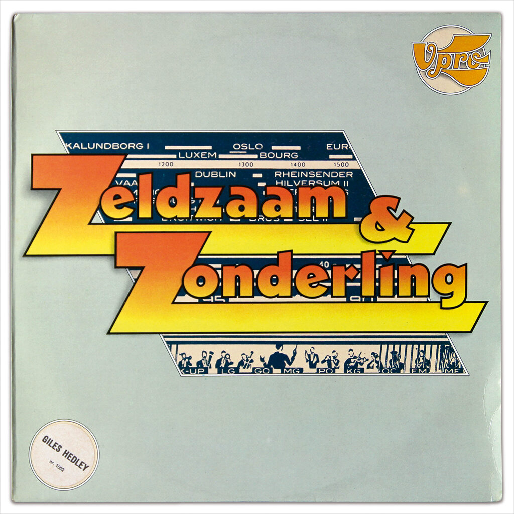
VPRO gramophone record sleeve, 1975
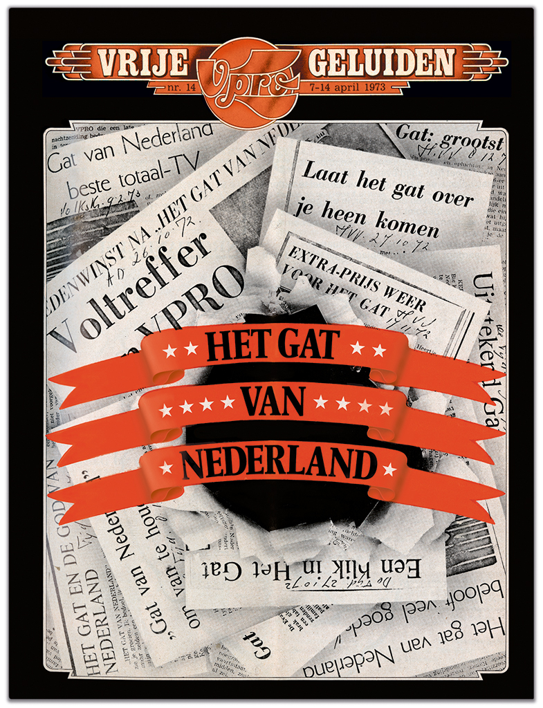
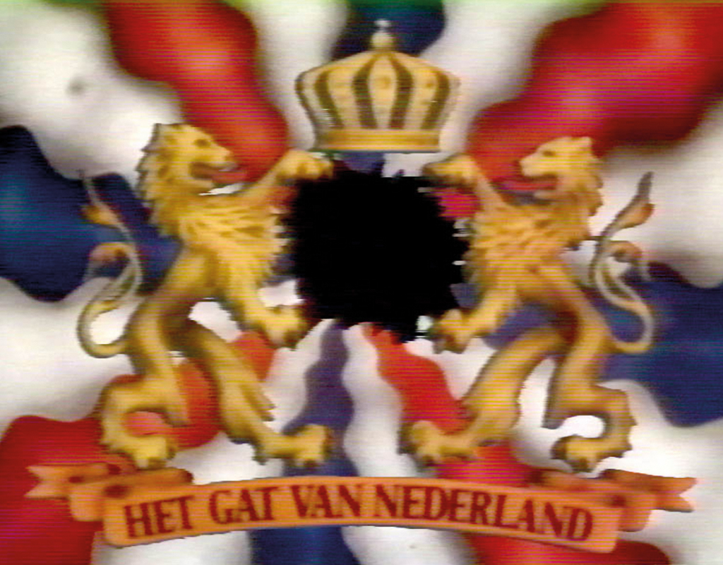
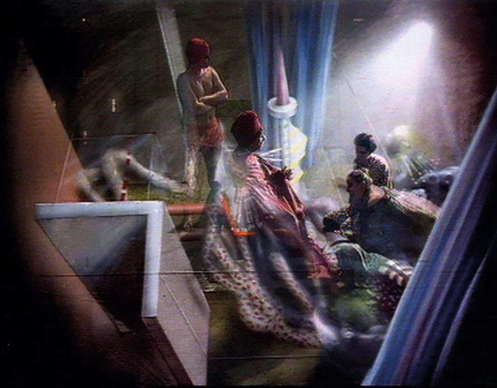
In addition to his leaders, bumpers and his contributions to programmes such as Berichten uit de samenleving (Messages from society), Het gat van Nederland and Machiavelli, Drupsteen also made his own programmes, such as De BV Haast Show with the Willem Breuker Collective and Het Grote Gebeuren, based on a story by Belcampo, for which he received the prestigious Nipkow Schijf award in 1976. His series De beide dames en … was created by a shared interest with writer Rudy Koopmans in the work of the American writer Gertrude Stein. Her stories deal loosely with narrative structures and causal relationships. In this small series of stories the viewer was given the freedom to make connections between a number of directionless events and to give them their own meaning.
Het Gat van Nederland, 1972-1976
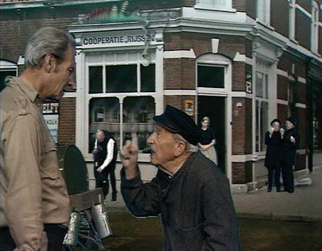
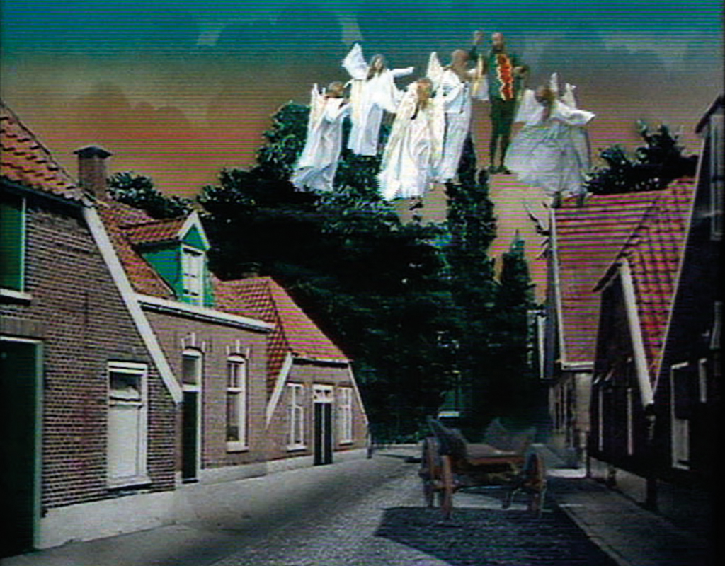
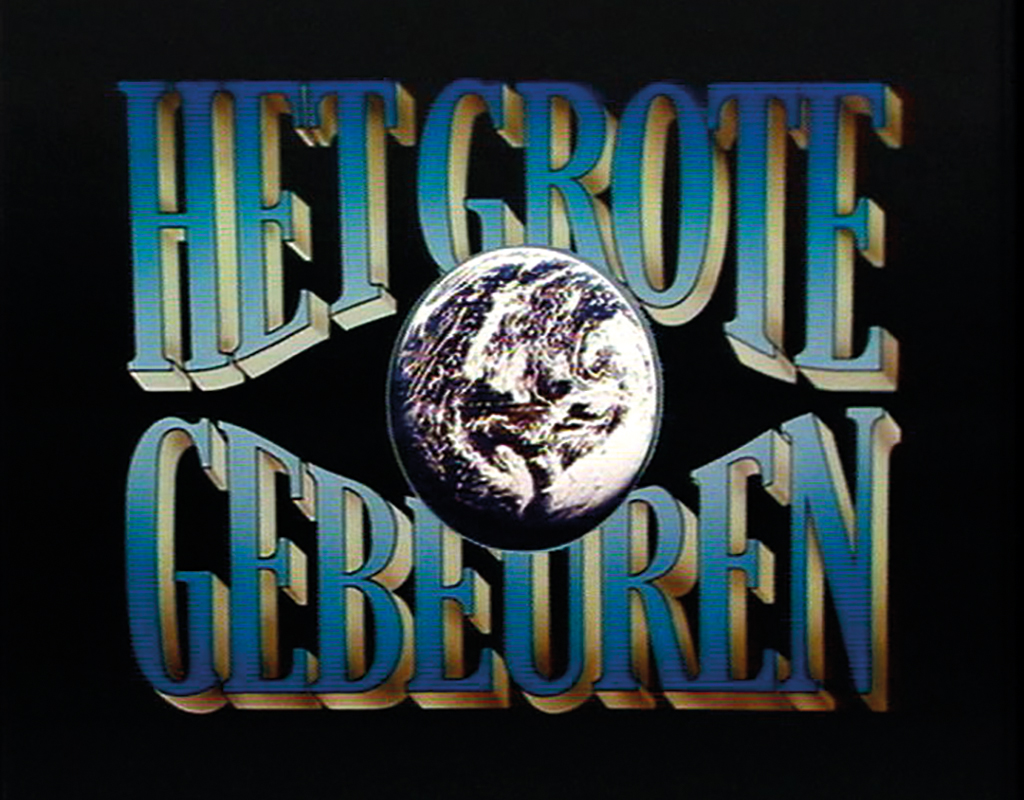
Het Grote Gebeuren, 1975
The revolutionary years of this small broadcaster gave the programme makers exceptional freedom. During weekly meetings, all broadcasted productions were evaluated and Blokker, as editor-in-chief, sharpened the quality awareness informally, clearly and, if necessary, relentlessly. Drupsteen was inspired by him and learned a lot from his intellectual power.
After Blokker’s departure in 1979, both the organisation as well as the control from the VPRO also became tighter. Slowly but surely, various programme makers left, including Hans Keller, Ad ‘s Gravesande, Pieter Verhoef, Ireen van Ditshuyzen, and also Jaap Drupsteen. In 1980, after having left the VPRO, Drupsteen intensified his collaboration with producer, stylist and spouse Milka Henriques de Castro. Together they worked on many assignments that ranged from commercials, corporate films, educational films, documentaries and music programmes, to work that was not displayed on a screen, such as projections for musical performances or on non-moving images without sound, such as printed matter and architecture.
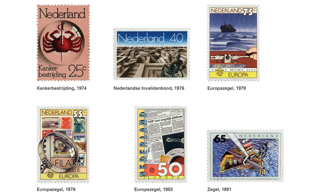
Already during his time at the VPRO, the Dienst Esthetische Vormgeving (Aesthetic Design Service, DEV) of the PTT had invited him to design stamps. The two directors that Drupsteen worked with at the DEV, Hein van Haren and Ootje Oxenaar, kept requests that were too demanding away from the designers. At the same time, they asked them to make optimal use of their freedom. Inspired by the subject matter and with respect for the wishes of the PTT, Drupsteen applied his own stylistic devices.
Halfway through the 1980s, Oxenaar stepped down as the designer of Dutch banknotes. The Dutch Bank organised a closed competition in 1988 to appoint his successor. Drupsteen and Jan van Toorn, Walter Nikkels, Gerard Hadders, Hans Kruijt and the collective Wild Plakken were invited to submit a proposal based on guidelines set out by Oxenaar. Initially Drupsteen’s entry was the least favoured because he had not followed part of the guidelines. However, after his explanation, the Dutch Bank realised that the guidelines would produce banknotes that were already in use. They also shared his view that themes to be depicted on the notes were not strictly necessary and should not be provided by the designer alone. Drupsteen was commissioned and the banknotes were given a theme that was not immediately visible: functionality – ease of use in cash payments.
Themes such as famous patriots had already disappeared, but Drupsteen’s series no longer showed any images, except for birds for the watermark and their prey animals as small security features. Ease of use increased because all notes were given the same height, while the length increased with their value. As a result, a deviating denomination in a stack of banknotes was immediately noticeable, partly because the printing continued right up to the edges. Further distinctions were made using clearer numbers, a more contrastive colour palette and through variation in the graphic arrangement. For each denomination this arrangement consisted of the number of graphic elements that corresponded to its value: from ten elements for the ten-guilder note to thousand elements for the thousand-guilder note. Due to the arrival of the euro, Drupsteen never got around to finishing the fifty-guilders note. He did compete for the assignment to design the euro banknotes in 1996, but he did not receive this assignment.
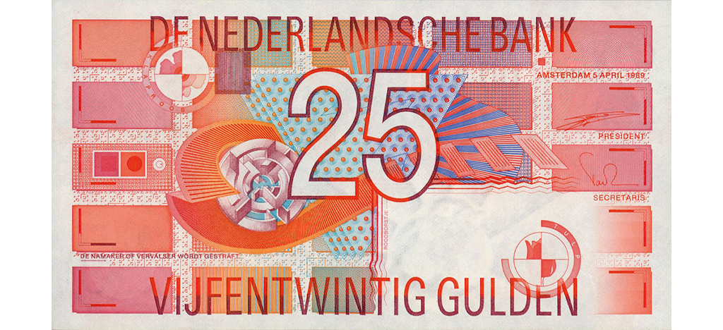
Dutch banknote Twenty five-guilders, 1990
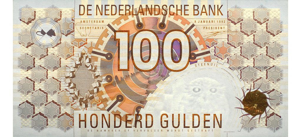
Dutch banknote Hundred-guilders, 1993
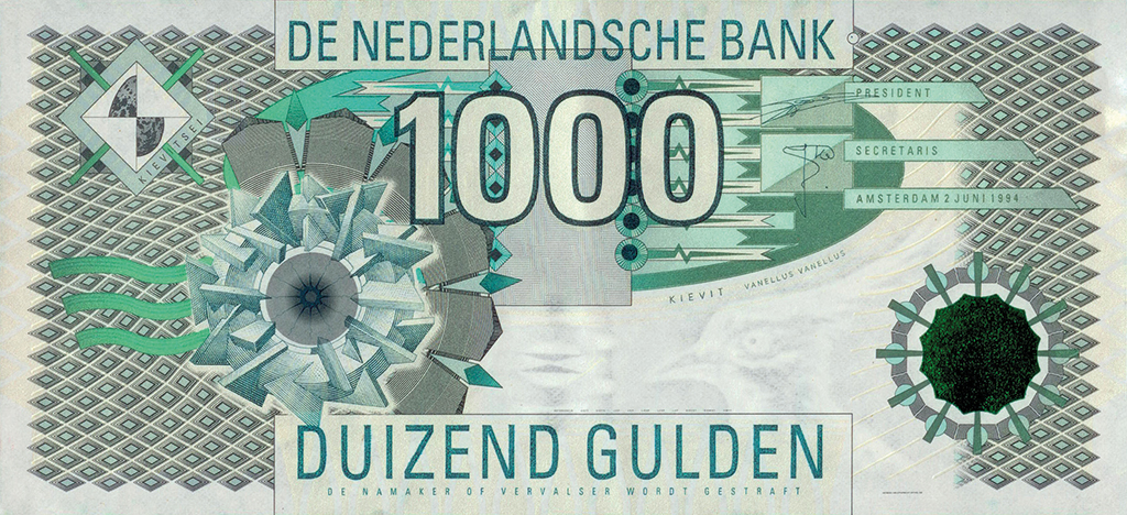
Dutch banknote Thousand-guilders, 1994
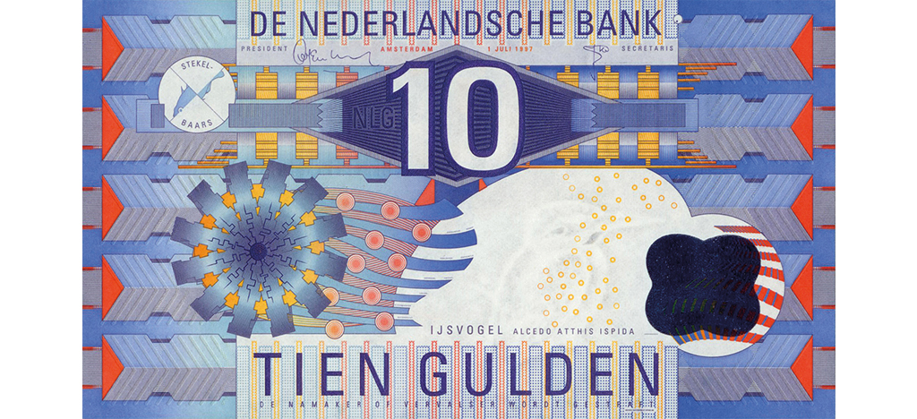
Dutch banknote Ten-guilders, 1997
Familiar with secured printed matter, Drupsteen designed the Dutch passport in 2000, whose authenticity is also protected with visible and invisible security features. Due to the international aspect of the document, the printing house had purchased security technology and several graphic guidelines were predefined. In addition to security features designed by himself, Drupsteen’s task was to give the travel document a visual identity. His most recent official document was the Act of Abdication for Beatrix’s abdication to her son Willem in 2013.
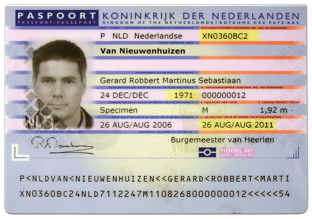
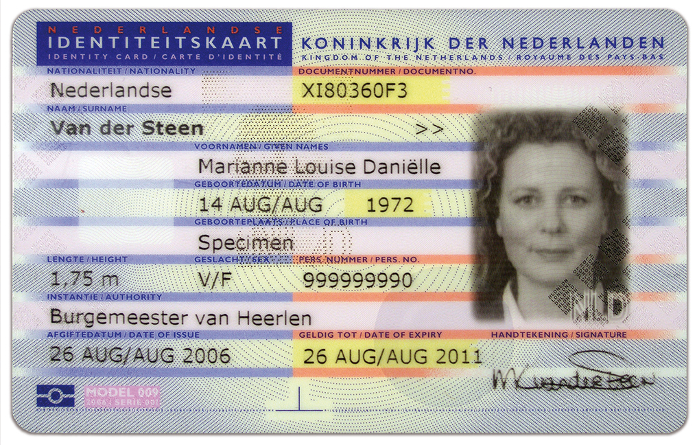
Dutch passport and identity card, 2000
In 2001 he was asked to design a glass wall around the Nederlands Instituut voor Beeld en Geluid (the Netherlands Institute for Sound and Vision) by architects Neutelings and Riedijk, who designed the building, consisting of historical television images so that the theme of the broadcaster’s corporate archive would be displayed on the outside. He evoked the images in glass by designing them in relief. The incoming light is filtered by bright colours applied in horizontal bands. For colour fastness, clarity and affordability, he asked TNO to develop a plotter that can apply and attach colour to glass plates. This technique allowed Drupsteen to use a greater variety of imagery on the glass plates and as such the loop of coloured images that goes around the building could be created.
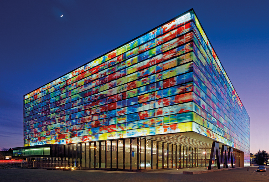
The Nederlands Instituut voor Beeld en Geluid (the Netherlands Institute for Sound and Vision) glass facade design, 2001
Whether it is glass, paper, or a screen on which images and typography – with or without sound – move or stand still, Drupsteen combines them into messages. Statements to be instantly understood, to inspire awe or respect, to enjoy, or to fill in for yourself. His tools, techniques and skills are many and he has mastered various specialisms, so that for some the variation in his oeuvre has even provoked disbelief. At the same time, his oeuvre shows coherence through his preference for coloured shapes placed in a rhythmic repetition with geometric details, usually in the centre of a coloured background, which he also does not leave unused. His graphic idiom developed over time through the modernism of the North Americans, the typography of the English magazine Nova and the ‘form anarchy’ of the Studio Alchimia from Milan, towards an increasingly personal signature that was always influenced by the wishes and requirements of the client, by technology and by the medium. All of this is always carried out carefully and laboriously, yet Drupsteen preferred, and still prefers, to do everything himself. As such, that large studio was never realised. He declined offers from abroad and did not teach any courses because academies were unable to purchase the necessary expensive equipment at the time. His weekly schedule was also too erratic for this because he worked on long-term projects in several studios at the same time.
Den Haag Vandaag, 1980
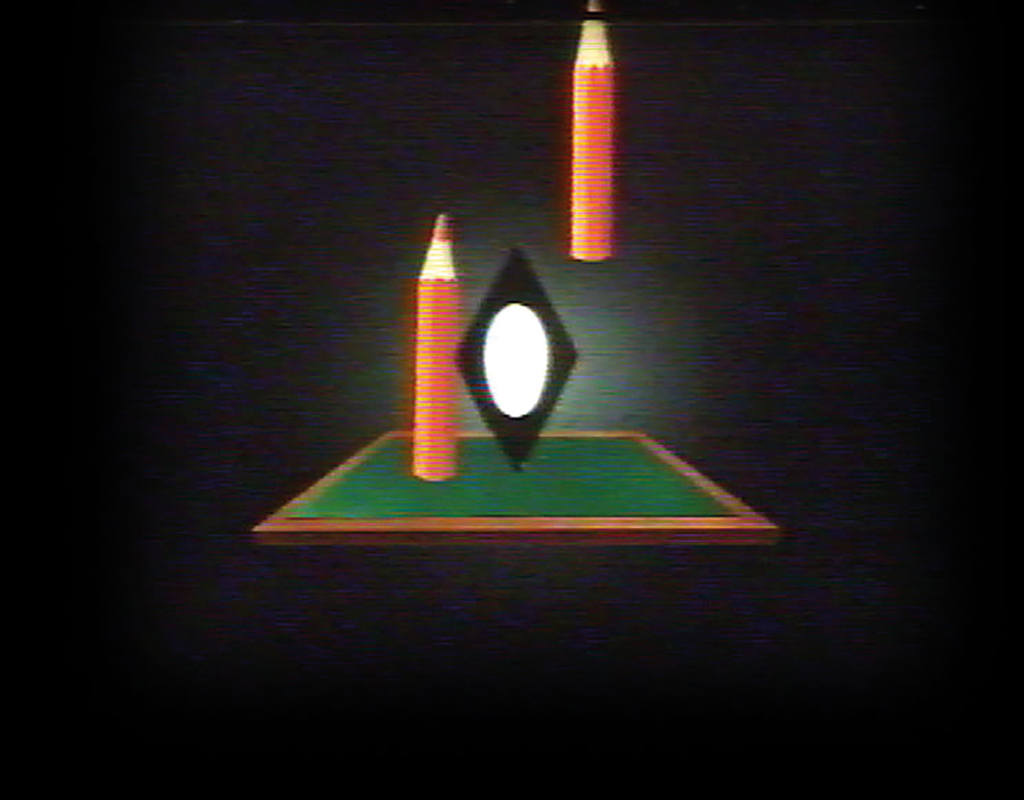
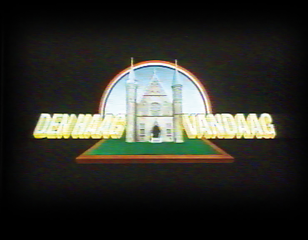
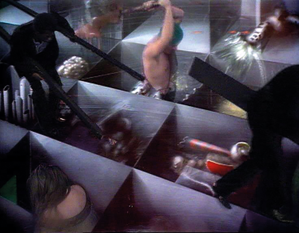
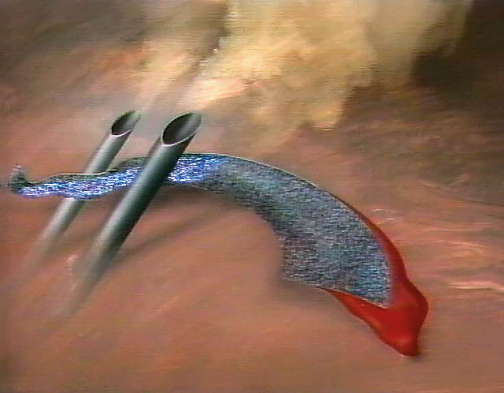
After working for the VPRO he continued to make leaders for other broadcasters, including those for Den Haag Vandaag, for which he designed the Ridderzaal using two voting pencils and a tilted voting box, accompanied by hasty music. He also designed and directed musical theatre productions for television such as Hertejoch Zanker, The Flood and the opera Barca di Venetia per Padova. In 1987 he received the honourable cultural television prize Prix Italia for The Flood. In 1983 he made Doe Maar’s hits more theatrical and accompanied the musicians rhythmically with all kinds of graphic shapes. In Hyster Pulsatu (1984) he made the actors move around in an environment consisting of graphic elements. The abstract animations made for this reacted to the rhythm, the pulses of the music. This was possible by connecting a synthesiser via an Apple IIe computer to a sequencer, which can store, edit and play music. Drupsteen was now able to make electronic music himself, stopped playing his double bass, and this technical development revived his fascination for the synchronisation of sound and image.
Hertenjoch Zanker, 1982
Hyster Pulsatu, 1984

The Flood, 1986
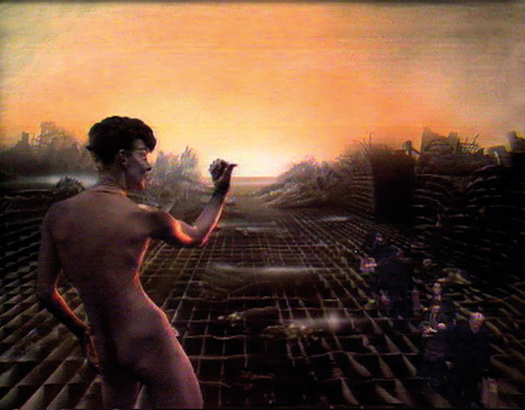
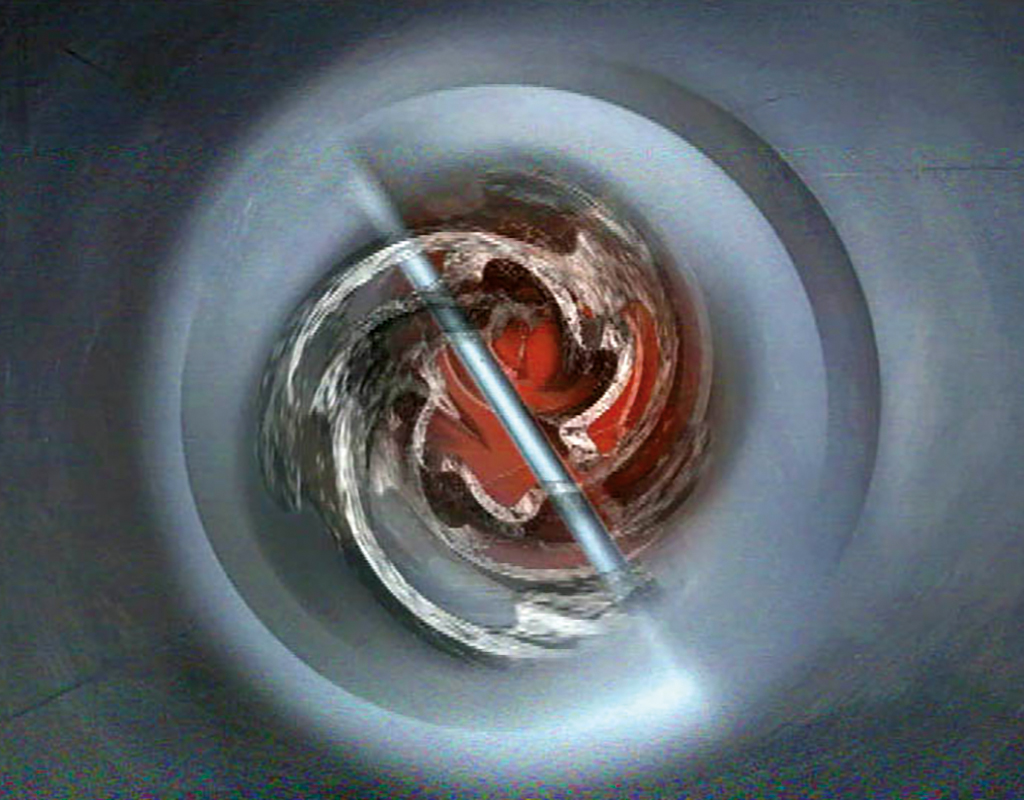
With this new technology he composed the music for the art programmes Nederland C and Kunstmest in 1985 and 1990 and animated abstract shapes at the same time. This was also the case for Pipe Driver from 2003, in which he gradually abstracted the image of an organ further and further and his son Floris constructed three-dimensional spaces that followed the rhythm of the music. Apart from the television screen, Drupsteen projected the first live synchronous animation at the Holland Festival in 1990, in which mysterious crop circles formed during a performance of Begleitmusik zu einer Lichtspielszene and Unanswered Question by the Radio Chamber Orchestra. For the 2004 Holland Festival, the audiovisual composition Now, made in collaboration with composer Jacob ter Veldhuis, was projected during a performance by the Concertgebouw Orchestra.
Nederland C, 1988
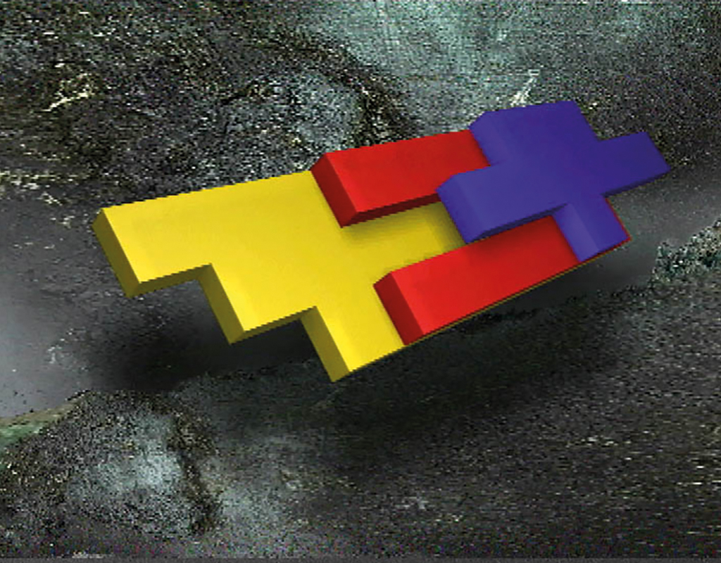
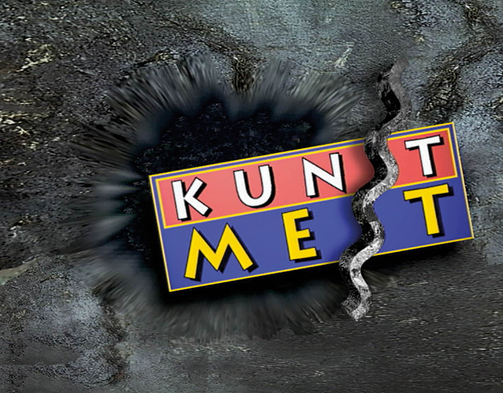
Kunstmest, 1993-1994
Pipe Driver, 2003
Music enhances our mood and emotions such as joy, sadness, anger and fear, while images represent the acquired emotional experience. The image in a musical performance are the musicians, their instruments and their collective movements. But this does not necessarily correspond to the message of the music. Nevertheless, there is a causal relationship between how musical instruments and other equipment convey their sound to us. This is consistent with how nature has programmed our brain. We connect signals from our immediate physical environment to create a combined impression that informs us of any danger or advantage. Swelling or fading sound in combination with an appearing or disappearing object is an auditory description of the movement, or a visual description of the sound.
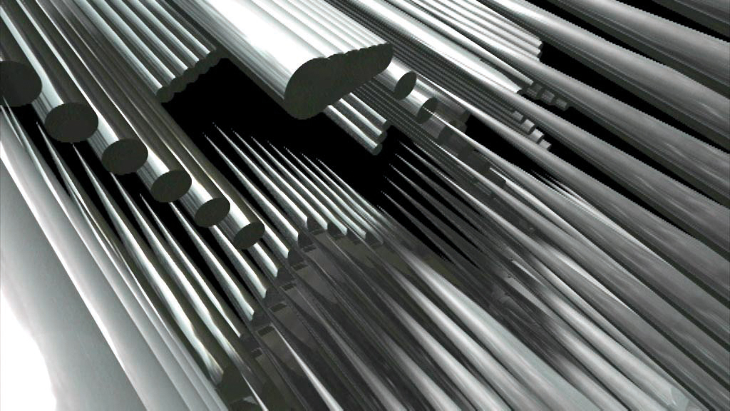
4k Cinegrid, 2007
Our brain is also able to combine sounds with images that are not caused by each other. Such a combination of a non-causal relationship is formed earlier and more easily when the moving images are unrecognisable and meaningless: this gives room to our imagination. In the sixties, for example, coloured liquid in a slide that started to move in all kinds of shapes by the warm projection lamp was merged with the music by the often hallucinating audience into one perceived experience. Later on, music’s visual support became more ingenious and laborious, which resulted in the video jockey.
Drupsteen played the harmonium from the age of six and studied Bach, melodies, rhythms and bass lines, and became fascinated by low tones. Hence the double bass which he later made to sound jazzy, and even later exchanged for a synthesiser that he could connect to a computer. In this way the music-making designer or the designing musician, which he is both, linked these two media together.
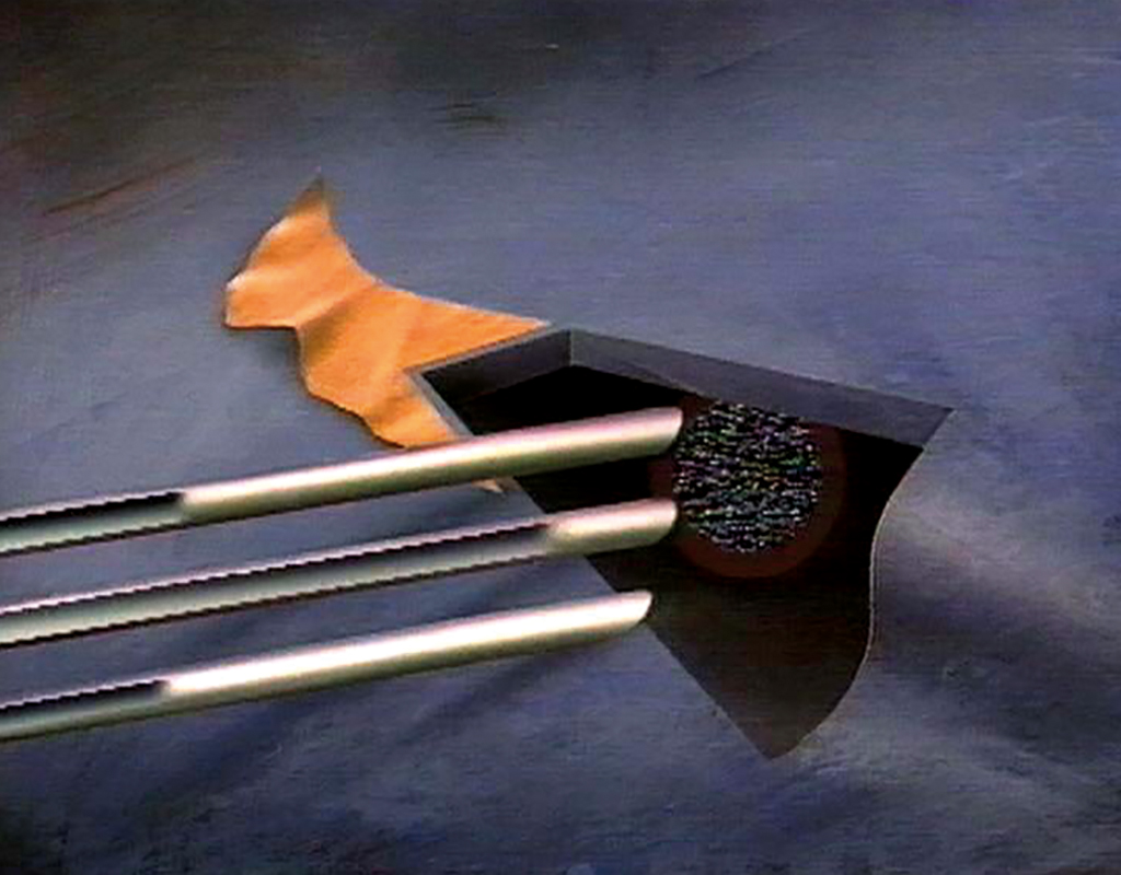
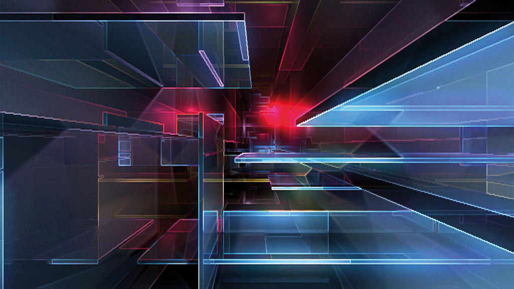
Twister, 2012
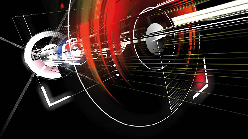
Lovesick, 2013
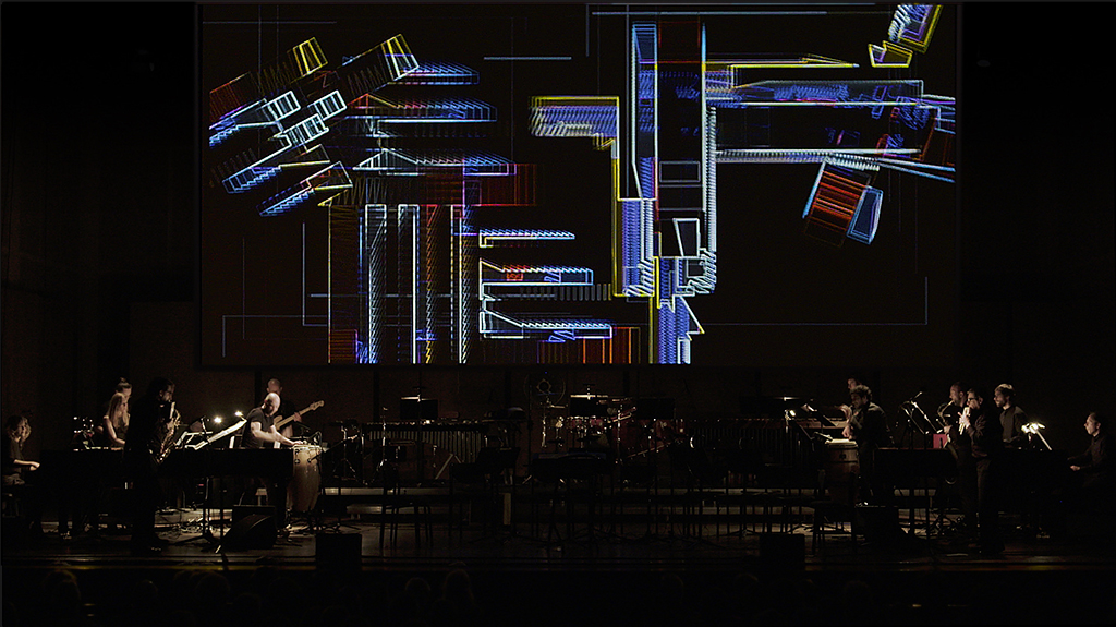
Concert by Asko Schönberg with motion graphics of Hoketus, 2019
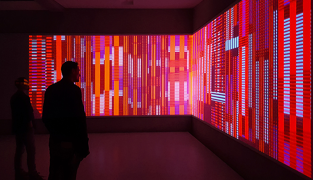
Exhibition ’The Rhythm Painter’ in Rijksmuseum Twenthe, 2016
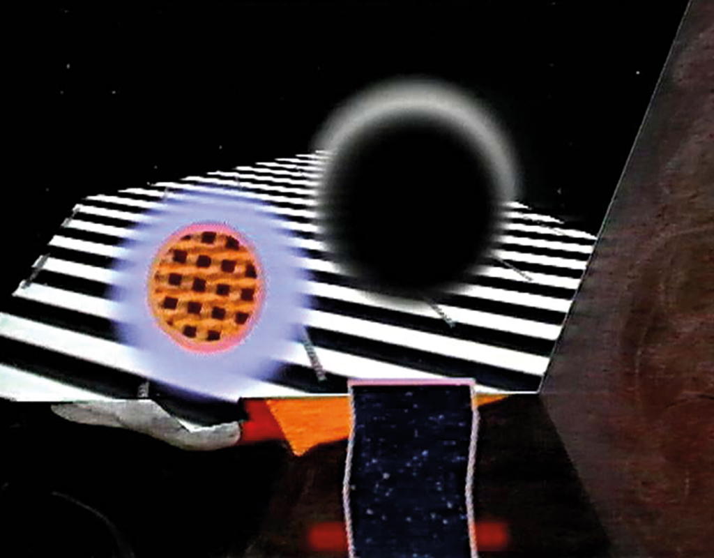
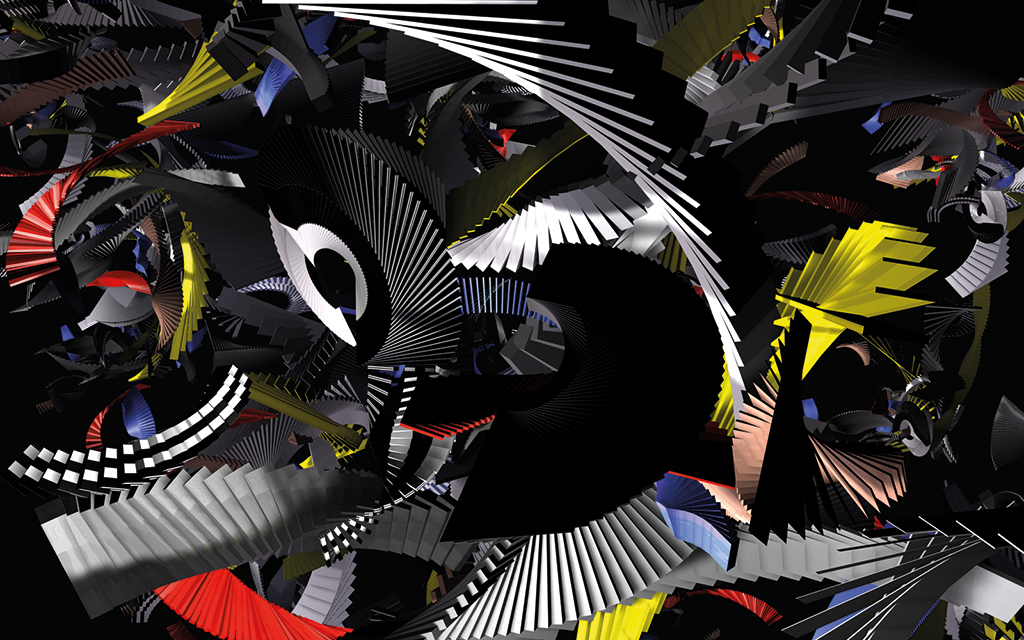
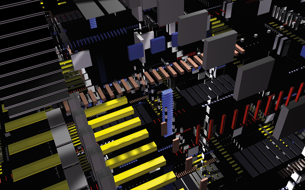
He composes and produces music, and programmes the movement of the shapes he drew. Sound structures distort visual patterns slowly or quickly which, usually on a black background, combine differently next to or on top of each other with each pulse or beat. It is visual music that hypnotises the audience, and through its abstraction provides the freedom to give it its own interpretation. Drupsteen has now come full circle, which began with Norman McLaren’s animation Begone Dull Care.
Perhaps these ‘pulse driven motion graphics’ are moving-fluid versions of his banknotes, or perhaps those bills are posters for it. In any case, Drupsteen combines its shapes, colours, movements and sounds in an arrangement to tell a story. And as such, due to the tight cadence of graphic elements and their interplay, this cumulative effect also arises in his visual work, which attracts him so much musically and makes his work swing irresistibly.
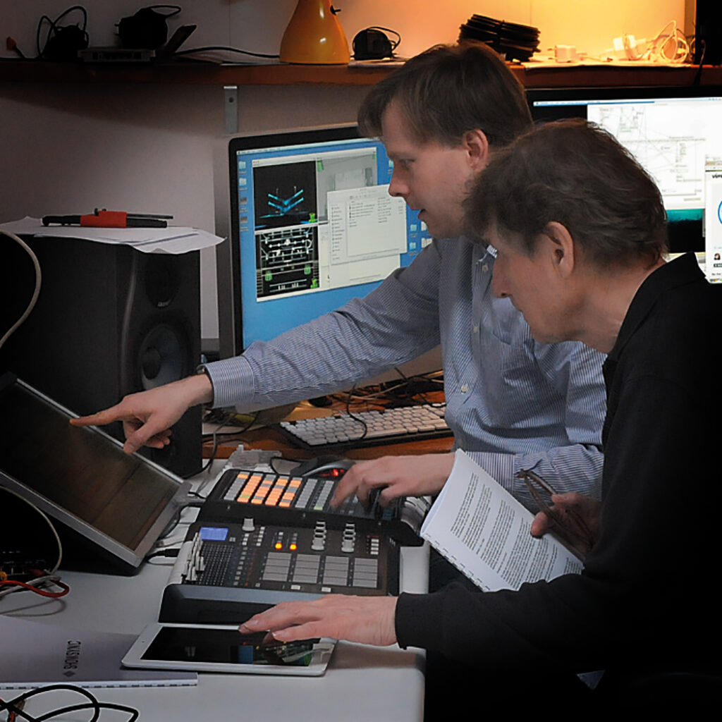
Working with Mattijs Kneppers on a new synchronisation tool for motion graphics and beats
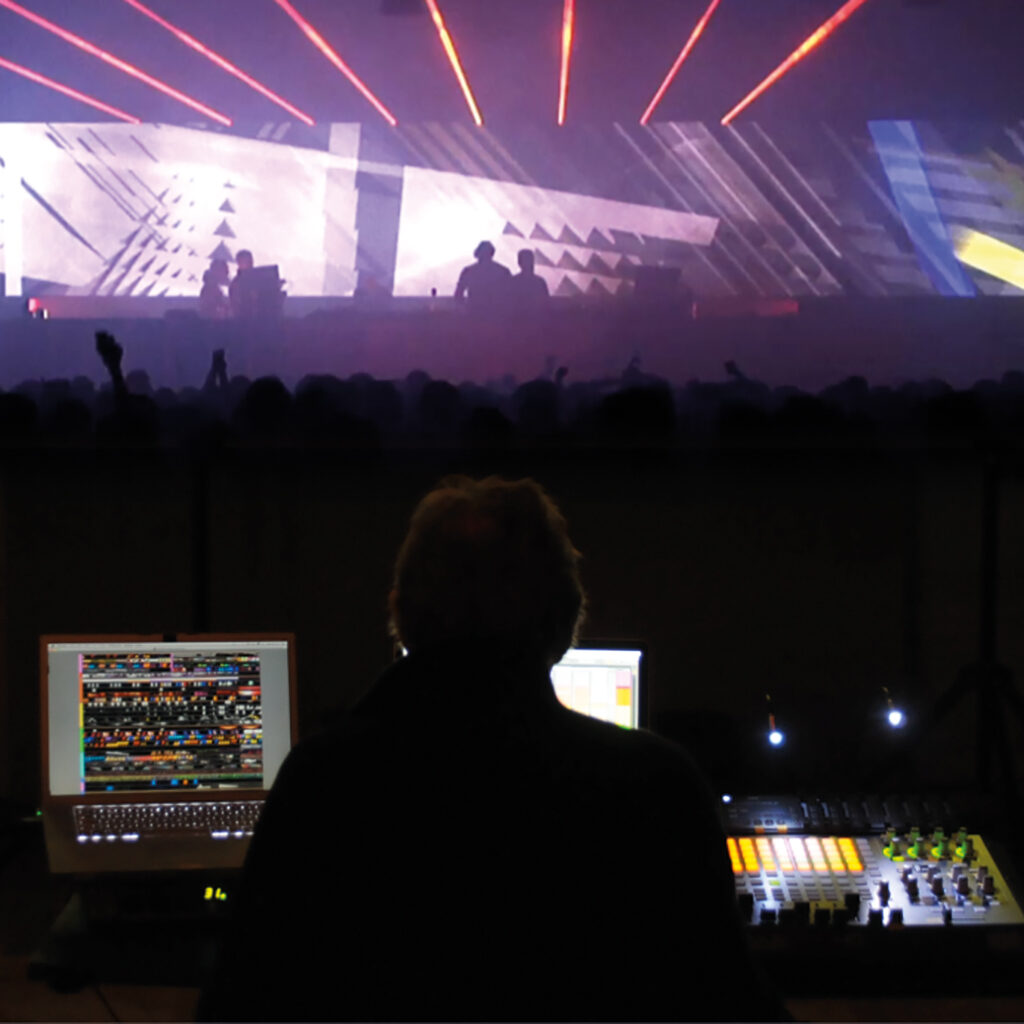
The first VJ performance with real-time synchronized motion graphics, for Dekmantel Anniversary, 2014
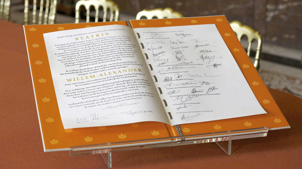
The Act of Abdication for Beatrix’s abdication, 2013
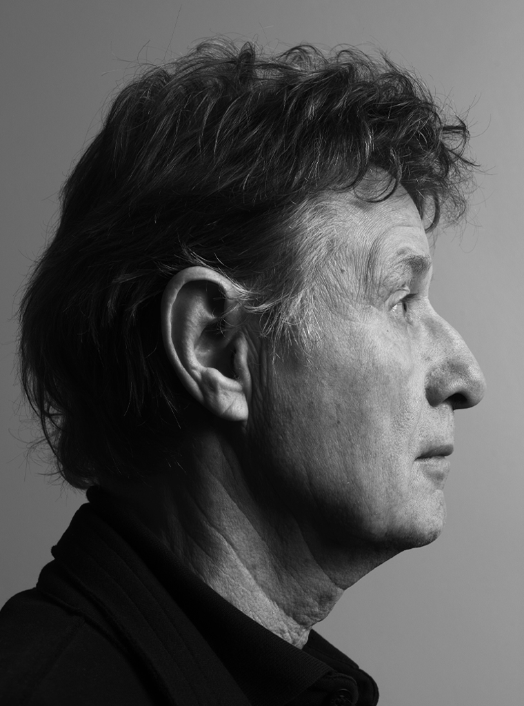
Jaap Drupsteen
born on 19 September 1942, Hasselt
Author of the original text: Chris Vermaas, July 2014
English translation and editing: Peter Hofstee
Final editing: Sybrand Zijlstra
Portrait photo: Aatjan Renders