My connection with graphic design in the Netherlands dates from before 1994 and after 2016. In March 1994 I left for the US, in July 2016 I left the US for Portugal. In the mean time I never returned to the Netherlands, and in recent years just for a short visit. In my American years, there were only chance confrontations with Dutch Design.
Concepts – Ans Zoutenbier, Hans Verlaat, Ton Haak, Anne Stienstra and Will de l’Ecluse, Amsterdam (1982)
The first time I came to work with a ‘real’ graphic designer was in 1967. It was a ‘very real’ one because his name was Otto Treumann, who was recommended to me by Louis Gans, a former curator of the Stedelijk Museum in Amsterdam. I had no experience with design. As a starting business journalist/public relations man I became charged with, among other things, purchases of contemporary printmaking for a few companies. I needed well-designed posters and a catalogue, and I asked Louis Gans, at that time a freelance art consultant, for advice. Louis and Otto taught me not just to look but to see. I remained involved with the visual arts and advised a few museums in the time that PR was not yet common practice at museums, let alone that they employed an in-house PR specialist. In 1971 I got involved with ‘Sonsbeek buiten de perken’, the controversial manifestation that brought minimal art, land art, conceptual art, video art, et cetera not only to Arnhem’s Sonsbeek Park, but to locations throughout the country. Wim Beeren, also a former Stedelijk curator, was its director; he became my mentor and taught me to look a lot further and see even better.

Met kunst werken – catalog of company art collection for CO-OP, design: Otto Treumann (1968)
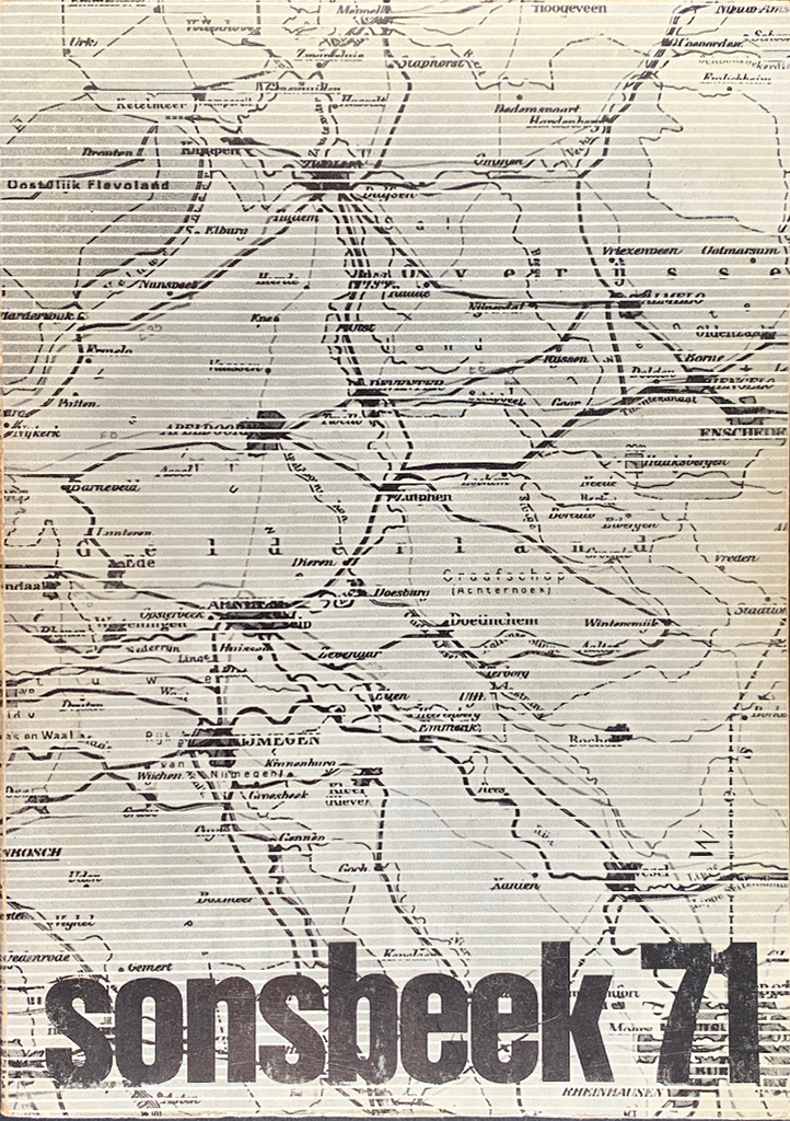
Sonsbeek 71 – catalogs for contemporary art festival Sonsbeek 1971, design: Wim Crouwel, Bram Engelse, Dirk Fortuin (Total Design)
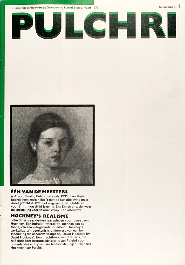
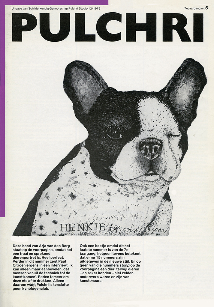
Pulchri – art magazine, design: Donald Janssen (1975)
Tel Design
Sonsbeek got me introduced to Wim Crouwel and his Total Design. After that I worked freelance for other museums, and for initiatives such as Octopus Foundation, which published Poppetgom by Studio Scarabee and Cubics by the architects Slothouber & Graatsma; and for an exhibition and publication called Arm : rijk = geen verhouding (about disproportional poverty on earth) for the Institute of Social Studies in The Hague. The exhibition design was commissioned to Tel Design, and that’s how I met Gert Dumbar. Tel Design was looking for new clients, asked me for advice, and I came up with the idea of publishing a newsletter. They agreed; it was called Telwerk. This modest and irregularly appearing, widely distributed petit magazine was very successful and continued to exist even after I, who in the meantime (in 1975) together with the industrial designer Frans de la Haye had been invited to enter into a partnership with Gert Dumbar and Jan Lucassen, took leave from Tel Design in 1980.
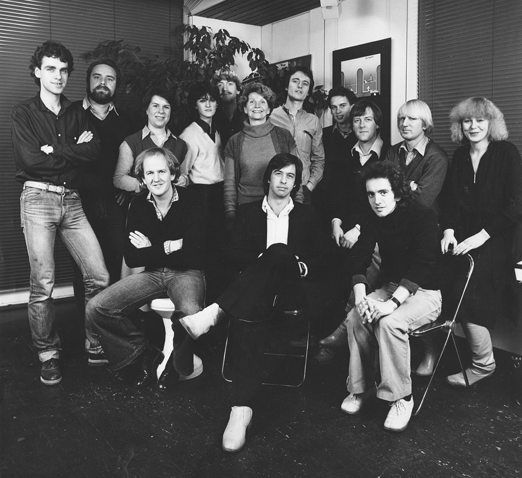
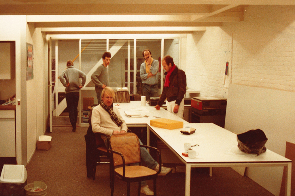
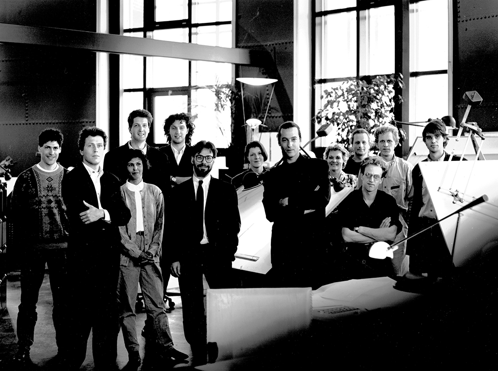
Tel Design – standing left to right Bobbert van Wezel, Makko, Ria van Zijderveld, Gemma van Dijk, André van den Heuvel, Ilse Tromer, René Hofman, Leo Krol, Andrew Fallon, Ton Haak and Ans Zoutenbier. Sitting left to right Will de l’Ecluse, Frans de la Haye and Pleun Vos. Photographer Gerard Weggelaar, Den Haag (1978)
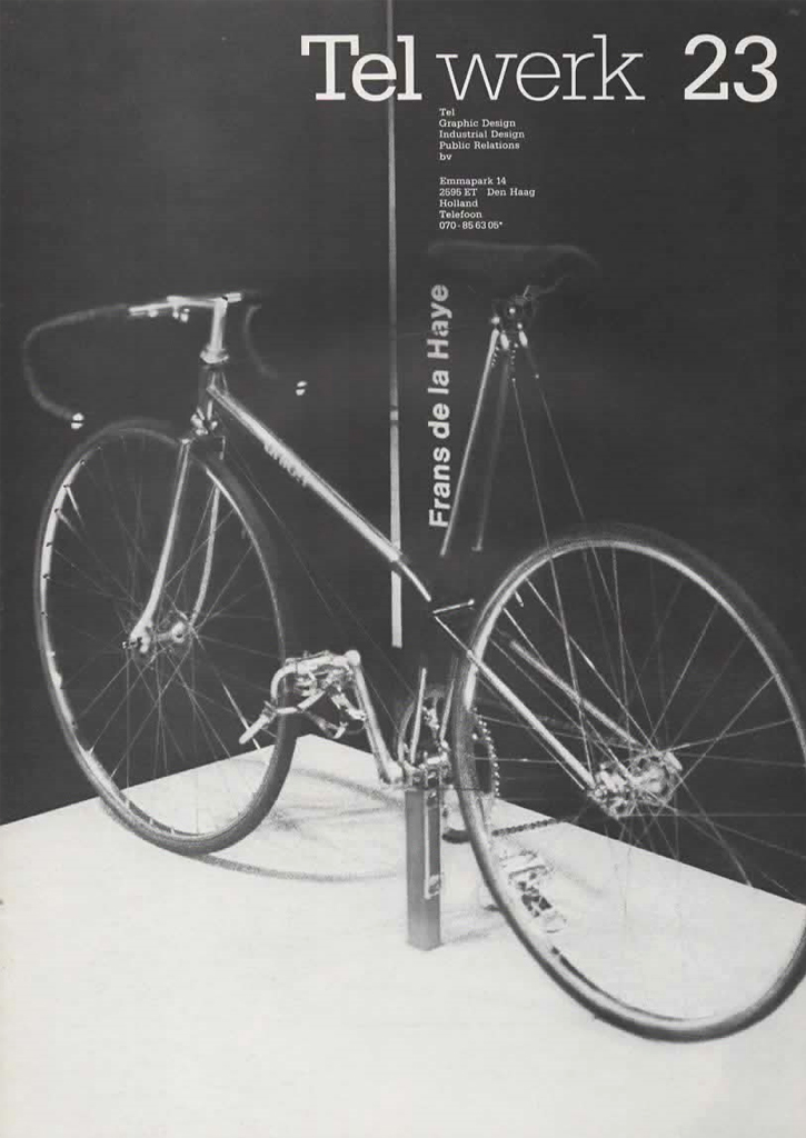
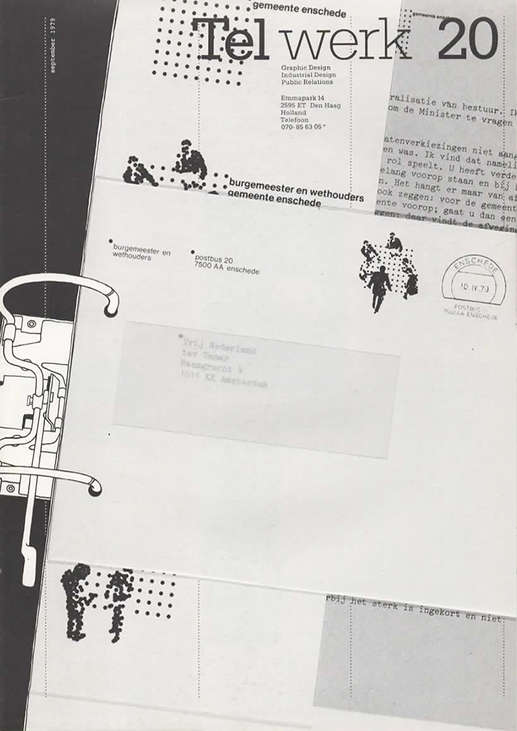
Tel Design – Telwerk design newsletter, (from 1974)
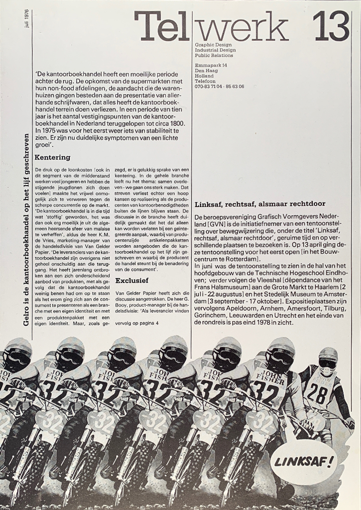
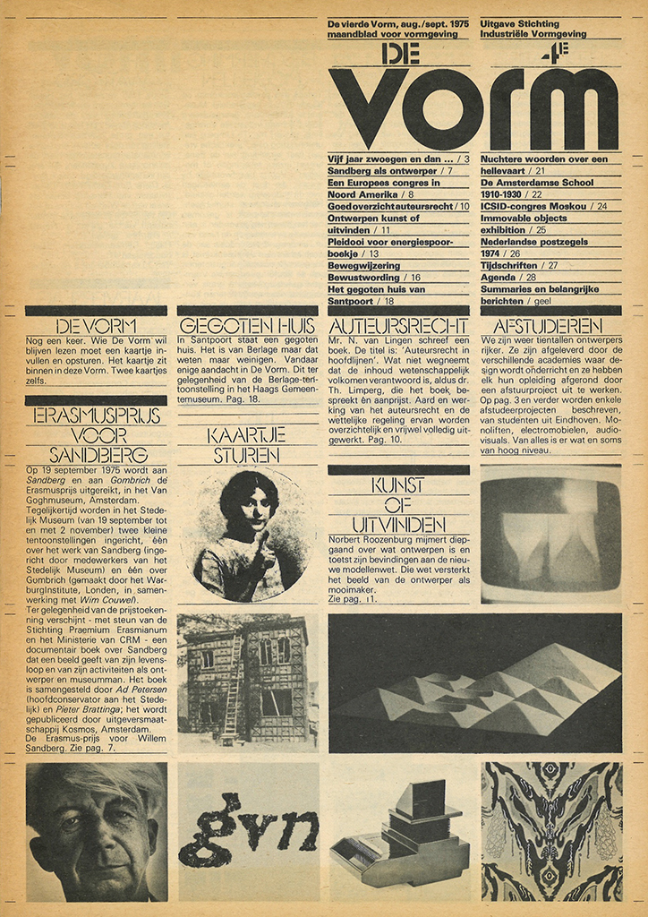
During my years at Tel Design, I was temporary (part time) director of the association of Dutch graphic designers GVN while their director, Titus Yocarini, explored India and Mexico. I was closely involved with the GVN exhibition signage and routing, Turn left, right, then continue straight on, and I became a co-founder and editor of the design magazine De Vorm, which was published by the Amsterdam-based Foundation for Industrial Design (although they stopped to exist before they’d paid all Tel Design’s bills for editing and design). My time at Tel Design was characterized not only by great joy but also by at least as great an unrest: these were the years of democratization, of revolution in the streets and at universities; we did not observe from the sideline, we participated, which meant that eventually more time and energy was spent in meetings and exchanges of dialectics than doing serious design. That stopped being fun, it led to cracks within the team and tears being wept, it terminated friendships. Gert Dumbar disappeared to tell his own story about what had happened and to continue a brilliant career under his own name.
Tel Design – De Vorm, design magazine published by SIV, design: Gertjan Leuvelink and others (1976)
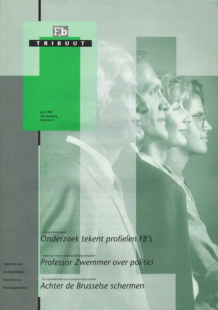
2D3D – Tribuut, monthly magazine for tax consultants, design: Pleun Vos, Claudia van der Straaten (1980)

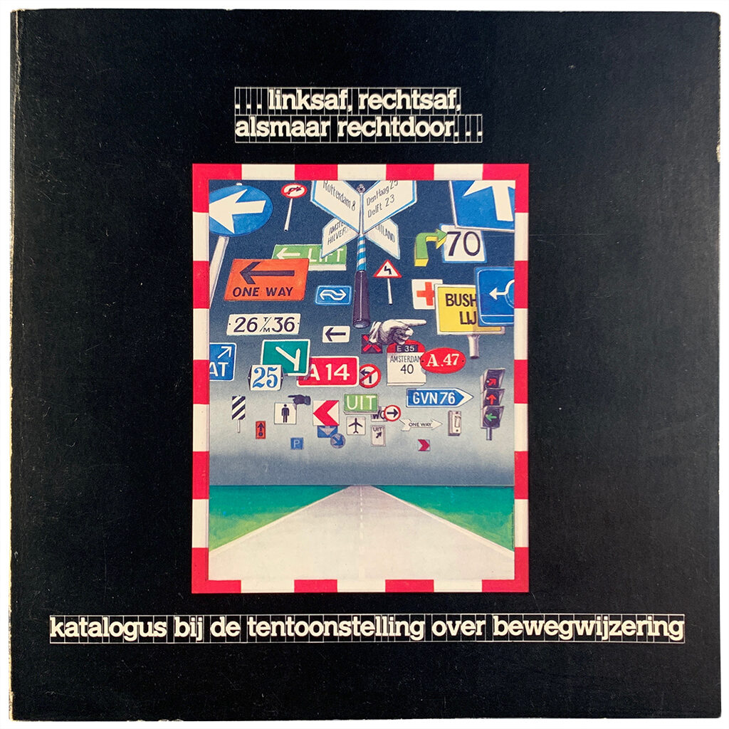
Linksaf, rechtsaf, alsmaar rechtdoor – (Turn left, turn right, continue straight on)
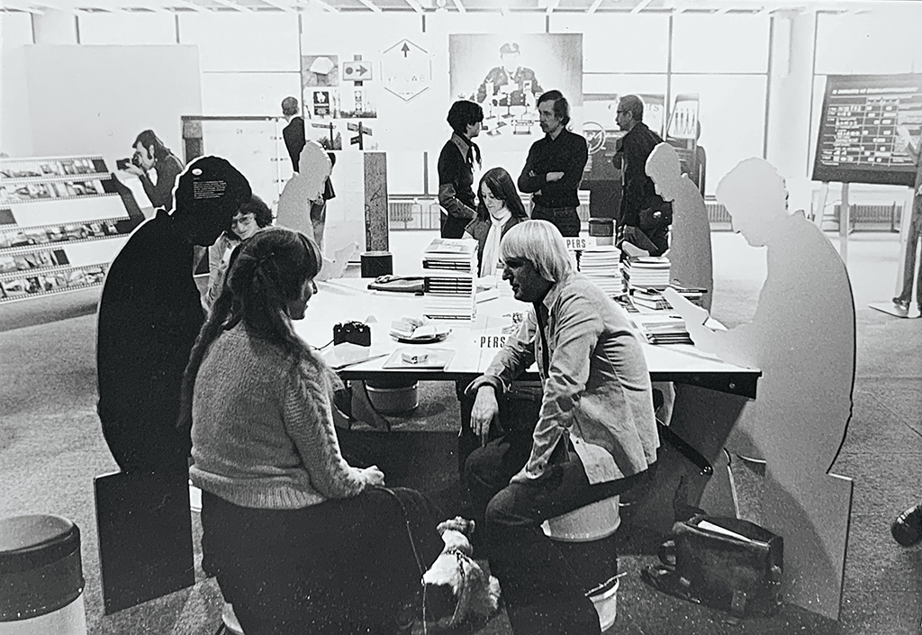
Ton Haak at GVN signage exhibition, Rotterdam, design (and photo): Donald Janssen (1975)
catalog of GVN signage exhibition, design: Donald Janssen (1975)
Unique climate
I was never able to decide on a preferred design philosophy. The orderly approach of a Treumann and a Crouwel suited me very well, and in the years after Gert Dumbar’s departure from Tel Design I would often seek the collaboration of other ‘Swiss influenced’ designers who cherished the grid and sometimes delivered very minimal, very dry, very serious if not severe and tight typography, which I liked much. Gertjan Leuvelink, Dirk Fortuin, Pleun Vos (and others at the 2D3D of that time), Hans Kentie. At the same time, I kept being fascinated by what a playful Gert Dumbar did, what Anthon Beeke or Hans Bockting did, what I saw the wild younger guard do, and also what a Lies Ros and a Peter te Bos stood for and achieved. In fact, I liked almost everything that was produced, in all their variety. I admired the makers for their creativity, their never-ending search for innovation, their desire to create perfection on their own terms.
My appreciation for all the unique craftsmanship only increased when, a quarter of a century later, I started receiving regular publications about the great names in the history of graphic design in the Netherlands. That was when Dutch Graphic Roots was first published and the ensuing cahiers presented not only outstanding designers, but also influential quality printers such as Cor Rosbeek and Simon den Hartog, and ‘mediators’ such as Paul Mertz and Hein van Haaren. Roots made me realize once again what a positive design climate I had found to work in, surrounded by so many talented and driven graphic specialists. Much later, I had just arrived in Portugal, Robert van Rixtel asked me if I was willing to translate his Roots cahiers into English, for publication on the internet – I said yes and spent long hours in total silence admiring what I was reading about the fifty or so people who were subject of a cahier, and enjoying close looks at the images of his or her work.
Concepts – company brochure with Partners in profile, photography: Reinier Gerritsen, design: Hans Bockting, Will de l’Ecluse (1983)
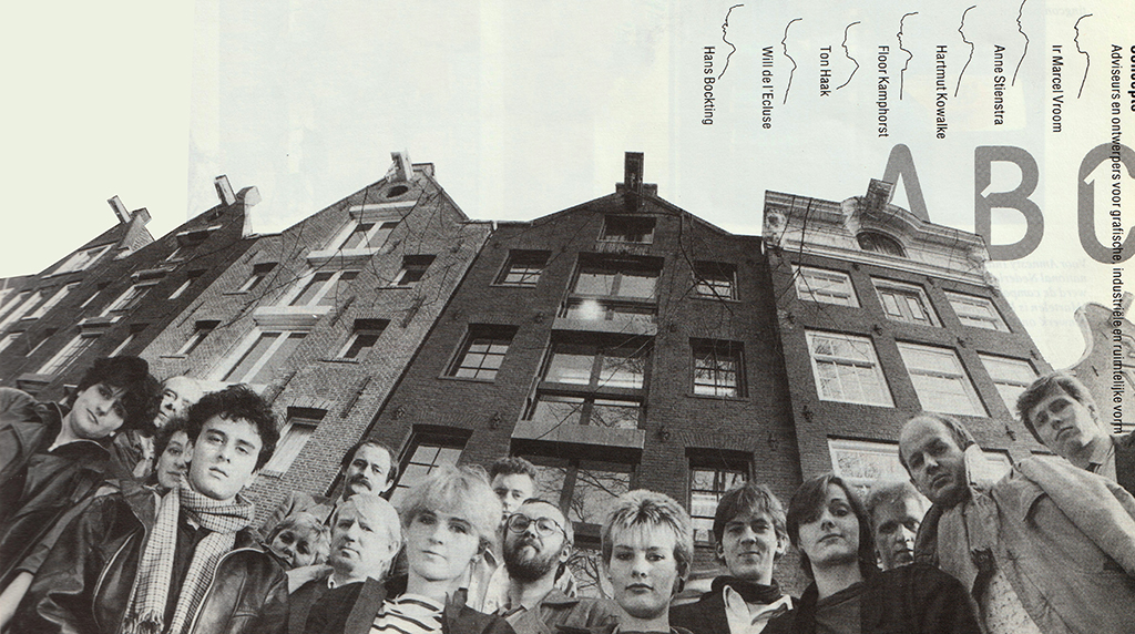
Concepts – Monica de Carvalho, Hartmut Kowalke, Xandra van der Zwan, Reyn Jongenelen, Ans Zoutenbier, Anne Stienstra, Ton Haak, Hedwig, Hans Verlaat, Hans Bockting, Els Staal, Eric Vos, Denise Ghering, Karl Sewalt, Will de l’Ecluse and Marcel Vroom. Photography: Reinier Gerritsen (1983)
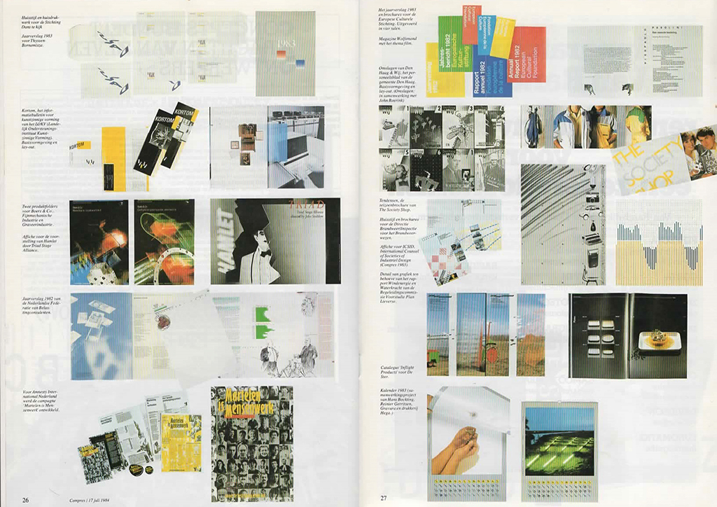
Compres – spread with Concepts projects in trade magazine for graphic management, lay-out: Mercurius (1984)
Concepts, Landmark, freelance
Andrew Fallon (coming from Total Design) joined Tel Design as a partner to replace Gert Dumbar. Then Jan Lucassen also left the partnership and the remaining trio, Andrew Fallon, Frans de la Haye and I, were left with an agency that had been practically bankrupted by democratization. The crew was reduced to a few young and therefore affordable designers and interns (from St. Joost Academy). I became their general manager and after a good year the debts were paid off and Tel Design was healthy again. I decided to leave Tel Design soon after, in 1980, and, after spending a sabbatical half year in California, continued as an independent consultant until, together with Will de l’Ecluse, Hans Bockting, Hartmut Kowalke, Floor Kamphorst and Anne Stienstra (graphic designers) and Marcel Vroom (industrial designer), I founded Concepts, in Amsterdam, which entered into a partnership with Ton Haas and Hans Ebbing, two young industrial designers from Arnhem (Hans, unfortunately, died too soon). Concepts quickly became successful, yet the agency split up in 1987. Together with Ton Haas, Marcel Vroom and Theo Groothuizen, who came from PTT Telecom, I founded Landmark industrial design agency in Rotterdam, to which my old companion Jan Lucassen, then director of the Eindhoven industrial design academy AIVE, also committed himself for a while.
Democracy
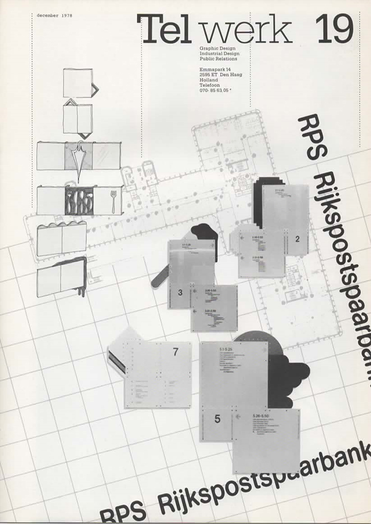
Of the series of clients of design projects in which I was directly involved, I will mention only a few. I often played a role both in the concept phase and in the presentation to clients and, sometimes the articulation of contents and objectives of the design to the benefit of employees or the public. For Delta Lloyd’s new corporate identity, in addition to a detailed design manual, a concise manual was compiled for all employees, which did not just explain how to deal with the design’s rules, but in fact how to communicate in words and writings with the company’s insurance and pension fund clients (the manual became known as ‘Delta Lloyd’s little blue book’). I was involved in corporate identity programs (Elion & Pajkert Bouwen, ECI, AGA, Boers & Co), signage systems (RPS, Delta Lloyd, Willem Eggert Centrum) and hundreds of annual reports, brochures and posters, as well as interior design projects for KLM Royal Dutch Airlines and Stadstimmerhuis, Rotterdam.
Tel Design 1962 – 1992 – jubilee book, spread with some projects 1976 to 1980, design: Gert Kootstra and others
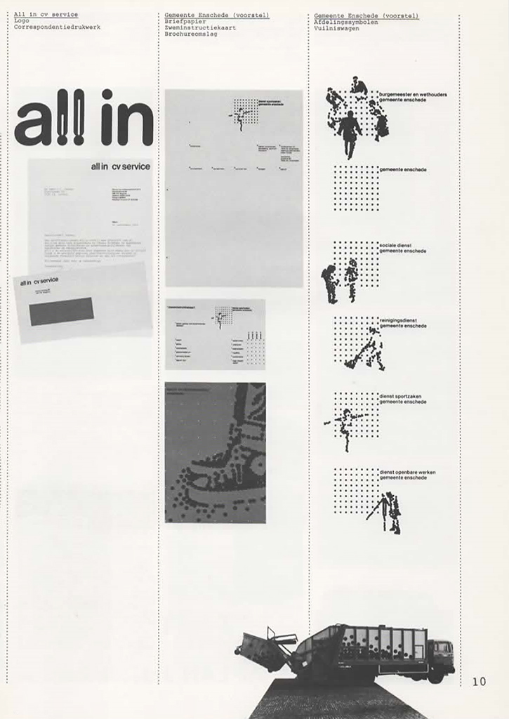
Tel Design – City of Enschede, proposals for a new identity program (not accepted), design: Pleun Vos (1977)
Of the identity programs, I most fondly remember the identity program for the city of Enschede, which never made it to application. Pleun Vos was the designer of a grid recognizable by red dots, around which for each part of the municipality (from the city council to the park service) human figures were grouped, who performed actions characteristic for their position or job. In short: the design radiated commitment and humanity, a democratic concept appropriate to the times. The then mayor, the alderman for culture and their spokesman who had supervised the project were very pleased. So were the department heads – all happy. Then followed the presentation to the city council. And what happened? While VVD and CDA and smaller conservative parties were in favor if not jubilant, the political party that had the large majority in the council voted against. These were the progressive socialists, who decided that something like the old coat of arms dating from a previous century (a shield with lions and, mind you, a prince’s crown!) was more appropriate. I can still hear the mayor, a prominent PvdA socialist, Ko Wierenga, a calm and erudite man, exclaim something like: ‘Well shit… what the f..k?’

2D3D – Den Haag Literair, literary city guide for poetry festival, design: Pleun Vos (1991)
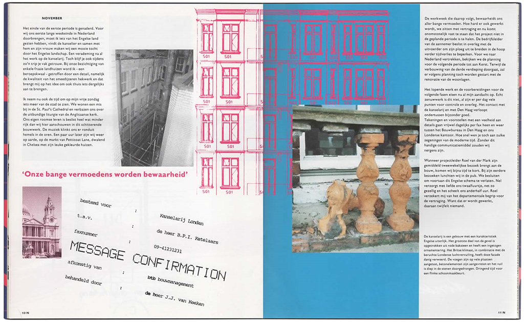
2D3D – Hollands Dagboek, (Dutch Diary) brochure for btb construction consultants, about renovation Dutch chancellery London, design: Nick Feeney (1992)
In 1989 I stepped down to become an independently operating consultant for graphic design in The Hague. In the years that followed, I worked on projects with Landmark and 2D3D (especially with Loes Schepens and Pleun Vos), and with freelance designers such as Hans Kentie, Donald Janssen (whom I had earlier joined to give the art magazine Pulchri a new face, lay-out and content), and others. I was active in several boards: as chair of the Stichting Kunstprojecten (Art Projects, Rotterdam); chair and organizer of the poetry festival ‘Dichter aan huis’ (The Hague); secretary of the board of the modern dance company Djazzex (The Hague); co-organizer of the Hague Art Salon; and more. In 1994, I decided to make a real break, sold most possessions and together with my wife Ans Zoutenbier bought a one-way ticket to Houston, Texas.
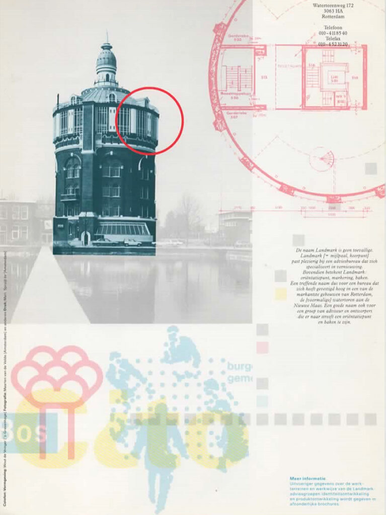
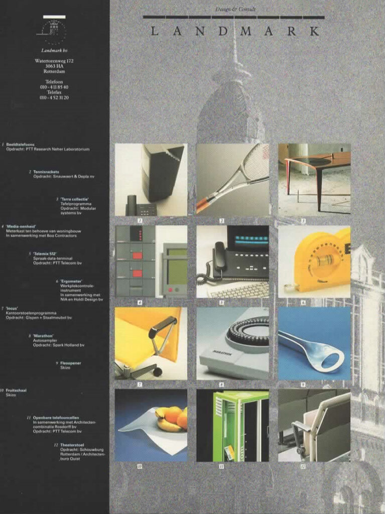
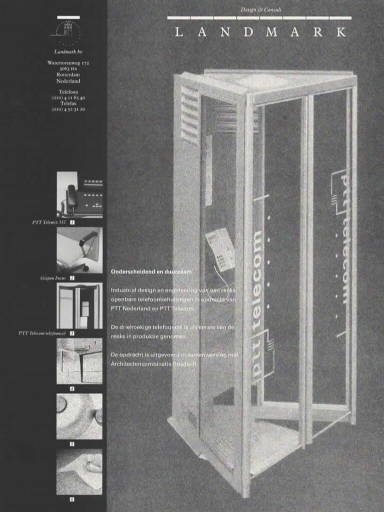
Landmark – brochure industrial design / product development, design: Wout de Vringer (1986)
Landmark – From left to right Tom Couvee, Marcel Vroom, Evelyne Veldsink, Carel van Houte, Marcel Wanders, Theo Groothuizen, unknown, Ton Haas, unknown, ounknown, Gerben Klinkenberg, Karl Sewalt, Taeke Bulstra (1990)
Second life
In the US, I began my second life with almost four years of wandering throughout all the states west of the Mississippi River and exploratory stays in Tucson (Arizona), Carmel (California), Matfield Green (Kansas), and Nanaimo (British Columbia, Canada). At the end of 1997, our travels came to an end and we settled in tiny Abiquiu, deep in the beautiful red rock desert in northern New Mexico. Ans and I started The Tin Moon Gallery, very tiny but smack beneath the house on the mesa where Georgia O’Keeffe had lived and died, which attracted ‘pilgrims’ and… art buyers. I also accompanied visitors on hikes in the desert or visits to Chaco Canyon or Bisti Badlands. I wrote a lot, mostly nonfiction, including for the magazine Amerika and for The Rio Grande Sun and THE art monthly in Santa Fe. And I published two collections of poetry: Abitare Abiquiu and Whims and Whispers, Pouts and Shouts. Sometimes I would read my poems, somewhere in a Colorado café six hours away from home (but what a spectacular drive!), and we would be rewarded with free meals and drinks. A piece of land surrounded by thousands of acres of Carson National Forest was purchased and there I designed our own house, which we built with the help of two illegal Mexicans who sang ‘cancones’ during work and with whom we ended the day toasting with Tecate from a can. The house became rather magnificent, as others also thought, and as a result I was asked to design a couple of new houses and a number of home extensions, and even to supervise a few (re)construction projects. Such fun!

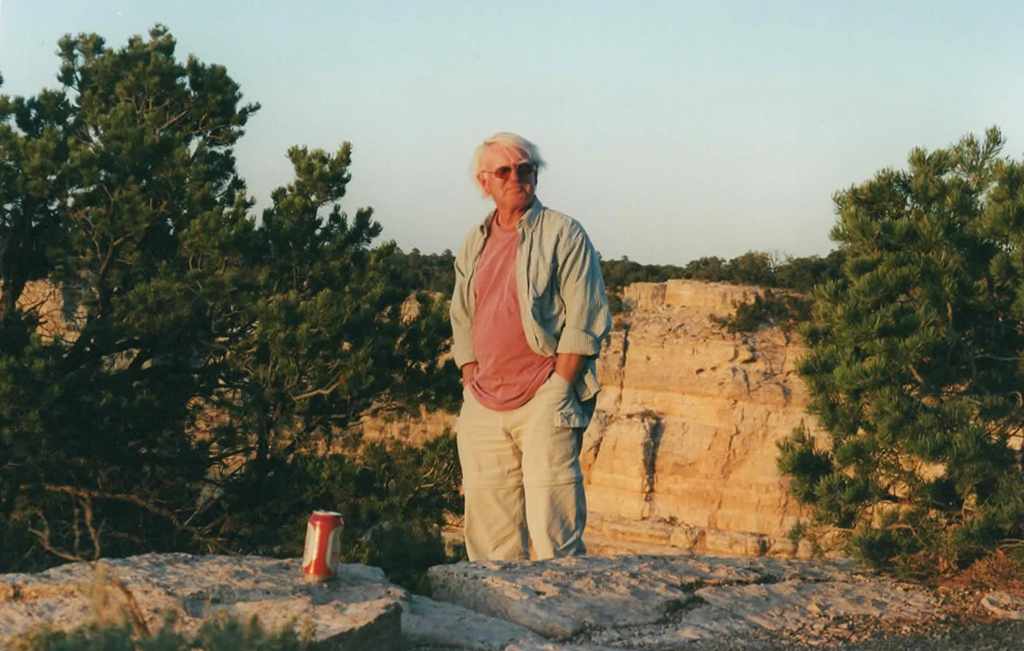
Piedra Lumbre (elevatie 2.500 meter), Abiquiu, New Mexico. Photo Ton Haak (2008)
Behind the house, Barranca / Abiquiu, New Mexico. Photo Ans Zoutenbier (2008)
A good neighbor
I was thrown back into my first life by getting Godfried Konings as a ‘neighbor’ from 100 kilometers away. A former graphic design student at St. Joost who had spent a period as an intern at Concepts in Amsterdam, Godfried now worked as a freelance designer in New Mexico, after living in New York for a few years. His clients included the Santa Fe Art Institute, with which, as with the Harwood Museum of Art in Taos, I was arranging artists in residence programs, exhibitions and publications for Dutch artists such as Jeroen van Westen, Risk Hazekamp, Gerco de Ruijter and Josephine Sloet, and for the Flemish artist and teacher at Lucas Art Academy in Ghent, Anne Ausloos.
The Wave – Sculpture by multimedia artist Brian Bondy (Abiquiu) (2005)
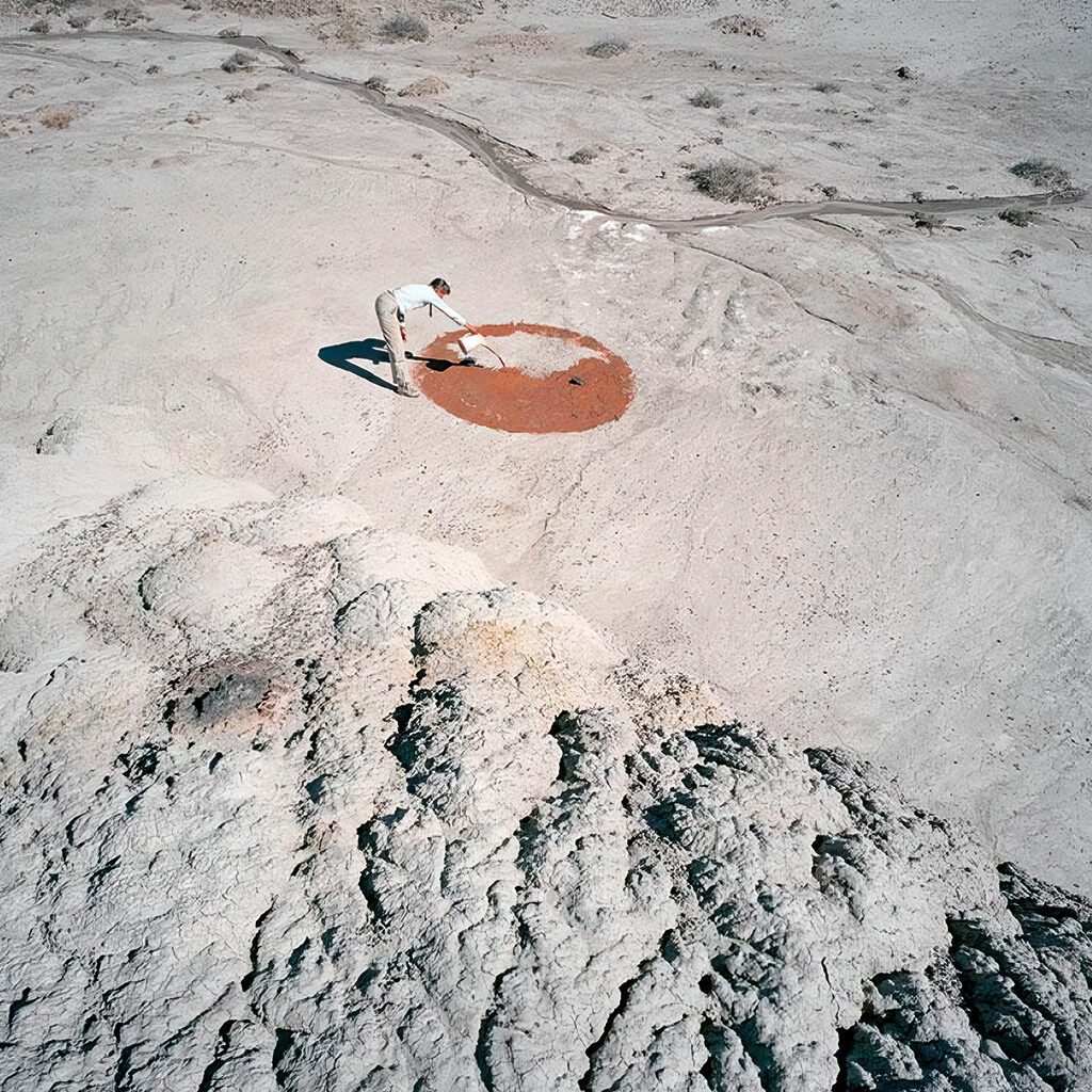
Nageezi – Anne Ausloos (Antwerp) takes red desert dirt to the white desert arroyo near Chaco Canyon, a project of Desert Passage, publications and exhibitions in Santa Fe Art Institute and Harwood Museum of Art, Taos, New Mexico. Photo Gerco de Ruijter (Rotterdam), just as Anne artist in residence (2008)
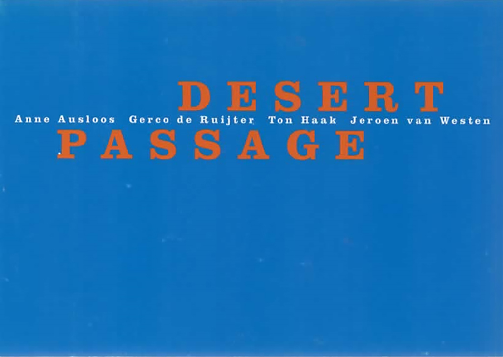
Desert Passage – art project New Mexico high desert, book and catalog-newsletter, design: Pleun Vos (2009)
Godfried and I became buddies and met regularly in Santa Fe to loudly complain about Holland and America just as well, meanwhile drinking Belgian beer and Mexican tequila; then, late at night, I had to find my way home, 100 km north, on unlit highways and dirt roads. His daughter Iza became, and is, my pseudo-granddaughter. Godfried Konings, unfortunately, is no more – he died far too young (in 2016, just after Trump had started to make his real face known and Ans and I had settled in Portugal ‘as political refugees’). But first I had also worked with my old companion Pleun Vos, who, now independent and from Amsterdam, designed a few artist publications with which I was involved (including Desert Passage).
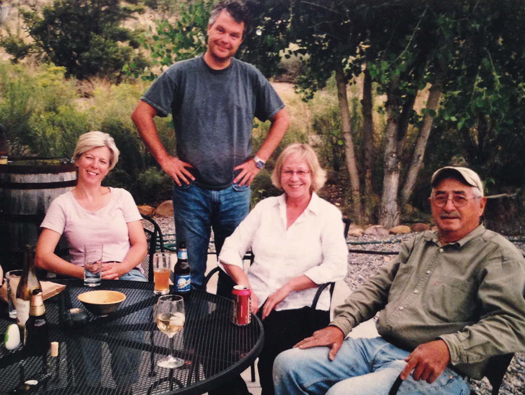
Abiquiu – Arian Roefs, Godfried Konings, Ans Zoutenbier and Alfonso Martinez, rancher and close neighbor. Photo Ton Haak (2009)
Santa Fe – Ton Haak and Arian Roefs, Jan and Iza, Godfried Konings. Photo Ans Zoutenbier (2014)
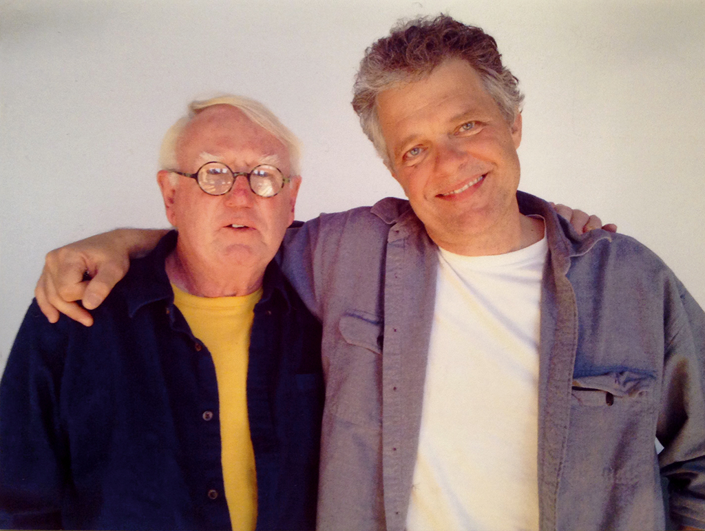
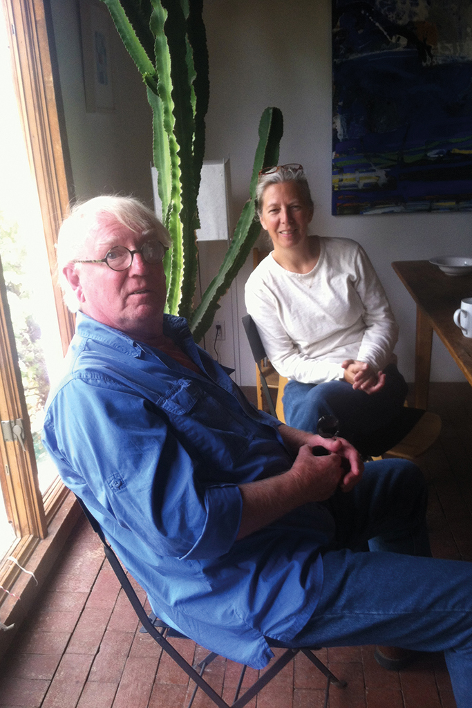
Santa Fe – Ton Haak and Godfried Konings (2014)
The City Different
The Santa Fe Art Institute was one of the few clients in New Mexico that allowed Godfried Konings to enjoy himself as a graphic designer. The desert wasn’t a rich hunting ground for designers, even though Santa Fe was and is known by Americans as ‘The City Different’, their ‘second art city’ after New York. There was indeed a cultural climate with sometimes exciting excesses in theatre and literature, and also in the visual arts, although this sector suffered most of all from intrusive commerce and the importance of money. The countless gallery openings provided weekly meeting places for a horde of rich folks, nouveau riche followers, and their trust fund kids. The SFAI could not distance itself from this crowd, but the scene was looked at with somewhat of a contempt. Godfried, though, quickly became their favorite designer.
Printed matter Santa Fe Art Institute, design Godfried Konings (2007)
I myself had met Susan Martin in Abiquiu, previously an esteemed member of the punk scene in New York and the art scene in Los Angeles (Venice Beach), who had mainly run photography galleries and performance art and who really knew everyone, from Andy Warhol down. Susan was (and still is) a lefty rascal (her father was one of the architects of the Moscow metro, until the crazy and cruel Stalinism of the 1930s forced him to escape). Susan and I understood each other, and she liked working with a certain Godfried on SFAI projects. ‘This Godfried, he is also from the Netherlands,’ she told me one day. ‘You should meet.’ The name Konings didn’t ring a bell, but okay, no problem, I’d like to meet him. The meeting took place at Susan’s home, on the sun deck of her house with a 100 kilometer view all the way to the Sangre de Cristo Mountains, right above a deep ravine in the area near Abiquiu known as Plaza Blanca (Susan’s neighbor was Shirley MacLaine, whose adjacent ranch counted 7,000 acres, which tells you how little one is bothered there by their neighbors). Godfried did remember who I was – and besides, he had just been made aware of my presence in New Mexico by… his old friend Robert van Rixtel, who had learned of my whereabouts through BNO, the successor of GVN. Anyway, that afternoon our hostess Susan was not given much attention and the conversation in Dutch included subjects such as Anne Stienstra, Hans Bockting, Hartmut Kowalke, Will de l’Ecluse, Ben Bos, Total Design, Hard Werken, Gert Dumbar and who not, and praise of the unique, oh so wonderful design climate in the Netherlands. Tears in our eyes. Get us one more beer, please, Susan…
In New Mexico more than in New York, Godfried had to fight for his views on design, for his sense of quality, and for a reasonable fee paid out from an also reasonable production budget. The fact that everyone by then owned a laptop on which his daughter did ‘such nice things’ was, also in the US, not conductive to a sense of quality, and stood in the way of everyone who wanted to step away from fixed patterns. And printers such as a Rosbeek or Ando or Steendrukkerij de Jong, Lecturis or… and so on – Godfried got teary eyed when thinking of them. The nearest quality printer was 700 km away in Texas and they didn’t really excel. ‘It is a f…ing desert, here,’ he would say sadly voiced. I readily agreed. But at the same time, we knew that each of the two of us loved the desert.
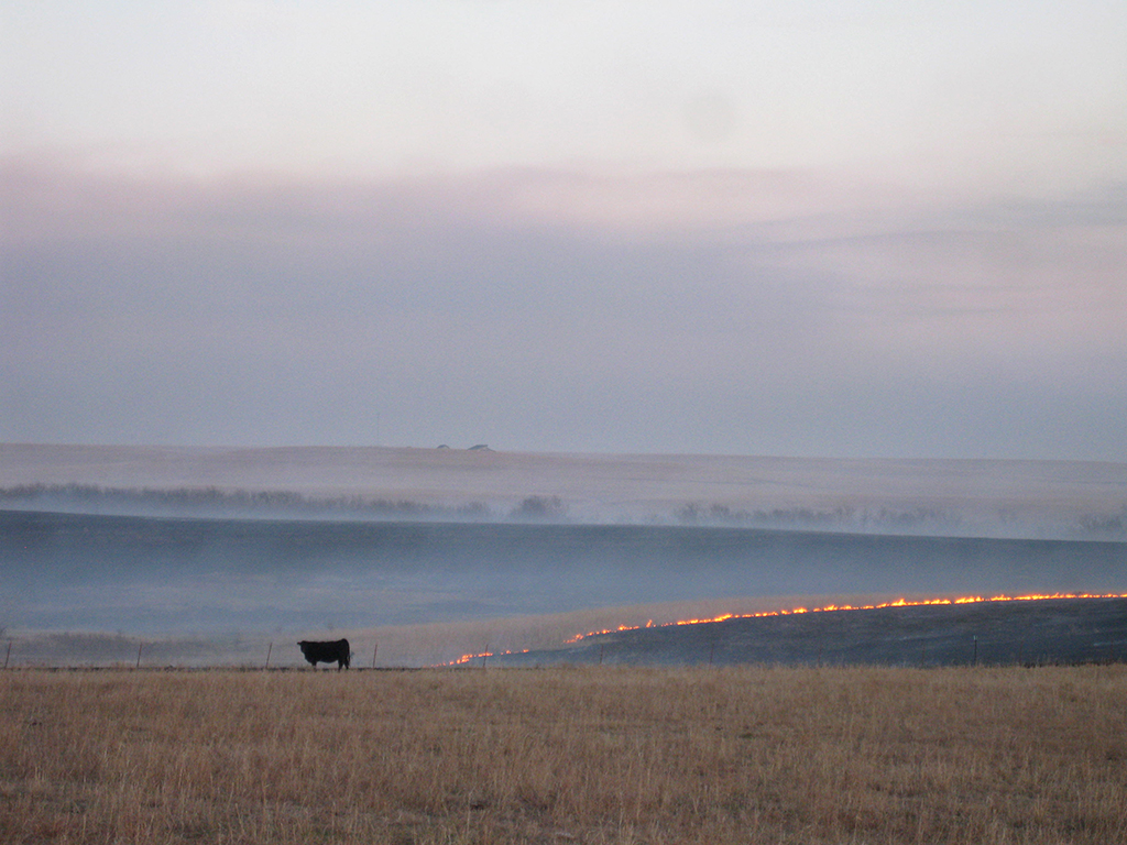
Tallgrass prairie, biannual grass burning, Chase County, Kansas. Photo Ton Haak (2015)
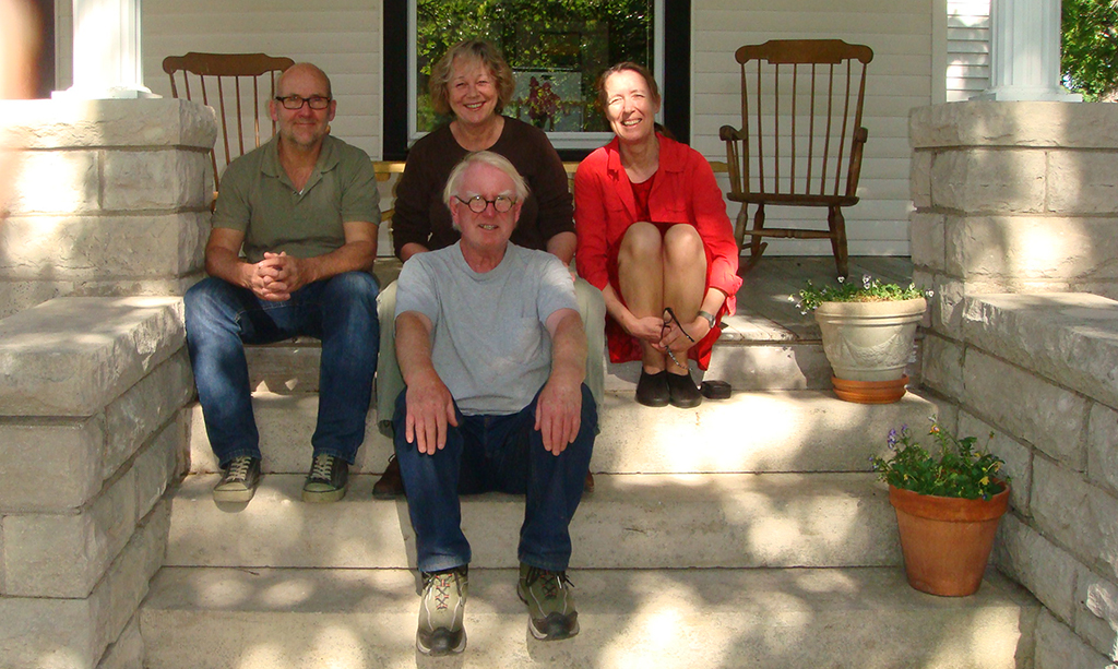
Ton Haak and Ans Zoutenbier with visitors François Caron and Joke Mammen (curator Unique Collections, University of Amsterdam) at The Gallery at Pioneer Bluffs, Matfield Green, Kansas (2015)
Art colony
I moved again within the US, from New Mexico to Kansas of all places, where, while exploring the West, I had previously spent a short time with great pleasure. There, in Matfield Green (47 inhabitants including 30 cattle ranchers, in the middle of the vast tallgrass prairie of the Flint Hills), I became the instigator of the formation of a small art colony that continues to grow gently to this day. Ans and I opened a contemporary art gallery, The Gallery at Pioneer Bluffs, and later also The Bank Art Space; I became curator of another gallery, Symphony Gallery in nearby Cottonwood Falls; and the image editor of the annual Symphony in the Flint Hills – Field Journal; I organized artist in residence programs for mostly young European and American artists, became co-initiator of a ‘prairie sculpture path’, and collaborated with, among others, the Ulrich Museum of Art in Wichita. Now, in 2022, six years after I left, many of the long years vacant, ancient prairie homes in Matfield Green have been refurbished and inhabited and I estimate the population at more than 80, for two-thirds visual artists, photographers, musicians, writers, journalists, architects and, yes, two graphic designers.
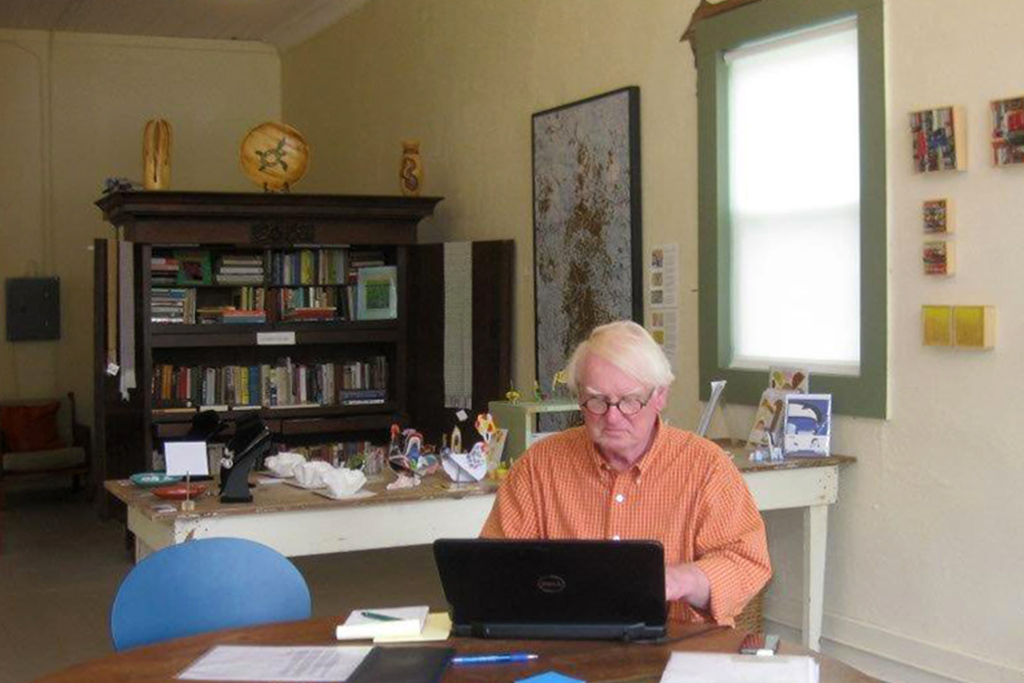
Ton Hook at Work in The Bank Art Space, Matfield Green, Kansas. Photo Ans Zoutenbier (2015)
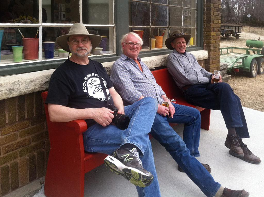
At the opening of an exhibition in rural Matfield Green, Kansas. In front of The Bank Art Space: Dave Leiker (photographer, Emporia), Ton Haak, Bill McBride (architect from Chicago, now sculptor and land artist, co-initiator Prairie Sculpture Path). Photo Ans Zoutenbier (2013)
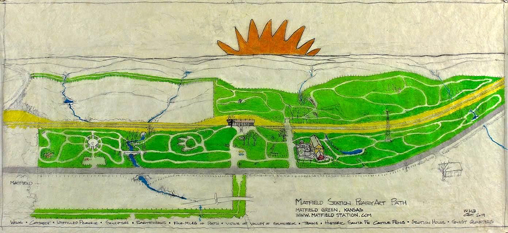
Artist impression of Prairie Sculpture Path (first phase) by Bill McBride, Matfield Green, Kansas (2017)
Painter Toshi Miki and painter and sculptor Mike Edge (Upstate New York and Abiquiu, New Mexico) had shows in The Gallery at Pioneer Bluffs, Matfield Green, Kansas. Photo Hendrik van Leeuwen (Den Haag), artist in residence (2014)
Dutch Design
I have noticed more than once in America with how much respect was and is looked at graphic design from the Netherlands. I noticed this already in the 1980s in Berkeley and San Francisco, where designers, who were still seen as ‘commercial artists’, started to shuffle somewhat apologetically with their own portfolio as soon as they heard that I knew Wim Crouwel from joint projects. Wim Crouwel was their god, a greatness of the caliber of Vincent van Gogh, that other Dutchman whose name has almost religious impact in the US. I noticed this later in Santa Fe, where a bookstore dedicated to art and culture even displayed publications on Dutch graphic design. At the SFAI, the mood was such that the then director did not even want to do business with American designers – the Dutchman Godfried Konings found a wide-open door. Advisor Susan Martin was of the same opinion; she worked on her own projects, such as ‘Some Serious Business’ (which has little to do with business but everything with art and design), for years with the Los Angeles-based Marika van Adelsberg as her favorite graphic designer.
Even in the middle of Kansas I could not avoid being confronted with the name Wim Crouwel and, yes, I derived ‘authority’ from the fact that I knew so much about him and his Total Design and had also worked with him a few times. I learned this when a group of students from the tiny art and design department at Tabor College in Hillsboro came to visit me in one of our galleries. Their graphic design teacher, Derek Hamm, became almost enamored when, after immediately mentioning the name Crouwel himself and digressing about ‘the alphabet’, he discovered that I had more than once shaken the man’s hand.
Fleeing Horse. ‘This accidental photo by artist in residence Risk Hazekamp (Berlin, The Hague), taken in the Oklahoma Panhandle, is symbolic for the disintegration of the American Empire, and my departure in 2016’ (2015)
Derek came to see me again and I let him rummage through my design books, and he also talked about Rudy Van Der Lans and his Emigre, and about Gerard Unger and Dick Bruna, for example. Ans and I attended Derek’s wedding to Katherine, also a graphic designer, and they became the ones who (without haggling) bought our house and took over one of the galleries, The Bank Art Space. I tell all this to indicate how big Wim Crouwel’s name is, how great the fame of Dutch Design is also in distant, ‘beef-on-the-hoof’ corners of a country like America, and how many doors get thrown wide open if one, being of Dutch origin, nonchalantly mentions one’s background ‘in Dutch Design’ at the occasion of a reception or a party. In Portugal this appears to not work so well. It may be my lack of knowledge of the Portuguese language, or is Dutch Design losing its shine?
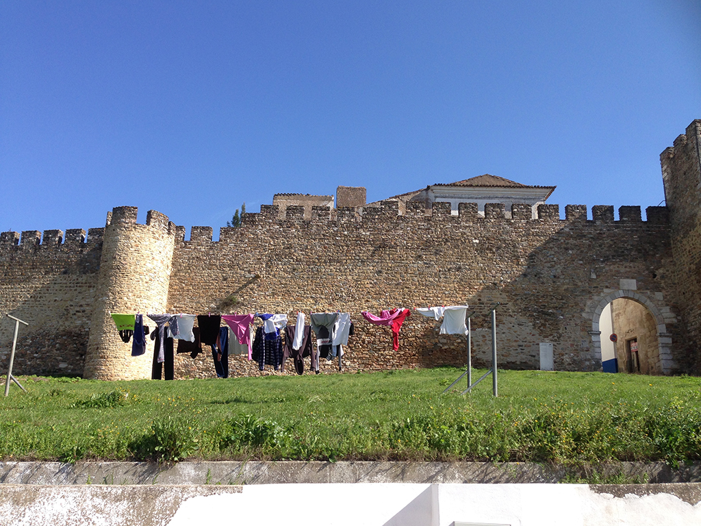
Laundry, celebrating old Portugal, near present day domicile Tomar. Photo Ton Haak (2017)
Something new
Now, living in Portugal, I miss New Mexico’s speechless landscape, and the small creative community in Kansas even more than the exciting emptiness of the prairie landscape. I disappeared but not until I had found young successors whom I wanted to give a free rein. I could not see myself remaining there to look over their shoulders, it’s their town now. Besides, I had just turned 73 and I wanted to start something new one more time, and then there was also that guy Trump in America…
Living in Tomar in central Portugal, in a country where fascism is a thing from the past instead of approaching, I am busier than almost ever. At Robert van Rixtel’s request I translated a whole bunch of the Dutch Graphic Roots. I also contributed to publications by artists such as Jeroen van Westen, Anne Ausloos, Lut Pil and Sarah Westphal (Shedded, Point of Departure, Forêt Asiatique / Forêt Océanique, In a Lifetime, Waterkader, BirdScore and Coincidence). I write about Portugal, a lot about its art and history, for the Dutch-language blog and website Portugal Portal, so far about seventy chapters. Forty of them I hope to publish soon under the title Poolshoogte in Portugal (checking out Portugal).
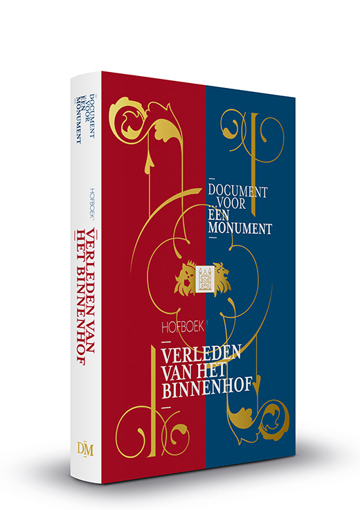
Document voor een Monument – Book One of a series about Dutch parliament and government buildings in The Hague, design: Mizja Haak (2021)
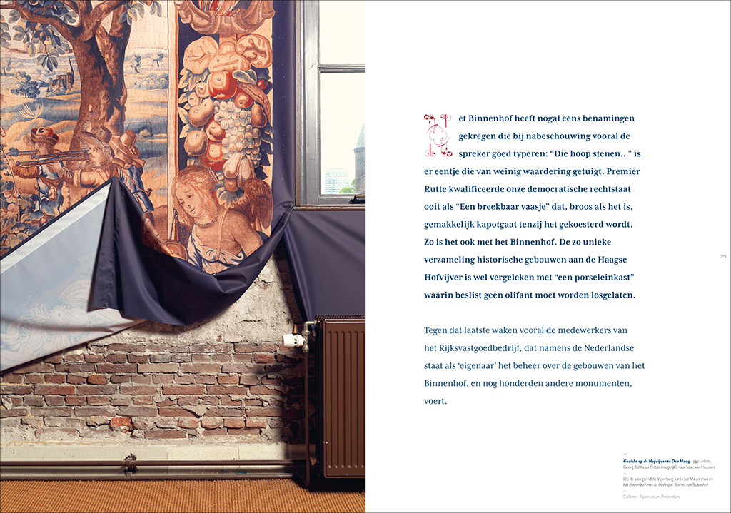
And I am a member of the editorial team and author for Document voor een Monument, a four-part series of fat illustrated books about the architecture, art and the ‘residents’ or users, as well as the past, present and future of the Binnenhof, the site of the Dutch parliament and government in The Hague. This series was initiated and is published over a period of five years by my son Mizja (who is also the graphic designer) and photographer Dick Holthuis; the last book will appear after the Binnenhof buildings, now being renovated, are back in business. In doing so, almost thirty years after I left the Netherlands, at the age of almost 80, in my second life I am learning more about the history and significance of the government center of my former homeland and the city where I grew up, went to school, lived and worked, than during my entire first life.
No escape
I never followed any vocational training, let alone that I had the pleasure of studying at an academy of art and design together with all the creative talented folks I worked with later. I did, however, follow the journalist course that was organized by the Netherlands Press Institute of the University of Amsterdam, which was then led by the former editor-in-chief of the daily NRC, professor Maarten Rooy. I started working quite early in life. The course for my two lives was set before I had turned 25, thanks to happy coincidence, by Louis Gans and Otto Treumann. Wim Beeren and Wim Crouwel, and also Hein van Haaren in his PTT/DEV days, gave me important pushes.
I am indebted to these five, just as to all those mentioned by name above, and many others ‘from the design world’ who remained unmentioned. All of them are to blame for the fact, that for more than 50 years I could not possibly escape from intensive interference with art and design, wherever I was living. They thus helped turn both of my lives into a moveable feast.
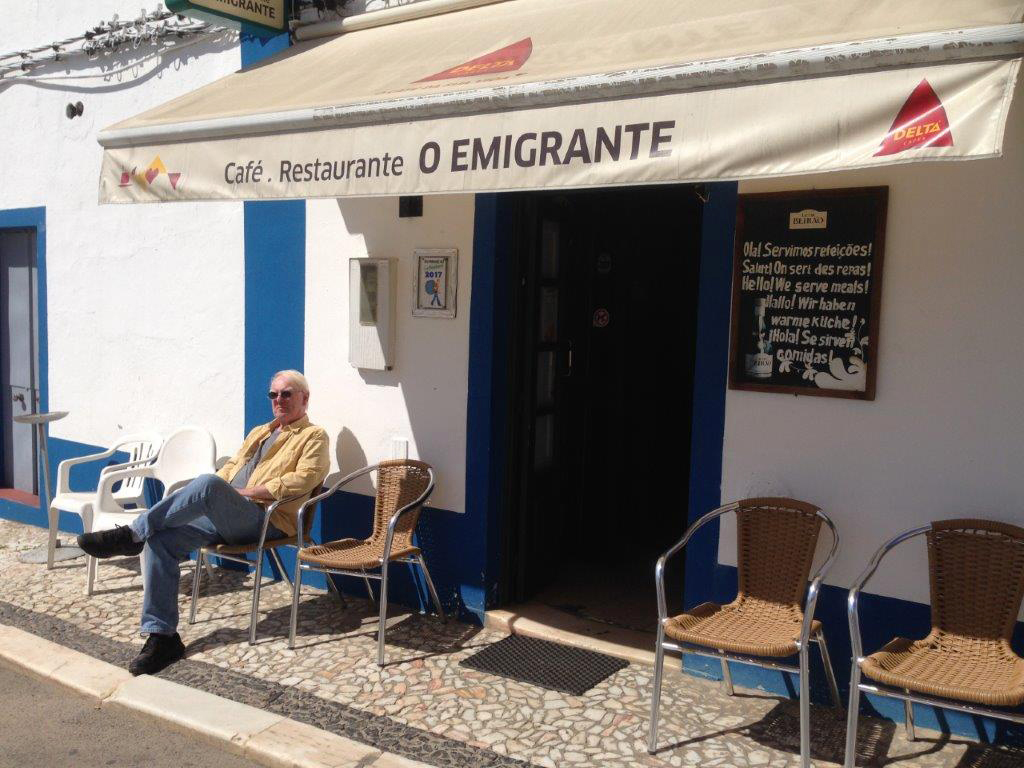
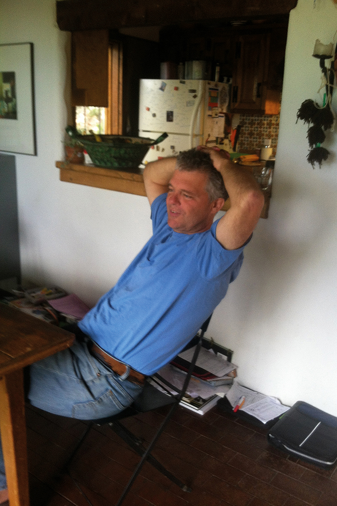
O Emigrante – Ton Haak, from the Netherlands via the US to Portugal. Photo Ans Zoutenbier (2017)
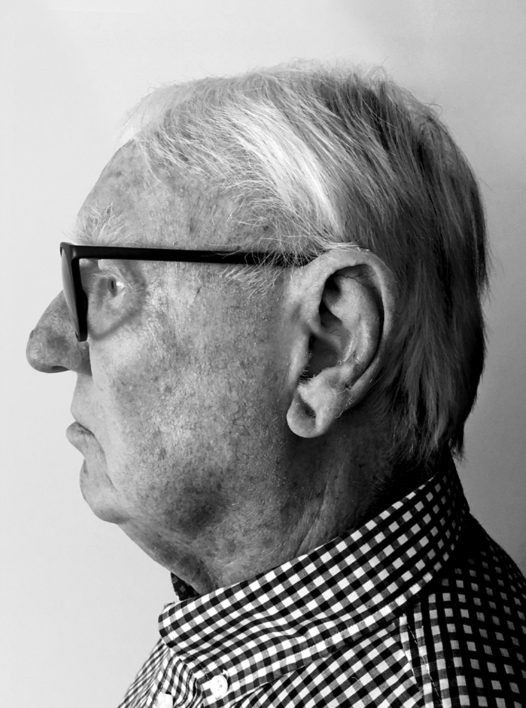
Ton Haak
born on 23 April 1943, Utrecht
honorary member BNO, Association of Dutch Designers
www.tonhaak.eu
Author: Ton Haak, mei 2022
Portrait photo: Ans Zoutenbier