Graphic designer Anthon Beeke is a street artist of a unique kind. A Beeke poster is almost always a provocation of the public space due to his disturbing choice of images cut so tight that they threaten to burst out of their setting. His posters present nude, vulnerable, imperfect and wounded bodies and details of bodies. Manslaughter, love, sex and beauty: the favorite themes of playwrights and artists are the focus of the poster designer too. And all is pressed together in a frame that, out in the street, in a fraction of a second manages to attract the attention of those passing by. A poster has to grab you before you know it. Anthon Beeke knows there is no second chance.
Beeke’s posters for Zuidelijk Toneel Globe, Toneelgroep Amsterdam, Stedelijk Museum Amsterdam, Holland Festival and KunstRAI are joyous beacons in the crowded public space of the past forty years. The often crude expression of sexuality always has an esthetic twist; there is a second layer with which Beeke succeeds to touch not just the eye but also the heart. He knows how to intrigue the passer-by. Beeke has described himself as a street fighter, with his designs halfway “irritation and entertainment.”
What Beeke (Amsterdam, 1940) produced was never seen earlier than in the 1980s and 1990s. No one exploring the city today will be able to find designs this charged with impact. “Today’s street is rather boring,” he concluded in 2013. Beeke is tough to follow; the foundation of his work is his intuitive intelligence and his playful soul, which together create uncomfortable images hard to delete from the retina. He is a visual artist rather than a designer, an agitator, less a typographer than a photographer.
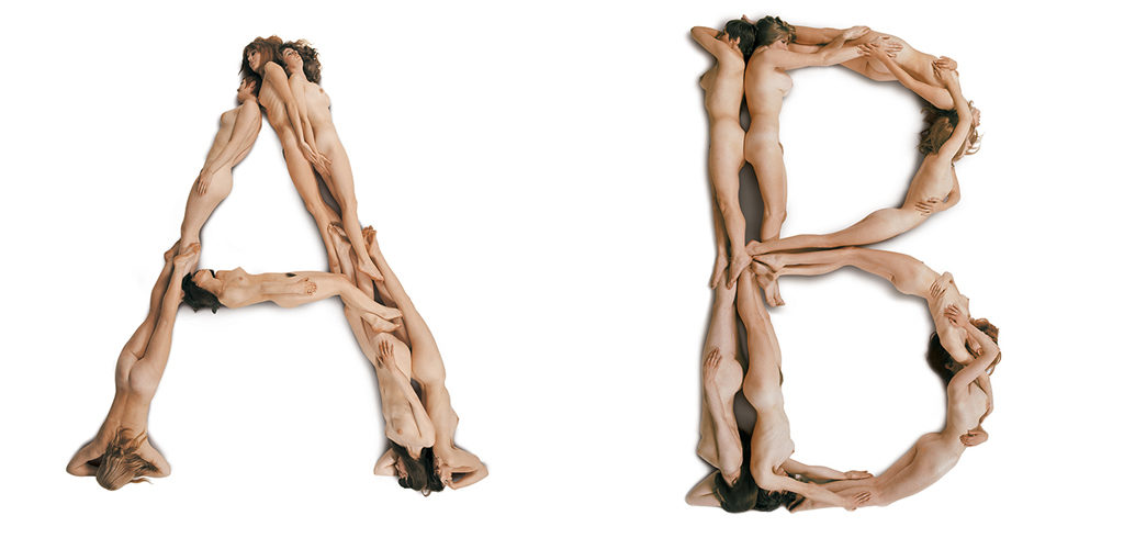
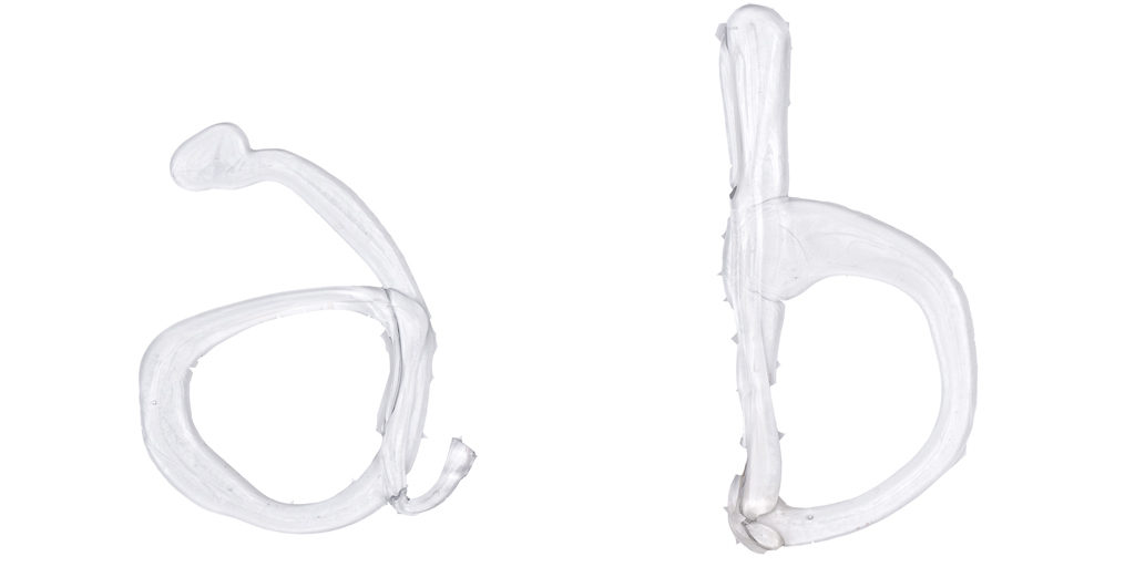
Can you imagine a designer who, in this day and age, creates a poster showing a woman who bends over and shows her genitalia such as Beeke produced for Troilus en Cressida (Zuidelijk Toneel Globe, 1980)? Or who finds one of the leading Dutch museum directors willing to be portrayed with bloody and bandaged head to give testimony of the vulnerability of the arts (Rudi Fuchs, KunstRAI, 1998). Who manages to convince his client that the removal of all vowels from his name HLLND FSTVL (1995) makes sense. Or who creates alphabets of nude female bodies (Blotemeisjes alfabet, 1969) or sperm (Glas alfabet, 2009). Imagine…
The freedom Beeke created for himself is key to his oeuvre. His fight for independence makes him one of the most influencing postwar poster designers. He selects the image, he chooses the story. He reduces a theatrical play to one image, deletes text if it disturbs, or comes up with a new name or title if he believes it will communicate better (NEMO, 1999). His clients grant him the freedom to operate; no wonder he experienced friction in his business and private lives. What Beeke created was uniqueness. “One is his own man,” as is said.
“I wanted to become a designer. Because my idea was: if I succeed, I will have something that is mine and that no one can take away. I will be free,” Beeke said in 2013 –four years after a brain infarct forced him to close his studio— when explaining why he decided to break with the Amsterdam laborers’ environment he was born to. His father, a plasterer, more than once had to be dragged home from the bar to prevent the weekly pay was spent on booze. “On weekdays he might be in Venlo working at rebuilding the town. On Fridays he came home drunk. On Saturdays he played pool and once again got drunk,” Beeke said. His father forced him to leave school at age fourteen; he had to join his dad in the plastering trade. “This was not my kind of life. Plastering meant loneliness, alcohol and sadness — nothingness.”
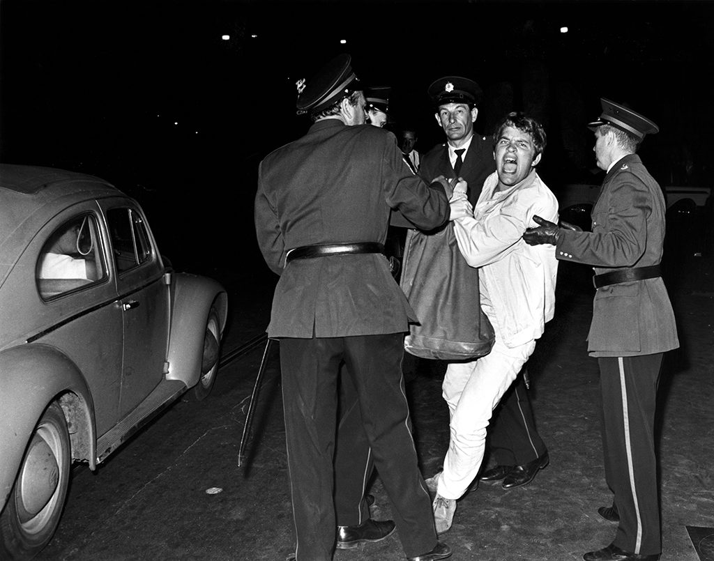
He decided to leave his parental home and conquer his own world. A new home was found in the 1960s in jazz, Provo and Fluxus, all three offering environments and movements that valued freedom, irregularities and the unconventional, precisely what came to define Beeke’s design themes. He is a child of his time for sure. Though no hardcore Provo, he does have a place in the iconography of the hippie period. A black-and-white photo by Cor Jaring, from 1966, shows Beeke being dragged away from a protest scene by unfriendly looking policemen in grey uniforms. Beeke is struggling and wears a bright-white suit. He appears to be the only one who recognizes the power of the camera and looks straight into the lens. His eyes are wide open as is his mouth: a silent protest. These mimics in combination with the brilliant suit create a most potent image.
Beeke’s first teacher, and guru, Jan van Toorn, selected this photo for publication in the annual report of the City of Amsterdam. Van Toorn had recognized the young fellow who in 1961 drove up in a Citroën Deux Chevaux with its roof open and loaded with a drawing table, ashtrays, and drawing tools. “He worked his butt off and was eager to learn,” said Van Toorn. Who also remembers there were “uncomfortable” moments, when Beeke disappeared and had to be searched for all over town. “He never changed.”
Coming of age. The 1960s
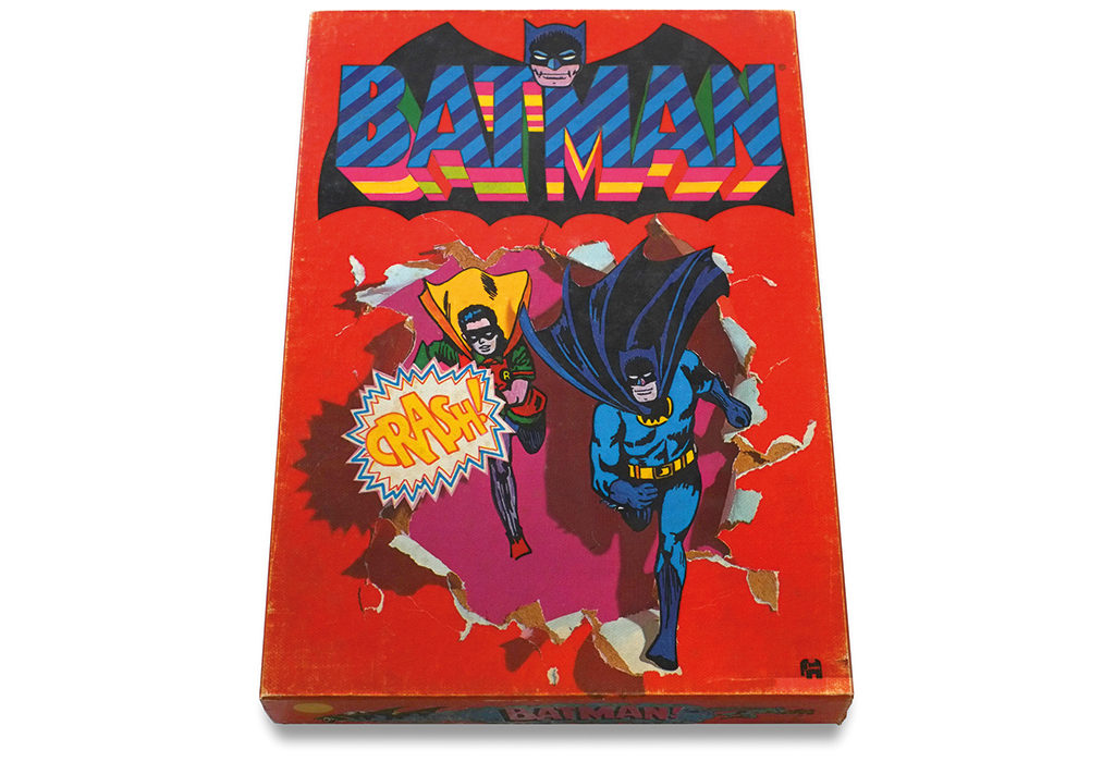
Before teaming up with Van Toorn, Beeke had worked for a butcher and as a pantomime artist – that is after he had dropped-out of art school. Van Toorn had started his studio in 1957 and already worked for important clients such as Drukkerij Mart.Spruijt and Hausemann & H, the Jumbo games producer. Beeke would eventually design games such as Tric Trac and Batman; and Crime, in which his wife Anna as well as their daughter and his mother participated as potential suspects — his first real commercial work as an independent designer. “Until they noticed the Provo photo and learned I had been arrested.” Jumbo wanted no longer to do business with him.
Beeke did not work for long with Van Toorn, the designer who ten years later occupied a central position in the debate about the fundamentals of the profession including the engagement of the desgner. Beeke, when asked, admits he feels more affinity with Van Toorn than Crouwel, who he considers to be a friend. Not that Beeke is political, on the contrary. His theater posters are foremost successful because he knows how to interpret subjectively. He reduces Othello to an eye in extreme close-up with a little cross in its pupil (Toneelgroep Amsterdam, 2003). And for Ilias (Toneelgroep Amsterdam, 1994) a bloodied T-shirt connects the controversial advertising campaigns shot by photographer Oliviero Toscanini for fashion house Benneton with storyteller Homerus’s way of flirting with suffering and grief. These designs reflect a colored view, far removed from the neutral and severe typographic grids Crouwel stood for.
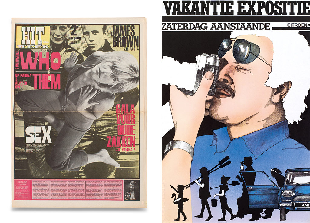
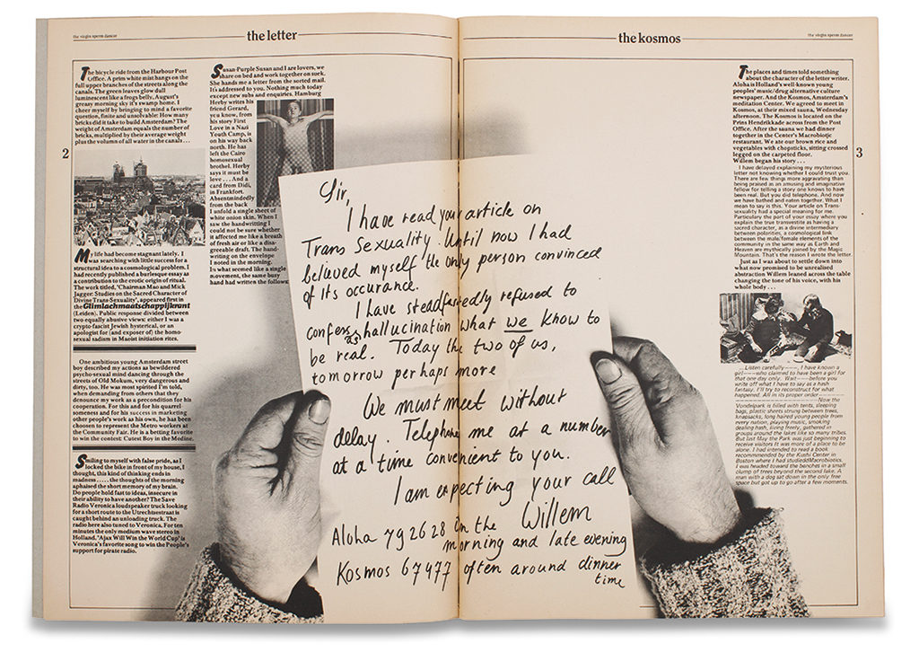
In the first ten years of his career Beeke’s work breathes the hippie period. He created pages for Willem de Ridder’s celebrated magazine Hitweek with its anarchistic contents and visuals. There were no typographic rules; type was treated as independent image – an approach Beeke always appreciated. In the 1960s he came up with Virgin Sperm Dancer, a posh sex magazine with photos by his ex-wife Anna Beeke. But the main feat was the Blotemeisjes alfabet – later called Body Type – , the images of with were shot in the Rietveld Academy’s gym in Amsterdam. Beeke found different poses for twelve nude girls and took photos from high above. This body alphabet was more than a brilliant photo concept – its execution was vintage Beeke. He is a master in keeping three dimensions alive on the flat surface of a sheet of paper. The nude girls are there not in abstraction; they are not made pretty, they are photographed with their bodies just as they are, in natural, everyday positions, thus becoming very believable, from A to Z. The concept’s simplicity never stretches the truth, and the results give testimony of devoted attention.
Ed van der Elsken who happened to stop by (because his tiny daughter posed as a comma) took a photo of the Blotemeisjes session that expresses its relaxed atmosphere. The models are without a worry in the world; they were recruited after they had performed nude at the opening of the “cosmic center” in Paradiso, Amsterdam then being the world’s magic hub. “They were so liberating,” Beeke would later say of those days. “We felt a constant urge to throw all windows wide open.” The alphabet helped create Amsterdam’s image as a city where everything was possible. And Body Type established Anthon Beeke’s fame worldwide.
De scissors are always there. The 1970’s
Beeke the designer preceded the computer, the tool that dominates the graphic industry since the 1990s. He creates images in his mind and executes them analog, aided by models (often friends and family members), mock-ups he builds himself, or everyday stuff found in his home or in one of his many collections. Then he takes his photographs. This way the design breathes depth and tactility; it is not flat in the sense of two-dimensional nor is it beautified or polished; it is readable and right on target. “Beauty as such doesn’t mean much to me,” Beeke has said.
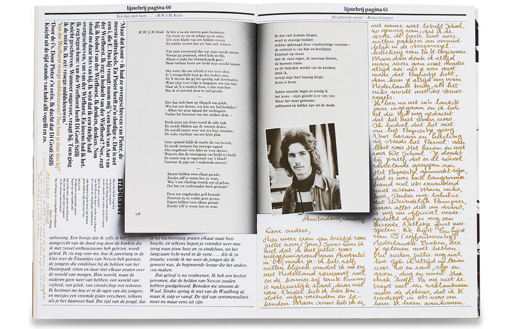
For car maker Citroën Beeke created, in collaboration with Swip Stolk, the 1973 advertising campaign for which friends and acquaintances were photographed while getting in and out of the cars. They created silhouettes and animations, a technique still surprising in those days; both the posters and the films looked spontaneous and natural. A similar depth and realism was achieved with the Boekenweekgeschenk 1973, Lijstebrij. Beeke defined the design, the contents came from Cees Buddingh, Kees van Kooten en K. Schippers. In this collage the designer went all the way exploiting the then young offset techniques. He cuts, glues together, uses shadow borders: there appear to be books within a book. The results are luxuriant, yet the use of scissors remains visible; the final product feels rich and realistic at the same time.
Beeke was conducting experiments all the time. He spent a few years as a director at Crouwel’s Total Design even if no one expected him to succeed in the more corporate world. “We were searching for new approaches,” says Swip Stolk, Beeke’s close friend and design partner since 1966. They did not copy predecessors. Everything had to be different. “Being a pain in the neck and messing around,” is how Beeke characterized his design process. In his archives refined sketches are hard to find. Intuition was the guiding light – moving cut-outs, photos or objects around until the choreography was perfect.
The theater years. The 1980s
The first commissions from theaters came at the end of the 1970s. La Casa de Bernarda Alba (1977), Glück (1978) and Leonce en Lena (1979) were three of Beeke’s first theater posters. They are softer, more poetic than his later stage poster designs but the randiness (with breasts, shaven vaginas, tong-kissing people) was already there; in Leonce en Lena especially the heat jumps out. “Anthon is great at sluttish work,” one of his assistents, René Knip, used to say. Beeke’s client was Gerardjan Rijnders, then the director of Zuidelijk Toneel Globe. Rijnders was creating a reputation with handling the stage classics roughly. He was invited to become the leader of the largest Dutch theater group, Toneelgroep Amsterdam, in 1986, and Beeke became his “in house” designer. Together they would kick the world awake.
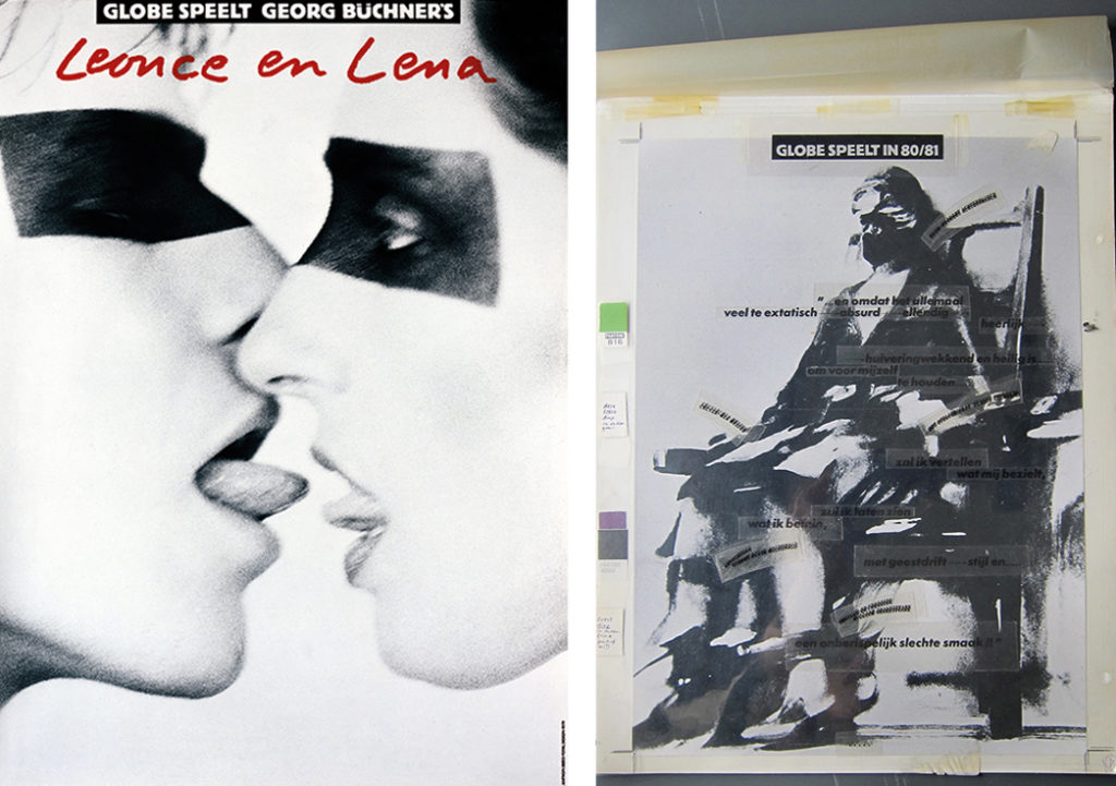
The collaboration had escalated already earlier, in 1980. Beeke created a poster for Troilus en Cressida, the design of which could never be forgotten, mostly because not only the moralists but also progressive women found problems in its display of female nudity. Beeke’s interpretation was that Helen of Troy was a textbook example of female abuse through the ages. He bound the cheeks of his model (most women who worked with him this time refused taking the part) with leather straps; her butt was painted white and received a tail; and the model presented her lower back to the camera. Female actors were angry. That the poster was splashed by paint did not worry Beeke a bit: “What I create doesn’t even touch porn. Yes, it deals with sexuality and sometimes with horniness. But porn is too easy, there is no layer below porn.”
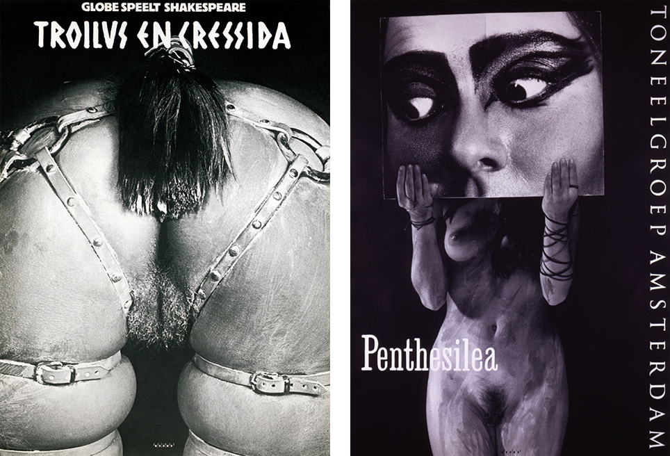
It is inconceivable that a poster such as this would be accepted in today’s public space. Sexuality and role models have changed. In our time, advertisements by H & M that show thin or sexy models already attract critique. Total nudity is unthinkable. Believing that his posters would support the feminist movements was a little naïve. Yet, “I never tried to cross borders,” Beeke says. “But I think that pushing against borders is much needed. Otherwise, an image is just an empty vessel.” Typical Beeke, who endangered his relationship with clients as well as colleagues many times by acting headstrong. Nevertheless, the poster of Troilus en Cressida is unforgettable and worked excellently to draw the attention in the streets. “The play became a huge success,” recalls Rijnders, who kept working with Beeke for more than twenty years.
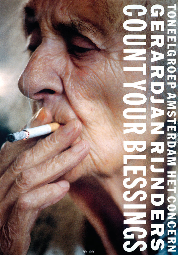
The collaboration resulted in a series of strong poster designs: Ballet (1989) showed a naked man upside down with a feather gourd around his penis; a Shakespeare sequel with Othello (2003) and Richard III twice (1983 and 1994); 3 Sisters (1983), a funny poster of three actors who keep a female cartoon figure’s mask in front of their faces; and foremost Count Your Blessings (1993) for which Beeke photographed his 90-year old mother extremely close-up as she smokes a cigarette, only shortly before she passed away. This design was awarded with the 1993 Theateraffiche Prijs. The collaboration of Beeke en Rijnders remained fruitful until the mid-1990s. Barnes Beurtzang (1995) reintroduced a female lower back, now showing torn pantyhose. But by now the public could no longer be shocked much by Beeke’s mannerisms. Weariness was expressed.
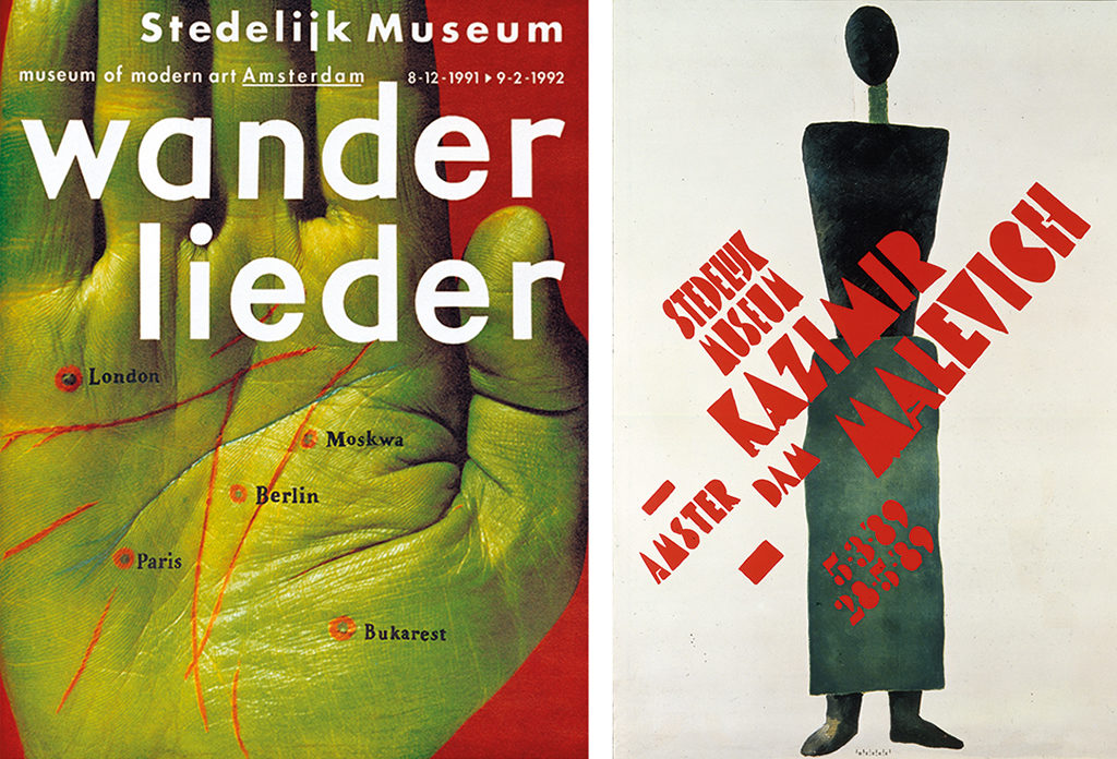
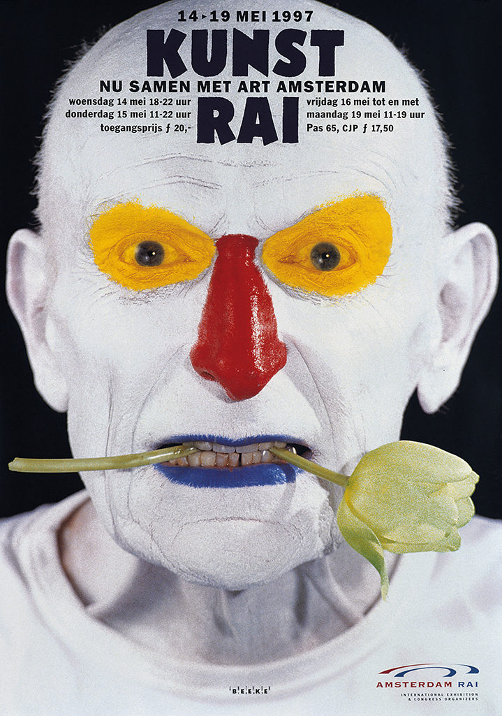
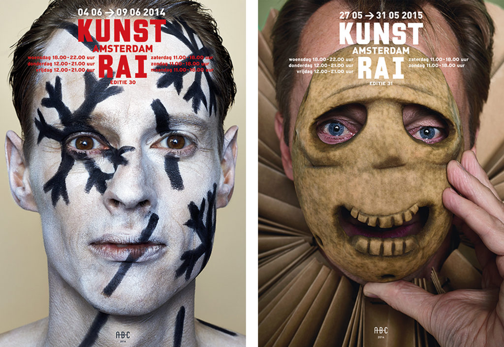
Place Beeke’s poster designs for theaters next to his designs for museums (Stedelijk Museum 1986-2006), festivals (Holland Festival 1994-2005) and events such as KunstRAI (1993-today) and notice how clearly he selects an atmosphere for each art form. The physical experience of the theater, with direct confrontations of the audience with the actors and their emotions, is mirrored in Beeke’s posters. Many bodies or body parts; zooms to ears, noses, sexual organs; hard contrasts, such as pubic hair and a gun, macho men grabbing each other where it counts, ladies in deeply-cut dresses and ink-black nails. Beeke’s designs for museums show his esthetic feelings – “it is all about distance and reflection, isn’t it.” Wanderlieder (1992) presents a metaphor from close to home: Beeke’s own hand-palm in green with the lifelines also colored and dots that indicate cities: it is a map indicating the uncertain future of Eastern Europe after the fall of the Iron Curtain. One of the most timeless posters he designed was for Stedelijk Museum’s Malevich exhibition (1998). The selected Malevich work is elementary, but the little typography he used is distilled from work by Russian avant-gardists. With other text absent, the poster is a miracle of splendid clarity.
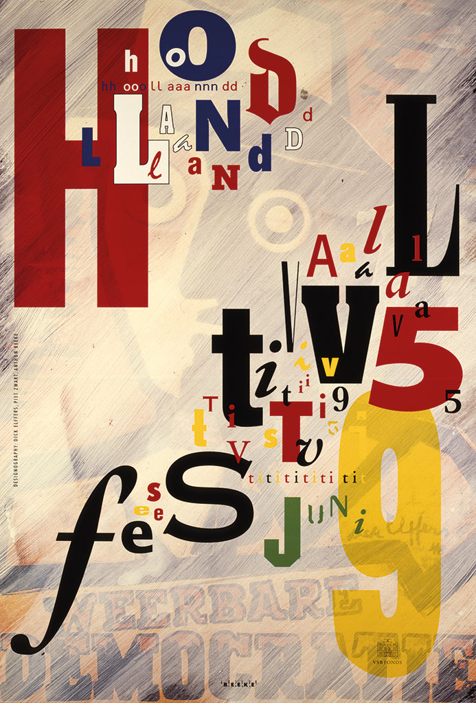
Festival posters designed by Anthon Beeke breathe lighthearted promises. The type (for Holland Festival, 1997) is constructed from pastry baked by pastry chef Van Wely; and in 1996 lettered flags are stuck in a red ear. In 1996, he composed a musically-poetic ode to typographer Piet Zwart and designer Dick Elffers: a boom timpano-like shattering of type, stolen (as Beeke liked to say) from a Swart catalogue, below which shimmers a second poster designed by Elffers. This is one of the strongest typographical posters of the late 1900s.
Enormous output. The 1990s
Looking at his posters you learn to understand why Beeke wanted to be his own photographer. Looking through the lens he can already decide what to cut out eventually. The Troilus en Crassida poster would have been less shocking if madam was put in a wider frame. Photographer Erwin Olaf once said: “After seeing this poster my decision was made: I wanted to become a photographer.”
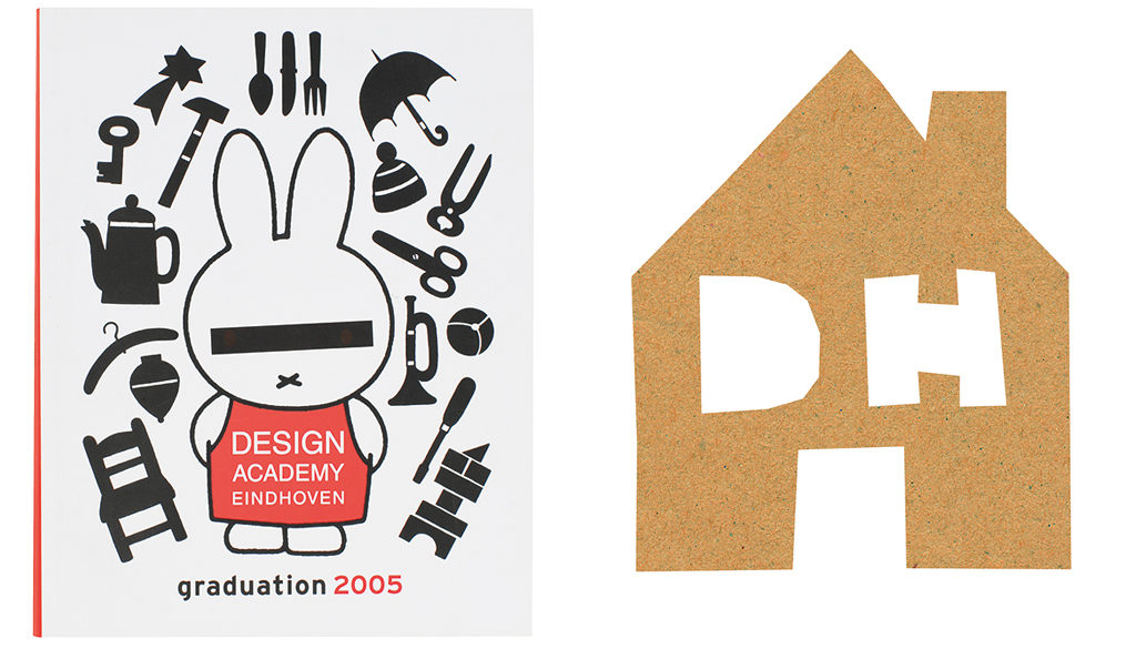
Beeke’s way of looking at things directs the minimal communication he envisions. He is able to let go so much text that Toneelgroep Amsterdam needed a second poster to inform the public about their schedule. Reduction is the core of all sober humor to be found in Beeke’s posters and even in the identity program and the invitations he composed for the Design Academy between 1995 and 2000. This faculty becomes all the more clear when he almost anatomically minimizes an icon such as Dick Bruna to his essence for Centraal Museum in 2000. Nijntje hardly has details; but by showing just one eye drawn wide apart from the “cross nose” and placed on a virgin-white background a whole estranged image results without giving anyone the opportunity to think if only for a moment it’s not Nijntje.
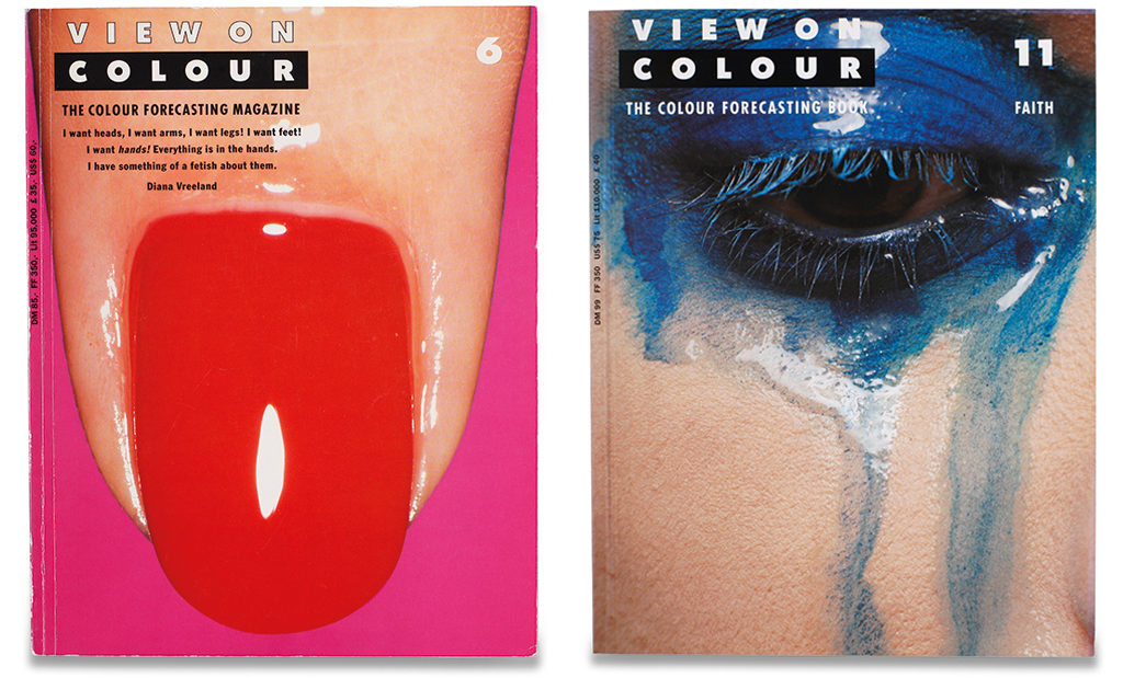
In 1989 he started the well-organized Studio Anthon Beeke. The following years were characterized by an enormous output. He attracted talented young designers. He developed a broad clientele with commissions from the cultural sector, commerce (KPN and Perscombinatie), as well as business-to-business work from Proost & Brandt and ADCN. He continued his own projects, though, together with his partner Lidewij Edelkoort. Visually sparkling magazines that attracted international attention came from this collaboration, such as Bloom and View on Color. Were his posters very direct and sometimes crude and roughly detailed, for “Posters don’t have to be beautiful, they have to catch the eye, wham! And it is not important on what quality of paper they are printed,” his book and magazine designs are carefully and sensitively detailed. When granted the freedom to create, with Edelkoort, an image-driven magazine, a wonderful synthesis of form and content came about.
The View on Color covers are autonomous art, celebrating love of looking. Beeke understands how to detect the beauty of unimportant-looking, everyday things. A finger, enlarged; an ear; an eye; folded hands. Much of what he created during his long career was used on the covers of View on Color, Interior View and Textile View. The magazines were expensive at €60 (at the beginning of the century) but they received a cult status soon.
Studio Anthon Beeke produced posters, identity programs and magazines and also worked on subtle commercial projects for high-end Hong Kong fashion house Joyce (1998) and paper producer Job Scheufelen. “Anthon found his inspiration close to home,” says Edelkoort. He uses his many girlfriends and his daughter as models, but finds models too in his kitchen: a cup, a potato (base for a face with a little hat on top). This approach keeps his work so recognizable.
It is fascinating to see how much creative power was developed in the twenty years of Studio Anthon Beeke. Until something cracked inside Beeke’s head. Since the brain damage of 2009 he has trouble formulating sentences. A collective was formed around his person (Anthon Beeke Collectief, AB/C) that creates possibilities to work for him. A KunstRAI poster with Daan Roosegaarde in 2014, one for Rijksmuseum (2015), and the corporate identity program for the Mode Biennale Arnhem (2014) were created with AB/C.
How Anthon Beeke thinks about image is shown best in work in which no image was used. For Atelierproject (1997) Beeke catalogued artists’ studios not by using photography but only in words. Everything he discovered on the locations was noted down on a map. This map is unbelievably detailed and as complex as the drawing of electrical circuits. Even if there are only words, the finished map is a strong image. “The image tells all,” Anthon Beeke always said.
Anthon Beeke
born on 11 March 1940, Amsterdam
died on 25 September 2018, Amsterdam
Author of the original text: Bob Witman, January 2015
English translation and editing: Ton Haak
Final editing: Sybrand Zijlstra
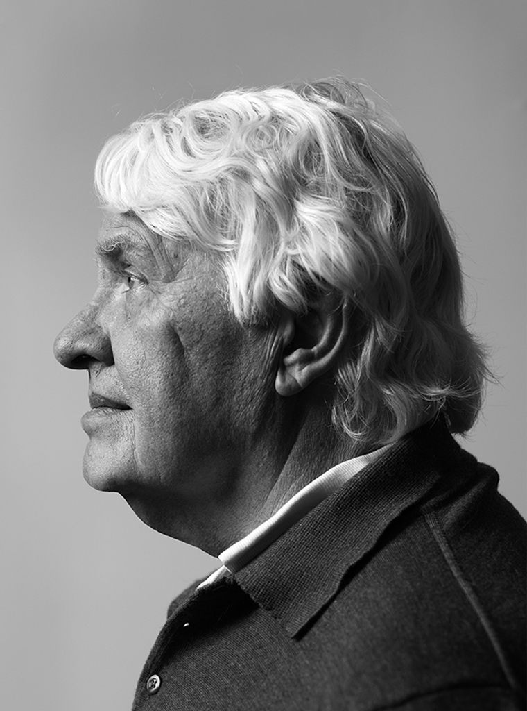
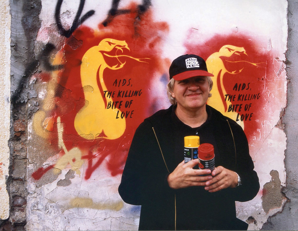
Portrait photo: Aatjan Renders