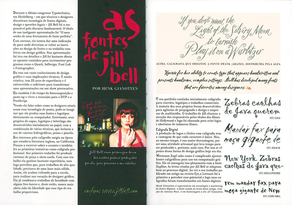
During the first conversation Henk Gianotten and I had for this publication, I became aware immediately that he can still be found smack in the middle of the graphic profession’s action. Our discussion hardly paid attention to the past; it was as if looking back was not yet an option. Instead we talked much about present-day and future developments in the world of graphic design. We exchanged views about the ways designers and print technicians must define their positions in these turbulent times.
Henk Gianotten is neither a designer nor a printer or a lithographer, nor someone who is merely a consultant standing between these participants in the graphic process. His professional knowledge and motivation are too important to confine him in one corner. At age 66, he is still a visionary and feeling urged to tell his story. Gianotten’s role as an intermediary between design and print – fields of experience that need each other but where often a different language is spoken — may be called uniquely exceptional. During our conversation it became obvious to me that we in the graphic design field cannot make enough use of the expert knowledge people such as Gianotten have accumulated and are so eager to pass on.
The first years
The Netherlands were not yet occupied by the German invaders when he was born, in Eindhoven, the first son in the fast-growing Gianotten family which ultimately counted an offspring of nine. The grandfathers on both sides worked in the graphic sector: one published a newspaper, the other ran a commercial printing business. Not that the oldest sibling was predestined for a professional future in that world: his father refused to continue the family tradition; he chose to become an economist and work for Philips after having financed his studies by selling advertising.
Gianotten inherited his father’s enterprising, recalcitrant and scrupulous character. He wrote articles for his lyceum’s school paper and was responsible for its layout. He convinced the head of the school that advertising could help make the paper cost-effective and guarantee its continuation; he himself sold the ads and was so successful at it that the school made a profit. At that time he had no idea in which direction to go in life. That he was passionate at creating the school paper and that he made a little money on the side working for a newspaper printer did not indicate he was aiming for a future career in graphics. He loved writing and the daily newspaper Eindhovens Dagbladasked him to contribute to its youth pages, which he did with great enthusiasm. His side job at the printing office taught him much about the tougher sides of the profession including the necessity of keeping deadlines. ‘I dearly loved the excitement each time the newspaper started its run,’ Gianotten remembers.
Other aspects attracted his attention, such as the interaction between advertisers and printers, which he experienced as very stimulating. In the end it was no great surprise that, after finishing his lyceum, Gianotten decided to continue his education at the School voor Grafische Vakken SGV (graphic arts studies) in Utrecht; there he developed his true passion for the graphic professions, and he never looked back.
SGV’s students were stimulated to attend lectures at the University of Amsterdam (UvA) on Fridays. One of his professors was Dr Willem Ovink, who taught ‘the history and the esthetics of the graphic arts and related techniques’ and left Gianotten deeply impressed. Ovink’s teachings laid the foundation for Gianotten’s ever-lasting fascination with the history of design and his devotion to technological developments; they convinced him, also, that an international exchange of knowledge and experience is ever most essential.
His publications about book typography had brought Ovink fame in the international world of graphics. He had been appointed esthetics advisor to typefoundry Lettergieterij Amsterdam v/h N. Tetterode (since 1963 named Tetterode and a subsidiary company of Bührmann-Tetterode) and was charged with the development of new font series for either Tetterode or third parties; and with administering and developing the company’s Typographic Library. In his publications, Ovink analyzed past innovations, which he took as a starting point for the development of future policies. ‘Ovink was a structured thinker,’ says Gianotten. ‘Not a great fan of all things new, he nevertheless tried to look with a fresh eye to typography’s developments. The never-ending confrontation between tradition and progress continued to inspire me too, throughout my career.’
Gianotten finished his studies with an internship at the Staatsdrukkerij (government printing office). A little later, in 1961, he found a job with a German printer, where he discovered many new techniques and was introduced to IBM computers. In 1963 he returned to the Staatsdrukkerij to manage the complicated Dutch phone books project with which Lettergieterij Amsterdam was also involved. One thing led to the other.
Tetterode, the beginning
When asked to join the largest producer and distributor of graphic equipment and materials in the Netherlands, Gianotten did not hesitate. Tetterode, as the name had become, combined production technique, design and typography under one roof – Ovink’s three cornerstones that had become Gianotten’s as well; he was already especially interested in the interplay of the three professional fields.
‘At first, I wanted to enter the creative team, but I discovered soon that wasn’t where my real passion was. Design had always had my interest, of course, but especially because of the experiments it introduced the printers to. Many creative ideas do not agree with production efficiency and finding solutions that satisfy all partners in the process is not easy. But the dialogue between designers and technicians is always instructive.’
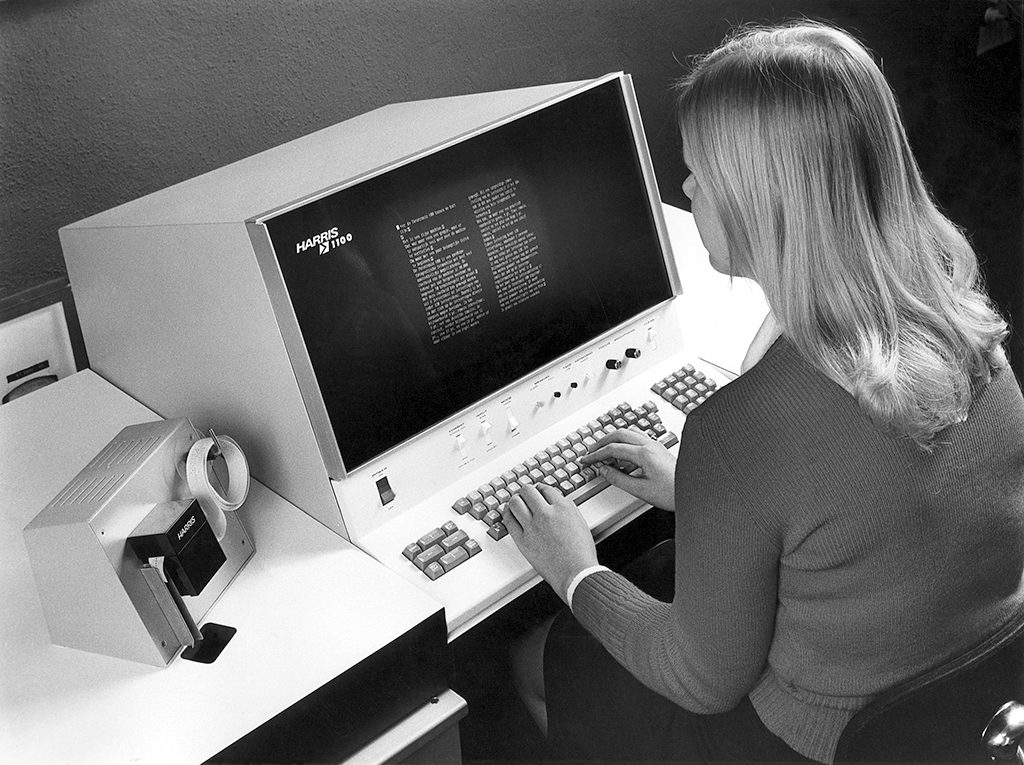
He started at Tetterode in the summer of 1963 as a sales assistant. He was immediately thrown in at the deep end of the job at the special equipment department (reproduction, photogravure, rotary printing). ‘On the second day already I had to do a presentation about the then new technique of photo typesetting. Imagine, in my audience were seasoned professionals working at the leading Dutch printer Joh. Enschedé.’
Gianotten moved on to senior salesman, to sales manager, and eventually to marketing manager also responsible for PR and publicity, and he became a member of Tetterode’s management team. By then it was 1973 and major developments were forever changing the graphic sector: from letterpress to offset printing; from lead type to digital phototypesetting. Tetterode was a huge and highly esteemed conglomerate and always at the frontline of new techniques. The company was so diverse that Gianotten, though he was often offered attractive positions elsewhere, was never tempted to leave; he remained a loyal Tetterode man for thirty-seven years.
A long career at one and the same company often leads to a certain narrowing of vision. Not in Gianotten’s case. He gave presentations and lectures in many countries, dealt with software and hardware producers and distributors, and put producers in touch with designers left and right. As a member of the management team he was responsible for strategic planning too and he proved to be farsighted and not afraid of making daring predictions.
Relationships with designers
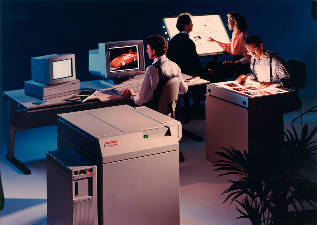
As head of PR and publicity, Gianotten had to commission graphic designers and he could of course not escape from witnessing how new technical developments time and again influenced the designers’ position in the printing process. In the 1960s and 1970s the different tasks were still clearly defined. The basic layout of a magazine, for instance, was decided on by the designer; once this was accomplished, the designer would concentrate on the design of headings and intros. The 1970s saw the start of the integration of the prepress process with a clear division of responsibilities between the designer, the typesetter and the lithographer. The production process was to be shortened and the quality of the product improved but, alas, many trials failed due to too complicated and expensive computer programs and a laser light output insufficient for the contemporary films.
These shortcomings lasted until in the 1980s. Gianotten: ‘For instance, when in early 1980 Total Design was commissioned to create the concept and design for Tetterode’s brochure about tradition vs future, I had to enter deep discussions with Jurriaan Schrofer and Daphne Duijvelshoff, who had delivered sketches and instructions for collage pages that “were to be produced fast and easy”. But the lithographers still had to cope with the time-consuming preparation of these pages by hand – they had to literally re-produce the designed pages before films could be prepared. So many stages were unpredictable during this complicated process; round after round of corrections had to be done and meanwhile the prepress costs skyrocketed.’
Mr PostScript
Five years later the graphic profession had definitely entered the new era. PostScript was introduced by Adobe’s John Warnock and Charles Geschke. ‘Such a smart tool,’ says Gianotten. ‘It became possible to transform “relative” indications from the sketch phase at any desired time into “absolute” information. This flexibility facilitated the postponement of the decision which bitmap pattern would be best for what output media. Designers were now able to integrate copy and images by working with a relatively simple layout program. I immediately recognized the revolutionary implications. Our clients would love the enormous savings that could be made.’

In the beginning, though, the results were marginal. Desktop publishing (DTP) was probably not the best choice of a name because it appeared to degrade the professions to something anyone could do – to a cottage industry. The larger design studios and printers looked down on DTP and Gianotten had a hard time at changing their perceptions about this do-it-yourself technique. He became known as ‘Mr PostScript’ and that was not meant as a compliment. But Mr PostScript was right. There was no escape. Young designers and producers adapted to the new possibilities quickly and publishers were most eager to profit from DTP’s substantial cost savings. PostScript became advantageous for all participants in the graphic process: a standard for the integration of text and imaging had become available, at last.
Gianotten had lots of convincing to do, though. He toured extensively to design studios and printing offices. He told the printers that in the future they would see the designers only when they delivered a file; their own typesetting department would become obsolete. He told the designers that PostScript offered them many new freedoms indeed, but he warned them of the pitfalls: they were assigned the role of typesetter whether they liked this or not; they were entrusted with new responsibilities; and they had to build up totally new relationships with printers. Looking back from today’s stage of progress, it is hard to understand how reluctant many then were to accept these developments. Of course everyone could see how important the integration of text and images was; nevertheless, Gianotten’s passionate pleas were often met with irritation.
‘I am a man of details,’ says Gianotten. ‘I want to scrutinize and understand all aspects before I try to convince others of my opinions. I can see how this can lead to a quite tiresome technical discourse, but do not forget I have to talk not just to designers but to software developers as well – I have to fully comprehend the consequences of what I am saying.’ A future without DTP was soon unimaginable, although it took a while before most of the larger design studios and printers would be convinced. Gianotten remembers ‘the digital jungle’ of the first years. Linotype had started with the production of RIPs and PostScript fonts only in 1985 and was not followed by other big producers of phototypesetting machines until three years later. Yet by then the tide had changed: the design studios were ready to quickly acquire DTP software and to establish their own prepress departments. After the cards had been reshuffled, the graphic process seemed to be under better control once again.
Color management
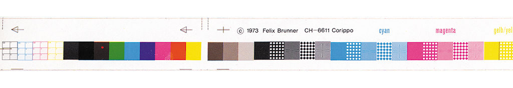
Yet a new revolution was signaling already: color management. Gianotten, who had introduced the Brunner system in the Netherlands in the 1970s, became an advocate of a new color-profile standard based on the CIE-Lab color system. Different from RGB colors (screen-related) and CMYK colors (related to printers, inks and papers), the CIE-Lab colors are device-independent and can be measured identically on monitors and printers as well as scanners.
Once more, Gianotten’s ‘gospel’ was received with irritated reactions. This time his audience did not feel so much threatened as well as confused: what the heck was the man talking about? The designers used Photoshop more and more without fully realizing they were accumulating not just the role of typesetter, but also taking over the lithographer’s job. Printers blamed designers when images were muddled (often caused by wrong color separation). Color management had to be recognized as a separate and special expertise, says Gianotten; the image files were to be synchronized with the possibilities of the production tools and the selected paper. Gianotten did not want to put off the designers with his technical reasoning but rather aid them with discovering the limits of their possibilities. ‘There is no need for the designers to fully understand all details of a technique as long as they are aware of the new responsibilities this technique imposes. They have to acknowledge that an inferior computer screen prohibits making the right decisions about a color or a color profile. And if designers do not want to take responsibility for the implication of all high-end possibilities, they should engage the collaboration of capable specialists.’
Even more so with the growth of Computer to Plate Technique (CPT) since its introduction in the 1990s. No films being needed, the last physical check of high-resolution images became unnecessary, or rather unwanted. Aware of the possibilities and consequences, Gianotten already in 1995 began ‘preaching’ the wide acceptance of International Color Consortium (ICC) standards. He was invited to give presentations about their performance even in the United States and China.
Typography
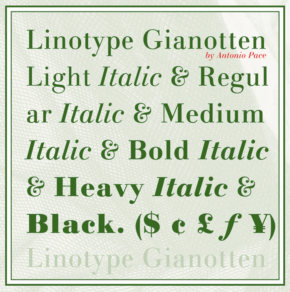
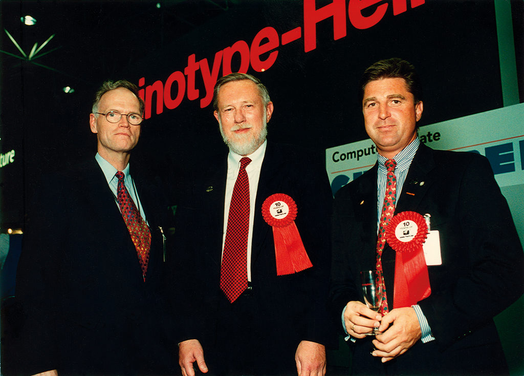
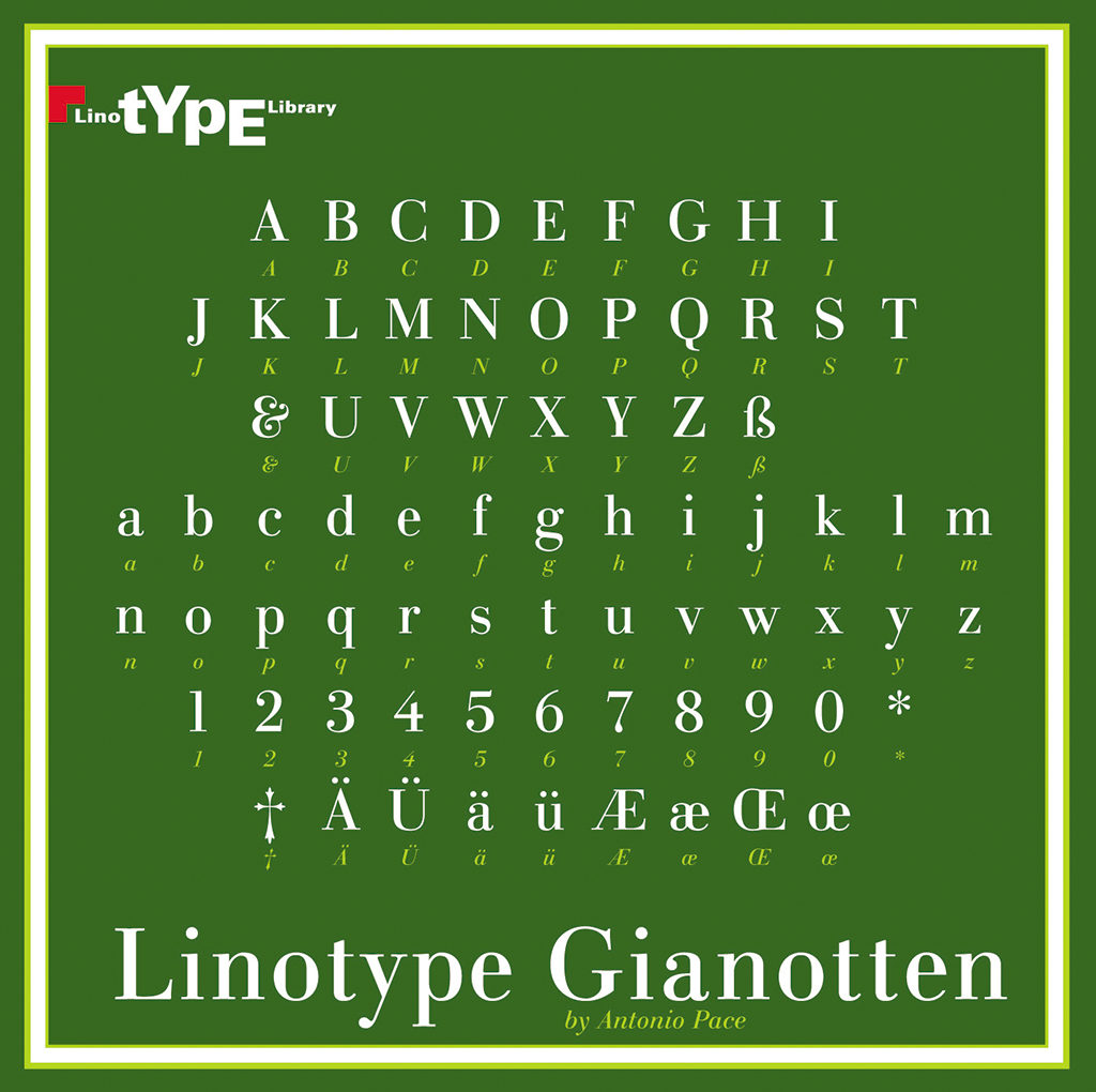
Font design and typography had Gianotten’s love and attention too. Tetterode sold phototypesetting systems produced by Berthold, Harris, Itek, Morisawa, Purup and Scangraphic, but the relationship with Linotype remained most important. Already halfway the 1980s Gianotten was working on the digitalization of type when John Warnock contacted Linotype to make their fonts PostScript compatible. Over time, Linotype and Gianotten would have many a difference to settle. Nevertheless, they had a mutual high respect and Gianotten’s pleas for better typography and image standards were heard and understood. Linotype-Hell knew very well they, too, had to depend on these standards if they wanted to remain a competitor in the global market. As a sign of Linotype’s appreciation, then CEO Bruno Steinert presented Gianotten with a CD introducing a new font designed by Antonio Pace, the LT Gianotten. Even after his retirement from Tetterode, Gianotten remained involved with Linotype projects.
His relationships with font designers remained just as strong. While working with Linotype he had met Adrian Frutiger, Herman Zapf and Akira Kobayashi. At all times during his career Gianotten published about font design and he still writes his column about typography for magazine Publish. Also, he remained a consultant and a mediator for complicated font management systems and typography projects. He was an inspiring member of the BNO study group ‘New Typesetting Techniques’. Edo van Dijk (EdenSpiekermann) once praised Gianotten’s input as follows: ‘Henk loves type. Especially complicated type. He fought a legendary fight for a well-designed and correctly applied euro currency symbol. Henk also loves type designers and hates the illegal copying of fonts that robs the creators of their rightful rewards. In his clear writings and presentations he explained the essence of font licensing and emphasized that graphic designers should pay for the fonts they use.’
PDF
Adobe’s Portable Document Format (PDF) is the standard for platform and software independent documents for already more than ten years. This digital file format stores and safeguards ‘everything’: layouts, color specifications, fonts and images – anything to be found in every source document. Again, Gianotten was one of the first to enter the good fight and convince designers and producers of the approaching new world, of PDF’s great importance.
Today, the PDF standard is a common good. Publishers and advertisers know no different than deliver PDFs to the graphic industry. Among designers the discussion goes on about Certified PDFs like PDF/X; once again the developments led to a reshuffling of responsibilities. The tricky question is: what does ‘ready to print’ mean? Ask ten designers and ten printers and there will be twenty different answers. A better question would be: is it the designer’s task to deliver ready-to-print documents? Gianotten does not leave much doubt: ‘Not necessarily,’ he says. ‘Be clear about who does what. Be clear about the type of PDF used, or else engage a specialist to do the job. And if the designer wants to do it all himself or herself, fine, but only after acquiring the specific knowledge.’
Advocate
At all times during his long career Gianotten was busy motivating people through his writings and his active participation in communities, symposiums and workshops. He was and remains a strong advocate of international standards.
At Tetterode, there was ample time and place to discuss new technical developments. Students of graphic design at the Gerrit Rietveld Academie were invited to work with contemporary machinery and techniques by initiative of Frits de Winter, the editor of Compres magazine and a part-time teacher at the academy, who wanted his students to understand the latest developments. Tetterode, always eager to be in a leading position in the discourse between designers and producers, gladly contributed. Gianotten always promoted endeavors by designers and producers to jointly develop new products.
Cor Rosbeek was another one who, as a highly respected printer, aimed at building good relationships between designers and graphic technicians. He recognized the uniqueness of Gianotten’s knowledge and expertise and invited him to lead workshops about technological changes and their consequences for designers.
Farewell to Tetterode
When in 2000, after thirty-seven years, Gianotten said farewell to Tetterode, trade magazine Grafisch Weekblad published an article under the heading ‘Thank you, Gia’. A few quotes:
Fokko Tamminga (Drukkerij Ando): ‘There is no one who can beat Henk’s expertise. He is honest in his convictions and supportive of anyone who seriously tries to absorb his opinions. He often saved us the day by never losing sight of the client’s good. He never pushed sales, instead he entered a discussion and was ready to learn what precisely you wanted and needed. Henk’s ideas about color management were not always mine – the more reason for keeping in touch with each other.’
Peter Matthias Noordzij (The Enschede Font Foundry): ‘Gianotten never shies away from new ideas, which is fairly unique in the graphic arts industry. He is not a dogmatist – he is open to different opinions and listens carefully.’
Cor Rosbeek (Drukkerij Rosbeek): ‘Henk is an institution, a phenomenon especially when new developments are on the table. He is the best prepress specialist in our country, while his interest in the artistic and creative side of the trade is heartwarming. He always managed to connect the desires of the creative people with the possibilities the technicians had to cope with. His explanations were always clear and precise; they enriched the designers.’
After Tetterode
Leaving Tetterode after so many years could have broken Gianotten’s ties with the world of graphics. In fact it did not, which was no surprise to anyone who had professionally experienced his devoted involvement in the industry’s ups and downs. All of his thirty-seven years at Tetterode were spent ‘looking outside the box’. His job put him in touch with designers and producers not just in the Netherlands. His deep and wide interest in all aspects of the graphic sector did not stop at five o’clock and didn’t stop after his retirement from Tetterode either. He entered a part-time consultancy with his son’s IT strategy company, Giarte. He studied graphic applications and the Internet; he taught printers about the introduction of standards; he mediated in conflicts between clients, designers and producers.
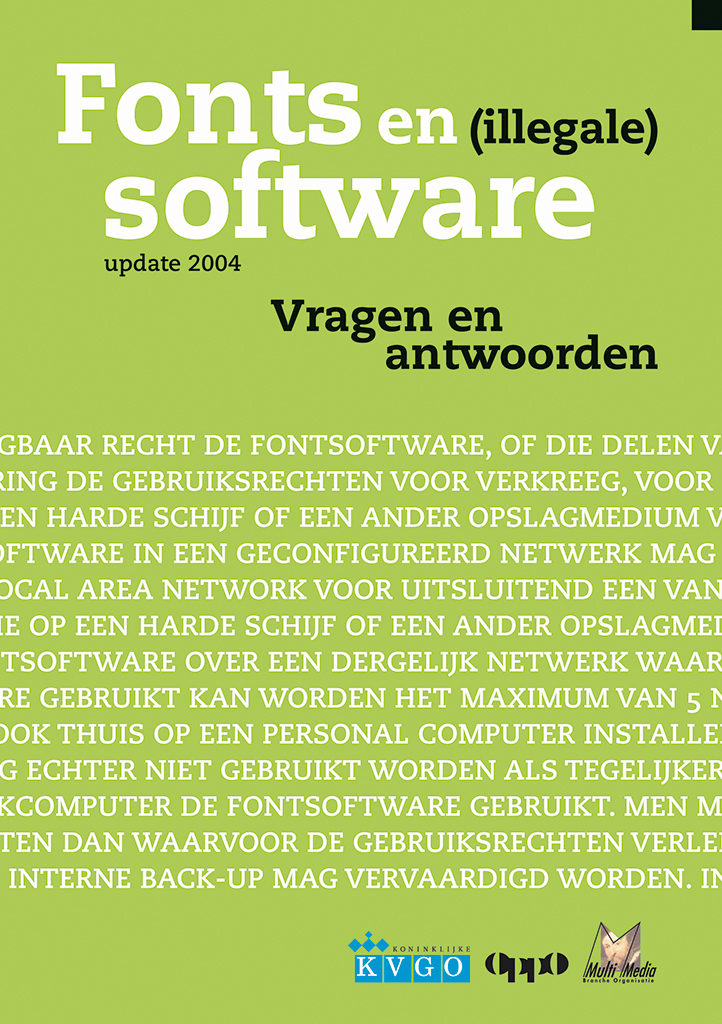
He published in Publish and Graficus and wrote extensively for Items: a series of contemplations about graphic techniques and an article about the development of the City of Amsterdam’s new identity program. For the graphic trade organizations KVGO and CMBO he wrote about fonts and (illegal) software.
Gianotten is a member of Printing Across Borders, this group of researchers, designers, publishers and printers that work toward international standardization of software and printing techniques. ‘The target is: stimulation of the collaboration between designers and printers to the benefit of their clients. A very important goal. The Dutch are not involved enough, I regret to say. In the past we had this BNO working group, but they disappeared. And yet, their participation in these discussions is of imminent importance.’
Gianotten continues to be ‘the man in the middle’, the mediator, the advisor. He fully understands the different expectations of designers and printers. He can help designers who are wary of the never-ending technical developments find and define their position. He can guide printers on their journey through the hornet’s nest of good standards. As Edo van Dijk once said: ‘Henk has helped many designers and printers with mastering the output of typesetting systems and design programs. He made PostScript and PDF relevant and contributed enormously to the improvement of the technical quality of our work. Without an optimal command of the instruments, there cannot be an optimal result.’
Gianotten’s position had a negative side as well. Too many designers recognized in him the representative of technology. Developments such as Certified PDF/X were seen as too complicated. ‘Designers shouldn’t forget that these new things are not easy for printers either,’ says Gianotten. But he acknowledges: ‘Not all printers accept me as being on their team either.’ He is not seen as a colleague and he ‘knows too much’; and it is often claimed that he is ‘always on the designer’s side’. Gianotten fully understands these opinions and hesitations. ‘One has to keep pushing, to keep repeating the message, and to continue at trying to convince all concerned of how important standardization is. All parties have to know precisely what their own position is and must be ready to redefine it time and again. Software programs offer new possibilities without explicitly announcing them, which invites a “do-it-all-yourself” approach that can endanger the product. The designer may be financially responsible for a failure, but that does not mean that the other participants in the digital process can just stand back.’
In 2003, Gianotten was honored with the Graphic Culture Award by the BNO and KVGO’s Cultuurstichting for his extraordinary merits at conveying knowledge to graphic designers and printers alike.
Henk Gianotten
born on 4 April 1940, Eindhoven
Author of the original text: Wim Westerveld, October 2006
English translation and editing: Ton Haak
Final editing: Sybrand Zijlstra
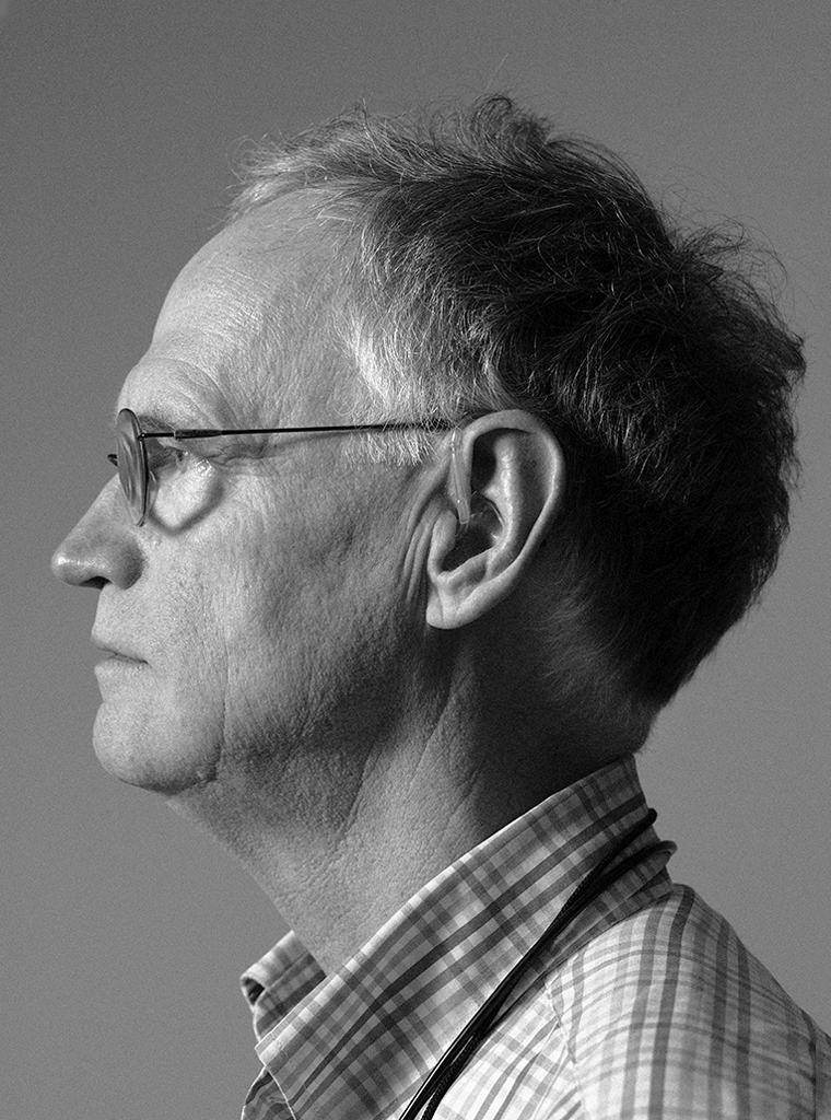
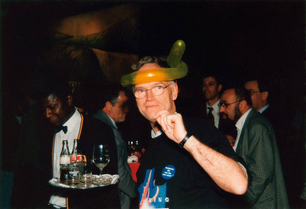
Portrait photo: Aatjan Renders