In 1932, The Hague’s academy of art was one of the first colleges to introduce graphic design in its curriculum. It was taught by Gerard Kiljan, who founded their ‘advertising department’, as it was then called. Paul Schuitema was one of their teachers, who strictly followed the ‘Bauhaus system’. Their approach to design was continued after WW II, even in the years when Swiss design was all the rage. The academy’s specific brand of Modernism, never lost its importance, even when J.J. Beljon became its director in 1957, who did not want anything to do with the methods of Bauhaus.
In the early 1960s, graphic designers professionalized under the influence of increased prosperity, the growing economy and examples from abroad. They widened their scope beyond graphic design towards industrial design, 3D design for architecture, interior design, exhibition design, and signpost design. Tel Design was the first multidisciplinary studio in the Netherlands. Founded in 1962 by the industrial designers Emile Truijen and Jan Lucassen, Gert Dumbar would be their free-thinking graphic design partner until 1977 (after which he would continue to influence and inspire young designers in his own Studio Dumbar, also based in The Hague). In 1963 followed Total Design in Amsterdam, with as founders Wim Crouwel, Friso Kramer and Benno Wissing. TD would prefer to follow the more businesslike Swiss approach to design.
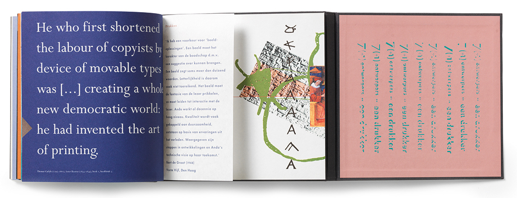
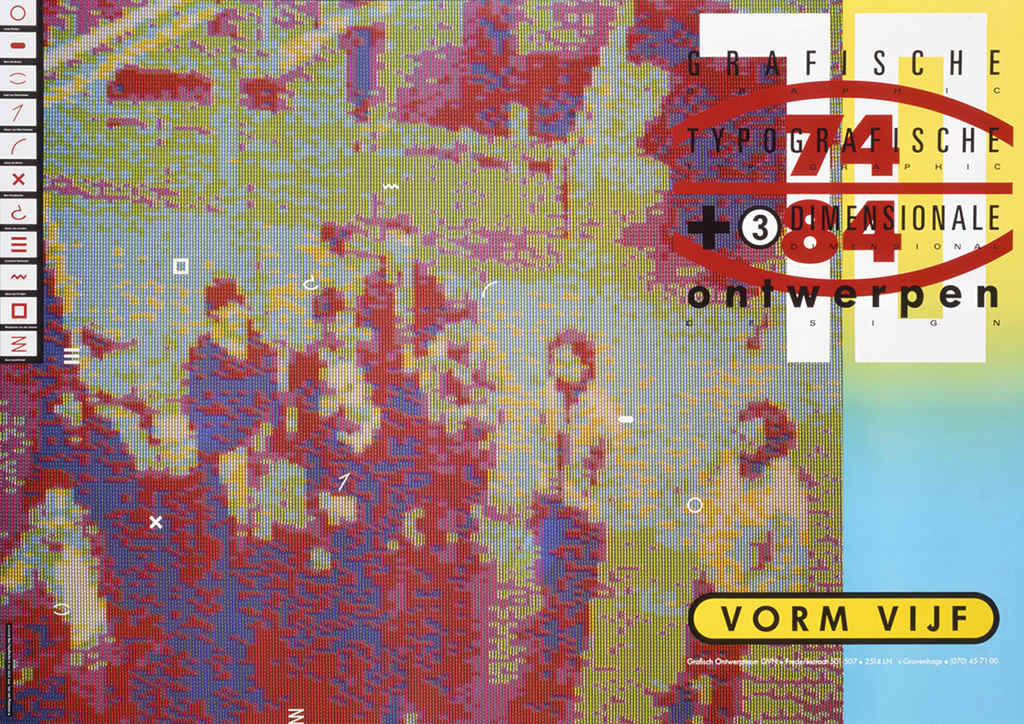
In the 1970s, graphic design really took off in the Netherlands. Corporate identity programs were developed left and right. The national postal service (PTT), central government ministries, regional and local authorities – all were ready to collaborate with designers and change their public image, just like the business world. The government printing shop Staatsdrukkerij (Sdu) started their own graphic design department to serve their government clients and to support their own publishing branch. Many independent design groups were founded in The Hague: Traffic, Van Raalte Kruit, Id-Studio, Checkpoint, TIQ (later 2D-3D), Smidswater, Ontwerpwerk, Faydherbe/De Vringer, Studio Tint, Skylla, i-grec, Barlock, Eric van Casteren Ontwerpers, Op Stand, Polyester, Lust, and more. Some quietly disappeared from the scene, others are still up and running. One of them, Vorm Vijf, started in 1974 after being founded by Joop Ridder (working for one year under the name Vormgroep 5). Five designers: Dirk Jan van Booij, Geert van Mierop, Annemarijke Mook, Ine de Vries and Joop Ridder. Five design disciplines: graphic design, photography, typography, illustrations and 3D design. Some of the original five soon left, others took over, including in 1976 Bart de Groot.
Bart de Groot (1948-2012) wanted to become a painter, but his father pushed him to learn ‘a real profession’ at the graphic art school in Utrecht. He studied ‘esthetic-technical design’, to become an intermediary between designers and printers. It prepared him well for his subsequent studies at the academy of art in The Hague. Jacques Janssen, Gerard Wernars, Henk Kemperman, Gerard de Vries, and Joop Beljon were his teachers. De Vries would tell him: “Leave the paved paths. Just fall flat on your face once in a while.” De Groot graduated cum laude and found a job at Koninklijke Van Kempen en Begeer in Voorschoten. For a short time he worked for Reginald Lindeman in Leiden after an internship at Tel Design in The Hague. Then came Vorm Vijf.
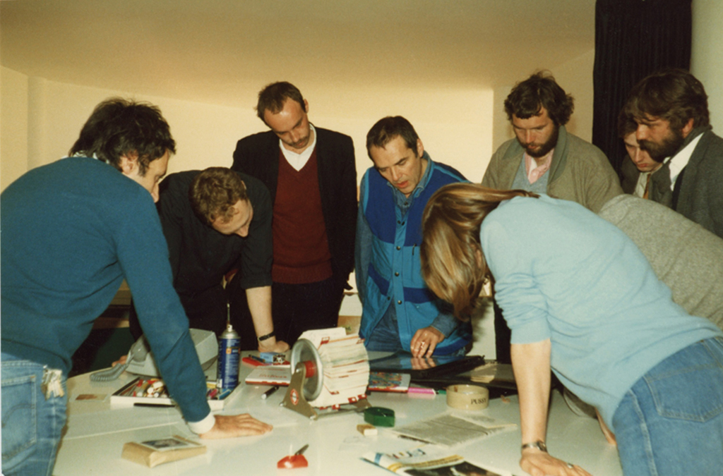
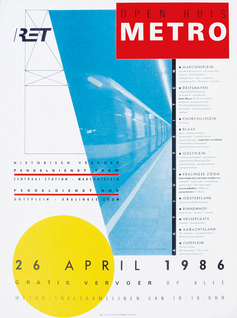
The duo Joop Ridder and Bart de Groot, Vorm Vijf’s core, managed to create a very successful studio. They worked day and night. Ridder managed to attract many important clients in Rotterdam, from the city’s printing shop to the municipal library and the public transportation system, RET. New faces joined them at Vorm Vijf: designers such as Ruud van der Lans (who would later become famous when living in Berkeley, California and founding Emigre, the spectacular international magazine about experimental typography and design), Aad van Dommelen, Wout de Vringer, Michiel Schriever, and others. Many came with their own clients in tow, or would establish their own studios, later.
Aad van Dommelen (1979–1987)
“Joop Ridder was a designer looking for excitement. Bart de Groot was the esthetician. He could disappear in the composition of a cover, which he then developed into a spatial universe full of readable, photographic and abstract elements, all in perfect balance with each other and forming a strong unity. Maybe he was not so much trying to communicate as to create art: the perfection of an autonomous art piece. He could keep manipulating the elements – enlarge, reduce, add new ones or remove ones he decided did not work well. His approach made me think of Mondrian. His ingredients were dots, grid lines made visible and such. Before the computer was introduced, Bart de Groot’s pencil would draw a primitive sketch, or he would play 1 : 1 with small cut-outs. Always, the results would be fascinating and contemporary. Whereas he did his work on creating covers in full view, logos were developed ‘invisibly’, in the evening hours probably, when he sketched on small strips of paper. There was no trail of try-outs. Bart has created some great logos.”
Joop Ridder was the extrovert of the two, the one who wanted to expand, enter architecture, film-making, what not. Bart de Groot was the introvert searching for improvement within the profession. In 1987, they each went their own way. Ridder founded Pro Forma in Rotterdam. De Groot remained with Vorm Vijf, in The Hague. Vorm Vijf’s reputation grew more than its size. Graphic design remained their focus.
Design in motion
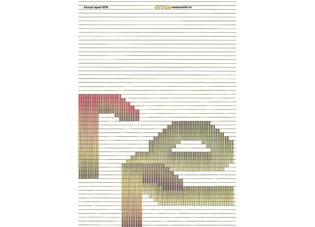
Vorm Vijf successfully survived all developments the profession encountered in the 1980s and 1990s. They designed the 1976 annual report for Ennia Reassurantie, which looked very hi-tech but was created with a Rotring pen, an airbrush and Letraset type. Soon enough the computer would take over. Total Design and Sdu bought the hugely expensive Aesthedis computer with which the graphic designer could do ‘anything’. Then Apple came with the Macintosh, offering the same capabilites. It was 1986 that the Mac made its entrance at Vorm Vijf, one of the first Macs in the Netherlands, with no printer available yet. The Mac’s type was ugly, decided both De Groot and Ridder – having learned the nuances of typography from Gerrit Noordzij at the academy in The Hague. But they knew things would improve, even though Gert Dumbar, seeing the first of these machines at work at Vorm Vijf, exclaimed: “That thing: BS!”
Frank Blokland (1980–1981)
“If I remember correctly, it was in 1980-1981 that Bart de Groot was my teacher of graphic and typographic design at the art academy in The Hague. He stood out because he was young; most of his colleagues were over 50. In those days, the old guard could still smoke cigars in class without receiving any comments, and they could lay their hands on the shoulders of female students without anyone taking notice or offense. But Bart added a fresh breath to the somewhat dusty and smoky environment.”
Starting at the end of the 1970s, graphic design in the Netherlands was in motion. The commotion was caused by the growing number of young designers who discussed the rather dogmatic – some said Calvinistic – modernism that dominated Dutch design. The ‘strict’ were attacked by the ‘flexible’, the ‘geometrical’ challenged the ‘free-thinking’. In other words, Wim Crouwel and his ilk opposite the young Turks, Hard Werken (Rotterdam) and Wild Plakken (Amsterdam, with strong political views), but also opposite Gert Dumbar (The Hague). As PTT/DEV’s Ootje Oxenaar once said: “Too few graphic designs show a sense of irony, of perspective. An incomprehensible form can surprise and even shock. Why not have some unicorns in a geometric park?”
Ben Faydherbe (1981–1986)
“Bart de Groot didn’t need to shout, he preferred to whisper. He approached design on a micro level. He would play with individual elements, push small pieces of paper around on a surface, texts, photos, colored strips – then freeze the composition under a sheet of glass. Not much would be changed later. Bart loves the poems by Gerrit Achterberg and I wouldn’t be surprised to learn he wrote poems himself. Writing poetry demands a similar process as his way of designing: pulling and pushing until every detail is in its right place. Vorm Vijf gave designers like me lots of freedom. We could do what we thought was right. I recall a great solidarity, too; everyone was always willing to help a colleague solve a design problem or finish a huge project.”
Initially, Bart de Groot was one of the more ‘strict’ designers, controlling precise rules. But he did not follow dogmas. He only used dogmas as a starting point, for a grid, or as an illustration by showing the grid’s dots and lines. He used details of images that referred to the theme of the design. A similar fragmentation was visible in science (specialization) and art (individualism) as well as day-to-day life (more choices were offered to consumers in the growing economy). De Groot’s approach might be compared to the change that became visible in sculptor Carel Visser’s work, which around 1975 evolved from constructivism to a much more liberated form and use of technique, yet without losing its sense of symmetry.
Vorm Vijf did not deliver one set style of design. Bart de Groot: “Everyone here works as an individual and so it is all about what each designer thinks looks good.” Vorm Vijf truly embraced this as an ideal. Again Bart de Groot: “We introduced a more ‘artsy’ approach to the strict rules that were reigning. What followed was a period during which everything was possible, everything was allowed, no rules were in force. Now [1999] we are holding back again, which is a good development. This way, we are communicating more effectively. The profession is not autonomous; it would mean its death if we’d approach it as such. Change is an essential element of existence: it starts up new processes, insights and solutions. An open mind is needed, also in the discussions with clients. Listening to the opinions of others cannot be missed in any serious discourse about a design or a product.”
Young Turks
Vorm Vijf was an ideal spot for young designers to start their career. Many first came as interns to experience design in practice before graduating from the art academy. Colleagues, working in The Hague but not owning the type or quality of equipment Vorm Vijf had at its studio, were invited to come and use theirs. Eric van Casteren, who joined Vorm Vijf in 1986, wrote: “During my application and presentation, I noticed the relaxed, open atmosphere. Everyone would drop in and watch and listen. Everyone was involved with everything. They had noticed my enthusiasm for publications from Quixotic (predecessor of [Z]OO Productions). I succeeded Ben Faydherbe and Wout de Vringer, a duo that had put their mark on Vorm Vijf with their headstrong designs.”
Eric van Casteren (1986–1990)
“I felt attracted to Bart de Groot’s design because it breathed his personal inspiration, even if it was confined to a sketch no larger than 4 cm x 3 cm. He was able to, magically, enlarge such a sketch on a copier and transform it into a layout. There would be a diagonal coming from one corner and an image cut off to add ‘reality’ and everything would be very esthetic. We got so much freedom at Vorm Vijf. We had to report our hours, but no one did. We worked hard but took time to experiment. Bart de Groot was a facilitator. He allowed Vorm Vijf to become a breeding ground for young talent.”
Katrien van der Eerden (intern, 1990–1991)
“A young designer would get so much freedom at Vorm Vijf… Responsibility too. They even stimulated us to connect our own commissions to the studio. They allowed me to participate in the competition for the design of the first series of phone cards. This helped me to start as a free-lance designer. Bart smoked a pipe and was always fingering his moustache. He is a ‘softy’ with a great sense of humor. He tells great stories.”
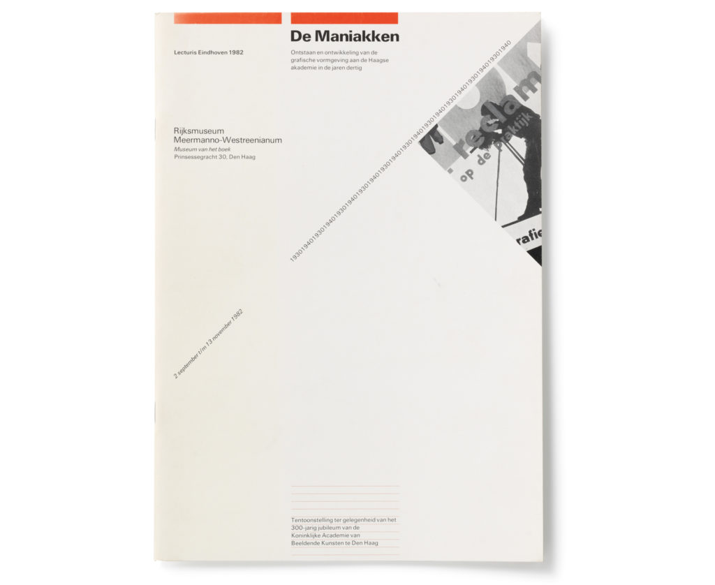
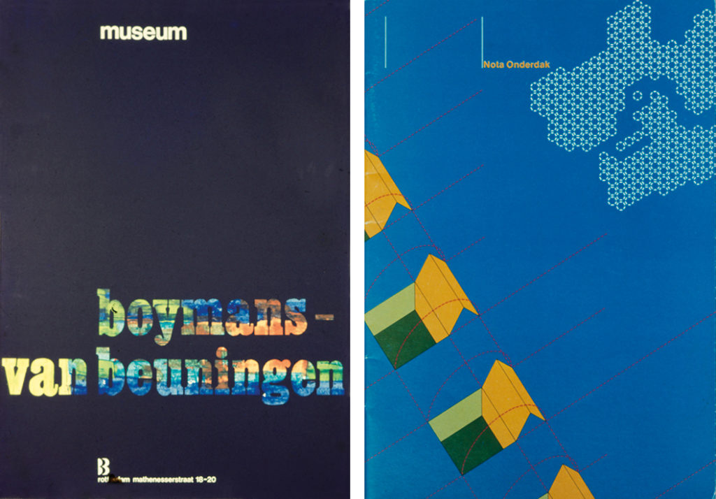
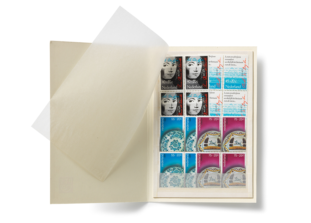
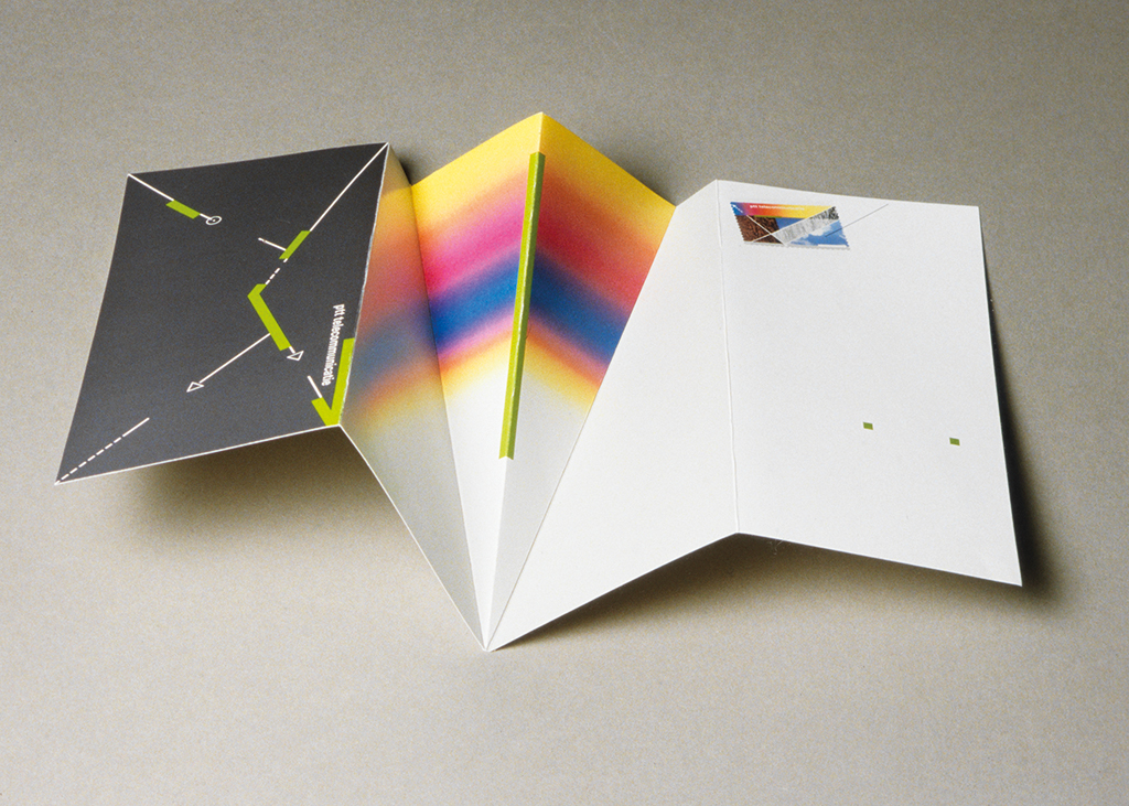
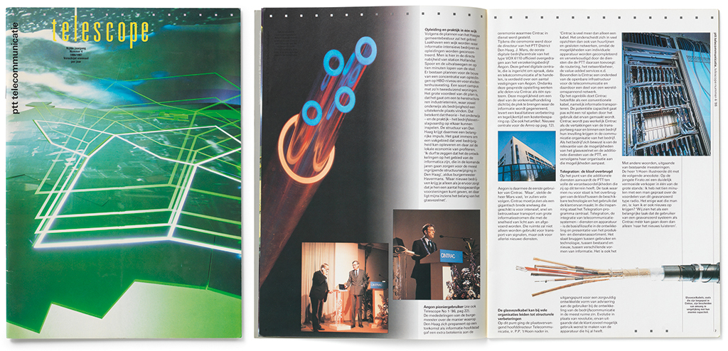
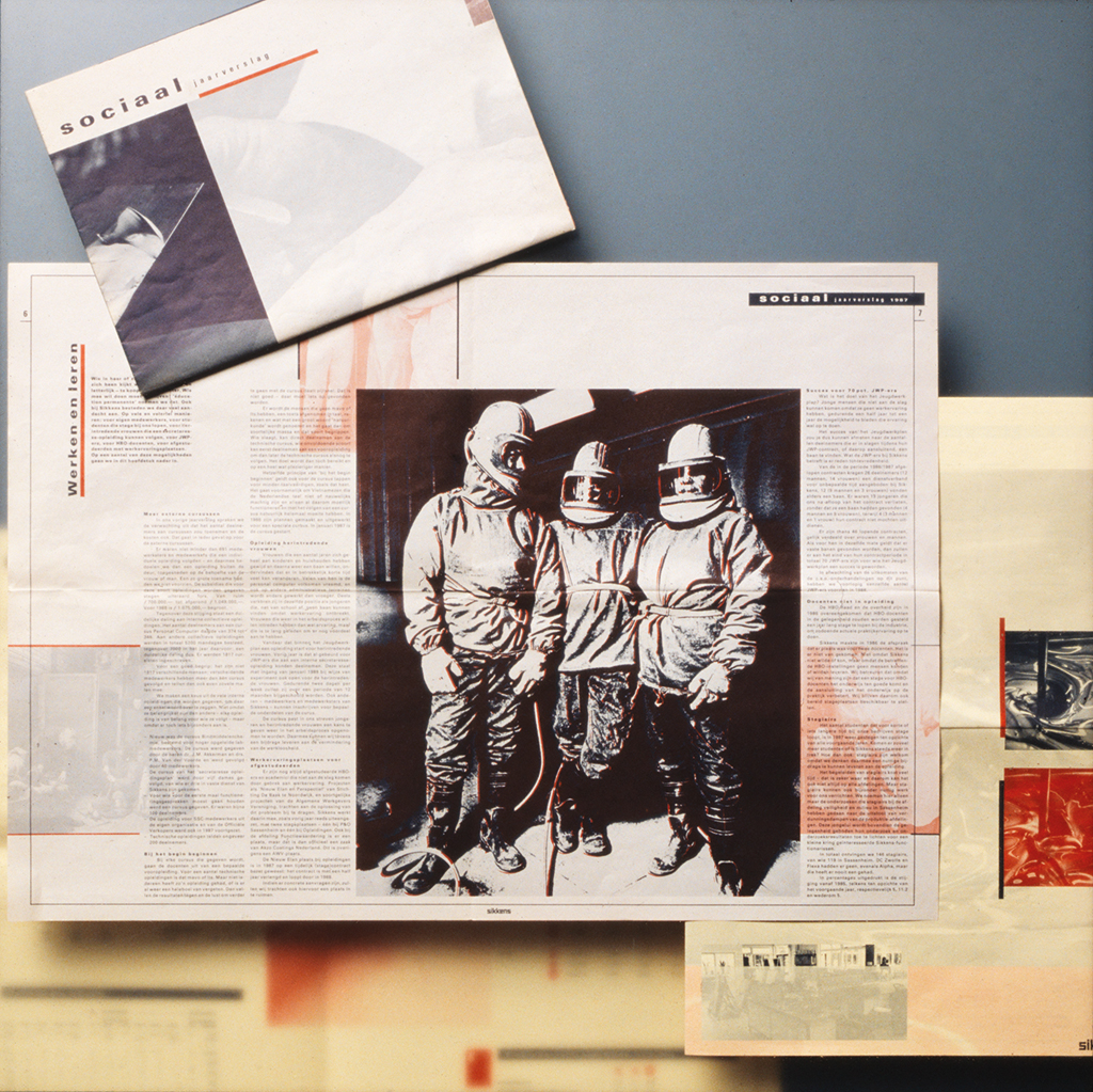
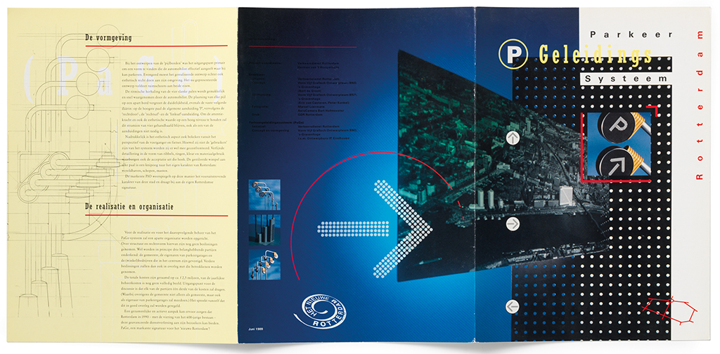
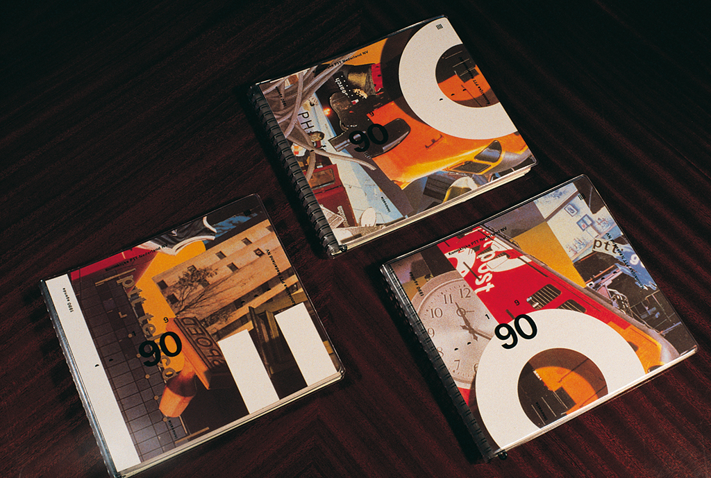
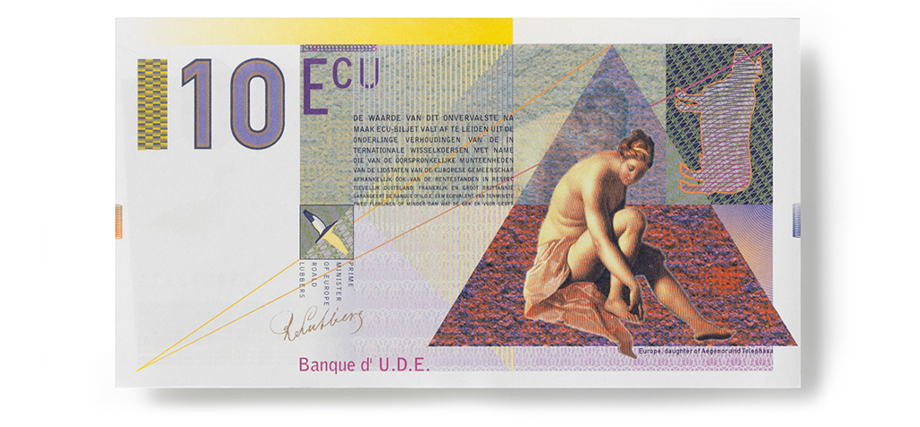
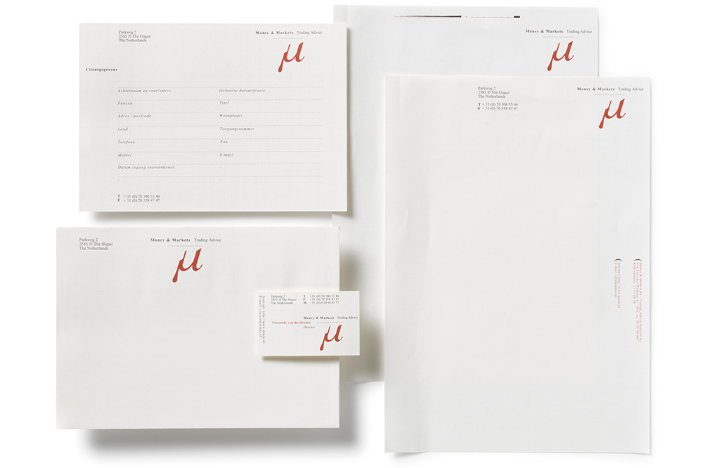
Nevertheless, Bart de Groot’s designs also showed a clear line – a signature. He managed to combine clarity and strictness with free interpretations like no other, but was not afraid to use tight grids either, for letterheads or typographic designs, for example in the book design for De Maniakken. PTT Telecom’s magazine Telescope allowed him the freedom of variations and experiments. In 1993, De Groot created a Proost Prikkels bulletin on the occasion of the arrival of the ‘Euro’ coinage. Vorm Vijf made history – though not a forerunner, the studio’s unpretentious thoroughness could not be disregarded. They had important clients: the City of Rotterdam, PTT Telecom, the Justice Department, ANWB (Dutch automobile association, travel and tourism), Philips Lighting, and Rotterdam Harbor. They made calendars for PTT (with 60 different covers!) and ING.
Paul Scholte (1985–2008, less three years)
“Pushing lines and clouds of text lines, that’s Bart de Groot. Adding, deducting, multiplying for hours on an end. At the finish, a deep sigh. He is a Baron of Münchhausen: he can raise a gale through just one of his nostrils. He is a man who understands his responsibilities. And he is not afraid to take them. Never easily satisfied, he motivates the studio to continue their search. He has created an atmosphere that makes all young designers eager to work at Vorm Vijf. He was smart enough to sell his stock in Vorm Vijf at the right moment and, surprise!, travel between France and Zoetermeer of all places while creating sculpture and paintings and doing whatever he wants to do. But he never hesitates to stop by at the studio and have a coffee with us. Never tea – Bart hates words beginning with a ‘t’ anyway…”
Hans Leydekkers (1988–2001)
“Bart de Groot is one of the few designers who can distance themselves from their designs. A virtuoso in typography, his intuition about detail and esthetics is unique. He may not be a real spectacular designer, but he knows how to open up to designers whose visual language differs from his. Quality and authenticity, that’s what it is all about for Bart. Which opened so many possibilities for our experiments. His attitude contributed to the development of many now established and respected designers. He was driven to make Vorm Vijf one of the leading Dutch design agencies, characterized by a ‘young Turks’ mentality’. Everyone was willing to work into the late hours. Salaries were unimportant. Important were: compelling design commissions.”
Fred van Ham (1994 ….)
“As the creative director at Vorm Vijf, Bart de Groot could employ his own creativity to loosen up other designers who had gotten stuck creatively in the middle of a process. He knew how to use a soft hand to steer people away from a quagmire. He had a good eye for details, but enough strength of expression to be exuberant. He designed an A-0 format poster from a painting he’d created about European unity. No digitalizing, just fat blobs of paint telling the story. This poster made it to all bus stops in the Netherlands. Bart was proud, and so was his client. That was Bart’s force: to send the right message at the right time. All the rest, he always said, is hot air, wasting oxygen. After he left the studio, he still remained attached.”
Bart de Groot left Vorm Vijf in 2003. Together with Joop Ridder, the more extrovert and commercially active partner, he had been the great influencer of the studio’s quality and success.
Bart de Groot
born in 1948
died in 2012
Author of the original text: Paul Hefting, June 2012
Translation and editing in English: Ton Haak
Final editing: Sybrand Zijlstra
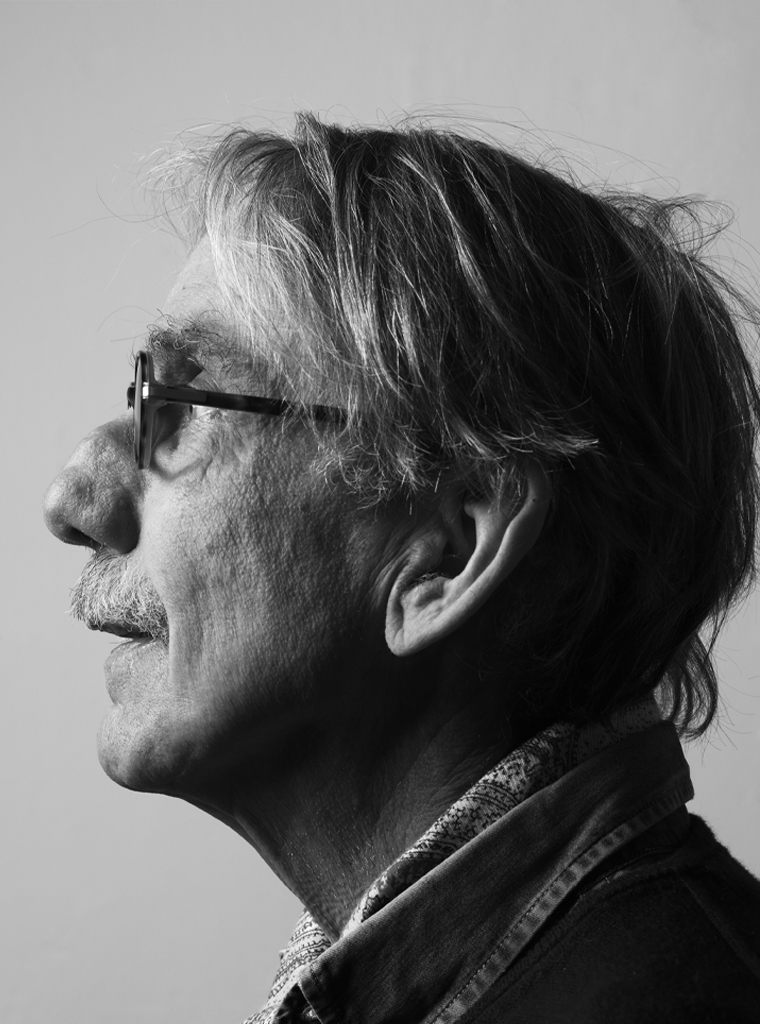
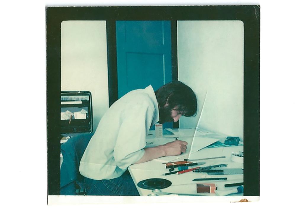
Portrait photo: Aatjan Renders