Thank his art teacher at the Amsterdam LTS (lower technical school) for discovering Frans Lieshout. Mister Zwart noticed his talents and advised his parents to have him show his drawings at the Gerrit Rietveld academy of art in Amsterdam. He had only just turned fourteen! At the academy, his talent was recognized; but his presentation showed he was still a copyist rather than a creator of original work. No wonder, he was much too young to be admitted to the Rietveld after all.
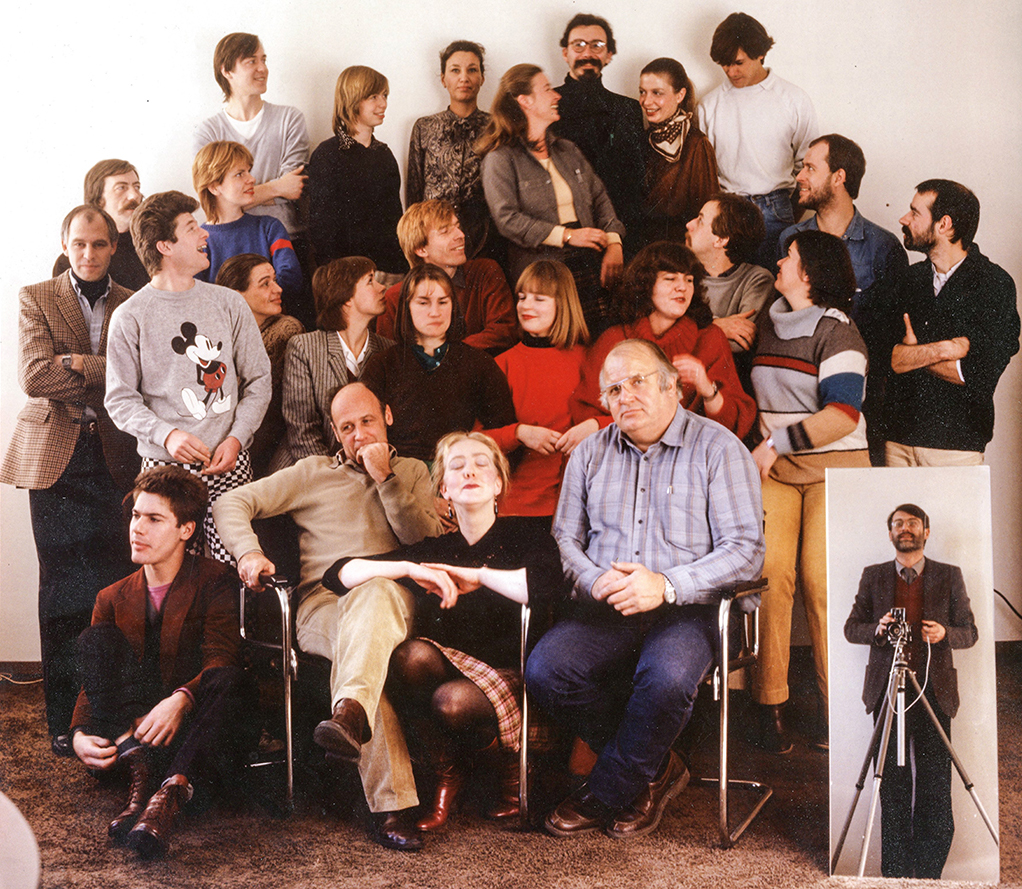
1982 – Total Design, from left to right, top to bottom: Henk Lamers, Francien van Hoorn, Mieke Alberse, Daphne Duijvelshoff, Wim Verboven, Katrien van Hoorn, Frans Nagel, Wim van der Weerd, Jeanne de Bont, Reynoud Homan, Henk van de Belt, Hans van der Kooi, Ernst Wijnekus, Frans Lieshout, Jolijn van de Wouw, Esther Verdonk, Marjo van den Broeck, Arlette Brouwers, Pien van der Zant, Anneke Landzaat, Joost Klinkenberg, Jeroen Berkhout, Ben Bos, Maria van Egmond, Wiet Weteling and in the mirror Tjeerd Frederikse.
1956-1971 Always drawing
The graphic designer and digital pioneer Frans Lieshout was born in Hoorn, in 1956, the youngest of five siblings. At home, everyone liked to draw and Frans was no exception. He was maybe seven when, walking home from school, his eyes were caught by the typography of a large poster promoting Esso; he became intrigued and ran home to copy what he had seen. It made him realize that he wanted to do ‘something with letters’, for instance as an advertising illustrator.
His elementary school teachers advise him to enter LTS. Drawing letters is in the curriculum and Frans is one of the students who have to learn working with type in practice by painting signs and publicity panels for the ‘Always Forward’ soccer team. He feels he is approaching the world that has fascinated him for so long already. At age fourteen, he receives the advice to follow some creative schooling after graduating from LTS before returning to apply at the Gerrit Rietveld Academy. He tries to enter the graphic school in Dintelstraat in Amsterdam, where the deputy director tries to discourage him, “because advertising artists have a tough job which can make them sick.” No openings for new students are available anyway.
1971-1977 Stumpel printers
In 1971, after his graduation from LTS, he finds a job at Drukkerij Stumpel in Hoorn as an apprentice-typesetter. They are the printers of Noordhollands Dagblad and more, and he is one of the lucky ones who receive the thorough in-house education for which the Dutch graphic industry of the time is famous. And: he loves the job, noses around in the printers’ lay-out studio and is allowed to design small print such as wedding announcements. The design of his first birth announcement demands the use of four colors as well as blind stamping, which earns Frans a reprimand from ‘Boss’ Herman, the director: could he restrain himself a little in the future? Frans wonders why. This will not be the last time that he tries to cross boundaries; he will continue to take it to the limit during his entire career.
He is interested in more than just typography. Designers like Roger Dean (record sleeves for Yes), design collective Hipgnosis, and illustrators Frank Frazetta and Ralph Steadman show him the possibilities of illustration. While working for Stumpel he attends class at the Dintelstraat graphic school one day a week; he is allowed to jump one year by the same deputy director who tried to discourage him earlier. Later, he enters the evening class ‘lay-out’ taught by Jan Brinkman and Ko Veekman and his future Total Design colleague Peter te Bos. Two years later, Frans enters evening class at the Rietveld; he reduces his days at Stumpel to four a week and uses the weekends to design study projects.
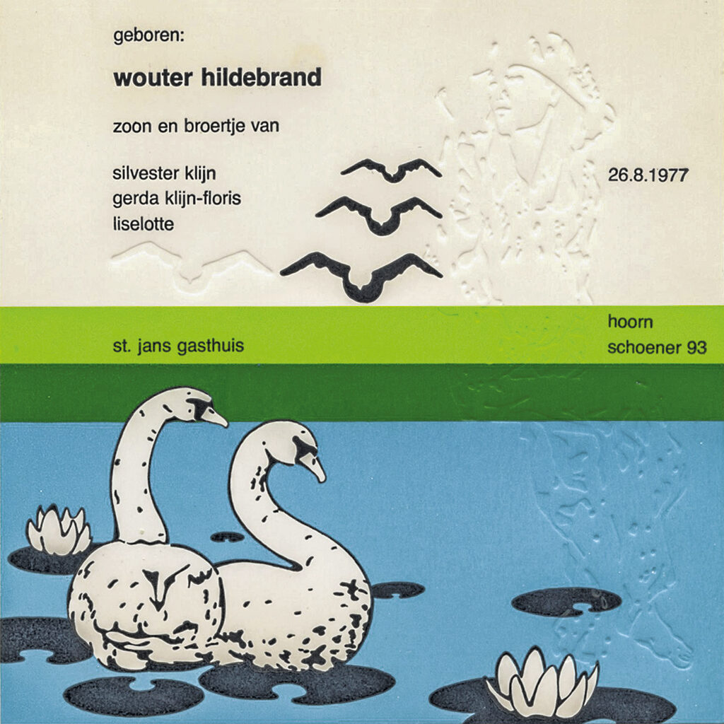
1977 – Silvester Klijn, birth announcement Wouter Hildebrand
1981 – Rietveld Academie, illustration graduation project
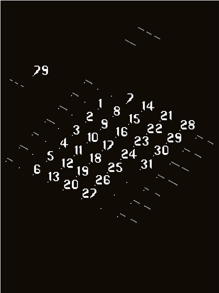
1979 – Calendar
1977-1981 Gerrit Rietveld Academy
The job at Stumpel is boring, also because there is so little to do. Frans desperately wants to enter day classes at the Rietveld. But one of his evening class teachers, the typographer Gerard Unger, tells him not to switch: “You’ll be unhappy with your approach to work.” Unger arranges for a meeting at Frans Spruijt printers to see if they can provide Frans with a more interesting job. Spruijt asks Frans if Wim Crouwel has ever seen his work. “Wim Crouwel?” Crouwel is his hero! Frans is a regular visitor at Stedelijk Museum and Museum Fodor in Amsterdam and knows Crouwel from his catalog and poster designs. He’s a collector. He admires the abstract character of Crouwel’s work, but also the experimental quality and the daring that it shows.
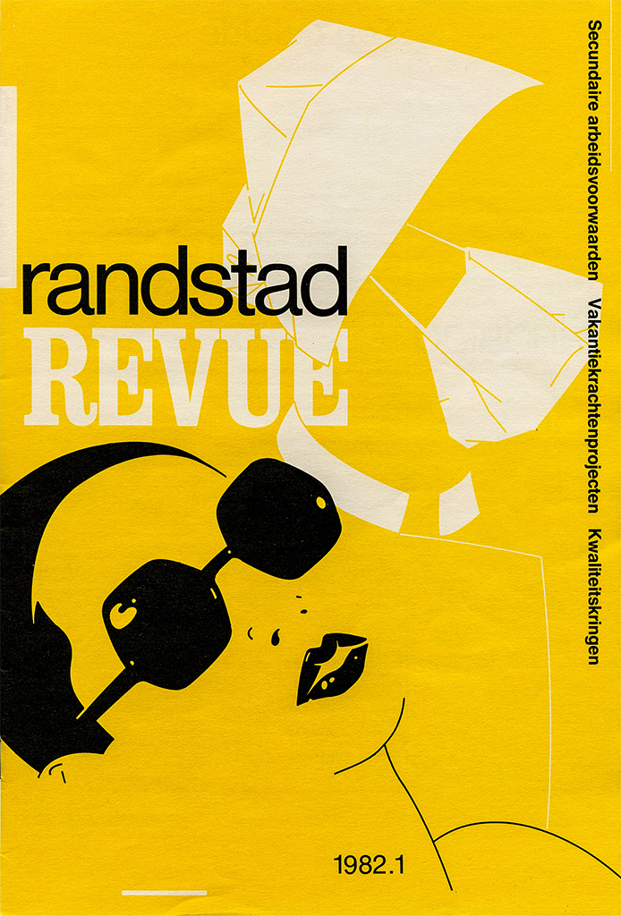
1982 – Total Design, Randstad Revue
1882 – Total Design, Jantje de Goede illustration advertisement
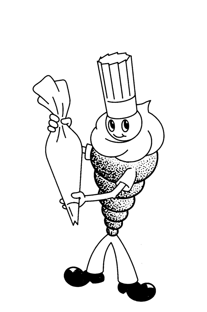
1988 – Total Design, Jantje de Goede mascotte
1979-1985 Total Design
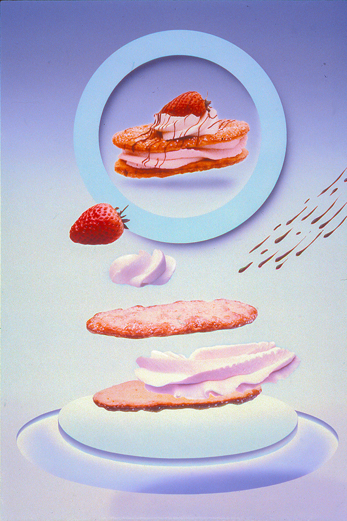
In 1979, there’s a vacancy in Jolijn van der Wouw’s team at Total Design. She is looking for a designer with more experience than Frans can show, but takes the trouble of introducing him to Ben Bos, who hires Frans. Ben shows he trusts Frans and gives him the space he needs to further develop his talents. It is not a problem when his first commission, an illustration about sports for temp agency Randstad’s annual report, is a failure, mostly because Frans really isn’t a sports fan. He needs to feel a relationship with his subjects and doesn’t function well if tight restrictions interfere with his creativity. He continues to work a lot for Randstad and together with Wim Verboven on Randstad’s magazine Randstad Revue, for HVO (support of homeless people), and for Jantje de Goede, a supplier of bakery products to patisseries.
Curious as he is about the profession, Frans pays visits to other studios and starts an extensive slide archive of the work of international designers. He gets involved with the exhibitions TD traditionally organizes in their corridors and meets Jelle van der Toorn Vrijthoff, who just left Sdu (government publishing and printing house) for a directorship of Total Design. They hit it off and Frans switches to Jelle’s team. Their opinions about visuals run parallel and they want to take a less dogmatic approach to TD’s aim for functionality; they prefer a less restricted, more impulsive creativity.
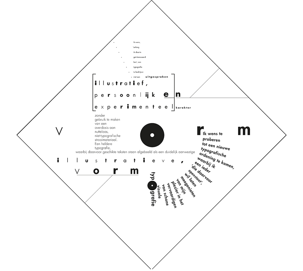
1985 – Typography wish
1983 – Artists Association Hoorn
Education and Science
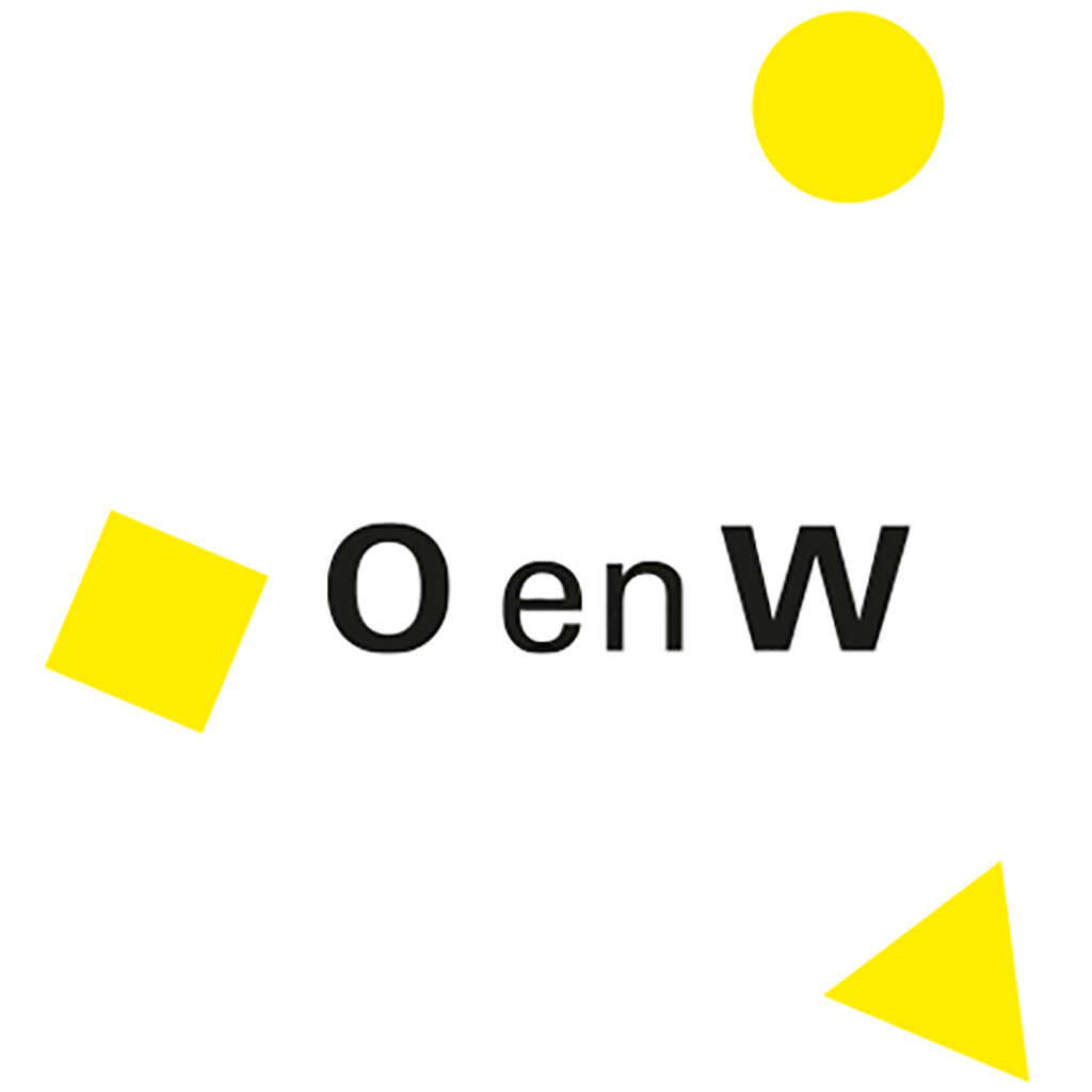
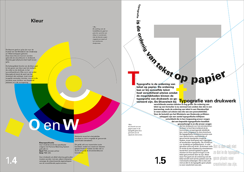
Their first big project together is the identity program of the government department of ‘Onderwijs en Wetenschappen’ (education and science). Jelle and Frans, assisted by the intern Lex Reitsma, are thrown into a very ambitious and labor-intensive assignment. TD is to design the basic elements and provide a toolkit that will allow for the (re)design of all aspects of the department’s presentation. They start with the logo, which uses the Univers to balance the two elements of the department’s name, O & W, to which a triangle, a square and a circle in yellow are added.
1982 – Total Design, Ministry of Education and Science, abbreviated version of the logo with Jelle van der Toorn Vrijthoff
1983 – Ministry of Education and Science, sketch design corporate identity brochure
These are surrounded by a rich variety of graphics; experiments with different text columns, lines and layers, and integrated photography are allowed. Lines connecting texts and images are beginning to characterize Frans Lieshout’s designs. Frans is inspired by the work of the German designer Wolfgang Weingart, whose style some call ‘Swiss punk typography’. April Greiman (USA) is also an inspiration. The allowance of a great flexibility is what characterizes the O & W department’s new identity; at the time, this is a significant departure from the much stricter Total Design doctrine. Later, many will look with amazement at what was created ‘by hand’ just using Rotring pens and sheet-film cutters.
Frans shows an almost maniacal approach to the precise execution of his designs. His commitment gets him a special position within TD and he is asked, with Reynoud Homan, to design the studio’s commemorative and promotional book, Ontwerp: Total Design. It is 1983. Frans is only twenty-seven.
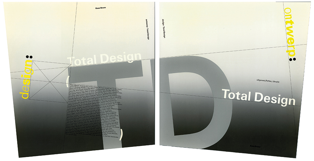
1983 – Total Design, cover ontwerp: Total Design
Ontwerp: Total Design has an unorthodox lay-out based on two colliding squares that are slightly rotated against each other. The book will be Frans Lieshout’s break-through. The national and international response it receives is overwhelmingly positive and confirms TD’s graphic supremacy. However, within TD it caused quite a battle; everything was weighed extensively and even the typography of the word ‘Ontwerp’ (design) in the title caused in-house polemics. Frans Lieshout had selected a potpourri of Universes not many could agree to. In the end, it was Wim Crouwel who decided: “Make the ‘e’ a bit bolder, then it will be okay.” And, to Lieshout’s and anyone’s surprise, this ended the discussion.
Aesthedes
In 1982, Van der Toorn Vrijfhoff is approached by Claessens Product Consultants in Hilversum. Originally, they were packaging producers. They used advanced technology and a design computer, the Aesthedes. Jelle asks Frans to join him on a trip to Hilversum to investigate what the computer’s possibilities are. It is a huge machine with three 20” screens that can present sixteen-million colors, unique at the time. Total Design buys one and pays hundreds of thousands for it. Frans is the first one who is receiving instructions – by Jelle, because no one else knows how to handle it. In the end, he is able to have the machine do what he wants and he is amazed of the machine’s precision; all what is in his mind suddenly can be realized. Frans starts experimenting with the Aesthedes when he has to design a poster for an exhibition of work by artist Marijke de Goey. It is 1984. He experiments with manipulated sharp typography and lines that flow from bold to thin.
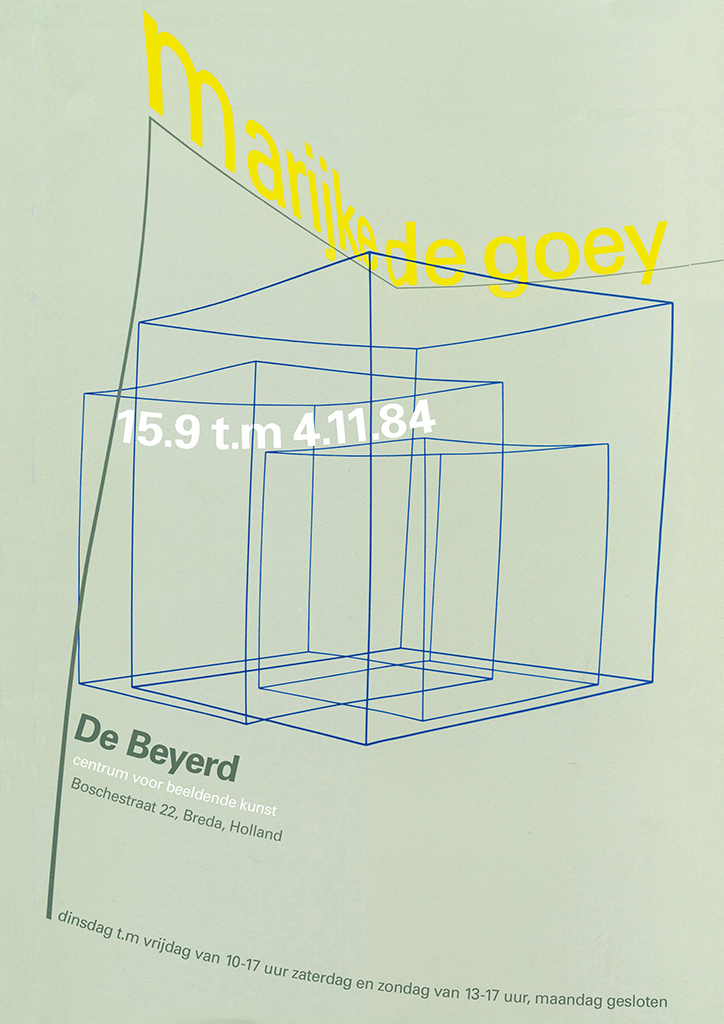
1984 – Total Design, De Beyerd affiche Marijke de Goey
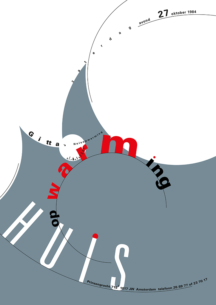
1984 – Gitta Fischer, invitation house warming
The digital possibilities suit Frans Lieshout’s love of ‘old-school’ crafts and his devotion to details. He, with his love of illustrations, can let his fantasy roam without spending much time at drawing perfect curves by hand – the Aesthedes lets you create and manipulate perfect splines. Jelle and he explore all possibilities of the system. The two of them are at the genesis of the digitalization of the graphic profession.
Trashcan
Frans Lieshout knows better than any other what the Aesthedes can do. In 1986, he designs the annual report for SEP, the collaborative of Dutch power companies. Inspired by artist Peter Struycken’s drawings, he designs complex patterns. He comes up with a new way of paging and a cover with punched holes and more complicated print details; altogether, it is a daring exploit. But after the report is dropped off at SEP, Ben Bos receives an angry phone call from SEP’s director: “What do you think you are doing? Is this an annual report? Do you believe we can send this to our relations? Mister Bos, this will go into the trashcan. We have to talk.”
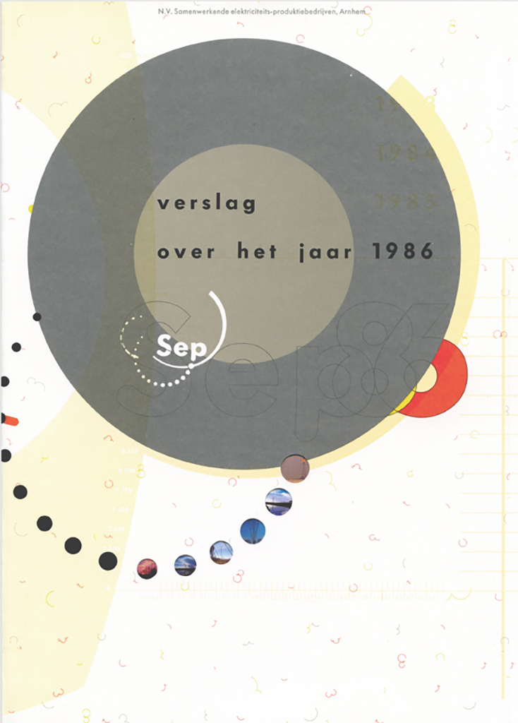
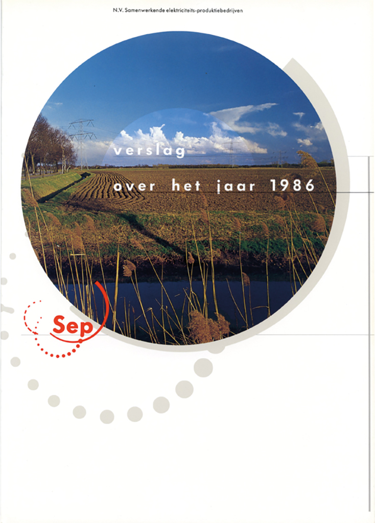
1986 – Sep Annual Report, 1st and 2nd editions
The director has a problem with the extremely detailed style elements and the jumping page numbers (that follow the center of the images according to an ingenious system). They meet in a highway restaurant near Utrecht. Project manager Joost Klinkenberg, Ben Bos and Frans Lieshout manage to douse the fire. TD does a few concessions to the design and SEP pays for printing the new version. Frans doesn’t agree full-heartedly because no objections had been made during the design process but removes all ‘silly things’. The debacle was caused by by many different factors. The team leader was young and inexperienced and had failed to give Frans Lieshout a proper framework. Frans chose his own direction and took his space.
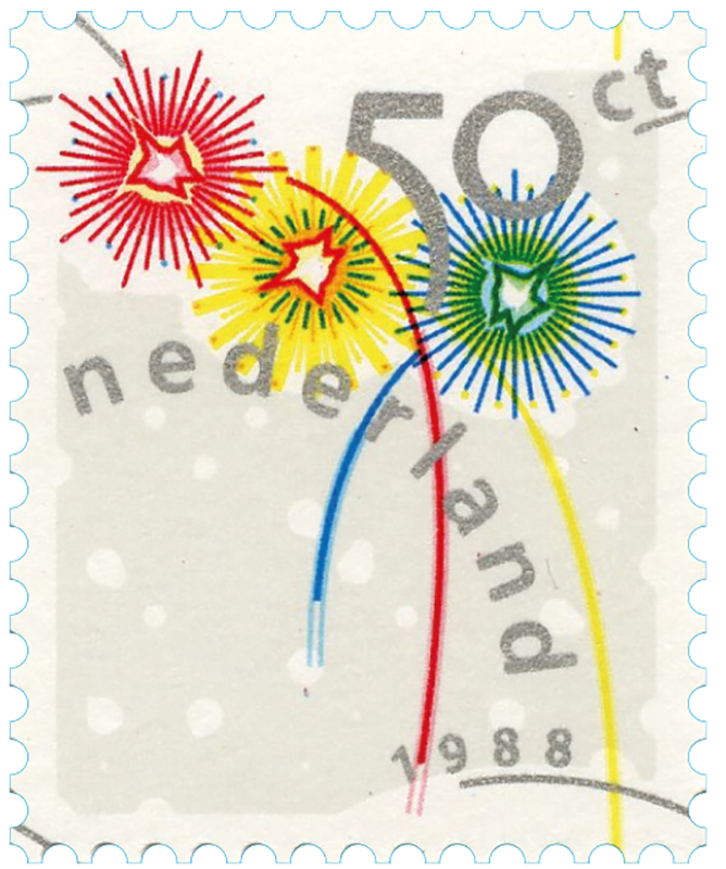
1988 – December Stamp
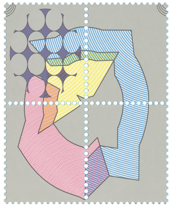
1988 – 4 stamps from the business gift for PTT postage stamp values
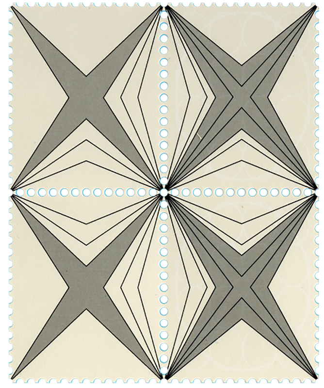
1988 – 4 stamps from the business gift for PTT postage stamp values
Postage stamps
It is Wim Crouwel who is responsible for Frans Lieshout’s design being part of the 1986 book Experimental Design by Igildo G. Biesele, by now a classic international publication presenting experimental graphic design by leading designers. The work for O & W is presented, as well as other print Frans Lieshout has contributed to. The book even opens to his designs. He appears to have caught the international Zeitgeist and his name is made. It leads to many commissions, including the design of a series of Dutch PTT postage stamps, one of the most desirable design jobs in the Netherlands. In the end, Frans designs an exclusive gift for company relations on the occasion of PTT’s move to have their stamps printed by Joh. Enschede’s new establishment in Haarlem’s Waardepolder. Two-hundred stamps are included.
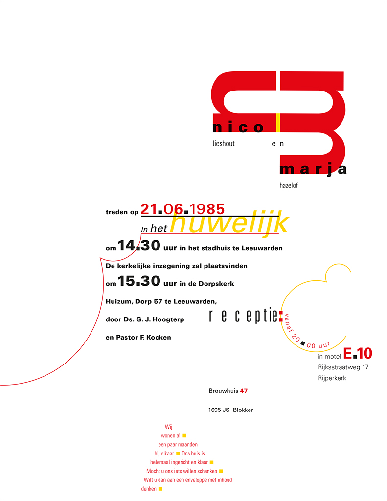
1985 – Nico Lieshout en Marja Hazehof, wedding card
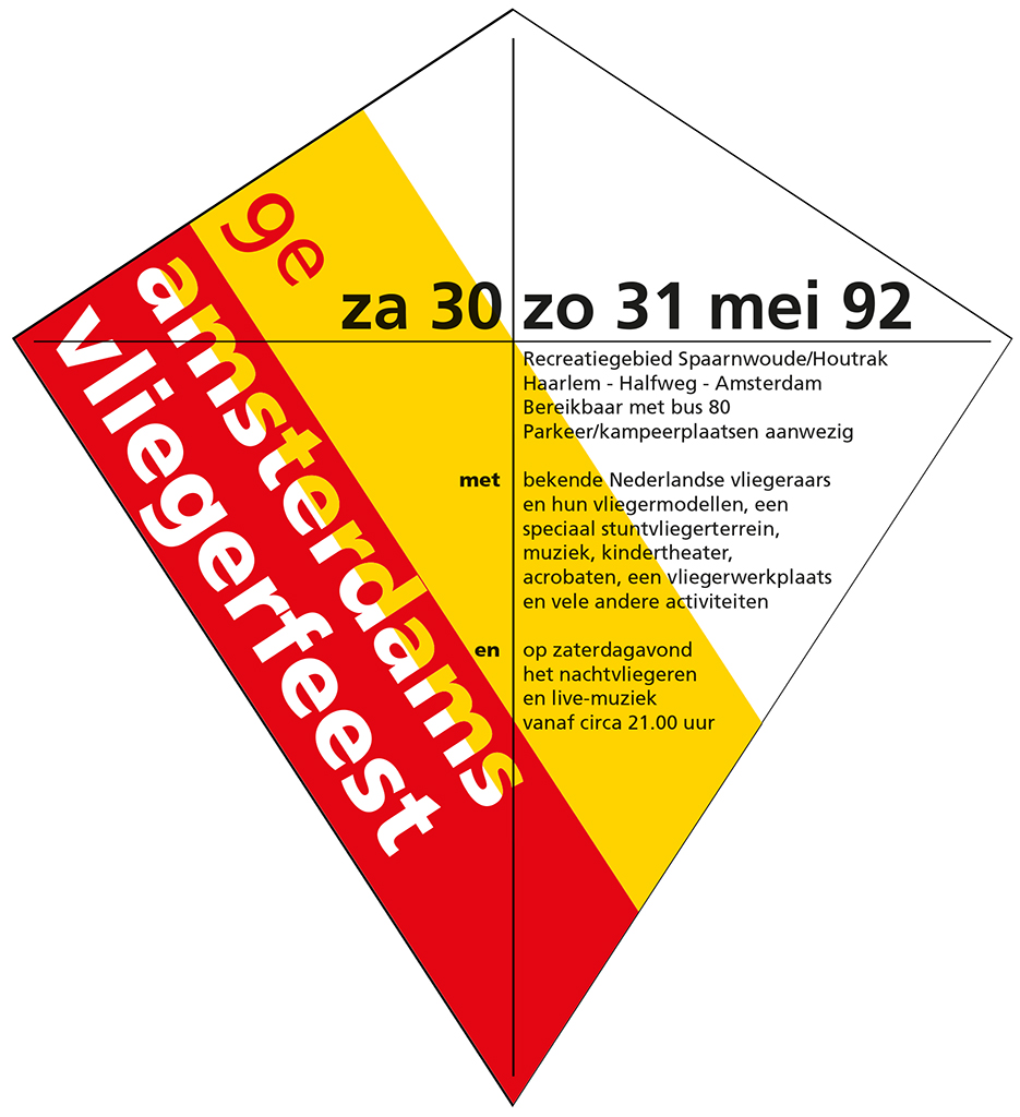
1992 – Harry Stork, affiche 9e Amsterdams vliegerfeest
1985-1992 Africa and TD
In this period, Frans’ zest for work can hardly be controlled. Within TD he takes up the position of a recluse and has his own peculiar habits. On hot days, he starts at eight, to disappear at noon to refreshing beaches. He’ll be back behind his desk at six p.m. only to leave around ten. Rightfully so, for who can sketch and use transparent paper in high temperatures? Not everyone at TD is willing to show understanding, but his stoic, autonomous, yet friendly behavior help him to avoid much resistance. His days are long anyway, sometimes not ending before one in the morning, which in the end leads to an untenable situation.
Frans isn’t happy with the yield of his hard work. In 1985, he decides to submit his resignation; he plans to travel for a year all over Africa and finance the trip by doing design jobs. The journey starts in London, where the British Museum’s book department offers inspiring documentation. In Cairo, it is the Islamic Museum and the typography of old Korans that inspire him (with the Islam not allowing the use of images of human beings). This brings Frans Lieshout to further develop his expertise as an expressionist typographer; this will become visible in his future work.
He keeps in touch with the Netherlands and continues a correspondence with friends and colleagues via mail letters to his parents’ home. He is sent the O & W’s annual social report he had finished sketching and roughly lay-outing before he departed. Along comes a praising letter from Van der Toorn Vrijthoff, roughly saying: “Your ambition to push out the boundaries of what’s acceptable in the design of visual communication offers an inspiring model to all your colleagues.”
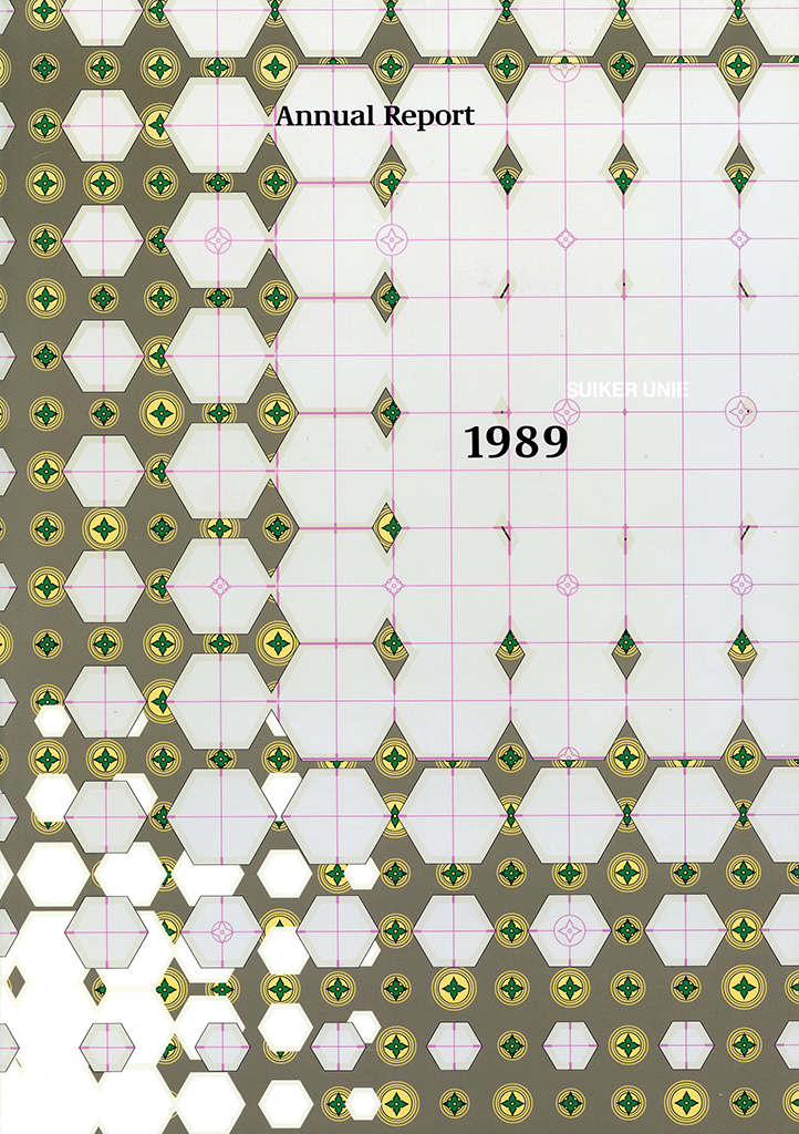
1990 – Total Design, suikerunie Annual Report
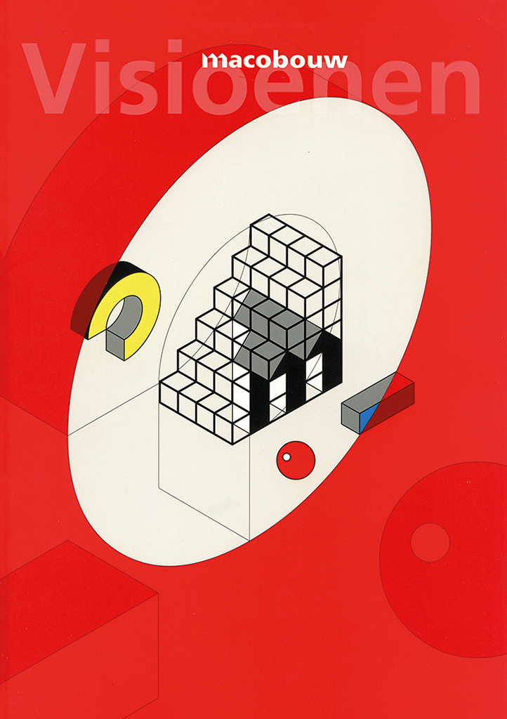
1991 – Total Design, Macobouw brochure
1987 – Total Design, Cam Implants logo
1989 – Total Design, htv architects logo
It is 1986 before Frans returns. He is totally rested. The money is all spent, but he receives an offer to return to TD. He has to decide between the dole and a job. He accepts the offer, now as before fully motivated but not as maniacal as he used to be. He designs magnificent annual reports for Suiker Unie (sugar cooperative) that are inspired by Islamic motives he had discovered in the Middle-East; a corporate identity program for Macobouw and for Cam Implants, HTV architects, Bax Nyst & Zwartkruis, Stibbe & Simont, as well as Total Design’s own new identity; and identities for Jantje de Goede and Holland Dance Festival.
1986 – Total Design, new year card 1987
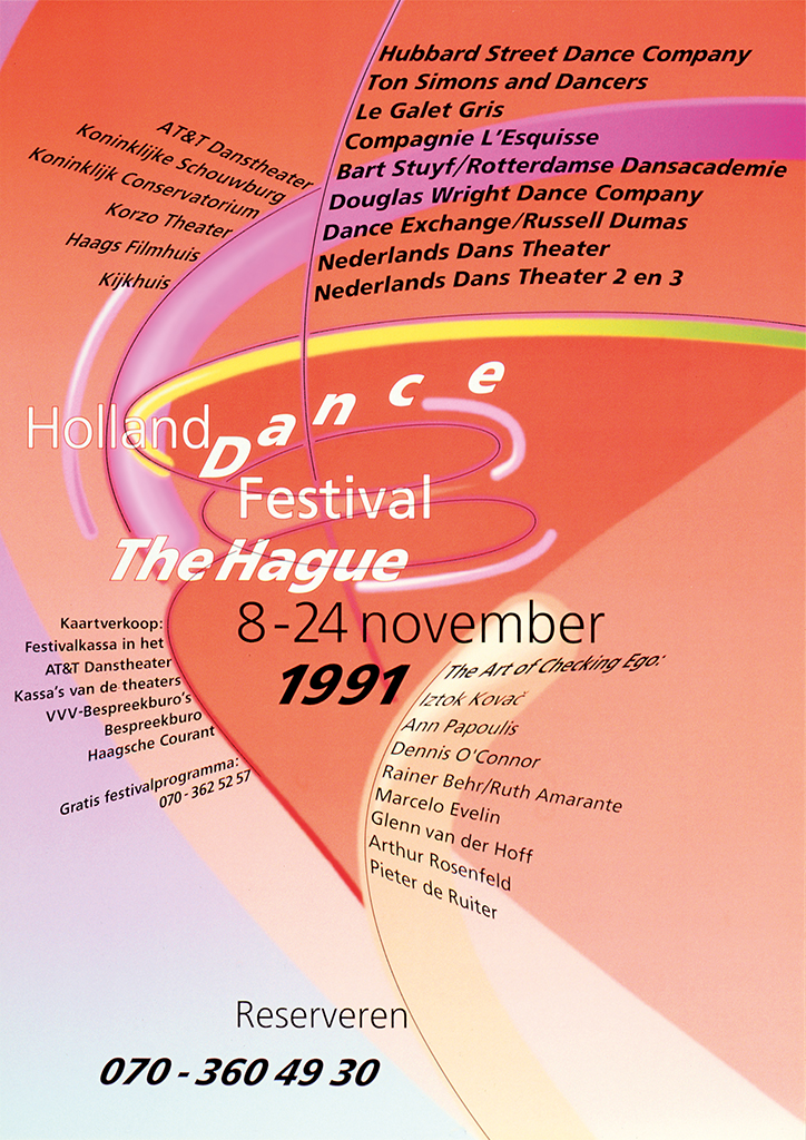
1991 – Total Design, affiche Holland Dance Festival The Hague
For most of his designs he uses the Aesthedes – this “machine from hell, the sublime Spirograph,” as Ben Bos calls it with an ironic undertone. But Frans can manipulate the machine and creates results he could never reach in another way. At TD, a new project is waiting for Frans Lieshout: a second book about Total Design and their work of the 1980s, Total Design, de jaren tachtig. By extreme framing of images and with the typesetting avoiding all regularity he once again takes it to the limit. Frans himself likes the experimental introduction page best.
1989 – Total Design,introductory spread design, Total Design the eighties
At the time, he is teaching at St. Joost Academy in Breda as well as at Rotterdam’s Willem de Kooning Academy. He is a visiting professor in Berlin where his German students expect to learn about the structures and grids Total Design is famous for. What they get to do are Dada-like projects. Much later, he teaches in Canada (Département de Design, Université du Québec à Montreal), together with the French designer and typographer Philippe Apeloig.
1992-1999 Design Connection
Like any other large studio, Total Design will experience break-ups. In 1992, Wim Verboven and Olga IJspeert decide to leave and establish Design Connection. They want to give prevalence not to the ideas of the designers, but integrate design and positioning by giving the clients their rightful say. Other TD designers follow them.
Frans Lieshout hesitates but follows suit a few months later, after a strenuous period of avoiding questions about his future plans. He leaves at a risky time to start anew, because he is a father now (of a son, David Roman) and has just bought a home together with his (first) wife Linda Grewer. And he knows he’s going to miss working with the Aesthedes. Luckily, Apple and Adobe software are coming available.
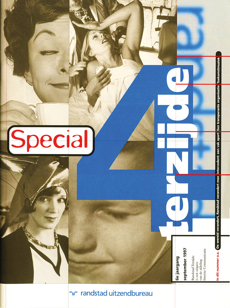
1997 – Design Connection, Randstad Magazine Terzijde
1999 – Design Connection, Cover tender assignment PTT
His work from this period shows the influence of Neville Brody and David Carson but with a Frans Lieshout twist, like for Randstad’s magazine Randstad Terzijde. For Nieuw Sinfonietta Amsterdam he designs splendid brochures and posters. Wilmink (architects) is also a client he works for through Design Connection.
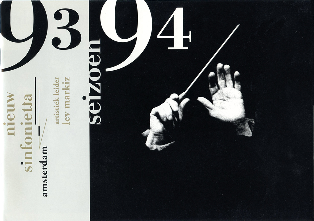
1993 – Design Connection, Nieuw Sinfonietta Amsterdam, seasonal brochure
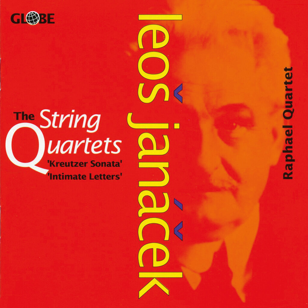
1992 – Design Connection, Globe CD-cover
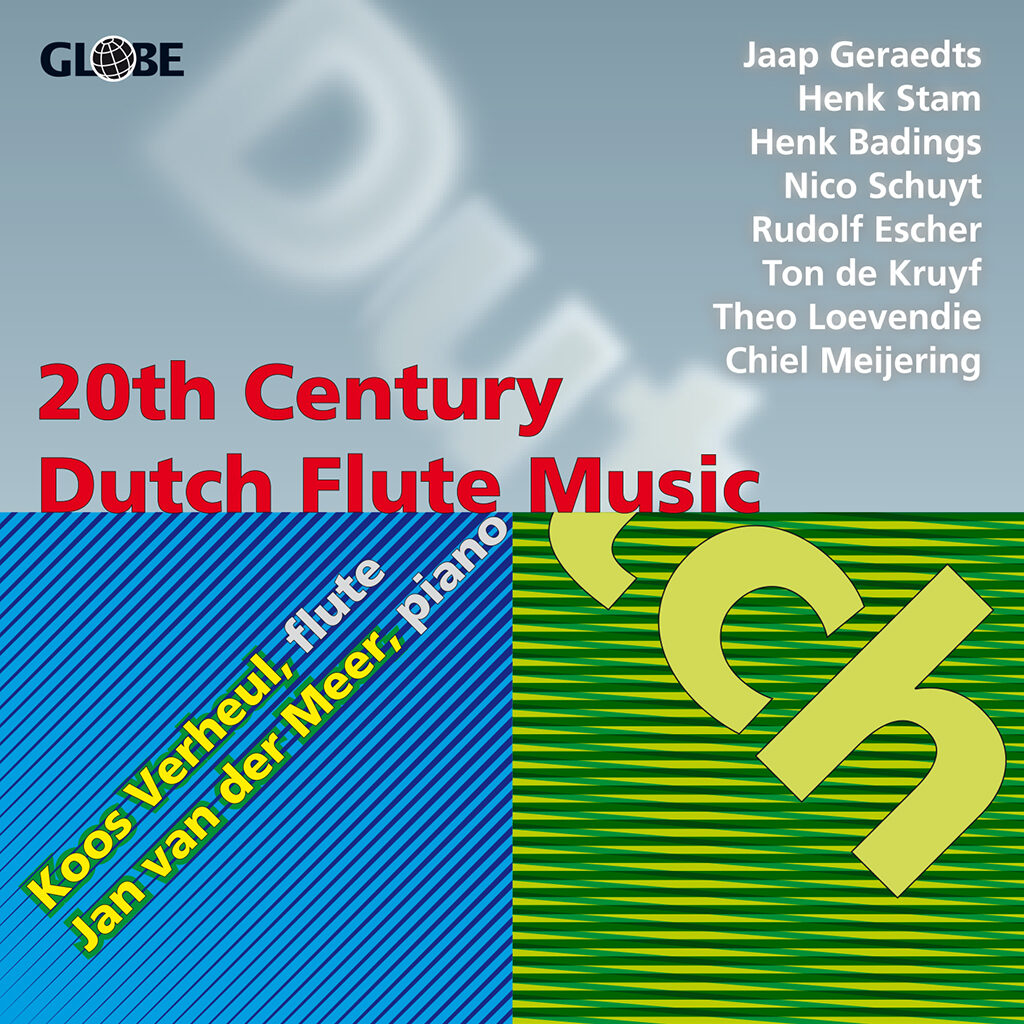
1993 – Design Connection, Globe CD-cover
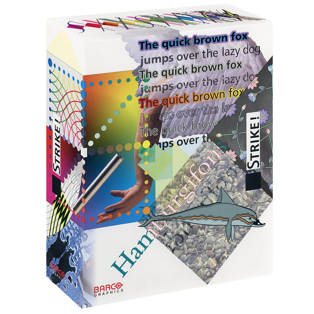
Then follows Globe, a record company specializing in classical music. He will design hundreds of very typographic CD covers for them; they allow him no more than one day to deliver, but he loves the creative freedom he’s granted. Then the project of his dreams arrives, from Belgium, via Barco Graphics. The client is graphic innovator Frank Adegeest who wants Frans to design packaging, advertising and brochures for Strike! and Creator, two design and pixel manipulator software packages that are far ahead of Adobe and elaborate on the Aesthedes.
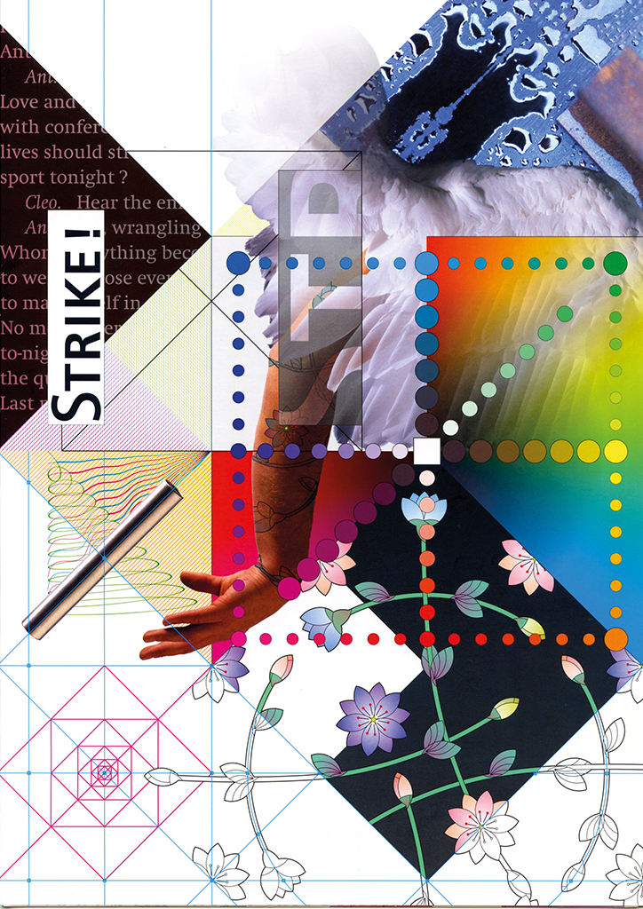
1996 – Design Connection, Barco Graphic
Cover Strike! brochure / Detail Strike! brochure / Detail illustration Creator / packaging Strike!
1999-today Cascade
In 1999, Design Connection and Concepts Design (Robert Jan Hofhuis) merge; they will continue as Cascade visual communication. The new group grows quickly and soon needs a new organizational structure. Just as in the past at TD, Frans Lieshout has to work in a team, which threatens his individualism. His position as independent advisor and creator, the role he was allowed to play at TD, changes too: from now on he has to deal with the client’s prevailing and articulated demands. These come first, the designer’s opinion comes second. This approach doesn’t suit Frans Lieshout well, but he concentrates on the exploration of the given concepts and the extensive development of ideas put forward by his colleagues. He is the guard who keeps a watchful eye on consistency of details and ultimate perfection. His graphic expertise is also welcomed when basic factual documentation is needed, for instance in annual reports. His background as an old-fashioned typographer and his experience with strict grids come in handy. His account sheet designs for SNS Bank are a creative surprise: forms and texts are ‘turned round’ and adjusted to different target groups, for the first time also including youngsters.
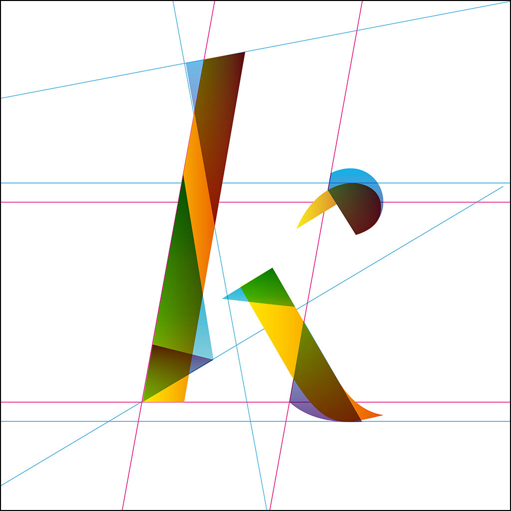
2017 – Letter designs
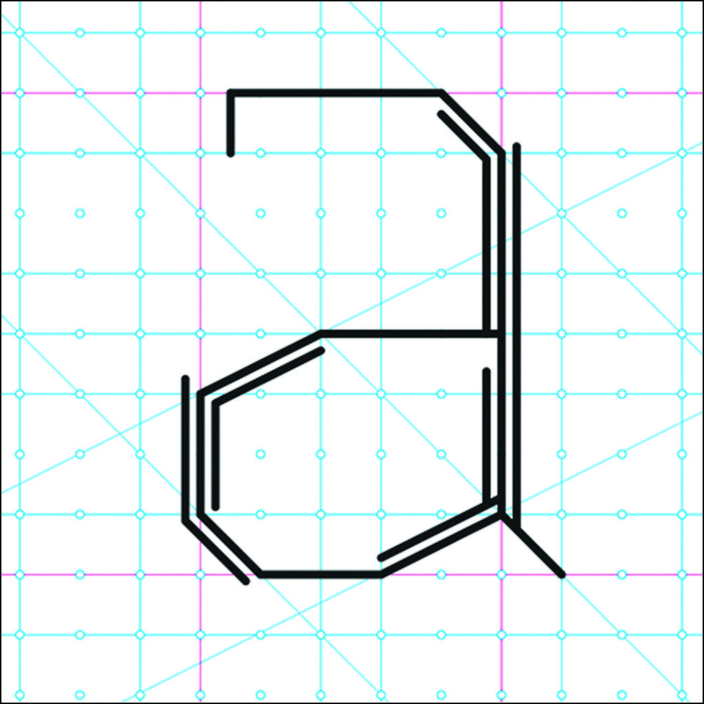
2017 – Letter designs
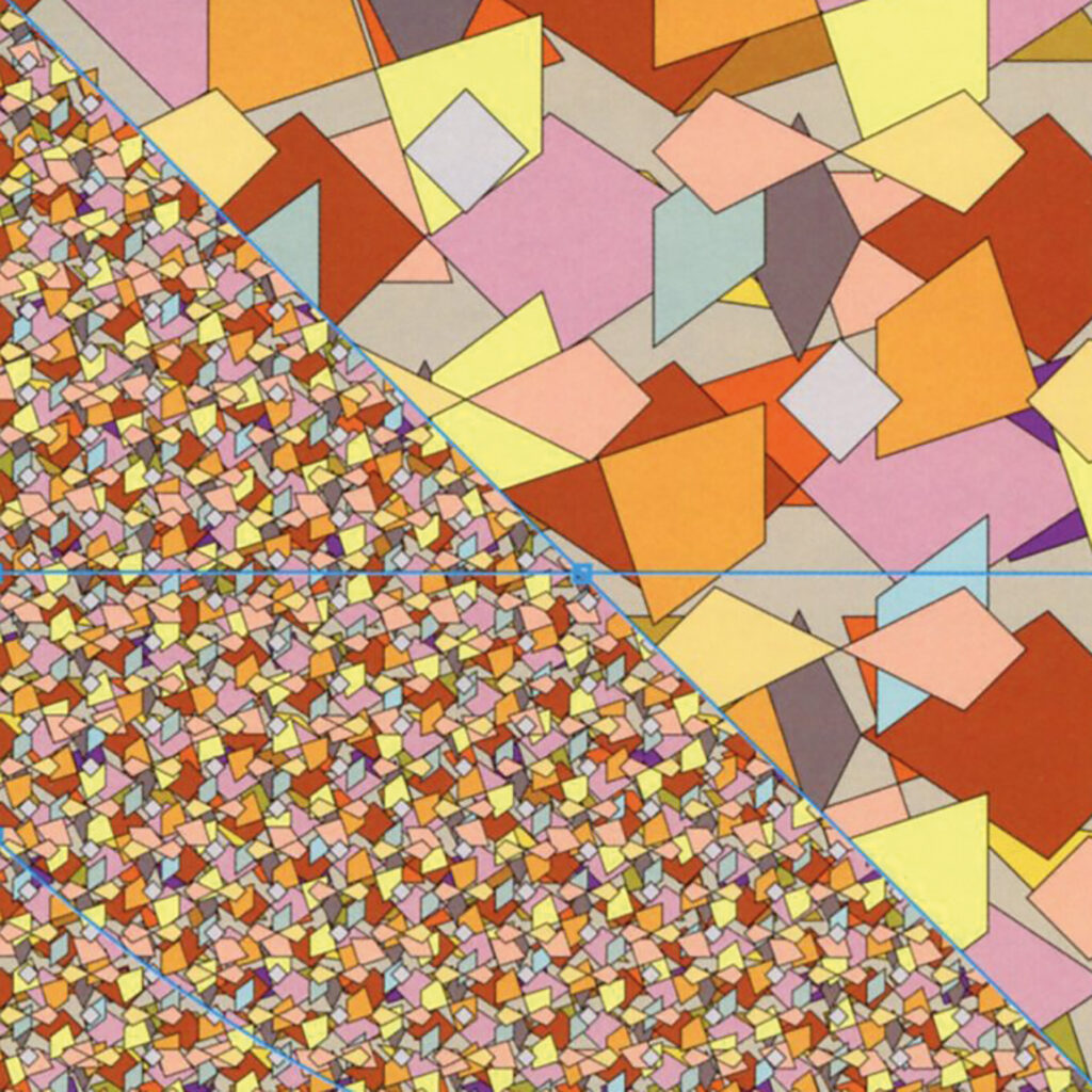
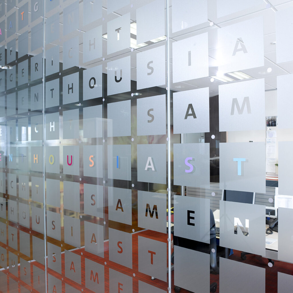
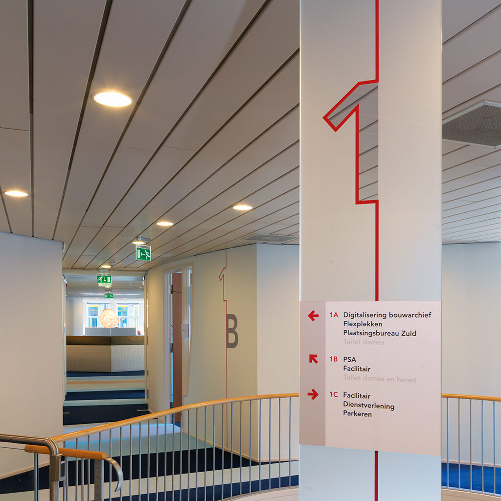
2015 – Cascade, Provincie Overijssel, Panorama Overijssel details and total visual
The development of a new identity program for the Dutch province of Overijssel gives him the opportunity to release his full creativity. The project will eventually include the signage system and glass facades of the Provinciehuis in Zwolle. The trust of the client and their good relationship allow him to keep pushing his boundaries. Experimenting with form, space, colors and transparency gives him new energy; he is allowed to skate over thin ice again (in his own words). In the end, the Provinciehuis offers the staff a wonderful home and the visitors a pleasant environment for doing business with the provincial government.
2015 – Cascade, glass visual Twentehuis design and detail

The design of entire environments will remain Frans Lieshout’s favorite professional pastime. He designs the offices of KNZB in Nieuwegein, the city of Venlo’s town hall, and offices of the OsiraGroep and Woonbron in Rotterdam. To the benefit of his Cascade colleagues he pairs passion for good design with the right intuition to create pleasant and efficient surroundings.
2008 – Cascade, OsiraGroep, glass decoration and signage headquarters
2010 – Cascade, Gemeente Amsterdam signage district south
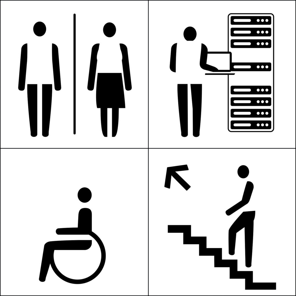
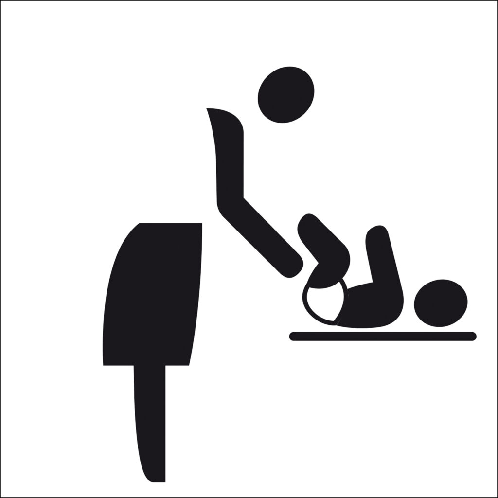
2017 – Cascade, Gemeente Venlo pictograms

2003 – Fli Design, Booyabase logo
2015 – Fli Design, Gerard Borkus logo
2017 – Fli Design, Marianne Vloetgraven logo

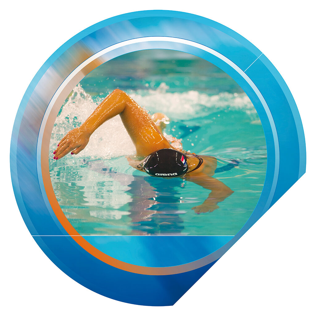
2015 – Cascade, Koninklijke Nederlandse Zwembond logo
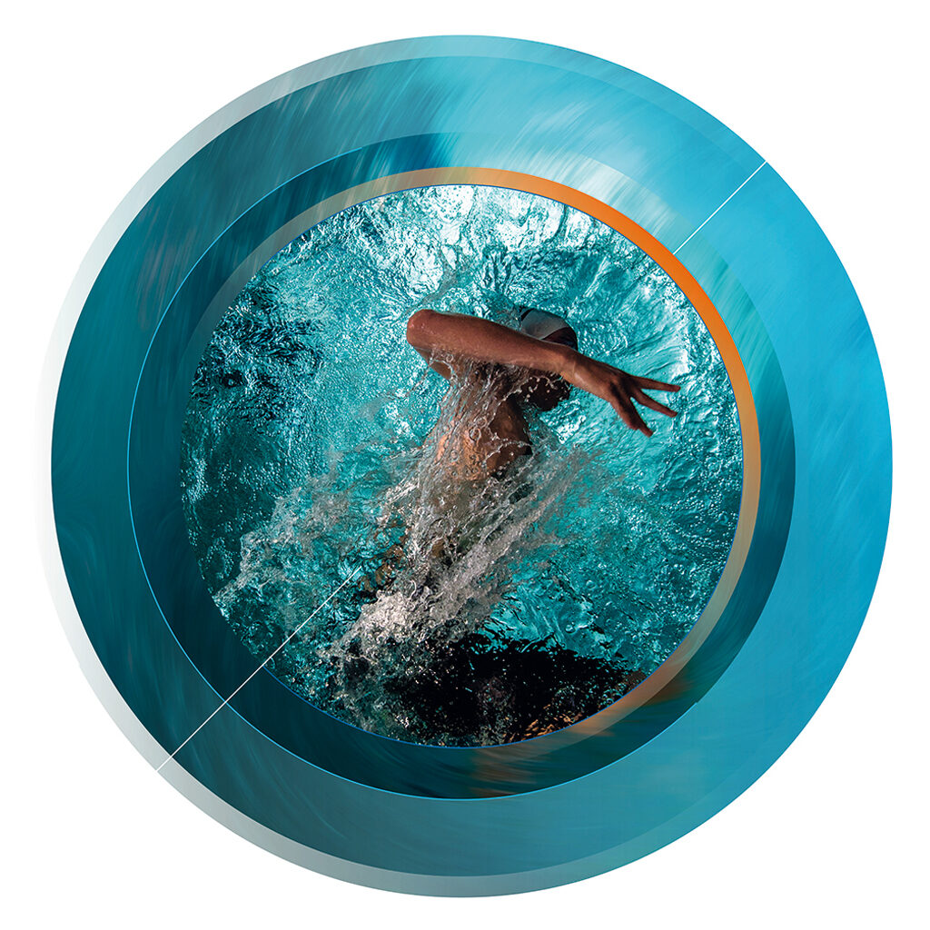
2017 – Cascade, Koninklijke Nederlandse Zwembond image objects
Own projects
Aside from Cascade, Frans Lieshout continues to be involved with freelance projects that give him all the creative freedom he desires. Most often he is chosen for his personal graphic style. In 2001, he meets his present-day wife, the actor Marianne Vloetgraven; she introduces him to the scene of actors, authors and painters. As a consequence, Frans designs an artist book for the painter Leo Schatz and collaborates with two poets, Machtelt van Thiel and Jos van Hest, to catch Schatz’s work in words and visuals. He loves what this new-found field can offer him as a designer. The Schatz book with the minimalist poems is colorful, multi-layered, and intriguing; the typography, his great love, is outstanding.
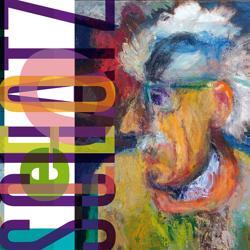
2016 – Fli Design, Foundation Leo Schatz, front of store special edition of art book, Leo Schatz ‘in ieder hoofd zit een ander hoofd’
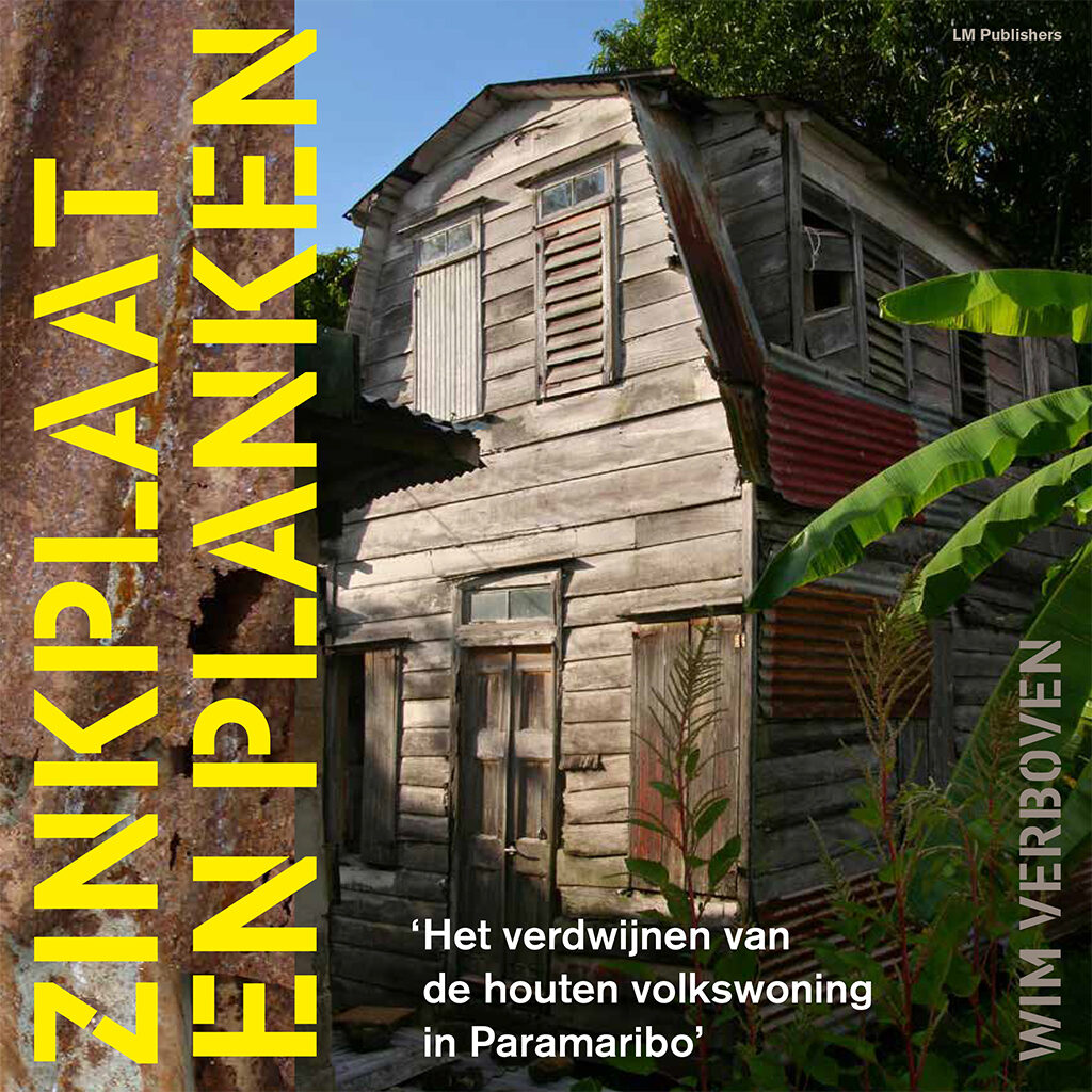
2016 – Fli Design, Front cover book Wim Verboven ‘Zinkplaten en planken’
2017 – Typographic painting
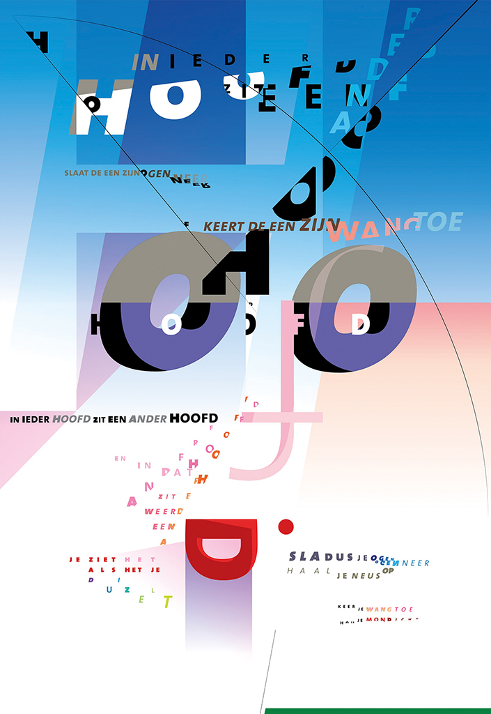
Poem ‘in ieder hoofd zit een ander hoofd’
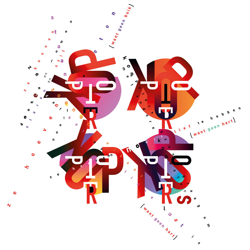
Poem ‘koppoters’
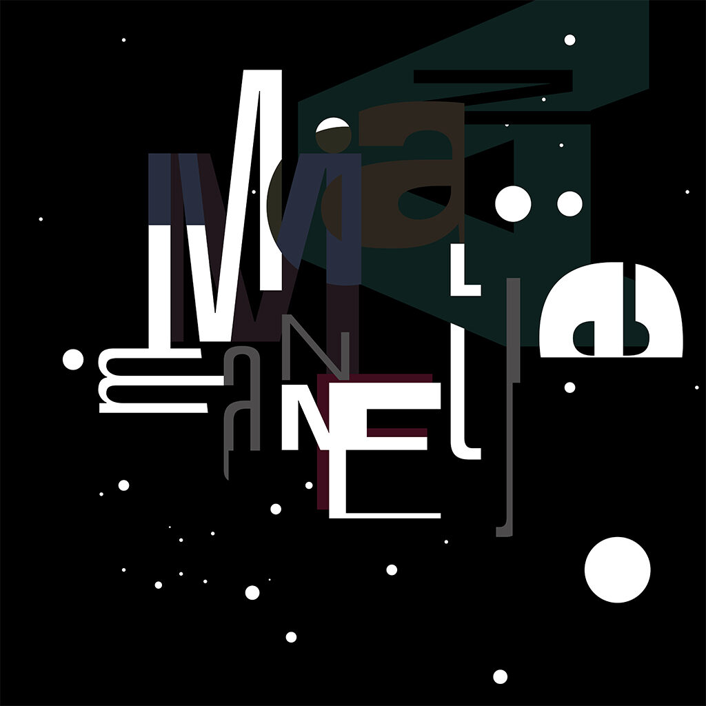
2016 – Typographic painting
‘Wat een wereld’
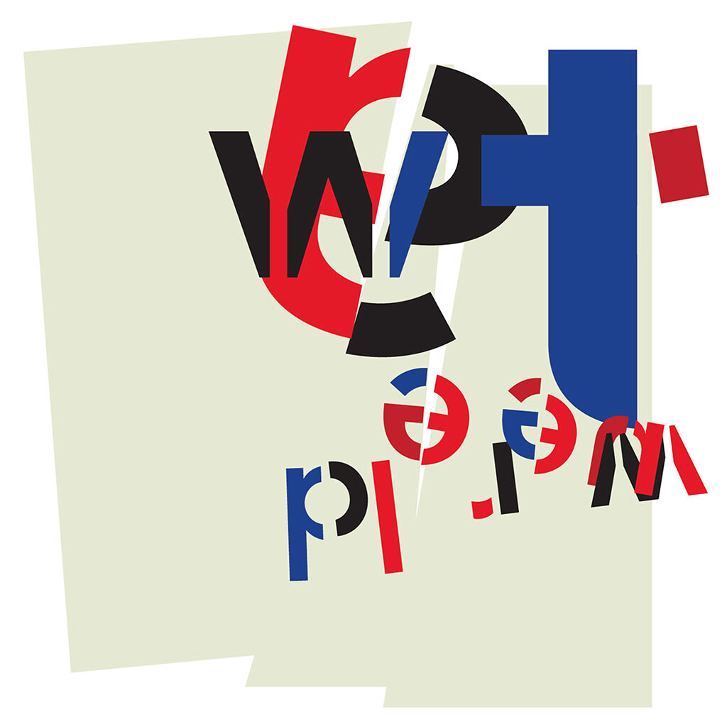
2017 – Typographic painting
‘Maanmannetje’
2017 – Typographic painting
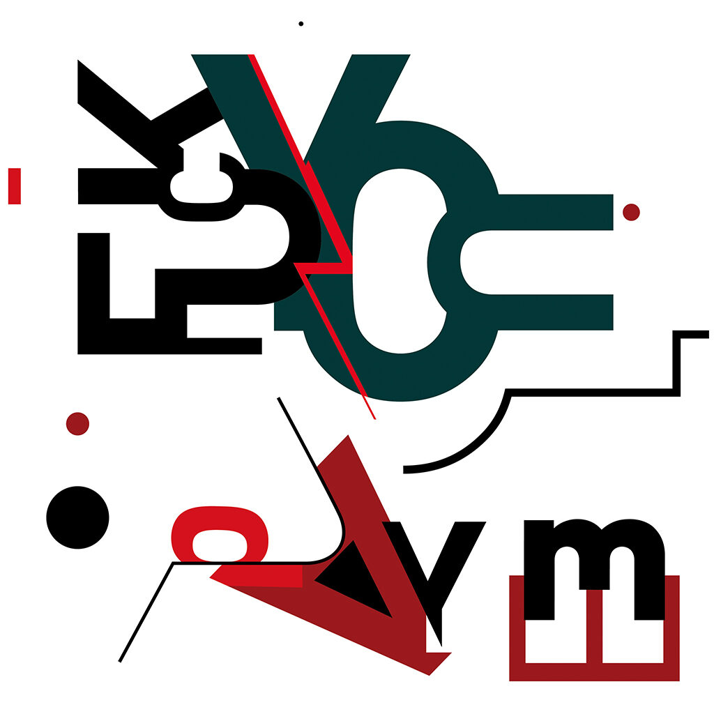
‘Fuck You Pay Me’

2017 – Typographic painting, poem ‘Dag’
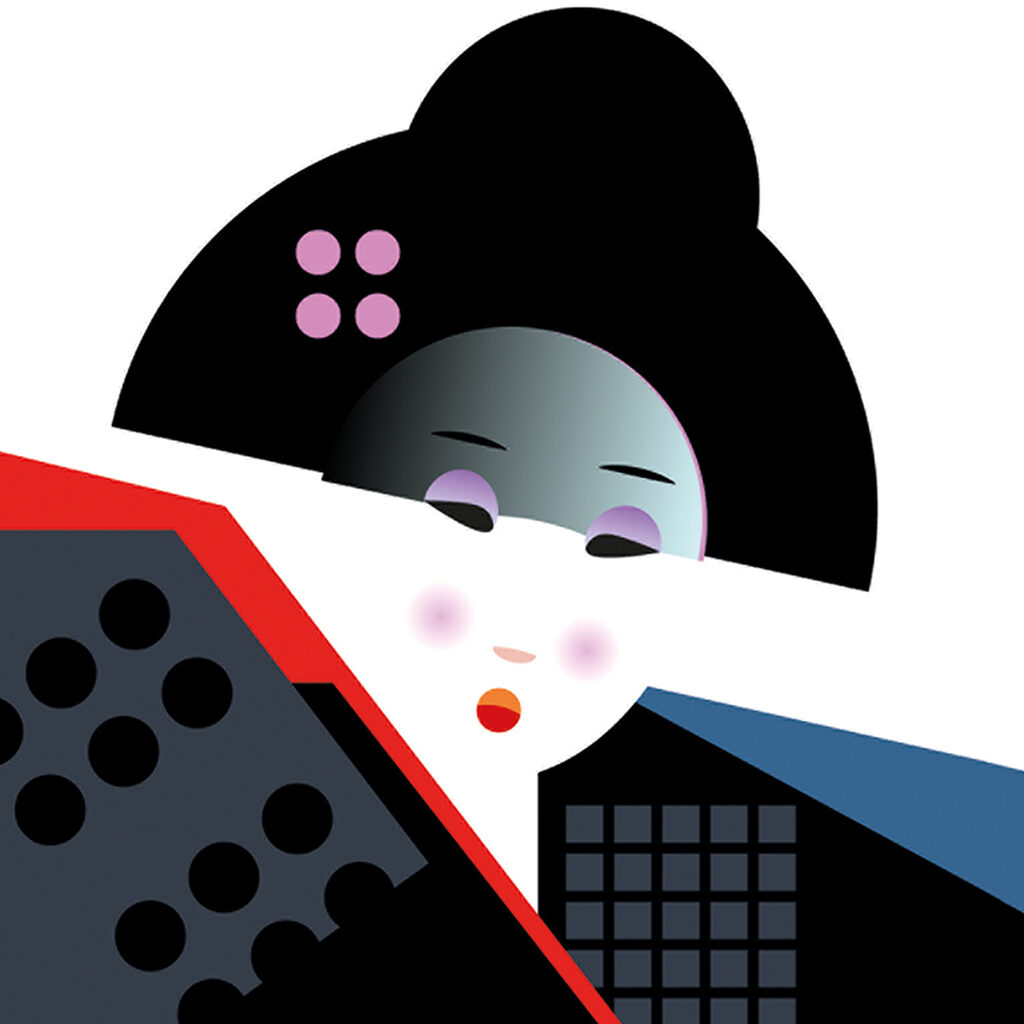
2018 – Geisha, free work
The success of the Schatz book inspires Frans Lieshout to build out his oeuvre with playful and enjoyable typography projects. He creates crystal-clear designs as well as exciting puzzles. He ‘paints’ with letters and, clearly, readability hasn’t the highest priority; the process seems to be more important and fascinating than the final product. The words his letters form are of secondary importance, because letters have an individuality of their own and, just like words, are more than providers of information: they please the eye. His freelance work leads to many group and solo exhibitions, with Artemis Amsterdam, Sopit gallery, in the city of Castricum’s town hall, and in tHUIS aan de Amstel. And it can be seen at Flidesign.nl.
2018 – Typographic painting, work in progress
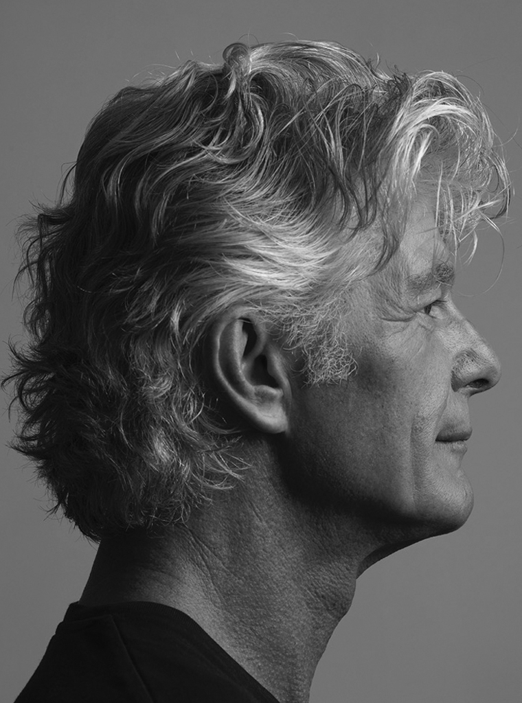
Frans Lieshout
born on 21 August 1956, Hoorn
Author of the original text: Jeroen van Erp, October 2018
English translation and editing: Ton Haak
Final editing: Sybrand Zijlstra
Portrait photo: Aatjan Renders