Despite the advice of one of his early teachers at the Institute of Printing Technology in Utrecht, who strongly recommended that he should not apply to an art academy – “it would be much too difficult to be accepted” – Henk decided to apply to several art academies in Holland the very next day. As the story has unfolded, it seems as if this was not a bad decision.
Henk van Assen is a graphic designer who was born on a houseboat in Hattem, Gelderland, The Netherlands, in 1961. He has lived and worked in the United States since 1991 where he has developed a well-respected practice for predominantly cultural clients and works on a range of design projects, from books to brand identity to print to physical spaces to screen.

Houseboat in Apeldoorns Kanaal, Hattem, where Henk was born in 1961
Much of Henk’s childhood was spent in Hattem. Growing up in a small town on the water, with his brother Johan and sister Thera, included many rowing trips on the nearby Ijssel. In later years, the family moved into the former bakery building owned by his grandfather. His mother, Riet de Jong, was a homemaker and administrative assistant at a local school and his father, Jan Willem van Assen, was a baker, factory worker, and self-educated artist who made oil paintings, watercolours and linoleum prints. In this setting, as an unwitting observer, he grew up surrounded by art. His father spent most of his free time painting so Henk was exposed to the making of art, visiting museums, and meeting numerous artists who were invited into the family home.


Oil paintings, watercolors and lino printing, made by Henk’s father, Jan Willem van Assen

Jan Willem van Assen: Een onstuimig talent. Catalogue for an exhibition in the Voerman Museum, Hattem, 2016. Design: Henk van Assen
Correspondence Courses
In the 1970s while still in high school, Henk’s interest in drawing and the graphic arts – particularly maps – emerged. During his subsequent military service, he enrolled in a correspondence course called Commercial Drawing, which prepared students for work in advertising and the printing industry. It was a correspondence course that was offered by TELEAC, an educational company. This became his first step in formalizing his emerging interest in graphic design (a term that was rarely used at the time). Upon his discharge from the Dutch military’s then mandatory service, he worked on the barge, Festina Lente, sailing up and down the many canals and rivers of Holland, Germany, and Switzerland. He recalls humorously an occasion in which he annoyed his captain when, in the middle of night, he was ‘caught’ doing Rotring ink pen exercises instead of getting the sleep required for his next day of hard labor.


Dutch Army 1980-82. Sailing on the Rhine as shipmate, 1982
Between 1981 and 1984, while Henk worked as a truck driver delivering parcels across Holland, he expanded his interest in the graphic arts by taking evening courses at the Institute of Printing Technology. These courses contributed to his decision to take the idea of a professional education a bit more seriously so he ultimately applied to several Dutch art academies. He was accepted by the Royal Academy of Art (KABK) in The Hague in 1984.
Education at the KABK
As a student at the Royal Academy between 1984 and 1988, Henk studied with many inspiring instructors included the distinguished typographers Gerrit Noordzij† and Reynoud Homan. After his foundation year, his interests migrated towards calligraphy, font design and ultimately, to more complex typographic and editorial projects. His persistence led to him graduating Cum Laude in 1988.

Sketches for the Senior project at the KABK. Above right: a hand-made poster for an imaginary identity, representing publisher Veen/Reflex.

Compilation of photos in different classes at the KABK, 1986-1988. With, among others, Mary Bentham, Angelique Hinderink; Bart Konings; Dik Klut; Jeroen van Pelt; Karen Polder, Peter Verheul, Colette Lacoste, Maarten Evenhuis and professor Alfons van Heusden (Illustration). Most pictures by Bart Konings
In addition to learning from his teachers, he also benefitted from becoming roommates with Peter Willberg†. Peter came from a long tradition of German designers/teachers including Hans Peter Willberg and Walter Breker, known for his Kieler Woche posters. The influence of Peter, who took design and studying very seriously, had a great impact. In the Summer of 1985, Peter’s father facilitated an internship for Henk at the German printer Weißbecker in Frankfurt where Henk learned many technical aspects of the printing process.
A few memorable moments at the Academy include: receiving an initial ‘F’ for the final project in Gerrit Noordzij’s class because there was no title on the book cover. Luckily this was rectified when Noordzij examined the actual contents and appeared more pleased with the final result. And in 1986, a representative from Apple came to one of his classes to show the potential of one of the first Apple computers. To this day he remembers thinking, after seeing heavily pixelated Garamond letterforms on the screen, that this development in font design would go nowhere. He now sees that early investment opportunities in Apple stock were missed by a great margin. Other fond memories include working in letterpress and silkscreen which were, at that time, the only way to make large posters. He also recalls ‘hanging out’ in the basement cafeteria with his classmates, several of whom are still friends. And waking up on the roof of the school after the graduation party which had begun in a Scheveningen strand tent!

Gerrit Noordzij with students and visiting critic from Japan, 1986


Interest in typeface design. Above: sketches and hand-painted lettertypes for Gerrit Noordzij’s course. Below: furthering the concept, using digital software, for graduate studies at Yale University.
First work experience
During the years 1988–91, Henk, now a formally-trained graphic designer, participated in internships (stages) at Total Design, Hard Werken, and with Reynoud Homan, where he gained professional experience on a wide range of projects. Total Design had just moved to new offices on the harbour side. Their studio was ultra-modern and professional. Henk worked on Ben Bos’s team doing work for Randstad and on a variety of other small-scale projects. He remembers being admonished by Mr. Bos, as he and another intern had put their names as credit on a small flyer for a not-for-profit organization. Too much ambition was frowned upon. Hans Brandt became a director at that time and even Wim Crouwel made occasional appearances. Through the influences of his education and internships, Henk’s work began to take on the qualities of late Dutch modernist graphic design, as descended from Piet Zwart and the De Stijl movement – characterized by the use of simple geometric forms, primary colors, and abstract, pared-down aesthetics – even if he may not have been conscious of this evolution. It was also the time when Total Design had started using its first computer to help with design – the Aesthedes. It took up a complete room and was operated by three people. Henk was invited to design a certificate for Randstad, his first exposure to computer-aided design.

Randstad training certificate. Created with Aesthedes computer during internship at Total Design, 1988
At the other end of the spectrum, his internship with Hard Werken, the ‘bad boys’ from Rotterdam, was also impactful. Everything was different in that office, including the bicycles in the hallways. Henk was on Rick Vermeulen’s team. They designed a lot of book covers at that time. He also fondly remembers the lunches with food provided by the studio (brood, hagelslag, kaas enz). He recalls that Gerard Hadders had an interesting personality and would ask provocative questions to all of those assembled around the table, including the interns, on subjects and concepts that would make you think. The evident differences in design philosophies between Total Design and Hard Werken helped him realize the importance of creating designs that had a sound structural form yet also included a healthy dose of visual expression mixed-in – a principle he still adheres to.
Reynoud Homan ultimately offered Henk a job, and instilled in him an everlasting passion for the designing of books and the importance of understanding the larger system of a design while not ignoring the numerous smaller details that were also part of the ‘scheme’. For the next two years, he worked in Amsterdam’s De Hallen which was then still a wholesale food market. He recalls it as a great working environment. Homan, already a well-known book designer at the time, created numerous high-end book projects for major museums and organizations throughout Holland. Being part of meetings and other events gave Henk a first impression of the world of ‘culture at large’. In one of his first client meetings at Homan’s studio, Henk was so excited ‘in the moment’ that, subconsciously, he whistled throughout the meeting. Homan asked him afterwards if this was a common habit and suggested that, moving forward, he delay this particular activity until after meetings were over. In those days, it was also very common to be ‘on press’ while books were printed so he was able to gain exposure to the printers Rosbeek, Veenman, Lecturis, Spruyt, Rob Scholte – some of the accomplished book printers of Holland at the time – while learning more about printing with each visit.
Further studies in the United States
During his two years with Homan, however, an increasing desire for further study kept nagging at Henk so, with the enthusiastic support of Homan, he applied to graduate programs in the UK, Switzerland, and the US (in the late eighties, there were few graduate programs available). He was accepted at Yale University School of Art, in New Haven, Connecticut, and entered its MFA program in 1991. While there he studied with the newly-arrived Sheila de Bretteville; Michael Rock (a principal of 2×4); Chris Pullman, who was at the time also Vice-President for Design and Branding at Boston’s WGBH, a prominent American public media entity; and former Yale University Printer, John Gambell, who instilled in Henk a deep love for the micro-details in typography. He also took classes with Michael Roemer, the German-born American film director, producer and writer, and acknowledges Roemer as someone who influenced his ideas on visual narrative and movement. Oddly enough, the design legends he thought he would be studying with at Yale, including Paul Rand and Armin Hoffman, had all departed due to the arrival of ‘the new kid on the block’, Sheila, but in retrospect, the new and younger cohort of teachers were a much better fit for the program as they introduced many new elements to the curriculum – including the value of rigorous research – that had been missing from the program before her arrival.
At the time, the design program was housed in a small nineteenth-century faux gothic red brick building but many classes took place in the adjacent Rudolph Hall (designed by architect Paul Rudolph and completed in 1963 as the ‘Art and Architecture Building’).


Left: Yale campus. Right: the Yale Art and Architecture building, designed by Paul Rudolph

Henk during graduation with Sheila de Bretteville, Michael Rock, and John Gambell
Simultaneously, a ‘Dutch invasion’ of sorts began during those years. Henk was asked to formally invite Irma Boom, in 1992, while she was in New York for the opening of an exhibition organized by Ellen Lupton, Senior Curator of Contemporary Design at Cooper Hewitt, Smithsonian Design Museum in New York. During Irma’s subsequent annual visits to Yale’s MFA program, there would be a dinner or drinks to go over the latest developments in the Dutch design scene. In later years, the same would happen with Karel Martens, Linda van Deursen and a number of other graphic designers from Holland who would all make an appearance in New Haven.

Henk (in back) with his MFA class mates visiting Paul Rand, who had withdrawn from the MFA program in 1991.


Left: Chris Vermaas visiting the MFA program, conducting a workshop, 1991. Right: Henk with Irma Boom, singing karaoke in Norfolk, Connecticut for the annual Fall retreat with MFA students, 1992
From the start, Henk noticed a significant difference between the teaching of design at the Royal Academy in the Hague and a liberal arts university like Yale. At KABK, much of the focus had been on making actual ‘design’, while at Yale, the focus on research, conceptual development, cultural history, and developing a personal voice and signature was more prevalent. His 1993 MFA thesis at Yale, “Visual Flow: Cinematography and Graphic Design,” explored the relationship between cinematographic techniques in filmmaking and sequentiality in printed materials. His research focused particularly on the work of Alexey Brodovitch (former Art Director at Harper’s Bazaar); Marshall McLuhan’s The Medium is the Massage, designed by Quentin Fiore; and Sergey Eisenstein, the Soviet film director, screenwriter, film editor and film theorist most noted for his groundbreaking silent film, Battleship Potemkin (1925). Of course, Eisenstein’s Theory of Montage, which revolutionized filmmaking by demonstrating how editing could be used to create new meanings and evoke emotional and psychological responses, has influenced many designers and filmmakers. The Yale experience introduced new elements, both educational and technical, to Henk’s world of graphic design. With access to the voluminous library and museum collections of Yale, e-mail available only as an unstable call-up service and the internet barely a blip on the radar screen, Henk now looks back: “It all felt quite new and exciting.”


Research sketches, exploring visual sequence in print

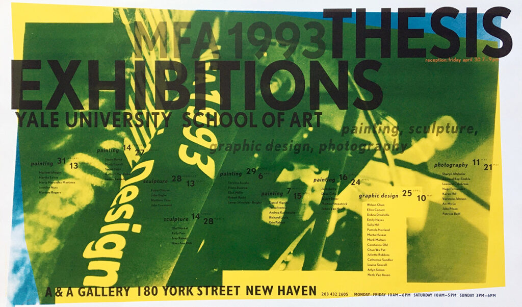
Poster for an exhibition of first year MFA-students. Silkscreened on a map of New Haven


Freelance design while studying at Yale University
First steps as a teacher
In 1993, Henk moved to New York. The city – to this day – has proved to be a hub of inspiration and momentum. He first worked as a freelancer at Lippincott and Margulies, a large corporate identity agency, and then at Eric Baker Design and FGI Inc. He also began his teaching career, first with the School of Visual Arts in New York and then, with the University of the Arts (UA) in Philadelphia. The curriculum at UA was especially watertight having been developed by well-known designers from Europe like Hans Allemann, and the American, Ken Hiebert, who had studied under Armin Hofmann, Emil Ruder, and Kurt Hauert at the Allegemeine Gewerbeschule Basel (AGS), in the ‘Fachklasse für Grafik’ (Basel School of Design, Class for Graphic Design). As a budding educator, it was reassuring to have the program philosophy in place which allowed him to teach his first courses within a proven structure.
Henk was then invited to teach at the University of Texas, Austin where he lived for what turned out to be four years. This was the first time he realized education could become an important part of his working career. With little freelance work in his first two years in Austin, he had time to further explore how to teach, in addition to what to teach. UT colleagues Edward Triggs, Dan Olson, Miodrag Mitrasinovic, and Katie Salen were instrumental in cementing the fundamentals of working with students in a large university setting.

Adapting to the “cowboy-culture” in Texas. Houston Rodeo, 1998
In 1999, Henk moved back to New York after accepting a position to teach in the graphic design program at Yale. [1] The program, established in 1950 by former Bauhaus master Josef Albers after he and his wife Annie had left Black Mountain College, is still considered one of the leading design programs in the US. In those days, Henk was splitting his time between New York and New Haven, working out of his East Village apartment in Manhattan while teaching at Yale. In 2004, Henk moved his studio to DUMBO, Brooklyn where it has been ever since, operating finally as HvADesign. [2]


HvAD studio in DUMBO, Brooklyn. View on the Manhattan Bridge, and interior of the studio
His own studio
At HvADesign, Henk (and his many team members over the years) have worked on numerous projects spanning the worlds of print, environmental, spatial, and screen-based media. With clients from the cultural, publishing, innovation and educational sectors, projects have ranged from brand identities and book design to website development and exhibition graphics.
Throughout his years of practice, book design has been one of the central pillars of his studio. At rough count, the studio’s production has included well over 200 books. Drawing on his studies, first at KABK, and then at Yale, and the work experience gained – particularly at Total Design, Hard Werken, and Reynoud Homan, and informed by the ‘macro and micro’ of book typography which he developed during his studies with John Gambell – Henk’s ongoing interest in grid structures and the sequential articulation of visual materials became the signature elements in HvADesign’s creation of publications for the cultural sector.
[Re]Reading Perspecta (MIT Press, 2004), an anthology of 50 years of Perspecta, the annual publication of Yale’s School of Architecture – a 1,000-page anthology – essentially created the studio as it quickly became that support was needed to implement the design concept over so many pages. Amanda Bowers and Sarah Gifford, then graduate students, were the first employees at HvADesign—and were followed by many more over the decades.


Book design, cover and selected spreads spreads from [Re]Reading Perspecta, 2004
Given his initiation to the arts as a child, it’s no surprise that he ended up working for art galleries and museums. His clients have included Yale University Press, Acquavella Gallery, Guggenheim Museum, New York Public Library, Museum of Fine Arts, Houston, FotoFest Houston, Rizzoli Publishing, California Museum of Photography, Zwirner Gallery and Royal Canadian Academy of Arts. Over a period of fifteen years, HvADesign has created most of the art catalogs for Acquavella, and publications for Zwirner, Pace, Mirviss and DiDonna galleries. In the studio’s work for the Museum of Fine Arts, Houston, HvADesign has designed many of the catalogs for its Latin American Department.


Selection of recent book design for a range of museums and publishers

Selection of recent catalogs for Acquavella Galleries, 2012-2026

Selection of recent catalogs for the Museum of Fine Arts, Houston, 2000-2026
A book design is an accumulation of decisions that impact textual and image content, as interpreted through the possibilities of grid application, sequencing, color, typography, contrast, interval, cropping, use of materials and, ultimately, printing and binding. In his publication layouts, his overarching interest is in the book as a three-dimensional object. The tactile qualities and materiality of cloth and paper and any additional elements that may enhance the ‘reader experience’ have been uniquely applied by HvADesign to many award-winning books during his years in the United States, and although published within the conventions of ‘the American publishing scene’, these works still express elements of the Dutch graphic design tradition of which Henk is certified member.

Selection of spreads for Ed Ruscha: OKLA

Customized dust jacket for the Spanish version of Untangling The Web: Gego’s Reticulárea, MFAH ICAA, 2007

Catalogue for the FotoFest Biennial 2016. The graphic identity has been applied to the fore edge of the book
In addition to book design, his studio has designed a number of exhibitions for clients including the New York Public Library, The Schomburg (Center for African-American Studies) and the Museum of Photography in Riverside, California. Most recently, HvADesign completed a remarkable exhibition design for the Museum of Photography titled Digital Capture: Southern California and the Pixel-Based Image World, an impressive exhibition that spans six decades (1962–2020s) and investigates the history and creative uses of digital imaging technology – from the Cold War and space race of the 1960s – to the ubiquity of digital media in our contemporary world.


Graphic identity for the exhibition Digital Capture – Captura Digital.


Selection of designs for exhibitions at the New York Public Library and the Schomburg Center for Research in Black Culture
A third pillar in the studio’s practice is visual identity projects for organizations and event campaigns.

Selection of (typographic) logo’s, 2005-2025


Identity for the Center of Collaborative Arts and Media, New Haven, Connecticut, 2018


Selection of prints work for a range of exhibitions
For FotoFest Houston (co-founded by Wendy Watriss and Fred Baldwin, and now directed by Steven Evans), Henk has designed their Biennial campaigns since 2006 and is currently working on designing the materials for the 40th anniversary of the organization.

Logo designs for FotoFest Biennials, 2008-2026


FotoFest Houston Biennial campaign 2020, published by Schilt Publishing, Amsterdam


FotoFest Houston Biennial campaign 2018, published by Schilt Publishing, Amsterdam
Over the years Henk has worked on a number of Yale School of Art exhibitions at the school’s Green Hall and adjacent Edgewood Gallery – particularly under the tenure of Dean Robert Storr, a former senior curator at Museum of Modern Art – including most of Storr’s posters and exhibition identities.


Posters for a range of exhibitions at the Yale School of Art, 2006-2016
Since 2020, he also worked on a number of projects with artist/designer Robert Tombs, President of the Royal Canadian Academy of Arts in Ottawa, Canada. It started with an invitation to Henk to give a lecture about Dutch graphic design on the 75th anniversary of the liberation of Holland by Canadian and other military troops at the end of the Second World War. This momentous historic event became an opportunity to develop a talk titled “An Enduring Influence: Dutch Graphic Design from the 1940s Resistance to the 1990s Internet.” The talk began with the war resistance work of Willem Sandberg and even included cautionary flyers urging Dutch women to be wary of Canadian soldiers! The on-line talk, which was introduced by the Dutch Ambassador to Canada, Innes Coppoolse, drew numerous viewers from Canada, the US, Ireland, France, Norway, The Netherlands, Germany, Italy, Greece, Brazil, Australia, and the Cook Islands.[3]
Since this presentation, Henk has collaborated with the RCA on a number of exhibitions and publications including art+language: Contemporary Korean Graphic Design; Ghost Stations: Amanda Dawn Christie, & Radio Canada International; Marina Roy, Jinny Yu & the Painted Object; pasapkedjiwanong: Mary Anne Barkhouse and Olivia Whetung; New Topographies: Leslie Reid and Barry Pottle; and Text Heavy: The Art of Type Design by Nick Shinn.


Posters for a range of exhibitions at the Royal Canadian Academy of Arts, Ottawa, Canada, 2022-2025
International workshops
Of equal importance to Henk’s design practice is his teaching, both to students at Yale and conducting workshops. For more than 15 years, Henk has conducted numerous workshops internationally, particularly in China, where he has visited many art schools and universities. Most of his teaching focuses on typographic projects and, in a way, things have come full circle as he still teaches some of his early letter-writing exercises – learnt while in Gerrit Noordzij’s class – to a wide range of students internationally who seem to enjoy such hand-built processes thoroughly, especially after the digital onslaught we have experienced over the last thirty years. He is also a regular visitor to the Universidad de Monterrey in Monterrey, Mexico and has done workshops and lectures in the US, Canada, Israel, and Serbia. He is also a co-founder, together with Tamar Many, of MindState, an organization that facilitates collaboration workshops, partnering with industry, designers, and MBA and Tech-innovation graduate students.


Internationale workshops. Clockwise: Nanshang, China; Shanghai; Tel Aviv, Israël; Monterrey, Mexico. A selection of posters to announce different workshops

Poster for a lecture on Dutch graphic design in Monterrey, Mexico, 2024. Design: Henk van Assen
To offset a serious bout of homesickness for Austin after moving back to NYC in the late nineties, he started a project with Dan Olson to document the typography of ranch gates throughout the South West. Over a number of years, comprising thousands of miles traveling throughout Arizona, Colorado, New Mexico, Nevada, Utah, Texas, and Oklahoma, they photographed over five hundred different ranch gates, focusing on each’s vernacular typography. The gates were put together by farmers and ranchers who likely had little art or design knowledge. Despite their naivité, or perhaps because of it, many delightful results were found. Over 100 photographs of these examples of ‘found typography’ were reproduced in the book Ranch Gates of the Southwest, published by Trinity University Press in 2009. The publisher’s promotional narrative states: “From rugged and functional to stylized and adorned, ranches with names such as F. V. Cuahope Ranch, High Lonesome, Felix River Ranch, and Rancho Quatro Hermanas reveal cultural history, landscape features, and individualism through language and design. Lucy R. Lippard’s introduction offers historical and cultural context of ranches and their gates. Landscape architecture professor Kenneth I. Helphand explains the environmental history of ranches from land appropriation and naming to the impact of gates on the landscape. In their own essays, Olsen and van Assen tell the behind-the-scenes story of making the book and describe type design and language from their perspectives as designers and photographers. Ranch Gates of the Southwest is both a sumptuous documentary record and a tribute to a quintessentially American symbol.”


Ranch Gates of the Southwest, published by Trinity Press, San Antonio, TX, 2012
In another side project, Henk was invited by some of his former undergraduate students, who had started a not-for-profit organization (14 x 48) to fill empty billboards in NYC. They asked him to create a billboard in Queens, the New York City borough with one of the most ethnically-diverse populations in the US. Henk’s design concept was one advocating mutual respect within the community.

Billboard for 4 x 18, an Arts organization, filling empty billboards in NYC with art and design
‘Practuation’
His multiple and varied involvements with education notwithstanding, Henk has maintained a steadfast commitment to his practice. As principal and creative director of HvADesign, “a multidisciplinary design studio,” he prides himself on exploiting the synergy between education and practice, sometimes referred to in his lectures as “practucation.”
Although Henk’s studio is still in NYC, he currently lives in Haddam, Connecticut (‘Orange Acres’ in a nod to Henk’s Dutch roots), with his wife, Melissa Liles, an international education specialist and founding director of IDD (Institute for Developing across Differences). Recognized in the US as a skilled teacher and award-winning graphic designer who imparts to new generations of students and clients alike, a passion for research-based graphic design processes and, in particular, the never-ending joy of expressing content through typography in all its amazing forms. Admittedly less-well known in The Netherlands, Henk is nonetheless a practitioner within the tradition that has made Dutch Design a quantity and quality so well-known throughout the world. And at 64, he has no inclination to stop designing…
At the time of this writing, he is in his 26th year of teaching at Yale and his 12th year at Parsons in New York City. His migration trajectory has become part of his identity as ‘the Dutch Boy’. It has been quite a journey, from skating the frozen canals of Holland (when they still froze) to the metropolis of New York and the faculty of Yale. Thankfully, Henk has retained a vibrant sense of humour throughout his somewhat epic trek, and a sense of humility, which has made him a much-sought designer and beloved teacher throughout the US and beyond.
Henk is recognized in the US as a skilled teacher and award-winning graphic designer. He imparts to new generations of students and clients alike a passion for research-based graphic design processes and — in particular — the never-ending joy of expressing content through typography in all its amazing forms.
—Robert Tombs
President, The Royal Canadian Academy of Arts; Artist; Designer

Melissa Leone (designer at HvADesign) with Henk during the installation of a pop-up exhibition for Brooklyn Center of History. A former Newsstand on a subway platform, reconstructed for a temporary exhibition, East New York (Brooklyn), 2025

Frida, The Making of an Icon, Museum of Fine Arts, Houston, January 2026. Catalogue designed by HVADesign (Henk van Assen and Melissa Leone)
[1] art.yale.edu/about/study-areas/graduate-study-areas/graphic-design
[2] hvadesign.com/studio
[3] youtube.com/watch?v=r69zGuaBAuE
Henk van Assen
born on 8 July 1961, Hattem
Author: Robert Tombs, January 2026
Final editing: Sybrand Zijlstra
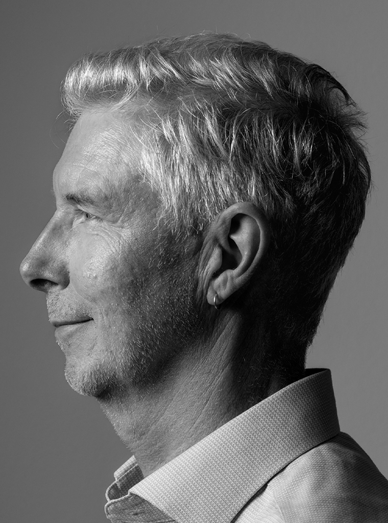
Portrait photo: Aatjan Renders