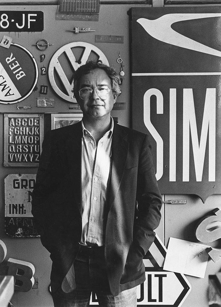
Kees Nieuwenhuijzen is a designer who does not spend much time theorizing about his profession. For fifty years, books have dominated his life, from literary paperbacks to photography tomes, but his oeuvre also includes architectural magazines, movie titles, posters and postage stamps. These different graphic products deliver proof of his meticulous professionalism and his joy at creating them.
Born in Utrecht on May 27, 1933, the young Kees Nieuwenhuijzen was not an easy one to handle. He had to double every grade in high school; it took him to age nineteen before he could conclude three years of HBS education. He applied for admission at the Instituut voor Kunstnijverheidsonderwijs (IvKNO – art & crafts school) in Amsterdam as well as at the The Hague art academy. The Hague was where he was accepted, a choice his parents agreed with because they had a friend in The Hague who could keep an eye on their son (their daughter Annet would also move to The Hague to act with Haagse Comedie). ‘Aunt’ Victorine Hefting was well connected in cultural circles. An art historian, she had been the director of Haags Gemeentemuseum, but in those days woman civil servants were still dismissed when they got married. Victorine Hefting and her husband, the famed publisher Bert Bakker, would be of great influence to Nieuwenhuijzen’s career.
The academy in The Hague
In The Hague, Gerard Kiljan had started an advertising design department in 1930; photography took a central position in the program. Nieuwenhuijzen decided to study there: “A profession one could earn an income with. Yet I knew at an early stage I wouldn’t really enjoy working for commercial clients. That was capitalism and I was too much left-wing for that.”
In his first year at the academy Nieuwenhuijzen, just as his father had expected, partied night and day. He had to double his first year. “But, because of my rather advanced age, I had to do my military service first. That’s how I lost two years. I was unfit to serve, had a hard time following commands, and had to do time in the brig now and then. One day, in a weekend, I went to The Hague for consultation with Kiljan. He showed faith in me. He found small design projects for me to do and, later, after I had restarted as a freshman, he allowed me to enter the second year after all.” Another design icon, Paul Schuitema, was also one of his professors. Schuitema and Kiljan were the ones who, together with Piet Zwart, had created the graphic face of modernism in the Netherlands.
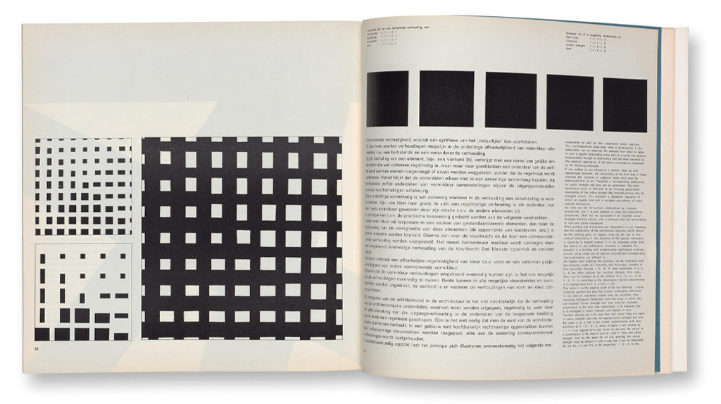
Schuitema and Kiljan were great teachers, remembers Nieuwenhuijzen. “Schuitema gave me a free range. Now and then my girlfriend and I joined him on a Saturday afternoon to paint from a model. Such a great guy he was, but not one to learn much from. Kiljan, though, was a born educator. Some thought differently and found him closed and difficult to work with. He demanded you worked according to a thought-through plan and remained critical about its implementation until the end. That’s how I still work. And I often ask myself, what would old Kiljan have said of this or that? He completely left us to our own devices – without any reference books. He did not even show us his own work. He spent hours explaining Itten’s color theory and set us to mix colors again and again. I kept many of my trials, they must be somewhere in my studio.” Nieuwenhuijzen graduated in 1958, the year a palace revolution would lead to J.J. Beljon being appointed as the academy’s director and Kiljan and Schuitema being removed from the department.
To Amsterdam and Jurriaan Schrofer
After graduating in The Hague, the ambitious Nieuwenhuijzen dearly wanted to work at printing house Meijer in Wormerveer. Meijer and Steendrukkerij De Jong & Co in Hilversum were the leading graphic industries. Meijer produced Range magazine for Philips and innovative photography books, for which Jurriaan Schrofer (1926-1990) coordinated different teams of photographers, illustrators and authors. Victorine Hefting and her husband were friends of Schrofer’s, and Nieuwenhuijzen was advised to talk to Schrofer first before applying for a job in Wormerveer. Schrofer asked him to become his assistant. It was the start of his career as a book designer.
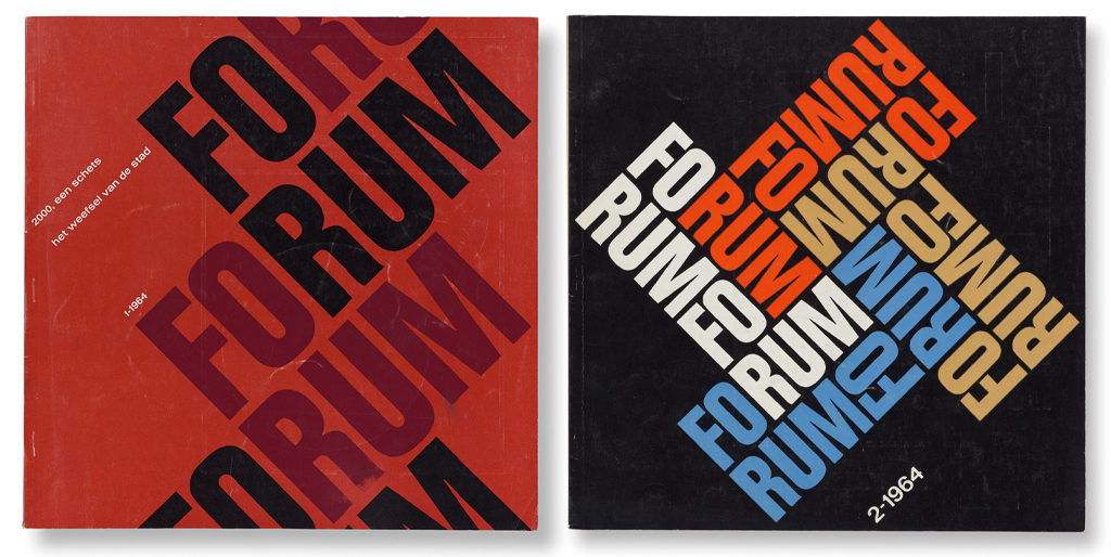
“Working for Jurri, and in the city I’d been dreaming of since I was a kid, was better than I could have hoped for,” said Nieuwenhuijzen. “The two of us sitting at the giant table Jurri himself had designed. He taught me how to work with a grid, a method he himself had picked up from Dick Elffers. We had a very pleasant relationship that allowed me to be critical. Bagara by photographer Ed van der Elsken was just out (1958), but I did contribute to Vuur aan Zee, the book that presented Dutch Hoogovens (steel producers). Jurri had asked Paul Rodenko to write its text. We sat conferring with five photographers to do the photo editing. Hundreds of photos, laid out all over the floor, were combined to form spreads. Very democratic. So a photo by Paul Huf could end up next to a photo by Ed van der Elsken. It all happened at Jurri’s studio in the Spuistraat, where he lived with photographer Violette Cornelius. A few years later, Jurri and Ed van der Elsken fell out because of a conflict about a cover design for De Verbinding for PTT. In 1959, Jurri started doing the graphic design of Forum, the architectural monthly. It was an incredibly good thing that he took me along to the meetings of the editorial board, with architects such as Aldo van Eyck, Herman Hertzberger, Jaap Bakema and Joop Hardy. Since then I always tried to have a direct relationship with the editors. Being on the editorial board means you’re well-informed. You hear many things that can improve the graphic design tremendously.” Schrofer and Nieuwenhuijzen’s editorial role was unique in those days. The international discussion about ‘the graphic designer as author’ was still decades in the offing.
In 1960, his job at Schrofer’s was temporarily postponed. Nieuwenhuijzen was asked to be the in-house designer at De Brug/Djambatan, a publisher specialized in Indonesian subjects. “I worked with Henk van Randwijk, the WW II resistance hero and co-founder of Vrij Nederland, the progressive weekly. It didn’t last long. Back to Jurriaan Schrofer, but now as a partner. Jurri and Wim Crouwel nominated me for membership of GKf, the professional association for designers. The committee did not appreciate my work and said I might be too much ‘under Jurri’s influence’. Later, when I had escaped from under Jurri’s wings, I re-applied and was accepted. It was time to be independent. Jurri was angry I was leaving him, probably because it was on my initiative, not his.”
Editor, director, designer
“From the start, Bert Bakker was an important client,” says Nieuwenhuijzen. “The first book I designed, Voor en na de Explosie (1960), a collection of essays by Simon Vestdijk, was published by his company.” Bakker had started the very successful Ooievaar series of paperback novels in 1954; each book found 10,000 or more buyers. In the beginning it was Hermanus Berserik who illustrated and designed their covers; in 1962, Schrofer and Nieuwenhuijzen took over. “I designed many of the covers. Book interiors never interested me much if they were purely typographic. At some point there was a problem at Bert Bakker’s. Victorine Hefting had a conflict with her husband, Bert Bakker, and I was allied to her. Later, after his nephew had taken over the publishing business, I got involved again and was asked to design many anthologies.”
Nieuwenhuijzen as a rule proposed only one cover design, not several to choose from. “I’m not running a shop,” he says. “I decide which one is the best. Sometimes my choice was not accepted, in which case I returned with a different proposal, but again: just one design had to do it. I knew some colleague designers had assembled a card index of typographic solutions from which they could construct an entire book from beginning to end so they didn’t have to keep reinventing the wheel. But I am someone who enjoys creating something totally new each time.”
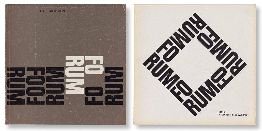
After working with Schrofer on designs for Forum, in 1964 Nieuwenhuijzen was asked to join the editors and be the magazine’s sole designer. He felt highly honored. He introduced a new typography in a new, square format. Former Forum editor John Habraken saw this as a referral to the magazine’s predecessor, Wendingen, also published in a square format (by the society Architectura et Amicitia). With a layout using three columns and a sanserif font the design followed the ruling Swiss typography standards. Each cover would be dominated by a visual play with the title word; on the June 1968 cover a whole kashba was constructed. In 1972, Nieuwenhuijzen left Forum, handing over the baton to Anthon Beeke and Swip Stolk.
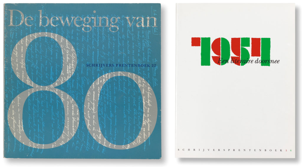
The Letterkundig Museum (literature museum) in The Hague was to be a client for twenty-something years. In 1968, Nieuwenhuijzen took over from Schrofer as the designer of the series Schrijvers Prentenboek, which was started in 1958. He acted not just as their designer but often also as a co-editor for these illustrated publications. First, he continued the basic layout his predecessor had used. At the end of the 1970s, he introduced his own approach: “Once again I chose for a square format. I could play at will with photos, illustrations and facsimiles. I also designed the museum’s literary correspondence series Achter het Boek and posters for their exhibitions. Later followed the design of the illustrated historical overview of Dutch literature, Ik Probeer Mijn Pen (1979), which was distributed through Bert Bakker and the organization for collective promotion of Dutch literature, CPNB.” Nieuwenhuijzen researched in museum archives for rich material and wasn’t afraid to bother authors like W.F. Hermans, then living in Paris, to get a recent portrait picture. “I wanted to create a light-footed approach to the history of Dutch literature. CPNB at first was hesitant; no wonder, the print run was a risky 80,000. But the publications became a popular success.”
In 1990 followed De Kwadratuur van de Kwattareep, also for CPNB. Lisa Kuitert, to become professor of the history of literature, was the image editor of this jubilee volume. She remembers: “Kees had read the text well and had discussed thoroughly it in meetings with the author, Jan Blokker. But he seemed so scatterbrained. He made mistakes, immediately correcting himself. I shouldn’t have worried, though. It turned out that he had everything perfectly aligned in his head.” The book became one his most beloved ‘best designed’ publications.
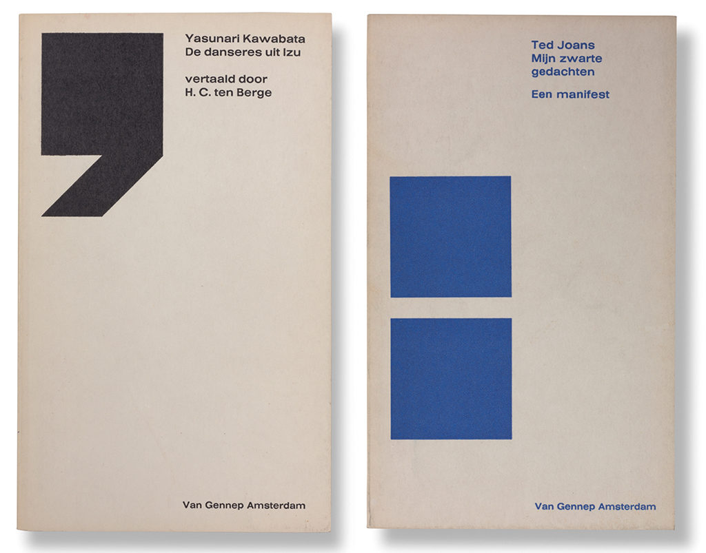
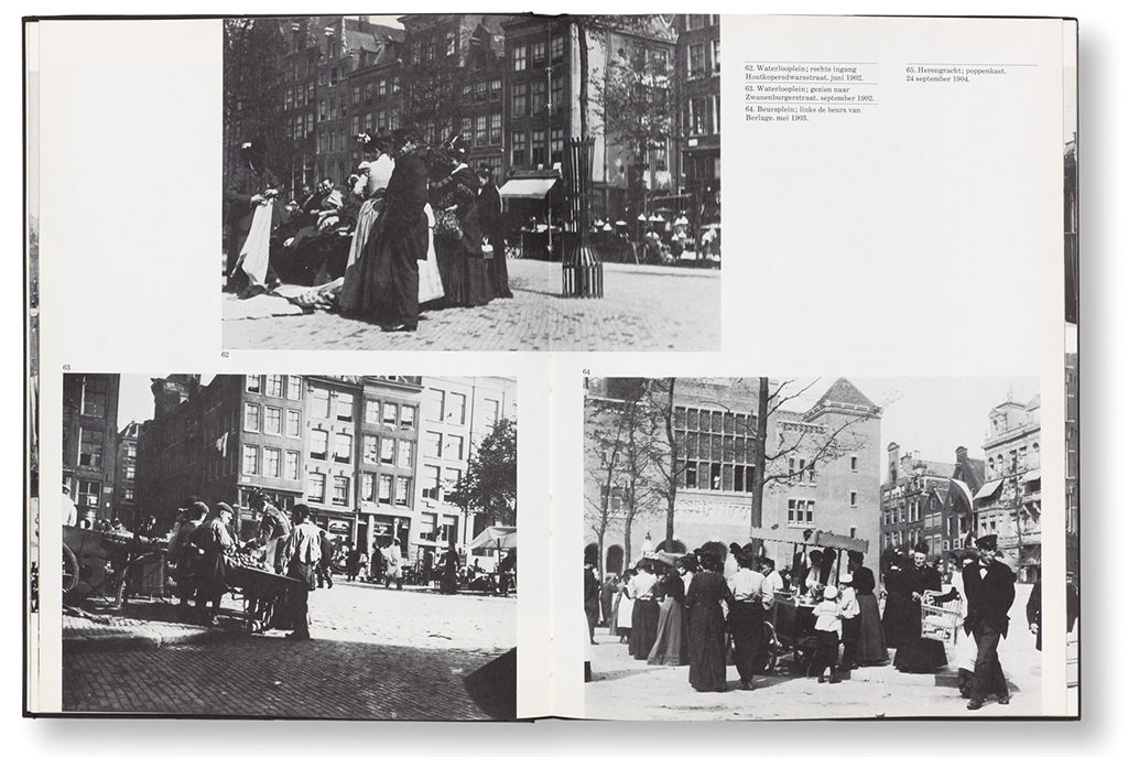
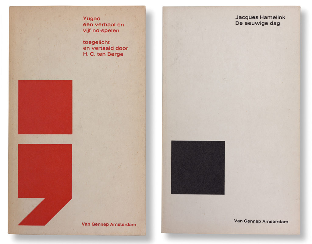
In the 1970s, Nieuwenhuijzen all alone created a series of publications for Van Gennep. These were devoted to topography and dealt with subjects such as the earliest photo images of Amsterdam, or Limburg province in 19th-century photos. He had to spend weeks on an end for research in libraries and archives. For Van Gennep publishers he also designed Bibliotheca Erotica. Nieuwenhuijzen knew Rob van Gennep well from his time at the art academy in The Hague, when they had met at De Posthoorn Bodega and the city’s art society, Haagse Kunstkring. He designed the magazine Cartons voor Letterkunde and several books for Polak & Van Gennep (until 1968).
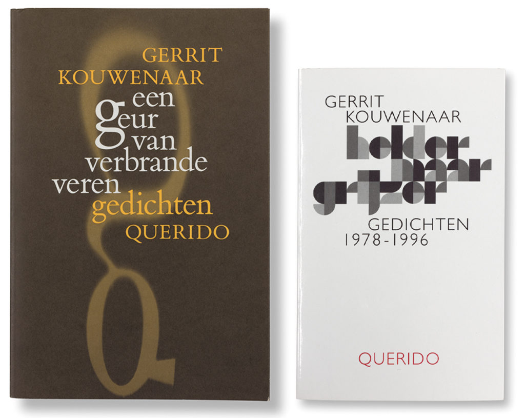
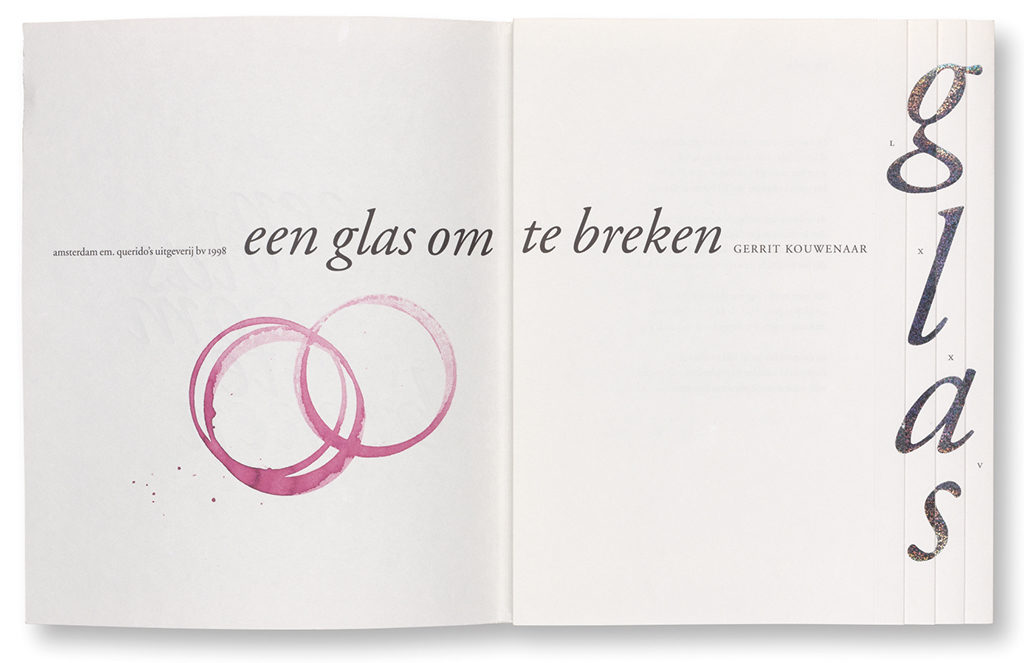
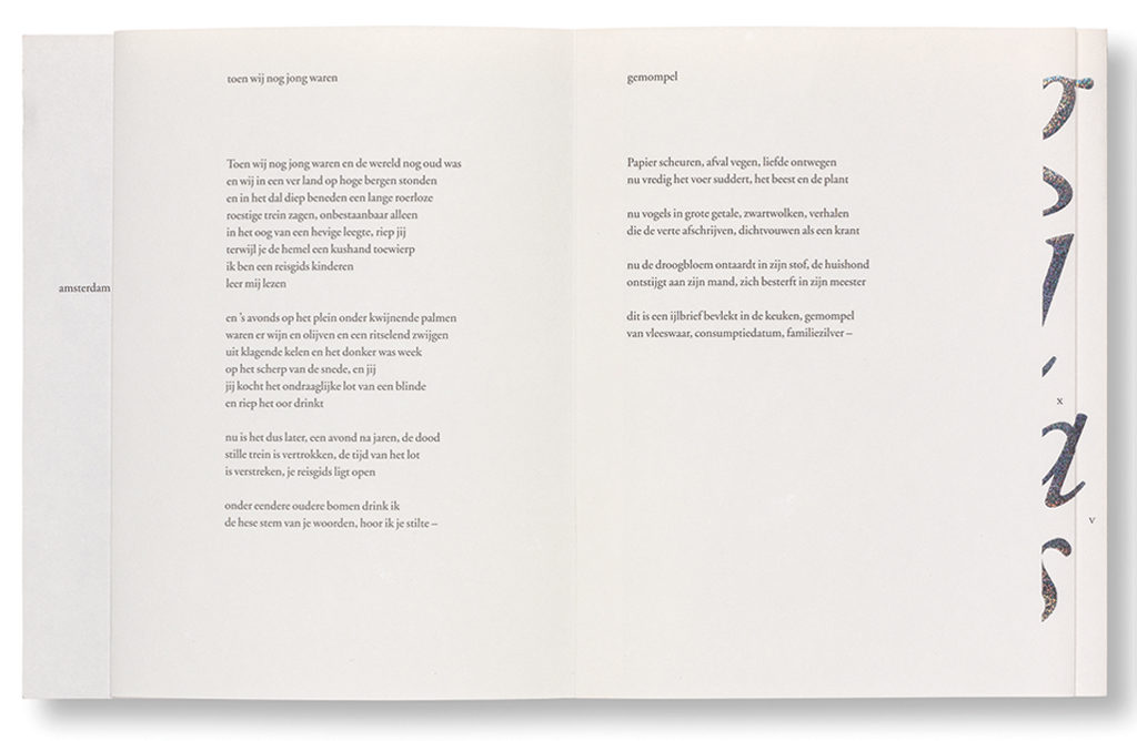
Strong ties were established with the poet Gerrit Kouwenaar. Their friendship resulted in Nieuwenhuijzen’s design of Kouwenaar’s poetry collections published by Querido, starting with Een Geur van Verbrande Veren in 1991. The poems were all typeset in lower case. During the production of Vallende Stilte a mistake was made that caused the cover text to wobble just the tiniest bit. This agitated Nieuwenhuijzen for a long time, even though the book received the Best Book Cover award in 2008.
Books
Until halfway the 1980s, a graphic designer would write the instructions for a publication’s typography and leave the factual typesetting for a specialist to do. When journalist Ischa Meijer interviewed Nieuwenhuijzen in 1969 and asked if typography was a craft, he answered: “No. I give instructions to a machine by way of an intermediary, a technician […]. It’s never a pencil or a brush, it is the machine.”
He preferred his photography books to be printed by Haasbeek in Alphen a/d Rijn. “When done with the design, I’d sit around the table with the printers before any lithography would have started. We would discuss each and every detail of the book, page after page, image after image. Haasbeek’s management had agreed with my way of doing things. I wanted total involvement of the printers. They had to be motivated to deliver top quality.”
Nieuwenhuijzen disregarded many of the industry’s new developments, although he could not escape all the digital facilities the changing times introduced. He bought a photocopier, and much later added an Apple Macintosh; but he kept writing instructions for other intermediaries he hired to execute the typesetting and the lithography. For many years, the book designer Adriaan de Jonge had the job; he called Nieuwenhuijzen ‘the measurement man’. For some time, De Jonge was almost Nieuwenhuijzen’s neighbor at Prinsengracht; he remembers how Nieuwenhuijzen’s sharp eyes noticed even the smallest divergences. “A mistake such as made by the printer of Vallende Stilte would keep him awake for many nights. With the Macintosh and especially the photocopier he prepared very precise models for his covers and also for the page layouts, which I followed in great detail. Sometimes he came and sat with me at the computer screen. His attention would often go to the division of space on a page, more than to its typography. He used just a few different fonts: Times, Helvetica; and he left me to decide on matters like kerning and interspacing.”
The Gerrit Rietveld
From 1969 to 1988, Nieuwenhuijzen taught graphic design at the Gerrit Rietveld Academy’s day and evening classes. “I did not teach how to work in practice. I didn’t ask my students to create book covers but, for instance, told them to design dice using the numbers 7 to 12. They’d have to solve so many problems doing this, it opened their eyes. Frans Oosterhof and I became the coordinators of the evening school, and Swip Stolk and Anthon Beeke joined us as teachers.” Oosterhof: “We were looking for a connection with art and investigated specific issues with regard to artist books; the relationship of original and reproduction – between language and translation, you could say. We created scores of such publications.”
In the graduation book of 1979, Nieuwenhuijzen wrote: “In my opinion, graphic design education should not concentrate on how to find solutions for specific design problems. There are no prescriptions. We must develop individual thought and action. All students are different. Each student has to discover his or her own capabilities and preferences, and needs to be granted the space and time to develop them. Design is a mentality. Long live the headstrong student!”
One of his students, Frederik de Wal, now a book designer, said: “He was a father figure, though a very direct and straightforward one. He was a true designer, even in his attitude to life and the way he dressed. He was driven to showing what the profession was like. He taught about structure, hierarchy and how to organize designs. In the early stage of my studies, I had to create an alphabet based on photos cut from magazines, and it had to be structured and show consistency of color and form. It seemed he wanted us to learn how to look at things in the manner of, say, the poet K. Schippers.”
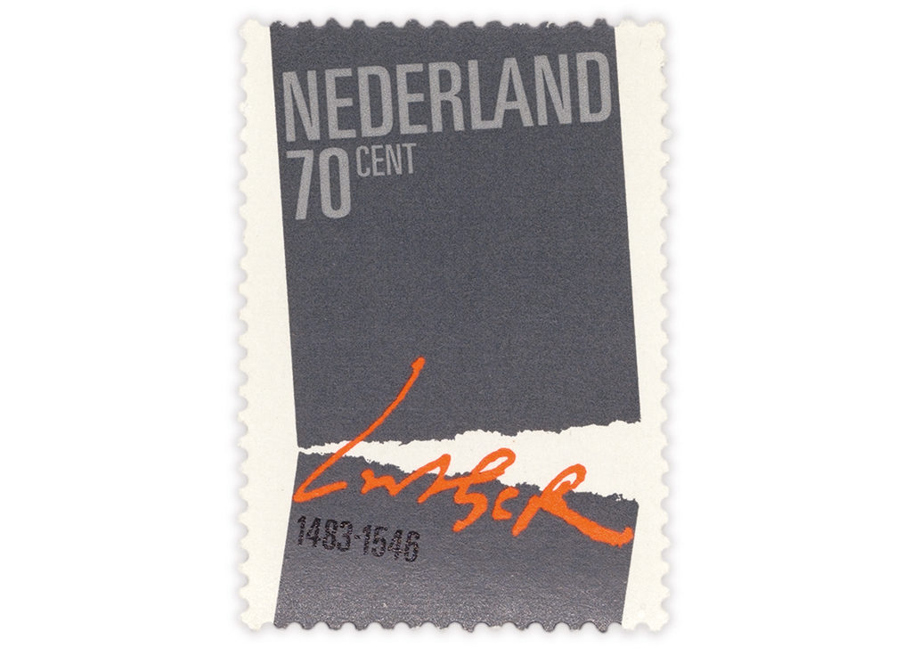
Non-books
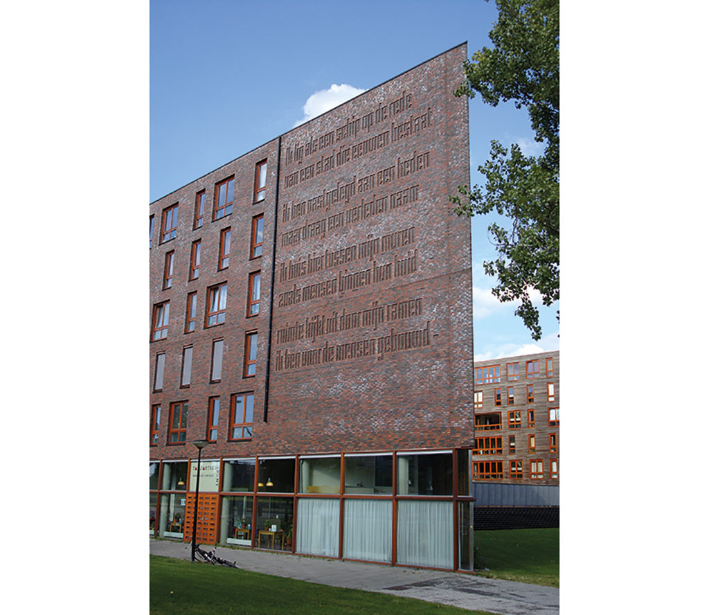
Nieuwenhuijzen was more than a book designer. He also created exhibition designs, film credits and postage stamps. In 2001, he designed the typography of a text to be applied on, or rather in, a façade of the Batavia apartment building designed by the architect Frits van Dongen, at Panamalaan in Amsterdam. It was an art project commissioned by De Principaal and the city of Amsterdam’s art foundation. Gerrit Kouwenaar wrote a poem for this project, the lines of which would be constructed from bricks and cover a wall area of 12 x 15 m. Nieuwenhuijzen’s design brought not just the poem but also the building to life. “A concept such as this one could only be conceived because the building had still to be constructed. I had prepared myself well, by playing with a ton of bricks and by climbing onto the roof of my own house and observe carton mock-ups I’d glued to windows on the other side of the canal. You have to prepare meticulously, otherwise it won’t work.”
‘Raster’
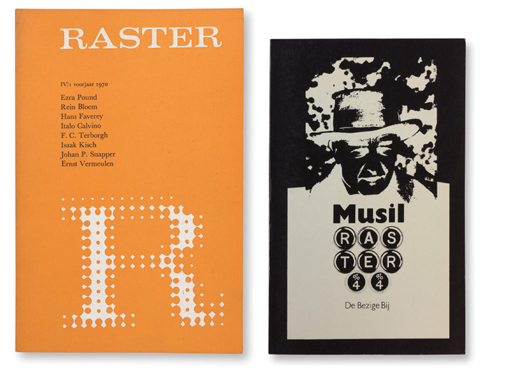
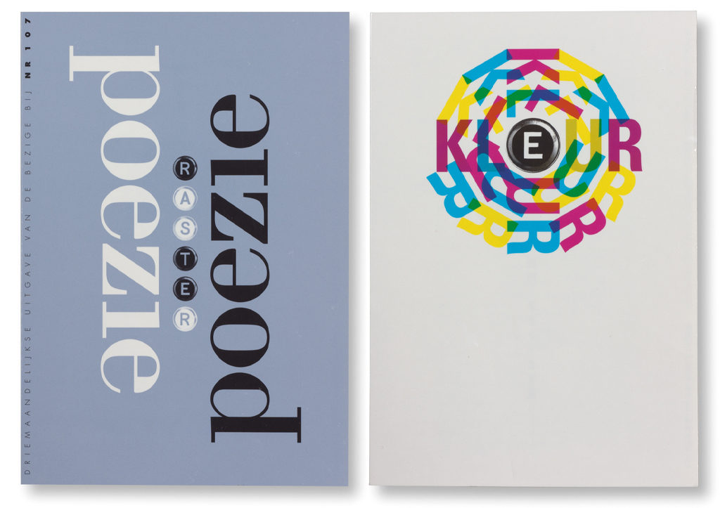
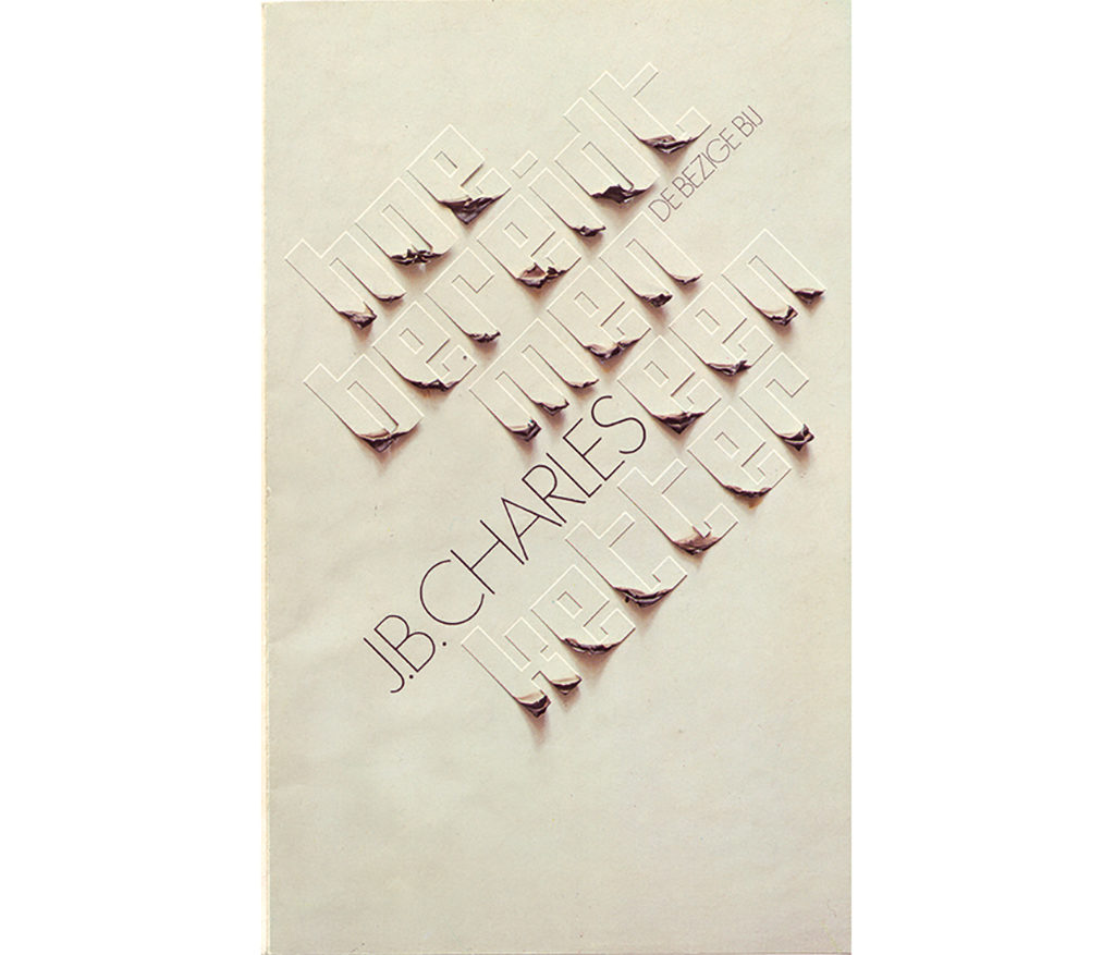
His designs for the literary magazine Raster, the platform of experimenting Dutch authors, earned Nieuwenhuijzen the 1992 H.N. Werkman Prize. He had been the magazine’s designer already for twenty-five years and would continue for another seventeen years until, in 2009, the last issue was published, ending a relationship that lasted altogether for more than forty years. In the beginning, he applied a uniform screen (raster) of the letter ‘R’ in different colors. Later, from 1977 on, Raster became a magazine with a book format and different cover designs; only the magazine’s title and the issue’s number would be consistent. They were ‘typeset’ from photos made of his old typewriter’s keys. The authors still delivered their copy the old-fashioned way, produced by typewriter. “It was a find, using those keys: they’re letters and the same time they’re images, photographs of a thing. And I also wanted to have something with the rounded character of printed dots. It worked out well this way.” Nieuwenhuijzen did not need to present his cover proposals to the publisher, De Bezige Bij, but only to the editors, who could work autonomously. One of the editors, Jacq Vogelaar, said: “Often, Nieuwenhuijzen had already developed an idea before we’d finished planning an issue. He could be sensitive to criticism: he either rejected it mockingly or took it on board.”
In the 1980s, Victor Levie was Nieuwenhuijzen’s studio assistant; they worked together on many Raster designs. Levie: “Other than the typewriter keys on the cover, we were free to do whatever we wanted. We used strong and clear typefaces on the cover and created contrasts between bold and light and large and small in the typography – not too sqeamish. I would find myself sitting in a passport photo cabin in preparation of the cover for Raster 13, or buying packaged bacon at Albert Heijn for Raster 16, the issue devoted to the painter Francis Bacon. Even if the concept wasn’t always classy, the way we executed the design sure was, and this made it work.”
For long years, the editors of Raster met in Nieuwenhuijzen’s studio. His deep interest in literature culminated in editorial contributions, such as an image essay for the magazine’s ‘kitsch’ special (1989) and a wry ‘in memoriam’ about his own leg amputation (2002). He contributed to the final issue with a retrospective piece. Raster had become an important part of his life. As Nieuwenhuijzen saw it: “I was one of the boys.”
Kees Nieuwenhuijzen
born on 27 May 1933, Utrecht
died on 5 November 2017, Amsterdam
Author of the original text: Mathieu Lommen, February 2009
English translation and editing: Ton Haak
Final editing: Sybrand Zijlstra
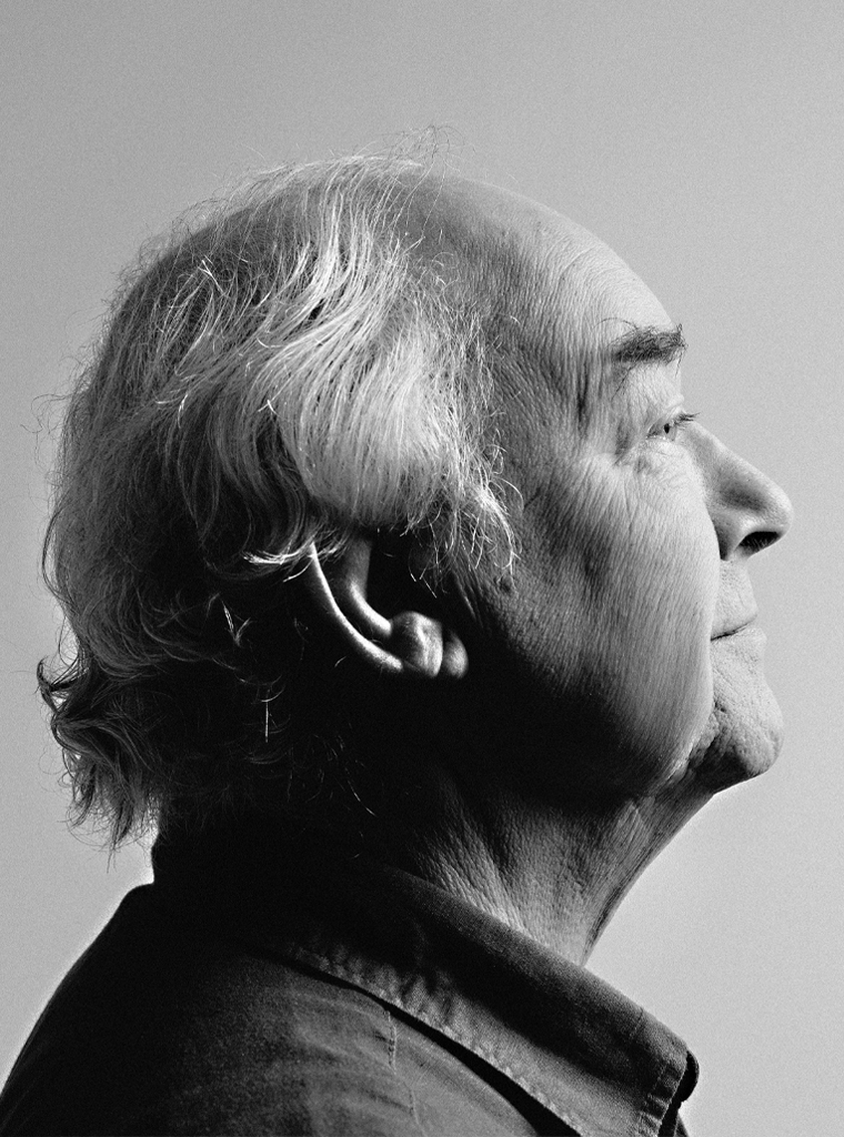
Portrait photo: Aatjan Renders