“North of Venlo, side by side with the new Van der Grinten head office (producers of photocopiers and phototype material), a small, white country home with a gabled roof is home to the company’s publicity department. This is where we find Jacques Peeters. To the notice board on the wall behind his back he has attached the publications that won him an award from the City of Amsterdam. Last year, Peeters received their First Prize for his calendar design, while the annual report he designed for Van der Grinten was also awarded. These are the rewards of an approach that could be defined as ‘orderly’, a word Peeters himself often uses. This 33-year old designer’s work is based on lucid and practical thinking.”
—L. Blankenstein in Ariadne magazine (May 26, 1968)
Jacques Peeters was born in Venlo, in 1934. His earliest memories are filled with images from WW II. “On May 10, 1940, the bridges across the Meuse river were destroyed to slow down the German army’s advance. To no avail. I remember vaguely seeing those enormous mangled pieces of metal rising from the water. I was not yet six and lived with my parents and a younger brother in a narrow street. My father was a chauffeur for a company that sold iron equipment; he delivered furnaces and stoves all over Limburg and Oost-Brabant.”
He attended only the first year at the elementary school run by friars next to the town’s main church. His brother and he were taken in by family after their mother got seriously ill (she died in 1944); they remained there until after the war ended. “My early education was chaotic and often interrupted. I was ill-prepared for secondary education, even though I was considered a good learner. I held out for about two-and-a-half years, mostly interested in art, history and biology and gym class. But then what?”
Lebesque
In 1949, Jacques Peeters was hired by H. Lebesque, a small printer annex bookseller in the center of Venlo that in earlier years had printed Venloosch Weekblad (weekly newspaper). Mister Louis was its director and ran the printing house, Mister Sef managed the bookstore. Jacques Peeters was to be trained in typesetting and from day one felt at home at Lebesque’s. Typesetters and printers were looked up to: at the end of the workday, they donned their dust coats and dressed up – “as if they were directors” – and all of them were members of the graphic trade union. For two years, Peeters was sent to attend graphic school one day a week in Roermond and another two years in Nijmegen. He also subscribed to the typography design course organized by the graphic industry’s national association. Encouraged to study by Mister Louis, he attended the three-year evening trade school, where he learned about management and procedures in commerce.
“At the time, there wasn’t much to do for young people in Venlo. On Saturday evenings we used to walk up and down Lomstraat and Vleesstraat and it was there that I first met Annemie, who would become my wife. Fashion store Palet stood out in the central area of town: their window shows were designed by Martien Lieberom. They were exciting and indicated that there was something bigger out there. I would later discover a similar excellence of show window design in Amsterdam at De Bijenkorf’s.”
Peeters was drafted. He served in the Royal Dutch Air Force in Nijmegen and at Volkel air base from 1954 to 1956. During weekends he paid Lebesque many a visit. One day, Mister Louis told him that Lebesque was too small a company to offer him a bright future and that the much larger printing house Lecturis in Eindhoven was awaiting his application.
Lecturis
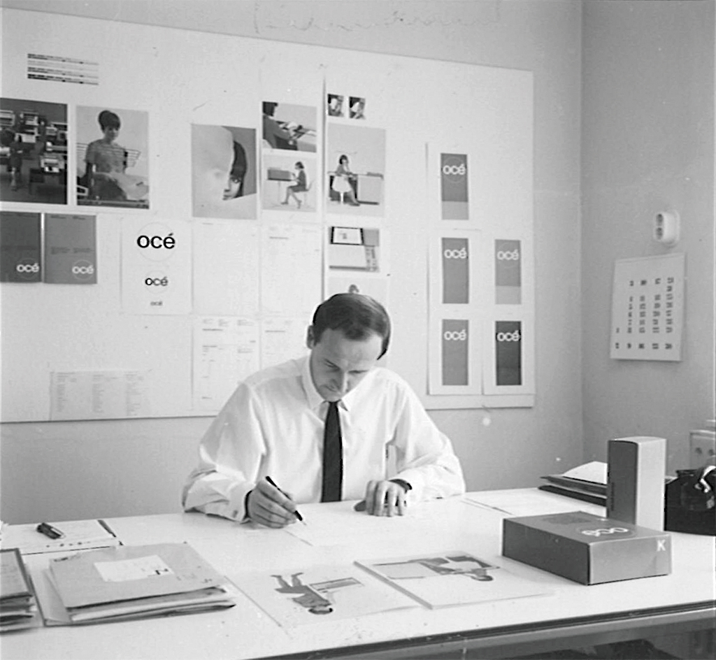
Peeters started to work at Lecturis in April, 1956. Lecturis was to be found at Zwembadweg, near Van Abbemuseum. Peeters’ official function was planning assistant, but he was also to work as the in-house graphic designer. During his first year at Lecturis, he attended the part-time evening class ‘Color Studies and Morphology’ at the academy of industrial design AIVE (now the Design Academy) in Eindhoven, taught by René Smeets and inspired by the teachings of Johannes Ittens of Bauhaus fame.
Over time, many graphic designers, aware of the high-quality print Lecturis delivered, came to Eindhoven to have their projects produced. These required a perfect planning and realization. Peeters was the one who was largely responsible for a smooth collaboration and a process that avoided handicaps. “It was my job to be the intermediary between freelance designers and the typesetters and printers. Later, Maarten Houtman and Gosse Petersen developed a study course for this ‘new’ profession at the graphic school in Utrecht.”
In 1957, Lecturis bought Monotype typesetting machines. From then on it was possible to create a constant quality of excellent lead type. This attracted many designers to Lecturis, like Teun Teunissen van Manen, who designed for Weverij De Ploeg in Bergeijk and later also for Spectrum Meubelen (furniture). “The way Teun managed to create a sort of ‘industrial typography’ for the information his clients wanted to communicate to their customers appealed to me. As did Karl Gerstner’s book Programme Entwerfen and other Swiss designers, such as Joseph Müller-Brockmann and Hans Neuburg. Also inspiring were Piet Zwart and Paul Schuitema.”
Peeters and Baer Cornet, who worked in Venlo as Van der Grinten’s designer, were friends. Peeters asked Teunissen van Manen if he would be willing to spend an evening at the Peeters home once a week and exchange ideas, something like a private class on typography and design. Teunissen van Manen agreed. One evening, he discussed the first issue of a new German magazine, Twen, aimed at readers in their twenties, a market of growing importance, who were interested in film, music, fashion and other hot items of the day. Willy Fleckhaus created the magazine’s contemporary design. Peeters and Cornet were highly impressed.
Lecturis director Van de Westelaken sent Peeters to Amsterdam to take a company training course at Monotype’s Dutch office. What he learned there became visible when Lecturis was commissioned to design the typography and to print 1961-1962 curriculum of the Technische Hogeschool Eindhoven (now Technical University Eindhoven). They also designed and produced the commemorative book Technische Hogeschool Eindhoven 1956-1961. Both publications found broad recognition and got Lecturis their first Best Book awards in 1961. Exclusive use of the roman text font and allowing only italics or bold for differentiation, the Monotype typesetting machines could produce all page lay-outs quickly yet perfectly. “We were very inventive at using the machine-type foundry to create perfect vertical column lines and we managed to reduce the time needed to lay out the pages considerably.”
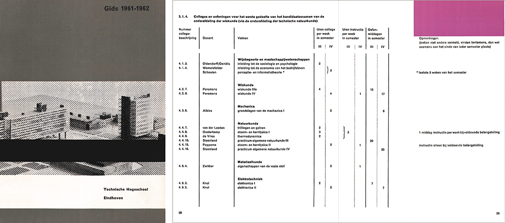
Cover and spread of THE’s 1961-62 curriculum (one of 1961’s 50 Best Books)
Late in the 1950s, Wim Crouwel, then associated with Kho Liang Ie, was invited to work for Van Abbemuseum. “I remember the day I was sitting with Crouwel outside on Café Wildschut’s terrace in Amsterdam to discuss the text and the typography instructions for the catalog De verzameling van het Van Abbe Museum. This was one of the first catalogs for Van Abbemuseum I was involved with; many catalogs followed, also for Peter Stuyvesant Collection. If needed, I could call Crouwel’s Amsterdam number day or night and have specifics clarified and problems solved.” From 1963, they worked with the multidisciplinary agency Total Design, which Crouwel had co-founded.
Lecturis was the printer of Museumjournaal from 1956 onward. Peeters as the intermediary collaborated with art historian Paul Vries, curator at Van Abbemuseum, until the last issue of the magazine’s eighth volume had been printed. He most fondly remembers the issues about Nul (1962) and the one on the occasion of Willem Sandberg’s departure as director of Amsterdam’s Stedelijk Museum (1963). Sandberg was the one who up untill then had designed all the magazine’s covers.
Lecturis director Van de Westelaken had a critical eye and was always reaching for a higher quality. He decided to switch to a different German type of ink that guaranteed the blackest of black in letterpress, comparable to photogravure standards. Museumjournaal, catalogs for different museums and photobooks by Martien Coppens demanded this excellence of quality print. Peeters designed the typography for the covers and the text of Land van stilte (Land of silence), one of the books by Coppens (in 1961). He chose the Monotype Grotesk as its font.
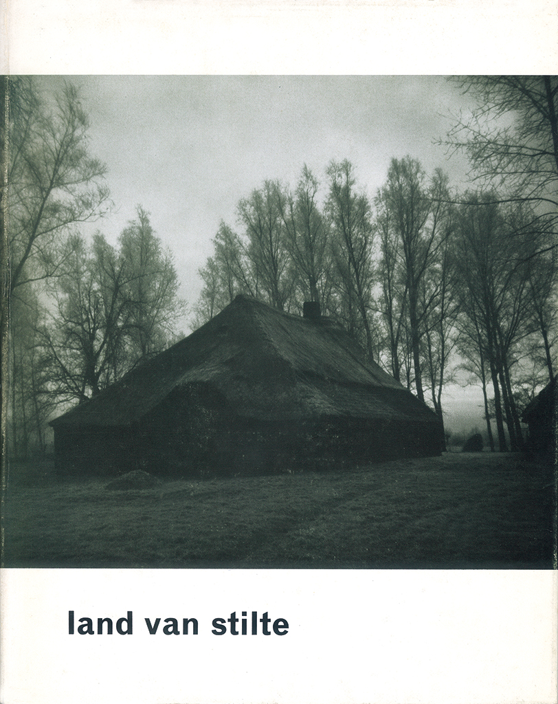
Cover of Land van stilte by Martien Coppens, published by De Kempen, Eindhoven, 1961
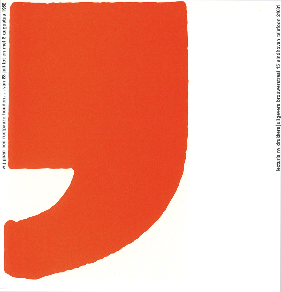
Message to relations Holiday closure Lecturis, Eindhoven, 1962
Armstrong Cork, a US company that produced vinyl floor tiles, also for the European market, became an important Lecturis client. Peeters designed a series of brochures and packaging for samples. This led to a close collaboration with Steendrukkerij de Jong & Co in Hilversum, more specifically with ‘brother in arms’ Simon den Hartog (who would eventually become the Gerrit Rietveld Academy’s director). “I saw the unique exhibitions in their lunchroom and their magnificent publication series, Kwadraatblad. They printed Sandberg’s posters for Stedelijk Museum.”
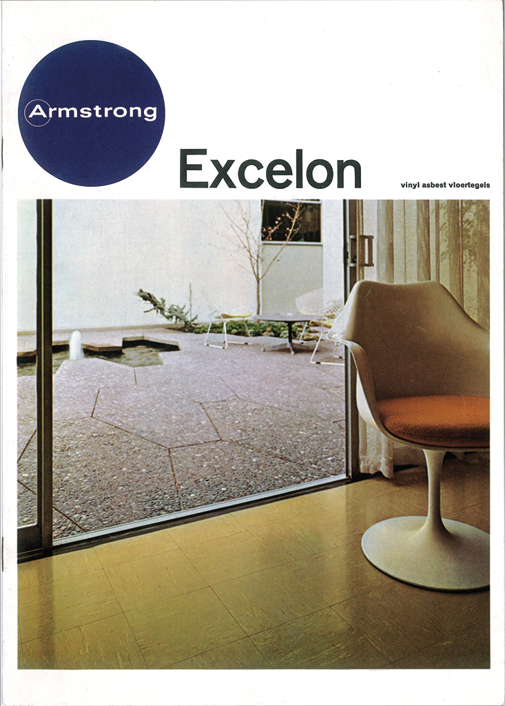
Brochure Excelon floor tiles, Armstrong Cork, Münster, 1961
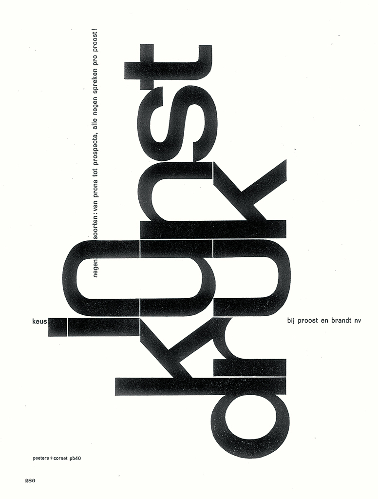
Ad for Proost en Brandt, Intergrafia, May 1961 (design Peeters / Cornet)
In 1965, Peeters was accepted as a member of GKf, one of the forerunners of the current BNO (Assocation of Dutch Designers). His time at Lecturis came to an end when, in 1963, Peeters was approached by the chemical company L. van der Grinten, later to become Océ van der Grinten, or Océ) in Venlo. He accepted the invitation of this large industrial company to become their chief designer.
Océ
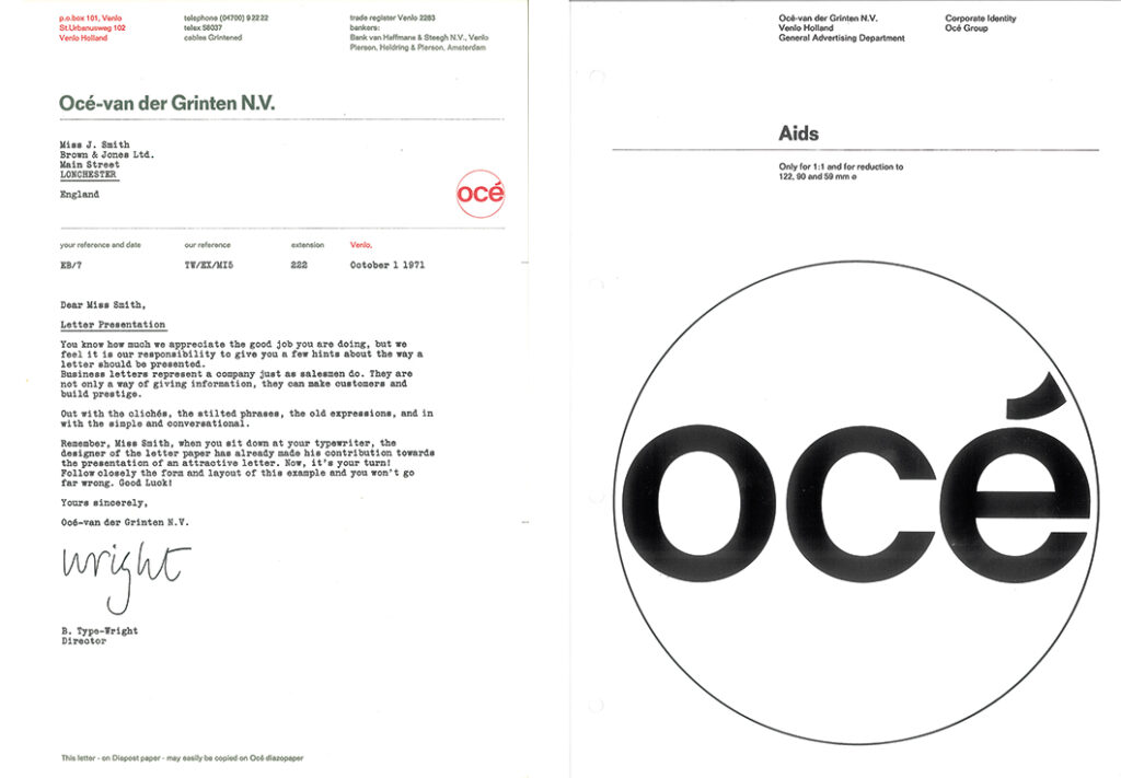
As Océ’s in-house designer, Peeters had the job of establishing and leading a small design and product presentation department. He became responsible for the development and production of the company’s identity program: printed matter including letterhead, product documentation, packaging, and annual reports, as well as exhibitions, showrooms and so on. Van der Grinten’s policy was to hire external consultants on big and important projects for a fresh look at issues, which could be very valuable in addition to the knowledge and capability of their own in-house professionals. The same was done for the corporate identity project, for which Peeters had proposed Wim Crouwel as the advisor. The company name was changed and the old logo was abandoned. ‘Océ’ now preceded the Van der Grinten family name. “I involved my young colleague Jos Kesseler with the research and preparation of the first series of proposals for the logo and the color differentiation for the different product groups. We looked at what Olivetti had done, IBM, Braun. We absorbed Ulm’s color schemes.” Mister Karel van der Grinten, chairman of the group, was a true advocate of the new identity program. In the company magazine DIA Peeters wrote extensively about the whole design process, something that had seldom been done before in the Netherlands.
In 1967, his corporate designs for Van der Grinten won Peeters the Frans Duwaer typography award from the City of Amsterdam. The award was to play a crucial role in the future development of the company’s image and its international introduction. Peeters himself was asked to accept a part-time teaching position at the art academy in Den Bosch. “For three years I coached graphic design students. In the end, though, I couldn’t guarantee the required continuity, for I was too busy at my job and had to travel a lot for Océ.”
Océ’s image
Van der Grinten’s director Jan van Susante was a unique and erudite person. In 1964 he decided the company should publish a book with photography by Martien Coppens and poems by the Belgian poet Paul Snoeck as a promotional gift – contents that were not directly related to the company’s core business. Peeters designed the cover and typography of this book, Op de grens van land en zee (On the border of land and sea). It was his first major design project.
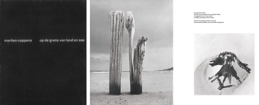
Cover and spread of Op de grens van land en zee by Martien Coppens, published by Van der Grinten, Venlo, 1964
Peeters, together with their German subsidiary, selected a knockdown aluminum display system produced by a company in Stuttgart for use at Van der Grinten’s trade fair exhibitions; the same company provided IBM, Lufthansa and Deutsche Bank too with easily disassembled systems. He had some explaining to do in Venlo, where they worked traditionally with their in-house construction bureau, but in the end the system was also to be used for Océ’s showroom interiors.
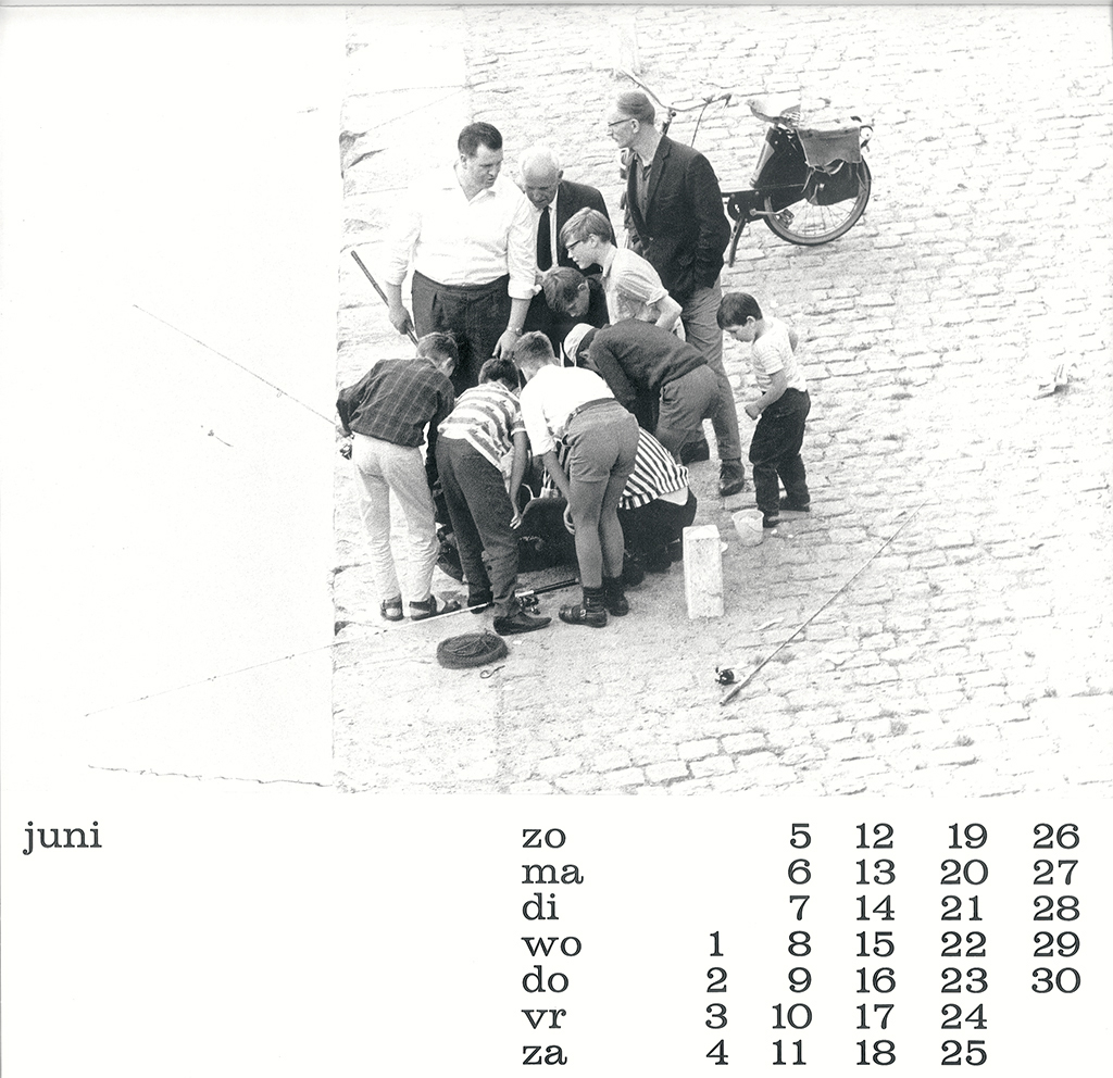
1966 calendar Mensen, by Jacques Huinck, published by Van der Grinten, Venlo
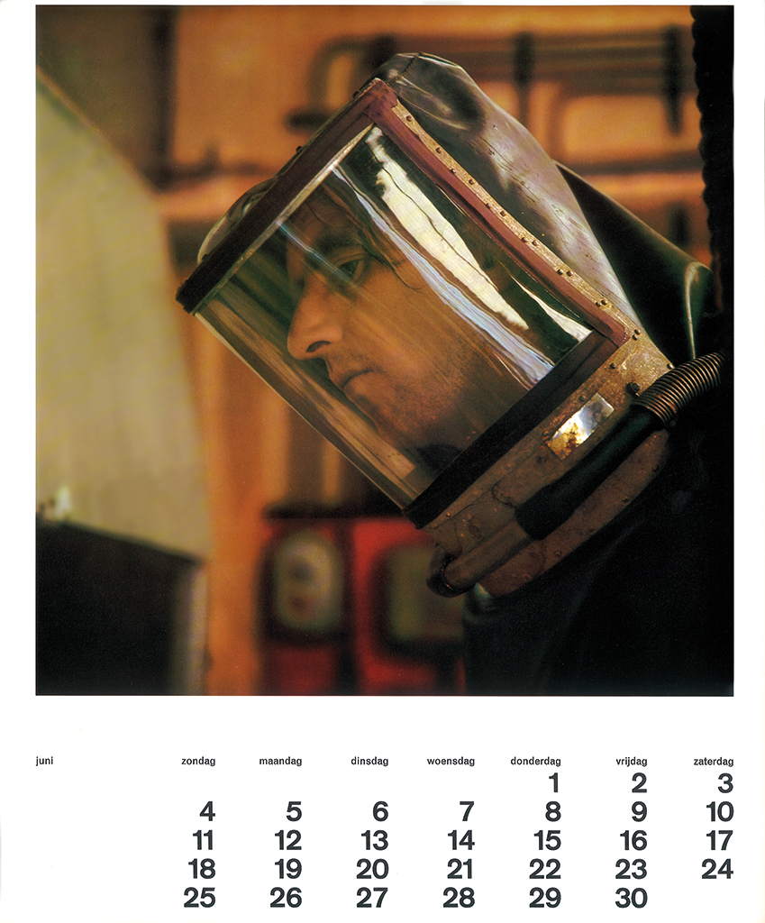
1967 calendar with photography by Martien Coppens, published by Van der Grinten, Venlo
Because of his position and status at Van der Grinten and especially the room that the company allowed him, Peeters could support a wide range of art and cultural projects. He had the new Océ 104 copier installed at the Milan Triannual of 1968, responding to a request from Bob Noorda and Andries van Onck; he provided a copy service at the 1971 art manifestation Sonsbeek buiten de perken; he arranged for the copies Wim Crouwel wanted to include in the Stedelijk Museum catalog Op losse schroeven; Océ together with Van Grinsven printers had a small catalog printed at the occasion of the farewell exhibition honoring the Limburg painter Lei Molin (town hall, Heerlen, 1967); Peeters was a member of the committee that organized the Icograda 1968 congress in Eindhoven and, together with Baer Cornet, designed all publications and posters.
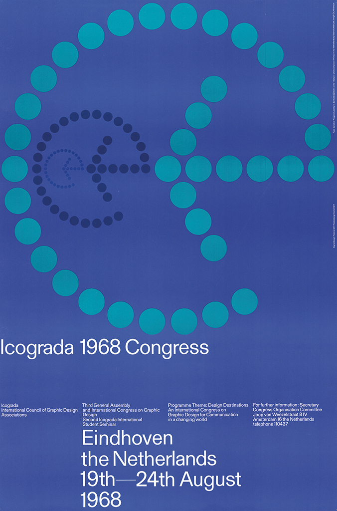
Poster for Icograda, 1968 (design Peeters/Cornet)
After the Coppens’ book was published to much acclaim, Peeters proposed that the company publish calendars about art, not directly related to Van der Grinten’s products and services, to boost up the company’s institutional image in the Netherlands as well as internationally. Peeters gave expression to Océ Group’s growing position in the international market by selecting Grafiek uit acht Europese landen (Graphic art from eight European countries) as the theme for the 1969 calendar; the graphic art to be published was chosen in collaboration with the local Océ directors in eight different European countries. The calendar was designed by André Capello, a colleague who had graduated from St. Joost academy in Breda. In October 1969, the leading German professional magazine Gebrauchsgrafik published an extensive article entitled ‘Ein Firmengeschicht’ about Océ’s corporate design.
1968 calendar Structuur, work by Peter Struycken, published by Van der Grinten, Venlo
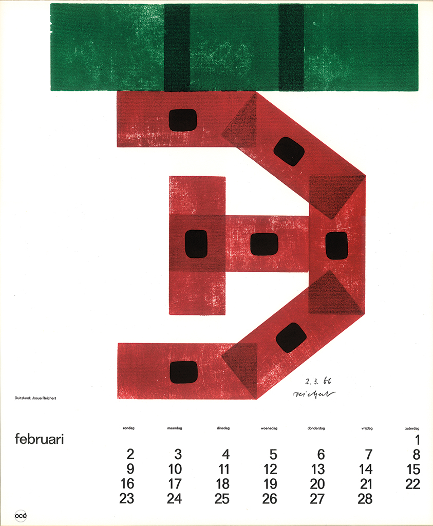
1969 calendar, woek by Josua Reichert (Grafiek uit 8 Europese landen), published by Van der Grinten, Venlo
A small team assisted Peeters with the design and implementation of all elements of the corporate identity, even including how serial numbers should be presented on their copiers. Peeters, who was finding less and less time to do designs himself, succeeded in attracting Baer Cornet, who left Lecturis in 1970. In November 1970, Peeters together with Louis Lücker, who worked for Océ as industrial designer, presented the lecture ‘Design and management at Océ-Van der Grinten’ at a meeting in RAI Amsterdam organized by the foundation for industrial design and the circle of Dutch corporate leaders. To support and sustain the identity program, Peeters, Baer Cornet and Jos Kesseler developed the manual Corporate Identity Océ Group, which was introduced to all European marketing managers in October 1971. “After the publication of the manual I felt that my job at Océ was done and I started looking for new challenges and opportunities.”
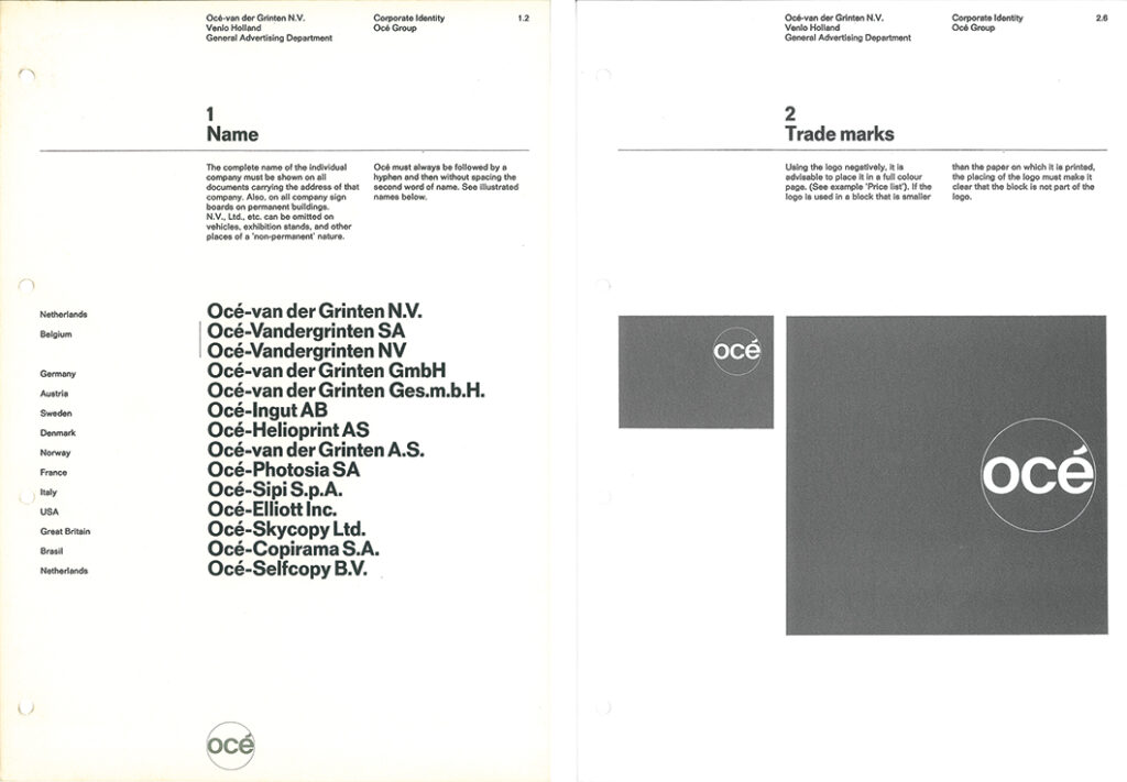
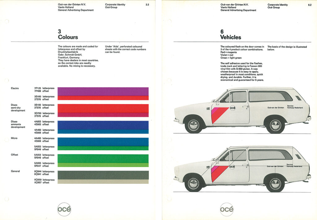
Pages from the corporate identity manual, Océ Group, 1971
St. Joost art academy
An ad published by St. Joost art academy in Breda mentioned they were looking for someone to develop their education programs and to supervise a reorganization. Peeters had some experience as a design teacher in Den Bosch; he went to see the academy director Jan van Haaren to discuss the option and also asked advice from Chris Brand (who taught design in Den Bosch as well as in Breda). Brand’s response was: “Jacques, that is the job for you!” By October 1972 Peeters was a deputy director at St. Joost. In Breda, the teaching staff was divided in their opinions about the direction in which their art education should develop. The academy’s board had commissioned Paul Kuypers (a consultant from Brabant’s provincial staff) to write a study. Peeters was assigned to supervise the implementation of its recommendations, but soon discovered there was more information to read between the lines than on first sight. Finding acceptance of new ideas, structures and regulations was not made easy because, as a result of the democratizing of education that had been pushed forward since 1968, everyone had strong opinions, professors and students alike. Kuypers had to lend Peeters a strong hand to get things done.
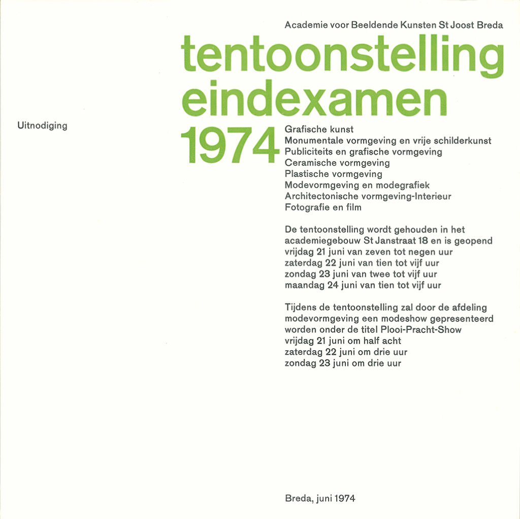
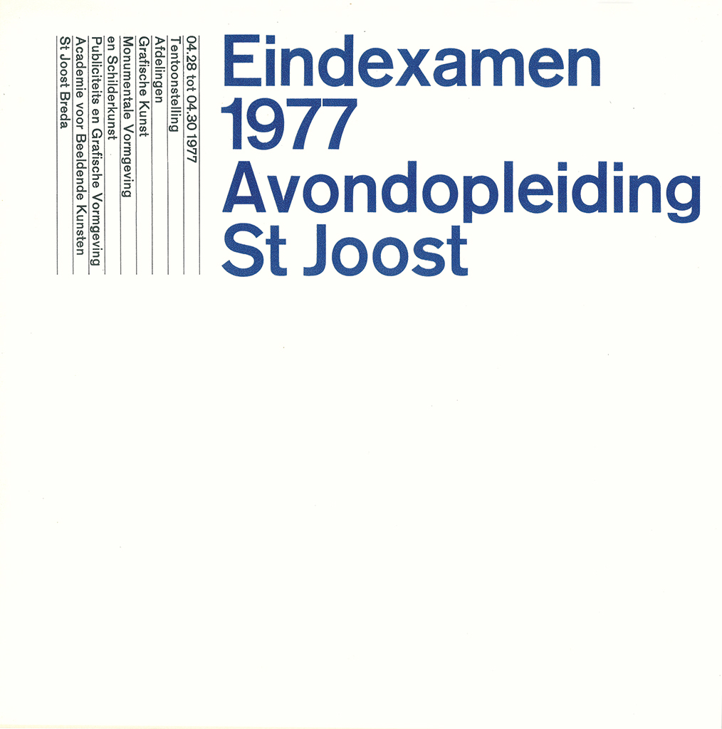
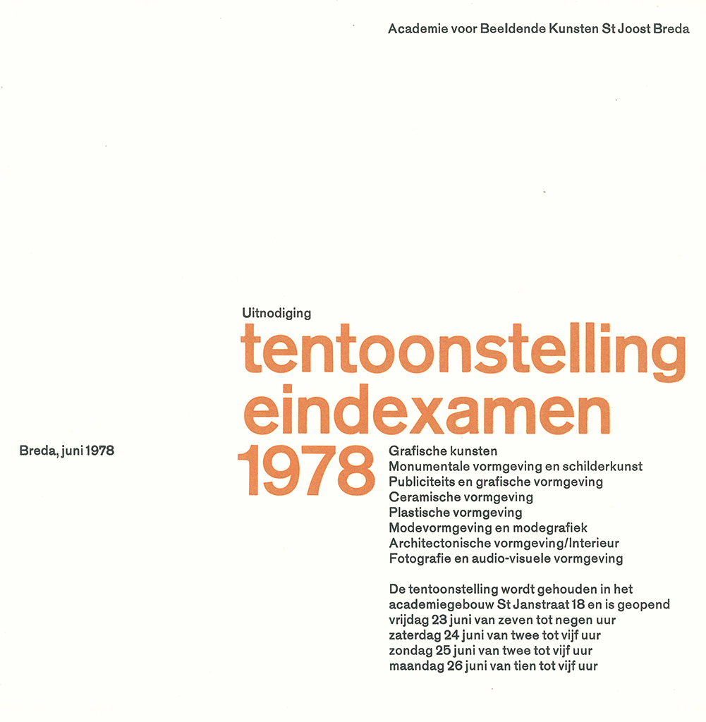
Publications of St. Joost academy of art, Breda (invitation 1974, catalog 1977, invitation 1978)
In 1974, Gerard Slee, St. Joost’s director, had to take sick leave. Peeters was appointed the academy’s acting director and eventually, when Slee’s illness forced him to retire, Peeters replaced him. “I followed an open door policy and immediately had a huge conference table installed in my room. Being directly involved with all the education processes I learned a lot about the organization as a whole.” Starting from the late 1970s, exchange programs were developed with art academies in other countries. A series of lectures were programmed including a four-day congress with lectures and discussions on a variety of issues and themes.
“…as directors to create the conditions for the education of young people […] in such a manner that the thought of a ‘sanctuary’ could be upheld without the risk […] of obfuscating the individual responsibilities of teachers, students, directors and board members” (Jacques Peeters in an interview by Jacques Grijpink in Brabantia magazine, January 1991).
One of his major tasks during the early years at the academy was the development of a new curriculum, with as priority a clear description of the programs for the photography and film department and the architectural and interior design department. Film evolved into audiovisual design. “By the end of the 1980s the academy’s independent audiovisual department had become a great success, having educated a number of remarkable filmmakers,” wrote Flip Bool in 50 jaar fotografie (Breda, 2008). For a few years, until 1980, Peeters held the chair of VABK, the Dutch association of art academies.
Long before Peeters became its director, St. Joost Academy had already explored expansion of its main building at St. Jansstraat. There were three annexes in town when, at the start of the 1975-76 academic year, the famous architect Herman Herzberger delivered a lecture called ‘Plan – Thoughts about a new work space for St. Joost’. Dré Tacke, member of the board of directors, was the one who would be tasked with the development of Herzberger’s ideas. They were close to realization when education minister Deetman ordered a reorganization of the Dutch higher education institutes (HBO): each school should have a minimum of 600 students. Herzberger’s plan had been based on 320 students (of day classes), a number St. Joost knew it could handle and therefore preferred. The ministerial decision brought all building plans to a halt. It forced St. Joost to start conversations with other HBO schools in the area, which in 1994 resulted in the academy’s move to Klein-Seminarie Ypelaar, an existing building owned by West-Brabant College.
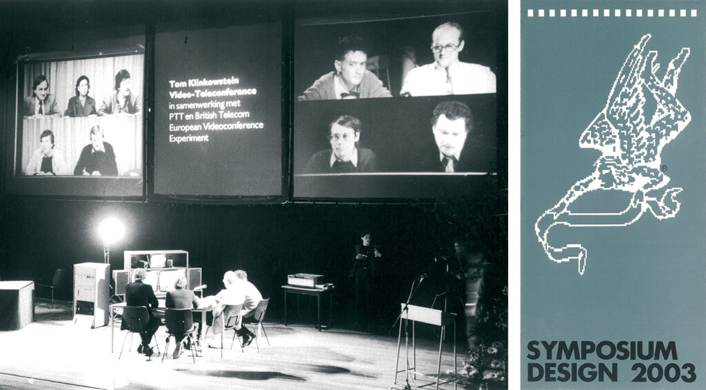
Symposium Design 2003, city theater, Breda, May 19, 1983 (photo: Hans Chabot). Program brochure, Symposium Design 2003, published by St. Joost, Breda, 1983 (design: Jan Begeer)
In 1983, De Beyerd in Breda looked back at twenty years of TD’s design history with the exhibition 20 jaar Total Design. Peeters saw his chance and took the initiative for a symposium (Design 2003), which would look at developments to expect in the near future. One of the academy’s professors, the American photographer Tom Klinkowstein, was a savvy computer wizard who knew about the newest developments; he created an interesting program that attracted 800 Dutch and Belgian professionals and aspiring professionals to Breda. Klinkowstein on stage in Breda’s city theater entered a confusing video discourse with colleagues in London and a teletype connection with the US. In 1983, this was enough to make the audience go wild. The program continued with a lecture by Erik Jansen, Paul Mijksenaar and Rens Holslag (TU Delft) entitled ‘The computer as a design and visualization tool’. Rent Holslag became St. Joost’s professor of pilot projects involving the computer, and collaborated in this field with the academies in Rotterdam and Eindhoven. This resulted in the introduction of the first design computers at these three academies.
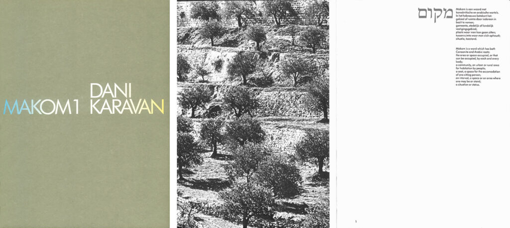
Cover and spread, catalog Dani Karavan, for De Beyerd, Breda, 1984
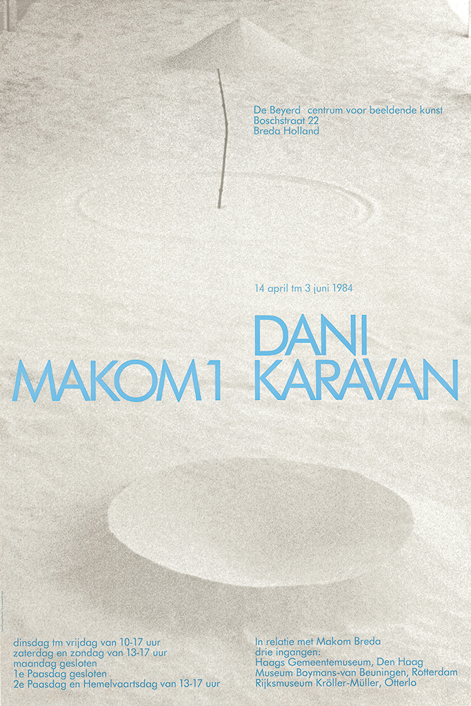
Poster Dani Karavan, 1984
Lecturis published a documentary in their publication series (1986, nr. 16) entitled Oefeningen typografische vormgeving (Exercises in typography). It presented the typography curriculum of St. Joost’s graphic design department and was edited and written by the department’s most senior professor, Jan Begeer. It showed designs created by students including the results of computer exercises and inspired many other academies to follow suit. Jacques Peeters was the one who presented the publication’s first copy to Lecturis director Henk van Stokkom. Symbolically, this event meant he had turned full circle in his professional career.
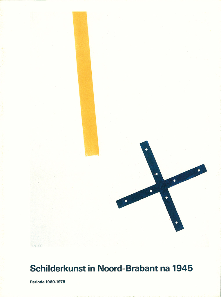
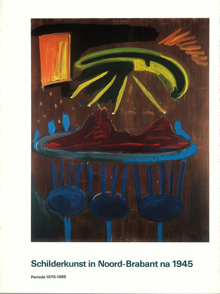
Catalog Schilderkunst in Brabant, published by NBKS, 1986 and 1987
In 1987, heart problems forced Peeters to step down and see Maarten Regouin take over the directorship of St. Joost. In November 1988, the academy bade him officially farewell by organizing an exhibition in De Beyerd called De jaren Peeters (The Peeters years), which presented the work of excelling St. Joost students from the period 1973 until 1987.
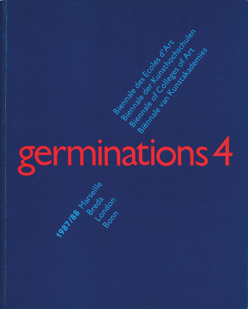
Catalog Germinations 4, Marseille, Breda, London, Bonn, 1988
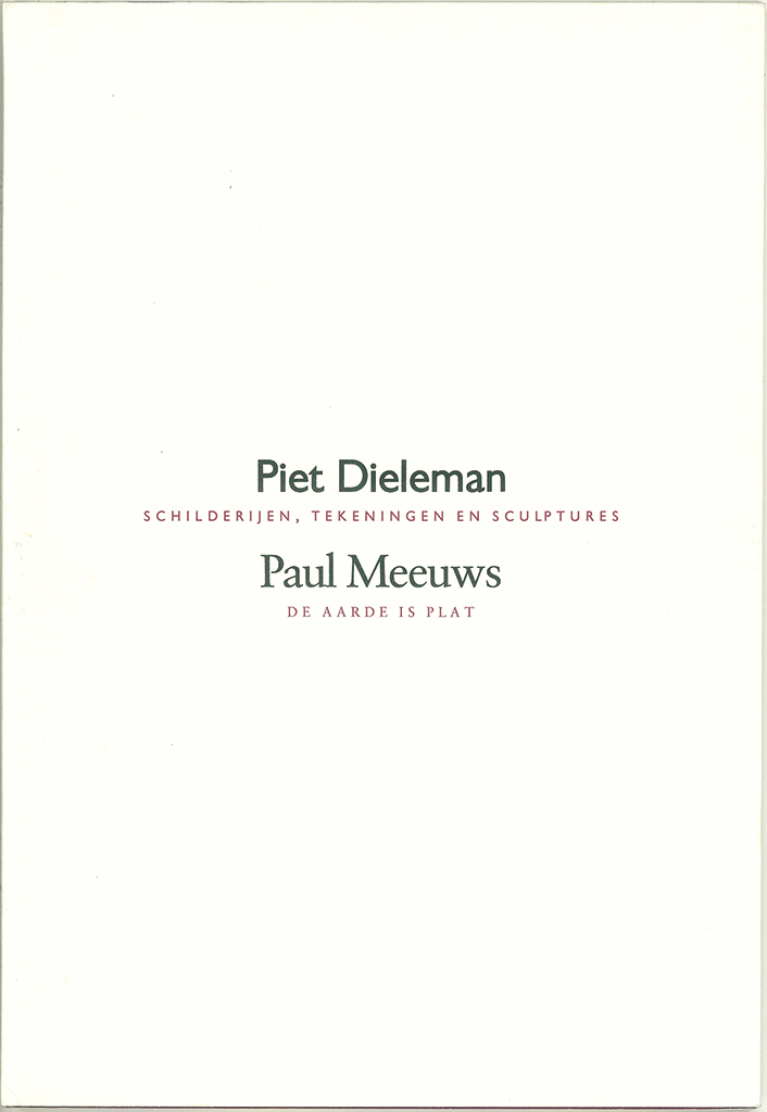
Catalog Piet Dieleman/Paul Meeuws, for Philip Morris Holland, Bergen op Zoom, 1989
Germinations
Peeters had been involved with the project Germinations since 1984. This German/French initiative aimed at the establishment of a European Biennial for (coming) graduates from European art academies. Georges Boudaille (founder of the Paris Biennial) and Horst Wegmann (cultural ambassador for Germany in France) were backing the initiative. Germinations 3, with the participation of the UK and the Netherlands, had Breda, Kassel and Paris as locations. Eight recent graduates from the art academies in Amsterdam, Breda, Enschede and Groningen showed their work. After his retirement, Peeters remained involved with the organization of the traveling Germinations exhibition. In the end, fourteen countries participated; the European Commission supported the initiative. In 1994, two locations in Breda shared the yearly exhibition: De Beyerd and the new home St. Joost had found, De Ypelaar. It was the last Germinations coordinated by Jacques Peeters and was opened by Queen Beatrix.
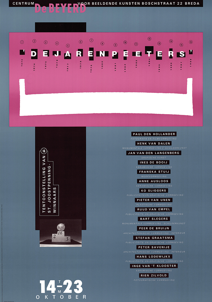
Poster farewell exhibition De jaren Peeters, for De Beyerd, Breda, 1988
Later
Not that Peeters disappeared from the art and design world. After he had retired, Peeters organized the project Art and literature by request of Philip Morris Holland in Bergen op Zoom. The first exhibition opened in September 1989. Peeters himself designed the catalog, Piet Dieleman/Paul Meeuws. He also designed the fourth (complicated to lay out) catalog of the series, A.M. Kopper/M. Februari. Young graphic designers were invited to do other catalogs. The project was terminated in 1994.
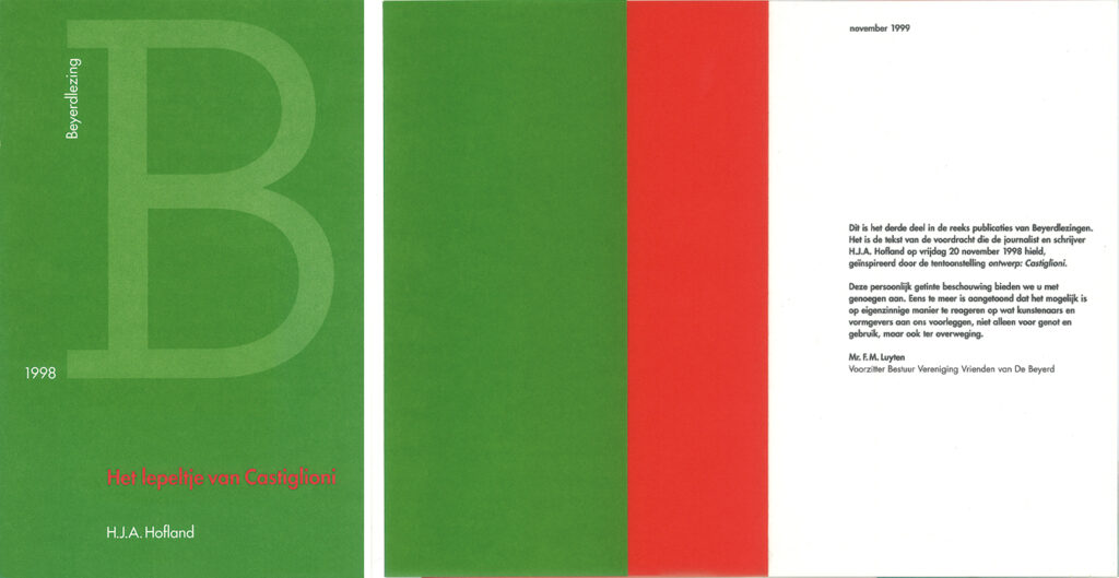
Cover and spread Het lepeltje van Castiglioni by H.J.A. Hofland (Beyerd lecture 1998)
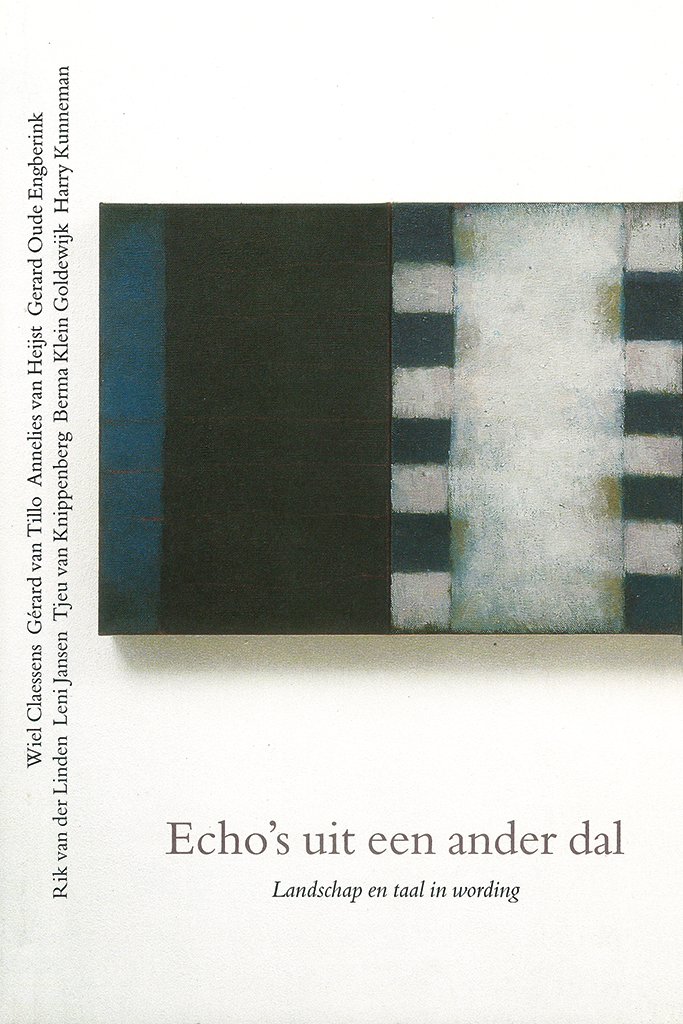
Echo’s uit een ander dal, Edmund Husserl foundation, Amsterdam, 1993 (cover design: Ton Frenken)
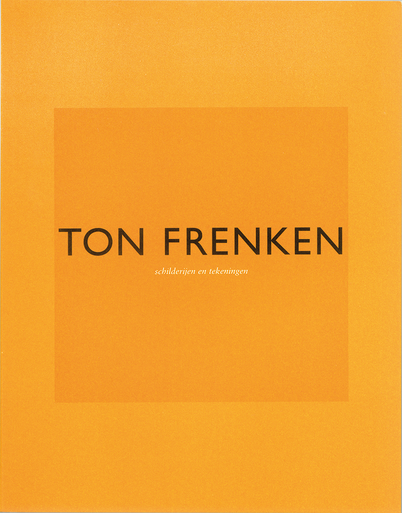
Catalog Ton Frenken, for art gallery Borzo, Den Bosch, 2000
With, and for, his good friend the artist, organizer, art critic and art teacher Ton Frenken, Peeters created many catalogs. In 2004/2005 came the apotheosis with the publication of Frenken’s book of quotes from eighteen episodes of Ulysses by James Joyce, which in a Dadaist way were combined with quotes from the Odyssee and Kafka’s poem Ithaka from 1904, the time that Joyce started his pilgrimage around Europe. After Frenken sadly passed away, his widow collaborated with Peeters to finish the project.
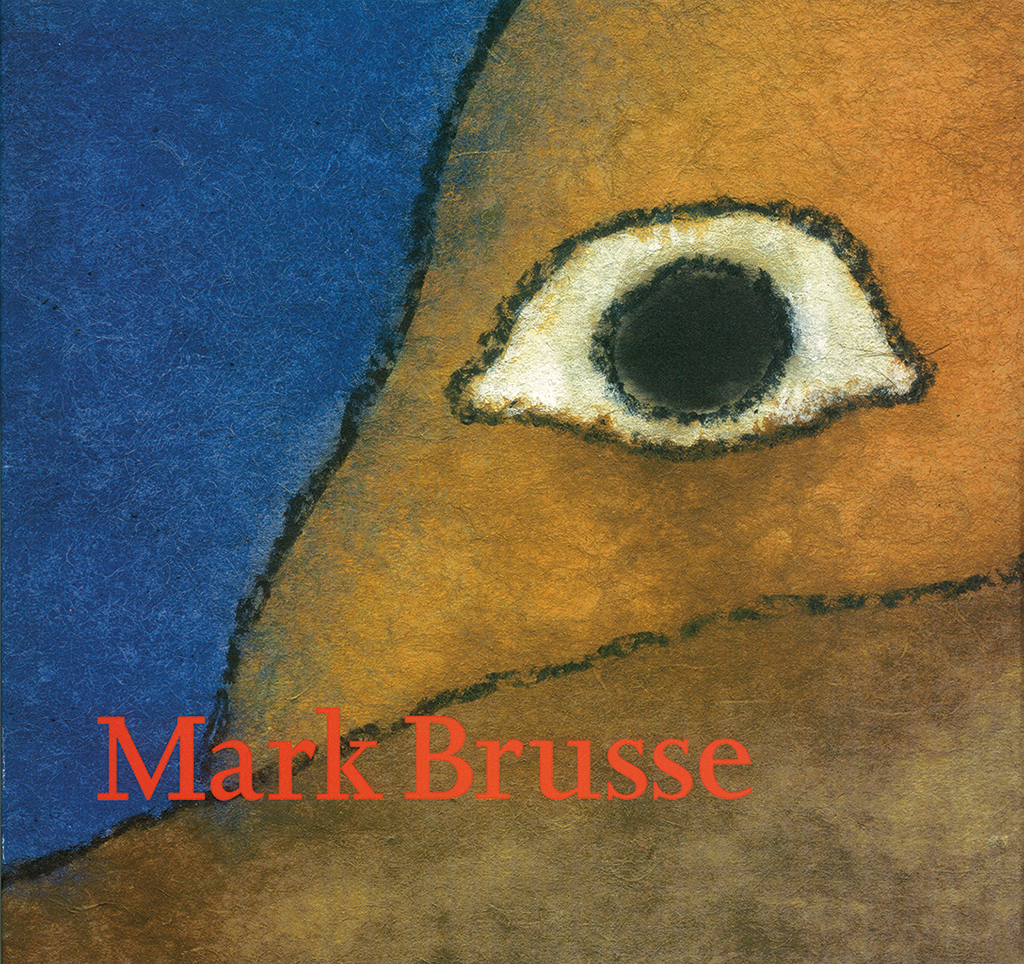
Catalog Mark Brusse exhibition, De Beyerd, Breda, 1999
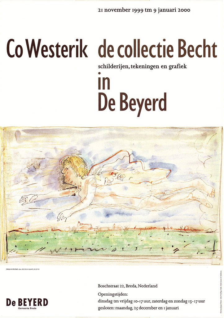
Poster Co Westerik. Collectie Becht, De Beyerd, Breda, 2001
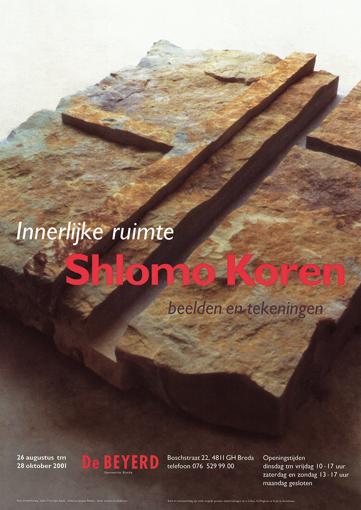
Poster Shlomo Korèn, De Beyerd, Breda, 2001
Jacques Peeters continued to design catalogs and posters for De Beyerd. He worked with the Israeli artists Dani Karavan, Ofer lelouche, Raffi Kaiser and Shlomo Korèn; he created an overview of artist Mark Brusse’s life and work and a series of posters for the exhibition Co Westerik. Werk uit de collectie Becht. “De Beyerd’s Frank Tiesing was a dream client who gave me the opportunity to closely collaborate with the artists and influence their catalogs’ contents.” Peeters was also responsible for publications of the Nieuwe Brabantse Kunst Stichting NBKS (New Brabant Art Foundation), most of which introduced the work of young artists. For SUN publishers in Nijmegen he collaborated with Henk Hoeks on books about the artists David Kouwenaar and Ria van Eyk. Now “a fulltime retiree,” Jacques Peeters continues to be involved with design projects which add lively chapters to the fascinating story of Dutch graphic design.
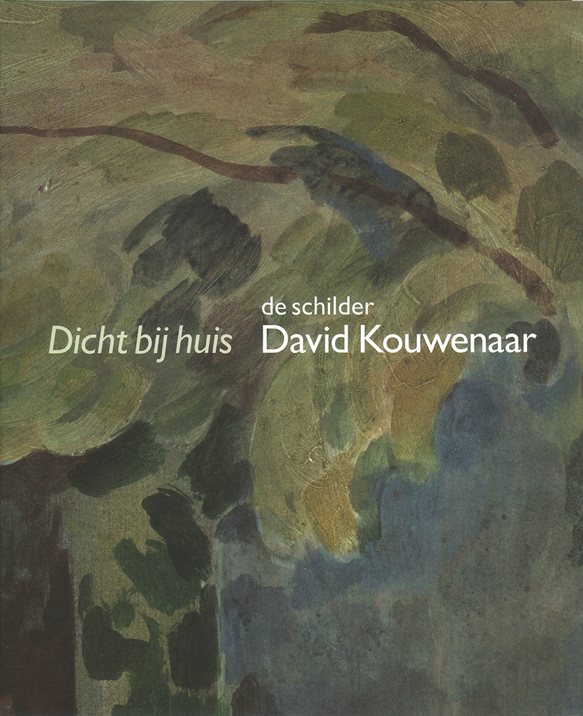
Book Dicht bij huis, about art by David Kouwenaar, SUN publishers, 2001
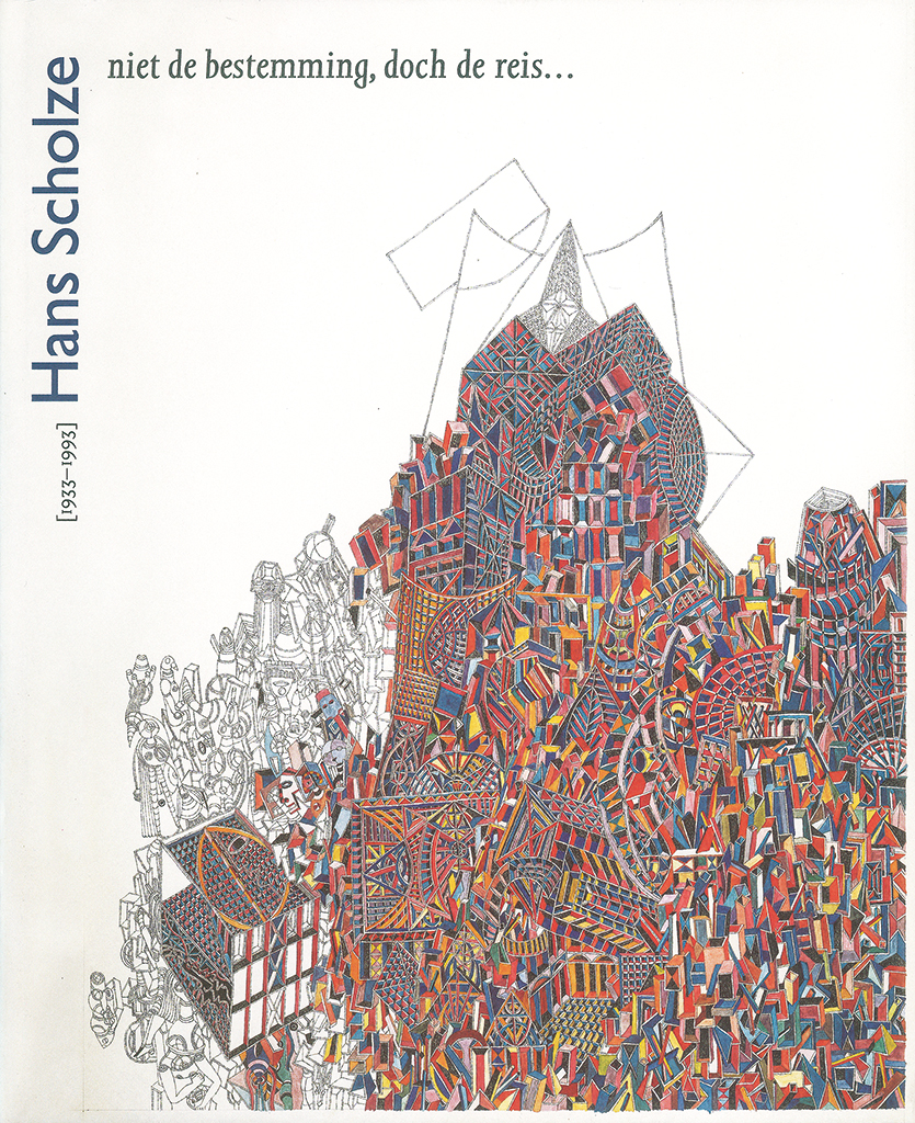
Book about Hans Scholze, SUN publishers, 2004
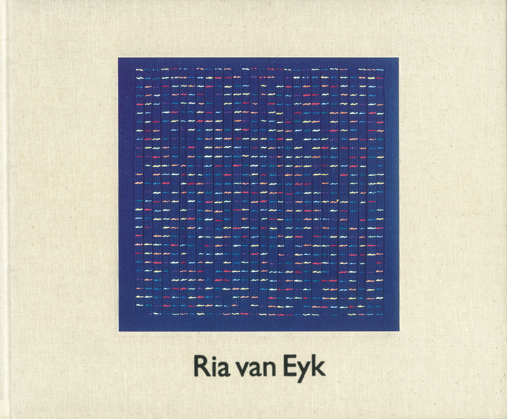
Book about Ria van Eyk’s life and work, SUN publishers, 2006
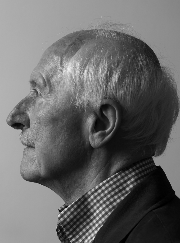
Jacques Peeters
born on 19 July 1934, Venlo
Author of the original text: Rens Holslag and Jaap van Triest, September 2016
Translation and editing in English: Ton Haak
Final editing: Sybrand Zijlstra
Portrait photo: Aatjan Renders