Will van Sambeek was one of those Dutch designers who were moved by Swiss modernist design already in the 1950s. In 1957, he was able to travel to this designers’ Mecca because he had won the award for best graduation project from St. Joost art academy in Breda. The other country that influenced his career was Japan, where he landed to work in the 1960s. Once back in the Netherlands, he and Shigeru Watano started their own design studio. They had a diverse clientele and worked on advertising campaigns and corporate identity programs, books and magazines as well as newspapers. Recently, his many-sided oeuvre was transferred to NAGO (the Dutch graphic design archives, now taken over by the Wim Crouwel Institute).
He was born in 1935, named Petrus Wilhelmus Maria and called ‘Willy’. Design was in his blood: at age fifteen he produced his own magazine The Sambec Star, with the squirrel in its logo inspired by the famous Dutch cartoon character Tom Poes. He loved cartoons and animation movies and preferred to draw over doing homework. His one-man ‘company’, named William Sambec Studios, produced copy for the weekly youth section of the daily Belgian newspaper, Gazet van Antwerpen. He also produced his own monthly insert: Variété. Hiding behind pseudonyms such as ‘Wim Wijsneus’ (Billy Smart), he wrote short fiction and stories about Marten Toonder’s studio and more. He added cut-out capital letters he had sampled from magazines to his copy to suggest which type would suit best. Some time later, a boy from Enschede, one Jan Cremer (the future author and painter), continued Variété, renamed De Tukkerbode (referring to the nickname of Twente area residents: ‘Tukkers’). His father decided to take action after he had found out about Will’s lack of school discipline; he sent him to a secondary school (MULO) that had special homework classes. Soon afterwards, his father decided to put Will’s name forward for enrolment at St. Joost art academy in Breda.
His parents Jo van Sambeek and Nelly Veltman, though easy-going, thought a good education was important. Father Jo had originally been destined to become a house painter, but he continued his education and ultimately became a teacher at Breda’s technical school. He painted and illustrated in his spare time. A good roman-catholic family, they had ten children; Will was their first-born.
The academy, originally located behind St. Joost chapel, had Gerard Slee as its director, coming from the art academy in Rotterdam. He reformed the original workshop for religious art into a real art school with different departments: painting and drawing, fashion, sculpture, ceramics, interior design, and publicity. Will van Sambeek still loved to illustrate – one day, he hitch-hiked to Amsterdam to see a show by his hero Saul Sternberg – but illustration was not taught as a separate discipline at St. Joost’s. All students, whatever their chosen discipline, were introduced to a broad range of subjects: religion, philosophy, literature, math, music, and art history. IJsbrand Pijper taught advertising theory, but the most influential teacher was type designer Chris Brand.
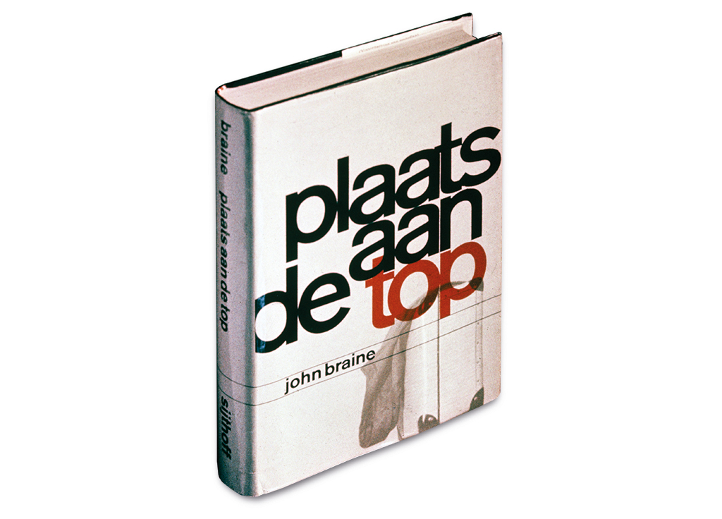
“He enthused us for typography and he was good at dealing with young people. At the time, he created the Albertina font and designed books for Sijthoff publishers. In calligraphy class he had us draw letters meticulously. Also, he showed us examples of letterheads used by designers like Jan van Krimpen and Dick Dooijes. We discussed the contents of magazines such as Graphis and Gebrauchsgraphik, available in the academy’s library. Later, the academy got its own printing press. We educated ourselves by visiting the E’55 event in Rotterdam and lots of museums.”
In 1955, Van Sambeek hitch-hiked to Paris, where he saw the first exhibition of work by members of the Alliance Graphique Internationale (AGI), a select group of top designers and friends who had assembled professionally. The Dutch were represented, too: Willem Sandberg, Wim Brusse, Dick Elffers, and Otto Treumann. Their work left an unforgettable impression (their influences were evident in Van Sambeek’s final exam projects). His poster design for Sunkist oranges used the drawing of a centaur – half woman, half donkey – that carried oranges in a basket; the female half-raised an orange which was kissed by the sun. The design was influenced by a French designer much admired by Van Sambeek, Raymond Savignac. Alas, the original poster got lost. The award for best graduation project came with 1,500 guilders and the stipulation that the money had to be spent for study purposes. After he had finished his obliged military service in the Netherlands. In 1957, Van Sambeek he used the money to travel to Switzerland.
The shock of modernism
In Basel, Van Sambeek asked for an audience with Karl Gerstner, a strongly methodical designer who developed complicated yet ingeniously flexible grids. In 1959, this master of grid design would write Die Neue Graphik and four years later he delivered Programme Entwerfen. Rational thought was the bedrock of problem solving, said Gerstner. Together with copywriter Markus Kutter he ran an agency that worked for the giant chemical industry Geigy. Geigy’s design department was a hotbed of creative talents and their graphic ‘Geigy’-style became famous worldwide as the International Style. This style, also taught by Emil Ruder, was influenced by Bauhaus and concrete art. Providing good information was seen as essential and the communication tools were grids, sanserif lowercase type and photography. Gerstner dismissed Van Sambeek’s work, saying he wasn’t interested in illustrations. At Gerstner’s, Van Sambeek noticed a commemoration book for Geigy that was still in the embryonic stage and got intrigued by the way photos and diagrams were used: they were subtly combined with a very strict typography. “A remarkable book. I sensed that something was going on, something new I wanted to be a part of. I was a sponge in Switzerland, I sucked up everything. I liked Gerstner the best: he didn’t go for mere esthetics; he was looking for strong concepts.”
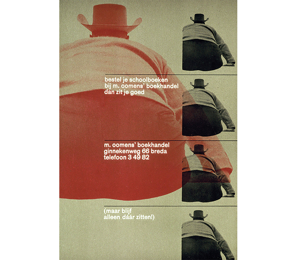
Zürich was where most of the modern Swiss designers had settled. It was there that Van Sambeek met Josef Müller-Brockmann, Richard Paul Lohse, Hans Neuburg, Carlo Vivarelli and Siegfried Odermatt. For a while he pondered about attending the Hochschule für Gestaltung in Ulm, but he couldn’t come up with the tuition fees. On his way back to the Netherlands, still hitchhiking, he went to visit the Triennial in Milan and the world exhibition in Brussels. He returned to Breda full of impressions and rich of experiences. He wanted to learn more about the Dutch modernists from the interbellum, because Emil Ruder had told him that Piet Zwart had been his frontrunner. Van Sambeek knocked on Piet Zwart’s door and also visited Paul Schuitema; he explored the historic avant-garde by reading everything he could lay his hands on. And he began to write. In his essays and articles he stated how the Dutch had preceded the Swiss and steered them toward developing their International Style. He lost his interest in illustrative design and urged for clarity and simplicity, and for departure from the chaos that dominated the design of the day. For quality reasons, he became an advocate of separating the education of the applied arts and the visual arts at art academies. Breda bookseller Hans Kreyns and Van Sambeek traveled to Amsterdam’s Stedelijk Museum to consult many volumes of De Stijl magazines that were preserved in the museum library. Kreyns was his first client (for his bookstore Oomens) and introduced him to others, such as publishers and the newly opened cultural center De Beyerd in Breda, then under the direction of Theo van Velzen.
To Amsterdam and Eindhoven
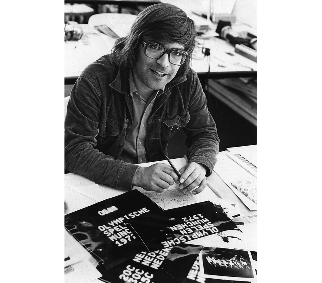
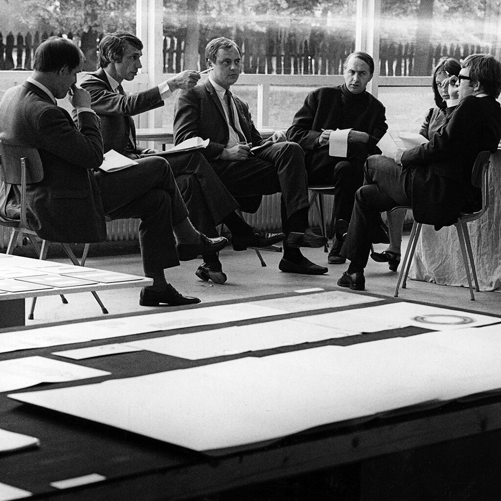
Lots of projects were dropped on Van Sambeek’s desk. His designs showed his preference for Akzidenz Grotesk and the use of lowercase type as well as geometrical forms; with color in planes and lines on top of each other or keeping close company, and photos in supporting colors. In 1961, he joined GKf, the elite professional organization. His work was entered in the exhibition in the Stedelijk Museum and he was asked to become a GKf board member. He was joining the inner circle of Dutch graphic design: Otto Treumann, Karel Beunis, Jurriaan Schrofer and Wim Crouwel. The exhibition traveled from Amsterdam to Breda, where Van Sambeek introduced GKf during his opening speech: “GKf means sensible design and high quality.” He continued: “The graphic designer, although a creator, isn’t an artist; and he isn’t just an esthetic and harmonious arranger of materials either: he determines the character of a printed item.”
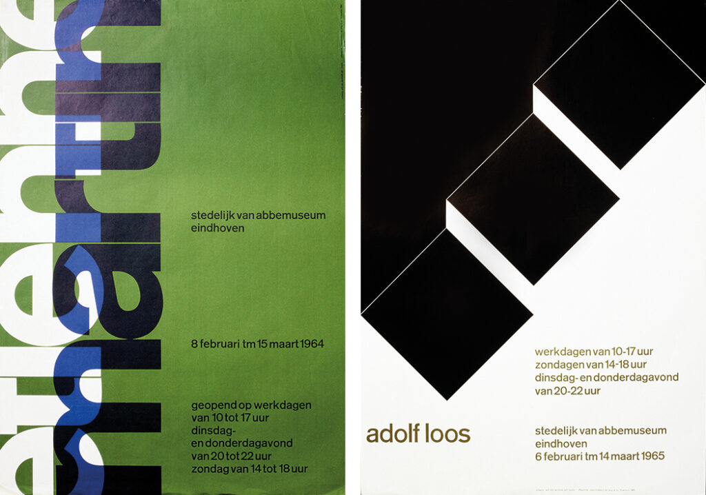
Later, Wim Crouwel asked Van Sambeek if he would like to succeed him as the Van Abbemuseum’s graphic designer in Eindhoven. Crouwel had followed Van Abbe’s director Edy de Wilde to the Stedelijk Museum in Amsterdam. He recognized Van Sambeek as a kindred spirit. Van Sambeek designed twelve posters and a series of catalogs for Van Abbe’s temporary director, Paul Groot. Steendrukkerij De Jong printed the posters, all of them graphic compositions of form, color and type. The artists were introduced by Van Sambeek’s abstract-geometric translations of their art, with their names and other information showing a subdued use of type. He visualized Etienne Martin’s sculptures, rising from the earth in a play of positive and negative shapes, by a vertical use of type. His poster design for the Adolf Loos exhibition using big squares referred to the architect’s design of terrace houses.
Japan
A major career change came not much later. Pieter Brattinga and Simon den Hartog (Steendrukkerij De Jong) had recommended Van Sambeek when a Japanese printer came looking for western designers. The Japanese had been advised to expand their design studio by Josef Müller-Brockmann, who had already sent several of his own assistants to Japan. Van Sambeek showed his work to a Japanese woman in Amsterdam, who pushed an incomprehensible contract under his nose. “I tried to figure out what it said, but Hans Kreyns told me, ‘Why bother? What do you have to lose? If all goes well, you’ll have a wonderful experience. If not, you’ll have had a wonderful experience too.’ In 1965, a 29-hour flight with 10 stops took me to Osaka. That’s how I ended up at Yarakasukan printers and at NIA, Nakamoto International Agency’s design studio, in the company of two Swiss colleagues, one English designer and a group of Japanese designers. They were eager to learn from us, but NIA also used us Europeans as their ‘chic’ showpieces. We felt honored to be the ones asked to introduce the Japanese to western cultural concepts, but it was somewhat confusing that we found ourselves so much in admiration of the Japanese culture.”
Van Sambeek was at home in Japan; he loved the rich Japanese culture and the country’s beautiful nature. He admired their temple architecture and their use of pin-and-hole connections to protect the noble wood. They designed their homes based on the floor mat module and the layout of their traditional gardens was also regulated by strict rules. Van Sambeek recognized many European modernist principles in the well-organized Japanese esthetics. Centuries-old family symbols resembled modern company logos. Food, the theater, folk art and books – all gave evidence of respect for craftsmanship and pure beauty. Nevertheless, Japan was already a technologically highly advanced society with bullet trains, audiovisual innovations and other technical and intellectual fireworks.
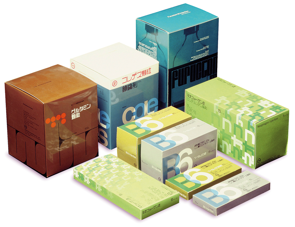
Edy de Wilde had asked Van Sambeek to collect Japanese graphic design for a show in the Stedelijk Museum. “The best work wasn’t visible in the streets, which were flooded by neon signs and advertisements. Young designers organized their own shows. The Japanese picked up whatever crossed their path, they adopted it and found new applications for it. They loved extremes, but at the same time they were less influenced by hypes – new fashions or developments only slowly took over. Their posters were very graphic; they expressed simplicity and showed a refined, subtle yet playful use of colors. This helped soften my own severe Swiss approach. Their culture never stopped amazing me: so individualistic on one side, such a strong sense of conformism on the other side. Even though forced to fit in, designers such as Tadanori Yokoo and Ikko Tanaka managed to create their own individual style of design. At NIA we noticed how polite the Japanese were; after a presentation, the client would congratulate and thank us warmly. He might suggest that, somewhere, there was someone higher in the hierarchy who could have a different opinion; most often this indicated that the proposal was turned down. Now and then we discovered elements of our rejected design proposals in the work of Japanese designers. We didn’t care, we just continued to do what we thought we had to do and created displays, packaging, and print especially for the pharmaceutical industry and companies such as Nintendo.”
According to the critic Masaru Katzumie (in the Stedelijk Museum catalog Gedrukt in Japan, 1967) the Japanese were suffering from a complex he called ‘dualism’. They wanted to develop their own design culture independently from western influences, while still thinking the world of what was happening in the West. Halfway the 1960s, designers and photographers had become hugely popular and famous in Japan. Van Sambeek wrote in the catalog: “In Japan, ‘design’ is a word that has acquired an image not unlike ‘Coca-Cola’.” The advertising sector was growing. Typesetting and print had already reached high quality standards. Leaving Japan, Van Sambeek recommended NIA to appoint the Swiss designer Helmut Schmid in his place, a student of Ruder’s who according to Van Sambeek practiced design as a devoted monk.
Will van Sambeek Design Associates
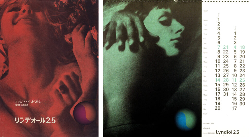
While living in Japan, Van Sambeek had befriended Shigeru Watano, an illustrator and designer who had provided the westerners with information, contacts and knowledge. When, back in the Netherlands, Van Sambeek was approached by pharmaceutical company Organon because they were planning to introduce their anticonception pill on the Japanese market, he remembered that Watano had indicated he’d like to work in Europe; he invited him to come to Amsterdam. Together, they created a campaign with ads, brochures, calendars and packaging. The only obstacle was: the Japanese government still had to approve the sale of the pill. The resistance against the pill coming from the gynecological lobby was strong – they were afraid to lose their abortion income. The gynecologists won, the campaign was canceled. Organon decided to aim the campaign on India. The Indians thought that the slightly erotic images (photos by Sanne Sannes) should be replaced by more explicit images from the Kama Sutra, but these were seen as unacceptable by Organon. In the end, Boudewijn Neuteboom produced a series of portraits of Indian women.
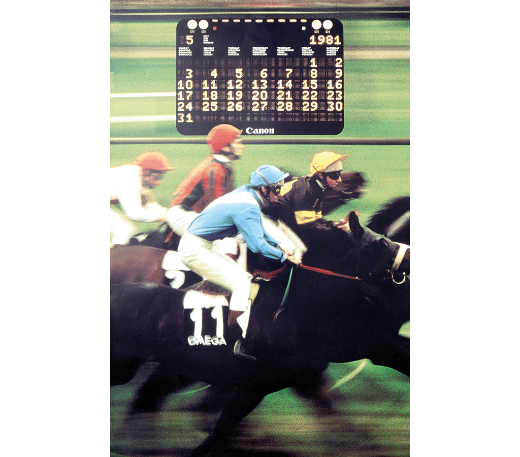
Watano’s presence in Amsterdam attracted clients such as Hotel Okura, Canon Europe (“For long years they were our studio’s mainstay”) and the Dutch entry to the 1970 world fair in Osaka. Watano took care of all typography in Japanese. “Shigeru was an illustrator foremost, an idea man and our cultural ambassador. We didn’t really divide tasks, we worked as a team, with four or nine designers, depending on the situation.” In 1984, Watano started his own agency.
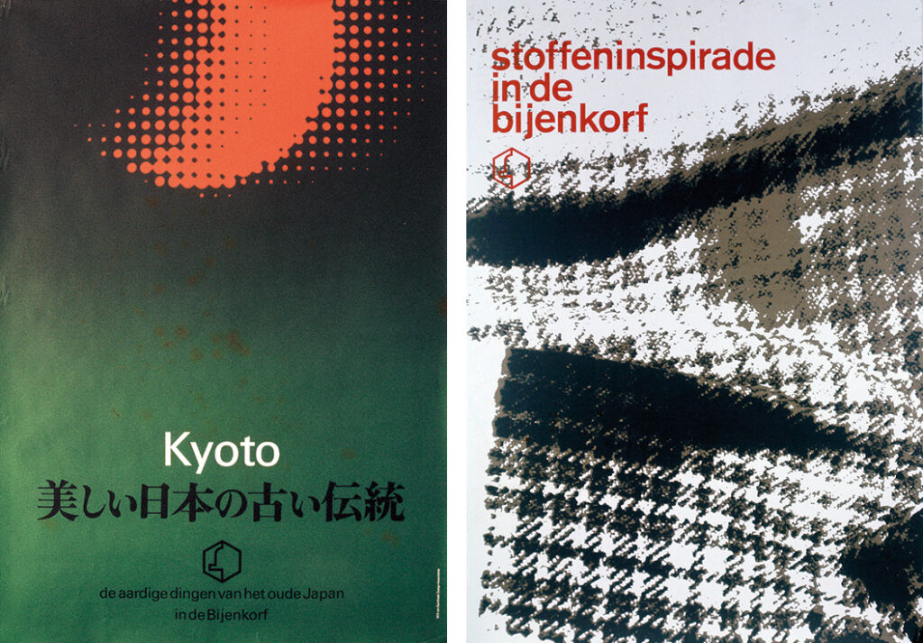
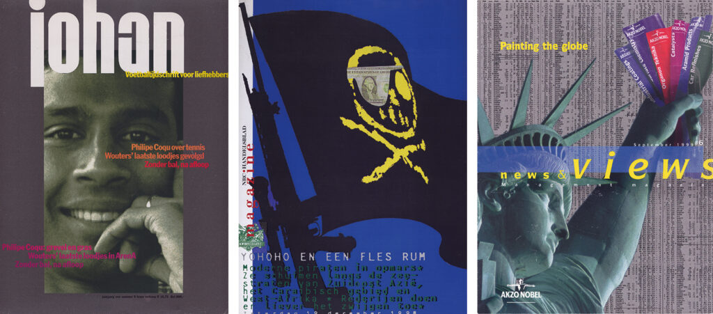
Van Sambeek’s studio got involved with a broad range of clients, including De Bijenkorf department stores, and they designed postage stamps, identity programs, packaging, and magazines for GP (Illustrated Press). Van Sambeek knew Mare van der Velde from Breda who was assigned to help start the new and prestigious glossy magazine Avenue, a publication put forward by GP’s ‘magazine engineer’, Joop Swart. GP had their own studio, under John van ’t Klooster, but their designers were not comfortable with the creation of a ‘high-brow’ product. In 1966, Joop Swart commissioned Van Sambeek. From its start, Avenue targeted a female readership; later, its editors added subjects about art, travel, literature and design. At Will van Sambeek Design Associates it was Henk Maas who was responsible for the fashion and cosmetics pages in Avenue. His ever-changing designs became guidelines for the other sections of the magazine.
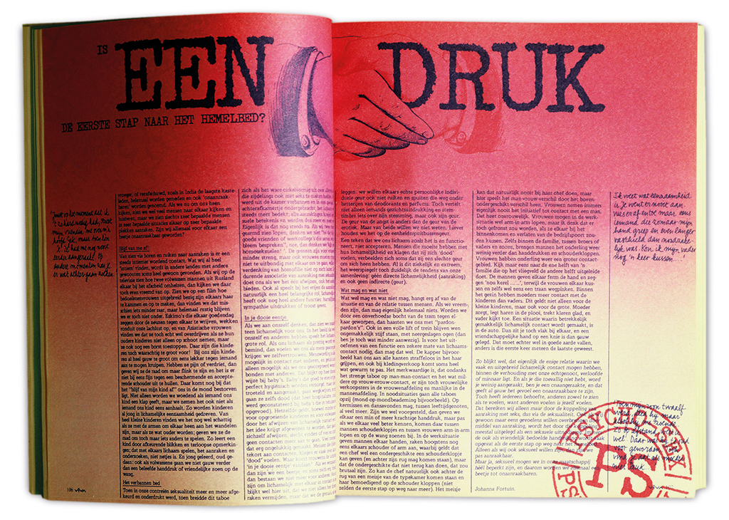
“We looked at British examples like Nova and the color supplement of the Sunday Times, Twen from Germany and Paris Match. Covers were created by different designers. Photography came from Boudewijn Neuteboom (also a former St. Joost student) and from Paul Huf. We were very selective. And we wanted the layout of each issue to be new; we used different fonts for headings and the grids also changed all the time, even within a one issue. The photography carried the magazine; we were not afraid to use blank space either, or strong contrasts. When Henk Maas left our studio, our connection with Avenue came to an end.” Joop Swart came up with another magazine concept aimed at young women. He bought the existing weekly magazine Eva and transformed it (in 1972) into Viva. Emancipation, work and sexuality were its subjects. Ad Werner designed its logo. Mariet Numan delivered illustrations and Philip Mechanicus was its photographer.
Van Sambeek got involved with more magazines published by GP (then a part of the VNU group of publications). All the time, new magazine concepts and formulas were invented and tested. Van Sambeek participated in these pitches until the 1990s, for instance for the women’s glossies Avantgarde, Etc. and Zest, as well as for sport and business magazines. After the Wall came down, they were sent to Berlin to design Tango, a low-key version of the news magazine Focus. The Germans had asked the former Avenue editor Dick de Moey to help them. After many expensive trials and experiments, the project was canceled. In 1990, Van Sambeek together with the journalist Max van Rooy tried to found Europlaza, a magazine about European culture, but did not succeed to get it published.
All-round
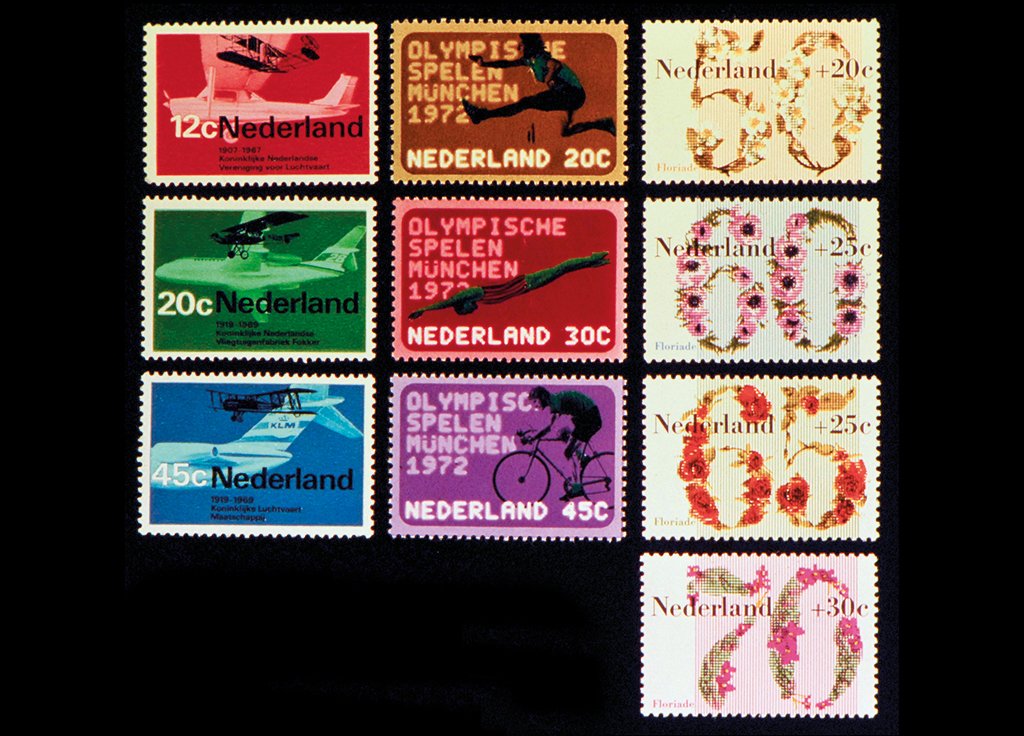
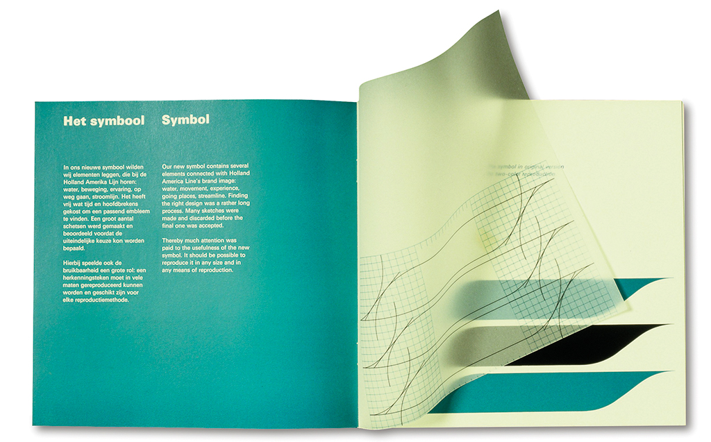
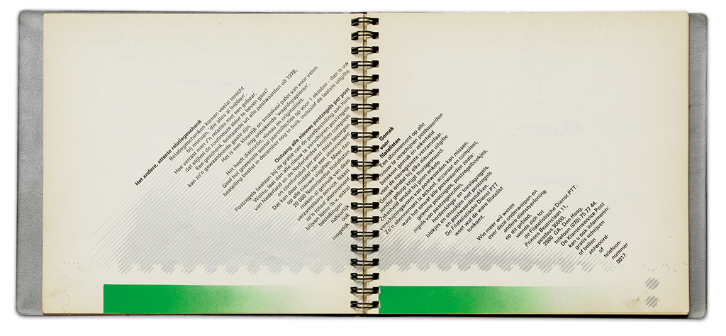
From the 1970s on, Van Sambeek’s studio blossomed. PTT commissioned stamps and desk calendars as well as brochures. For Holland-America Line (HAL) they developed a new corporate identity, a range of print publications and ship lettering; the logo refers to a flag, waves, and the bow of a ship. From Meijer Pers, a daughter company of Meijer printing in Wormerveer, came projects for annual reports of the Nederlandse Middenstandsbank and Taltaal, and a commemoration book for Schiphol Airport, as well as cookbooks and wine books.
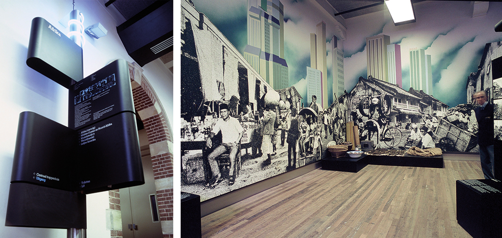
In 1976, the studio was responsible for the renovation of the interior exhibitions and displays of the Tropenmuseum (Museum of the Tropics) in Amsterdam, a complicated project to which interior designer Ko Kuin contributed. “We had to collaborate with ten curators, each of whom had his own ideas about how to organize the permanent exhibitions. Some of them were still thinking of copying African villages, which didn’t excite us much; we wanted to get rid of those dressed-up primitive ‘mannequins’ – we were thinking of photo collages and multi-media presentations.” Even though the design had to deliver an informal presentation, Van Sambeek used grids and modules and standard elements in the design.
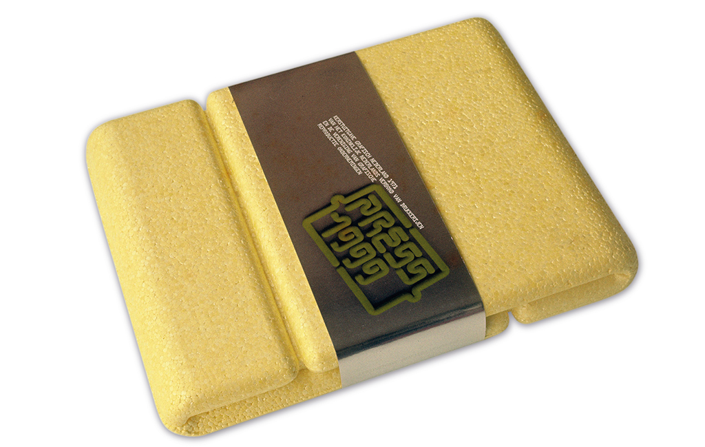
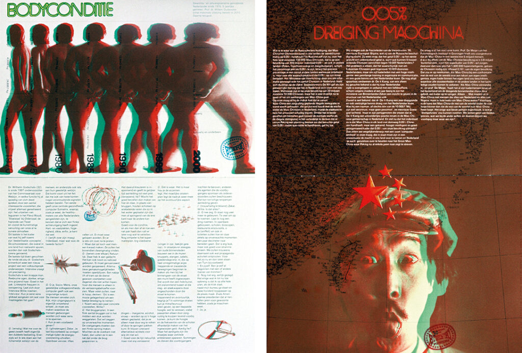
One other pinnacle was the design of de 1971 Christmas issue of Grafisch Nederland, the yearly showcase of the Dutch graphic industry. Each time, the selected designers had total freedom to do what they wanted with the chosen theme. In 1971, the theme was ‘communication in the year 1999’. Van Sambeek created a diverse and comical preview of the future by presenting a collection of ‘magazines’ in a foam box; the magazines were parodies of existing media. An in-depth interview was shown by way of a centerfold, in which the Dutch TV star Willem Duys appeared naked (also metaphorically, for all contents of his pockets were shown as well). Another magazine served the more nostalgic people: it looked back to 1971 from 1999. A brochure printed on aluminum paper referred to the future role of the fax machine as a distributor of the news. The general obesity of the Dutch was presented in a publication about ‘the body condition’ and a range of illustrations about the future could be viewed in stereo with the aid of 3D glasses. Nico Scheepmaker was the publication’s editor; authors of name, such as Tim Krabbé, Hugo Brandt Corstius and Renate Rubinstein, contributed. Thirty years later Will van Sambeek was asked to design the 2000 issue of Grafisch Nederland. Theme: ‘Optical illusions’. Although more conventional than the 1971 design, this publication was also a state-of-the-art graphic production. Full of gold and silver sprinkles, with abundant colors and fine typography, this Christmas issue opened the readers’ eyes to the world of optical illusion. Anamorphosis, trompe d’oeuil, and other illusions (such as by Maurits Esscher) were presented.
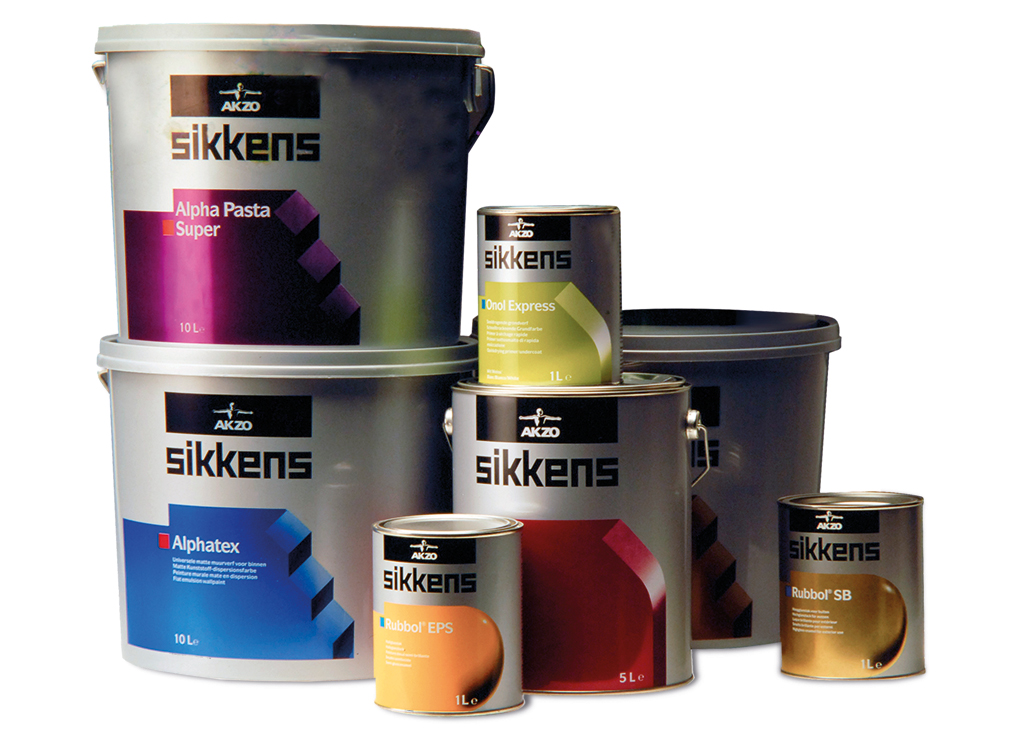
Not that Van Sambeek never designed more down-to-earth projects. For instance: packagings for the patisserie of industrial baker Meneba and for Sikkens/Akzo/Nobel paints. Newspaper publishers, too, commissioned Van Sambeek. He designed Friesch Dagblad, Volkskrant, and the Saturday supplement of NRC Handelsblad. His studio was interested in and used all graphic media. Throughout his career, Van Sambeek stylistically stayed close to what had inspired him already as a young designer: he loved to produce magazines and other surprising print, and he used exuberant collages and colors. He was always up-to-date.
When in 2005 AkzoNobel reorganized and hired another design agency, Will van Sambeek, then aged 70, decided to close his studio and retire; he had accomplished enough.
Will van Sambeek
born on 21 August 1935, Rosmalen
died on 3 November 2022, Amsterdam
Author of the original text: Frederike Huygen, September 2013
Translation and editing in English: Ton Haak
Final editing: Sybrand Zijlstra
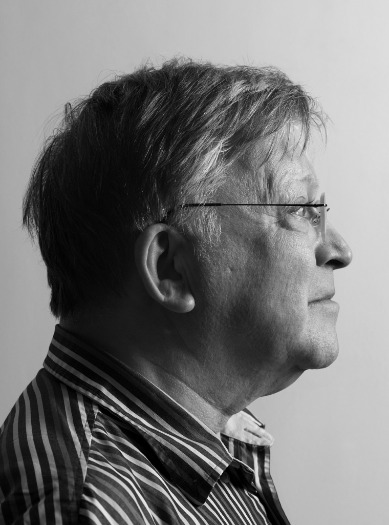
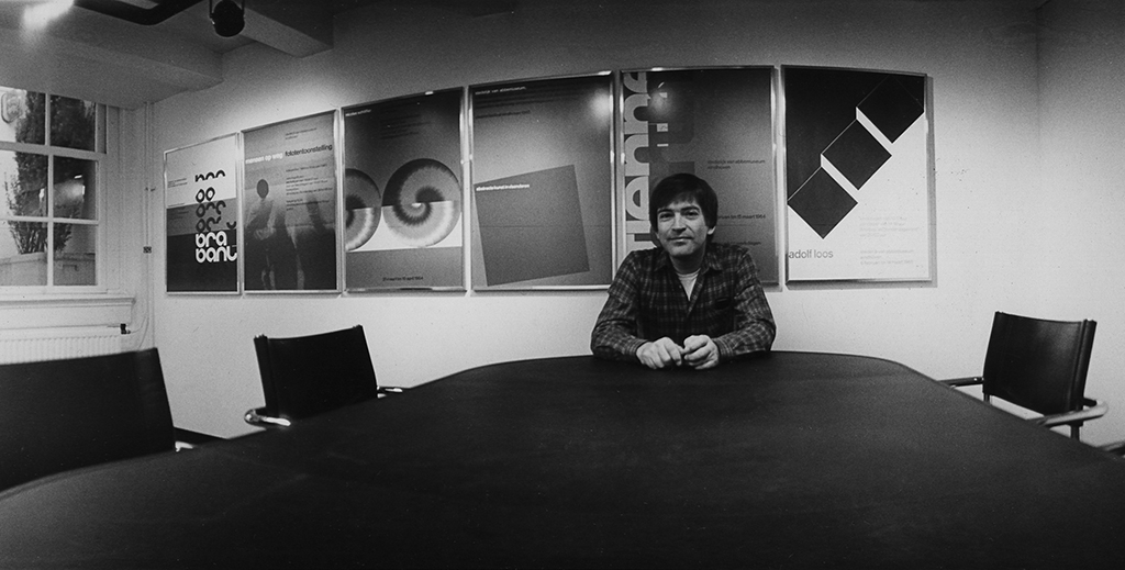
Portrait photo: Aatjan Renders