1967 – In the year that Milou Hermus graduates in fashion design from St. Joost, Breda, she is nineteen years old – an age at which most others first try to get admitted to an art academy. The editors of fashion magazine Cri decide she deserves a spread, which has as heading: “Milou Hermus, by all means no neat fashion.” She sits on the bed in her teenage room, looking pert if not cheeky and wearing red fishnet stockings and a beret. The interviewing journalist writes: “She is just a normal sweet girl, dressed in a modern but not striking way.”
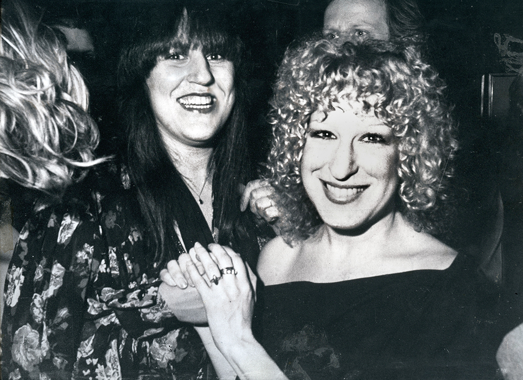
Milou Hermus and Bette Midler, 1978 (photo: Jan Stappenbeld)
Yet, this nineteen-year-old girl had already been the subject of an article in a Dordrecht newspaper, because her fashion shows were ‘experimental’ and her designs, such as a dress of transparent plastics, were ‘risqué’. It was the time of cultural and sexual revolutions: the 1960s. Poets and artists were meeting at Beat evenings where rock bands with names like The Soft Boiled Eggs performed. And where Milou would show her “silk pantsuit that precisely followed the shape of her body”.
BIJ redactioneel, De Bijenkorf, 1979
Bette Midler, 1980
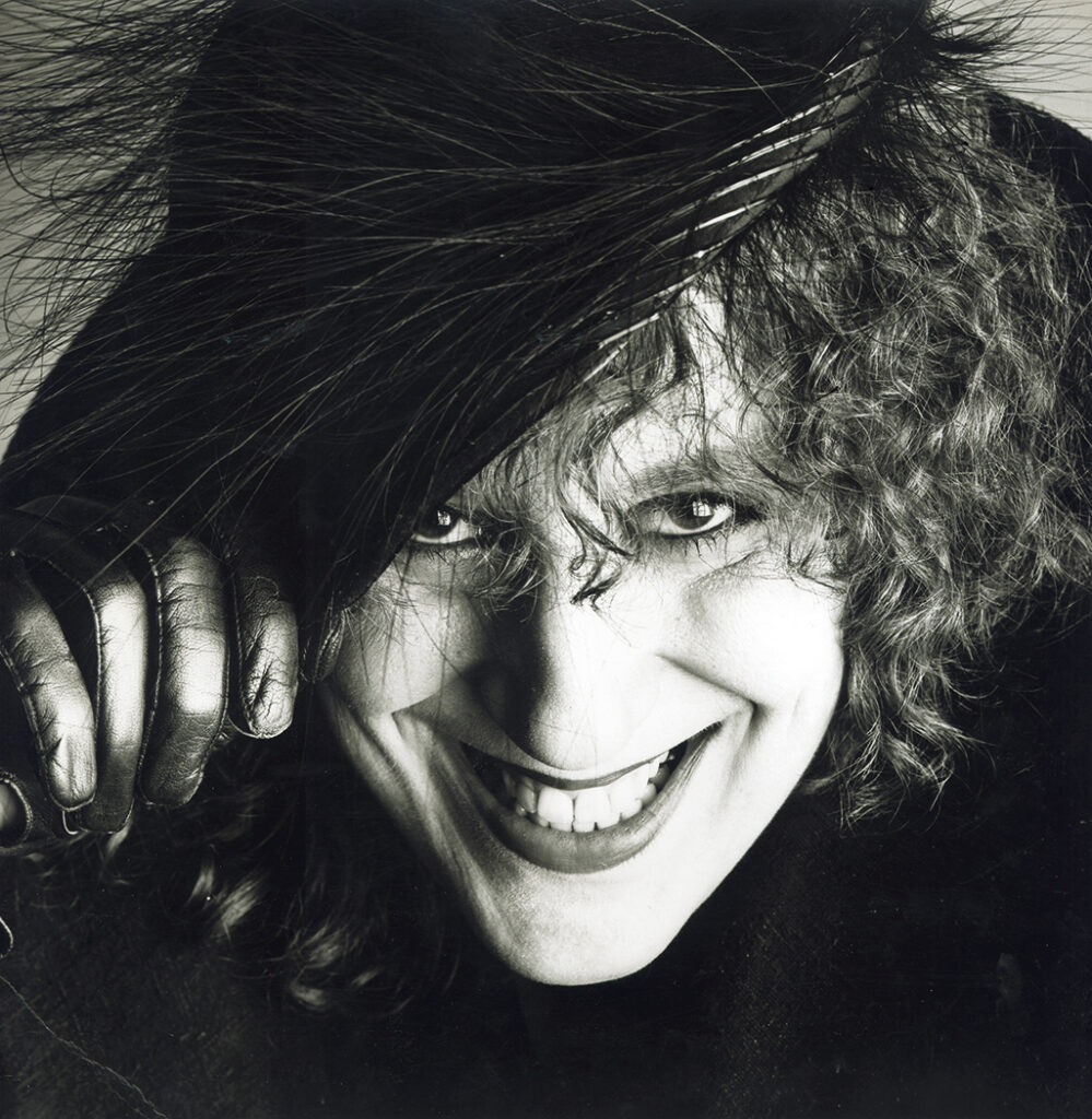
Milou Hermus, 1980 (photo: Paul Huf)
1980
Merel Laseur and Paul Huf write a column for the Saturday section Z of NRC Handelsblad. They write about beauty. Milou is thirty-three, a successful artist and illustrator; her friend, the artist Ton Blommerde, and she just moved to a stately home on Amsterdam’s Stadhouderskade. Looking back, Milou is a little embarrassed about how she expressed herself to Laseur and Huf. The piece opened as follows: “Now at thirty, I think I am extremely beautiful. Reaching thirty was something to be happy about. […] I remember I was reading Henry Miller at the time, and I loved it. Not just the frivolous sex, but what he said about himself – I don’t remember what exactly it was, but he released something in me that made me love life and do what I wanted to do, and grab anything I could grab.” The Paul Huf portrait photo NRC Handelsblad published over five columns along with the article shows a close-up of a broadly smiling femme fatale, who is wearing a feather hat and black gloves. Milou had 5,000 copies printed by Art Unlimited; she has still a bunch of them in her handbag, to hand out.
1947
Milou Hermus was born in Dordrecht. Creativity and inventiveness counted high in her family. Her mother sketched what she called ‘keekereekee’ drawings; her father was an inventor but devoted to sculpting in his off hours. Her brother and sister were creative in their own ways. In 1996, the family organized a group exhibition showing work by four of the five family members. Amazingly, after the minimum of acceptable secondary education Milou is allowed to study at St. Joost. She continues to live with her family in Dordrecht and takes the train to commute. “My mother didn’t want to see me living by myself in Breda, a town with a wild image at the time. And I didn’t want to become pregnant. I wanted a career!”
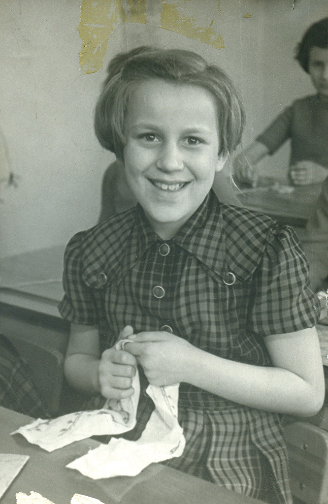
Milou Hermus, 3rd grade, 1957
1973
It took Milou five, six years to break through. In the meantime, she picked up everything to make a buck: working in fashion and making illustrations. For Van Gils fashions she creates hundreds of drawings for their sales catalogs. She designs dresses and has them made in home-ateliers to sell them in her small store at Lijnbaansgracht, Amsterdam. For the alternative magazine Gandalf she draws an advertisement for a mail order business that tells the male readers to, for once, ‘decorate’ their spouses by buying them a product from their lingerie collection. Milou lives in Amsterdam with her life-long partner Ton Blommerde. On a day Van Gils had just paid her, her eyes noticed a garage round the corner in Jordaan where a red VW Karmann Ghia was for sale. She could afford the negotiated price, although they said they would take the car radio out. It took her a while to park the car safely near their home (she had barely managed to get a driver’s license) and she proudly called out her partner to come and have a look. Not long after this, they managed to trade the VW for a Citroën 2CV – the VW gave up just after they’d left the rural buyer’s garage. Had they ever changed the oil, asked the buyer. Milou had no clue.
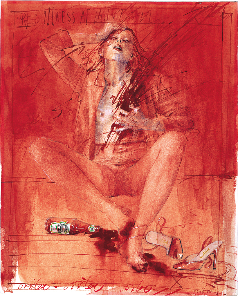
Avenue magazine, 1977
Her break-through came with what Milou calls her ‘ketchup drawings’. Dick de Moei was the art director for a fashion report in Avenue magazine (and would later receive an award for it). He saw her work and told her: “Just do something with red.” She created three magazine pages and was paid a mere 500 guilders. “Since Ton and I wanted to go to New York, where we could have someone’s apartment to stay in for just a little money, I started trading with Dick. I was commissioned to do a whole series and a cover. The fee paid for our New York trip.”
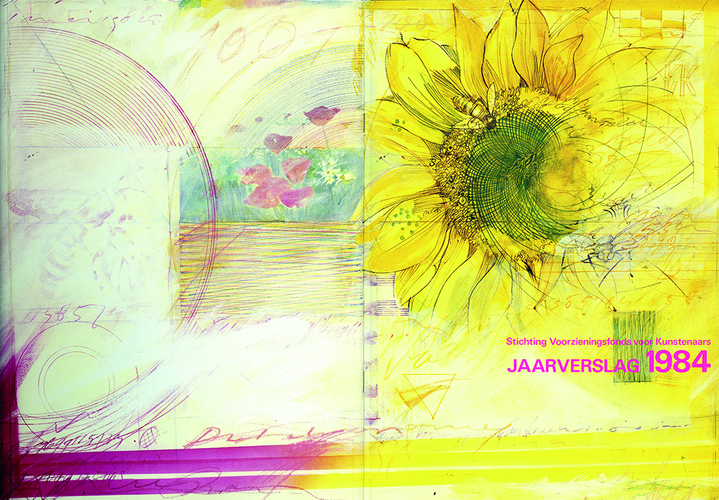
Annual report SvK, 1984
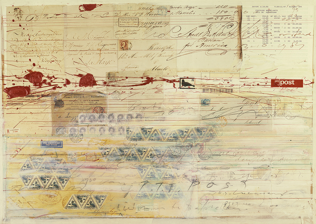
Calendar cover, PTT, 1987
2008
Les Belles Hollandaises is the result of a terrible crisis in Milou’s life caused by her partner’s suicide and her mother’s death after a devastating illness, all in 2005. Milou cannot create anything, has to stop teaching too. She misses Ton: “He was my sparring partner. He was an avid reader and he knew a lot. And he was phenomenal at composition. Sometimes when I was stuck he would come over and give me great suggestions. As I was trying to pick up my work, he was there all the time. Or rather, the problem was: he wasn’t there.”
Her painter’s block is broken when she paints a portrait of her best friend Moniek Toebosch’s mother. She discovers she loves doing portraits. She’d done them before, mostly of young, sexy and dynamic models. But now she paints an old woman. Later, she paints Moniek – like herself not as young as she used to be when she posed for the ketch-up drawings. Her sensitivity to intimacy, physicality and erotic tension comes out again, but now in the form of a devastating mirror of the times and a confrontation with transitoriness and mortality, at the same time ravaging and consoling. She paints series of portraits of older, strong women – women whose bodies, hands and faces show they have lived a life. As she too has lived a life. And so she paints a multiple self-portrait, mirroring all women who, setbacks notwithstanding and regardless of their waning beauty, remain strong and beautiful.
Moniek Toebosch
2015
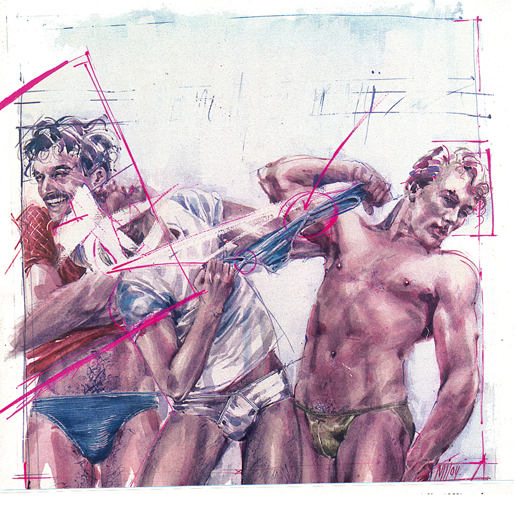
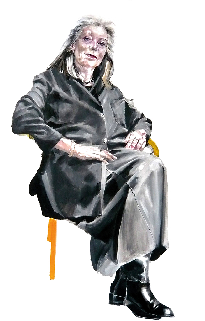
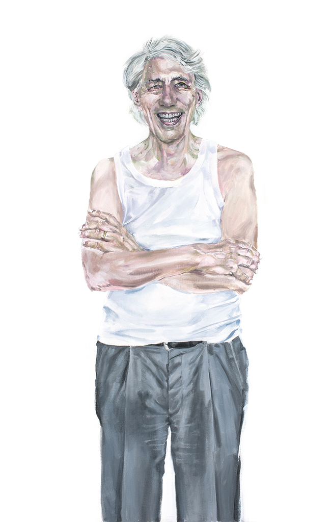
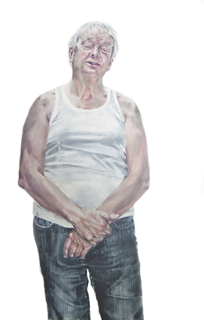
Les Belles Hollandaises (2008) was meant to be a one-off project. It marks a turnaround: Milou re-finds the energy that had disappeared with Ton’s demise. She creates a sequel – as often in Milou’s case – casually, unemphatically and yet purposeful. Hollandse Heren is a gallery of men presented literally in their underwear. Making portraits and drawing from a model had done her good, but until then she had only portrayed women – friends of hers and one could say partners in misfortune. But men are different, and her relationship with men is different. Men want to be boss and prefer to hide behind a businesslike self-assurance. Milou admires men too but now and then still sees herself as an outsider, a little girl begging for attention.
Wim Crouwel
Paul Mijksenaar
She also understands that a series of portraits of men no one knows would not attract much attention. So, she selects men she admires: Huub van der Lubbe, Wim Crouwel, Wim Pijbes, but also a cousin and a long-distance skater. And she undresses them: portrays them dressed in their vests. She gets each of them to get rid of their jacket, shirt and tie and paints them against a plain white background in light watercolor tones – even senator Alexander Rinnooy Kan who had sworn he wouldn’t allow her to paint him. She paints them (in her own words) as if they step out of the bathroom after shaving and brushing their teeth. She shows their vulnerability, their innocence, before they will hide again behind their uniform, the suit.
Mireille Houtzager, the art historian, recognizes Hollandse Heren as being painted in the tradition of the Dutch Golden Age’s portrait art, which also put their subjects somewhat isolated in a barren context without any confusing attributes. Only the men’s clothing betrayed their wealth and importance: fine lacework, costly velvet and fur, pristine white cartwheel collars. Milou takes those attributes away too: the men are disarmed and precisely because of that disarming.
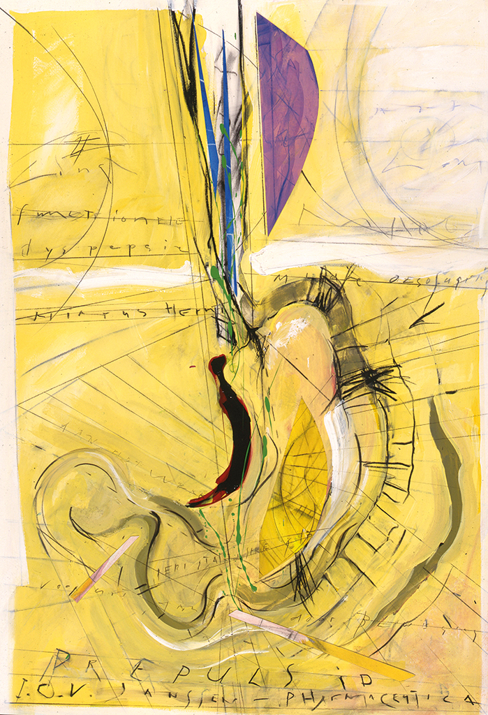

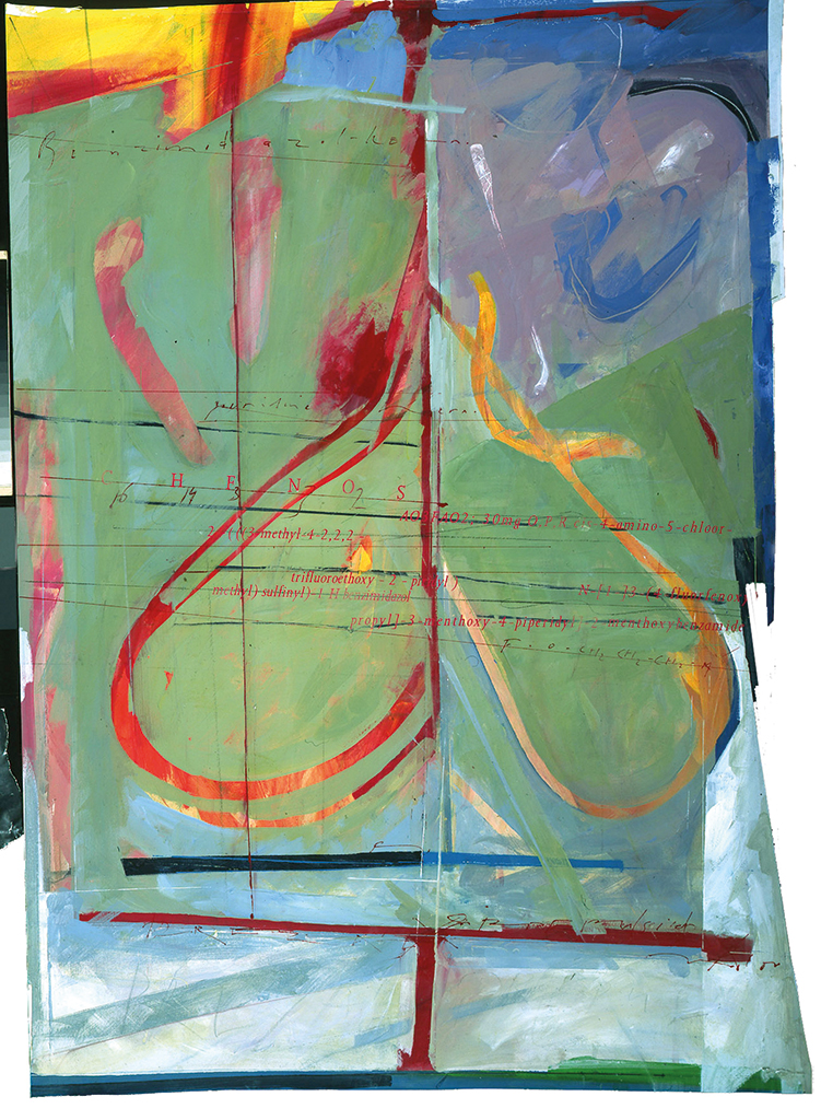
Illustrations for Janssen-Cilag
1993–2005
For twelve years Milou Hermus worked for the pharmaceutical company Janssen-Cilag in Tilburg. Each time a new prescription medicine was ready for the market, the company, a part of the Johnson & Johnson group, commissioned Milou to deliver a drawing that indicated the product’s effectiveness. The works were printed in small numbers; they were gifts and handed to relations during seminars and congresses, but not before Milou had penciled in or painted a unique and personal touch to each print. “At the end of the day my arm would be hurting like crazy – I’d have a tennis elbow. I would be invited to join the party in some fancy restaurant in Vienna or Nice where the doctors were be fêted. I entered in their slipstream and was pampered just like them.”
Brochure KPMG, 1991
Inspired by the subject and the conversations about it with the developers of the medicines – and just as important, with her Ton – Milou created what Mireille Houtzager calls: a lyric-abstract expressionist style. The drawings were done by hand and enriched by transfers of photographs, newspaper cuttings and other graphic elements.
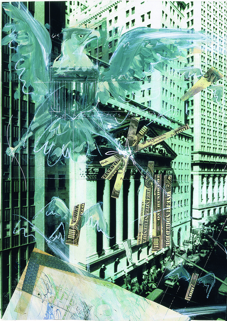
Quote magazine, about Wall Street, 1990
Brochure ARBVO, 1991
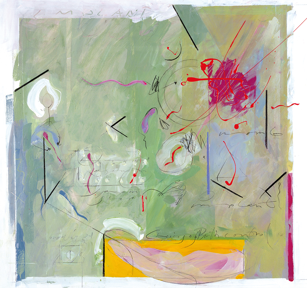
ORIGIN, Organon, birth control, 2000
KPMG, illustration of Amstelveen office, 1991
2002
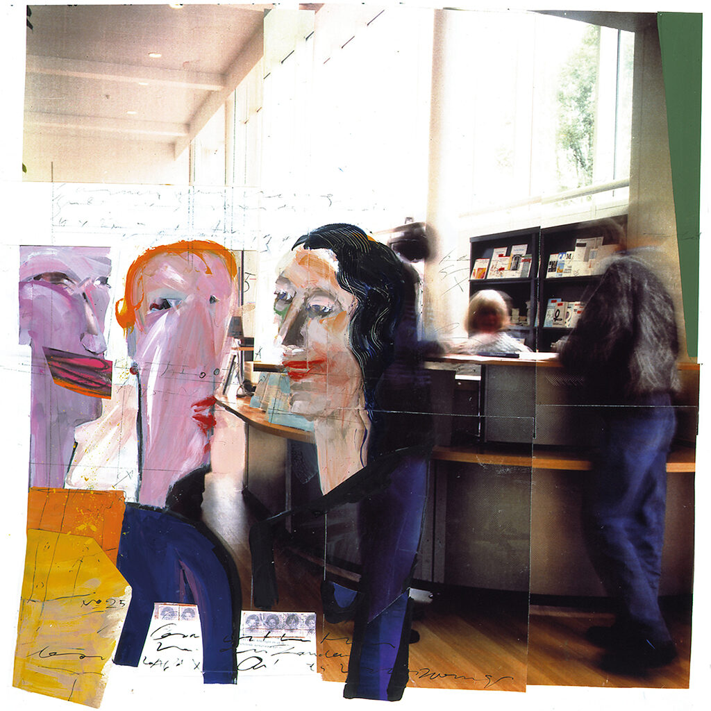
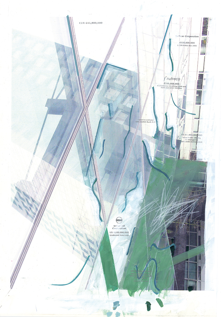
In 2002, Milou illustrates ABN AMRO’s annual report over 2001. BRS Premsela Vonk takes care of the graphic design. Milou’s work for the annual report (I am not allowed to call them illustrations) shows the use of many techniques: photography, typography, calligraphy, painting and sketching; together they create a half-abstract space within the half-abstract world of asset management, operational risk policy and net interest revenue, and the connected numbers that amount to 6,624 + 961 million euros but only for the net interest.
Annual report ABN AMRO, 2001
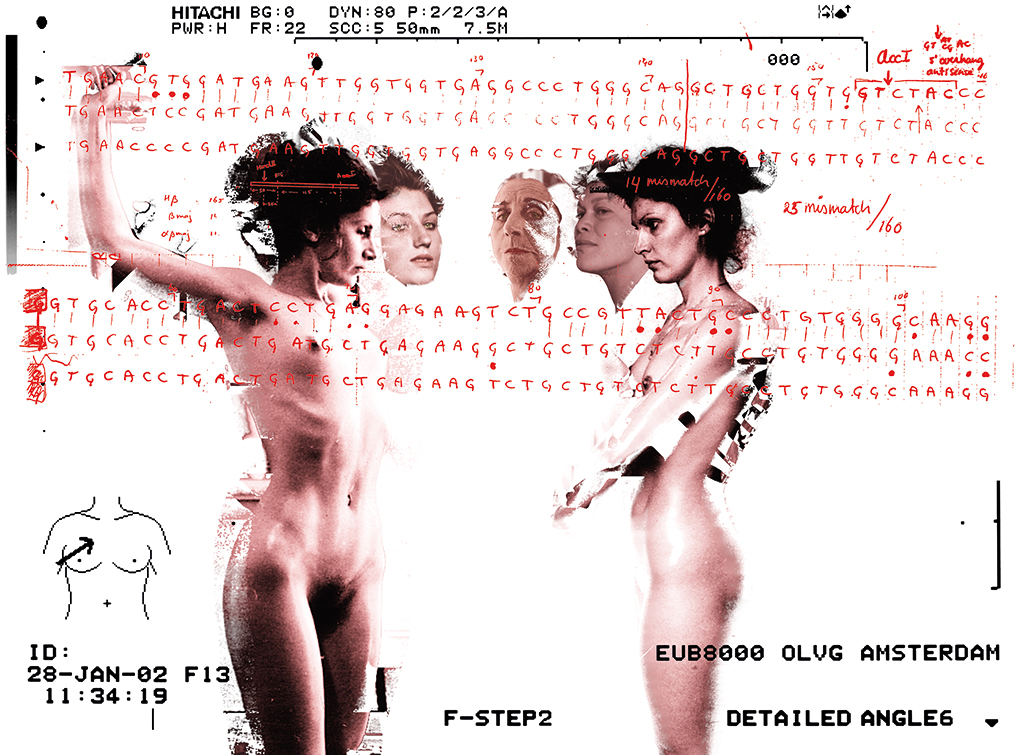
NRC/Handelsblad, breast cancer, 2002
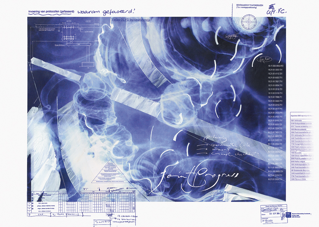
Annual report OLVG, 2004
Milou’s work is maximally half abstract. Many representative elements can be recognized if only because her work is ‘handmade’ from real material. It is tangible, for her handwriting and brush stroke cannot be overlooked. Milou remembering this period: “They needed something different for their annual reports. Something loose to liberate the more strict graphic approach, something a bit less boring. Later, after the computer had conquered graphic design, the designers started to cut photos and insert all sorts of elements themselves. They didn’t need me anymore. In response, I went out to acquire annual report commissions myself. That way I was boss.”
Florius Bouwfonds, real estate loans, 2005
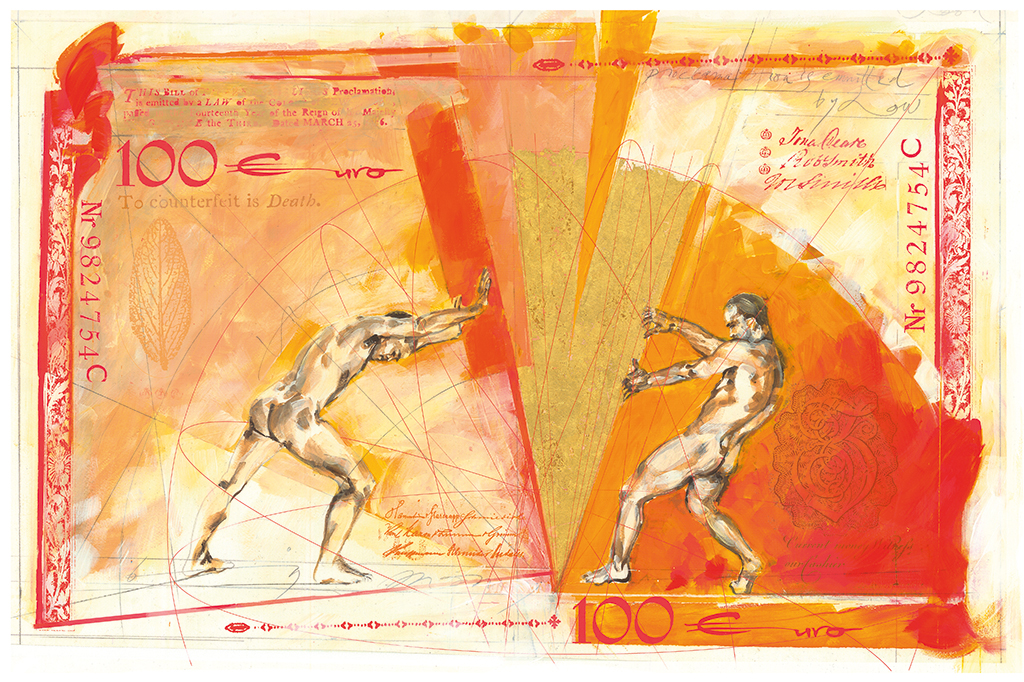
Rabobank, litho 100 euro, 2013
Brochure Heidemij, 2005
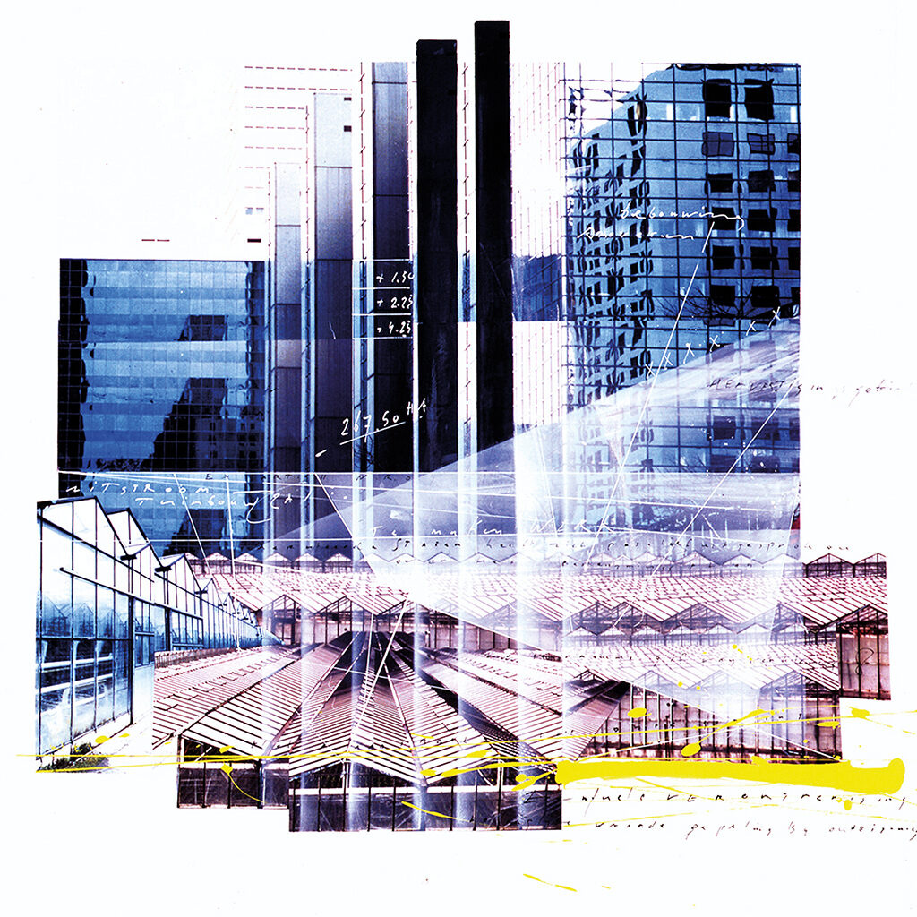
Hogeschool van Amsterdam, 2005
2018
During one of our chaotic meetings I ask Milou to write down the timeline of her life in just a few words. “Not too complicated, just a few words about what happened – your exhibitions, your studies, your clients, awards, you know what I mean.” I detect some nervousness about this homework when I try to set up our next meeting. This is all that Milou presents:
1947 – 1963 – 1967 – 1973 – 1987 –
1992 – 2000 – 2005† – 2008 – 2015
The years of her birth, study, break-through, changes of style, her last two big projects, and of course 2005’s drama. The stories behind the years have to come out during long and animated conversations.
Such as: tell me who you work and worked for. Milou takes a deep breath and out comes a random list: DAF, Ford, Schildersbedrijfschap, Aegon, Avenue, Playboy, Opzij, AkzoNobel, Amnesty International, Janssen-Cilag, Bont voor Dieren, Ando publishers, Elsevier, NWO, New York Times, Quote Magazine, NRC/Handelsblad, Manteau publishers, PTT, Bladeren publishers, Bugamor, Organon, VNU, MODAM, Search Magazine, De Bijenkorf, Longdon Shirts, Bernard Woorts Wines, Heidemij, Hudig-Langeveldt, Katholieke Universiteit Nijmegen, Delta Lloyd, Universiteit van Amsterdam, Eckhardt Wintzen, Hogeschool van Amsterdam, Zwiers, BSO, KPN, Van Gils, Bouwfonds, VPRO, ABN AMRO, KPMG.
Milou does not have a preference for a certain type of client, as long they give her enough freedom to do what she wants. She can handle practically any subject and always strives to deliver a unique product. “I cannot work without giving it all. As soon as I notice that the automatic pilot is taking over, I know things will go wrong. I think it is also because I don’t want to be anonymous.” You could say there are few subjects she isn’t interested in. You could also say her interest is mostly in the work itself, telling a story with an image. Or to be specific, finding the right image for the given subject. And simply to make a living.
Annual report G&D software, 1994
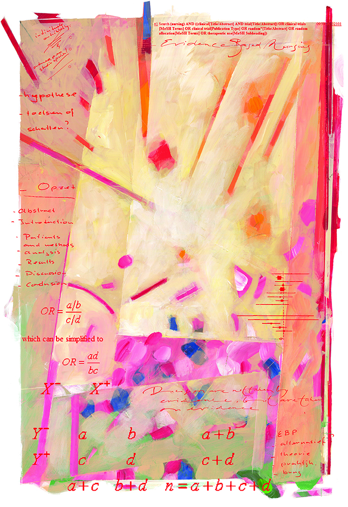
1994–2000
Hypothese was a science magazine for which Milou Hermus over a period of six years created the covers. She worked in close collaboration with Titia Schoenaker, a designer working at BRS Premsela Vonk in Amsterdam at that time. “Titia decided which color the type would have in my image. At first it was a bit tentative, but after a while we collaborated very nicely.”
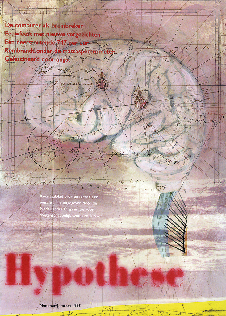
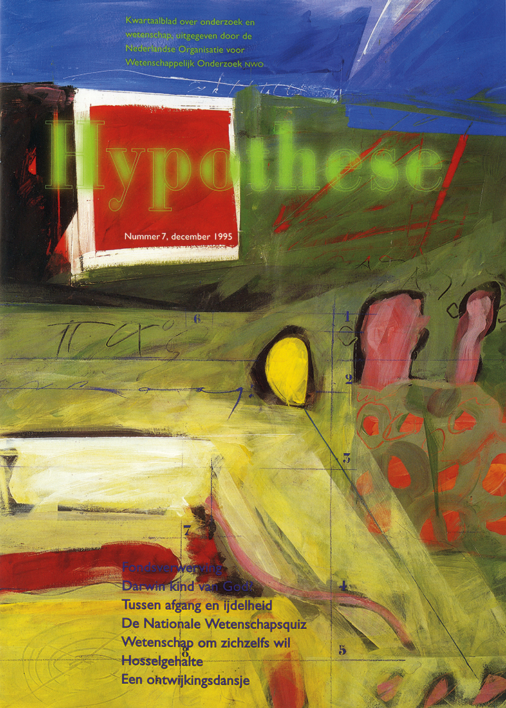
Covers Hypothese magazine, NWO, 1995 and 1998
At the end of their involvement with Hypothese a collection of this beautiful work appeared in a special publication. In the preface, the magazine’s founder points out the link between science and art and calls research a common divisor. Milou’s work exemplifies this pre-eminently. In the introduction for this publication, Mireille Houtzager questions if absolute autonomous art even exists. Maybe every form of art is a response to a commission, even when it is only a commission the artist gives to theirself.
I believe Houtzager is right. Any artwork is preceded by research, a study of the media and the possibilities it offers to express precisely what has to be communicated. In Milou’s work we discover time and again how she takes a great deal of freedom towards the subject, the context and the framework of the ‘illustration’. At the same time, without this framework her work is almost unthinkable – it is perpetually indebted to it. Which does not imply it is ever logical or predictable, let alone gratuitous. Just as it is not true for science: applied and autonomous at the same time, methodical as well as creative.
1995
Milou Hermus, even though she worked for the Dutch feminine magazine Opzij, is surely no feminist. (A birthday calendar she created for Opzij hangs on the wall in my loo – we’ve known each other since I was a student.) Milou is a strong woman, let there be no doubt about it; not one to be intimidated, she is a hard nut to crack and doesn’t hesitate to use her femininity.
VPRO radio & TV guide, cover Opera, 1995
Anne van den Heuvel, one of her students at St. Joost academy of art in Breda, in the 1990s, remembering Milou: “A huge black fur coat. A dazzling smile, a large nose, twinkling eyes, a jungle of hair, a cigar. She called us ‘her kids’ even if all of us were quite mature. Thinking of Milou I see a mama gorilla with her babies. She was of my parents’ age yet still a naughty chick. It was just wonderful. She oozed sensuality, looked sexy. Often she was wearing tight black T-shirts with a staggering décolleté. I was young and this exuberance fascinated me. And if she laughed, her breasts laughed with her. She told us: ‘Don’t hesitate to throw your body into the arena.’ She was businesslike, enterprising too. But she gracefully handed us parts of her own commissions; from the proceeds all of us would go to Florence or New York. After my graduation, she helped me to start my professional career.”
I ask Milou why all this feminine sensuality and erotic tension was so important to her, she answers: “I am a kind of macho, someone who likes to say: see what I can do? I like to make a lot of hoo-ha. I know how to sell myself, with some theatrics. Because in the end I know I my professional qualities very well.” And she adds: “Flirting, teasing, creating intimacy, that’s all fine. But beyond that, no way! Anyone who tries, gets a kick in the shins.”
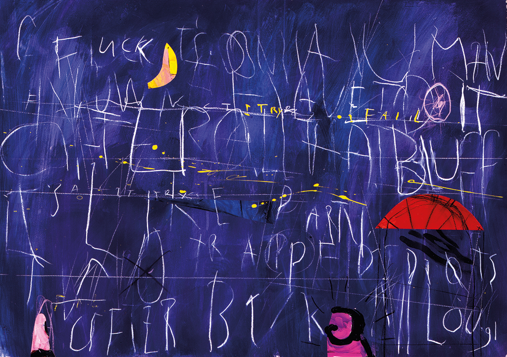
Fuck, Charles Bukowski, 1991
1993
“I only started doing illustrations to make money,” she confesses in Indruk magazine published by Bouwfonds. “3D design was my first true love. I looked at fashion shows and saw performances, dynamic space, statements of our time.” As so often during our conversations and in my readings about Milou, she points to the status of illustration. She regrets that her work is judged by its as artistic quality rather than for its usability, its functionality. She sees each drawing primarily as a search for the right metaphors for the subject at hand.
In fact, it makes perfect sense that her work is praised not so much for serving purposes as for its esthetics. For two reasons. One: Milou’s work is artistically rich, diverse, virtuose and accessible – without ever being pleasing. Two: when Milou’s work is assembled in a publication or an exhibition, each piece’s context disappears and what stands out is the enormous visual and literary power of her whole oeuvre, which surpasses the (seemingly) simple concept of ‘illustration’. Milou Hermus stands alone at the top of Dutch illustration, with at most one or two colleagues approaching her level. I cannot wait to see what she’ll create after her Hollandse Heren.
Milou Hermus
born on 17 April 1947, Dordrecht
died on 11 April 2021, Amsterdam
Author of the original text: Carel fhm Kuitenbrouwer, December 2018
Translation and editing in English: Ton Haak
Final editing: Sybrand Zijlstra
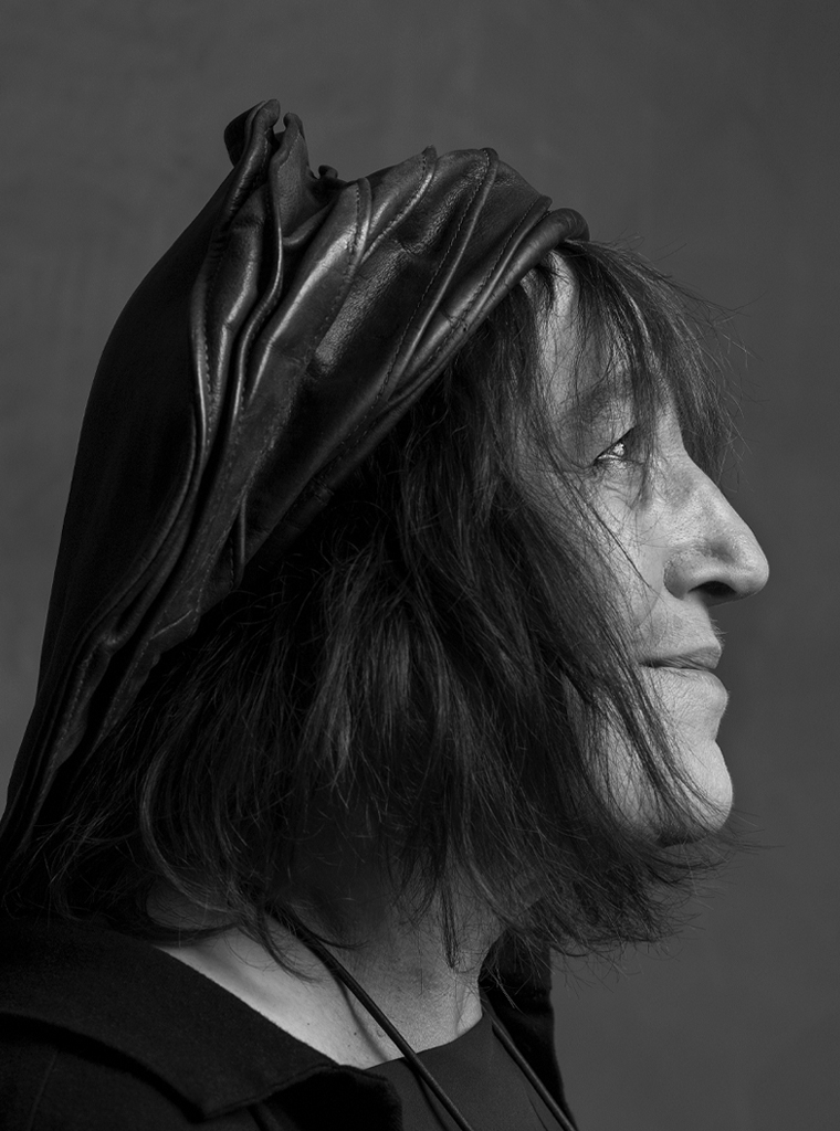
Portrait photo: Aatjan Renders