Designer Roger van den Bergh (1948) has had an interesting, international career. After completing his education in the Netherlands and an internship at Total Design, he moved to London in the 1970s and worked as a graphic designer for Allied International Designers. In 1980, he relocated to the United States where he landed jobs at major design firms including Anspach Grossman Portugal, Chermayeff & Geismar, Landor, and Siegel & Gale, and focused on corporate identity. In the late 1980s, he started his own agency in New York City, Onoma, which is the word for ‘name’ in Greek.
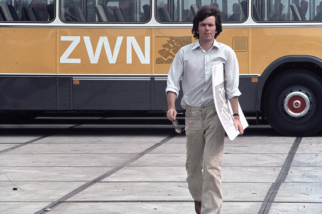
At the Zuid-West Nederland mass transit assignment in Zierikzee, Zeeland province, 1977.
Can you tell us about your background and how you became a designer?
I was born in Nijmegen. My father was an electrical engineer, and I looked up to him growing up. He was both technical and creative, a rare combination of skills. He was also very focused on automation and invented all kinds production processes to optimize machines. He also gave many lectures and had charisma. Both my parents came from large families. My mother was the oldest of eight children and had to help out at home. She was very intelligent but had little education. She read a lot and sent us to an after school art class where we learned to draw, create sculptures and make pottery.
In elementary school, I was constantly distracted and could not concentrate. My studies didn’t go well because of this. Afterward, I went to the Bisschoppelijke Nijverheidsschool, a technical school (LTS), and then to the HTS. It did not go well at the HTS either. At one point, my father asked me if I had ever heard of industrial design. He was in contact with the School for Industrial Design Akademie voor Industriële Vormgeving, AIVE in Eindhoven, (renamed later as Design Academy) because he was asked to judge a degree project. Industrial design fascinated me. I started studying at AIVE in 1966 and that was where I came into contact with a new world
Two years later, there was a strike to have more students participating in the curriculum. The students at AIVE discussed the influence of the information society, new means of communication and new computer technology through theorists like Marshall McLuhan, though none of us could foresee the later development of the internet. We even occupied the academy for a short time because we wanted more say in the programme and the curriculum. These were the years of protests against the Vietnam War, student uprisings in Paris and democratisation. The activists were well organised through large meetings and smaller discussion groups. Everything was recorded and we wrote all kinds of papers. [footnote 1]
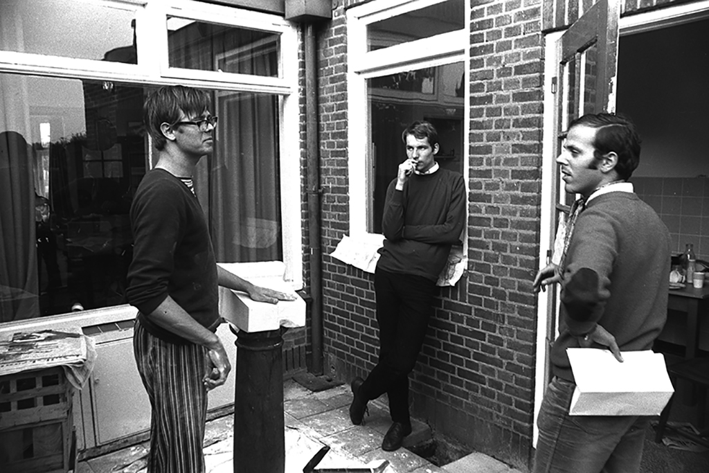
Fourth year at the Academy of Industrial Design. Left to right: Adgild Hop, Ton van Raamsdonk, Franklin Wolff, Hofstraat, Eindhoven.
I joined the strike, although I was shy. My landlady ripped off the ‘Johnson Molenaar’ poster that I had hanging in my room. The poster’s headline was a misspelling of ‘Johnson murderer’ because insulting a head of state of a friendly nation could land you in jail. For us aspiring designers, the questions we were asking ourselves were about what we are contributing and who we are working for. Do we dedicate our profession to luxury goods and profit or do we want to contribute to meaningful products and real needs? The result of the strike was that students gained more influence over the educational programme.
I spent a lot of time with the Dutch cartoonist Joost Swarte, a fellow classmate at the time. There were many different teachers and their lectures and classes were stimulating. There was a lot of talk about the definition and process of industrial design. The industrial designer Wim Gilles comes to mind for his model of product analysis: looking at all existing products and extracting the best elements from them to use for a new design. The other approach is to create a list of requirements for a product and have designers work from scratch based on that list. But someone like the filmmaker Frans Zwartjes was also around, who experimented with the medium, had fun crazy ideas and was thinking unconventionally. The best solutions often emerge from this kind of thinking. Another influence for me was teacher H. van de Wildenberg, who gave assignments that made you examine your design choices further and think about the “why”.
We went to the Van Abbe Museum in Eindhoven with Zwartjes, but visual art was new to me. An exhibition of Moholy Nagy made a big impression on me, as did the photographic work of the couple Bernd and Hilla Becher. Karel Elno also taught us about art and encouraged us to read books by Nikolaus Pevsner, Reyner Banham, and Siegfried Giedion’s Space, Time and Architecture.
Internships
After the strike I entered the third year where we had to do a number of internships. I went to the Shell Plastics Laboratory in Delft (KSPLD) and later to Sphinx in Maastricht. At Shell, all kinds of plastics were tested in the laboratory, such as crates for milk cartons. It was very technical, but of course designers must have knowledge of materials and production processes. For graphic designers, for example, it is important that they learn how to typeset, and this process makes you aware of the principles of typography. We had that subject in our first year in addition to drawing. During the internships – which lasted three months each – we had to write a daily report and a thesis at the end.
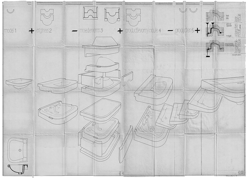
‘Exploded view’ for ceramics factory De Sphinx, Maastricht. Groups of housewives came to the factory for an excursion. Van den Bergh: ‘For them I made these educational drawings of the relatively complicated production process of toilet bowls and sinks.’
Van de Wildenberg introduced me to Total Design. In 1969 I worked there for six months as part of Benno Wissing’s team. TD was a somewhat intimidating environment, but there were also people who were more approachable like the Amsterdam-born Wiet Weteling, who was a jack of all trades. I tinkered with my bicycle in his workshop at the top floor of the building. Every day we’d all have lunch together at a long table and it was a chance to hear what everyone was doing. It all made a big impression on me.
In Wissing’s team I had to make technical drawings for display cabinets for Schmidt opticians. I also worked on the signage for the Ahoy Hall, a new Rotterdam convention centre which had a strong spatial component. Everything had to be executed very precisely and perfectly and I learned a lot from Benno, especially from his philosophical attitude. As a designer, you always have to be critical and ask questions, look at things through a different lens and try to understand problems. When I worked on the Ahoy Hall with Wissing’s assistant Hartmut Kowalke, I drew out the line pattern for the signage, mapping out how and where people walked around in that building. Wissing asked if I wanted to stay longer and so my three-month internship was extended. [footnote 2]
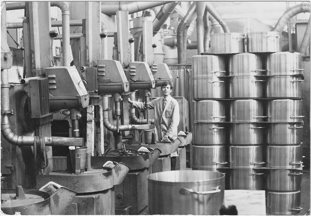
Behind one of the many machines at the Württembergische Metallwarenfabrik (WMF) in Geislingen an der Steige, Germany, Summer 1969.
After Total Design, I interned at the Württembergische Metallwarenfabrik (WMF) in Germany. I worked alongside everyone in the factory, starting the day early and working long hours.
When I entered the fourth year at AIVE, I lived in a house with a few other students. Although the strike had led to more participation, several students, including myself, were not satisfied with the education at AIVE. We decided to go to the St. Joost Academy in Breda. I took graphic design courses there, but mainly worked on my final exam. It was 1971 and the Delta Project in Zeeland province was nearing completion with the closure of the Brouwershavense Gat estuary. That event became the subject for my degree project. I made an architectural model, posters, booklets and an overall identity. For the project I explained the engineering method of the Delta Project which used both blocks of concrete and caissons for the first time. I got full cooperation from Rijkswaterstaat (‘Department of Waterways and Public Works’) and other contractors involved, and I was also allowed to go everywhere I needed for research. It was great to work on, and I graduated with honours.
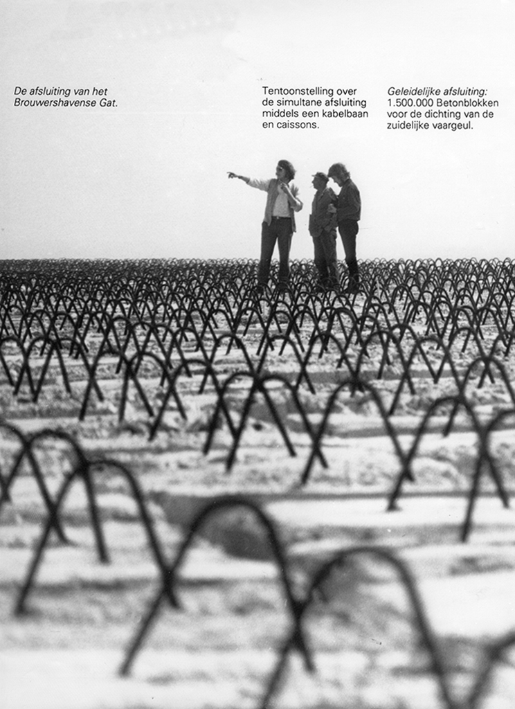
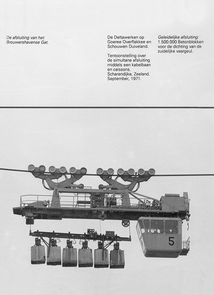
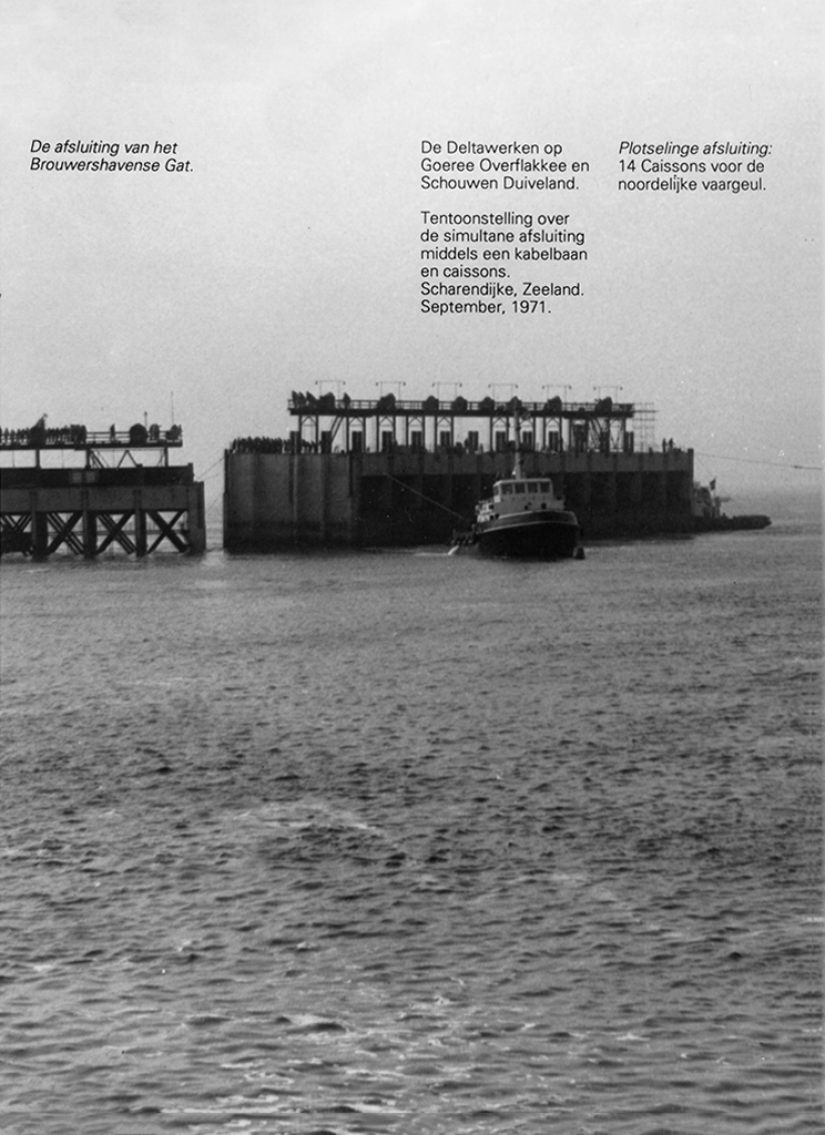
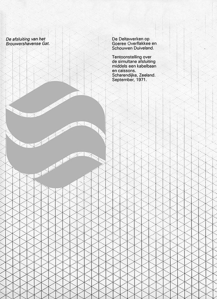
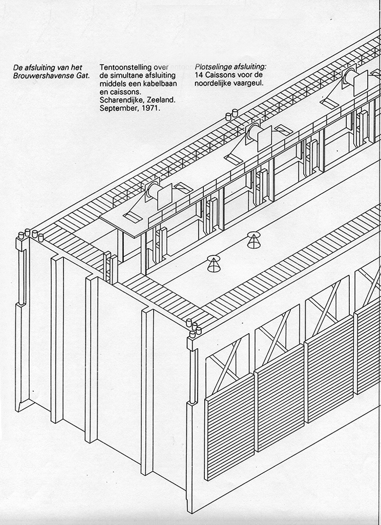
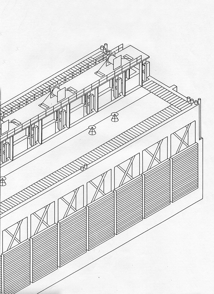
Graduation project St. Joost Academy Breda, 1971. Drawings, photos and general identity for an exhibition about the closure of the Brouwershavense Gat Estuary in the province of Zeeland, part of the Delta Project, Zeeland.
In the meantime, I had been working with my housemates on a proposal for an identity for the Zuid-Ooster mass transit in Nijmegen. We took the proposal to managing director L. Hortensius at the head office. We didn’t hear anything back right away, but eventually, we got a call from Siep Wijsenbeek, who was in charge of the design and overall identity for the Dutch Railways. All bus companies were subsidiaries of this transit agency. Wijsenbeek asked me to present the new identity and the project was approved immediately. That was my first big assignment. Later I received similar work from Wijsenbeek in Zeeland and Friesland provinces, where bus companies were merging and needed new identities.
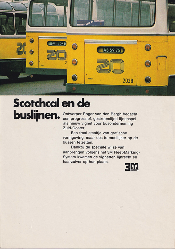
Buses of Zuid-Ooster mass transit service with the new logo in a 3M advertisement, 1971.
After graduating, I joined the firm Identeam in Nijmegen, which designed many corporate identities, including those for the Provinciale Gelderse Electriciteits Maatschappij (PGEM). I worked there for two years and our clients included the Nederlands Boek en Lektuur Centrum and conference centre De Baak in Noordwijk. But I wanted to go to London because it was a bigger city and the design projects were on a larger scale.
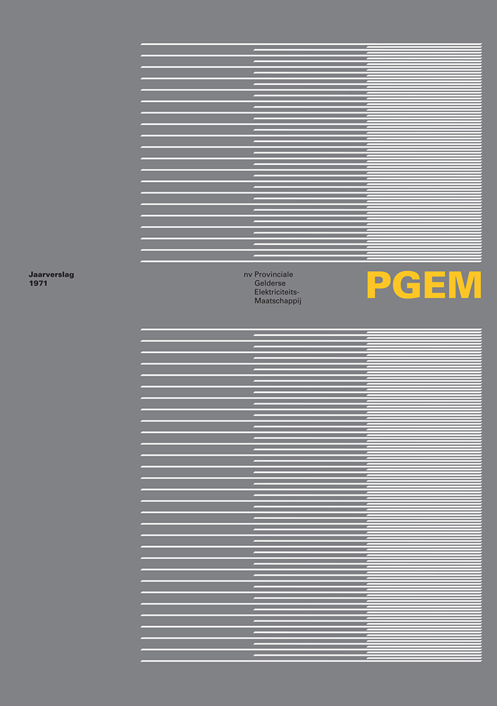
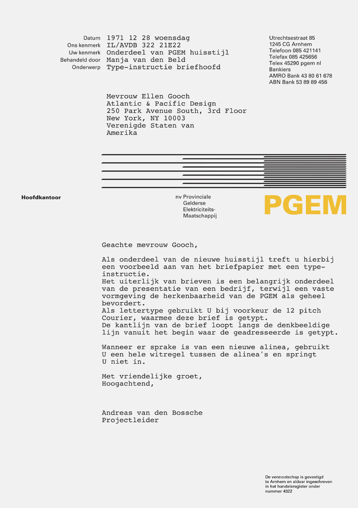
House style for the Provinciale Gelderse Electriciteits-Maatschappij, PGEM 1972. The structure visualises the generation, transport and distribution of electricity and functions as a structure for stationery and marketing communications.
AID, 1973-1975 [footnote 3]
I applied to a number of agencies in London. In 1973, I received an offer from Allied International Designers (AID). At AID the atmosphere was warm and inviting compared to TD, where everything was tidy, neatly organised and clean. At that time about thirty people worked at AID. James Pilditch was the managing director and there were a number of project managers who had their own clients. You were always working for different clients, depending on how busy you were. AID had hired a Dutchman to do acquisition for them on the Continent and worked on many programmes, including Dutch companies such as Albert Heijn, Van Gelder paper, AKZO, Philips and ABN. I worked on brochures for Van Gelder paper for Eric Baskerville and on ABN for John Lloyd.
Van den Bergh: ‘The ABN logo was designed in 1974 by my boss at AID: John Lloyd. The assignment was that ‘ABN’ had to become an acronym. There was also a proposal from me with the Akzidenz Grotesk and I had come up with a modular system, but the bank chose the Lloyd logo. The two obliquely cut letters of the A and B make the logo unique, they echo the triangular shapes of the letter N.’
What was the difference between TD and a design agency like AID?
TD always presented only one design solution, while the British agency usually came in with three or four options. I am in favour of the second approach because there is always more than one solution. Moreover, for a client, there is an emotional element to choosing an identity. It’s certainly not a purely pragmatic matter. People often react primarily and subjectively to a presentation: ‘I don’t like red’. So it works if there are multiple options. Nowadays, many more people are involved in those design processes and decision-making, and then you see that it’s about reaching consensus. It works well to present multiple options and discuss the pros and cons of each one. A corporate identity is about how a company comes across, the target audience, and the positioning of a company in relation to consumers and the market. Pilditch was very charming and a good storyteller, accompanied designers to presentations, travelled a lot and published many books on the subject.
Multinationals like to work with a large English agency, in part because of the language, because they are internationally oriented and because it gives them status. [footnote 4] The attitude of these agencies is very different from that of TD or Tel Design and much less ‘arrogant and distant’. The English firms are more inviting, and the atmosphere is more relaxed. In England, the offices of Wolff Olins and Crosby Fletcher Forbes Gill (later Pentagram) were conceptually top-level at the time. AID was less pretentious and more pragmatic, somewhat comparable in quality to TD and Tel. At the time, Pentagram was also very good with its work for Lucas, a major supplier to the automotive and aerospace industries. [footnote 5] They received this assignment after a pitch between three agencies. Pitching is good, you will work much harder to get an assignment and increases the quality of the end-result.
After two years of AID, there were fewer assignments. In 1973-74 there was the oil crisis and a major miners’ strike in England. Everywhere people worked in the dark with lit candles. I returned to the Netherlands and sent brochures about my work to prospective clients. Assignments soon followed, including a monthly magazine for the municipality of Nijmegen, some customers via the Lecturis printing company and via Wijsenbeek with whom I had kept in touch. Wijsenbeek called me for an identity for a number of merged bus companies in Zeeland and through him I also ended up with the NS subcontractors for communication material. Other assignments included identity systems for Midden-Brabant Healthcare Insurance, County Council Den Bosch and RoadAdvertising Fleetmarking, annual reports for Grasso and Schiphol Airport and brochures for Overpelt-Plascobel, Janse Lichtreclame and Océ van der Grinten.
United States, 1980s
In the seventies, I often travelled to the United States using cheap airfares from Loftleidir Icelandic and I was immediately captivated by the city of New York. In 1978, I was thinking about working in the US so I sent letters to firms like Chermayeff & Geismar. I was drawn to these agencies because of the larger and more complex projects. Corporate identity interests me because it involves many different assignments and clients, from banks to airlines, and many different media and information carriers: from printed matter to vehicles, signage and typography on buildings. Aside from my graphic design background, my training in industrial design turned out to be quite beneficial.
Anspach Grossman Portugal 1981-82
In 1979, I met RitaSue Siegel, a headhunter in graphic and corporate identity design. As a company consultant, she looked for new talent and received twenty-five percent of your annual salary. In 1981, Siegel placed me at Anspach Grossman Portugal (AGP), a large corporate identity firm. Gene Grossman was the design partner, Russ Anspach and Joel Portugal were marketeers and strategists. Their agency was well run and they received large assignments for clients like Citibank, Texaco and Peat Marwick. The combination of design and strategy works particularly well for corporate identities. I look back with joy on my work for the National Australia Bank. That was a very large and complex project. The bank had become the second largest in the country through a merger, and therefore needed a new name and clear identity. [footnote 6]
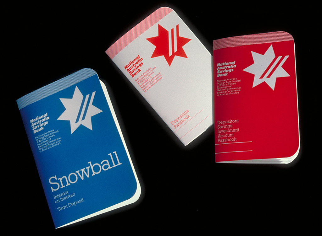
House style of the National Australia Bank, 1982. The points of the star represent the six states of Australia and the seventh represents the territories (similar to the Australian flag). The two stripes refer to the merging banks.
Chermayeff & Geismar 1982-83 [footnote 7]
Chermayeff & Geismar, whom I contacted in 1982, were very different from AGP. Tom Geismar was very precise and wanted to see everything you worked on. Ivan Chermayeff was much different, but more direct. He’d allow you to work on a project and say, ‘just make it’, even for large clients like the Banco de Bogota. Then a week later, he’d ask if you wanted to show your designs.
Identity for Banco de Bogota, 1983, based on a historical pre-Colombian symbol.
After almost two years, the firm, unfortunately, had to let me go because they were moving. So I called RitaSue Siegel again. She arranged an appointment with Landor in San Francisco sometime in October 1983. That turned out not to be just one conversation, but I had to talk to a number of people all day long. At the end, they asked if I wanted to come work for them.
Was your modernist design appealing to Americans?
What I was creating looked different, more European, and that added cachet. It was functional, minimalist, more timeless and also playful. Many agencies want a new and different approach, and they also called my references, who told them I work fast. But what you design of course has a different aesthetic signature for each client. An airline or a bank should not be too trendy or frivolous. I matched those agencies with my portfolio, which allowed the agencies to offer a more diverse range of options to clients. But identity programmes are not only about a form. Above all, they are about the implementation and the structure of all information carriers.
What were the differences between those American agencies?
In the 1980s and 1990s, Landor, Anspach Grossman Portugal, Chermayeff & Geismar and Lippincott & Margulies were the top four. Landor mainly designed packaging from the start in the 1940s, but around 1970 came into contact with the airlines Alitalia and Singapore Airlines and the Bank of America. The emphasis shifted toward corporate identity. Chermayeff & Geismar received large assignments for Mobil Oil, Chase Manhattan Bank and Pan Am. They were design-driven. The agency consisted of designers and did not employ any marketeers, similar to Pentagram, Paul Rand and Saul Bass. Marketing and strategy means: interviewing everyone in the company and having many conversations to determine the position of the company within the market, where does it want to go, etc. It examines a company like McKinsey does, including researching the audience/customers, corporate culture, dealing with customers, perception and reality. An identity programme is just one of the tools to boost the perception of the company.
I learned about such things at AID and through authors like Wally Olins. Olins understood the power and value of corporate identity and knew how to convey it in publications. He gave a lecture I really liked at the ICOGRADA Congress in 1978. He highlighted the identity implications of the 1969 VWF-Fokker merger and subsequent integration into Airbus. He also developed corporate image models in his 1978 book, ‘The Corporate Personality’. This kind of research was new at the time. TD and some other design firms attracted clients who had something to do with culture and art and were less focused on market analysis.
Anspach (AGP) blended the methods of strategy and analysis with design and had well-known clients like Texaco and Citibank. The strategy people and designer Gene Grossman were sometimes at odds with one another and sometimes there was some antagonism, but Grossman usually had the better arguments and could sell his designs well. When they reviewed design concepts, their discussions sometimes led to heated discussions. Personal conflicts are inherent to any agency. Grossman was the intermediary who explained to the designers what to do and discussed the design concepts with us during the so-called ‘design critiques’. At those meetings, all our work was put up on the walls, but he usually kept the marketeers out. In general, business strategy work is very profitable, much more so than design. However, the strategists and the designers do need each other.
Landor, 1983-1985 [footnote 8]
In the eyes of many designers, Landor’s work was rubbish until about 1983. Landor wanted to change that and started looking for new outside talent. Because Landor’s expertise was in packaging, their style was more illustrative. Although their work for Alitalia, Singapore Airlines and Levi’s was strong.
Landor Associates had several departments when I joined in 1983: TBS (Tobacco, Beverages and Spirits), SPG (Special Projects Group, which I was part of) and DSG, the Design Systems Group with technical draughtsmen, almost engineers, who worked out identity guidelines, for example. For the 1985 British Airways project there was a team composed of DSG and SPG. We created lots of concepts and discussed them for hours on end.

On the ferry boat/the headquarters of Landor Associates in San Francisco, 1984. Van den Bergh second from the left, Walter Landor looking at the screen.
Landor was located in an old ferryboat, the Klamath, which was a brilliant move by Walter Landor at the time. Customers loved it and you had a great view of the bay, so they were immediately in a good mood when they came in for a meeting. The SPG group was in an adjacent building. There were twenty-five people at SPG, eight of whom were project directors responsible for an entire project and worked independently, although we did have to report to a general manager. In total, about two hundred people worked at the firm, including a personnel manager. There was a so-called ‘bullpen’ with junior designers who learned the trade and worked things out. But they also participated with ideas and concepts. Everyone came up with a design which was then pinned up on the wall for critique. Walter Landor was often present and he always wanted a story to go with it, so those became hours-long sessions that I didn’t like. Landor always had the last word.
At Landor, people talked about concepts for hours, at Siegel & Gale, Alan Siegel spoke for five minutes and immediately said: ‘This, and that, and that’. He was not a man of lengthy discussions. On Monday mornings, there was always a meeting at Landor where, among other things, the assignments were discussed and distributed. You then received the report on that company and were told about the budget. The number of hours was usually fixed, as were deadlines and planning. I worked on Conrad International Hotels, a subsidiary of Hilton (domestic hotels inside the US), and a large motel chain called AllStar Inns. You worked on several assignments at the same time. It was hard work and it involved a lot of travelling.
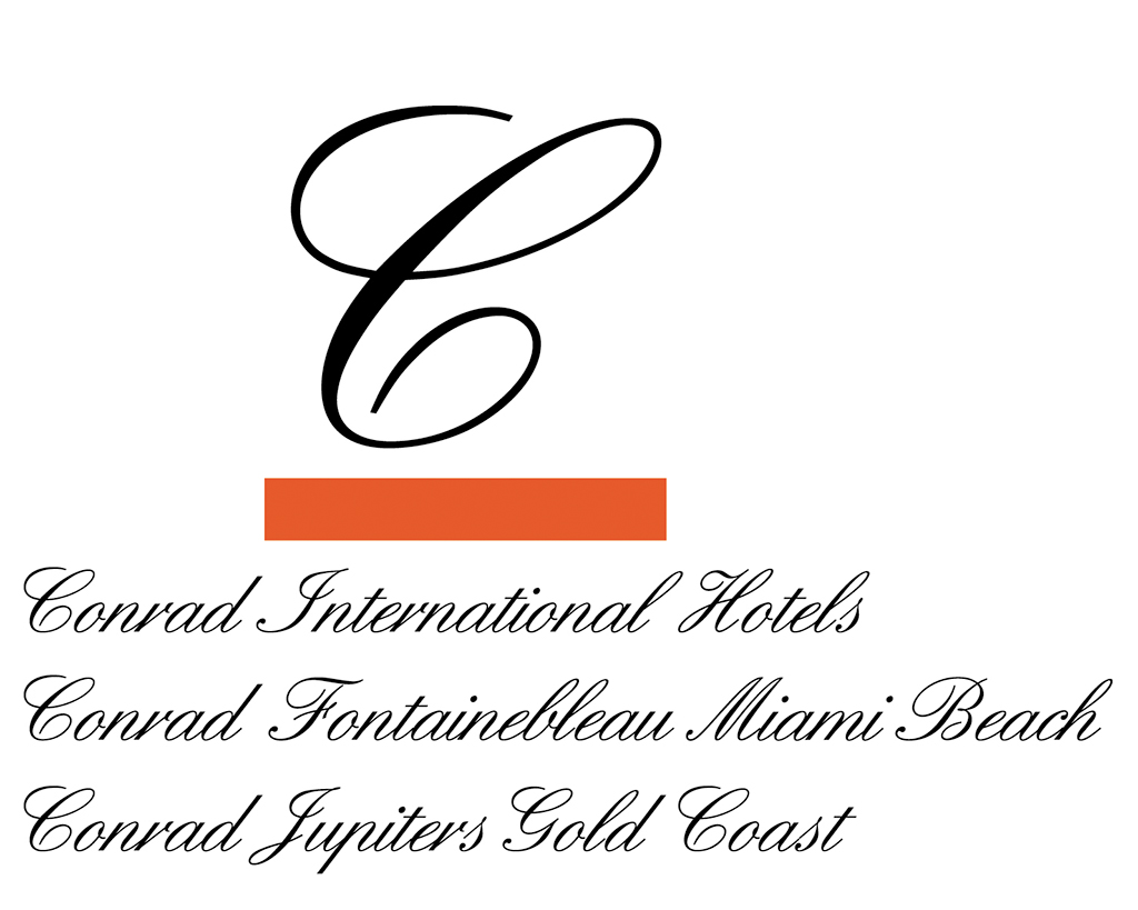
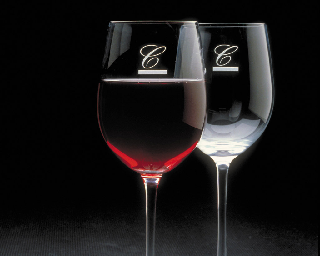
Corporate identity for Conrad International Hotels, 1984.
Siegel & Gale 1985-88 [footnote 9]
After almost three years in California, I wanted to go back to New York and I received a call from a head-hunter who told me that Alan Siegel wanted to have dinner with me in Santa Monica. Within the first minute of sitting down, he handed me an envelope with an offer. This was in late 1985. I accepted. Siegel did corporate identities and was involved in ‘language simplification’. He was able to reduce a complicated four-page mortgage application form to one clear legible page. Alan was a lawyer by training but was very much interested in design. ‘Simple is Smart’ was key.

Cover of the book ‘Simple’ by Alan Siegel, 2013.
They sent me everywhere, including to South Africa where apartheid was coming to an end. There it was about the 1,400 branches of Barclays Bank that had been taken over by the South African conglomerate Anglo-American. They needed a new name and identity. We gave a presentation to the board of directors that included both Africaners and Englishmen, and there was quite a bit of tension. In situations like this, as a designer you are mainly concerned with reaching a consensus.
In addition, I worked for Siegel & Gale on the US Steel project, a fascinating assignment. It involved a name change because the company was planning on moving into sectors other than steel, such as the recent acquisition of Marathon Oil. The abbreviation USX was already used as its stock symbol which became the new name. I got that assignment on a Thursday afternoon and was told it had to be ready the following Monday morning. I always worked better under tight deadlines and found the pressure helped me come up with better concepts. Three years later, I was asked to leave due to internal reorganisation at the firm.

One of the USX logotype concepts.

USX house style, formerly United States Steel, 1986.
A private desk
In 1988, I married Ileana Truneanu and started my own firm called Atlantic & Pacific Design. Although I did not take any clients from Siegel & Gale, I had of course maintained many contacts. For example, I received a major commission from a Japanese printer for an identity for the Sapporo Beer brand, and travelled to Tokyo for the job. But after about five months, the project was put on hold. Nevertheless, new opportunities came from this, like the identity for a medium-sized Japanese steel mill Eumeria.
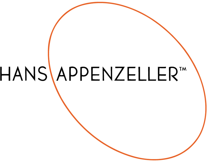
Logo for jewellery designer Hans Appenzeller, 1989. Appenzeller had galleries/shops in New York at the time.
In 1995 I decided to accept the request from an old colleague Steve Gilliatt to set up shop together. I knew Steve from previous firms. He was a real rainmaker who brought in a lot of work but was fed up with the big agencies. The largest and most loyal customer was the telecommunications company BellSouth. BellSouth went on to become one of the major sponsors of the 1996 Atlanta Summer Olympics. This gave us a flying start because it came down to two gigantic jobs: first, the overall design and branding strategy and second, the preparations for numerous signage systems, communication materials, 3D venues, kiosks, large monitors, and more for the BellSouth Olympics Sponsorship.
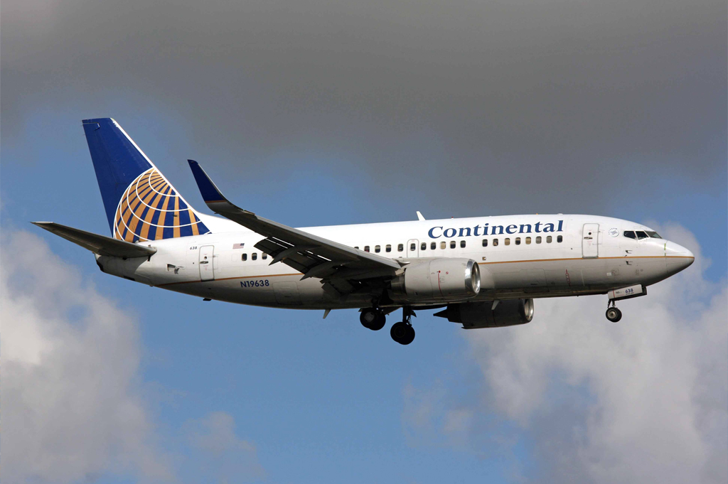
Corporate identity, symbol and livery for Continental Airlines (now UNITED), 1991-92. Van den Bergh: ‘Continental Airlines CEO Frank Lorenzo wanted to promote international travel and focus on the corporate customer. He found the identity of that time too 1970s and suggested the colours dark blue, silver, gold and grey. I worked on that project for Lippincott and Margulies, who had received the assignment but were understaffed at the time and hired me.
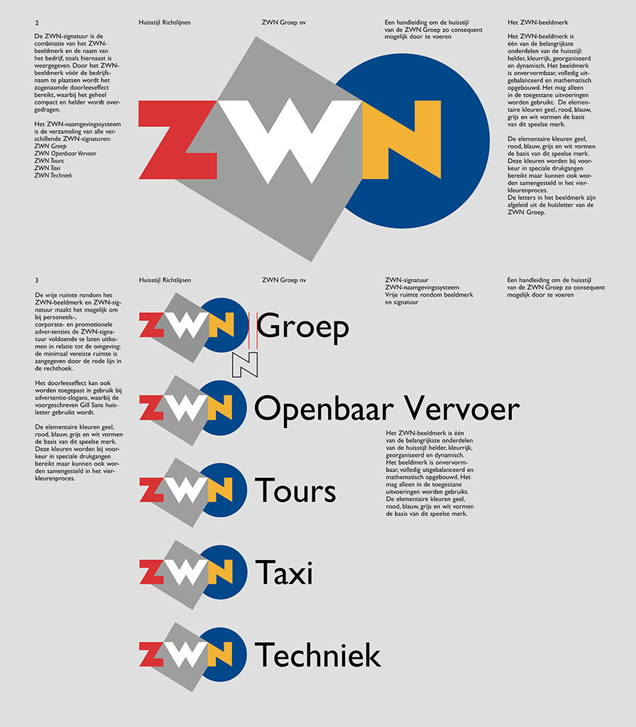
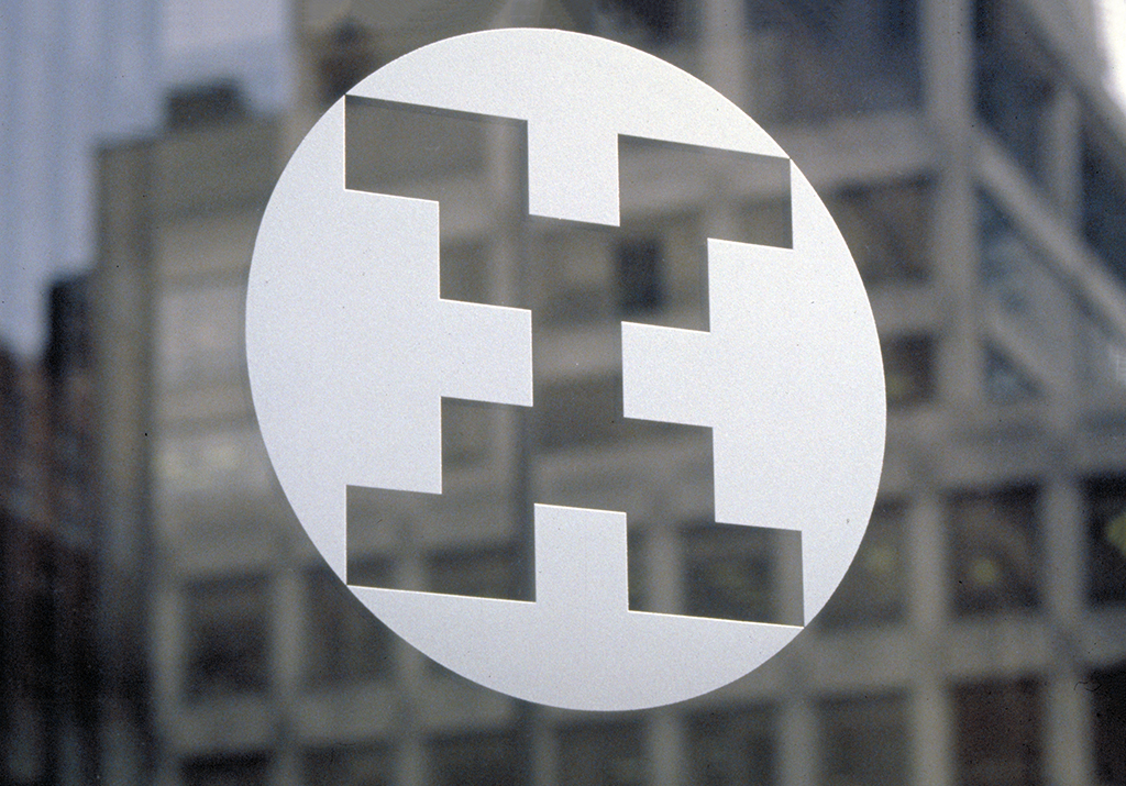
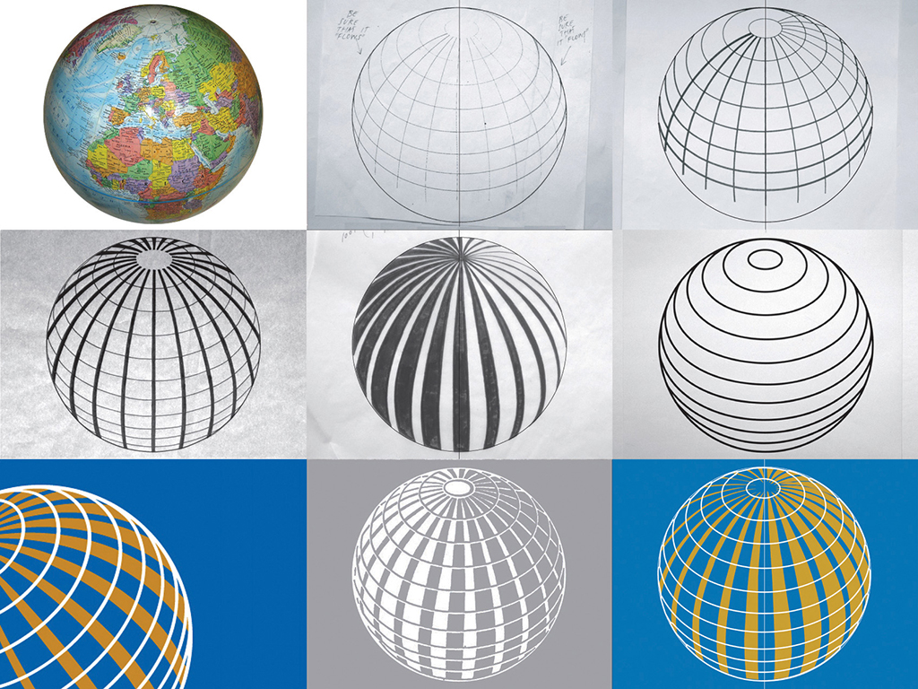
ZWN Group, public transport agency created from a merger of West Nederland and Zuid-West Nederland, 1995.
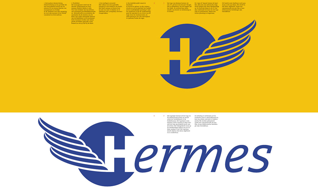
Part of the identity guidelines of Hermes regional transport, 1995.
We hired many designers, but at the same time we realised that the input of my wife Ileana was crucial to make this project a success. She was also a designer, but mainly in the field of exhibitions. Anyway, it was a great success and other assignments followed. We grew into an agency of about eighteen people. The time I’d previously spent designing got eaten up by logistical and managerial tasks, meetings, etc. And that is why, at a certain point, Ileana and I decided to form a new and smaller agency together.
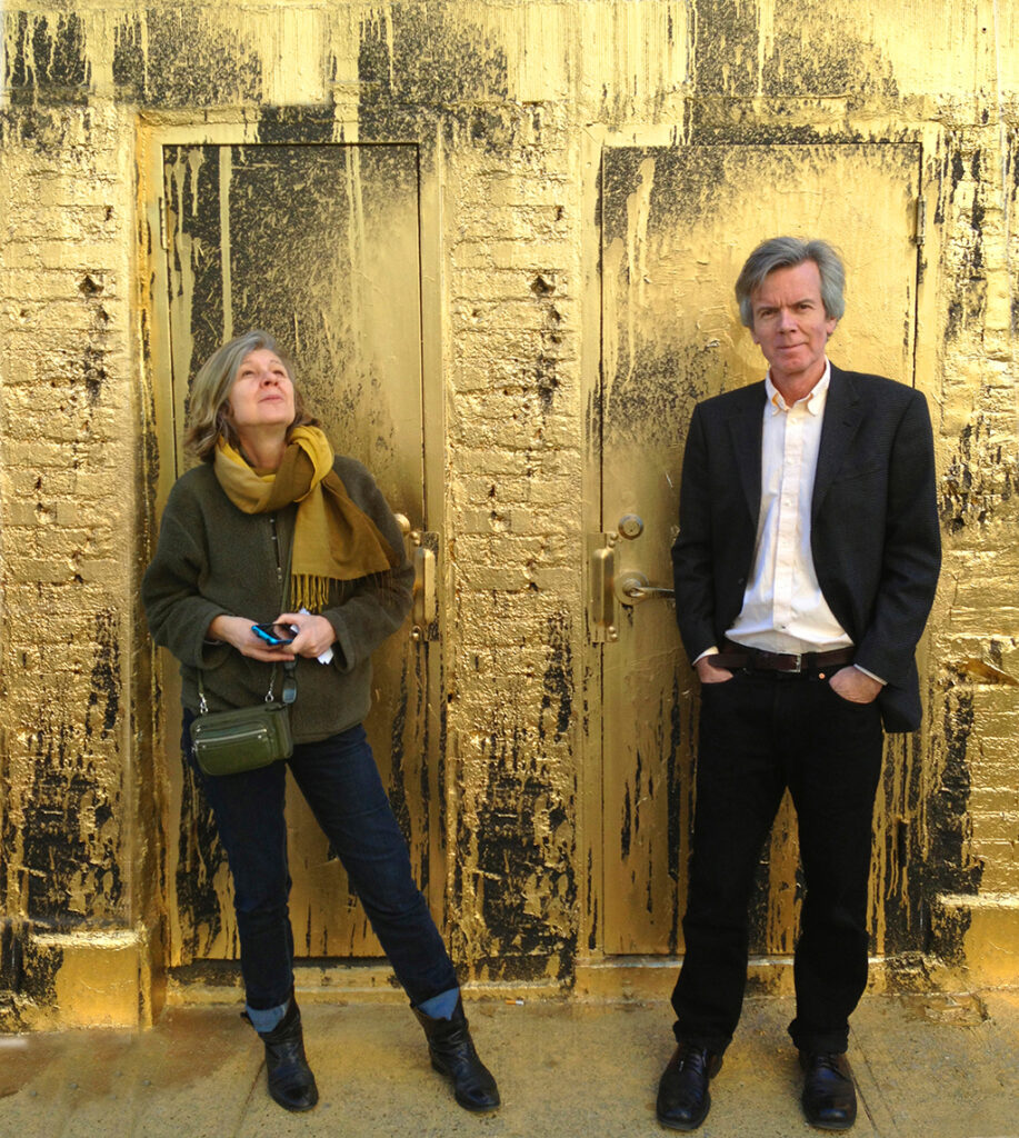
Roger van de Bergh with his wife Ileana Truneanu in 2013. Photo Sigrid Estrada.
We called our firm Onoma, Greek for ‘name’. We had clearly defined our tasks from the start: Ileana focussed on exhibition and media design while I took care of the identity projects. Sometimes we worked with assistants or interns. Ileana’s more practical approach influenced my own design approach quite positively. She was able to see the big picture of design problems. Ileana was financially very disciplined and more structured than me. Her analytical approach also made it easy for her to oversee complex structures involved in exhibition design. Ileana was very conceptual, much less influenced by rigid design principles than I was.
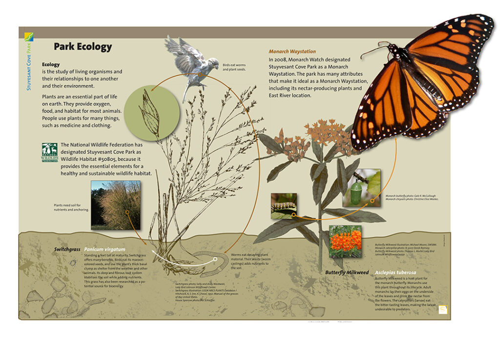
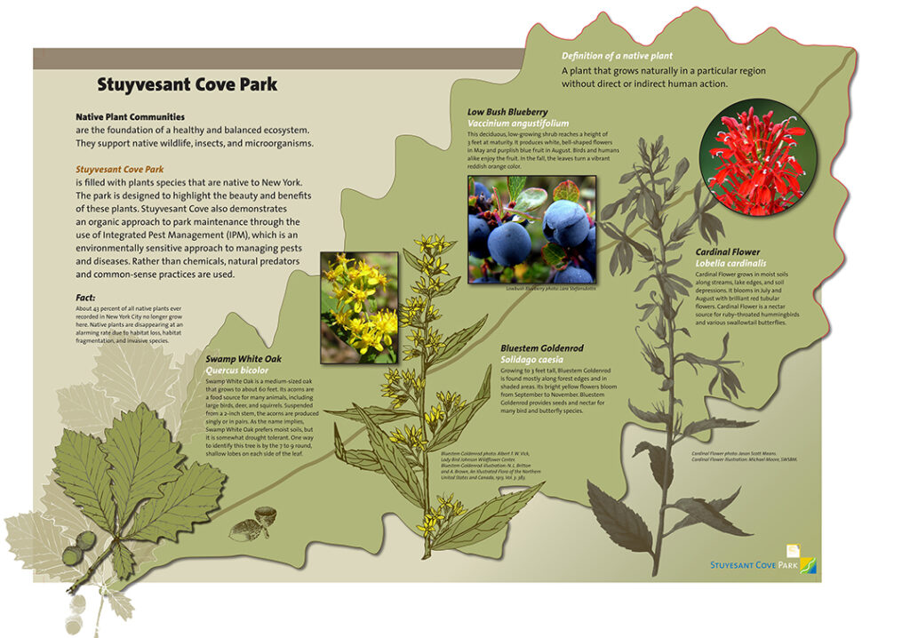
Ileana Truneanu designed this open-air exhibition about the local flora and fauna. The park is also an important intermediate stop for the Monarch butterfly.
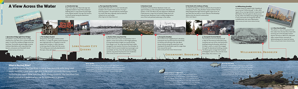
Another section of the open-air exhibit explains the history of the eastern banks of the East River in Queens and Brooklyn through a silhouette on the horizon.
In the sixteen years of our agency – Ileana unfortunately passed away in 2014 – in addition to our own clients, we had two assignments on which we worked together one hundred percent: the information design for the AirTrain at the JFK and EWR (Newark) airports and a relatively large project for the new and upcoming airline EOS. EOS was the first in the market to offer business class only in Boeing 757s with 48 seats/beds. B/E Aerospace adopted the industrial design of the seats and the design, prototyping and production of the entire interior including specifications was completed in just eleven months.
Mass transit
In 2017, I tried to improve the New York subway map. It was my own initiative, motivated in part to provoke a discussion. I found Massimo Vignelli’s Unimark 1972 map, which is considered iconic in design circles, not very user-friendly and far too abstract. On his map the coloured lines are dominant, while my map articulates the stations and better reflects the geography, making it easier to read and use. I sent it to the Metropolitan Transportation Authority (MTA) but I never received even a response. Steven Heller did write a piece about it though in Print Magazine.[footnote 10]
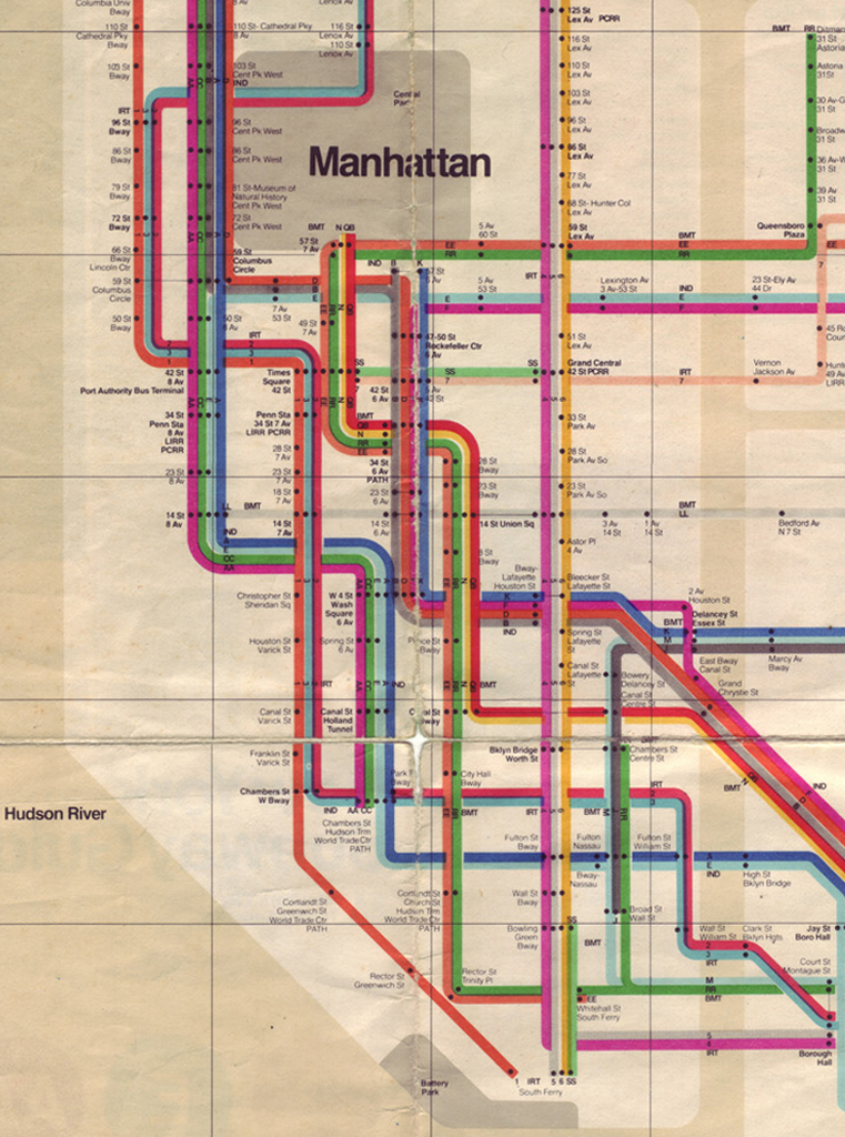
Portion of the NY City subway map (Lower Manhattan), design Massimo Vignelli, 1972. © Metropolitan Transportation Authority, New York.
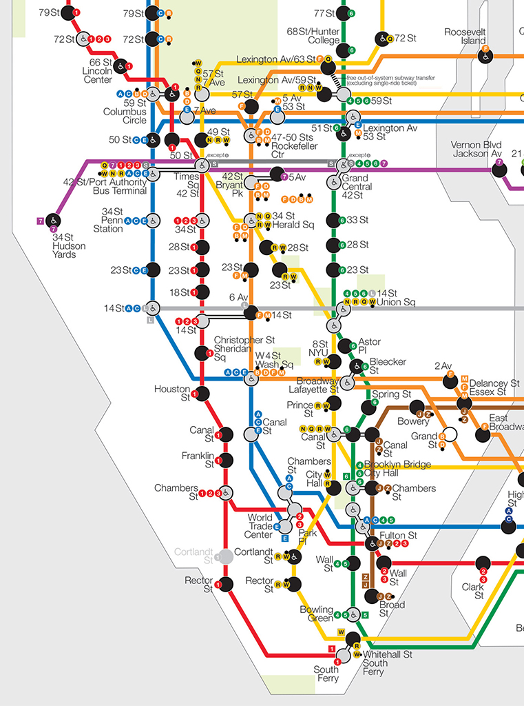
Portion of NY City subway map (Lower Manhattan), design Roger van den Bergh, 2017.
I was also approached by advertising agencies and in around 2000, for example, I designed an identity for Archer Daniels Midlands (ADM), a huge food processing company, but the assignment did not pan out. Sometimes I work on an assignment through a marketing consultancy I know who refers its clients to me. For example, I worked for an umbrella organisation of dermatologists in Chicago that wanted to modernise their look. The fact that I’m a one-man business is no problem. Sometimes I outsource certain parts like creating websites.

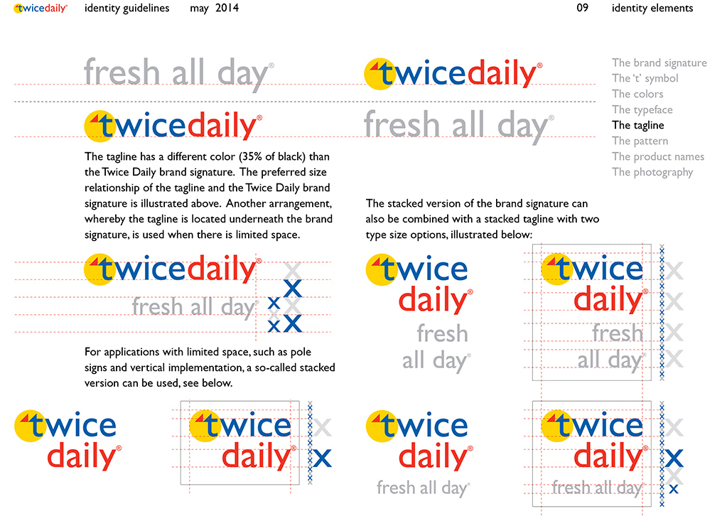
Twice Daily, convenience stores chain in Tennessee, 2012.
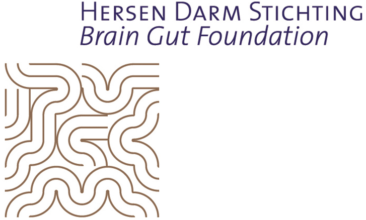
Identity for the Brain Gut Foundation, Eindhoven, 2015.
Identity for a national association for dermatology. Part of the implementation was a proprietary typeface design.
Many assignments come to me indirectly. I regularly send out brochures and sometimes I receive work through assignments I have done pro bono. I once made a commemorative book for free for The Netherlands Club in New York and designed their identity. As a condition of working for free, I wanted complete freedom and no hassle. That book led to a similar assignment for the Dime Savings Bank of Williamsburgh.
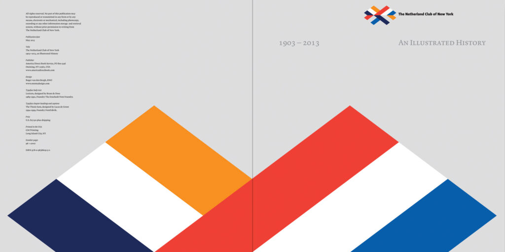
Book for The Netherland Club of New York, 2013.
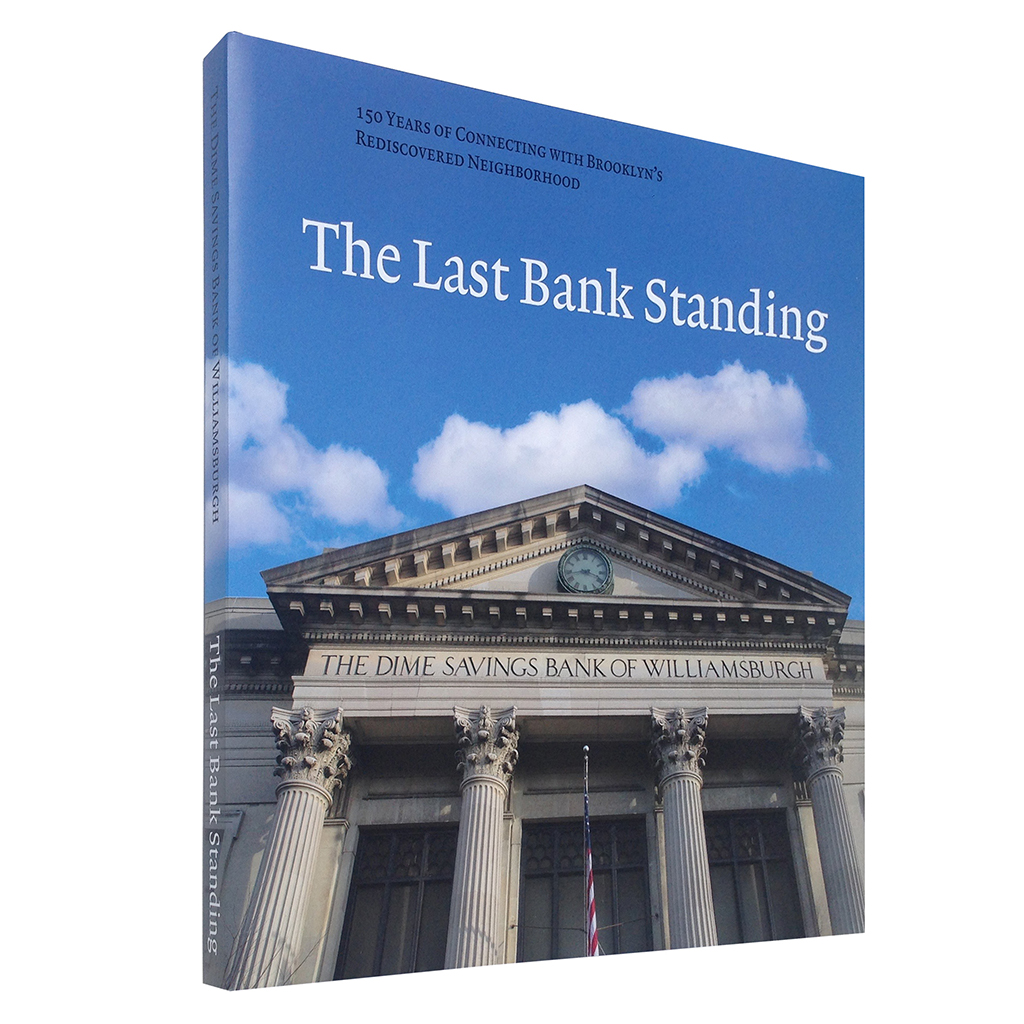
Book for the 150th anniversary of Brooklyn’s only independent bank.
It has become easier to operate alone because corporate identities have become an established phenomenon and a recognised means of communication. The computer came in the mid-eighties. Because I always kept track of all design software applications (such as InDesign, Illustrator and Photoshop), I didn’t have to outsource all kinds of tasks to others. You do have to be very flexible and resilient because you cannot control how busy you are or will be.
Meanwhile, I am working on a large study for a book about the heyday of corporate identity design between 1955 and 1985. The concept of this new platform was initially a whole new phenomenon for businesses and institutions. For example, announcing a new corporate style was a much more important event than it is today: there was great attention spent on an introduction by the media.
Does creating corporate identities also become boring or a routine?
Every project is different, simply because different people are involved each time. I certainly don’t think it’s boring. As a designer, you determine the course of the process. It is about achieving the best solution, not ‘my way or the highway’. You are often negotiating or mediating. If one idea doesn’t work and things come to a halt, I’ll start the process again because that way you get a different conversation and a different response. A great deal takes place via email or Zoom nowadays, but that doesn’t work as well as direct contact. There is no substitute for sitting together at a table to discuss the details of a project. You can feel the atmosphere better. I try to avoid irrelevant discussions as much as possible. I am verbally reasonable, in the sense that I can explain well and I usually get along with everyone, but I am not a salesman.
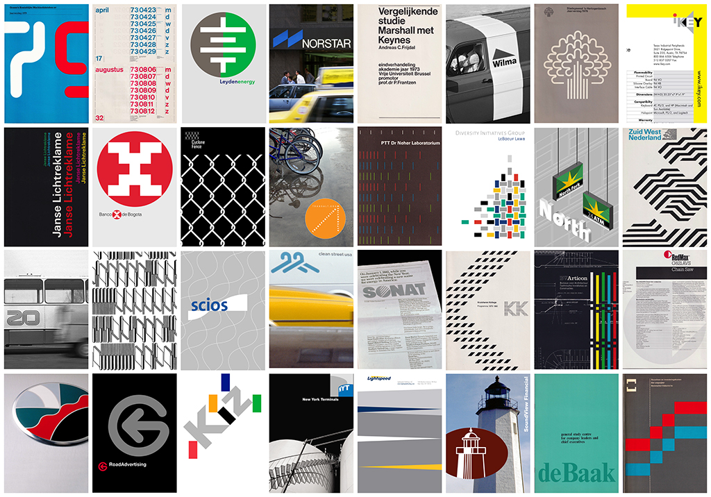
First row, left to right: Annual report 1980, calendar introducing ISO year-month-day sequence 1973, battery developer 2009, regional bank 1982, research paper 1974, building contractor 1980, county council 1977, keyboard developer 1999.
Second row, left to right: Sign maker 1977, medium-size bank 1983, steelmaker subsidiary 1986, bicycling promotion 2008, telecommunications research 1980, law firm diversity promotion 2004, super-regional bank 2003, mass transit agency 1977.
Third row, left to right: Regional carrier 1971, national library 1972, biopharmaceutical research 2001, drycleaning chain 1986, offshore drilling 1982, educational institution 1978, building contractor 1980, garden equipment 1987.
Fourth row, left to right: Asian car brand 1993, sign maker 1976, fashion brand 1987, oil terminal 2003, on-line broker 2012, regional bank 1987, management training 1972, efficiency management 1980.
Notes
1 See also the memories of Koen de Winter on www.designhistory.nl/2010/herinneringen-aan-de-aive-deel-2/ and Jeroen van den Eijnde, Ideologie en theorie in het Nederlandse vormgevingsonderwijs, Arnhem: ArtEZ Press 2015).
2 Benno Wissing called Van den Bergh ‘one of the best I’ve ever had’ in the internship report. He continued: ‘In the first weeks of his internship he learned to finish a drawing perfectly. We tried to teach him that the industrial designer should not only know the consequences of his design, but that he should also be able to translate his design into readable instructions.’ Wissing found him eager to learn but not yet sufficiently versed in the ‘interdisciplinary thought process’ and also seemed to find him somewhat ‘shy’. He emphasised in the letter that any design problem should be analysed from sociological, economic, technological and psychological aspects.
Letter to H. van de Wildenberg, 7 August 1969, TD archive 1015 inv. 102, Amsterdam City Archives.
3 Allied International Designers focused on assignments throughout Europe and had offices in several countries. Founder James Pilditch was seen as a pioneer in England because he linked design and economic success early on and promoted the profession. Wibo Bakker wrote in Droom van helderheid, his book on house styles, that AID marketed the phenomenon to increase sales, pushing itself more and operating more aggressively to obtain assignments. In the Netherlands, AID was seen as a more commercial agency compared to TD, oriented more towards marketing than design. For example by Gerrit Noordzij in the article ‘Humbug in publicity’. He denounces the ‘nonsense’ and ‘talk’ with which AID presented its designs and its marketing approach. He rejected the logo for Van Gelder Paper because the two shapes in the brand disappeared at a distance and because of the typography. Noordzij did not see that the two spirals represent rolls of paper.
Wibo Bakker, Droom van helderheid. Huisstijlen, ontwerpbureaus en modernisme in Nederland 1960-1975, Rotterdam: 010, 2011; Peter Gorb, ‘Obituary James Pilditch BE’, RSA Journal, vol. 143 (1995) No. 5465/December, pp. 17-18; James Pilditch, Communication by Design. A Study in Corporate Identity, London: McGraw-Hill 1970; Ariadne and Revue der Reclame via www.iaddb.org; Gerrit Noordzij, ‘Humbug in publicity’, in De Groene Amsterdammer, 19 October 1968 (p. 11).
4 At the launch of the AKZO identity in 1971, Eric Baskerville of AID stated that he was against very strict identity guidelines and recording everything in detail in a manual.
Jaap Deltenre, Akzo huisstijl laat ruimte voor creativiteit’, Revue der Reclame, 7 April 1971, pp. 198-199.
5 See also: Peter Gorb (ed.), Living by Design, Pentagram, London/New York: Lund Humphries/Whitney, 1979.
6 See also: Joel Portugal, ‘ Avoiding a Corporate Identity Crisis’, Management Review, 1 April 1986, pp. 43-45.
7 Ivan Chermayeff did not want to have a design firm’s proprietary style and did not want to be trendy. A logo had to connect to the languages people already know, to be simple and memorable. He saw design as problem-solving, but he emphasised how essential customer trust was and compared the designer to a doctor. His partner Tom Geismar said that Chermayeff was more of a man of one idea, whereas he tried out various different options himself.
Mildred Friedman et al., Graphic Design in America: A Visual Language, Minneapolis: Walker Art Center 1989, pp. 70-72; Ian Paget at www.logogeek.uk, ‘Talking Logo Design with Tom Geismar’, n.d.
8 Walter Landor was born in Germany as Landauer, but changed his name when he studied in England and worked there as a designer. Designing names, packaging and brands were his strength, as became apparent when he started an agency in San Francisco in 1941. In the 1970s, the agency received more and more identity assignments for banks and airlines. His office was housed in an old ferry, the Klamath. He had an eye for talent and gave young people a chance. He was less powerful as a manager and strategist. In the 1980s, this led to clashes with CEO John Diefenbach, who was aiming for greater efficiency, teamwork and internationalisation at the time.
Véronique Vienne, ‘The Brand Named Walter Landor: Historical View’, in: Graphic Design History, editors Steven Heller and Georgette Balance, New York: Allworth Press 2001, pp. 180-187 [previously published in Graphis May-June 1999]; Bernard Gallagher, ‘Walter Landor (1913-1995)’, 8 June 2011 & 8 November 2012, www.immigrantentrepreneurship.org.
9 Alan Siegel was trained as an attorney. After working for several advertising agencies, he founded Siegel & Gale in 1969 with Robert Gale. The starting point of Siegel & Gale was the combination of strategic thinking and top design, a new idea at the time. Siegel has noted that most CEOs feel uncomfortable evaluating a design. Therefore, it would be good if the designer presents alternatives and demonstrates how it works. In the 1970s, the agency simplified Citibank’s forms and contracts, creating a separate department for this subject within the agency. The following decade was dominated by the concept of ‘corporate voice’: on the basis of a company’s inherent values, all interaction with public groups should be brought out in a coherent manner from the personality of the company. In 2012 Alan Siegel started a new agency, Siegelvision, which focuses on brand identity and consultancy for non-profit and educational organisations.
www.fundinguniverse.com/company-histories/siegel-gale-history/; Steven Heller, ‘Alan Siegel’, Print 59 (2005) Sept./Oct., pp. 42-43; Louis J. Slovinksky, Alan Siegel, On Branding and Clear Communications, New York: Jorge Pinto Books, 2007.
10 Steven Heller, ‘Up With the Underground,” Print Magazine, 12 January 2017, www.printmag.com/daily-heller/van-den-bergh-mtasubway-map/.
Roger van den Bergh
born on 28 June 1948, Nijmegen
Author of the original text: Frederike Huygen, March 2023
Interviews on: April 23 and Augustus 2, 2018; Januari 24, Maart 21, Juni 12, Augustus 6, 2019; December 28, 2022.
English translation: Peter Hofstee
English editing: Leeron Hoory
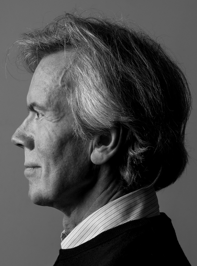
Portrait photo: Aatjan Renders
Images: © Roger van den Bergh