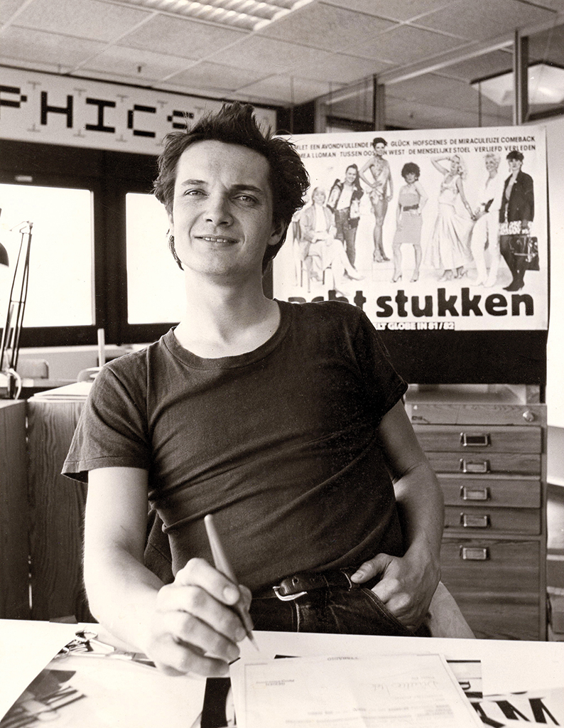
As a student at the Rietveld Academy, Ron van Roon discovered that practice suited him better than the academy. He left the Rietveld, found clients everywhere and started his own Studio Ron van Roon (later Rouwhorst + Van Roon), which produced fifty years of eye-catching posters, logos, leaders and book covers. The Van Roon style: freedom, verve and craftsmanship – and always with a unique touch.
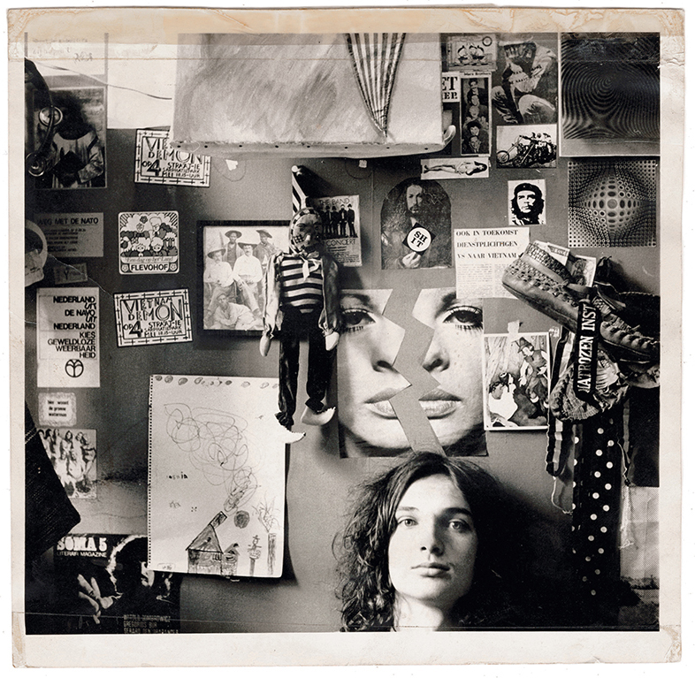
Ron in front of his bedroom wall, ca. 1972
My parents felt that things were becoming rather bleak in Europe after the war, so they were open to a publisher’s suggestion of starting a Sunday newspaper in Curaçao. My father Frits van Roon set up that newspaper, De Morgenster, in an American style. He was editor-in-chief, reporter and designer and even handled distribution himself, driving around in a beautiful old Ford. However, after five years, when the newspaper continued to incur losses, they pulled the plug, and my parents thought: now what, back to the Netherlands? As Canada was promoted as an emigration destination, they moved to Montreal in the early fifties, along with my brothers Peter and Frits junior, who were born in Curaçao in the meantime.
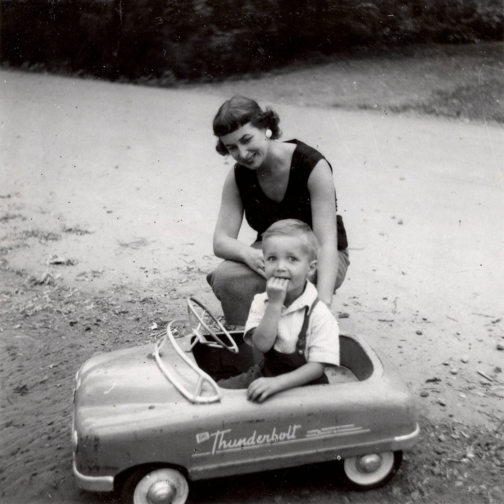
In Canada, my father worked for the World Radio and the Canadian Broadcasting Corporation (CBC). I was born in Saint-Eustache, a suburb of Montreal, at the end of 1953. We lived behind the railway line, and I can still remember the sound of trains whistling at night. We wore jeans and sneakers, played ice hockey and baseball, and had cornflakes for breakfast in the mornings. I believe that’s where my love for letters began, with Kellogg’s cornflakes. Those boxes looked so good, with those beautiful script letters. And I had a pedal car, a Thunderbolt, again with such beautiful lettering.
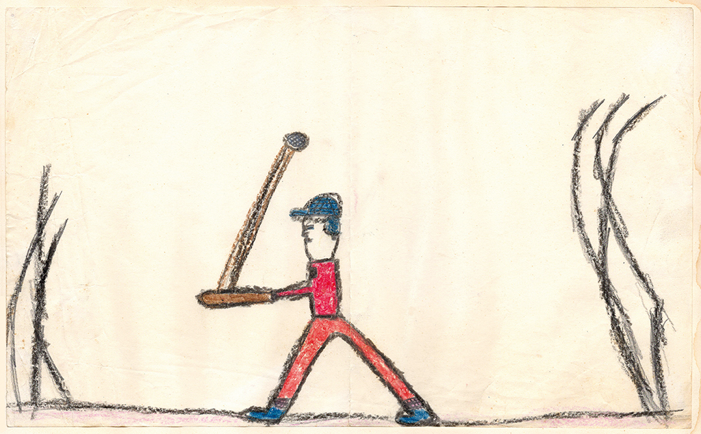
Children’s drawing, ca. 1958
Next to mother in the Thunderbolt, Canada, ca. 1957
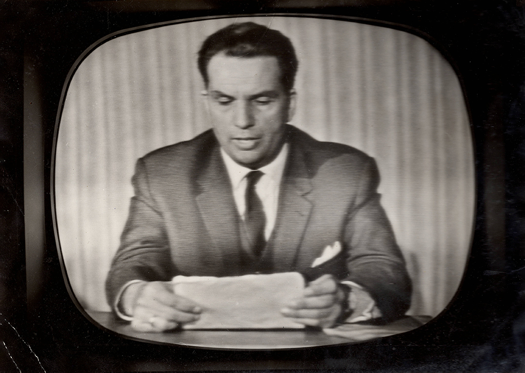
Frits van Roon as presenter of the NTS News, ca. 1964
Then came the big shock: my parents wanted to return to the Netherlands! In 1961, we left Canada with the Holland-America Line. We had mostly spoken English at home until then, and as soon as I was in the Netherlands, I didn’t waste any time forgetting English because I spoke so oddly, and I was bullied about it at school.
My father started working for the television news, then called NTS. He was both a reporter and a presenter, going out into the country with camera and sound in the afternoons and presenting the results in the evenings. They called him ‘De Wybertjesman’ because he always wore an American-folded pocket square.
In Amsterdam, I attended the Geert Groote School. It emphasised art and drawing, although it was a different kind of art than I would have liked – without hard lines and contours, all according to the principles of Rudolf Steiner. Fortunately, they let me be a bit more free, allowing me to have a enjoyable time in school. It was also challenging because I had a significant learning gap due to the language difference. While my friends rushed to the Vondelpark to play football, I had to go to an old lady’s attic to improve my Dutch.
Luxaflex
I was drawing endlessly, and around the age of fourteen, I began creating my own newspapers. The Avenue magazine was on the table, and I would transcribe it entirely, using a hand-drawn typeface, a technique I had taught myself.
Given that my brothers had attended the Gerrit Rietveld Academy—Peter for photography and Frits for free arts—it seemed natural for me to follow suit. To be on the safe side, I first enrolled in the Saturday afternoon course, where I learned figure drawing. Later, I took the entrance exam for the free arts direction.
I had a very good time there, thanks to the lessons from the old guard. However, I observed from my brother that there was little to be earned in the fine arts direction. Consequently, I inquired about the possibility of joining the graphics department. Before doing so, I had to undergo an entrance exam with Charles Jongejans. Even before I could open my folder, he asked, “Can you lower the blinds for a moment?” They were huge windows, three or four in a row, and when I finished, he remarked, “I don’t need to see your folder anymore because just look at what you’ve done.” I had perfectly aligned those blinds at the bottom. It wasn’t a joke from Jongejans; he meant it, so that man had won my heart.
At the Academy, you were asked why you were so eager to enter the profession. I responded: I want to create things that an Eskimo or a Japanese person can understand. Not with language but with images. I made that statement when I was nineteen, and actually, I still think the same way.
What I struggled with was the democratisation at the Academy. I found it challenging that the class would judge your work. I loved the letter-drawing lessons from Mrs. Ten Holt; I can’t remember her first name. She wore beautiful suits, smoked Chesterfields, and sat with a little dog at her feet, like the one Charlotte Mutsaers has. She made us calligraph entire alphabets with two pencils attached, on such large sheets of paper. And then came her pen: scratch, scratch, scratch, as if you were being cut into strips, and you had to start over again. The perfect way to learn it.
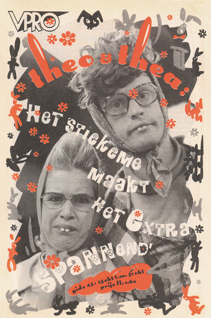
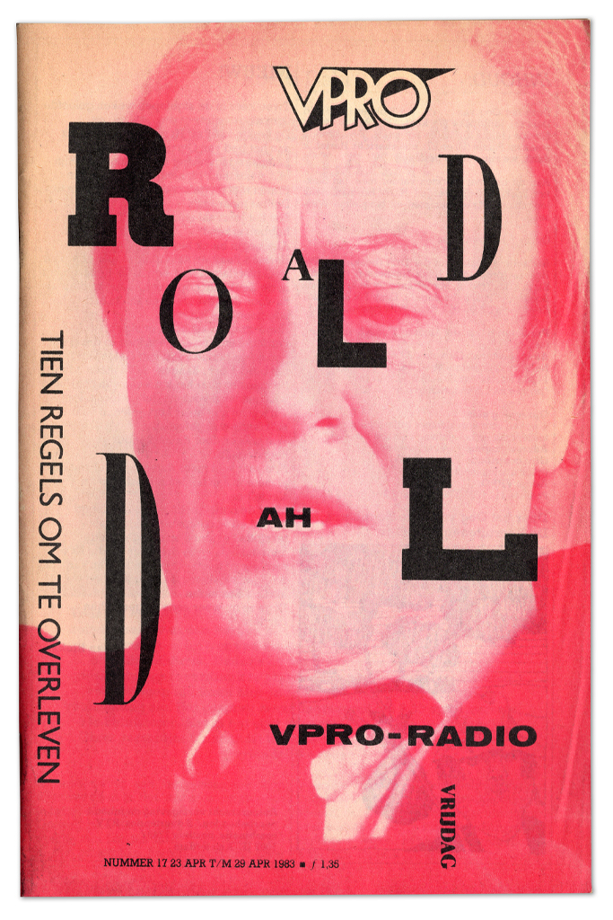
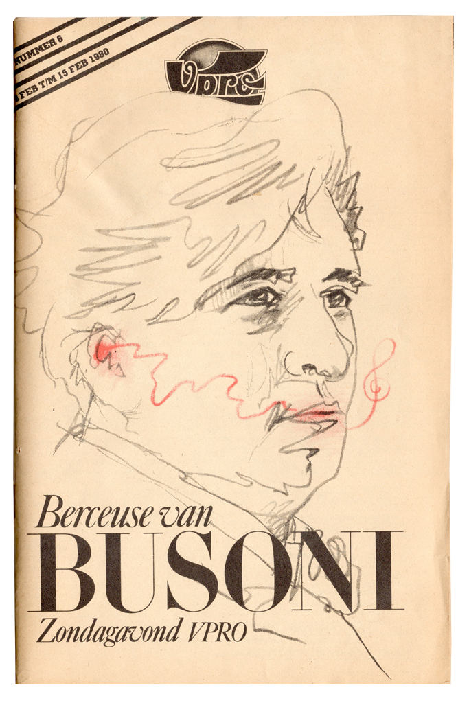
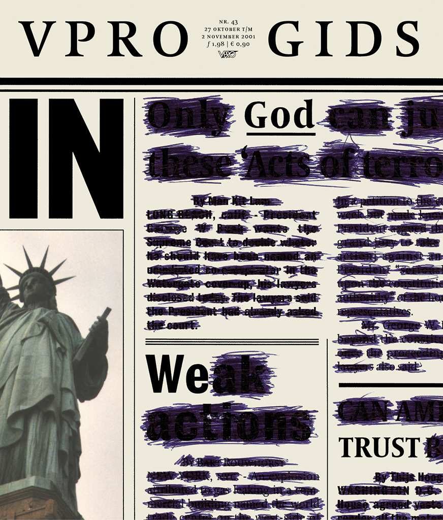
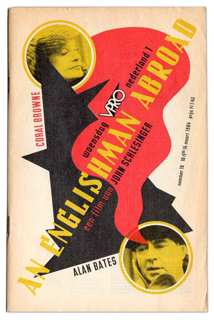
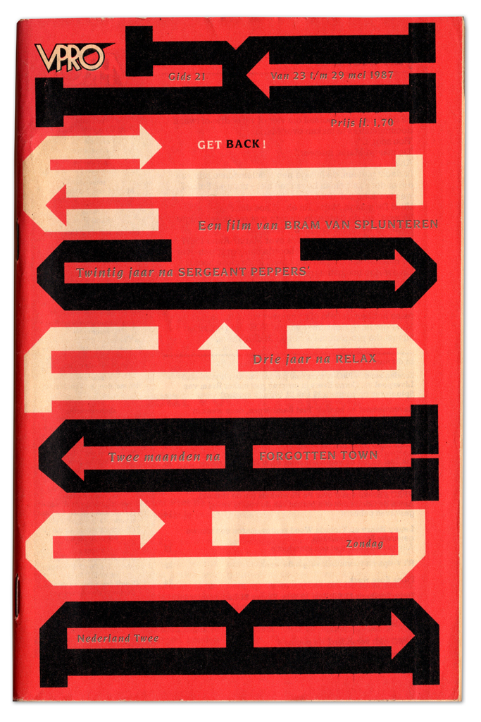
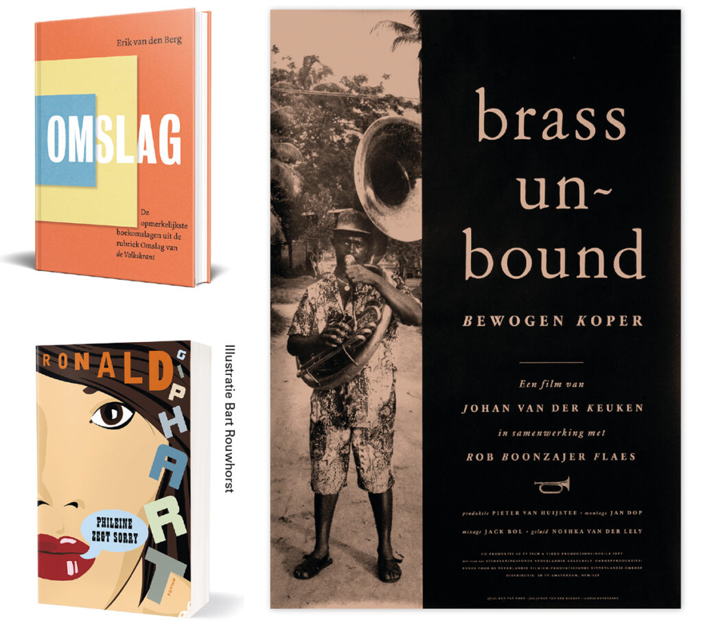
Various covers VPRO magazine
Aloha
At the same time, I grew up with the magazines Hitweek and Aloha: delightful, all styles mixed together, their design exuded such freedom and fun. I also thought Rolling Stone looked good, with that beautiful masthead. But I also found Wim Crouwel’s Total Design fantastic. At the Academy they didn’t appreciate Total Design; they thought it was way too clean. However, when it was time for my internship, I was determined to go to Crouwel. Unfortunately, it turned out to be fully booked for four years, and on the advice of my internship supervisor, I then went to Studio 124 by Eelco Bos.
Eelco has been very important to me. He taught me how to look at architecture and listen to classical music – and with him, I discovered that I enjoyed the practical aspect more than the Academy. When my internship was over, Eelco said, ‘I think you should do another internship.’ And he picked up the phone and called Gert Dumbar of Teldesign: ‘Gert, I have an enthusiastic guy here who really wants to intern with you, is that possible?’ That’s how I ended up at Dumbar’s. I was even working on his famous logo for the NS (the Dutch Railways), enormous in size. It’s quite a complex design, but I can still easily draw it for you.
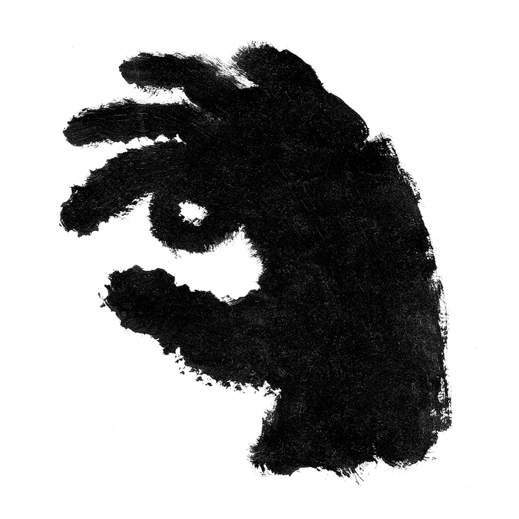
Dumbar taught me how to approach a task with an open mind. One afternoon, he received a call from the VPRO guide, asking if he could create a cover about TV personalities. I was working in my room, and I could see him in the next room. Shortly after, Lex van Pieterson, the regular photographer Dumbar worked with, came in. ‘If it’s crooked, it’s Pieterson,’ we always said. Dumbar fished a piece of cardboard out of the trash and tore a hole in it, which became the television screen. He drew two eyes on it and stuck his hand with a cigar through the hole, Lex took the photo, and the cover was finished. An incredibly valuable lesson; with Dumbar I saw that it’s all about the idea first and foremost.
Illustration advertisement Triodos Meerwaarde-polis, ca. 1996
‘The romance of the final journey’ 1990, and ‘Big Brother is Watching You’, ca. 1998, NRC Handelsblad
Olympic Gay Games Amsterdam NRC Handelsblad, 1998

comic book music Noordhollands
Philharmonisch Orkest, 1995
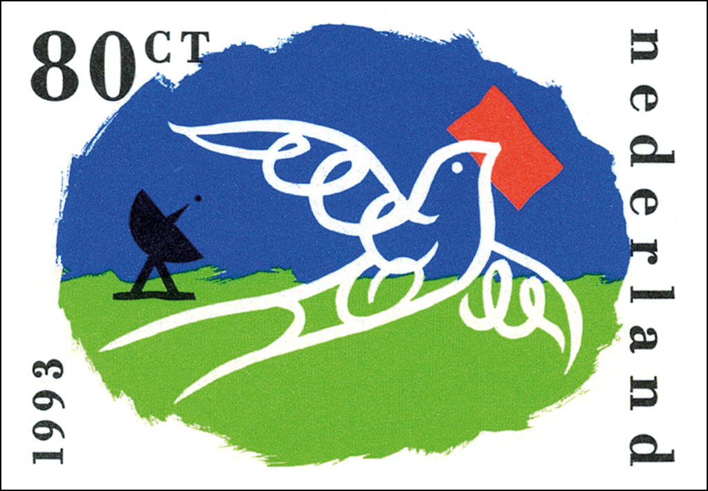
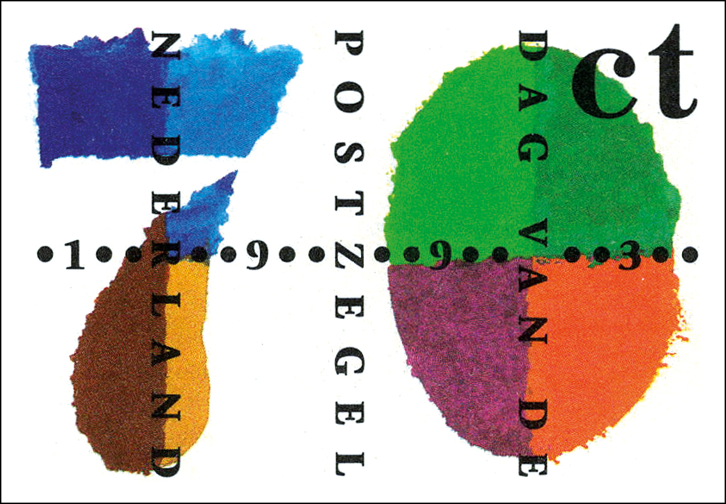
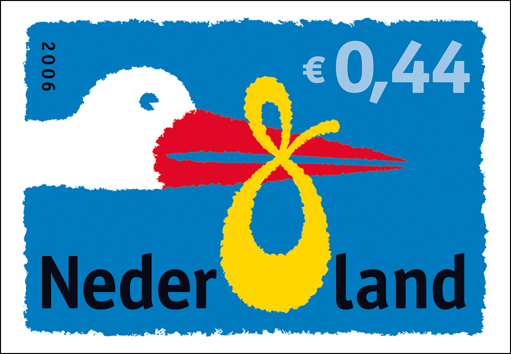
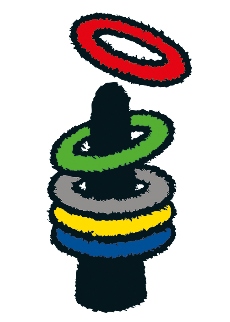
Postage stamps
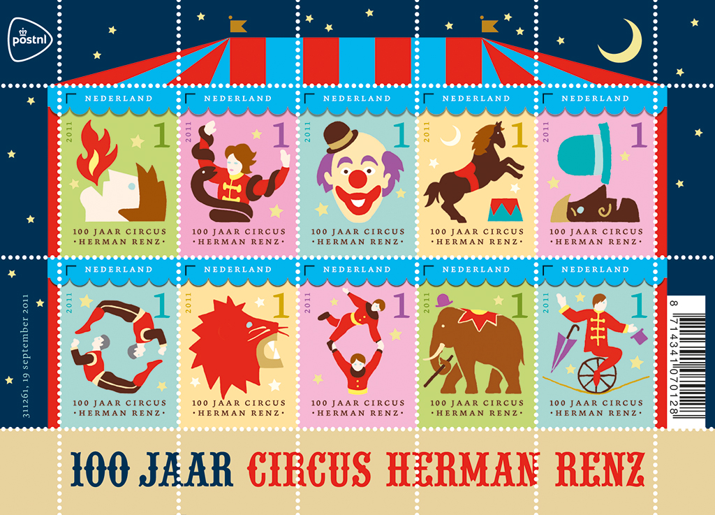
Postage stamp sheet 100 years circus Herman Renz, 2011
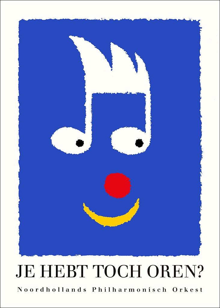
Affiche Je hebt toch oren? (copywriting Paul Merz), ca. 1995
Problems
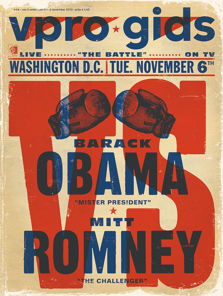
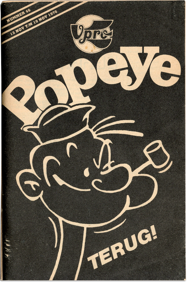
A few years later, I had the opportunity to design a cover for the VPRO myself. I went to the VPRO building on the ‘s-Gravelandseweg to show my work. I received my first assignment from Nelleke van der Drift, and what an assignment it was: Popeye! My design, with the text ‘Popeye terug!’ (Popeye is back!), appeared on the cover, alongside Jaap Drupsteen’s logo. After that, I continued to make covers for the VPRO guide for a long time, even up until the recent past.
Unfortunately, there were some problems at the Academy. I had arguments with teachers who thought I should repeat a year because I had been absent too much due to those internships. I left without completing the programme. Simon den Hartog, the director at the time, told me years later that he regretted letting me go. ‘I should have protected you,’ he said, ‘because who else at the Academy can say they’re already designing for the VPRO?’
When I left the Academy, I made a list for myself of companies that I would like to work for. VPRO was at the top, followed by Avenue, Amnesty International, NRC Handelsblad and record companies, among others. I also wanted to make stamps, and I eventually succeeded eight times, at the invitation of Julius Vermeulen. In 1975 I was able to draw for the NRC Handelsblad newspaper, for their Saturday supplement. On Monday I received a call, on Tuesday I received the text by fax, and on Thursday a motorcycle came and rushed with my drawing to the printing house in Rotterdam — a wonderful way to work.
VPRO magazine, 1976
Graphic department NOS, ca. 1983
Avenue was the crown prince of the Geïllustreerde Pers (Illustrated Press), a magazine with top photographers, and I was lucky enough to freelance there as a designer for six months. On one afternoon in 1980, I was sitting on the Stadhouderskade having a sandwich when I saw an old intern of Eelco Bos, Maike. And Maike said, I’m very excited, I have a job application in progress at the NOS, they are looking for a graphic designer.’ It was as if the windows opened in my mind: image and sound at the same time! She saw me looking, and she said, ‘Hey, you’re not going to apply, are you?’ ‘Well, Maike,’ I said, ‘I’m afraid I am.’
Out of the 350 applicants, I was selected by my later good friend and colleague Frans Lasès, who was in the committee. We created leaders, sets, you name it. For all broadcasters except VPRO, because they had Jaap Drupsteen. It was a fantastic time, although I ended up in a crisis because nothing I made seemed to work: it was a lot of noise with little substance. Things turned out well later, and I particularly enjoyed working with Rob van der Linden, the director of the Humanist Broadcasting Foundation.
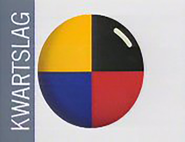
A leader was needed for the Kwartslag TV programme by public broadcaster Human. Joop Stokkermans, an excellent professional, was usually called in for the music. But I thought: new design means also new music. And that’s how Stephen Emmer joined the broadcaster. I knew him from the band Minny Pops with Wally van Middendorp, but also through my father. Stephen’s father, the newsreader Fred Emmer, and he were colleagues. I saw Stephen on the Dam Square in Amsterdam, where he was waiting for the tram. He was in low spirits because he had just been kicked out of the music magazine Vinyl that he had started, and I said, ‘I need music for the Humanist Broadcasting Foundation, something along the lines of Minny Pops, but there’s one problem: it can only last five seconds!’
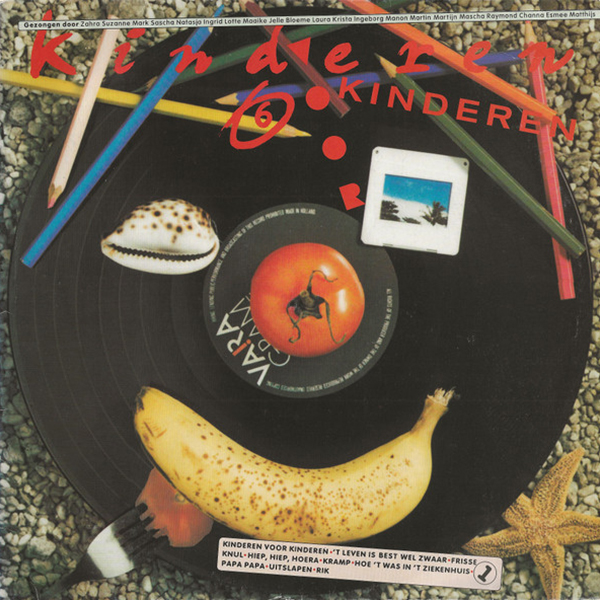
Kinderen voor Kinderen 6, 1985
in cooperation with Ko Sliggers
An hour later, we were at Stephen’s home in the Beethovenstraat. He had just bought a small drum machine in England, actually a children’s toy. It had four coloured keys. If you pressed one colour, you heard boom-tish-tish-boom, and another boom-tish-boom-tish. That then resulted in the TV logo with those four quarters: it was conceived in an afternoon in a room in the Beethovenstraat and used by Kwartslag for many years to come.
I owed another special experience to my father when he handled publicity for hospitality businesses. A friend of his had taken over restaurant Adrian in the Reguliersdwarsstraat, a small, somewhat secret top restaurant with classic French cuisine where Prince Bernhard would dine incognito.
After the takeover, I was given the task of designing the menu and the logo, a dream assignment. I used the Caslon font for that, a beautiful serif font that also had to be placed on the window. I found a window painter in the Yellow Pages. A man arrived on a bicycle in white overalls, with paint pots and one of those sticks with a rubber ball on it. I showed him my sketch, and I said, ‘I want it optically in the middle because with the ‘a,’ you lose space, and if you measure it, everything comes out slightly too much to the left or right.’ ‘Come back in two hours,’ the painter said.
I went to the record store Concerto, and when I came back, Adrian was on the window, perfectly straight and in the middle, beautifully thick in off-white. My heart was pounding in my chest, it was that good. It was also another learning moment: I want to be able to do what that man can do!
After four years at NOS, a different wind began to blow. I had to do the design for a comedy duo, the Mounties, and I wasn’t interested in that at all. I left in 1985 and together with Toni Mulder we started the Dynamo agency in the Staalstraat. It existed until 1990, when Toni and I decided to continue independently, and I founded Studio Ron van Roon.
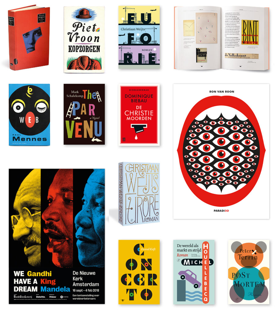
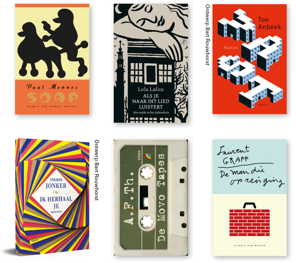
Book covers and posters, 1990–2023
Toni was an excellent poster designer and the initial designer of Vinyl, which is how I knew him. We worked on the design for the Shaffy Theatre, and Toni also designed numerous book covers. He had a carpentry degree, and you could see the solidity in his covers.
However, there was one cover he couldn’t manage. He said, ‘Ron, I can’t figure it out, can you try?’ Vic van de Reijt, the publisher at Van Nijgh & Van Ditmar, immediately approved my design and so the fourth edition of De kip die over de soep vloog (‘The chicken that flew over the soup’) by Frans Pointl was published in 1990.
I had previously designed a cover in 1983 for Tuindersliedboek (‘Gardeners’ Songbook’) by Drs. P, but it was only after Pointl’s book that the number of orders started to increase. Luckily for me, as I had always wanted to design covers, but for a long time, it just didn’t happen. Ultimately it became at least eighty percent of my work.
Vic van de Reijt, publisher
Dear Ron
We know each other since the Tuindersliedboek (‘The Gardeners’ Songbook’) by Drs. P (Bert Bakker, 1983). In 1988, you became a book designer at Nijgh & Van Ditmar, and now, forty years later, there are several metres of books designed by you in my house. And not only that: you and Bart have also designed all my CD compilations and created the website for Het Heen- en Weerschap, the foundation that manages the copyright of Drs. P, with whose songbook your design career began.
Assigning a cover task to you always had something special. Some editors would endlessly elaborate on the content of the book, but that made you nervous. Instead, you sought a striking detail. For Frans Pointl’s De kip die over de soep vloog (‘The chicken that flew over the soup’), you were not interested in that chicken, but the place where that soup was consumed, and so, a miniature image of Heck’s Lunchroom in 1949 at Rembrandtplein, extremely subtly lettered, appeared on the cover. For Grunberg’s Tirza, when you heard about the father’s suffocating love for his daughter, the cellist, you needed only half a word of instruction. Your gaze would then go towards the ceiling, and I knew that a few days later, you would deliver the perfect cover. Nicely pasted on cardboard, placed among other books, showing how distinctive it was.
Designing is a way of life that you don’t just shake off. So, you still go to Bart every day to make sure everything is going well, and, of course, you occasionally pick up a cover.
I’m looking forward to it!
Faro
An important design was Figuranten (‘Silent Extras’) from 1997 by Arnon Grunberg, my second design for Grunberg after Blauwe maandagen (‘Blue Mondays’) from 1994, and the starting signal for a long series of covers I would create for him. I received the request for Silent Extras after my plane crash – I need to tell you something about it first because that accident had a profound impact on me.
It happened on 21 December 1992: a DC-10 from Martinair crashed at Faro Airport, in the south of Portugal. More than fifty people did not survive, including someone right in front of me and someone right behind me. And the strange thing is: if the ceiling would now collapse here, you and I will have a different story about what happened. When you experience something so enormous, your deepest self is affected. If there’s a pendulum and it goes out of balance, the point is to get it into balance again. This took me two years. Depression is not in my nature, but there was a period when it was.
I became more mature because of it; the carefree attitude was over. And it changed my work too. When Vic called me for Silent Extras, I thought: I’m not going to show off what I can do; I don’t want bells and whistles anymore; I’m going to the core. I did it in one go. I took a spoon, fork, and knife from my cutlery drawer – so-called “Haagsche Lofjes”, still from my marriage. I called photographer Kato Tan and said: I don’t want a glossy photo; I want a polaroid. Vic immediately approved it, and I still consider it a successful cover. I had one doubt: whether it would end up in the cookbook section. Once Silent Extras had become a success, I asked Vic about it. ‘I never doubted it for a second,’ Vic said, and that’s because it’s not a glossy photo, of course.
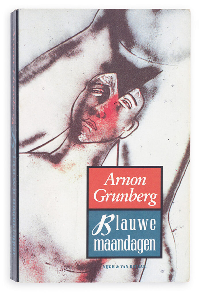
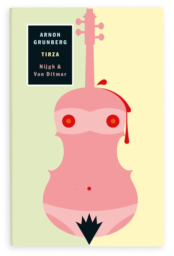
Illustration Bart Rouwhorst
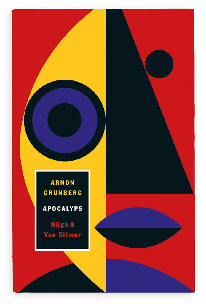
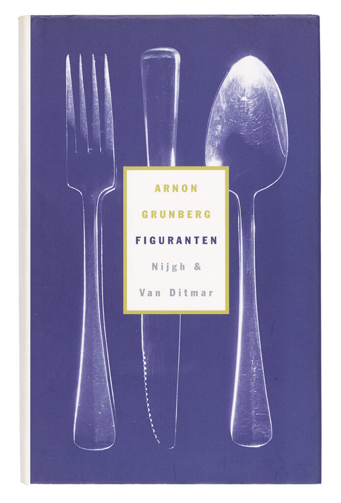
Photo Kato Tan
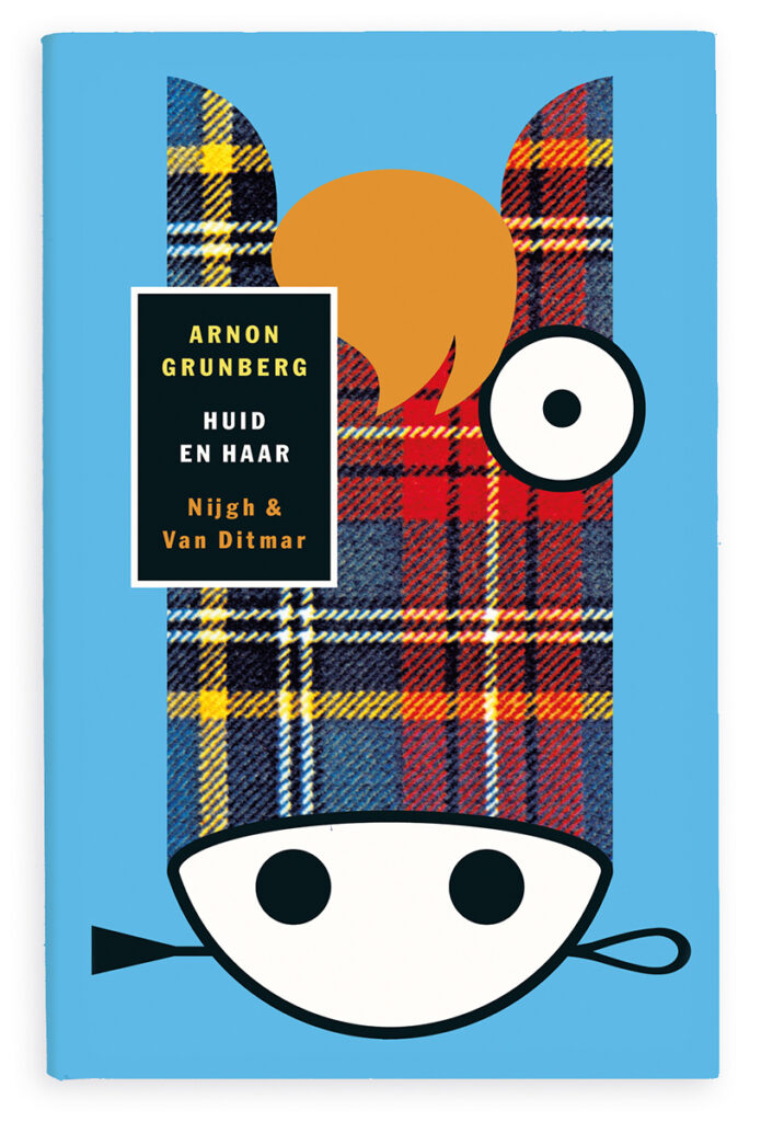
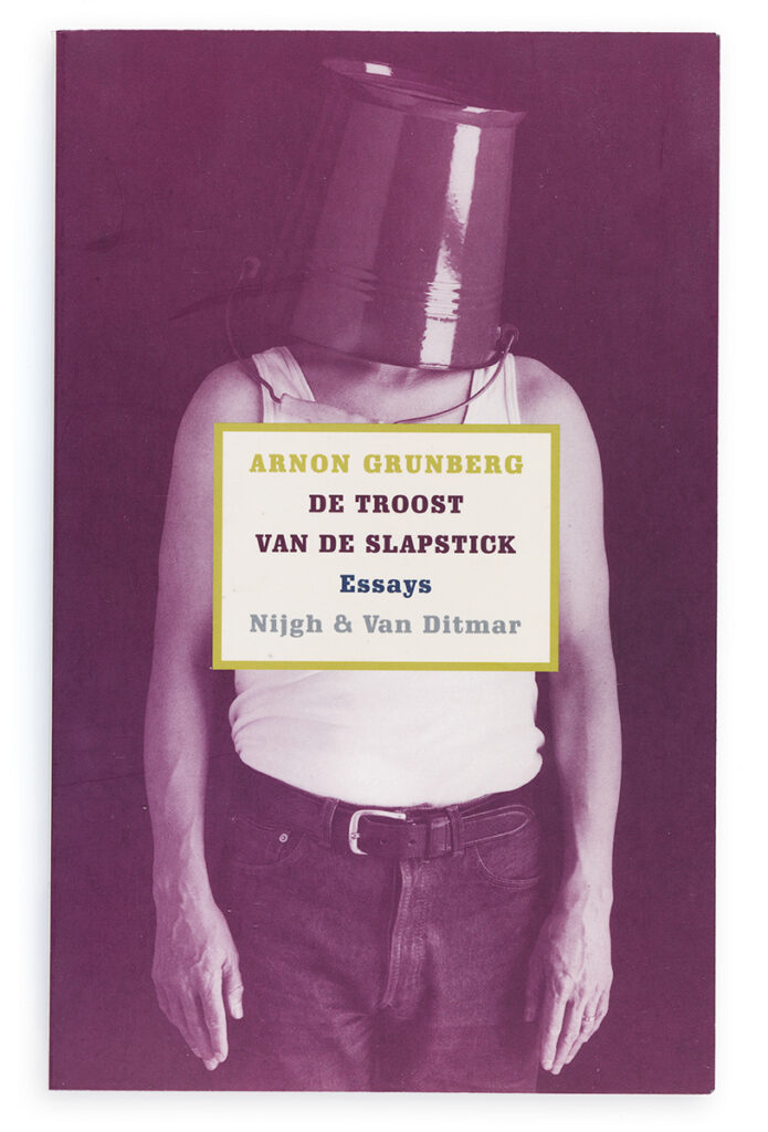
Photo Kato Tan, model Ron van Roon
Arnon Grunberg, writer
The spine
colour could undo everything. I am not such a writer, I would almost say it is beneath my dignity, but that is hypocritical and only conceals how it really is: I also fear the misstep at the last moment, but I know my place. The visual aspect is not my forte. The last time I extensively intervened with a cover was for my first novel, Blue Mondays, in 1994 when I insisted on having a drawing by Roland Topor on the book’s cover. Ron van Roon designed the cover, and since then, he has designed the covers for almost all of my books published by Nijgh & Van Ditmar.
It seems that I had encountered Ron van Roon once before during the Frankfurt Book Fair in 1992 (where I also met Vic van de Reijt, thanks to whom I ended up at Nijgh & van Ditmar). But I don’t remember anything about Ron van Roon in Frankfurt. Memory is selective. I did not yet know that Ron would become the consistent packager of my content, and I could not anticipate that the importance of his packaging would only grow.
Books are increasingly becoming objects that are not so much read but rather looked at and only sometimes touched. In America, there is even a cult — if that is the word — of the cover. Of the spine. In New York, I have come across several bookshelves, not only in photos taken by a real estate agent, filled with books that consist of nothing more than the spine. The interior is blank. The interior is non-existent.
This could be the salvation of literature. People buy a book as they would buy a decorative vase. Of course, the author’s name will still matter. (‘I’d like four Zadie Smith novels above the fireplace.’) But it is the exterior that is crucial for success. Publishers will say, ‘Ron van Roon has a new design, write a short description for the back cover.’
In the future, authors will share their authorship rights with the designer. And now that I think about it, it is purely due to Ron van Roon’s decency that he has never demanded a share of the profits.
Actually, I owe everything to him. He is also a modest, unassuming man who never dominates the conversation in daily life. If he had told me back in Frankfurt that he had been a bailiff or a judo coach, I would have believed him.
Publishers might not like me for saying this, but I think of a writer as a brand. Whether it’s Grunberg, Drs. P, or Houellebecq, I present them as a brand on the cover, with recognisable, recurring elements. Furthermore, I don’t see it as my job to have an opinion about those books. There’s also an unspoken rule in publishing: make sure the designer and the writer don’t get together because they’re like fire and water. What one can do and what the other can do are completely different things. I’ve never received any feedback on my designs from Grunberg, and we’ve hardly had any personal contact. It doesn’t really matter because I consider myself as the standard. If I’m not satisfied, I won’t show it, and it only goes to the publisher when I think it’s completely okay.
On the other hand, I’ve always cherished the principle: you don’t do it alone; you do this work together, with your client and your printing house. I have taught at most art academies in the Netherlands, at the invitation of Joost Bottema I was a guest lecturer at the Merz Academy in Stuttgart for many years, and I also organised symposiums with the BNO, such as Cover Stories – the makers and the market, in 2007.
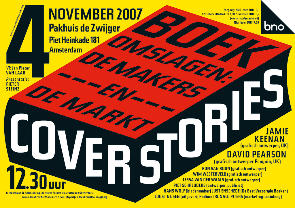
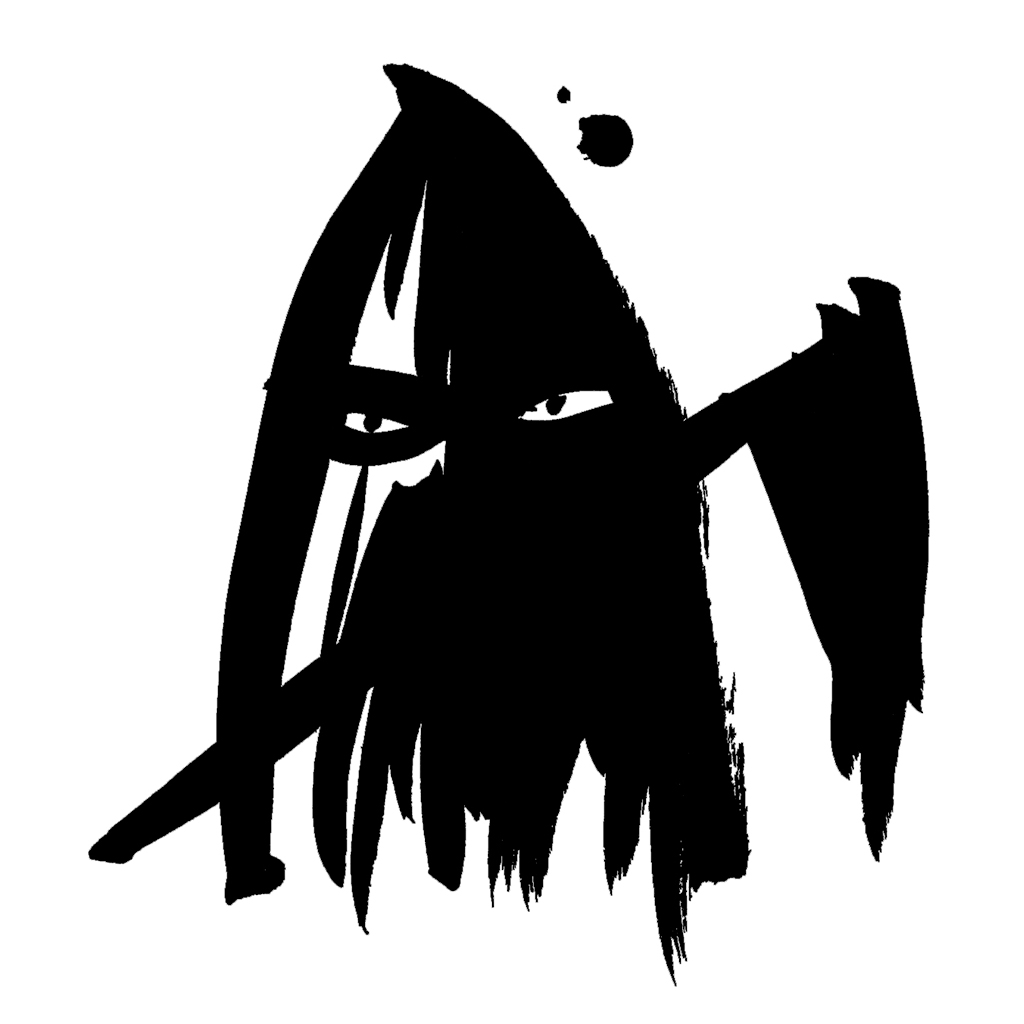
Illustration Peter van Dongen
Through those connections, I’ve had about a hundred interns over the years, and I’ve always emphasised to them: make sure you have a good relationship with everyone. When you write a letter, do it as if you’re writing to a friend, never put yourself above your client!
Apart from Vic, Joost Nijsen has also been very important to me. He and Vic were a kind of duo at Nijgh, and when Joost started his own publishing house, Podium, I designed one of the first covers for Podium in 1997, Phileine zegt sorry (‘Phileine Says Sorry’) by Ronald Giphart. Many more followed, and I also had the opportunity to design Podium’s logo and corporate identity.
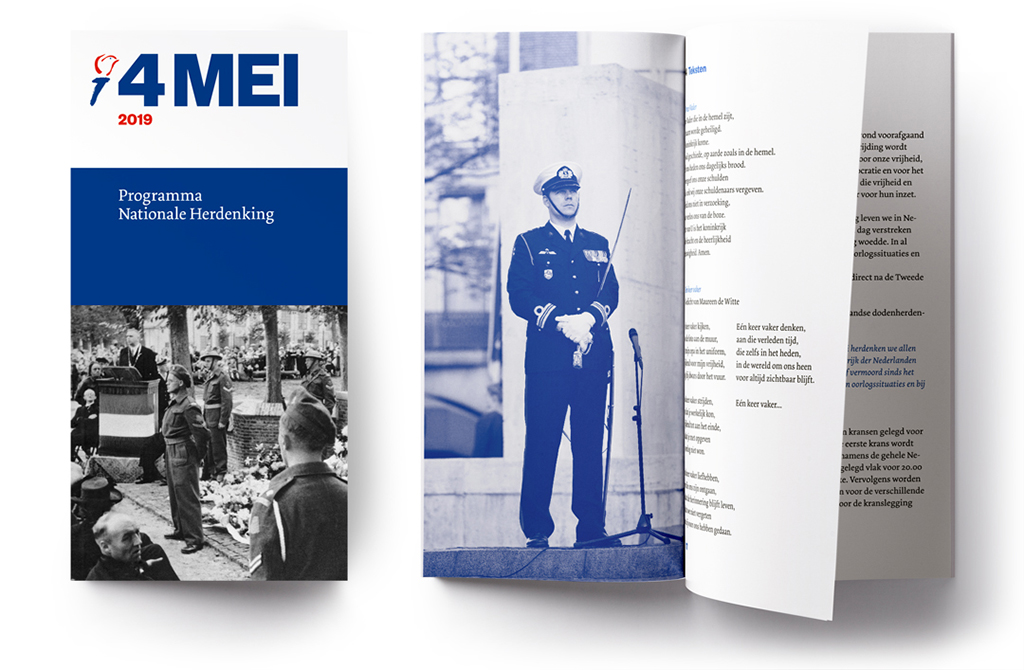
4 and 5 May
Another inspiring connection was Just Enschedé, who managed the Best Designed Books Foundation for many years and was the link in a series of prestigious assignments, including for the CPNB Foundation and the National Committee 4 and 5 May. Equally important was my old school friend Thomas Steiner, who became the Head of Communication for Triodos Bank and granted me the task of designing the bank’s logo – a significant assignment that also provided me with some welcome financial flexibility.
The designer who played the second most significant role in my life after Toni Mulder is Bart Rouwhorst. I met Bart on the day the planes crashed into the Twin Towers. He came to show his work, and I knew right away: this is a student who is very eager. He did an internship, and when my assistant at the time, Man Kit Lam, left a year later, Bart succeeded him. Bart and I have stimulated each other enormously. He is a highly original designer, and only when we both find a design good enough does it go to print.
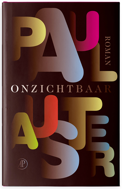
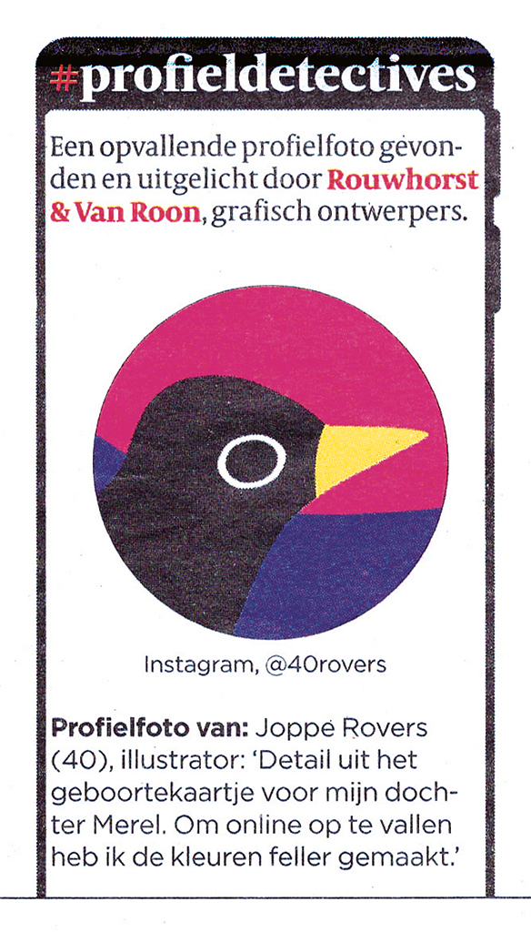
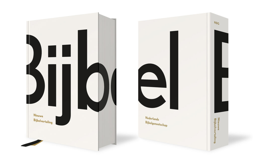
One of my favorite designs by Bart is the cover for Paul Auster’s Invisible, along with his design for the cover and interior of the Bible, the New Bible Translation of the Dutch Bible Society, which was honoured as the Best Designed Book. The Stedelijk Museum included his Bible design in its collection in 2019, and that also put our studio on the map. In the same year, Bart became my partner, and since then, we are known as Rouwhorst + Van Roon. Under that name we also came up with ‘Profile Detectives’ in 2020, a weekly column in the Volkskrant newspaper about unique profile pictures on social media.
During the period when computers started to become prevalent, I initially thought: let others delve into that, I want nothing to do with it. But one day, I had a meeting at Balans Publishing House. I came in with five folders, and after everything was examined and approved, the printer, who was also present, said, ‘Mr. Van Roon, next time it will be like this, right?’ and then he waved one of those floppy disks… I said: ‘But Mr. Printer, will everything I have with me here fit on such a thing?’
It was so humiliating that I immediately bought a computer, with a scanner and printer and everything. Because I didn’t even know how to turn it on and off, I took a desktop publishing course, I was the only graphic designer among the other participants. After a year, I offered the course leader a job. For four years, Heleen worked with me in my former studio in the Lauriergracht. I made the sketches, and she worked them out on the computer. Fortunately, I gradually became more familiar with the equipment.
Now that I have turned seventy, after almost fifty years in the business, I can hand over the studio to Bart with peace of mind. From now on, clients will call him first. I would love to continue doing projects because I don’t see myself stopping as a designer – this profession is too wonderful for that.
Ron van Roon
Bart Rouwhorst
Ron van Roon
born on 5 November 1953, Montreal (Canada)
Author of the original text: Erik van den Berg, 2023
English translation and editing: Peter Hofstee
Final editing: Sybrand Zijlstra
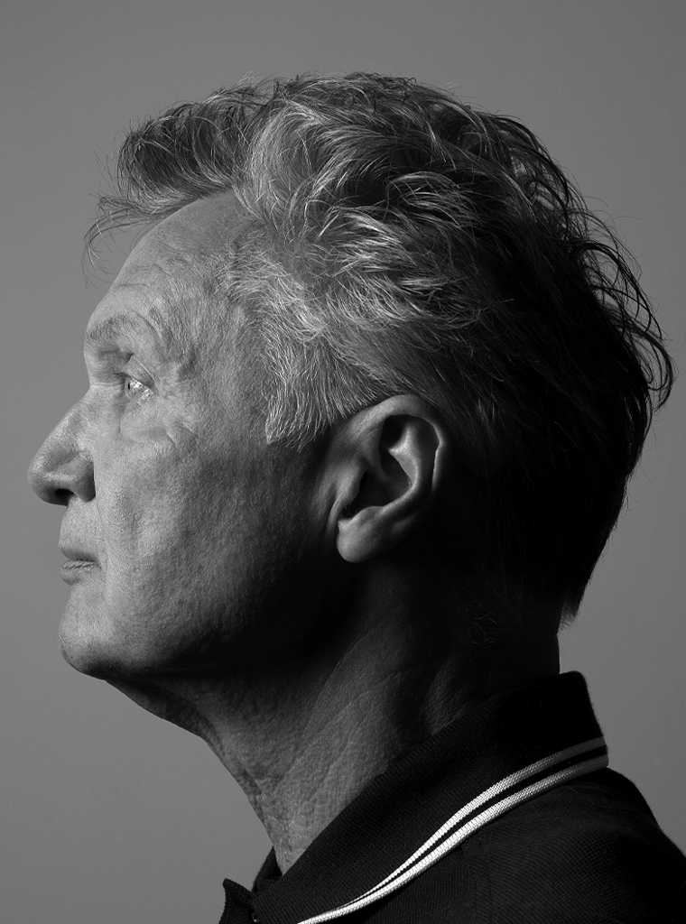
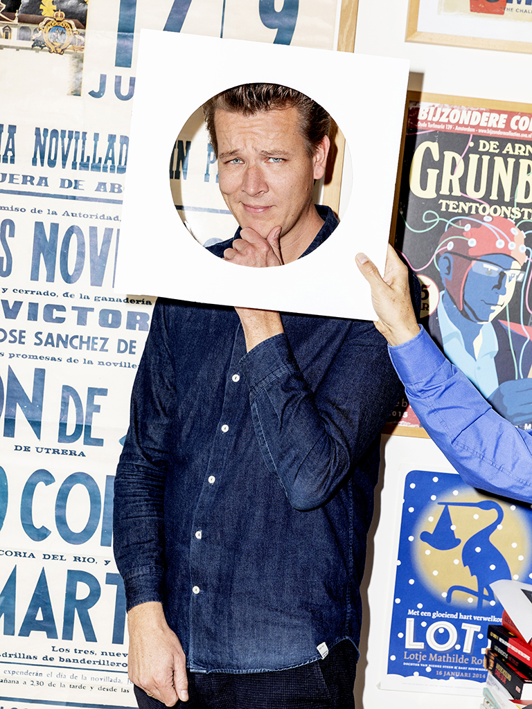
Portrait photo: Aatjan Renders