
Here in America, if one were asked to name a single Dutch designer, I bet the name Rudy VanderLans would come to mind first. It’s been that way here for a long time, since at least the late 1980s when Rudy’s Emigre magazine and its singular series of fonts set the American design scene of the late twentieth century on fire with more energy than anyone else I can think of.
To many, Rudy remains the quintessential outside observer – amused, detached, European, an actual emigre. But don’t be fooled. Rudy has been a die-hard Californian ever since he visited in 1980, fell in love with the reality of a place his youthful imagination had long envisioned, and enrolled at the University of California at Berkeley to take classes (originally for design, but, upon that department’s disappearance, switching to photography). And his love for California continues through his brilliant photography, capturing all of its rust and dents, all the head-scratching non-sequiturs, and all of the warmth and beauty of this American landscape.
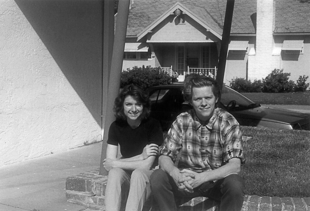
Zuzana Licko en Rudy VanderLans, Sacramento, 1993
Emigre has been lauded many times by American and Dutch design associations – the Chrysler Award for Innovation in Design, the AIGA gold medal, the Charles Nypels Award, and the New York Type Directors Club Medal to name a few. In spite of all these honors, Rudy VanderLans remains modest. He will tell you that he was in the right place at the right time; that the Macintosh’s ascendance carried his own career upwards with it. That may be chronologically accurate, but hardly proof of causality. For he was not the only person playing with this new machine. But he was one of the first to accept its limitations and turn them into assets.
I, too, was in the right place at the right time when I first encountered Rudy. I was a designer at an Oakland marketing firm, miserable in my job and prospects. One evening a sympathetic colleague recommended I attend a lecture by this weird up-and-coming design duo at the California College of the Arts, just down the road from our office in Oakland, Rudy VanderLans and Zuzana Licko. I had never heard of them or seen any of their work. I took a chance, and, while sitting in the audience, my world quietly exploded. As Rudy is fond of saying, “my options as a graphic designer had expanded tenfold.”
The next day I hunted down the latest issue of Emigre (#17 – Wise Guys) at a Berkeley newsstand. I read it front to back and back to front (it was actually designed that way!). I can’t say that I understood it all, couldn’t quite figure out its aesthetic properties, but I knew that, more than anything else, I wanted to learn. The rest is my story, and we’re not here to talk about that.
For many designers like me, Emigre and its in-depth discussions about design appeared to have burst forth on the scene as a force of nature. Of course, that’s never the case. A lot of difficult groundwork went into getting the magazine from an idea in Rudy’s head into the oversized publication in my hands. How did an unassuming Dutch designer get from there to here? It’s an interesting story.
**
Could you talk a bit about your early design apprenticeships? You worked with some great designers and design firms early on. I imagine most designers would have stayed the course and built a steady career from those foundations. What kinds of projects were you given? Did your attitudes about design change during those years? Was there something unsatisfying that made you restless?
“After finishing my four years at KABK (Royal Academy of Art, The Hague), from 1974 to 1978, the fifth year was an apprentice year, and I was lucky to first land a three-month internship at Total Design in Amsterdam in 1978, where I was part of team Jolijn van de Wouw, and then a six-month internship with Vorm Vijf in The Hague, which was started by two KABK graduates, Joop Ridder and Bart de Groot. At both studios, the work consisted of identities, annual reports, exhibitions, posters, etc., all the basic staples that most design studios in Holland worked on in those days. Cultural and government institutions were the bread-and-butter clients.
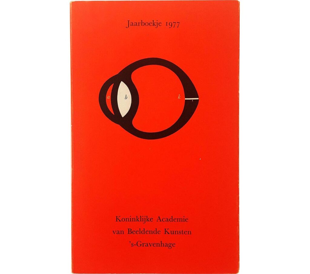
KABK Jaarboekje, 1977
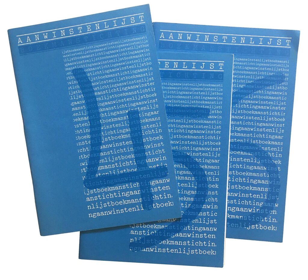
Total Design, 1978
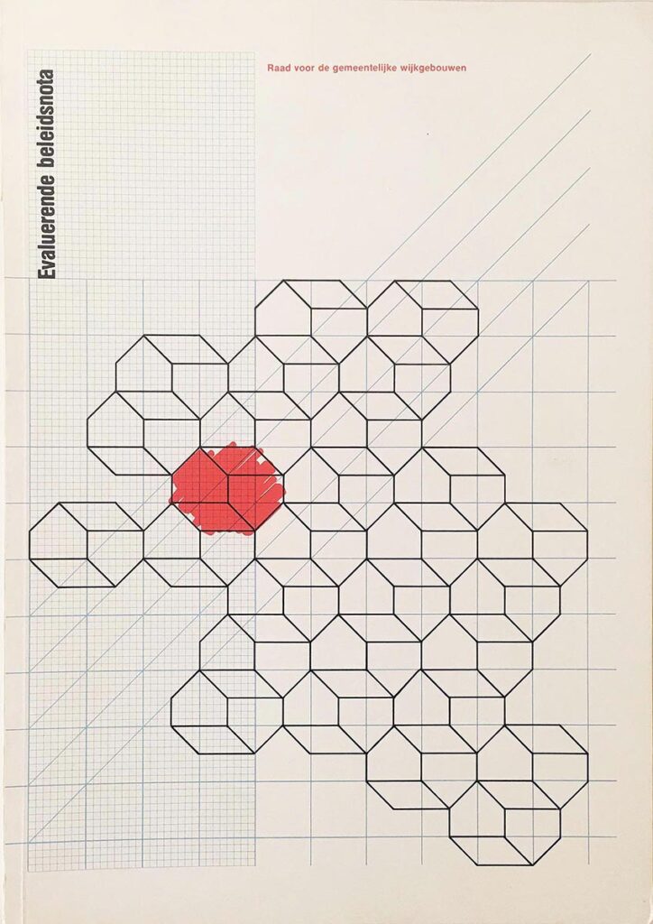
Vorm Vijf, 1978
My first job at Total Design was to come up with variations of the running heads for the PTT (Post, Telephone, Telecommunications) house style manual. If I remember correctly, at the time there were three different studios working on that identity. The scope was just enormous. I worked on just a tiny fraction of it. Later on, I was given a number of small booklets to design for non-profits in Amsterdam. One was a series of recurring booklets that were meant to be created entirely on an IBM Selectric typewriter, and I had to design the template and then develop typographic instructions for the secretaries on how to put each booklet together. This system design was the type of work we were perfectly trained for at KABK.
After my apprenticeship at Vorm Vijf in 1979, they offered me a steady job, which was my first real job as a designer and I was their first employee. I consider myself very lucky to have landed both these early jobs. Total Design was a huge studio, divided into separate teams with separate departments for production and client relations, and a secretary, etc. Meanwhile, Vorm Vijf at the time was just a two-man operation, where everybody wore every hat. So that first year after school, I received a solid introduction to design culture in Holland.
All of this was interrupted by my being drafted into the army in May 1980. To give myself a bit of a buffer, I decided to take a two-month trip across the USA before reporting for duty. It’s something I had always dreamed of doing. So I bought a Greyhound bus pass in Amsterdam, flew to New York, and bussed across the country and ended up in California. I instantly knew that’s where I belonged.
Anyway, upon return from my trip, I reported for army duty but got dismissed after just a few weeks. I landed a job with Tel Design in The Hague, which at the time was run by Andrew Fallon and Paul Vermijs. Tel Design too, did mostly identity design and annual reports. The work that was produced in these studios at the time was just incredible. And it was all done manually – no computers. So my skill sets for doing mock-ups and paste up were very well developed in those days.
One of the things that really stands out for me about that time is how each studio I worked at would have lunch together each day in a lunchroom. This idea of working together and eating together, it was all very social, very Dutch. But I had also started to realize that I wasn’t really a team player; that I didn’t really thrive in those kinds of environments. I also wasn’t all that interested in these all-encompassing, time-consuming identity programs that took forever to develop and implement. I had always imagined myself to be designing one-offs, like album covers or book covers that were geared to smaller audiences and allowed for a lot more personal expression. At this time I had become aware of the work of Hard Werken and Piet Schreuders, and their respective magazines, which showed an entirely different approach to design that seemed much more attractive to me.
So during my USA trip, in April 1980, I had visited the University of California at Berkeley and decided on the spot to apply for their Master’s program in design to see what else design had to offer. They handed me a bunch of application forms, which I brought back home, and after a lengthy application process I was admitted. School would start September 1981. There was just one caveat: they had discontinued the design department, but they had liked some of the photographs in my portfolio. So they asked me if I would be interested in studying photography instead. I said yes, quit Tel Design, and moved to California in 1981.”
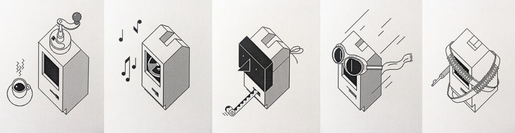
Illustrations for Apple Macintosh, 1985
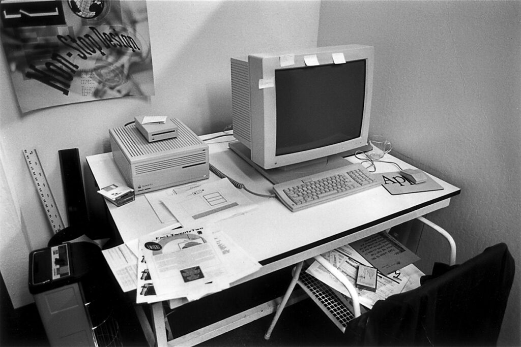
Berkeley Office, 1990
In 1981 there weren’t many MFA programs in design available, and maybe none in the Netherlands. Had you seen the student work at Berkeley and liked what you saw? How did you imagine an MFA education in California would differ from your earlier education at KABK?
“My education at KABK was almost entirely studio classes. There was very little if any theory or history of design. It was all about making things, a bit like a trade school. We spent hours learning how to make mock-ups and mechanicals with pen and ink and setting metal type by hand. And every Monday morning we spent about three hours doing calligraphy, under the watchful eye of Gerrit Noordzij. At the time I had no idea what that was for; that portion to me felt very antiquated. But with all the other classes, under the guidance of the head of the department, Jacques Jansen, I received a solid Bauhausian, form-follows-function, less-is-more, crystal-goblet type of design education.
To be honest, when I was reading the course descriptions for the MFA program in design at UC Berkeley, I had no idea what to make of it. It all seemed very theoretical and out of my league. I was a little nervous about what I was getting myself into. But I wanted so badly to go to California, and not just on a three-month tourist visa. I wanted to live there and have a particular purpose beyond just visiting. So when they told me the design program was discontinued and they suggested I study photography, it was a bit of a relief. I was going to live in California, a place I had dreamed about, and I was going to be able to walk around all day and photograph it. It sounded like heaven.”
And you’re still here! And you’re still photographing it! And, despite your hesitancy, you were the catalyst for an awful lot of theoretical conversation within MFA design circles. Besides a nervousness around master calligraphers, what else from your fundamental education remains with you to this day?
“It’s the crafts part of the education that remains, almost like second nature. Things as simple as how to hold a piece of paper without nicking it, a concern for the direction of the fibers when you lay out a signature, or how to get the most out of different printing techniques by understanding how things are produced. There was an emphasis on efficiency and economy in making things, how to get the richest results with the most modest of means.
And, perhaps ironically, when we started designing type at Emigre, all those ‘antiquated’ lessons from Gerrit Noordzij’s calligraphy classes came rushing back to me and turned out to be quite useful. All of a sudden those exercises with broad nibbed and pointed pens made sense and helped resolve issues of structure and consistency. And I can always fall back on those very basic typography lessons that emphasized how to create order out of chaos and how to make things clear. Although it’s those lessons, and the things I had taken for granted, that I later questioned most in the pages of Emigre magazine.”
From your first visit to your current photo practice, California has had a profound effect on you, not just as a place to live, but with a deeper resonance. And you have since become as associated with California as you have been with the Netherlands. I often hear that someone visits a place and it ‘feels right,’ but never have the chance to pursue that more deeply. Put yourself back in that moment when you got off the bus and knew that California was ‘the place for you.’ What qualities hit you? The geography? The weather? The people? Was it a familiarity or an exoticism that drew you? Or something else altogether?
“I remember very vividly arriving in Hollywood after an all-night trip on the Greyhound bus. I was sitting next to a lady who claimed she had dated Jack Palance when she was young. Then, looking out the window and seeing the Capitol Records building, for a second I thought I was in the kind of dream I often had about my being in California. But this was real.
I had built up an entirely stereotypical image of California from watching American television series and movies, and reading Kerouac and Steinbeck and Wolfe. And I loved Westerns, which were often shot in California. And I almost exclusively listened to West Coast music. I grew up in Voorburg, just outside The Hague, which had a large venue, de Vliegermolen, where every major band that toured Europe would play. So in the mid-seventies I got to see all my favorite musicians like the Flying Burrito Brothers, the Eagles, Leon Russell, Ry Cooder, Little Feat, Neil Young, etc. Whenever a band from California would visit, I would be in the front row. I would also devour Muziekkrant Oor, the leading Dutch pop music magazine in those days, and read Constant Meijers who would write these long New Journalism-type of essays in which he would travel to California and spent time with Neil Young or Randy Newman. That stuff placed me right in the middle of California or, to be more specific, in Topanga Canyon or Hollywood.
So when I finally arrived in California, at the age of 25, I was well prepared for what to expect. There was no culture shock. It seemed both familiar and exotic at the same time. Familiar because I’d seen and read so much about it. And exotic because it was so different from Holland. In Holland everything is pretty much flat and overcast, and every inch of the country is designed and planned and regulated and things are built to last. And tradition weighs heavily. California is the opposite. It’s sun-kissed and brilliantly lit, like a stage set. It exudes a kind of impermanence, especially its build environment, which may have something to do with the always present threat of earthquakes. And it felt unencumbered by tradition. If Holland is Wim Crouwel, California is David Carson.”
* *
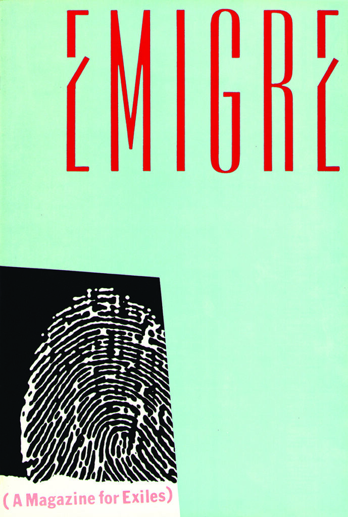
Emigre #1, cover and page spread, 1984
Originally dreamed up as a showcase for creatives who found themselves immersed in foreign cultures, Emigre was hardly a blockbuster at the start. Looking back at its early issues is like listening to the first formative tracks of a favorite band. There was always a chance that the whole project would fall apart except for the glimmers of something special shining through.
And those first issues, made before the Macintosh was even available, are full of such glimmers. Rudy’s curiosity, his ability to work with whatever was at hand, his eagerness to educate himself on new processes and new ways of thinking about form and content were all being formed, and, despite what most designers imagine, without any digital help.
When the first Macintosh arrived in Rudy and Zuzana’s Berkeley apartment in 1985, it was Zuzana’s type design, in its low-resolution form that first entered the magazine. Digital layout tools were still unreliable, and so, for quite a whileEmigre remained a hybrid of multiple modes of working, part digital, part paste-up.
It wasn’t long before the magazine became, in essence, about itself. That is to say, Rudy had been focusing his attention on designers, illustrators, and photographers he knew all along. But soon, the visual relationship between text and image took center stage, culminating in what I consider his first masterpiece, 1987’s Alienation issue (#8). At this point all of the fonts were generated in-house, using Zuzana’s new postscript-generated fonts like Matrix and Oakland, and much of the magazine was organized and typeset within a still-primitive-but-workable digital layout program, ReadySetGo! In issue #8, the fusing together of text with Italian photographer Stefano Massei’s beautiful images formed an aesthetic that leapt far past the slick highly-vectorized digital illustrative style bubbling up in contemporary American design at the time. It was not ‘pop-ish’ or lightweight. It was moody and soulful.
Emigre Fonts came into being around this time. With the marketplace opening up, outside designers could try their hand with these strange letterforms. And they bought them in droves. Emigre type began seeping into all sorts of design and advertising projects. Older, conservative designers were noticing and holding their noses. Young designers were noticing and devouring it all. Many of them were still in school, just learning about design. Emigre became a place for them to gather and discover other young designers like Vaughan Oliver, Allen Hori, and Henk Elenga, all of whom were working with open-ended visual languages. By issue #10 (the Cranbrook issue), according to Rudy, Emigre ‘had unofficially become a graphic design journal.’
Perhaps the most amazing result of this shift was that young graphic designers were displaying passion, not just formally in their work, but in actually reading and writing and debating about design, possibly for the first time in our young profession’s history. Emigre was a forum, and each issue was read with both skepticism and appreciation, as readers sharpened their pencils to write a passionate letter-to-the-editor.
When I was a design student at Cranbrook, I vividly remember a new issue of Emigre arriving in the department (#20, the Ex-patriates issue), and how we students gathered around the magazine to witness what topics were covered, what new design treatment was revealed, who was featured and who was panned. This was well before the internet, and so this became the primary place to discover who was important to pay attention to. Although we knew many of the names: Allen Hori, Ed Fella, Jeff (Mr.) Keedy, we were learning new ones as well: Nick Bell, Rick Valicenti, the Designers Republic. And new writers were producing heroic texts that made an impact: Anne Burdick, Andrew Blauvelt, Dave Barringer, Jeff Keedy, to name just a few.
This ebullience continued for quite some time; until 2009’s Looking Back hardcover retrospective as a final salute (officially #70). That is quite a record and a long time to sustain interest and passion in an admittedly niche topic. The internet’s growing dominance eventually took over the conversation, at least for a while. What happened after that? It’s hard to say for sure. As the design profession splintered into so many separate camps, and designers sought jobs that paid exceptionally well but had little influence within our culture, the collective spirit has seemed to evaporate. But once again, this is a story for another time.
**
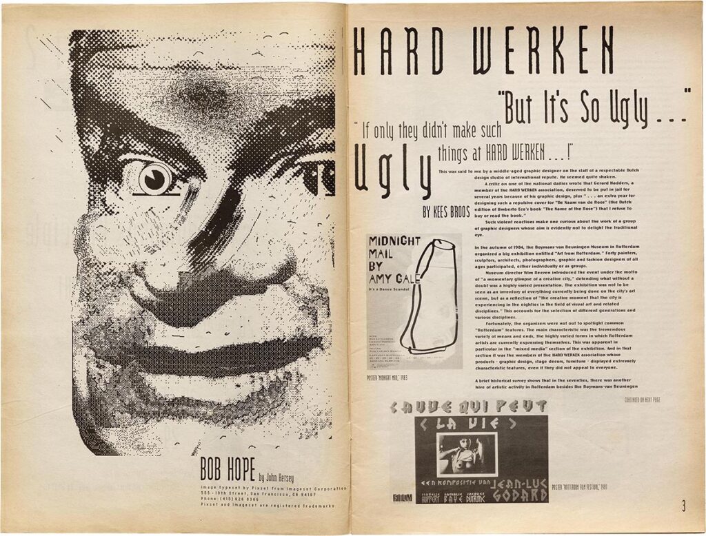
Emigre #6, page spread, illustration by John Hersey, 1986
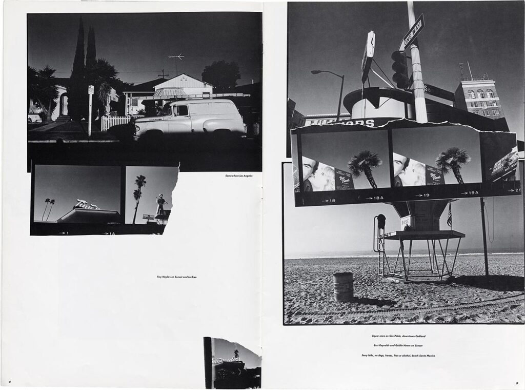
Emigre #8, page spread, photography by Stefano Massei, 1987
Let’s go back to the early days of Emigre for a bit. What was the impetus to start Emigre?
“Emigre magazine was started in 1984 by myself and two other Dutch artists whom I had met in San Francisco, Menno Meyjes and Marc Susan. Menno and Marc knew each other from studying at the San Francisco Art Institute. Originally, the magazine was going to be named Dutch Punch, but that idea was dropped when we made an unsuccessful funding pitch to some very wealthy Dutch expatriates living in Palo Alto. On the way back from that meeting, Menno suggested we should call the magazine Emigre instead and feature the work of fellow world travelers. It was a naive idea to get our own work published, a shortcut to bypass galleries and publishers. Of course we had no idea how difficult it is to publish and distribute a magazine, and after a few issues both Menno and Marc went their own way. At the time, Menno was working at Francis Ford Coppola’s Zoetrope studio and had written the screenplay for The Color Purple, for which he won an Oscar. So he had better things to do. Marc also moved to Los Angeles and pursued his dreams as an artist and poet. That left me and Zuzana to continue the magazine, which we did. And without Menno and Marc’s input we were free to explore our own interests which at the time were leaning heavily towards design and type design.”
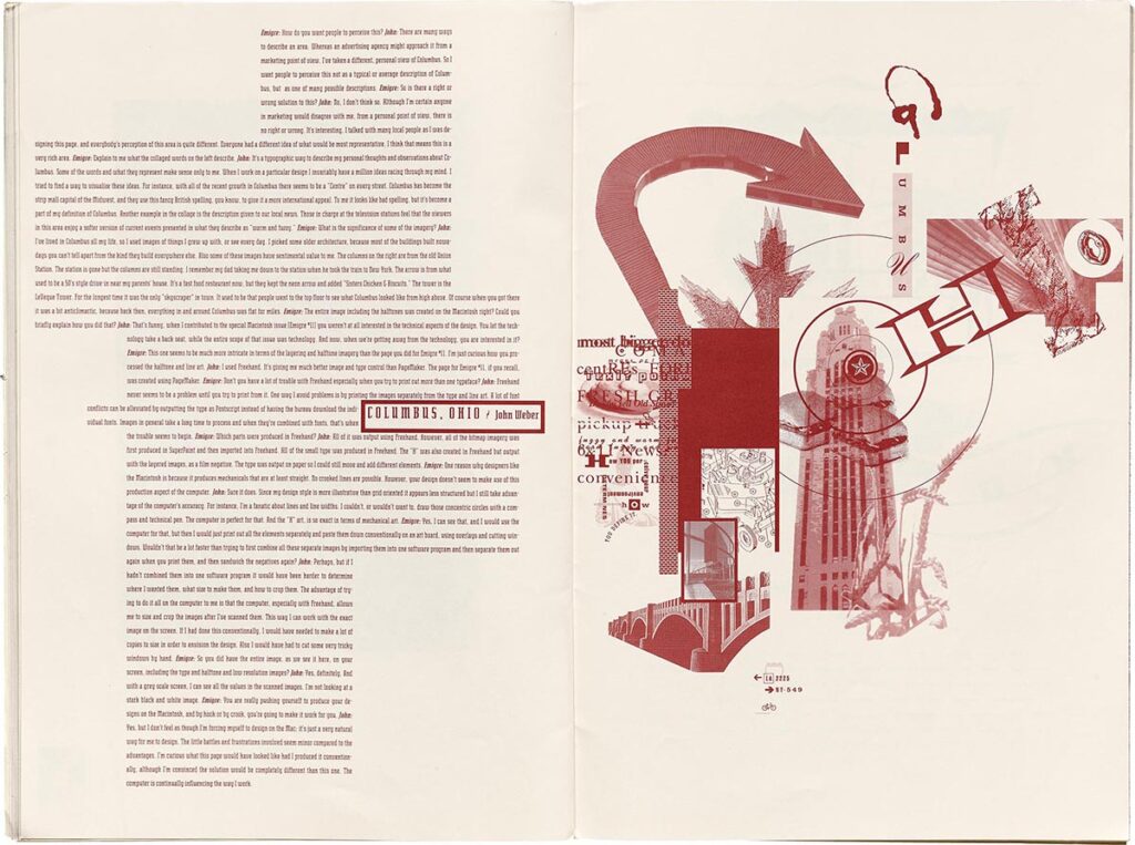
Emigre #13, page spread, illustration by John Weber, 1989
Emigre #34, page spread, 1995
Your magazine recalibrated what it meant to be significant or even interesting, and what questions could be asked about the field of design. I suspect you were choosing to feature designers who you found personally interesting, but were you aware of the way Emigre was reshaping contemporary design history? Or, if not at first, when did you start to realize the power you were wielding?
“There was a big disconnect with the work and designers that I admired at the time, and who the mainstream design magazines and books were featuring. Fella and Schreuders, for example, were exemplary of how the vernacular can inform design, along with other postmodern ideas. These designers, in terms of their practice, didn’t fit neatly into the stereotypical image of what a graphic designer or a design practice encompassed. Schreuders was a self-taught designer who created and published his own magazines. Fella was a commercial designer/illustrator/artist who turned teacher/guru. Schreuders was particularly interesting, because he railed against designers like Crouwel and Dumbar and the entire Dutch design scene, which he considered to be criminal and suggested should not exist at all.
I was always interested in designers whose practice was not reliant on outside clients and commercial jobs or, if there was a client, it would be a cultural institution or a non-profit. I was very curious about how they made it work, and I had a lot of questions. I didn’t really have an affinity towards the kind of commercial graphic design work that was featured in the design publications and annuals and award shows of the time. I didn’t feel inspired to show that type of work in Emigre or ask questions about it. It’s the kind of work I had walked away from. It didn’t interest me much.
And there was so much else going on within our profession at the time. The Macintosh had been introduced, completely reordering how design was made and produced. There was a growing interest within MFA programs in post-modernism and theory, and the DIY movement was flourishing with dozens of small independent magazines being published. So yes, design was changing and its history was being reshaped, but we were being reshaped by it perhaps as much as we helped reshape it.
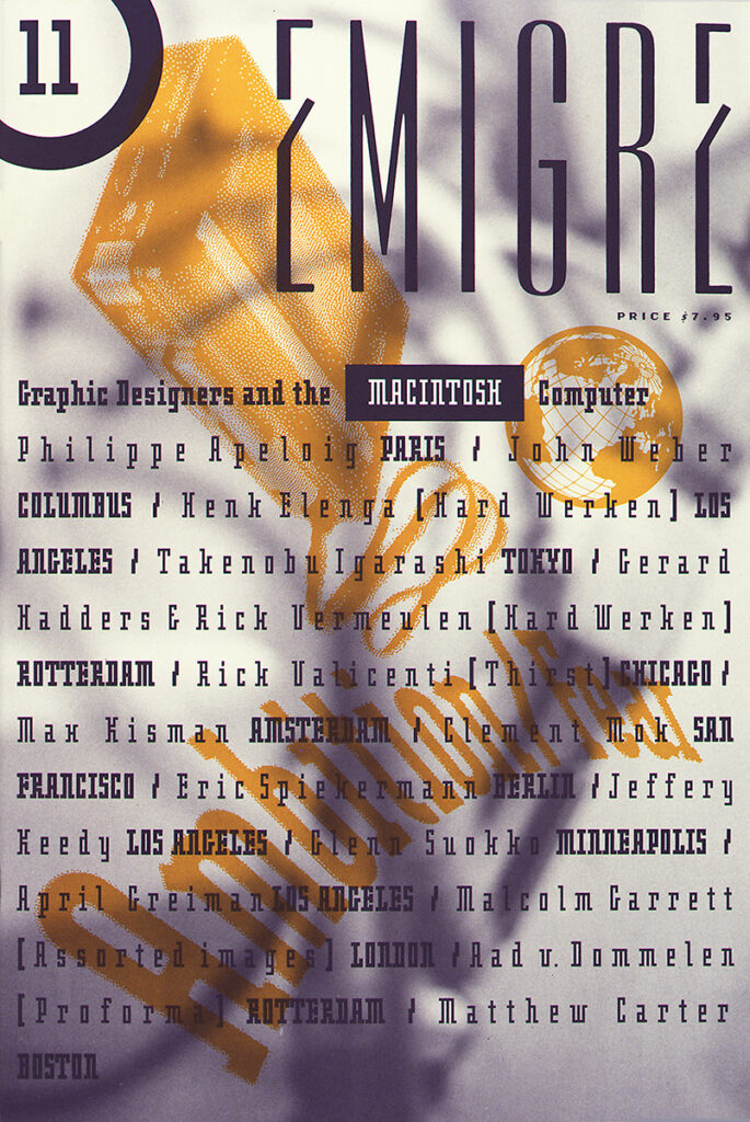
Emigre #11, cover, 1989
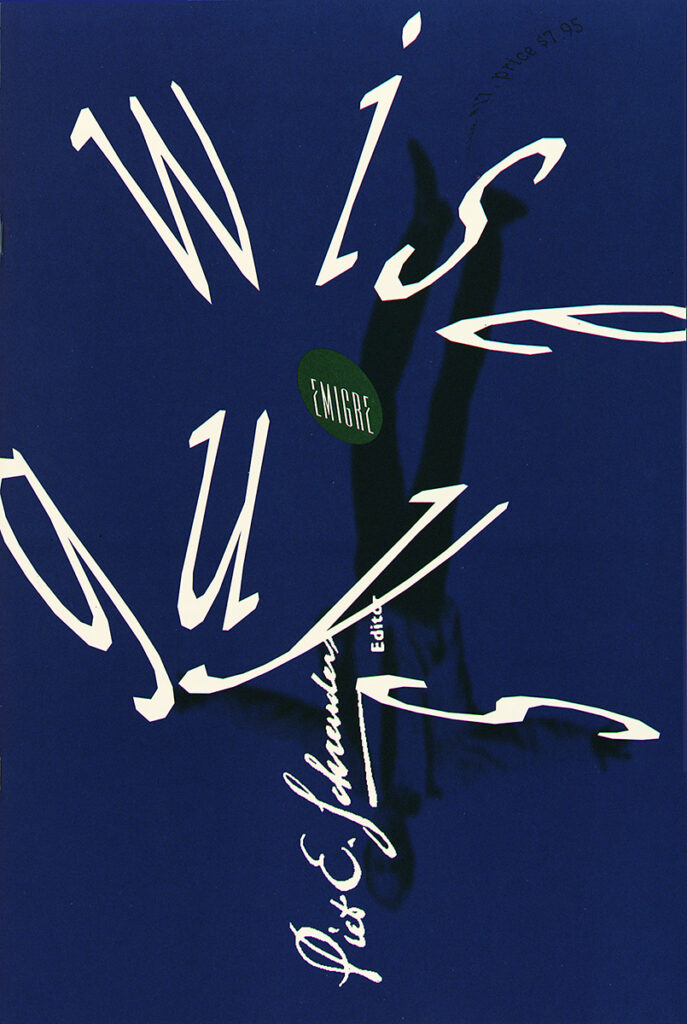
Emigre #17, cover, 1991
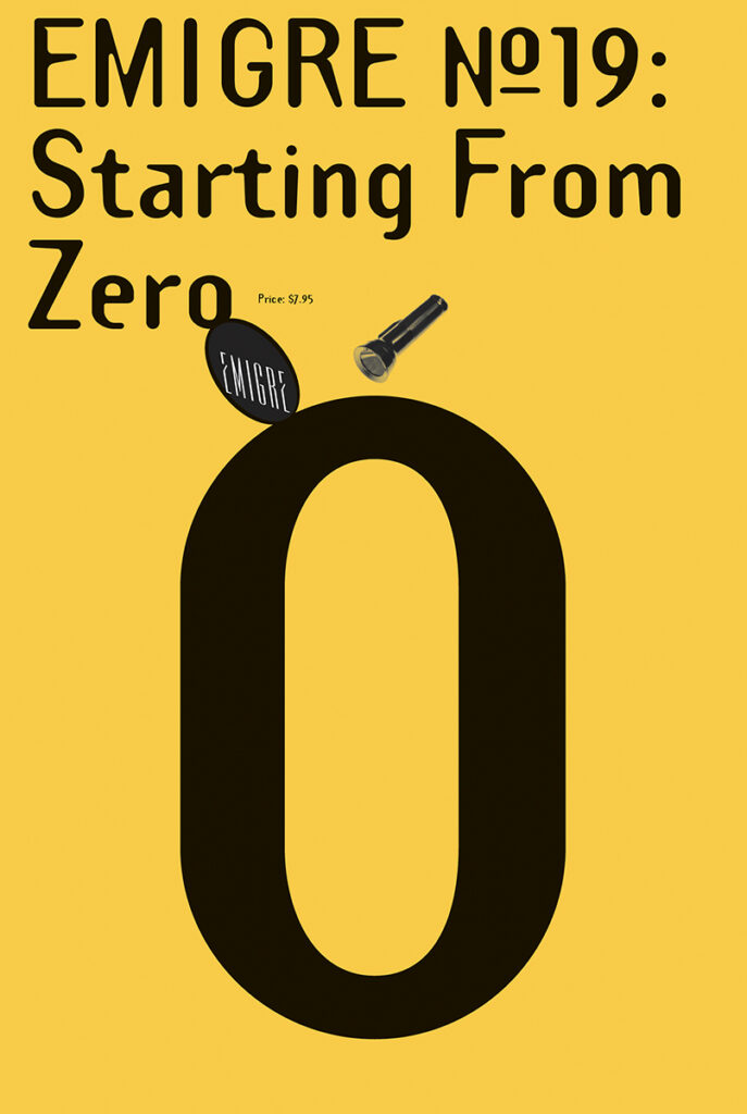
Emigre #19, cover, 1991
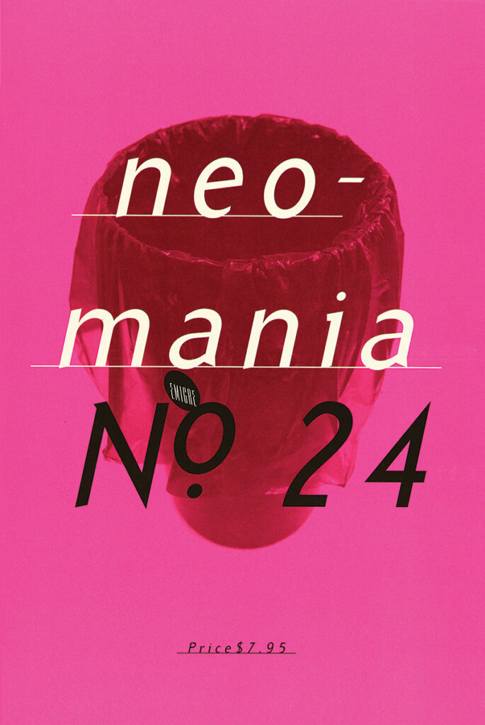
Emigre #24, cover 1992
But when you find yourself at the start of some kind of historical era, it’s not immediately clear that it’s anything special or whether it will lead to anything specific. Like Piet Schreuders, we often railed against established norms of beauty and appropriateness within design, testing the limits so to speak, but I had no idea if any of it would stick in any significant way, so it never felt like we were in a position of authority. And there were plenty of people who thought what we did was regressive, that it was a step backwards. Although, when certain well-known designers started to notice Emigre and the work we were publishing and refer to us as an aberration of culture, it became clear that we had touched a nerve, that perhaps we were undermining something that was valuable to certain people. But to say that we were wielding power is perhaps overstating it a bit. We were offering alternatives.”
Emigre #37, cover, 1996
Emigre #46, cover, 1998
Emigre #40, page spread, 1996
Emigre #43, page spread, 1997
In most people’s eyes, the work and ideas you were featuring in Emigre were more than mere alternatives. If that’s all they were, the old guard would have simply been amused, like their reaction to psychedelic posters in the 1960s. I know it wasn’t exclusively in Emigre, but there was a powerful force behind the work you were featuring that did more than hit a nerve. It captivated young designers and suggested a rewriting of the canon. Not just a passing of the torch but grabbing it out of the hands of the old guard who didn’t want to let go. Did you sense any of that when the artists you introduced became design celebrities?
“If all we accomplished with Emigre was to provide an alternative, I’d be happy with that assessment. And I don’t want to diminish the work that we promoted. Obviously, it was quite influential, and hopefully expanded the palette used by designers these days. But I’m a little apprehensive using terms like rewriting the canon and that we were wielding some kind of power. I don’t think that’s what it was about. That’s what we worked against.
We had arrived at a point within graphic design where the establishment was coming up with the same kind of reductionist solutions for every design problem, completely stripping it of any kind of humanity. The idea that you should only need five typefaces or only be concerned with legibility and the golden section, etc., seemed way too limiting for all the different types of communication that design could be involved in. We also wanted to show that being a designer didn’t necessarily mean working for a client, that designers had the ability and the skills to create their own products and be their own client. Roger Willems at ROMA Publications is a good example.
Again, I didn’t feel what Massimo Vignelli and Paul Rand were doing was bad design. I liked their work. What I had a problem with was that they wanted the entire world to look like that and abide by some kind of very narrow notion of beauty and appropriateness. That didn’t make any sense to me. And the reason why some of the people we featured in Emigre became design celebrities, is because they too realized that design could do much more than simply solve problems.”
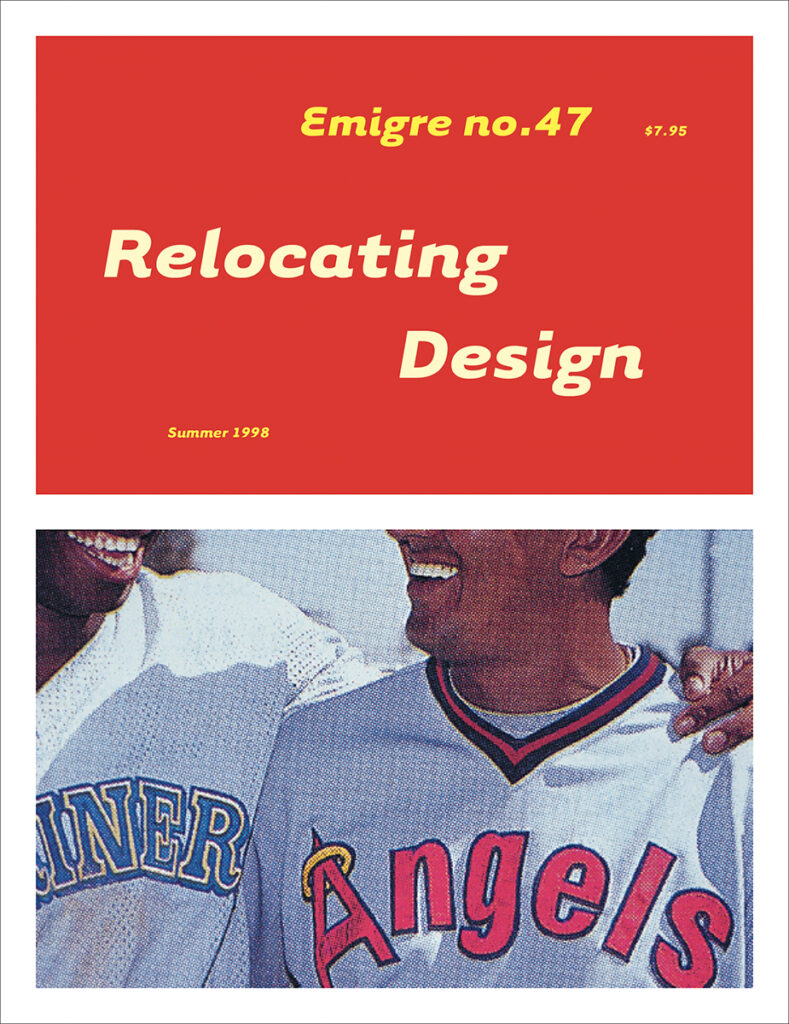
Emigre #47, cover, 1998
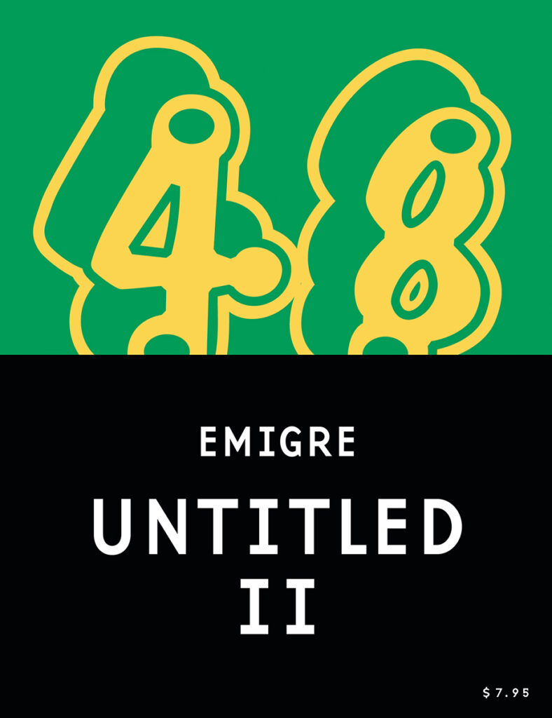
Emigre #48, cover, 1998
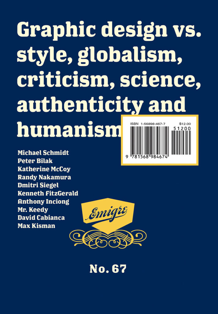
Emigre #62, cover, 2002
Emigre #67, cover, 2004
I know that I’ve been asking questions from an American perspective. Before Emigre, design in the U.S. was focused on domestic creativity. Many of the designers you featured were British and Dutch, who were all new voices to us, but I suspect they were more familiar in their own territories. (I used the Made in Holland issue (#25) as a blueprint for who to seek out when I worked at Studio Dumbar in The Hague during the Summer of 1993.) How was Emigre received in those areas, where the alternatives you were advancing were already happening?
“Yes, you’re right, design was definitely far more adventurous in Holland at the time. And designers here in the U.S. often wondered why I had left Holland since it was such fertile ground for graphic design. But the thing that got us a lot of attention when we started publishing Emigre was our early adaptation of the Macintosh and the typefaces that Zuzana was producing.
We were in the right place at the right time. All the major computer magazines were based in San Francisco, and when the Mac came out in 1984, they were looking for people who could use it to make illustrations. So Zuzana and I and a handful of other artists were invited to take a test drive, and we loved it. We ended up buying that first 128K Mac right after it came out. I ended up doing a lot of illustration work for these magazines. And then a few years later, when Adobe started producing postscript fonts, Zuzana was hired to do bitmap editing of screen fonts for them. Both Apple and Adobe were based just south of us in Silicon Valley, which was an hour or so away from where we were. So yes, we were early adopters and more or less grew up with it.
All around us, initially, there was a lot of resistance to the Mac. Most designers saw it as a step backwards. But little by little people came around, and designers from all around the world started to stop by our studio to check out what this computer was about and ask questions or share experiences. It’s how we made so many connections with designers abroad. I have to think that it was our early work with illustrations, digital layouts and digital fonts, and the ability to disperse these experiments through Emigre that set us apart and got us noticed. And we had great distribution for the magazine in those days in Holland, England, and Japan. So we raised eyebrows, and it turned heads everywhere.”
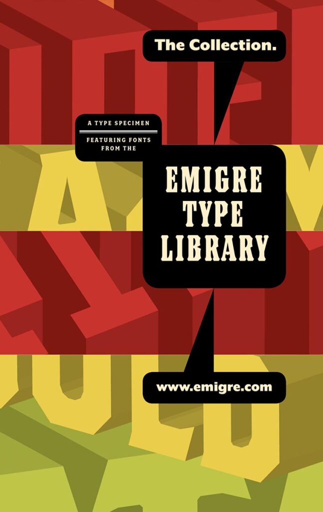
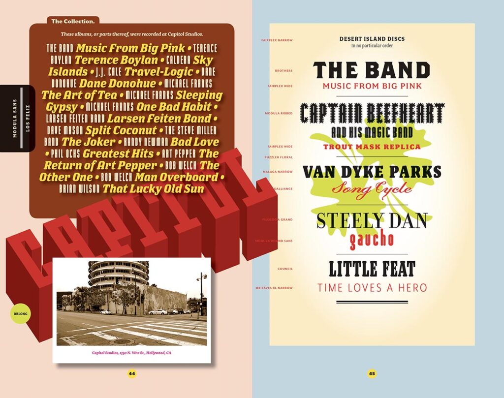
The Collection, type specimen, cover and page spread, 2010
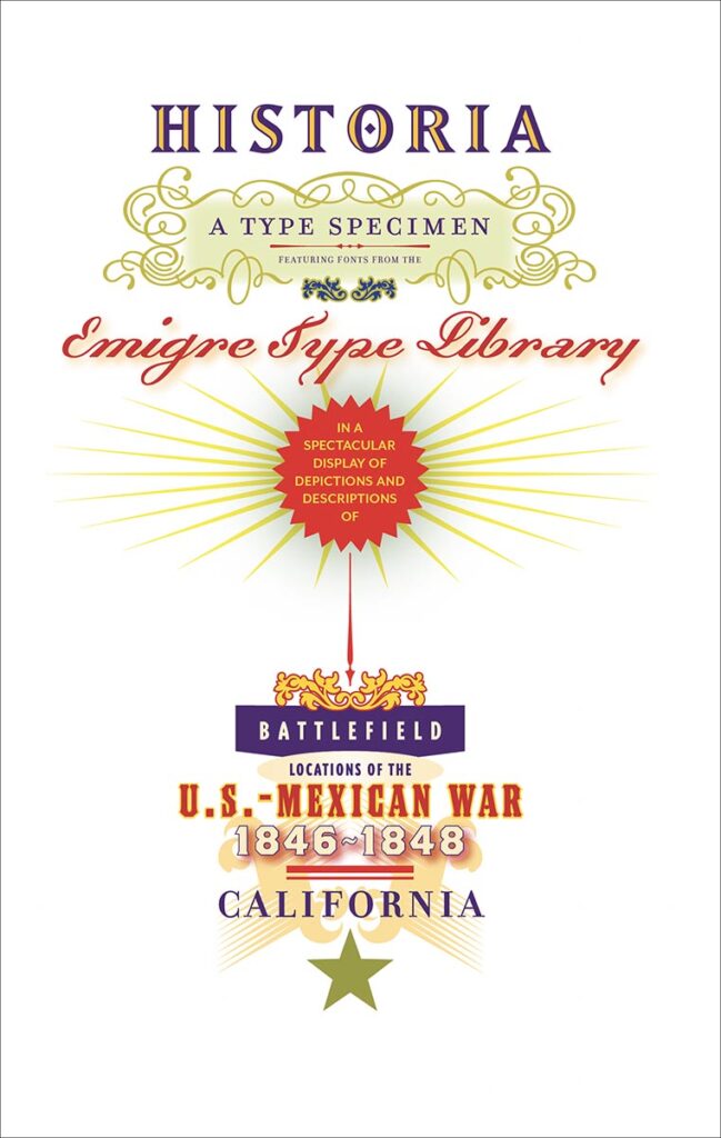
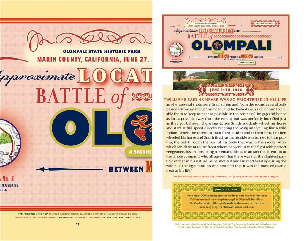
Historia, type specimen, cover and page spread, 2010
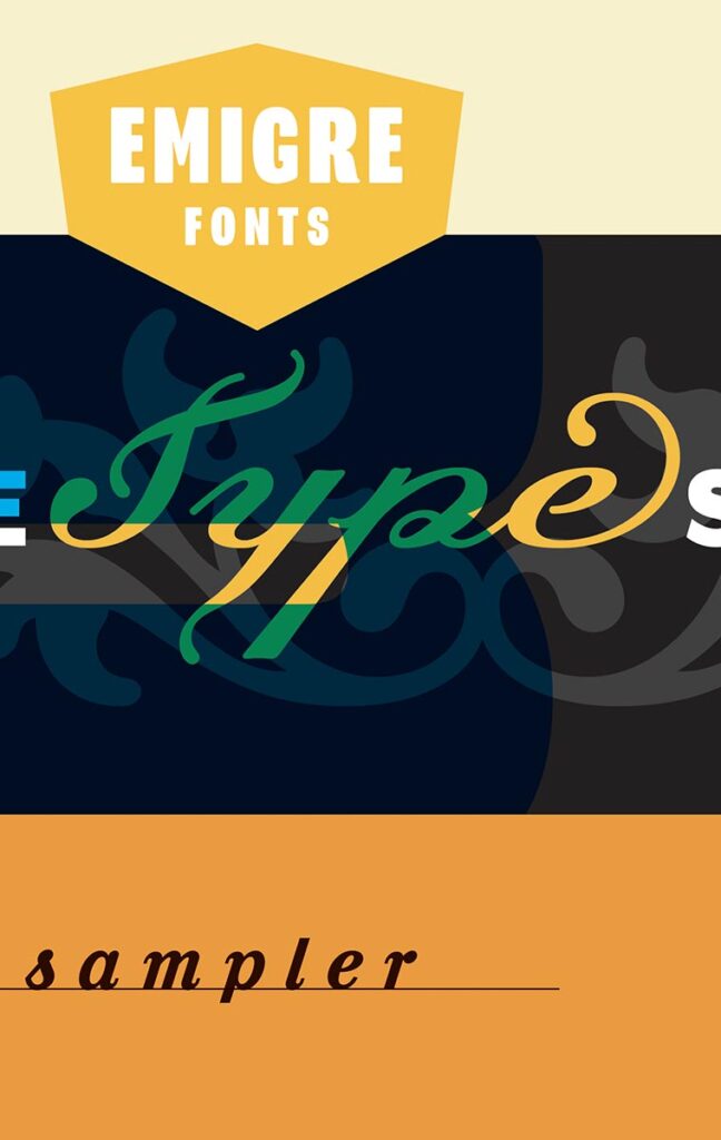
Emigre Type Sampler, type specimen, cover and page spread, 2014
Turning to one of the most enduring legacies of Emigre, your font collection has always been beloved. From the early quirky lo-fi experiments to the serious workhorses like Mrs Eaves, your releases seemed to be gobbled up by the design world. It seemed like every company hoped to apply ‘cool’ to their product by using an Emigre font in their marketing!
“Yes, that was something we never saw coming or intended to get involved in. And the Emigre Fonts collection is mostly Zuzana Licko’s doing, whom I met at UC Berkeley when we were both students there in 1982. It’s her talents and her curiosity to turn the Macintosh inside out and to really understand its abilities that got us started in the font business.
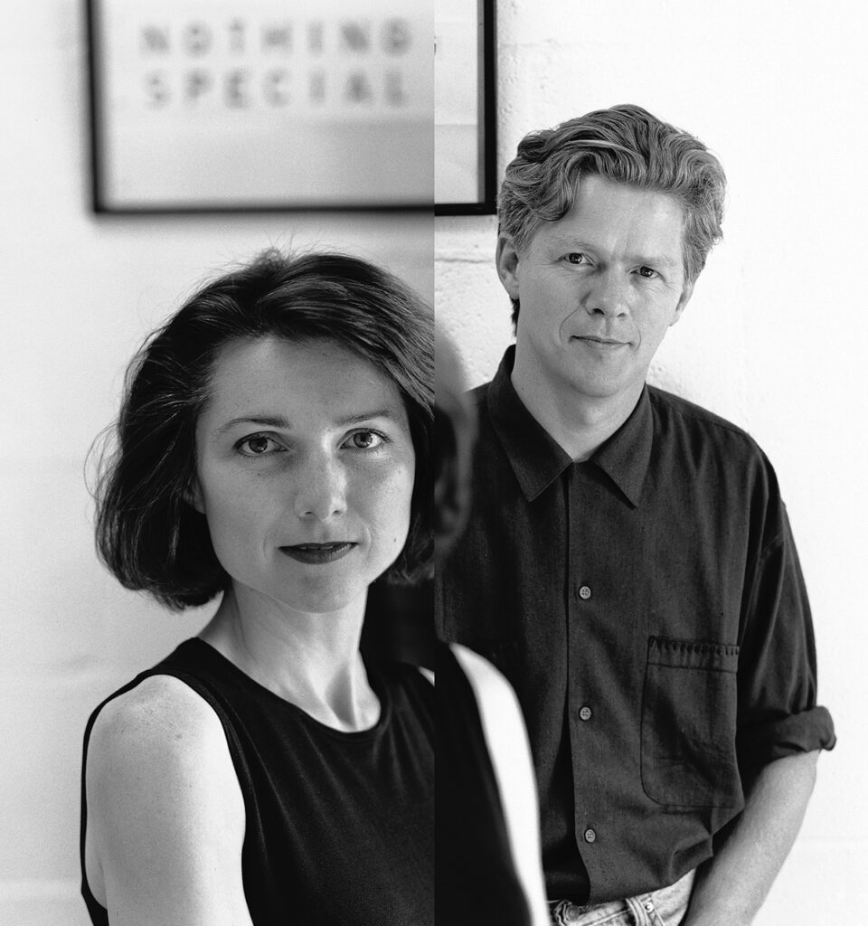
Zuzana Licko and Rudy VanderLans, 1997 (photo by Hope Harris)
At the beginning it was purely the fun of being able to design and produce functioning fonts on a computer. And it was a cost-saving issue because it allowed us to do our own typesetting with our own fonts, something that was nearly impossible before. The exposure of those fonts in Emigre magazine generated interest with designers who then contacted us. At first we sold typesetting services, and then later, when more designers bought into the Mac, we sold the fonts on floppy disks. But it was amazing to see how fast these fonts infiltrated culture. From being dismissed at first to seeing them in advertisements for Cadillac and the Warner Bros. annual report and the first Batman movie, to name just three examples. It happened in the blink of an eye. And it was the resulting financial success of our font business that allowed us to publish Emigre magazine and do all the other things we ended up doing, like publishing books and music and all kinds of collateral.”
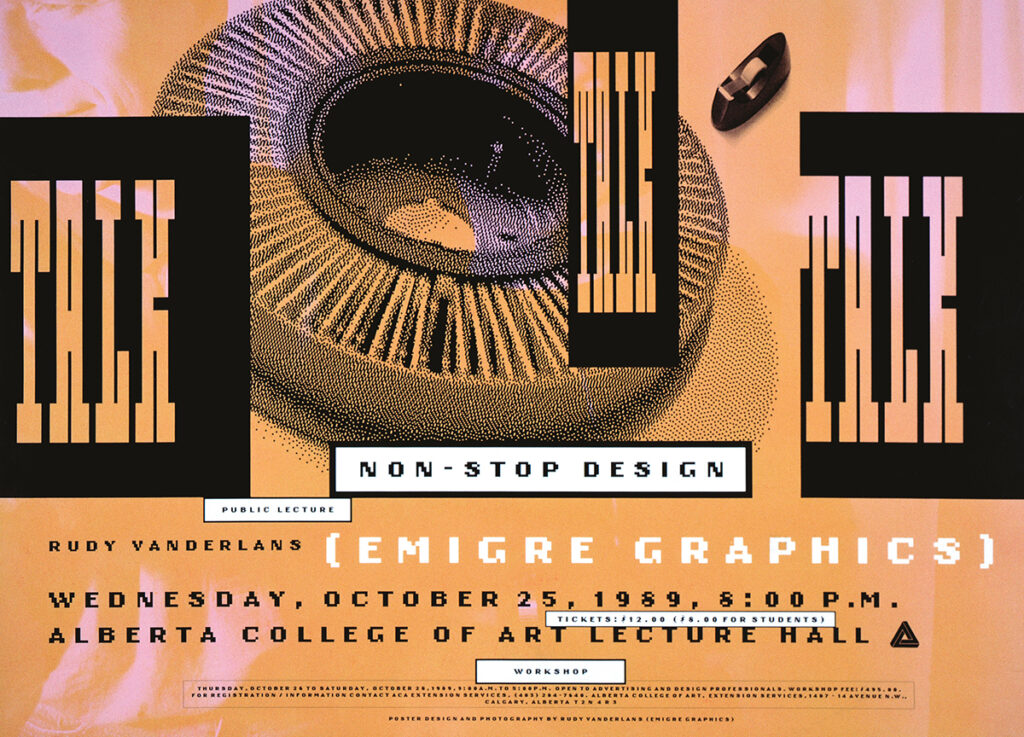
Talk Talk Talk, lecture announcement poster, 1989
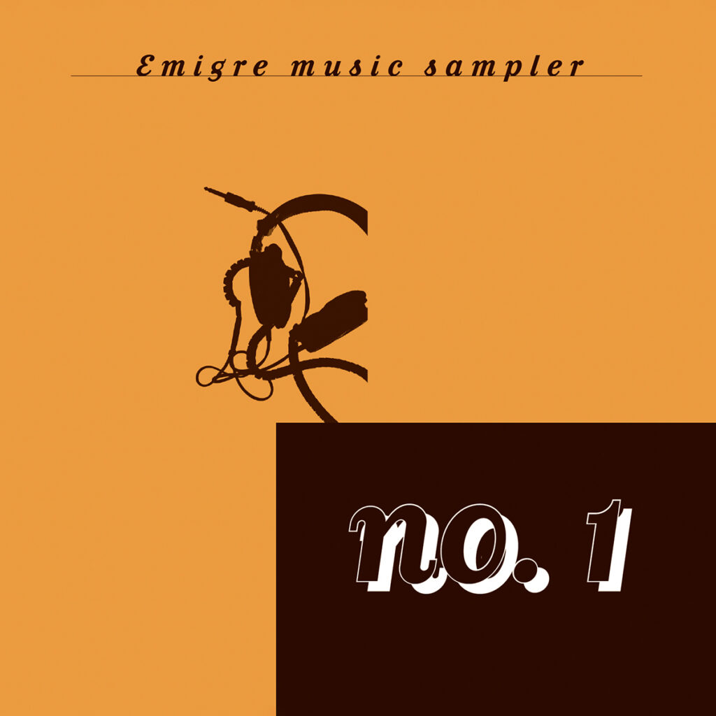
Emigre Music Sampler No.1, CD cover, 1992
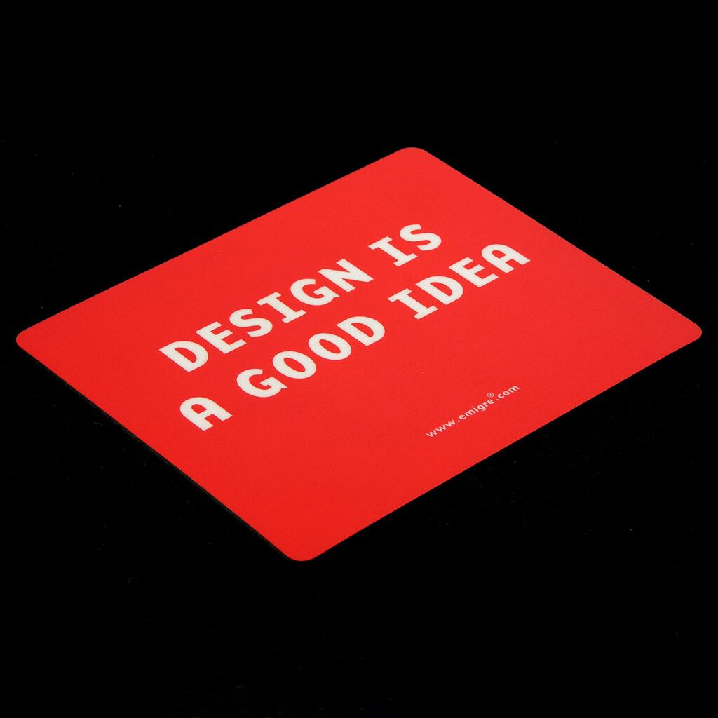
Emigre mouse pad, 2002
**
There is of course so much more about Emigre’s history and legacy; its multiple formats from tabloid to normal-sized to CD package to paperback, its continued evolution into new areas of design criticism, its reinvigoration of the First Things First manifesto and debate. All of this material is easily searchable, and an upcoming lavish volume is on its way (see below). But perhaps something more should be said about Rudy, himself. Despite his Dutch background, Rudy’s story is an essentially American one. He came to the United States from a distant land, headed west, settled down, bucked the establishment and authorities, did things his way, made a name for himself through hard work and ingenuity, and came out on top. Perfect! You can almost hear the sweeping western theme music play as the credits roll.
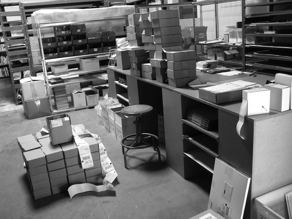
Emeryville Warehouse, 2005
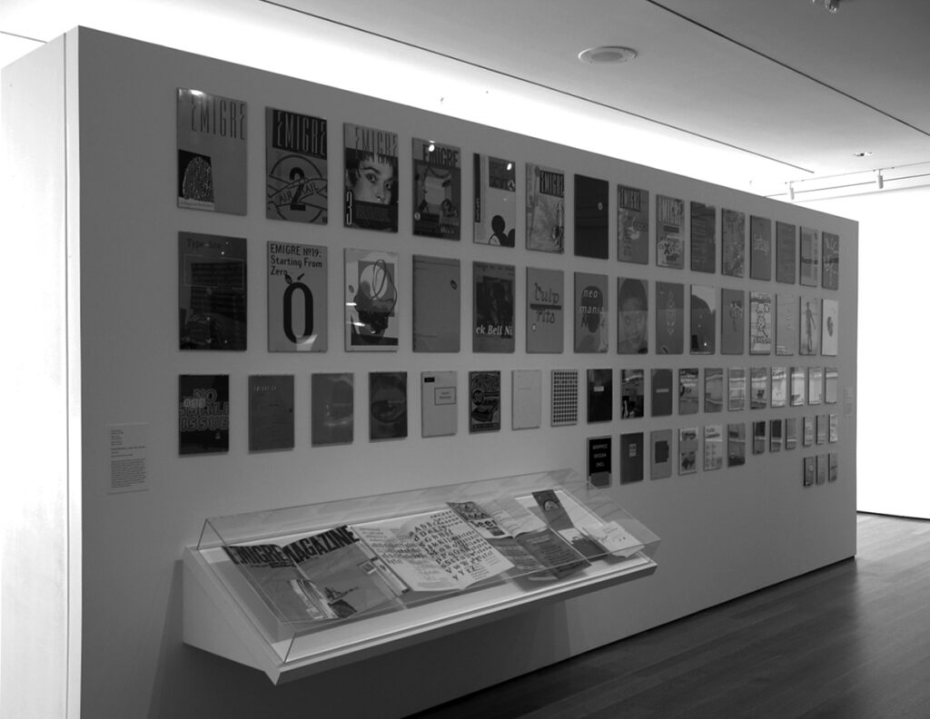
Tentoonstelling Emigre, MoMA New York, 2006
Rudy VanderLans, Berkeley office, 2007
But like his magazine, and fonts, and maybe like a lot of us, Rudy is a hybrid, and has retained a quality of Dutchness about him. Neither showy nor loud, his quiet modesty remains intact. He has learned the power of ‘making do,’ using the resources at hand to make something unexpected. All of this is evident in his photographic life. Rudy has always maintained a ‘why-not’ curiosity, and a practical optimism that has allowed him to borrow and modify what he has seen others accomplish to develop his own solutions. Maybe I’m too partial, but I don’t think his solutions have ever been replicated, at least not with the sincerity and deep regard for content that he has always displayed.
Finally, Rudy has been uncommonly generous, using his own platform to launch the careers of so many other designers, writers, critics, and educators. He has been foundational in bringing together all of these voices into a community of conversation and debate.
Designers have held the keys to making their own projects and producing their own stories for a long time. Few have bothered to use them as effectively as Rudy VanderLans. His example is as relevant as ever, and I still share it with my students today.
Let’s give him the last word.
**
Trilogy: Palm Desert, Cucamonga, Joshua Tree, photo books, 1991-2001
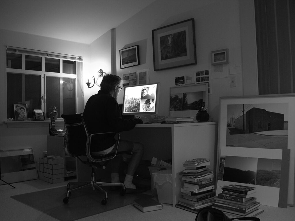
Berkeley office, 2020
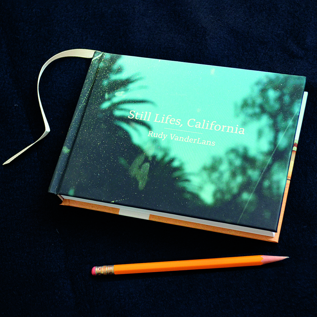
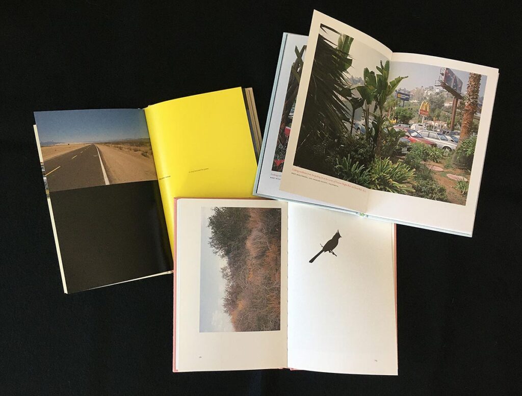
Still Lifes, California, photo book, 2015
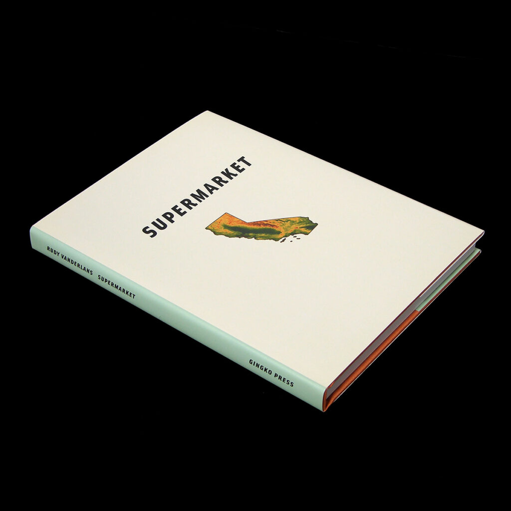
Supermarket, photo book, 2001
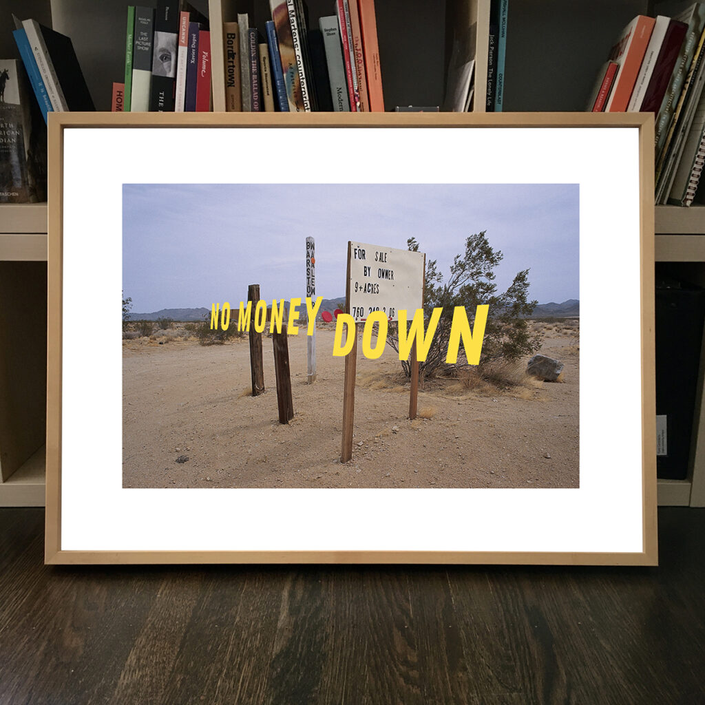
Digital print with vinyl type from Supermarket series, 2023
So with all you have accomplished, you still seem as busy and productive as ever. What’s in store for the future?
“Well, our type foundry business continues to keep us busy with a lot of mundane chores, and I just finished a new type specimen that’s currently at the printer. But we’re in a position now where both Zuzana and I are making time to venture out into other directions, away from type. For me, that’s photography. I’m working on my next photo book with Gingko Press. It’s a continuation of the postcard-sized images of California I’ve been obsessed with. But probably the biggest project we’re involved in currently is a definitive book and exhibit about the history of Emigre organized by Letterform Archive in San Francisco. A few years back we donated the entire Emigre archive to Letterform Archive, and they suggested that after forty years of Emigre it was time for such a book. The text has already been written by Emily McVarish, and Jon Sueda is in the process of designing the book. It will be a huge tome, with an accompanying exhibit. It’s supposed to be out early 2025. It feels a little bit like a certain chapter of our life is closing, but we’re looking forward to what’s next.”
Bravo, Rudy! A richly deserved homage. We will read it and continue to learn from you.
Rudy VanderLans and Zuzana Licko, 2013
This text is based on an interview with Rudy VanderLans by Martin Venezky, conducted in January 2024.
Rudy VanderLans
born on 10 October 1955, Voorburg
Author: Martin Venezky, januari 2024
Final editing: Sybrand Zijlstra
Portrait photo: Dennis Letbetter