“This is the funniest greeting card we received this year,” wrote Graficus magazine in the summer of 1956. Even today, sixty years later, it is an adorable piece of graphic art. It shows a youngster who… Well, let’s begin at the beginning.
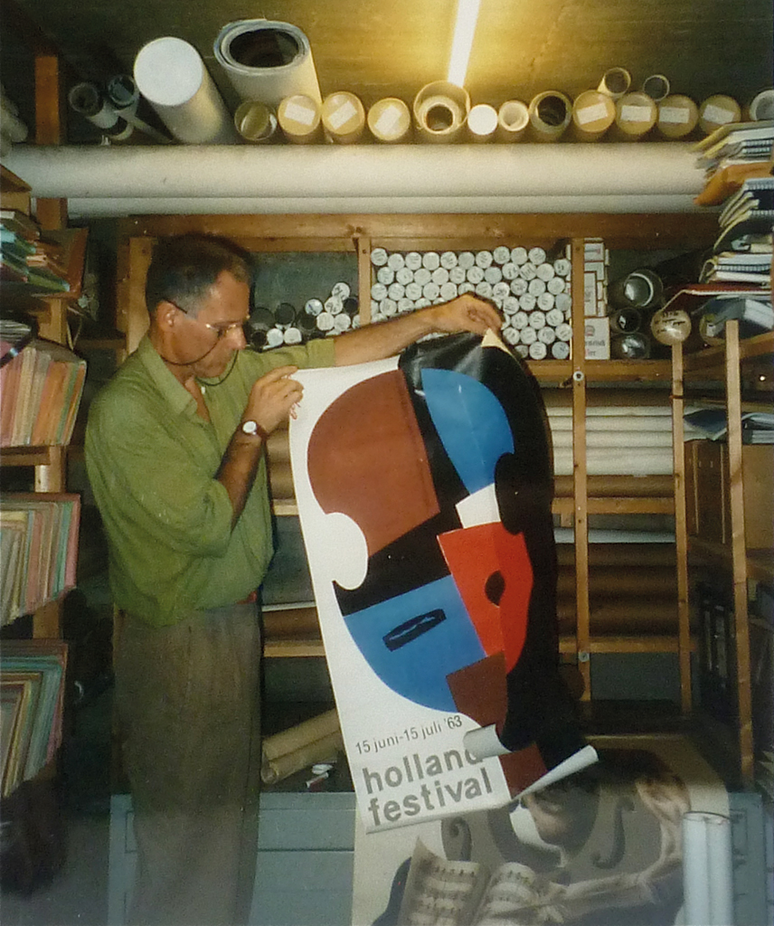
Bart Boumans rearranging the Holland Festival’s poster collection
His name was Bart and he lived in Deventer where his father ran a photo store: Foto Boumans. Because he loved manual work he attended vocational training. Walking from school back to home, he would pass De IJsel printers, founded in 1898, where the open doors would invite him to come and see what was going on in that exciting place: k chk k chk pock… k chk k chk pock… said the Heidelberger press, delivering stacks of freshly printed sheets of paper. One day he was invited in. From then on, Bart couldn’t be kept away from this magical place. After he had shown the printers some samples of his sketches, De IJsel’s director Diepsmeer asked him if he was willing to make a drawing – “one that we can print as a card announcing to our clients from when to when we’ll be closed for the summer vacation.” His first commission!
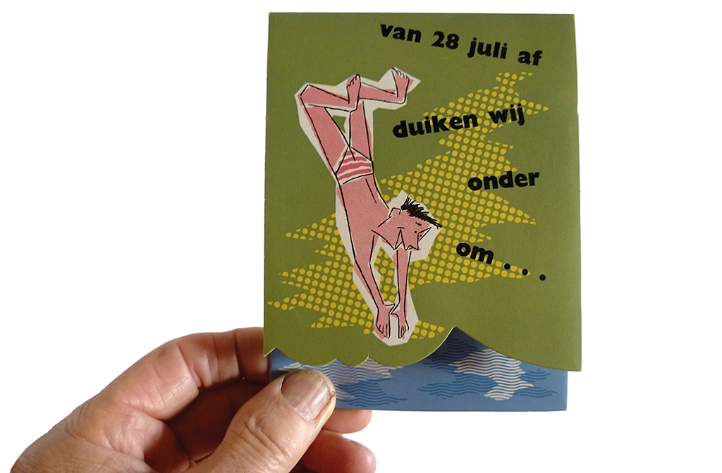
Greeting card announcing a vacation closing, for De IJsel printers, 1956
He responded by making more than a simple drawing. He delivered the design of a double card, folded in such way that its front was shorter than its back. On the cover: a young man diving into the blue water printed on the sticking-out back. The text said: “On July 28th we’ll take a dive and submerge.” Opening the card would have a happy face break through the water’s surface and show the text: “But we’ll emerge again on August 15.” It was not an easy card to produce, but the printers enjoyed doing the trifling work. Bart Boumans was sixteen at the time. Now in his seventies, the designer Boumans is an accomplished versatile artist and the artist Boumans is a many-sided graphic designer. He always avoided to be confined to one professional field; this allowed him to produce a true treasure of creative expressions. It wasn’t fame he was pursuing. Nevertheless his work can be found in the collections of the leading museums of the world: MoMa, Tate, Stedelijk, British Museum. His resemblance to the French actor Jean-Louis Barrault is uncanny.
Making drawings, playing with letters, designing print – that was what the young Boumans wanted to do. So, he went to Arnhem to study graphic design at the art academy. Harry van Kruiningen was his head teacher and Henk Peeters of the Zero group taught calligraphy and helped him to get rid of his left-handedness and become ambidextrous; he can still use both his hands simultaneously to produce mirror script.
He kept in touch with De IJsel. In 1960, at age twenty, Boumans was invited to enter their employ to do jobbing work – making layouts, no one spoke of design. At De IJsel, he learned typesetting, how to draw on a zinc plate as prep for lithography and how to work with the up-and-coming technique of offset printing. De IJsel had to print posters designed by ‘real’ designers like Wim Crouwel and Boumans also met Han de Vries and Piet Klaasse, the illustrator. “They taught me a lot,” a still thankful Boumans says.
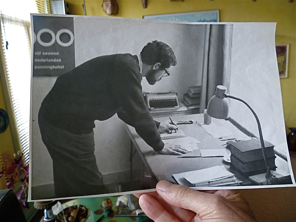
Boumans at 24, working for Van Stek, The Hague, 1964
Catalog The New Realists, The Hague, 1964
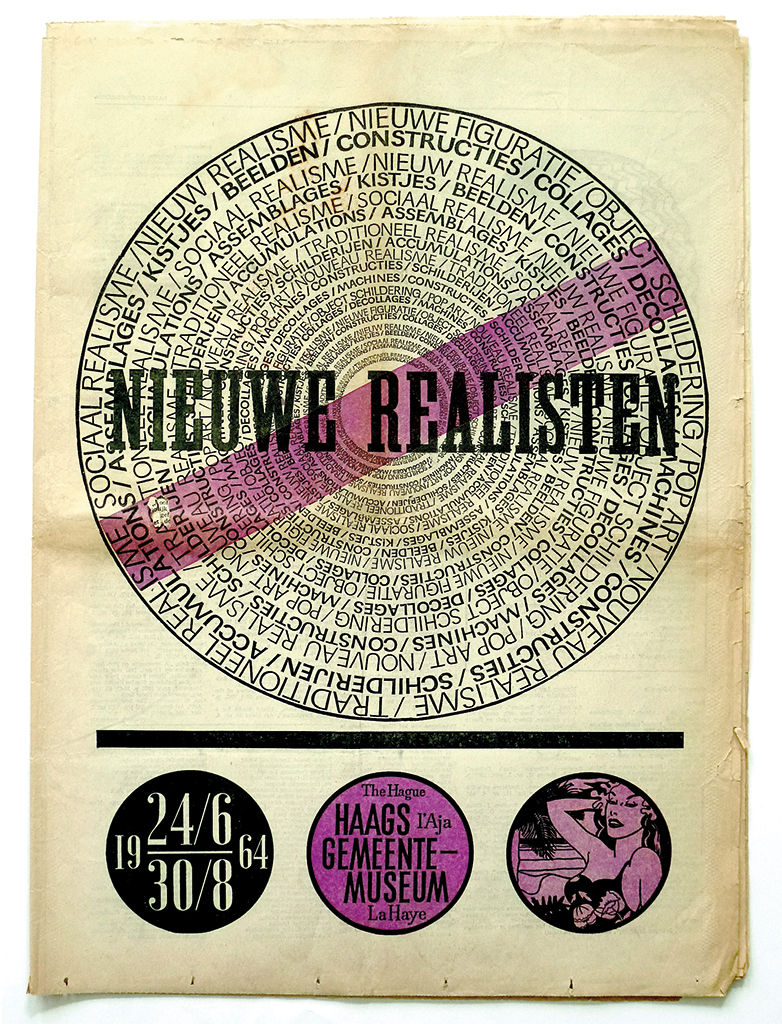
He also met Wim van Stek, who designed and created exhibitions. Van Stek worked for Haags Gemeentemuseum and asked Boumans to join him in The Hague as his assistant. Boumans left De IJsel in 1963 and received an amazing farewell gift: a litho press, which he installed in the farmhouse of a friend. In the archives at De IJsel he had discovered how artist Bart van der Leck had approached one of Andersen’s fairy tales and how he had made use of letters in an inventive way. His famous namesake had opened a new world and inspired Boumans to employ all sorts of existing or still to be designed type to create endless fantasies on paper. By the way, he had experimented with linocut letters already when, in Deventer, he had helped a cabaret group without money get some print they needed.
Van Stek involved Boumans with different projects, from poster design to exhibition design (not that his name was ever mentioned, neither was Van Stek’s). Wim Crouwel was one of Boumans’ examples, as was the more colorful and flamboyant Nicolaas Wijnberg. At that time, Wim Beeren was running the education staff at Haags Gemeentemuseum together with Hein van Haaren and Cor Blok. Boumans watched and listened carefully to these art historians and curators, and again learned a lot. After three years with Van Stek it was time for new adventures. Together with a friend he started a small advertising agency in Amsterdam, where he helped organize activities for young members of the Jewish community. When he discovered they had no other aspirations than smoking weed (it was the 1960s after all), he found no objection in decorating the interior of their illegal hash cellar. For some time he also hung around a college for social work and he brought Jews and Palestinians together at a symposium.
He enjoyed his life, but needed a break. Boumans traveled to Israel where he worked in a kibbutz for a year and also taught art. Together with an American girlfriend he took off on a journey all over Europe, including behind the Iron Curtain. Finally back in the Netherlands he found a letter from De IJsel: “You were interested in our lead type, the Futura, right? Come and get it.” Boxes full of type and typesetting tools were waiting for him. In the meantime, Boumans had met René Treumann, who together with Frans de Jong had started a small print studio in Amsterdam. Boumans and his boxes full of type joined them and continued his search for old type material. One evening, he found trash bags full of wooden letters somewhere in the Plantage neighborhood; nearby was an old printing workshop where they had many more treasures waiting for him. The trio called their print studio ‘Het Drukhuis’. Their first location was near Waterlooplein; later they moved to Herengracht, where their quite famous Amsterdam artisanal studio became a print lovers’ heaven. Het Drukhuis produced all sorts of print and designed and built exhibitions; they were not afraid of experimenting. When Handelsblad daily newspaper merged with NRC and moved to Rotterdam, they were offered their 64-side rotation press. “Imagine the fun we had,” smiles Boumans.
Pieter Brattinga became a friend soon after he had founded his Print Gallery, where experimenting became almost a religion. Brattinga let artists have a go at Steendrukkerij de Jong’s presses in Hilversum, a project he had started together with Stedelijk Museum’s curator Ad Petersen. Boumans was asked to coordinate the project, but he did his own experiments as well. One of his own projects, to print handmade lithographs from offset sheets, failed miserably time after time; but Brattinga only became more exhilarated and each time yelled: “Keep going. Keep going!” After wasting tons of paper, Boumans was proud of what he had managed to produce: a Dutch carré-shaped landscape drawn with a fat pencil on Kodatrace transparent foil and printed in seven colors. Buyers of the print were given the task to cut it to pieces before reassembling the whole lot. “Officially,” grins Boumans, “there were fifteen different ways to do this, but in reality there were 150,000 options. I don’t think anyone succeeded.” Nevertheless, this print made it to the collections of all-important international museums.
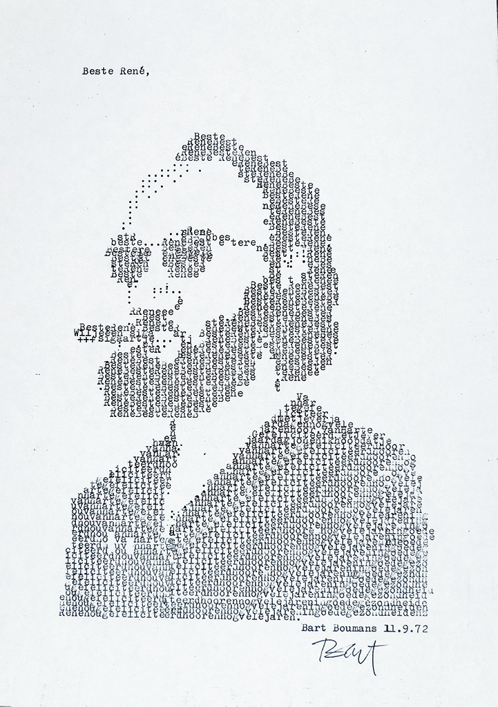
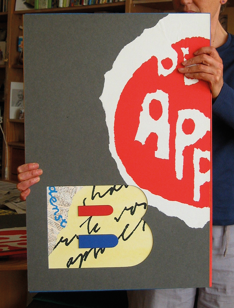
Portrait of the German RAF terrorist Andreas Baader, created from type, published in Het Parool newspaper, 1972
Typed application in the form of a self-portrait, Het Drukhuis, 1972
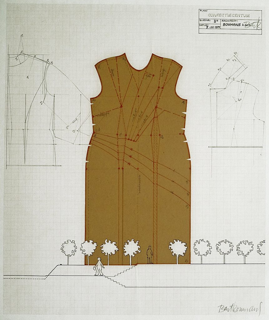
During the construction of the Amsterdam Metro, many buildings formerly housing Jewish confection studios in the Waterlooplein area were demolished. Boumans sent a proposal to the city council to create a memorial building in the shape of a paper pattern discovered somewhere in the area. It was a serious proposal. The city council did not honor Boumans with a reply, 1975
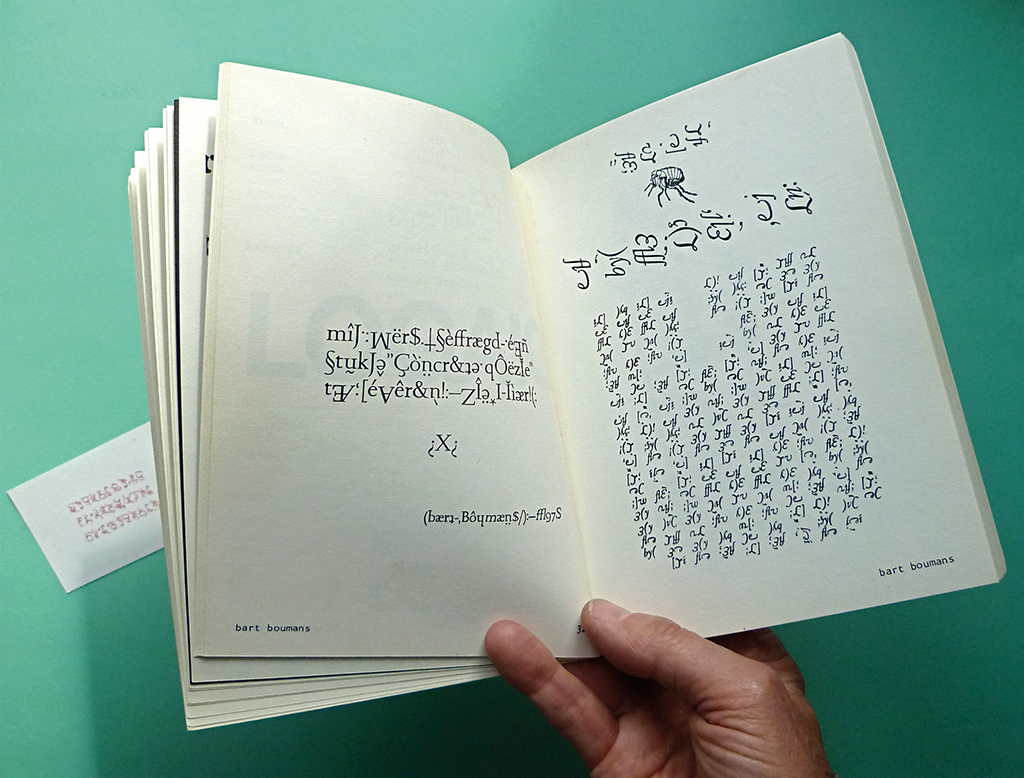
‘Conceptual poetry’ created from Garamond type by Boumans for a publication about unique ways of using type, 1975
The 1970s. Everything was possible. A longhaired Bart Boumans experimented to his heart’s content. Collages of postcards: with a tulip field on Scheveningen beach; three Eiffel Towers in a row; photographs dissected to form typewriter letters; the Mona Lisa by teleprinter; a mysterious code created from fragments of italic Garamond type. Boumans the ever-rebellious typographer. From Van Stek he had learned how to create exhibitions and catalogs, flyers and posters. When Dick Elffers quit working as Rijksmuseum’s designer, Pieter Brattinga and Otto Treumann suggested Boumans to take over. How could Boumans say no. He accepted, and yet, one exhibition and one catalog later (Centsprenten, 1976), Boumans decided he was not made for lasting ties, even with a dream client like Rijksmuseum. “I don’t feel comfortable in larger organizations. I am not looking for a prestigious position that brings fame and glory.”
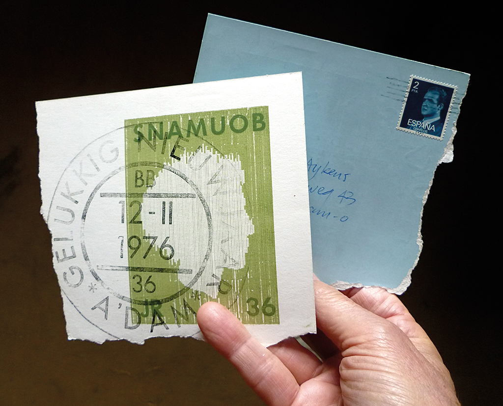
New Year’s greeting card sent from Spain; front and back are reversed, 1976
In the stamp workshop Posthumus, Amsterdam, Boumans joyfully experimented, for example with this self-portrait stamp, which he used to autograph his own publications, 1981
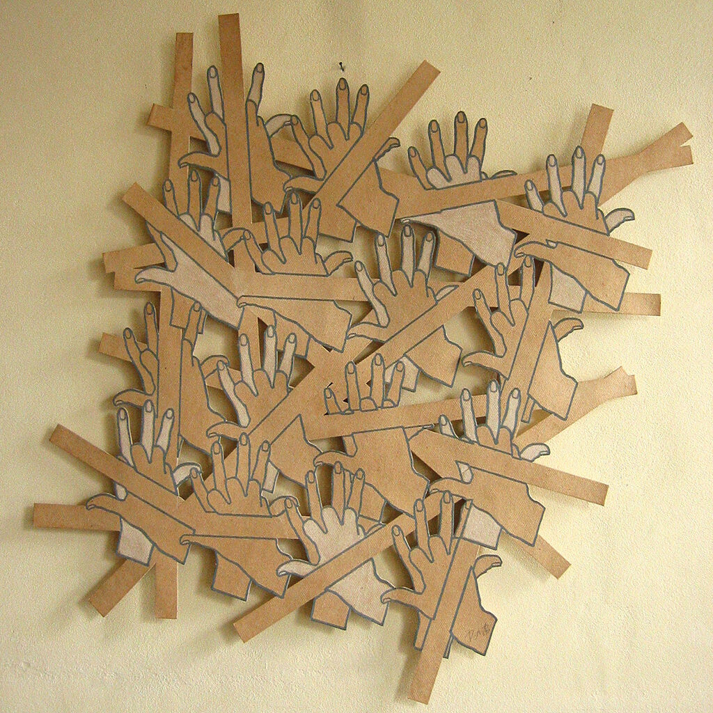
Cuts making a playful paper sculpture, 1982
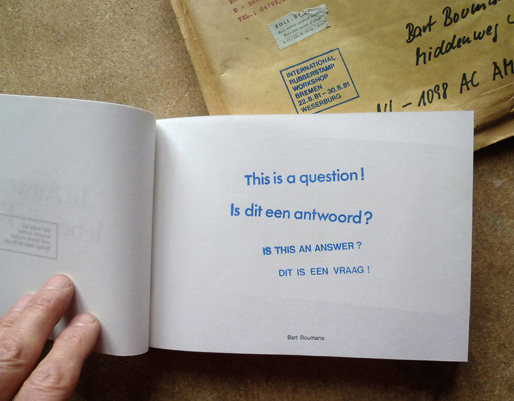
Game using letters, here to open a discussion about the relativity of question and exclamation marks, 1982
Boumans, as everyone who knows him well understands, is modest and unpretentious and shies away from the limelight. His creativity gets a boost if he stays away from pressure. The Gerrit Rietveld Academy asked him to come and teach, and he refused. Yet, he accepted a teaching position at AKI in Enschede, where he stayed for nineteen years. Why there? Boumans: “It was a much homier place to be. Not pretentious at all. Also, it took me back to Twente. Joop Hardy was AKI’s director, a philosopher of sorts, who was happy with my more philosophical, social academy approach. I tried to loosen up my first-year students, make them forget all the bias they had about art.” He made them think without any restraint, in a pure Fluxus way, about what they’d want to create and learn how what couldn’t be created – like castles in the air or conceptual fantasies – could be created after all. He taught them how to explore limits and how to get over them. He invented mail art projects, often with a social-political background such as the conservation of the rain forest. But mainly he taught typography and the history of type. “Knowing the history of your profession is essential. You have to know where letters came from and to understand why you shouldn’t use an English font for a German book without a clear reason.”
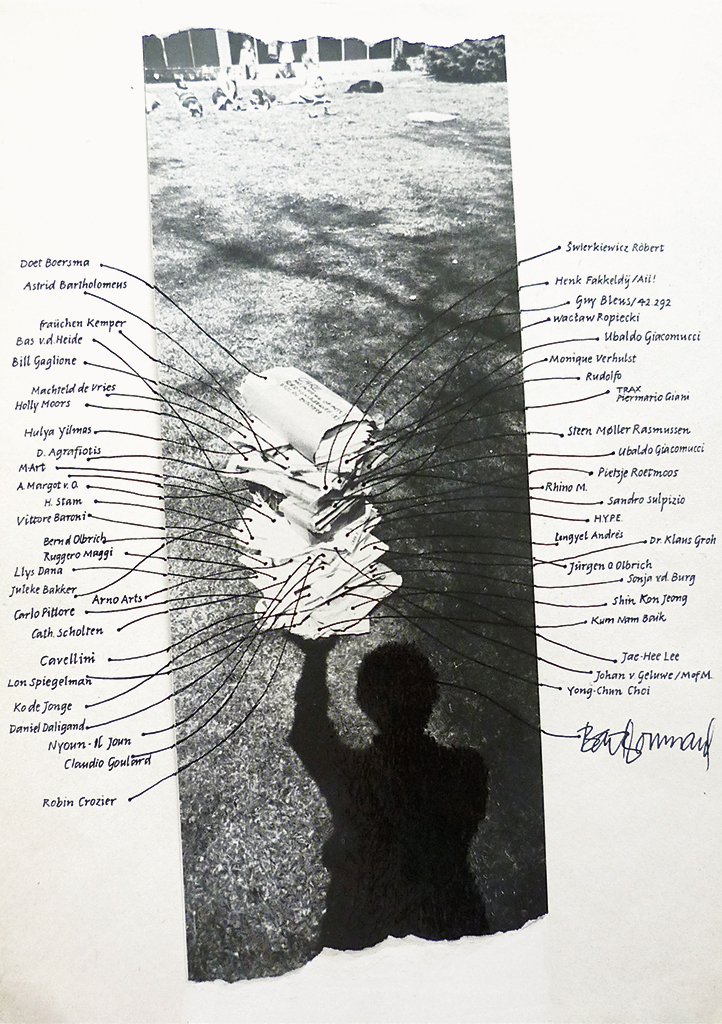
A contribution to mail art magazine Care: a stack of submissions photographed with shadow image and explanations, 1984
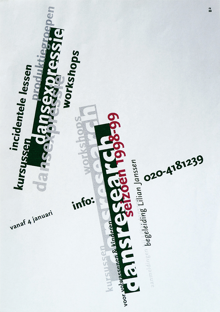
Brochure for a dance school, 1998

Siena cathedral created from postcards, 1999
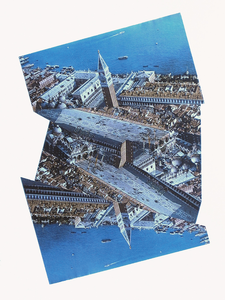
View of Venice, collage using three postcards, 2003
Posters were subject to his lessons: he projected scores of slides of what he had photographed in the streets of Amsterdam. And even better, he showed the real thing, posters he had found at printers, theaters, design studios, and distributors – and doing so, he created a magnificent collection. On the attic of his Watersgraafmeer home you can find 8,000 of the most beautiful posters created by Dutch graphic designers: Elffers, Wijnberg, Escher, Sandberg, Bons, Crouwel, Van Toorn, Beeke – all the big names. At De Appel theatre in The Hague all posters designed by Jan Bons in the thirty years he worked for them were stacked haphazardly, also in an attic. Boumans offered to arrange and catalog them, on the condition he could take duplicate sets home. He offered the same deal to Holland Festival and became the proud owner of hundreds of posters designed by the best Dutch graphic designers. His private collection became unique. The Dutch Poster Museum in Hoorn made a selection for an exhibition and Boumans himself created its colorful and playful poster. At AKI he had already organized some twelve poster exhibitions, by theme, within three years. One about Sandberg he called Typographic Music.
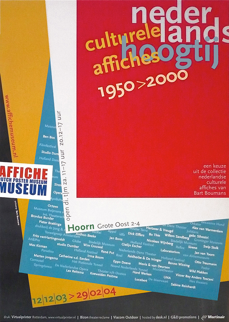
Poster designed by Boumans at the occasion of the exhibition of his own poster collection, Hoorn, 2003
Special edition of 25 boxed Jan Bons poster designs for De Appel (previously archived and exhibited), 2007
All these adventures actually leave you somewhat breathless. Boumans shows me a box full of fascinating print of which we can only show a small part. And there’s still more to discover stored in his attic, including masks, about which more, later.
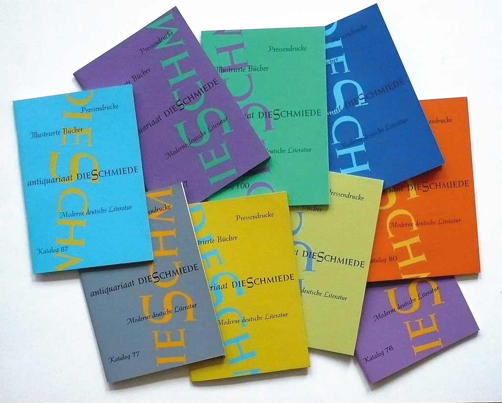
Catalog covers German antiquities, 2000
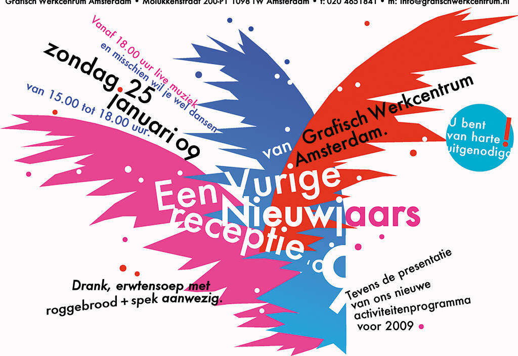
Page for GWA website, 2009
Logos designed by Bart Boumans
One AKI mail art project was called Care, a title that expresses love. Each of his students contributed with whatever he or she wanted as long as it fitted in a chosen theme. The magazines were distributed to a network Boumans had discovered through his colorful Amsterdam-Mexican friend, Ulysses Carrion, reaching Italy, Korea, Brazil, and scores of other countries. The recipients and their circles of friends had to create a new issue and mail it throughout the network. Altogether twelve issued were produced, three of which came from Enschede, all wonderful experiments.
In 1996, Boumans left AKI after having put hundreds of designers on the road to professionalism. He remembers the students who did not stand out with most affection. “Of course, you notice the most talented ones immediately. But to see the others developing themselves too with a little prodding… that’s really satisfying.” His own talents grew, too. Sculpting got his devoted attention. At age eighteen, Boumans had sculpted his father’s portrait. It still has a place in his living room: a strong, characteristic face that just must resemble his father’s. “It’s really him,” confirms Boumans, who hadn’t thought about creating sculptures for forty years, but rediscovered the art as he was closing in on sixty. After sketching the defining lines of a face within five minutes, he is ready to start a clay portrait. The drawing is already a piece of art.
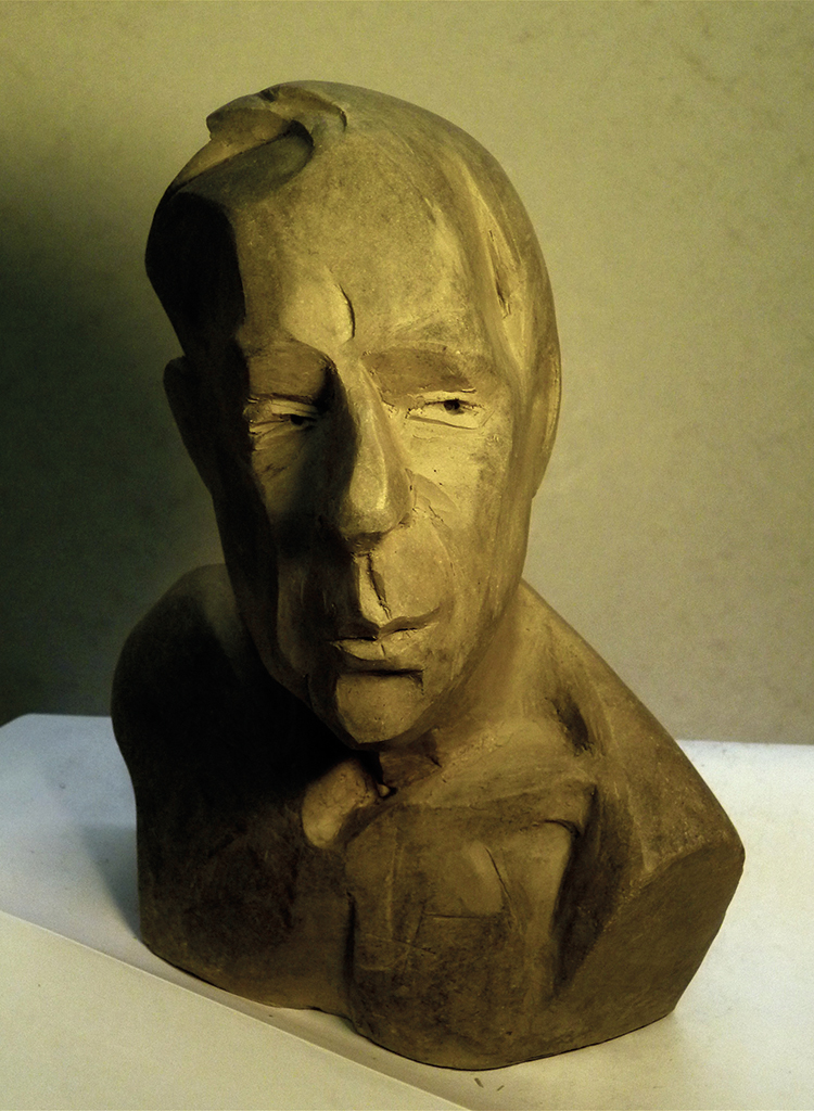
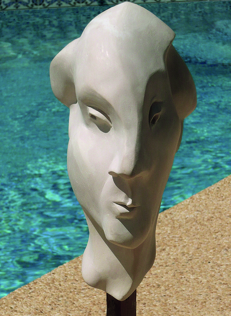
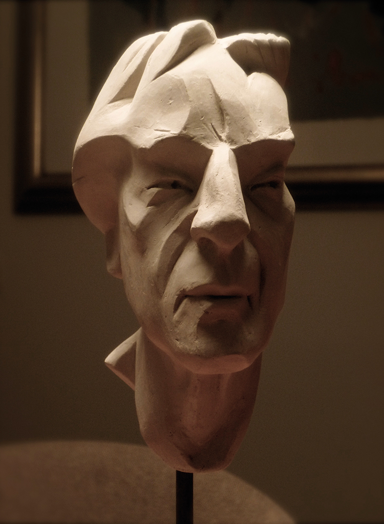
Clay portraits, 30 cm high, 2000s
After AKI came many catalogs, posters, books, logos and illustrations; he also collaborated on website designs and with art projects. And he kept teaching: in Utrecht, Zwolle and in Israel, too. Also, he taught stonecutters all about typography for monuments or gravestones. “Maybe I could have reached the top if I had concentrated on one aspect of my profession,” says Boumans. “But I have no regrets. I took on whatever I encountered. If it’s something new, I’ll go for it.” Like book binding and book restoration. Het Drukhuis had familiarized him with the craft. One of his students was man of letters Frans A. Jansen, who would become a professor of the history of the book and letterpress printing, thus continuing to feed the fire that Boumans had stoked.
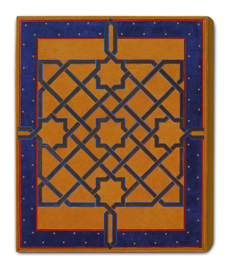
Book binding and book restoration became his true passion and art form. For a friend he found a way to add more character to a newly bound volume of woodcuts created by Frans Masereel. For the flyleaf, red on one side and black on the other side, Boumans cut out the letter M (in sanserif); he glued a letter F to the front (black on red) as well as to the back (white on black), playing with the symmetry of the M. Very simple, very beautiful. Much heavier were the tomes he created, together with Hans van der Horst, for the famous hermetic library owned by Joost Ritman. They added parchment or leather to flat wooden covers for the books from the 12th or 14th century and attached letters from fonts that were created in the same periods, with the type in silver or gold. They went looking for the leather in Paris, where they also visited the extraordinary craftsman who made the stamps to their designs.
Bart Boumans with AKI students, 2004
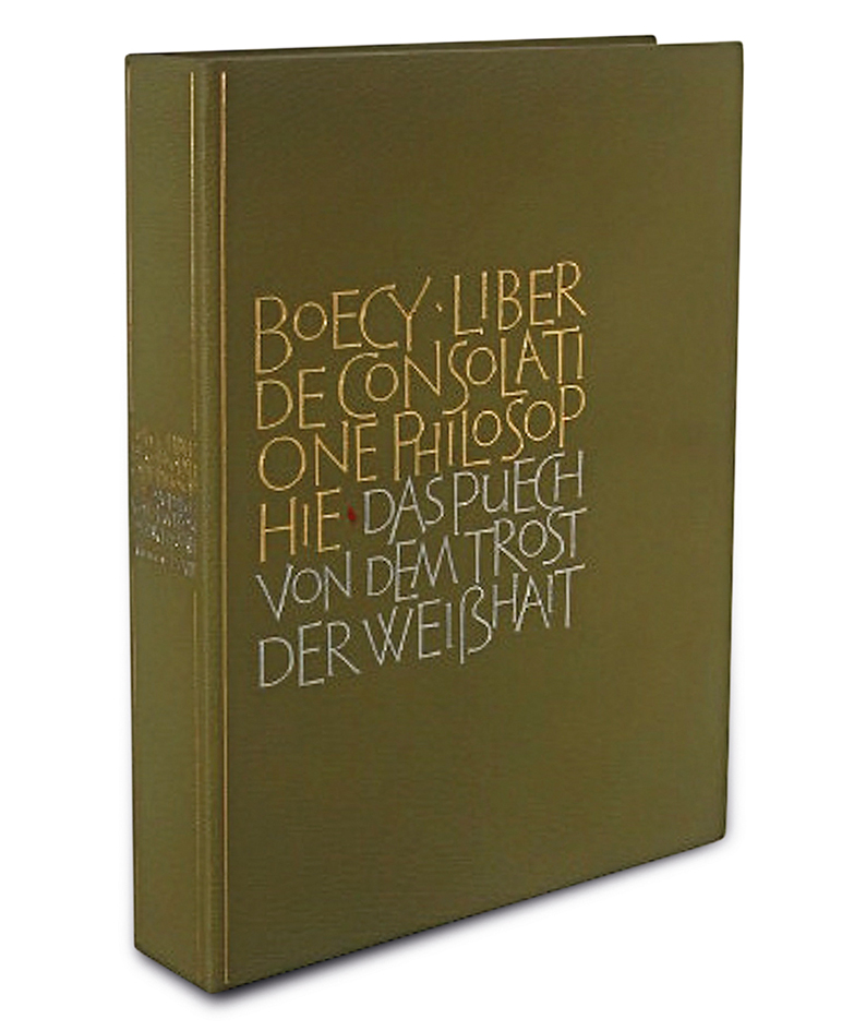
Cover design (Boumans and Van der Horst) of 15th-century philosophy tome from the Ritman Collection; green leather with gold type of Latin text and silver type of Middle German title; in box, 2005
Cover for Jewish ‘Spanish Bible’ from the Braginsky Collection, Switzerland, 2012
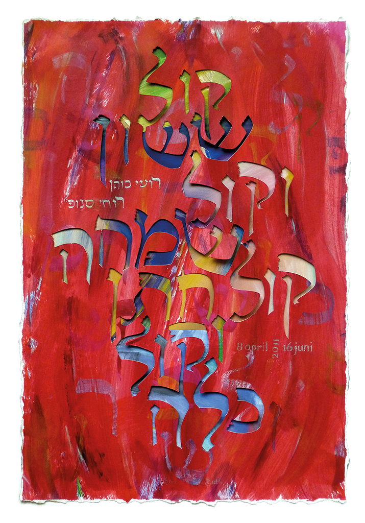
Text in Hebrew from cut-out letters on a multicolored background, 2011
“The cover design always has to represent the book’s contents,” says Boumans. “But you shouldn’t try to hide that the cover is made in our time. Through the ages, books have gotten new bindings, a new packaging.” Yet, when Boumans had taken a little much liberty with restoring a book about Plato from the 1300s, Ritman responded in fury. Ritman made peace again after an American expert had praised the work by sending Boumans a huge bouquet of flowers.
And then the masks. It happened a few years ago during one of Boumans’ frequent trips to Spain. He noticed some thick, wooden sheets cut from the base of palm trees. They had oval shapes about 60 cm long; they were pointed at the top and bent backward just a little from a centered vertical ridge. “Masks!” He bought them and cut and painted all kinds of faces, like magic. Soft colors were applied to the dark wood, creating eyes, a nose, a mouth, partly open, partly painted. They may have hair, from a broom or leaves. It is a newfound ‘tribal art’ related to ethnographics from Africa or Oceania. Boumans made some twenty of these masks. In 2013, they were exhibited in a contemporary sculptor’s studio, thus spontaneously connecting western and exotic cultures, thanks to the ever-renewing artist who started his life in art by designing a funny greeting card.
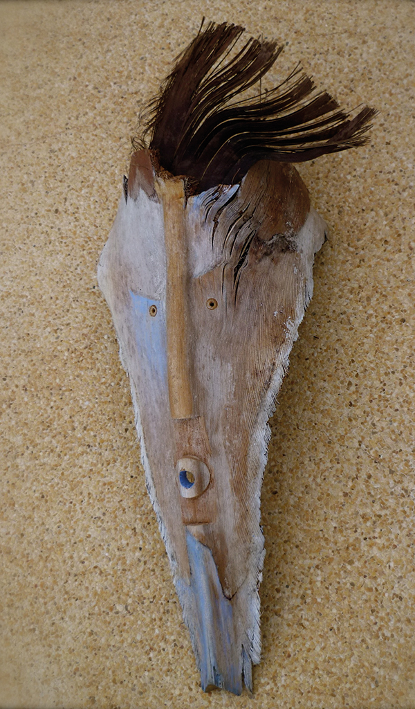
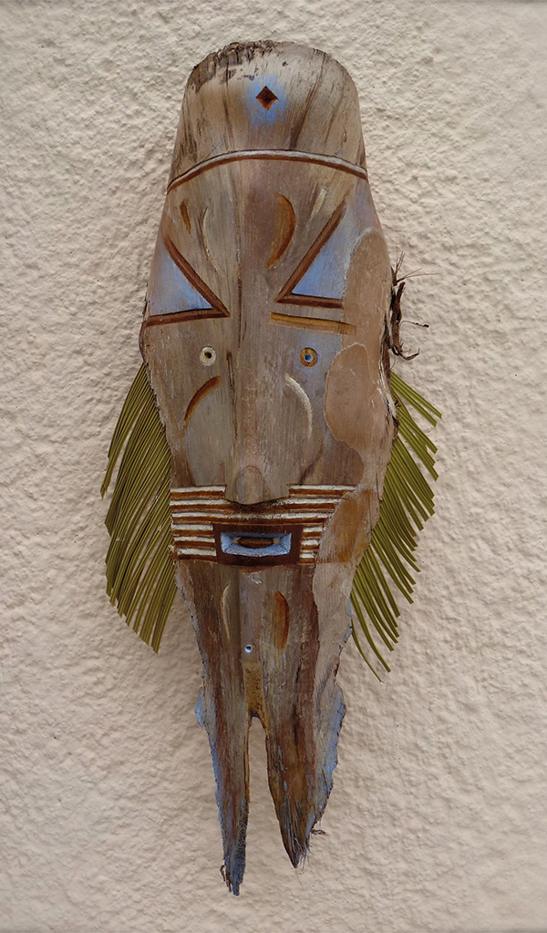
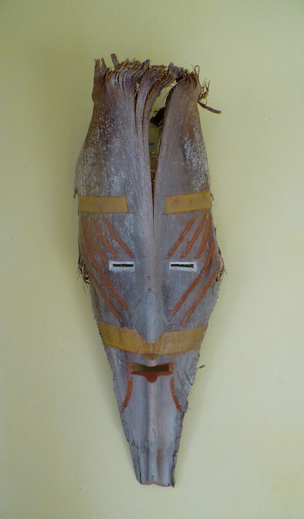
Exotic ‘masks’ on sheets from a palm tree base, Spain, 2010s
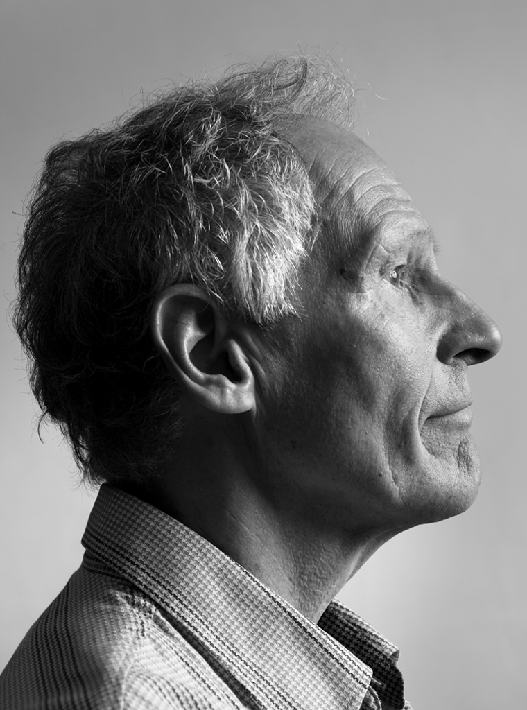
Bart Boumans
born on 12 February 1940, Deventer
Author of the original text: Frans van Lier, November 2013
Translation and editing in English: Ton Haak
Final editing: Sybrand Zijlstra
Portrait photo: Aatjan Renders