Designer and vocalist Petrus Johannes Jacobus Vincentius te Bos was born on Christmas Eve, 1950. He and his seven siblings, three brothers and four sisters, grew up in Alkmaar, where he attended the (lower) technical school to receive vocational training for house painter, a job he held for two years. In his 17th year, he was offered a job with Decora, an Alkmaar-based company producing the hand-painted giant billboards (like a six meter high King Kong) for movie theaters. Te Bos proved to have a talent for the job, because from a young age he had loved drawing and sketching. He decided to enter the evening class of graphic design that was taught at the Graphic School in Amsterdam.
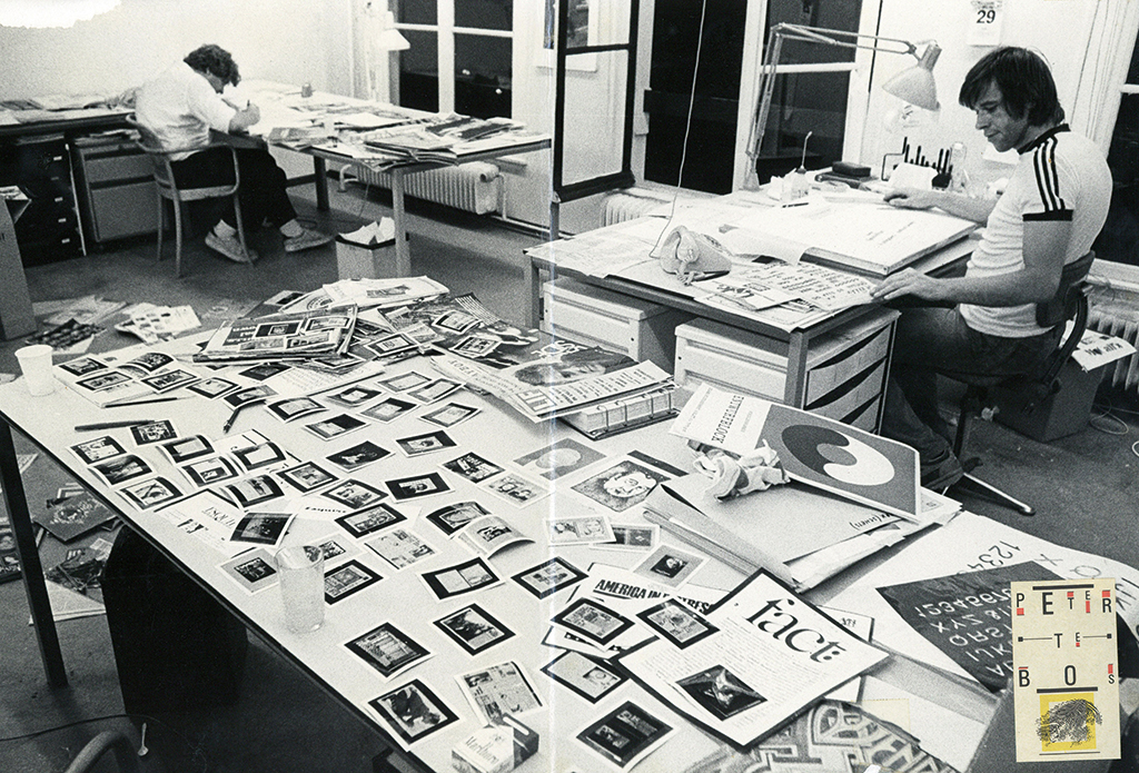
Anthon Beeke and Peter te Bos at Total Design in the late 1970s
Total Design
In the early 1970s, Te Bos was hired by Total Design, then already an assembly of graphic design icons such as Wim Crouwel, Ben Bos and Anthon Beeke. Six months later, Beeke asked Te Bos to join him as his assistant. The two of them were soon known as ‘Team Beeke’; they showed a similar work ethos, as a rule not starting before 11 a.m. and continuing past 6 p.m., after which Te Bos had to hurry to attend evening class, by now at the Gerrit Rietveld Aacademy. On many evenings he returned to Total Design’s Herengracht studio to continue working until the early hours, but not before he had taken possession of a bottle of wine he was always sure to find in the cellars of TD’s neighbor, the architects Premsela Vonk. Not all at TD appreciated these irregular working hours and his rock & roll mentality, but the quality of his work was recognized and protests were silenced soon. Together with Beeke, Te Bos created trail-blazing posters for Globe stage company, for De Bijenkorf department stores, and (with Wim Crouwel) for Holland Festival. They were the designers of Ed van der Elsken’s famous photobook Amsterdam (1979). Many of their projects broke with the ‘TD style’, but that does not make them less relevant for the Dutch graphic design canon. Forty years after being first published the book Amsterdam is still for sale in its original lay-out.
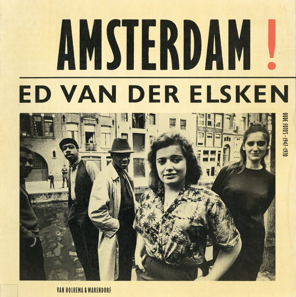
Photo book Amsterdam, Ed van der Elsken, 1979
Book of Masks, Pentagram, 1980
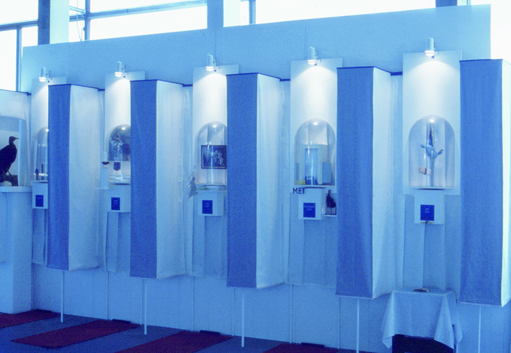
Pentagram Design
Colleague André Toet was the one who pushed Te Bos to try his luck in London. No results came from his first endeavors to find a job by knocking on doors and showing his portfolio. But back in Amsterdam, a month later, he received a phone call from John McConnell: Pentagram wanted to hire him after all. Te Bos moved to London where he entered a world he had no affinity with: the corporate design world. He got involved with projects for big clients and learned much that he would put to use later in his career, as the developer of an identity for Lowlands Festival. Meanwhile, he dove headfirst into the post-punk London scene, where the music of the 2 Tone label was hip and smoking was still common, at work or in the Underground.
Back to Amsterdam
Kees Nieuwenhuizen and Gerard Unger, his teachers at the Rietveld Academy, had granted him a one-year break from his studies. Te Bos returned to Amsterdam; he graduated in 1981. His graduation project, an installation about Virtues, made Paul Mijksenaar (state commissioner at the final exams) frown: What did this have to do with graphic design? Rumor had it that Mijksenaar allowed Te Bos to graduate only because “he would leave the profession anyway to become a musician”.
Graduation project, an installation, 1981
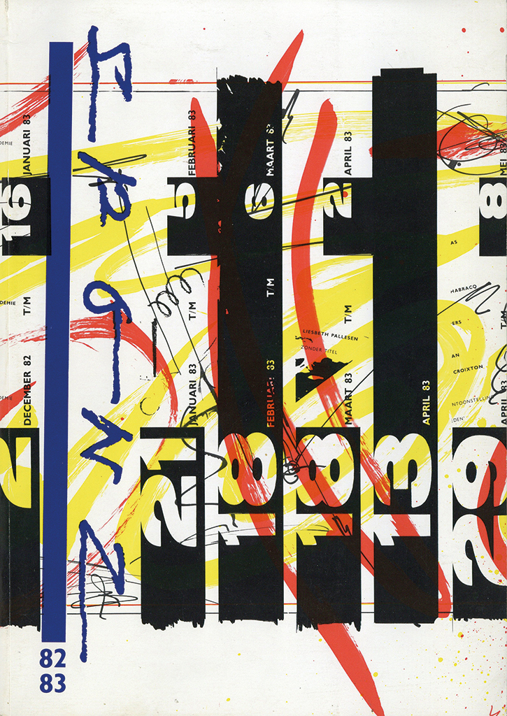
SPONZ catalog, 1982 / 1983
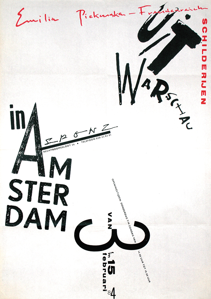
SPONZ poster, 1982 / 1983
SPONZ gallery
In 1981, Te Bos, together with the artist Alexander Schabracq, established SPONZ art gallery at a location on Rechtboomssloot in Amsterdam’s Nieuwmarkt district. SPONZ along with AORTA and W139 became leaders of the alternative art scene in the Dutch capital. They created a platform for young artists at a time that didn’t look bright for art. In 1982, during an art auction organized by SPONZ, Te Bos performed on stage with his band Combola, later to be renamed and become famous as Claw Boys Claw. Running the gallery took up more and more time; in 1983 they decided to close it and reopen as a pop-up restaurant, but to no avail. Yet SPONZ had offered Te Bos the opportunity to develop his own Dadaistic approach to corporate identity. His poster designs, although unruly, were always recognizable. Identity programs based on the creation of unity through diversity became his trademark. At the same time Te Bos began developing his characteristic cut-and-paste style.
SO
After graduating, for six months Te Bos was a partner of André Toet’s Samenwerkende Ontwerpers SO (collaborating designers) before coming to the conclusion he wasn’t made to be a part of a larger team. He decided to continue as a freelance designer. One of his first projects was the design of a logo and a poster for the theater group Alex d’Electrique, a design with the frayed edges that became typical of his work of later years. For almost all his logos, but also for identity programs and book projects, Te Bos designed a new, unique typography: bold, direct, expressive. “My logos throw a graphic punch to your face,” is how he explained his unique approach. Te Bos did not shy away from experiments either. One of his adventures was the restyling of the European edition of Penthouse magazine, for which he had to travel to Zürich and work from his hotel room. After presenting his sketches to the magazine’s art director he received his fee in cash.
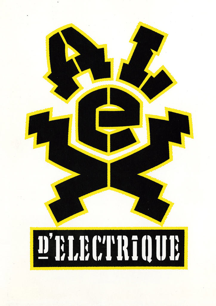
Poster for Alex d’Electrique, 1991
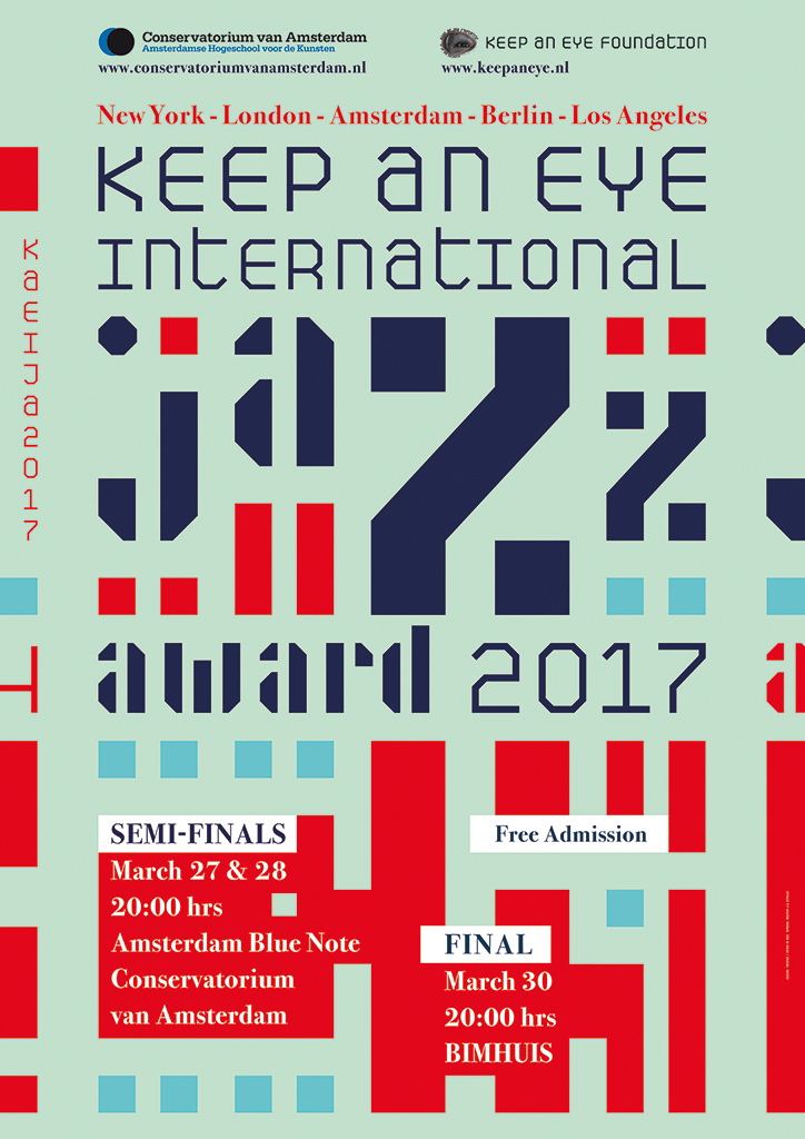
Poster for Jazz Award, 2017
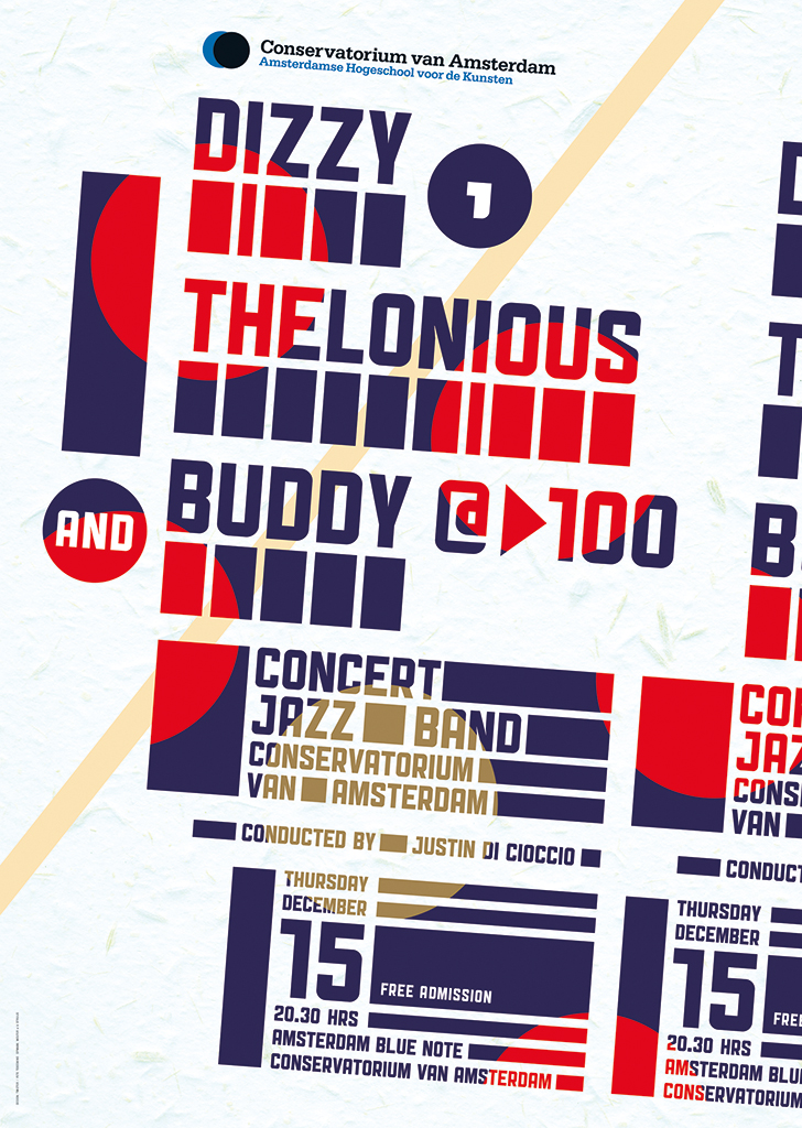
Poster for Amsterdam Conservatorium, 2017
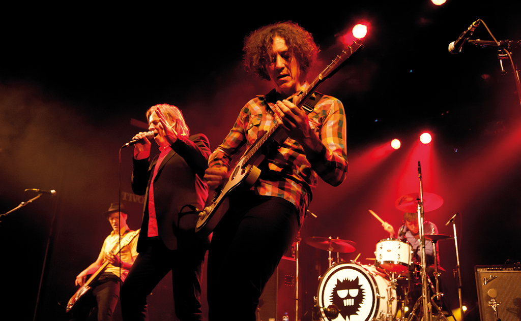
Claw Boys Claw
1984. Peter te Bos and Claw Boys Claw received first prize during a talent hunt organized in café De Snelbinder, Amsterdam. The prize money? 300 Dutch guilders, which the band members used to tape their debut album Shocking Shades of Claw Boys Claw – a mixture of trash, acid rock, blues and psychobilly. Music critic Swie Tio, writing for the Netherlands’ leading music magazine, described the album as “the best LP ever produced in the Netherlands”, giving the band a flying start. It was the wild beginning of a long and exciting career that in 1986 took the band to performing at Pinkpop festival and, one year later, to receiving the national Pop Award. The honor was presented by the Dutch government’s minister of culture, Elco Brinkman, who experienced a few uncomfortable moments on stage when Te Bos dealt him a smacking ‘thank you’ kiss. Of course Te Bos himself designed all of the band’s art work. He continued to develop his own recognizable style and succeeded with making the common become absurdistic and the absurdistic become common. Not just his music became all the rage, his distinct album cover designs excelled and attracted attention among music lovers. At that time, young British designers such as Peter Saville, Neville Brody, Malcolm Garrett, Vaugh Oliver and the 8vo collective with their cover designs brought a new élan to the UK’s graphic design. At first, the designs by Te Bos did not find much recognition in the design world. That needed more time.
Claw Boys Claw
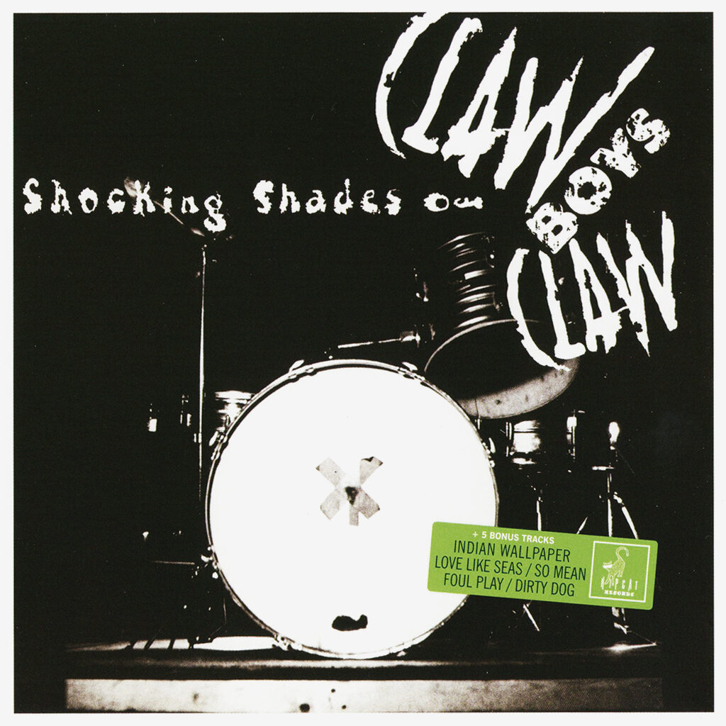
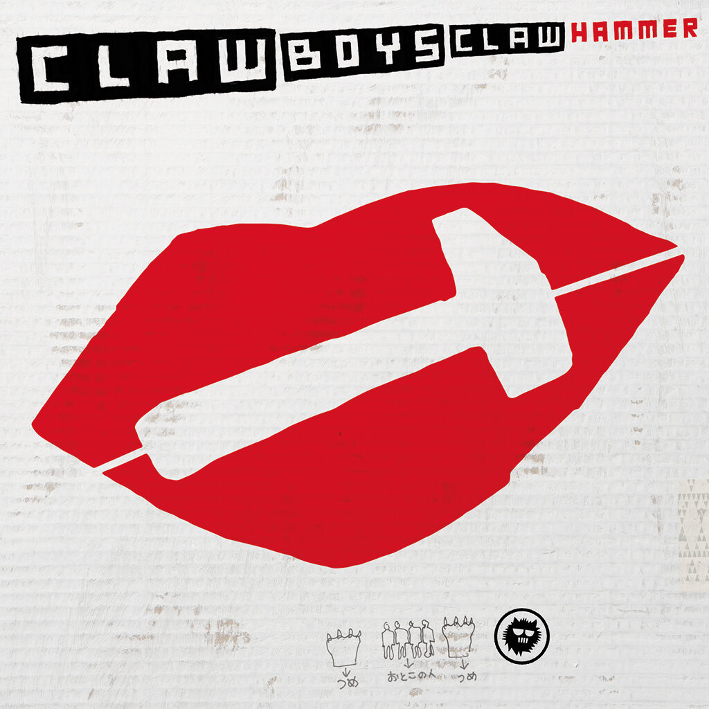
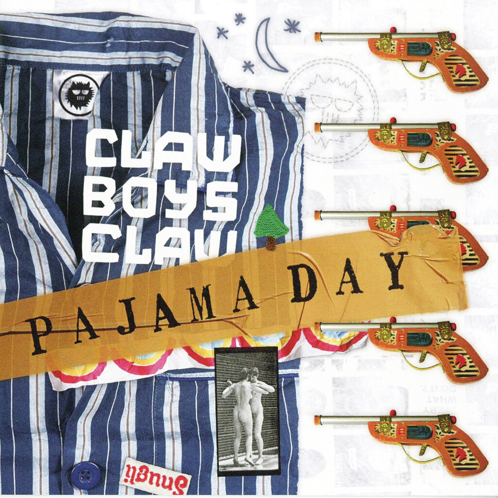
Album covers for Claw Boys Claw: Shocking Shades, 1984; Pajama Day, 2008; Hammer, 2013
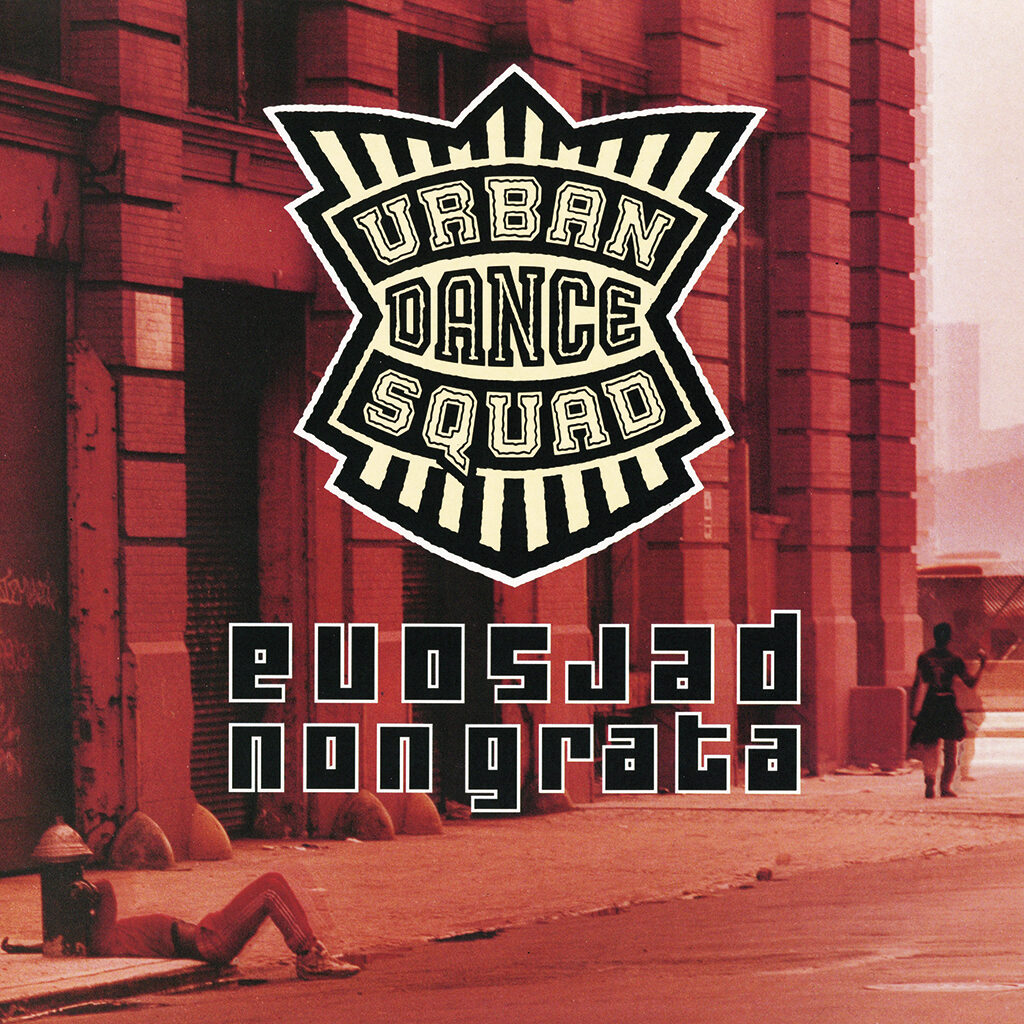
Album cover for Urban Dance Squad, 1994
Parallel careers
From 1984 on, his careers as a designer and as a musician/vocalist develop side by side. The musician in him provides him with a new vision of the design process. Coming up ‘out of the blue’ with a singing line in mumbo-jumbo English against a tentative guitar riff inspires him to look for more freedom in his graphic designs. He strongly believes that the element of surprise is important. More and more often he embraces ‘nothingness’ as the starting point for an extended process of sketching and drawing. He prefers to begin working without any direction, mindful of Peter Straub’s maxim: “It is not exciting to know where you’re going.” Piles and piles of drawings show how extensive his search is of the best meeting of form and content. They show his experiments and also that his uncoordinated-looking approach is of an almost military precision. His sketches are handmade; digitizing comes only at the end of the process; he cherishes his own characteristic handwriting: it has become his trademark. Te Bos sees more similarities between his two careers than differences.
Book covers
In the 1980s and 1990s, Te Bos designs scores of book covers (together with Wouter van der Struijs) for bestsellers by Stephen King, Dan Brown and many other authors. He is also responsible for the hundreds of covers for the Poem pocket books published by Luitingh-Sijthoff, most of them reprints of popular publications. His collaboration with the publishers does not always go smoothly, which will later make him decide to quit altogether. It often leads to conflicts and he uses a pseudonym, Pierre Dubieux, when the design is too watered-down and he disagrees with the final choices. Which annoys the marketing people, who would prefer to use his real name. Te Bos likes using pseudonyms anyway: there are album covers credited to Pete Teboskins and many a goodwill project is signed by Piereke van ’t Struikgewas.
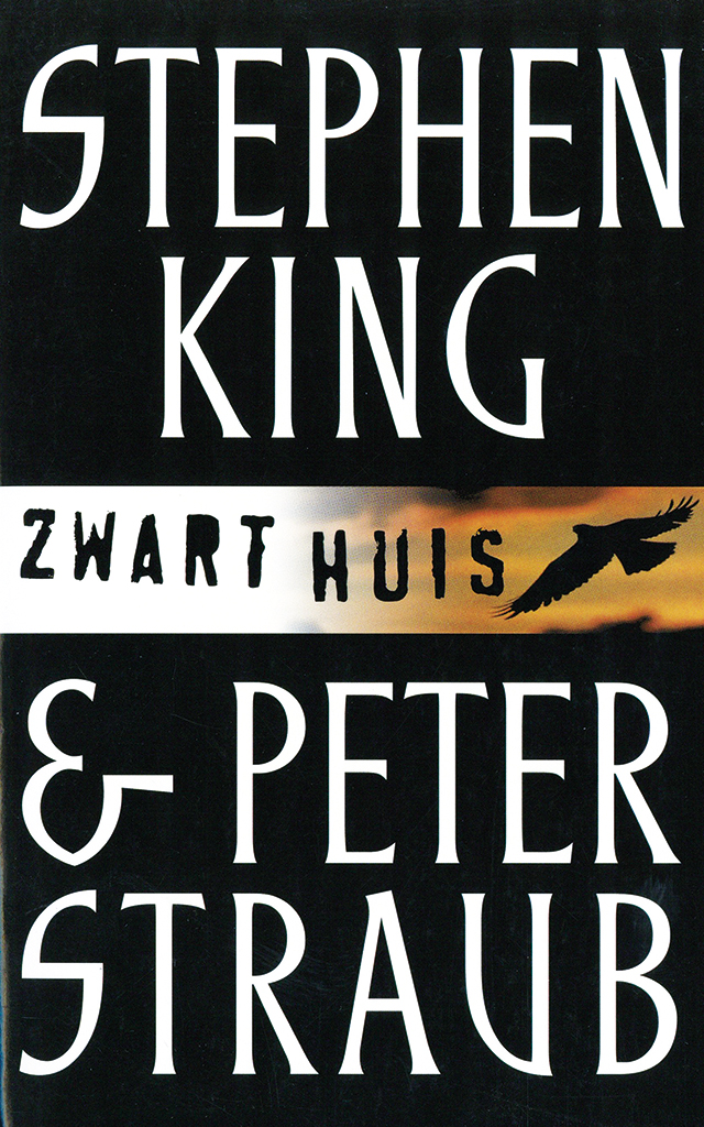
Cover for Stephen King & Peter Straub, 2001
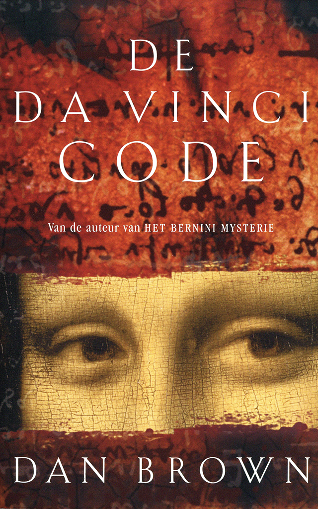
Cover for Dan Brown, 2004
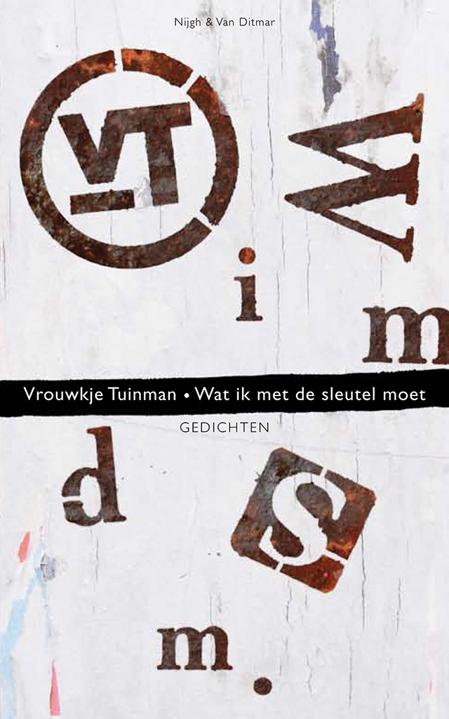
Cover for Vrouwkje Tuinman, 2011
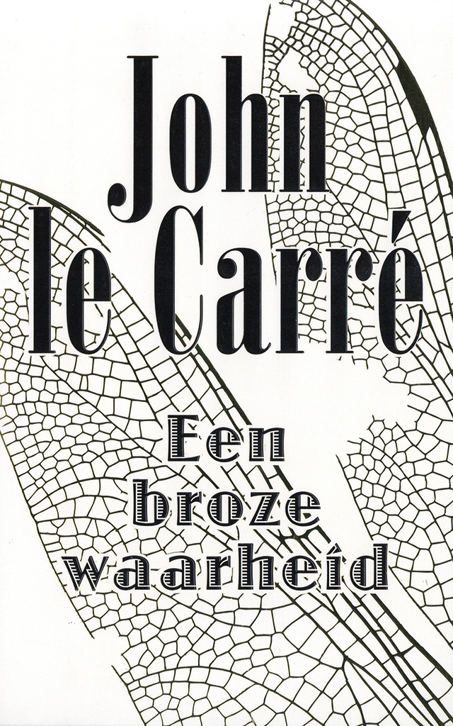
Cover for John le Carré, 2013
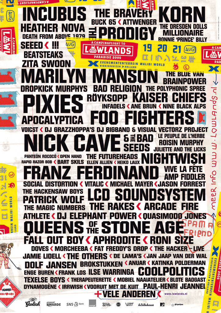
Lowlands
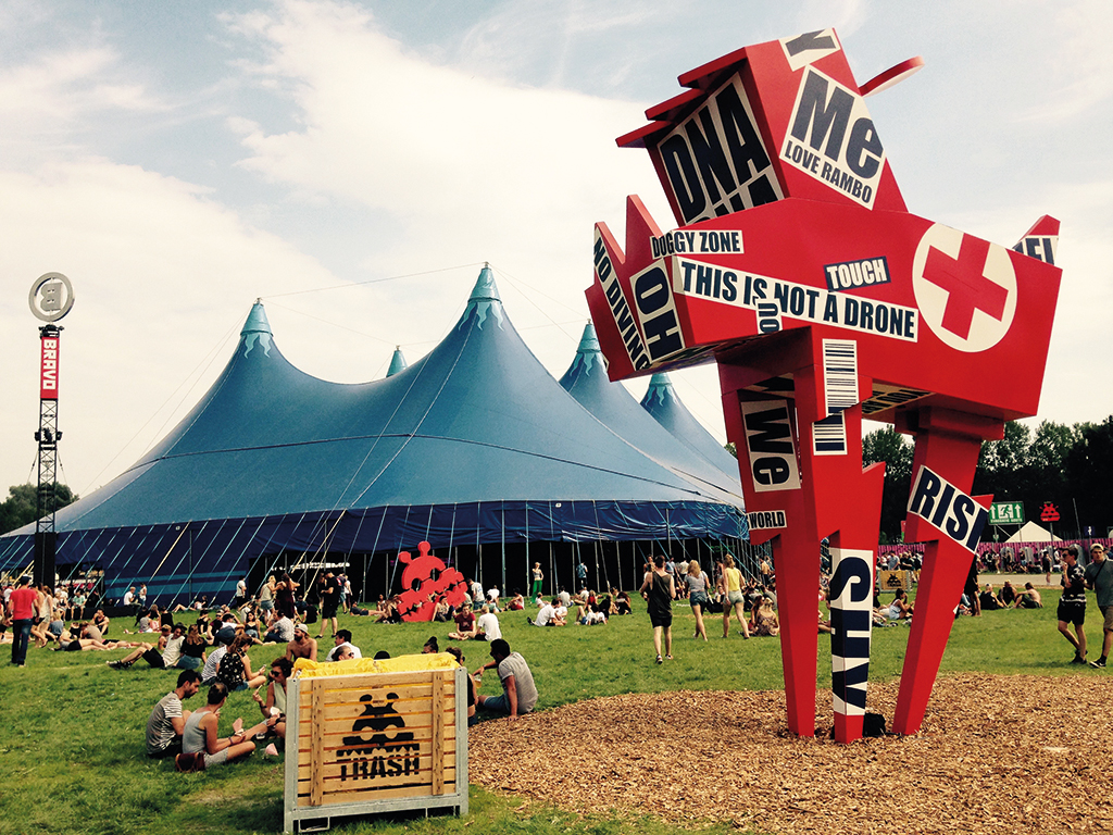
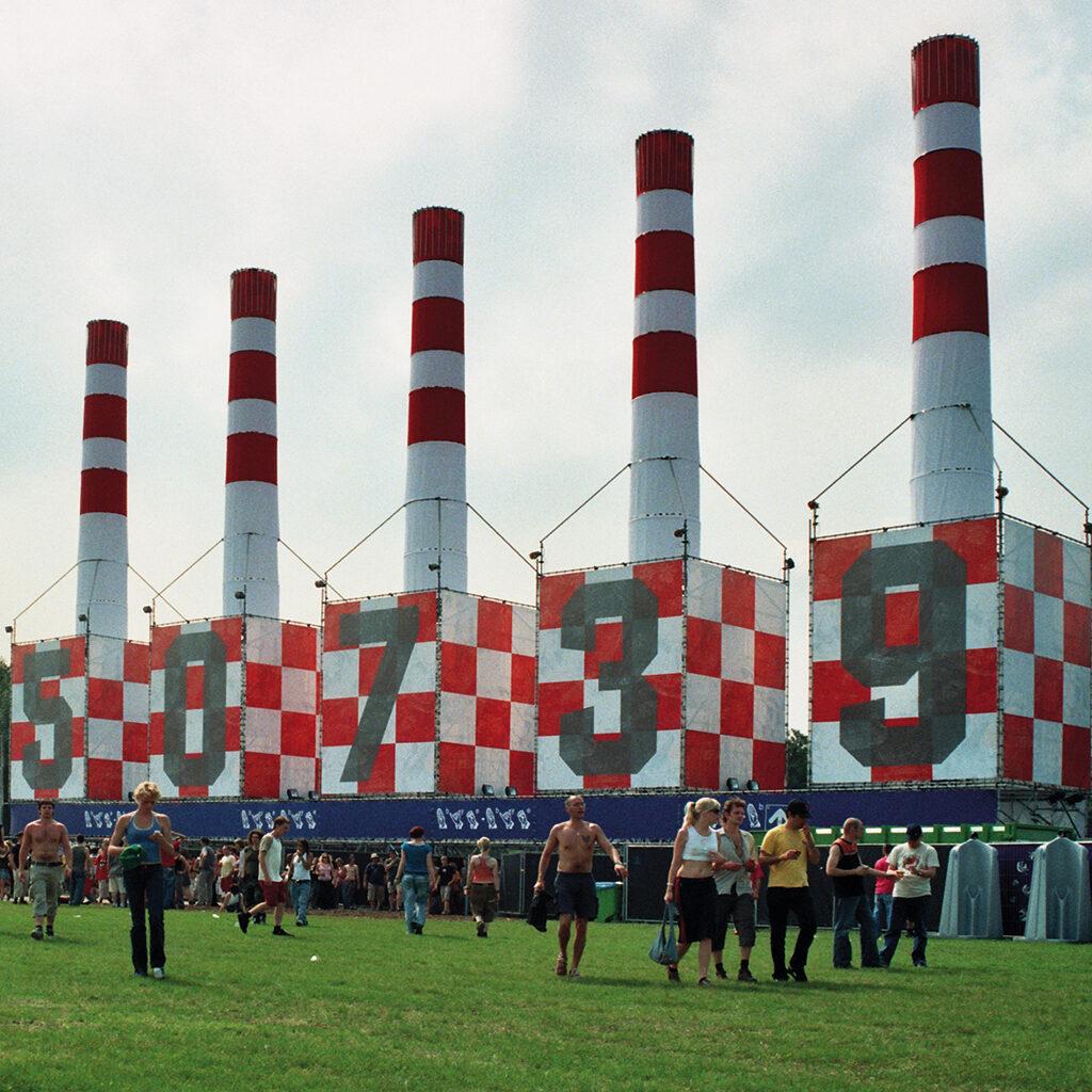
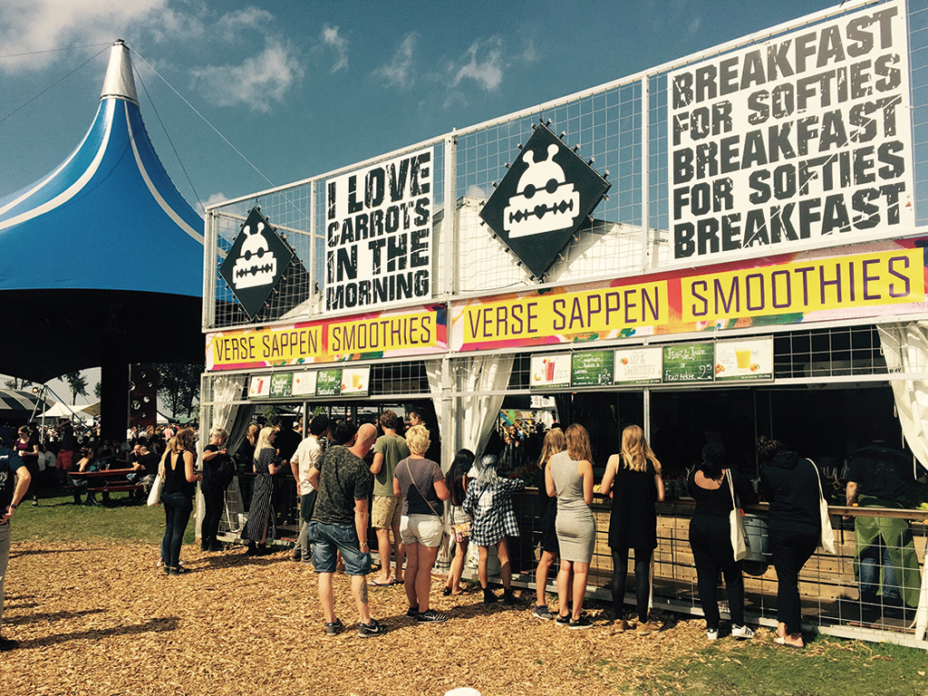
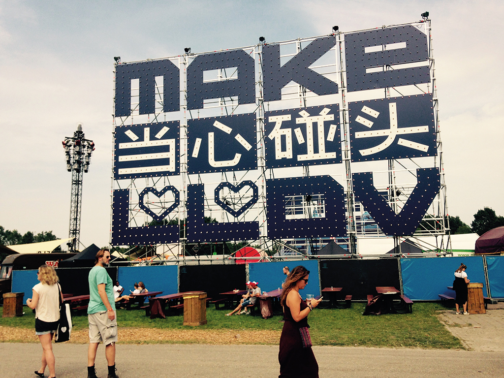
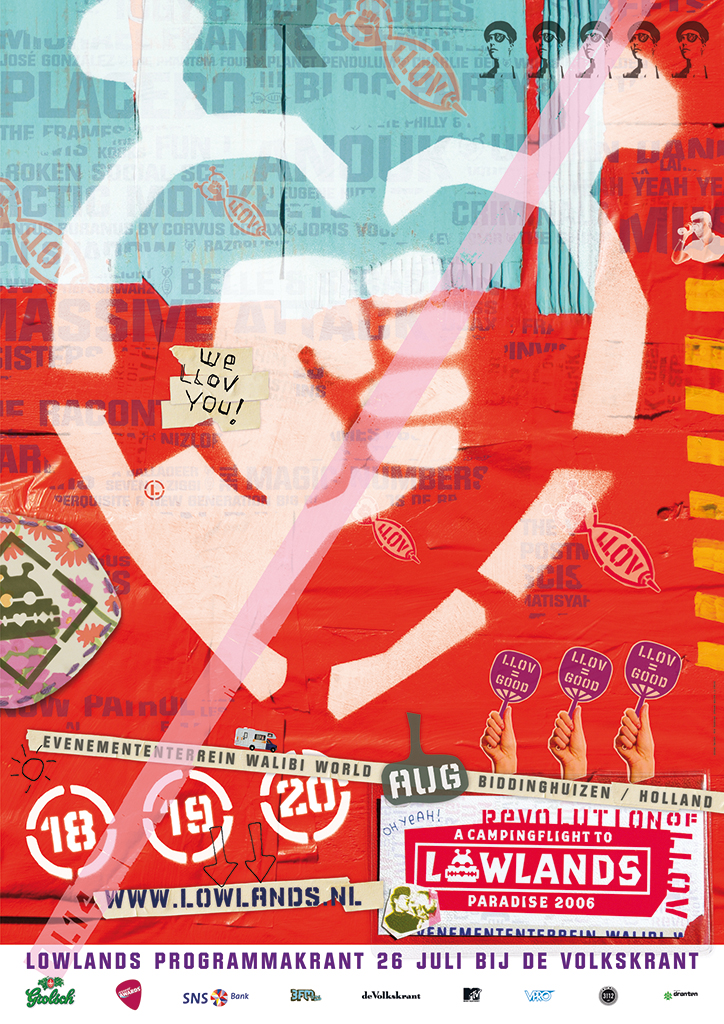
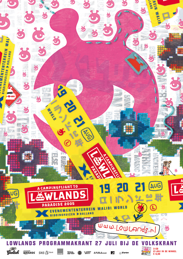
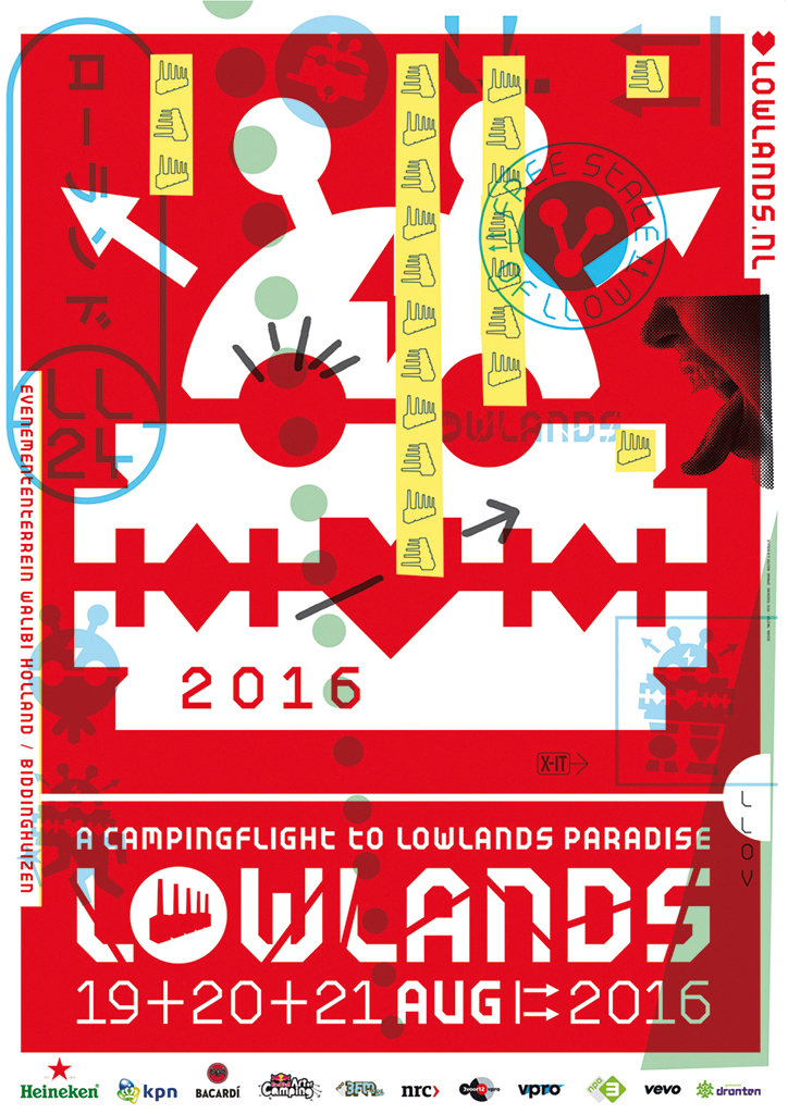
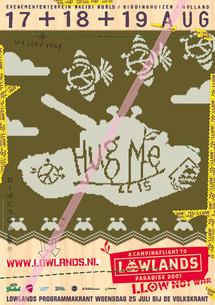
1993. Lowlands Festival, Biddinghuizen. Peter te Bos designs their logo. The festival is a continuation of one of the first pop music festivals in the Netherlands, A Flight to Lowlands Paradise (1967, Utrecht). The new Lowlands will provide a stage to underground musicians, theater performers and visual artists. Before the organizers know it, the small three-day festival explodes and becomes hugely popular. Te Bos is a major contributor to this success because the organizers, Mojo, with each edition of the festival give him more and more free rein and allow him to decide not just the festival’s graphics, but also to put his mark on the whole atmosphere of the festival grounds. As always he starts from nothing; there is no plan, he has only his mental compass to guide him. Unafraid and imperturbable, he takes up the design of all the festival’s graphics and visuals. He designs coins, stickers, signs at the gates, shop fronts, most merchandising, sign postings, promotional films, and eventually the website and app. His five huge chimneys at the entrance of the festival grounds become iconic and his design of the festival’s mascot, Rapid Razor Bob, is popular among visitors as a tattoo.

Lowlands Rapid Razor Bob and Lowlands Festival grounds, 2016
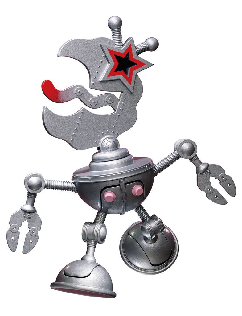
Lowlands Robolow, 2000

LowLows, 2003
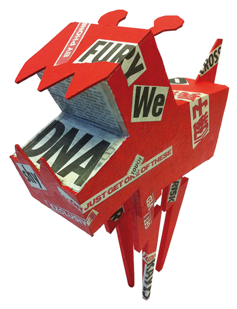
Lowdog, 2013
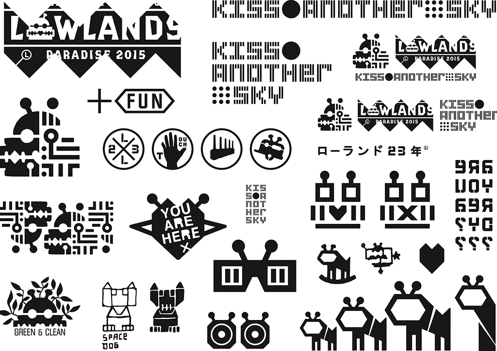
Lowlands offers ‘the pirate’ te Bos the opportunity to make good use of all his previous experiences, from working on Total Design’s and Pentagram’s corporate identity systems to his love of music and contemporary art; his talent for the design of three-dimensional objects; and not to forget his endless energy and unique sense of humor. Each year, Lowlands changes face without losing identity. It is amazing how the visual identity is kept in motion, thus underscoring the festival’s rebellious character. After the end of each festival, Te Bos sits down in front of blank sheets of paper to start sketching afresh. His reincarnation of the logo introduces a new and surprising style variation; he manages to prevent that Lowlands gets institutionalized. The logo themes receive their own name, which strengthens them. Year after year, Te Bos generates a new story that attracts broad attention to the new style. Over time, te Bos and Lowlands become one. For the last four festivals he designs six different fonts to make a point. His visual dynamics get him much praise and, of course, criticism too.
Posters for Lowlands Festival
One of his festival projects is The Daily Hell, a ‘newsletter’ (666 copies). This project becomes manifest as collages of cut-outs on walls, fences, and objects; it is a reaction to the festival’s happy positivism as expressed in the official festival newspaper Daily Paradise. Sex, drugs and rock & roll are subjects not avoided by The Daily Hell – they are approached in a raw and more undisciplined manner than Lowlands itself could afford to do. Yet te Bos succeeds in making the Hell an integrated part of the festival. The ever-adapting but never-changing Lowlands identity is noticed in the Netherlands and abroad. Te Bos will be involved until the end of 2016’s event.
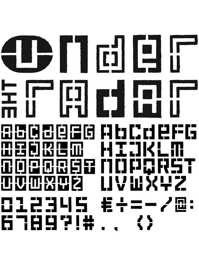
Lowlands Bossy Radar letter font, 2014
Daily Hell Kerkvan, 2015
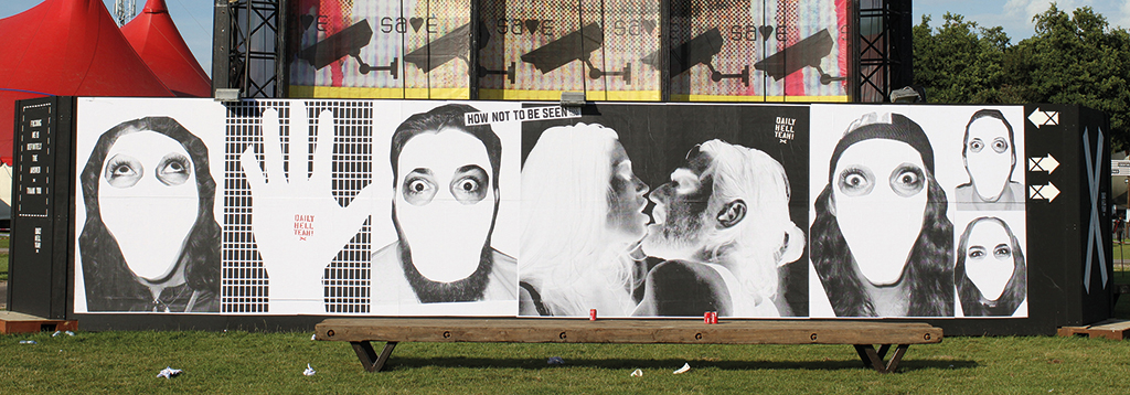
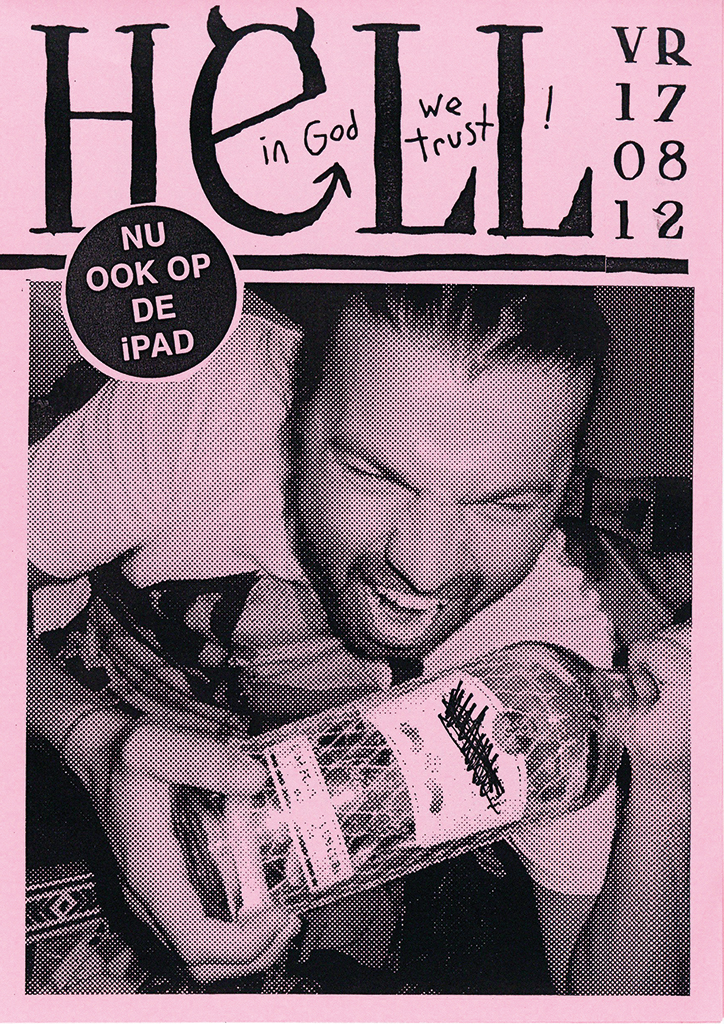

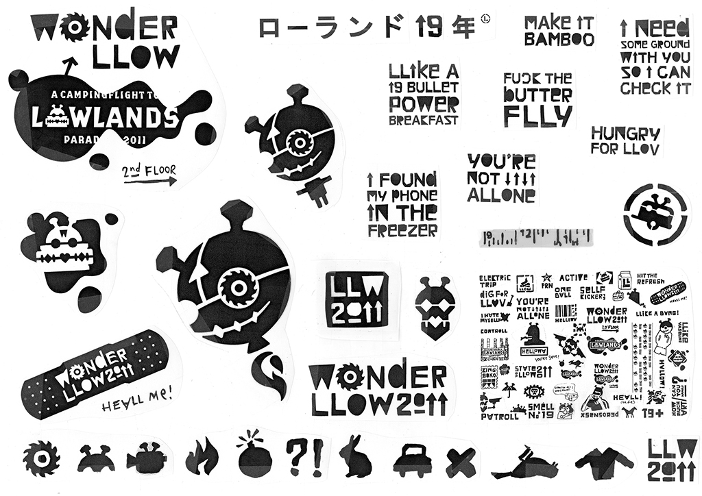
Lowlands The Daily Hell
Daily Hell Wall, 2014
Daily Hell Magazine, 2012
Daily Hell Collage, 2015
The 1990s
In the 1990s, David Carson’s grunge typography, known from Ray Gun magazine, gains a huge popularity in the international design media, it is considered to be the next big thing. The grunge approach underscores te Bos’ slogan: “Leave some space for imperfection, for letting your personality shine through.” More and more 3D objects accompany his work; if he fails to realize his thoughts on paper, te Bos starts to cut up the paper and to search for different materials to work with. As always, there is no ‘bigger plan’, it is just a matter of handicraft – eventually, everything is the result of slowly walking through the process. For the Lowlands logo he discovers many variations in 3D. Will-O-The-Wisp is the name of the peanut seller he creates for the like-named Claw Boys Claw album. It’s Not Me, The Horse Is Not Me (the letter horse) is a recent project, like all the others a testimonial of his love for the old-fashioned way of making things, for details, and for his never-ending search for the power of expression.
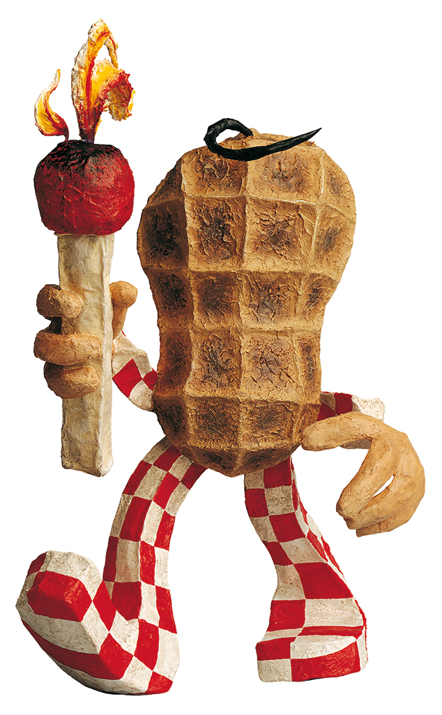
CBC Will-O-The Wisp, 1997
Gurkin, 1950
Don’t take it all to seriously
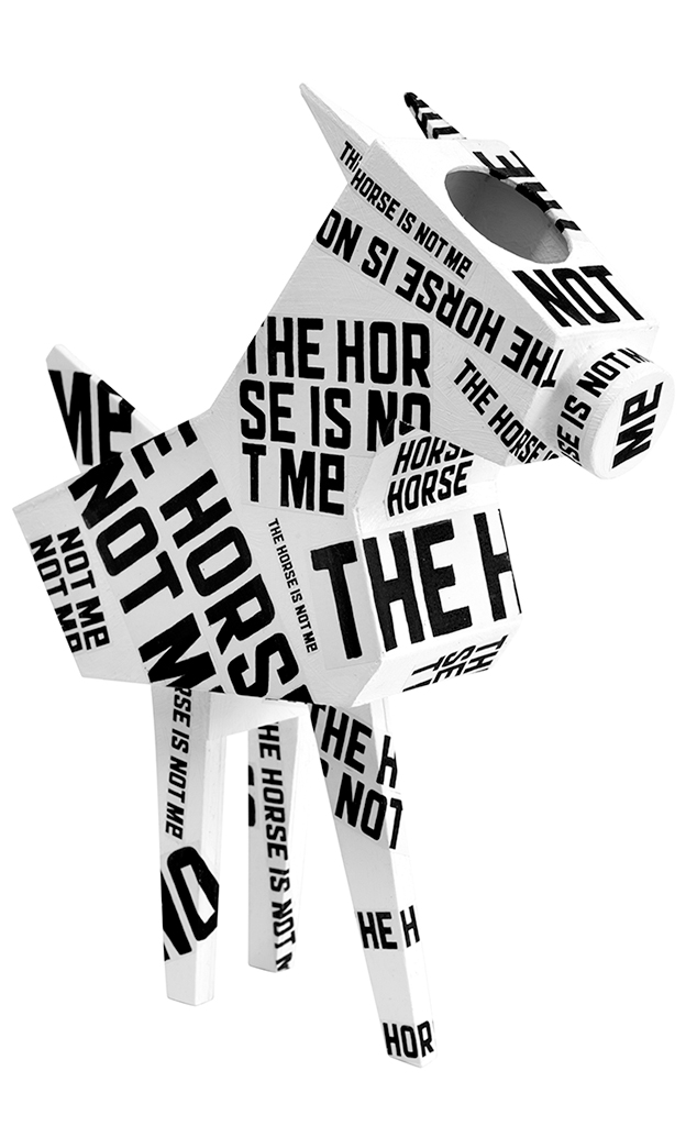
Letterpaard (letter horse), 2017
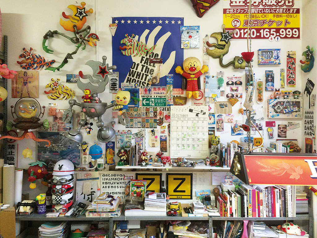
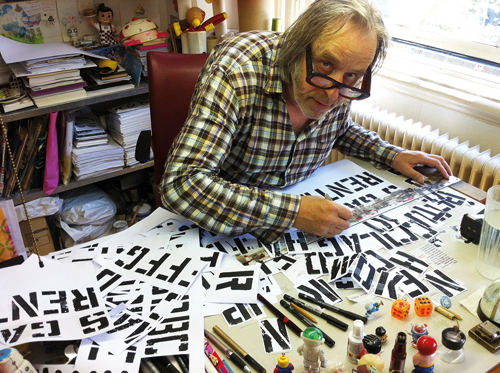
For many years, Peter te Bos shares a studio with Wouter van der Struijs. The studio name is Twizter Design. By 2017, the balance has moved to more autonomous work. Always challenging, always provoking and always steeped in self-mockery, without whimsical interferences by clients. “Make some noise yourself,” says te Bos.
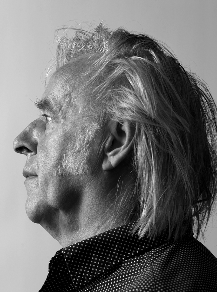
Peter te Bos
born on 24 December 1950, Amsterdam
Author of the original text: Jeroen van Erp, July 2017
Translation and editing in English: Ton Haak
Final editing: Sybrand Zijlstra
Portrait photo: Aatjan Renders