‘No idea,’ says Piet Gerards when asked about the size of his body of work. His work is currently in the depot of the House of Books and is being archived. At the start of 2025, the count for books alone was over 900, ‘with another three linear metres still to go’. Posters, invitations, brochures, postage stamps, coins, calendars, visual identities, annual reports and occasional printed matter are still waiting to be processed.

Piet Gerards on horseback, with his parents, older brother and the dog Teddie. His two sisters had not yet been born (1951).

Cub Scout in the scouting group (1961)

At the start of his career (1973)
Piet Gerards is born on 29 November 1950 in Heerlen. He grows up in a family of teachers in Schinnen, a village on the green edge of the mining region. The family belongs to the local middle class in a community with an active social life. He attends primary school there and imagines that he might become a missionary. During secondary school, he considers training as a handicrafts teacher, but in the end he chooses the art academy in Maastricht, where he spends three years in the fine art painting department. Gerards: ‘I found the atmosphere suffocating, as if time had stood still. Leaving early was the best decision I could have made. Of course I learned some things there: a sense of composition, colour and proportion. But the thing I value most in hindsight was the optional weekly music class, taught by a teacher with a broad outlook. All the great composers from Claudio Monteverdi to Luciano Berio and the Dutch avant-garde of the time were covered. And contemporary jazz was also included. I still benefit from it to this day.’
Gradually he becomes a political activist and joins the Pacifist Socialist Party (PSP). Through teaching (one year as an uncertified drawing teacher at a domestic science school) he moves into adult education for young adults, first in Geleen and later in Brunssum, where he works on publicity, social education and the fortnightly film screenings. He also organises political evenings and cultural group trips to various European capitals. The idea of training as a graphic designer never occurs to him, but in both work and activism he takes on every design-related task he can.
1977 is an important year. Irritation over communist dominance in the cultural sector leads to the founding of Sirkus Ana and the Cooperative Association Anarcho Artistieke Producties (AAP), and Gerards leaves the PSP. Sirkus Ana brings together about fifteen anarchist-minded people in their twenties. AAP, which he founds with photographer Gustaaf Begas and architect Jan Teeken, sees itself as an idealistic working cooperative in which designing and publishing are the main goals. In 1978, Sirkus Ana and AAP organise the event ‘The Constitutional State at Stake’, prompted by political developments in West Germany, and the cultural event ‘Banaal’.
Piet Gerards: ‘Until the early 1980s I had neither the professional knowledge nor the means to present myself as a proper graphic designer. I used the materials I did have at home: rub-down lettering, a typewriter, stamps of all kinds and sizes. And I had built a simple screen-printing table. The poster I designed and printed for “Banaal” was made entirely with stamps, deliberately messy and casual. The programme sheet, with the subtitle Against the Elephant-Skin Mentality, was made in the same simple way. It probably suited the spirit of the time, because it worked: the festival was a great success.’

Poster for the cultural events ‘Banaal’ (1978)

Poster for ‘Anarchisme sieklus’ (1979)

Kladdaradatsch published the interview with anarcho-syndicalist Arthur Lehning. In the photo, from left to right: Arthur Lehning, Johny Lenaerts and Piet Gerards (Amsterdam, 1979). Photo: Joep Schreurs. Kladdaradatsch appeared nine times. The issue shown is from 1980.

AAP produces posters featuring leading figures of anarchism – Mikhail Bakunin, Peter Kropotkin, Buenaventura Durruti, Emma Goldman and Pierre-Joseph Proudhon – and takes part in the Flemish anarchist magazine Kladdaradatsch, which leads to first contact with Arthur Lehning, the éminence grise of anarcho-syndicalism. Gerards and his friends develop into activist anarchists: they adopt rigid positions, take radical stances and play a role in the anti-militarist movement of the late 1970s.
In 1980, he rents a studio on the outskirts of Heerlen and establishes himself as ‘Piet Gerards/AAP, Screen-printing & Layout’. He acquires a simple headline setter, an Olivetti typewriter with interchangeable type wheels and memory for one line, a typecase with some favourite metal types, a proofing press and a cutting machine. The self-built screen-printing table is replaced by a professional one with a single-person squeegee. His first clients come from social work, education, the environmental movement and the cultural sector. He learns the profession by doing it himself, experimenting, buying specialist literature – which eventually becomes a large collection of books on graphic design and typography – by studying the work of colleagues, and by choosing the right people to work with. During his years as an activist he learns how to recognise talent, how to bring people together and how to encourage them to achieve their best.


1980–1984: Studio/screen-printing workshop Navolaan, Heerlen
1984–2007: Studio Akerstraat, Heerlen
2007–2017: Studio Weteringschans, Amsterdam
Photos: Gustaaf Begas

The poster dedicated to Emma Goldman (1978) is the first in a series of five

Poster for the presentation of Europa (1982)
The first screen-printed book publication, Europa, still under the AAP imprint, appears in 1982 and leads to contact with Stefan and Franciszka Themerson. Europa is a long poem by the Polish futurist Anatol Stern, first published in 1929 with a design by Mieczysław Szczuka. Gerards follows this brilliant example for his own edition. In 1983, European Night appears as the first part of the Visum series, a selection of poetry by three Russian émigré poets, the best known of whom is Vladislav Khodasevich. It is the first book published under his own name: ‘Gerards, publisher in Maastricht.’ A year later, he moves into the former offices of the Geological Museum on the Akerstraat in the centre of Heerlen, where he realises the original AAP concept of designing, printing (screen-printing and letterpress), publishing and exhibiting.
In that context, Nuuks emerges. Gerards: ‘Seven editors, seven subscribers, that was the idea behind Nuuks, a magazine that appeared every two months between 1982 and 1987, twenty-one issues in total. The contributors sent their pieces in seven copies to the editor responsible for that issue, who bundled the articles, letters, photos and prints, added a cover and sent everything round. A lot of silliness, sometimes serious texts, sometimes provocative ones, always fun. I was editor-in-chief four times.’


Two covers designed by Gerards for the magazine Nuuks, issues 4 and 11 (1980, 1984).
The spread shown is part of the opening sequence of issue 11.

Collage, screen-printed foldout; for Nuuks 10 (1984)
In 1985, Galerie Signe is established in the Akerstraat building – from 1987 to 2003 it continues in the neighbouring building under the direction of Gustaaf Begas. In the same year, Joep Schreurs joins the publishing house, which from then on is called Gerards&Schreurs. Together they set up the Fragmenten and Visum series: books by and about Osip Mandelstam, Octavio Paz, Fernando Pessoa, Antonin Artaud, Louis-Paul Boon, J. C. Bloem, Daniil Kharms and Pierre Kemp. The bilingual The Girls of Zanzibar appears in 1988 as the fourth part of the Visum series. It is Karel van het Reve’s selection of Russian poetry. Some time earlier, Gerards approaches Van het Reve about translating the small Cyrillic booklet first issued by De Lantaarn. When Van het Reve says he has no time, he suggests asking his translation group in Leiden, which leads to this Visum volume. The plan for a series about design in the broadest sense comes to an end after two publications: About 2 Squares by El Lissitzky (1984) and Opstellen over typografie by Jan Tschichold (1988). A planned publication on the Polish avant-garde never gets off the ground.
De meisjes van Zanzibar appeared in 1988
In 2000, publisher Plantage issued an expanded edition of De meisjes van Zanzibar as an anniversary publication. Shown is the poster sent to bookshops.
Three of the ten volumes from the Fragmenten series published by Gerards&Schreurs; the first two appeared in 1986, the third in 1987.
Huis Clos begins in 1986 as the bibliophile branch of the publishing house. The bilingual 20 Years of Huis Clos. A Short Tour Through a Virtual Exhibition (2006), written by former colleague Ralf de Jong, describes the qualities of the first twenty-four books.
The combination of these activities brings new contacts and clients: the printers Rosbeek and Groenevelt, the city of Maastricht, the APB Pension Fund, the State University of Limburg (Studium Generale), the Council for the Arts and publisher Herik. Osip Mandelstam’s Laatste brieven 1936–1938 becomes his first Best Dutch Book Design in 1987, the first of thirty-six.
Gerards soon reveals himself to be a multitalent: graphic designer and exhibition maker, organiser of art events, conceiver and maker of books and magazines, and publisher. For him, thinking and doing are one and the same, which allows him to work quickly and effectively. He is driven, but he also has the gift of admiration, which leads him to return again and again to the work of the ‘masters’ he holds in high esteem, looking, reading and listening with fresh attention. Measuring himself against the highest standards requires great confidence in his own abilities. It also means that he demands the highest standards from his assistants and collaborators, which explains his reputation for being ‘critical’, ‘difficult’ and ‘demanding’.
From 1989 on, he surrounds himself with assistants, mainly to cope with the increasing technical workload. With the introduction of the Apple Macintosh computer, the designer also becomes typesetter, layout artist and lithographer. A year later, the Plantage publishing house in Leiden, run by Yolanda Bloemen, takes over the Gerards&Schreurs list, and from then on Gerards designs the Plantage publications. Around the same time, his collaboration with the Rotterdam publisher 010 begins, for whom he will design around 145 books. From 1992 on, Gerards has artistic responsibility within a partnership with Marc Vleugels. This cooperation lasts one and a half years. To house the growing studio, the basement in Heerlen has by then been converted into a workspace.
Six of the forty-five books Gerards designed between 1990 and 2021 for the Leiden-based publisher Plantage
Ton van de Ven (who works with Gerards from 1993 to 2005, now a graphic designer at Studio Denk in Venlo and at Expert Printing & Publishing at the Jan van Eyck Academy in Maastricht): ‘The years with Piet were an eye-opener. Working in his studio did not only mean graphic design, it was a whole world. Visual art, architecture, literature, music, but also his social engagement. He stood firmly for what he believed and wanted to share it with others.
Very little active acquisition was done. The work, mostly books for interesting projects, came in naturally because of his good reputation and strong involvement. That was a privileged position, but also the result of Piet’s attitude. If he did not like a job, he simply did not take it. It is a rule I still follow today. Because our work at that time was mainly typographic and we could handle large amounts of text, many assignments were text-heavy books. A good example is That Is Architecture (2001) for publisher 010: eight hundred and ninety-four pages without a single image and with a typographic cover. Still an extremely strong design.


Dat is architectuur (2001), 010 Publishers, Rotterdam
The bar was always high. There were never any concessions in quality. That certainly applied to the typography. At that time far fewer digital fonts were available and often the spacing between letters was not good. We adjusted the kerning in QuarkXPress and Fontographer until we were satisfied with the result. It was many hours of work, but the beautiful typesetting was incredibly rewarding.
Piet’s designs are always instantly recognisable because he remained true to himself and to his own taste and style. Unaffected by trends or fashions, his books still look fresh and modern today, even those that are already 35 years old.’ [All staff members and interns are listed on pietgerards.nl]
For designer Piet Gerards, who learns his craft as a reader, the letter is his most important tool. Having good fonts is essential. Around 1990, thanks to a trade-in deal with Agfa Gevaert – Gerards owns a hardly used repro camera and developing equipment – he acquires a whole range of classic book typefaces, including Bembo, Baskerville, Garamond, Caslon, Sabon, Spectrum and several sans-serifs. But his appetite for type does not end there. A publication about Scala, a font by Martin Majoor, sets him on the track of new typefaces designed for the needs of the digital age. He buys many Dutch-designed fonts, not only Scala but also Quadraat (Fred Smeijers), Documenta (Frank Blokland), Swift (Gerard Unger), Albertina (Chris Brand) and Trinité (Bram de Does). In the years that follow, dozens more typefaces are added.
For the design of Faces Maastricht Europe (1991), a commission from the city of Maastricht and the Province of Limburg for the European summit, he receives the Gold Medal of the Schönste Bücher aus aller Welt (Stiftung Buchkunst, Leipzig) in 1993. The studio’s first presentation, Boeken maken ’82–’92, is followed in 1997 by Herdruk Neuauflage Reprint and, between 2002 and 2011, by an annual newsletter. In Huis Clos Fold-out (supplement to the magazine De Boekenwereld, Vantilt 2015), Gerards uses sixteen Huis Clos covers to describe the fortunes of the small publishing house.

Faces Maastricht Europe was awarded the Gold Medal by Stiftung Buchkunst, Leipzig, in 1993. The book was the result of exemplary collaboration between the designer, initiator and author Pieter Beek and photographer Kim Zwarts.

What began as a simple programme booklet grew into a standard reference work on the importance of the magazine i10 (ABP, 1994).

Programme booklet and bus advertisement for the i10 event.
At the start of 1995, the presentation of the compact disc containing recordings of the concerts held during the event took place at the Beurs van Berlage in Amsterdam.

For the event i10 Traces of the Avant-Garde (ABP, Heerlen 1994), Gerards is able, for the first time since Banaal, to realise his ideas about multidisciplinary presentation on a large and professional scale. The focus is an exhibition with loans from several museums, for which a museum-like space is built in the central hall. The programme includes political and cultural debates, architectural tours, concerts, a film night and theatre. A book of the same name is published with the project, edited by Toke van Helmond, in which experts from the Netherlands and abroad discuss the themes that appear in the magazine i10 (1927–1929). Shortened pages from i10 articles serve as illustrations for the relevant chapters.

The poster for the project on Russian filmmaker Andrei Tarkovsky shows the model of the installation that artist Ine Schröder built at Kunstencentrum Signe in 1997.

In the famous Glaspaleis by architect Frits Peutz in Heerlen, the final event of the project ‘John Hejduk. Fabriceren in je hoofd’ took place in autumn 2001.

In 1998, also in Signe, a programme took place dedicated to the Polish-English artist couple Stefan and Franciszka Themerson.

Piet Gerards, Jasia Reichardt and Gustaaf Begas (who took the photo) preparing the exhibition in London (1998).
Following this event, and in what is by then called Kunstencentrum Signe, further projects are organised around Andrei Tarkovsky, Stefan and Franciszka Themerson, S. I. Witkiewicz and John Hejduk, each accompanied by a Huis Clos publication. Friends and collaborators – artists, musicians, photographers, writers and architects – are regularly involved, such as the poet Leo Herberghs and the artist Joseph Kerff.
By this time, Piet Gerards begins to focus on complex publications in the fields of architecture, visual art and literature. He designs books about and often in close collaboration with architects such as Jo Coenen, Herman Hertzberger, Charles Vandenhove, Wiel Arets, Arie Graafland, Van Berkel & Bos, John Hejduk, Manuel de Solà-Morales, Frits van Dongen, Hubert-Jan Henket, Cees Dam and Frits Palmboom, and about artists including Lei Molin, Pierre van Soest, Piet Killaars, Ger Lataster, Bram van Velde, Constant, Christiane Baumgartner, Iris Kensmil, Ine Schröder, Peter Struycken, Toon Teeken and Bas Jan Ader.


For one of the opening exhibitions of the Netherlands Architecture Institute in Rotterdam (1993), Gerards designed John Hejduk. Berlin night, one of his most awarded works.


‘New Babylon’, the utopian project by artist and thinker Constant, is the subject of this monumental book in which objects and texts are treated equally and chronologically, following a proposal by author Marc Wigley. The book was published by Witte de With Center for Contemporary Art and 010 Publishers (1988).
By the late 1990s, his ties with the region grow weaker. In 1999, Gerards moves to Amsterdam, the centre of the Randstad, where most of his clients are based. New clients include NAi Publishers, the Mondriaan Foundation, PTT/TPG Post, the Dutch Mint, Vesteda, Museum Meermanno, Huis Marseille and the publishers Plataan, Bas Lubberhuizen, De Buitenkant, Ernst & Sohn and Birkhäuser. From 1999 onwards he designs five stamp sheets: ‘Seventeenth-Century Art’ (1999), ‘Dutch Nursery Gardens and Their Plants’ (2001), ‘Industrial Heritage’ (2002), ‘Heemschut 100 Years’ (2011) and ‘Unesco World Heritage’ (2014). In 2013 he designs a stamp to mark the royal succession.
A substantial monograph, Working Title: Piet Gerards, Graphic Designer, written by Ben van Melick, is published at the end of 2003 by Uitgeverij 010. The book receives international recognition (Ehrendiplom Schönste Bücher aus aller Welt and the ISTD Premier Award), but the reception in the Netherlands is very hostile, with a particularly hurtful jury report in the Best Dutch Book Design competition.
‘UNESCO World Heritage in the Netherlands’ is the theme of a stamp sheet that appeared in 2014.
Working Title: Piet Gerards, graphic designer (010 Publishers, Rotterdam, 2003). Front and back are literally reversed: the blurb is placed on the front.
In 2006 the decision is taken to close the Heerlen studio and make a fresh start at the Weteringschans in Amsterdam. New clients soon find their way to the studio: Vantilt, SUN Architecture, Athenaeum–Polak & Van Gennep, Lecturis and Architectura & Natura, as well as Stichting De Roos, the Graphic Culture Foundation, the City of Amsterdam, Stichting De Gouden Ganzenveer, the Special Collections of the University of Amsterdam, the Open University and the Themerson Archive.
In Leipzig, in 2004, Gerards meets his Romanian colleague Dinu Dumbrăvician. Both serve as jury members for the Schönste Bücher aus aller Welt awards. Their friendship leads to a book-collection initiative in the Netherlands, mainly gathering English-language professional literature, intended for the library of the Universitatea Națională de Arte in Bucharest, where Dumbrăvician teaches. When Gerards visits the city for the first time in 2007, the idea for the exchange project Atelier Tipografic is born. At the end of that same year, twelve Dutch students from six academies work for a week with twelve students from the Romanian academy. Many people contribute voluntarily, including bookseller Warren Lee, type designer David Quay and publisher Hans Oldewarris. Studio staff member Maud van Rossum and intern Hanna Donker play important roles. The project is repeated in 2010, this time with the participation of several Austrian academies. Participants include art historian Marjan Groot, colleague Hans Bockting, the Association of Dutch Designers (BNO) and the Typographic Society of Austria (TGA).
Huis Clos, which has published 27 books up to that point, makes a fresh start in 2008 with a new team. Until the press closes in 2017, more than forty additional titles appear. Ben van Melick takes charge of the editorial work, Willem van de Wetering handles publicity and distribution together with Jo Linssen, Lily Balmaekers manages the finances and Huup Offermans builds and maintains the website. In 2015, the Special Collections of the University of Amsterdam organise an exhibition to mark the fiftieth Huis Clos publication, focusing on the books that have won national and international prizes for their design. This fiftieth publication, Boeken van nu. Terug naar de toekomst, is written by Ralf de Jong (who works with Piet Gerards from 1999 to 2001 and is now a lecturer in typography at the Folkwang Hochschule in Essen). After that, about twenty more titles appear, including Theater Levano, edited by Camiel Hamans and Ben van Melick, and Ik ben een gemankeerde saxofonist. Lucebert & Jazz, edited by Ben IJpma and Ben van Melick. Both books are published in 2013 and are chosen as Best Dutch Book Designs. The first also receives a Premier Award from the International Society of Typographic Designers, and the second an Ehrendiplom from the Schönste Bücher aus aller Welt. To promote Theater Levano, dedicated to the work of theatre-maker and musician Chaïm Levano, a small theatre is built inside the design studio during the Small Publishers Fair (Paradiso, Amsterdam) using 140 cardboard boxes. Levano performs five short pieces using texts by Kurt Schwitters, Velimir Khlebnikov and Ernst Jandl.

In Jo Coenen. Van stadsontwerp tot architectonisch detail, Coenen’s work is described thematically by Hilde de Haan. NAi Publishers brought out the Dutch edition in 2004; Swiss publisher Birkhäuser published the English edition that same year.

One of the many artist monographs designed by Gerards is Toon Teeken. More is More. Text by Lukas Hüsgen. Published by SUN (Nijmegen, 2006).


Almost 70 books were published by Huis Clos between 1986 and 2017. The four books shown illustrate the fascination of Gerards and his publishing partners with theatre, jazz and poetry.They date from 2008, 2012, 2013 and 2013.
Five years earlier, in 2008, a small book is published about the record cover designs of ICP drummer Han Bennink: Han Bennink: Cover Art for ICP and Other Labels. This is followed in 2012 and 2015 by Enkele regels in de dierentuin and Worp en wederworp, both about the leader of the Instant Composers Pool Orchestra, Misha Mengelberg, and both edited by Erik van den Berg. In the Bennink publication, Gerards uses an idea he has not been able to realise for i10 Traces of the Avant-Garde because of lack of time: using printed sheets from the book’s interior as cover paper. This time it does work. By using a carefully planned cutting method, he manages to give all 750 copies of the first printing a unique cover. In the award-winning bilingual publication from 2017 on the Gaberbocchus Press of Stefan and Franciszka Themerson (Biography of a Publishing House, written by Walter van der Star with contributions by Jasia Reichardt and Nick Wadley), he uses another earlier idea: the same book issued with different covers.

Impression of ‘Theater Levano’, which took place in December 2012 in Piet Gerards’ studio.
Between 2009 and 2011, Gerards organises sixteen evenings devoted to books in his studio under the title ‘25 Chairs’. Conversations between book lovers often start at the bookcase, so he invites people he believes would enjoy sharing their love of books with others. He asks them to choose ten books from their private collections that are important to them. Using these ten books, shown physically and also projected, they tell the audience of twenty-five people what the books mean to them. Participants include literary scholar Marita Mathijsen, musician Bart Schneemann, curators Saskia Asser and Jan van Adrichem, photographer Bart Sorgedrager, gallerist Johan Deumens, publisher Henk Hoeks and architect Herman Hertzberger.
In 2010, Huis Clos publishes Complot rond een vierkant, a book by Frederike Huygen about the Goodwill series that Drukkerij Rosbeek issues as a corporate gift between 1969 and 2006. The title refers to the square format of the books. To celebrate the launch, Gerards designs an exhibition in the Provincial Government Building in Maastricht. As he has done for the i10 exhibition ten years earlier, he builds an intimate display space inside a large reception hall, in which the items representing the different themes of the Goodwill series can be shown: visual art, architecture, music, design, literature and photography. Gerards is twice asked to design a volume in the series: Twee tot de derde, a poetic correspondence between poets Wiel Kusters and Oskar Pastior (1987), and De twaalf tonen van Matty Niël. Muziek wordt gedacht by Fred van Leeuwen (1999). Typokalender 1996, for which he and eleven colleagues each design a monthly calendar page, comes about on his own initiative.

In the Huis Clos publication Complot rond een vierkant (2010), introduced by Frederike Huygen, involved graphic designers describe their contributions to the renowned Rosbeek Goodwill series.


Impression of the exhibition held to mark the publication of Complot rond een vierkant in the Provincial Government Building in Maastricht (2010).

In the academic year 2010–2011, Gerards teaches at the Plantin Institute for Typography in Antwerp. Together with colleague Antoon de Vylder, he sets up the book typography course. He involves authors Paul Claes and Walter van der Star in the programme and persuades the institute to exhibit the students’ final projects at the Plantin-Moretus Museum. For ten years, from 2007 to 2017, he designs the publications for Stichting De Gouden Ganzenveer. A few months after the festive presentation of the award, which honours a versatile authorship, a book appears containing an essay on the laureate’s qualities and a report, in text and images, of the often special award ceremony. The design of the ten books subtly reflects the unique character of each author.
For the Bonnefanten Museum in Maastricht he designs, in 2019, a large book on the work of artist Ine Schröder: Uncorrected Proof. Gerards has already worked closely with Schröder in earlier projects at Kunstencentrum Signe, and in 2009 she exhibits in the Amsterdam studio to mark the appearance of a small Huis Clos publication about her work.

Uncorrected Proof Ine Schröder (Bonnefantenmuseum, Maastricht 2019) is essentially the artist’s working archive. She reused or destroyed much of her work during her lifetime. Thanks to the photographs she consistently made, creating this book was still possible.

Large monographs on Franciszka and Stefan Themerson, created in 2019 and 2023 for the Themerson Archive.


Ubu To You, from the same publisher and edited by Jasia Reichardt, appeared in 2024. Shown is the unfolded case containing the two-volume work.
In 2018 he closes his studio. Maud van Rossum, who has worked there since 2000, continues the activities under her own name. Gerards leaves Amsterdam for Arnhem. From then on he works occasionally under his own name, often in collaboration with colleague Stephan de Smet. For the London-based Themerson Archive, run by Jasia Reichardt, he designs monographs on Franciszka and Stefan Themerson (2019 and 2023) and the monumental two-volume Ubu To You (2024), about Franciszka’s fascination with Ubu, the main character in Alfred Jarry’s play Ubu Roi.
His extensive professional library moves to the Universitatea Națională de Arte in Bucharest. Huis van het Boek (formerly Museum Meermanno) in The Hague now looks after his entire body of work.


In 2017, all books designed by Piet Gerards were arranged by year for transfer to Huis van het Boek.
His complete (typo)graphic library ready for transport to the art academy in Bucharest (2018).
Piet Gerards
born on 29 November 1950, Heerlen
Author: Ben van Melick, november 2025
Final editing: Martin Majoor en Piet Gerards
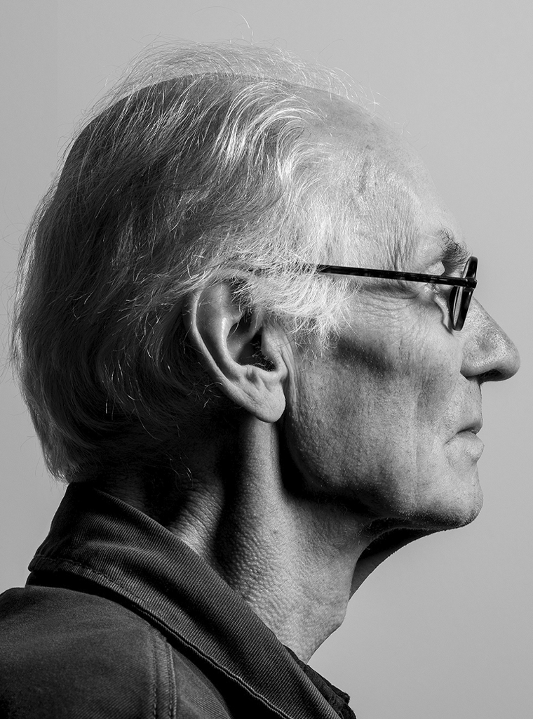
Portrait photo: Aatjan Renders