In the morning of 10 October 1974, Gerard Unger boarded a train in Bussum to Kiel, Germany. There he had an appointment at the Hell firm with Herr Peter Käpernick of the Schriftabteilung. One of Hell’s inventions was the Digiset, a typesetting machine that built up the shapes of letters by rapidly drawing small lines of light on light-sensitive paper. German typeface designer Hermann Zapf had advised the company to design typefaces that would exploit the advantages of this typesetting technique and overcome its drawbacks, but this was a lengthy, specialist and costly process that required investments to be recouped. Type designers were therefore a rarity at that time.
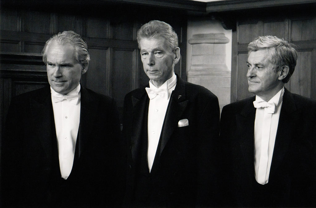
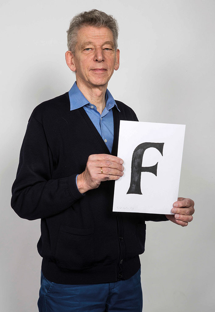
Gerard Unger (center) received his PhD from the University of Leiden on 5 September 2013. He is accompanied by his paranymphs Chris Vermaas and Bertil Arends, photo by Mariët Sieffers.
Sketches for such a letter were part of Unger’s travel luggage, and the next day he presented them to Käpernick. He saw potential in his ideas on how to design typefaces for a digital typesetting machine, but the proposal had to be drastically adapted to the rough grid of the Digiset. That day, a business relationship was formed that lasted for fifteen years and produced five font families. Unger traveled back to Bussum as the Netherlands’ youngest and highest-paid type designer.
After the five font families for Hell, seventeen more have been added, and together with the two that Unger designed at the start of his career, the total comes to 24. In addition, he carried out various graphic assignments and wrote many publications. From 1971, he taught typography for 34 academic years, mainly at the evening school of the Rietveld Academy. Nevertheless, he spent most of his time on type design, so the friends of his then young daughter Flora thought that her father wasn’t the smartest, because he was still drawing letters at home.
Books torn in half
Born in 1942, Gerard Unger grew up in Arnhem, as the youngest son in a family of three boys and three girls. His father sells yarn for the Arnhemse Algemene Kunstzijde Unie, which later merges with the Koninklijke Zout Organon to form AKZO. During a walk through the woods near Oosterbeek in September 1944, the Battle of Arnhem announced itself with thousands of paratroopers suddenly suspended in the air. For the two-year-old Gerard they were funny toy men, but for his father a sign to immediately turn around. After the battle, the family camped in a hotel on the Veluwe that burned down, then in a bakery, and finally in the chicken coop of a farm, before returning home on a horse and carriage in April 1945. During their absence, English and Canadian soldiers had heated their meals using books as fuel. Gerard remembers the disorganised bookcase with many books torn in half: a piece of Bosatlas, an issue of Arts et Métiers Graphiques that was out of its binding, and half of a PTT booklet by Piet Zwart in which he coloured.
After the war he learned to read and write. The replenished bookcase contains the magazine Rayon Revue, initiated by his father to promote the yarns of AKU, which was designed by Otto Treumann between 1947 and 1958. Thanks to a school friend Gerard becomes acquainted with the Christmas issues of the Drukkersweekblad in the printing office of his father. In the bookstore Hijman, Stenfert Kroese & Van der Zande, which he frequently visited, he finds First principles of typography by Stanley Morison, translated into Dutch by Jan van Krimpen, and Drukletters (Printing types) by M.H. Groenendaal. During his fifth year of secondary school, which he had to repeat, Gerard dropped out of school in 1962. After six months of compulsory military service he was considered unsuitable by the army, and at the age of 21 he began with the four-year study of graphic design at the Instituut voor Kunstnijverheidsonderwijs (Institute for Applied Arts Education), later the Gerrit Rietveld Academy, in 1963. During his first year he drew his first typeface and in his exam year he drew a second one, intended for engraving in laminated plastic. In 1967 he graduated with a study on the chronological development of numbers.

‘A counter-proposal’, Gerard Unger, Kwadraatblad, Steendrukkerij De Jong & Co, 1967
Revelation
Every teacher enriches his knowledge, especially illustrator Lex Metz, art historian Piet Zimmerman and typographer Theo Kurpershoek. The latter brings him into contact with people and institutes outside the academy, such as theTypografische Bibliotheek van Lettergieterij Amsterdam (Typographic Library of the Amsterdam Type Foundry) on the Bilderdijkstraat, where he meets Gerrit Willem Ovink. In addition to his special professorship at the University of Amsterdam, Ovink is also aesthetic advisor to the type foundry and manages its book collection. When freshman Unger comes to read frequently, Professor Ovink shows him the way and recommends books to him. Half a century later, Unger writes in his acceptance speech as professor: “This is how I was introduced to theory, which was a revelation: typography as a science almost complete, books as vehicles of their own science.”
He reads that the English type designer Stanley Morison stated: “Type design moves at the pace of the most conservative reader. The good type designer therefore realizes that, for a new font to be successful, it has to be so good that only very few recognize its novelty. […] Typography is the efficient means to an essentially utilitarian and only accidentally aesthetic end […].” Unger questions both principles because according to him, elegance can definitely go hand in hand with functionality. Or the other way around: besides being useful, a typeface may also stand out because of its tantalising and self-aware form.
After graduating in 1967, he started working at Total Design in Wim Crouwel’s team. A few months later, Crouwel publishes his New Alphabet, specifically designed for the digital typesetting machine, in which he constructs the letter shapes using only horizontal and vertical parts in order to compensate for the limitation of the low number of lines to which the photographic paper is exposed. This limitation inspired Crouwel, but also makes his assistant think, who is then given the opportunity to formulate a ‘counter-proposal’. Unger writes: “The introduction of a new alphabet requires people to adapt. It would make more sense to demand a modification of the machine. […] I want to stay as close to the old type forms as possible, because they are read the most easily.”
Independent designer
But Unger is not yet a type designer. After six months of Total Design, he was hired at advertising agency Prad. In 1968, he married Marjan de Boer, whom he met at the art academy. That same year, he was educated as a type director for Prad for two months in London, after which he set up typographic guidelines for internal use. Sixteen pages of advice with many examples, such as: “Ultimately, it should be a clear whole for the reader which he can easily digest, which he can read without difficulty.”
In 1970, Unger reduced his work for Prad to share a room with Bram de Does and Anton Witkamp for two days per week at the renowned printing house Enschedé & Zonen in Haarlem. Among other things, he is working on the Markeur typeface. This sans serif is milled in plastic (hence the rounded corners) and this is how Enschedé introduces itself to the signage market, moreover because lead letters have become history for this age-old company as well.
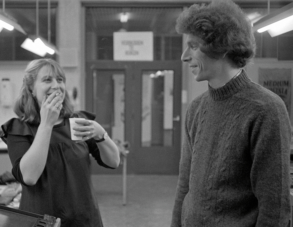
Gerard Unger and Mariet Numan in the typesetting room of the Gerrit Rietveld Academy, 1974 photo by Piet Schreuders
After leaving Enschedé and Prad, he establishes himself as an independent designer in 1972. Not much later, he tries to set up a signage design office together with former fellow student Paul Mijksenaar, but clients do not yet recognise its usefulness. Later, they both work on the Routext signage system and are part of Pieter Brattinga’s department who advises the Municipality of Amsterdam on the visual aspects of the metro to be built. For this, Unger designs M.O.L.(1975), again a sans serif and again with rounded corners. The latter to respond to the radiating effect of the light boxes in the underground. To further increase the typeface’s legibility, he enlarged the interior spaces by connecting the ends of the arches further apart from each other on the stem and then bending their ends less deeply inwards.
M.O.L. metro Amsterdam, 1975
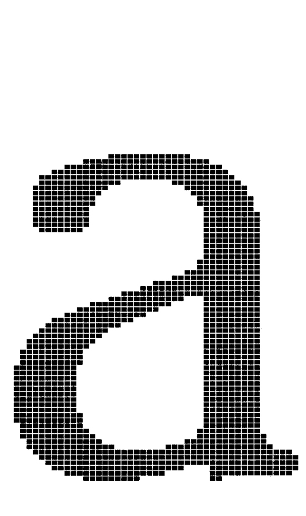
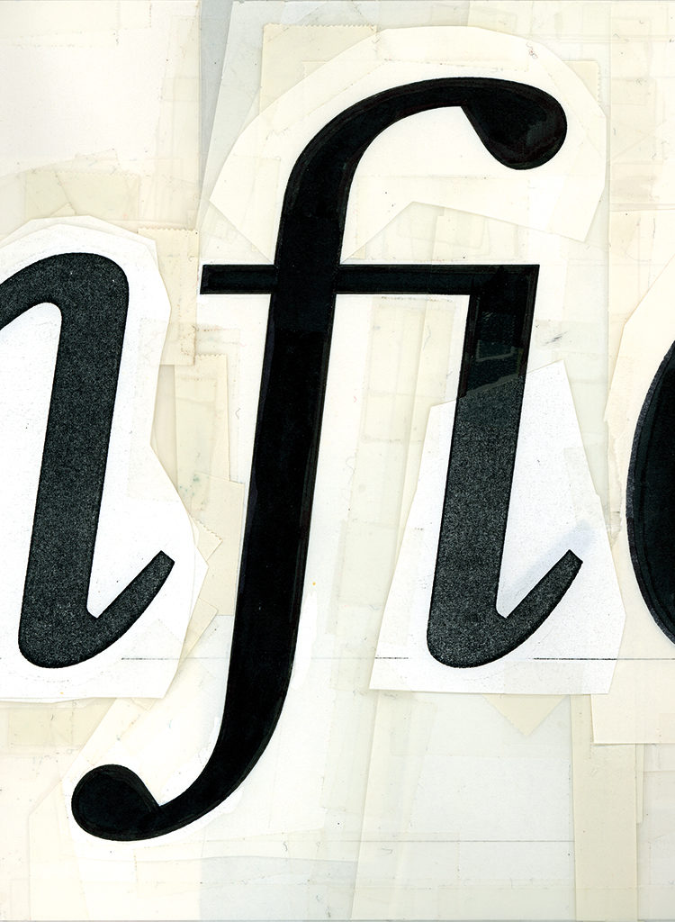
Demos bitmap a, 1975
Digital typesetting
In the meantime, the printing industry is in transition due to the rise of photographic typesetting. This process can be accelerated with a cathode ray tube by building up the letters with thin lines on photosensitive paper. In early 1974, prior to M.O.L., Unger designs his first text letter, which he shows to the Amsterdam-based printer Frans Spruijt. Eventually he comes into contact with the German company Hell in Kiel, after which he adapts his design for their digital typesetting machine. The following year, Hell releases this typeface under the name Demos (1975). The interior spaces have been enlarged, so that the letters can be better formed into words and the text lines have a more horizontal appearance. Unger further emphasises these larger interior spaces by shortening the length of the ascenders and descenders. Because the digitally controlled light beam scatters slightly during the typesetting process, Unger does not give the letter shapes any sharp angles. Hell released the sans-serif Praxis in 1976, which is based on the same principles, making it easy to combine with Demos. Unger was inspired by Jan van Krimpen’s typeface design Romulus from 1932 for his font family duo, which was unusual at the time.
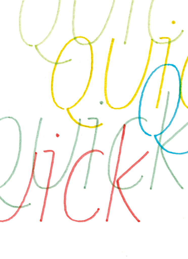
In the third episode of the series of ‘documentaries’ by Lecturis, titled Tekst over tekst (‘Text about text’) (1975), Unger states: “The Trajan capitals, writing with a flattened pen and the letters of Garamond no longer suffice as examples. The only thing we have left is convention […].” According to him, letter forms can vary more strongly because a ‘core alphabet’ is stored in our memory. He wonders “whether a standard design, a fixed typographic formula or a programme, using a limited number of resources, is sufficient for our current and future written communication”. He answers this question at the back of the issue: “Those who have more means of expression can say more.”
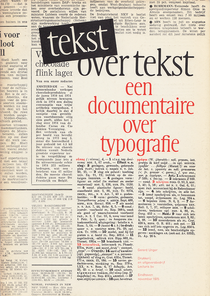
Cover Text over text (Text about text), Lecturis 1975
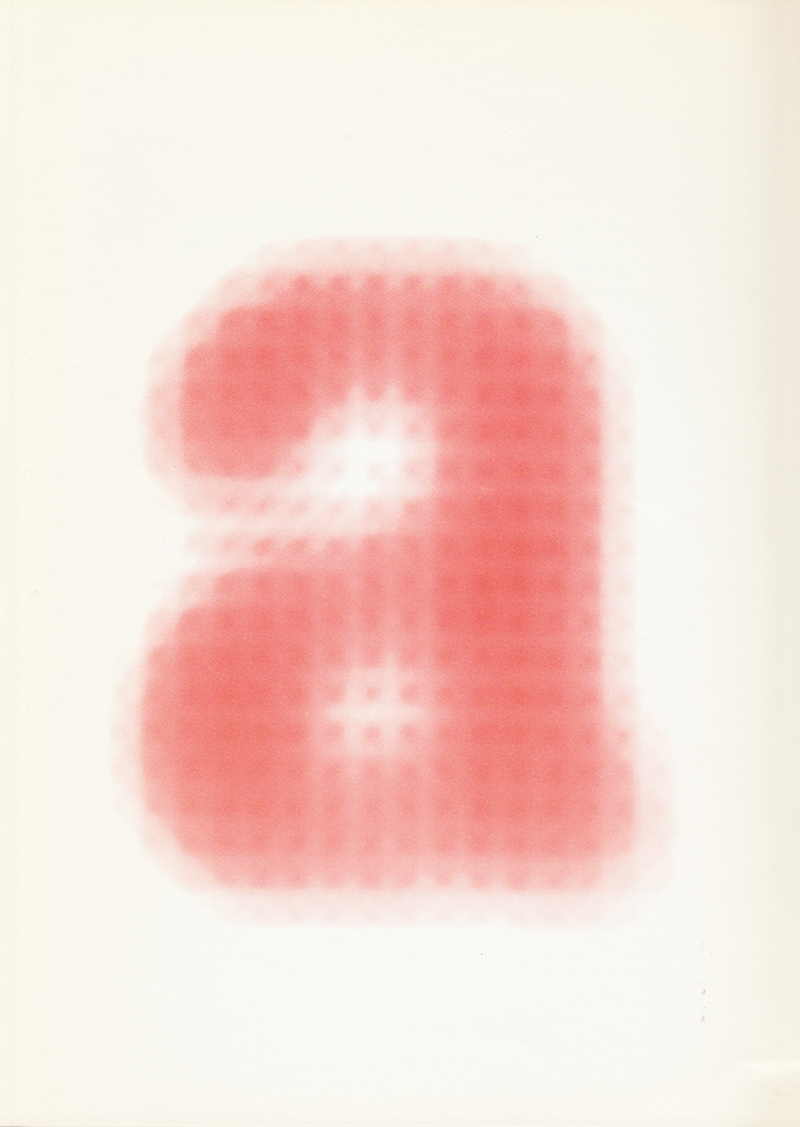
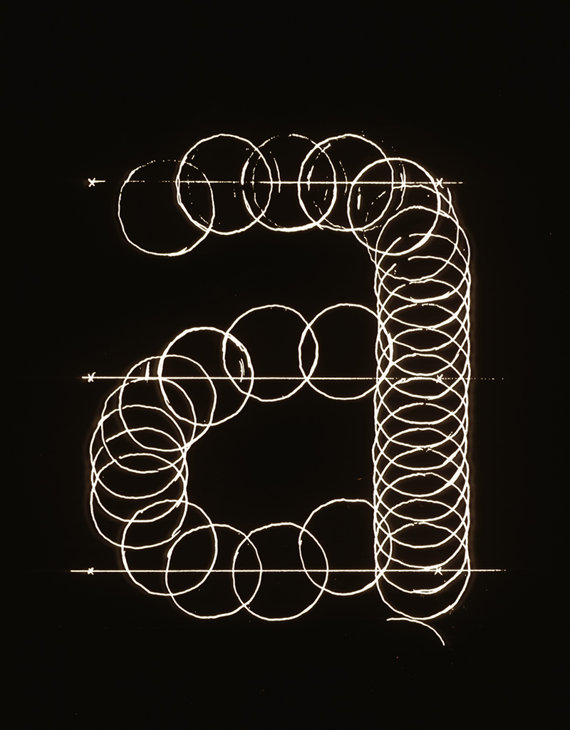
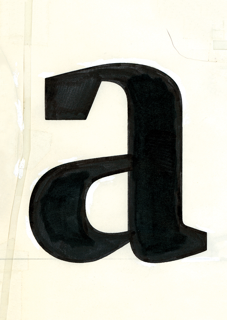
Core letter a, Text over text (Text about text), Lecturis 1975
Four years later, during a visiting professorship at the Rhode Island School of Design in the United States, he finds the correspondence of type designer William Addinson Dwiggins, who died in 1956, with the vice president of typesetting machine maker Mergenthaler, Chauncey H. Griffith. As a producer of the Linotype typesetting machine, they worked with Dwiggins on a typeface for newspaper typography, which was a difficult task due to the high printing speed, heavy press pressure, thin ink, absorbent pulp paper, and the small size of the letters. The Experimental No. 223 was Dwiggins’ end result, which was never carried out for several reasons, but included an ingenious intervention he called the ‘M-formula’. The ‘M’ stands for the puppets that he carved out of wood for his own puppet theatre and whose appearance is exaggerated to such an extent that the audience in the back row could still ‘read’ them clearly. This formula – the smaller the measure, the more pronounced the shape – also had to be applied to the character of typefaces in order to successfully transport their ‘face’ over the reading distance. From that moment onwards, Unger applied this formula toall of his type designs.
Hollander, design sketch, 1983
Flora, preliminary study, 1981
Flora, sketch, 1981
In the 1970s, advancing technology increasingly refined the grid in which the letter shapes are drawn. Nevertheless, the diagonal and curved letter shapes are still built up intermittently. This problem partially disappeared thanks to the vector technique that Peter Karow developed for drawing the complex curves of ship hulls. Together with Hell, Karow tested this technique on the drawing of letter contours in order to be able to enlarge and reduce them steplessly. Thanks to this progress, Unger is able to detail his letter forms more sharply and he draws the typeface Hollander, published in 1983, with pointed serifs. With its relatively large x-height, the design is based on the work of the 17th-century punchcutter Christoffel van Dijck. A year later, Unger presents the ‘upright italic’ Flora, which is the result of calligraphic experiments with ballpoint and felt-tip pens. The finer grid makes it possible to digitally display the tightly stretched monoline arches. The font is named after his daughter who was born in 1983.
Dot matrix printer typeface for Philips, 1980-1981
Argo a, 1991
Swifts
Unger has an office at home in Bussum and, in addition to his type design, writing and teaching work, with the assistance of former students he works on various graphic assignments. Signposts, house styles, magazines, books, stamps and everything else that requires expertise in typefaces, such as the typography for the Dutch guilder coins by Bruno Ninaber van Eyben, the letters on the Queen Beatrix stamp by Peter Struyken, the numbers for the Dutch telephone directories –1984 – and a dot matrix printer typeface for Philips that never made it to the market due to the overwhelming success of the laser printer.
A paint-corrected paste test for the italic Swift, 1985
Drawing of a bold version of Swift, 1985
A poster promoting Swift, 1985
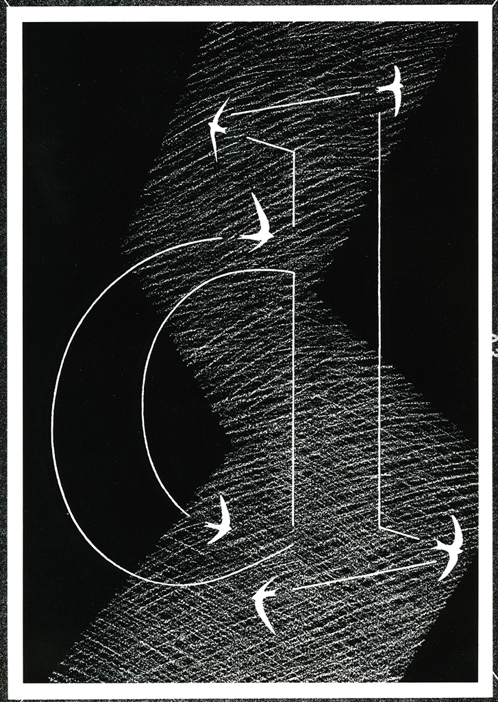
He often carries out graphic assignments with his own typeface designs, or they inspire him to create new ones, such as Swift from 1985, named after the common swifts that fly around his house. Their fast turns provide the inspiration for tight arches, and their large wings for sturdy serifs to allow the letters to get through the rough printing process of newspapers unscathed. Because printing has improved since, Unger is able to draw more elegant letter forms and, partly due to the great variation in weights and the many special characters for other languages, Swift is a great commercial success, not just for newspapers.
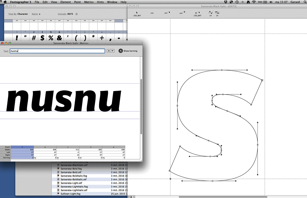
Swift is the last typeface to be released at Hell. In 1989 they closed their Schriftabteilung, which can no longer compete with the Apple computer and the accompanying software for designers who want to draw letters. The personal computer has democratised type design. The conservative influence of the traditional type publishers gives way to that of the experimental and self-publishing type designer. This development has resulted in an entirely new generation of Dutch type designers. In 1987 Unger invites a group of them to his home in Bussum to comment on each other’s designs. After this afternoon he realises that he is no longer the youngest type designer in the Netherlands and that they can no longer be counted on the fingers of one hand. One year later he bought the Fontographer programme himself, which he has since used to draw his letters on his own screen.
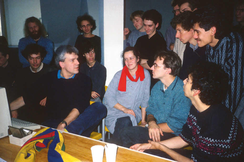
Gerard Unger at home in Bussum, among a young generation of type designers. With Evert Bloemsma, Petr van Blokland, Jelle Bosma, Ruud Franken, Bart de Haas, Henk van Leyden, Martin Majoor, Marie-Cécile Noordzij, Matthias Noordzij, Bart Oosterhoorn, Albert Jan Pool, Just van Rossum, Fred Smeijers, Rob Verhaart, Peter Verheul, Erik Vos, Wim Westerveld and Bas van Zanten. 1987 (photo Chris Vermaas)
However, the quality of the printers still leaves something to be desired. With the laser printer, the pixels are not close enough to each other to print the letter shapes intact. This problem inspires Unger to draw Amerigo (1986), which he developed for the American type publisher Bitstream and whose detailing can withstand the low resolution of 300 dots per inch. Unger also solves the same problem for the printers that the Dutch company Océ will sell. For them he designed Oranda (1987), taking the typewriter letter as the starting point because their market consists of the office segment. In 1991 Unger puts Argo on the market at URW in Hamburg, a sans-serif font that pairs well with Swift and the last typeface that he drew by hand. As the typeface market is now a global one, Unger is expanding his fonts with special characters, ensuring that they function technically well on various digital platforms. He now takes care of the promotion, distribution and financial handling himself. Together with Bavo van Rossum he sells Gulliver (1993), which is advertised as “the most economical typeface in the world”. For this font family, he increased the dosage of his proven recipes, such as enlarging the interior spaces, intensifying the character of the letter using the M-formula. This gives the smaller point size a larger ‘letter-gesture’. Gulliver, with its relative size, is named after the main character in Jonathan Swift’s Gulliver’s Travels, who looks like a giant when he visits the island of Liliput. For twenty years, Van Rossum and Unger have been selling this typographic efficiency at a high price in the market of bulk consumers, who easily recoup the investment. For example, the North American newspaper USA Today, which has trimmed three centimetres in width thanks to Gulliver and with its circulation of one and a half million copies, it needs to cut much less trees for the necessary paper.
Decoder, 1991
Delftse Poort, 1991
Experimental fonts
In the Californian magazine Emigre, which functioned as the mouthpiece for designers of experimental fonts who did not emphasise legibility in the 1990s, Unger published his essay Legible? in 1992, in which he states: “Reading creates its own silence. […] For a short moment, all those black signs disappear off the stage, change their outfits and return as ideas, as representations, and something as real images.” Where Unger previously pointed to the ‘functional’modernists’ constricting interpretation of legibility, in this essay he emphasises the non-functional interpretation of the ‘experimental’ post-modernists, which he later describes as ‘selfish experiments’.
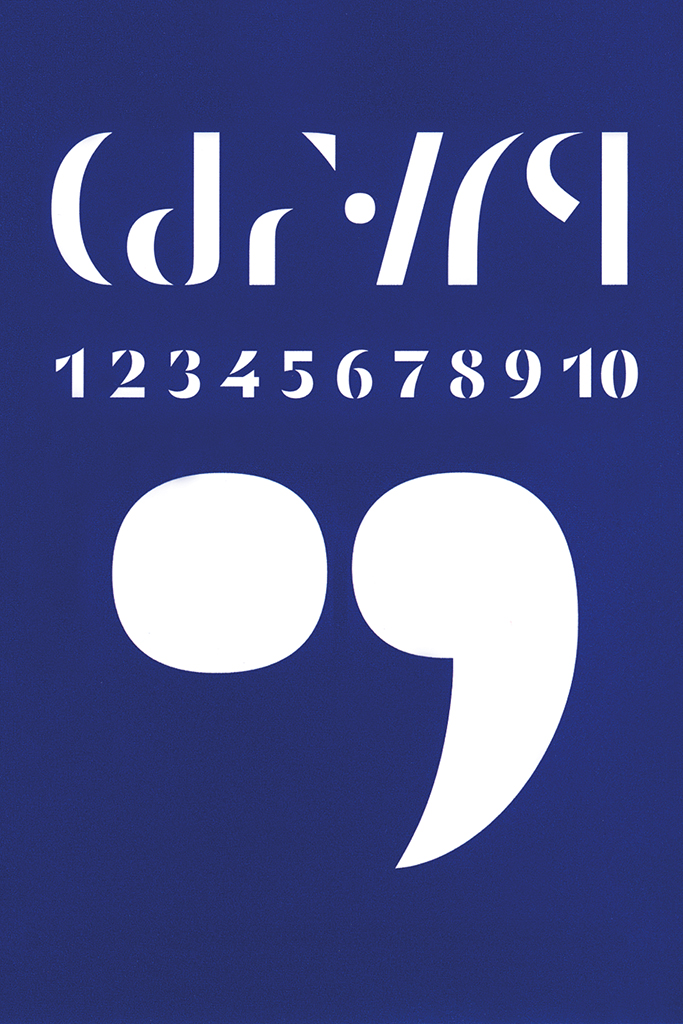
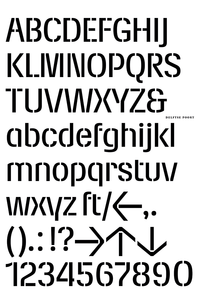
Unger himself presented his most experimental font one year earlier in the magazine Fuse, published by Neville Brody and Erik Spiekermann. In addition to one full stop and one comma, Decoder (1991) consists of ten separate shapes that can be combined to form all letters, numbers and diacritics. This project underlines that a type designer with a limited number of basic elements – their shapes, encounters and counter-shapes – constructs the characters of a font that as such show visual cohesion. In the same year, he designed the ‘stencil typeface’ Delftse Poort on behalf of the insurance company Nationale Nederlanden for the signage of their Rotterdam headquarters.
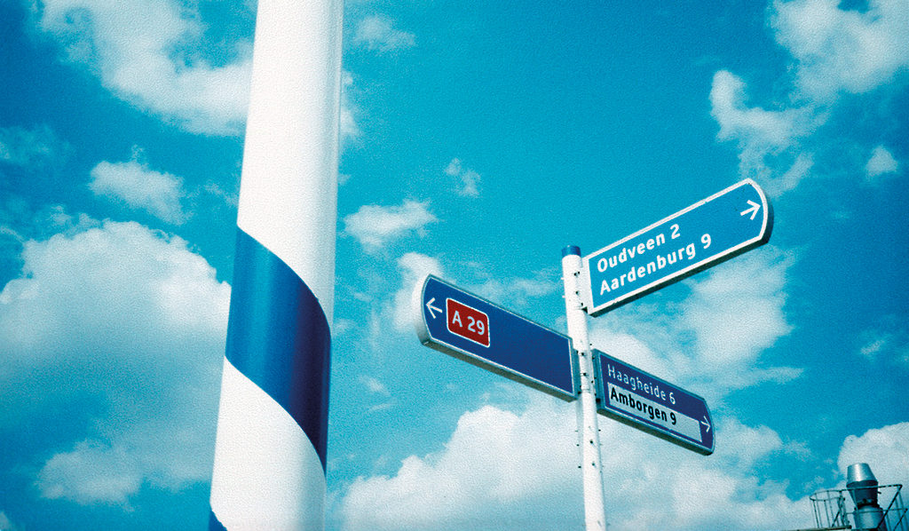
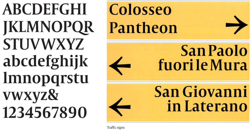
In the 1990s, two fonts appear for use in signage. One for the traffic signs of the ANWB in 1997, of which Unger increases its legibility over a greater distance. By adopting several characteristic details of the original font, his new typeface prevents dangerous situations on the road. Another font is made in order to guide the many pilgrims and tourists through Rome in a dignified manner in the holy year 2000. Unger based the shapes of Capitolium in part on the calligraphy of Giovanni Francesco Cresci who, in his 1570 publication Il perfetto scrittore, brought the capitals of the Trajan columns to the attention again by adding lowercase letters. Unger combines the elegant Southern European roundness with a clear northern structure and he uses it to design the signposts himself, which are ultimately not placed.
ANWB, 1997
Capitolium-Road, 2000
In 1997 he wrote a book about reading called Terwijl je leest (While You’re Reading), which he illustrated and designed himself. It is an ode to the readable appearance of language, again with the conclusion that, thanks to graphic conventions, we are able to communicate through distance and time. In the following years the publication appeared in Italian, English, German, Spanish, Korean, French, Portuguese and Chinese.
Meanwhile, from 1993 Unger teaches six times per year as a visiting professor at the University of Reading. He lectures at home and abroad, maintains his international contacts at the annual conference of the Association Typographique Internationale, the ATypI. In addition to his work for various clients, such as the FilmFonds, PTT/KPN, the Van den Ende Foundation and Rijksmuseum Twenthe, he is still making time – as his own client – to design typefaces.
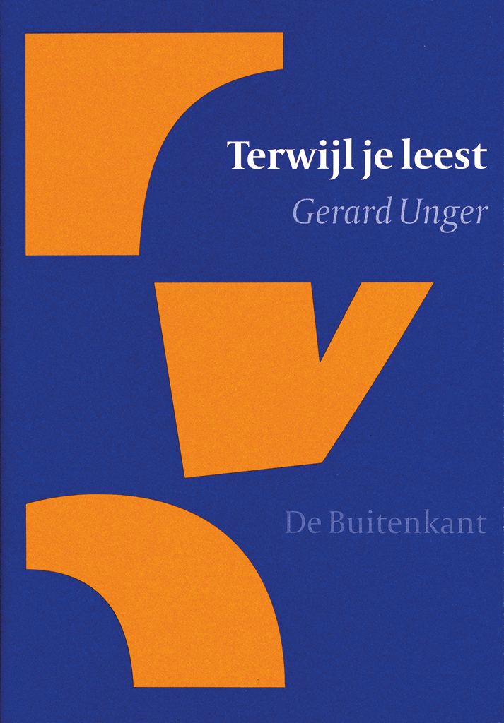
Cover Terwijl je lees (While reading), 1997
Logo FilmFonds, 2001

Double page annual report 1987 of De Bussy Ellerman Harms NV, 1988
Reading as a social right
He resumed his 1975 plan for a text typeface inspired by the work of the 18th-century French type designer François-Ambroise Didot, resulting in the serif Paradox (1999). Paradox again inspires him to draw the newspaper typeface Coranto (2000). This is followed by the sans-serif Vesta (2001), based on Roman capitals, in which their geometric structure disappears partly due to the narrowing of the letters, and partly due to the minimal contrast between thick and thin parts. BigVesta is an extended font family released by Unger two years later, where ‘Big’ refers to the increased x-height. Two years later, in collaboration with Veronika Burian, he designed Allianz (2005) for the German insurance company of the same name, consisting of serif and sans serif fonts in various weights for both paper and screen.
In 2006 Unger transformed his Capitolium, which was never used in Rome, into the newspaper typeface Capitolium News by increasing the x-height, so that a smaller size can suffice and more letters can fit onto one line, and by making the delicate shapes more robust for the rough printing process. From that year on, the newspaper De Volkskrant has set its columns in this font.
When he retired from the Rietveld Academy in the same year at the age of 64, Leiden University appointed him professor of typographic design. In his inaugural address entitled ‘Typography as a vehicle of science’, he argues that reading is a social right in order to participate in society. There have been experiments with the efficiency and aesthetics of reading since the nineteenth century, and the results reflect the constantly changing attitudes of this in society. As such, Morison’s theses about the conservative reader and utilitarian typefaces have been countered.
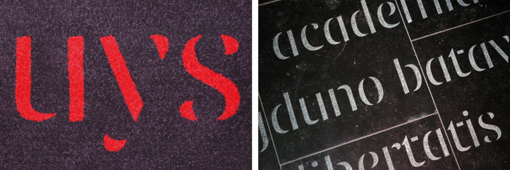
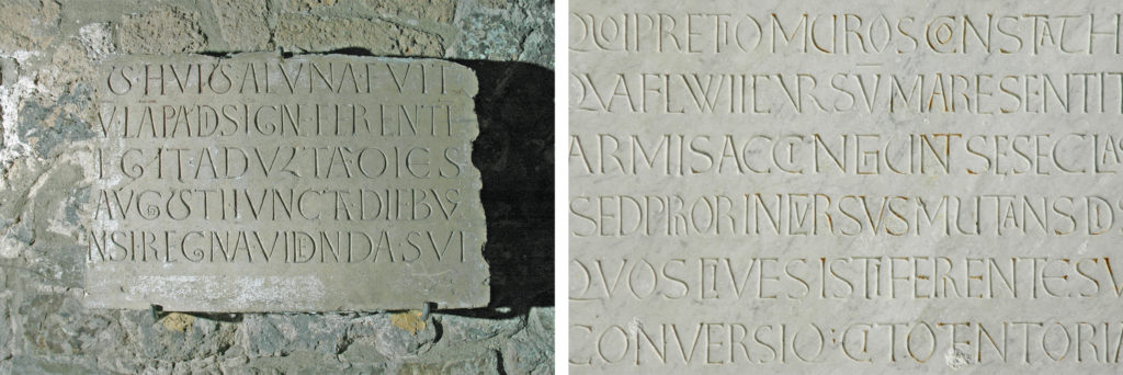
Detail of carpet (left), detail of millwork in stone (right), Leiden Letters, 2008
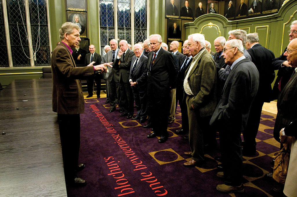
Unger does the same with his Leiden Letters (2008), which on the one hand can be viewed and on the other hand can be read, two activities that can never be performed at the same time. Because a ‘core alphabet’ is stored in the reader’s memory, Unger only needs to suggest the thin connections between the thicker parts of the letter. He reapplies this visual hint and many of his other principles in Alverata, based on eleventh and twelfth-century Romanesque capitals. He started in 2009 and obtained his doctorate on it four years later. Unger became acquainted with Romanesque capitals in 1976 in Moissac, southern France. The variation that the late medieval letter cutters put into the shapes of their letters inspired him to draw Alverata Irregular and Alverata Informal. One of the challenges was to design a font family which evokes a uniform typographic image across all European languages with all their different characters and letter combinations. For his research Unger travels throughout Western Europe to Romanesque churches and monasteries. He does not follow the examples faithfully, but applies them to the 21st-century letter structure.
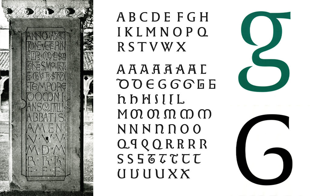
Sources of inspiration for and drawing overview of Alverata.
The extensive Alverata font family is the apotheosis of Unger’s oeuvre, in which he combines his typographic signature and all his proven recipes with experiments and scientific research. On 5 September 2013, Unger received his PhD from the University of Leiden with his thesis Alverata, contemporary European letters with roots in the Middle Ages, in which he describes the history of Romanesque capitals, type design in the 20th and 21st centuries, and the design process of Alverata.
Out of Alverata emerges Sanserata (2016), an ‘articulated sans serif’ with occasional small serif-like extensions to accentuate the ends and therefore improve readability, especially on screen.
Gerard Unger and Alverata, 2013 – Photo Maurice Boyer
Sanserata, 2016
The world of typefaces
In recent years, Unger has been writing on a forthcoming theory of type design, adding another publication to the long series of writings that have given many access to the world of typefaces. He wrote them at his desk, next to his undamaged and well-stocked bookcase. At home, a coach house renovated by former fellow student Mart van Schijndel on the Parklaan in Bussum, where he talks to his wife Marjan about work, exhibitions they visited or films they watched, and anything else that comes to mind, such as the delicious dishes they like to serve their many friends. Always colourfully dressed, often with a bit of purple and never with plain socks, he also never forgets to feed his rabbit and, when they are in the country, to greet the swifts.
After this he prefers to sit back at his work table, where he drew his typefaces, which, as graphic building blocks, form words and ultimately form language. And he is very serious about that, because when asked whether he would ever publish his own signature handwriting – a slightly cursive and readable monoline – as a font, he replies: “No, I think that would be childish.” Nevertheless, Unger’s hand is always recognisable in his oeuvre. Throughout the years, within the compelling conventions of typography, he became increasingly adept at efficiently fusing functionality with elegance, which earned him great admiration from the international community of type designers and which allowed the reader to read.
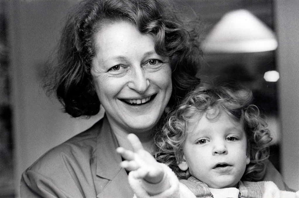
Marjan and Flora Unger, 1984 – Photo Bert Nienhuis
Gerard Unger received two honorary doctorates: from the University of Tallinn in 2004 and the University of Hasselt in 2008. He has also received several awards, including the H.N. Werkman Prize (1984), the Gravisie Prize (1988), the Maurits Enschedé Prize (1991), The Society of Typographic Aficionados Prize (2009), the Piet Zwart Prize (2012), the Type Design Award of the Tokyo Type Directors Club (2016) and the TDC Medal from the New York Type Directors Club (2017).
Gerard Unger
born on 22 January 1942, Arnhem
died on 23 November 2018, Bussum
Author of the original text: Chris Vermaas, November 2017
English translation and editing: Peter Hofstee
Final editing: Sybrand Zijlstra
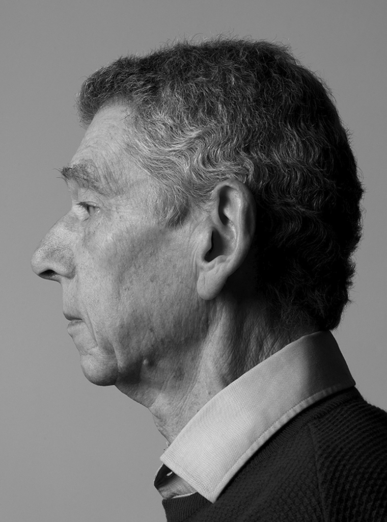
Portrait photo: Aatjan Renders