To many designers, it will sound like a great career: to work from home for years, to establish your own design studio, then to emigrate to America and end up at management level in the largest studios in New York, Los Angeles and San Francisco. With Henk Cornelissen it all went exactly the other way round: from large to small, from panorama to close-up, from Sunset Boulevard to an attic in Breda. Exploring his archive is like a flashback in slow motion. “In preparation of the interview for this publication, I pulled open old boxes, workbooks and chests of drawers. My whole eighty-year life passed by!”
Henk Cornelissen 1991, photo Jeske van der Poel
Ginneken en Bavel, Breda, Huijbergen
Henk Cornelissen was born on August 27, 1941 in Ginneken and Bavel (Brabant province), the middle one of three sons. His mother was left with her three small children after his father died in August 1944; according to his mother, his father drowned in the river De Mark. Although he was barely three years old at the time, Henk still has strong visual memories of his father. He vividly remembers sitting on his father’s knee and showing him a drawing of a house.
After her husband’s death, his mother refused to accept the church’s alms and searched for work. A few years later, she remarried a man who was the only one of his family to have survived the Spanish flu of 1918. An orphan, he had been put to the care of the nuns and brothers, so had no serious experience with a family life. He left the education of the children to Henk’s mother.
In 1948, the family moved to a new home in a working-class neighborhood in Breda. Already at primary school it became clear that Henk could draw really well. He remembers that in sixth grade a drawing he had made of the new Super Constellation aircraft remained on the blackboard for two weeks.
After primary school, boarding school followed with the brothers of Huijbergen; first MULO (middle school), then PABO ‘kweekschool’ (training future elementary school teachers). It was a good education; in addition to studying, lots of attention was paid to sports. While many boys suffered from homesickness, Henk loved it there. “I had a great time in Huijbergen. Fantastic. I was a loner. I took off on my own, into the woods. I wasn’t going to walk hand in hand with one of the brothers like most of the others did. I walked alone.”
St. Joost 1
It is at PABO in Breda that Henk discovers he wants to become an artist, and he signs up at St. Joost art academy. The first year he attends the evening school. His does well and his results are good enough to make him switch, after a year of evening classes, to the day school. Initially he doesn’t know which direction to choose. The department of liberal art and sculpture is his choice until Jan Begeer, a new teacher, tells him about all the possibilities the publicity department has to offer: graphic design, typography, three-dimensional design, photography, illustration. “I didn’t even know graphic design existed!” says Henk. He quickly decides, “This is it! I don’t have to make a choice. I can do everything.”
He feels at home in the publicity department, which will later be called graphic design department. He still speaks with great appreciation of his teachers of that time. “Jan Begeer was stimulating, Chris Brand taught you to look, and Wim Smits thought everything was ‘phenomenal’.” The department also offers a view of the world outside the academy and organizes excursions to, for example, legendary printing house De Jong en Co. in Hilversum and to exhibitions in Stedelijk Museum in Amsterdam.
Henk in an interview from 2008: “The visual world in which I fully consciously grew up was the one in which conceptual art – developing a train of thought and getting to the bottom of its consequences – and minimal art – bringing something back to its essence – took off.”
In 1963, Henk Cornelissen receives the St. Joost Medal, which is awarded to the best graduate of the year. The award is linked to a sum of money that allows making a journey abroad. A wonderful prospect, but the compulsory military service claims Henk first. He is selected to join the Infantry Reserve Officers School in Ermelo. After basic training, he becomes a platoon commander with the medical troops, stationed in Amersfoort. During the last months of his conscription, he services as the head of the Information Section, in La Courtine, France, where Henk and his team produce a weekly newspaper. He experiences flying on an airplane for the first time in his life; he visits the caves of Lascaux; and he attends many a wine festival. An accident of his stepfather calls him home. Even though conscripts with the rank of second lieutenant are well paid, Henk is happy to say farewell to the military. The army is not his world. He wants to go to America.
New York, Los Angeles, San Francisco
Magazines he reads in the library of the Stedelijk Museum help Henk to find the names and addresses of young and interesting designers in New York. It is not easy to get in touch with them in the mid-sixties. Henk gets help from Chris Brand, who gives him the address of Aaron Burns, the director of the International Center for Typographic Arts. Burns responds positively to the letter and the slides Henk sends and promises that he is willing to vouch for him. With the promise of a ‘paper job’, Henk is able to obtain the coveted permanent resident’s Green Card.
Commissions made in America, 1965-1971
On September 30, 1965, Henk arrives in New York City, where he visits the designers named on his list and receives several job offers, including from Milton Glaser and Herb Lubalin. To learn to master the American-English graphic jargon as quickly as possible, and to discover how things work in NYC design practice, Henk hooks up as personal assistant with Neil Fujita, a Japanese-American designer of book covers (including InCold Blood by Truman Capote), packaging, and annual reports. He stays at Neil’s for a year and a half and learns how American studios operate.
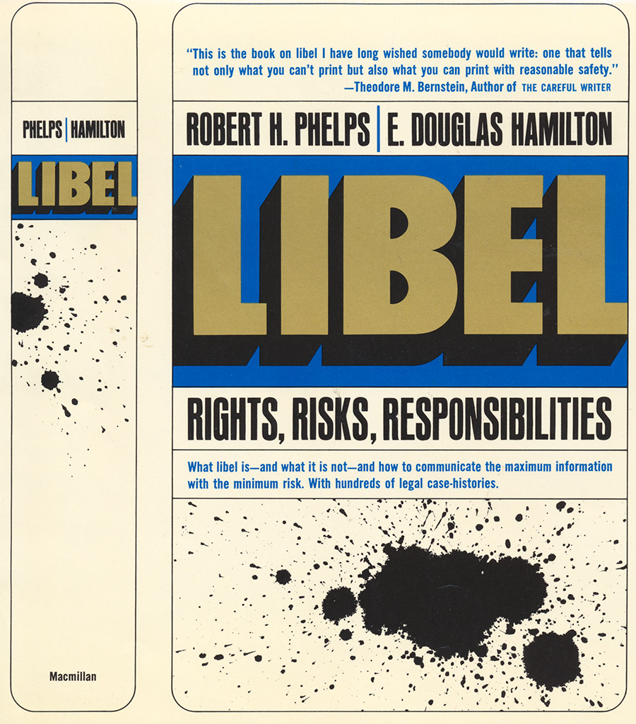
Bookcover Libel
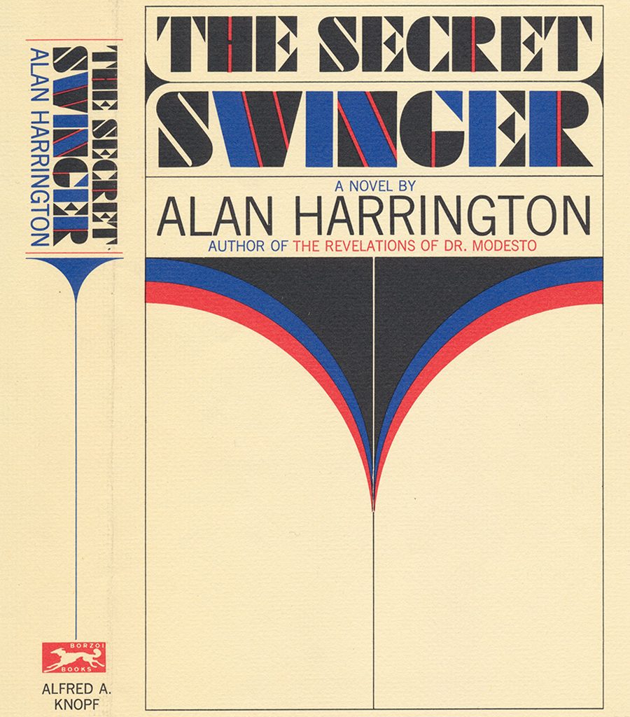
Bookcover The secret
Henk is only a month in New York when he meets Machteld (or Mac as Henk calls her) in Washington Square. Their eyes had already crossed, one time at St. Joost in Breda and later at the American consulate during their visa applications, but they had not made contact. This afternoon, though, in Greenwich Village, they start a conversation and instantly become friends. Later, after Machteld has returned to the Netherlands, Henk calls from New York on her birthday and tells her (the call lasts an hour and a half) that he misses her and that he would like her to fly back to New York.
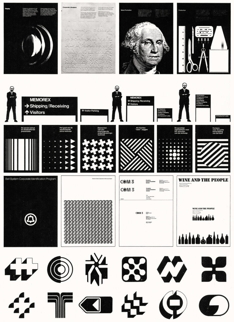
After attending his best Dutch friend’s wedding, Henk returns to America. It is December. Machteld occupies the seat next to his. A few months later, in the Subway on their way to the Cyclone roller coaster on Coney Island, he proposes to her. They get married on Dutch Liberation Day, May 5, and Neil Fujita is their best man. From 33rd Street near the Empire State Building they move to East 3rd Street near St. Marks Place and Tompkins Square. A lively neighborhood with the rock temple Fillmore East and the jazz café Slugs around the corner. They attend concerts of groundbreaking rock bands and discover many progressive jazz artists. By that time, Henk has joined the studio of Sandgren & Murtha’s, a large design agency specialized in corporate identity and packaging design; they are involved in the development of logos for a large number of companies, such as New York Stock Exchange, National Steel, Avis, Hershey Foods, Horace Mann Educators, Gilette, John Hancock, Corn Products, Transamerica, and Flextrac Nodwell.
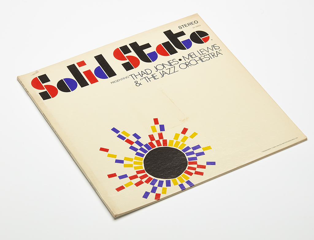
Record cover Solid State
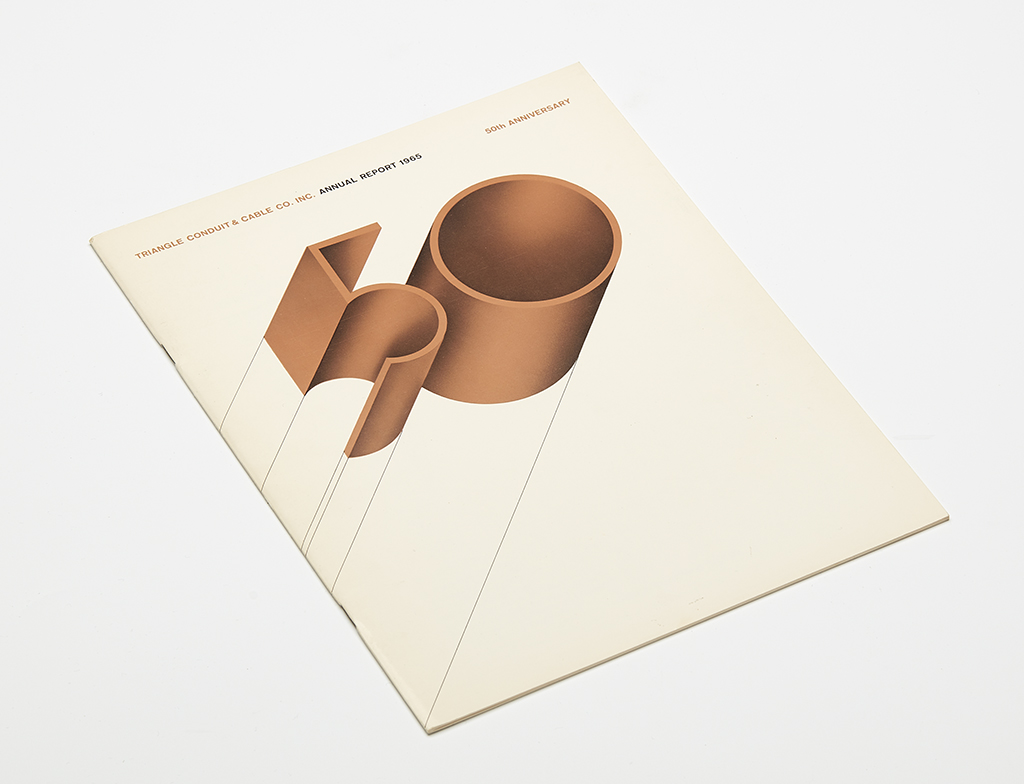
Triangle Conduit Annual Report, 1965
Henk says about the Canadian Flextrac Nodwell: “This Calgary-based company produced heavy track machinery for forestry. The presentation of the new logo took place during the shareholders’ meeting of General Dynamics, the group of which Flextrac Nodwell was a part. In the hall in Rockefeller Center, I noticed a photo exhibition of all sorts of war equipment. Our presentation was received with applause, yet I decided not to work on the project anymore. Having become a conscientious objector, I was vehemently opposed to the war in Vietnam.”
After three-and-a-half years in New York, Henk and Machteld decide they want to see more of America. They plan to travel for ten weeks all over the United States, Mexico and Canada. Two weeks of vacation are already more than most American employees get – ten weeks is unthinkable. Henk resigns. They head south in their Volvo station wagon and after visiting New Orleans they drive into Mexico to visit the impressive remains of the Maya, Toltec and Olmec cultures throughout the country. Back from Mexico, on their way north via the Grand Canyon and Death Valley, they stop in Los Angeles at the desk of Saul Bass, one of the most acclaimed American designers. Henk receives a solid job offer. They promise to call him after he returns to New York.
A few weeks later, after their road trip via San Francisco, Chicago, the Canadian cities of Ottowa, Montreal and Quebec has ended in the Lower East Side in New York, the phone is ringing. “Hank, are you still coming?” The answer is an unequivocal “Yes!” and Henk heads west again. Machteld arranges the move and follows later.
As a designer and project manager, Henk is involved in the introduction and implementation of the new corporate identity for Bell Systems, at that time the largest telecom company in America. “Saul Bass was God. Famous for his movie posters and leaders. And he proves to be the most social employer I’ve ever had. All staff shared in the success of the agency.”
Machteld and Henk live in Beverley Hills, but find the vast Los Angeles area rather boring and ugly compared to New York. “After six months, I was approached by Unimark International, at that time the best and largest design group, with offices in Chicago, New York, London and Milan, among others, to join them at a new office to be started in San Francisco. Although Machteld was expecting, we didn’t have to think about the opportunity for long. We found a spacious floor on Sacramento Street, near Golden Gate Park, next to the Children’s Hospital, where some time later our daughter Tessa was born.”
Together with Pieter van Delft and Bob Robb, Henk Cornelissen designs the corporate identity program of Memorex, producer of computer tapes and one of the first technology companies in Silicon Valley (which had not yet acquired that name at the time). Among other things, he designs the signage for the entire company complex. “San Francisco and the surrounding area were great, but when in 1971 I received a letter from Jan Begeer, asking me to come and teach two days a week in Breda, I immediately knew this was what I wanted to do. Six years in America were enough.”
St. Joost 2
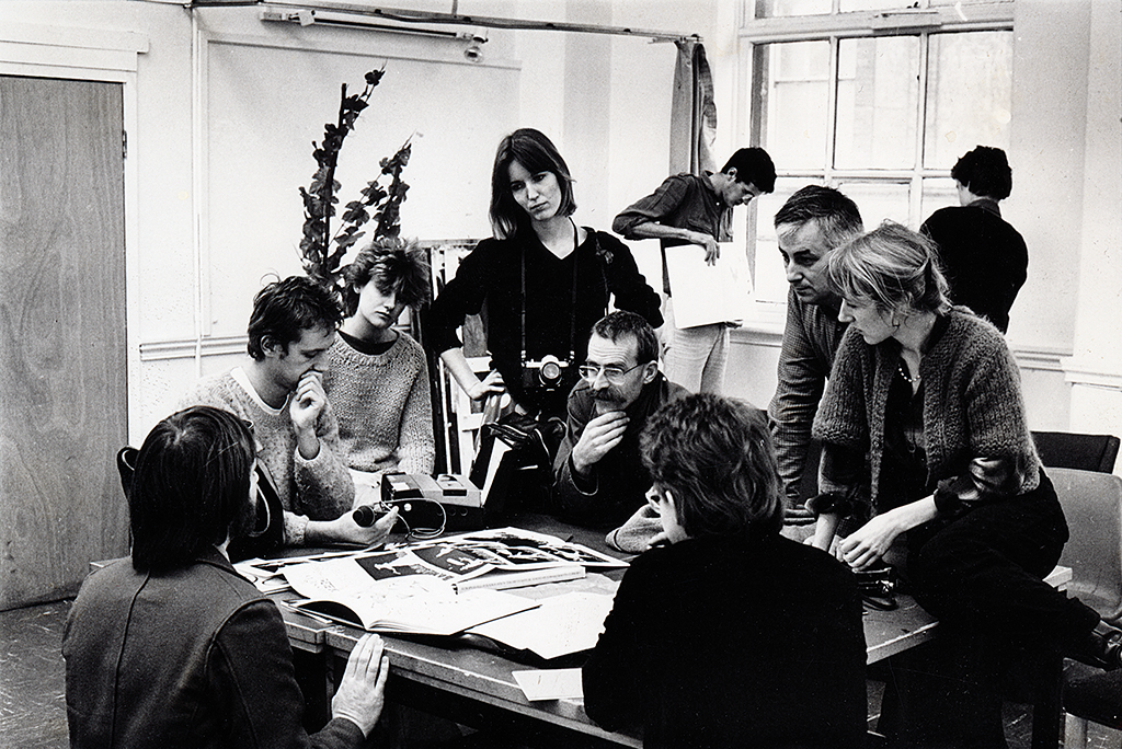
At his start as a teacher at St. Joost, the agreements about the division of responsibilities within the graphic design department are crystal clear. Henk says: “Jan Begeer focused on the emotional aspects of design and I taught form patterns and research. I was the first young teacher and with me they got a shot of the American mentality, ‘the sky is the limit’. For me it was clear that the students’ work had to be shown, that the students had to move out of the school into the world.” Therefore, Henk demands that all student assignments are concluded by a joint publication. Henk’s approach is strongly conceptual, but also understanding of the importance of the development of skills. “The first years I had students do lots of form and structure exercises. An assignment had to be a total project, that is, the design phase had to be followed by the realization of the designed product. I have always seen it as important that students also gain practical and professional experience by implementing their ideas. I received the full cooperation of our well-equipped workshops.”
Form studies St Joost Academy, left 7 1971, middle 8 1973-1974, right 9 1974-1975
Cornelissen & Kruijsen/Designers
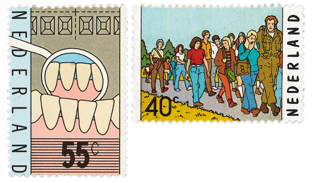
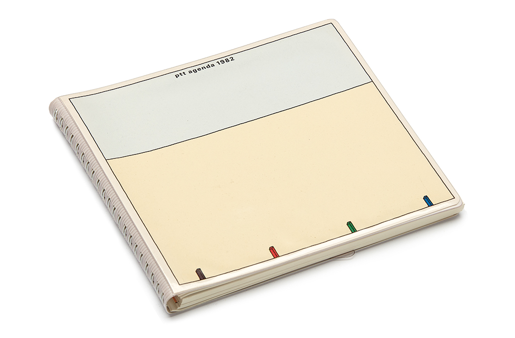
In addition to teaching at the academy, Cornelissen works as an independent designer in Breda. His best client is Ars Longa (applied arts, interior design and home furnishings). He designs their identity: logo and font, and their wrapping paper, shopping bags and a façade sign lettering of enamel. In 1975, together with former student Karel Kruijsen, he starts a design agency for graphic and three-dimensional design named Cornelissen & Kruijsen/Designers. Their first project is an exhibition about the Berlage Prize in Pulchri Studio in The Hague (1975); Ootje Oxenaar, heading DEV, PTT’s esthetic design advisors, is the one who recommends them for the job. DEV becomes an important client, commissioning them to design stamps, for instance on the occasion of the 40th popular Four Days March in Nijmegen, and on one hundred years of dental education, and also the PTT desk calendars for 1982 and 1983 (with illustrations by Ton Homburg).
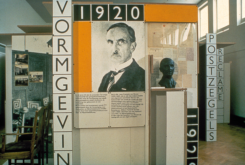
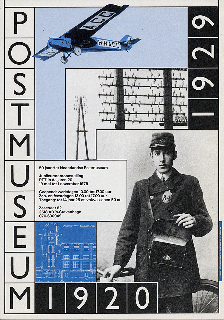
Exhibition and poster by Cornelissen & Kruijsen/ Ontwerpers, for the 50th anniversary of the PTT Post Museum, 1979
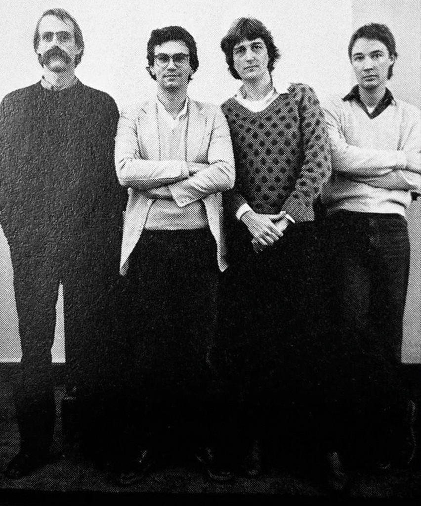
Group photo: Henk Cornelissen, Karel Kruijsen, Frans Bevers and Ton Homburg, 1977
For the 50th anniversary of the PTT Post Museum in 1979, Cornelissen & Kruysen/Designers develop the exhibition, the poster, a postcard and a postmark. The 3D part of this exhibition is designed in collaboration with Frans Bevers, who was involved in 1976 with the renovation and interior design of the former V&D department store, now Breda’s public library (1978), a huge project that included the design of a complicated signage system.
Work by Cornelissen & Kruijsen/Ontwerpers,
1975-1983
Other clients include Schapers–Oome–Brabant Groen, Record Service Benelux, Brabant Biennale, Van Gurp florist, Doe Het Zelf magazine, Stadsschouwburg Eindhoven. And EADI, the European Association of Development, Research and Training Institutes; they commission Henk to design their identity program and letterhead, which Henk now counts among his best work. For the Herwig Garden Plants Encyclopedia and the Herwig Houseplant Encyclopedia he not only designs the cover and interior lay-out, but also a series of twenty-five symbols; the use of them makes it possible to save some forty pages of text per book.
Cornelissen & Kruysen/Designers grows from a two-man studio to an agency with six employees in addition to Henk and Karel, including Frans Bevers, Ton Homburg and René Pijnenburg. After eight years, the collaboration comes to an end, which is three years later than was mutually agreed on at the start.
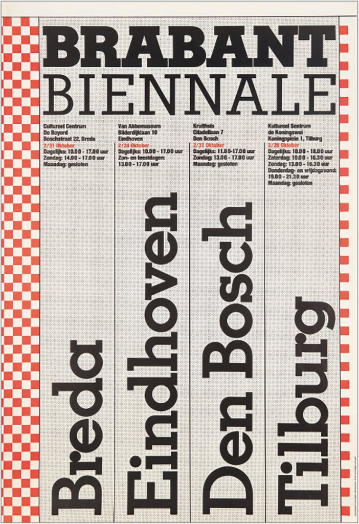
Poster Brabant Biennale, 1976
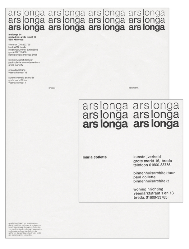
Corporate identity Ars Longa,1973-1976
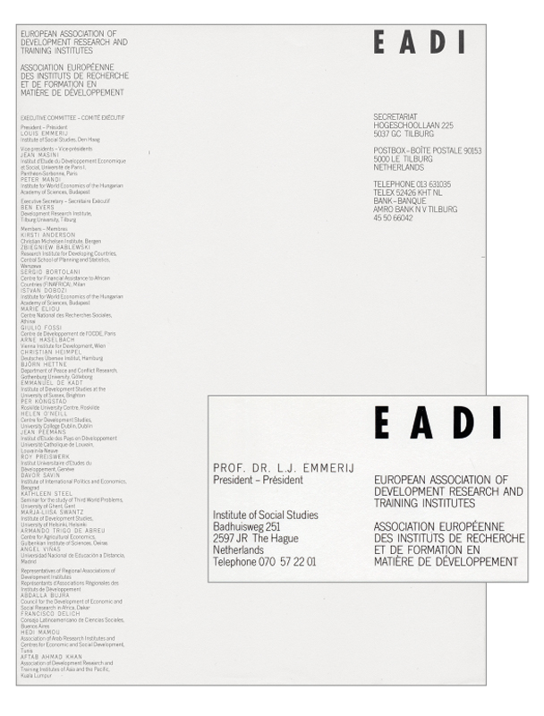
Corporate identity EADI, 1979
Maastricht and Hilversum
From 1983 to 1985 Cornelissen is connected to the Jan van Eyck Academy in Maastricht, where he supervises artists who want to create and produce artists’ books. He fondly remembers his in-depth discussions with the students. The experience will prove to become decisive for the direction his professional life will take later on.
In 1984, it is farewell to St. Joost as Henk becomes the head of the design department of NOS, the Dutch national television broadcaster. He manages more than forty employees who create leaders for almost all Dutch TV networks. In addition to handling the assignments and managing the team of designers, he spends much time dealing with program producers and discussing budgets. He works with a number of interesting designers, such as Frans Lasès, Ron van Roon and Ko Sliggers. However, Henk does not feel at home in Hilversum; the increasing commercialization of the broadcasting networks has a negative impact, also on his work. And he misses education. He makes use of his daily commute from Breda to radio and television city Hilversum, and vice versa, to prepare and formulate assignments for students – students he does not have yet, but whom he expects to deal with in the foreseeable future.
St. Joost 3
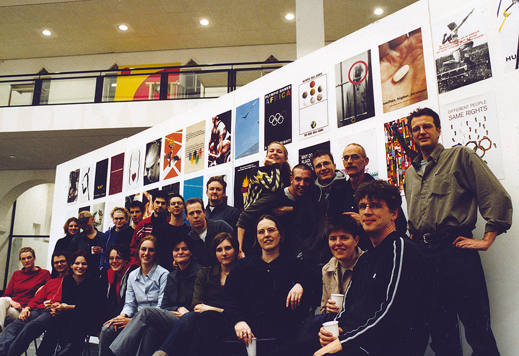
Within a year Henk resigns from NOS to return to the art academy in Breda, where he succeeds Jan Begeer as a teacher and as the department chair. Together with graphic design teachers Hartmut Kowalke and Geert Setola he works on the expansion of the already excellent reputation of the department’s study program at home as well as abroad. Henk has been fifteen years on the job when he again says farewell to St. Joost and retires from teaching in 2000.
Royal College of Art, Londen. Henk with Geert Setola and the students Hans Arnold, Vincent van Baar, Berry van Gerwen, Jaap de Jonge, Michel van der Sande, Bernadet Willemen and Giet Zwetsloot. Far left Dan Fern, the host. 15 January 1981
Henk with Berry van Gerwen and students. Olympic Games and Human Rights, 2000
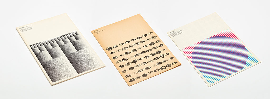
In his third St. Joost period, Henk lets the substantive aspects of the assignments play a more important role. This approach results in magnificent publications, such as Almost Black (1986), 28x28x28 (1987), Arrows/Arrows (1992), Pairs and Opposites (1994), Figurative Marks (1994/95), and The Only Real (1997). These publications, an active internship policy and successful participations in international poster competitions such as L’Eau, L’Europe, L’Environnement (Paris, 1990), Football, Culture du Siècle (Paris, 1998), and The Olympic Games and Human Rights (Melbourne, 2000) ensure that the curriculum is recognized as the best in the Netherlands. The French magazine Azimuts devotes an article to the department titled ‘Le graphisme à Breda’ (no. 3, 1992).
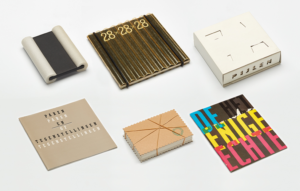
Publications Academy St Joost, Graphic Design Department, 1986-1997
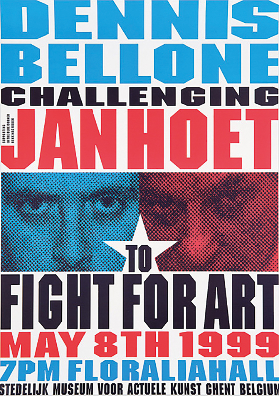
Poster, Dennis Bellone challenging Jan Hoet, Fight For Art, 1999
Worth mentioning is a project that has never been seen by anyone and of which no one except its creators knows where it was carried out. When it becomes common knowledge that St. Joost is moving to a new location, Henk decides to leave ‘something’ behind in the vicinity of the old building and gives it the title Future Archeology. Students provide ideas, and the one presented by Chrisjan van Tiggelen is chosen. It proposes to construct a large pod that contains thirteen beans, one from each participating student or teacher. In the middle of the night, the huge pod cast in bronze is buried in a secret place. The bean Henk contributes is made from a piece of coal taken from the cellar at Bauhaus and symbolizes The Energy of Dessau. Henk speaks with enthusiasm and boyish glee about this action, but he refuses to give details of the project. It remains ‘the secret of Breda’.
Christmas and New Year stamp 1987/1988
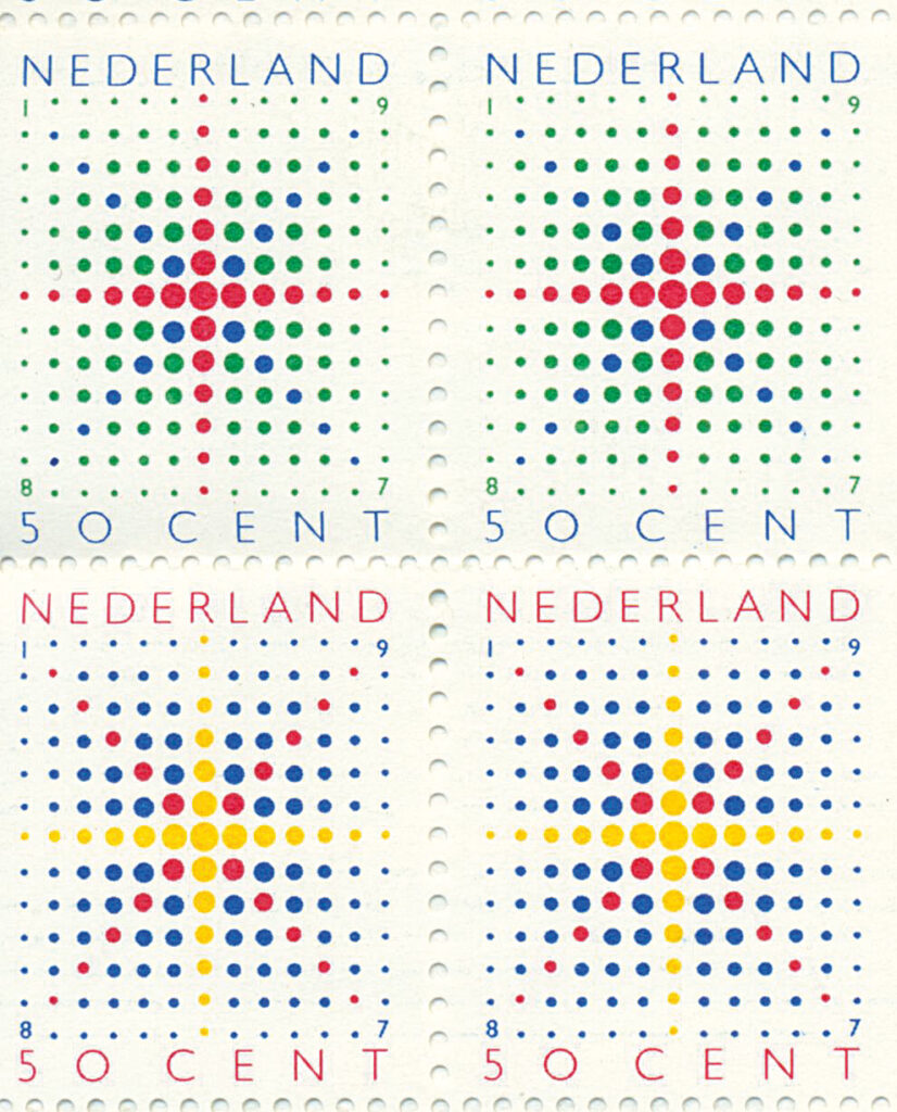
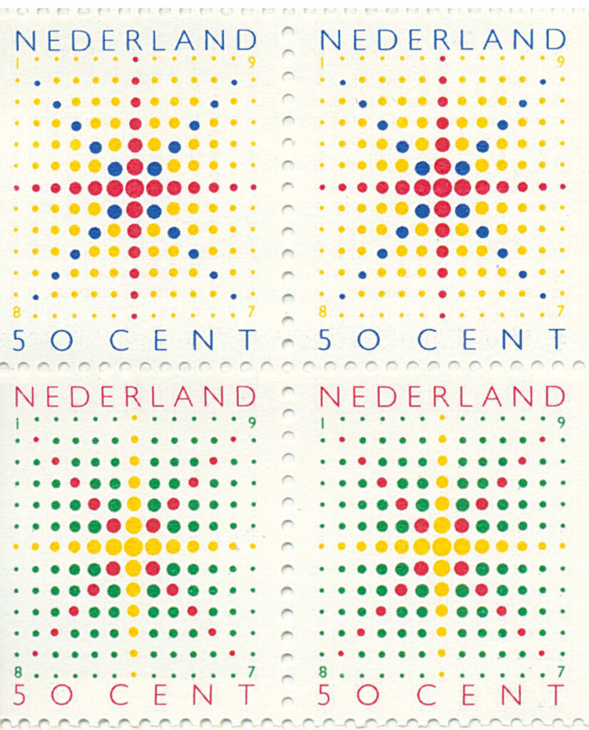
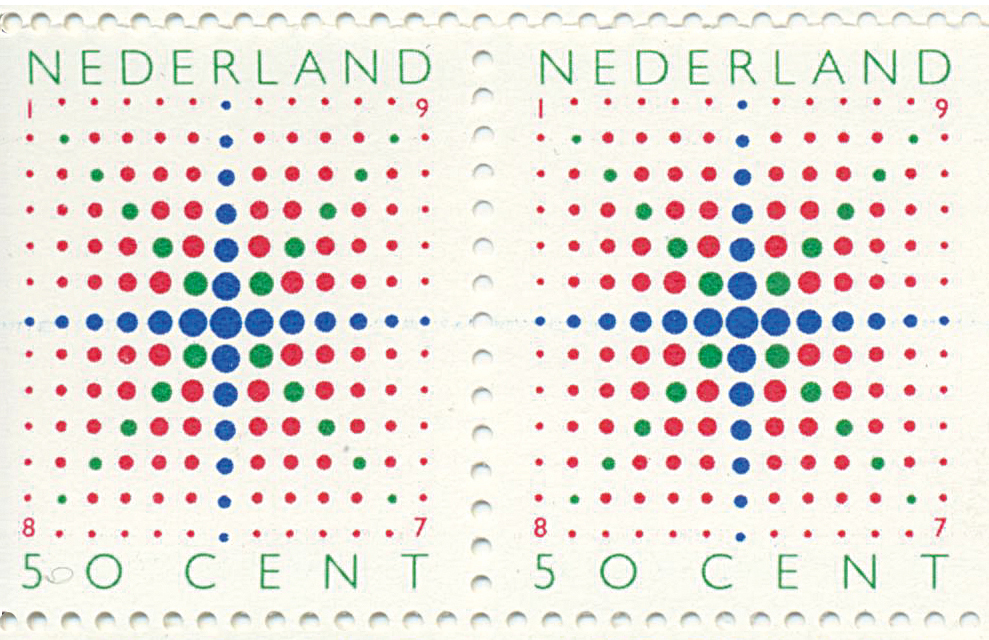
In 1987, Henk is asked to design a Christmas stamp for the national postal service, PTT. The Netherlands is one of the few countries that has never before issued a Christmas stamp. The reason is political and has to do with the separation of church and state. Therefor the original assignment is to design two stamps, a Christian and a non-Christian one. Henk – after initially agreeing with this idea – decides he cannot accept the assignment. He manages to convince the client, PTT, that it should not be a Christmas stamp but one that honors the end of the year. For Henk, both Christmas and New Year are celebrations of light. He develops a dot structure based on the horizontal and vertical toothing of postage stamps. The dots become smaller and smaller towards the edges and corners. The way color is used in the design presents new meanings: candle flames, Christmas stars, fireworks. PTT decides for the first time to not issue a stamp sheet but a booklet containing twenty stamps. From the hundred variants he has developed, Henk selects five. His gift to the Netherlands is a beautiful series of stamps, but to himself he gives a new life.
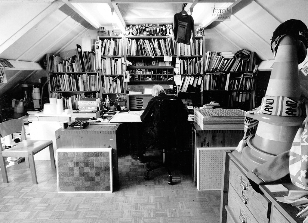
In the attic
“The experience of endless sketching and creating variations while designing the stamp was fascinating. I realized that I should continue on this path. After designing the stamp, I decided: no more design work on commission. If there are limitations, I will discover them myself, I don’t need someone else to restrict me. From now on, I will only make free work.” Now, in 2022, 34 years and more than 700 art works later, this is what he is still doing. Every day around 10 a.m. Henk disappears into the studio on the top floor of his home where he continues to work on his random structures often until late in the evening.
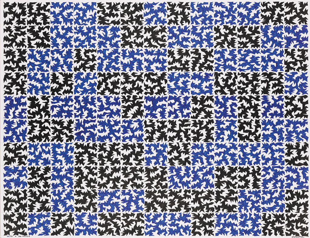
Free work, 2001
See more at www.henkcornelissen.nl
“Sometimes it is content that motivates me, a report in the newspaper, the American elections or my smoking addiction, but most of the time it is a formal principle. Before I put a pencil (or whatever) on paper, I do trials in my notebooks. I base my decisions on these trials. I decide in advance exactly what I am going to do, but there is always the factor of chance to reckon with: it can be the dice, maybe a time schedule, or a quantity. I strictly adhere to the self-imposed restrictions. Actually, the only thing that can surprise me is chance: I never know what exactly the outcome will be, only that it will never be an automatic repetitive structure that remains unchanged all over the entire sheet of paper. The size of the paper is fixed, it’s standard, a 50 x 65 cm landscape.”
Free work, 2012
See more at www.henkcornelissen.nl
TOEVAL (Coincidence)
In 1992, Henk Cornelissen decided to literally challenge chance by using the letters T, O, E, V, A and L (spelling ‘toeval’, which means chance or coincidence in Dutch) and assign each of them to one eye of the dice. The rule is that he has to throw 1, 2, 3, 4, 5 and 6 in a row to form the word ‘toeval’. After each throw, he stamps a letter on a standard sheet of paper. Every six throws form a word, followed by a space, 18 words per line, 48 lines per sheet, nine sheets per year, stamped in a different color each year. The laws of probability determine that the chance to get the word ‘toeval’ in six throws is 1 in 279,936. On Thursday, January 9, 2003, at 2:12 p.m., on the 100th sheet, after 516,228 throws, the liberating word finally showed up, as witnessed by Machteld.
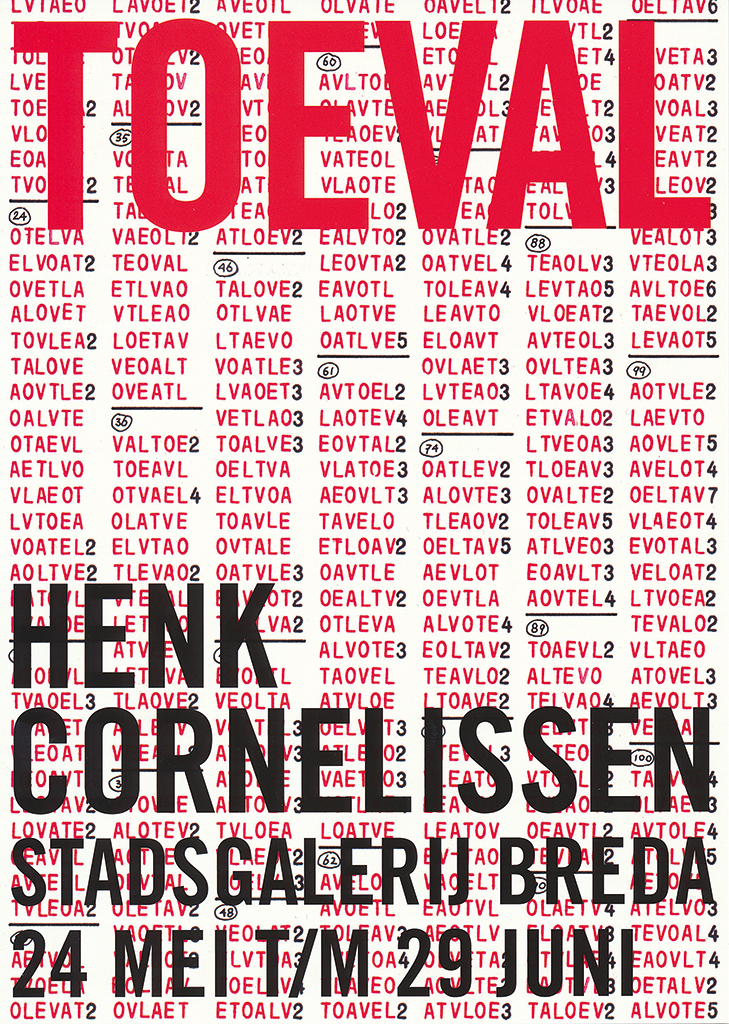
Video about the project TOEVAL, made by P&P directors, Breda
As a follow-up, Henk registered all 86,038 possible words on six new sheets in the years after 2003. This showed which words had not fallen, or if they did, how many times. The exercise delivered a breathtaking graphical presentation. The entire project was exhibited in Breda during the 2008 Graphic Design Festival Breda, at the invitation of the festival’s organizer. In 2007, Henk Cornelissen had already received the Culture Award of Breda for putting the city on the map and make it known as city of graphic design.
The world
Henk and Machteld have seen a lot of the world: in addition to the United States, Mexico and Canada, they traveled to Morocco, the North Cape, Ireland, southern Italy, Greece and eastern Turkey. In more than fifty years of road travel they wore out a Ford Transit, a Mercedes bus, a Volkswagen Transporter and a Peugeot Boxer. Nevertheless, since 1988 Henk has spent most of his time in his attic studio in Breda, in continuing self-chosen isolation.
“This has to do with the fact that when I was very young, I wanted to do one of two things with my life. I either wanted to mean something to the world as a missionary, for example in education, or to retire to a strict monastery. Looking back today, I see that I dedicated the first part of my life to society through education and my work as a graphic designer. In the second part I have withdrawn, not into a monastery cell but into my own attic, where the only thing I have to think about is my work.”
Machteld
From the first days in New York to the long years Henk spent in his attic studio, Machteld was always there. Henk can still be found in his studio, and Machteld is never far away. It will not surprise anyone that their closeness also turned out to be a topic for a project. Ever since they started living together, Henk has been making a three-dimensional object for each of Machteld’s birthdays. An impressive series of objects has emerged, a testimonial of a love even greater than his love for series, numbers and systems.
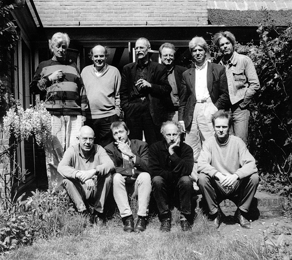
Teachers St. Joost, 1994 Standing: Geert Setola, Hugues Boekraad, Henk Cornelissen, René Pijnenburg, Paul van ‘t Hullenaar, Bas Wilders. Seated: Hartmut Kowalke, Rens Holslag, Dominique Ampe, Jaap van Triest
Henk Cornelissen
born on 27 August 1941, Ginneken en Bavel
Author of the original text: Frans Bevers, September 2022
English translation and editing: Ton Haak
Final editing: Sybrand Zijlstra
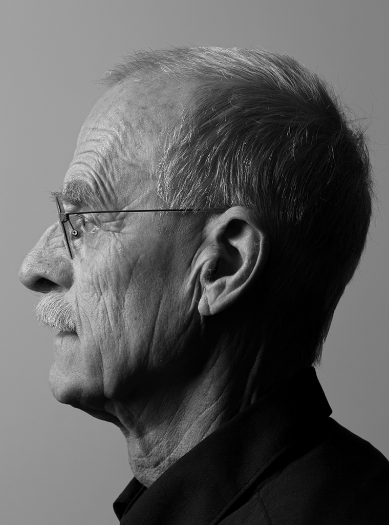
Portrait photo: Aatjan Renders