“Packaging design is a real specialization; as a designer, you cannot do it just like that. I realized I had a feel for it the day I first saw Louis Swart’s work, who at the time designed packaging for Albert Heijn. Later, I had the opportunity to join his agency and I ended up doing projects with Louis that, I believe, still very well reflect the taste and the general atmosphere of that period. That’s what is so fascinating about this profession. You must appeal directly to the public. A packaging designer creates portraits of an era, experiences, memories.”
“Everything was still in its infancy then. We worked a lot by intuition. Later, much more was possible technically, extensive research was done, and marketing became more and more important. But I still think intuition should be the foundation. How do you entice someone to make a purchase. How do you clearly position a product and a brand on the shelves surrounded by its competitors. And how do you persuade people to choose that specific product. It has to match what they are expecting while at the same time being distinctive enough to attract the eye. And someone who is used to buying the same product must be able to recognize it easily but must also be kept from trying something else. It’s a continuous balancing act.”
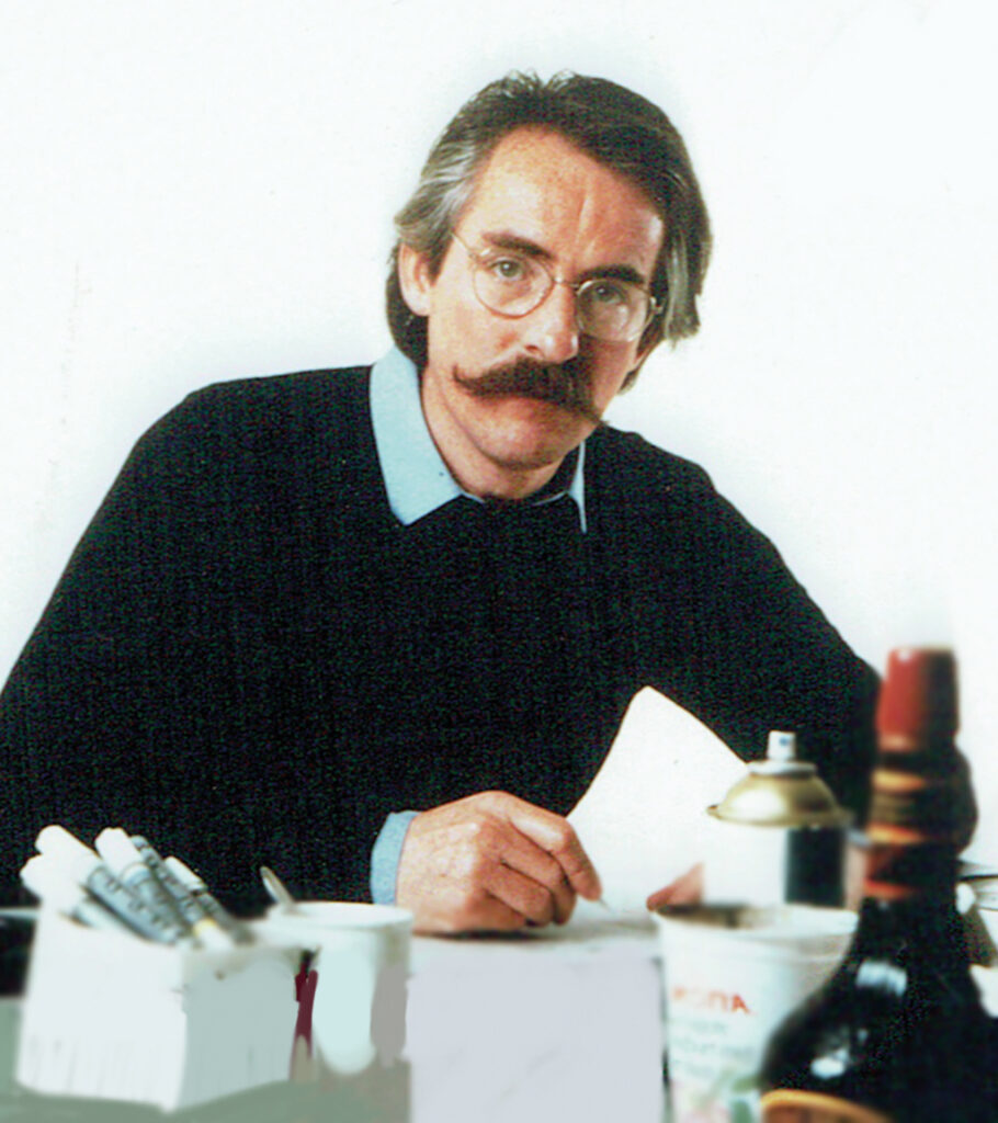
Joep Bergmans, 1982
Effective
Whoever asks Joep Bergmans (1941) to tell about his career enters a conversation with a man who knows where his passion lies and who has been able to arrange his whole working life around it. A working life centered around designing for products, brands, and companies familiar to everyone in the Netherlands. Dairy products, snacks, drinks, coffee, tea. Everyday products of which most people seldom realize how much creativity, research, craftsmanship, daring, and risk they involve.
“Of course, I am proud of receiving so many awards for our work. I was asked to join juries, my work got published in yearbooks and professional magazines, including Graphis. It’s very pleasing to see your work published, but what matters is the work itself. Packaging design is supposed to contribute to the success of products and companies. When that actually happens, for example, a spectacular growth in sales after the redesign of a product, or when you see your own work at eye level on the shelves of every supermarket in the country, that’s a tremendous feeling. Even though I am well aware that not many people will notice it. They don’t have to. What’s important is that it works.”
“I already knew when I was a boy”
The family he grew up in taught Joep at a young age to see with the eyes of a designer, a creator. His father, Jac Bergmans, was an ambitious entrepreneur and even more passionate as a lover of art and design. Inspired by designers like Charles Jourdan in Paris and Herbert and Beth Levine in New York, with whom he established close friendships, Jac Bergmans designed and produced shoes, some of which were internationally awarded and became exemplary for Dutch footwear from those days. Stimulated by his environment and having inherited some of his father’s talents, Joep decided at a young age that he wanted to become a designer. He wanted to make things more beautiful, simpler, and easier to understand. Especially the graphic aspect appealed to him, which he became acquainted with through magazines his father subscribed to, such as Graphis and Domus. No surprise then that after graduating from high school he went to Amsterdam to study at the Graphic School while taking classes at IvKNO, the future Gerrit Rietveld Academie, in the evening.
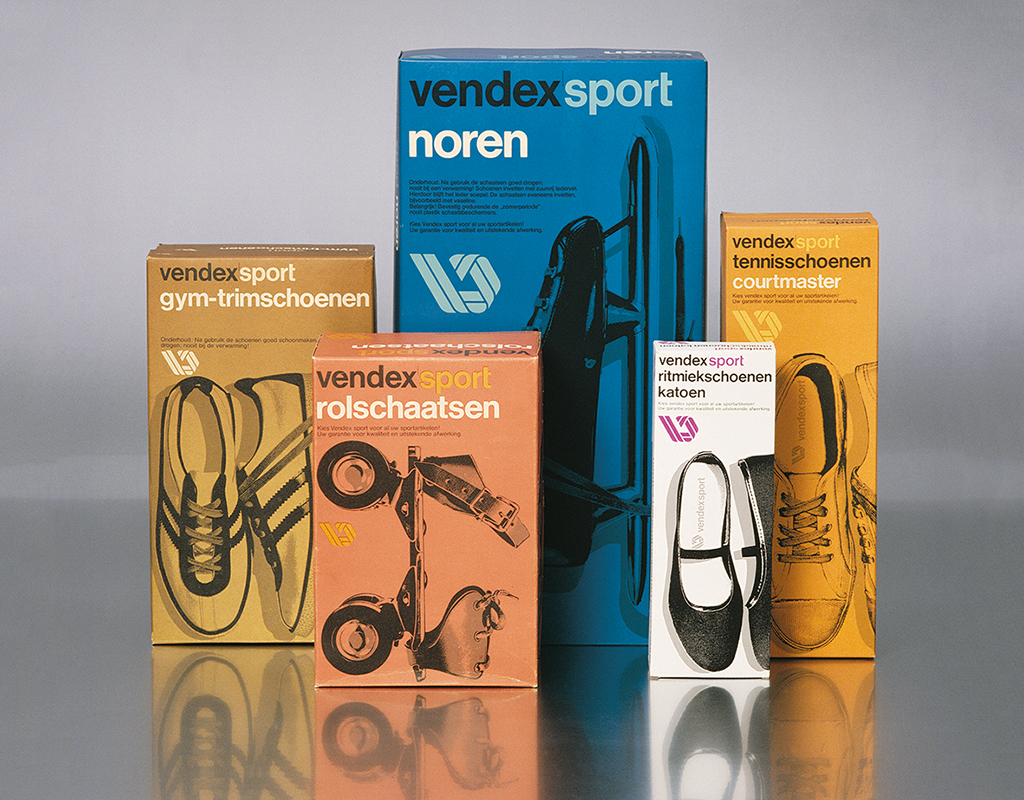
Vendex Sport (Gouden Noot, Graphic), 1974
Into the big world
He set his first steps as a full-time professional at Interad, an agency related to Prad, the best-known advertising agency of the post-WWII years in the Netherlands. ‘Advertising’ was still a very broad and basic concept. It was new and modern, effective and successful, and proved to be a magnet attracting all kinds of talented professionals, including creatives.
Soon, Joep was sought out to do more specific graphic design projects. Not just ads but brochures, annual reports, identity programs. His work stood out. Early on, he was already awarded the Gerrit Jan Thieme Fonds Penning, a prestigious graphical award, twice. Joep was attracted to Swiss Design but in Louis Swart’s studio for the first time he saw work he could really identify with: clear and convincing graphic design aiming at immediately catching the consumer’s attention.
Louis Swart Design Coordination
Joep’s choice of employment at Louis Swart Design Coordination (LSDC) was a career-defining move. Louis Swart was “a businessman and a great designer.” Swart’s professional philosophy found its origins in the US, so rather than traditionally Dutch his approach was international: packaging is a tool to promote sales and as a design professional it is up to you to usher in factors such as aesthetics, fashion, and culture.
It was the 1960s. WWII was long gone. The Netherlands was blooming. The Dutch were consuming like never before. Corner grocery stores became supermarkets and an attractive, attention-grabbing packaging had to take over the role of the person behind the counter. Grocery chains like De Gruyter, Albert Heijn, and Simon de Wit were fighting for the consumers’ favors and used graphic design (with pioneers such as Total Design, Tel Design, and others). The collaboration between Albert Heijn (Egbert Jonker and Dolf Brunott) and LSDC (Louis Swart and Joep Bergmans) proved to contribute to the increasingly strong position of Albert Heijn.
Albert Heijn
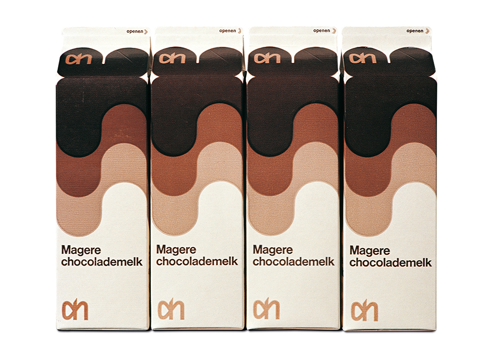
Magere Chocolademelk
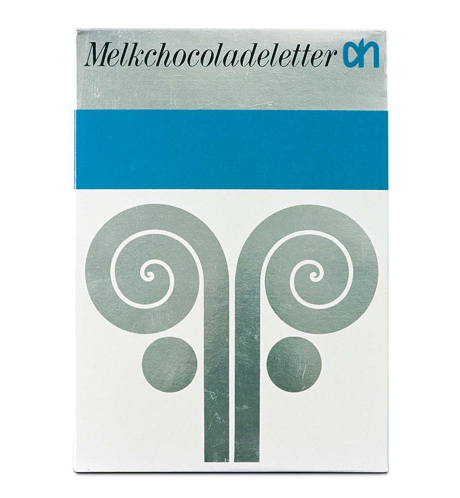
Melkchocoladeletter (Zilveren Noot)
1970
Joep can wax lyrical about those days. “The way they rebuilt Albert Heijn’s stores impressed me greatly. It was all new for the Netherlands: a supermarket! Imagine: long aisles of shelves, wayfinding with the aid of typography and photography, signage, floor plans, check-outs. Different sections for fresh produce and household products. And everything was brand new, everything had to be designed. Albert Heijn’s corporate color blue, as proposed by the London-based studio AID, who also designed the logo, struck us as very powerful: fresh, dynamic, and recognizable. It defined the overall image and was of course also reflected in all of the packaging. A very exciting time. Wonderful to have been involved in all of it.”
Ten Cate Bergmans Design
In 1973 Joep together with ex-Interad account manager Hendrik ten Cate decided to establish their own studio: Ten Cate Bergmans Design (TCBD). It opened the door to twenty years of abundant work for some of the leading clients in the Netherlands. After Albert Heijn they acquired Melkunie as a client (their merger with Campina came later) as well as Mona, Smith’s (the future Lay’s), Heineken Gedistilleerd (Heineken’s export division), Formido, Hubo, Scott-Page, Honing, Postbank, ING Group, ING Bank, Allied International, Coberco, Vroom & Dreesmann, Philips, Solvay, and other well-known businesses.
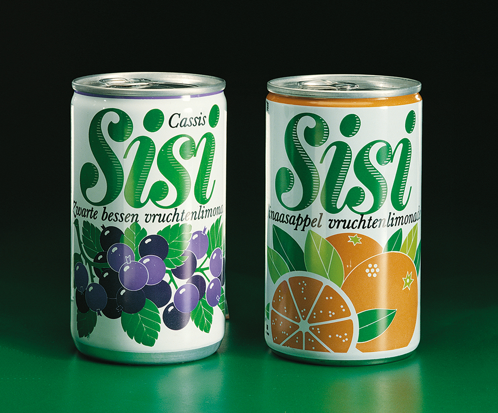
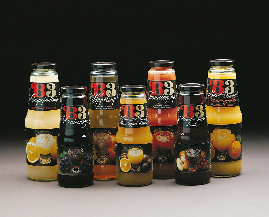
Vrumona: Sisi, 1974 / B3 (Graphis), 1978
In these turbulent years, TCBD became known as a training ground for the next generation. Charles du Bois first came from Louis Swart to TCBD, along with Dick Ording, and in 1980 they started Du Bois Ording Design (later dBOD). At TCBD their places were taken by two designers who a few years later would also establish their own studios: Eugene Bay started VBAT in 1983 and Rob van den Berg founded Milford-van den Berg Design in 1985. Both agencies managed to build up a great reputation in the profession.
There were countless possibilities in those years and creative designers with a feeling for marketing and brand management had a field day. Design studios attracted specialists from other disciplines as well and went looking for new and often international collaborations. This unstoppable process pushed Joep slowly toward an unavoidable decision.
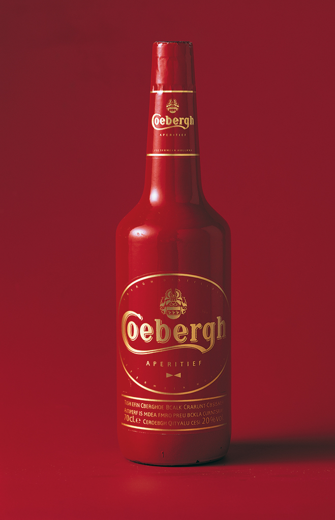
GWN, Coebergh, 1978
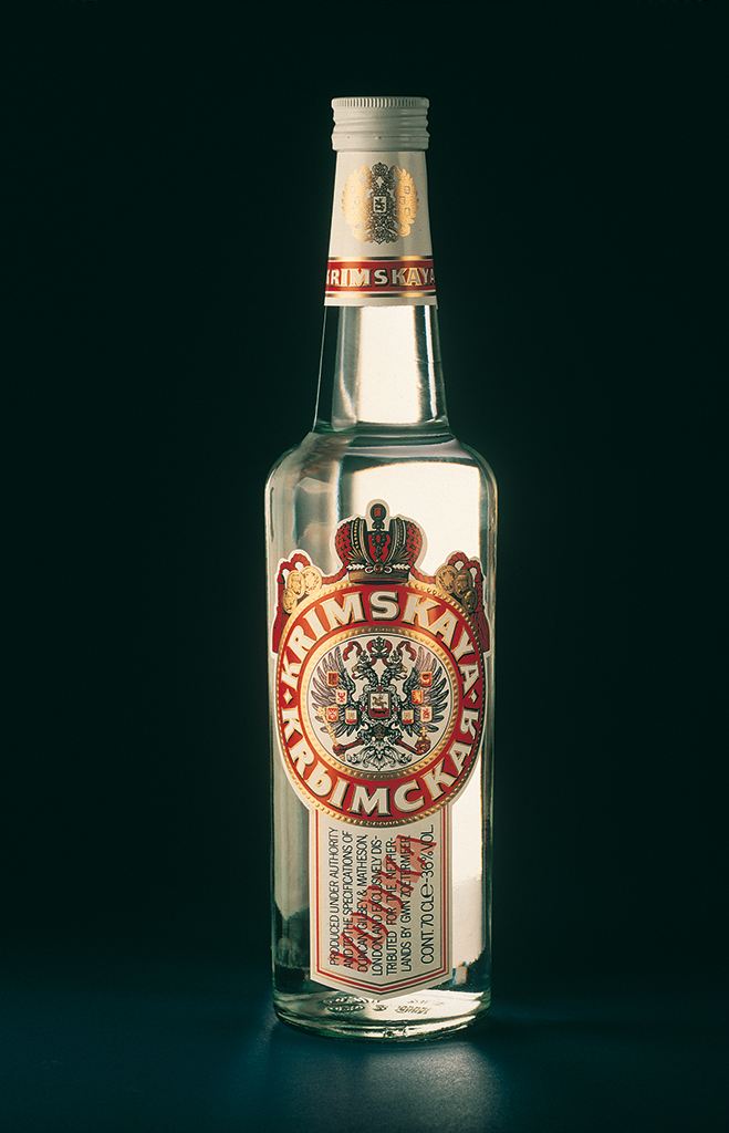
GWN, Krimskaya Vodka (Graphis), 1982
Joep / Silence is golden
His glow, if he liked your work, warmed your whole being. It remained bright until you showed him something he did not like; then the light went out as quickly as he had turned it on. Some of us went through a ‘cold’ patch for several projects. Only to emerge released from this wilderness once we produced a winner.
Do not get me wrong, Joep was not dictatorial or mean in any way as the lead creative force in his company. He was crystal clear. We were not there to have a great time but to create great ‘Joep-worthy’ work. That was, after all, his prerogative.
All the time I worked with Joep, this approach never diminished. He could either make you feel a glorious success or a glorious failure. (I suppose you could argue that whatever happened, he always made you feel glorious.)
So, what has this done for my development as a designer and a design leader? He made me stronger. Why? He taught me that we create work for others in our type of design business and not for ourselves.
We are not artists working for ourselves or people like us. We work for the public at large. They have to ‘get it’ instantly. If they don’t, they simply pass by your designed product and consider a competitor.
As he always told me, “You can’t be with your design on the shelf to explain your design. It has to do all the work alone in its place of purchase.” He believed that too much explanation during creative reviews can be a waste of time. “They have to answer the brief and bring a product to life without a lot of verbal support.” In Dutch, he was more to the point. Joep always spoke to me in Dutch.
Joep was the necessary counterbalance in my development. My own English ‘talky talky’ approach helped me vocalize my ideas and visual style. Joep’s Dutch directness made me soon realize that good ideas and spot-on design don’t need much vocal support. I am grateful to him for making me very un-British.
Eugene Bay
Founding Partner and Chairman and CEO
VBAT 1984-2018
Joep Bergmans Packaging Design – “The product is the hero, the package is the message”
In search of clarity and renewed personal conviction, Joep decided to leave the complexities of running a large agency behind and to return to the core of his original passion: packaging design. In 1996, together with his life companion and business partner Susan he founded Joep Bergmans Packaging Design (JBPD), a studio with only three assistants. Someone who must certainly be mentioned here is Joep’s right-hand man Hans van de Bovenkamp, who unfortunately died much too young in 2014. JBPD established a network of well-known independent specialists to add to the team if required by the size or complexity of a project. This formula proved to be a success. Longtime clients of Joep’s like Mona and Melkunie stayed with him. New clients came knocking on his door as well, such as the well-known Johma.
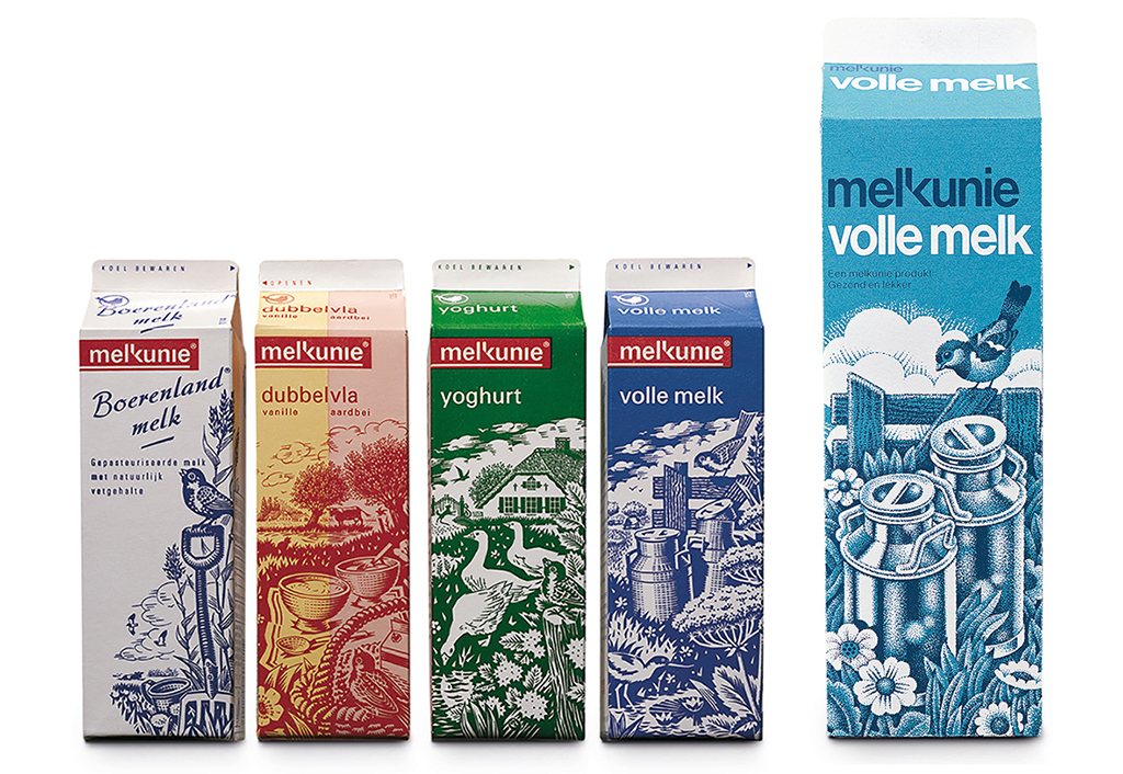
Melkunie, Volle Melk. National introduction of new logo and packaging range for fresh products, 1980
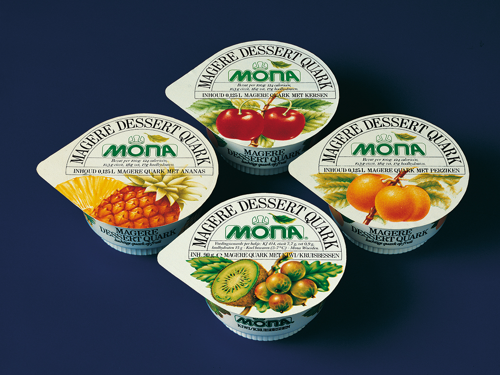
Mona, Magere dessert kwark (Graphis), illustration Barend Köhler, 1982
Joep was God
I often think about the unique time I spent with Ten Cate Bergmans Design. About one of those unforgettable days when Elly, secretary of the executive board, Joep included, sent me a somewhat panic-stricken look. I had evidently asked for something impossible. Funny enough I cannot remember what it was I had asked for, but Elly’s look is still etched in my memory. ‘How could you ask for the impossible. Joep will never agree!’ And that was final…
Ten Cate Bergmans Design, with Joep as motor, were driven by an enormous desire for perfection. We had to deliver the best work for our clients and to accomplish the best results, no stone was to be left unturned. I worked there for four-and-a-half years, learned an enormous lot, and never stopped being surprised at how few of my designs were ultimately used. This happened not just to my projects, it happened to all the designers who worked under Joep. We worked bloody hard, we were very motivated but it also often ended in disappointment when Joep reviewed our finished work and remarked with an icy calm that he would have another look later. We knew then that our proposal wouldn’t stand much chance.
Anything could happen, final lay-outs were stopped by Joep and changed, even after the design had been approved by the client, which often caused problems of course.
But the point was: it wasn’t good enough and if Joep said so, it just wasn’t.
This wasn’t always easy to accept, especially if you had worked throughout the night preparing the screens for creating the seal for a cigar box (20 mm x 45 mm) that needed twenty-two print runs, and Joep would show up at ten-thirty in the morning, his hair still wet from showering, to show you his uncensored disappointment. Telling him that he should understand you had worked all night was no help: “I don’t pay for effort but for results.” And he was right.
We had a wonderful time working at this magnificent agency and experienced many highs and many lows that maximally tested your resilience and perseverance. It was like walking on a tightrope – something you learned a lot from and would come in handy in the future.
Thank you, Joep, for everything – you were a true champion of our profession.
Rob van den Berg
Founding partner and creative director
Milford-Van den Berg Design 1985-1999
Mountain Design 1999-2001
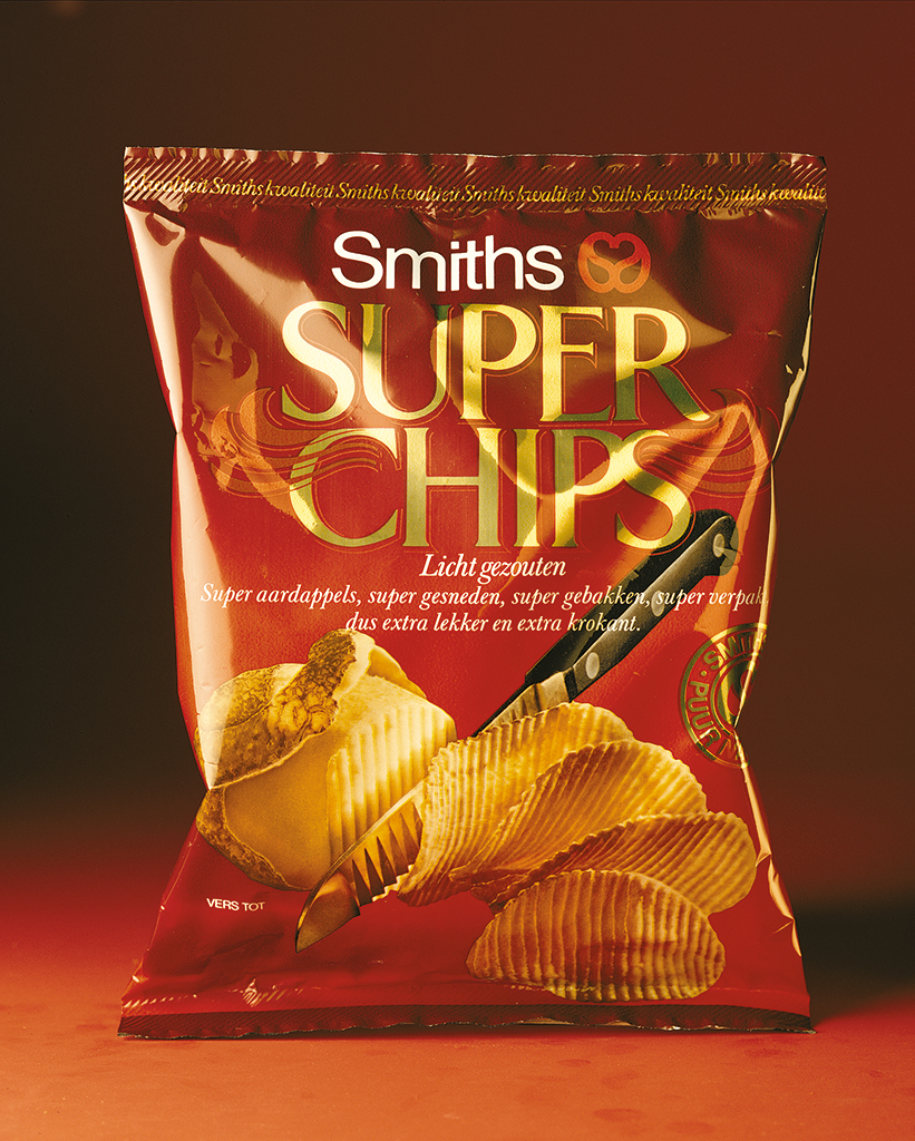
Smith’s Superchips, 1983
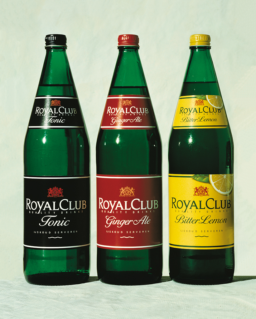
Vrumona, Royal Club (ADCN Award), 1986
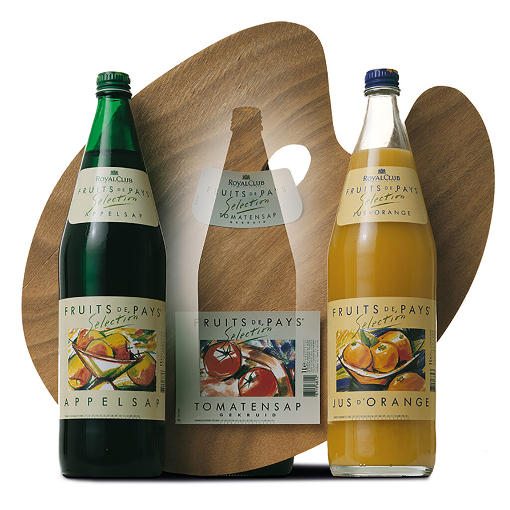
Fruits de Pays (ADCN), illustration Hans van den Bovenkamp, 1989
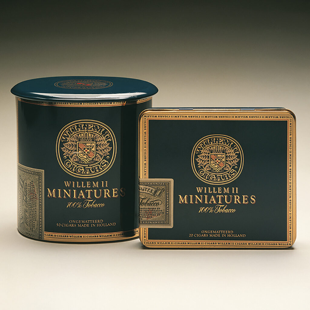
Willem II (Graphis), 1985
“I follow my intuition”
Joep’s life was defined not solely by his professional accomplishments and his business successes. Just like in his father’s life, the arts played an important, maybe even dominating role in Joep’s life. Not only did he visit art exhibitions and develop a preference for the work of specific visual artists, he also painted, drew, and sculpted himself. “I always needed the freedom of creating things independently from my professional work. It is my oxygen,” Joep says.
At some point, this deeply felt passion for art made Susan and Joep decide to enter a new stage in their life, in which creating art could be fully enjoyed, free from the burdens of commercial pressure. Deeply exploring ideas, producing large-size canvases, sculptures, and other 3D objects. Life would not have been complete without an attempt to pursue this.
Out of everything that motivated him in this field he created a new existence. On the sunburnt slopes of a hill in the interior of the Spanish province Valencia, among the almond trees, he found a spot that befitted his dream and where he went on to create a huge body of work full of exploration, playfulness, and invention. It led to several exhibitions of his work. The desire to be closer to their loved ones led them to move to Belgium in 2018. However great their Spanish period was, Joep and Susan decided to end it to return to the environs of their past and of their family, children, grandchildren, and friends.
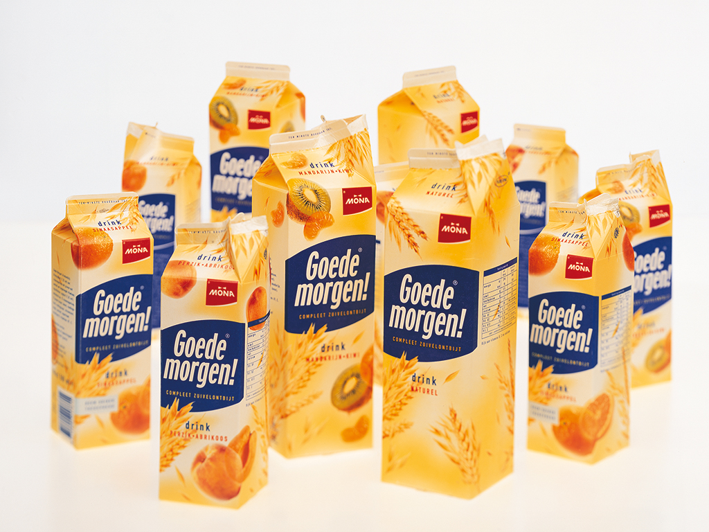
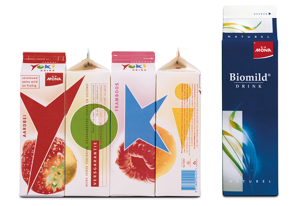
Mona: Goedemorgen! Drink, 1999 / Yoki Drink, redesign, 2000 / Biomild Drink, 1993
Master in groundbreaking new design
Joep Bergmans was a master of packaging design. I have worked with him as a client as well as a colleague. Joep had good taste and he had guts. He was an original thinker. He always took things a step further in his designs, they were often ground-breaking.
One example: the new, blue packaging of Mona Biogarde Drink. The dairy industry was flabbergasted and some folks said this was really ‘not done’. But the new packaging doubled the sales even before the advertising campaign had started.
Another example: the box for Johma salads. Until then salads had been sold exclusively in square boxes. Joep designed an elegant box with an organic shape that raised the product’s high-quality image. As was often the case with his work, many imitations followed. It can still be found on the shelves, thus proving the power of ground-breaking design.
His designs got Joep into confrontations with many Dutch marketing specialists. Product managers couldn’t or wouldn’t always see the potential of his designs. Often, they were brought back to mediocracy or otherwise killed by changes or because of ‘new’ demands. These clients did Joep as well as themselves a disservice – such missed opportunities!
Joep set the tone for many product segments, but he never prided himself on it. He was a humble man, which did him honor, although it kept him from receiving the recognition he deserved. Hopefully, this publication will help to change the perception. I have so many great memories of Joep as a person and as a professional. He was an honest, hardworking man with an amazing talent.
Riejanne Boeschoten-Mulder
International marketing manager and Product groep manager Mona, 1989-1995
Commercial director BU Product & Packaging Inizio Design, 1995-1996
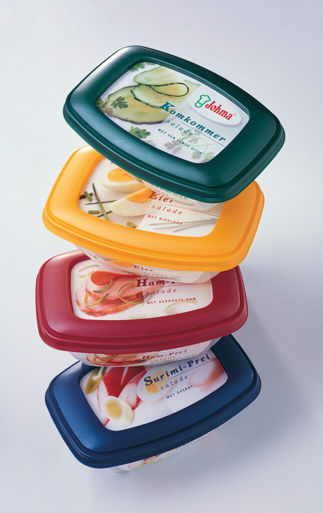
Johma salades,introduction, 1998
Photography Remko Kraaijeveld
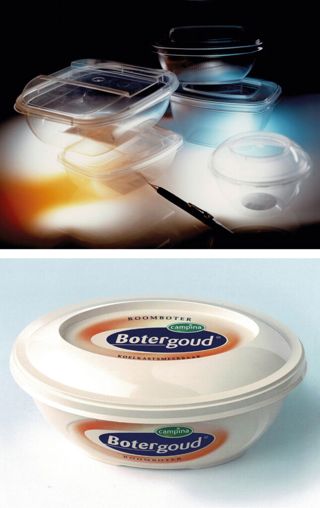
Johma transparent packages, 1998
Photography Henze Boekhout
Campina Botergoud kuipje, introduction, 2001
Design flowing through his veins
Joep was such a versatile designer and conceptualist, and he had a vision about everything. Apart from graphic design, industrial design had his interest too. Design was flowing through his veins. He had no problem with letting go and leaving you to take care of the job, even if he might have different ideas.
For a few years, I shared a room with him. I worked on my own projects but he would look over my shoulder and we would have stimulating discussions. He was a modest man, quiet, cherishing private jokes.
And he loved abstract art. We went to Kassel year after year to visit the very inspiring Documenta. Joep would enjoy himself immensely. He was always happy with anything creative.
Joep was a very critical but also a very happy professional. I had a great time working with him, and I learned a great deal.
Dick Ording
Creative director, founder, and co-owner Du Bois Ording Design, 1980-2005
Afterword
Former colleagues, assistants, and others who came to know Joep professionally speak admiringly about him without exception. They recall his impressive skills as a craftsman, his convincing proposals, and his amazing drawings. Joep always managed to deepen his talents, demanding the most of himself and expecting the same from everyone he worked with. He was a driven perfectionist but also a congenial and humble person, as he proved once again when we worked closely together on this publication. “All these superlatives,” he insisted. “That really has to be toned down.”
During the time we worked together on this project it was clear that Joep was suffering badly from the effects of Covid-19. How bitter that it proved fatal just when the first proof was finished. He still had many plans for “later, when this is over.” His dreams for the future became our last memory and this publication became a posthumous homage from all those who contributed to it.
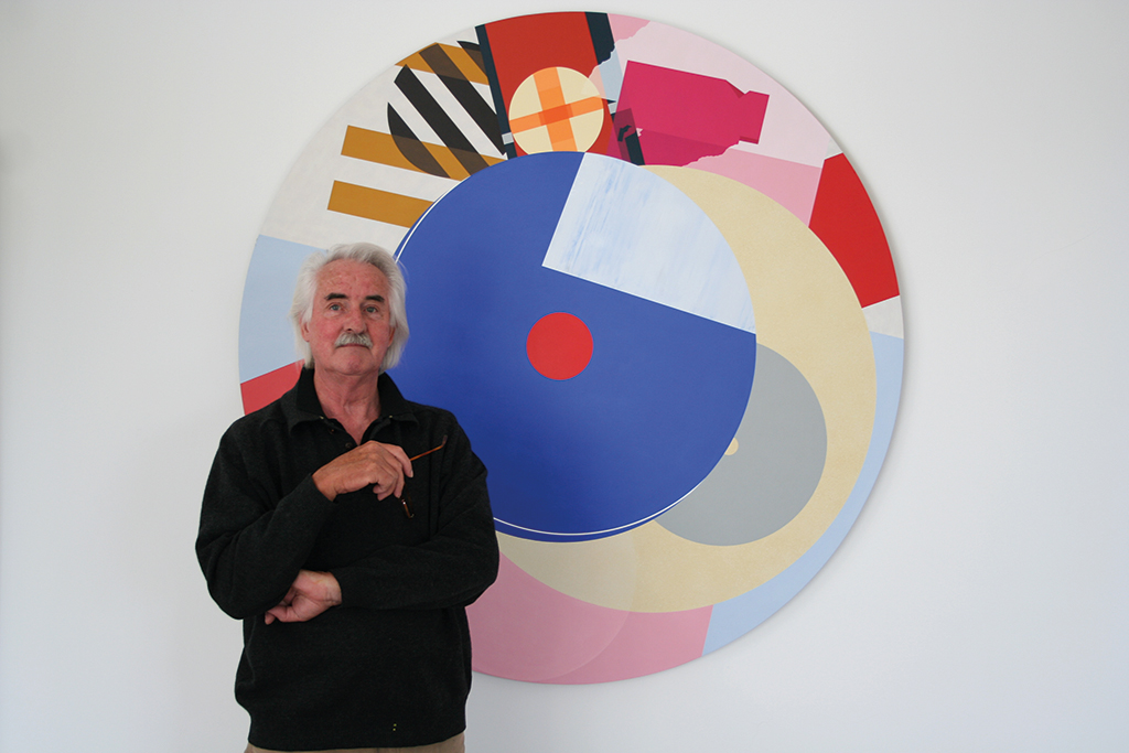
Joep in front of his painting Constellation, acryl on panel 1400 cm, 2006
Joep Bergmans
born on 30 May 1941, Waalwijk
died on 15 May 2021, Ravels, Belgium
Author of the original text: Jos van de Zwaal, 2021
Translation and editing in English: Ton Haak
Final editing: Sybrand Zijlstra
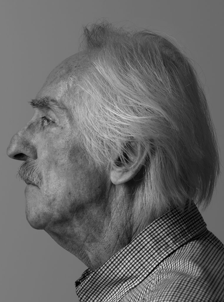
Portrait photo: Aatjan Renders