At the World Expo 1958 in Brussels, I admired the pavilions of some large nations. I was eighteen years old and quite impressed by it all. Finding the pavilion of the Netherlands at last, I was struck by how information was presented. Shape, size, color, sound, and spatial layout did interact and reconfirm one another. Wim Crouwel had designed the interface of the Expo’58 pavilion of the Netherlands. I wanted to be a designer.
Being a voracious reader I worked at the best bookshop in town. My mother nudged me in the right direction. From my mom, I got ambition, and from my father tenacity. With five brothers and one sister, I was spot on, in the middle.
Twenty years old I knew just about everything to do with well-designed books and was enlisted compulsory into the national army. I did my time, trained as to be expected, scored a military driver’s license, and became a reliable typist. Dischared conscripts were entitled to claim their old job but I decided it was time for change.
I remembered Wim Crouwel and the Brussels Expo’85. He was the person to talk to. He invited me to come and see him. In a stately building at Reguliersgracht in Amsterdam Wim ran his studio on the fourth floor. Wim listened intently. I should do two things he said: attend the admission exam at IvKNO and get in touch with the people downstairs. I followed his advice.

Little steps turned into bigger ones. I became one of the founding partners of a design consultancy owning a very representative workplace in Amsterdam, 610 Keizersgracht. At the back Edo Smitshuijzen, Jan Brinkman, Sietse Wolters en Niko Spelbrink. At the front: Guus Ros, Margriet Blom, Petra Minnesma, Tineke Stevens, Marise Knegtmans en John Stegmeijer. Photo: Rob Fels.
The sixties
Rijnja Repro, the business downstairs, made blueprints: copies of large architectural drawings. Mr. Rijnja turned out to be an inspiring boss and he had a job for me. My modest first job was to compile, design, and present a catalog of drawing materials for sale. I legally lifted hundreds of illustrations from their sources. Some objects had to be drawn afresh.
The Rijnja photography department was a revelation to me. A reproduction camera filled a whole room as did the tang of carbon lights burning. The sheer size of those photographic prints thrilled me. Good things were happening there.
The firm expanded. An offset press was installed and the persistent rhythm of printed paper ticking away at a rate of 3000 sheets an hour sounded like progress. I got hands-on experience in preparing for offset printing. Performing these now redundant activities improved my understanding of printing.
The sixties started with promise. The economy was booming and anything seemed possible. My future wife Elisabeth and I bought a house in the paddocks. We married, had our daughters Marijke and Karin, and paid off our mortgage in five years.
In the meantime, I attended evening classes in Graphic Design at IvKNO: for five years, four nights a week. This is where I met my future partners in business: Jan Brinkman and Guus Ros. The three of us kept in touch.
Jan Brinkman, whom I had introduced to Mr. Rijnja, joined the firm. After some time he got a riveting brief: the photography department needed to be put straight. Jan analyzed the situation and took drastic action. He dismantled the only light trap to the darkrooms. Everything came to a standstill and renovations were done in no time. Eventually, he introduced new procedures and offered advice on investments. He ran the photography unit being accepted by his colleagues. Job done, Jan moved on.
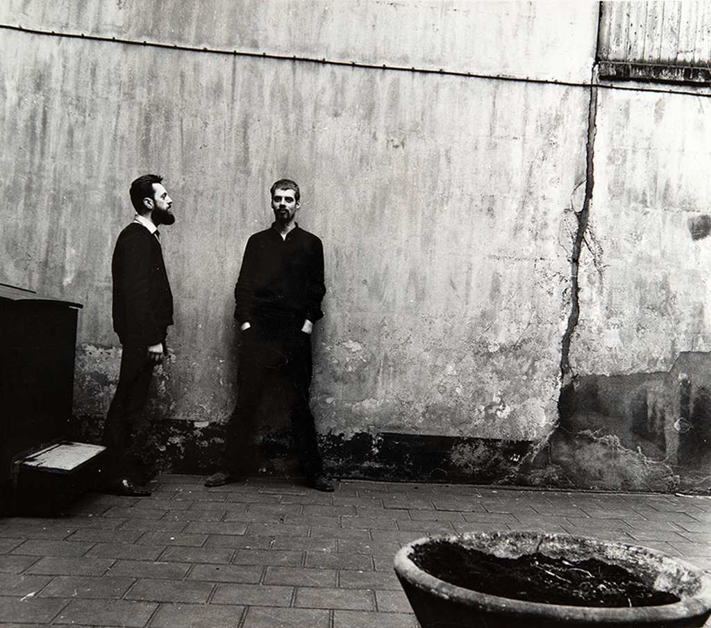
Niko and Jan as part of their own Black and White project 1964. Photo: Rob Fels.
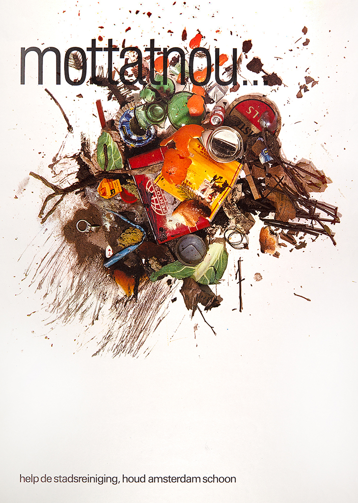
Poster, Keep Amsterdam Clean. Illustration Rob Fels.
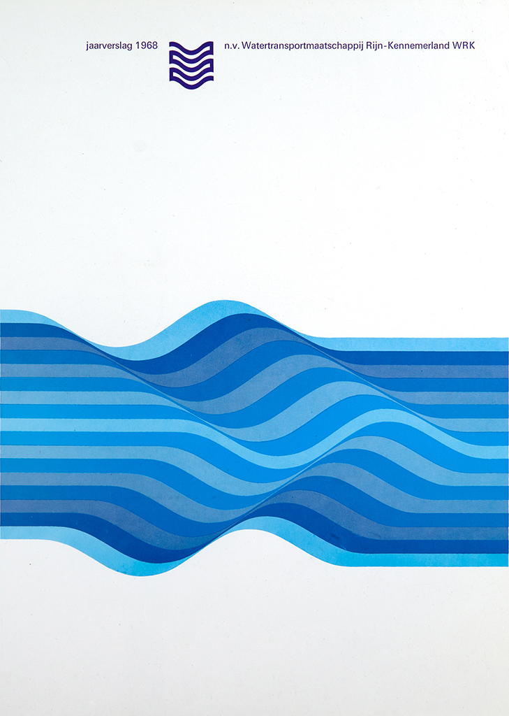
Annual Report, Amsterdam City Watertransport Company 1968.
At Work
My job at Rijnja also ran its inevitable course. My next move was to get a proper design job at the best place in town: the city council’s Stadsdrukkerij. Its CEO Dolf Stork, determined in achieving high quality overall, was convinced that graphic design is key to well-produced printed matter. Due to his high standards, I did an introduction course in hand composition as well as courses in machine- and photo composition. A publication I designed at Stadsdrukkerij ‘Lines for Tomorrow‘ was selected as one of the country’s best-designed books in 1969. Also, my poster ‘Keep Amsterdam Clean‘ was discussed in the press.
Meanwhile Jan and I, now in our twenties, closely cooperated on gigs as freelance designers. The Netherlands, low-lying land as the name suggests, as a country needs to keep the ocean out. An Inventive Dredging Company, doing just that, was one of our first clients. We designed sales brochures for the equipment they developed. One-day photos for an upcoming brochure pictured amphibian vehicles sporting military hardware on top. A pitch was in progress with the aim of our client’s inventions ultimately being deployed in Vietnam where the infamous war continued to rage. We did not want to be part of this!
Understanding our hesitation the CEO of the company patiently explained that the economy of the Netherlands relied to a certain extent on an industrial-military complex. Besides, if he would not build this weaponry, someone else would. We agreed to disagree with our good client and went our separate ways.
Good gigs popped up. Strengthened by our ventures together, Jan knew it was time to take our efforts more seriously. Would I join him and start our own business as designers? I thought that was an excellent idea.
The Nederlandse Gasunie commissioned Premsela Vonk Architects to design a national showcase explaining all about Natural Gas. Objects, models, facts, and figures should appeal to the public at large. Jan Vonk asked us to be their graphic design sub-contractors. Briefed by specialists at Gasunie we designed displays of processes, presented data in diagrams, and were in control of labels for displays and the overall signage.
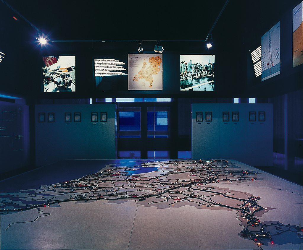
Gaspoort, Representation of Natural Gas Pipelines 1972. Photo: Rob Fels.
Chemisch Weekblad, a periodical, needed covers. Jan would every week be briefed at the last minute. However, we steadily produced in time by Wednesday. The weekly beat set us up for a challenging pace.
Nederlandse Spoorwegen, the railway company in the Netherlands, commissioned us to design their Annual Report two years in a row. One cover pictured two seemingly endless passenger trains traveling in opposite directions. Our staunch photographer Rob Fels found a perfect spot. He clambered on top of the span of a very large railway bridge. Below the rails, the bustle of a busy shipping lane was in view. Excellent photos were the result. However, in the early morning, the fire brigade lifted Rob and his Hasselblad cameras off his precarious position. We had failed to first ask permission for the shoot knowing full well that approval in advance could never be secured.
Proost en Brand, paper merchants, famously published Proost Prikkels (Proost Stings). I co-wrote and designed Prikkel 340, a volume stacked with facts and figures on paper, design, and printing. Reprints were needed to satisfy the explicit demand from designers. Ten years later I was asked to design an updated version of this publication Prikkel 394. I also designed Prikkel 353 and Prikkel 379.
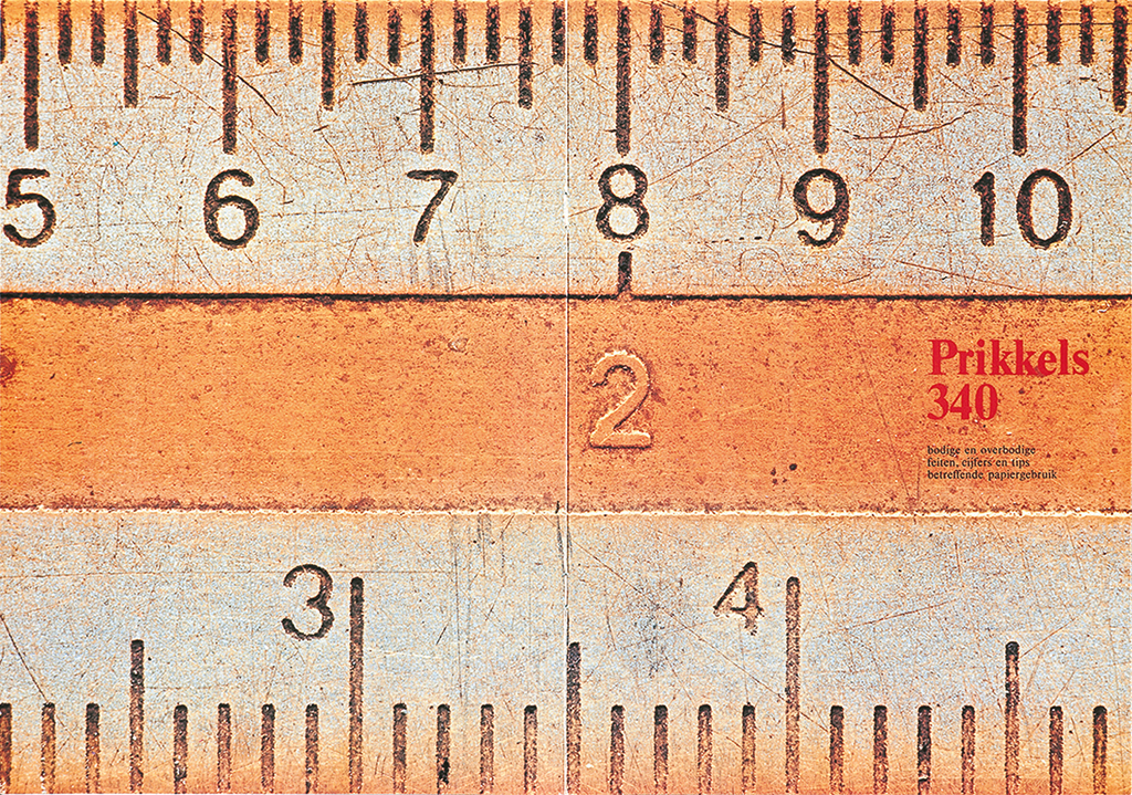
Prikkel 340.
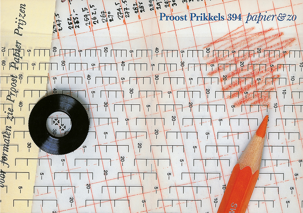
Prikkel 394.
The seventies
We invited Guus Ros to join. We had studied together at IvKNO and he brought with him his pitched sense of humor, ample expertise, and importantly, his clients: publishing houses of distinction. Our partnership contract set out how we would work together and, interestingly, how to split up when the time would come. Decisions on who-does-what followed easy patterns.
A decade of hands-on experience with typography increased my appetite. Typography is writing with prefabricated letters declared Gerrit Noordzij. Lectures by Professor Ovink at the University of Amsterdam convinced me that typography is a unique expression of culture.
At the end of 1974, tipped by a friend, I applied for a temporary job in her unit at the Greater London Council. I rounded my time off in London by creating a compact exhibition. My colleagues at the unit commended me on how easily legible my small print turned out to be. I took that as a compliment.
Town planning Colour-coding standards 1982.
The township of Zoetermeer was expanding rapidly. An extensive town planning report needed to be designed and delivered in a hurry. A set of outsize maps was prepared and ready for print. Jan and Marcus (Jan’s buddy from London) made scores of separations by hand for printing in seventeen special colors. Fortunately, Edo Smitshuijzen timely jumped in to help.
The job for Zoetermeer also had documentation to be designed and printed. This text was riddled with graphs and diagrams. With no time to specify typesetting in the traditional way experience and zeal prevailed. I used an IBM Selectric II golfball typewriter to – in one single sweep – type pages ready for print. No cut and paste was required, even crop marks were typed in. This was desktop publishing before the term even existed. The production of the Zoetermeer maps and documentation came in on time and on budget.
Edo accepted our invitation to join the partnership. Not only a fantastic designer; he also had a knack for business. Eventually, he put systems in place that created a strong financial foundation for our firm. After first working together as Brinkman Spelbrink Ros en Smitshuijzen we renamed our venture BRS.
By that time we needed to move out of our attic at 96 Oudezijds Achterburgwal. The landlady of 626 Prinsengracht had space available for lease. BRS applied and we got a new studio giving on to an elegant inner-city garden.
Typography to the rescue
Newspapers started to look different in the seventies and not for the better. Photographic typesetting teamed with offset printing badly needed new routines overnight. Tested practices and the stringent requirements of letterpress printing had lapsed into wildly oscillating experiments which churned out stacks of insipid-looking newsprint. The result was not worthy of quality content.
I made my opinion clear at a conference of newspaper editors. What I said touched a raw nerve. Reading The Seybold Report I knew that typographic attributes could be programmed into custom-built algorithms. I suggested embracing the blessings of automation in full. Especially editors of regional newspapers were interested in solutions.
At Haarlems Dagblad typographic detail for each segment of the paper was determined in negotiation with editors. Tested and proven solutions were programmed and applied to the everyday production process. My instructions guided the look of Haarlems Dagblad for over two decades. Five other regional newspapers became clients as well. Efficiency, harnessed with consistency, changed these newspapers for the better.
Newspaper Masthead Haarlems Dagblad.
De Nederlanden van 1870, a life insurance company, needed to overhaul its corporate presentation. Random use of line printers mystified clients. Before, an imposing document stood for the importance of a policy contract. Now, this looked like a strip of paper bordered with a pin-feed. Besides, the information on these documents proved hard to read. My first meeting with the head of IT was unusual. The man, his feet on his desk, declared: ‘decisions are made by me’. I did not like his shoes or his ideas. My inquiry resulted in an informed inventory of all business forms at 1870. I designed not just a logo but applied clear typography to all written communication. Legibility is important, especially as small print gives some insurers a bad reputation.
We bought the ground floor of an imposing warehouse at Prinseneiland in the old port of Amsterdam. The first talent I offered employment was Margriet Blom. Being very enterprising she fitted our team well. Ten years later she became a partner in our firm. Sietse Wolters is quite methodical and outright visually expressive, a rare combination. He became a partner nine years after commencing his career with us.
The eighties
The second decade of BRS took off and we prospered. Jan gave direction to our cooperation and we all shared one ambition in particular: our goal was to create outstanding quality. This worked for our clients, a fact not lost in the marketplace.
The dynamics of our merry band of designers changed again. John Stegmeijer, a gifted and experienced designer, joined our partnership. Our five quite distinct personalities made for an interesting mix. Each of the five partners now headed a unit. My mob, unit 2, included the talents of Marise Knegtmans and Martijn Luns from the beginning. Over time I worked closely with: Ben van Berkel, Bram Dilrosun, Christa Jesse, Gonnie Hengelmolen, Hans Brandt, Hans van der Haar, Harmine Louwé, Joost van Grinsven, Lillian Smits, Marianne Brouwers, Sara Saunders, Susan Lloy, Titia Schoenaker and Wim Westerveld.
Confidently I spread my interests. The syndicates Icograda, Icsid, and IFI all promote design worldwide. They had joined forces to present their 1981 international conference in Helsinki. It opened my eyes. Enthusiastically I took in presentations and enjoyed the social gatherings which are the framework of such get-togethers. I was surprised to find out how easy it is to exchange ideas with colleagues from all over the world. One chat turned out to be beneficial in particular. Harry Swaak CEO of Lumiance was looking for the services of a graphic designer. Back home Harry and I met again.
Lumiance designed and produced excellent light fittings for professional use. Vision and function inspired everyone. We produced their seasonal catalogs, packaging, documentation, and everything else to appropriately signify their corporate visual identity.
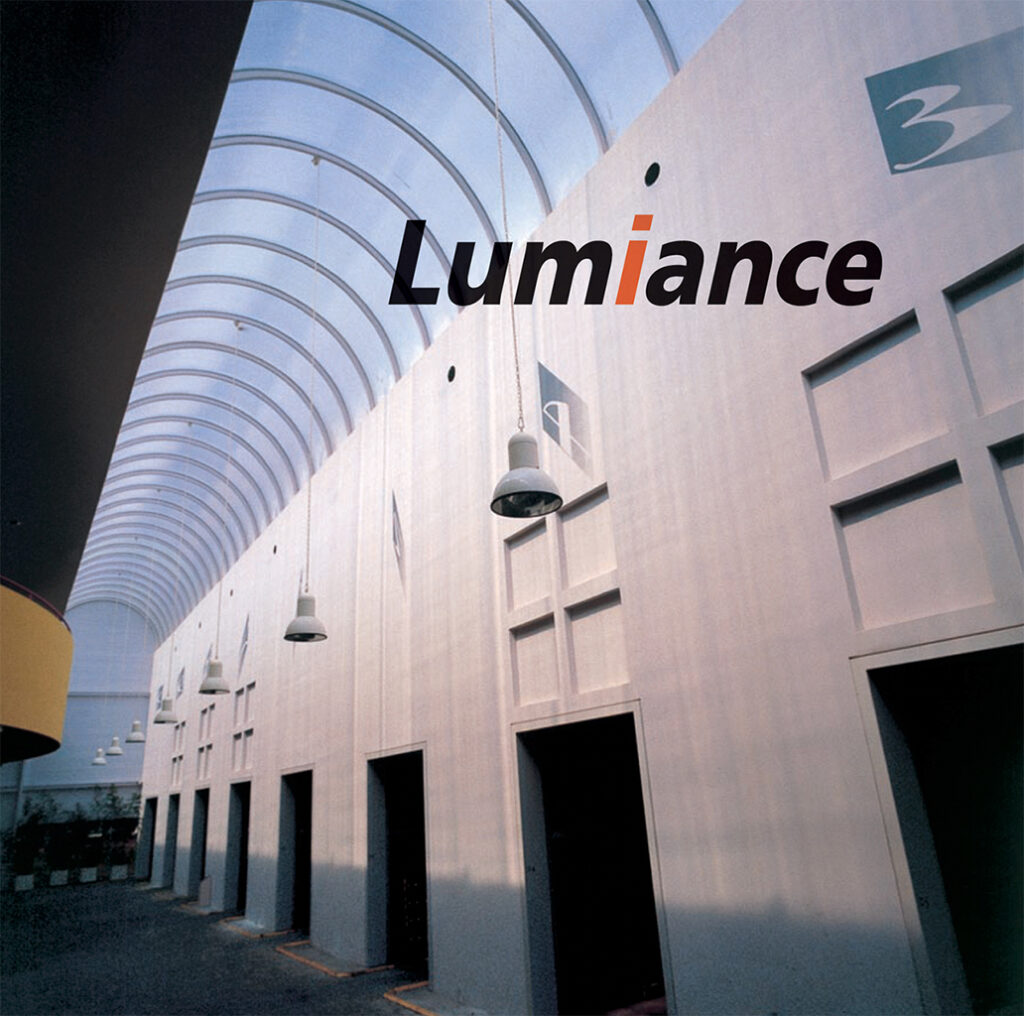
Lumiance transport hub, Haarlem 1984. Photo: Rob Fels.
A couple of years later we moved again. We acquired a distinctive city palace on 610 Keizersgracht, one of the main Amsterdam canals. This pristine patrician home, built three centuries ago, featured floors with alluring rooms and high ceilings. The best room had a view of our private inner-city garden with an enormous red beech tree. We had made it!
Visual Identity
The breadth of the government of the Netherlands grew steadily. The increase in scope caused drawbacks in getting the government’s many messages across. Our pitch was a perfect fit for a brief of the State Ministry of Home Affairs, BiZa, aimed to improve communication. We won the job and, working in tandem with the design office of the State Printing House, we created entirely new information policies for BiZa. A monumental task that did change the pace of what was going on at BRS. In the three-year process, I was instrumental as type director for part of the project.

Typography for the State Ministry of Home Affairs 1985.
TNO, Applied Scientific Research, was eager to cut avoidable expenditure. Each of the many centers within the organization focused on a specific field of research and operated with a large degree of independence. Together they produced a mountain of printed matter. BRS made an inventory of all printed material in use. We analyzed the production method and purpose of every separate item. Our recommendation focused on production logic. An example: the number of business forms we identified was reduced by 80 percent. The forms remaining required just one set of typesetting specifications. As result paperwork from separate centers started to look like belonging to one organization. It was a good first step toward a full TNO corporate identity program, which we realized later on.

Logo TNO.

Logo NWO.
NWO, Netherlands Organisation for Scientific Research, develops and finances research programs with national and international science organizations. We applied a procedure quite similar to what we did at TNO.
Titia Schoenaker art-directed Hypothese, an NWO journal whilst Milou Hermus produced its striking covers. Milou also created covers for all brochures we designed for KPMG Accountants while their International Office was established in Amsterdam.
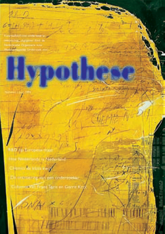
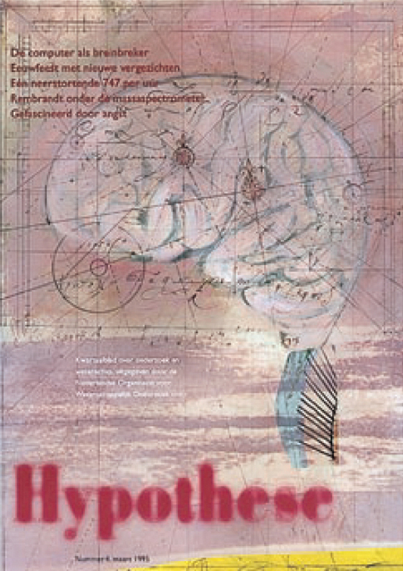
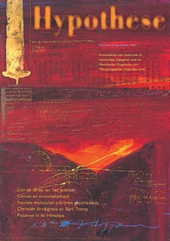
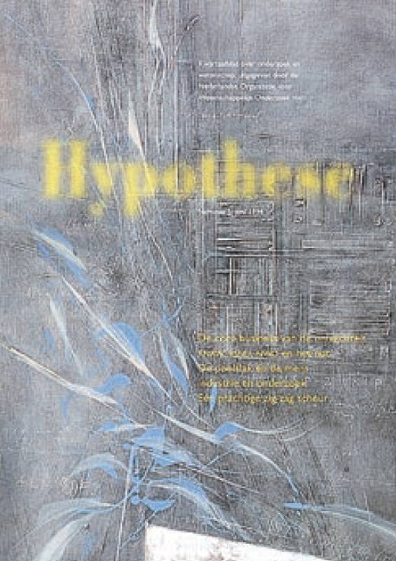
Covers for NWO periodical Hypothese: Milou Hermus.
Art direction: Titia Schoenaker
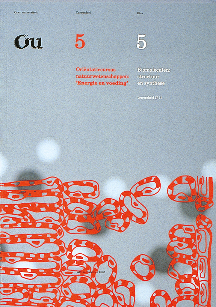
OU, Open University, a new national organization made it its policy to produce study books in-house. I read in the newspaper that at least thirty thousand unique pages of course material would be made each year. It seemed worthwhile to find out if they would need our services. This was the case indeed and, one of our first assignments dealt with study books. In dialogue with on-site experts, we created a typographic concept that would support students to study effectively. With my experience in structuring text for newspapers, I was well placed to tackle the job. Tested and proven specifications were programmed and applied in everyday book production. Within a few months, the production was ready for use and turned into full swing.
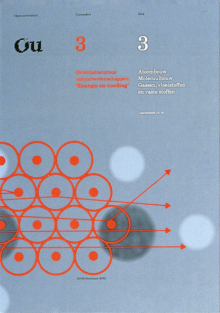
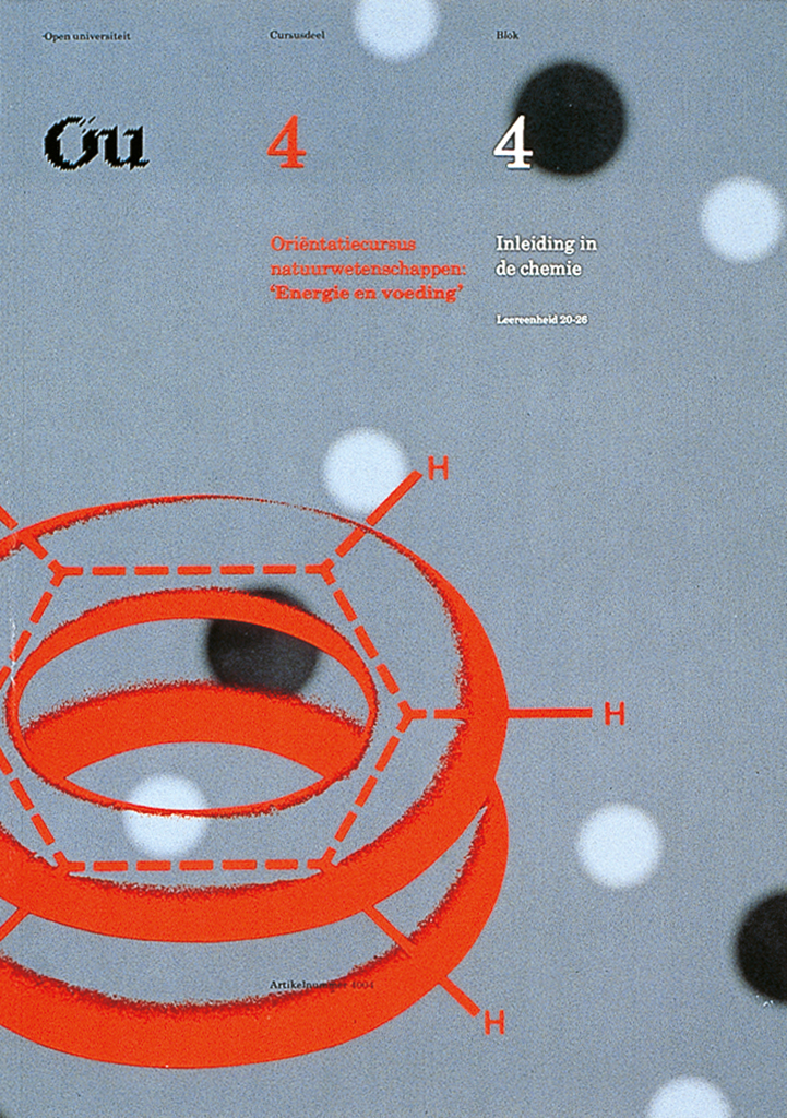
Covers for OU study books
on Nutrition 1986.
‘s-Gravenhage has been the seat of the national government for some 600 years. With the national economy booming, part of the city’s center was ripped up. New executive buildings popped up everywhere. The city’s charming, old-fashioned character was replaced by a dynamic approach to just about everything. The city council did not just stand by but threw itself bravely into a new direction even changing ‘s-Gravenhage decisively into Den Haag (The Hague).
Emerging successful in a selection process we were instructed to create a versatile visual corporate identity. This house style should bring the profusion of all agencies together under one dynamic symbol. The Hague is at the seaside. Its coat of arms pictures a stork. These fetching scavengers rummaged on the fish market and were the city’s heraldic symbol. Edo produced a new metaphor: as The Hague was taking flight, so did its famed stork, now flying over the country’s coastline.
As with TNO and NWO previously, we created a well-stocked tool kit. A big change though was the emergence of desktop publishing. Electronic templates powered by algorithms instructed users directly on how to publish online. This construct remained practical for an astonishing further thirty years during which the image of the Flying Stork was the signature of The Hague.
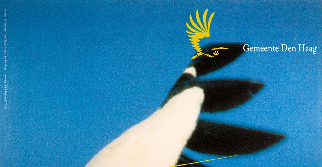
Flying stork over coastline and typography, Den Haag 1986.
BRS Premsela Vonk
In 1987, BRS achieved momentous change again. We joined forces with architects Premsela Vonk. (Benno Premsela and Jan Vonk). We had collaborated on projects for two decades already. Jan Brinkman and Jan Vonk systematically hammered the deal out. A full merger anticipating developments in the marketplace turned out to be an excellent decision at the time. Our union now operated as BRS Premsela Vonk. We offered all our expertise combined. Initially, this involved Graphic design, Textile design, and Architecture. Our range of disciplines extended later including Industrial design, Information design, and Interactive audio-visual design.
Unit 2. Sara Saunders and Christa Jesse.
Unit 2. Titia Schoenaker and Hans Booms.
We bought a school building at 89 Nieuwe Prinsengracht in Amsterdam. The property fitted our purpose wonderfully well. With ample space available different design disciplines toiled away in former classrooms. Most new projects we attracted required a mix of expertise indeed. We started to merge properly and formed one single enterprise with ten partners. I loved to drop in at Textile Design and discuss pattern and texture, text, and typography with Josée de Pauw.
The Chamber of Commerce in Amsterdam spruced up its corporate image. As with TNO and NWO before I created a well-stocked tool kit for this purpose. A rather monumental 3D version of the logo required material and structural advice. Benno Premsela scrutinized my plans and came up with very practical solutions.
Benno, the epitome of culture, remains a unique source of inspiration. He extended boundless kindness, wisdom, and experience to everyone. The memory of Benno remains an enduring influence in the Netherlands and abroad.
A rolling stone gathers no moss
My unit 2 was always profitable just as was meant to be. My partners were happy for me to pursue my more personal interests.
The Soho Project. Enthusiastic about evolving new technology, three colleagues in the Netherlands and I attempted to have software developed to assist page layout and typography. We were soon left behind by the Apple Macintosh computer and QuarkExpress software.
Newspaper design. Outspoken about the deplorable look of newspapers I was invited by the Gerrit Jan Thieme Foundation to explore my ideas in writing. They published my brochure: De Jas van de Krant (A coat for a newspaper).
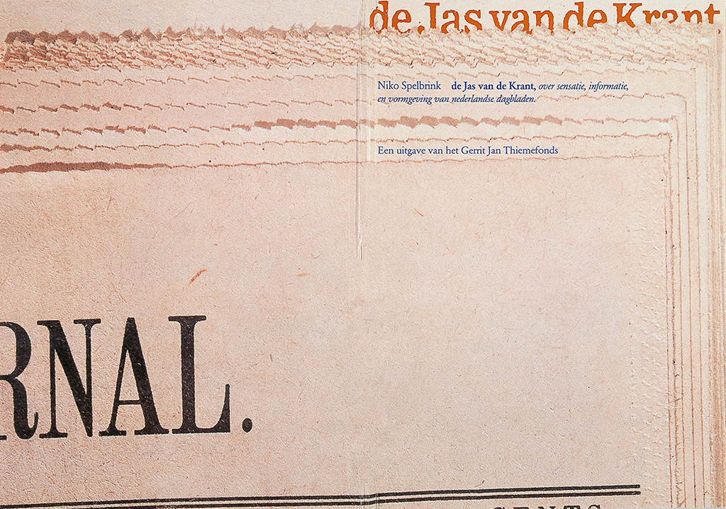
Gerrit Jan Thiemefonds: ‘de Jas van de Krant,’ (a Coat for a Newspaper) publication.
Signaal Foundation. Students may have grand ideas but no money. I endeavored to help some of them financially. The principal of the Rietveld Academy Simon den Hartog approved and professor Jan Boterman selected projects, coached students, and made sure it all worked out appropriately.
Teaching Typography, for eight long years I introduced students to the finer detail of typography at the Arnhem Academy of Art. Replacing Karel Martens temporarily, his cohort that semester proved to be legendary. I did aid future type designers Martin Majoor and Fred Smeyers to a successful start of their careers. Graphic designers Dien Bos, Paulien Hassink and Wim Westerveld were each singled out to work at BRS Premsela Vonk.
Acadia University. I accepted an invitation to be a guest lecturer in Halifax, Nova Scotia. I loved the zest of my Canadian students who diligently took note of the subtleties of typography not minding my funny accent or the wild snowstorms raging outside. Bram Dilrosun had collected me when I arrived at the airport. We became long-time friends. He later supported BRS Premsela Vonk with his talent for design as well as with his managerial flair.
Design world-wide. Three syndicates represent design worldwide: Icograda, International Council of Graphic Design Associations; Icsid, International Council of Industrial Designers and IFI, International Federation of Interior Architects.
Secretary-General Marijke Singer invited me to be a board member of Icograda. Later, design associations around the globe elected me to be President of Icograda from 1987 through 1989.
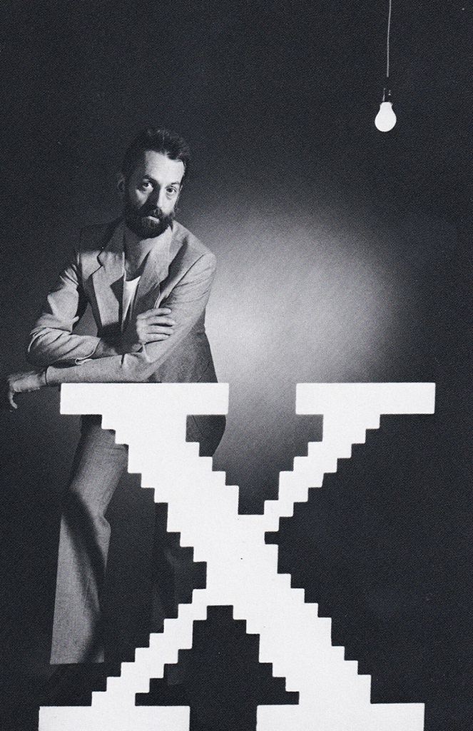
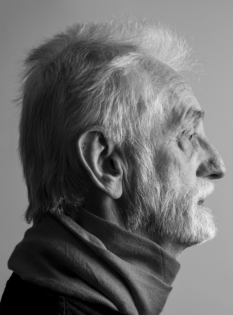
Niko, studio portrait by Rineke Dijkstra.
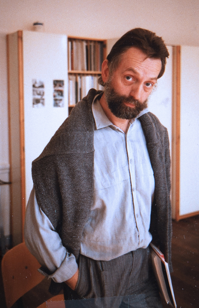
Niko, snapshot.
International Design Congress 1989 Amsterdam. Dutch Design had become a byword for design that is innovative, entertaining, and practical. Icograda, Icsid, and IFI jointly prepared to host this conference. Being president of Icograda at the time and an Amsterdam local as well, I was in the middle of it all. The congress was a success and attracted thousands of international delegates. On the occasion, Benno Premsela pulled all plugs and invited the cream of design worldwide for a superb lunch at our studio. During the lunch, Peter Struyken, artist and inventive envoy of everything new, presented his view of the international artistic avant-garde.
Another voice
Pieter Brattinga wrote an article for the November/December publication of Print, New York 1991. Print is a leading journal of graphic design. The article appeared in a supplement: The Dutch Issue. Pieter gave it the title: Public and Private 1945-1991. I would like to quote page 119:
The head of Information Services for the Ministry of Internal Affairs, Dick Houwaart, started looking for design groups other than that of the state printing house to solve visual communication problems in all divisions of that ministry, which was responsible for approximately thirty sub-institutions. With the support of Secretary-General Dr. P van Dijke, Houwaart was able to solicit pitches from five design offices. The BRS office won the competition and subsequently worked with the design office of the state printing house to develop new design policies for the Ministry of Internal Affairs. This far-reaching project, extending to all levels of the national government, changed the public face of the Netherlands.’
Pieter Brattinga further observed:
‘… the employees of the various institutions and departments of the ministry were involved in the analyses which preceded the proposal for a new house style [Corporate Identity Program]. The result was the creation of New Design based on need and function rather than the application of a visual coating to existing designs. BRS was so organized that the commission to redesign the ministry’s forms was given to a unit of BRS which specializes in legibility, use, and ongoing development of business forms online…’. This in effect pre-dates the notion of UX, User Experience Design, which would become trendy some twenty years later.
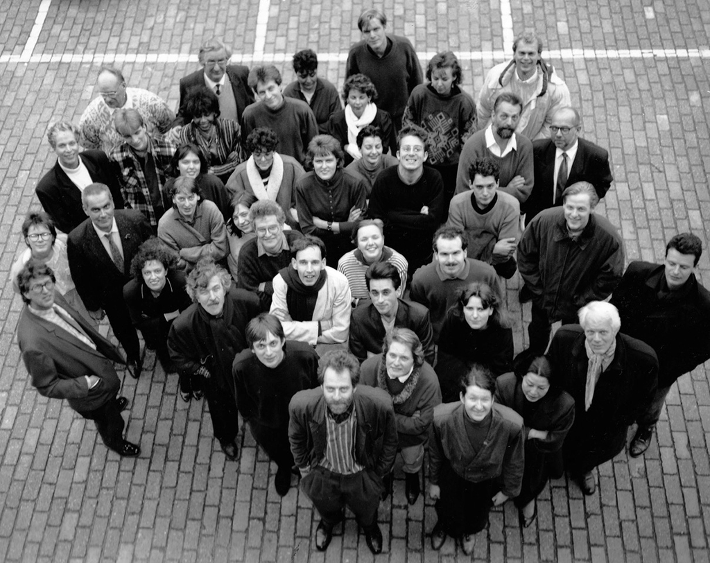
BRS Premsela Vonk. All of us workers at the company’s parking lot. Photo Rob Fels.
A dazzling send-off
I always held Elisabeth, the mother of our daughters Marijke and Karin in high esteem. I parented daughter Laura two decades later with Julie, her Australian mother. After working years in Amsterdam Julie decided to go home to Melbourne. I made a difficult decision and joined mother and daughter in Australia where our son Saul was born.
Fifty-one years old I got a spectacular farewell. My partners and everyone at BRS Premsela Vonk surprised me with a grand party. Erik Spiekermann came from Berlin and addressed me in his goodbye speech with the title: Sex, and Type, and Rock & Roll. Among the many guests was Hans Booms. He is the man who picked up from me when I let go as a partner of BRS Premsela Vonk and as leader of my Unit 2. Younger, and with a glowing reputation, he was experienced, amicable and a musician to boot. Yearly visits to BRS Premsela Vonk convinced me that I am quite replaceable indeed.
My stay in Australia led to a new design consultancy: Ography. As a founding partner, I was involved with Ography from 1995 until 2010. My Australian partner Prue Marks is still running the business. Being a tenured academic at RMIT University I was also a regular guest lecturer at Monash University and Swinburne University in Melbourne, at HvA in Amsterdam, and in Singapore. It kept me busy for twenty-five years.
And…, that’s another story.
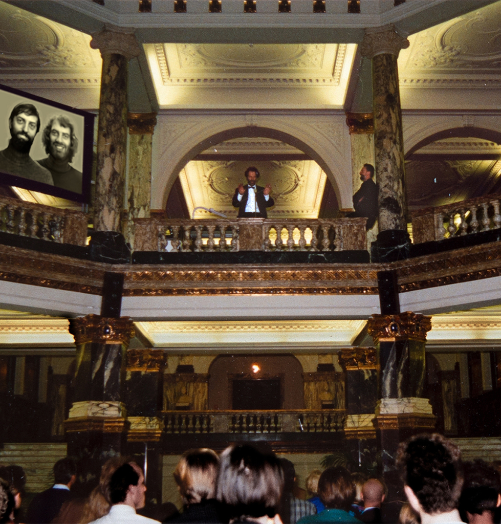
Farewell party. Jan addresses Niko 1991. Photo Rob Fels.
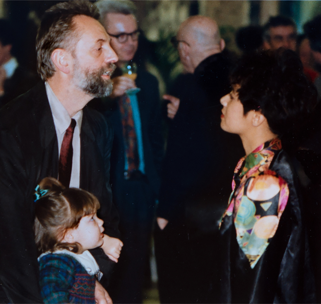
Farewell party. Laura, Niko and Roos 1991. Foto Rob Fels.
Finally
A big thank you to my friends who helped me with facts and photo’s, with text and technology. Without you I could not have told my story. Any errors or mistakes made however, are entirely mine.
I especially would like to thank Robert van Rixtel, Andrew Fallon, Bert Bulder, Els Wiegant, Sietse Wolters and Titia Schoenaker. Most of all I owe my partner, and final text editor, Maria Odilia van Schaik who stood me by in literally every aspect of this process. Thank you Marie.
Niko Spelbrink
born on 6 December 1940, Hilversum
Author: Niko Spelbrink, June 2022
Portrait photo: Aatjan Renders