Walter Nikkels was educated at Rotterdam’s Academie van Beeldende Kunsten, where he studied at the department of ‘Decorative and Monumental Arts’. It taught the concept of ‘community art’, of a ‘designed art’ in the 1950s. Nikkels graduated after four years. Early monumental commissions gave him the fiscal freedom to continue studying painting at the Akademie der Bildenden Künste in Munich, an environment where the more formalistic interpretations from the Rotterdam Academie were discussed frequently and heatedly. In sharp contrast, back in his home country eighteen months of military service was waiting. Nikkels: ‘After that’s done you return home without a penny. Therefore I followed my parents when they moved to Deventer, where I drew and painted all day. Each day I was asked: “And what now?” and “What do you expect of the future?” It became clear I could not continue this kind of life and I looked for an escape, somewhere in the west of the country.’
To Amsterdam. ‘I applied for a job with a ceramics studio. The Employment Exchange lady told me, this neatly-dressed young guy coming from the provinces: “Young man, that’s nothing for you!” So, I went to Rotterdam.’
Nijgh & Van Ditmar Publishers were looking for someone to manage productions and Nikkels became the chosen one. ‘Mind you, this company was different from the advertising agency of the same name, where many artists became merely scraperboard specialists.’
Nikkels found a small room in the basement of the house owned by the communist man of letters dr W. van Ravesteyn, Jr. Nikkels met with a very liberal managing director of the still new publishing house, which had its small offices in the Westerstraat, and later was to become Rotterdam University Press, for which Nikkels made his first-ever cover design. The publication’s title was, how aptly, Labour and Society.
High expectations
‘One day Waldemar Flem, my old teacher at the Academie in Rotterdam, came in to present a cover design and at seeing me there acted as if somewhat irritated. He asked what I was doing there and I felt ashamed … those high expectations that were cultivated at the art academy … we were all designated to become world-famous … well, the reality was a little different. Yet, I have to thank the managing director of this publishing house for allowing me to continue my development. He decided the then six-day work week would not be helpful and often sent me home to work in peace on my designs. On other days, at the office, I would take care of all kinds of business. This included elementary typography and how to efficiently manage book or magazine print page lay-outs, nothing very spectacular because we were merely following the Anglo-Saxon tradition of scientific book production. Luckily this allowed for some freedom of playing with the cover designs. We created an idiom related to the formalistic opinion of art of those days, Konkrete Kunst (Concrete Art).’
Nikkels continued to create his liberal, free artwork from his basement room. He managed to receive a grant from the Italian Embassy to attend etching classes at Brera Academia in Milan, where he, although he really ‘lapped up’ the latest developments in visual art, soon came to the decision not to follow through and not to switch his career to art. By that time Nikkels had married and was living in Dordrecht. The director of the local museum commissioned him to design an invitation or a poster and now and then even a thin museum catalogue. Dordrecht introduced Nikkels to the museum world and taught him this wasn’t always paradise: ‘The board once sent a note asking what the heck a typographer was doing to deserve a 75 guilder fee for making an invitation card.’
‘Every explanation, every theory of what is made, is also in the defense thereof.’
One of Nikkels’ museum commissions was to design a poster for the exhibition De Nederlandse Postzegel (Stamps of the Netherlands) to be opened by Hein van Haaren, then heading the Dutch General Post Office PTT’s Department of Aesthetic Design, DEV. Van Haaren’s first question was: ‘Who did this design?’ Nikkels was called to meet Van Haaren, who told him: ‘You should design a stamp for us, someday.’ Nikkels, still a rookie in the profession, had to wait for almost a year before he received the commission.
To Eindhoven
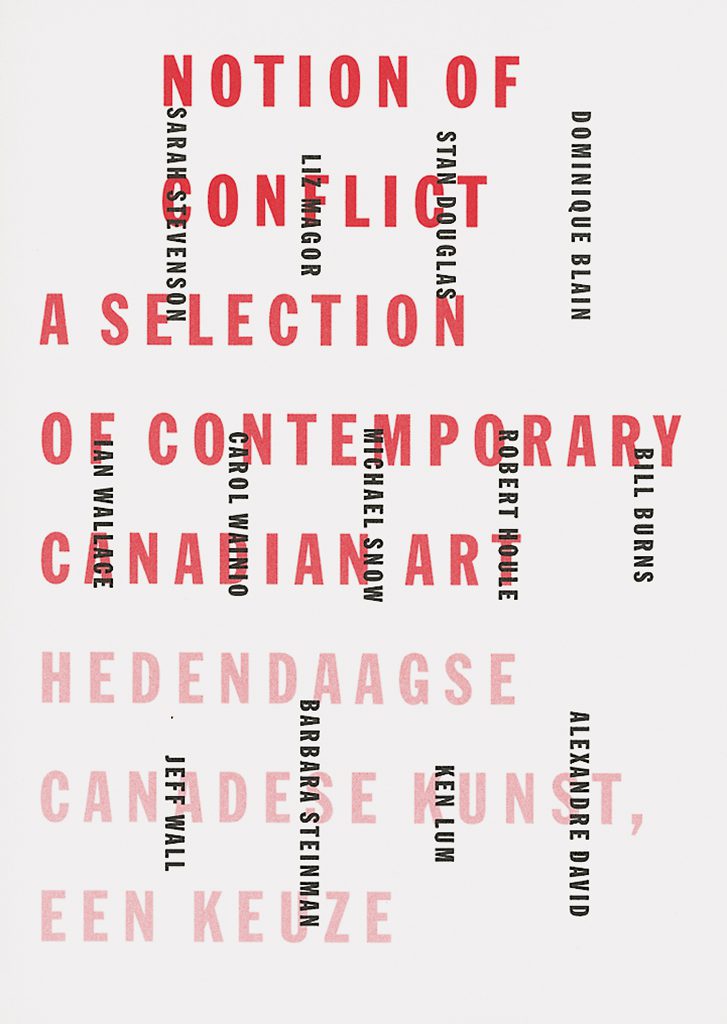
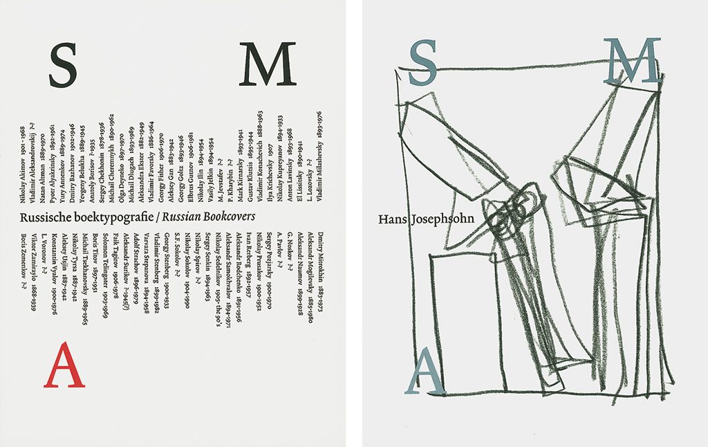
The mayor of the city of Dordrecht, Jaap van de Lee, who was familiar with Nikkels’ designs, was appointed mayor of Eindhoven. At the same time Eindhoven’s Van Abbemuseum’s directorship was switched from Jean Leering to Rudi Fuchs, and the appointment of a new creative professional to succeed Jan van Toorn as the museum’s graphic designer was seen as urgent. Hein van Haaren as well as Wim Crouwel were asked for recommendations. Both proposed Nikkels, as did the newly appointed mayor of Eindhoven. This started the long-term professional relationship of Nikkels and Fuchs that only halted during the years of the Fuchs directorship at the Haags Gemeentemuseum and was taken up again after Fuchs was appointed to director of Amsterdam’s Stedelijk Museum, SMA. The collaboration came to an end in 2003, the year Fuchs departed from SMA, an event that was marked by a small but important exhibition of designs Nikkels created for the museum.
‘My first book design in Eindhoven was for an Edgar Fernhout exhibition. It was to be printed by Lecturis, owned by Henk van Stokkom, who always printed everything for the museum. I was at home anxiously waiting to hear how it was received. What would Rudy’s reaction be? I had to wait till dinner time. The phone rang. “Hallo?” Silence. “This is Fuchs speaking.” Silence. Then Fuchs mumbled compliments. “Yes, Mr Fuchs, beautiful, thank you …” And my introduction into the world of contemporary art was a done deal. After this baptism, we never needed many words to collaborate well.’
Fuchs took Nikkels along with him in 1986 when he became the curator of Dokumenta 7 in Kassel. Said Fuchs later: ‘Our collaboration began almost eleven years ago. We never talked much about the theories and principles of book design. Nikkels is if possible even more buttoned up than I am. Our conversations concentrated on art.’
Schisms and breaches
Nikkels at Van Abbemuseum created a schism with regard to the approach of typography. His predecessor, Jan van Toorn, had presented a very personal and dominating style that had a large impact on the typographical culture of the day. In came Nikkels with a different yet also strong personal style, dominating too, but especially in unpretentiousness. Nikkels said he wanted to be ‘more modern’ than Van Toorn.
The schism was less of an ideological breach than one would think. Nikkels was a Van Toorn admirer (as he should be at the time). The schism was not just caused by a change of museum directors. The exhibition De Straat (The Street) allowed for a much stronger idiom than used when creating books and other print dealing with the artwork by conceptual artists such as Lawrence Weiner and Carl Andre, pushed forward by Fuchs in a breathtaking series of exhibitions. This art made extensive use of text and type; therefore the relationship of the graphic designer’s typography with that used by the artist became a very delicate matter.
While Nikkels was well-known as a graphic designer for art by now, the typographic culture in the Netherlands was still dominated by Total Design’s Wim Crouwel and Jan van Toorn. Yet, the Van Abbemuseum catalogues designed by Nikkels received high acclaim, especially abroad, as did his designs for Dokumenta 7. This resulted in the appointment of Nikkels to professor ‘für Entwurf, Buchkunst und Schriftentwicklung’ (design, book art and typography development) at the prestigious Staatliche Academie für Bildende Kunst in Düsseldorf. He was preceded there by greats such as Anna Simons and Walter Breker, photographer Bernd Becher’s teacher who designed such a splendid Bodoni-like alphabet.
Inside typography
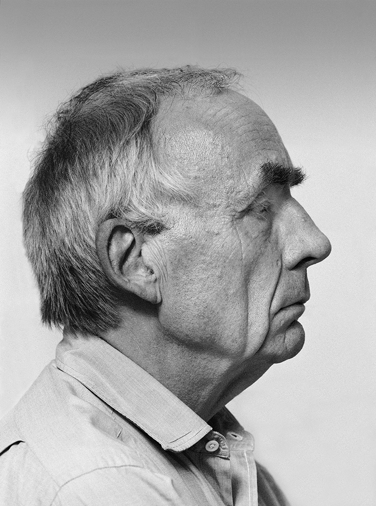
The photographer who was commissioned to shoot Nikkels’ portrait as shown here, after entering the Nikkels home in Dordrecht and strolling round and taking in the interior, exclaimed: ‘There’s no computer!’ Not really true. Nikkels does do e-mails and (in collaboration with others) uses the computer for preproduction work of his designs, but yes, the original designs are indeed handmade: ‘For me, this is the only, indispensable way to get results.’ Intuition and sensitivity influence his sketching, glue-ing, cutting, carving and shifting while searching for a grid, a balance, a place for each element in the design. The need to slow down dominates, any different approach is impossible. This is more than a pronounced attitude. His posters, for instance, avoid all conformity to any norm or standard the advertising gurus have set in stone. Also, Nikkels works just as easily with large as with small formats; his manual energy concentrates on what is at hand: a stamp, a book, an invitation, a poster—even a birth announcement card gets special attention and as a result, its own sensational composition.
‘It is sad to see how the canon of the past is clumsily and ignorantly applied as material for the postmodern practice.’
Nikkels is a contemporary classicist who avoids discussions about the use of upper and lower case, a difficult subject in Germany after all. He respects and respectfully exploits conventions, sure. As a contemporary classicist he could easily be in favor of ‘kleinschreiberei’ (all lower case) but he refrains from admitting this: its modernistic, avant-garde character after all does not change if one applies it today, its compulsory and somewhat artificial character continues to dominate and, strangely enough, in our time adds on a bourgeois aftertaste.
The savage landscape
Sometimes Nikkels’ work appears to have lost all naivety, as if he let go his responsiveness to new impulses. This is the consequence of his not easily gained and therefore solid work ethic; and it is this that directs his very personal signature to become a statement if not a hermetic system. Nikkels is a master of constraint.
He may speak in a somewhat aggrieved tone about his work and position, and about the typographic relationships of the Netherlands and Germany. There are many variations of creative relationships: Irma Boom’s provocations of Otto Treumann he calls the immature shouting of a discontented child. A sense of wrong hits Nikkels himself too, and quite often, but never becomes manifest in his work, only in conversations and discussions about design. He manages to find accommodation for any accursed issue and to make the situation bearable.
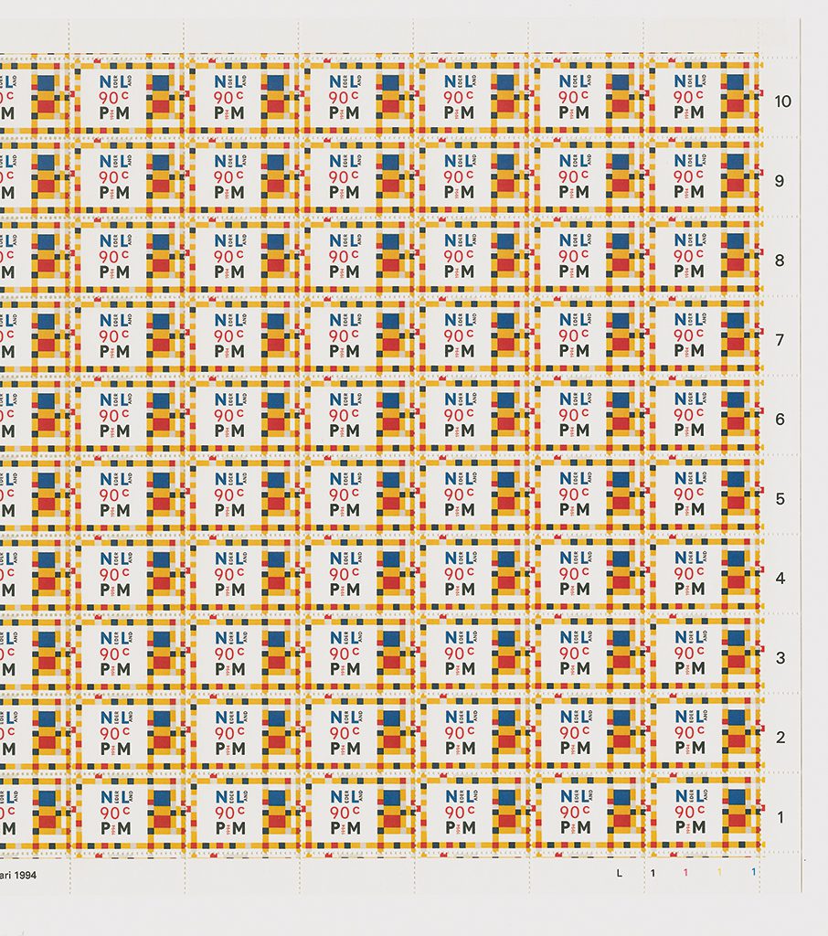
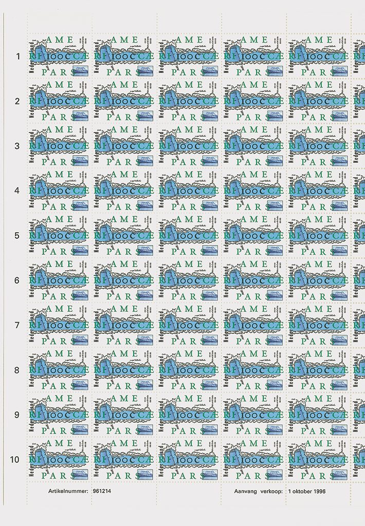
His status as a typographer is unassailable even if there are uncertainties in his private life and influences from cultural changes or different appreciations in different regions he cannot control. Nevertheless, Nikkels is the first to admire colleagues he understands and be subtly thoughtful of the ones he does not ‘get’. There are frictions of character and of opinion at play in the typographers’ world, this world being made up of the most recalcitrant of professionals. Nikkels likes to work with Frank Blokland’s new fonts such as Prokyon, or the VandenKeere for his America stamps; he is in much praise of font designers like Bram de Does. If in an interview Irma Boom says: ‘If there is something in common about my books, it’s the roughness; they are all unrefined. Very often there is something wrong with them. It is not like Walter Nikkels—very solid where you can’t change anything,’ she is not just blunt and over-simplifying. There is truth in what she says, for everything has been given its one and only precise location.
‘I am always making several different designs and never know which is best. I need three or four weeks to think about them—most times by that time the design has been printed already.’
Her statement puts forward a rather forced viewpoint and does not honorably reflect the real meaning of both her and his professional approaches. Such misleading ‘engagements’ are hard to find with Nikkels, not with his person, not in his work. This may leave the impression he is not militant. Yet his battlefield is the flat surface, even if it is no larger than one cm2. There he is a real warrior—why else would he have been chosen to be Wim Crouwel’s successor at TGP Post?
Influence
Nikkels has a substantial influence on students and young designers, especially in Germany. But also at Academie St. Joost in Breda, where one can find a Masja Mols, who wrote her graduation thesis about Nikkels, and an Ineke Leeuwendaal, who in her thesis about book typography devotes a long chapter to his work, while at AKI in Enschede his work appears in many a paper too. There are graphic designers such as Gracia Lebbink to whom Nikkels’ work evidently is an inspiration.
Situated between Thonik and DEPT, in a killing competition, it is striking to see how the young design guard forces themselves to oppose his reputation and work. ‘The words “graphic design” or “to design” often imply servility,’ says Paul Du Bois-Reymond (DEPT), ‘while we always want to stress our own authenticity.’ He is definitely not aware of the authenticity and layers in Nikkels’ work. Indeed, this work cannot be easily deciphered; it is not fast food. Even highly experienced designers can be misled by their own fixations and inaccurately reproduce their vision of his work: ‘Never a heartbeat, never a dance,’ or, ‘If Walter doesn’t pay attention, it’ll become too beautiful.’ There is some truth here: Nikkels can balance on the border of a deadly perfection. Yet ‘life’ and vitality are not absent—it just depends on one’s viewpoint. Nikkels remains true to his beginnings: the art of drawing, which delivers the keynote to design; and the tactile movements of drawing must be executed constantly to establish whatever kind of experience, whether affirmative or denying. Drawing calibrates, recalibrates, checks or corrects the experience. This is what makes Nikkels tick: the ever-conflicting confrontations with the self, a wild flow that needs to be fed as well as drained, this foundation of his success, with all the loneliness that comes with it.
Architecture as a source
Most times the theory that the essence of graphic design is linked to the notions and understandings nestled within architecture is a little suspect. Though not in the case of the connections Nikkels creates through his work.
From the beginning of industrialization and with the growing understanding of the possibilities and effects of typography authors writing about the profession have tried—offering a variety of baseless or unclear arguments or even without offering any arguments at all—to connect graphic design to architecture. Piet Zwart, Alexander Stols, just to name a few. What is really going on is an attempt to explain why so many architects themselves are active in graphic design as well: Berlage, Le Corbusier, and so on.
Auke van der Woud is a renowned architecture historian. At the time his book Waarheid en Karakter (Truth and Character) was published—a book in which the myths of architecture were punctured—he impassionedly explained his arguments during a radio interview; these were seamlessly applicable to graphic design as well, to its position and to the recognition the profession gets. The book does not present the products of architecture but discusses cultural mores, social relevance, and concepts thereof. From then on, real relationships between architecture and graphic design were no longer unthinkable. Whether Nikkels knew about Van der Woud’s writings does not add to or detract from the succinctness of the viewpoint Nikkels publicized in Der Raum des Buches (The Space of the Book).
A component of ratio
His fascinating manipulations with two- and three-dimensional space to which he adds, if necessary, an exalted play with images, is more than just a simple palette. Few other designers can do this much with so little. Look at the open-air poetry of his (not used) designs of banknotes. With his work for Citroën only Karl Suyling came close to Nikkels. Funny, sometimes also Jan van Toorn’s work presents a similar magic.
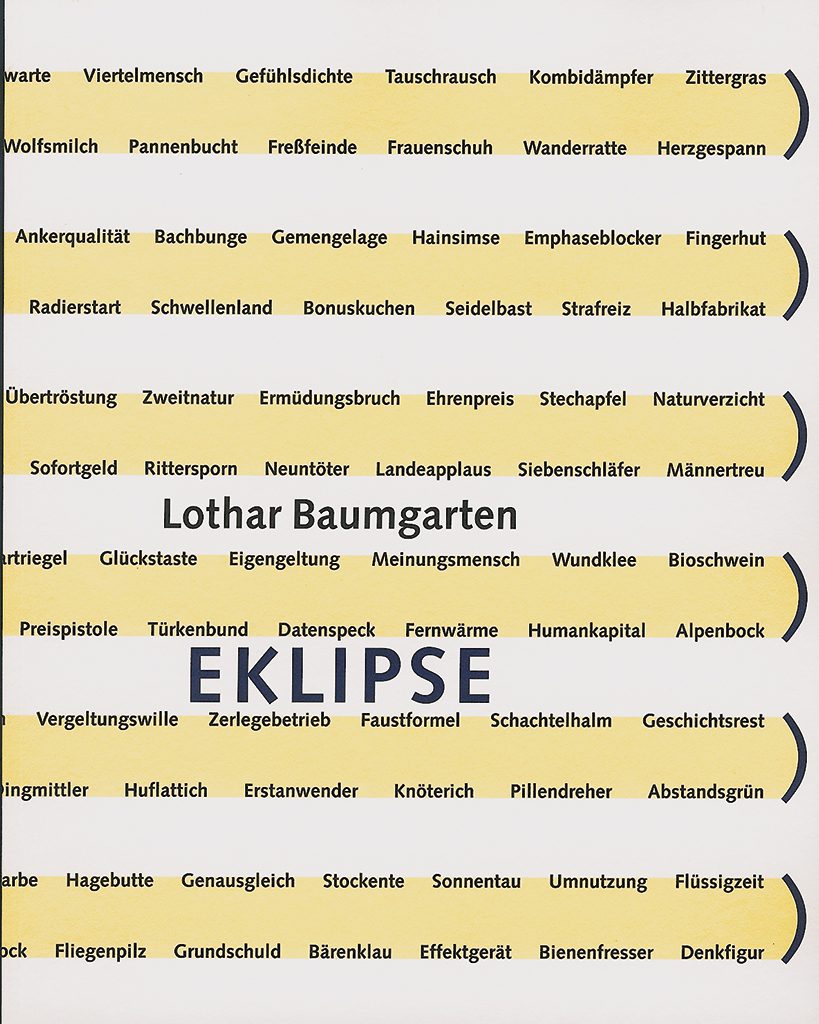
Yet, can one use the word architecture here? But then, for his friend Lothar Baumgarten—with whom he made many books including the magnificent Carbon—he designed a loft in New York. The much talked-about exhibition Bilderstreit (Image War) was a graphic as well as a spatial Nikkels design. His way of defining space is even better visible and voluptuously admirable in the redesign and interior decoration by Nikkels, in collaboration with director Guido de Werd, of Museum Kurhaus in Kleve. He worked eight years on this project, the ultimate confirmation of his diabolical talent.
‘I won’t say the theories of Georgio Grassi and Aldo Rossi were in front of me—nonsense!—but when reading them later I recognized much of what preoccupies me in typography. Grassi’s plea about rationalism and functionalism in architecture … suddenly I saw the dilemmas and I could only support all the conclusions he drew. Of course I knew architect J.J.P. Oud’s development, I studied at the Academie in Rotterdam after all. How could I not be aware, for I had to pass his creations day in day out by train, and I learned to understand that Oud put functionalism forward for discussion as an ideology rather than as a component of rational architectural design.’
Authority, no author
The many years he spent teaching at the highly respected academy in Düsseldorf notwithstanding, Nikkels wrote little about his profession. One may reproach him for not confiding his thoughts to paper, although he is not the only graphic designer to be missing. For others, such as Sjoerd de Roos, Christiaan de Moor, Dick Dooijes, Dolf Overbeek, Willem Ovink, Hein Oltheten, Hein van Haaren, Jan en Huib van Krimpen, Paul Mijksenaar, Piet Schreuders, Gerard Unger, and Hub. Hubben, their writings were a logical consequence of their work as a designer or design manager.
‘The miracle of the design process is what appears to be a coincidence.’
Nikkels is a serious person. Serious arguments are what he puts forward. He is a prolific speaker especially when in other countries than the Netherlands. His choice of words, his speech, in a way they are all related to his personal design process. Even while searching for the right words he is one of those unique people who are able to formulate their thoughts carefully even though doubt and hesitation may simmer through; he is even able to put things in a humorous perspective that is much harder to discover in his work.

Nikkels can at long last be found at the art segment of design-land. An experienced traveler, he is well acquainted with other lands and areas and knows how to react adequately to them if only when surrounded by a select group of people. Here, more friction becomes manifest than caused by the times or the lack of time: to Nikkels typography and graphic design, however functional, appear to become doomed to mean much less to many more people.
Escape routes and border explorations
Nikkels the expert of long-term development shuns and distrusts easily gained success. He is always a slow starter of a process but never a slow mind. This time and age, suffocated by speed, surrounded by ever-changing parameters and shallow fashions, comes accompanied by indifference and boredom.
But in the chest of Nikkels, this renaissance man of counter-fashionable originality, roam at least four souls: painting, music, romance, poetry. His position in Germany does not make things easy for him. The solidity of a background created by the ‘designed art’ of his early education in Rotterdam is not popular, not even with many art-loving intellectuals. In Düsseldorf, too, he has to defend his position with strong arguments, his work being so interwoven with it. He explores music; his passion for piano is tested whenever he has the opportunity and his shiny black grand piano confirms the necessity of continuous exercise.
Nikkels is a permanent traditionalist who regards the design process as a craft, a force that—just like playing the piano—is based on a worthy interaction of head, heart and hands. He continues to follow the technological developments but with ever suspicious eyes. He applies new techniques, of course, but selective and with care. His whole being and work are founded on ‘simplicity’. Anyone must understand how difficult it is and how much clarity is needed to reach such meaningful simplicity.
His field has broadened but was also, after Amsterdam’s Stedelijk Museum stopped being his client, moved geographically and culturally. His commissions now come from Germany. Or from Switzerland, Portugal, the United Kingdom. His goal was always to intensify the relationship of two autonomous fields—visual art and typography—nevertheless bringing forth a subtle strengthening oneness. His ‘Leitmotiv’ always was that the art catalogue is a respectable genre of its own, autonomous as a gratifying book design, and an integral part of any exhibition.
Walter Nikkels
born on 25 November 1940, Lobith
Author of the original text: Jaap Lieverse, September 2005
English translation and editing: Ton Haak (unauthorised)
Final editing: Sybrand Zijlstra
Portrait photo: Aatjan Renders