‘I really had to fight to be allowed to do illustration for my final exam’, says Theo Barten, looking back on his studies at the Academy of Visual Arts St. Joost in Breda. He experienced the old, solid, craftsmanship-based education. There wasn’t much freedom. The revolution of the late sixties came just a little too late for the Publicity department. But it was certainly an education that, in retrospect, was a good basis for a versatile career.’
It is a career that I have been able to follow closely; we have known each other for almost sixty years. At the beginning of our conversation, Theo presents me with a timeline that starts in 1960, when he goes to secondary school. It is a useful guideline, but I start in 1948, the year in which he was born on 6 May in Boxtel.

‘Aluminum race’ from Basic Lines 1, 2023
A Brabant family
You could call the family he grew up in a typical Brabant family from that time in which he grew up: six children, of which the girls were given a completely different role than the boys. His father is a chef in the insulation board factory of which his father-in-law is the director. Mother comes from a family of thirteen children and takes care of the household. ‘I have two sisters and three brothers, of which I am the eldest. We, the four boys, had complete freedom. Apart from occasionally having to do some shopping for mother at the grocer on the corner, we could do whatever we wanted. Our sisters did go to secondary school, but in addition had to help out around the house every day’, Theo looks back. The eldest of the two is following the secretary course at Philips, the other is doing the MO teacher training French and teaches in secondary education. The brothers all choose creative subjects: one becomes a biologist and photographer, the other a music teacher and choir leader. The youngest brother, like Theo, became an illustrator and also plays guitar and keyboards in various bands. Theo says about his youth: ‘I started drawing very early. At the time, you had those thick, cheap pads of newspaper and I drew comics in them. I did that all day long: on the table and under the table or wherever. I was a very leptosome boy who hardly went outside and certainly did not do any sports.’ In 1960, he went to the HBS-A course at the Jacob Roelandscollege in Boxtel. After his final exams, he enrolled in the Academy of Visual Arts St. Joost Breda in 1965.
Morning prayer
From the general basic year, he chose the department that was initially called Publicity and was later renamed Graphic design. From that time on, Theo and I wait for the train to Breda almost every day, where we sometimes see the other academy studentsart academy students from Boxtel: Bruno Ninaber van Eyben, who studies to become a jewellery designer in Maastricht, and graphic designer in spe Toon Michiels, who goes to the Royal Academy in Den Bosch. On the platform, the conversation about the latest music is usually more important than discussing the assignments we are working on. In the last year, the journey to the academy in Breda is made in a packed Ford Taunus of a fellow student who picks up passengers from Esch every morning in Boxtel, Goirle, Tilburg and Breda, only to arrive at the academy just too late, where the door only opens after the director has said his morning prayer.
The fight for illustration
When asked whether there was room for illustration or illustrative design at the department where he studied, Theo answers resolutely: ‘I had to fight to allow illustration to be included in my final exam in 1969. There were a few teachers during the course who paid attention to it. Chris Brand of course not, he was a pure typographer. Wim Smits taught the subject of spatial design and Jan Begeer mainly concentrated on graphic design. IJsbrand Pijper did pay some attention to illustration, but it was mainly the founder of the academy, Gerrit de Morée, from whom I learned the most in that area. He really taught us how to draw. It started with model drawing and you could then go further and further in that.’ At that time it was still self-evident that the final exam consisted of assignments formulated by the teachers. One of those compulsory assignments was to make an object in the visual language of a famous artist. ‘Our final project was about pop art artist Marisol Escobar. She made life-size wooden human figures, covered with plaster masks and other additions. Each student was assigned a teacher for the spatial design component, who had to be sculpted in his image and likeness, Marisol style.’ About Chris Brand’s head, which consists of three photosTheo places a perspex hood as an invisible barrier and a hole at the mouth with the inseparable shag in it. Here too, the illustrator shows himself.
All-rounder among the farmers
He finds his first job as a designer at the CHV, the Cooperative Trade Association for the agricultural sector in Veghel. From 1969 to 1974 he is the only designer at the company and does everything that needs to be done in the field of design: the logo, the house style and the staff newspaper, for which he also makes a comic strip. Theo is also a reportage photographer.When he is asked to take over the management of the publicity department, which now consists of three people, he realizes that he does not see anything in such a future and decides to respond to an advertisement from the educational publisher Malmberg. He is hired there as a book designer.
Book designer for education
There is not much to tell about his period at Malmberg publishers, where he worked from 1973 to 1978: these were long-term school book projects with little room for creative ambitions. Long meetings and extensive discussions preceded the realisation of the final product. The most interesting thing for him was designing the book covers. It was nevertheless an educational period because of the experience gained with complex typographical problems, but after five years it was time for a different direction.

Caravan
A journey and a new start
Before Theo left Malmberg publishers, he met his current wife Karin Schreppers, a visual artist, in 1975. In 1978 they decided to make a two-month trip through the United States of America. It not only gave Theo the opportunity to discover the country that is a myth for him and many of his contemporaries, but also the time to think about his future. Once home he makes an important decision: ‘After working for a number of years as an employee, I decided to start working as a freelance illustrator after the trip through the USA.’
The clear line
The drawing style called ‘the clear line’ can be described most briefly as drawing with a fixed line thickness. Theo Barten has always had a preference for that ‘clear line’. In addition to comic strip artists Hergé (Tintin) and Edgar P. Jacobs (Blake and Mortimer), his sources of inspiration are graphic designer Dan Fern, cartoonist Guy Billout and the Japanese print artists Hokusai and Hiroshige. In 1982, Theo drew a self-portrait for the poster that Toon Michiels designed on the occasion of the exhibition of illustrators within the GVN (Graphic Designers Netherlands) in the Stedelijk Museum Amsterdam. The poster immediately put him on the map and earned him an award from the Art Directors Club Netherlands.

Poster ‘Is Getekend’ for the exhibition of the GVN illustrators, with Toon Michiels,1982

the clear line

Artbox poster
Artbox
Following this award, he was approached by Artbox, an agency for illustrators, who were interested in using his clear-line style for advertising purposes. During the years that he worked for this agency, he gradually developed his style: ‘Gradually, I started combining the clear line with airbrush. Ronald Slabbers and I were the only ones in the Netherlands who did that. We were called the Kings of the Clear Line.’ After the exhibition ‘Vingerplanten, 3 manieren van Illustratie’about the work of Sylvia Weve, Studio Dumbar and Theo Barten in Museum Het Kruithuis in Den Bosch (in 1988), he more or less said goodbye to the clear line.‘In my new work, the outline increasingly plays a subordinate role. The rapidograph has been replaced by the coloured pencil; many areas of colour no longer have an outline at all.’, he said at the time.

Theo Barten in his Studio

‘Kaos,’ cover illustration, with Toon Michiels, 1986
Amiga
In the mid-eighties, Theo Barten discovered the computer as a means to further expand his technical repertoire. Artist initiative V2, then based in ‘s-Hertogenbosch, where he now lives, gave him the opportunity to experiment with an Amiga.
‘I was allowed to watch how the computer was used at V2. The penny dropped immediately. I immediately bought a computer myself. In the early eighties, that was an Amiga 2000, then an Amiga 2500. I worked with Deluxe Paint, a bitmap drawing program where you always saw the pixels. Artbox thought it was interesting to see them in my illustrations: a new trend.’
He is one of the first in the Netherlands to work in this way, but after a while it imposes too many restrictions on him and he switches to making collages. All previous techniques come together here: clear line, air brush, Deluxe Paint, collage and the good old colored pencil.
‘De literaire slaap’ for Elseviers Weekblad. Art director Jan Flier, 1986
Theo: ‘I worked with prints and then incorporated them into my collage drawings. The illustration for the article “De literaire slaap” by Gerrit Komrij for Elseviers Weekblad was extremely important for the transition from air brush airbrush to collage technique. I was given that assignment based on my previous work, but I felt I had to do something else. Then I started cutting and pasting. I later worked on the drawing with air brush airbrush. It was exciting whether the art director would agree. To my relief, he was very enthusiastic.’

‘Creditkaart genot,’ pixel drawing for Eurocard, 1985
ANWB
In addition to his work for the advertising world, Theo Barten worked for the ANWB until well into the eighties: ‘Although the magazine was often thrown away unread and with the banderole and all, most people know me from the ANWB members magazine Kampioen, which had a circulation of three million copies. I worked for it from 1982 to 1986. Gert Dumbar, who had designed the house style for the ANWB, thought it would be a good idea to include a comic strip in the magazine to make the magazine a bit more light-hearted. I then came up with the comic strip De Verdwaalde Paddestoel, a black-and-white comic strip to which the lithographer later added a light blue overlay.’

‘De Verdwaalde Paddestoel’. Comic for the ANWB Kampioen, 1982-’85
Not long after, editor Jan van Overbeek asked him to make drawings for his column on bicycle technology. In these extremely precise, comic-like instructional drawings, there is always a layer of perspective to be found. It is a characteristic that recurs in his work: cars, trains, planes and other objects are drawn with uncompromising precision, correct down to the last detail, but there is also the double bottom of humour and irony. No computer is used in the making of them; everything is drawn by hand.‘To be able to make the curves I had all the templates that were for sale,’ he says.
The assignment for the Kampioen expands to making illustrations for the editorial articles. Here the pure illustrator is back in action. Unfortunately, in 1986 the editors decide that the comics no longer reflect the ANWB’s philosophy. After six years the collaboration comes to an end.

‘Zitten en zitten’. Illustrations to a monthly section on bicycle maintenance. For the ANWB Kampioen, 1982-’85

Illustration for the ANWB Kampioen, 1982-’85
But it is not only the substantive discussion that is at stake. ‘The possibility to draw professional comics as a freelancer in the Netherlands is practically zero,’ Barten says in the NIC Bulletin (Dutch Illustrators Club) in 1990. ‘In relation to the labor-intensive work, it is paid far too little.’ Earlier, in 1977 and 1978, he published the (unpaid) comic Spruitjes in de mayonaise in the magazine Modern Brabant. The ANWB comic was the first and also the last that he made on commission. ’
Dutch Railways
John van Straten, his former colleague at Malmberg publishing house, started working as a designer at the Dutch Railways and asked Theo to join him as an illustrator in 1982. In the twelve years that Theo Barten worked for the NS, he created editorial illustrations, infographics and cartographic infographics for their publications, for example about the North-South Line, the Betuwe Line and the rail expansion for the Amsterdam-Utrecht route. In 1993 he designed the covers of the railway timetables. ‘Around the eighties, illustration and infographics were still an extension of each other’, according to Theo Barten. From around 2000 there was an editorial separation and since then infographics have been considered a fully-fledged discipline in their own right, alongside illustration illustrations.’

NS Railway booklets, domestic, 1992

NS Railway booklets, international 1992

Betuweroute, cartographic infographic, for NS Railinfrabeheer, 1995
Infographics
Creating data visualizations is becoming increasingly important. In 2000, he was awarded the Annual Infographics Prize for his work for paint manufacturer Sikkens, a prize created by the BNO (Association of Dutch Designers) and the Algemeen Dagblad.
It brought him many new clients: Intermediair, De Ingenieur, Natuur Wetenschap en Techniek, the Algemeen Dagblad and, the Financieele Dagblad, the Ministry of Infrastructure and the Environment, Rijkswaterstaat, the Cultural Heritage Agency, the Dutch Railways, Nationale Nederlanden, Shell, KLM, the Eindhoven University of Technology, the Association of Insurers and Holland Herald. For Robeco, he determined the face of the illustrated campaign for which he visualized variations on the theme of ‘return’ for a long time. This campaign was awarded an Effie for the most effective advertising in 1988.

Empty Dutch Business, for Intermediair, 2006

Profit distribution Nationale Nederlanden, for Jean Cloos Art Direction, 1995
Theo says about the changed content of his work: ‘I like both the analytical and the autonomous side of my profession. Creating infographics is a fundamentally different discipline than illustrating for the advertising world, where no one interferes with my style. That style is precisely the reason why they ask me. When creating infographics, you look for the most suitable technique to convey the information. I also always did a lot of research to understand that information properly. The infographic for Rijkswaterstaat is a good example. No one actually knows what this agency does exactly. A lot of consultation was needed to be able to make that clear. That often takes more time than the drawing itself. There are projects that I have worked on for more than half a year. With the scientist or another specialist, I then develop a plan on how to visualize something. In the beginning, there is often nothing at all, just a question and that is not always clear either. That is why it is really a design profession. I feel at home with that.’

Poster Rijkswaterstaat. Text and concept: Henk Leenaers Line 43. Design, cartography and infographic illustrations: Theo Barten
Shape of Things
Theo’s love for the design of cars and trains can be found in much of his professional work. He also seizes the opportunity to show this in less serious projects. For example, in the two witty Super-8 films entitled ‘Shape of Things’ that he made in 1976 and 1978 for the TGV Film Festival, a cheerful initiative by designer and artist friends. In Shape of Things 1, he uses his facial expressions to portray the different characters of carefully selected car models and trains. For Shape of Things 2, in which he shows concern about the uniformity of the latest designs, he places a rectangular white cardboard box over his head while in the background the middle-class cars rush past in an endless stream on the highway.
Narwal
Together with Maarten Swarts and his brother Frans, Theo founded the Narwal publishing house in 2010, where the shared fascination for the heritage of everything that drives is given a platform. Until 2024, they will publish twelve books in a relatively small edition, based on photos from their own archive.
The origin of that archive lies in 1969. From that time on, he and Maarten Swarts crisscrossed Belgium, Northern France and the Netherlands every weekend for a number of years in a row in search of abandoned American and English army trucks that had been adapted by small contractors, garages, fairground visitors and other operators for a second life in civilian service. An Austin K2 converted into a chip shop becomes the namesake of the Frituur Zorro series, a documentation of reused military vehicles from the Second World War. Lucas Beaujon, who also photographed hundreds of trucks, restored a large number of them and also owns a few, is an important partner in this.
Where in the 1970s someone else would go to the Spanish coast or a French campsite, Theo travels with his friend Maarten and brother Frans to Czechoslovakia in the then mysterious Eastern Bloc. They photograph the still abundantly present, mostly pre-war French, American and Russian cars, in addition to the well-known Skodas from the country itself. In 2014 they decide to publish a selection from their collection of hundreds of photos in Pozor! The Automotive Landscape of Czechoslovakia in the Seventies.

‘Pozor’ 2014

‘All Along the Control Tower’ 2015
Between 2015 and 2017, Narwal publishes three photo books by Theo and his brother Frans (Barten & Barten) under the title All Along The Control Tower, with the control towers of the RAF (Royal Air Force) in the United Kingdom that have survived from the Second World War. An almost complete inventory of buildings, which can be seen in their full restored glory or as barely recognizable ruins.
Basic Lines
In 2022, Theo decides to stop working on commission–but not on drawing. He starts a new project, Basic Lines, and is completely back to the clear line. Many interests come together in these drawings: he places buildings, cars and trains in unexpected and surprising situations: a pylon of the Clifton Suspension Bridge from Bristol is lost on Place Charles de Gaulle in Paris; the Museum aan de Stroom is put in place in the port of Antwerp by ‘Vlotkraan nr. 9′ from 1948;, the CCTV towers of OMA walk over the Great Wall of China, the Chapelle Notre-Dame-du-Haut in Ronchamp by architect Le Corbusier is transformed into a surrealist painting and Buckminster Fuller visits Truus Schröder in his Dymaxion Car in her house in Utrecht, designed together with Gerrit Rietveld. The one hundred and fifty drawings are published by Lecturis in ‘Basic Lines/ Architecture with a Twist’, volume 1 (2023) and volume 2 (2025).

‘Basic Lines 1’ 2023

‘The Visit’ Basic Lines 1, 2023

‘Ronchamp See-Through’ from Basic Lines 1, 2023

‘The Pot’ from Basic Lines 2, 2025

‘Boomerang’ from Basic Lines 2, 2025

‘Nulland’ from Basic Lines 2, 2025
Theo Barten will initiate a number of exhibitions from 2023 onwards, where his books and printed drawings will also be for sale. He is happy with the direct contact he has with his audience there.‘Because,’ he says ‘I always worked alone at home. That was really frustrating – the whole world kept turning and I just sat in my studio. I really missed working with people outside my own world. You could say that being an illustrator is a lonely profession.’

Theo Barten, Rochester (VK) 2012
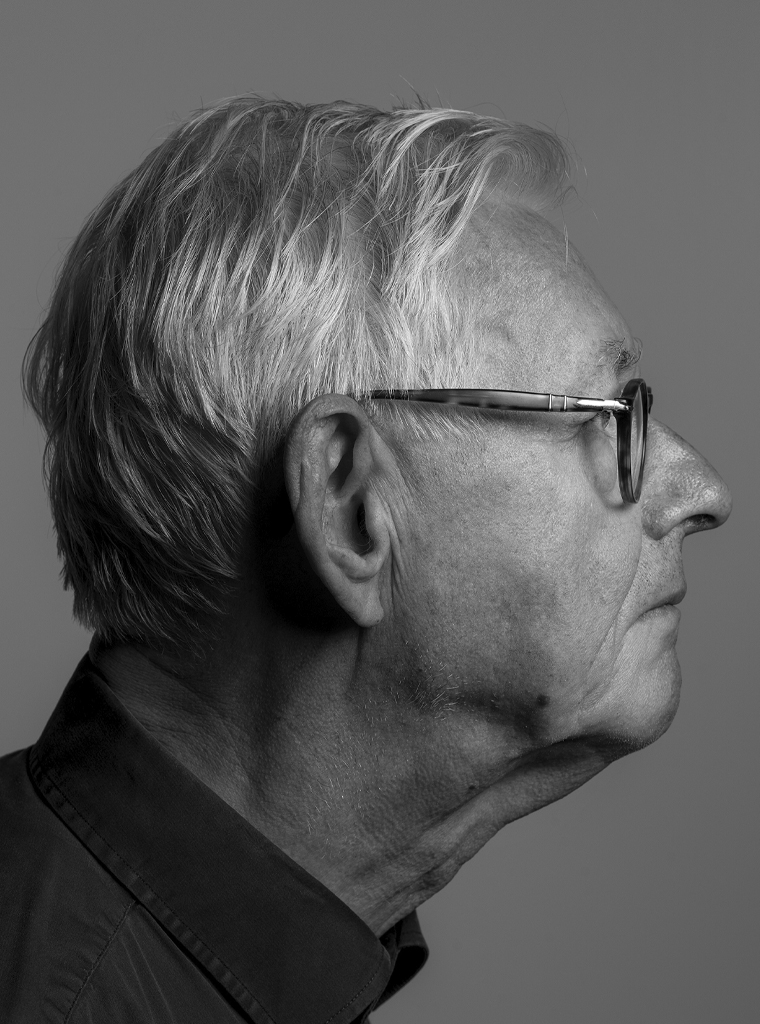
Theo Barten
born on 6 May 1948, Boxtel
Author of the original text: Frans Bevers, Februari 2025
Portrait photo: Aatjan Renders